Best Florist Websites of 2026 (28 Real-World Examples)
Flower-shop storefronts, local studios and event portfolios with useful lessons for your next florist website.
A florist website has to sell a visual experience while answering very practical questions. Can the flowers reach the right place on the right day? Is this a ready-to-order arrangement or a custom event commission? These examples show different ways to make that decision clearer.
A bouquet shopper and a wedding planner arrive with different needs. The first may need a delivery cutoff, price and available arrangement in a few minutes. The second needs evidence of style, scope, process and an appropriate starting budget. Strong florist websites make those paths distinct without losing the character of the studio.
This collection includes neighborhood shops, larger delivery retailers, a multi-florist marketplace and event-focused design studios. Compare each site with a business model like your own. A national catalog's navigation is not automatically right for a two-shop florist, and a cinematic wedding portfolio is not a substitute for a usable local ordering flow.
Before the examples
What makes good florist website design in 2026?
Make fulfillment clear
Put delivery area, available dates, pickup options and cutoff rules near the order path. If availability depends on the recipient's address, explain that before visitors compare unavailable products.
Separate shopping from consultation
Ready-to-order flowers need prices and checkout. Weddings and installations need representative work, scope, location and a clear inquiry. Do not force these different decisions into one generic contact button.
Show real floral work
Use photographs that demonstrate arrangement scale, materials and setting. Credit project photographers where appropriate, and explain that seasonal substitutions may affect an order rather than implying every stem is always available.
Keep the shop current
Assign responsibility for holiday menus, delivery cutoffs, sold-out products and workshop dates. A beautiful homepage loses usefulness when yesterday's event remains its leading announcement.
The collection · 28 examples
28 florist websites worth studying
Compare the examples by the task they support: urgent local delivery, curated bouquet shopping, workshops, recurring flowers or custom events. The reviews focus on observed presentation and navigation, not the quality of the flowers or fulfillment service.
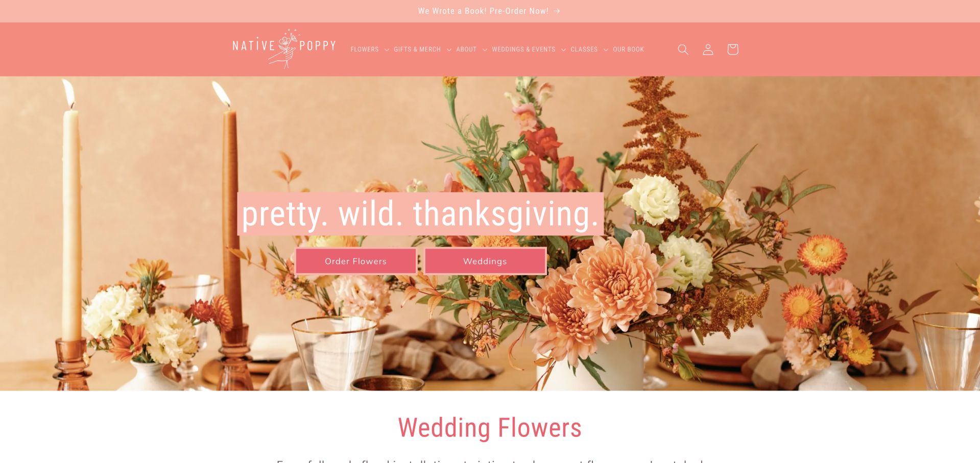
Native Poppy makes its colorful personality visible without hiding what visitors can buy. Daily flowers, wedding work, gifts and classes have distinct routes, while the homepage introduces the San Diego shops and a recurring flower club. That separation matters because a quick gift order and a wedding consultation need different next steps. The seasonal tablescape gives the flowers a social setting, while pink blocks behind the headline keep the message distinct from the busy photograph. Two similarly sized buttons make the everyday flower order and wedding route equally visible, reflecting the different reasons someone might arrive at this local studio.
What you can learn
Keep everyday purchases and event inquiries separate, then support both with real shop information. A memorable palette should reinforce these decisions rather than substitute for them. Preserve those familiar task labels when campaign photography changes. A holiday image can introduce the season, but customers still need a predictable way to choose an arrangement or begin a longer conversation about an event. Review the banner and hero together when a seasonal offer ends.
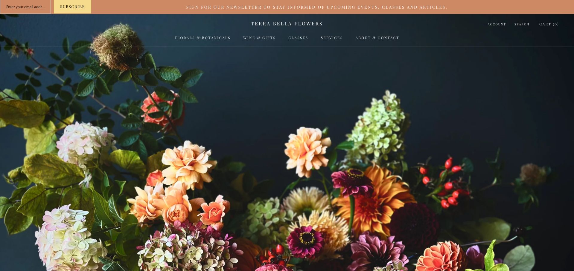
Terra Bella uses a dark floral photograph and restrained navigation to establish a studio mood. Below the opening image, florals, botanicals and classes explain the range, with Seattle neighborhood and delivery-area information giving the presentation a practical local anchor. Its environmental language is the business's own positioning, not independently verified certification. The opening photograph lets warm petals emerge from a deep background, with a widely spaced menu remaining visually quiet above it. A newsletter field and explanation occupy the top strip, so subscription has more explicit instructional text in the first view than the path to selecting flowers.
What you can learn
Combine a distinctive photographic style with clear local service information. If classes are important revenue, give them a visible route instead of burying them in a news feed. Decide whether newsletter discovery deserves that much early attention for a visitor arriving with a gift deadline. The same atmospheric image could support a concise shopping or delivery prompt, while class announcements and studio updates remain available to people who want an ongoing relationship.
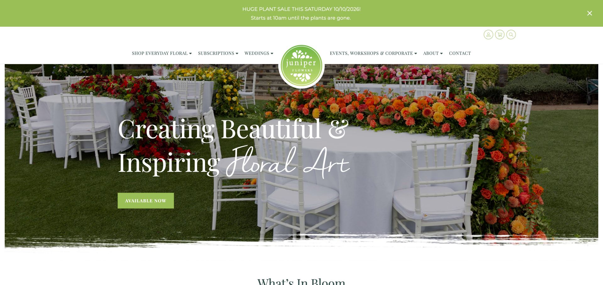
Juniper pairs a long event-table photograph with expressive type and a direct available-now link. The page then moves into seasonal arrangements, subscriptions and its floral story, making the studio feel more personal than a generic product grid. An October event announcement remained visible during this November inspection, a useful reminder to review time-sensitive banners. Rows of chairs and a decorated table show the arrangements in a complete event setting, making proportion and color relationships easier to understand than an isolated bouquet would. The circular green identity overlaps the header and image, while the green purchase button echoes that mark and remains a distinct next step.
What you can learn
Use event imagery to establish taste, but keep the purchase route obvious. Give seasonal banners an owner and removal date so yesterday's promotion does not become today's first impression. Carry the relationship between identity color and primary action into the product selection pages. Distinguish an event portfolio from arrangements available to order, even when both use similar photography. A visitor inspired by the table should understand whether the next click opens a gallery, a subscription, or a current collection.
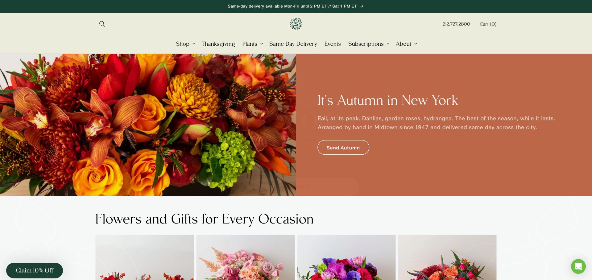
Scotts Flowers pairs a close arrangement photograph with a warm, readable autumn panel. The navigation separates same-day delivery, events and subscriptions, while occasion tiles start immediately below. A delivery cutoff appears above the menu. The initial discount overlay required dismissal before the underlying design could be reviewed. The split composition gives the arrangement a close photographic view and reserves a solid terracotta area for campaign copy. Below it, occasion cards provide a more familiar way into the catalog, so the seasonal treatment does not have to explain every possible reason for sending flowers.
What you can learn
Place delivery limits near the shopping path and pair seasonal imagery with a specific collection action. Keep signup promotions subordinate to the urgent task of choosing flowers. Use the solid copy panel to protect legibility as floral colors change through the year. Keep occasion categories stable underneath the campaign and make the delivery message easy to revisit once a shopper leaves the homepage. A date-sensitive promotion needs a planned replacement as well as an attractive launch.
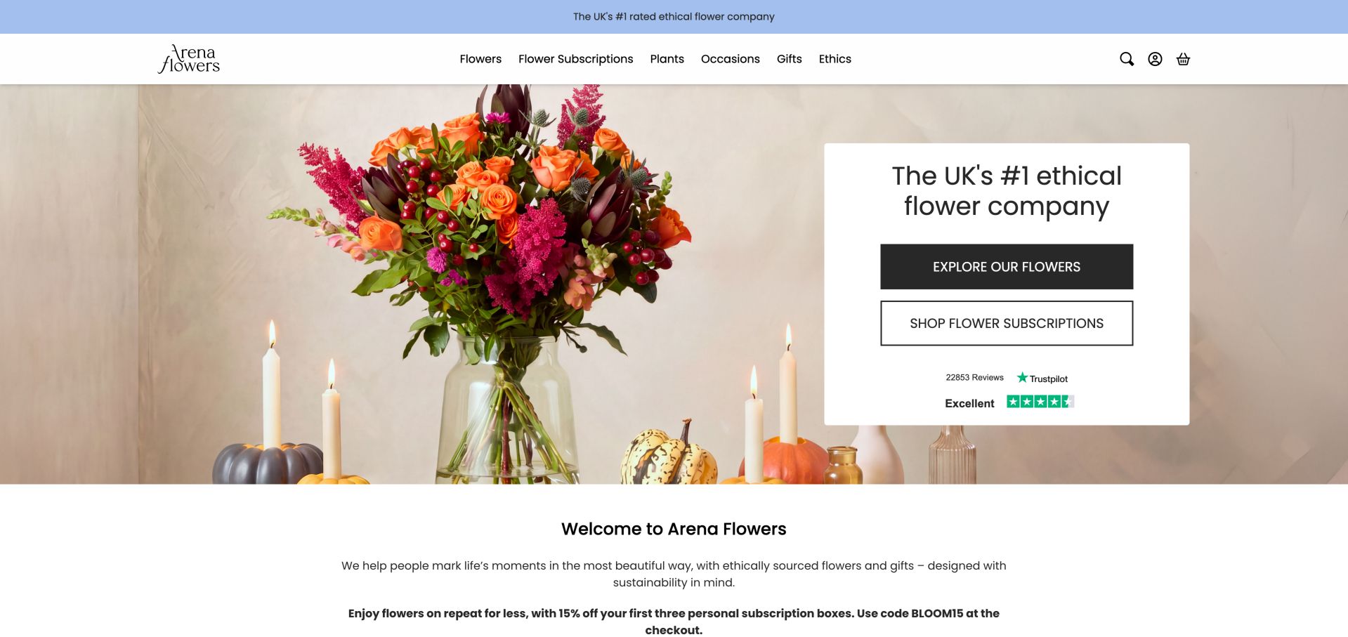
Arena Flowers uses a warm bouquet image and a quiet text panel to connect shopping with its ethical positioning. Flowers and subscriptions have separate actions, and the navigation gives the ethics story a visible place. The design is worth studying for that connection, without treating brand statements or review badges as independent evidence of product quality. A white card separates the buying decision from the bouquet photograph, and the filled flower-shopping button has stronger visual emphasis than the outlined subscription action. Review marks sit within this same panel, concentrating reassurance and navigation in one place without requiring text to compete with the petals behind it.
What you can learn
Link values-led claims to specific supporting information and keep the purchase journey straightforward. A sourcing story works best when visitors can distinguish documented practice from promotional wording. Use that difference in button treatment to signal a primary task while preserving the recurring purchase option. The subscription destination should clearly explain cadence and commitment before a customer proceeds. Keep any supporting claims linked to their source rather than allowing a familiar badge to carry an unexplained promise.
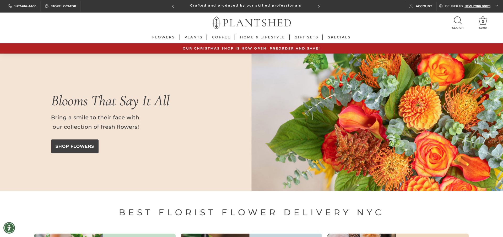
PlantShed places flowers in a wider lifestyle storefront. A pale split hero gives its arrangement photograph room, while the high-contrast navigation groups flowers, plants, coffee, home goods and gifts. Locations, workshops and subscriptions broaden the relationship beyond a one-off bouquet, but the range also asks visitors to make more decisions. The utility bar separates a store locator and delivery context from the broader product menu, helping distinguish visiting a physical location from ordering an item. A seasonal preorder strip sits above the softer arrangement hero, introducing a second timeline alongside the main flower-shopping action.
What you can learn
When a florist sells several related experiences, build a deliberate category hierarchy. Keep flowers easy to find and make location-based offerings distinct from shipped or delivered products. Explain what a displayed delivery location represents and provide an obvious way to change it. Preorders should retain their own date information when shown beside everyday flowers, while coffee, workshops and store visits need location context appropriate to those experiences. This keeps the lifestyle range from blurring fulfillment expectations.
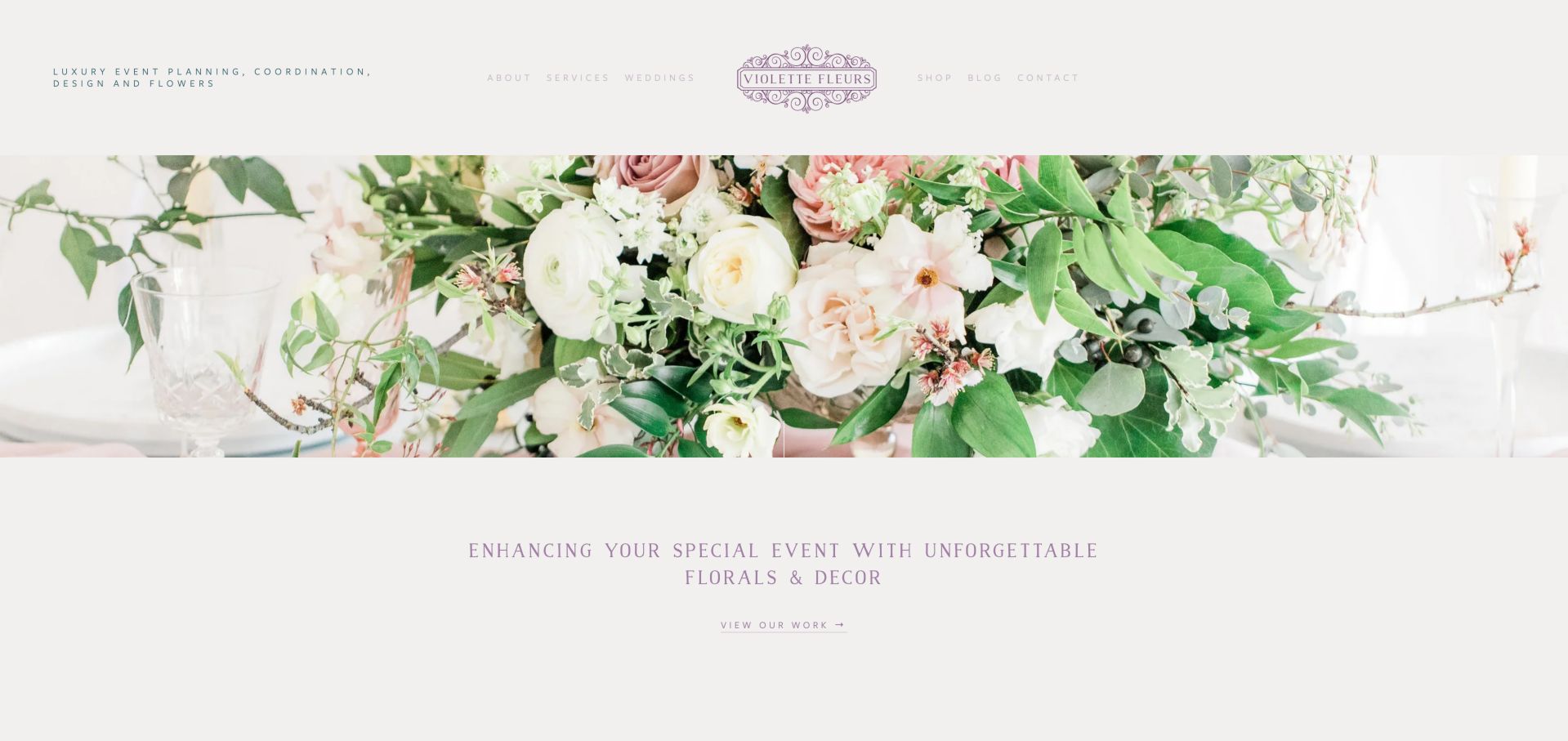
Violette Fleurs introduces event planning, design and flowers above a restrained floral photograph. A short statement and portfolio route lead into different visual styles, while later content includes custom hatboxes and bouquets. The pale lavender typography supports a delicate visual identity, though its contrast against the light background deserves careful testing. The photograph appears as a wide, relatively shallow band rather than a full-screen background, leaving substantial white space around the identity and introductory text. A small portfolio link below the image keeps the composition quiet, but it also asks visitors to notice a subtle route into the strongest visual evidence.
What you can learn
An event florist can present a consistent aesthetic without forcing every project into one style. Use portfolio groupings to explain the range and keep text legible over the quiet palette. Give the portfolio action sufficient emphasis without abandoning the restrained layout. Treat the delicate color palette as something to test at real text sizes, especially for navigation and short descriptive lines. A calm presentation should make the next useful action easy to recognize on both small and large screens.
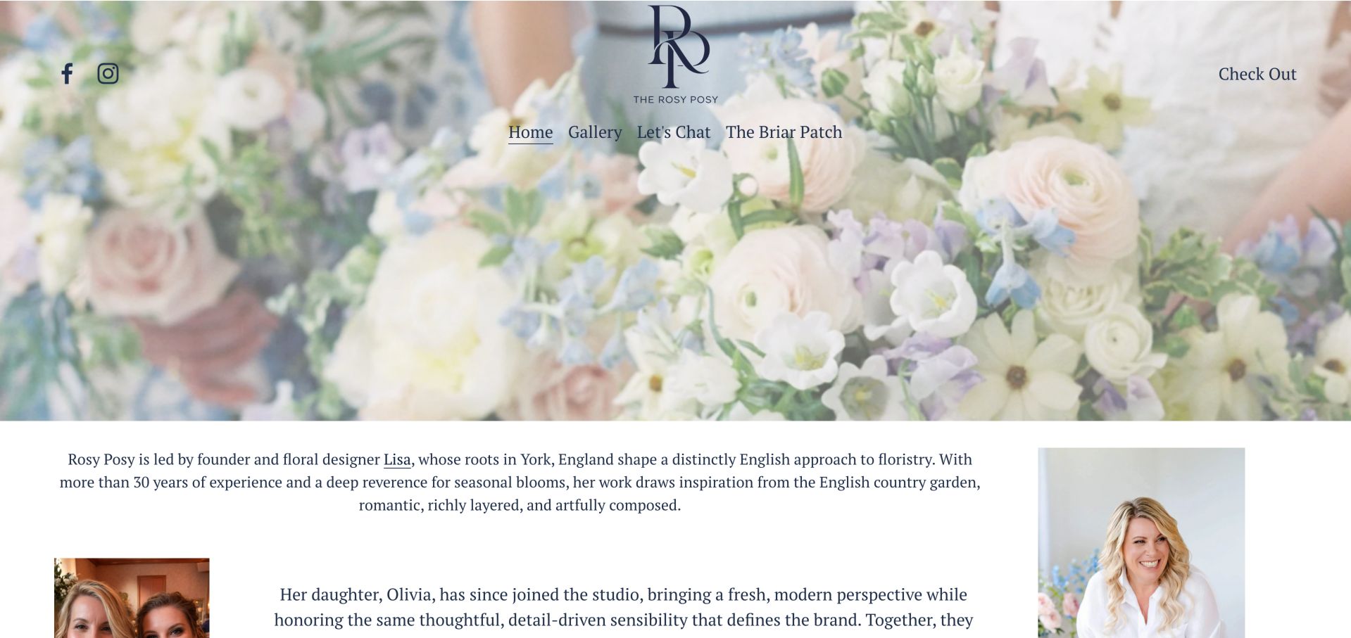
The Rosy Posy opens with a generous floral image and a small set of navigation choices. Founder and family-studio storytelling then explains the aesthetic, followed by service geography, collaboration and a stated full-service minimum. That combination helps visitors understand the practice before asking for a consultation rather than treating every event as an interchangeable purchase. A large central monogram and floral background do most of the introductory work before portraits give the studio a human presence. Literal labels such as Gallery and Let's Chat are immediately understandable, whereas the branded Briar Patch label requires more context for a visitor who has not encountered the business before.
What you can learn
For custom floral projects, explain the approach and qualify scope before the inquiry. A stated starting investment and service region can be more useful than a large anonymous gallery alone. Pair distinctive section names with a brief explanation of what visitors will find there. Place the inquiry route beside service scope and relevant portfolio work, not only after a long biography. Founder storytelling is most useful when it helps a prospective client understand the working relationship and next step.
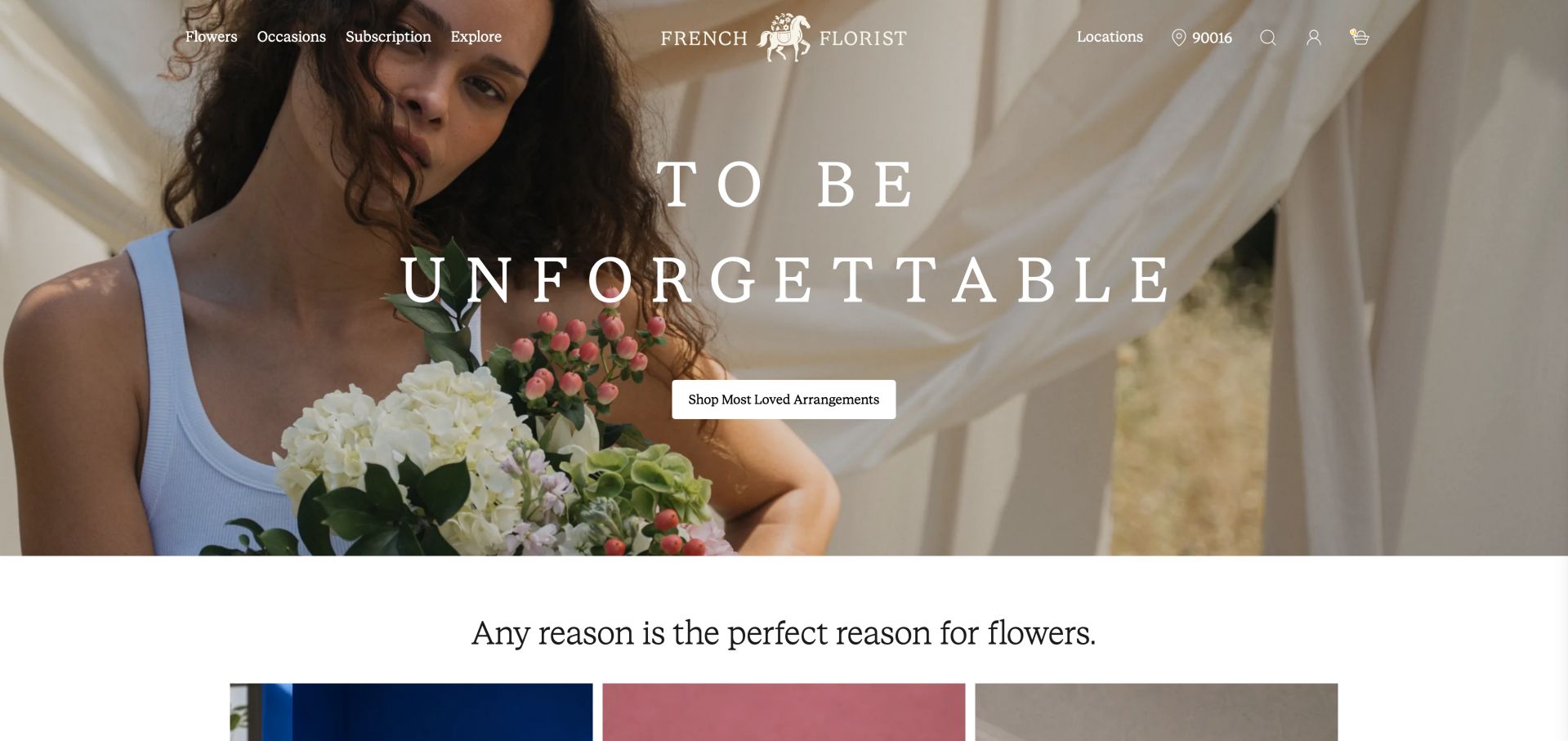
French Florist fills the opening screen with a lifestyle photograph, widely spaced serif type and one prominent arrangement-shopping button. Flowers, occasions and subscriptions remain in the navigation, with location context alongside account tools. The page moves from mood into occasion categories, best sellers and designer's choice rather than relying entirely on the hero image. The person holding the bouquet gives a sense of scale that a tightly cropped flower image would not provide. A single light shopping button sits within the photograph, while the following occasion section changes the rhythm from an emotional campaign image to concrete choices a customer can scan.
What you can learn
Use lifestyle photography to establish a mood, then offer a specific shopping action and practical categories. Keep text contrast stable across every image used in a rotating campaign. Plan the crop around both the arrangement and the action rather than choosing a photograph solely for its mood. On narrow screens, retain enough of the subject to communicate size and keep the button away from visually busy areas. The transition into occasion categories should remain easy to find.
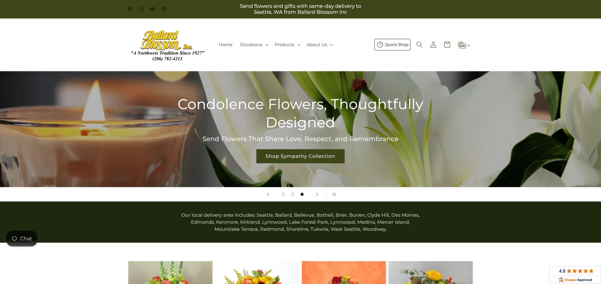
Ballard Blossom places local delivery messaging above a familiar store header and occasion carousel. The inspected slide promoted sympathy flowers, and the delivery-area list immediately below named Seattle-area communities. Product categories and question-led advice follow, making the site useful for visitors who first need to know whether their recipient is within reach. An outlined Quick Shop control in the header offers a stable route independent of the current carousel slide. The visible carousel controls sit in a separate light band, making them easier to distinguish from the flower photograph and giving the promotional area a clearer beginning and end.
What you can learn
Answer delivery geography near the top of the page. Pair occasion categories with clear practical answers, but avoid turning the first screen into an unstructured list of every neighborhood served. Keep an enduring shopping action outside any rotating campaign. Summarize delivery coverage in plain language before presenting the full community list, and let visitors reach detailed boundaries when needed. Carousel controls should remain recognizable and usable even as sympathy, celebration and seasonal artwork change their tone.
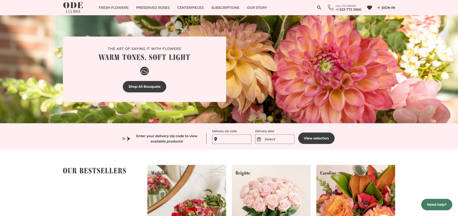
Ode à la Rose combines a pink floral hero with a compact bouquet action, then asks for a delivery ZIP code and date before showing available selections. The product cards use named arrangements and visible starting prices, while subscriptions and preserved roses are separated in the header. The availability controls make fulfillment part of discovery rather than a checkout surprise. The pink availability strip forms a visual bridge between the decorative hero and the first product cards. It groups destination, date and the action that reveals selections in one horizontal sequence, making the relationship between those inputs clearer than placing each question in a separate promotional section.
What you can learn
Ask for the delivery information needed to show a relevant catalog, but explain why it is needed. Keep browsing possible and avoid implying availability has been checked before a valid destination is supplied. Keep the chosen destination and date visible as shoppers compare arrangements. Provide clear explanations for empty fields, invalid entries and unavailable dates, with a way to revise the search. These are design requirements suggested by the interface; the review did not submit a real address or test an order.
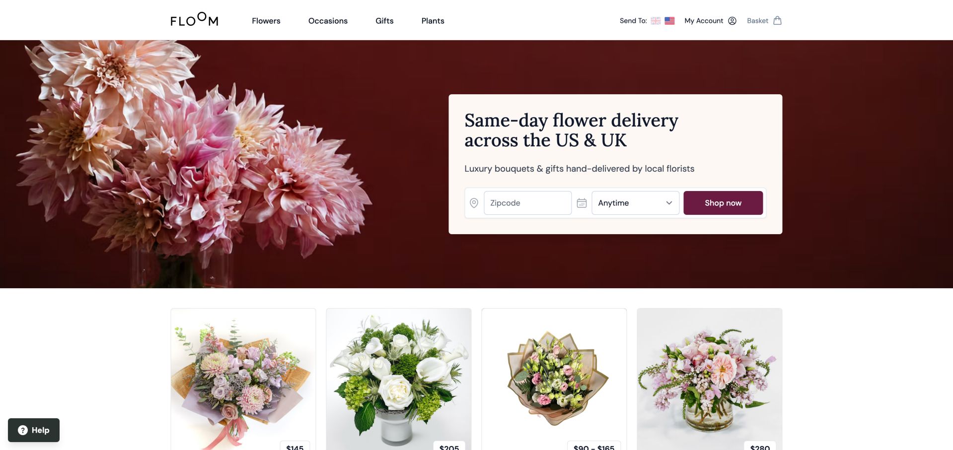
Floom presents a delivery-location and date search within its opening floral image. Product cards name the supplying florist alongside arrangement and price information, making the marketplace structure visible. It is a useful comparison for independent shops, but its multi-provider model is different from a single studio taking responsibility for every order. The pale search card contrasts with the maroon floral area and groups the destination and timing controls above the shopping action. Country choices in the header provide another layer of context, which matters because a marketplace visitor may be arranging a gift somewhere other than their own location.
What you can learn
Make the fulfillment model clear. If multiple florists supply products, credit them and help users understand which selection applies to their delivery destination. Make delivery context persistent when someone returns from a product or supplier page. Do not make a country setting stand in for a recipient address, and explain when a change alters the available catalog. Supplier identity should remain visible at the point where the visitor compares price, arrangement and delivery options.
Pros
Location-led discovery
Supplying florists are named
Cons & considerations
Country choice can interrupt arrival
Marketplace patterns may overcomplicate a small shop
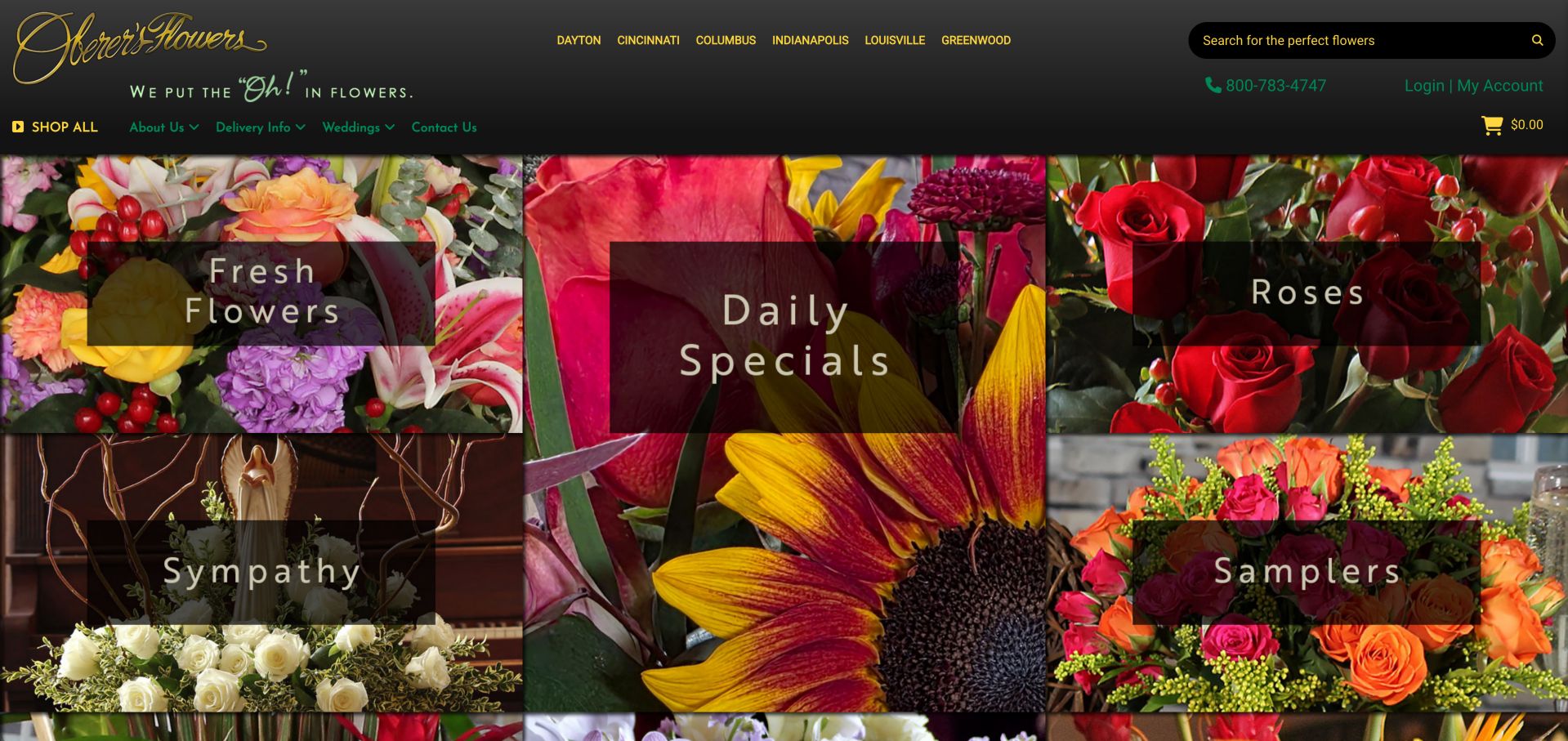
Oberer's Flowers uses a dense photographic tile grid rather than one dominant hero. Fresh flowers, sympathy, daily specials, roses and samplers are immediately visible, while city links and search occupy the header. This favors visitors who know their category, although the crowded menu and image-based tile labels create accessibility and scanning concerns. The taller central daily-specials tile becomes the focal point, while the surrounding flower categories provide several secondary entrances. Dark translucent label areas create some separation from the photographs, but the combination of city links, search and differently sized images still asks visitors to process many elements at once.
What you can learn
A category grid works when the catalog has stable, recognizable groups. Use real text labels and a clear hierarchy so the design remains understandable without relying on embedded image text. Choose one level of visual emphasis for the main catalog groups and reserve stronger treatment for a deliberate promotion. Keep each category name as accessible text with a clear focus state. The layout should communicate the same choices when photographs are unavailable or a customer navigates without a pointer.
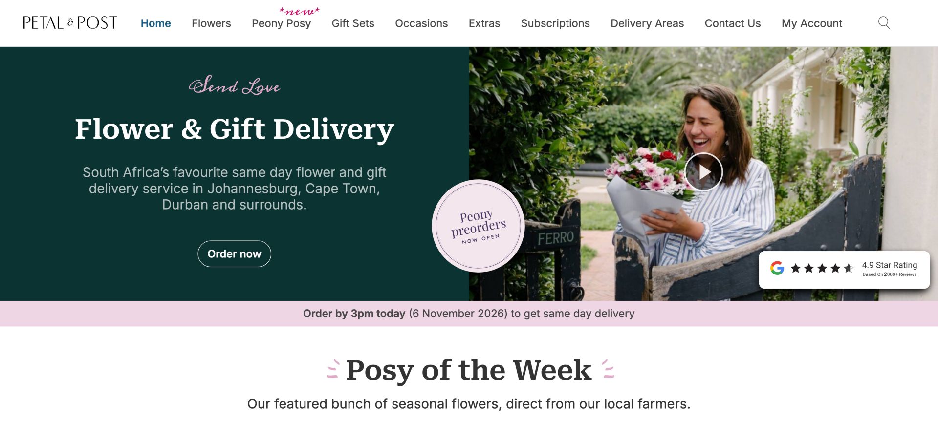
Petal and Post explains its flower-and-gift offer beside a delivery photograph, with named South African cities and a visible cutoff strip. The Posy of the Week concept and three-step explanation turn a limited assortment into a clear buying model. Source and delivery statements are presented as the retailer's own claims rather than independently assessed guarantees. A dark teal copy area carries the offer beside a lighter photograph with a video control, leaving the basic shopping message understandable without watching the media. A circular peony preorder promotion and a separate delivery cutoff strip introduce timely offers alongside the recurring weekly-posy concept.
What you can learn
A smaller catalog can feel intentional when the selection model is explained. Show how bouquet size, note and delivery fit together, and keep cutoff messages synchronized with actual operations. Separate the date rules for a preorder from the cutoff for a current arrangement. Keep the weekly selection explanation available as ordinary page content even if the video fails to load. A concise recurring offer can simplify choosing, provided its size options and delivery expectations remain explicit.
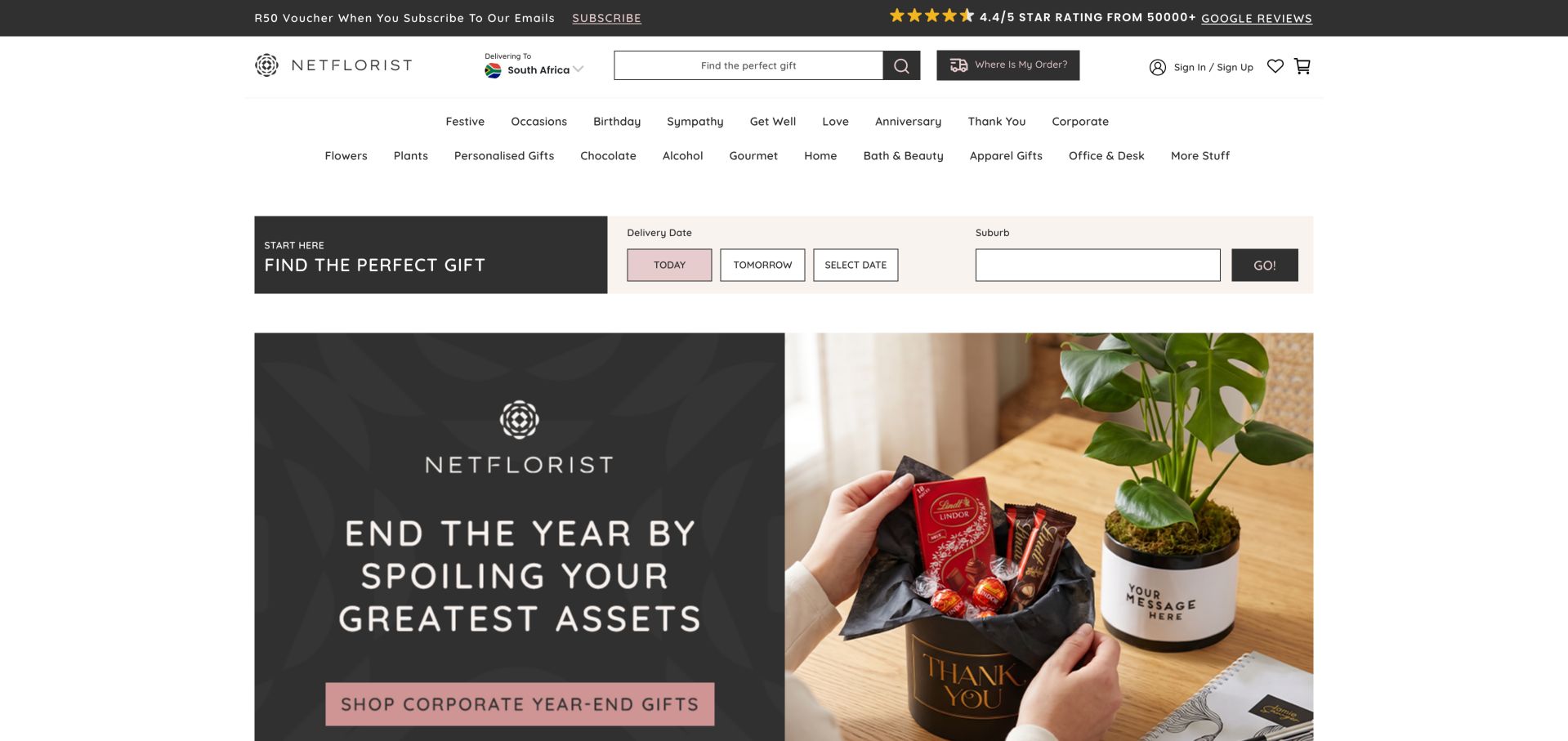
NetFlorist places a date-and-suburb finder above its promotional banners, making delivery context a first-class task. Two rows of navigation reflect a much wider gift assortment than flowers alone. Search and order tracking are prominent, while the inspected campaign emphasized corporate gifts. This is a large-catalog pattern, not a template every independent florist needs. The navigation divides occasions from product types, offering two ways to approach a broad assortment. A large search field and a dedicated order-tracking link serve different stages of the customer relationship, while the delivery finder sits below the menus before the large campaign images begin.
What you can learn
When product variety is large, prioritize availability, search and tracking before adding more promotional categories. A smaller shop should borrow the task clarity rather than the full navigation density. Keep existing customers' tracking task separate from promotional browsing. A delivery finder should explain incomplete location information and preserve the chosen date when the catalog changes. The interface has several classification systems, so a clear active state and consistent category names are especially valuable after the first click.
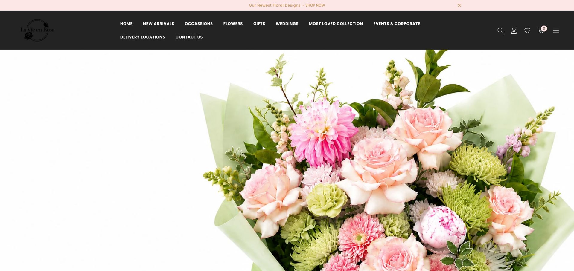
La Vie en Rose uses an expansive bouquet photograph beneath a dark menu that separates occasions, gifts, weddings and corporate events. The homepage adds local-shop context, delivery information and seasonal products farther down. Its image-led opening is elegant, but practical reasons to choose a product are less immediate than on availability-led stores. The white background behind the bouquet makes individual stems and the overall arrangement shape easy to distinguish. Yet the first view spends far more space on that image than on an ordering action, while the dark header carries a considerable amount of navigation in two rows.
What you can learn
Let product photography carry the atmosphere while bringing delivery coverage and purchasing actions into the same early view. Broad occasion menus should not obscure the simplest order route. Introduce a short product or collection label near the image so the photograph has a practical destination. Check that the identity remains distinct from the dark header and that the main purchase route is recognizable among occasion links. Delivery information is most useful before a customer invests time in choosing.
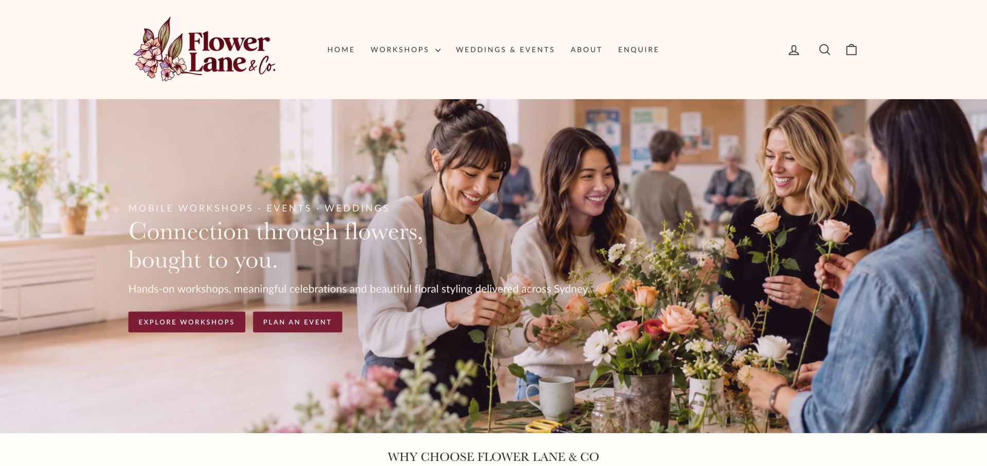
Flower Lane & Co now leads with mobile workshops, events and weddings rather than a conventional bouquet catalog. A participant photograph accompanies separate workshop and event-planning actions, followed by explanations of group suitability and different class formats. It is a useful example of aligning a florist's website with its actual service model instead of inherited retail assumptions. Showing people arranging flowers explains participation rather than merely displaying a finished object. Burgundy buttons distinguish workshop discovery from event planning, while the cream header and illustrative identity create a consistent setting for both routes. The photograph helps communicate the social character of the service before the detailed class descriptions begin.
What you can learn
If experiences are the business, organize around group needs and event planning. Explain venue requirements, suitable audiences and next steps rather than presenting workshops as incidental products. Use workshop pages to compare practical differences such as duration, group suitability, materials and venue needs. Keep those details separate from the inquiry requirements for a custom event. The opening image can communicate enjoyment, but prospective organizers still need a concise way to judge whether a format suits their group.
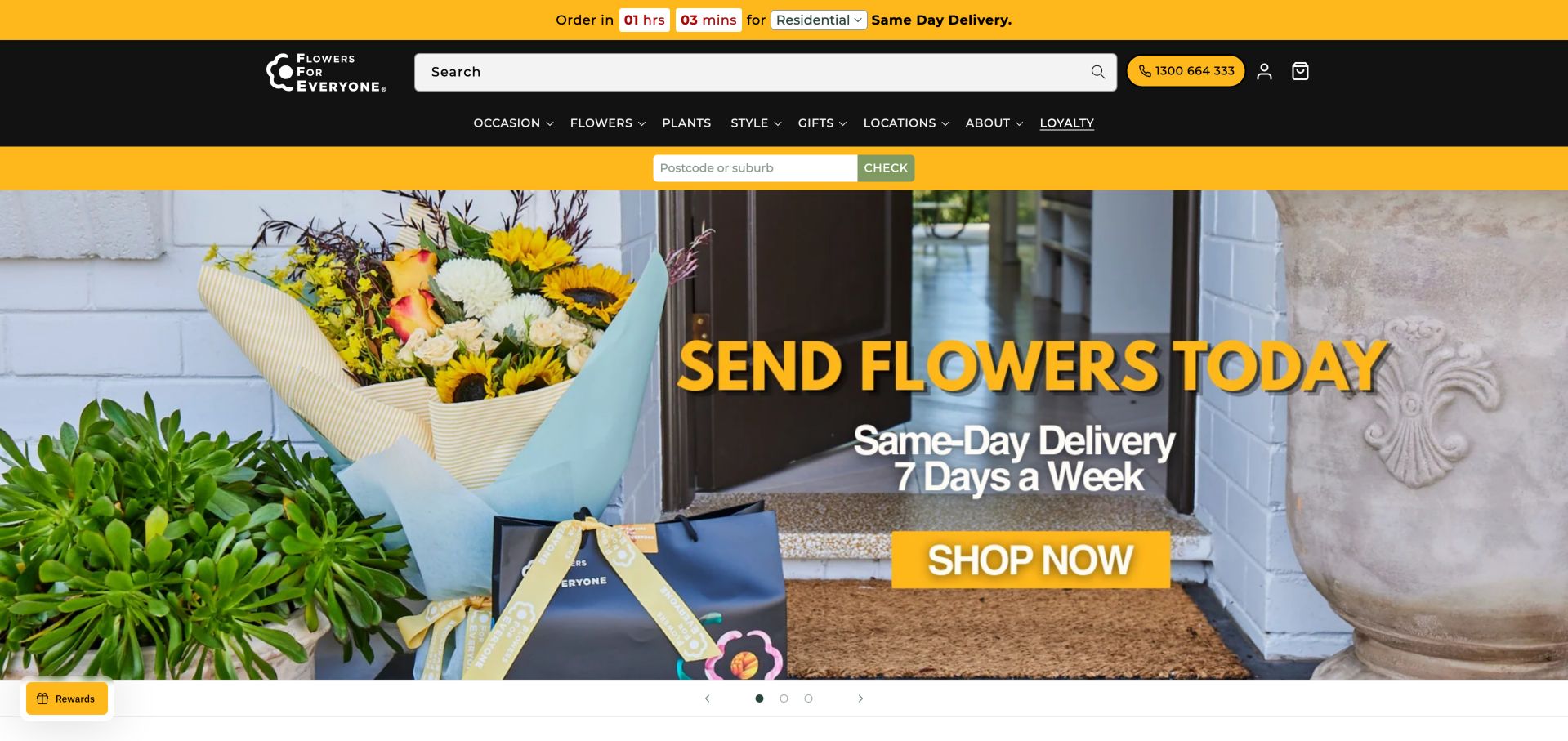
Flowers for Everyone puts a delivery countdown and postcode check above an image-led campaign. The page then organizes occasions and best-selling arrangements with prices and rating displays. A first-visit delivery popup needed dismissal to see the storefront, illustrating both the importance of availability and the friction created when it blocks browsing. Yellow connects the delivery strips with the campaign headline and shopping action, making fulfillment part of the visual identity rather than a small footer note. The large search field offers another route for someone who already knows what they want, while the image and carousel serve broader browsing.
What you can learn
Make delivery checks useful without trapping visitors in a modal. Treat countdowns as operational data that must match the selected address, day and delivery type. Keep the countdown, postcode context and displayed delivery promise consistent as the visitor moves through the store. Explain expired cutoffs and unavailable destinations without clearing the customer's other choices. A prominent promise creates an expectation that later pages must clarify; its presentation alone does not verify operational performance.
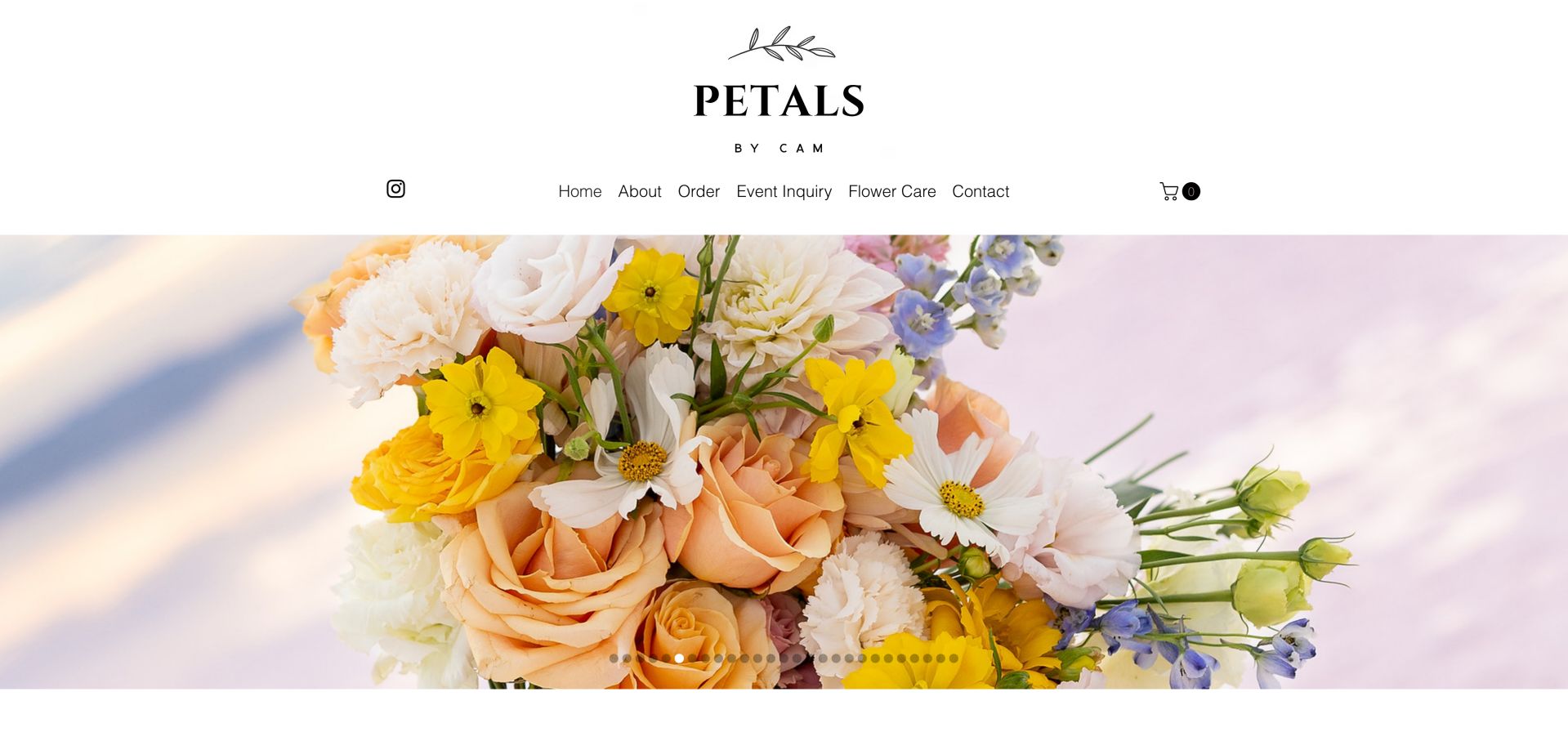
Petals by Cam uses a large centered identity and an uncluttered navigation row above a floral slideshow. Order and Event Inquiry are separate routes, with Flower Care also visible. The page describes flowers for corporate events, weddings and home, but the opening photograph leaves service detail and geographic context to later reading. Flower Care appears alongside ordering and event inquiries, acknowledging that useful content continues after the purchase. The generous identity area and large slideshow leave the opening view visually calm, although the long row of slide indicators suggests more images than a visitor can readily distinguish at a glance.
What you can learn
A small studio benefits from a limited menu with clearly different order and event paths. Add a concise service-area statement beside the opening image so beauty does not replace orientation. Select a small set of images with different explanatory purposes instead of relying on many similar floral views. Add concise context about the type of work each represents and retain usable slideshow controls. Aftercare deserves a stable navigation route, but the first view should still orient a prospective customer.
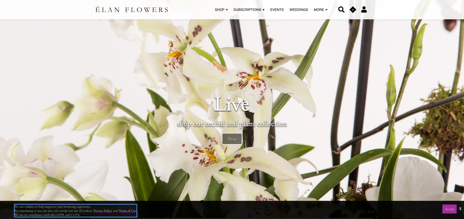
Élan Flowers relies on full-width floral photography and a restrained shop menu, then introduces its Tribeca location and signature collection. Weddings, orchids, plants and journal content have their own entry points. The inspected orchid slide was visually immersive, although small white overlay text and a bottom cookie notice competed with the photograph. The thin header leaves almost the entire opening view to a close orchid photograph. That crop emphasizes color and texture more than the size or shape of a purchasable arrangement, so the small collection description and shop action carry much of the responsibility for explaining what the visitor can explore next.
What you can learn
Present a signature collection consistently, but keep descriptive text and shopping controls readable on every image. Luxury positioning should still answer location and delivery questions quickly. Balance close floral studies with images that show a complete arrangement and a useful sense of scale. Keep the collection name and action visible when cookie notices are present. The decorative opening can remain spacious while subsequent product information supplies the dimensions, format and delivery context needed for selection.
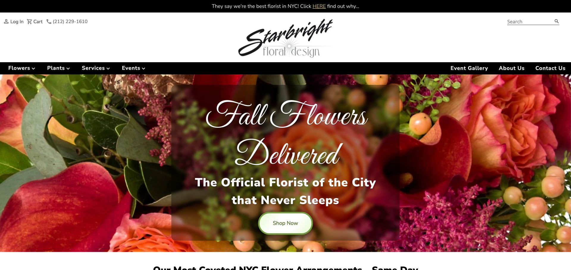
Starbright uses a bold seasonal floral hero beneath a large identity and two clear groups of navigation. Farther down, it explains weekly subscriptions, delivery timing and its family-owned story in substantial text. The design gives practical questions space, though repeated superlatives should be understood as marketing statements rather than independent endorsements. A translucent dark panel separates the seasonal message from the dense flower close-up, while a light shopping button stands out within that panel. The navigation groups shopping and service offerings toward one side and company or gallery information toward the other, giving the broad header some recognizable organization.
What you can learn
Use the homepage to answer the operational questions that trigger calls, then link to fuller detail. Keep those answers concise enough that a seasonal promotion does not lead into a wall of text. Maintain that division as the site grows so new promotional links do not displace essential shopping tasks. Break substantial delivery and subscription explanations into short, named sections near their relevant actions. Marketing superlatives should not take the place of specific information about how a service works.
Pros
Substantial delivery explanations
Retail, event and subscription services are visible
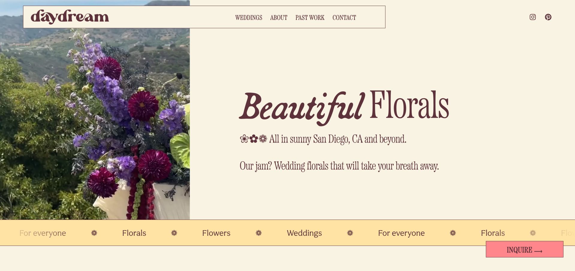
Daydream Florals combines a narrow floral image with expressive burgundy typography on a cream background. The page clearly identifies San Diego wedding work and later introduces the florist, portfolio, inquiry and a stated minimum investment. The persistent inquiry action fits a consultation-led business better than an artificial shopping cart would. Most of the hero is reserved for readable cream space, with the floral photograph occupying a narrower vertical area. The pink inquiry control contrasts with the burgundy type and yellow decorative ribbon, giving an otherwise expressive composition a clear practical destination without requiring several competing buttons.
What you can learn
For a wedding-focused studio, make personality and fit visible before requesting details. Show representative work and a starting investment, with a straightforward inquiry path that remains available while browsing. Keep the inquiry action visually consistent as visitors move between past work, the studio story and wedding information. Decorative type and repeating ribbons should support the identity without obscuring service details. A concise explanation of what happens after an inquiry can make the consultation route easier to approach.
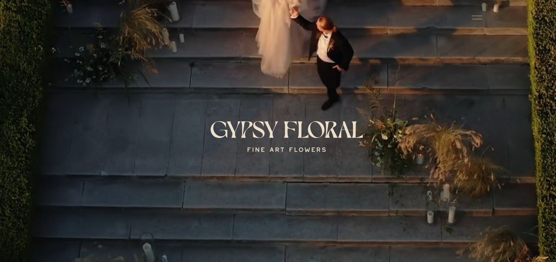
Gypsy Floral opens with event footage, a centered identity and a compact menu. The page separates weddings, brand activations and an interactive flower-bar service, using portfolio work and inquiry routes rather than retail product cards. The film communicates atmosphere well, but visitors need the menu or a scroll to understand the practical service range. The captured opening uses an overhead view of a couple within an event setting, letting movement and spatial context introduce the floral work. A centered wordmark and short descriptor remain restrained, while a small menu icon in the upper corner carries nearly all the visible navigation responsibility.
What you can learn
Immersive media should lead into an explicit service explanation. Keep an obvious route to portfolio and inquiry, and provide a useful static fallback for people who cannot or do not want to load video. Give the menu an identifiable label and ensure that its first choices explain the service range. A cinematic opening can establish atmosphere, but it should not require watching a complete sequence to learn where the studio works or how to begin an inquiry. Retain meaningful context in the fallback image.
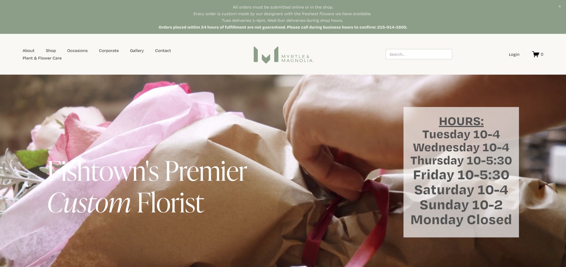
Myrtle & Magnolia makes its Fishtown location central to the opening message. A visible announcement explains ordering and short-notice limits, while store hours sit on the hero. Below, custom arrangements, weddings and local delivery areas establish a neighborhood studio rather than a generic wire-service catalog. The large hours panel and multi-line ordering notice make the shop's operating model unusually visible before a customer reaches the catalog. Behind them, hands wrapping flowers provide a useful image of personal preparation, while the header separates occasions and corporate work from general shopping and care information.
What you can learn
Be specific about how a local shop works. Put hours, delivery expectations and custom-order limitations where visitors can find them, then reduce the amount of text competing with the flowers. Give the most urgent ordering restriction the strongest emphasis and link to fuller detail rather than giving every line equal weight. Store hours and delivery windows are different facts, so label them distinctly and maintain them together. Keep a straightforward shop action available beside this operational information.
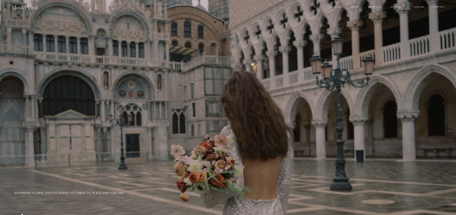
Moss Floral uses a cinematic destination image and unusually small navigation to establish an editorial mood. The page develops its Fort Worth base, destination work and selected stories through color, place and atmosphere. It is a portfolio-led model for considered event commissions, with inquiry and service routes rather than immediate retail buying. The opening photograph places the bouquet within an expansive architectural setting, with the floral object occupying only part of the composition. A short positioning line sits near the lower edge, and the minimal header leaves the setting almost uninterrupted. This presents an aesthetic relationship between place, clothing and flowers.
What you can learn
Show complete environments when the service is spatial design, not just bouquets. Pair the editorial imagery with readable navigation and clear service geography so prospective clients can judge fit. Use project captions to explain that relationship and show how the same approach varies across venues. Preserve enough space and contrast for navigation at ordinary reading sizes, even within an editorial composition. A prospective client should be able to move from visual inspiration to services without searching the image for controls.
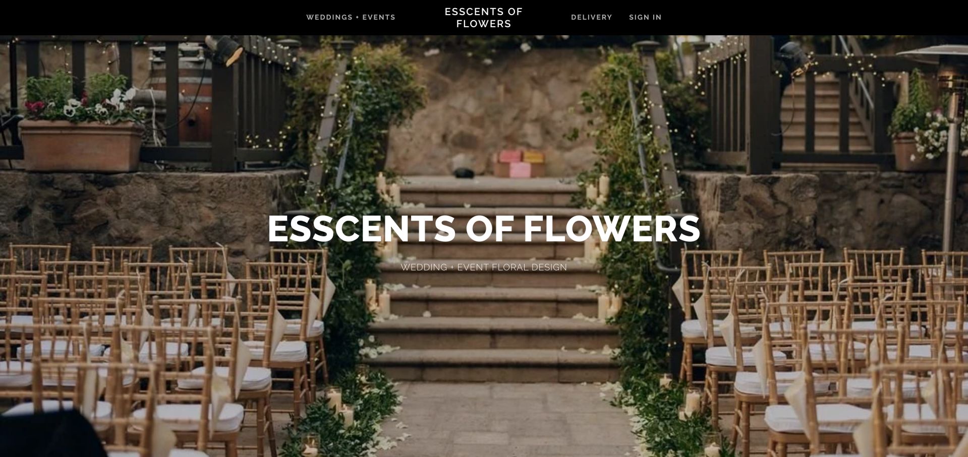
Esscents of Flowers opens on a ceremony setting with a direct wedding-and-event descriptor. The homepage then introduces its Oakland studio and a consultation path, while delivery remains a separate navigation item. A newsletter popup initially covered the work, making the contrast between the clear underlying page and an interruptive promotion particularly noticeable. The ceremony photograph uses the aisle and steps to lead attention toward the floral installation, demonstrating how the work shapes a complete space. A solid black header separates navigation from the image, with wedding and event work on one side of the identity and delivery on the other.
What you can learn
Use the studio story to explain the work and make consultation easy to locate. Delay optional signup prompts until visitors have seen enough of the portfolio to know why they would subscribe. Carry that distinction into the destination pages so a delivery customer does not enter an event-planning questionnaire. Use concise project context to explain what was designed within each setting. A consultation action will be more meaningful after visitors understand the kind of work and scope the studio undertakes.
Pros
Clear wedding and delivery split
Personal studio context
Cons & considerations
Newsletter popup interrupts arrival
Long personal narrative benefits from clearer grouping
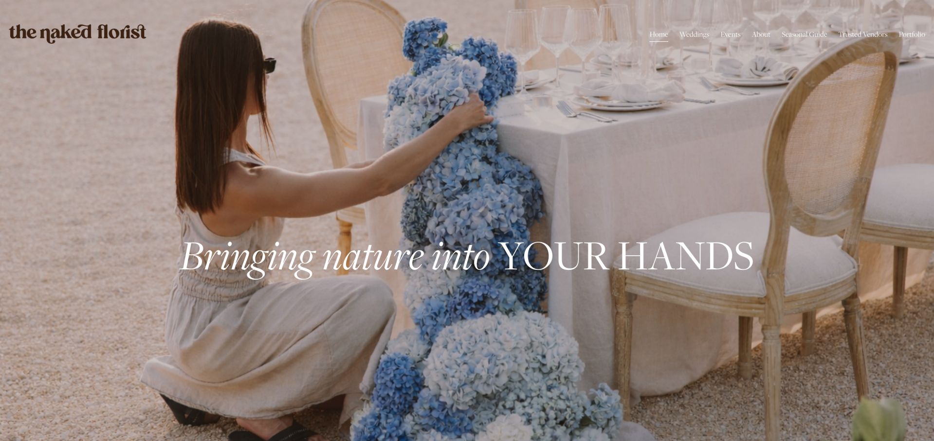
The Naked Florist shows the designer working on a large floral installation in its opening image. Wedding, event, seasonal-guide and trusted-vendor links frame the service as a considered commission. The page introduces Ashleigh and explains a design approach before the inquiry, a useful model for studios whose value lies in interpretation rather than standardized bouquets. The designer's hands adjusting a blue installation show process and scale within a furnished event setting. That image makes the creative service tangible before the biography begins, while the seasonal guide and vendor links suggest supporting information beyond a simple gallery of finished arrangements.
What you can learn
Show the making and scale of the work, not only finished close-ups. Support an artistic positioning with practical planning resources and a visible route to discuss a specific event. Connect planning resources to the projects they help explain, such as seasonal choices or collaboration with other event suppliers. Keep attribution and service boundaries clear when discussing partners. The large photograph is most useful when the accompanying text turns artistic intent into understandable options for a prospective client.
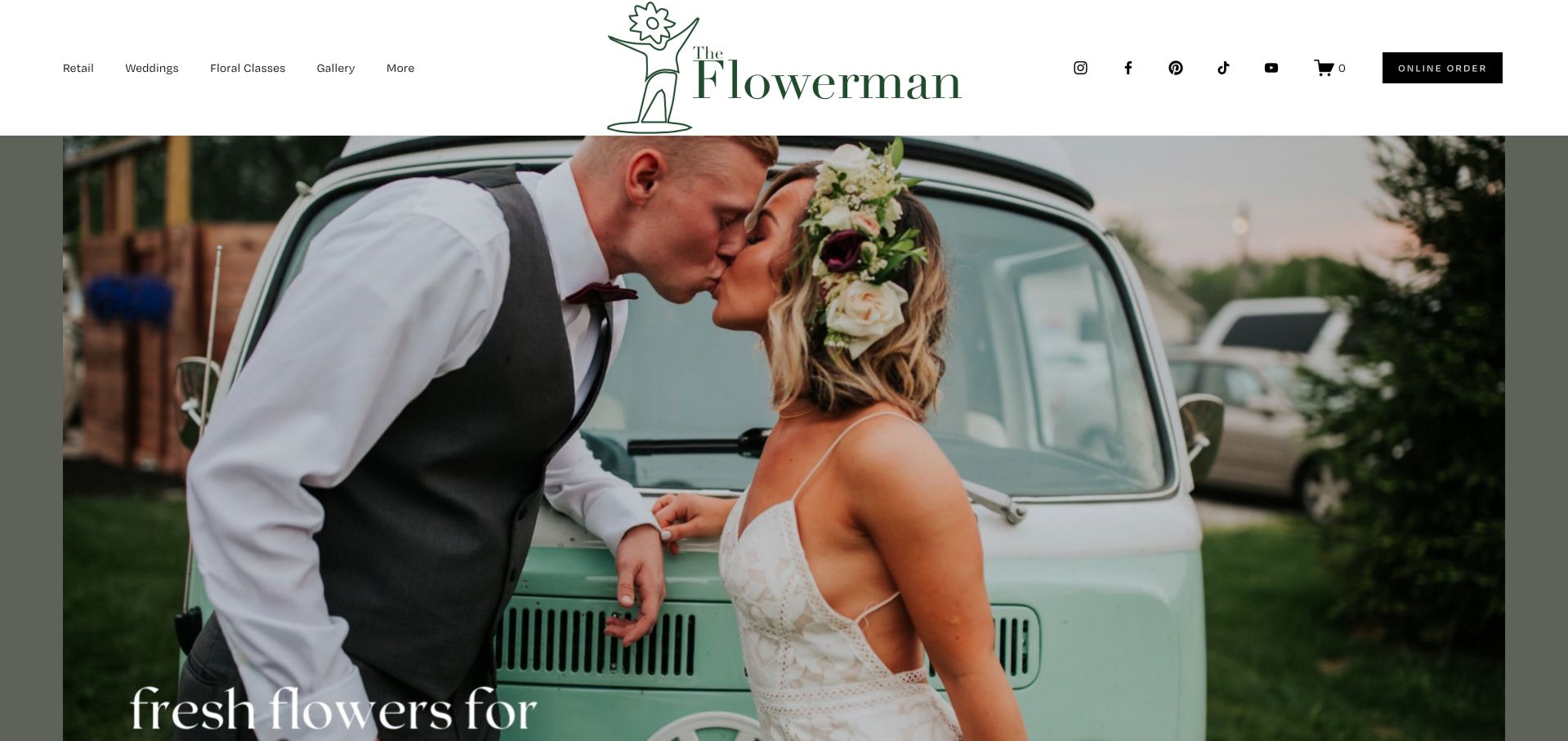
The Flowerman pairs a large wedding photograph with separate Retail, Weddings and Floral Classes navigation. An online-order button remains prominent, while the page later introduces consultations and its different services. Photographer credits appear in the project presentation, giving useful context to portfolio imagery without making every visitor follow the same route. The oversized central identity divides the header between service navigation and social, cart and ordering controls. A black online-order button retains strong contrast despite the large wedding photograph below, creating a practical retail entry even when the campaign image emphasizes an event rather than an everyday bouquet.
What you can learn
Separate purchase, class and consultation tasks at the navigation level. Credit project photography and ensure that a wedding-led hero does not hide the everyday retail offer. Retain that purchase route across wedding galleries and class pages so visitors can change tasks without returning to the homepage. Give the service overview enough prominence to explain the different ways to work with the business. Portfolio images should carry credits without competing with the decision to shop, learn or inquire.
Kegan is a freelance web designer and developer with 15+ years of experience helping businesses turn complicated website requirements into clear, maintainable digital experiences. He works directly with clients from planning and design through development, launch, and ongoing support.
For florist website design, his development approach focuses on occasion-based product discovery, delivery-area and cut-off information, custom floral inquiries, and straightforward ordering journeys. The scope can be a targeted improvement or a complete custom build, with responsive layouts, thoughtful content structure, and integrations chosen around the people using and maintaining the site.
Show 3 other florist website designersHide other florist website designers
List the services that actually generate inquiries or sales: daily bouquets, subscriptions, weddings, corporate flowers, workshops or a mix. Give each an appropriate route and decide which deserves the opening message.
Map delivery before designing checkout
Document service areas, pickup locations, order cutoffs, excluded days, address requirements and substitutions. Test how the website communicates unavailable dates without collecting a real order during QA.
Create useful product information
Photograph different sizes consistently and explain what is included: vase, wrap, approximate scale, card and delivery charge where applicable. Separate a representative designer's-choice image from a promise of exact stems.
Qualify event inquiries respectfully
Show service geography, portfolio examples and a starting investment if the studio is comfortable publishing one. Ask only for details needed to start a conversation, such as date, venue, event type and approximate scope.
Build a seasonal publishing routine
Schedule holiday categories, opening hours, workshop dates and image changes. Record when each promotion should disappear, and keep evergreen purchasing routes working when a seasonal collection sells out.
Test the entire decision on mobile
Check navigation, product selection, date controls, delivery errors, image cropping and inquiry labels at narrow widths. Verify keyboard access and contrast. Use a safe test environment rather than submitting real customer orders.
The editing job behind the design
Choose tools for the florist's operating model
A bouquet store needs dependable inventory, product variants, delivery rules and order notifications. An event studio may need a manageable portfolio and inquiry workflow more than a complex catalog. Evaluate those needs before choosing a platform or copying a competitor's visible technology.
Public technology observations can help explain how a page is delivered, but they do not prove the florist's hidden inventory, accounting or fulfillment systems. Review integrations, data ownership, accessibility, ongoing costs and staff editing needs directly with the provider before making a decision.
Our WordPress website examples offer a separate look at publishing approaches. A visible platform label is evidence for that named page, not a guarantee that the same system will suit your requirements.
Before the public launch
Florist website launch checklist
State the service area without relying on a visitor's inferred location.
Separate flower orders, event inquiries and workshop bookings.
Show delivery and pickup limitations before checkout.
Explain arrangement size, vessel and substitution policy.
Use real photographs with appropriate rights and credits.
Keep product prices and availability synchronized with operations.
Make phone and shop details easy to locate.
Give event prospects representative work and a clear next step.
Provide useful errors for unavailable dates and locations.
Check keyboard navigation, contrast and mobile text sizes.
Give every seasonal banner and workshop listing a review date.
Test in a safe environment without submitting real orders or inquiry emails.
These checks are a project checklist, not a performance, legal, security, or accessibility certification. Test real journeys with the people responsible for the website before making claims about the result.
Sources & editorial method
How this collection was selected and reviewed
The public homepages were inspected and captured on November 6, 2026 UTC, during November 5 Pacific editorial work. Reviews compare visible design, content and navigation. Promotional claims, ratings, delivery promises and testimonials remain statements from the featured businesses, not independent endorsements. No purchases, consultation submissions or delivery checks using personal information were made. Screenshots record the observed page state and may differ as campaigns change.
Each example links to its actual source page. Screenshots are direct browser captures with their own capture dates; moving imagery, announcements and live designs can change. The notes describe observable design choices and conditional tradeoffs, not measured traffic, conversion results, service quality, or accessibility conformance.
Technology labels use public page metadata, asset evidence, or explicitly cited platform documentation. Platform documentation is not a complete current deployment audit. A component reference may be legacy or unused; it is not a complete backend inventory. Unknown stacks are omitted. These sites are editorial examples, not our client portfolio.
Written, Edited and Curated are separate editorial records, not timestamps advanced by a rebuild. Website designs and imagery belong to their owners. See our editorial standards or suggest a correction.
Questions worth asking
Florist website design questions
Should a florist put delivery information before products?
If availability depends on the destination or date, make that dependency clear early. A compact delivery-area explanation or optional availability check can prevent wasted browsing. Avoid a blocking popup when visitors only want to understand the shop.
Do wedding florists need an online store?
Not necessarily. Custom event work often benefits more from a strong portfolio, service geography, process and qualified inquiry. Add ecommerce when there are real standardized products or experiences that customers can purchase without a consultation.
How many product categories should the homepage show?
Use the smallest set that reflects how customers shop. Occasion, arrangement type and price can all help, but repeating them in several long menus creates clutter. A larger catalog may need search and filtering; a small studio may only need a few curated collections.
What makes floral photography useful rather than decorative?
Show both detail and scale. A close-up communicates texture, while a person holding a bouquet or a full table setting helps visitors understand size and context. Explain representative imagery and seasonal changes instead of promising an identical arrangement without qualification.
Is a website review a recommendation of the florist?
No. These reviews assess visible website design and customer journeys. They do not verify flower quality, delivery performance, prices, awards or customer-review claims, and they are not endorsements of the businesses.
Start with the decision your customers most often need to make. Make that route clear, support it with honest photographs and operational detail, then add the visual character that makes the studio recognizable.