Best Medical Spa Websites of 2026 (14 Real-World Examples)
Medical spa website examples that connect a distinctive brand with clear treatment and consultation routes
A medical spa website has two different jobs: introduce an aesthetic point of view and help a visitor understand who provides care, where to go and what happens next. These fourteen examples show clinic, concierge and retail-connected approaches without treating visual polish as evidence of clinical quality.
Start with the questions a prospective patient can reasonably answer. They may know a concern or a location, but not a device name or an appropriate procedure. A useful site offers plain-language orientation, provider information and a consultation route alongside its named treatment index. Attractive photography can make the setting tangible; it cannot determine suitability or guarantee an outcome.
This is a design collection, not a treatment recommendation, provider accreditation or review of clinical practice. Source websites were inspected publicly and captured directly. Treatment claims, prices, memberships and offers belong to their publishers and can change. Reviews discuss presentation and navigation rather than adopting promotional medical claims.
Before the examples
What makes good medical spa website design in 2026?
Make the first appointment understandable
Explain whether the first step is a consultation, a treatment appointment or a returning-client booking. The Things We Do publishes different instructions for new and returning patients; SKINNEY exposes those audiences as separate actions. Do not send everyone to the same portal without orientation.
Let people browse without knowing procedure names
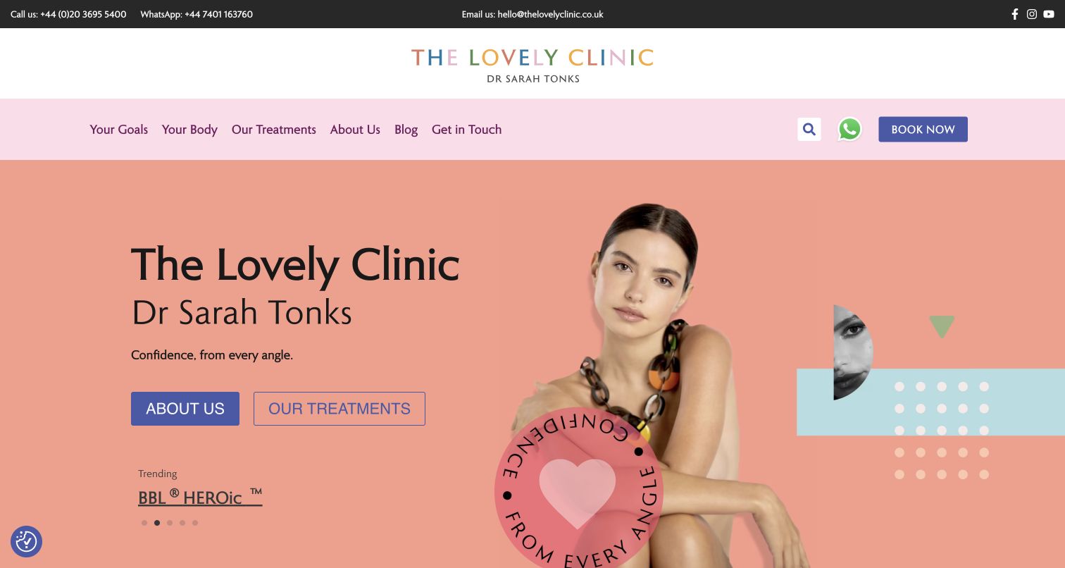
Pair a maintained treatment index with concern-based or body-area navigation where useful. The Lovely Clinic makes these parallel paths explicit. A quiz can offer general direction, but should not appear to diagnose, establish suitability or replace a professional consultation.
Connect the brand to real providers and places
Maintain practitioner names, roles, biographies and location information. For multiple clinics, show relevant differences in hours, travel arrangements and availability. A portrait, award logo or press quotation should not carry the entire trust story.
Govern promotions and overlapping panels
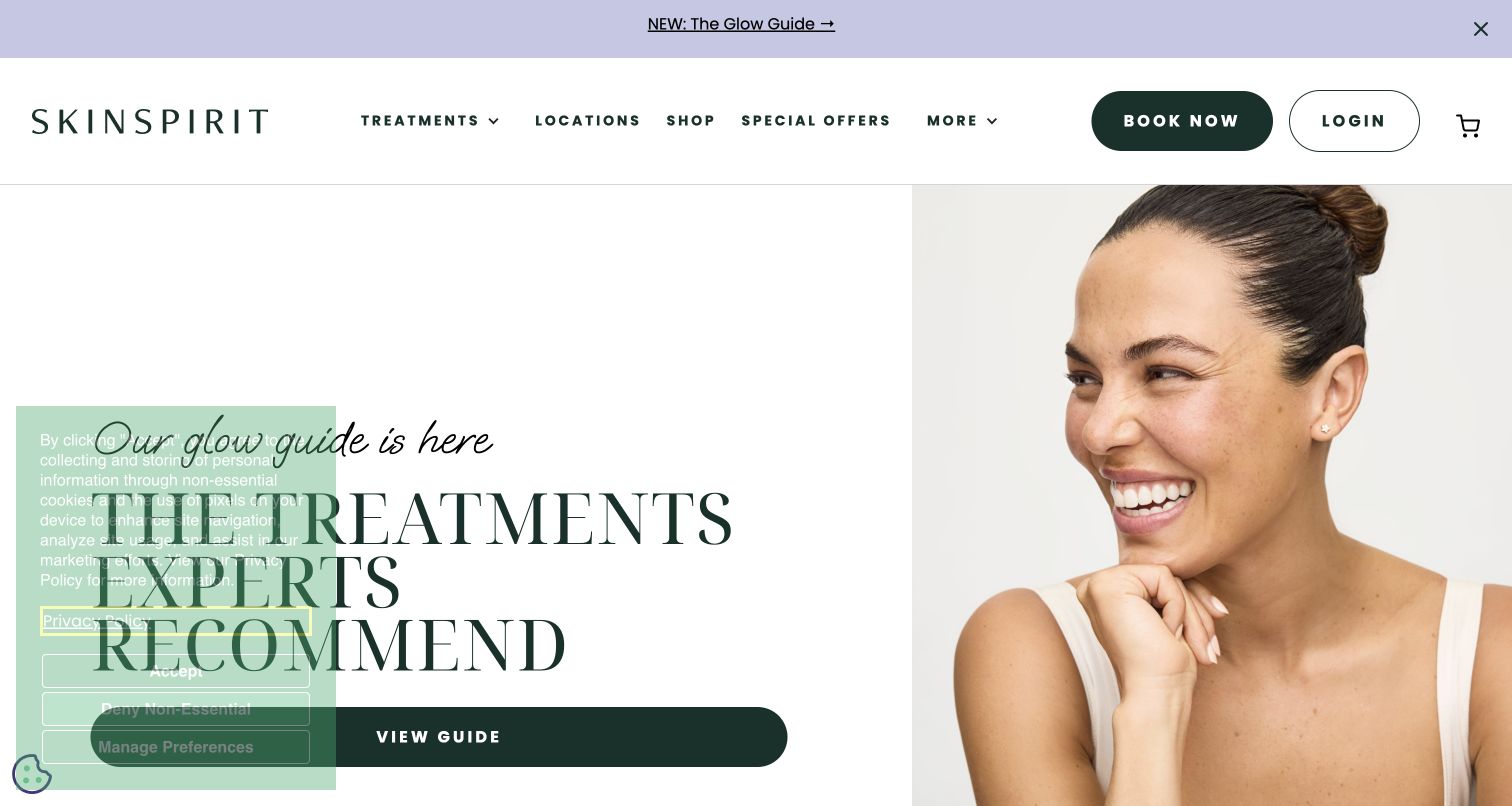
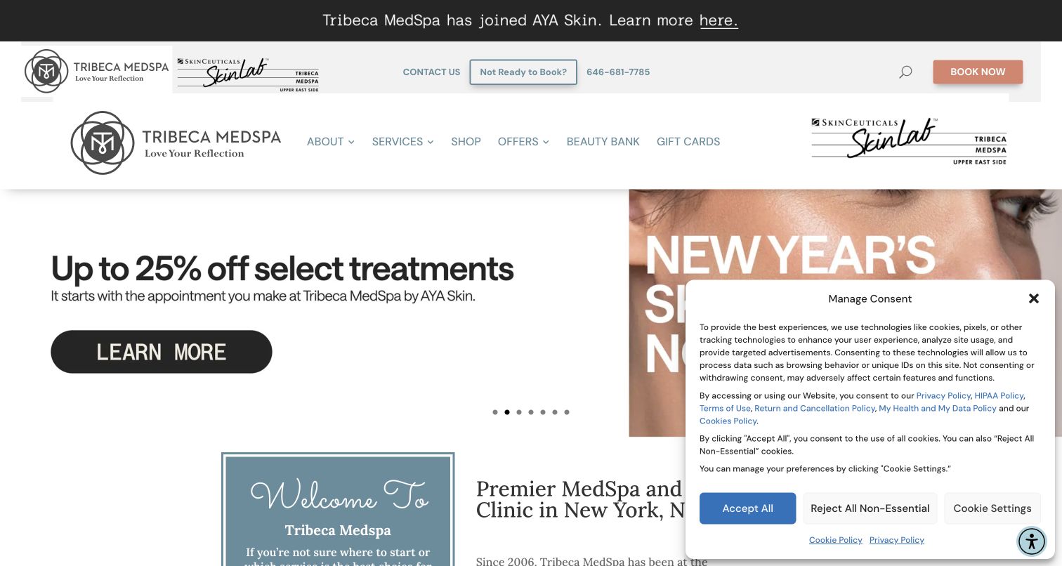
Campaign slides, memberships, discount tabs, chat and consent notices share the same screen. Review their combined state and give every date-sensitive offer an owner. The observed SkinSpirit and Tribeca screens demonstrate how notices can obscure otherwise clear content.
The collection · 14 examples
14 medical spa websites worth studying
Compare the examples by their first decision: choosing a clinic, meeting a provider, understanding a home visit, comparing services or entering a retail catalog. The most useful pattern depends on the service model. Editors Choice recognizes a researched design approach within this collection, not medical care or treatment effectiveness.
The Lovely Clinic uses salmon, pink and blue instead of the neutral palette common in aesthetic websites. Its opening composition pairs a large portrait with the clinic name and Dr Sarah Tonks, then offers separate about and treatment buttons. Navigation gives people three ways into the service range: their goals, a body area or a named treatment. Further down, practitioner introductions, help content and category summaries add context beyond the opening campaign. The screenshot also shows a prominent phone, WhatsApp and email strip, so the playful identity does not remove ordinary ways to ask questions.
What you can learn
Make a specialist clinic recognizable through a coherent visual language, then support visitors who do not already know a device or procedure name. Goal-led browsing and a conventional treatment index can coexist. Keep practitioner biographies and consultation expectations close to those routes; a portrait or press strip is not a substitute for current clinically reviewed information. A remote photo-enquiry feature also needs specialist review of consent, retention and secure handling.
Pros
Three navigation models support different levels of treatment knowledge
Direct contact remains visible above the expressive branding
Cons & considerations
Overlapping service routes will need careful editorial ownership as the catalog expands
The collage and trending carousel warrant contrast and reduced-motion testing
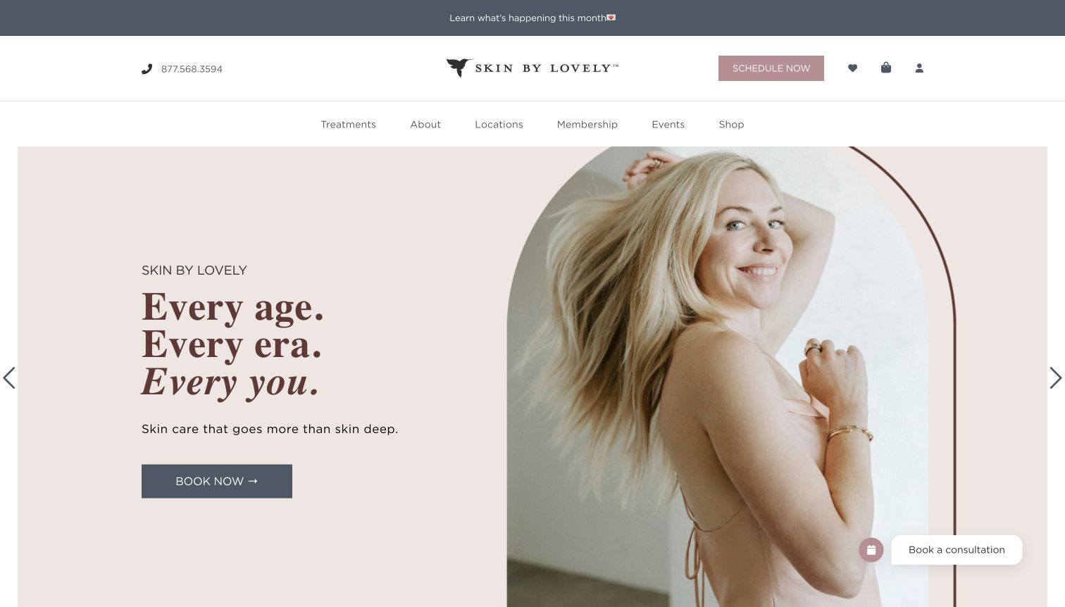
Skin by Lovely places an arched portrait alongside a short age-inclusive campaign in a pale pink hero. The header separates the phone, scheduling action and shop utilities from the main treatment and location navigation. Beneath the campaign, the inspected page introduces providers by name, role and credentials before moving into skincare products. That sequence distinguishes the people performing services from the products sold through the same website. A permanent consultation launcher adds another appointment route, while the restrained slate and rose colors connect promotional and practical parts of the layout.
What you can learn
Plan clinic and retail journeys together without treating them as the same decision. Somebody comparing practitioners needs different information from somebody replenishing a product. Provider cards should lead to maintained biographies and relevant locations, while booking should explain whether the next step is a consultation or a treatment appointment. Keep the inclusive message consistent across imagery and service copy, and check whether repeated scheduling controls remain helpful when the viewport is smaller.
Pros
Provider names and roles are exposed on the homepage
The menu separates treatments, locations and product shopping
Cons & considerations
The large portrait leaves detailed orientation below the first view
The persistent consultation launcher needs overlap checks on narrow screens
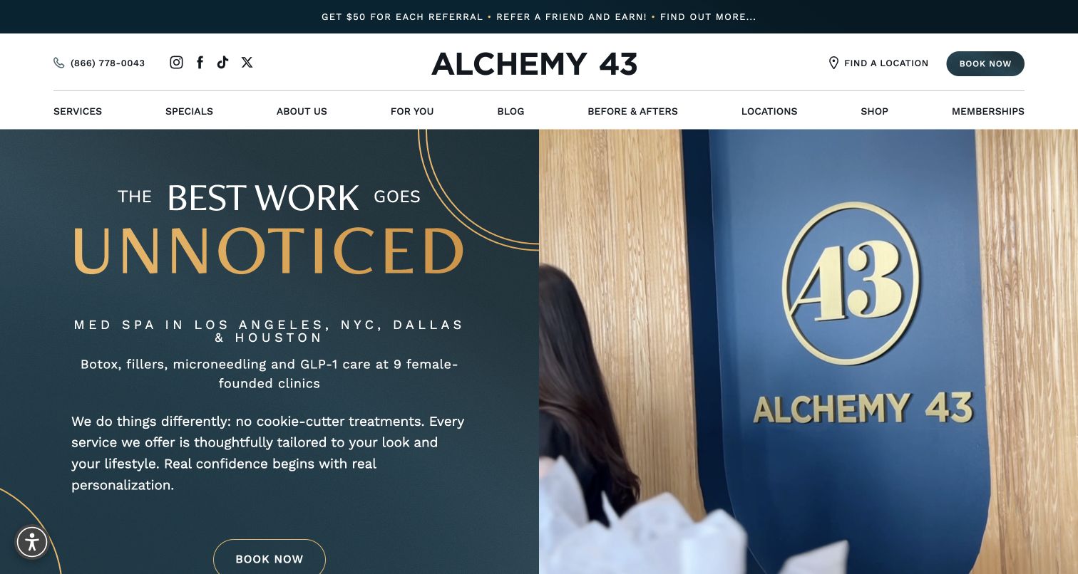
Alchemy 43 gives the opening screen a deep teal text panel, gold typography and a full-height view of its branded interior. Unlike a purely atmospheric spa introduction, the hero names city coverage and several service families in ordinary text. Find a Location and Book Now are distinct header actions. The inspected page continues with categorized treatment links, dated specials, location cards and provider context. The capture clearly divides an editorial slogan from a practical explanation: the expressive words attract attention, while smaller lines describe what the business offers and where.
What you can learn
Pair an aspirational brand statement with a concrete service explanation. For several clinics, distinguish choosing a location from entering the booking system. Keep offers and membership information governed by dates and conditions, especially when campaigns appear in both banners and card grids. Assign one publishing owner to synchronize those surfaces. If background footage supplies atmosphere, ensure the service explanation and key routes remain understandable without playback, animation or imagery.
Pros
The hero names served cities and service categories
Location discovery has its own persistent action
Cons & considerations
The large opening pushes provider detail below the initial screen
The broad offers section needs a dependable expiry workflow
SkinSpirit leads the captured screen with a guide campaign rather than a single discounted procedure. A portrait fills the right half while oversized serif text and a guide link occupy the left. The header keeps Treatments, Locations, Shop and offers alongside separate booking and login controls. Later sections group treatment families and link to medical professionals and clinics. The actual capture includes a semi-transparent consent panel covering part of the headline and action, demonstrating how a spacious composition can become crowded in its real first-visit state.
What you can learn
Keep educational campaigns outside the critical path to finding a clinic or accessing an existing account. Establish a consent-panel layout that preserves headline comprehension and essential controls, then test the combined state instead of only a clean design. National-scale service cards should lead to location-specific availability and provider information. Do not infer clinical standards from the prominence of a guide, awards language or a polished portrait; those require a separate scope of evidence.
Pros
Booking and existing-client login are differentiated
Treatment and location discovery stay in the primary menu
Cons & considerations
The observed consent panel overlaps the guide headline and action
A campaign-led opening adds a step for visitors seeking a particular provider
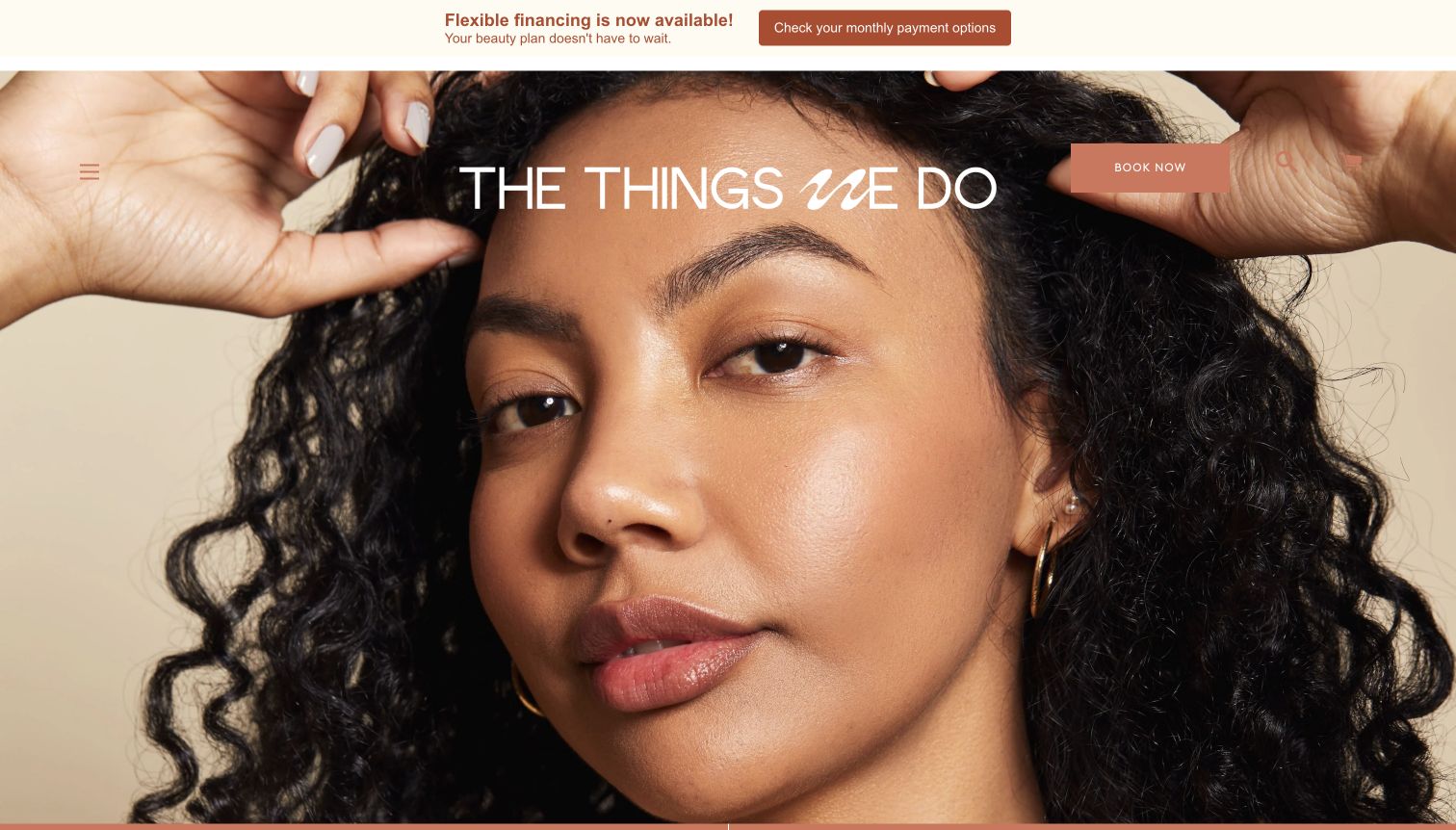
The Things We Do opens with an edge-to-edge portrait and a large mixed-style wordmark, resembling an editorial beauty publication more than a conventional clinic directory. Its visible header is deliberately compact: menu control, booking and search/cart utilities. The inspected page then becomes retail-oriented, with shopping by skin type, concern and routine, product cards, and links to the founder, locations and treatments. Official booking information also distinguishes new patients from returning patients, an operational difference that matters more than the header's minimal appearance. A financing announcement occupies a separate strip above the portrait.
What you can learn
Use a strong visual entrance only if subsequent structure makes the service model clear. A clinic selling products needs conspicuous paths to services, practitioners and locations, not only a shopping quiz. When new and returning clients follow different appointment processes, explain that before sending either group into a portal. Retain expressive typography in headings while keeping utility links and practical instructions legible over changing photography. A quiz should orient, not replace individual clinical assessment.
Pros
The portrait and wordmark create a coherent brand entrance
Shopping categories use recognizable customer questions
Cons & considerations
The hidden main menu adds a discovery step for clinic information
The retail-heavy homepage may need stronger orientation for first-time patients
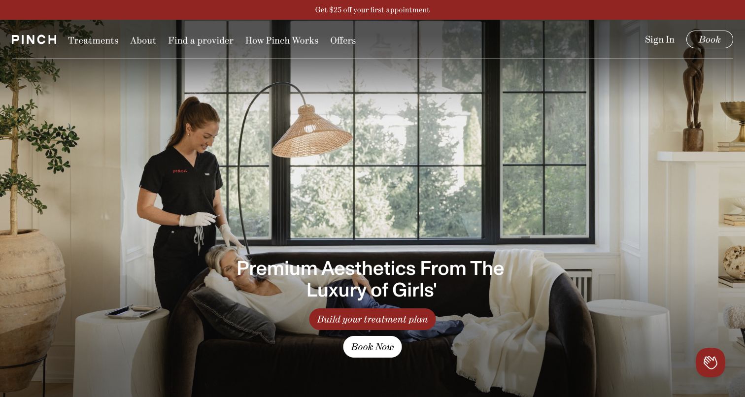
Pinch uses a living-room treatment scene to explain that its service comes to the client. Red treatment-plan and white booking actions sit over the image, while the header exposes providers and How Pinch Works alongside treatments. The public page breaks the process into three steps and introduces named nurse-practitioner profiles with locations, credentials and treatment interests. The opening headline changes its final phrase, captured mid-transition in the saved view. A promotional modal appeared during inspection; the retained capture shows the underlying service demonstration without that form obscuring the main actions.
What you can learn
When the delivery model differs from a standard clinic visit, explain logistics before asking for a booking. Show what happens, who attends and where the service operates, then provide relevant profiles. Treat a treatment-plan quiz as optional orientation rather than a clinical conclusion. Animated text needs a coherent static fallback and reduced-motion behavior, so the service explanation does not become an incomplete phrase at an unfortunate moment. Test promotional overlays against that same introductory task.
Pros
Photography demonstrates the home-visit model
Process and provider routes are in primary navigation
Cons & considerations
Changing text can appear incomplete during transitions
An immediate promotional modal can delay understanding of the model
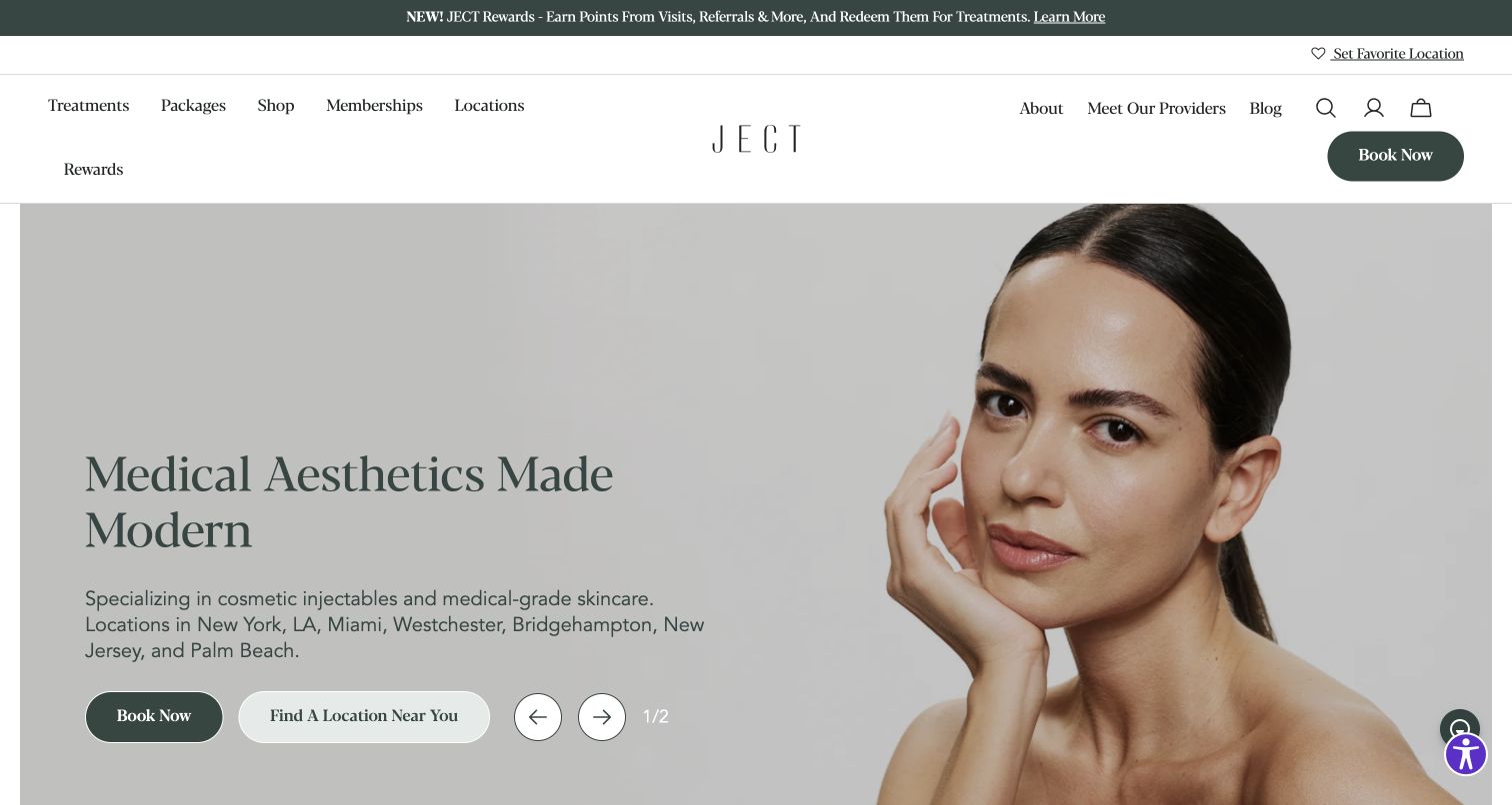
JECT combines a muted portrait with a short description naming cosmetic injectables, skincare and the regions it serves. Book Now and Find a Location Near You sit together in the hero, offering direct and exploratory next steps. The header exposes providers, while the long homepage introduces treatment cards, products, membership content and practitioner profiles. The saved view shows the breadth of commercial content in navigation itself: the rewards item wraps beneath the main left-hand row, increasing header height. Serif headings, dark green actions and pale backgrounds keep those sections within a restrained visual identity.
What you can learn
Separate ready-to-book visitors from people who still need to choose a clinic. Give provider discovery a dependable place beside treatment descriptions, and maintain consistent service terminology on location pages. Before adding membership or rewards links, test the header at intermediate widths rather than only a wide design canvas. A concise aesthetic brand need not give recurring-client programs equal priority to information a newcomer needs. Review carousel controls and stable text routes together when planning content.
Pros
The hero distinguishes booking from location discovery
Provider discovery is exposed in the header
Cons & considerations
The rewards item wraps onto a second header row in the capture
Several commercial programs can compete with treatment orientation
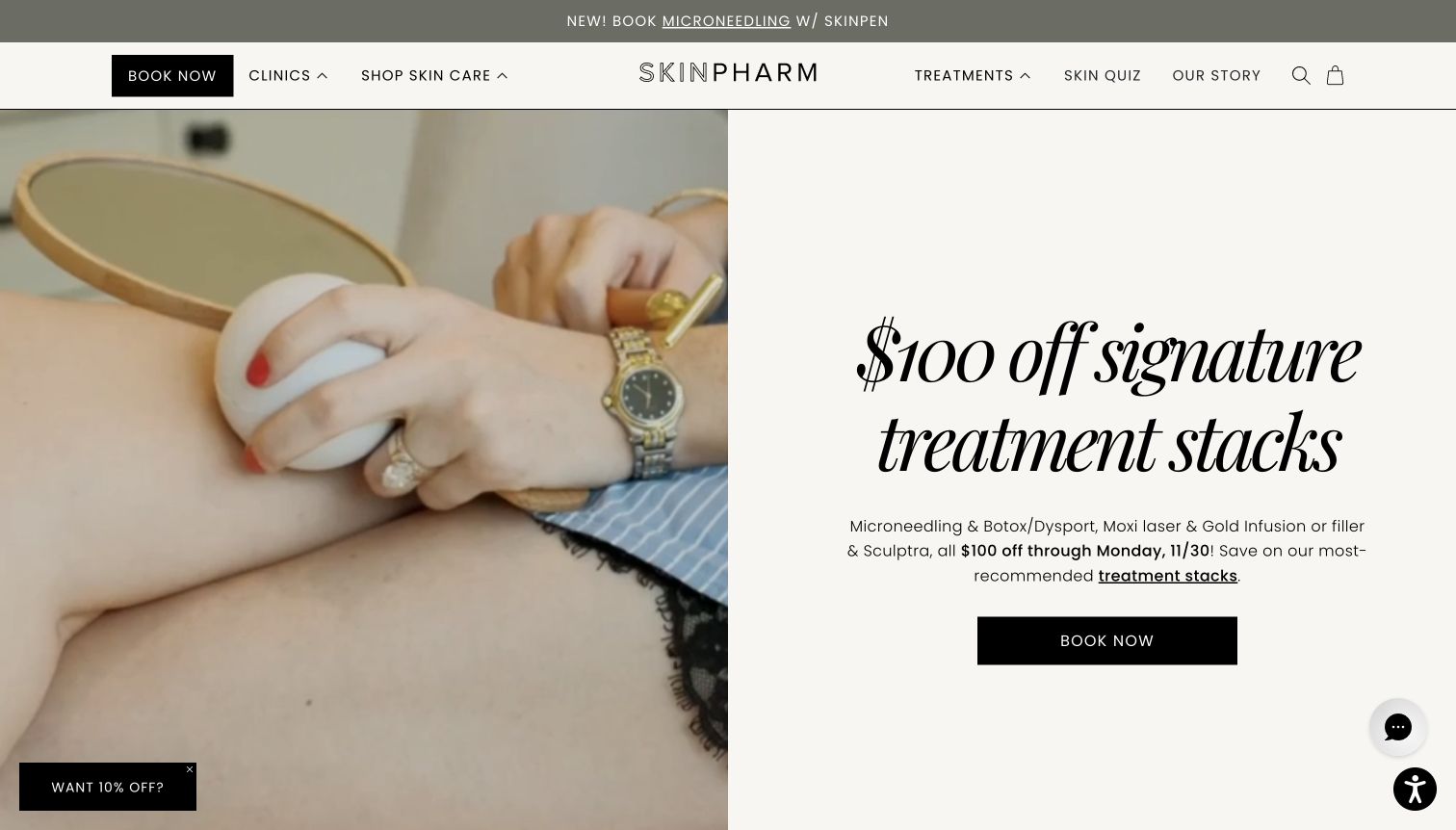
Skin Pharm gives its treatment-stack promotion a clean split screen: procedure footage on the left and large italic type, explanatory copy and a black booking button on the right. Clinics and Shop Skin Care sit on one side of the wordmark, with Treatments and the story on the other. The public page alternates product merchandising with clinic and skincare explanations. A small offer tab and chat launcher occupy opposite lower corners in the capture, while the main promotion remains readable. The imagery supplies an actual treatment context rather than relying entirely on a model portrait.
What you can learn
Name clinic and retail destinations explicitly and connect each campaign to explanatory detail. A paired-treatment offer needs clinically reviewed descriptions and current conditions; a commercial bundle does not determine suitability. Create a publishing workflow that updates media, headline, dates and linked pages together. Test video fallbacks and corner widgets as part of the actual page, including paused media and small screens. Keep a general consultation route available when the featured promotion is not the visitor's starting point.
Pros
Clinic and skincare shopping have separate labels
The campaign includes written explanation beside its media
Cons & considerations
The promotion-led opening delays broad service comparison
Video and corner widgets add combined states to test on mobile
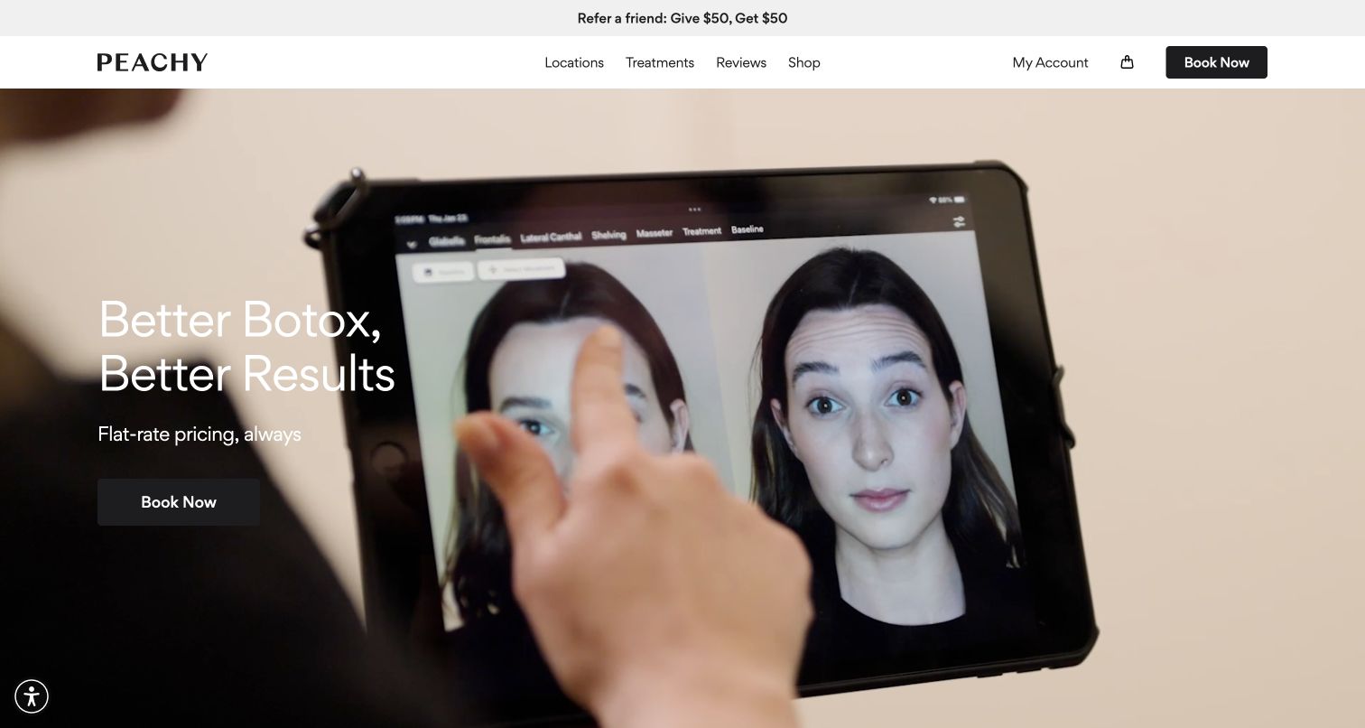
Peachy's hero places a short treatment proposition and flat-rate message over a close view of tablet-based consultation. Compact navigation focuses on locations, treatments, reviews and shopping, with booking separated on the right. The public page follows with three explanatory claims, a short offerings section, city-based studio browsing and a consultation route. Compared with broader menus in this collection, its transferable design choice is the deliberate narrowing of the first decision. The tablet imagery provides process context, although it does not independently establish the clinical merits of the technology shown.
What you can learn
A focused service can support a simpler homepage than a comprehensive treatment catalog. Explain what the headline price includes, what is separate and where current terms can be found. Use process imagery to make consultation tangible, while linking device or algorithm claims to appropriate explanation. Preserve a consultation route for people who cannot know whether the advertised treatment is relevant. Keep the large booking action as a clear next step, not a substitute for suitability information.
Pros
The initial proposition focuses on one treatment family
City-based browsing follows a compact offer explanation
Cons & considerations
Flat-rate language needs explicit scope and exclusions
The full-bleed moving background requires a readable static alternative
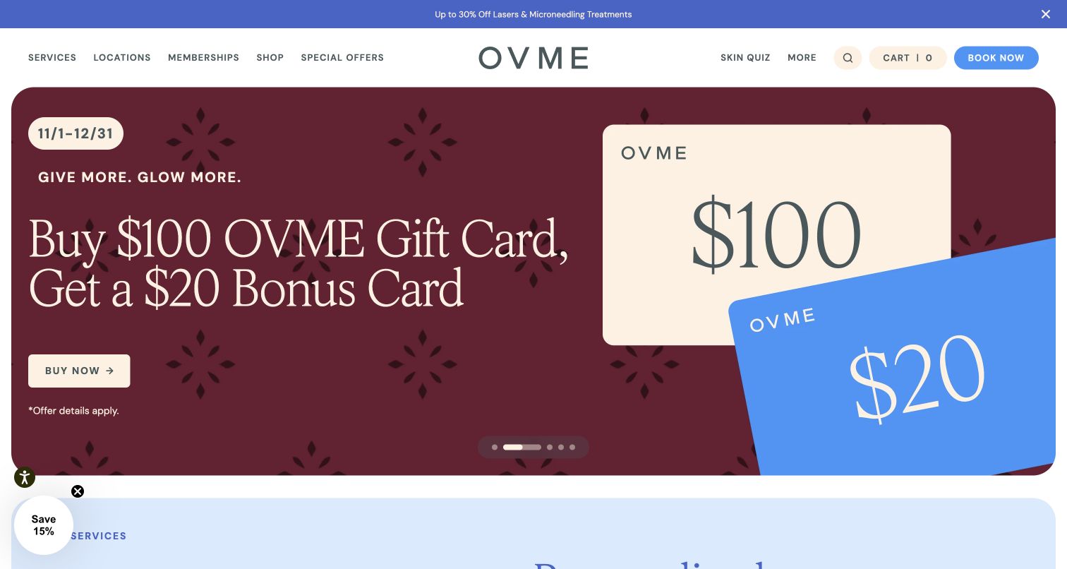
OVME's captured carousel presents a gift-card campaign in burgundy, cream and blue, with dates visible above the large headline. The rounded campaign panel is followed by a contrasting pale-blue services section. Navigation exposes services, locations, memberships, shopping, offers and a skin quiz, plus separate booking. Inspected content offers a quiz for uncertain visitors, a consultation path and a state-filtered clinic directory. The opening is memorable but is one of several rotating messages, including service discounts and a location announcement. A floating savings tab also overlaps the beginning of the following section.
What you can learn
Maintain stable routes to services and clinics outside rotating campaigns. Make offer dates and complete conditions easy to find, and give somebody responsibility for removing stale slides. A quiz and provider consultation are different experiences: one offers general orientation, while the other requires clinical evaluation. Review carousel, discount tab and consent notices together on mobile, where the full campaign may not fit. Ensure ordinary links remain useful if movement is paused or the slider fails to initialize.
Pros
The campaign puts its date range close to the headline
The wider page offers consultation and location discovery
Cons & considerations
Several campaigns need consistent expiry ownership
The savings tab can compete with the start of service information
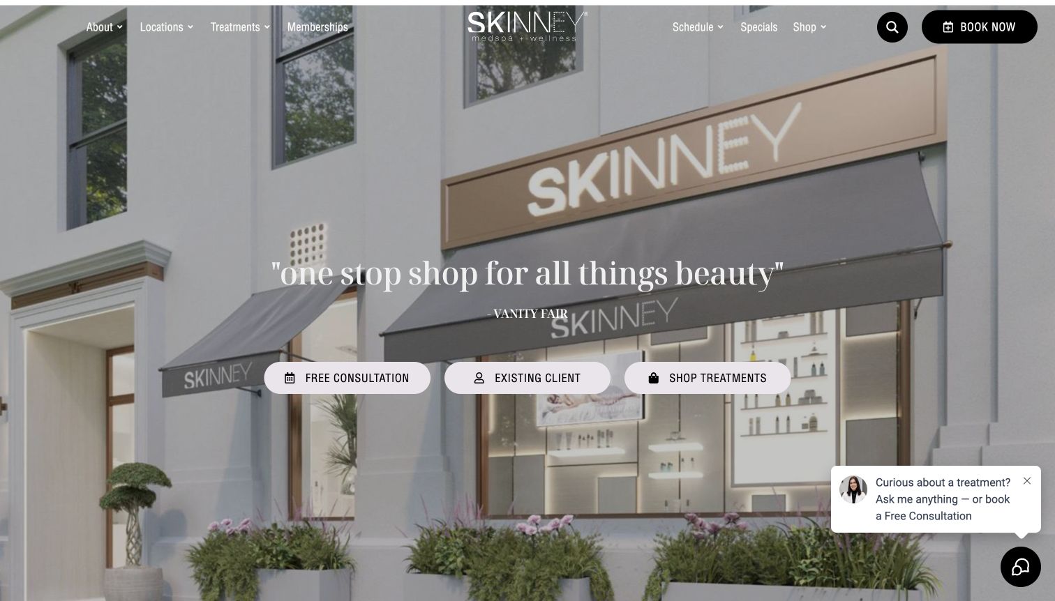
SKINNEY places its storefront photograph behind a short press quotation, then gives three central actions equal space: free consultation, existing client and shop treatments. Two compact navigation groups flank the wordmark, with booking separate. The inspected homepage expands into treatments, memberships, a store, founders and client content. The retained screenshot shows a chat prompt in the lower right; an initial offer form was observed before returning to the unobscured page. Its useful pattern is the explicit audience split, not the promotional wording or press endorsement. The storefront also gives an otherwise broad service proposition a recognizable physical setting.
What you can learn
When consultations, repeat appointments and prepaid products use different systems, name those destinations before someone enters one. Keep returning-client access fast while giving newcomers enough context for a first appointment. Treatment shopping should explain consultation requirements and relevant terms without implying that a purchase establishes suitability. Check navigation contrast over the storefront and govern chat and promotional overlays as one interface. Each central action should retain its meaning when the page becomes a stacked mobile layout.
Pros
The three actions distinguish new, returning and shopping tasks
The real storefront gives the introduction a place identity
Cons & considerations
The press quotation provides less practical detail than a plain headline
Offer forms and chat can compete with the central choices
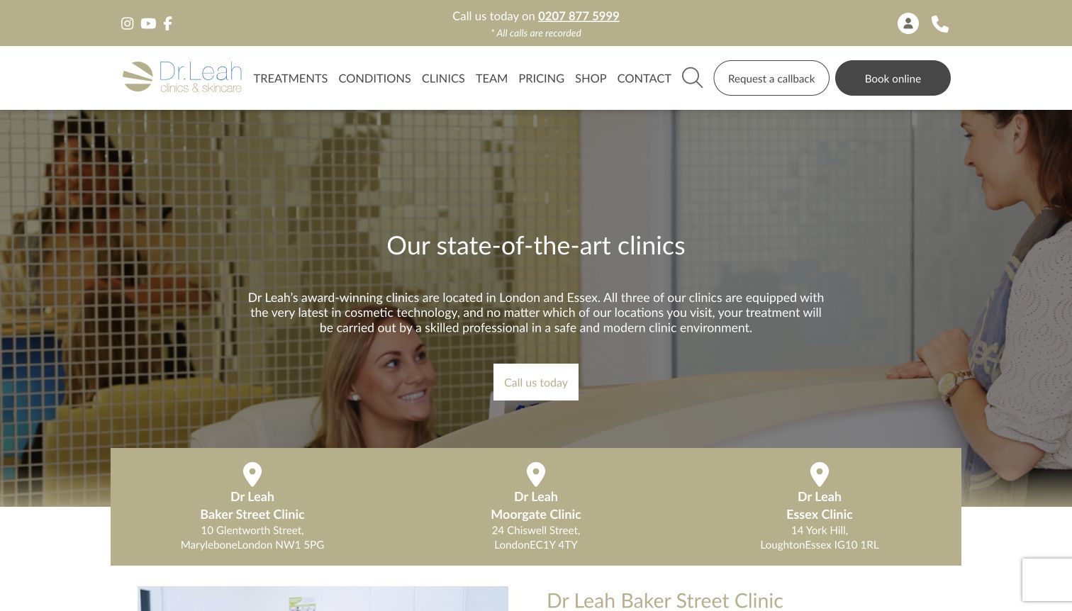
Dr Leah's location directory uses a reception photograph and a London-and-Essex introduction above a three-column address band. The page gives each clinic a separate description, hours, contact details and booking link. The inspected descriptions explain transport and parking context rather than repeating a city label. This view was selected instead of the homepage's oversized promotional carousel. Its conventional hierarchy makes location comparison easier to study: shared navigation stays above, while branch-specific blocks and photography continue below. The first screen makes all three addresses visible without requiring the visitor to manipulate a map.
What you can learn
Treat a location directory as a practical decision page, not a row of identical place cards. State relevant differences, including travel context, hours and service availability. Assign an owner and process for temporary changes rather than relying on an evergreen address alone. Keep phone and booking recognizable throughout. Review small address typography and contrast in bands adjoining photography, and offer plain text directions so selecting a branch does not depend on an interactive map loading successfully.
Pros
Each clinic has its own hours and contact details
Descriptions include transport and parking context
Cons & considerations
Important address text is relatively small
The broad global treatment menu may distract from a branch-selection task
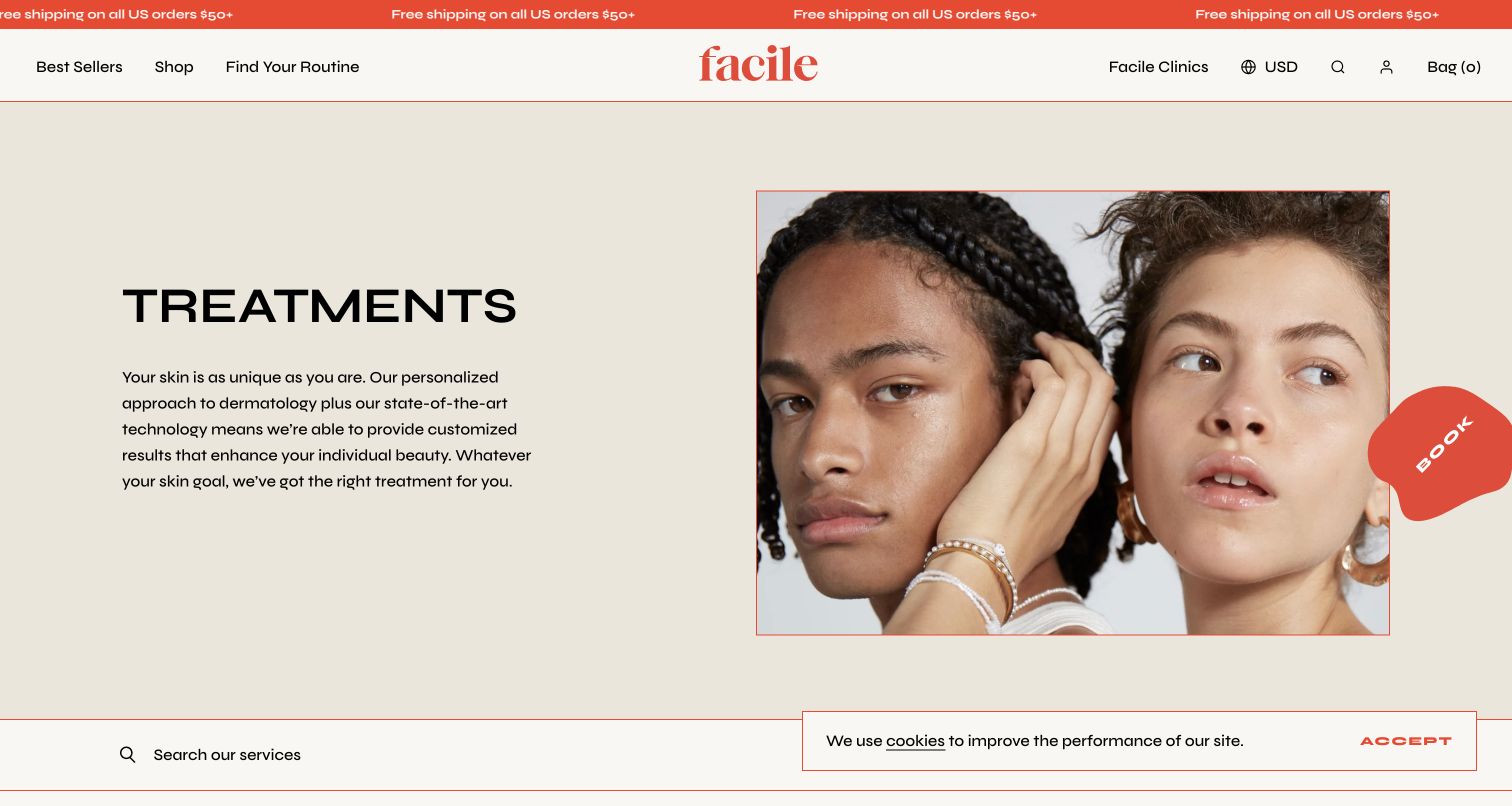
Facile's treatment page opens with a simple heading, short paragraph and paired portrait in a cream-and-orange composition. Search and category links follow, grouping the catalog by injectables, lasers, facials and treatment aims. Inspected cards display names, fixed or starting prices, summaries, details and booking links. Consultations have their own service entries instead of being hidden in a contact form. The capture retains a cookie notice over the lower edge, and the retail-oriented header makes clear that clinical services sit within a wider product brand. The list offers substantially more orientation than a menu made entirely of device names.
What you can learn
Make service summaries comparable by repeating consistent fields, distinguishing starting from fixed prices and linking to maintained detail. Keep consultation easy to find for people who cannot choose from procedure names alone. Search and categories can supplement each other, but the unfiltered list must remain useful. Review the hierarchy where a product storefront hosts clinic content so booking does not disappear among account and cart controls. Prices should remain connected to scope, current terms and clinical evaluation.
Pros
Cards expose prices and separate detail from booking
Consultation is explicit in the service list
Cons & considerations
The retail-first header gives clinic navigation less prominence
Starting-price cards require clear explanations of final-cost factors
Tribeca MedSpa announces its move into AYA Skin while retaining Tribeca and Skinlab identities in stacked header areas. A large offer carousel leads into a welcome section that distinguishes booking from a not-ready-to-book enquiry. The longer public page groups services by concerns and treatment families, including consultation and product advice. The capture includes a large consent panel covering much of the right side. It is a useful example of accumulated interface layers: legacy identities, a new affiliation, contact controls and promotions all compete in the same entrance. The current relationship notice is clearer than silently changing the familiar brand.
What you can learn
During a brand transition, explain the relationship in one maintained notice and retain familiar practical routes. Avoid addressing every stakeholder request with another row or popup. A visitor should identify the clinic, find a service and understand consultation before encountering commercial programs. Review consent placement alongside repeated branding and campaigns, and keep treatment instructions and local details maintained while identity work proceeds. Date-sensitive promotion assets also need review so an inherited carousel does not undermine the clarity of the new announcement.
Pros
The notice explains the new brand relationship
An enquiry route accommodates visitors not ready to book
Cons & considerations
Stacked branding occupies substantial vertical space
Kegan is a freelance web designer and developer with 15+ years of experience helping businesses turn complicated website requirements into clear, maintainable digital experiences. He works directly with clients from planning and design through development, launch, and ongoing support.
For medical spa website design, his development approach focuses on practitioner credentials, carefully governed treatment information, realistic consultation expectations, location details, and privacy-conscious inquiry handoffs. The scope can be a targeted improvement or a complete custom build, with responsive layouts, thoughtful content structure, and integrations chosen around the people using and maintaining the site.
Show 3 other medical spa website designersHide other medical spa website designers
Plan a medical spa website around informed next steps
Document the real appointment pathways
Map new consultations, existing-client appointments, enquiries and product purchases separately. Confirm which routes leave the main website and what a visitor needs before entering them. Do not submit patient details or real bookings as routine design testing.
Build a clinically governed content inventory
Assign qualified reviewers to treatment descriptions, suitability language, preparation, aftercare and outcome claims. Designers should identify the fields and review workflow, not improvise clinical statements. Establish an update schedule and archive outdated campaigns without losing essential patient instructions.
Define reusable provider and location records
Store names, roles, biographies, clinic assignments, addresses, hours and contact routes in structured records. Make it possible to update a practitioner or temporary closure consistently. Review genuine photography permissions and avoid implying that a model is an actual patient or provider.
Separate education from commercial offers
Decide where fixed prices, starting prices, packages, memberships and gift cards appear. Connect every summary to current scope and conditions. Keep consultation available when a visitor cannot reasonably select a procedure, and do not let a promotional bundle stand in for suitability assessment.
Specify sensitive-data boundaries
Inventory booking systems, contact forms, photographs, analytics, chat and quizzes before integration. Keep routine public browsing separate from clinical intake. Have the appropriate privacy and security specialists assess providers, consent, retention and data access; a public screenshot does not establish that an implementation meets those responsibilities.
Test the full first-visit state
Review the site with consent notices, campaign banners, chat and promotional panels present together. Test keyboard use, zoom, narrow screens, paused media and reduced motion. Ask testers to find a provider, choose a location, understand the first appointment and locate current instructions without completing a real booking.
The editing job behind the design
Choose technology around publishing and patient-data boundaries
The public site needs reliable editing for services, practitioners, locations, instructions and expiring offers. A straightforward content model often matters more than a theme with many decorative features. Keep retail inventory and appointment workflows explicit when both share a brand; a product checkout and a clinical booking are different journeys.
Assess booking, intake, photo upload, quiz, chat and analytics integrations with the appropriate specialists before selecting them. Keep health-related information out of general marketing events and routine QA records. Technology observations in these examples describe public evidence only; an empty list means no supported label was authored, not that the website uses no technology.
Our WordPress website examples offer a separate look at publishing approaches. A visible platform label is evidence for that named page, not a guarantee that the same system will suit your requirements.
Before the public launch
Medical spa website planning checklist
Explain what a first appointment involves.
Distinguish new and returning patient routes.
Keep consultation available beside named treatments.
Offer understandable service categories without diagnosing.
Maintain practitioner names, roles and clinic assignments.
Publish current location hours and practical arrival information.
Connect price summaries to scope and current conditions.
Assign review owners to treatment and aftercare copy.
Expire campaigns across banners, images and linked pages together.
Test the combined consent, chat and promotional-overlay state.
Provide readable static alternatives to moving media.
Review sensitive-data handling before connecting booking or photo tools.
These checks are a project checklist, not a performance, legal, security, or accessibility certification. Test real journeys with the people responsible for the website before making claims about the result.
Sources & editorial method
How this collection was selected and reviewed
The fourteen examples meet the saved random collection target. Each source was independently opened in an ordinary browser, visually inspected and directly captured; Facile is represented by its treatment menu and Dr Leah by its location directory, labeled accordingly. Reviews identify an observable design pattern, practical lesson and conditional tradeoffs. Eudelo was excluded after its official site announced it had ceased trading. Editors Choice is an explicit design selection favoring a specialist clinic, not a clinical endorsement, measured conversion result or visitor-vote ranking.
Each example links to its actual source page. Screenshots are direct browser captures with their own capture dates; moving imagery, announcements and live designs can change. The notes describe observable design choices and conditional tradeoffs, not measured traffic, conversion results, service quality, or accessibility conformance.
Technology labels use public page metadata, asset evidence, or explicitly cited platform documentation. Platform documentation is not a complete current deployment audit. A component reference may be legacy or unused; it is not a complete backend inventory. Unknown stacks are omitted. These sites are editorial examples, not our client portfolio.
Written, Edited and Curated are separate editorial records, not timestamps advanced by a rebuild. Website designs and imagery belong to their owners. See our editorial standards or suggest a correction.
Questions worth asking
Medical Spa website design questions
What should a medical spa homepage prioritize?
Make the service model, locations and consultation route understandable, then help visitors find relevant providers and service information. A campaign can lead visually, but should not obscure practical next steps or require people to know a device name before browsing.
Should services be organized by concern or treatment name?
Both can be useful when maintained consistently. A visitor may start with a concern while a returning patient already knows a procedure. Offer plain-language orientation and a treatment index without presenting concern-based navigation as a diagnosis or suitability decision.
Should treatment prices appear on the website?
Prices can make comparison easier if their scope is clear. Distinguish fixed from starting prices and link to current terms, consultation requirements and relevant exclusions. A price or package should not imply that a treatment is appropriate for every visitor.
Can a clinic and skincare shop share one website?
Yes, but they need clearly named routes and different expectations. Skin Pharm and The Things We Do illustrate combined brands. Someone buying a familiar product should not have to enter clinical booking, and a person seeking practitioner information should not be funnelled only into retail shopping.
Does inclusion mean a med spa or treatment is recommended?
No. This collection studies public website design, content presentation and navigation. It does not assess clinical practice, verify every credential or recommend treatment. Follow current provider information and consult appropriately qualified professionals for personal medical questions.
A compelling medical spa website gives its brand room to breathe while making the next step precise. Begin with consultation, provider and location clarity, keep clinical content under qualified review, and let promotions support that structure rather than dominate it.