Best Driving School Websites of 2026 (27 Real-World Examples)
Driving school websites that explain lessons, eligibility, and booking
These 27 examples compare lesson packages, instructor introductions, service areas, license-stage guidance, and the transition into scheduling.
A learner needs to understand the actual lesson product: duration, transmission, pickup arrangements, price, and any eligibility conditions. Requirements vary by location, so a website should point to the relevant authority rather than treating one general explanation as universal.
RACV is the editorial choice for its practical lesson presentation. Dates attached to published prices or policies remain the provider’s dates; a new screenshot does not make an older price statement newly verified.
Before the examples
What makes good driving school website design in 2026?
Describe the lesson product
State lesson length, vehicle or transmission options, service area, and pickup arrangements. Explain how a package differs from an individual lesson before promoting savings.
Keep eligibility contextual
Identify the jurisdiction and license stage covered. Have the school maintain links to the responsible authority and review its own instructions when requirements change.
Separate availability from purchase
Explain whether the visitor chooses a confirmed slot, requests an instructor, or purchases credit for later booking. These are different commitments and need different action labels.
The collection · 27 examples
27 driving school websites worth studying
Compare the examples by the visitor decisions they support. Each review identifies a specific pattern, practical lesson, strengths, and limitations in the directly inspected page.
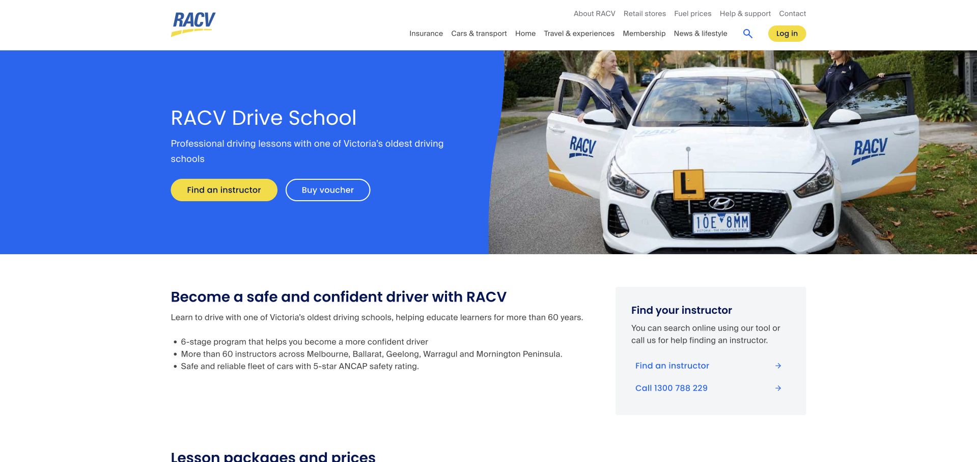
RACV gives its driving-school page a compact blue-and-yellow introduction with separate instructor-finding and voucher actions. Its strongest feature is the dated price table, which compares lesson lengths, bundles, and member versus standard rates. A later sequence explains that learners find an instructor, call to arrange a time, optionally buy vouchers, and agree on the meeting location. This is our editorial choice because it connects the advertised product with the actual booking process. The page is longer than necessary because other RACV offers appear later. It also gives different instructor-count thresholds in separate sections, suggesting the repeated network facts need a single maintained source.
What you can learn
Publish lesson length, package contents, eligibility, and the effective price date together. Explain whether buying a voucher reserves a time or simply pays for a future booking, so learners understand the next step before committing.
Pros
A dated table compares durations and member or standard prices.
The booking sequence distinguishes scheduling from voucher purchase.
Cons & considerations
Unrelated RACV promotions lengthen the page.
Repeated instructor-count statements need more consistent maintenance.
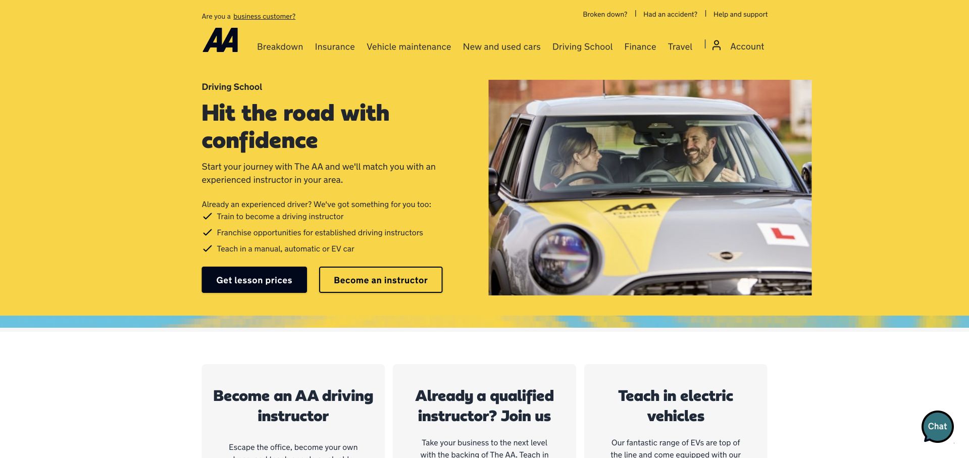
The AA places its driving-school service inside the familiar yellow parent-brand layout, pairing a learner-and-instructor photograph with actions for lesson prices and becoming an instructor. The local matching promise is understandable, and later advice links cover preparation and a first lesson. The balance of the opening is less clear: most supporting bullets discuss instructor careers rather than learning to drive, and the next row continues that recruitment emphasis. The global header also contains insurance, travel, finance, and vehicle services, adding choices unrelated to a lesson enquiry. The retained capture follows declining optional cookies; a small chat control remains at the edge.
What you can learn
When one service page serves learners and instructors, separate their paths with short audience labels and relevant supporting facts. Give the learner route enough practical detail to stand on its own within a broader corporate navigation system.
Pros
Lesson prices and instructor recruitment have separate actions.
First-lesson preparation receives a dedicated advice link.
Cons & considerations
Recruitment dominates the supporting copy beneath the learner headline.
The parent-brand navigation introduces many unrelated destinations.
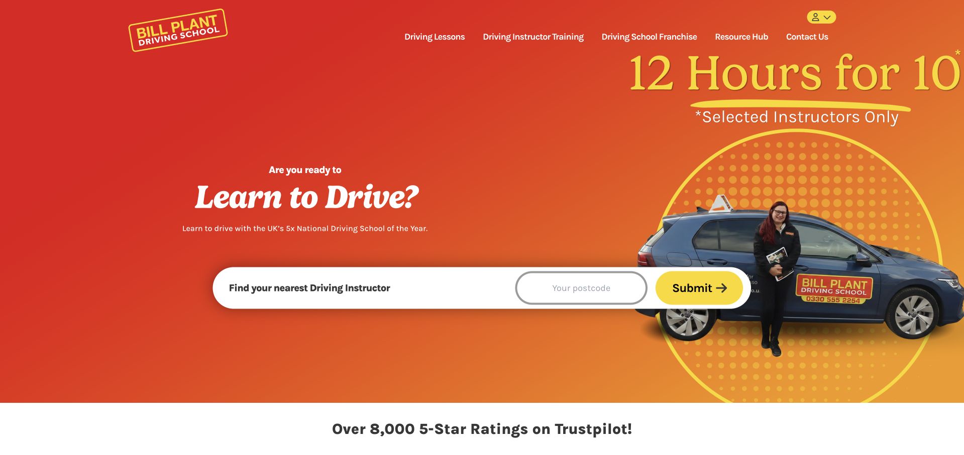
Bill Plant uses a vivid orange-and-red hero, a learner photograph, and an unusually large postcode finder. A lesson-hours promotion appears in the image with a nearby qualification that it applies only to selected instructors. That qualification matters because a national campaign should not imply universal local availability. The header separates learner lessons, instructor training, and franchises, while the body offers further resources and insurance content. The promotional artwork is heavily cropped at the right edge of the desktop viewport, weakening the balance of the composition. The finder button also says only Submit, even though finding an instructor would communicate its result much more clearly.
What you can learn
Keep local availability and promotional restrictions close to a national offer. Label the search action by its result, and test campaign artwork at the actual desktop width so important terms are not dependent on an awkward crop.
Pros
The postcode finder is prominent and easy to identify.
The hours promotion includes an instructor-availability qualification.
Cons & considerations
The promotional artwork is cropped at the viewport edge.
The generic Submit label does not explain the next step.
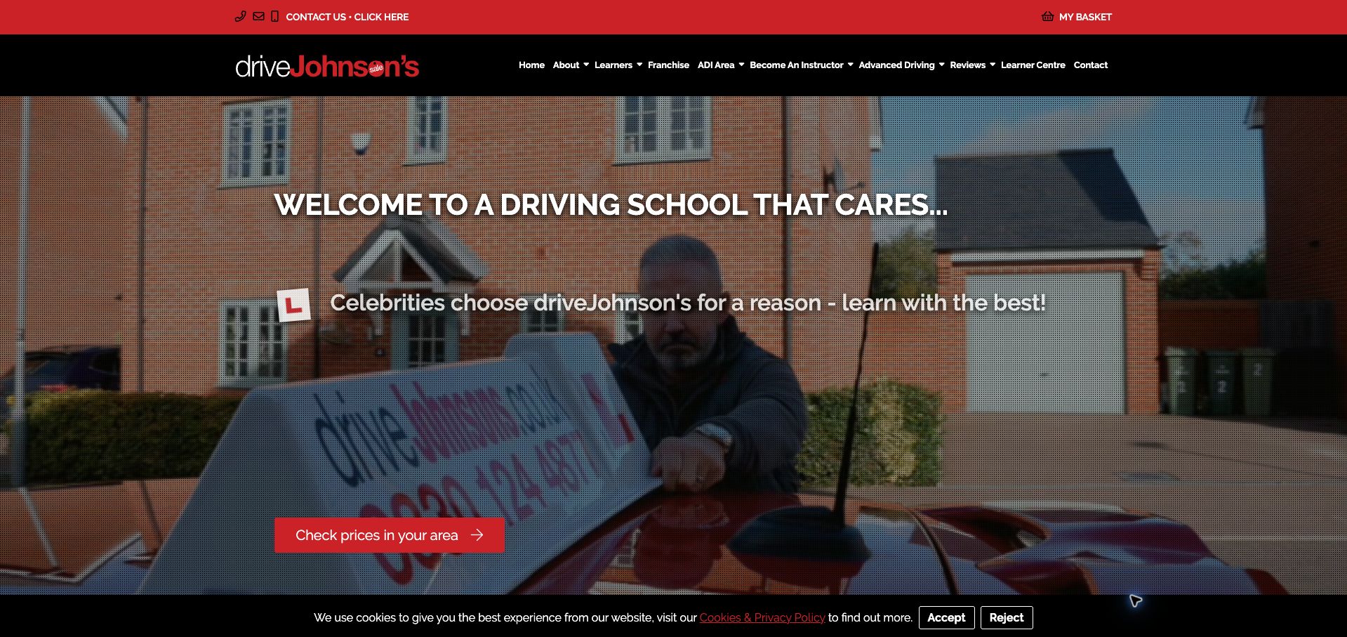
driveJohnson’s places a red local-pricing action over a full-width promotional image beneath a black navigation bar. The body distinguishes learners from instructors and identifies weekly lessons alongside intensive courses, giving visitors a basic way to understand the offer. A notice also explains that the office is closed on Sunday while online payment remains available. Celebrity endorsement, pass totals, and a countdown sale receive considerable prominence, however, before a learner sees a concrete local package. The header contains several professional-instructor destinations, and the retained cookie strip occupies the bottom edge. The displayed pass statistics are marketing claims rather than teaching outcomes verified by this design review.
What you can learn
Lead a regional pricing journey with the lesson format and availability that the visitor needs. Keep endorsement and urgency secondary, and distinguish office support hours from the availability of online booking or payment.
Pros
The primary action explicitly promises local prices.
Weekly and intensive learning formats are distinguished.
Cons & considerations
Celebrity imagery and countdown urgency outweigh package detail.
Instructor navigation and the cookie strip add competing information.
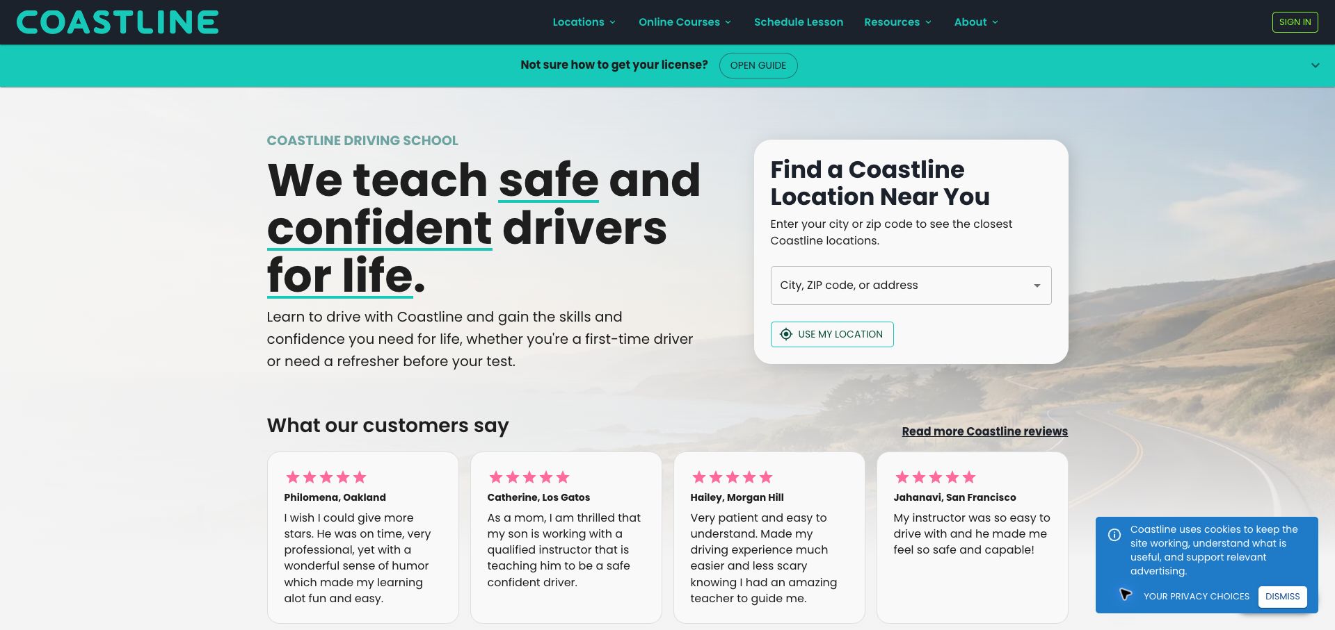
Coastline places a white location-search card beside a large introductory headline, with a turquoise licensing-guide banner immediately above. This gives visitors two sensible paths: find nearby lessons or first understand the process. The search accepts a city, ZIP code, or address, while a later state selector acknowledges that requirements vary geographically. The body discusses availability, pickup, and lesson reports in specific terms. A long sequence of testimonials and benefit claims still separates the opening from some practical details, and no local price appears until the visitor chooses an area. A small privacy notice remains in the retained capture without covering the main search.
What you can learn
Pair geographic search with a separate explanation for people who do not yet understand the licensing journey. State practical booking features plainly, then move visitors toward local prices and availability before lengthy testimonials or brand assurances.
Pros
The location finder explains several acceptable search inputs.
A prominent guide supports learners unsure of the process.
Cons & considerations
Local costs are absent from the opening.
Extended testimonials delay some practical service information.
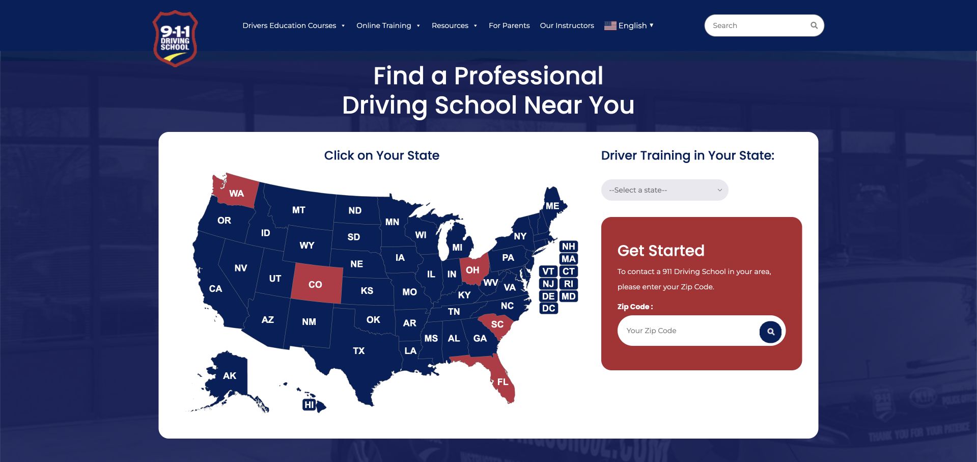
911 Driving School makes geography the whole opening task. A large United States map sits beside a state dropdown and a separate ZIP-code field, beneath a navy header that includes parent resources and instructor information. The dropdown is a useful alternative for visitors who cannot easily select a small state on the map. The page nevertheless presents three geographic controls together without explaining how their results differ. Highlighted states also lack an immediately visible legend, making the color distinction something visitors must infer. The opening gives little help choosing between classroom education, practical lessons, and other services until the visitor has moved into a local destination.
What you can learn
Use a map as a supplement to a clearly labeled location selector. Explain any geographic color coding and provide a brief service distinction so visitors know whether they are finding a school, an online course, or an in-car lesson.
Pros
A state dropdown provides an alternative to map interaction.
Parents have a dedicated navigation route.
Cons & considerations
Three location controls compete without clear differentiation.
The map’s highlighted states lack an immediate explanatory legend.
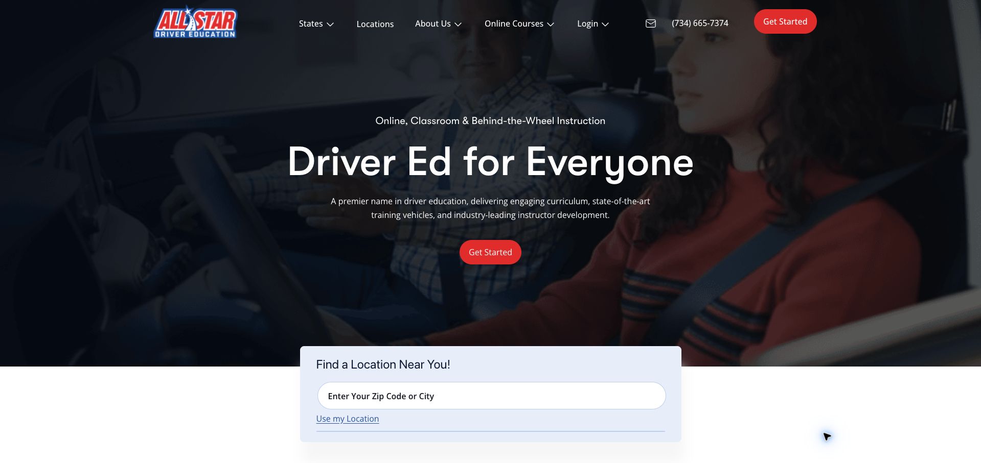
All Star opens with a darkened learner-and-instructor photograph, a restrained red action, and a clear line naming online, classroom, and behind-the-wheel instruction. A city or ZIP-code finder overlaps the bottom of the hero, followed by links to the states served. This makes the geographic scope discoverable and avoids presenting a single course as suitable everywhere. The main Get Started label is less specific than the finder, however, and the hero's broad promotional paragraph does not explain how the three teaching formats relate. The body adds experience and student-volume claims before a detailed program comparison. Those claims support positioning but do not establish educational outcomes in this review.
What you can learn
Introduce the available teaching formats in plain language, then explain which components a learner needs in their state. Give the main action a specific destination and keep location search visible without requiring an additional permission prompt.
Pros
The opening names three distinct instruction formats.
State links supplement the city and ZIP-code finder.
Cons & considerations
Get Started is less informative than a named course-selection action.
The formats are listed without an immediate comparison of their roles.
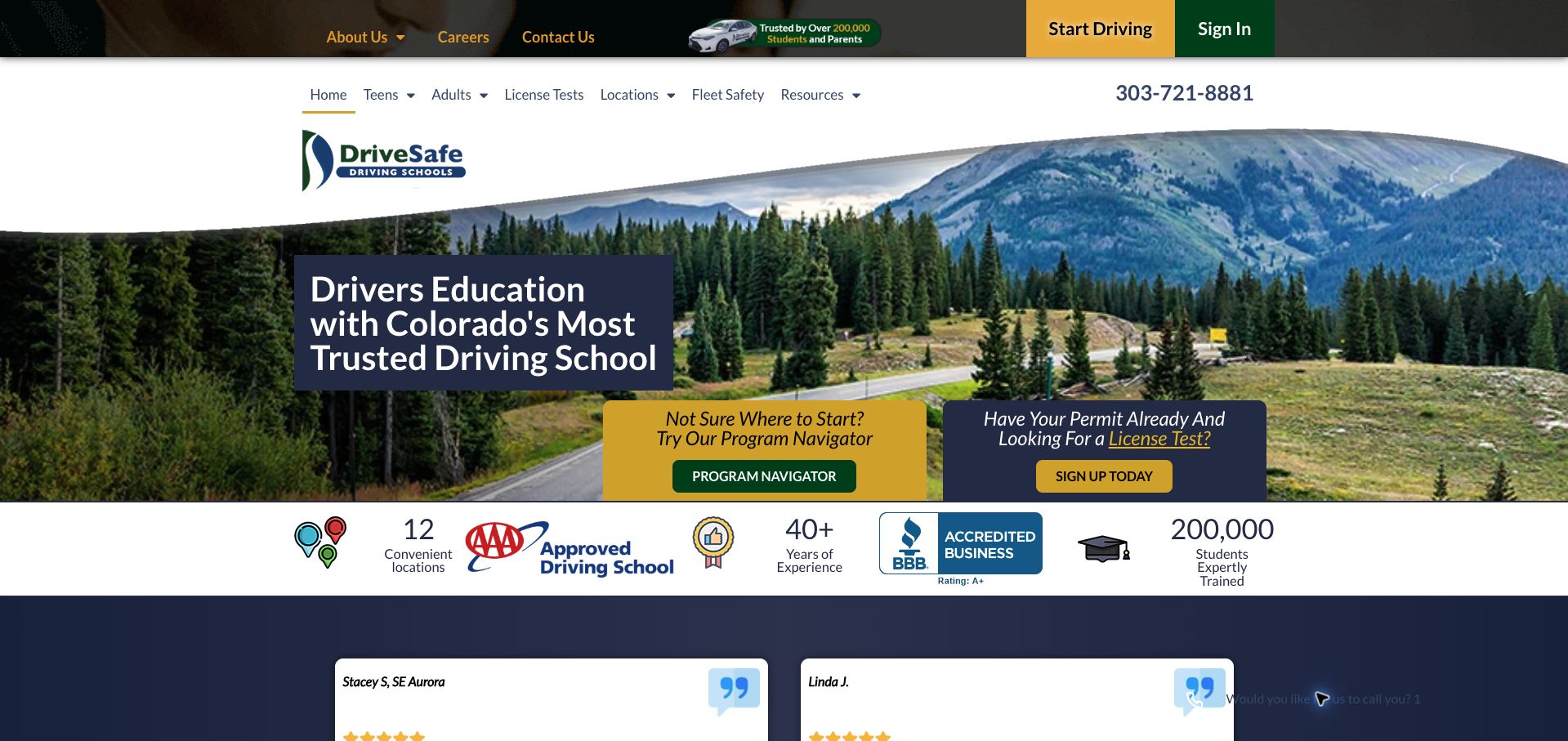
DriveSafe places two useful decision panels over a Colorado road photograph: one for visitors unsure where to start, and another for people who already have a permit and need a licence test. The main navigation reinforces that distinction with teens, adults, testing, and locations. This is a more helpful starting point than assuming every visitor wants the same course. The first screen also contains a tall two-level header and a row of badges and statistics, making the layout busy. Testimonials occupy substantial space before the later program overview. The navigator's presence is clear, but its recommendations were not tested through a submitted learner profile.
What you can learn
Organize the first choice around the learner's current stage, then offer guided help when that stage is uncertain. Keep credibility badges subordinate to the selector, and make clear whether testing is separate from a teaching package.
Pros
The opening distinguishes guidance from test-only booking.
Teens, adults, and licence testing have separate navigation.
Cons & considerations
A tall header and badge row crowd the first screen.
Testimonials delay the more detailed program overview.
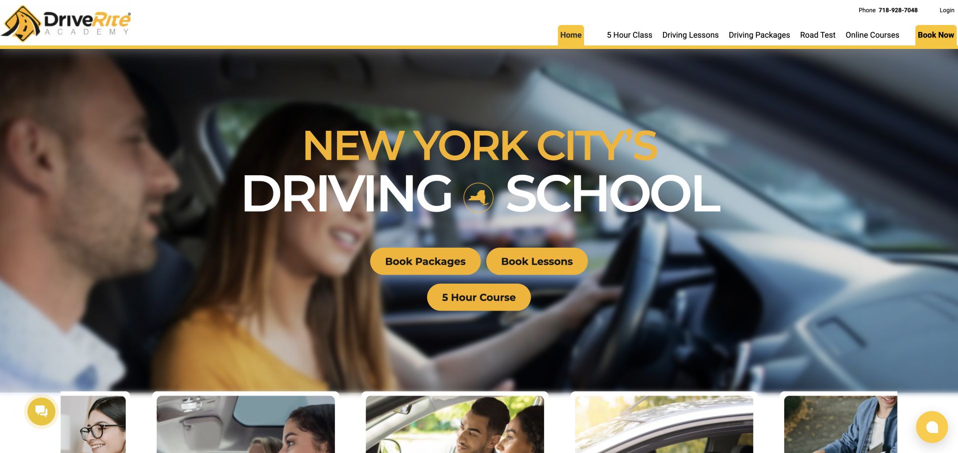
Drive Rite uses a yellow-and-white identity over an expansive in-car photograph. Its hero offers three direct routes: lesson packages, individual lessons, and the five-hour course. The header repeats those categories alongside road-test services, creating a recognizable service menu for visitors who already know what they need. The page gives less help to someone deciding between those options for the first time. Repeated service labels and broad ease or pass-rate claims take up space without providing a compact comparison of contents, duration, or cost. Chat controls on both sides of the viewport also add visual competition. No booking or payment flow was submitted during this review.
What you can learn
Use distinct actions for genuinely different services, but attach a short explanation of who needs each one. A simple contents-and-price comparison can help uncertain learners choose without relying on repeated labels or general confidence claims.
Pros
The hero separates packages, lessons, and the five-hour course.
Road-test services are clearly named in navigation.
Cons & considerations
The opening does not explain how to choose among the three options.
Repeated service labels and multiple chat controls add clutter.
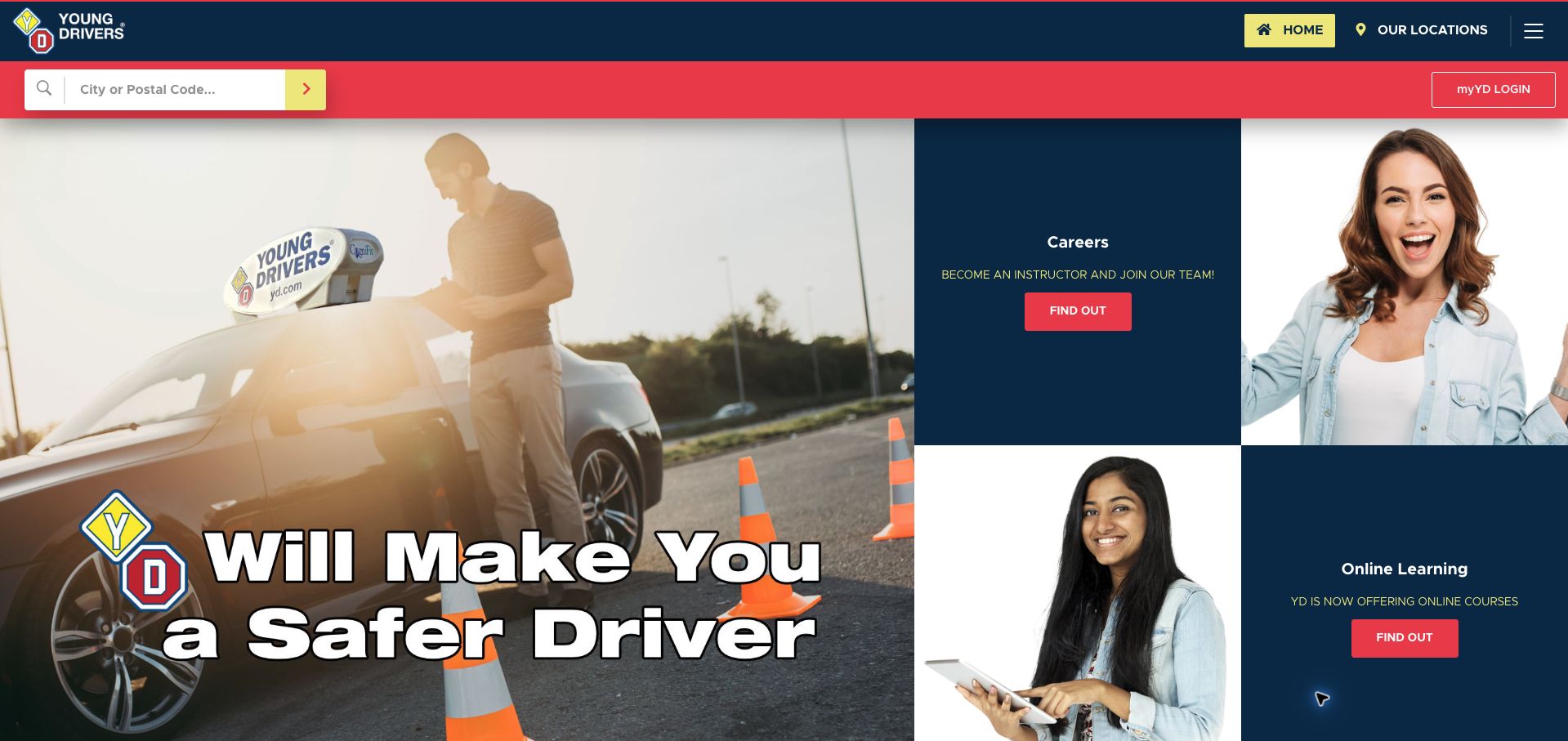
Young Drivers of Canada places a city or postal-code search in a red strip directly below its navy header. That persistent geographic route is useful because the large opening composition otherwise divides attention between a brand image, instructor careers, and online learning. The body explains that the organization also serves driver improvement and professional training, rather than only young beginners. Much of the broader navigation sits inside a menu, while the first screen gives recruitment almost as much weight as student learning. The safety-focused image slogan and graduate statistics are prominent positioning devices; the page does not provide an equally immediate comparison of local course contents and prices.
What you can learn
Keep location search visible across a broad training organization, but separate student enrollment from recruitment in the opening hierarchy. Explain the local program before relying on brand scale or safety language to carry the decision.
Pros
City and postal-code search are visible above the hero.
The body clarifies that training extends beyond novice drivers.
Cons & considerations
Recruitment competes directly with learner content in the opening.
Local course contents and prices are not immediately comparable.
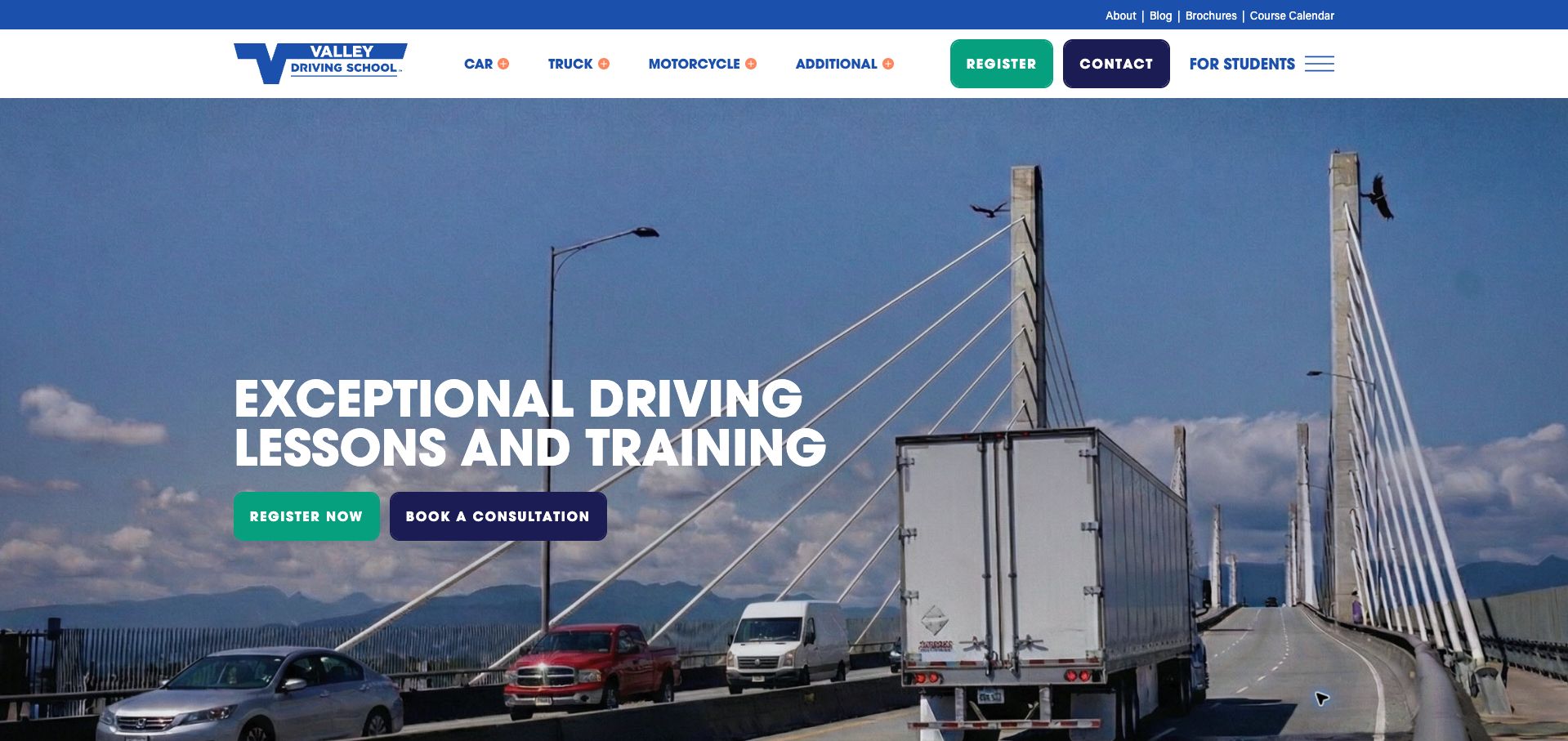
Valley Driving School uses a large bridge photograph with vehicles to establish the breadth of its training. Car, truck, and motorcycle categories are prominent in the header, while the hero offers both registration and a consultation. This lets a visitor who knows the required program proceed, while someone with a more complex goal can ask for guidance. The body explains the regional service and customizable training approach. The image occupies nearly the full first screen, leaving specific program comparisons below it. The generic claim about exceptional training also tells visitors less than the vehicle categories, and the Additional menu label is too broad to reveal the services inside.
What you can learn
Use vehicle type or licence goal as the primary navigation when a school serves several training markets. Keep consultation available for complex needs, but label secondary categories precisely and bring program requirements closer to the first screen.
Pros
Car, truck, and motorcycle routes are easy to identify.
Consultation offers an alternative to immediate registration.
Cons & considerations
The expansive photograph delays program details.
The Additional menu label gives little information about its contents.
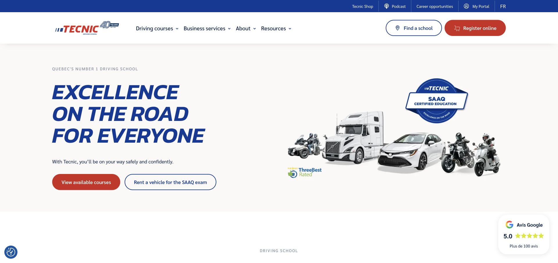
Tecnic combines a cream background, blue italic headline, and a lineup of different vehicle types. The two opening actions distinguish available courses from renting a vehicle for the SAAQ exam, a useful separation between education and test-day logistics. Finding a school and registering remain visible in the header, while the body covers car, motorcycle, heavy-vehicle, and specialist programs. The large network statistics and branded A+ program require further reading before a newcomer understands a particular course. The initial cookie dialog also blocked the central content and required a preferences step to decline optional categories. The final capture shows the page after that choice.
What you can learn
Separate training from adjacent services such as test-vehicle rental, then connect each to local availability. Translate a branded teaching program into concrete contents and requirements, and keep the first course choice accessible without an intrusive privacy overlay.
Pros
Course selection and exam-vehicle rental have distinct actions.
School finding remains visible beside registration.
Cons & considerations
Branded program language delays concrete course comparison.
The initial privacy dialog obscured the main introduction.
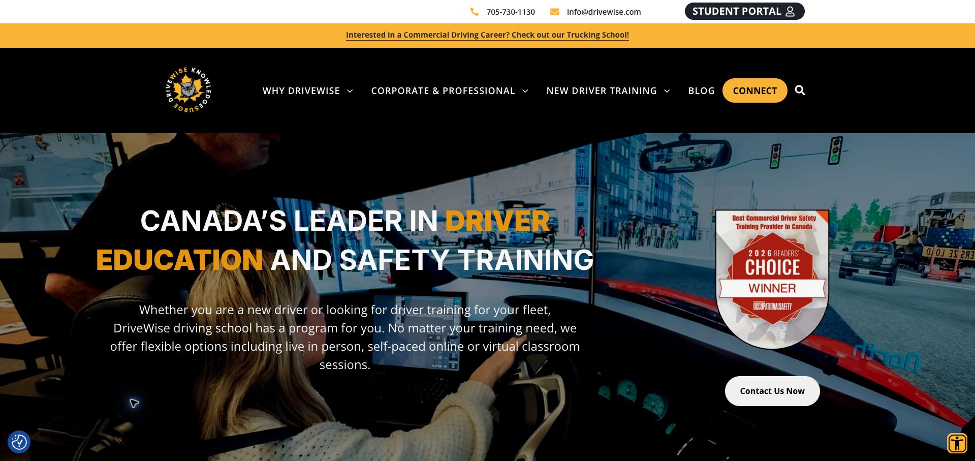
DriveWise uses a black-and-gold identity over a driving-simulator image, with a short paragraph naming in-person, self-paced online, and virtual classroom formats. Below the hero, new-driver training and corporate programs receive distinct routes, helping explain why the brand serves more than one audience. The student portal and contact information are visible above navigation. The opening itself leads with a broad leadership claim and a generic contact action, while a trucking-school promotion occupies another strip above it. This pushes the more useful audience distinction down the page. The retained capture follows rejecting optional cookies; the simulator image establishes a training context without proving the effectiveness of that method.
What you can learn
Separate novice and professional learners before asking them to make contact. Name teaching formats clearly, then attach each format to a relevant program, location, and requirement so the broad offer becomes a practical choice.
Pros
New-driver and corporate training have separate body routes.
The introduction names several delivery formats.
Cons & considerations
The hero action is less specific than the audience choices below.
A separate trucking promotion adds another competing opening message.
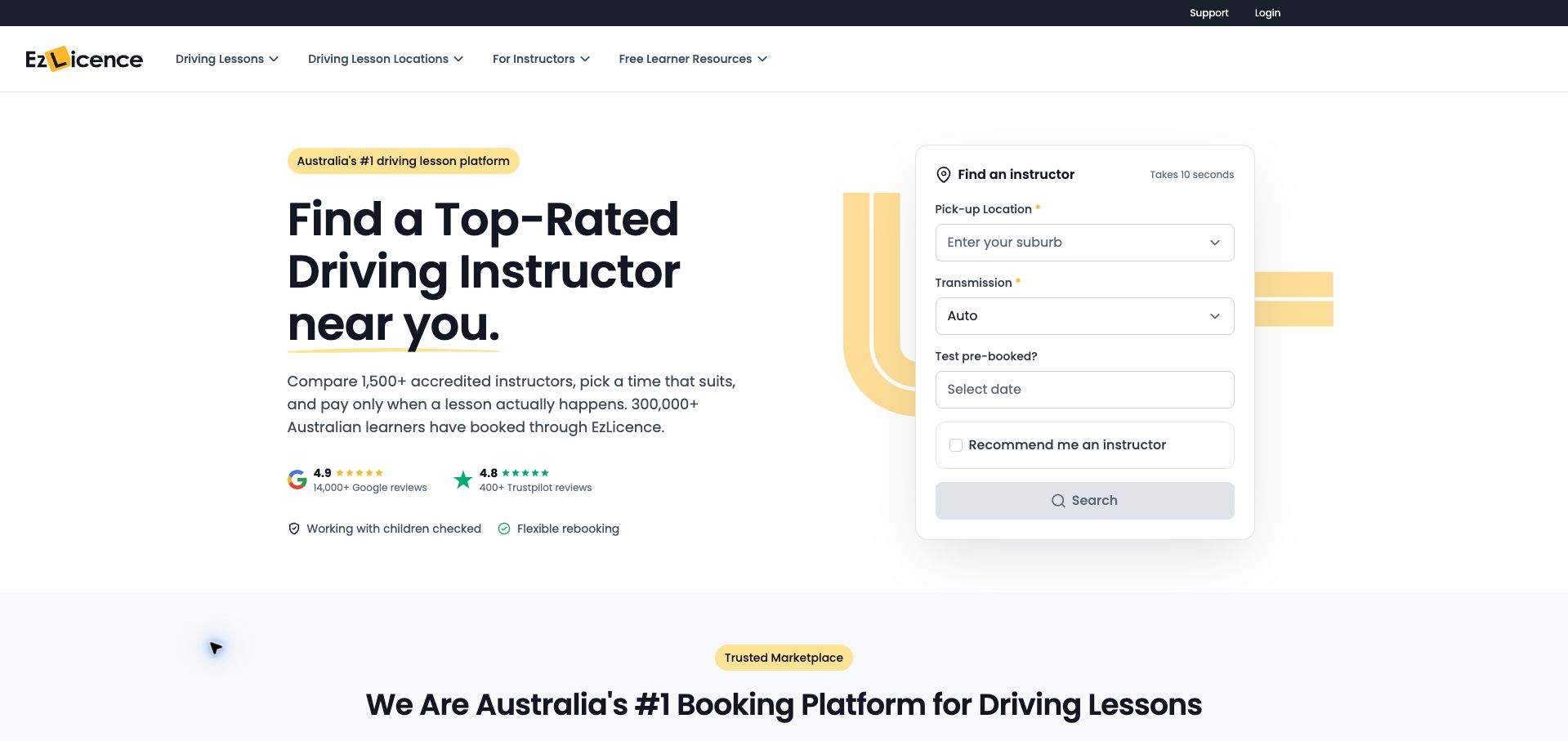
EzLicence places a compact instructor finder beside a large headline in a restrained white-and-yellow layout. Pickup suburb, transmission, and an optional pre-booked test date appear before search, making the matching criteria explicit. The body then illustrates a three-step comparison and booking process, including instructor profiles, calendars, and confirmation. This is a marketplace presentation rather than the website of a single local school, and that distinction helps explain the emphasis on choice. Promotional speed claims and repeated scale statistics still occupy substantial space. The illustrative profile prices should also remain clearly separated from actual search results, since the page states that individual instructors set their own rates.
What you can learn
Ask for the constraints that materially affect instructor availability before presenting results. Clearly distinguish explanatory mock profiles from live offers, and explain who sets prices and provides the lesson when the website operates as a marketplace.
Pros
Location and transmission are explicit matching criteria.
The body explains comparison, scheduling, and confirmation in sequence.
Cons & considerations
Illustrative prices could be mistaken for actual available offers.
Repeated scale and speed claims add length before detailed conditions.
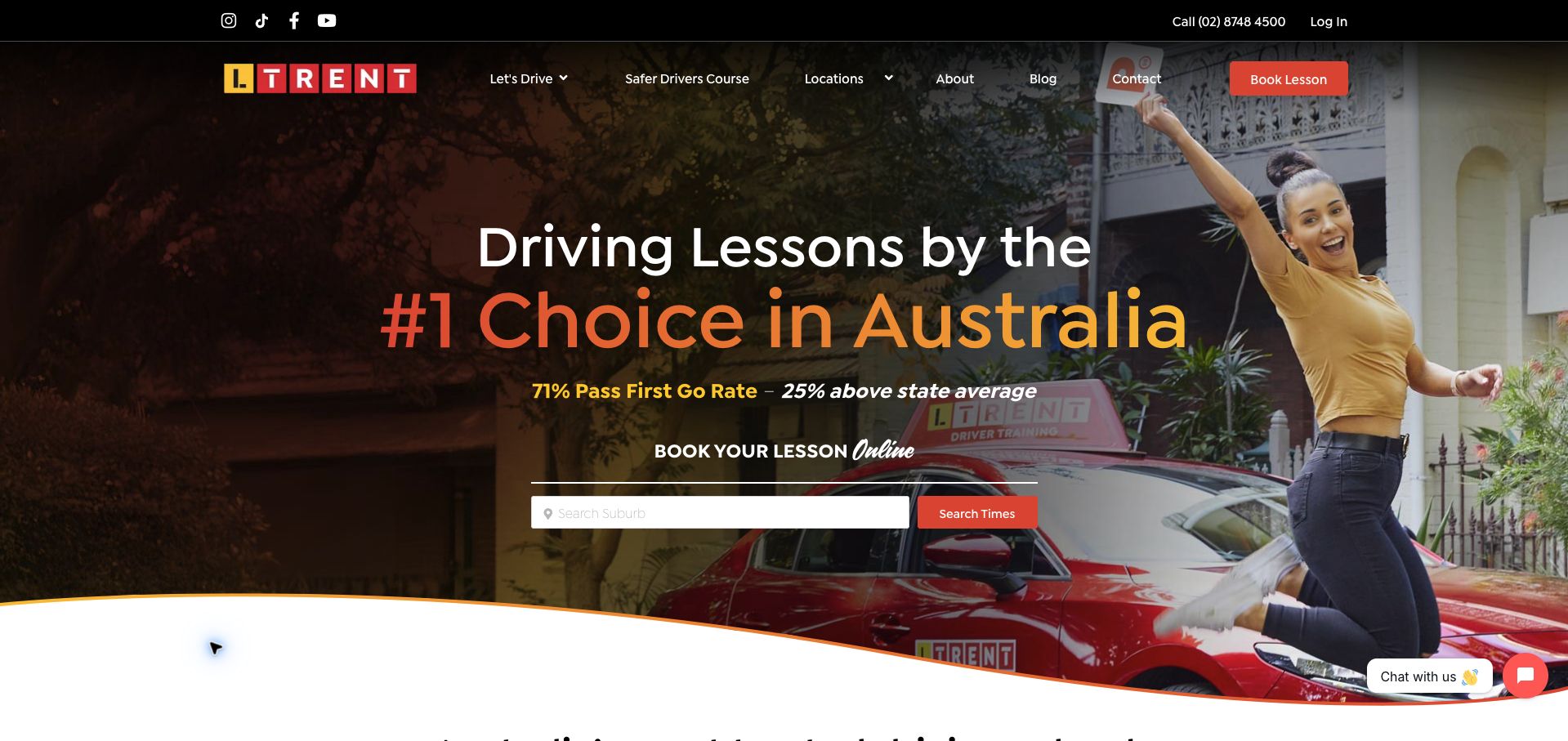
LTrent places a suburb field and a Search Times action over a celebratory learner photograph. The action is more informative than a generic booking prompt because it tells visitors they are looking for availability. A separate header route identifies the Safer Drivers Course, and the body introduces different lesson needs. Large pass-rate and national-ranking claims dominate the hero, however, without an immediately visible date or methodology beside the comparison. The image and gradient headline also make the opening visually busy. The course section discusses logbook benefits as part of its offer; eligibility and current rules should remain close to that information rather than being assumed from the headline.
What you can learn
Use a booking action that names the next result, such as available times in a suburb. Keep performance claims dated and explained, and place course eligibility beside any advertised licensing benefit so practical decisions do not depend on promotional shorthand.
Pros
The search button explicitly promises lesson times.
The specialist course has a distinct navigation route.
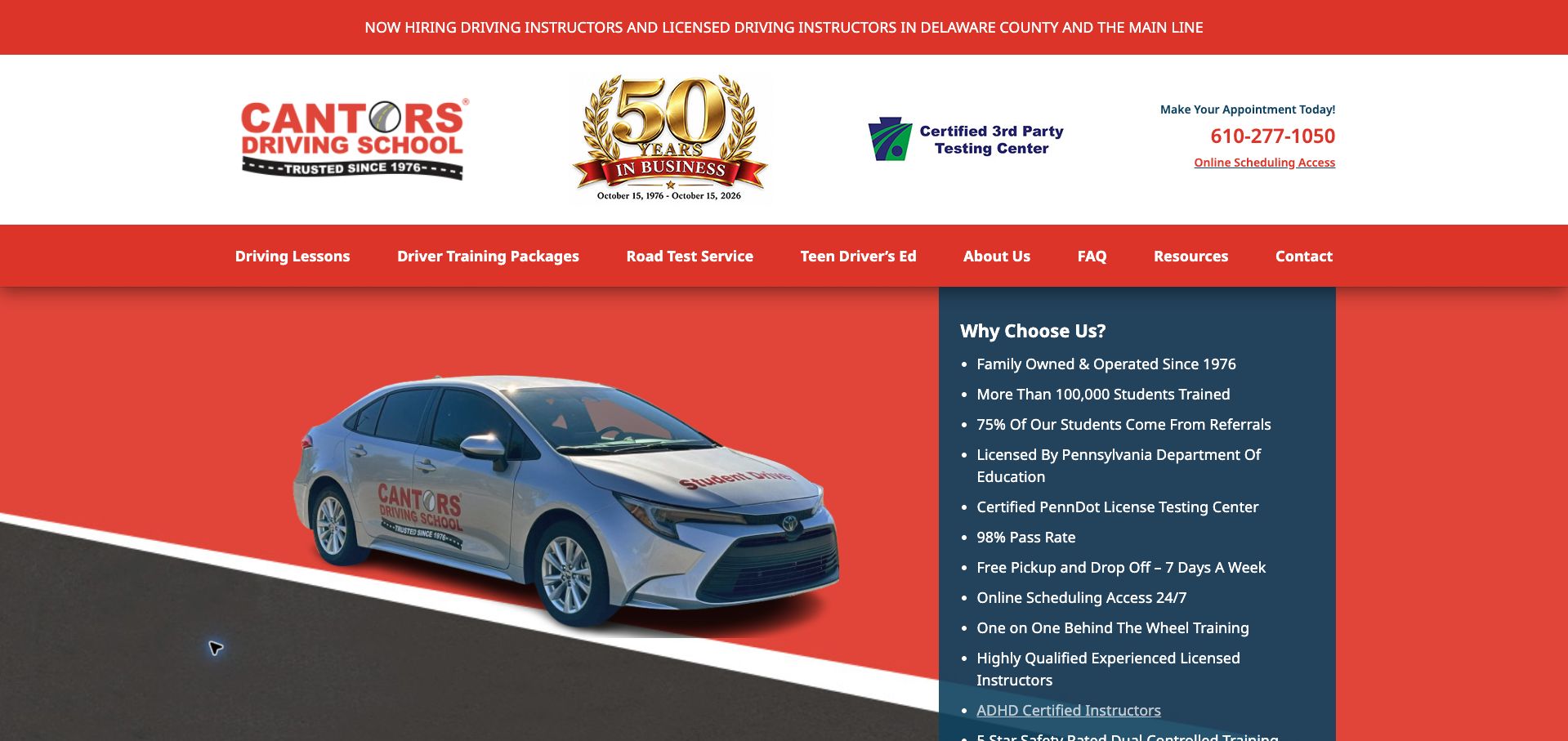
Cantor's Pennsylvania site uses a red-and-blue layout with a large anniversary badge and a long opening list of reasons to choose the school. The list includes useful operational details such as one-to-one teaching, pickup, and online scheduling, while package cards below state lesson duration and price. Separate hours for lessons, office scheduling, and road tests are particularly helpful because those services do not share one timetable. The opening still gives considerable space to recruitment, badges, and broad pass-rate claims before the package comparison. The dense list could be organized into a few scannable groups, and the claimed pass rate needs a clear definition and reporting period to be meaningfully interpreted.
What you can learn
Publish package contents and distinguish teaching hours from office and testing hours. Organize practical benefits by task, and give outcome statistics a defined period and population instead of placing them among ordinary service features.
Pros
Packages state lesson duration and cost.
Lesson, office, and testing hours are distinguished.
Cons & considerations
Recruitment and large badges delay the package comparison.
The pass-rate claim lacks immediate explanatory context.
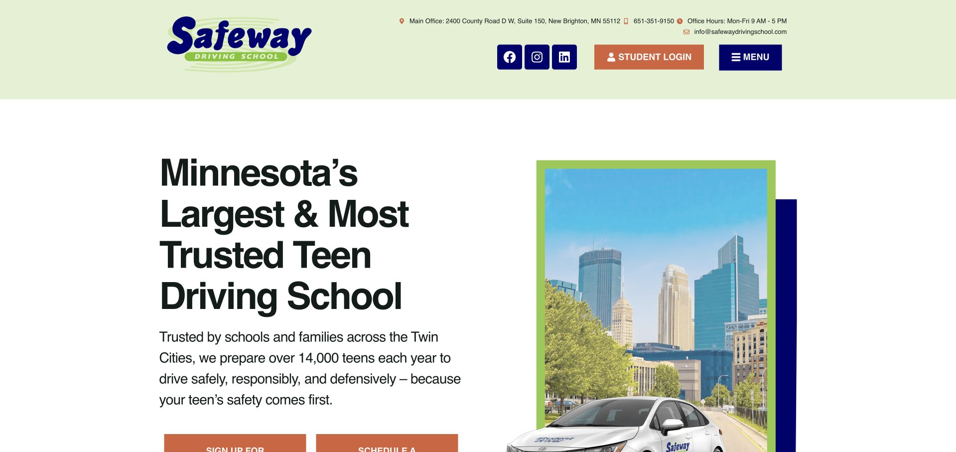
Safeway uses a pale-green header, large local headline, and a city-and-car composition to introduce its Minnesota teen programs. The homepage provides separate actions for classes, parent sessions, behind-the-wheel lessons, and permit testing, while an enrolled-student route explains account access. The body also distinguishes classroom, Zoom, and self-paced learning formats. This recognizes that a parent and a student may arrive with different tasks. The oversized opening headline pushes the action group toward the bottom of the first screen, and most navigation is hidden behind Menu. Several equally strong actions would benefit from a short explanation of the recommended starting point for a completely new family.
What you can learn
Map the homepage to the roles and stages involved in teen education: new student, enrolled student, parent, and test candidate. Explain which action comes first, and keep the format comparison close to that decision instead of below an oversized introduction.
Pros
Parent, student, lesson, and permit tasks have separate routes.
Several classroom delivery formats are distinguished.
Cons & considerations
The large headline pushes practical actions down the viewport.
New families receive several choices without an obvious recommended sequence.
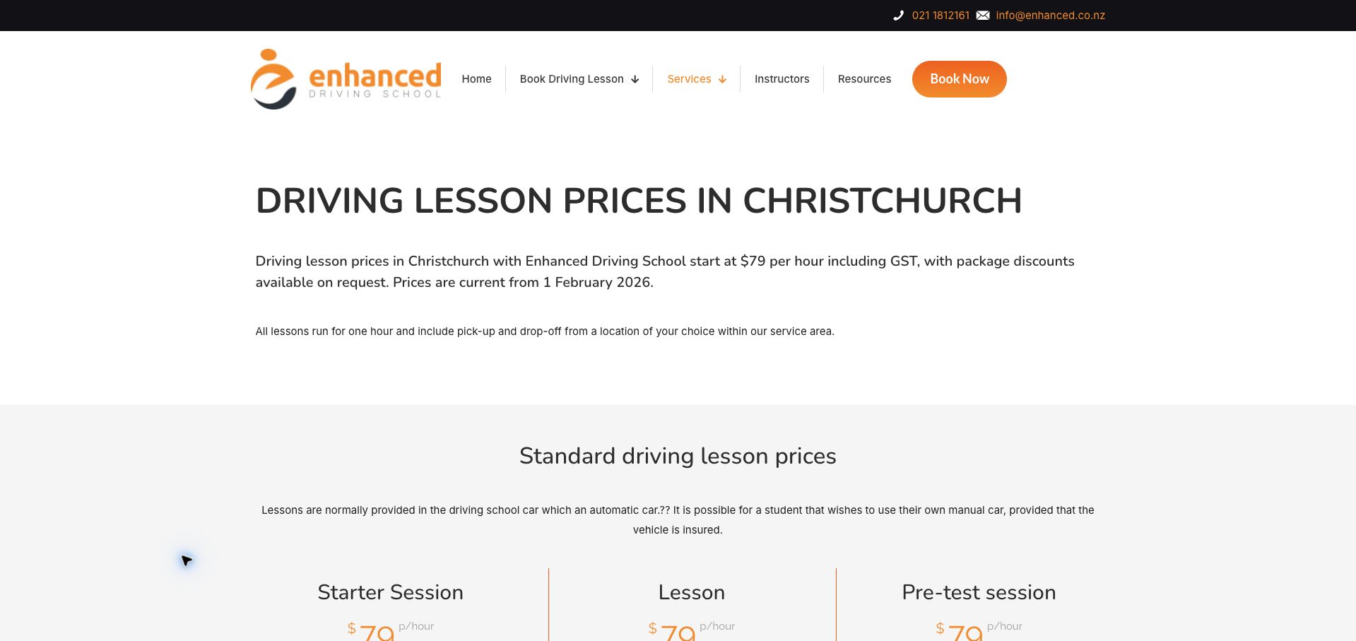
Enhanced's price page leads with the hourly rate, tax inclusion, effective date, and lesson duration before presenting a grid of services. It then explains pickup, payment methods, package quotes, and the separation between tuition and test fees. This is unusually useful purchasing information for a small school, presented in a simple orange-and-white layout. Editorial quality is uneven: the introductory vehicle sentence contains unresolved punctuation and grammatical errors. The general inclusions list also says a school automatic car is included, while the manual-lesson card specifies the learner's own vehicle. That exception should be attached clearly to the shared list rather than left for visitors to reconcile themselves.
What you can learn
State the full lesson cost, duration, inclusions, payment method, and effective date together. Keep exceptions attached to the affected service, and proofread operational copy carefully because an ambiguous vehicle requirement can change what the learner needs to arrange.
Pros
The page states tax, duration, and an effective price date.
Payment, pickup, package quotes, and test-fee separation are explained.
Cons & considerations
An unfinished vehicle sentence weakens clarity and polish.
The shared vehicle inclusion needs an explicit manual-lesson exception.
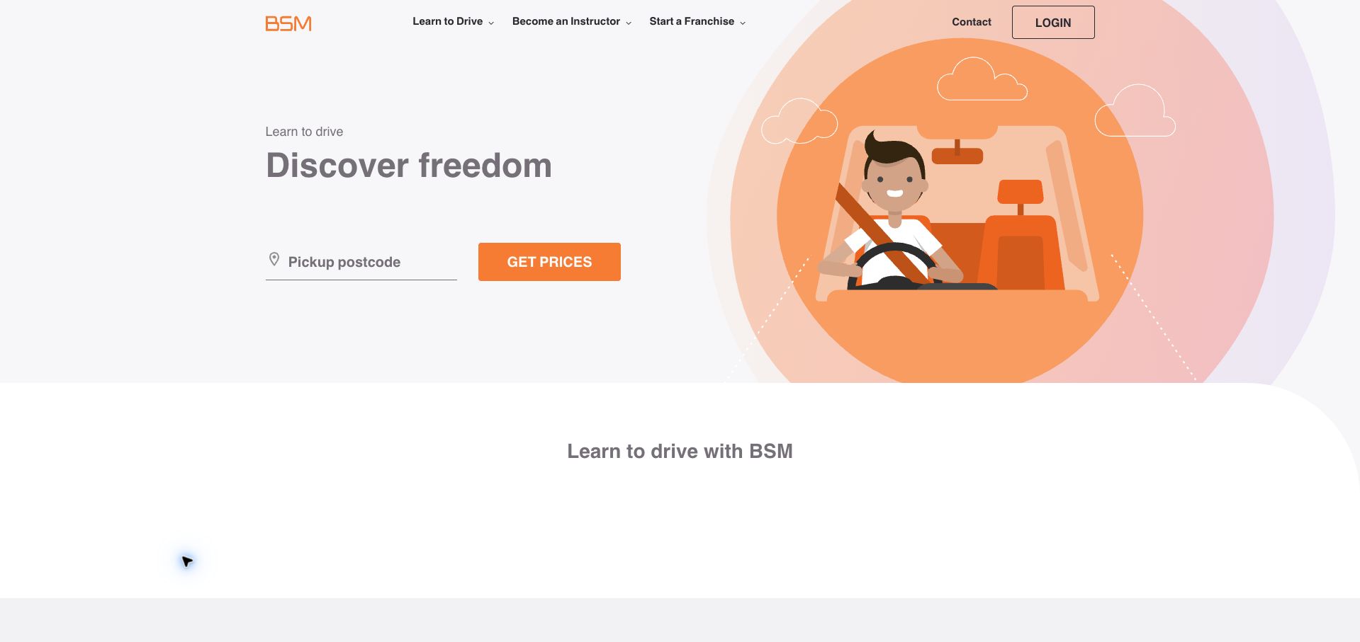
BSM uses a soft orange illustration and a short headline beside a pickup-postcode field and a Get Prices action. The interface is deliberately compact, with learner, instructor, and franchise routes kept in a small header. Below, the page explains instructor selection, calendar access, and online payment before presenting a four-stage learning outline. This gives the simple search a little procedural context without overwhelming the opening. The pale gray typography is less assertive than the orange action, and the initial promise does not explain whether the next screen will show prices alone or also availability. Broader lesson suitability and transmission choices are not part of the first comparison.
What you can learn
A short postcode form can be effective when its action promises a specific result. Clarify what learners will see next, and surface the few constraints that change the offer, such as transmission and availability, before a purchase decision.
Pros
The opening focuses on one local pricing task.
The body explains calendar access and the broader learning sequence.
Cons & considerations
Pale typography weakens parts of the visual hierarchy.
The initial search does not describe availability or transmission selection.
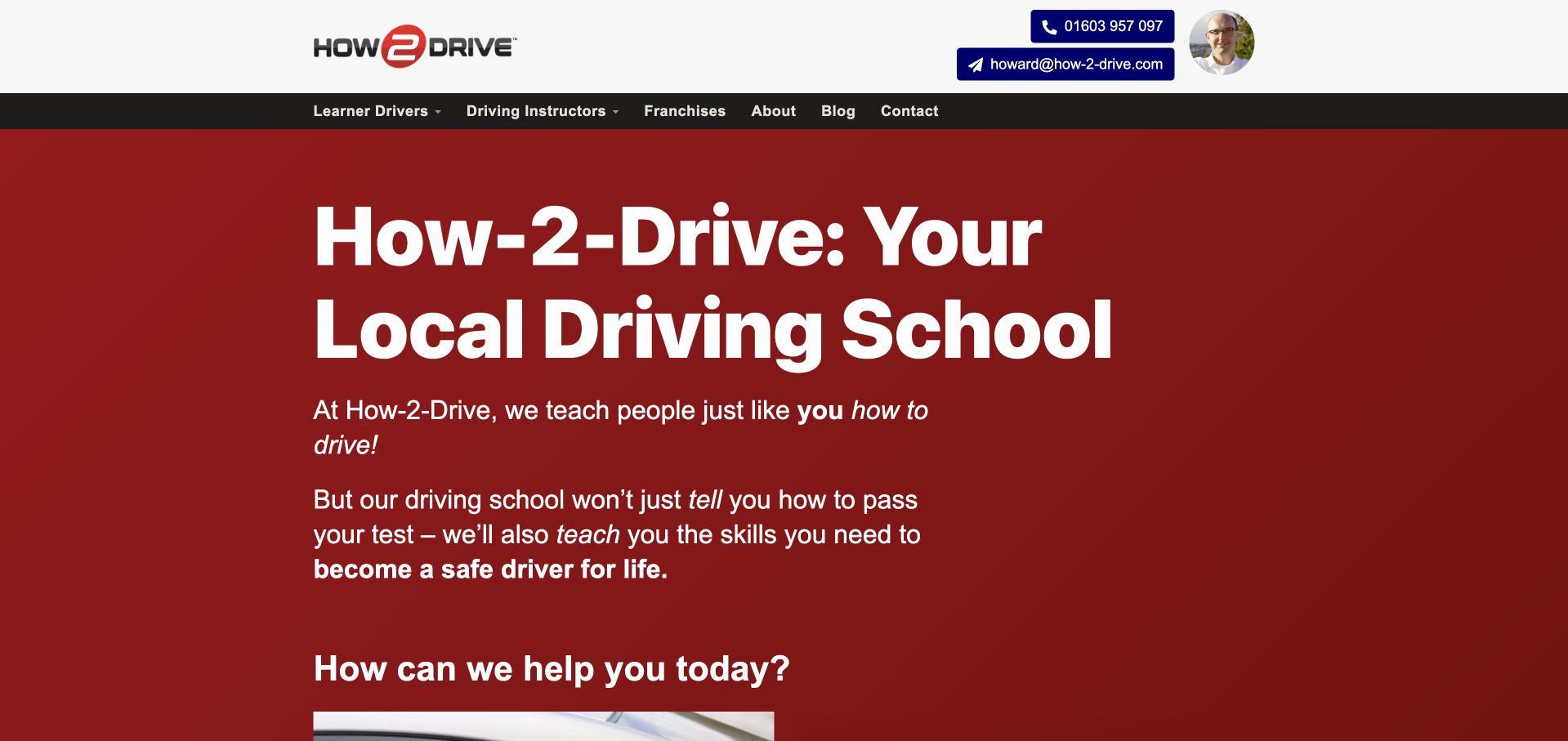
How-2-Drive presents a large white-on-red introduction beneath direct phone and email details. Its next decision separates learning to drive from teaching others, then distinguishes weekly lessons and intensive courses from instructor training and franchises. A first-lesson promotion includes an exclusion for learners who already hold a full licence or have a practical test booked. The booking copy also explains that the school will call back to arrange the lesson, which is more accurate than implying instant confirmed availability. The very large introduction delays those practical choices, while the word local appears before the opening identifies a specific service area. The layout could reach the useful audience split sooner.
What you can learn
Explain whether a booking action reserves a time or starts a callback. Place offer exclusions beside the promotion, and pair local positioning with a named service area before expanding into separate learner and instructor routes.
Pros
Learner and professional-training routes are clearly separated.
The first-lesson offer includes exclusions and a callback explanation.
Cons & considerations
The oversized introduction delays the useful choices.
The opening calls the school local without naming its coverage.
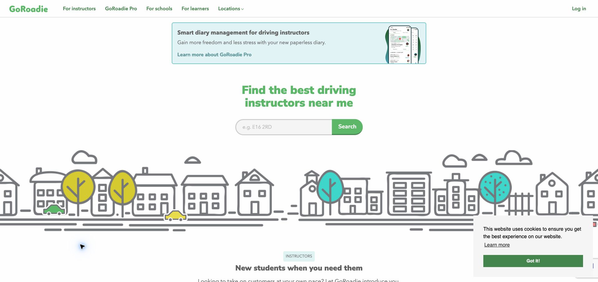
GoRoadie uses a light green identity, a simple postcode search, and an illustrated neighborhood to introduce instructor discovery. The navigation explicitly separates instructors, schools, and learners, making the platform's different audiences visible. The homepage also promotes diary software above the learner search and then moves into instructor lead-generation benefits below it. That produces an uneven learner journey: someone searching for a lesson encounters professional software and referral-pricing content before much explanation of their own comparison process. A cookie notice remains at the bottom corner of the retained capture. The page is best understood as a marketplace and instructor-tool example, rather than a single school's enrollment page.
What you can learn
A two-sided platform should maintain a clear path for each audience. Keep learner search and its next-step explanation together, and move instructor software or acquisition pricing into an explicitly labeled professional section so visitors do not have to filter irrelevant offers.
Pros
The navigation names the platform’s different audiences.
The postcode finder is simple and visually distinct.
Cons & considerations
Instructor software is promoted before learner discovery.
Professional referral content interrupts the learner’s main page sequence.
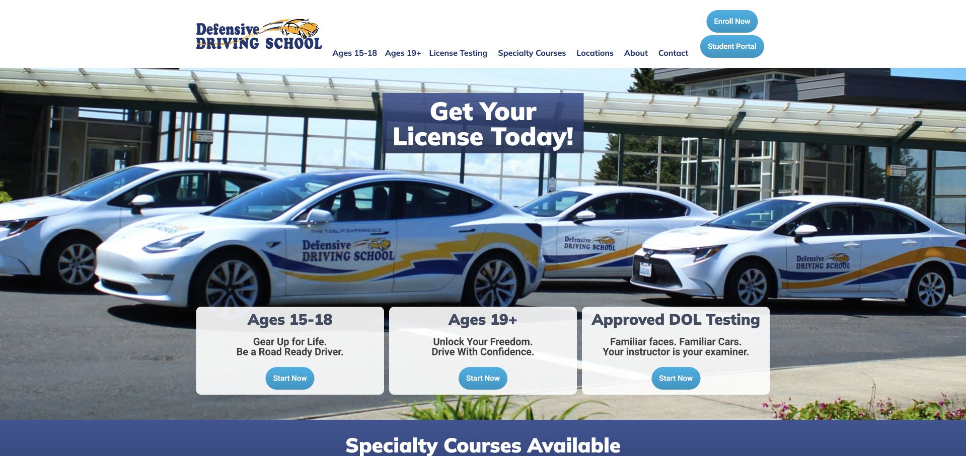
Defensive Driving School places three large cards over a photograph of its training cars: ages 15–18, ages 19 and older, and licence testing. The same distinction appears in the header, while specialty courses are listed beneath the hero. This is a useful information structure because age and current stage can change the service a visitor needs. The headline about getting a licence today is broader than the actual education and testing prerequisites, so it would benefit from more precise framing. Every card also uses the same Start Now action rather than naming the destination. A long specialty list adds breadth but could be grouped by learner need.
What you can learn
Use age and current licensing stage when they materially determine the available service. Label each action with its specific destination, and keep headline promises consistent with the preparation and eligibility required before testing.
Pros
Three opening cards distinguish age groups and testing.
Specialty training remains discoverable beneath the main routes.
Cons & considerations
The immediate-licence headline needs clearer qualification.
Identical Start Now labels obscure differences between destinations.
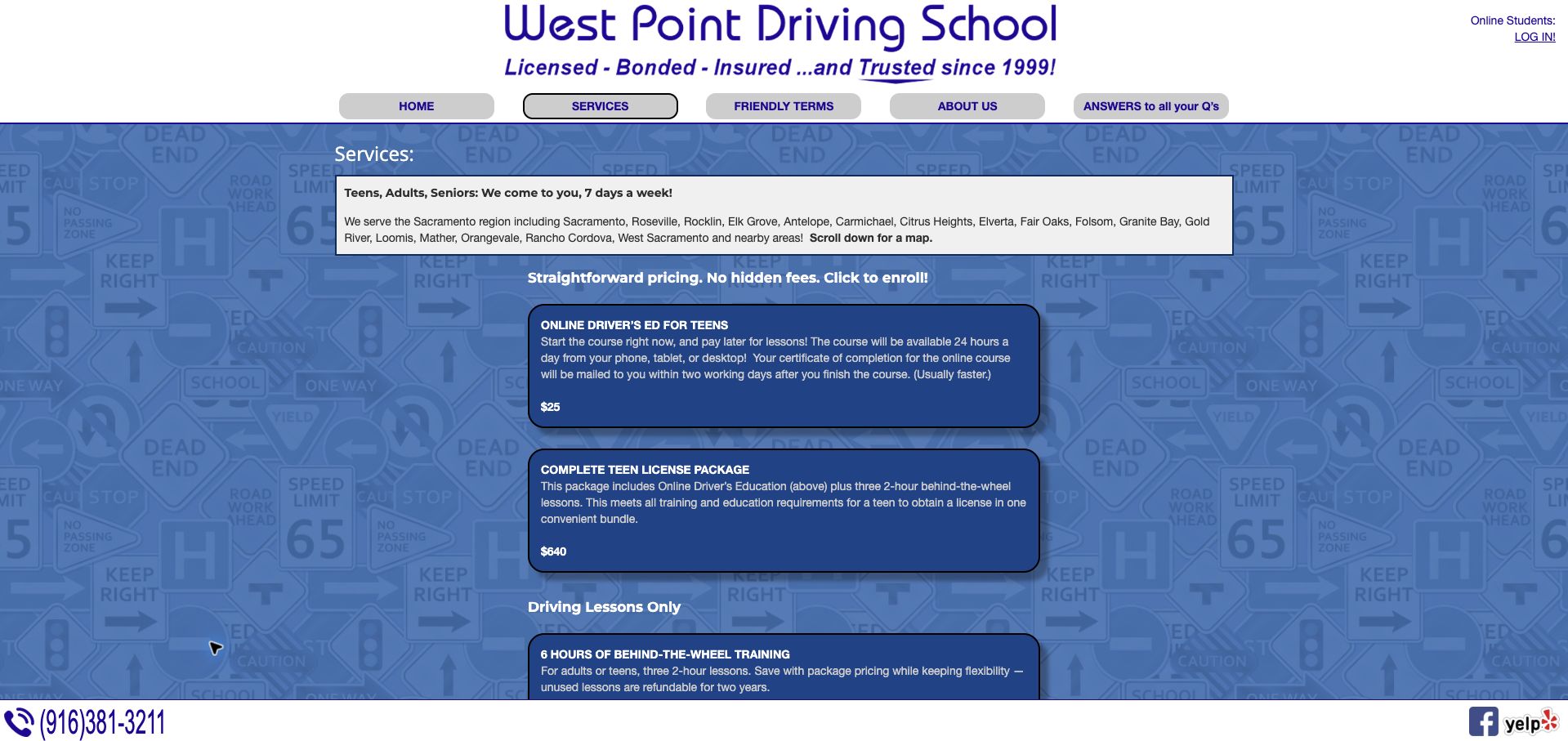
West Point's service page begins with the geographic coverage and pickup promise, then presents priced blocks for online education, a combined teen package, and practical lessons alone. The distinction between classroom content and time in the car is explicit, and lesson counts are paired with two-hour durations. A later package description also states a refund window for unused lessons, helping explain the commitment. The road-sign patterned background and narrow, small-text cards make the page visually dense despite the useful content. Enrollment is implied through clickable blocks rather than strongly differentiated buttons, and the long service-area paragraph would be easier to scan as a concise geographic summary.
What you can learn
Separate online education from practical instruction and show hours, lesson count, and refund conditions beside each price. Give enrollment a recognizable action and keep decorative backgrounds from competing with the operational information people need to compare.
Pros
Packages distinguish online education from practical lesson hours.
Unused-lesson refund terms appear in the package description.
Cons & considerations
The patterned background competes with small card text.
Enrollment actions are less obvious than the package descriptions.
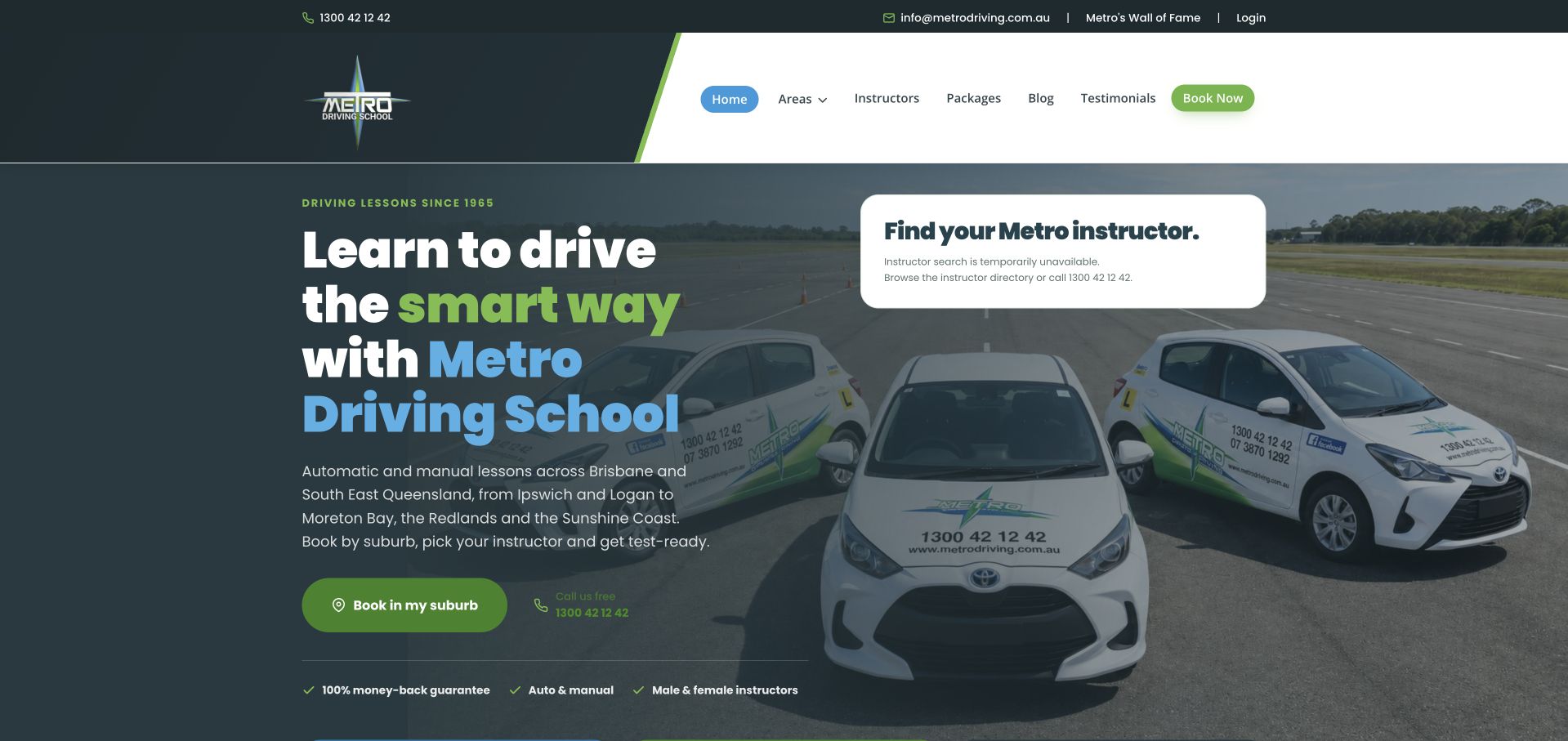
Metro combines a dark fleet photograph with a clear regional description and a suburb-based booking action. During this visit, the instructor-search panel explicitly reported that search was unavailable and pointed visitors to a directory or phone support. That is a useful failure state, although it still interrupts the intended first task. The body offers strong alternatives: beginner, skill-building, instructor-choice, and test-preparation routes, followed by package cards with lesson quantities, prices, and inclusions. The long page repeats instructor and trust themes in several places. Its prominent money-back guarantee also needs directly accessible conditions so the reassurance can be understood alongside the package commitment.
What you can learn
Design an actionable fallback for an unavailable finder, then preserve the rest of the purchase information on the page. Use consistent package fields and attach guarantee conditions to the offer rather than relying on a repeated reassurance badge.
Pros
The unavailable search state names directory and phone alternatives.
Package cards include quantities, prices, and practical inclusions.
Cons & considerations
The main instructor-search feature was unavailable during review.
Repeated trust sections and a lightly qualified guarantee lengthen the journey.
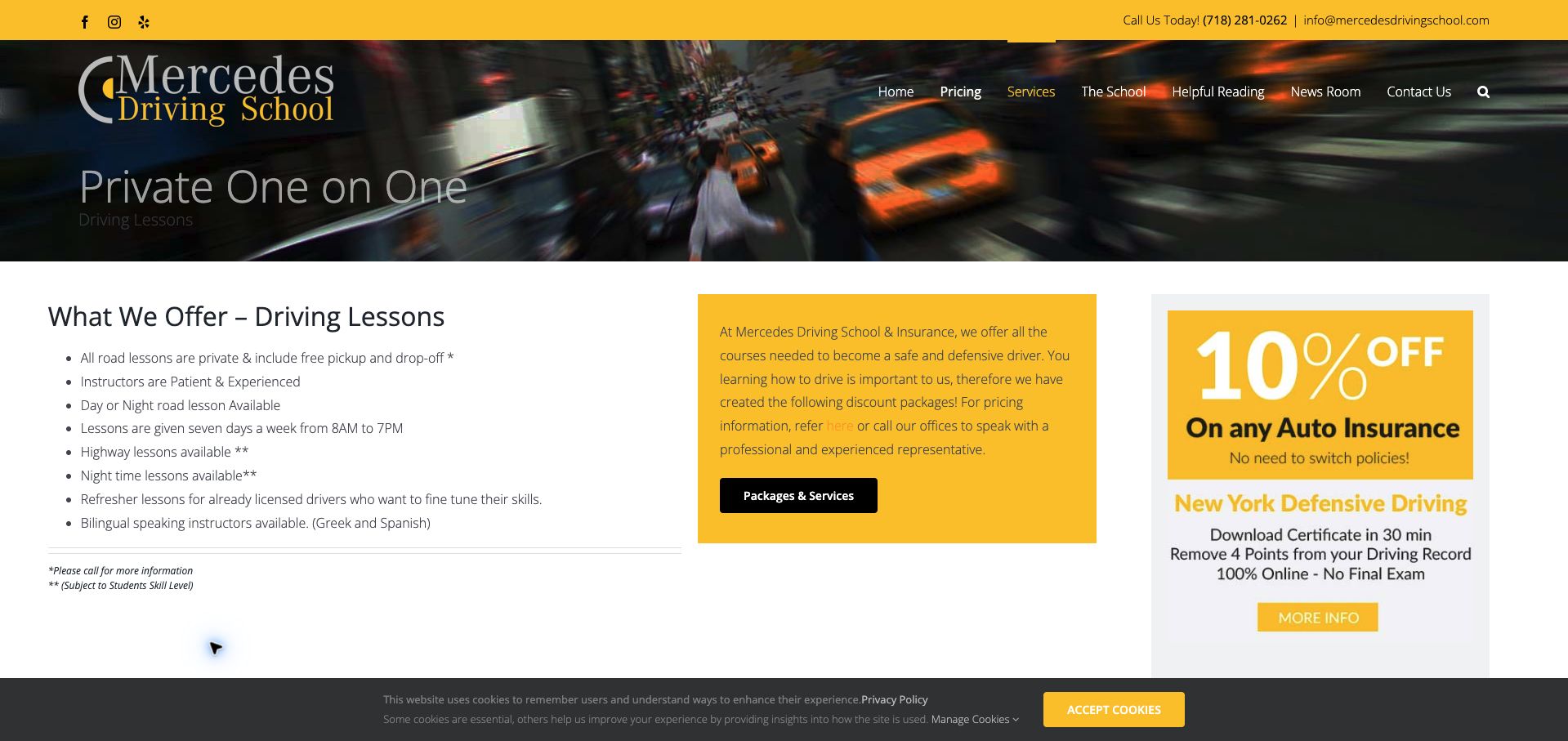
Mercedes Driving School's lesson page uses a yellow-and-black identity and a compact list of service facts. Private lessons, pickup, seven-day availability, refresher training, and language options are grouped in one readable column. Highway and night lessons carry a skill-level qualification, which is important context rather than a universal promise. A neighboring yellow panel links to packages and pricing, while an insurance-course promotion occupies a third column. The three-column composition spreads attention across different services, and the main lesson heading has weak contrast over a dark traffic image. Pickup details also defer to a phone call instead of describing the coverage directly on this otherwise practical page.
What you can learn
Use a short specification list for lesson logistics and place conditions beside advanced options. Keep pricing and pickup coverage attached to the same service, and give unrelated courses less visual weight than the learner's immediate decision.
Pros
Lesson timing, languages, and refresher options are grouped clearly.
Advanced lesson options carry a skill-level qualification.
Cons & considerations
The heading has weak contrast over the traffic image.
Pickup conditions require a call while another course competes beside the lesson offer.
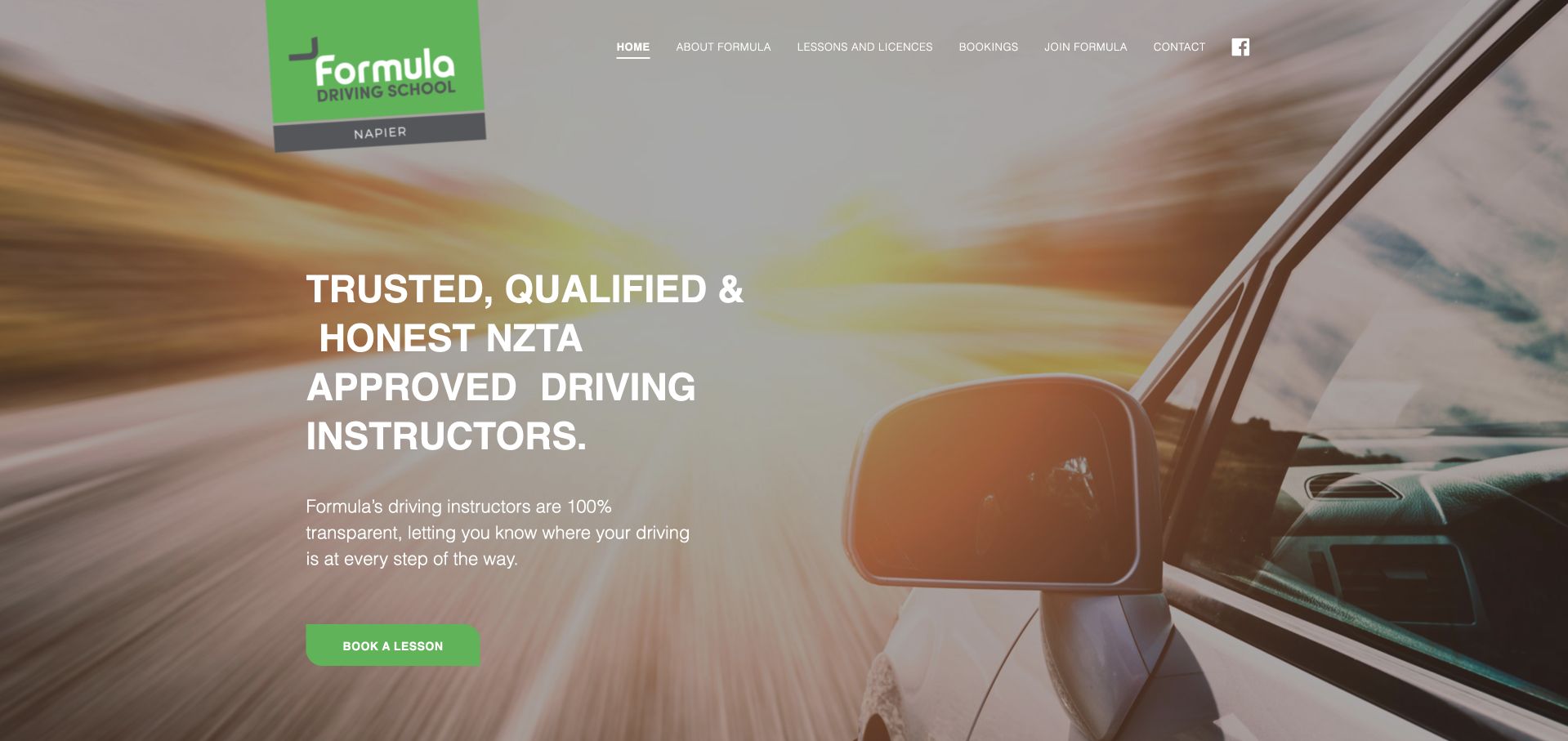
Formula uses a green logo and action button over a large sunset driving image. The header separates lessons and licences from bookings, and the body explains a practical distinction: returning learners can text a preferred time, while new learners complete a short enquiry and wait for a response. That helps prevent an enquiry from being mistaken for a confirmed reservation. The photographic opening is less informative about the school's location and prices, with Napier appearing mainly in the logo. White text also sits over a pale, busy image. Repeated descriptions of the freedom of driving take up space that could instead explain service coverage, lesson duration, and availability.
What you can learn
A small school can keep personal scheduling while explaining exactly what happens after an enquiry. State the service area, duration, and typical response process close to the booking action, and keep essential text on a consistently readable background.
Pros
New and returning learners receive different booking instructions.
Lessons and licensing information have a distinct navigation route.
Cons & considerations
Location and pricing are not clear in the main opening copy.
Pale photography and repeated aspirational text reduce practical clarity.
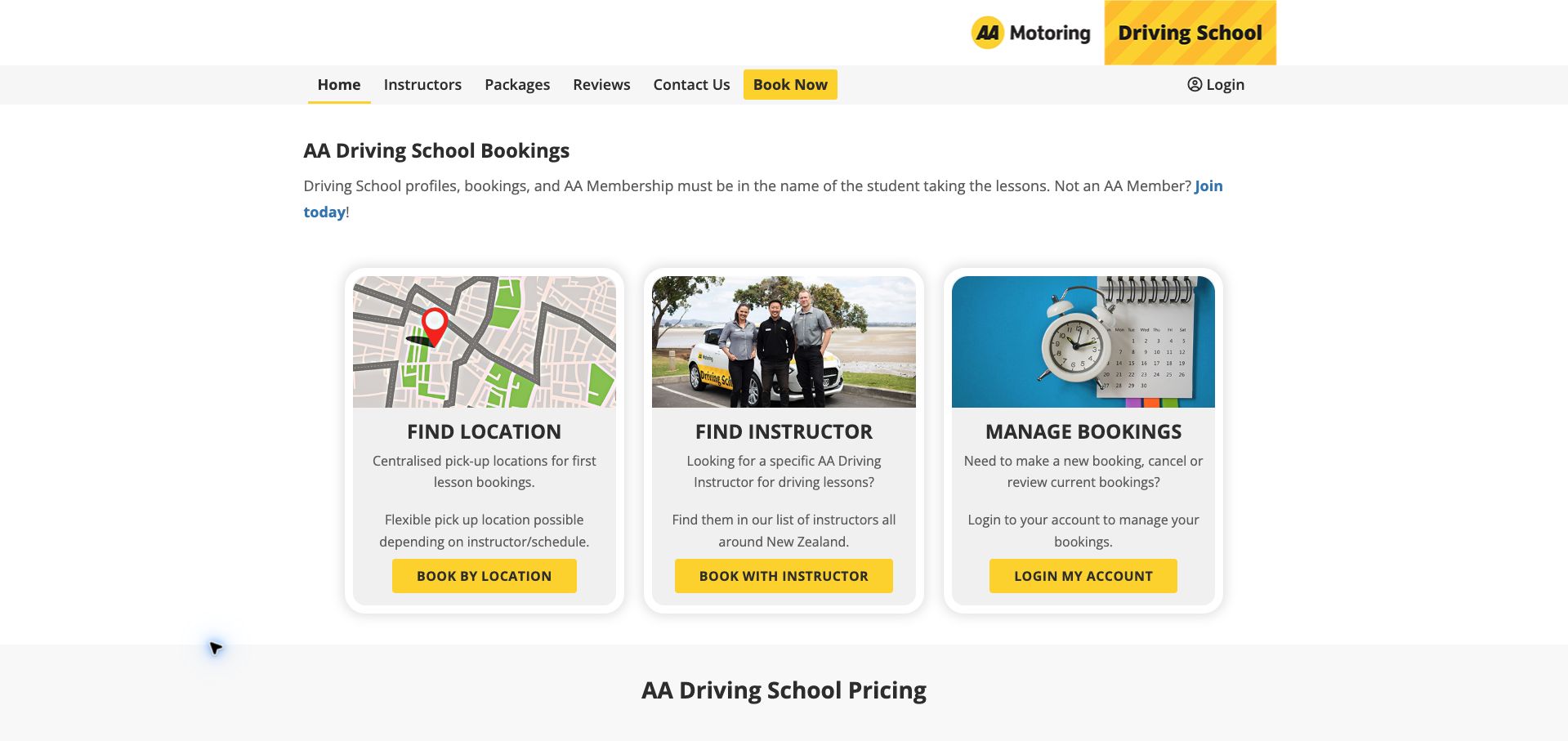
The New Zealand AA booking homepage is organized around three cards: find a location, find an instructor, and manage bookings. The location card explains that first lessons use centralized pickup points, with flexibility depending on the instructor and schedule. An opening note also specifies whose name belongs on the student profile. Below, package cards repeat lesson duration and member versus standard prices, making the financial distinction easy to compare. The page is operationally useful but visually repetitive, with similar card shapes and repeated booking labels. The introduction promotes membership before fully explaining its relationship to lesson purchase, so nonmembers must read the pricing comparison to establish their options.
What you can learn
Separate new bookings from account management and support both location-led and instructor-led selection. Put pickup rules and profile requirements before the booking flow, and show member and nonmember prices together without implying that membership is required.
Pros
Three cards distinguish location, instructor, and account tasks.
Pickup conditions and member versus standard prices are explicit.
Cons & considerations
Repeated card styling and booking labels flatten the hierarchy.
Membership promotion precedes a clear explanation of nonmember options.
Kegan is a freelance web designer and developer with 15+ years of experience helping businesses turn complicated website requirements into clear, maintainable digital experiences. He works directly with clients from planning and design through development, launch, and ongoing support.
For driving school website design, his development approach focuses on lesson and license pathways, instructor information, price conditions, service-area details, and lesson booking. The scope can be a targeted improvement or a complete custom build, with responsive layouts, thoughtful content structure, and integrations chosen around the people using and maintaining the site.
Show 3 other driving school website designersHide other driving school website designers
Record which areas and lesson types each instructor serves. Explain reassignment and contact processes without presenting a broad coverage map as a guarantee of immediate availability.
Write package conditions
Define duration, expiry, cancellation, pickup exclusions, and test-day vehicle arrangements where applicable. Put the relevant conditions next to the price comparison.
Test a new learner’s path
Check that a visitor can identify the appropriate lesson, understand the total stated commitment, and find a suitable area before entering personal information.
The editing job behind the design
Choose systems the team can keep accurate
Use maintained lesson and coverage records connected to scheduling. Avoid copying changing prices into several campaign images.
Keep legal requirements linked to the relevant public authority and operational policies under school ownership. Public design references do not establish licensing compliance.
Our WordPress website examples offer a separate look at publishing approaches. A visible platform label is evidence for that named page, not a guarantee that the same system will suit your requirements.
Before the public launch
Website planning checklist
State lesson duration.
Identify transmission options.
Explain pickup coverage.
Qualify package savings.
Publish expiry conditions.
Describe cancellation terms.
Link relevant official requirements.
Distinguish credit from a slot.
Maintain instructor availability.
Test the mobile booking path.
These checks are a project checklist, not a performance, legal, security, or accessibility certification. Test real journeys with the people responsible for the website before making claims about the result.
Sources & editorial method
How this collection was selected and reviewed
These 27 examples match the collection target saved before research. Public pages were directly opened and visually inspected; the pictured source and capture date identify the reviewed state. Reused captures retain their earlier dates. Each source also has a bounded public stack-audit attempt, with inaccessible and unknown results kept explicit. Editors Choice recognizes website design and information, not service quality or promised outcomes. No purchases, bookings, applications, or private forms were submitted. Images and trademarks belong to their owners.
Each example links to its actual source page. Screenshots are direct browser captures with their own capture dates; moving imagery, announcements and live designs can change. The notes describe observable design choices and conditional tradeoffs, not measured traffic, conversion results, service quality, or accessibility conformance.
Technology labels use public page metadata, asset evidence, or explicitly cited platform documentation. Platform documentation is not a complete current deployment audit. A component reference may be legacy or unused; it is not a complete backend inventory. Unknown stacks are omitted. These sites are editorial examples, not our client portfolio.
Written, Edited and Curated are separate editorial records, not timestamps advanced by a rebuild. Website designs and imagery belong to their owners. See our editorial standards or suggest a correction.
Questions worth asking
Driving School website design questions
What should a lesson price include?
The lesson duration, relevant vehicle or transmission, location conditions, and important exclusions. Explain package totals and expiry separately.
Can a national page explain every licensing requirement?
Only with accurate location-specific guidance. Link the responsible authority and identify which rules apply to the visitor’s area.
How should gift or prepaid lessons work online?
Explain whether the purchase creates credit, how it is redeemed, and any expiry or eligibility conditions before checkout.
Do pass-rate claims prove teaching quality?
A homepage claim alone does not establish its methodology or individual outcomes. This collection evaluates the website’s presentation and information.