Best Tea Brand Websites of 2026 (29 Real-World Examples)
Tea brand websites that turn flavor, format and ritual into clear choices
Explore 29 tea brand website examples, with practical lessons for product discovery, gift shopping, brewing guidance and the balance between brand storytelling and everyday buying.
Tea is easy to photograph beautifully and surprisingly difficult to describe well. A shopper may know a favorite box, a flavor preference or a preparation method without knowing the name of the blend they need. Another visitor may be buying a gift for someone whose caffeine preferences they do not know. A useful tea website translates that uncertainty into clear choices: tea type, ingredients, flavor, format, quantity and preparation.
The examples in this collection range from familiar boxed-tea brands to specialist importers and heritage tea houses. Some lead with direct shopping, while others act as broader homes for education, hospitality or trade. Seasonal campaigns were prominent during the review, but the most reusable lessons sit beneath them: recognizable packaging, useful product cards, sensible category boundaries and a dependable route from an attractive image to the facts needed for a purchase.
Before the examples
What makes good tea brand website design in 2026?
Explain what the tea tastes like
Use concise, consistent flavor descriptions alongside the actual tea type and ingredients. A poetic blend name can establish character, but it should not be the only information available to someone choosing an unfamiliar product. Distinguish descriptive tasting notes from ingredients that are actually present.
Make format and quantity comparable
Loose leaf, sachets, tea bags, tins, refills and gift boxes answer different needs. Show the relevant weight or count before a visitor reaches checkout. If servings are estimated, explain the preparation assumption rather than presenting incompatible quantities as equivalent.
Support gifts without hiding everyday tea
Gift shoppers may need budget, recipient preference, presentation and delivery information. Repeat buyers need stable search and category routes. A seasonal campaign can serve the first audience while predictable navigation and product cards continue to serve the second.
Connect atmosphere to useful detail
Photography can show color, packaging and the ritual of preparing tea. Pair it with readable text, a specific action and nearby product information. Ingredient or wellness language needs an appropriate explanation; a visually persuasive campaign is not evidence of a health outcome.
The collection · 29 examples
29 tea brand websites worth studying
Compare how these 29 brands introduce their tea, organize large assortments and support different shopping intentions. The collection presents observed design patterns and tradeoffs, rather than a ranking of tea quality or business performance.
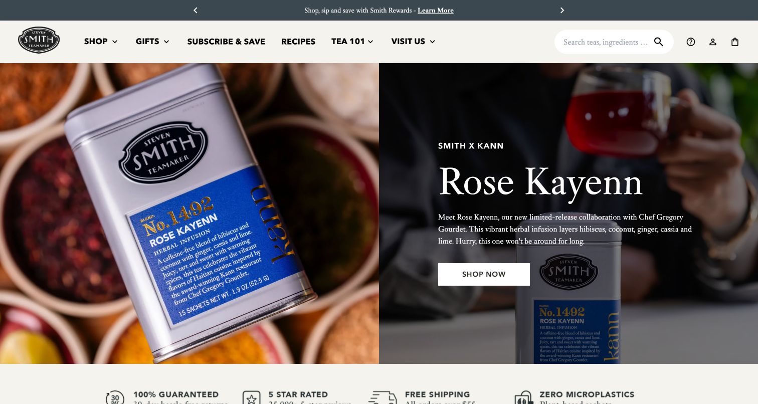
Smith Teamaker introduces a seasonal collaboration through close photographs of a tin, spices and poured tea. The accompanying copy names the collaboration and describes its ingredient direction, giving the campaign more substance than a purely atmospheric slogan. The cream header keeps recipes, Tea 101 and visiting information alongside the shopping and subscription routes. Below the hero, seasonal product cards carry labels and purchase controls, connecting the editorial story to an actual assortment. This is a useful model for a brand whose expertise is part of the product. The large photographic introduction and extensive product carousel still require deliberate pacing so visitors can compare items efficiently.
What you can learn
Make a collaboration explain the tea itself: ingredients, flavor and the reason for the partnership. Then connect that story to educational material and plainly labeled products instead of relying on personality alone.
Pros
The campaign connects its named collaboration to specific ingredients and tea imagery.
Recipes, introductory tea education and visit information broaden the shopping context.
Cons & considerations
Large photography postpones a compact view of the available seasonal products.
An extensive horizontal product carousel can make side-by-side comparison more laborious.
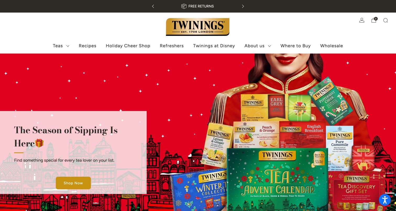
Twinings gives its holiday campaign a bright red stage, with a model carrying recognizable tea boxes and a translucent pink panel holding the invitation to shop. The centered gold wordmark and roomy white navigation retain a more traditional brand character around that energetic image. Below the campaign, best sellers return the visitor to named blends, packaging and prices. This is useful for customers who recognize a box from a store but do not remember every product detail. The navigation also makes recipes, wholesale and store discovery distinct destinations, allowing the retail catalog to sit within a broader brand website.
What you can learn
Use familiar packaging as a bridge between a seasonal story and everyday purchasing. Keep core blends and functional store information easy to reach when the campaign changes.
Pros
Recognizable tea boxes connect the campaign photograph with the products below.
Recipes, wholesale and store discovery have explicit destinations in the navigation.
Cons & considerations
The tall header and large campaign delay the first product comparison.
The busy photograph competes with the overlay's promotional text and button.
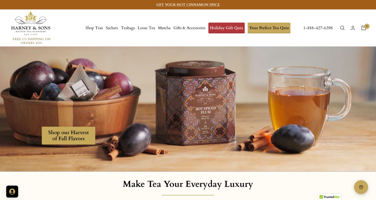
Harney & Sons combines a warm harvest photograph with a surprisingly practical header. Sachets, tea bags and loose tea are visible shopping distinctions, while gift and tea quizzes offer guided routes for visitors who have not chosen a blend. The seasonal image uses tea tins, fruit, spices and a cup to suggest flavor without replacing the product entirely with lifestyle imagery. Below it, collection links and brand assurances extend the story into shopping. The result serves an experienced customer looking for a particular format and a newcomer looking for help, although those many routes make the top of the page feel crowded.
What you can learn
Organize a large tea catalog around both format and uncertainty. A clear loose-leaf or tea-bag route can coexist with a quiz, provided their visual priorities remain easy to distinguish.
Pros
Format labels help repeat customers move directly toward a suitable preparation method.
Separate gift and tea quizzes acknowledge two different kinds of shopping uncertainty.
Cons & considerations
The dense header asks visitors to scan several competing discovery routes.
The atmospheric hero gives little product detail before its collection button.
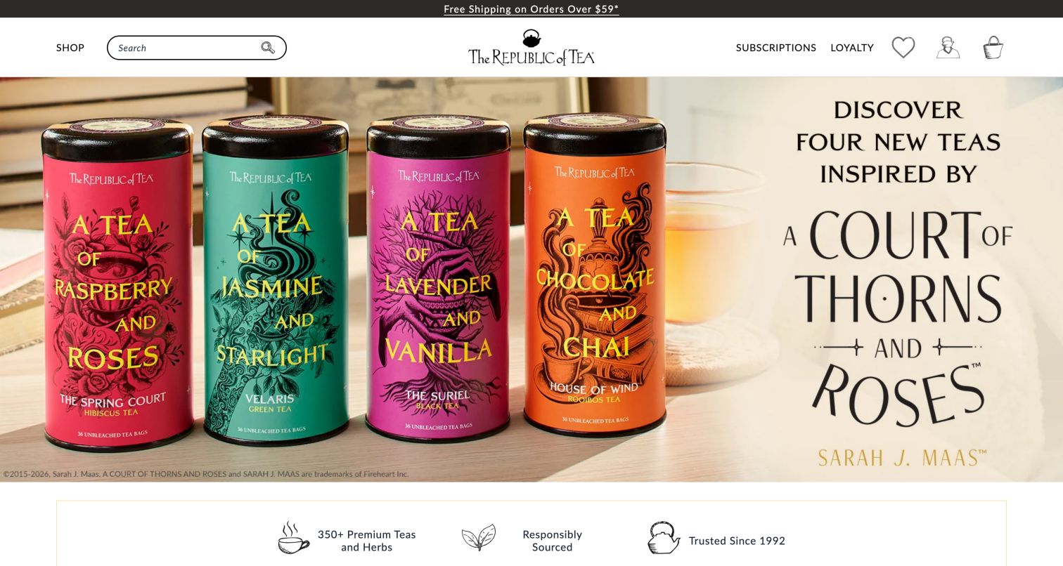
The Republic of Tea uses a literary collaboration as the main visual event, showing a row of colorful tins next to a large title treatment. The compact header preserves a conspicuous search field, while the product area below offers best-seller and seasonal tabs with product types and starting prices. Farther down, gift categories based on spending level provide a different way to narrow the assortment. That combination is valuable because someone arriving for a specific collaboration and someone buying an unfamiliar recipient a present need different entry points. The strong campaign identity, however, can temporarily make the wider tea range feel secondary.
What you can learn
Support a highly specific collaboration with ordinary shopping tools. Search, product-type labels and budget-based gift categories let visitors use the collection even when they do not share the campaign's fandom.
Pros
Large tin photography makes the collectible packaging central to the campaign.
Budget-oriented gift categories offer a useful alternative to browsing tea types.
Cons & considerations
The oversized collaboration takes substantial space before the wider product range.
Several header functions rely on outline icons that deserve clear accessible names.
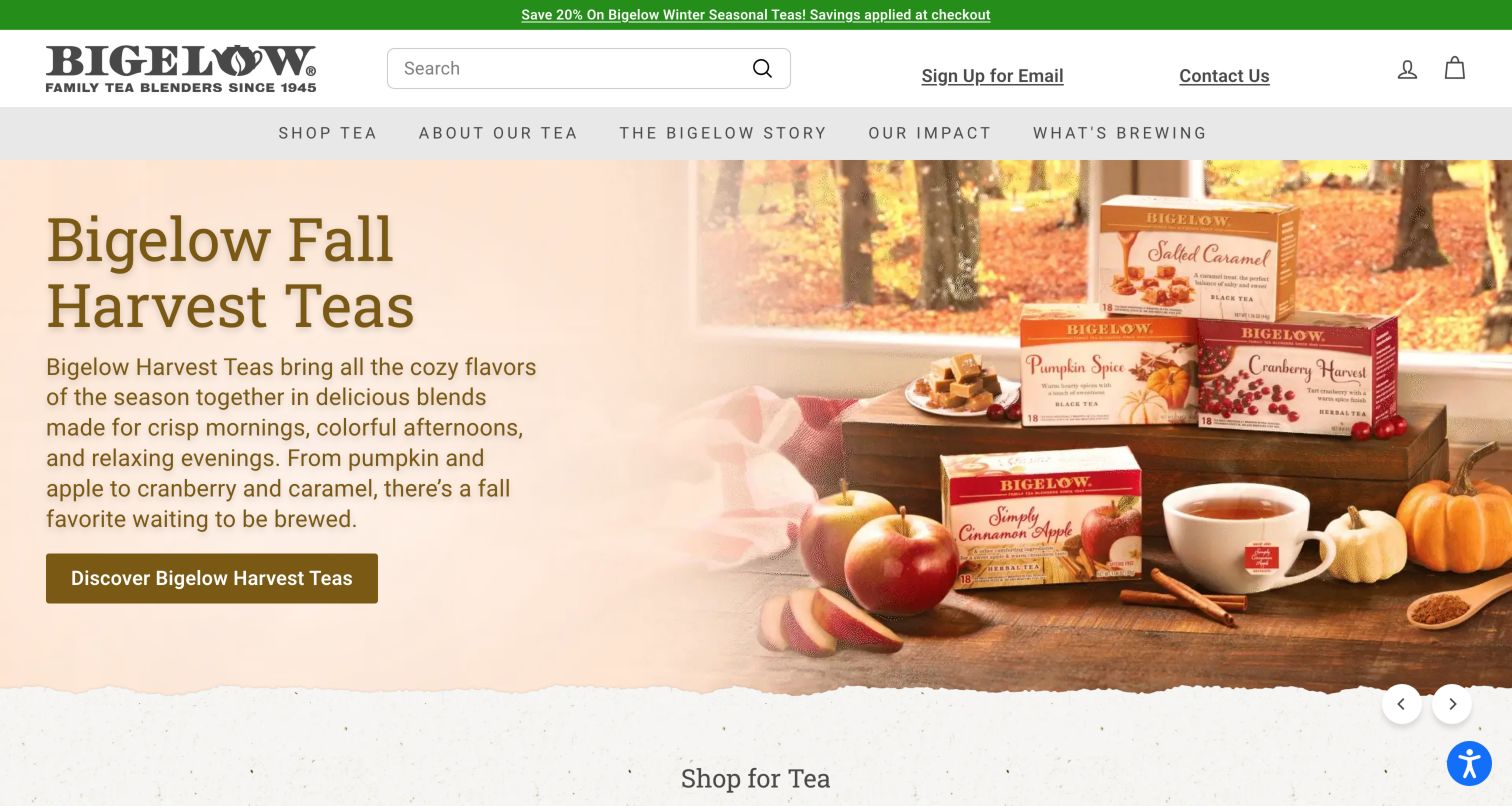
Bigelow places a long search field in a functional header above navigation for tea, company history, impact and editorial material. Its fall campaign pairs a peach text panel with a photograph of boxed tea, a cup and pumpkins. The product remains recognizable within the seasonal setting, which helps the image behave like an expanded shelf display. Tea-type categories below provide a simpler route back to black, green, herbal and cold-infusion options. The seasonal description is relatively long for a hero, and the carousel introduces several other campaigns, so visitors who already know what they want benefit from the persistent search more than from browsing every slide.
What you can learn
Give familiar retail products a clear online finding mechanism before adding seasonal storytelling. Packaging recognition and a prominent search field can do more practical work than another campaign slide.
Pros
A large search field is easy to locate above the promotional content.
Box photography preserves the connection between online browsing and store shelves.
Cons & considerations
The long seasonal paragraph reduces the speed of scanning the hero.
Multiple carousel campaigns add choices before visitors reach the simpler tea categories.
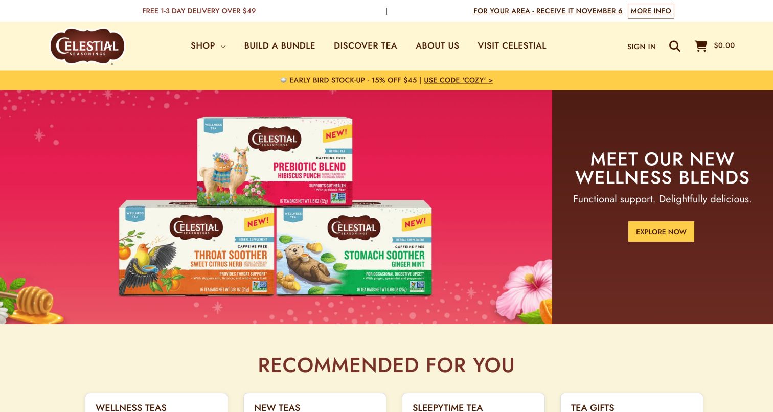
Celestial Seasonings carries its illustrated packaging into a cheerful cream, yellow and brown interface. The observed hero places brightly colored boxes beside a short introduction to a new blend group, followed by a clear collection action. Recommended products and tea collections then use recognizable families such as Sleepytime alongside broader categories like herbal or black and green tea. This structure helps someone navigate through remembered packaging as well as through tea terminology. It also mixes several classification systems: named families, preparation style and wellness-oriented positioning. Those routes can be helpful, but the product page still needs to explain ingredients and caffeine without depending on the category name.
What you can learn
Use memorable packaging families as shortcuts, then connect them to consistent product information. A customer recognizing an illustration should still be able to compare ingredients, format and caffeine across the catalog.
Pros
Illustrated boxes give returning shoppers familiar landmarks within the collection grid.
A concise campaign action makes the featured product family easy to explore.
Cons & considerations
Named families and tea types share the taxonomy without being equivalent categories.
Wellness-oriented labels need careful supporting product information beyond the promotional headline.
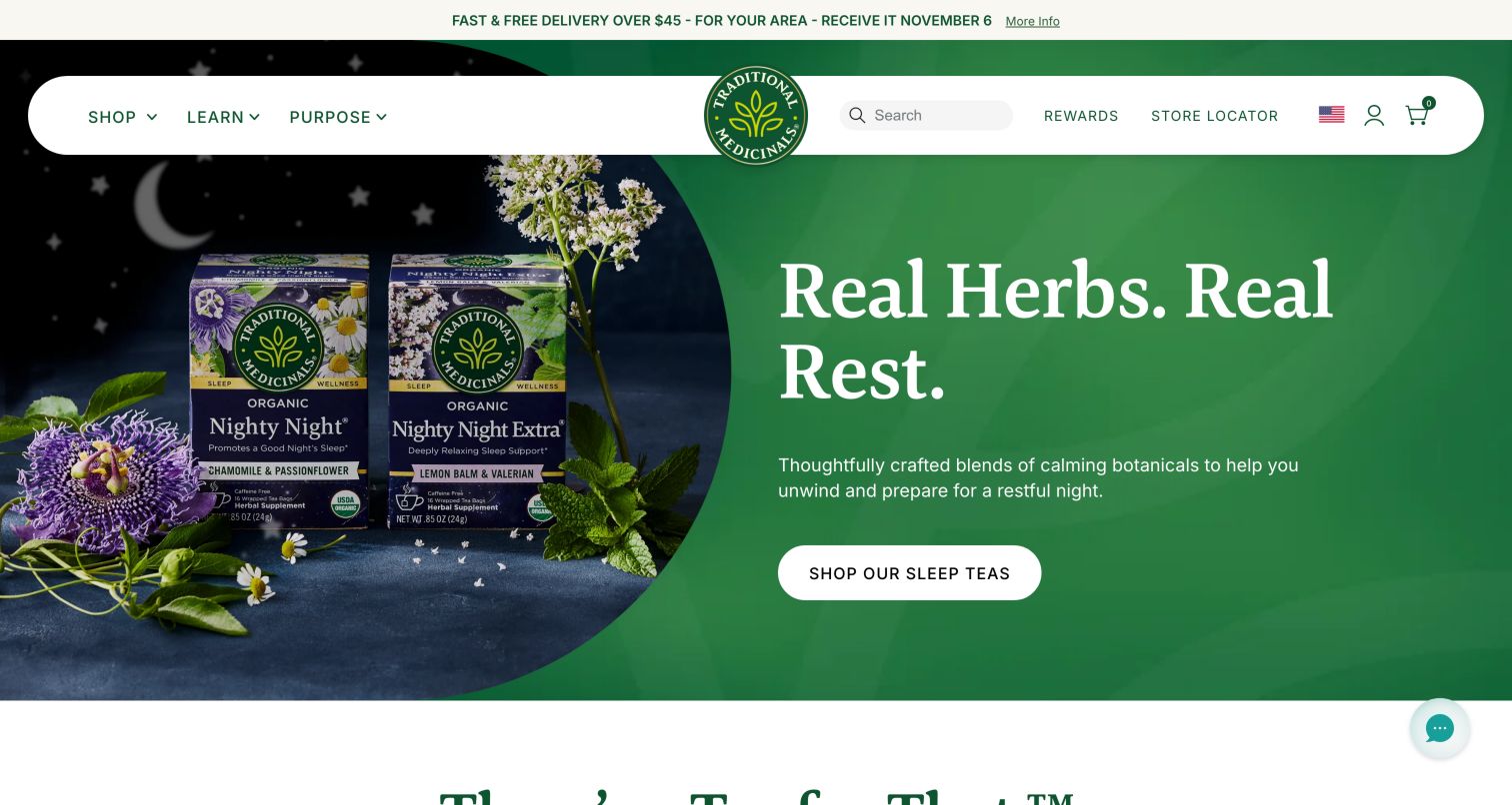
Traditional Medicinals presents a dark green seasonal scene framed by a rounded white navigation bar. Botanical imagery and tea boxes sit beside a large serif headline, making the ingredient story part of the visual identity. Below the hero, intention-based tabs organize the range around topics such as relaxation or digestion, while Learn and Purpose remain separate top-level destinations. This is a useful distinction between choosing a product and understanding the brand's approach. The same structure also creates a responsibility to explain the boundaries of promotional language. A design review can recognize the navigation pattern without treating any suggested health outcome as an independently verified product benefit.
What you can learn
Keep goal-based browsing connected to clear ingredient, caffeine and preparation details. Give educational and sourcing material its own route so a short campaign phrase does not carry the entire explanation.
Pros
The botanical palette and product photography create a coherent herbal-tea identity.
Separate learning and purpose routes make deeper supporting material discoverable.
Cons & considerations
Goal-based category names need more context than a short promotional label provides.
Tea and adjacent product formats require explicit distinctions within the shopping experience.
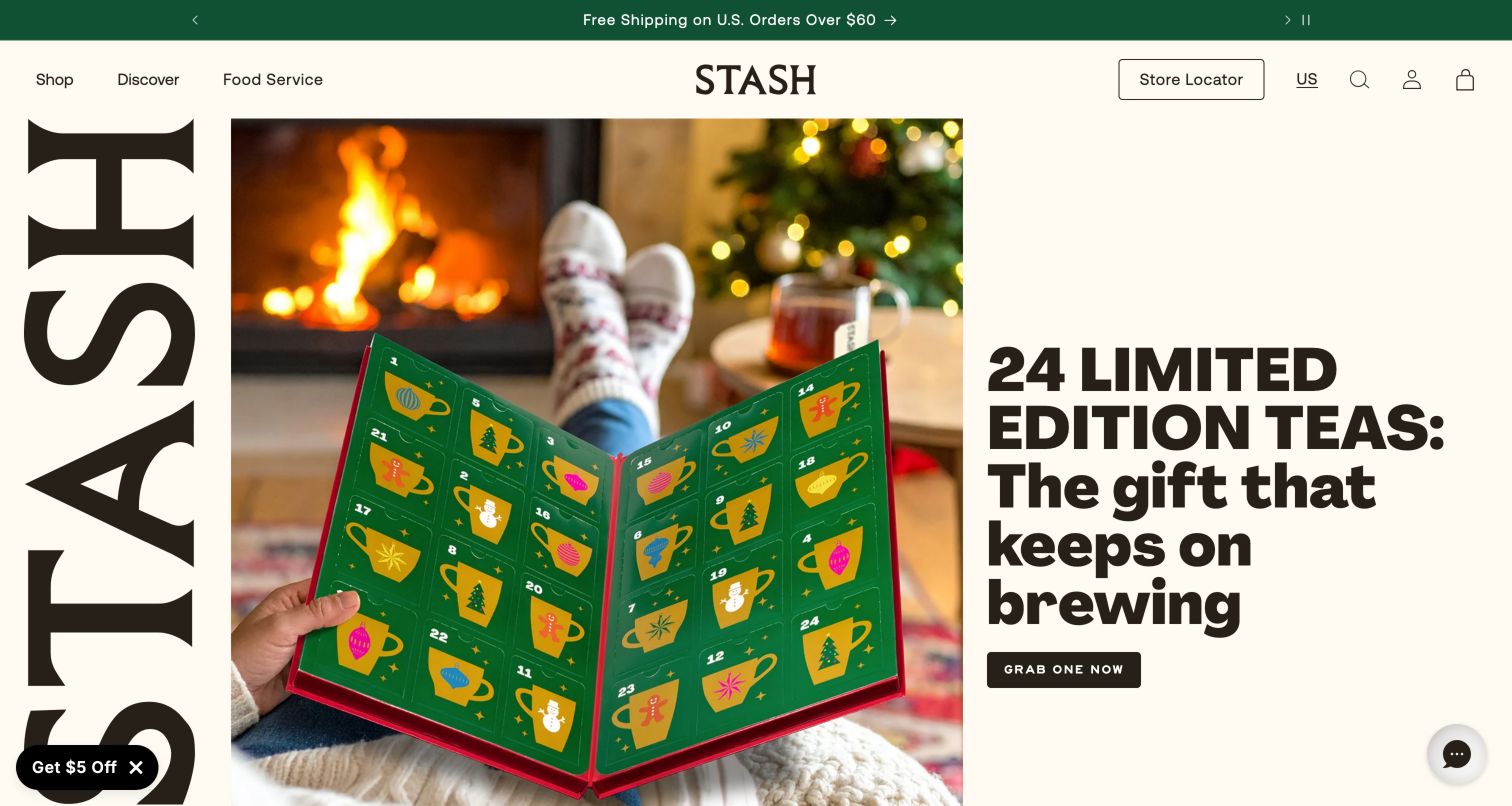
Stash turns the first screen into an editorial composition: huge vertical brand lettering, a central advent-calendar photograph and an oversized headline occupy three distinct columns. A compact header still keeps Shop, Discover, Food Service and the store locator recognizable. The photograph shows the gift in use rather than presenting only a flat package. Below that dramatic introduction, best-seller cards become more practical, identifying caffeine status, pack quantities and purchase controls. The contrast is useful: personality attracts attention, while the cards answer routine buying questions. The initial promotional popup interrupted that composition during the visit and was dismissed before the selected screenshot was captured.
What you can learn
Pair expressive campaign art with predictable product-card information. A bold brand system works best when visitors can quickly move from its visual story to caffeine, quantity and price decisions.
Pros
The three-part hero gives the seasonal gift a distinctive visual presentation.
Product cards expose caffeine and pack choices close to the buying controls.
Cons & considerations
Oversized lettering leaves little room for product detail in the first screen.
An initial promotional popup interrupts the carefully composed campaign before browsing begins.
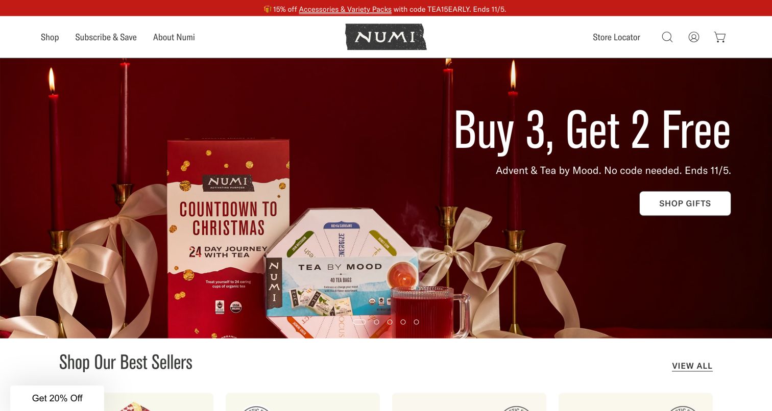
Numi surrounds a deep red holiday campaign with a relatively spare header: Shop, Subscribe and Save, About and Store Locator are easy to distinguish. The hero pairs gift and tea packaging with large offer text, nearby timing information and a direct shopping button. That proximity helps visitors understand the campaign without searching a distant banner for the basic conditions. Product discovery and the ingredient story continue below, giving the brand more depth than the initial promotion alone. The composition is clear, but the large offer naturally attracts attention before the sourcing or product narrative, and an introductory signup overlay adds another competing promotional moment.
What you can learn
Place the essential limits of an offer beside its action, then provide a stable path into the ordinary catalog. Promotional urgency should not be the only explanation of why a tea belongs in the range.
Pros
The main offer, timing information and action appear together in one area.
Store discovery and subscription shopping remain distinct routes in the simple header.
Cons & considerations
The large discount treatment dominates the first impression of the tea range.
The introductory signup overlay adds friction before the underlying campaign can be read.
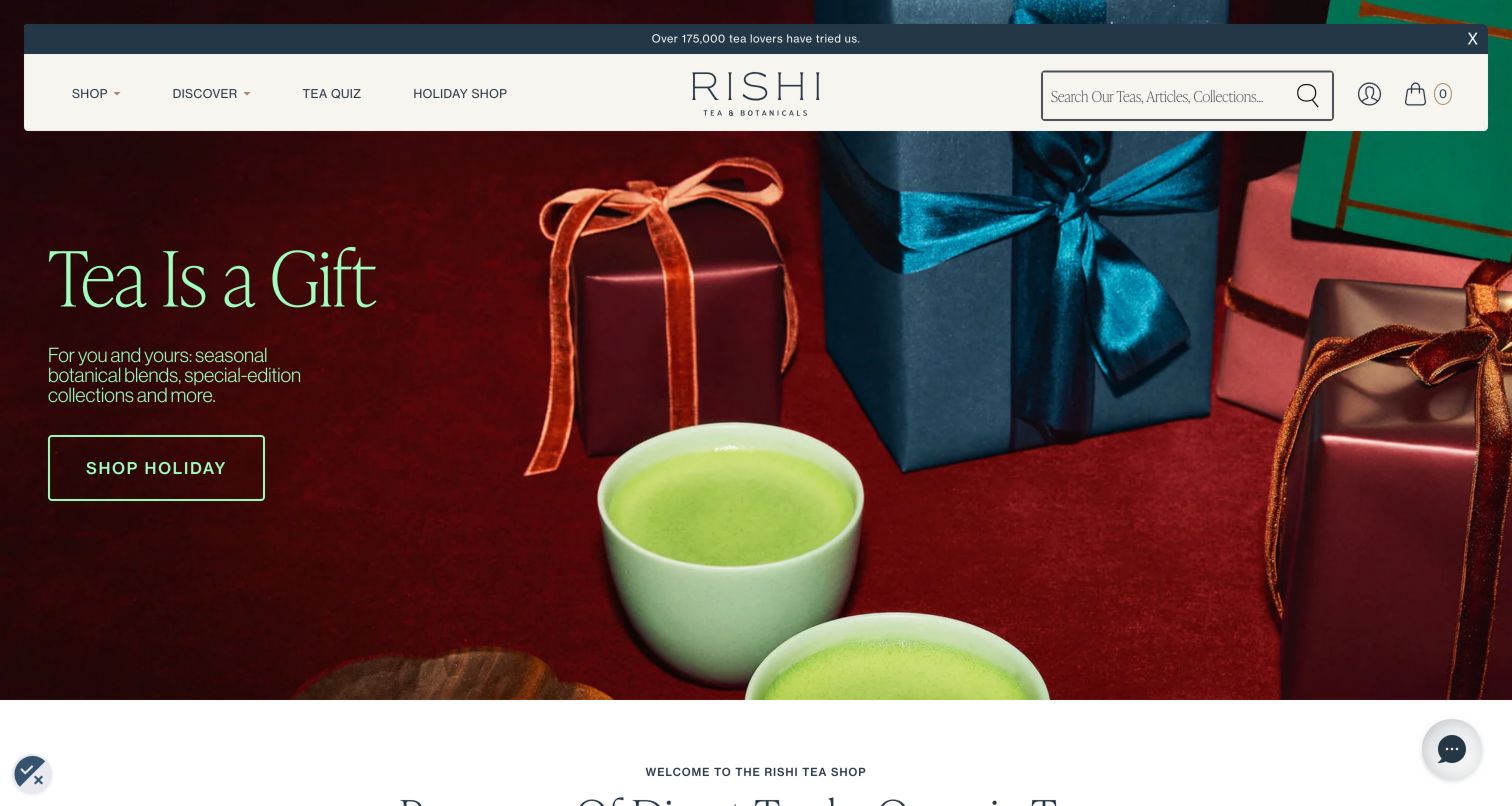
Rishi places pale green matcha cups and wrapped gifts against a rich red background, with a small amount of seasonal copy beside them. The floating white header exposes search and a tea quiz without requiring visitors to open the main shopping menu. Below the hero, featured-product tabs distinguish best sellers, new arrivals, matcha, caffeine-free options and gifts. Individual items use leaf photography and short flavor descriptions, giving shoppers more useful comparison material than a poetic blend name alone. This is a strong discovery pattern for an unfamiliar assortment. The initial full-screen rewards promotion, however, had to be dismissed before that catalog structure became visible.
What you can learn
Translate specialist products into concise sensory descriptions while preserving accurate tea-type labels. A quiz can guide uncertain visitors, but the ordinary product cards should also support an informed comparison without it.
Pros
Short flavor descriptions help shoppers compare unfamiliar teas without opening every product.
Visible search and a dedicated quiz provide two different routes into discovery.
Cons & considerations
The full-screen introductory promotion interrupts access to the catalog and campaign.
Seasonal gifting dominates the first view even for visitors seeking everyday tea.
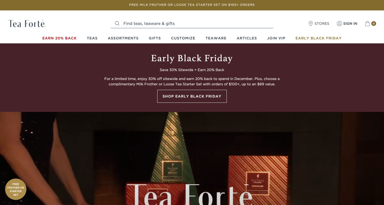
Tea Forté makes its search field a major part of the header, explicitly inviting searches across teas, teaware and gifts. The main navigation separates assortments, gifts, customization and accessories, which reflects the different decisions involved in buying a present. The observed campaign combines a broad burgundy offer area with large lifestyle imagery of gift sets and tea service. Below it, product and customization routes give the shopper more concrete choices. This structure is useful for a catalog where presentation matters alongside flavor. Its main challenge is promotional density: seasonal offers, rewards language and other incentives can demand as much interpretation as the products themselves.
What you can learn
For a gift-led catalog, distinguish the contents, presentation and customization choices. Keep promotional terms readable, but do not let several overlapping incentives displace the information needed to choose an appropriate gift.
Pros
The wide search field clearly covers teas, teaware and gift products.
Separate assortment and customization routes recognize different ways of building a present.
Cons & considerations
Several promotional messages increase the amount of offer information to interpret.
Large campaign imagery pushes detailed gift comparisons farther down the page.
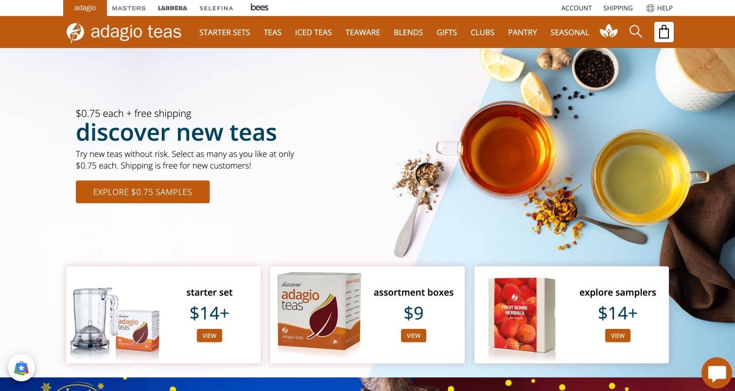
Adagio leads with an approachable sample offer, using cups and loose ingredients to show the product beside a plainly worded invitation to explore. Three product cards immediately below introduce starter sets and sampler formats with photographs and prices. The page then offers task-oriented shortcuts such as alternatives to a familiar drink, single-cup preparation and caffeine-free options. This creates several practical ways to begin without already knowing a tea name. The orange navigation is much denser, spanning tea, teaware, blends, gifts, clubs and adjacent brand destinations. The homepage therefore works best when its simple sampling route remains visually stronger than the surrounding catalog complexity.
What you can learn
Give uncertain shoppers a small, understandable first purchase. Sampling, starter equipment and plain-language preference categories can explain how to enter a specialist catalog without making a quiz the only available route.
Pros
Starter and sampler cards put tangible products directly beneath the introductory offer.
Everyday shopping intentions supplement the specialist tea and blend categories.
Cons & considerations
The many navigation tabs create a busy frame around an otherwise simple introduction.
Adjacent brand destinations can distract visitors before they understand the main assortment.
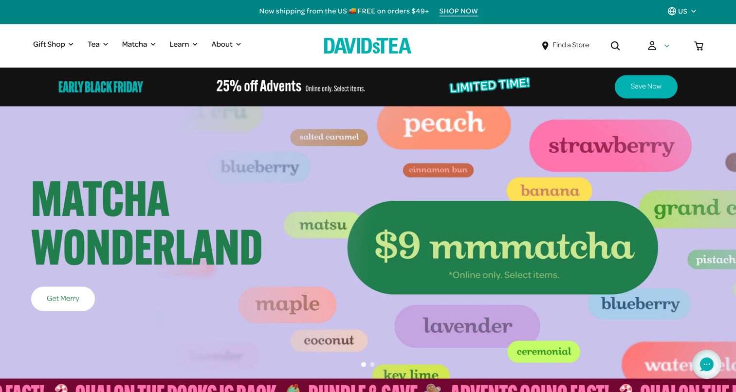
DAVIDsTEA uses bright seasonal color, playful lettering and flavor references to make its assortment feel exploratory. The captured matcha campaign combines a lavender background, a strong green headline and a direct seasonal action. Beneath the carousel, product tabs return to more concrete information: prices, sale comparisons, serving counts and review totals. Those details matter because decorative flavor names alone do not explain the size or value of a tea purchase. The header keeps Tea, Matcha, Gifts and learning content distinct, but several promotional strips and moving elements compete for attention before the visitor reaches those useful product comparisons.
What you can learn
Let playful flavor branding introduce the range, then anchor it in consistent quantity and serving information. Seasonal art can change often while the product-card structure remains familiar and easy to compare.
Pros
Serving information gives shoppers useful context beyond a decorative product name.
Separate tea and matcha routes make two major product families easy to locate.
Cons & considerations
Stacked promotional strips compete with the main campaign for attention.
Playful campaign buttons can be less explicit than a named product or collection action.
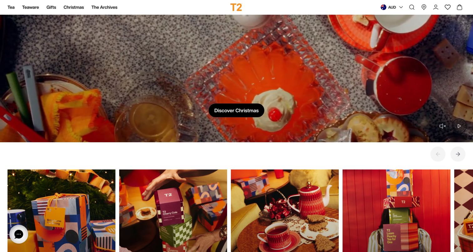
T2 uses a large holiday table scene to connect tea, gifts and brightly colored teaware. The compact white navigation keeps Tea, Teaware and Gifts distinct, while the orange wordmark remains recognizable against the cinematic image. Visible pause and sound controls acknowledge that the hero is moving media rather than a static banner. Below it, photographic category cards and separate new-tea and new-teaware sections turn the visual story into shopping routes. The approach suits a brand selling the setting around tea as well as the leaves themselves. It is less efficient for a visitor who wants to compare a particular blend immediately.
What you can learn
When accessories are central to the brand, show how tea and equipment belong together, then separate their shopping paths. Moving lifestyle imagery should have usable controls and should not be the only route into the catalog.
Pros
Tea and teaware share a coherent visual story without losing their category distinctions.
Visible playback controls give visitors a way to manage the large moving hero.
Cons & considerations
The immersive first screen delays the details needed to compare individual teas.
Some observed interface labels exposed translation-key wording and deserve localization review.
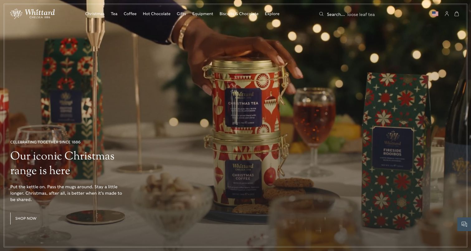
Whittard opens with an expansive Christmas table scene containing mugs, jars and gift packaging. A delicate white border and restrained serif text make it feel like a campaign film rather than a conventional product grid. The navigation makes the broader assortment explicit by separating tea, coffee, hot chocolate, gifts and equipment. Below the campaign, product cards, prices and quick-view controls offer a more practical shopping layer. This is a useful example of a brand organizing several related drinking rituals under one visual identity. The first screen is less effective for quick orientation because small white navigation and campaign text sit over a detailed moving background.
What you can learn
A multi-beverage store needs explicit category labels even when the campaign presents a unified lifestyle. Preserve strong text contrast and give visitors a direct path to the relevant drink category before they explore the seasonal story.
Pros
Tea, coffee and hot chocolate remain clearly separated in the main navigation.
Product cards below the campaign restore concrete prices and item-level shopping controls.
Cons & considerations
Small white text competes with detail and motion in the full-screen background.
The large campaign leaves little product-comparison information visible on initial arrival.
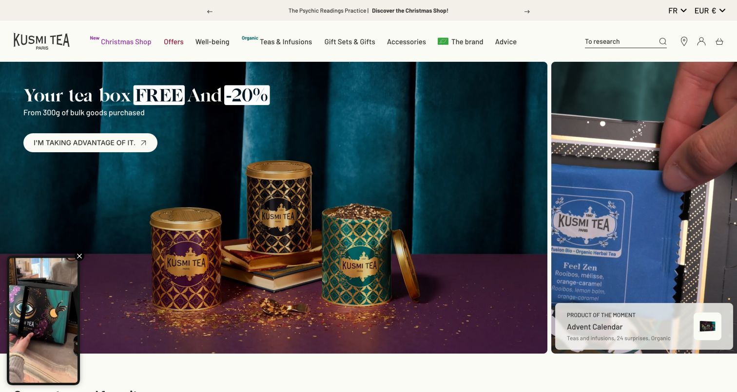
Kusmi uses jewel-toned tins and a rich teal campaign background to make packaging part of the product appeal. The main visual sits beside a narrower advent-calendar feature, giving the homepage two simultaneous seasonal stories. Farther down, favorite products expose meaningful format differences, including sachets, tins and bulk weights. That information is particularly useful when the same blend can be bought for daily use or as a gift. The catalog therefore combines decorative presentation with practical packaging choices. The observed page also included moving secondary content, and the combined campaign panels can make the first view feel busier than the restrained cream header suggests.
What you can learn
Treat packaging format as a real shopping decision, with clear weights and quantities. Attractive tins can draw attention, but customers still need to understand how a refill, sachet box and gift container differ.
Pros
Distinctive tin photography gives the brand a recognizable visual presence.
Visible package weights and sachet options support useful comparison between formats.
Cons & considerations
Two simultaneous campaign panels divide attention in the opening view.
Additional moving content increases visual activity around an already detailed promotion.
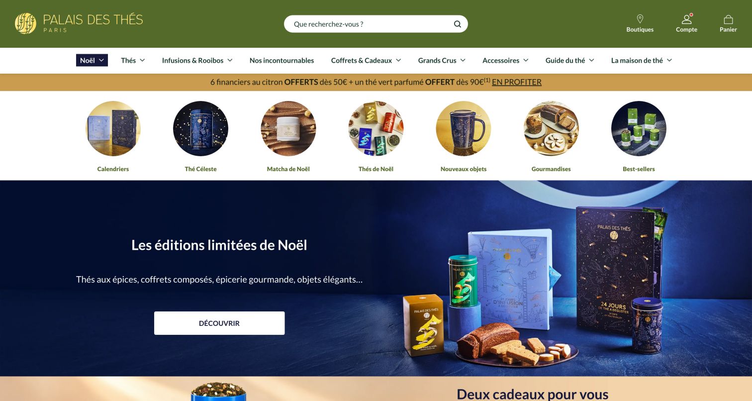
Palais des Thés places a row of circular category images before its main seasonal campaign. Visitors can therefore choose a calendar, seasonal tea, matcha or another featured category without first interpreting the large navy and gold hero. A long search field sits in the green header, while the navigation includes both broad tea families and more specialist routes such as grands crus and a tea guide. This creates a useful range of entry points for different levels of experience. The tradeoff is density: the main navigation, promotional strip, circular shortcuts and campaign each introduce another set of labels within a relatively short vertical distance.
What you can learn
Give a large catalog several levels of entry, but make their purposes distinct. Visual shortcuts can handle current interests, permanent categories can organize the range, and educational guides can explain specialist terminology.
Pros
Category shortcuts appear early enough to bypass the large seasonal campaign.
Search and educational routes support both known-item finding and unfamiliar tea discovery.
Cons & considerations
Several layers of navigation create substantial label density near the top.
Overlapping seasonal categories can make the relationship between shortcuts and catalog unclear.
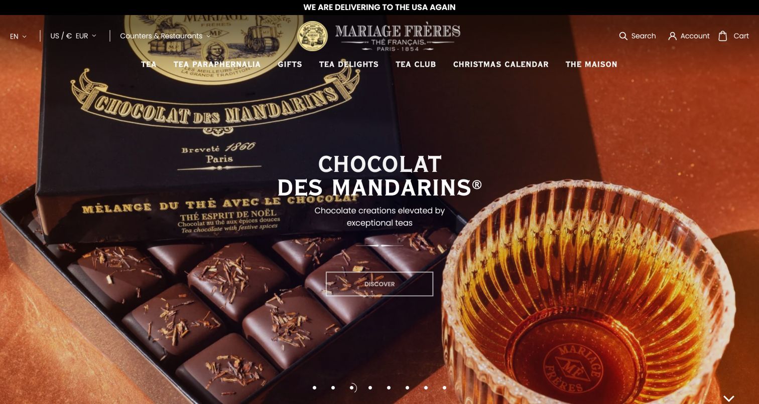
Mariage Frères uses a full-screen photographic carousel with centered white titles and a restrained outlined action. The captured campaign pairs tea with chocolate, while other observed slides introduce gifts, matcha and specialist tea collections. The transparent header links tea, paraphernalia, gifts, delicacies and the wider maison, framing the business as a complete tea house rather than a list of products. Lower on the page, classic blends receive more concrete flavor descriptions. This gives the brand room for atmosphere and heritage, but many successive stories share similar presentation and discovery language, so the visitor must do more work to distinguish their destinations.
What you can learn
A heritage brand can present a wider world around tea, provided each story leads somewhere specific. Pair evocative campaign names with plain product or experience descriptions so visitors can distinguish gifts, food and tea collections.
Pros
Photography connects tea, packaging and related delicacies within a consistent luxury identity.
Classic-blend descriptions provide useful flavor context below the atmospheric opening.
Cons & considerations
Numerous carousel stories make it harder to compare the available destinations quickly.
Repeated generic discovery actions explain less than explicit collection or product labels.
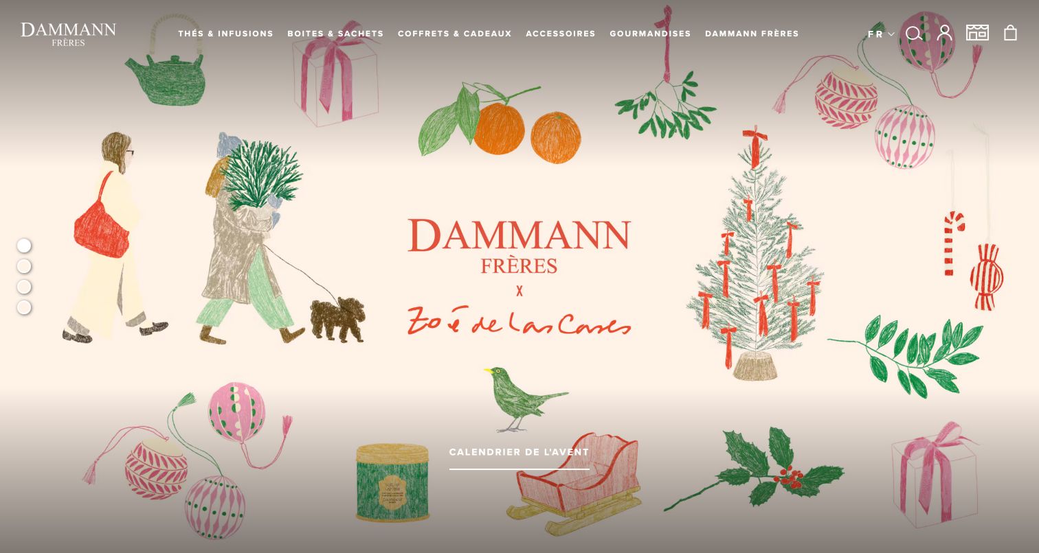
Dammann Frères opens with a hand-drawn Christmas illustration and a named creative collaboration. The light background, delicate artwork and sparse campaign action give the page the character of a decorated gift package. Navigation then leads into tea, infusions, packaging, gifts and accessories. Below the large visual, the catalog becomes more systematic, with tea-type headings, prices and indications of online or store availability. The contrast is useful: an artistic campaign introduces the brand while a conventional taxonomy supports actual selection. The first screen still provides little product detail, and parts of the pale header compete with the similarly light illustration underneath.
What you can learn
Use a seasonal collaboration as the visual introduction, then return to dependable tea types and availability information. The artwork should enrich the catalog without becoming the only explanation of what shoppers can buy.
Pros
The illustrated collaboration gives seasonal gifting a distinctive and coherent visual identity.
Tea-type organization and availability information add practical structure below the campaign.
Cons & considerations
Sparse first-screen information makes visitors scroll to understand specific product choices.
Light header elements need careful contrast against the detailed pale campaign artwork.
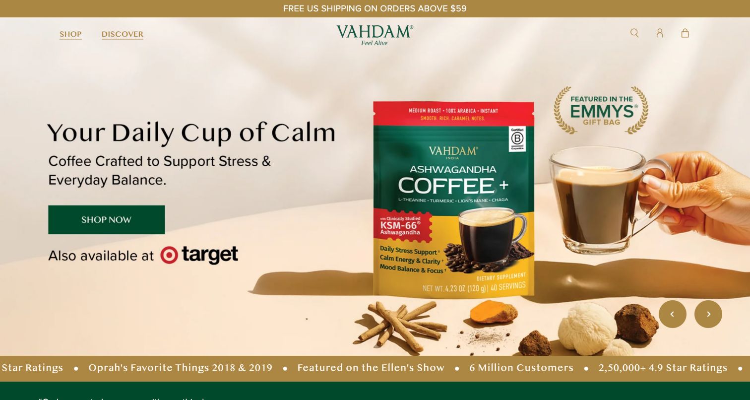
VAHDAM keeps its header sparse, with Shop and Discover around a centered green wordmark. The observed carousel moved from a seasonal offer to a coffee-related campaign, while the page below explicitly separated tea, herbal supplements, wellness coffee and spices. That distinction is valuable because the brand spans products that visitors may evaluate for different reasons. Product tabs and per-serving price information add more concrete shopping context after the broad campaign. The opening image, however, can make the tea assortment temporarily difficult to identify. Promotional health language and press or trust references also need supporting context rather than being treated as proof within the visual design itself.
What you can learn
When a tea brand expands into adjacent categories, make those boundaries visible. Keep ingredients, product type and purchase terms clear, and avoid allowing a broad wellness campaign to substitute for specific product information.
Pros
Category cards distinguish tea from coffee, supplements and spices in the broader range.
Per-serving price information adds useful context to selected product comparisons.
Cons & considerations
A coffee-led carousel slide can obscure the tea offering on initial arrival.
Dense promotional and trust messaging asks visitors to interpret several claims at once.
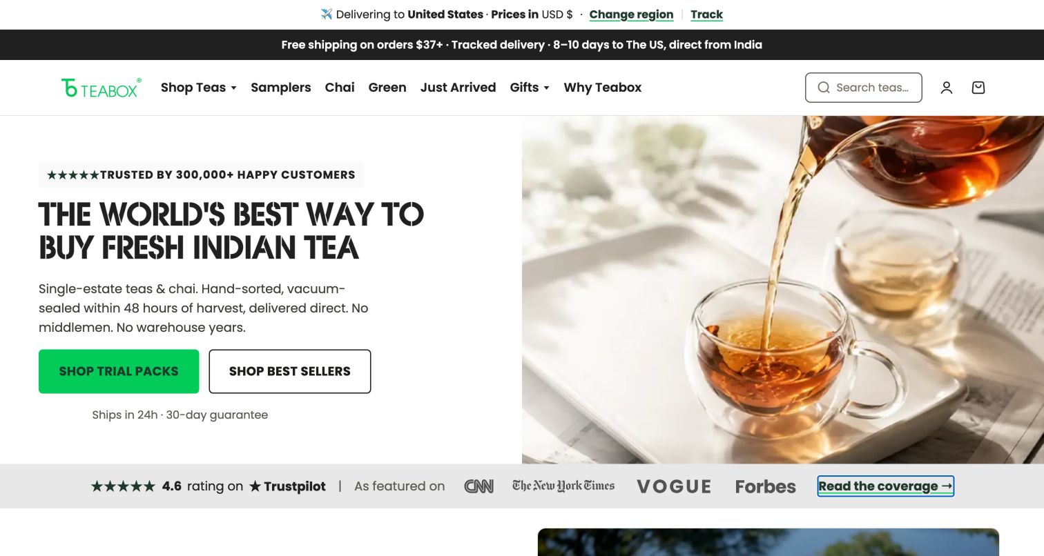
Teabox divides its hero between a clear product proposition and a photograph of tea being poured into glass cups. The text explains the brand's sourcing and packaging approach, while separate actions lead to trial packs and best sellers. This is more immediately informative than a purely seasonal banner because it tells an unfamiliar visitor what the business wants to be known for. Farther down, founder information and press references add supporting routes, and sampler language clarifies the distinction between a one-time purchase and a subscription. The page contains many quantified claims, however, so its persuasive strength depends on visitors being able to inspect the supporting explanations.
What you can learn
Explain the supply-chain difference in ordinary language, then offer a low-commitment way to try the product. Keep one-time and recurring purchase terms explicit, and connect prominent claims to material customers can inspect.
Pros
Trial packs and best sellers provide clear choices for new and returning shoppers.
Sampler wording distinguishes a one-time order from an ongoing subscription commitment.
Cons & considerations
Numerous quantified statements increase the need for clear supporting explanations.
An introductory signup promotion interrupts the otherwise direct path into trial products.
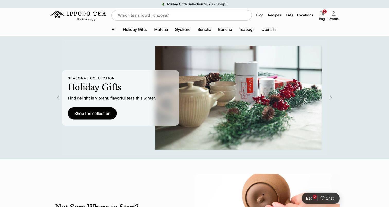
Ippodo gives a long search field an unusually conversational prompt, asking which tea the visitor should choose. Under it, the navigation names specific Japanese tea families such as matcha, gyokuro and sencha, along with tea bags and utensils. The seasonal hero uses restrained photography and a translucent text card, while separate matcha and green-tea quizzes provide assistance below. Best-seller cards add short flavor descriptions such as light or rich, helping bridge the gap between specialist terminology and an everyday preference. The design preserves the precision of its catalog, but newcomers still need those explanatory routes because the category names alone do not communicate taste or preparation.
What you can learn
Keep specialist names accurate while adding plain-language flavor descriptions and introductory guidance. A focused catalog can teach customers how to choose without replacing its real tea categories with vague lifestyle labels.
Pros
Specific tea families create a precise and consistent catalog structure.
Separate quizzes and concise flavor descriptions help translate that structure for newcomers.
Cons & considerations
Unfamiliar category names need explanations before a first-time visitor can compare them.
The conversational search prompt may suggest guided advice beyond a conventional search field.
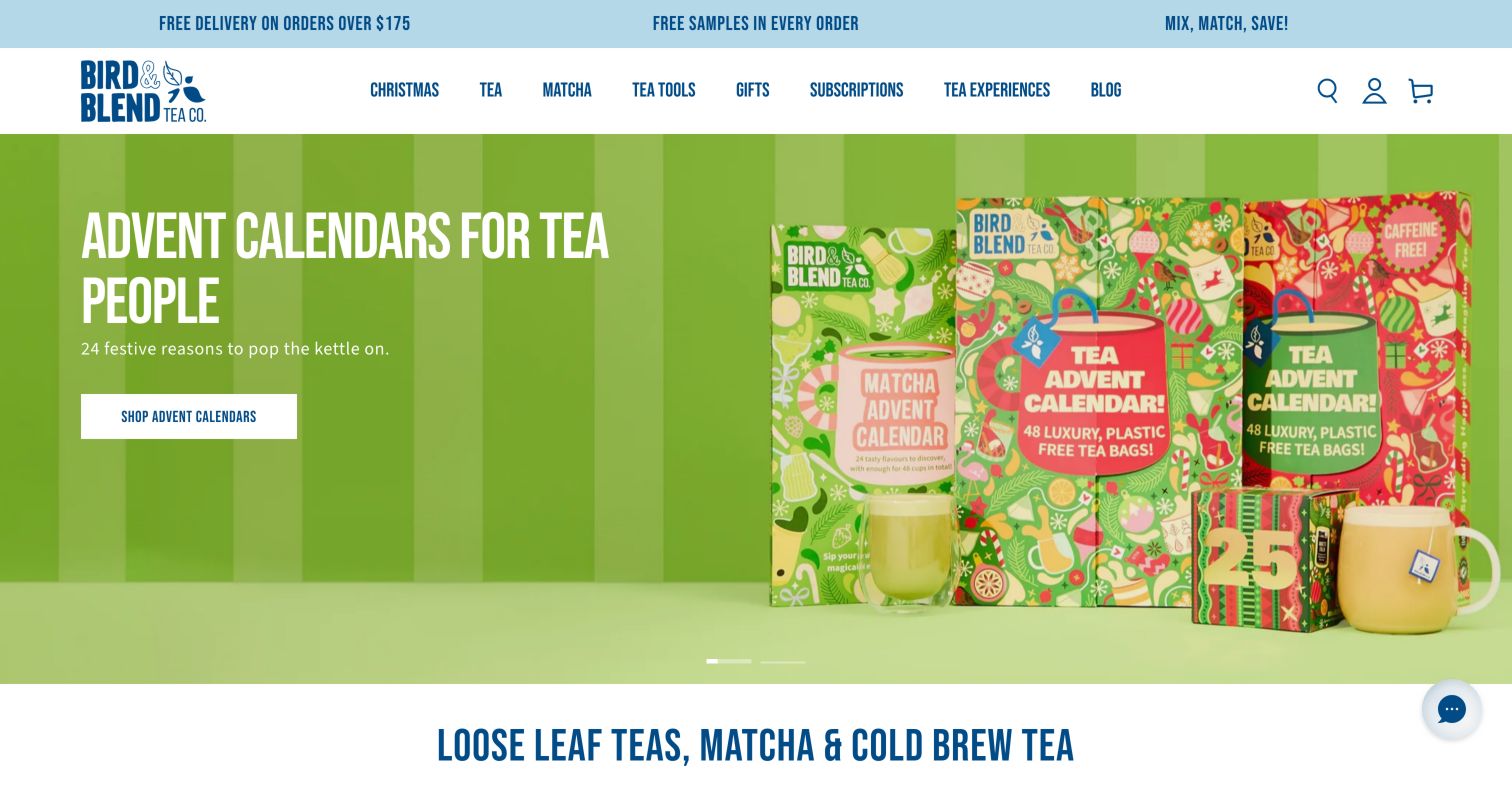
Bird & Blend uses bright pink and green seasonal packaging to make its gift campaign immediately recognizable. The navigation extends beyond tea and matcha into tools, subscriptions, experiences and editorial content, reflecting a business that sells participation as well as products. Below the hero, category cards use approachable labels such as classic brews, cold brew and sticky chai, while gift tabs distinguish regular tea, matcha and caffeine-free choices. This gives the playful identity a useful shopping structure. Promotional strips and bold condensed lettering add energy, but they also increase the amount of competing information, especially when regional delivery details sit close to the campaign.
What you can learn
Connect a playful product range to practical preference categories and real-world experiences. Workshops and shops can strengthen discovery, while gifts still need clear caffeine and product-type distinctions for an unfamiliar recipient.
Pros
Experience and subscription routes make the wider tea business visible in the header.
Gift categories distinguish matcha and caffeine-free choices rather than treating gifts as uniform.
Cons & considerations
Several promotional messages compete with the colorful seasonal campaign for attention.
Condensed type and dense navigation require careful spacing as screen width decreases.
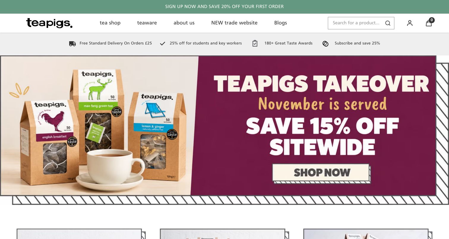
teapigs combines a hand-drawn wordmark with a restrained white header and a bold seasonal promotion. Below the offer, three shopping modes—gifts and bundles, pick and mix, and subscriptions—explain different ways to buy the assortment. Another section asks what the visitor is looking for, using familiar preferences such as tea with milk, green tea, herbal tea and caffeine-free options. These labels reduce the need to understand every blend name in advance. The homepage is therefore useful beyond the promotion, but the collection of delivery, discount, award and subscription messages creates a busy informational band before that simpler preference-based structure appears.
What you can learn
Separate how customers buy from what they prefer to drink. Mixing, gifting and subscribing are purchase modes; milk-friendly or caffeine-free preferences help select the tea within those modes.
Pros
Distinct buying-mode cards clarify gifts, mixed selections and recurring orders.
Everyday preference labels make the range approachable without extensive tea knowledge.
Cons & considerations
Multiple benefit and discount messages crowd the area before product discovery.
The dominant seasonal offer delays the more durable explanation of shopping choices.
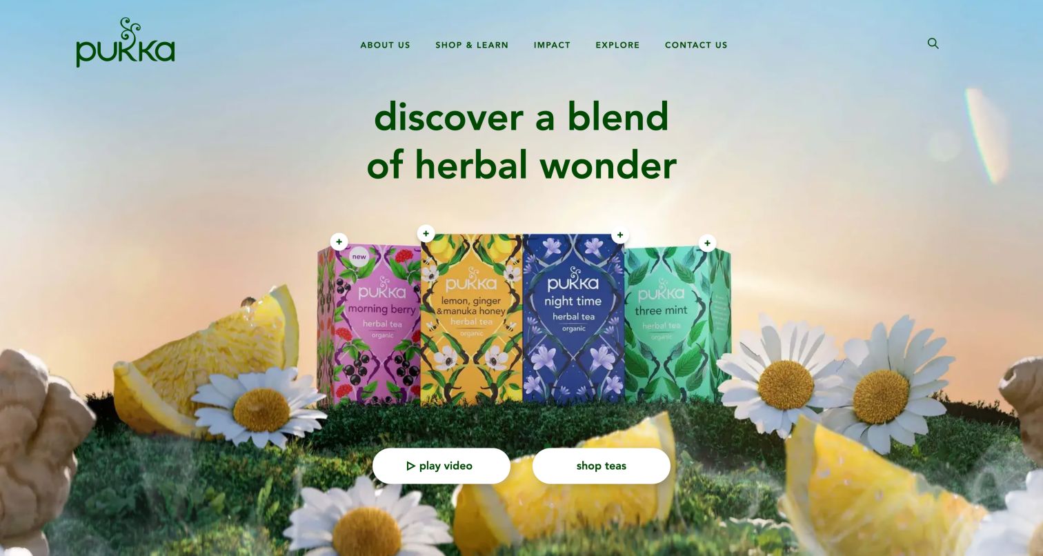
Pukka places illustrated tea boxes in a surreal landscape of grass and oversized botanicals against a soft pastel gradient. A large green statement introduces the scene, while two prominent actions lead toward a video or the tea range. The header is comparatively simple, with shopping, learning and impact destinations around the brand identity. This makes the opening easy to understand as a brand introduction rather than a dense online shop. The ingredient-inspired visual language is memorable, but it supplies little immediate comparison information. Small plus-sign hotspots also need sufficiently descriptive labels so their purpose does not depend entirely on understanding the surrounding illustration.
What you can learn
Use botanical imagery to establish identity, then provide a direct route to factual product details. Interactive hotspots should explain what they reveal, and visitors should not need to watch a video to discover the range.
Pros
Distinctive packaging and botanical illustration create a coherent first impression.
Two prominent actions keep the opening choice comparatively simple and visible.
Cons & considerations
The first screen provides little information for comparing individual tea products.
Small plus-sign hotspots need clearer descriptive context than their visual symbol alone.
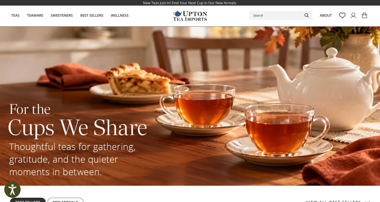
Upton Tea Imports opens with a warm table photograph featuring a teapot, clear cups and seasonal food. The campaign softens a catalog that becomes considerably more specialist below, where blend names, tea grades and starting prices appear in product tabs. The header keeps teas, teaware, sweeteners and best sellers separate, while educational links include processing, nomenclature and tasting information. This combination offers an accessible visual entry without removing the detail experienced tea buyers expect. The seasonal hero's wording is largely part of the artwork, however, and the next action is less explicit than the catalog's ordinary text links and controls.
What you can learn
A specialist catalog can use warm lifestyle imagery to welcome newcomers while retaining precise product names. Make the campaign action and important wording available as ordinary text, then link unfamiliar terminology to concise education.
Pros
Detailed product naming preserves information that experienced loose-tea shoppers value.
Educational resources help explain processing, tasting and specialist tea terminology.
Cons & considerations
Artwork-based hero text is less flexible than ordinary page text across screen sizes.
The campaign's next step is less explicit than the catalog controls below it.
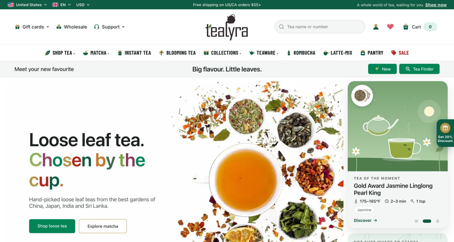
Tealyra frames its homepage with a broad category row covering tea, matcha, teaware and several adjacent products. The main hero shows loose ingredients around a cup, while a separate featured-tea card includes more concrete preparation information, such as temperature, time and quantity, alongside flavor descriptors. That is a valuable departure from purely promotional merchandising: the visitor sees something about making the tea before entering a product page. Search also invites a product name or number, supporting repeat buyers. The breadth of the category row can feel overwhelming, and an introductory signup panel initially covered part of the discovery content during the observed visit.
What you can learn
Bring a small amount of useful preparation information into discovery cards. Temperature, steeping time and flavor descriptors help customers understand unfamiliar tea, but should appear in a consistent structure that remains easy to scan.
Pros
The featured-tea card connects discovery with practical brewing information.
Search by product name or number supports customers returning to a known item.
Cons & considerations
The extensive category row requires substantial scanning before a destination is chosen.
The introductory signup panel interrupts the practical information in the hero area.
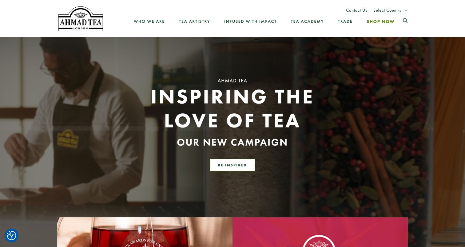
Ahmad Tea presents a brand campaign through darkened lifestyle video, a large white headline and an invitation to explore. The header emphasizes the company, tea artistry, impact, education and trade, while a contrasting Shop Now action leads toward a separate regional store. Below the film, editorial stories, a tea academy and collection categories continue the brand narrative. This is a different homepage role from a direct product grid: it serves trade visitors and people learning about the business as well as shoppers. The division can work well, provided the transition to the shopping destination and its regional context are made clear.
What you can learn
Decide whether the homepage is a brand hub, a store or a clear combination of both. When shopping occurs elsewhere, make the destination and regional context understandable before the visitor leaves the main site.
Pros
Trade, education and company information have clear roles in the main navigation.
A contrasting shopping action remains visible within the broader brand-focused presentation.
Cons & considerations
The campaign invitation gives less immediate product direction than a named tea collection.
A separate shopping domain adds a transition that visitors need to understand clearly.
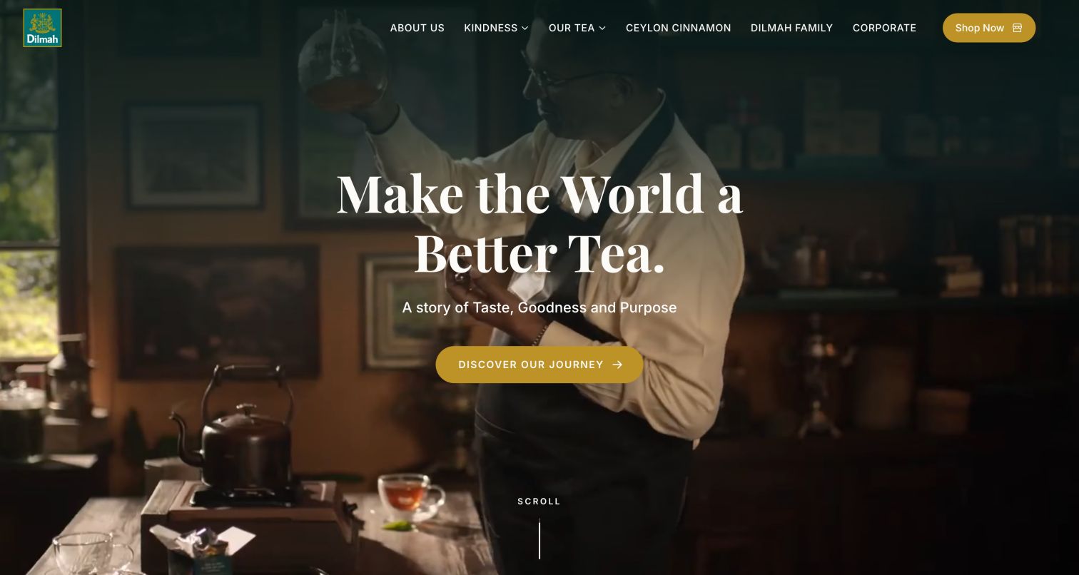
Dilmah uses a large founder and tea-tasting scene to introduce its brand purpose. White serif typography and a gold action sit over the darkened image, while the header includes tea, the family, kindness, corporate information and a separate shopping route. Below the opening, a founder-history section leads into numbered routes for products, hospitality, experiences, education and the foundation. This makes the breadth of the organization visible and connects tea to people and places. It is less direct for someone comparing a blend, because the full-height campaign and institutional story come before a compact product overview and several destinations belong to related sites.
What you can learn
Connect a founder story to clear practical destinations. A broad tea organization can explain its purpose while keeping shopping, hospitality, education and foundation activities distinct enough that visitors understand each transition.
Pros
Founder imagery and consistent gold accents create a recognizable institutional identity.
Numbered destination links expose the wider tea, hospitality and education network.
Cons & considerations
The full-height purpose campaign delays a concise view of the tea assortment.
Related-site destinations need clear transition cues to preserve the visitor's context.
Kegan is a freelance web designer and developer with 15+ years of experience helping businesses turn complicated website requirements into clear, maintainable digital experiences. He works directly with clients from planning and design through development, launch, and ongoing support.
For tea brand website design, his development approach focuses on product discovery, origin stories, brewing information, and ecommerce. The scope can be a targeted improvement or a complete custom build, with responsive layouts, thoughtful content structure, and integrations chosen around the people using and maintaining the site.
Show 3 other tea brand website designersHide other tea brand website designers
Plan a tea website around the decisions that precede a purchase
Create a consistent product information model
Agree on the fields every tea needs: product type, ingredients, flavor description, caffeine information, format, net quantity and preparation guidance. Add origin, harvest or grade information where it is relevant and supported. Keep tasting notes distinct from the ingredient list, especially when a description uses fruit, spice or floral language.
Separate permanent categories from campaigns
Tea types, formats and caffeine preferences should remain dependable as gift seasons and new launches change. Give temporary campaigns a clear place in the design without making them the only entrance to the catalog. Review whether the same product appears under several useful routes or whether overlapping labels simply create confusion.
Design for several levels of tea knowledge
A repeat buyer may search by a blend name or product number. A newcomer may start with milk, caffeine, flavor or preparation equipment. Preserve precise tea terminology while offering plain-language descriptions and optional guidance. A quiz can help, but ordinary product cards should still support a meaningful comparison.
Give gifting its own decision support
Organize gifts around factors a buyer can actually judge, such as spending range, tea format, caffeine preference, included equipment and presentation. Explain what is inside a set and whether separate items are needed to use it. Keep seasonal delivery information current and specific to the visitor's selected market.
Clarify recurring and one-time purchases
Subscriptions, mixed boxes and one-time samplers should be easy to distinguish before any commitment. Explain quantity, frequency and the relevant management options in the purchase flow. Avoid making a low introductory price more prominent than the fact that an order recurs.
Test the complete discovery path
Review navigation, search, filtering, product variants, gift selection and the transition to any regional store. Check keyboard use, readable contrast, motion controls, text resizing and popup dismissal. Test with people who know little about tea as well as experienced buyers; a static screenshot cannot establish usability or accessibility across the complete store.
The editing job behind the design
Choose tools that keep tea information and shopping terms consistent
The most important platform decision may be how reliably the team can maintain product variants and structured information. A tea catalog needs to distinguish the blend from its packaging, weight, stock position and regional availability. Search, filters, subscriptions, reviews and store locators should use that information consistently. Before choosing tools, identify which system owns each field and how seasonal bundles or discontinued formats are updated.
Public technology observations can identify references to commerce, content, media and interface services, but they do not establish the complete internal operation of a tea company. Read each example's evidence at its documented scope. Evaluate product modeling, editorial controls, regional shopping, subscription terms and maintenance effort directly when planning a store, rather than assuming a visible brand's apparent stack will fit another business.
Our WordPress website examples offer a separate look at publishing approaches. A visible platform label is evidence for that named page, not a guarantee that the same system will suit your requirements.
Before the public launch
Tea brand website review checklist
Can visitors find a known blend through search or stable categories?
Are tea type, ingredients and tasting notes clearly distinguished?
Is caffeine information easy to locate and appropriately qualified?
Are loose leaf, sachets, bags and other formats labeled consistently?
Do product cards show comparable weights, counts or serving assumptions?
Is basic brewing guidance available before or near the purchase decision?
Can gift buyers identify the contents, equipment needs and presentation?
Do seasonal campaigns preserve a direct route to everyday products?
Are one-time orders and subscriptions unmistakably different?
Are market, currency and regional-store transitions clear?
Can visitors dismiss promotions and control moving media?
Have navigation, text resizing, keyboard paths and product variants been tested?
These checks are a project checklist, not a performance, legal, security, or accessibility certification. Test real journeys with the people responsible for the website before making claims about the result.
Sources & editorial method
How this collection was selected and reviewed
This collection follows the saved target of 29 distinct tea brand websites. Official public homepages were opened and individually reviewed on November 5, 2026. Direct browser screenshots retain the actual source URL, capture date, dimensions and editorial attribution. The selected captures show rendered pages after ordinary promotional or privacy overlays were dismissed where necessary. Reviews describe observed presentation and navigation; checkout, signup, subscription and other forms were not submitted. Campaigns and offers reflect the observation date. Public stack observations are separately scoped evidence and do not establish internal systems, product efficacy, performance or accessibility certification.
Each example links to its actual source page. Screenshots are direct browser captures with their own capture dates; moving imagery, announcements and live designs can change. The notes describe observable design choices and conditional tradeoffs, not measured traffic, conversion results, service quality, or accessibility conformance.
Technology labels use public page metadata, asset evidence, or explicitly cited platform documentation. Platform documentation is not a complete current deployment audit. A component reference may be legacy or unused; it is not a complete backend inventory. Unknown stacks are omitted. These sites are editorial examples, not our client portfolio.
Written, Edited and Curated are separate editorial records, not timestamps advanced by a rebuild. Website designs and imagery belong to their owners. See our editorial standards or suggest a correction.
Questions worth asking
Tea Brand website design questions
Should a tea website organize products by type or flavor?
Most substantial catalogs benefit from both. Tea type is a stable organizing principle, while flavor helps people who do not know specialist names. Add format and caffeine routes where they help actual decisions, and keep the underlying product information consistent across every view.
What information belongs on a tea product card?
Include the name, a useful image, product type, relevant format or quantity and a clear price. Short flavor descriptions and caffeine information can help when they remain readable. More detailed ingredients and brewing guidance belong close to the product decision, without overloading every card.
How should a brand present tea gifts?
Show what is included, how it is packaged and whether the recipient needs an infuser or other equipment. Budget, tea format and caffeine preference are useful ways to narrow gift choices. Keep delivery information tied to the selected market and current season.
Does every tea store need a quiz?
No. A quiz can help an unfamiliar visitor express preferences, but it should complement clear categories and informative product cards. Customers who know the tea they want need a short route to it, and visitors should be able to understand the range without answering a questionnaire.
How should tea brands handle wellness language?
Keep product type, ingredients and preparation information clear, and distinguish descriptive or promotional language from substantiated claims. The design examples here show how websites organize those messages; they do not verify health benefits or endorse a tea as a treatment.
Start with the choice the shopper is trying to make: a familiar blend, an unfamiliar flavor, a preparation format or a gift. Then use packaging, photography and brand history to make those practical decisions feel connected to a distinctive tea experience.