Best Pet Sitting Websites of 2026 (18 Real-World Examples)
Pet sitting websites that explain service area, visit formats and a realistic first inquiry
These 18 pet care website examples examine local coverage, team introductions, service comparisons and the difference between requesting care and confirming a booking.
Pet sitting starts with a fit question rather than an instant purchase. A visitor needs to know whether the business serves the address, offers the right kind of visit and has a suitable process for discussing the pet’s routine. Dog walking, cat visits, overnight stays and boarding are not interchangeable, and a friendly photograph cannot explain those differences.
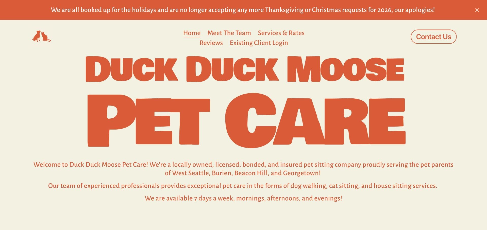
Duck Duck Moose Pet Care is our Editors Choice for a concise West Seattle introduction, named service-area neighborhoods and separate dog-walking, cat-sitting and house-sitting context. Its inspected page gives existing clients their own login and publishes an explicit notice that Thanksgiving and Christmas requests are closed for 2026. The design lesson is honest scope and capacity communication, not an independent assessment of care quality or safety.
Before the examples
What makes good pet sitting website design in 2026?
Define the service and its geography
State the actual neighborhoods or coverage boundaries and distinguish home visits, walks, overnight presence and boarding. Explain visit duration or service format where practical. A broad city label should not leave a visitor guessing whether an address outside the core area is included.
Introduce the people and the process
Use actual team information and explain how a new inquiry becomes an agreed service. Describe any consultation or introductory meeting process without promising that every request will be accepted. Keep existing-client access separate from the first-time visitor’s route.
Publish capacity and holiday limits honestly
Give unavailable periods and request cutoffs clear dates. Explain that an inquiry does not confirm care, and identify how confirmation occurs. Do not leave an always-open-looking booking action beside a fully booked notice without clarifying its purpose.
The collection · 18 examples
18 pet sitting websites worth studying
The collection spans local independent teams and larger service platforms. Compare how each explains coverage, visit format and client onboarding. The reviews concern the public website and do not verify insurance, credentials, staff screening or care outcomes.
Duck Duck Moose Pet Care opens with oversized orange lettering on a warm cream background. The short introduction identifies West Seattle and nearby service areas, then explains dog walking, cat sitting and house sitting in ordinary terms. Team, Services & Rates and Reviews form a compact set of next steps. Most notably, a prominent current notice explains that the business is already fully booked for the major 2026 holidays. The selection is for this website’s specific voice and clarity, not a judgment about pet-care quality. The sparse opening still leaves detailed service comparison to another page.
What you can learn
Use the homepage to establish location, actual service scope and real capacity before collecting an inquiry. A clear unavailable-date notice can be more helpful than a permanently optimistic booking button that creates avoidable requests.
Pros
The opening names the service area and distinguishes three kinds of care.
A specific holiday-capacity notice communicates a real operational limit.
Cons & considerations
Prices and visit lengths require the Services & Rates page.
The minimal first view provides little visual introduction to individual caregivers.
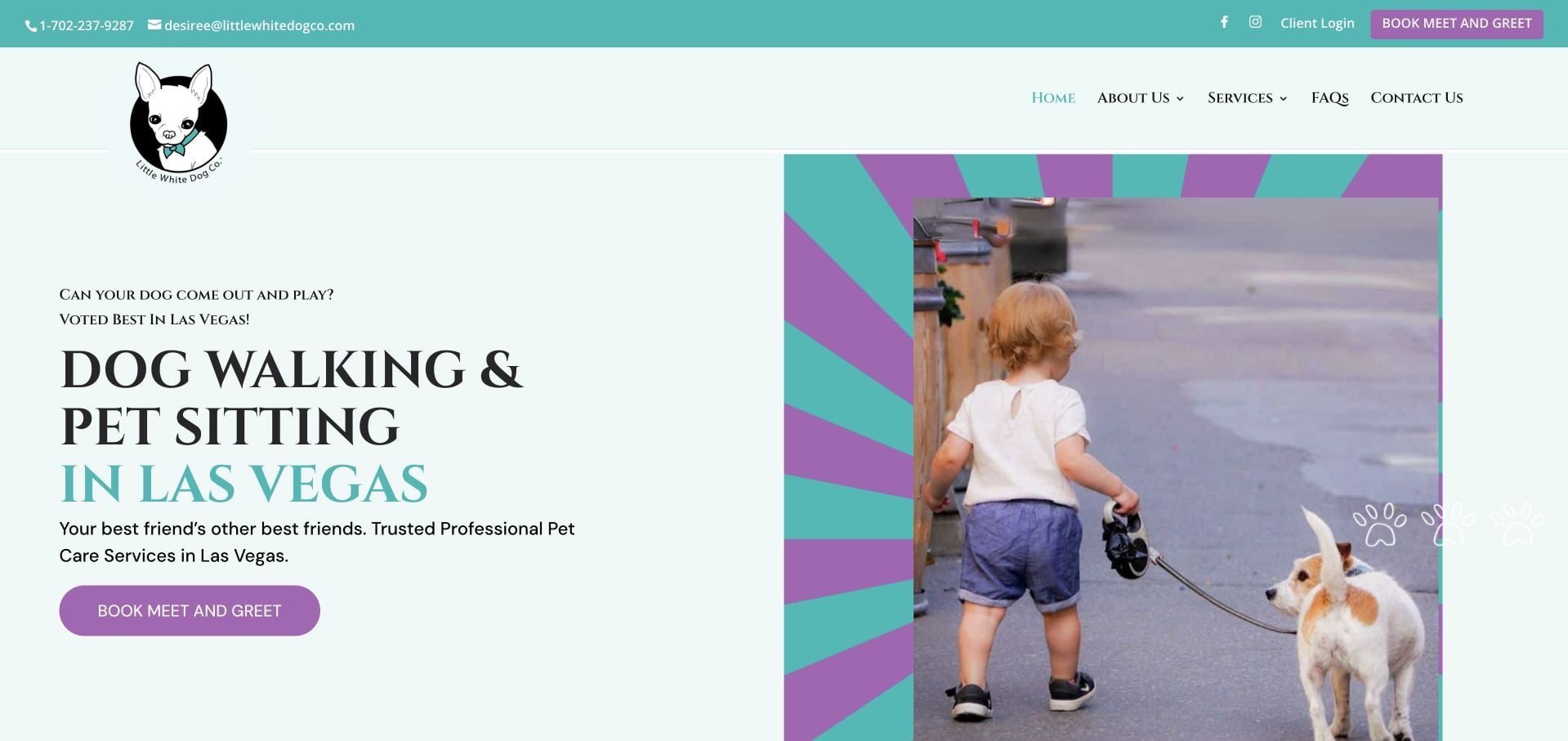
Little White Dog Co. uses turquoise accents, a recognizable illustrated mark and an explicit Las Vegas service introduction. The inspected page names individual neighborhoods and separates dog walking, pet visits and wedding support. Book Meet and Greet is a consistent action, correctly presenting an introduction rather than implying instant assignment of a caregiver. A step-by-step explanation and a team route support the process. Repeated actions and a long sequence of customer quotations make the page more expansive than its main task requires. Its insurance and training statements are business claims, not independently verified service endorsements.
What you can learn
Name the actual first step when a caregiver must meet the owner and animal before service begins. Keep geographic eligibility and service types near that action so people can establish fit before creating an account.
Pros
The meet-and-greet action reflects a specific onboarding process.
Named neighborhoods make the coverage area understandable.
Cons & considerations
Repeated actions and testimonials lengthen the page.
The broad service mix needs clear limits on each individual visit.
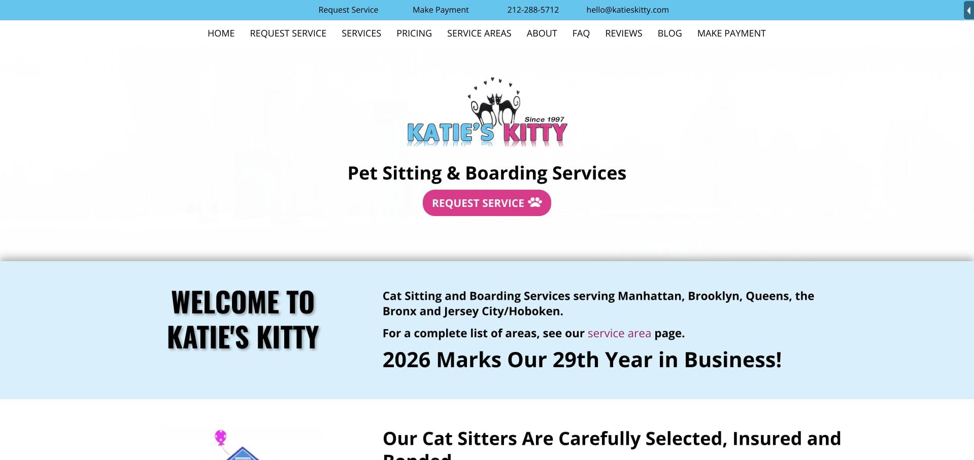
Katie’s Kitty uses bright blue and pink accents around a direct cat-sitting and boarding introduction. The inspected page names the New York boroughs and nearby service areas, then separates care in the client’s home, host-home boarding and exotic-pet interests. Pricing, Service Areas and FAQs have literal navigation labels. This makes the care setting more understandable than a single general pet-care promise. The header has many choices, including payment for existing customers, so a first-time visitor must still distinguish requesting service from managing an established booking.
What you can learn
Explain where the animal stays before asking someone to request dates. Keep new-client inquiries distinct from existing-client payment and account tasks, even when all are important to the business.
Pros
The page distinguishes home visits, boarding and exotic-pet care.
Pricing and Service Areas are direct navigation destinations.
Cons & considerations
Numerous equally weighted header choices slow the first decision.
Existing-customer payment interests compete with new-service requests.
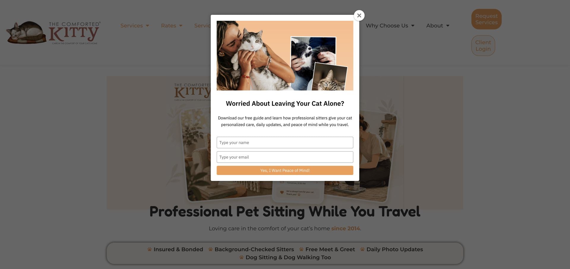
The Comforted Kitty places a ZIP-code and care-type check near the main pet-sitting introduction. That is a useful first question before a visitor reads a large nationwide-looking offer. The inspected page distinguishes drop-ins, extended daytime visits, overnight stays and house sitting by duration, with separate cat and dog interests. A three-step process explains request, meet-and-greet and ongoing communication. The large menu and repeated service blocks make the page lengthy, and an opening lead-capture overlay interrupts the eligibility task. This review evaluates the interface, not the service-quality claims.
What you can learn
Check coverage before asking for a detailed care request. Define visit formats with durations and setting, then keep promotional overlays from obstructing the eligibility control that helps visitors decide whether to proceed.
Pros
The ZIP-code check addresses geographic fit early.
Visit formats include concrete duration and setting distinctions.
Cons & considerations
The lead-capture overlay interrupts the initial task.
Repeated service blocks make the large page harder to scan.
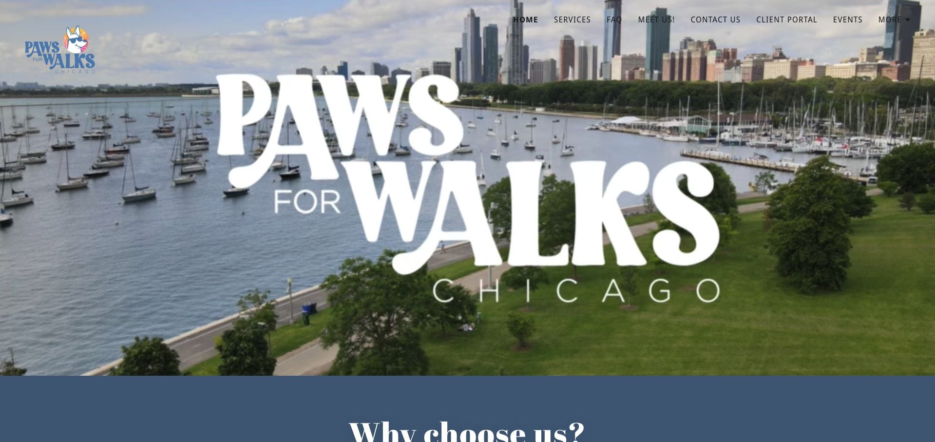
Paws For Walks Chicago introduces its city through a broad waterfront photograph and a large wordmark. The inspected page explains dog walking and pet sitting, then describes app scheduling, GPS records and visit journals with pictures. A team route and services page offer more concrete information than the general trust language alone. The opening image leaves those practical details below the fold, while repeated reliability statements lengthen the explanation. The business’s screening and certification claims are not independently audited by this design review.
What you can learn
Explain the owner’s communication experience in practical terms: what report arrives, through which channel and after which kind of visit. Put that information beside clear service choices rather than relying only on broad trust claims.
Pros
The page explains visit journals and photo updates.
Services and team information are identifiable routes.
Cons & considerations
The image-dominated opening delays the concrete service explanation.
Repeated reliability language makes the body less concise.
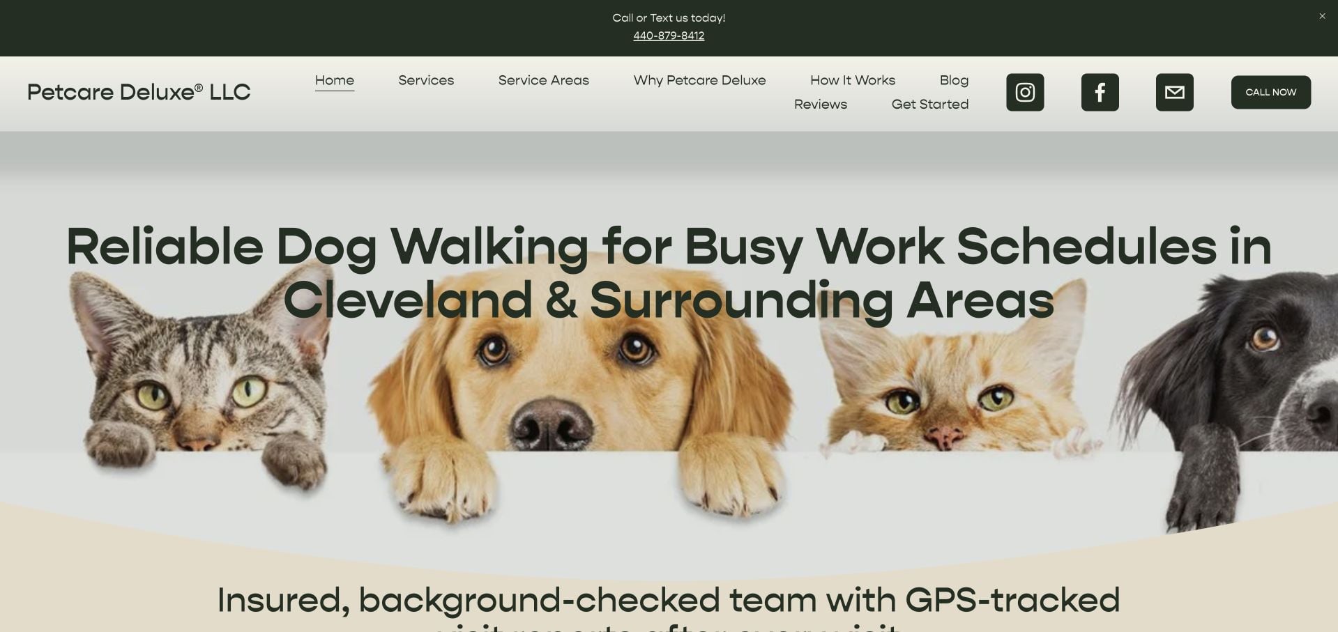
Petcare Deluxe identifies Cleveland and surrounding areas in a direct opening about recurring care. A collage of different animals gives the page a friendly identity, while the first action offers a consultation rather than a guaranteed immediate booking. The inspected content distinguishes recurring walks, cat drop-ins, travel care and support for busy households. It also explains backup coverage and visit reports as parts of the process. Several weekly-plan incentives compete for attention, and travel visitors need to distinguish their request from the main recurring-care proposition.
What you can learn
Organize the offer around genuinely different customer routines, not only animal types. Explain the consultation and onboarding process before asking for dates, while keeping occasional travel care discoverable beside recurring plans.
Pros
The opening identifies a specific region and primary customer routine.
Recurring, cat and travel-care interests have separate explanations.
Cons & considerations
Multiple weekly-plan incentives crowd the introduction.
Occasional travel care is secondary to the recurring-service pitch.
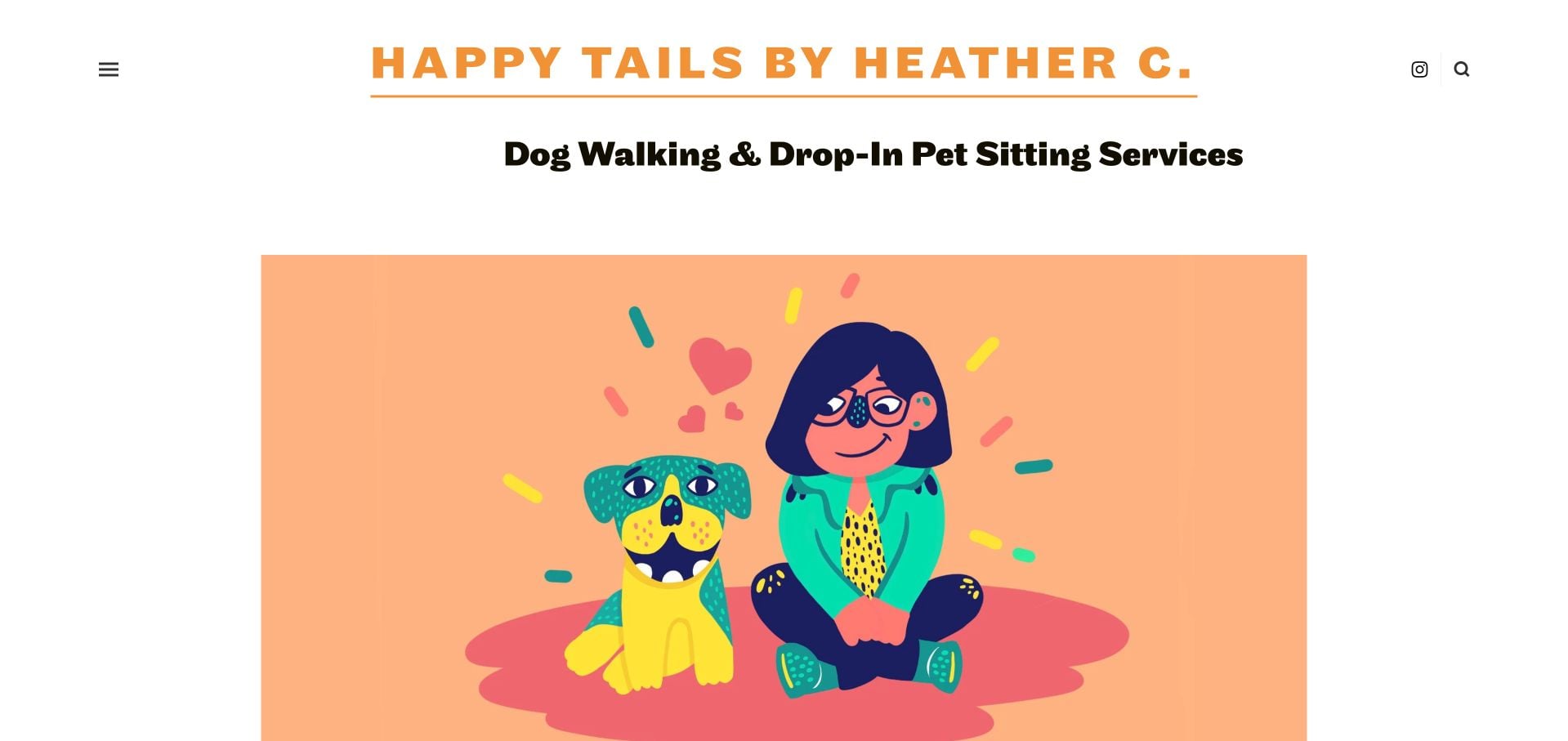
Happy Tails by Heather C. uses an orange-accented wordmark and a colorful illustration before a personal introduction to Heather and her local work. The inspected page explicitly states that the business is not accepting new clients. Services and Rates remain available as information, with a clear Hackensack contact context. That capacity notice is the most valuable operational detail in the page. The illustration provides personality, but a first-time visitor still needs further information about visit duration, coverage and the person who would provide care when capacity changes.
What you can learn
Keep the website useful even when the appointment book is full. State the current capacity limit clearly and maintain the service information, rather than leaving a generic request form that implies new bookings are available.
Pros
The page openly communicates that new-client capacity is full.
The named owner and local contact context make the business identifiable.
Cons & considerations
The opening illustration gives limited information about actual care visits.
Detailed service comparison remains on a separate page.
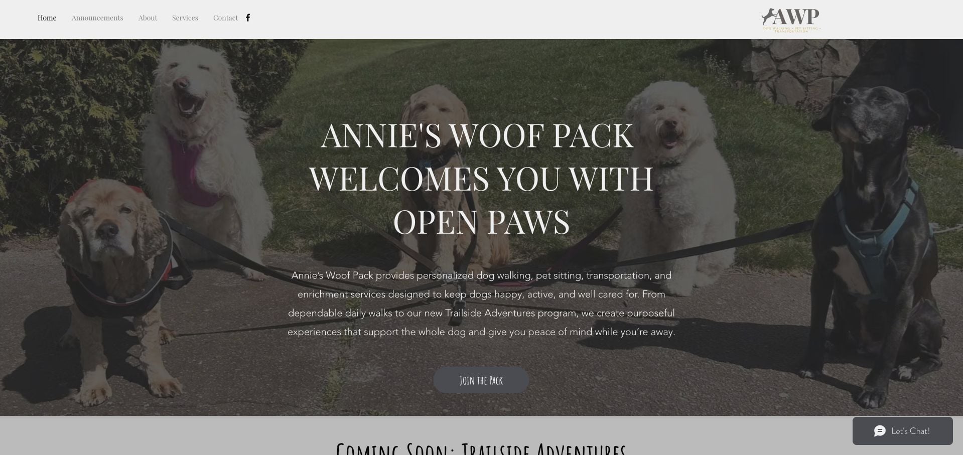
Annie’s Woof Pack pairs a real dog photograph with a concise service introduction and a Join the Pack action. The inspected page separates existing pet sitting from a forthcoming group-adventure program, including an explanation of evaluation and participation requirements. A personal About section supplies the provider context. This is useful for studying how a small business can announce expansion without pretending the new service is already fully available. The long forthcoming-program explanation also pushes established service details down the page, so the current offer needs to remain easy to identify.
What you can learn
Label forthcoming services honestly and separate their interest or inquiry process from existing appointments. Keep the current pet-sitting offer visible while explaining evaluation requirements for a materially different group activity.
Pros
The new program is explicitly labeled as forthcoming.
Evaluation and participation context are explained rather than omitted.
Cons & considerations
The lengthy expansion announcement delays established-service information.
The general Join the Pack label explains less than a literal request action.
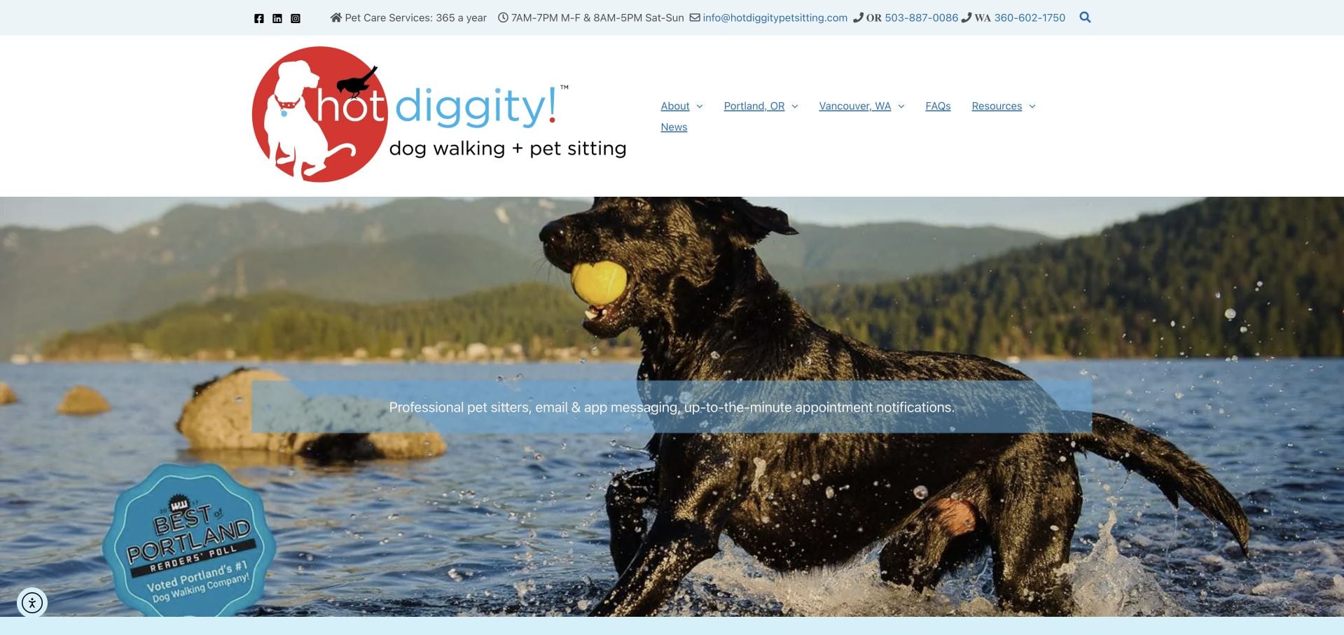
Hot Diggity! uses a real outdoor dog photograph above a regional choice between Portland and Vancouver. The inspected page makes clear that Vancouver services are provided by a sister company, rather than presenting both routes as an identical local operation. A broad service list separates drop-ins, overnight care, transport and other visit types. Contact and office-hour information are visible in the utility area. The amount of regional and service detail is useful, but it creates a long page, and each route still needs its own concrete rates and onboarding expectations.
What you can learn
If geography changes the provider, say so before the handoff. Keep service availability, office contact hours and care hours distinguishable rather than allowing a broad always-available statement to imply identical administrative support.
Pros
The regional gateway identifies the sister-company relationship.
The service list distinguishes several materially different visit formats.
Cons & considerations
The long regional introduction takes time to scan.
Rates and onboarding context depend on continuing into the local route.
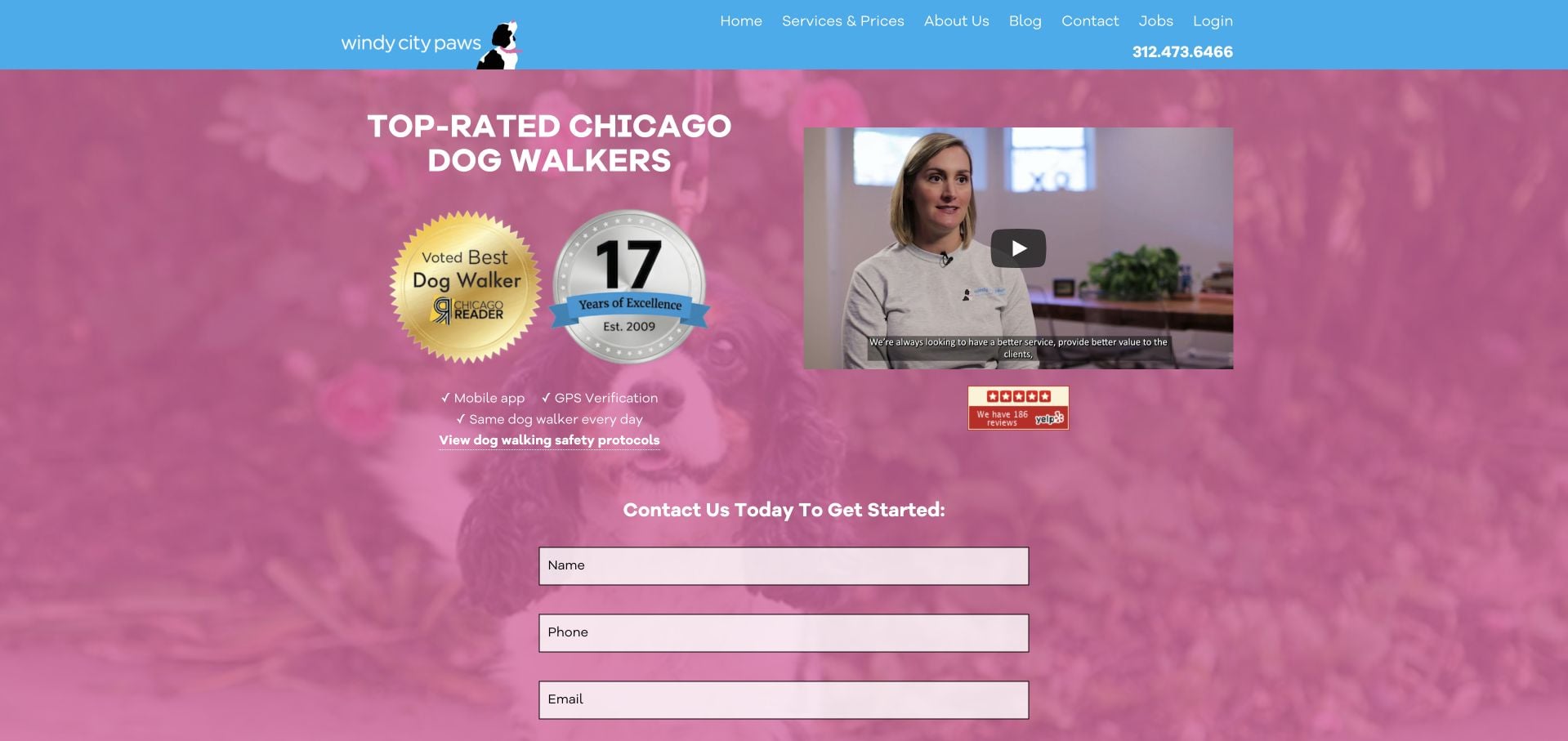
Windy City Paws uses a bright pink introduction with a video, short reporting features and an inquiry form immediately in the hero. The inspected page names Chicago neighborhoods and links to service prices and safety-process information. Its footer distinguishes office hours from the broader pet-care offer, which is important for setting contact expectations. The design gets to the inquiry quickly, but it asks for personal details before a visitor has read much about service fit. Video, badges and the form also compete in a relatively dense first view.
What you can learn
Place the basic service area and appointment model before, or alongside, an early inquiry form. State administrative response hours separately from care availability so the website sets expectations rather than merely collecting requests.
Pros
Named neighborhoods help establish geographic fit.
The page distinguishes office response hours from the service offer.
Cons & considerations
The hero requests details before much service context is presented.
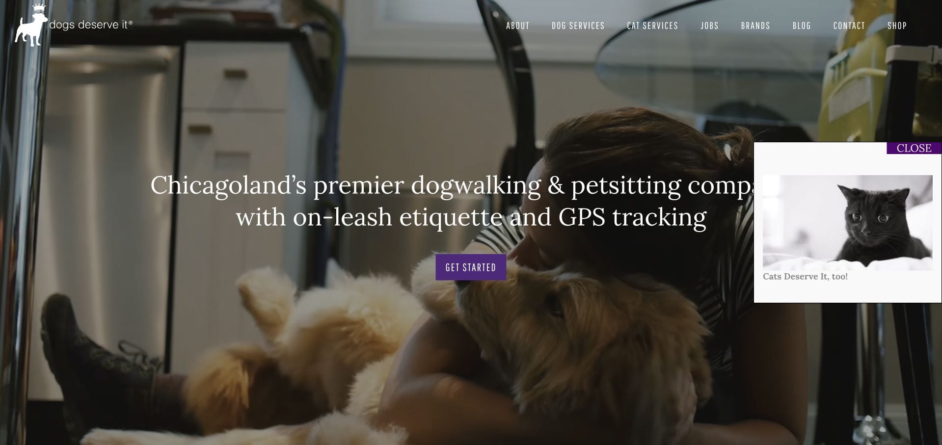
Dogs Deserve It uses a darkened photograph, purple actions and a concise Chicagoland introduction. The navigation gives dog and cat services their own routes, a useful distinction for visitors who might otherwise assume the business only serves dogs. The inspected content also presents company history and an editorial blog. The broad service promise and Get Started action leave more detailed comparison to another page, and a promotional content layer appeared over part of the first view. The design lesson is the explicit cat pathway rather than any claimed service results.
What you can learn
Make secondary animal categories visible when the business name suggests only one audience. Keep the initial service request separate from shopping or editorial promotions that can interrupt an otherwise direct appointment journey.
Pros
Dog and cat services are separate navigation destinations.
The opening clearly establishes the local region.
Cons & considerations
The general Get Started label provides limited process detail.
A promotional overlay competes with the opening service explanation.
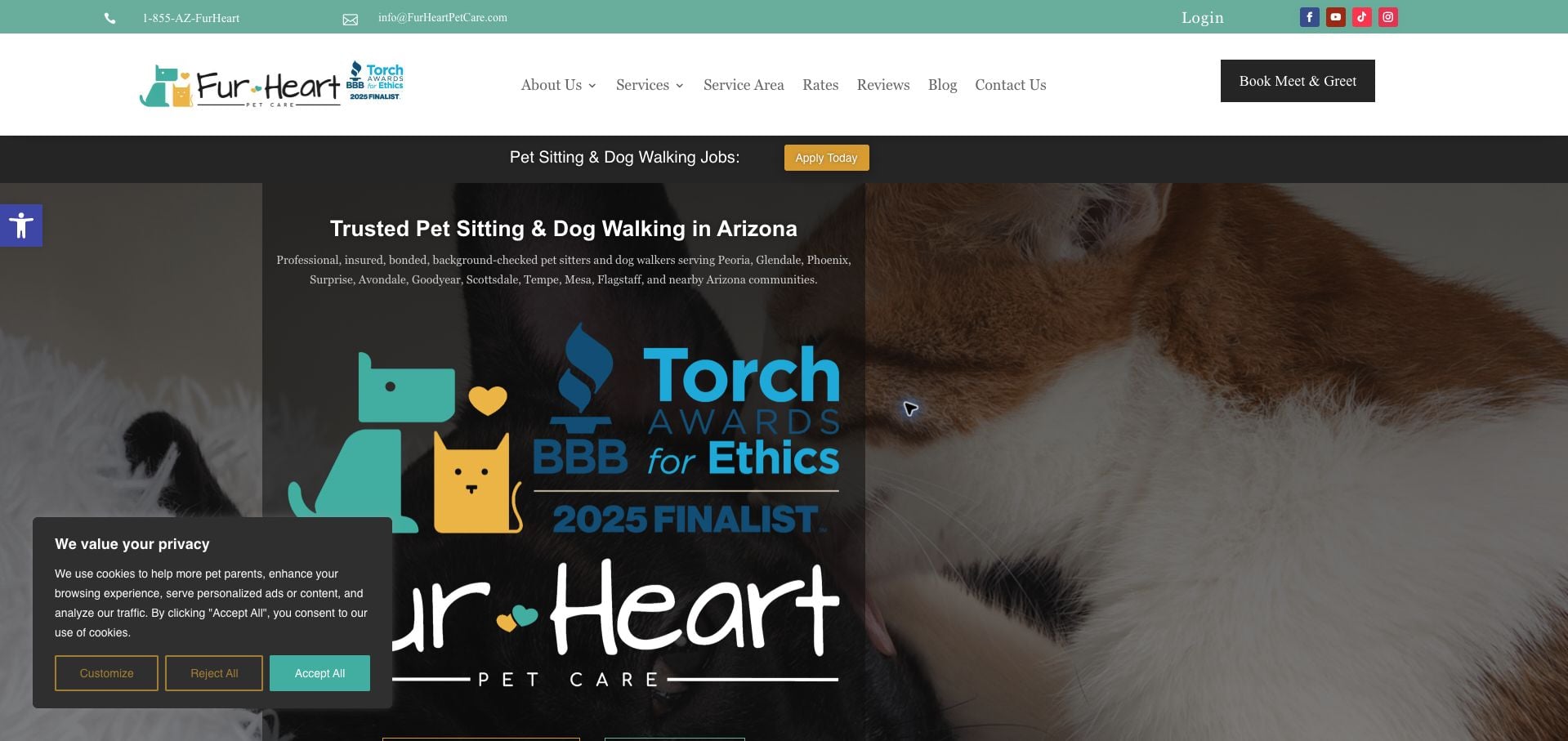
Fur Heart Pet Care names Arizona communities and separates dog walking, drop-ins and travel or overnight care. The inspected page gives meet-and-greet and client login different actions, keeping prospective and existing customers partly separated. Packages are introduced as a recurring-care option rather than the only available format. The homepage also contains a substantial award graphic, recruitment messaging and privacy controls, all of which compete with the main explanation. This is a useful example of service segmentation, while its many operational claims remain the business’s statements rather than independently verified assurances.
What you can learn
Group visits by the situation they serve and distinguish new-client onboarding from account management. Keep recruitment, awards and privacy interfaces from overwhelming the service-area and appointment information people need first.
Pros
Walking, drop-in and travel-care formats are distinguishable.
Meet-and-greet and client login have separate roles.
Cons & considerations
Awards and recruiting messages compete with the service introduction.
The large coverage list needs local eligibility confirmation.
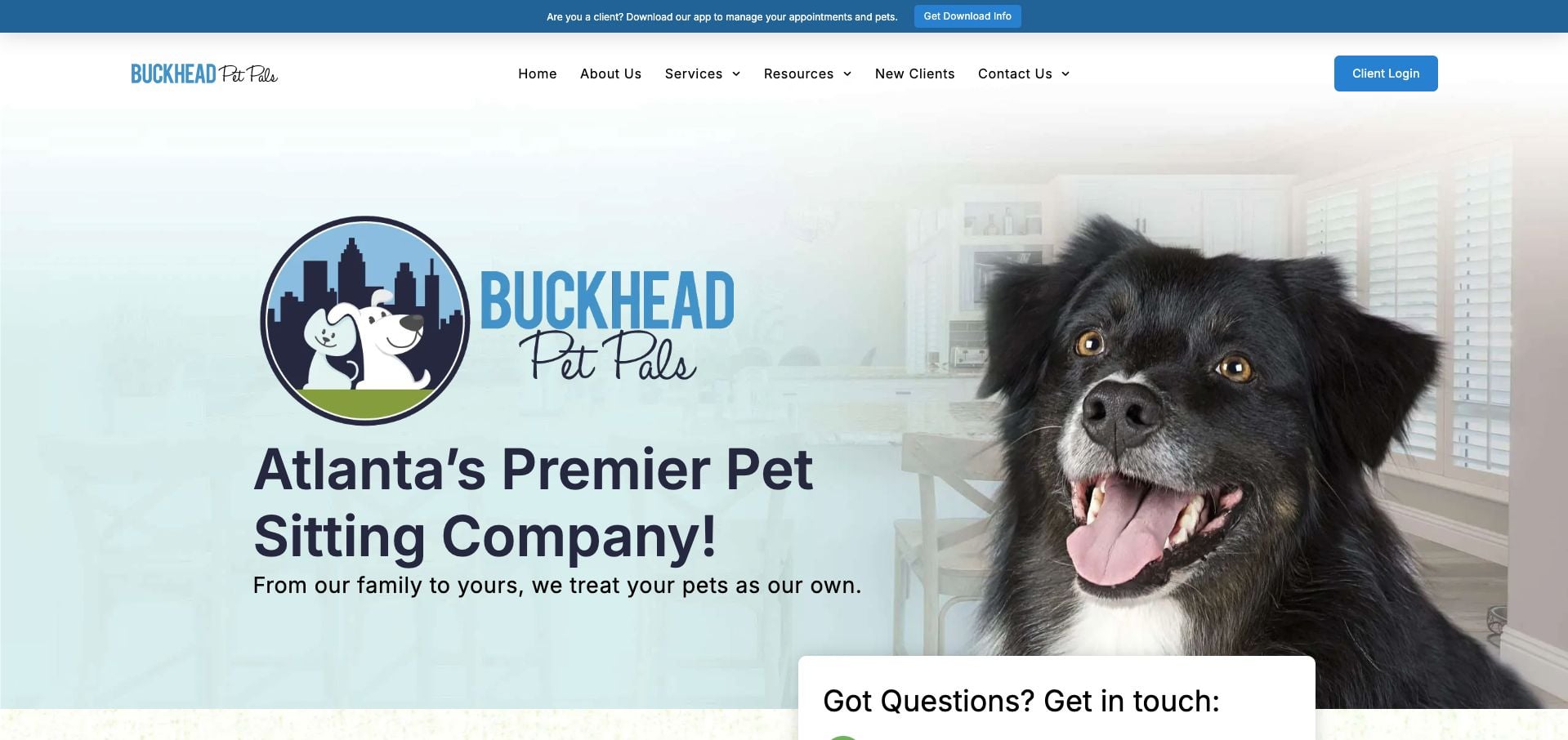
Buckhead Pet Pals pairs an Atlanta introduction with a large dog photograph and a visible new-client inquiry area. The inspected page gives call and text numbers different labels, includes a starting per-visit price and separates cat, dog and walking interests. A service-area route helps visitors establish local fit before assuming availability. The early form asks for several details, including address and needed dates, while company-history and award material extend the page. The practical borrowing opportunity is the concrete service unit and contact distinction, not the volume of promotional evidence.
What you can learn
Label phone and text channels accurately and explain the unit behind a starting price. Give visitors a way to confirm service-area fit before asking them to submit a detailed home-care request.
Pros
Call and text contact are clearly distinguished.
The starting price identifies a per-visit unit.
Cons & considerations
The early form asks for substantial detail before a full service comparison.
History and award sections make the homepage lengthy.
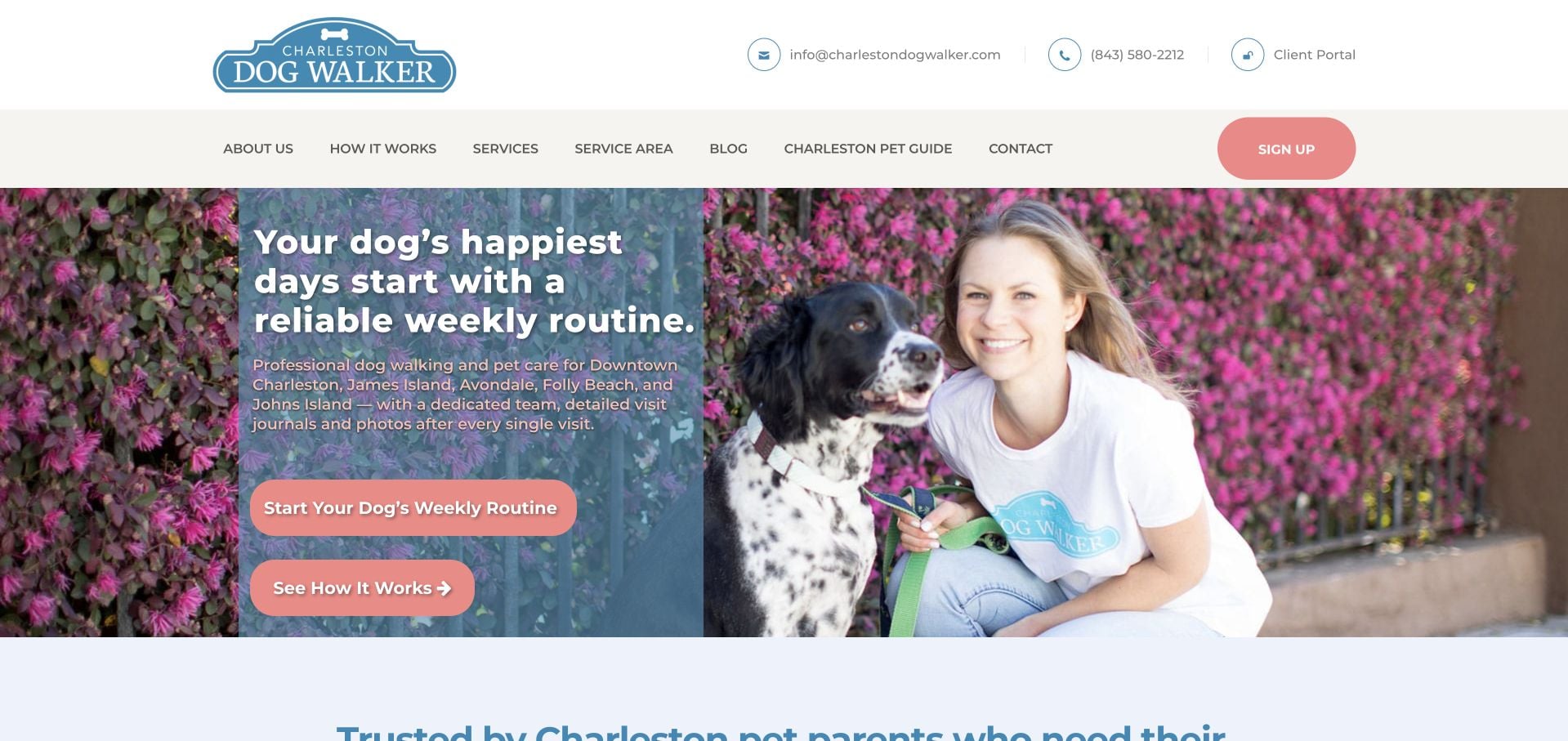
Charleston Dog Walker uses a concise weekly-routine message with a large service-area introduction and two different next steps: starting a routine or reading how it works. The inspected body explains team consistency and photo journals, then uses attributed long-term client quotations to develop that idea. This is more specific than a generic love-of-dogs homepage. It also gives recurring walks priority over occasional pet-sitting needs, so travel visitors must continue into the services menu. Long problem-and-solution passages can repeat the same proposition before adding another useful detail.
What you can learn
State whether the business is built around recurring care, occasional travel or both. Give the process explanation a genuine alternative action, and keep secondary visit types discoverable without forcing visitors to reinterpret the main promise.
Pros
The opening identifies neighborhoods and a specific recurring-care model.
How It Works offers a lower-commitment alternative to signing up.
Cons & considerations
Occasional travel care is less prominent than the weekly routine.
Extended problem-and-solution copy repeats the main proposition.
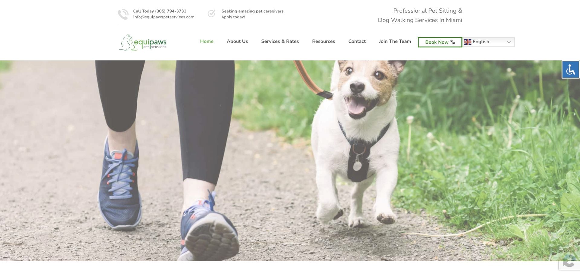
Equipaws presents its Miami context and a distinct green-accented identity, then explains the people behind the business and the role of an introductory meet-and-greet. Dog walking, cat visits and overnight care are described as different ways to build a care plan. Services & Rates is a plain navigation destination, with booking separated from team recruitment. The inspected page has extensive content and several utility or accessibility controls around the edges. The story is useful, but the main appointment route should remain apparent when those additional layers are present.
What you can learn
Connect a personal team story to the actual onboarding process. Keep the service menu, geographic context and first meeting clear before adding recruitment, editorial and utility layers to the same interface.
Pros
The meet-and-greet is explained as part of building a care plan.
Services & Rates gives visitors a literal comparison route.
Cons & considerations
The long story requires substantial scrolling.
Multiple utility and recruitment elements compete around the service journey.
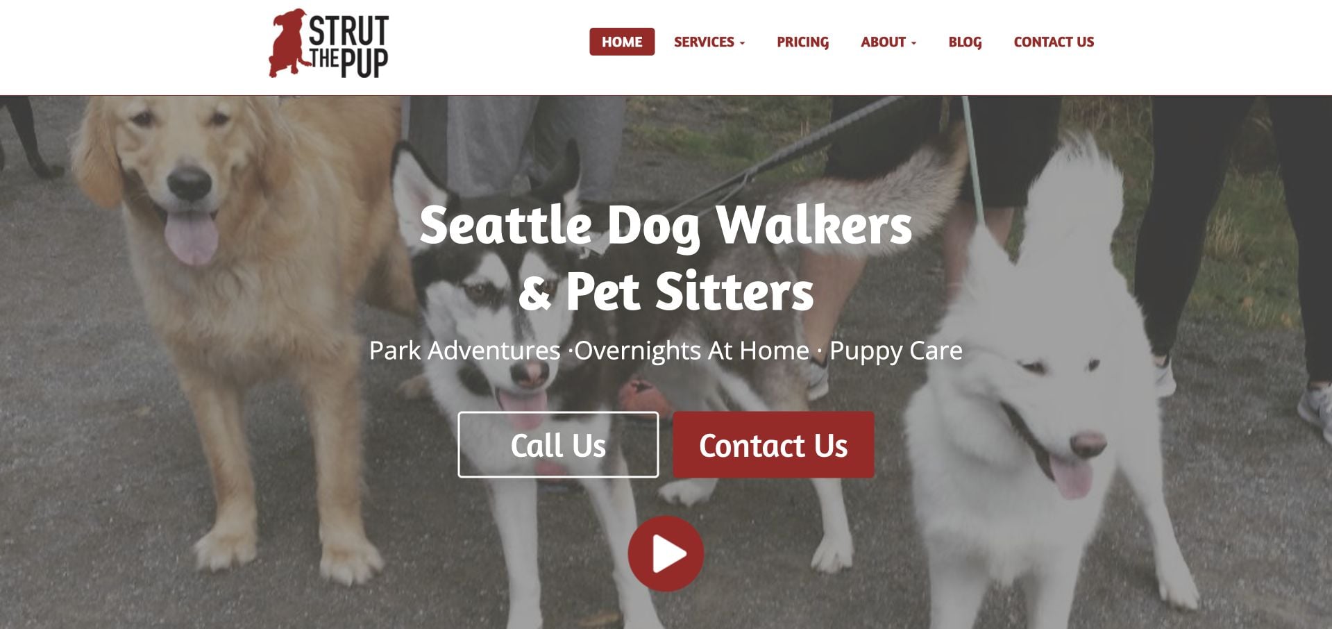
Strut The Pup identifies Seattle and separates ordinary walks, off-leash adventures, overnight stays and puppy care. The inspected descriptions explain that overnight care happens in the client’s home, a useful distinction from boarding. A direct pricing route and separate call and contact actions support the introduction. Team employment and training are described by the business, while a video invitation adds another way to explore. The broad navigation and multiple care categories need careful hierarchy so that the visitor does not have to interpret everything before choosing a simple home visit.
What you can learn
Specify the care setting in the service label when home sitting and boarding could otherwise be confused. Keep group adventures separate from individual visits, and make prices and first-contact options easy to reach.
Pros
The overnight label explicitly identifies the client’s home as the setting.
Pricing and contact routes are recognizable.
Cons & considerations
The number of service categories makes the header substantial.
Video and broad trust messaging add attention demands before comparison is complete.
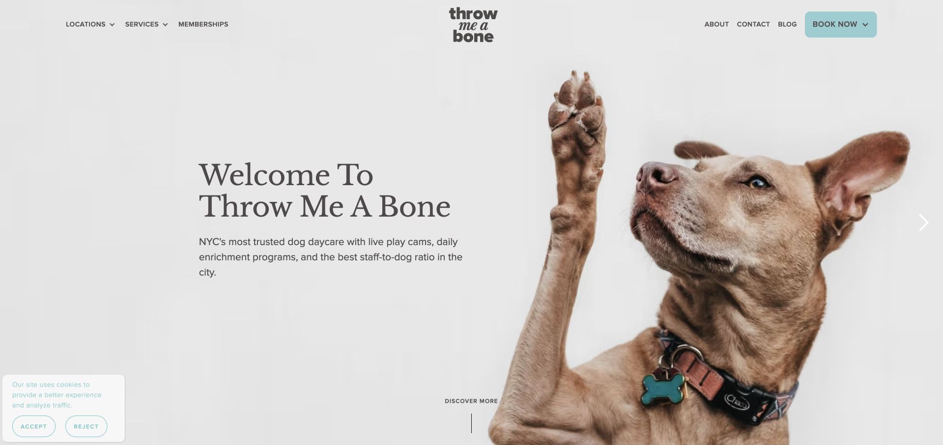
Throw Me A Bone uses a playful, tightly cropped dog photograph and a compact white header to introduce its New York pet-care brand. The inspected page separates daycare, boarding, grooming, walking and sitting rather than implying that all are the same service. Importantly, the sitting description qualifies availability to partnered properties and explains the short home-visit format. Location cards provide physical-facility context. That breadth is useful to study, but the daycare-led opening can obscure the narrower eligibility of a home-sitting request, and privacy controls occupy part of the first view.
What you can learn
State service-area or property eligibility on the relevant care description, not only in a later form. Separate facility-based services from in-home visits so photographs of one do not imply availability of the other.
Pros
The sitting description includes a property-eligibility qualification.
Facility services and home-visit interests are separately described.
Cons & considerations
The daycare-led hero can overshadow the narrower sitting offer.
The wide service range and privacy notice add competing interface layers.
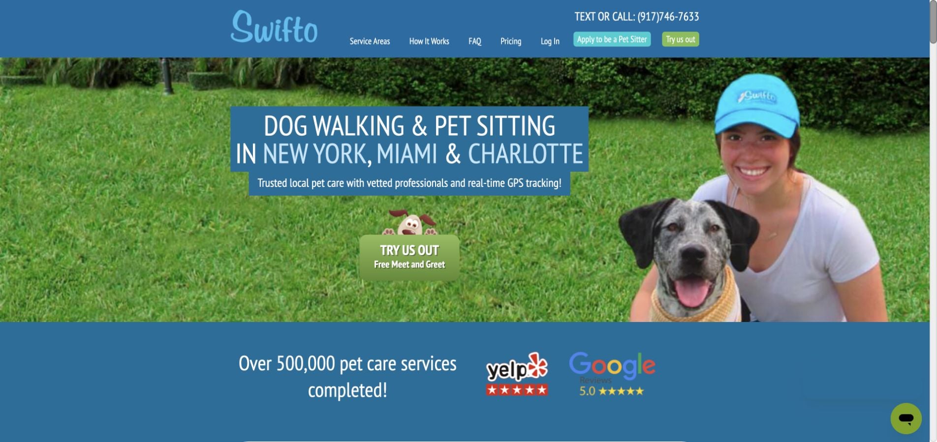
Swifto names New York, Miami and Charlotte in its opening, placing a short meet-and-greet qualification beside the main trial action. The inspected body explains photo updates, start-and-finish notifications and GPS information as parts of the care-reporting process. Pricing, service areas and FAQs are visible navigation choices. Conditions attached to appointment guarantees are also explained rather than left completely unstated. The long feature sequence and prominent provider-recruitment interest can distract from a straightforward client request, while actual eligibility still depends on the local service area.
What you can learn
Explain what the owner receives after a visit and qualify timing or availability promises near those explanations. Keep provider applications distinct from customer onboarding, particularly when both share a small navigation.
Pros
The opening names the operating regions and introductory meeting step.
The page explains reporting features and availability conditions.
Cons & considerations
The long feature sequence makes quick service comparison harder.
Provider recruitment competes with the client appointment journey.
Kegan is a freelance web designer and developer with 15+ years of experience helping businesses turn complicated website requirements into clear, maintainable digital experiences. He works directly with clients from planning and design through development, launch, and ongoing support.
For pet sitting website design, his development approach focuses on service-area and visit-format explanations, named caregiver introductions, onboarding information, and privacy-conscious scheduling handoffs. The scope can be a targeted improvement or a complete custom build, with responsive layouts, thoughtful content structure, and integrations chosen around the people using and maintaining the site.
Show 3 other pet sitting website designersHide other pet sitting website designers
Plan the route from a local search to an agreed visit
Document coverage before adding a map
List the neighborhoods, service types and any travel boundaries the business actually supports. Make exceptions explicit rather than drawing an impressive but vague radius. Keep the geographic wording consistent in the homepage, service pages and inquiry form.
Describe the first-client sequence
Explain the ordinary steps: an initial request, a conversation or meeting where applicable, service agreement and confirmation. State who responds and what information is useful at the beginning. Do not collect door codes, keys or detailed household access instructions through a generic public contact form.
Keep seasonal information maintainable
Assign an owner to holiday availability, request cutoffs, service changes and published rates. Show the year on holiday notices and remove expired messages. Provide existing clients with the correct update channel rather than making them resubmit a new-client inquiry.
The editing job behind the design
Separate public information from private client details
A small site with clear coverage, service descriptions, actual team introductions and a useful inquiry can be more effective than an elaborate map with uncertain boundaries. Keep pricing units understandable: per visit, walk, overnight or another defined format. Explain relevant additions rather than using a low starting figure without context.
If a client portal supports scheduling or communication, label it for existing clients and retain a clear new-client route. Explain external handoffs and use an appropriate private process for household and pet information. Do not treat a software badge, testimonial or published insurance claim as independent verification of the business.
Our WordPress website examples offer a separate look at publishing approaches. A visible platform label is evidence for that named page, not a guarantee that the same system will suit your requirements.
Before the public launch
Pet sitting website planning checklist
Name the actual service-area neighborhoods.
Distinguish walking, visits, overnight care and boarding.
Explain visit formats and pricing units.
Introduce the actual team.
Describe the new-client process.
Keep existing-client login separate.
Date holiday and capacity notices.
Explain inquiry versus confirmed service.
Provide direct contact and response expectations.
Keep household access details out of public forms.
These checks are a project checklist, not a performance, legal, security, or accessibility certification. Test real journeys with the people responsible for the website before making claims about the result.
Sources & editorial method
How this collection was selected and reviewed
These 18 examples match the collection count saved before research. The editorial team directly inspected the public company pages and recorded source URLs, visible text and screenshot provenance in the supporting capture manifest. Direct browser captures are individually dated; the collection may also reuse an existing direct capture of the same primary property without changing its original capture date. The guide-level narrative was prepared from that inspected evidence. Reviews describe website design, service information and navigation, not professional competence, safety, treatment effectiveness, availability or promised outcomes. Business claims, testimonials and badges are not independent verification. Public technology labels require source evidence; unknown stacks remain unlisted. No appointments, purchases, inquiries or private intake forms were completed for this review. Parked, blocked, empty and unrelated pages were excluded. Website imagery and trademarks belong to their respective owners.
Each example links to its actual source page. Screenshots are direct browser captures with their own capture dates; moving imagery, announcements and live designs can change. The notes describe observable design choices and conditional tradeoffs, not measured traffic, conversion results, service quality, or accessibility conformance.
Technology labels use public page metadata, asset evidence, or explicitly cited platform documentation. Platform documentation is not a complete current deployment audit. A component reference may be legacy or unused; it is not a complete backend inventory. Unknown stacks are omitted. These sites are editorial examples, not our client portfolio.
Written, Edited and Curated are separate editorial records, not timestamps advanced by a rebuild. Website designs and imagery belong to their owners. See our editorial standards or suggest a correction.
Questions worth asking
Pet Sitting website design questions
Should a pet sitting website show a service-area map?
A map can help, but readable neighborhood or boundary information should accompany it. Explain exceptions and avoid implying that every address inside a broad circle receives the same service. Let uncertain visitors ask about coverage before completing a long form.
What should a new-client inquiry ask for?
Begin with the general service area, requested dates, type of pet and service interest. Explain the next step and use an appropriate private process for detailed routines or household access information. Requesting care should not look like an automatically confirmed booking.
How should holiday availability be shown?
Publish the affected dates or holiday year and state whether new requests are open, limited or closed. Distinguish existing-client arrangements where relevant. Remove or update the message when the period changes instead of recycling an undated banner.
Can trust claims replace information about the team?
No. Useful team introductions and a clear service process answer different questions from badges or testimonials. Present any professional or insurance statements accurately as the business’s published claims; this visual collection does not independently verify them.
A useful pet sitting website helps the right local client start a well-informed conversation while making service limits, privacy and confirmation boundaries clear.