Best Alpaca Farm Websites of 2026 (21 Real-World Examples)
Real alpaca farm websites showing how to explain visits, seasonal access, fibre products and animal ownership without mixing those journeys together.
A good alpaca farm website makes the animals appealing and the visit arrangements unmistakable.
People arrive at an alpaca farm website with very different intentions. One family wants to book a short encounter, another visitor has a gift voucher, a knitter wants fibre, and a prospective owner needs husbandry information. A beautiful herd photograph can welcome all of them, but it cannot answer every practical question. Clear routes and accurate availability turn that first impression into a useful website.
This collection compares 21 directly reviewed farm websites and specific farm pages. The examples include visitor attractions, working breeding farms, fibre shops and smaller developing operations. Compare the decisions about experience descriptions, seasonal notices, booking and farm identity. The selections are design references, not recommendations about animal care, service quality or the suitability of a particular visit.
Before the examples
What makes good alpaca farm website design in 2026?
Explain exactly what a visit involves
Distinguish a meet-and-greet, a walk, a guided tour and a self-guided visit. State the duration, age arrangements, whether people share an animal and any practical access conditions. Place this information before the reservation decision. Do not assume a photograph communicates terrain, facilities or how much interaction is included.
Make current access more prominent than aspiration
Seasonal farms need to separate animal access from shop opening hours. Display closures, appointment requirements and booking-only access near the main invitation. A farm may remain active while its visitor programme is closed; the website should explain that distinction rather than leaving visitors to infer it from an attractive picture.
Separate experiences, products and ownership
Use different routes for booking a visit, buying or redeeming a voucher, shopping for products and enquiring about animals. Breeding and husbandry information serves a different decision from a family day out. Keep that depth available without making every visitor read it before finding the experience calendar.
The collection · 21 examples
21 alpaca farm websites worth studying
Start with the seasonal-availability and booking patterns, then compare the quieter farm-story and fibre-retail approaches. Each example keeps its own directly captured source page and a collection-specific review.
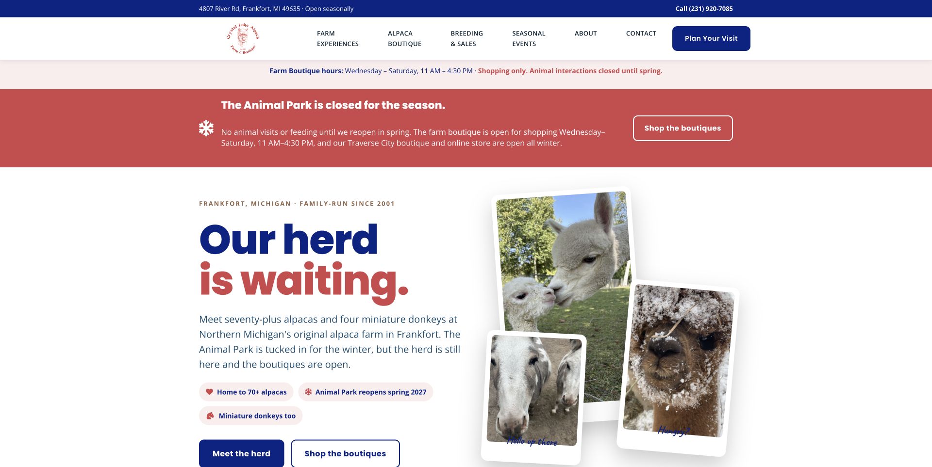
Crystal Lake makes an awkward seasonal distinction unusually easy to understand. A dusty-red notice says animal visits are closed, while the adjacent boutique-hours strip explains what remains open. The navy headline and overlapping animal photographs keep the page welcoming without hiding that constraint. Meet the herd and Shop the boutiques lead to different intentions, and the page continues with expandable stops, gallery filters and visit information. This is useful hierarchy for an alpaca farm with several revenue streams. The repeated closure messages occupy a lot of space, but they prevent an appealing photograph from becoming an accidental invitation to arrive when the animals are unavailable.
What you can learn
Put the operational exception beside the invitation. A seasonal farm can keep an attractive introduction while naming which experiences are closed, which shop remains open and what visitors should do next.
Pros
Seasonal closure and shopping availability are explicitly separated.
Distinct herd and boutique actions support different visitor goals.
Cons & considerations
Repeated notices take a substantial portion of the opening screen.
The long interactive page needs regular seasonal maintenance.
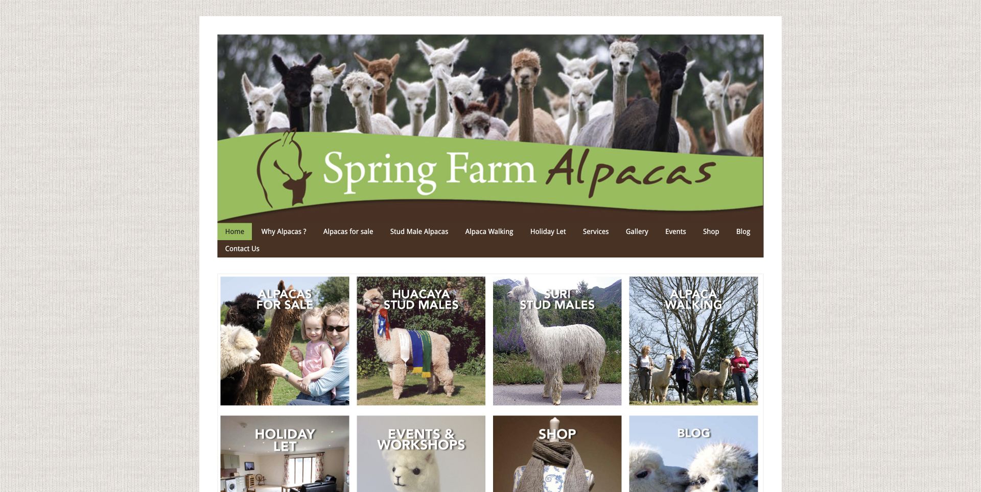
Spring Farm introduces its alpacas through a broad herd photograph, a curved green masthead and a compact brown navigation row. The useful decision point comes in its photographic service tiles: sales, breeding, walking, holidays and the shop are presented as different reasons to visit the site. Longer husbandry and biosecurity material then gives serious prospective owners somewhere to continue. The textured framing and traditional composition feel personal, though the number of destinations can demand attention from a first-time day visitor. Study the way the business separates its audiences rather than assuming one large booking button serves everyone who arrives.
What you can learn
Give leisure visitors, prospective owners and fibre shoppers their own understandable entry points. Small photographic routes can explain the shape of a farm business before its detailed care information begins.
Pros
Service photographs make the range of farm activities concrete.
Care and husbandry information supports deeper ownership research.
Cons & considerations
Several equally prominent routes compete for the first decision.
Hilly Ridge pairs a large photograph of visitors and alpacas with a rounded booking panel. That makes the experience feel like time spent with animals, rather than a product represented only by an icon. A green utility strip and restrained white masthead keep contact and navigation separate from the photograph. Gift-voucher and visit routes are visible together, with further photographic choices below. The circular overlay is a memorable visual device, although it covers part of the scene and asks the photo to carry several messages. It is a useful reference for making a rural attraction approachable while retaining a direct route to booking.
What you can learn
Use a real encounter photograph to show the nature of the activity, then give the booking and gifting actions a clearly bounded panel. Keep enough of the scene visible to explain what the visitor will actually do.
Pros
Visitor photography describes the experience before the detailed copy.
Booking and gift routes appear early.
Cons & considerations
The overlay covers part of the photograph.
Several choices in one panel can dilute the primary action.
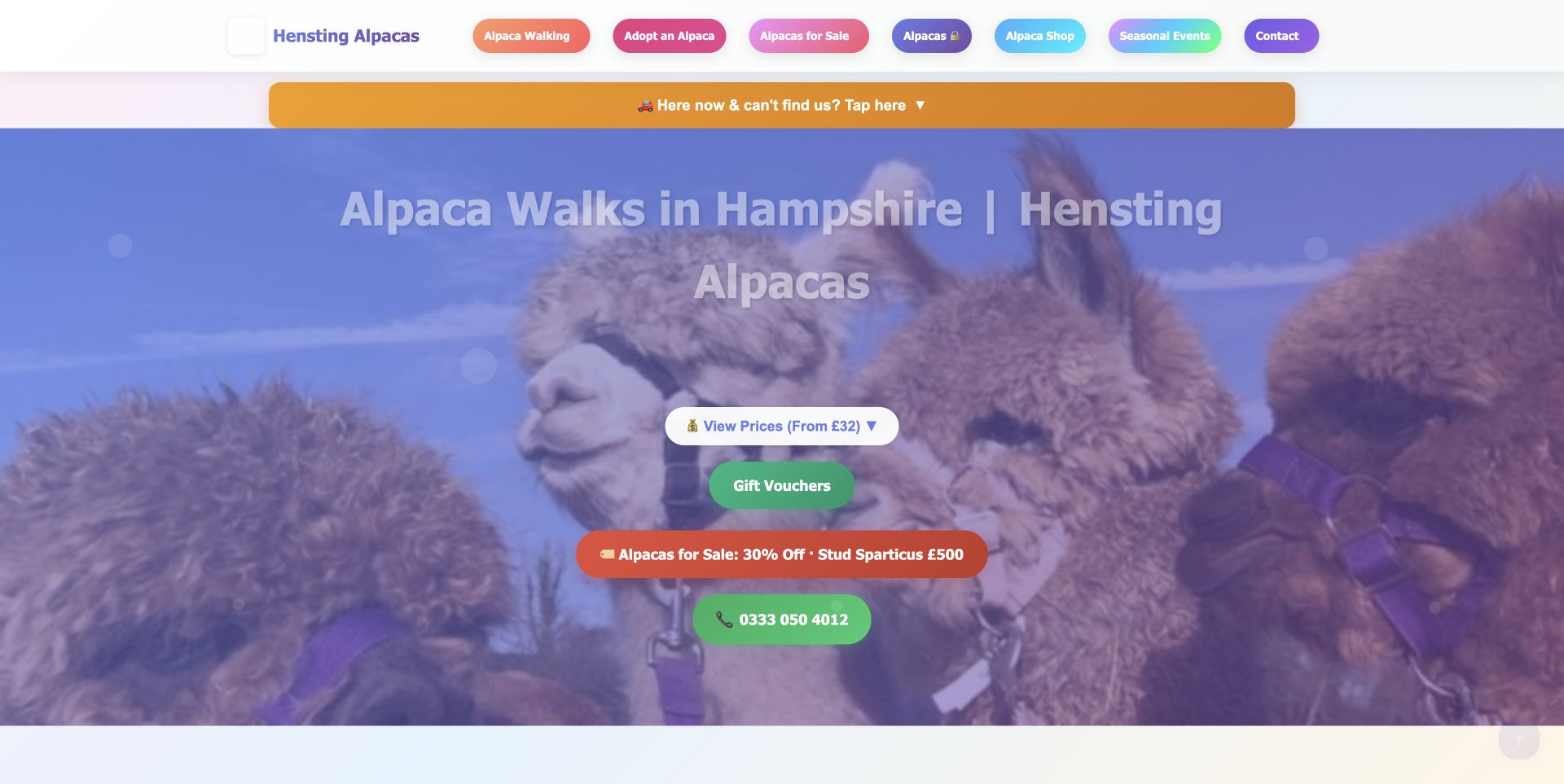
Hensting uses colourful rounded navigation and a close alpaca photograph to give its opening page an informal character. The unusually useful element is the orange arrival-help strip for people already nearby who cannot find the farm. Price, gift and telephone actions sit around the main introduction, while the longer page covers practical questions such as duration, ages and clothing. This combines the excitement of an animal experience with information needed on the day itself. The number of colours and calls to action makes the screen busy, so a smaller farm should borrow the arrival assistance and intent separation without necessarily copying every visual treatment.
What you can learn
Plan for visitors who are already on their way as well as those still browsing. A clearly labelled arrival-help route can sit alongside the sales journey without forcing people to search through promotional copy.
Pros
Arrival help addresses a concrete visitor need.
Practical visit conditions accompany the promotional material.
Cons & considerations
Numerous colours and actions compete in the opening view.
Important details still require reading farther down the page.
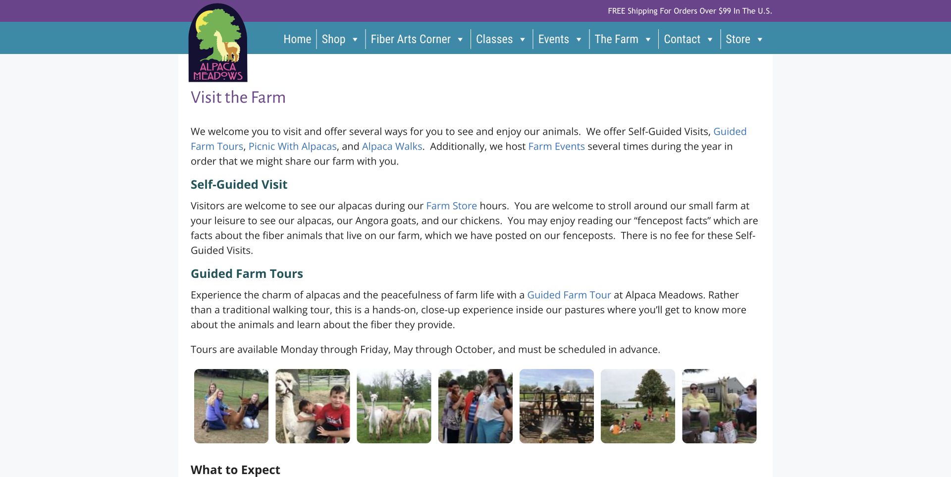
Alpaca Meadows’ Visit the Farm page leads with explanation rather than a full-screen promotional image. Purple and teal accents frame a readable central column, and the text distinguishes self-guided visits from booked guided experiences. A small row of encounter photographs provides context without taking over the page. Below, the practical notes address terrain, restroom availability and dogs, making the visit decision more specific. The restrained page is less immediately dramatic than a photographic homepage, but its value is the clarity of the promise. It shows how a farm can help visitors choose an appropriate experience before they reserve it.
What you can learn
Give each type of visit a plain-language definition, then state the practical limits near that explanation. Visitors should understand what is self-guided, what needs booking and what facilities are available before committing.
Pros
Self-guided and guided options are explicitly distinguished.
Practical limitations are described in the visit copy.
Cons & considerations
Text carries more of the explanation than imagery.
Small thumbnails provide limited detail at a glance.
Charnwood Forest’s Pukka Pacas site combines an illustrated animal masthead with a strongly seasonal opening panel. The retained capture pairs festive graphics with actual alpaca imagery, while navigation provides routes into the wider experience offering. Further cards give individual activities a place in the hierarchy instead of hiding them inside a single general enquiry. The visual approach is energetic and memorable, but it needs ongoing editorial attention: a seasonal promotion can quickly dominate the farm’s year-round proposition. For a visitor business, the useful pattern is to preserve a stable activity structure underneath the current event campaign.
What you can learn
Treat a seasonal event as a layer over a stable experience catalogue. Keep the farm identity and everyday activities easy to find when a temporary campaign occupies the largest part of the homepage.
Pros
Illustrated branding makes the farm identity recognisable.
Activity cards provide routes beyond the current promotion.
Cons & considerations
Seasonal graphics dominate the opening impression.
A broad activity menu requires visitors to compare several options.
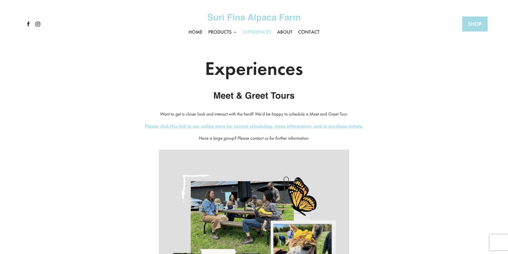
Suri Fina’s Experiences page is deliberately spare. A centred column, aqua links and generous whitespace let the Meet and Greet explanation carry the page. The text directs readers to tickets, gives larger groups a separate instruction and distinguishes the farm store from a guided experience. A collage lower down adds human and animal context without interrupting the practical information. This is a useful example for a small operation that does not need a complex booking catalogue. The tradeoff is that the ticket link is less visually forceful than a conventional button, and the narrow text layout places more responsibility on the wording.
What you can learn
A simple experience page can work when it answers the right questions in order. Explain the visit, state how to arrange it, separate group enquiries and make clear whether the shop follows different access rules.
Pros
Tour and store arrangements are described separately.
Group instructions reduce ambiguity before contact.
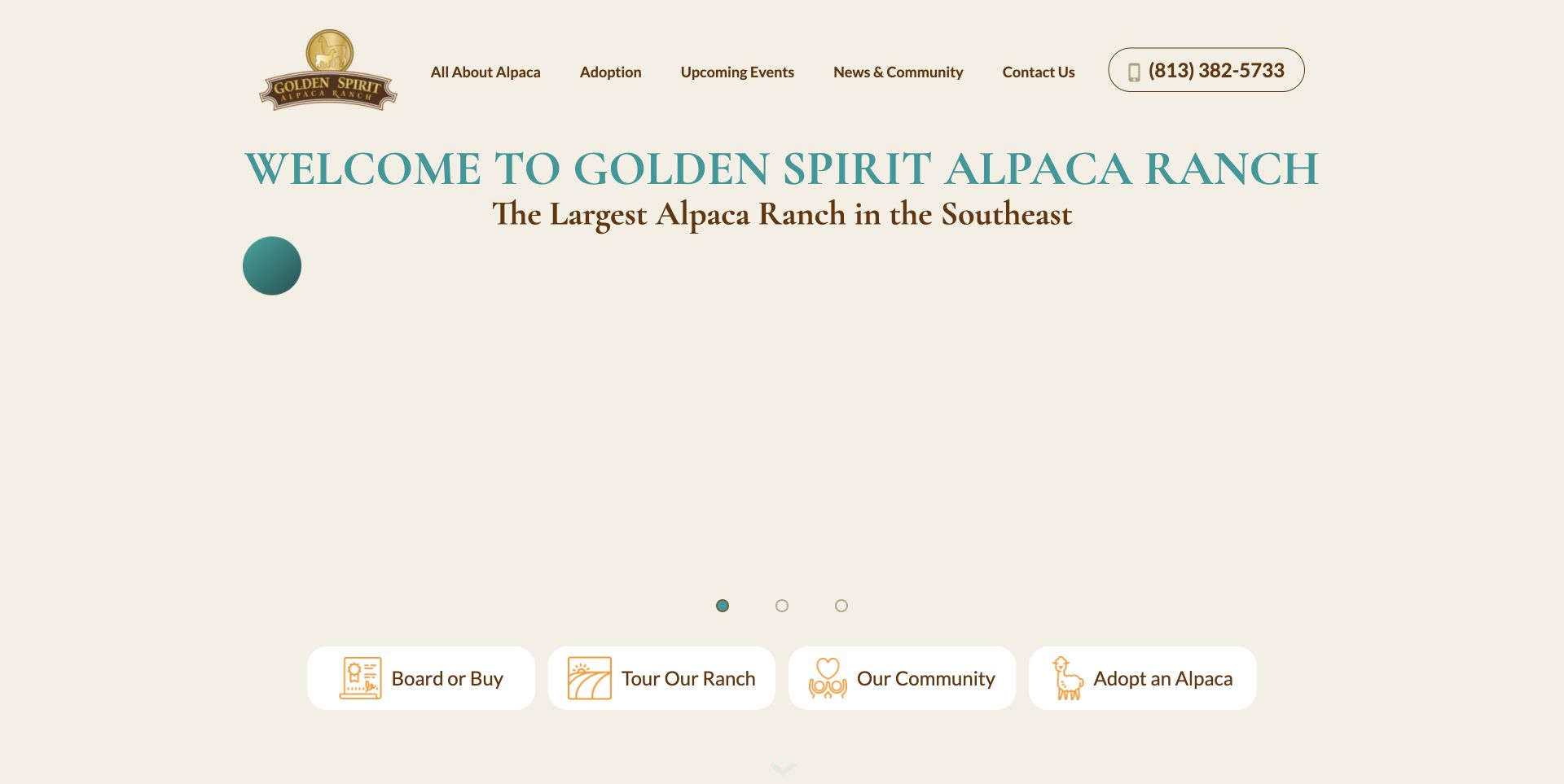
Golden Spirit uses a cream and teal palette, serif headings and a pasture photograph to establish a calm first impression. Four icon-led routes then distinguish ownership and boarding, tours, community activity and adoption. That structure is more useful than treating every visitor as a potential ticket buyer. Farther down, the page distinguishes the tour location from the mailing address, a small but important detail for a physical destination. The opening remains composed, although icon categories need their labels to explain the exact service. Study the audience structure and practical location distinction rather than interpreting the peaceful presentation as a claim about the quality of care.
What you can learn
Separate the reasons people contact a farm before asking them to act. When operational and mailing locations differ, label that difference explicitly instead of relying on a single generic address in the footer.
Pros
Audience routes are clearly separated.
Different address purposes are stated in the page.
Cons & considerations
Icons need accompanying labels to explain the services.
Visitors must continue reading for the detailed arrangements.
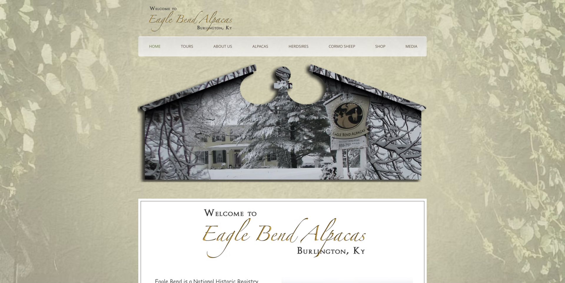
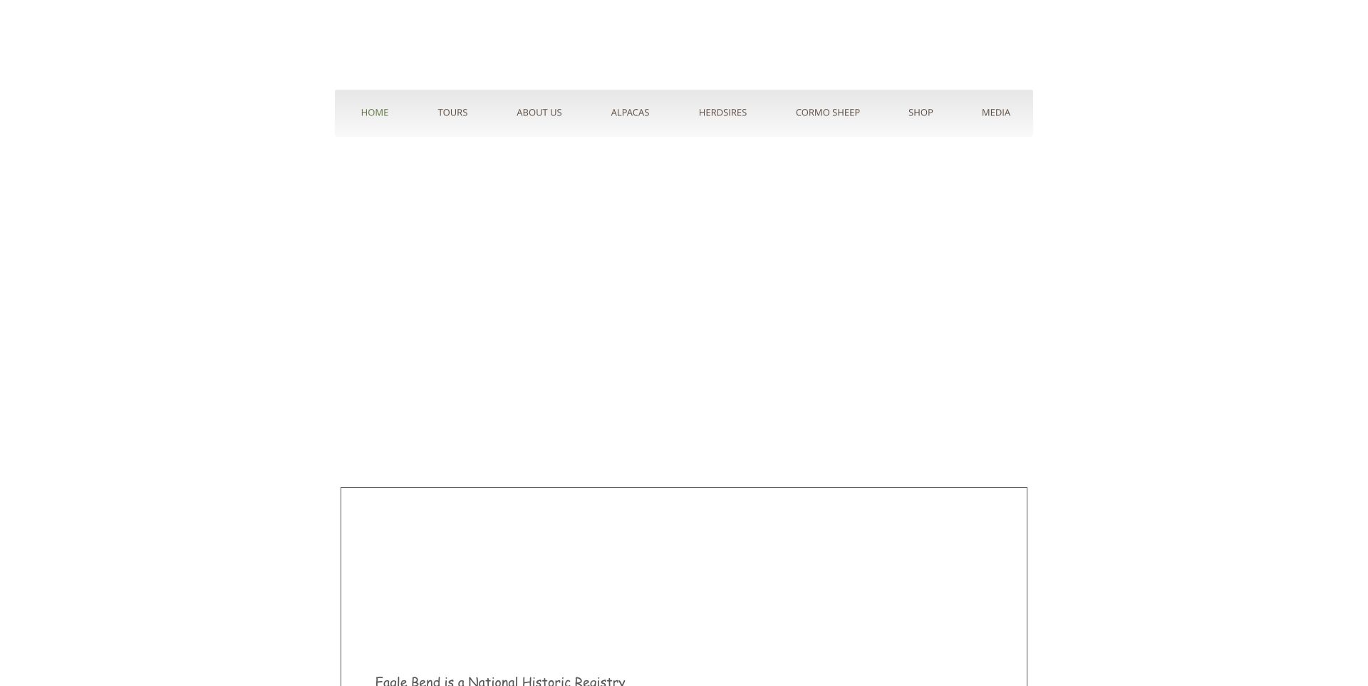
Eagle Bend presents its yarn and fibre business within a pale-green botanical frame. The script wordmark, centred navigation and winter property photograph make the farm setting part of the shop identity. The page also names tours as appointment-only and provides routes for alpacas, fibre products and Cormo sheep. This works as a reference for a farm whose products and animals belong to one story rather than separate brands. The decorative framing and restrained typography are characterful, but practical actions can feel quieter than the surrounding scene. A visitor should not have to infer that the existence of a farm photograph means unrestricted public access.
What you can learn
Connect the product range to the place it comes from while making the access arrangement explicit. An appointment-only farm can show its landscape without presenting itself as an always-open attraction.
Pros
Farm imagery connects retail products with a physical setting.
Appointment-only touring is explicitly communicated.
Cons & considerations
Decorative framing competes with the practical content.
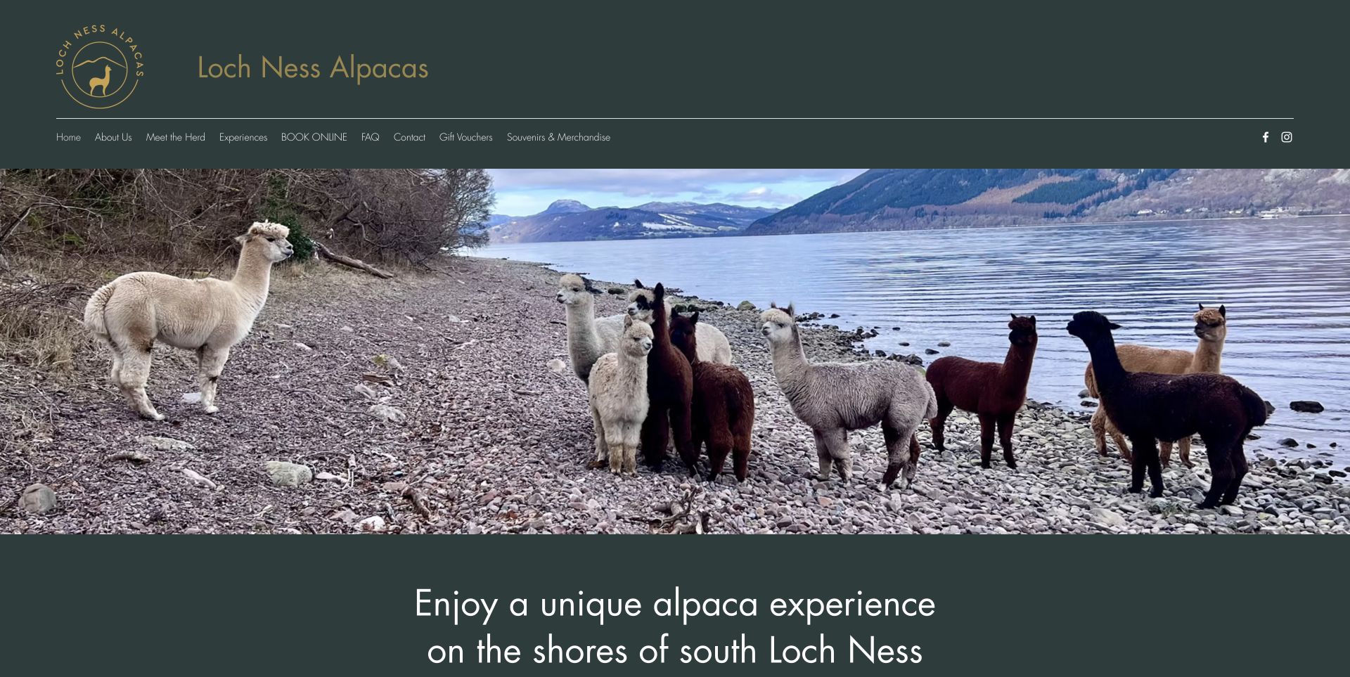
Loch Ness Alpacas makes its location visible rather than relying only on a place name. A broad shoreline herd photograph sits beneath a dark-green and gold masthead, with a compact navigation row leading to booking, questions and gifts. The lower page introduces named alpacas, adding personality after the larger landscape has established the setting. This combination gives the experience a specific sense of place. The photograph uses much of the opening screen, however, so visitors still need to move beyond it for the operational detail. The useful lesson is the relationship between landscape, animal identity and a small set of direct visitor routes.
What you can learn
Let one real landscape photograph establish why the location is distinctive, then keep booking and practical questions close to it. Individual animal profiles can add personality after the basic visitor journey is clear.
Pros
A real shoreline setting differentiates the experience.
Booking, FAQs and gifts have distinct routes.
Cons & considerations
The large photo delays detailed visit information.
Animal stories should not replace practical conditions.
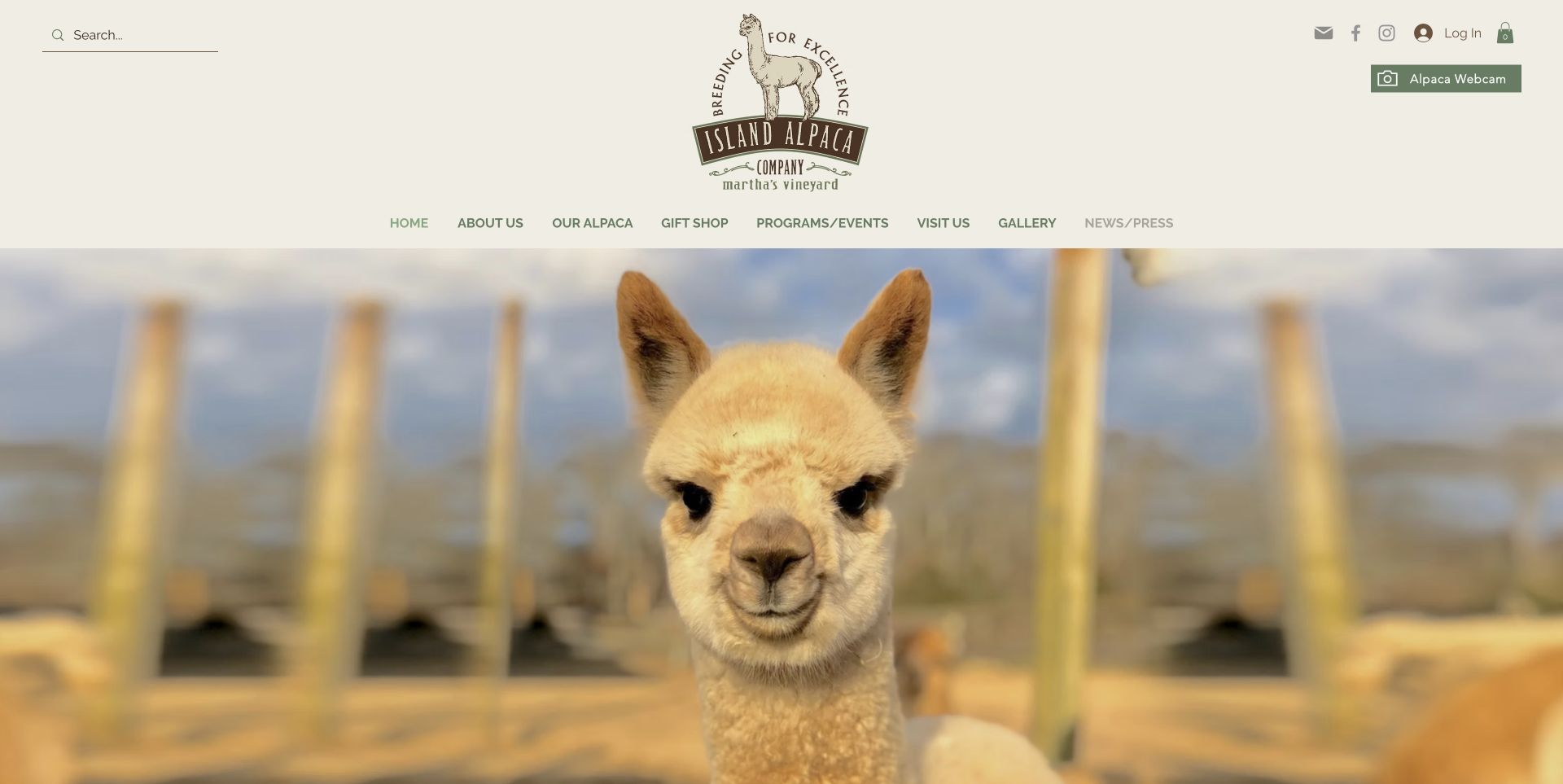
Island Alpaca gives its illustrated farm logo a generous cream-and-olive masthead, then lets a close-up alpaca photograph dominate the first view. Search and a webcam link occupy clear utility positions. Below the photograph, the site separates gifts, Walk and Talk, yoga, alpaca sales and special events into named routes. That directory is valuable for a farm with several different audiences. The opening announcement had to be dismissed before the retained capture, and the large masthead and image delay practical visit details. The design is most useful as an example of keeping a recognisable identity while giving a varied programme understandable categories.
What you can learn
Build a clear programme directory underneath the brand introduction. Name activities in visitor language, retain search for people with a specific goal and avoid making a welcome announcement obstruct the first decision.
Pros
Named programmes separate distinct visitor intentions.
Search and webcam are easy-to-distinguish utility links.
Cons & considerations
Large masthead and photograph push details down.
An opening announcement initially obstructed the page.
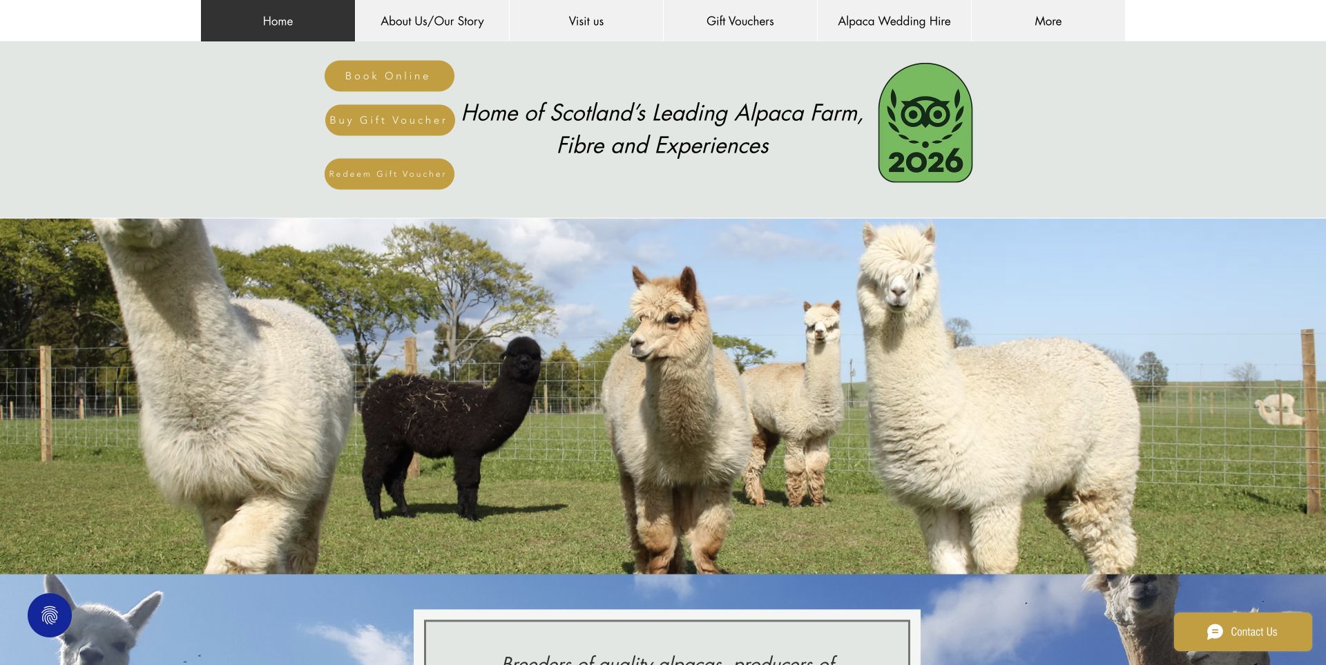
Bowbridge places three gold actions beside its opening headline: book online, buy a gift voucher and redeem a gift voucher. That last distinction matters because returning gift recipients have a different task from new buyers. A pale-sage strip leads into a broad herd photograph, while the page explains one-hour, two-hour and private experiences below. Gifts, mindfulness and husbandry are given their own routes. The long series of large text blocks could be easier to scan, and the opening contains several competing elements. Even so, the explicit separation of purchase and redemption is a practical pattern worth borrowing for experience-led farms.
What you can learn
Treat voucher redemption as its own journey. A gift recipient should not have to work through the purchase path to discover how to arrange a visit, and different experience lengths should be explained before booking.
Pros
Booking, voucher purchase and redemption are separate actions.
Different durations and private visits are explained.
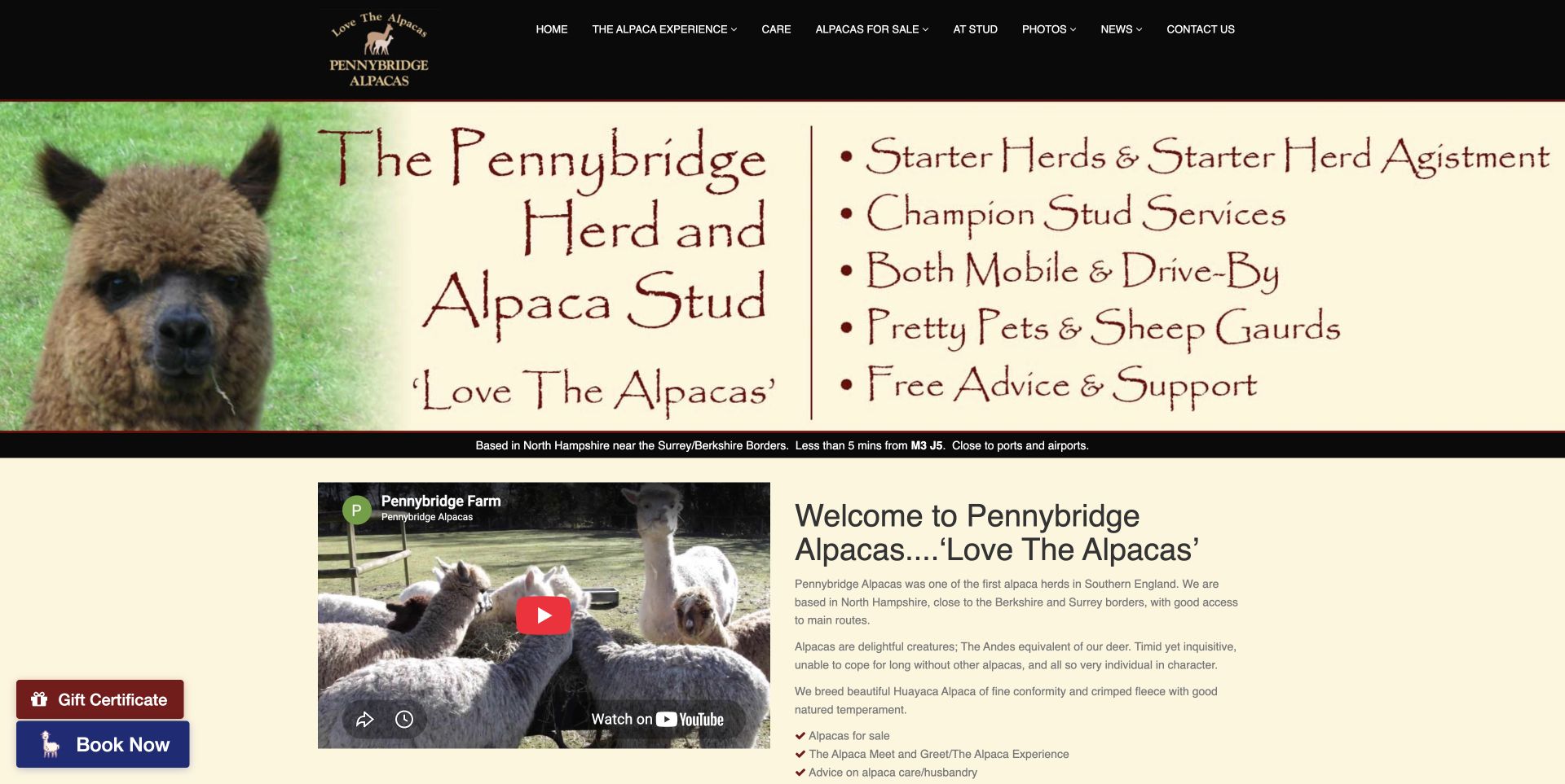
Pennybridge uses a black-and-cream palette and a wide banner to introduce herd and stud services. Immediately below, a narrow strip places the farm near a motorway junction, before a two-column video and introduction explain the wider offering. Persistent Book Now and Gift Certificate links keep experience purchases available while readers explore breeding, care or photographs. The banner includes a substantial amount of image-based text, and some navigation destinations are HTTP links, so the implementation is not a model to copy literally. Its useful editorial pattern is the combination of regional orientation, audience-specific content and readily available booking shortcuts.
What you can learn
Place a concise geographic cue near the introduction and retain a direct booking shortcut through longer farm information. Keep important banner wording as readable page text when building a new version of this pattern.
Pros
Location information appears before long introductory copy.
Booking and gift shortcuts remain visually distinct.
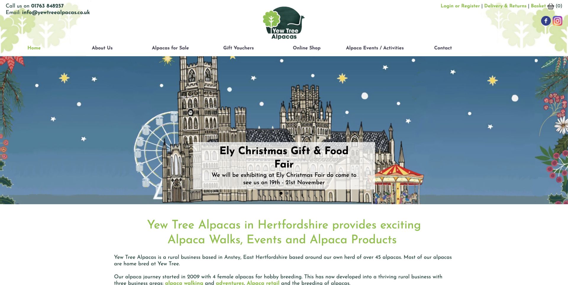
Yew Tree repeats leaf illustrations, rounded lettering and green accents across its masthead and headings. The reviewed opening promotes a dated seasonal fair, while contact details, vouchers and the basket remain visible in the header. Below, the introduction names walking, retail and breeding as separate business areas and explicitly says that activities are prebooked rather than open-farm access. This is helpful operational copy beneath a promotional surface. The seasonal artwork can displace the main visit proposition, so its dates and relevance need active upkeep. The site is a useful example of keeping retail and experiences under one rural identity while stating access limits plainly.
What you can learn
Use seasonal campaigns without losing the everyday access rule. If a farm is not open for drop-in visits, say so beside the experience introduction and keep booking, shopping and contact destinations easy to distinguish.
Pros
The page explicitly states the prebooked-visit requirement.
A consistent illustrated identity connects shop and farm.
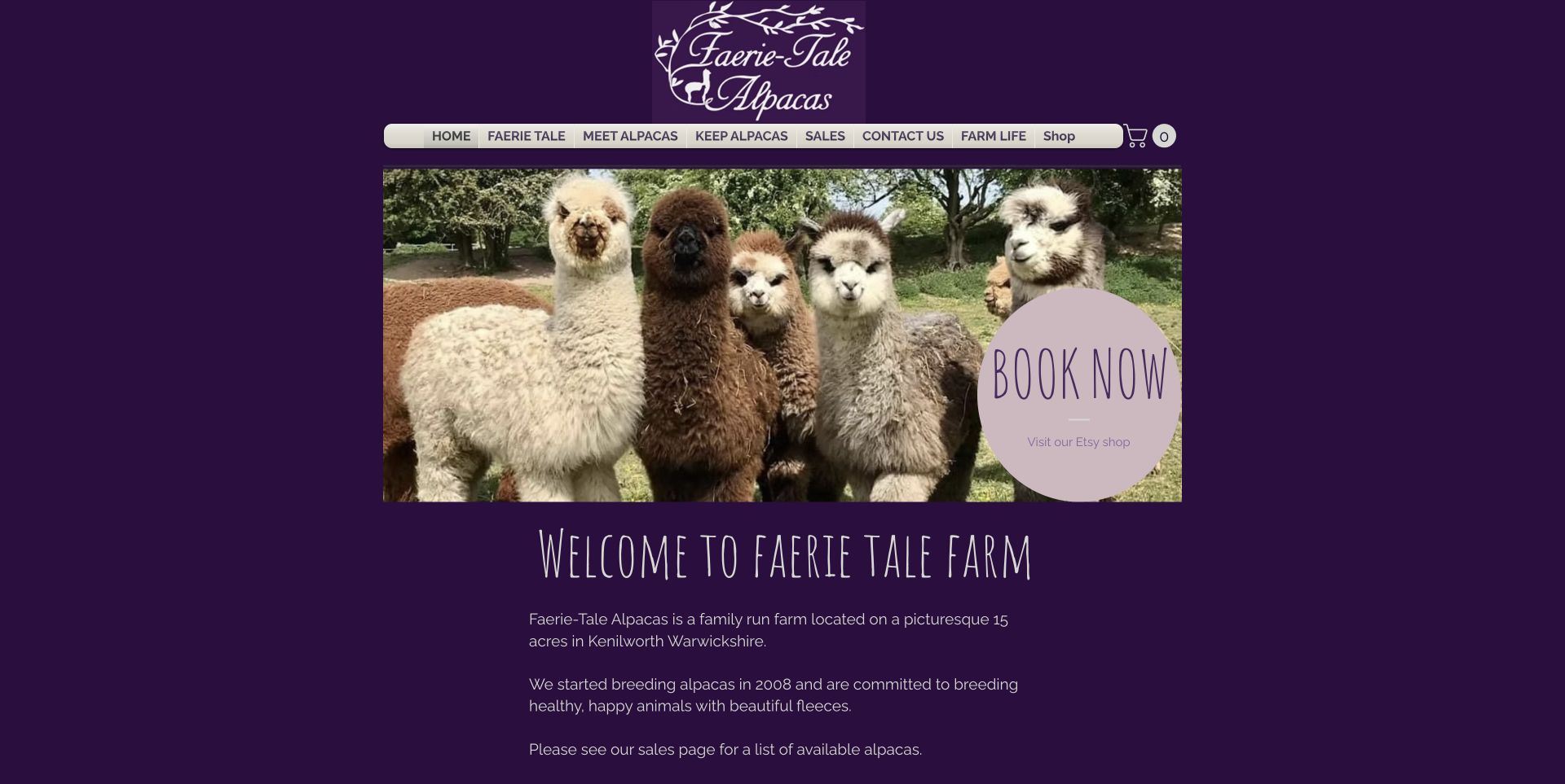
Faerie Tale builds a distinctive identity from a deep-purple background, hand-lettered headings and a compact herd photograph. Its navigation separates Meet Alpacas from Keep Alpacas, an effective distinction between a day out and a much larger ownership decision. The page explains two-hour and shorter encounters with age differences, then connects the farm’s fleece story to knitted products. A circular booking callout catches attention but also contains an Etsy link, placing two different destinations together. The useful idea is the clear audience vocabulary and coherent visual personality; the call-to-action grouping would benefit from a stronger separation between visiting and shopping.
What you can learn
Choose navigation labels that describe the visitor’s intention. Meeting animals and keeping them are different commitments; give each its own route before introducing products or asking for a booking.
Pros
Meet and Keep labels distinguish two very different audiences.
Experience durations and age differences are explained.
Cons & considerations
Booking and external shopping share one callout.
Decorative lettering needs restrained use for longer text.
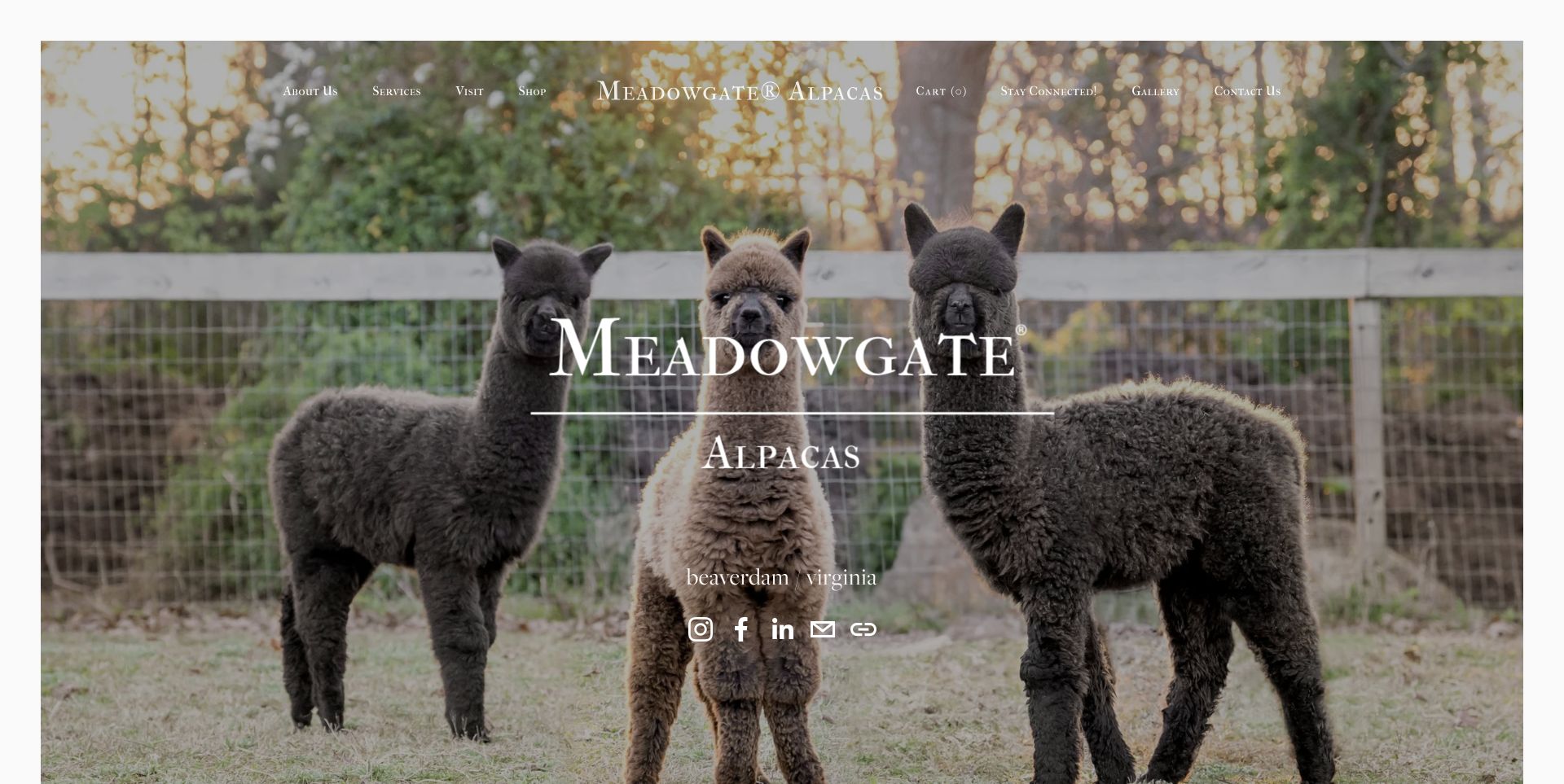
Meadowgate opens with a carefully framed herd portrait, white serif lettering and a restrained location label. Small overlay navigation offers visits, services and shopping without crowding the scene. Below, a direct notice explains that the usual holiday event will not take place and points readers toward the online store. That candour is a useful complement to the polished photography: the site does not let an attractive farm image imply that every familiar event is still available. The full-screen photograph delays the practical notice, and the white navigation crosses varied tones, so the visual calm comes with a hierarchy tradeoff.
What you can learn
When a recurring farm event changes, explain the change explicitly and offer the relevant alternative. Strong photography can preserve the brand feeling, but current availability still needs a conspicuous place in the page.
Pros
Seasonal event cancellation is stated plainly.
Visit, service and shop routes remain separate.
Cons & considerations
The full-screen hero delays operational news.
White overlay navigation depends on the photograph underneath.
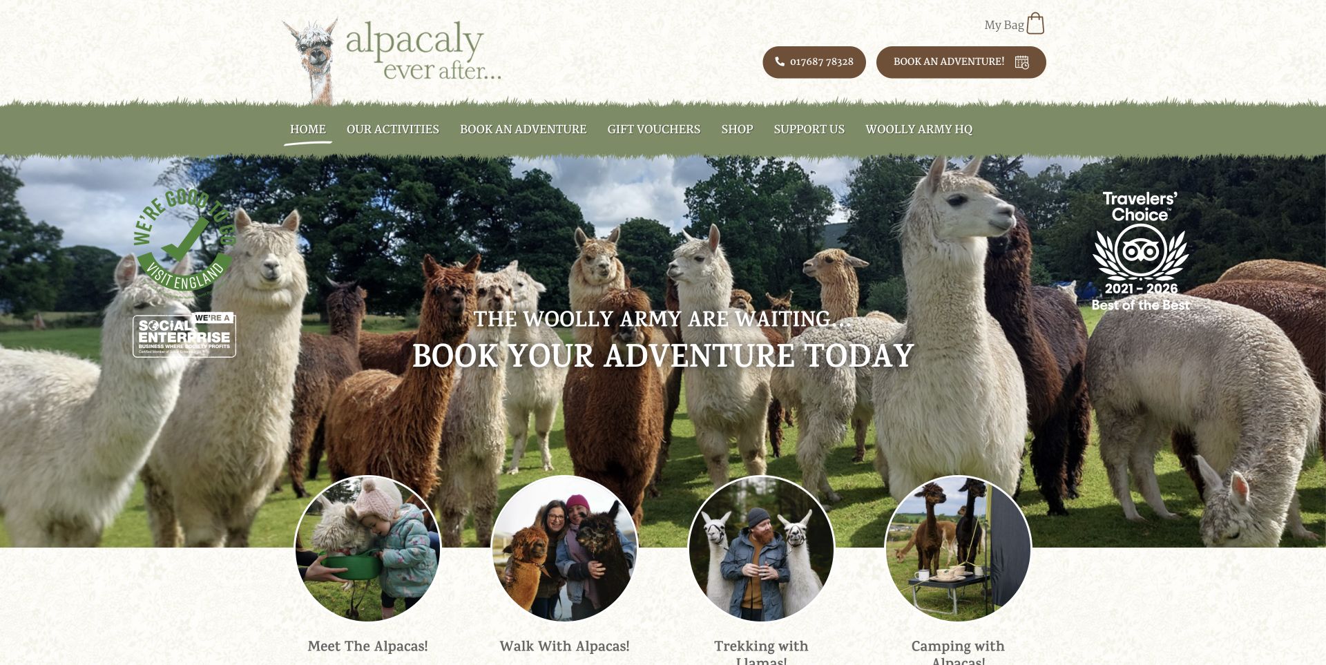
Alpacaly Ever After combines a grass-edged navigation bar, an illustrated wordmark and a broad herd photograph. Four circular activity portraits bridge the hero and the next section, distinguishing meeting alpacas, walking, llama trekking and camping. Repeated booking links make the primary action clear, while the social-enterprise mission is explained after visitors have seen the available experiences. The many badges and overlay headings compete with the animals, so the page is better studied for its activity structure than copied wholesale. It demonstrates how a playful farm identity can still give visitors a useful comparison of different ways to spend time on site.
What you can learn
Let activity imagery explain the choice before a shared booking route. If several experiences use the same reservation system, visitors still need clear labels and pictures that show how those experiences differ.
Pros
Four activity portraits make the offering easy to compare.
Booking remains prominent while mission copy follows.
Cons & considerations
Badges and headings compete with the hero photograph.
Activity detail requires another step beyond the overview.
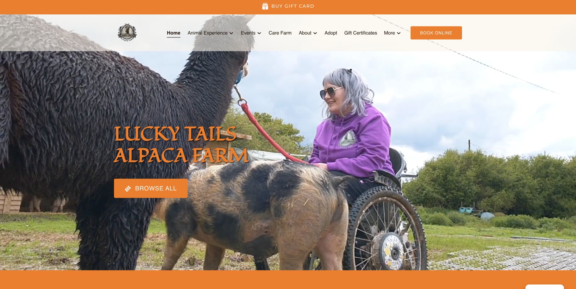
Lucky Tails uses orange booking accents over a large farm-visit video, with a separate gift strip at the top. The more useful planning pattern appears in the activity listings: age, duration and starting price accompany each option, and Learn More is distinct from Book Now. Those fields help visitors compare an alpaca walk with longer mixed-animal encounters. The captured video frame shows an actual visitor interaction, but it should not be treated as proof of every accessibility condition. Motion and the long seasonal catalogue can distract from comparison, making consistent card information especially important on a site with this many choices.
What you can learn
Use the same practical fields for every experience so visitors can compare them. Keep a detail route beside booking, and describe access requirements explicitly rather than expecting photographs or video to answer those questions.
Pros
Activity cards supply duration, age and price context.
Learn More and Book Now are separate choices.
Cons & considerations
Moving hero content can distract from the introduction.
A long seasonal catalogue demands careful maintenance.
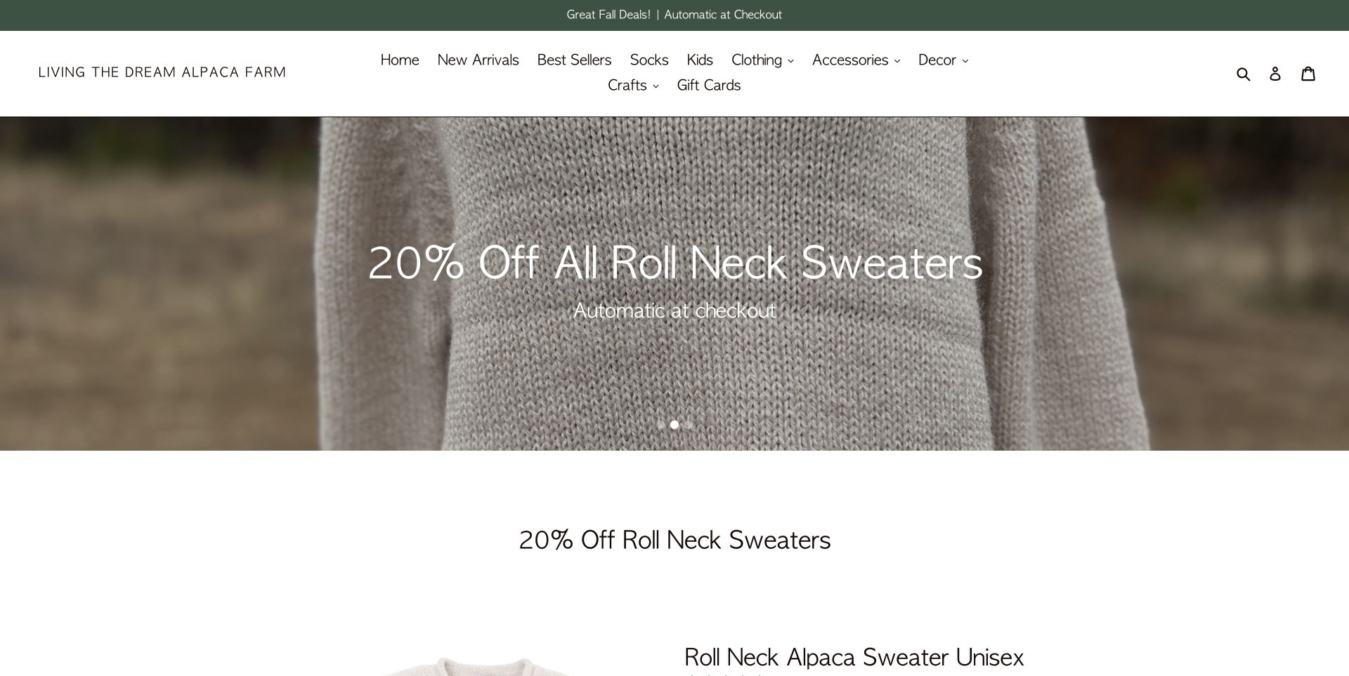
Living the Dream presents a product-led storefront: a forest-green promotion strip, a garment close-up and a clearly divided clothing and accessory navigation. Featured product options and composition appear before a larger grid, while named rescue alpacas and the physical Quechee farm are introduced farther down. That ordering makes the commercial priority unmistakable. It is a useful counterpoint to visitor-first farm sites, showing how a physical farm can support an online retail identity. The tradeoff is that visiting information takes longer to reach, and readers should distinguish the shop’s stated imported product sourcing from products made from the farm’s own animals.
What you can learn
Choose the homepage order around the primary customer task, but keep the farm connection specific. If the shop sells products from several sources, describe that provenance accurately instead of allowing the farm brand to imply everything is home-grown.
Pros
Product categories and options support a direct shopping task.
Named alpacas and farm information ground the business.
Cons & considerations
Visit information is far below retail content.
Product origin needs careful distinction from the farm story.
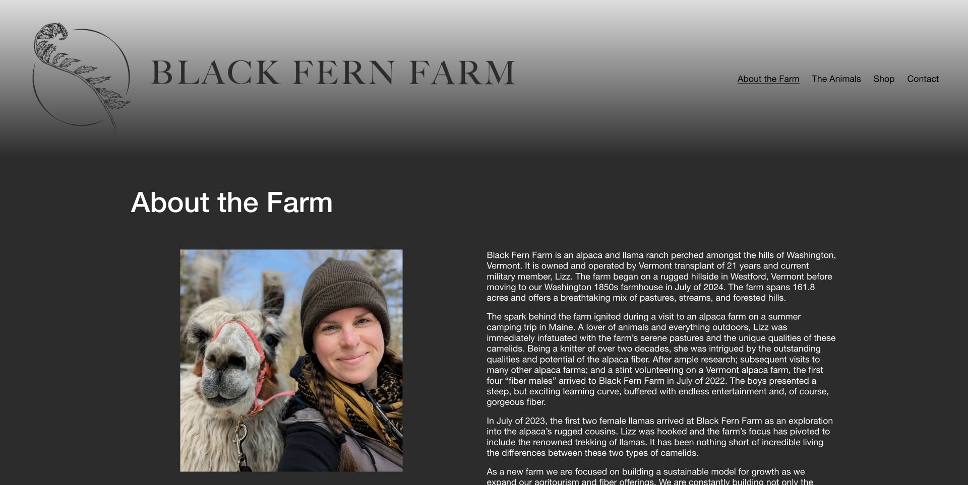
Black Fern’s About page places a real owner-and-animal portrait beside a chronological account of the farm. The monochrome fern identity, charcoal panel and short four-item menu give that story a restrained setting. The copy distinguishes its beginnings with alpaca fibre from later llama interests, making the business’s development more specific than a generic passion statement. The long paragraphs and oversized masthead are less suited to someone seeking an immediate visit arrangement. As a design reference, this page is useful for showing the person and decisions behind a growing farm, while reminding authors to keep practical next steps distinct from narrative background.
What you can learn
Use a farm story to explain concrete decisions and changes, supported by a real portrait. Keep that narrative separate from visit instructions so readers can learn about the owner without mistaking background information for booking guidance.
Pros
Portrait and chronology give the farm story a specific human context.
A short menu keeps the page structure simple.
Cons & considerations
Long paragraphs require sustained reading.
Practical next steps have limited prominence on the About page.
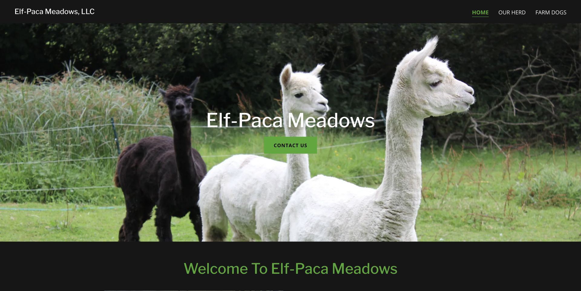
Elf-Paca Meadows uses a black header, green accents and a broad herd photograph with one Contact Us action. Its short navigation keeps attention on the animals instead of presenting a large commercial catalogue. The homepage then explains weekday appointments, weekend hours, school-tour lead time and named telephone contacts. That detail matters more than the simplicity of the hero: it tells readers that different kinds of visits follow different arrangements. The conditions are well below the opening photograph, and partner-business sections make the page longer. The useful pattern is a direct farm introduction backed by specific operational instructions rather than a vague invitation to drop in.
What you can learn
State visiting rules by circumstance rather than listing one ambiguous opening-hours line. Weekdays, weekends and school groups may need different instructions, and those distinctions should be easy to find before someone travels.
Pros
Weekday, weekend and school-group arrangements are distinguished.
A single opening action avoids competing sales messages.
Cons & considerations
Visit conditions sit well below the hero.
Partner-business content lengthens the journey to practical information.
Kegan is a freelance web designer and developer with 15+ years of experience helping businesses turn complicated website requirements into clear, maintainable digital experiences. He works directly with clients from planning and design through development, launch, and ongoing support.
For alpaca farm website design, his development approach focuses on seasonal farm visits, animal experiences, fibre products and clear booking or shop availability. The scope can be a targeted improvement or a complete custom build, with responsive layouts, thoughtful content structure, and integrations chosen around the people using and maintaining the site.
Show 3 other alpaca farm website designersHide other alpaca farm website designers
List the enquiries the farm actually receives: availability, gift redemption, group visits, arrival directions, clothing, dogs, facilities and what happens in poor weather. Use that list to shape the information architecture. It is often more useful than a menu organised entirely around the farm’s internal operations.
Give booking, buying a voucher and redeeming a voucher distinct labels when they are different processes. If the booking provider is external, make the transition understandable. Keep a route back to the farm’s own visit information so readers can resolve questions without abandoning the decision.
Name a single next step for each audience. A school organiser may need to enquire, a family may choose a date, and an animal buyer may need a conversation. Do not send all three into one unexplained contact form.
Create a reliable seasonal information structure
Write the baseline access rules first: whether visits require booking, which days are available and whether the shop follows a different schedule. Then give temporary notices a defined place near the opening invitation. A seasonal notice should add to that structure rather than contradicting a permanent headline.
Use dates that explain the relevant season or event. Remove or update a campaign when it ends, and check the booking provider at the same time. A prominent winter photograph does not tell readers whether animal visits are open, closed or available by appointment.
Include arrival directions that work for a rural site. Distinguish the visitor entrance from a mailing address or another business location. Give visitors a way to find day-of help without making them navigate through a long sales page.
Use the farm’s own evidence and voice
Choose actual photographs that show the animals, setting and type of encounter. A close-up can introduce personality; a wider view can explain the terrain or group experience. Caption specialist pages accurately so a farm-store or About-page capture is not presented as the homepage.
Keep claims specific. Describe what the farm offers and what its website shows, without implying that awards, photos or enthusiastic copy prove care standards or visitor outcomes. If products come from several makers or countries, explain that provenance rather than letting the farm name imply a single source.
Give the people and animals behind the farm a place in the story, then connect that story to practical information. Names, portraits and a short chronology can make the business recognisable. They should support, rather than replace, the information someone needs to arrange a suitable visit.
The editing job behind the design
Choose technology around the farm’s working process
An experience-led farm may need a booking service with date capacity, gift redemption and clear confirmations. A fibre shop needs product options, stock information, delivery terms and accurate product origin. A breeder may need a manageable animal catalogue and enquiry route. Choose those capabilities from the real business process rather than from the appearance of another farm’s homepage.
Public source checks can identify some content systems, libraries, fonts and delivery services, but they do not reveal every operational tool. A booking link shows a visible integration; it does not establish how the farm manages payments, staffing or animal records behind the scenes. Keep those limits explicit when comparing technology choices.
Test the practical content as carefully as the visual presentation: a date notice, voucher instruction or arrival link can become inaccurate even when the page still looks polished. Keep the farm’s own source records and photographs organised so later updates retain the right observation and capture dates.
Our WordPress website examples offer a separate look at publishing approaches. A visible platform label is evidence for that named page, not a guarantee that the same system will suit your requirements.
Before the public launch
Alpaca farm website planning checklist
Name the farm and its actual visitor location near the introduction.
Distinguish a walk, meet-and-greet, tour and self-guided visit.
State whether advance booking or an appointment is required.
Explain duration, ages, group size and animal-sharing arrangements where relevant.
Keep animal-access dates separate from shop opening hours.
Give seasonal closures and temporary changes a conspicuous place.
Separate buying a gift voucher from redeeming one.
Provide practical terrain, facility, clothing and dog information.
Label the visitor entrance separately from a mailing address if they differ.
Use real farm photographs with accurate context and ownership.
Distinguish farm-produced fibre from products sourced elsewhere.
Keep animal sales and husbandry enquiries separate from leisure bookings.
These checks are a project checklist, not a performance, legal, security, or accessibility certification. Test real journeys with the people responsible for the website before making claims about the result.
Sources & editorial method
How this collection was selected and reviewed
We directly reviewed these 21 distinct alpaca farm properties and captured the cited pages on November 12, 2026 UTC, during the November 11 Pacific editorial batch. The saved industry draw of 21 was retained. Each review describes observed page decisions and practical tradeoffs; no booking, purchase, enquiry or animal-care assessment was performed. Captures use the actual source pages, with ordinary notices dismissed through their own controls where necessary and no reconstructed imagery. Crystal Lake Alpaca Farm is the explicitly researched Editors Choice for its clear separation of seasonal animal access, boutique availability and visitor routes. That badge is an editorial website-design selection, not a service-quality endorsement. Each source also received the standard bounded public technology audit: one exact page and a limited same-origin asset sample, with evidence scope and dates retained in underlying records.
Each example links to its actual source page. Screenshots are direct browser captures with their own capture dates; moving imagery, announcements and live designs can change. The notes describe observable design choices and conditional tradeoffs, not measured traffic, conversion results, service quality, or accessibility conformance.
Technology labels use public page metadata, asset evidence, or explicitly cited platform documentation. Platform documentation is not a complete current deployment audit. A component reference may be legacy or unused; it is not a complete backend inventory. Unknown stacks are omitted. These sites are editorial examples, not our client portfolio.
Written, Edited and Curated are separate editorial records, not timestamps advanced by a rebuild. Website designs and imagery belong to their owners. See our editorial standards or suggest a correction.
Questions worth asking
Alpaca Farm website design questions
What should an alpaca farm website show first?
Show the farm’s identity, location and main visitor task, then make current access clear. An inviting photograph is useful, but booking requirements, seasonal closures and the difference between animal visits and shop access should not be hidden far down the page.
How should different alpaca experiences be compared?
Use consistent fields such as duration, age arrangements, group size, what interaction is included and whether a walk is involved. Give readers a detail page as well as a booking route. Describe actual access conditions rather than expecting a photograph to answer every practical question.
Should gift vouchers have a separate route?
Yes, when purchase and redemption are different tasks. A gift recipient needs to know how to select a date and what the voucher covers, while a buyer needs the terms and available options. Clear labels prevent the two journeys from being confused.
Can the same site sell fibre products and promote farm visits?
Yes, if the two intentions have clear routes. Keep product categories and delivery information separate from visit arrangements, and explain where products come from. A farm brand should not imply that every product was made from that farm’s own herd when sourcing is broader.
Does an Editors Choice badge assess animal care or the visit itself?
No. This collection studies website design and communication. The selection is based on the reviewed page structure, imagery and information hierarchy. It does not verify animal-care standards, service quality, accessibility of every activity or the outcome of a booking.
The strongest pattern is a clear promise: show the animals and the place, explain the real experience, and make the next step fit the visitor’s purpose.