Best Credit Union Websites of 2026 (19 Real-World Examples)
Credit union website examples that make membership and everyday banking easier to understand
A credit union homepage has to serve a member paying a loan, a newcomer checking eligibility and a household comparing products. These nineteen examples show different ways to keep those journeys clear while giving a cooperative institution a recognizable local or specialist identity.
Start a credit union redesign with the tasks people bring to it, not a list of campaigns that departments want on the homepage. Login, lost-card help, loan payments, branch information and membership questions each need a dependable route. A strong brand introduction can sit alongside those tasks, but it should not replace them.
This collection reviews public-facing design, navigation and content presentation. It does not rank financial products, audit banking security or establish regulatory compliance. Rates, offers and eligibility can change after a screenshot. Follow each institution's current product pages and disclosures for the terms that apply.
Before the examples
What makes good credit union website design in 2026?
Separate member service from product discovery
Returning members should recognize login, payments and urgent help without opening several marketing menus. Prospective members need eligibility, product explanations and a clear account-opening route. Map both journeys before deciding which campaign deserves the largest image.
Explain who can join
A local story does not establish membership eligibility. Give the membership page plain-language eligibility details, required next steps and the right contact for questions. Keep those rules maintained by the institution rather than inferring them from its name or photographs.
Keep rates connected to their conditions
A headline rate needs a reliable path to the current product terms. Establish one owner for changes across rate tables, banners and product pages. The design should make APR, APY, term, effective date and qualifying conditions understandable without treating them as interchangeable.
Treat alerts as part of the interface
Closure, outage and fraud notices compete for limited screen space. Give them an expiry process, clear priority and accessible dismissal behavior. Avoid independent teams placing several overlapping panels over the joining or login controls.
The collection · 19 examples
19 credit union websites worth studying
Compare the examples by the job each page does: mission-led introduction, product campaign, audience selector or member-service entrance. The useful pattern is not always the most decorative one. Look at how the page helps a person choose a next step without losing access to ordinary banking tasks.
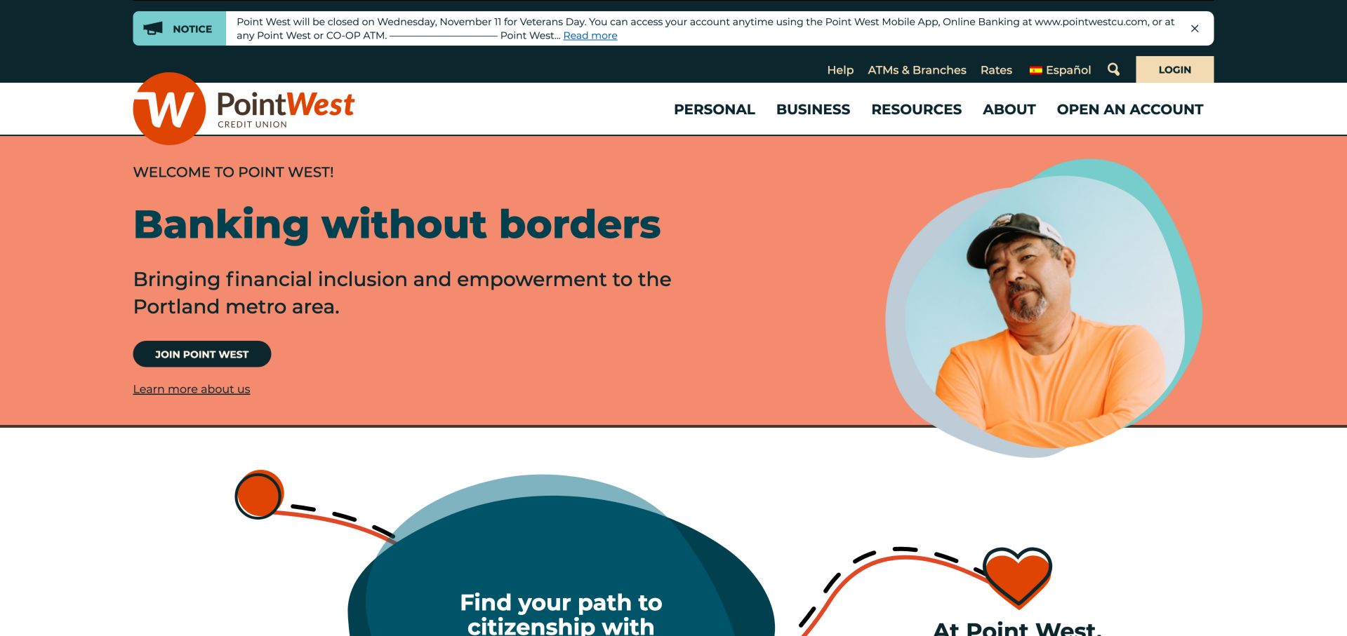
Point West puts its Portland-area purpose beside a portrait rather than opening with a rate promotion. Coral and teal fields make the introduction distinct, while the utility bar keeps rates, branch information, Spanish and login easy to identify. Member stories and the citizenship-related section give the community message something concrete to point to. The portrait breaks the edge of the coral panel, giving the page a human focal point without putting the main message over a busy photograph. The filled joining button and quieter institutional link establish two different levels of commitment.
What you can learn
Pair the membership invitation with a specific service area and supporting member stories. Keep the everyday banking controls separate from the longer mission narrative so returning members do not have to read a brand story to sign in. For a comparable local institution, write the service-area explanation before choosing the hero image. Test whether a new visitor can identify the community being addressed and find more information without confusing the invitation with proof of eligibility.
Pros
Specific Portland-area positioning instead of a generic banking slogan
Spanish, help, rates and login share a predictable utility area
Cons & considerations
The large closure notice and two navigation rows consume substantial vertical space
Product comparisons sit below the mission-led opening rather than leading it
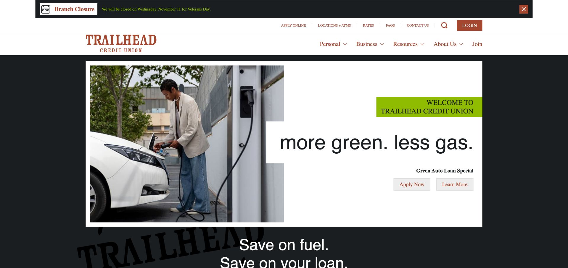
Trailhead uses an editorial-style composition for an electric-vehicle loan campaign: a large photograph, an offset white text panel and a restrained pair of actions. Below that introduction, shortcuts separate joining, loan payments, finding a branch and contacting the team. Rates and educational stories give visitors reasons to continue beyond the current offer. The rust-colored wordmark and serif navigation contrast with the oversized sans-serif campaign line. That combination gives the promotion an editorial character, while the white panel creates a defined reading surface independent of the vehicle photograph behind it.
What you can learn
A promotional hero works better when routine tasks have their own stable section. Keep a learn-more route next to the application route so a visitor can inspect product conditions without entering an application. Plan how the offset panel will stack when the photograph no longer has room beside it. Keep the product name and both actions together at narrow widths, and make sure a change of campaign does not move the member-service shortcuts.
Pros
Separate learn-more and application actions suit different readiness levels
Task shortcuts make loan payments and branch finding explicit
Cons & considerations
Oversized campaign typography leaves little room for product detail in the first view
Seasonal offers require coordinated updates across the hero, articles and rate sections
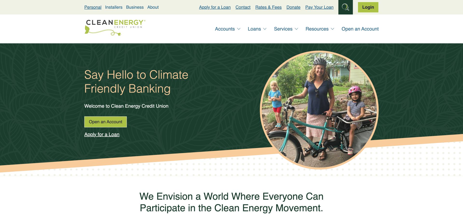
Clean Energy connects its climate-oriented message to a family photograph, leaf texture and two distinct actions for accounts and loans. Navigation names practical categories such as solar, heat-pump and vehicle financing rather than leaving the mission abstract. An impact-calculator section and digital-banking explanation extend the story down the page. Its circular photograph overlaps an angled section boundary, while the leaf pattern stays behind the text rather than competing with it. The upper navigation also distinguishes personal, installer and business audiences, making the specialist positioning visible in the site's structure.
What you can learn
Explain the connection between the institution's purpose and the actual products available. Treat impact claims and calculator assumptions as content requiring evidence and maintenance, not as decorative numbers copied into a redesign. For a similar specialist organization, map the questions each audience brings before combining their navigation. An installer looking for program information needs a different entry point from a household exploring an account, even when both share an interest in the mission.
Pros
Product categories give the environmental theme a practical destination
Accounts and lending have separate primary routes
Cons & considerations
The extensive loan taxonomy needs careful mobile-menu testing
Impact calculations and promotional financial claims require continuing editorial oversight
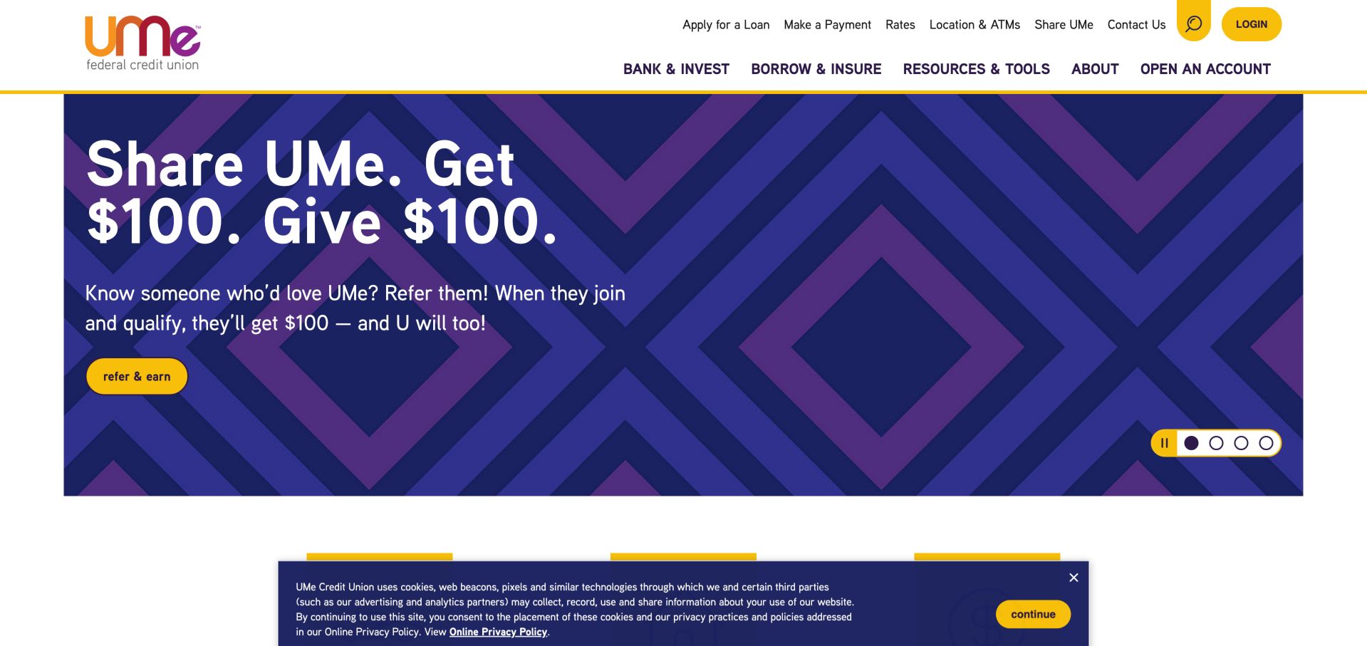
UMe's purple patterned campaign panel, yellow controls and large conversational headline make the first view unusually expressive for a financial site. Product tiles and rates follow, while the Burbank section names local programs and community activity. The carousel includes a pause control, but several promotions still compete for the visitor's attention. The same yellow appears in login, search, the referral action and carousel controls, connecting utilities with the campaign visually. Purple geometric shapes supply texture without requiring a lifestyle photograph, so the large referral message carries most of the persuasive work.
What you can learn
A friendly voice needs supporting details about the community and the product. Give rotating campaigns a visible pause control and retain stable loan, payment and login routes outside the rotation. Create rules for how promotional buttons differ from permanent banking controls even when they share a color. Check the page with a long campaign headline and an open privacy notice, since those combined states determine whether the next section remains discoverable.
Pros
Burbank-specific community material supports the local positioning
The hero exposes navigation and pause controls for its promotions
Cons & considerations
A promotional carousel can hide an offer before someone finishes reading
The cookie notice overlaps the lower first-view content
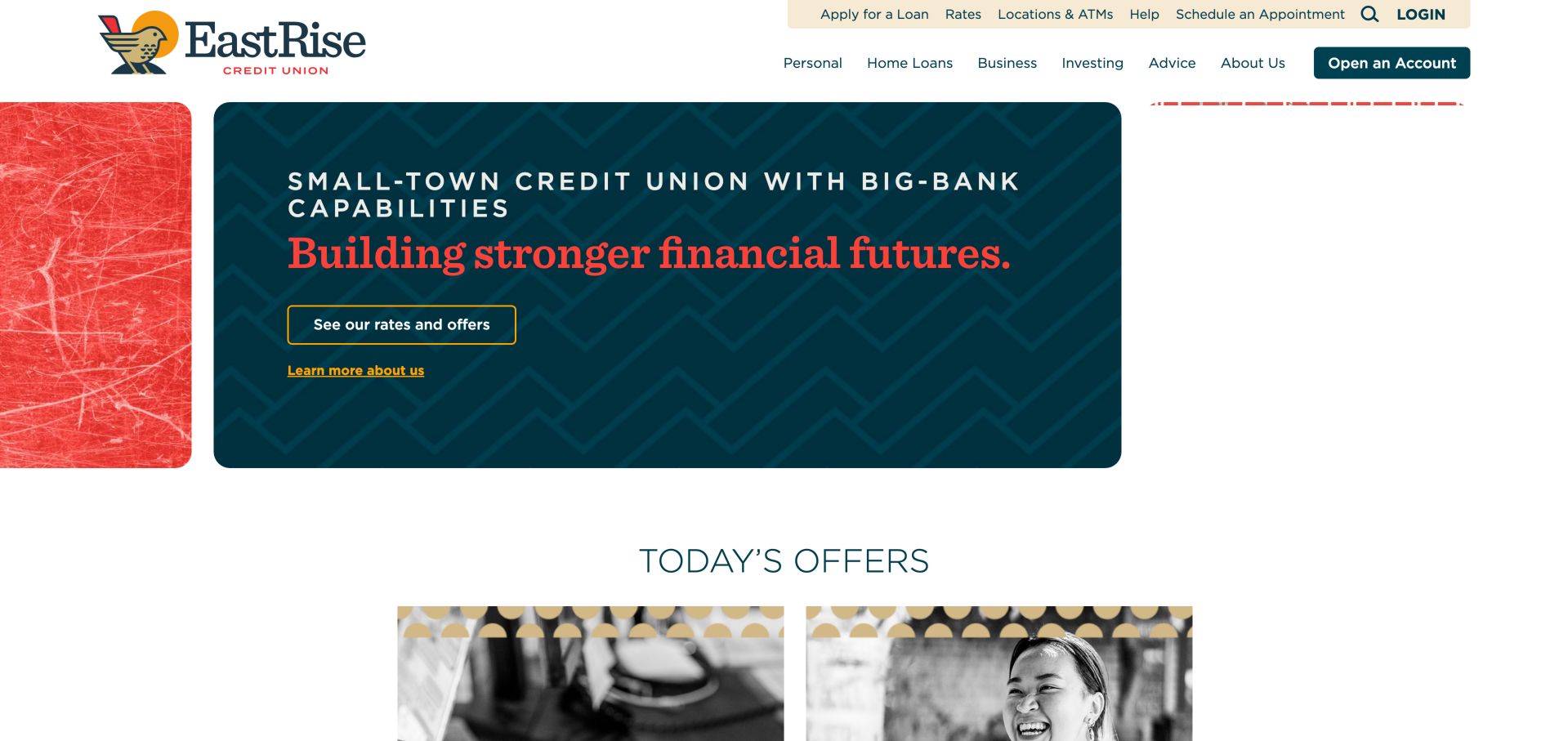
EastRise combines its bird mark with a dark patterned message panel and adjacent textured imagery. The rates-and-offers action gives the broad financial-future statement a useful next step. A prominent appointment link and later financial-counseling, security and education sections help the site address people who need assistance rather than only ready applicants. Rounded panels and ample white space separate the main brand statement from the offer cards beginning below it. The outlined rates button and underlined about link provide a readable distinction between investigating a product and learning the institution's story.
What you can learn
When a new or evolving brand needs explanation, place a concrete product or support route beside the positioning statement. Keep appointment booking visible without making it the only way to learn about products. Use the offer cards to answer concrete questions after an abstract brand introduction. Establish consistent title lengths and image crops, then test a card without promotional artwork so the section still works when the content team has only a clear product explanation.
Pros
Appointment scheduling appears in the utility navigation
Counseling, security and educational resources complement product marketing
Cons & considerations
The expansive introductory composition postpones detailed offers
Carousel-style brand-value sections need keyboard and small-screen checks
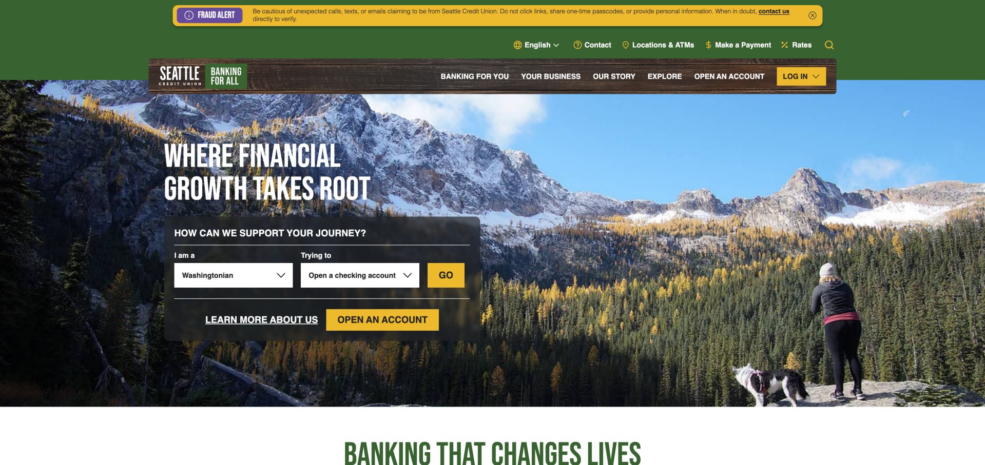
Seattle's mountain photograph establishes a regional setting while a dark panel asks who the visitor is and what they want to do. The goal selector sits alongside direct membership and about routes, so it does not completely replace conventional navigation. A bright fraud warning is visually separated from the product message. A wood-textured navigation strip reinforces the outdoor setting, but the selector itself sits on a dark reading surface with white fields and a yellow action. This contrast concentrates the interactive elements in one area of an otherwise expansive landscape.
What you can learn
Use a guided product selector as an optional shortcut, not a barrier. Offer plain links to joining, payments and support for people whose task does not fit the selector's categories. Write the selector options as recognizable tasks and show a meaningful result for each supported combination. Test an undecided visitor as well as a ready applicant; the guided route should help them investigate, rather than implying that a selection establishes product suitability.
Pros
The opening connects audience and task in a compact form
The fraud warning has a distinct visual hierarchy
Cons & considerations
Text and controls over photography demand contrast checks across screen sizes
Selectors require clear labels and a useful fallback when scripting is unavailable
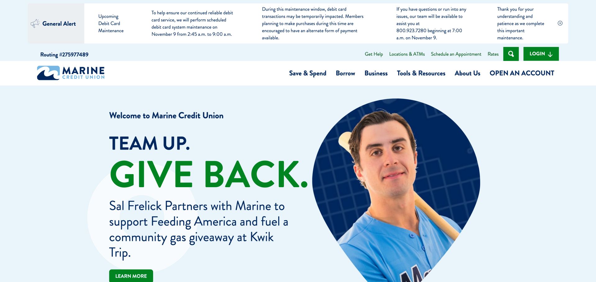
Marine places a community partnership campaign in a large blue-and-green hero, with a portrait and a specific learn-more action. Further down, account opening, loan applications and branch finding have their own shortcuts. A guided selector and life-stage sections then offer alternative routes for visitors who do not know a product name. The saved view exposes the tension between a detailed service alert and an unusually large campaign composition. Blue and green connect the portrait, heading and navigation, but the practical routing information occupies a separate strip above the principal product categories.
What you can learn
Reserve a clear place for urgent service notices and keep them separate from promotional campaigns. Follow broad community content with concrete member tasks so the homepage still functions as a service entrance. Design an expanded alert state with a short summary and a reliable route to the complete explanation. Preserve space for login and help even when the message becomes lengthy, and test the layout with both an alert and a campaign active.
Pros
Service maintenance information is separated from the campaign area
Direct task shortcuts coexist with a guided product selector
Cons & considerations
The long maintenance message takes up a large portion of the first view
Campaign content can push routine product comparison below the fold
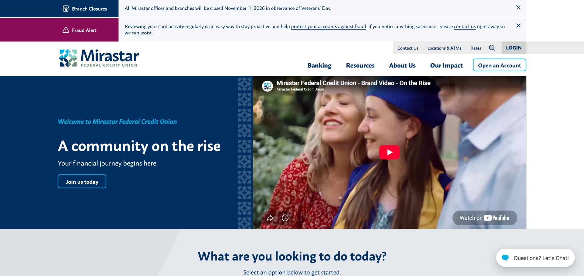
Mirastar pairs a concise community message and join action with an embedded brand video. The next section breaks tasks into account opening, lending, help, online-banking enrollment and wealth advice. Distinct notice bars handle closures and fraud information above the main navigation rather than mixing those messages into the hero. The two-column opening keeps the joining message on a solid blue panel while the video preview supplies the human scene. Its thumbnail and play control are clearly separate from the site's own action, reducing ambiguity about what will happen when each is selected.
What you can learn
A brand video should have an equivalent text introduction and a clear next action. Place support and enrollment alongside sales tasks, because an existing member's first visit after a rebrand may be about reassurance rather than a new product. Define the useful content that remains if the embedded player cannot load. Preserve the short explanation, joining route and task heading as ordinary page content, and avoid making a member watch a promotional film to understand where routine support has moved.
Pros
Support and online-banking enrollment are explicit task choices
Text and joining action remain outside the video embed
Cons & considerations
Multiple alerts create a tall header before the main introduction
The third-party video preview introduces an extra loading dependency
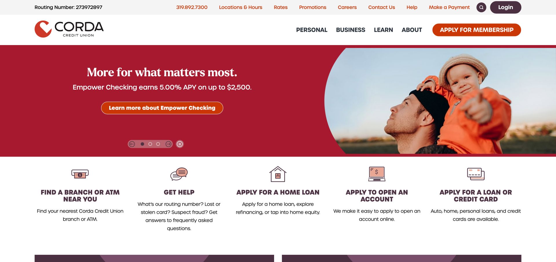
Corda's red campaign panel combines a family image, a checking-product message and a descriptive action. Directly below, five illustrated shortcuts identify branches, help, home loans, account opening and other lending. The page separates savings and lending rates later, which gives comparison information more structure than a single undifferentiated rate strip. Each shortcut combines a small illustration, an uppercase task label and explanatory text, making the row more informative than icons alone. The help card explicitly names several urgent questions, which gives that otherwise broad label a more concrete purpose.
What you can learn
Keep high-frequency tasks visible below a rotating promotion and label each with the action it supports. Separate deposits from borrowing when presenting rates, and link each summary to its current conditions. Use comparable explanatory captions to distinguish tasks that visitors might otherwise confuse. At smaller widths, preserve the relationship between each icon, heading and description; equal visual weight should not force a person to scan an unwieldy horizontal strip of choices.
Pros
The five-task row includes both support and acquisition actions
Savings and lending rates have distinct sections
Cons & considerations
Five equal shortcuts can feel dense at intermediate screen widths
The rotating hero still requires pause, focus and reduced-motion checks
Embold's dark patterned background, vivid headline and curved vehicle photograph make the auto-refinance campaign the dominant first-view element. A later task row directs people to cards, mortgages, membership and branches. The cooperative-structure section explains why member ownership matters, giving the visual identity a substantive follow-through. Triangular texture repeats behind the offer, while the vehicle image uses a broad curved crop. The captured alert region above the navigation is largely empty, illustrating how a reserved notice area can consume attention even when its visible message is limited.
What you can learn
An energetic campaign should still name the product and show where to find the conditions. Pair the offer with a plain-language explanation of membership, rather than assuming the visitor already understands a credit union. Give campaign content a maximum practical length and a clear route to fuller explanation. Include an empty-notice case in template testing so an inactive message does not leave a large colored band above the most frequently used member controls.
Pros
The campaign identifies its product and end date in the headline
The cooperative explanation gives context beyond rates
Cons & considerations
The long offer headline dominates the initial viewport
The alert region occupied significant space in the observed first view
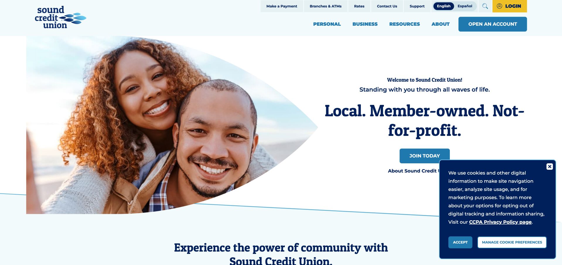
Sound places a large portrait inside a curved shape opposite a concise member-owned message and join action. English and Spanish options sit near login, rates and support. A later goal selector and community-benefits sections offer several routes into the site, while promotions and advice appear farther down the page. The large photograph sits to the left of centered copy on a clean white field, with a thin blue curve linking the composition to the following section. The bilingual utility control is visually distinct from the larger account-opening action beneath it.
What you can learn
Give language selection the same practical visibility as login and support. Explain member ownership with concrete service benefits, while keeping specific product offers separate from broad institutional promises. Maintain equivalent labels and destinations across language versions, including help and product information beyond the homepage. Test the initial page with the privacy panel open, because a clear joining button alone is insufficient if its supporting explanation becomes obscured.
Pros
Language choice remains near frequent banking tasks
The member-owned positioning is clear in the opening composition
Cons & considerations
The cookie panel overlaps the hero's lower action area
The long sequence of benefits, promotions and articles needs deliberate mobile prioritization
Call Federal uses a yellow split hero to promote auto lending, with separate text for refinancing and a clear learn-more action. A product finder follows, then the page explains its Richmond-based support and presents routes to accounts, lending, branches and help. The visual treatment is energetic without disguising the basic task labels. A diagonal boundary separates the family photograph from the yellow copy panel, and the product-specific button is more descriptive than a generic next-step label. The smaller refinancing link offers a related path without asking the hero to contain a second full campaign.
What you can learn
Let a homepage campaign focus on one product, but preserve an equally clear path for people seeking assistance. Link to the product explanation before asking for application data. Use descriptive action text to make related borrowing journeys distinguishable before navigation. In a redesign, check that the refinancing destination retains the context promised by that secondary link, rather than returning people to an undifferentiated list of every loan category.
Pros
Auto lending and refinancing are clearly identified
Support appears alongside account and loan-starting tasks
Cons & considerations
The campaign's large block of text competes with the image for attention
The strong promotional color needs careful contrast checks in all button states
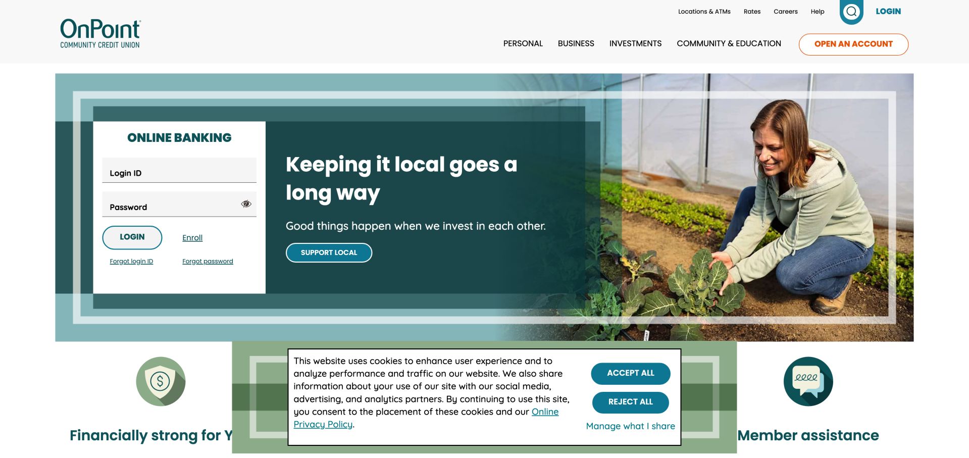
OnPoint embeds a visible online-banking form beside a local-community campaign rather than hiding login behind several steps. Recovery links appear under the login control, while the surrounding navigation exposes rates, locations and help. Later sections explain digital-banking changes, cybersecurity and education, making service communication part of the homepage. A white login card is framed by translucent teal rectangles and positioned beside the campaign copy. Enrollment and the two recovery links stay inside that card, giving account access its own small information hierarchy instead of scattering assistance through the surrounding promotional area.
What you can learn
Treat returning-member access as a first-class journey and provide recovery routes near the sign-in area. A public marketing review cannot verify the security of the underlying banking system; test that separately with the authorized provider. Evaluate the complete sign-in state, including empty fields, recovery and enrollment, with the institution's authorized testing process. Keep decorative campaign changes outside this interaction boundary, and ensure the equivalent small-screen layout preserves the same labels and assistance routes.
Pros
Login and recovery links are visible in the main opening area
Service-change and cybersecurity content sit beside promotional updates
Cons & considerations
An embedded login requires particularly clear trust and integration boundaries
The cookie notice obscures part of the shortcut row in the first view
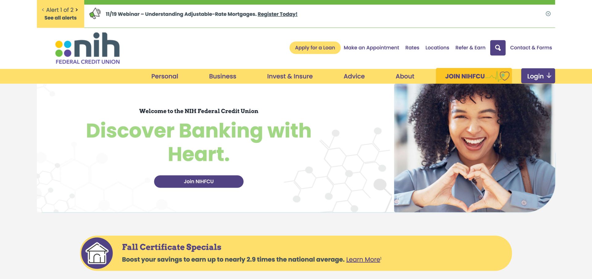
NIH Federal uses molecular line art, a heart gesture and a concise joining action to make its identity recognizable. The header places appointments, rates and locations above the main product navigation. Account, loan, digital-service and branch shortcuts are followed by coaching and fraud resources, so the page offers more than a list of offers. Yellow navigation bands and purple controls repeat the colors in the logo, while the molecular motif remains faint behind the message. An alert counter offers access to multiple notices without displaying all their text as separate full-width bars at once.
What you can learn
Use visual details that reflect the institution's audience without making eligibility assumptions. Place wellness and fraud-help resources near practical tasks, and let the current membership rules explain who can join. When several notices share a compact area, make their count and full list understandable without relying on rotation. Test the hierarchy with an urgent service message and a routine event announcement together so the more consequential information receives appropriate prominence.
Pros
Distinctive visual motifs support a specialist identity
Appointments and financial-wellness resources are easy to recognize
Cons & considerations
The tall alert and navigation area reduces the first-view content space
Pale hero text warrants contrast testing rather than an assumption of accessibility
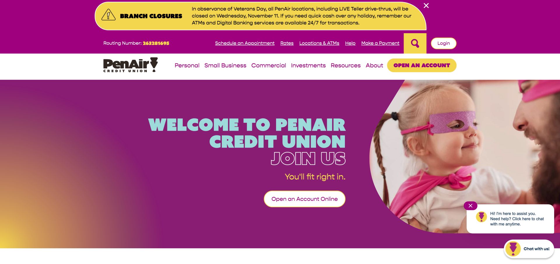
PenAir uses a vivid purple-and-yellow palette, a family photograph and a direct account-opening action to introduce membership. The navigation separates personal, small-business and commercial routes. Below the welcome, a task finder, digital-banking section and community-impact material give the broad invitation more practical detail. The primary account action is repeated in the navigation and hero, but its shape remains consistent across those placements. The playful photograph and outlined headline amplify the welcome, while underlined utility links provide a denser, more practical reading layer above it.
What you can learn
Make differences between individual, small-business and commercial audiences explicit before they enter product menus. A welcoming tone is most useful when paired with current eligibility and account details, not just a large join message. Make repeated actions lead to a consistent destination and retain ordinary explanatory links for people who are not ready to start. Review whether the chat launcher covers any important control on narrow screens, especially when the service notice is also expanded.
Pros
The main navigation distinguishes small-business and commercial needs
Account opening has a clear visual priority
Cons & considerations
Large welcome imagery leaves product detail for later scrolling
The chat prompt and service alert add competing elements around the hero
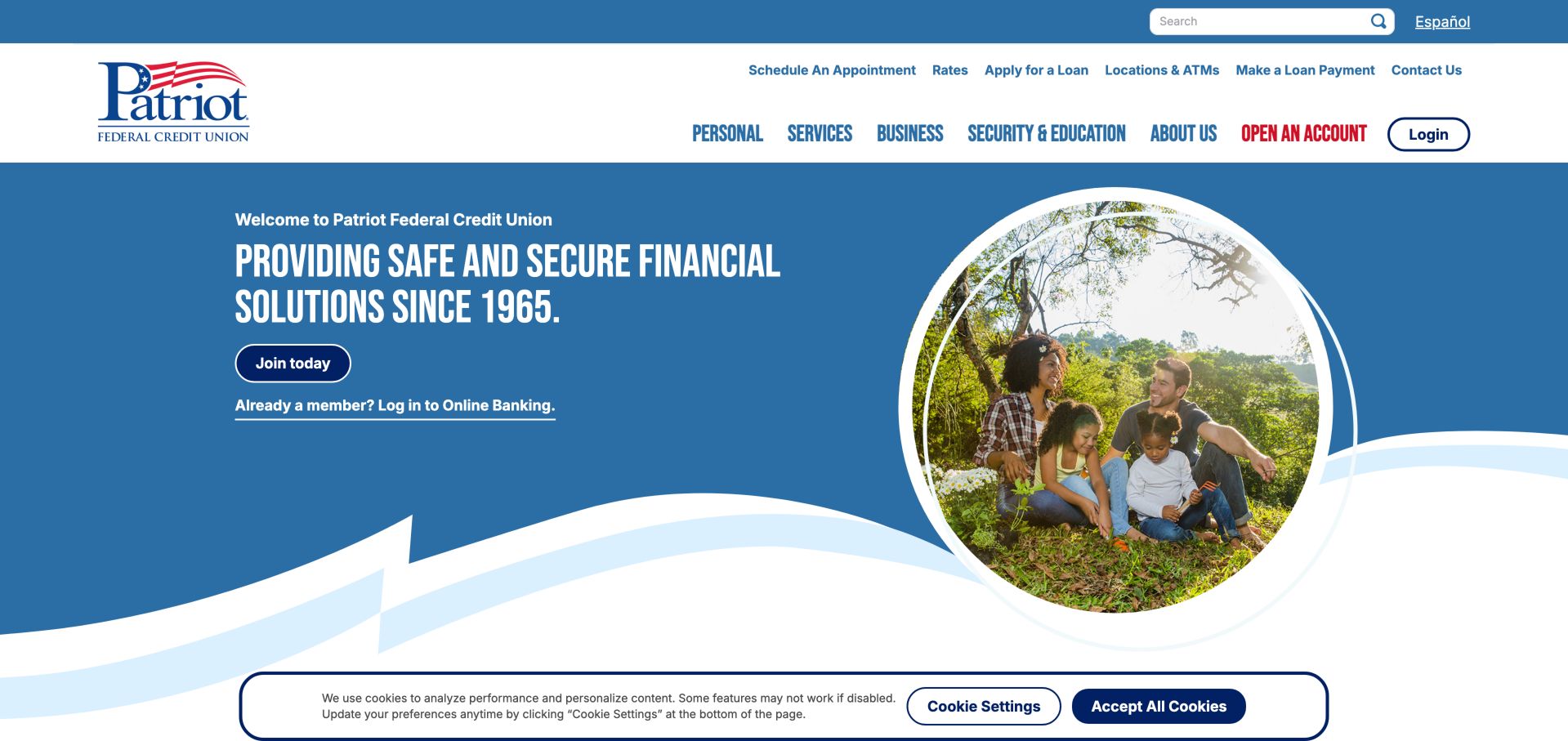
Patriot's blue introduction places joining and existing-member login beneath a short institutional statement. The utility row exposes appointments, rates, applications, branches and payments. Later content introduces language interpretation and community activity, adding useful context beyond the red-white-and-blue visual identity. A circular family photograph and flowing white section edge soften the otherwise conventional blue layout. The explicit existing-member sentence beneath the join button is especially useful: it distinguishes two audiences in ordinary language without requiring a product-finder interaction.
What you can learn
Tell returning members where to sign in while giving new visitors a distinct joining route. Treat language support as a service with a clear explanation of how to request it, rather than relying only on a translation toggle. Carry that audience distinction into subsequent pages so a visitor does not lose their place after choosing a path. Test whether the joining route explains membership and whether the member route presents recognizable recovery options, while avoiding security conclusions from visual polish alone.
Pros
Joining and existing-member access are separated in the hero
Language-support information has a dedicated homepage section
Cons & considerations
The generic institutional statement provides less product detail than a focused offer
The utility navigation contains many similarly weighted choices
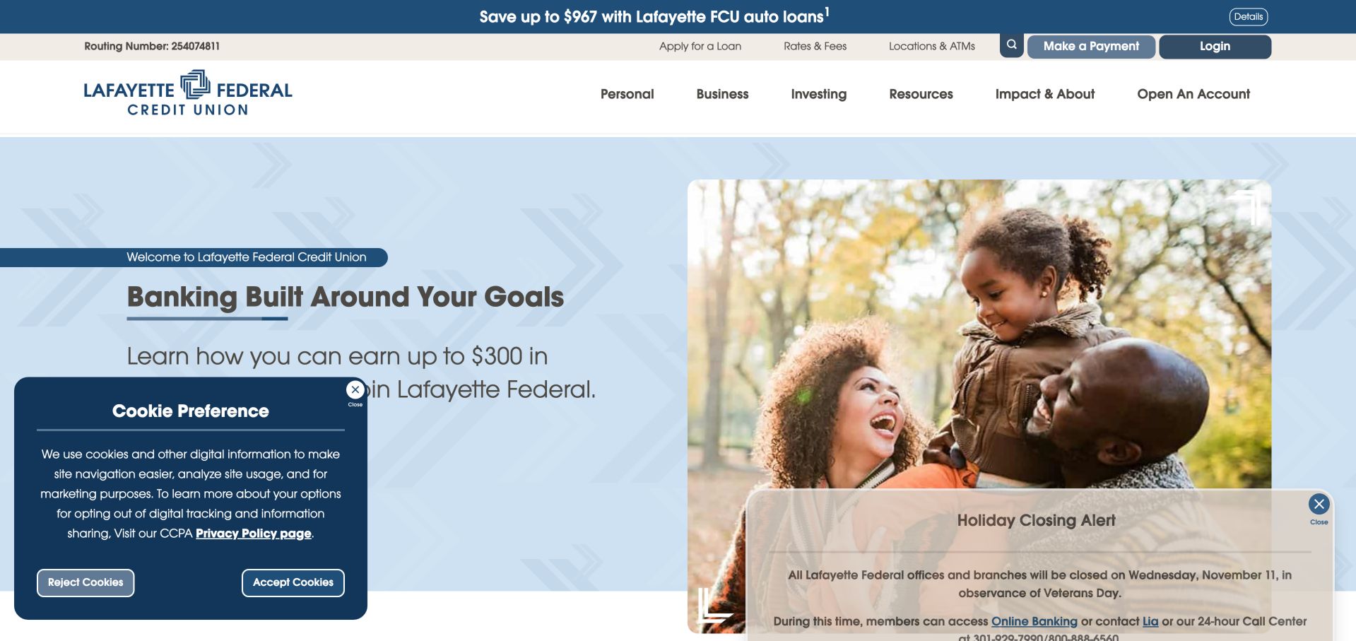
Lafayette places a family photograph and membership-bonus explanation in a pale blue hero, then organizes products around financial milestones. Account, vehicle, home, investment and business sections give the homepage a broad overview. The observed first view also contains separate cookie and closure panels, demonstrating the cumulative cost of independent overlays. The screenshot makes the overlay problem concrete: one panel covers the promotional copy while another covers the family image and lower page boundary. The underlying split composition is orderly, but its useful hierarchy changes substantially when both notices appear together.
What you can learn
Plan notices as a shared system instead of adding a new overlay for each team. Keep incentives tied to their conditions and use product-family sections to help people compare the next appropriate route. Specify combined notice behavior during design review, including placement, dismissal and return visits. Judge the initial experience with those panels present instead of approving only a clean mockup; essential product explanations and permanent member controls need usable space in the real starting state.
Pros
Product families are organized around recognizable financial needs
Rates, payments and login remain visible in utility navigation
Cons & considerations
Two simultaneous overlays obscure substantial hero content
A bonus-led introduction needs a clear route to qualification details
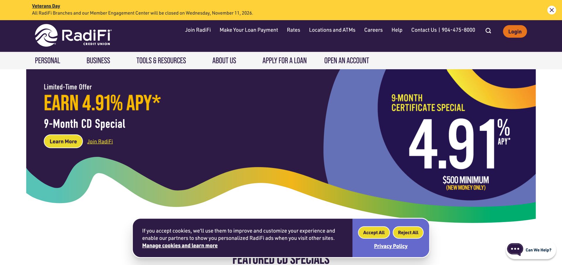
RadiFi's purple-and-yellow hero gives a certificate promotion a strong numerical hierarchy and shows its term and minimum alongside the headline. Learn-more and joining routes have different emphasis. The page then expands into local decision-making, digital convenience and community content rather than treating the offer as the entire brand. The same campaign is expressed as ordinary copy on the left and an enlarged graphic on the right, with a curved multicolor border joining the two. That repetition strengthens recognition but also creates multiple places where promotional wording must stay consistent.
What you can learn
When a promotion leads with a rate, place key qualifying cues nearby and link to the complete current disclosure. Review how promotional values are maintained across the hero, product page and rate table. Treat text and artwork as one editorial update when an offer changes. Provide meaningful text alternatives for promotional graphics and check the page without those images, so the product name, qualifying cues and route to complete information remain understandable.
Pros
The campaign presents term and minimum beside the headline
Product information and joining have distinct actions
Cons & considerations
The cookie banner overlaps the beginning of the following section
Large rate graphics need ongoing synchronization with disclosures
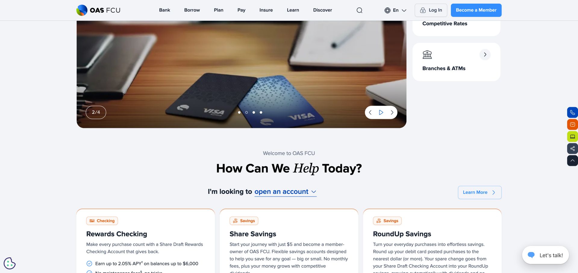
OAS Federal separates a large promotional carousel from four persistent cards for loans, transfers, rates and branches. Short verb-led menu labels organize the wider service range. A goal-based product section continues below, with product descriptions and disclosures in the page rather than relying only on promotional images. The saved capture includes the transition from the carousel into the product finder, making the relationship between promotion and comparison visible. Checking and savings labels introduce separate cards with short descriptions, while the main menu keeps its compact row of action-oriented categories.
What you can learn
Keep essential tasks outside a rotating campaign so visitors can move directly to services. Use clear headings and labels for the cards, and verify that every carousel message remains available when motion is paused or reduced. Keep the product cards independently useful when the selector is untouched or unavailable. Define sensible default content and descriptive link labels, then test paused motion and keyboard focus around the carousel before assuming the visible controls provide a complete accessible interaction.
Pros
The persistent side rail gives routine tasks a stable location
Short verb-led navigation labels reduce jargon at the top level
Cons & considerations
The image-heavy carousel can occupy most of the initial viewport
Several unlabeled carousel buttons in the observed structure warrant an accessibility review
Kegan is a freelance web designer and developer with 15+ years of experience helping businesses turn complicated website requirements into clear, maintainable digital experiences. He works directly with clients from planning and design through development, launch, and ongoing support.
For credit union website design, his development approach focuses on membership information, clear product content, branch details, accessible navigation, and careful handoffs to account systems. The scope can be a targeted improvement or a complete custom build, with responsive layouts, thoughtful content structure, and integrations chosen around the people using and maintaining the site.
Show 3 other credit union website designersHide other credit union website designers
Plan the journeys before choosing a credit union design
List the top support tasks
Use available support questions and site-search terms to identify repeat tasks such as lost cards, routing information, payments and digital-banking enrollment. Decide which belong in a persistent utility bar and which need a dedicated help page.
Map membership and product decisions separately
Write down what a newcomer needs to know before joining, then what a member needs to compare before choosing a product. Avoid sending every visit straight into an application. Provide current product explanations and a human-help route.
Inventory third-party destinations
Document where login, applications, appointment tools and calculators are hosted. Decide how external transitions are explained and how someone returns to the main site. Review privacy, accessibility and security with the appropriate providers; a good-looking public page is not evidence that these integrations meet every requirement.
Design one notice system
Define urgent service alerts, routine closure information and marketing offers as different message types. Set length limits, expiration dates and who can approve each. Test the combined state with a cookie panel, rather than reviewing each overlay in isolation.
Create a governed product-content model
Assign owners for rates, eligibility, fees, disclosures and offer dates. Make common information reusable so one change does not leave conflicting values across the homepage and product pages. Include a review date in the editorial workflow even when it is not displayed to visitors.
Test representative tasks on small screens
Ask testers to locate a branch, find lost-card help, understand membership requirements and compare two products. Test keyboard navigation, zoom, focus visibility and reduced motion. Use authorized test environments for banking integrations and never submit real financial applications as routine website QA.
The editing job behind the design
Choose technology around publishing and banking boundaries
The public website and the core banking experience are different systems with different responsibilities. A CMS should help authorized staff maintain products, help content and expiring alerts. Account access and applications need their own provider-reviewed integration, authentication and privacy arrangements. Do not infer a hidden banking platform from a public JavaScript library.
Evaluate search quality, multilingual content ownership, accessible navigation and release rollback before selecting a visual theme. Keep analytics and marketing tags away from sensitive fields and follow the institution's approved privacy approach. Public technology observations in this collection describe visible evidence, not a complete architecture or security audit.
Our WordPress website examples offer a separate look at publishing approaches. A visible platform label is evidence for that named page, not a guarantee that the same system will suit your requirements.
Before the public launch
Credit union website planning checklist
Keep login and recovery routes easy to identify.
Provide a direct lost-card and urgent-help route.
Explain membership eligibility on a maintained page.
Separate product information from application entry.
Link rate summaries to current terms and disclosures.
Assign owners and expiry dates to campaign content.
Check branch addresses, hours and service notices.
Make language selection and language-support options clear.
Test navigation with keyboard, zoom and small screens.
Provide pause and reduced-motion behavior for rotating content.
Review external banking, calculator and appointment transitions.
Keep private account information out of public analytics and QA records.
These checks are a project checklist, not a performance, legal, security, or accessibility certification. Test real journeys with the people responsible for the website before making claims about the result.
Sources & editorial method
How this collection was selected and reviewed
The nineteen examples use the saved collection target rather than a ranking or a claim of complete market coverage. Public homepages were directly inspected and captured, and each review identifies a design pattern, practical lesson and tradeoffs. Several examples share a specialist design agency, so similarities are discussed as implementation patterns rather than independent proof of effectiveness. Editors Choice is an explicit editorial design selection within the collection, not a financial recommendation, service-quality award or vote result.
Each example links to its actual source page. Screenshots are direct browser captures with their own capture dates; moving imagery, announcements and live designs can change. The notes describe observable design choices and conditional tradeoffs, not measured traffic, conversion results, service quality, or accessibility conformance.
Technology labels use public page metadata, asset evidence, or explicitly cited platform documentation. Platform documentation is not a complete current deployment audit. A component reference may be legacy or unused; it is not a complete backend inventory. Unknown stacks are omitted. These sites are editorial examples, not our client portfolio.
Written, Edited and Curated are separate editorial records, not timestamps advanced by a rebuild. Website designs and imagery belong to their owners. See our editorial standards or suggest a correction.
Questions worth asking
Credit Union website design questions
What should a credit union homepage prioritize?
Start with the most common member tasks and the information a newcomer needs to join. Login, help, payments and branches often need persistent routes. Product campaigns can occupy the main content area, but they should not obscure those service paths.
Should rates appear on the homepage?
They can help visitors choose a product to investigate, provided each summary leads to current terms and is maintained consistently. Decide who owns updates and how a rate change reaches every affected banner, table and product page. Do not treat a screenshot in a design collection as a current financial quote.
Is a product-finder dropdown better than ordinary navigation?
It is an additional route, not a universal replacement. A visitor who knows they need a payment or lost-card page should not have to classify themselves first. Retain ordinary links and test the selector's labels, keyboard behavior and fallback state.
Can a public website review establish security or accessibility compliance?
No. A public review can identify visible design choices and issues worth testing, but it does not examine private infrastructure or all user journeys. Formal security, accessibility and regulatory work require the appropriate specialists, scope and evidence.
How can a smaller credit union look distinctive without complicating the site?
Use specific community stories, genuine photography and a restrained visual identity around a familiar task structure. Point West's Portland-focused introduction is one example of a local story with explicit joining and service routes. The useful lesson is specificity, not copying its exact colors or claims.
A useful credit union website makes the next step clear without asking visitors to decode the institution. Begin with member tasks, explain membership and products accurately, and use the visual identity to make those practical routes feel coherent.