Best Print Shop Websites of 2026 (18 Real-World Examples)
Eighteen real examples connect finished print with the practical decisions behind a project, from paper samples and artwork guidance to quotes, binding and delivery.
Explore 18 real print-shop websites and the details that help customers compare products, prepare artwork, choose materials and understand the next ordering step.
A print-shop website has to make a physical service understandable on a screen. Visitors may arrive with a finished production file, a rough design idea or only an occasion and deadline. The strongest journeys explain what can be produced, what information is needed and where a customer can get useful help before placing an order.
This collection compares eighteen distinct public printing-service websites. It includes specialist studios, document printers, commercial production companies and broad online catalogs. The reviews examine visible design and information structure, not the quality of an unpurchased print job, a supplier’s delivery performance or the accuracy of its environmental claims.
Before the examples
What makes good print shop website design in 2026?
Show the printed object and its options
Use photographs that reveal scale, paper character, folds or finishing where possible. Connect the image to a specific product or process, and give visitors a way to compare stock and obtain samples. A dramatic mockup can introduce an idea, but it cannot substitute for an accurate production specification.
Separate browsing, quoting and ordering
Differentiate a standard product configuration from a custom estimate and a technical question. Explain what happens next, which details are needed and whether the visitor is only requesting information. A generic starting button should not hide a commitment or an unexplained account requirement.
Make preparation part of the service
Keep artwork guides, templates, proofing explanations and delivery conditions close to the relevant product. Define unfamiliar terms where they affect a choice. A print website becomes more useful when its attractive examples lead into the information needed to produce a successful file.
The collection · 18 examples
18 print shop websites worth studying
Compare product search, specialist process explanations, samples, preparation resources and quote routes across the eighteen source views. The Editors Choice recognizes website design and communication, not printing quality or fulfillment performance.
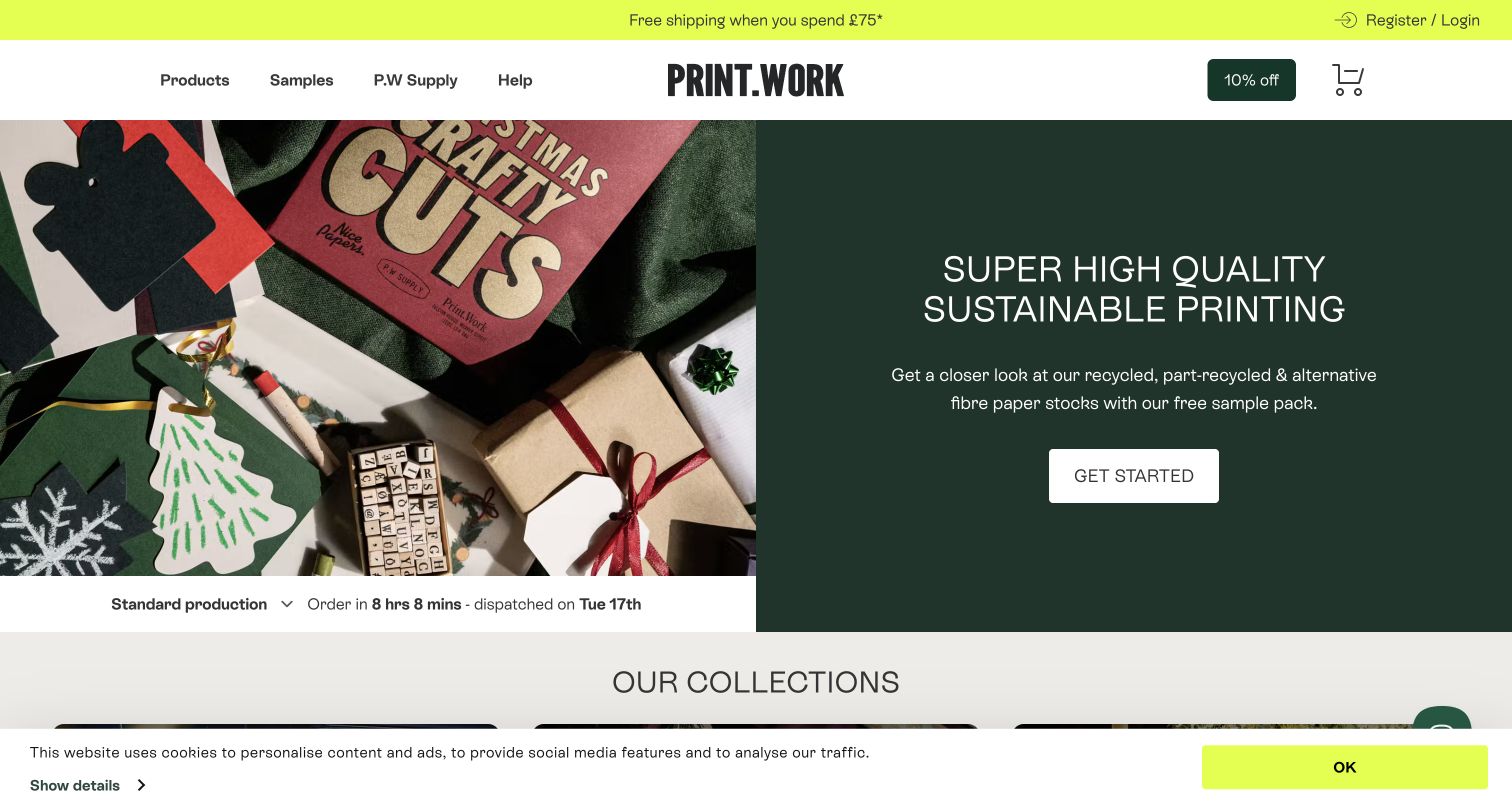
PRINT.WORK introduces its service through a split screen: a photograph of printed Christmas pieces sits beside a dark green promise and an invitation to explore paper samples. The restrained structure lets the colorful output provide the decoration. Product, sample and help routes remain visible above the hero, while the dispatch selector gives the page an operational detail beyond a brand slogan. Collections for graphic arts, weddings and seasonal work help visitors connect a printing format with an intended use. Paper information, technical guides and an inspiration gallery make preparation part of the same public experience.
What you can learn
Put material guidance near the first buying decision. For a specialist printer, sample packs and clear artwork help can make a distinctive visual identity useful to someone who is still learning the process.
Pros
The sample route acknowledges that paper and ink cannot be judged fully on a screen.
Collections organize creative use cases without hiding the underlying product categories.
Cons & considerations
The prominent seasonal photograph gives less immediate context for everyday business printing.
Dispatch information and shipping territory need to remain accurate as production conditions change.
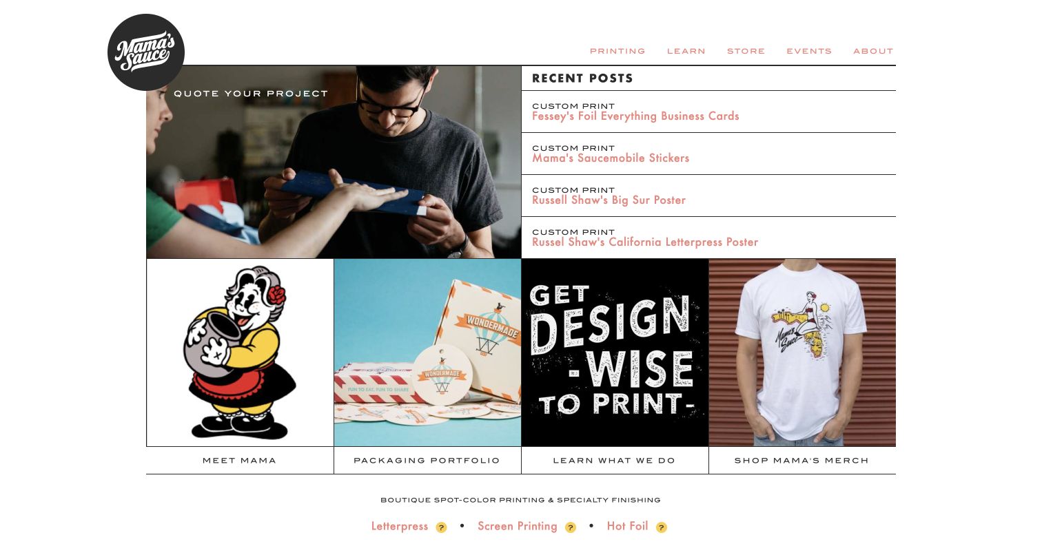
Mama’s Sauce gives its homepage the feel of a compact studio journal. The circular logo overlaps a working photograph, and the strongest image link leads toward a project quote. A neighboring recent-post list provides specific examples rather than another broad sales statement. Below, photographs separate the team, packaging portfolio, educational content and merchandise. Letterpress, screen printing and hot foil are named as distinct processes, helping a visitor understand the studio’s specialty. The page is worth studying for the way its human workshop identity and technical offering sit together without adopting a large retail catalog layout.
What you can learn
Let completed work explain a specialized process, then offer an obvious route to discuss a project. Separate that consultation journey from merchandise so buyers know which kind of transaction they are starting.
Pros
A visible quote destination matches the custom nature of the featured print work.
Process names and learning links give newcomers useful terms for a project brief.
Cons & considerations
Recent-post headlines require some exploration before the range of production options becomes clear.
The compact editorial grid gives individual project photographs limited room to show fine finishing detail.
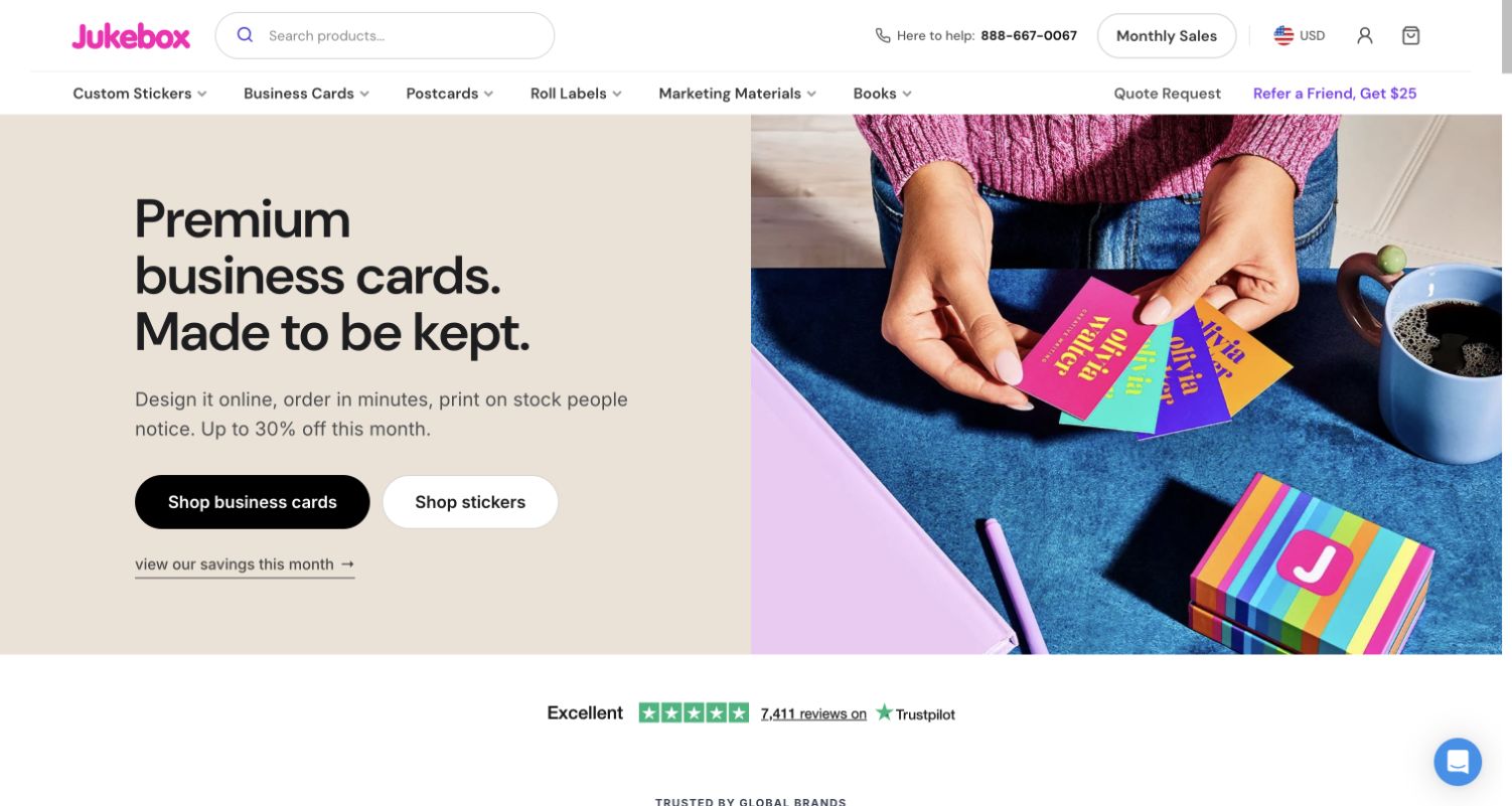
Jukebox opens with a close view of business cards being handled, making the physical product more prominent than the mechanics of ordering. A pale text panel keeps the headline and two product routes readable beside the saturated photograph. Above it, a large search field supports visitors who already know what they need, while category navigation covers stickers, cards, postcards, labels and books. Farther down, product cards and material-specific card categories expand the choice. The page demonstrates how a large print catalog can begin with one understandable object without pretending that every visitor arrives with the same purchase in mind.
What you can learn
Use a focused product photograph to establish the quality of the presentation, then give search and category routes equal practical attention. Material choices should become clearer as visitors move toward a particular product.
Pros
The photograph shows scale and handling rather than presenting the card as an isolated render.
Separate business-card and sticker buttons provide useful alternatives within the same hero.
Cons & considerations
Promotional messaging competes with the material-focused introduction for attention.
The breadth of stock and finish options still needs explanation on subsequent product pages.
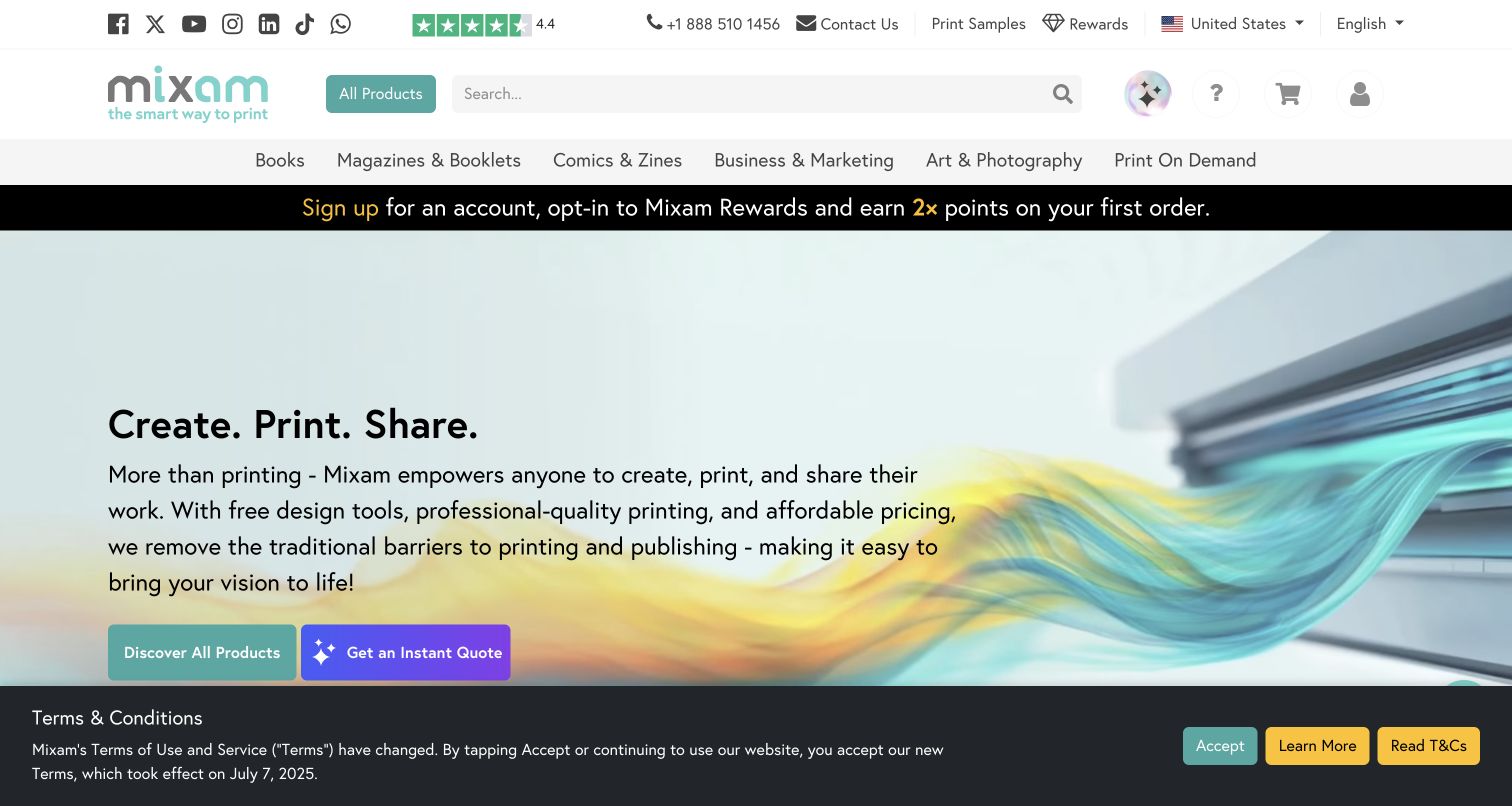
Mixam frames printing as a sequence of creative tasks. Its opening statement connects making files, producing physical work and sharing the result, with separate routes to products and an instant quote. The category navigation emphasizes books, magazines, comics and art alongside business materials. Lower sections repeat the process through tabs and link to specific formats, including novels, photo books and zines. Sample packs and FAQs address preparation and production questions. The first-visit capture also retains a terms-update notice; it is part of the observed page, and no acceptance or order was performed during this review.
What you can learn
Organize a publication printer around the stages a customer must understand. Keep inspiration, file preparation, production and distribution distinguishable, even when one company offers tools for all of them.
Pros
Publication categories reflect recognizable projects rather than only technical binding terminology.
Samples and question-led help provide routes for visitors who are not ready to order.
Cons & considerations
The dense utility header and rewards message add substantial material before the main proposition.
The large terms notice competes with the first product and quote choices in this captured view.
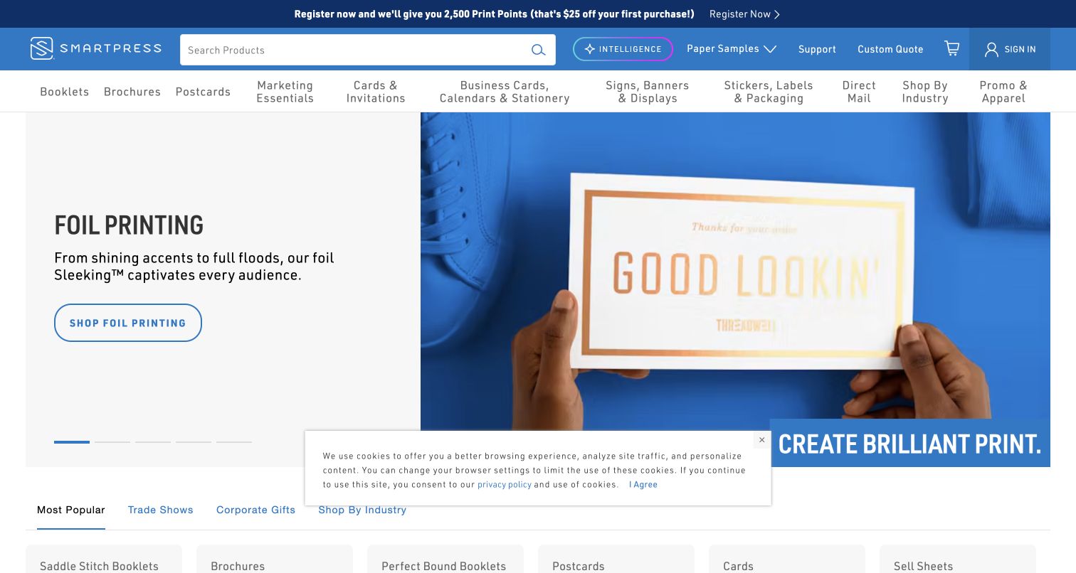
Smartpress uses a large foil-printing feature to demonstrate a specific finishing effect. The photographed card occupies most of the hero, while a short description and outlined button keep the featured process identifiable. Its blue header places search, paper samples, support and a custom quote route together. Product families remain available in a separate navigation row. The rest of the homepage broadens the offer into kitting, a business asset hub and enterprise printing. This gives the site two useful modes: an approachable product catalog for a defined job and a service introduction for work requiring coordination.
What you can learn
Show one production technique clearly, then connect it to sample information and the right level of assistance. Complex fulfillment services should have their own explanation instead of being squeezed into standard product options.
Pros
Paper samples and support are visible before visitors commit to a product configuration.
Distinct service cards explain that business requirements can extend beyond printing the sheet.
Cons & considerations
The rotating hero makes the initial product emphasis dependent on the slide displayed.
Two navigation rows, registration messaging and a cookie notice create a busy first-visit frame.
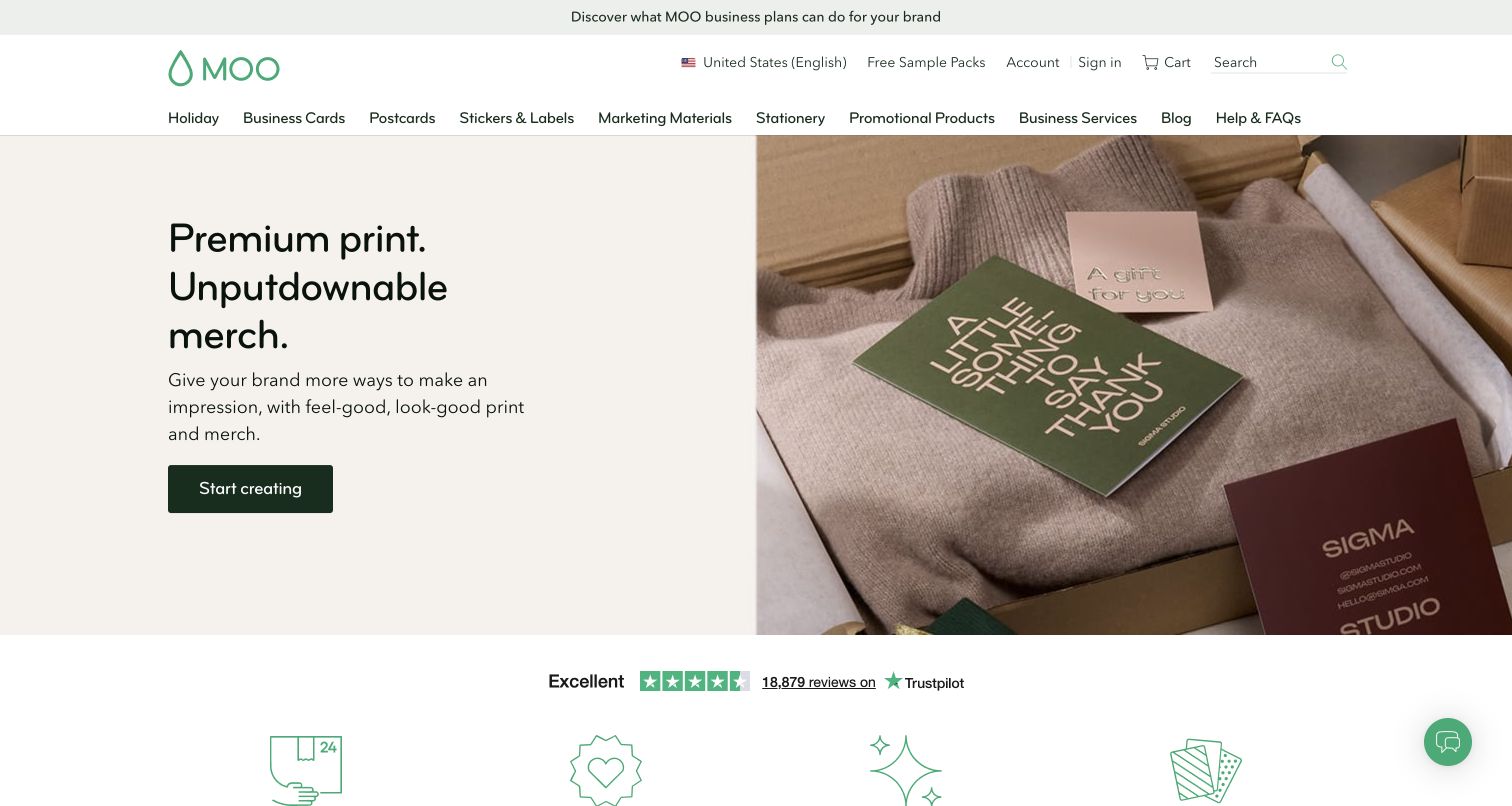
MOO’s United States storefront introduces printed cards and merchandise through a restrained split layout. A pale text field sits beside a closely styled photograph of cards resting on fabric, allowing texture and color to carry the presentation. The header keeps sample packs visible alongside the account and shopping tools, while the main navigation names familiar product categories. Below the hero, short service links cover delivery conditions, the company promise, business plans and paper samples. The design shows how a commercial printer can present a premium identity without making the first screen an exhaustive specification table.
What you can learn
Use photography to communicate the physical character of print, but keep samples and delivery information close enough to support a real decision. A calm opening works best when familiar product routes remain obvious.
Pros
The product photograph connects printed pieces with a plausible gifting and merchandise context.
Sample packs have a visible header route rather than being buried in a support section.
Cons & considerations
The broad Start creating label does not identify a particular product or preparation step.
The opening lifestyle image offers little detail about stock, thickness or finishing limits.
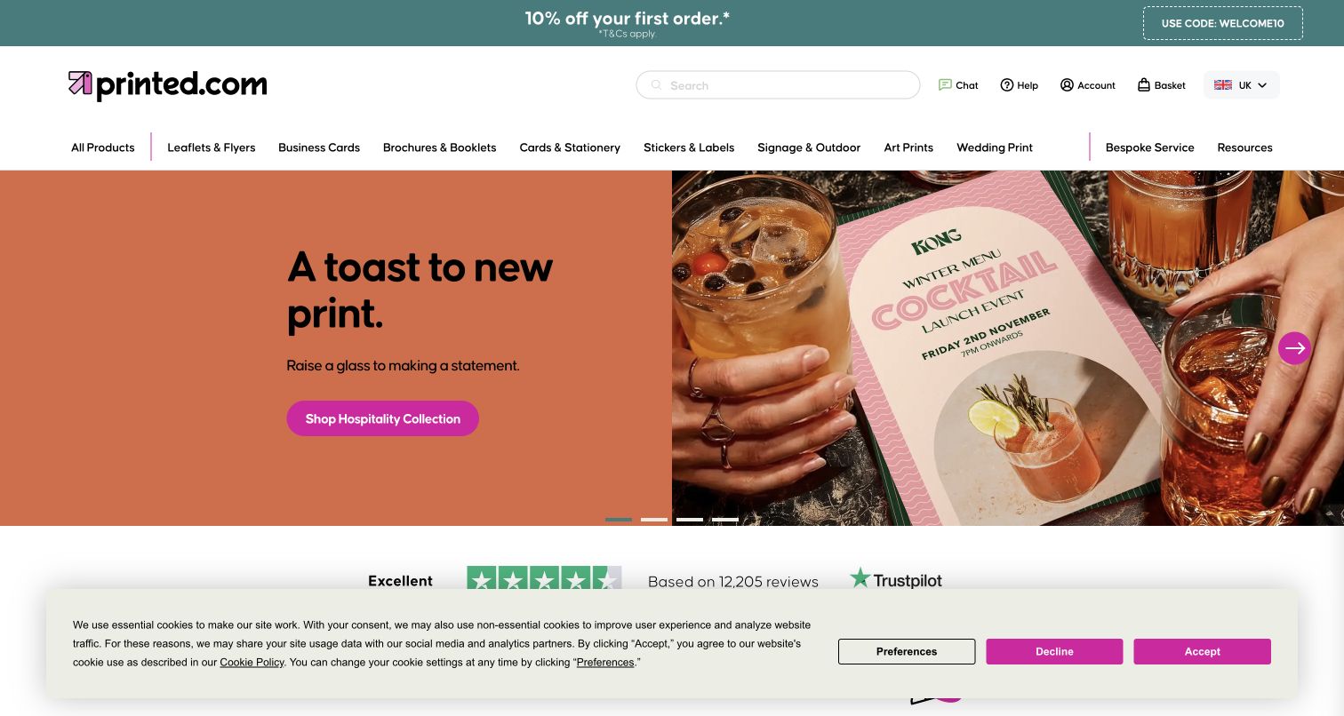
Printed.com’s UK homepage pairs a hospitality-themed photograph with a direct collection link. A menu and drinks make the intended use of the printed piece immediately recognizable, while the surrounding navigation preserves access to individual formats. The homepage also exposes a practical support layer: sample packs, downloadable templates, version printing and delivery information. Product cards combine photographs with labels and starting-price context, although current terms still need checking at the destination. The useful pattern is the connection between an occasion-led campaign and the preparation resources needed to produce a real file.
What you can learn
Build campaign collections around situations customers recognize, while keeping the production vocabulary available nearby. Someone attracted by a finished menu or invitation should be able to find templates and paper guidance without starting again.
Pros
Hospitality and wedding routes explain uses that ordinary product labels may not communicate.
Templates, samples and version-printing guidance give the visual pitch practical follow-through.
Cons & considerations
The rotating campaign can prioritize a temporary occasion over a visitor’s everyday requirement.
The broad product navigation and first-visit cookie banner compete for space around the hero.
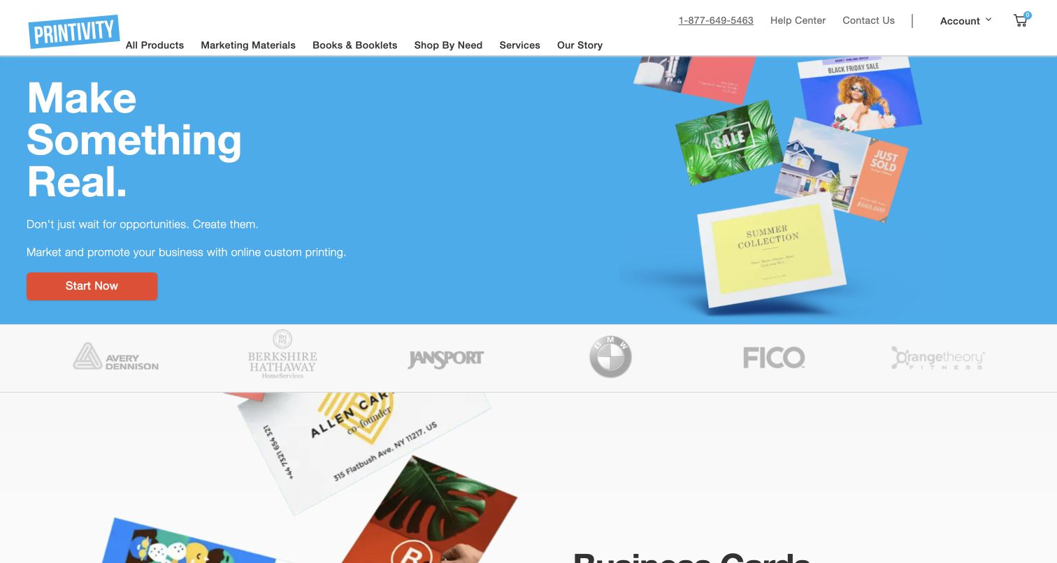
Printivity uses a bright blue field and a group of printed promotional pieces to make its business focus legible quickly. The large headline is brief, with supporting copy explaining custom printing for marketing and promotion. A contrasting Start Now button leads toward products. The compact header separates marketing materials, books, needs and services, and keeps help and contact details in a utility row. Below the hero, business-card imagery begins a more specific product section. The page is useful as a study in moving from a broad motivational statement into recognizable output without adding a long company introduction first.
What you can learn
Keep the first proposition short enough to scan, then show the actual formats a customer can buy. The product section should supply specificity that an ambitious campaign headline cannot provide by itself.
Pros
The bold color and orange action button create a clear visual path through the introduction.
Help and contact routes remain visible above the product navigation for less certain visitors.
Cons & considerations
Start Now gives little indication of whether the next step is browsing, designing or quoting.
Customer logos occupy valuable space before the visitor reaches detailed product information.
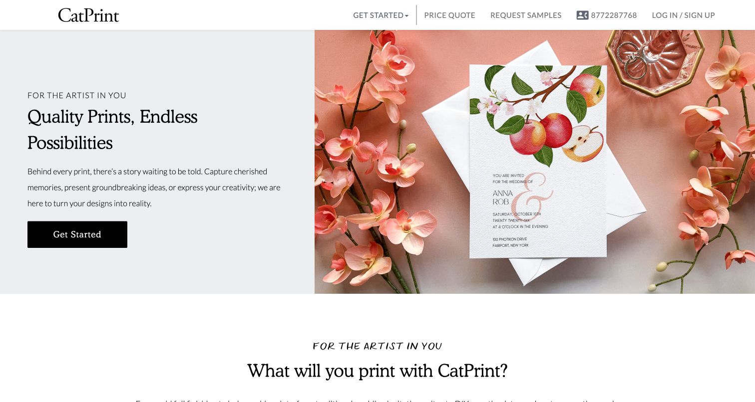
CatPrint’s homepage gives a wedding invitation a large photographic role without letting the image replace the explanation. A pale panel names the audience and presents a clear starting action. Farther down, the product range includes art prints, cards, foil, holographic finishes and booklets. The service explanation is especially relevant to creative buyers: it describes delivery-date selection and optional physical proofs alongside online proofing. Those statements are company-published process information, not tested fulfillment promises. The site offers a useful example of balancing an inviting visual tone with questions that often make a first print order feel uncertain.
What you can learn
Explain the proof and delivery process in ordinary language alongside the attractive output. A creative customer may know exactly how the finished design should look while still needing help understanding production decisions.
Pros
The page connects artist-oriented language with specific products and finishing categories.
Proofing and delivery explanations address concrete concerns beyond the initial visual appeal.
Cons & considerations
The broad Get Started action offers less direction than the more specific product links below.
The wedding-focused hero can understate the wider art and business printing range at first glance.
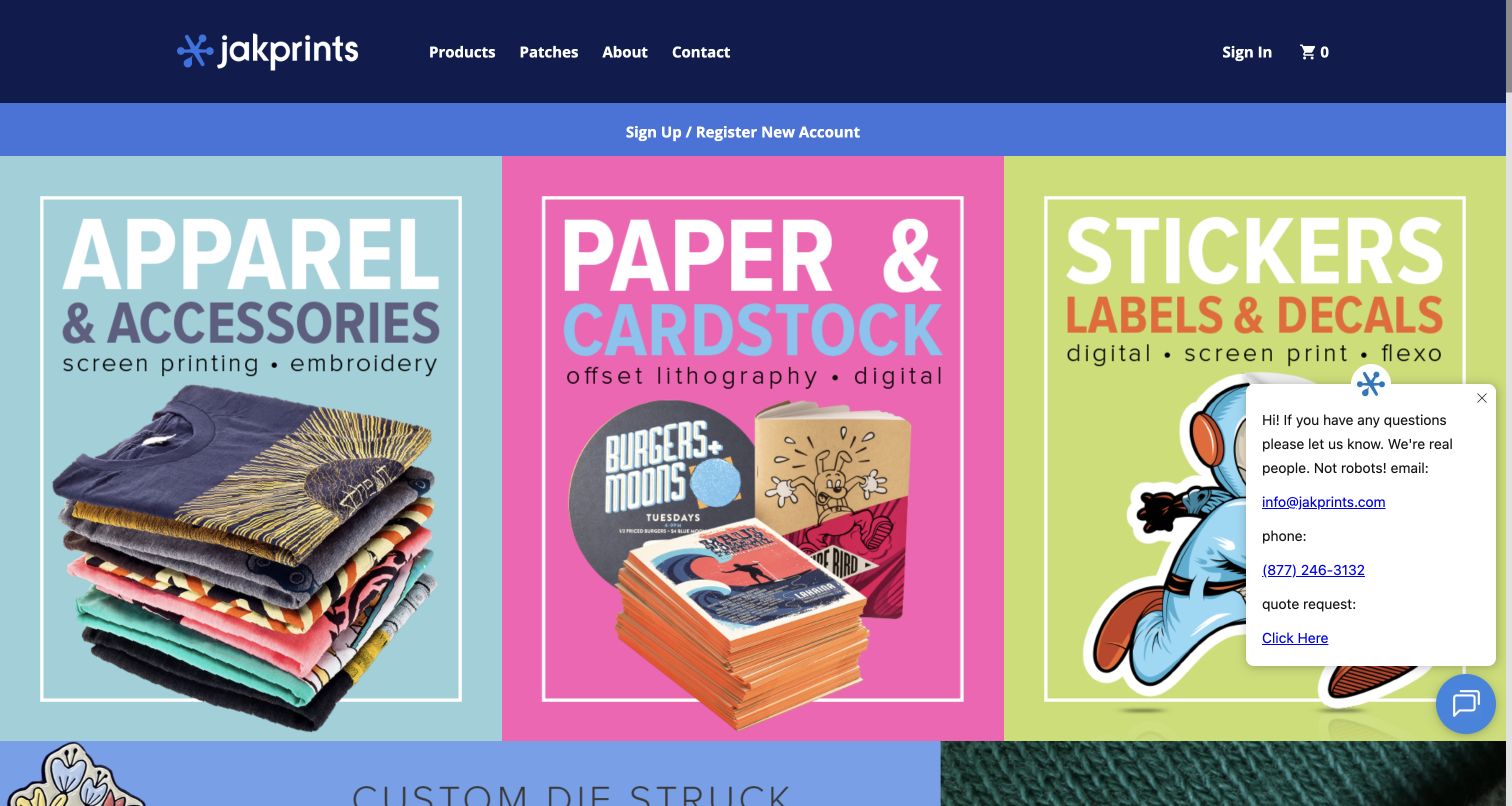
Jakprints makes its main categories unusually concrete. Three adjacent color blocks introduce apparel, paper and cardstock, and stickers, each illustrated with finished items and associated printing methods. The arrangement functions as both brand expression and an immediate category map. A compact dark header contrasts with the bright product area, while later cards lead into business cards, notebooks, passes and other formats. File preparation, templates, stock information and sample packs appear in the wider public navigation. The page is worth studying for its willingness to show different production disciplines together rather than reducing the business to a single vague printing promise.
What you can learn
When a company genuinely spans several production methods, make those divisions visible with examples. Customers can choose the right family before encountering the more specialized vocabulary of individual materials and processes.
Pros
Distinct photographs and color fields make the three primary production families easy to compare.
Visible method labels connect familiar products with the processes used to make them.
Cons & considerations
The prominent registration strip asks for account attention before explaining a project journey.
The source help popup overlaps part of the sticker panel in the captured first-visit state.
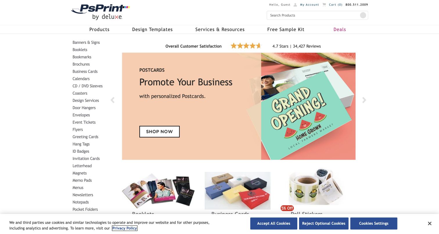
PsPrint keeps a long product index visible beside its main campaign. The left column names formats from booklets and brochures to envelopes, menus and posters, allowing a visitor to bypass the rotating promotion. The central panel combines a postcard example with a concise action, followed by a grid of other product families. Lower resources include a sample kit and layout guidance. The visual system is more utilitarian than the boutique studios in this collection, but its strength is clear: it gives a broad inventory a stable entry point instead of making every visitor browse an inspiration-led sequence.
What you can learn
Consider a persistent catalog index when customers arrive knowing the product name. Pair that efficient route with preparation help, so the interface supports both a repeat order and someone producing a format for the first time.
Pros
The product list offers direct access independently of the current homepage promotion.
Sample and layout resources acknowledge decisions that happen before a print-ready file exists.
Cons & considerations
Many similarly weighted links make the sidebar demanding for visitors unfamiliar with print terminology.
The compact central layout and cookie strip leave less room for large material-detail photography.
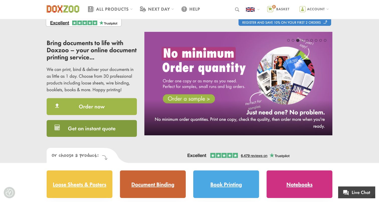
Doxzoo leads with the task of printing, binding and delivering documents. Its main panel offers separate ordering and instant-quote actions, while the adjacent campaign highlights small quantities. Below, four colored category tiles distinguish sheets, document binding, books and notebooks. This is a useful alternative to a general marketing-print catalog: it begins with a document and the treatment it needs. The homepage also links to delivery guidance and help. The reviewed view retains the United Kingdom context, with regional currency and delivery statements understood as source information rather than a promise tested by this collection.
What you can learn
Name the document task before introducing technical production options. Separating quotation from ordering gives visitors a route to estimate a project while they are still deciding how the finished document should be bound.
Pros
The four broad categories reduce the initial choice to recognizable document outcomes.
Distinct quote and order buttons make different levels of purchase readiness visible.
Cons & considerations
Repeated ratings and promotional material add density around the otherwise straightforward task controls.
The rotating banner can emphasize quantity before a visitor has understood the available binding choices.
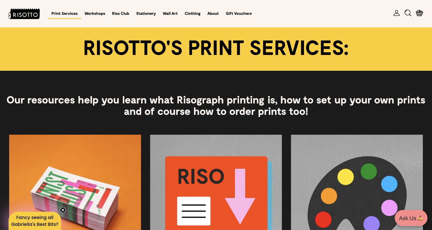
RISOTTO’s print-services page uses strong yellow and black sections to establish a clear specialist destination. Its introductory explanation leads into three visual routes: producing a print, learning how to prepare files, and exploring papers, inks and templates. That structure is more useful than presenting risograph as a visual style alone. The page gives beginners an educational route while allowing prepared customers to continue toward the order calculator. Workshop and consultation links broaden the service without obscuring the main resources. The result is a recognizable studio identity attached to a practical explanation of how someone can participate in the process.
What you can learn
Treat technical education as part of the service design. For an unfamiliar printing method, a clear distinction between preparation guidance, material tools and ordering can reduce uncertainty before a customer submits artwork.
Pros
The three resource routes match different stages of readiness within the same specialist workflow.
Photographs and bold graphics express the studio’s print character while keeping the categories recognizable.
Cons & considerations
Large introductory typography pushes the full resource-card labels below the initial viewport.
Workshop, retail and subscription routes elsewhere in the navigation can distract from a single production task.
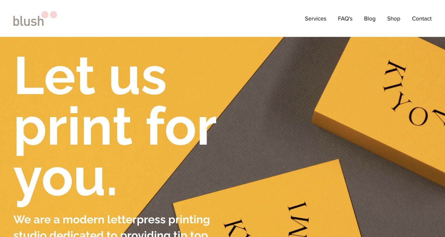
Blush opens with an oversized invitation to print and a close photograph of yellow cards on a textured surface. The large composition makes the physical output central, while a small navigation menu keeps services, FAQs and contact within reach. Further down, the studio identifies its letterpress and finishing expertise and separates business cards, social stationery, labels and packaging. Sample packs and estimates are described as conversations about a specific project, rather than universal product configurations. The design is useful for a studio whose service depends on selecting paper and processes together with a client.
What you can learn
Give craft output enough space to show its character, then explain how a project becomes a useful conversation. Samples, artwork preparation and estimates should connect the expressive portfolio to a concrete next step.
Pros
Close photography lets paper texture and restrained color carry the visual identity.
Preparation guidance and tailored sample information support the consultative nature of the service.
Cons & considerations
The very large hero type pushes part of the introductory explanation below the captured screen.
Email-based estimate and sample routes need clear expectations about the information a customer should provide.
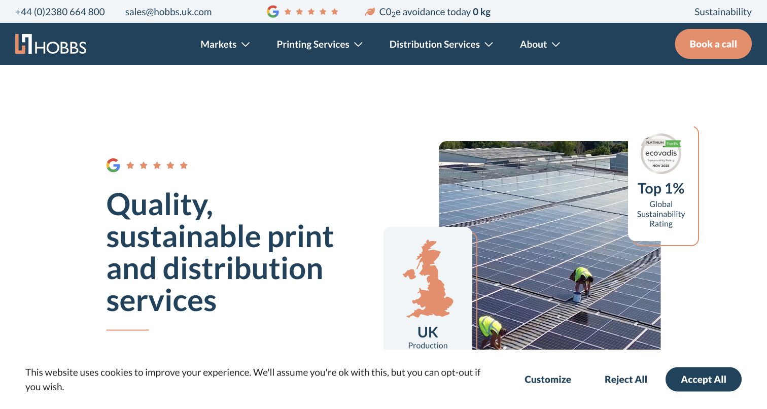
Hobbs introduces printing and distribution together, distinguishing its service from a storefront focused only on ordering individual products. The opening image and supporting badges emphasize the company’s environmental positioning; these are presented as source claims, not independently certified by this review. Navigation separates markets, printing and distribution, while later sections describe different run sizes and publishing support. A quote route and a call route give visitors two ways to begin a conversation. The page is worth studying for how it connects the physical production of a publication with what happens after copies leave the press.
What you can learn
If fulfillment and distribution are central to the business, explain them alongside production rather than as an afterthought. Different run sizes and customer markets need clear destinations before a visitor is asked to discuss specifications.
Pros
Separate printing and distribution routes reflect genuinely different parts of a publication project.
Market navigation helps organizational visitors locate a relevant service context.
Cons & considerations
The opening environmental imagery gives less immediate visual information about the printed products themselves.
Badges and quantitative environmental claims require maintained supporting evidence beyond their prominence in the design.
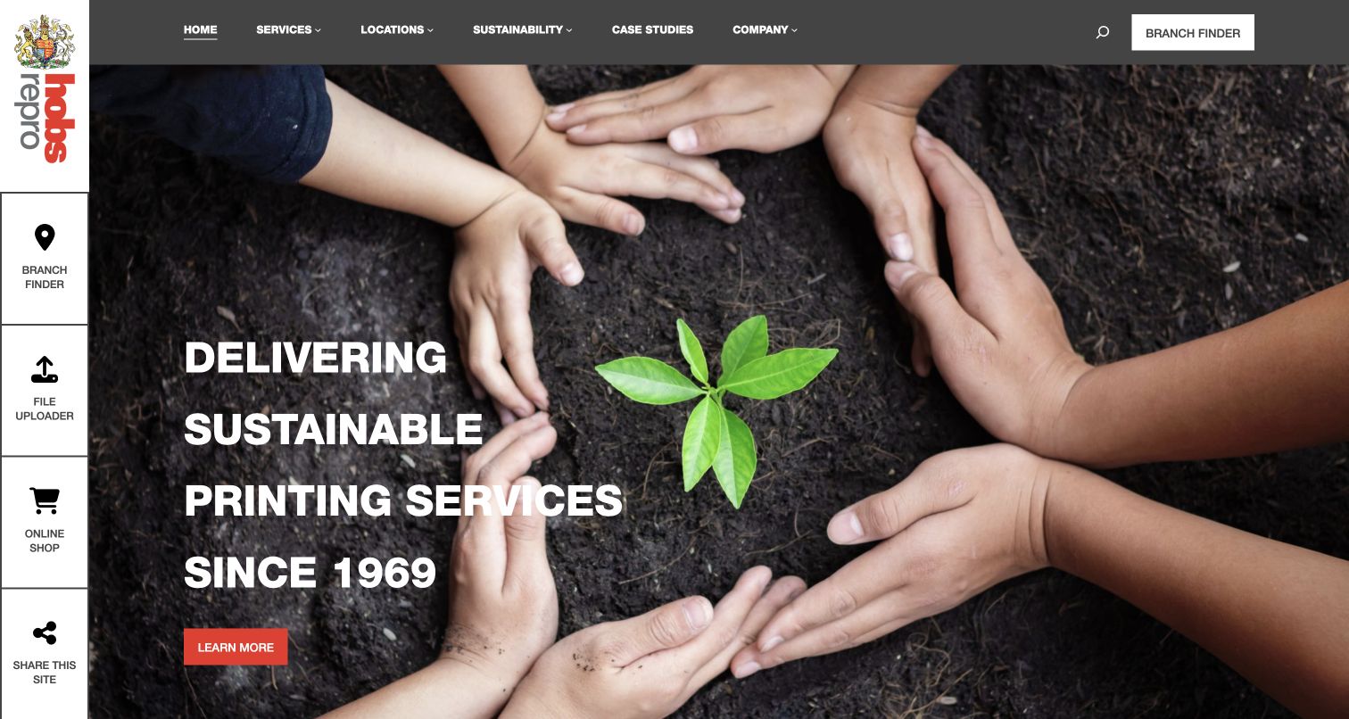
Hobs Repro combines a national service introduction with a persistent vertical utility rail. Branch finding, file upload and online shopping remain distinct routes instead of being hidden in the company menu. The main navigation separates services, locations, sustainability and case studies, and later copy explains the relationship between local teams and a wider network. Its opening environmental photograph presents a broad brand message rather than a particular printed item. The most transferable design choice is the visible operational navigation: returning customers can recognize their next task without reading the entire corporate narrative.
What you can learn
Keep recurring customer tasks accessible even when the homepage tells a larger company story. A branch-based printer should make the distinction between locating support, sending an approved file and shopping online understandable before any interaction.
Pros
The utility rail makes location, upload and shop destinations visually different from editorial navigation.
The page connects local service access with examples of broader design and production work.
Cons & considerations
The prominent environmental hero does not show the print formats a new visitor can obtain.
The fixed rail consumes width and needs careful adaptation when the available screen becomes narrow.
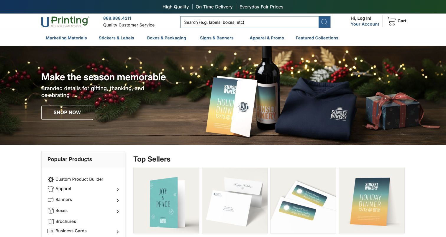
UPrinting uses a seasonal photograph to show several coordinated branded objects, then moves into a structured product catalog. A large search field supports known-item discovery, while the top categories distinguish marketing materials, labels, packaging, signage and promotional products. A separate popular-products menu remains visible beside the first product cards. Lower sections introduce custom quotation, artwork checking and templates. The page demonstrates how a broad printing offer can use a campaign to suggest combinations without abandoning the ordinary product names that returning customers need. The reviewed scene is a design example, not a verification of product quality or production claims.
What you can learn
Let seasonal merchandising suggest a use case while preserving stable category access. A large catalog needs a dependable search and labeling system so the campaign can change without changing how customers find familiar formats.
Pros
The hero presents coordinated printed items rather than an abstract promise about customization.
Search, category navigation and the product index offer different levels of catalog familiarity.
Cons & considerations
Overlapping category systems can require extra interpretation for a first-time visitor.
The wide range of packaging and promotional options makes clear specification guidance essential after the homepage.
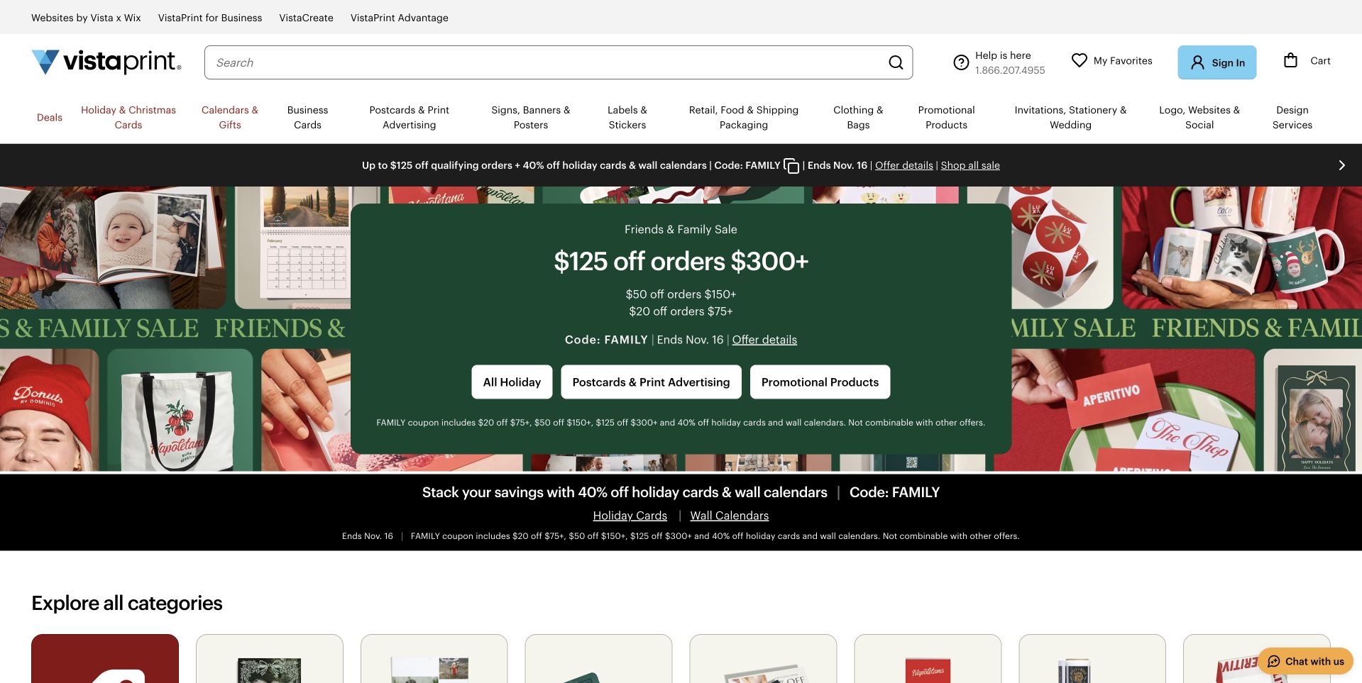
VistaPrint’s captured homepage is led by a seasonal promotion, with an offer panel surrounded by photographs of cards, calendars, bags and other printed goods. The shopping paths remain visible above that campaign through search and a detailed product-category row. Three buttons inside the promotional area separate holiday items, print advertising and promotional products. This makes the page useful for studying how a wide catalog can retain its structure during a strong retail event. The image is the verified earlier November 9 capture, preserved with its original date rather than labeled newly observed.
What you can learn
Keep the catalog’s ordinary routes stable while promotional content changes. A seasonal offer can attract attention, but visitors should still recognize where their usual product lives without interpreting the campaign’s terminology or discount conditions.
Pros
The prominent search field supports visitors who already know the format they need.
Several campaign buttons connect the offer to different customer intentions instead of one generic sale page.
Cons & considerations
Multiple promotional bands repeat information and push the category imagery farther down the page.
The dense navigation mixes personal, business and design services, increasing the need for clear destination pages.
Platform source: Official technology-specific customer or workload source. Twilio describes Vista using Segment for customer-data centralization, Protocols governance, experimentation and personalization. This evidence establishes only the stated product, workload, organization or historical association. It does not prove that the pictured public page uses the technology, reveal its CMS/frontend, establish a complete current architecture or independently verify vendor-reported outcomes. Platform evidence is separate from the direct website screenshot and is not a complete current infrastructure audit.
Kegan is a freelance web designer and developer with 15+ years of experience helping businesses turn complicated website requirements into clear, maintainable digital experiences. He works directly with clients from planning and design through development, launch, and ongoing support.
For print shop website design, his development approach focuses on print-product comparisons, artwork preparation guidance, paper and finish information, sample ordering, and dependable quotation or checkout handoffs. The scope can be a targeted improvement or a complete custom build, with responsive layouts, thoughtful content structure, and integrations chosen around the people using and maintaining the site.
Show 3 other print shop website designersHide other print shop website designers
Plan around the file, the finished object and the customer’s next decision
Define the products and customer tasks before designing the catalog
Start by listing what the print business actually produces and which parts of the process it controls. A local document printer, a letterpress studio and a packaging catalog need different starting points. Record the common customer tasks in ordinary language: getting a price for a booklet, comparing business-card stocks, preparing a two-color artwork file or locating a nearby team. These tasks are a better foundation than copying the navigation of a much larger supplier.
Group the catalog according to decisions visitors understand. A product-based structure works for customers who already know the format. Occasion or industry collections can help less experienced buyers, provided they lead to the same maintained product information. Process names such as letterpress or risograph are useful when the method materially affects the result, but should come with an explanation and examples.
Decide where the website should support self-service and where human advice is necessary. A standard product can lead toward a configuration, while a complex finish may need a brief and estimate. Explain these routes before asking for an account or file. Keep product labels stable when seasonal campaigns change, and assign someone to maintain the catalog so retired formats and unavailable options do not remain prominent.
Connect material evidence with accurate production information
Plan the photography and product information together. A close view of a foil detail, a folded invitation or a bound document can answer questions that a flat graphic cannot. Include enough context to understand size and use, and avoid presenting a digital mockup as a photograph of a completed job. If customer work is featured, obtain the appropriate permission and credit it accurately.
Give each product a maintained set of specifications. Depending on the service, that may include dimensions, stock choices, page counts, folding, binding, color options and finishing limits. Use consistent units and explain terms where a visitor makes the decision. Sample packs can help communicate tactile qualities, but their contents and availability should be described rather than implied by a generic image.
Treat production and delivery information as operational content. Distinguish print turnaround from shipping time and explain how approval or file corrections affect the schedule. Keep environmental or certification statements tied to specific, maintained evidence instead of using them as decorative badges. The website should help someone understand the proposed job; photographs, ratings and brand language do not independently establish that an order will meet a particular quality or deadline.
Design a clear handoff from preparation to proof and order
Map what the customer must supply before production can begin. Show which file formats are accepted and link to relevant templates or preparation guides. Provide concise explanations of bleed, safe areas, color and image requirements where they affect the selected product. Avoid forcing everyone through a long technical article when a short contextual answer would resolve the immediate question.
Explain proofing as a distinct stage. A customer should know whether they will see an online preview, receive a physical proof or communicate directly with a team, and what approval actually means. Do not imply that a file upload alone places an order or that an inquiry reserves production time. Clearly label estimates and state which choices may change the final price.
Plan for incomplete and unusual projects as well as the ideal purchase. Give customers a way to ask a bounded question without supplying unnecessary personal or commercial information. Keep uploaded artwork and inquiry records outside the public website library. Test long product names, missing previews, invalid files, unavailable delivery options and narrow screens through the appropriate automated and product checks. The finished journey should make responsibility clear at every handoff, from preparation through confirmation.
The editing job behind the design
Choose tools around the catalog and production workflow
Use one maintained source for product descriptions, specifications, templates and available options. The content system should make these updates straightforward for the team responsible for them.
A configurator, quoting tool or file-upload service should have clear boundaries and understandable error states. Keep production artwork and customer records private rather than treating them as ordinary public media assets.
The stacks below come from bounded public-source audits and qualified documentary evidence. They do not reveal the complete ordering, prepress, payment or production systems behind a print business.
Our WordPress website examples offer a separate look at publishing approaches. A visible platform label is evidence for that named page, not a guarantee that the same system will suit your requirements.
Before the public launch
Print-shop website brief checklist
Name the actual printing services, territory and supported customer needs.
Keep stable product categories available beside seasonal campaigns.
Show genuine examples with permissions, captions and appropriate material detail.
Explain dimensions, stock, color, binding and finishing choices consistently.
Provide relevant sample information without implying unverified quality guarantees.
Separate product browsing, custom estimates, technical questions and orders.
Place artwork templates and preparation guidance near the relevant product.
Explain proofing, approval and file-correction responsibilities.
Distinguish production turnaround from shipping and delivery conditions.
Support environmental and certification statements with specific maintained sources.
Keep customer files and inquiry records private and access-controlled.
Assign owners for product availability, templates, service details and operational notices.
These checks are a project checklist, not a performance, legal, security, or accessibility certification. Test real journeys with the people responsible for the website before making claims about the result.
Sources & editorial method
How this collection was selected and reviewed
The collection contains eighteen distinct public website properties, matching the original saved industry draw of eighteen. Seventeen new direct browser captures were prepared for this collection. VistaPrint uses a verified earlier November 9 capture from stable authoring records, retaining its original timestamp and receiving new print-shop commentary. Every image was inspected. Broad public technology-audit attempts cover every source page; blocked and partial scans remain explicitly qualified and do not establish hidden systems. Some genuine first-visit captures retain source privacy, terms or assistance notices. No order, account action, file upload, inquiry or form submission was made during the review. The Editors Choice is an editorial website-design selection, not a vote-derived award or a supplier-performance endorsement.
Each example links to its actual source page. Screenshots are direct browser captures with their own capture dates; moving imagery, announcements and live designs can change. The notes describe observable design choices and conditional tradeoffs, not measured traffic, conversion results, service quality, or accessibility conformance.
Technology labels use public page metadata, asset evidence, or explicitly cited platform documentation. Platform documentation is not a complete current deployment audit. A component reference may be legacy or unused; it is not a complete backend inventory. Unknown stacks are omitted. These sites are editorial examples, not our client portfolio.
Written, Edited and Curated are separate editorial records, not timestamps advanced by a rebuild. Website designs and imagery belong to their owners. See our editorial standards or suggest a correction.
Questions worth asking
Print Shop website design questions
Should a print-shop homepage lead with products or services?
Use the business model and the customer’s main task. A broad online catalog benefits from familiar product categories and search. A specialist studio may need to explain its process and show completed work before directing a visitor to a custom estimate. Keep both the offering and the next step clear.
How can a website communicate paper quality?
Use accurate product photographs, clear stock information and a sample route where available. Show texture, scale or finishing when those details matter. A screen cannot reproduce how paper feels, so avoid implying that imagery alone fully establishes the physical result.
What should appear before a customer uploads artwork?
Explain accepted file formats, the relevant preparation requirements and what the upload starts. Link to the correct template or guide, distinguish a quote from an order, and make clear how the file will be reviewed and kept private.
Should print turnaround and delivery be described separately?
Yes. Production time, proof approval, file corrections and shipping can affect the schedule differently. State the conditions that apply to the actual product and destination rather than presenting a broad speed claim as an unconditional arrival promise.
Does the Editors Choice recommend a printer’s services?
No. The selection recognizes public website design and communication. This review does not involve purchasing print, testing fulfillment, verifying customer reviews or certifying a supplier’s environmental or product-quality claims.