Best VTEX Websites of 2026 (20 Real-World Examples)
Twenty public stores and booking properties with documented VTEX projects, direct captures and practical commerce lessons. Current observations and historical platform relationships are kept distinct.
Good commerce design helps people find the right thing, understand the conditions and choose a useful next step. These VTEX project references show how those needs change across grocery, apparel, specialist equipment and experience booking.
This collection begins with H Mart, Samsung Brazil, OBI Germany, Coca-Cola Andina Chile and Under Armour Brazil. Each opening example is a recognizable brand with evidence for the specific public property being reviewed. Regional stores are not treated as proof of a global platform, and several brands within one retail portfolio do not become extra examples.
The source relationships have different dates and roles. Manchester City is included for the documented first stadium-tour booking phase, while Al’s case describes VTEX commerce behind a separate frontend. Equinavia, Saint Croix and Loja Três have historical VTEX project evidence but current Shopify signals. Their present screenshots are useful design references, not claims that their current stores still run on VTEX.
The reviews examine real public page states, including promotional overlays and Santa María’s initial store-selection prompt. No checkout, booking, prescription, account or newsletter was submitted. Use the collection to plan discovery, service information and campaign structure; it does not rank stores by revenue or certify their accessibility.
Before the examples
What makes good VTEX website development in 2026?
Make shopping intent visible
Search, category browsing, local availability and specialist services solve different problems. Decide which intent deserves the most space for the actual catalog. A grocery shopper returning for familiar products needs a different opening from a visitor evaluating a stadium tour. Keep changing campaigns within a stable structure of useful tasks.
Choose the storefront approach deliberately
VTEX documents distinct storefront options. FastStore is a headless framework based on Next.js, while Store Framework uses VTEX IO and React with native commerce components. Choose an approach around the team’s maintenance responsibilities and integration needs; the appearance of a public store alone does not establish which option it uses.
Market, delivery area, stock context, payment terms and campaign exclusions can change the meaning of an offer. Present those conditions where a visitor chooses a route, rather than burying them under promotional artwork. A known brand does not remove the need to explain which regional business and service area a page represents.
The collection · 20 examples
20 VTEX website examples worth studying
Five recognizable brands open the collection, followed by specialist retail and booking properties. The sequence is editorial, with no technology awards, invented customer results or duplicate regional quotas.
We start with five recognizable brands or organizations: H Mart, Samsung Brazil, OBI Germany, Coca-Cola Andina Chile, Under Armour Brazil. Each attribution applies to the named website property, not every product or website belonging to its organization. This is a curated reading sequence, not a measured ranking.
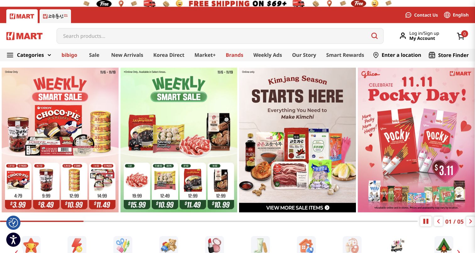
H Mart puts shopping utility ahead of a lifestyle introduction. A wide search field sits beside account and basket controls, while the next row separates categories, weekly ads, brands and store finding. The opening campaign brings several grocery offers together: packaged snacks, chilled products, kimchi ingredients and a seasonal confectionery promotion. Prices and pack imagery make the panels feel like a familiar supermarket circular. The design rewards a shopper who already knows the category, although the many simultaneous offers demand close reading. The VTEX case concerns the US dry and fresh online stores; our bounded source audit reached its size limit and supplies no new stack conclusion.
What you can learn
Give repeat customers stable search and category tools, then place changing promotions inside a clear campaign area. Explain regional availability near the entry points that depend on it instead of making every visitor decode small promotional footnotes.
Pros
Search occupies a useful share of the header.
Weekly ads and store finding have explicit destinations.
Cons & considerations
Several adjacent offers compete for attention.
Small eligibility text needs careful reading before purchase.
Visible tech stack
Earlier / documented evidence
VTEX
Platform source: Official VTEX exact-property project case. US public grocery storefront; vendor documents completed Magento-to-VTEX migration of dry and fresh stores. Not its corporate site or every regional system. Platform evidence is separate from the direct website screenshot and is not a complete current infrastructure audit.
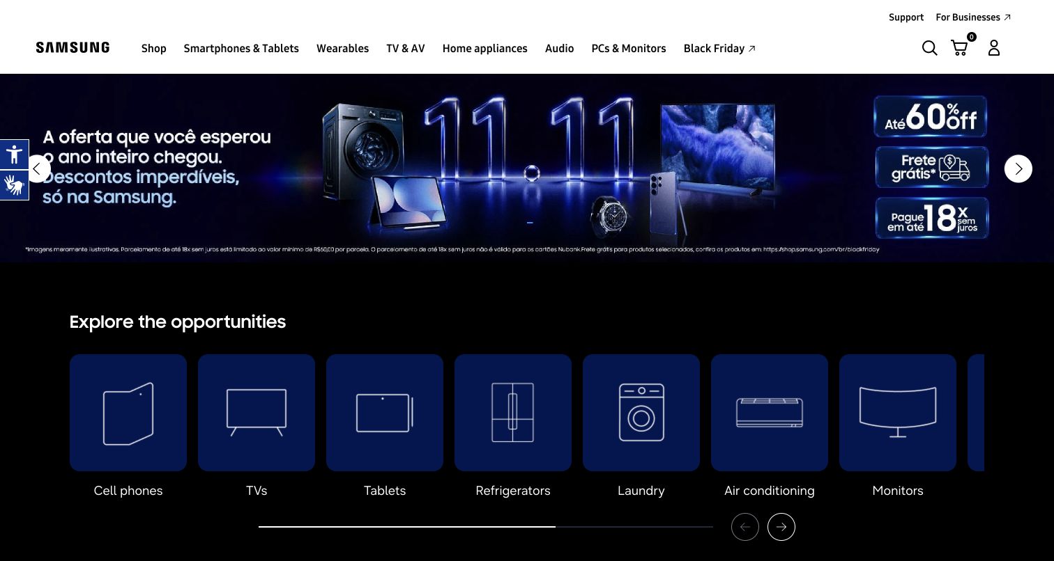
Samsung Brazil’s captured Black Friday page uses a dark campaign canvas beneath a restrained white navigation bar. The large promotional banner groups a washer, television, phone and wearable around the same event, then the next section turns those product families into simple illustrated cards. This creates a useful transition from a broad sale message to a more specific shopping route. The navigation still separates support and business audiences from the consumer categories. Portuguese banner artwork remains visible alongside browser-translated labels. The documented VTEX relationship concerns the Brazilian direct store and its earlier VTEX IO work, not every Samsung website or the hardware shown in the campaign.
What you can learn
Pair an event headline with durable category choices immediately below it. Campaign artwork can create recognition, but visitors should not need to interpret every discount condition before finding the product family they actually need.
Pros
Product-family cards give the promotion a clear next step.
Consumer categories remain separate from business support routes.
Cons & considerations
Banner conditions are much smaller than the offer.
Horizontal category browsing can leave options outside the initial view.
Platform source: Official VTEX exact-property project case. Official VTEX case documents the Brazilian D2C operation and its 2022 VTEX IO work. The reviewed regional offer entry redirected to shop.samsung.com/br/blackfriday. Evidence concerns Brazil only, not Samsung worldwide. Platform evidence is separate from the direct website screenshot and is not a complete current infrastructure audit.
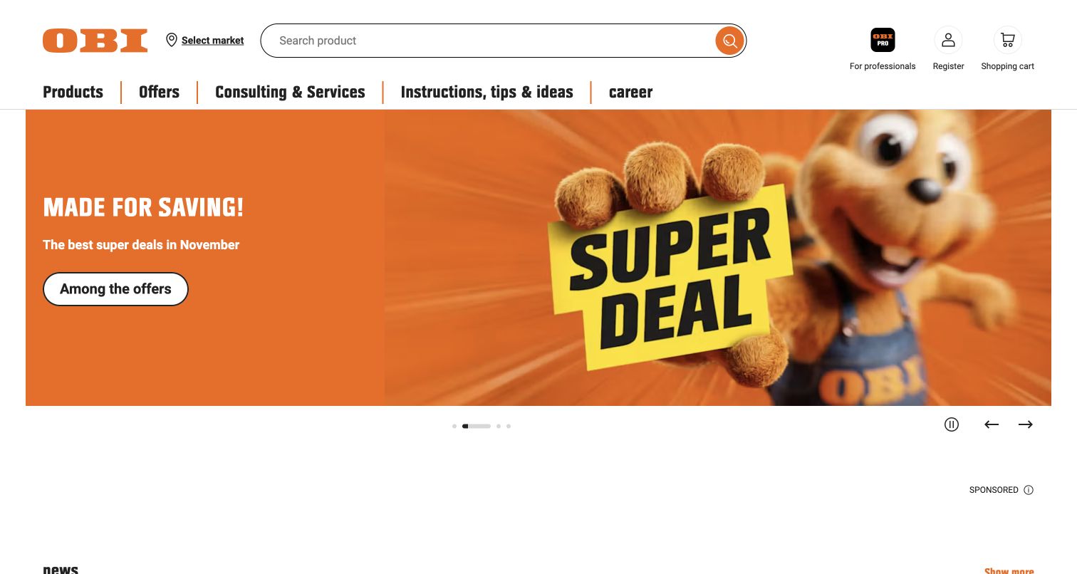
OBI Germany places store selection and a prominent search field beside its orange identity. Below them, the main navigation distinguishes products, offers, consulting services and practical instructions. That division recognizes that a home-improvement visit can start with either an item or a problem. The captured promotion uses the brand’s beaver character and a large saving message, with one contrasting action on the left. Carousel controls include a visible pause control. An open sponsored area below the hero creates a noticeable gap before further content. VTEX’s May 2024 announcement documents the German commerce and marketplace migration; the current bounded audit returned 404 and did not establish additional technologies.
What you can learn
Keep project advice and service routes as visible as the catalog when customers may need help deciding what to buy. A strong campaign can sit above that structure without replacing the practical paths people return to repeatedly.
Pros
Store choice is available before product discovery.
Advice and consulting have their own clear navigation entries.
Cons & considerations
The sponsored space interrupts the first content sequence.
A rotating promotion should remain understandable without motion.
Visible tech stack
Earlier / documented evidence
VTEX
Platform source: Official VTEX exact-property project case. German public home-improvement store. May 2024 vendor release reports completed ecommerce/marketplace migration and German store integration, not every country or corporate site. Platform evidence is separate from the direct website screenshot and is not a complete current infrastructure audit.
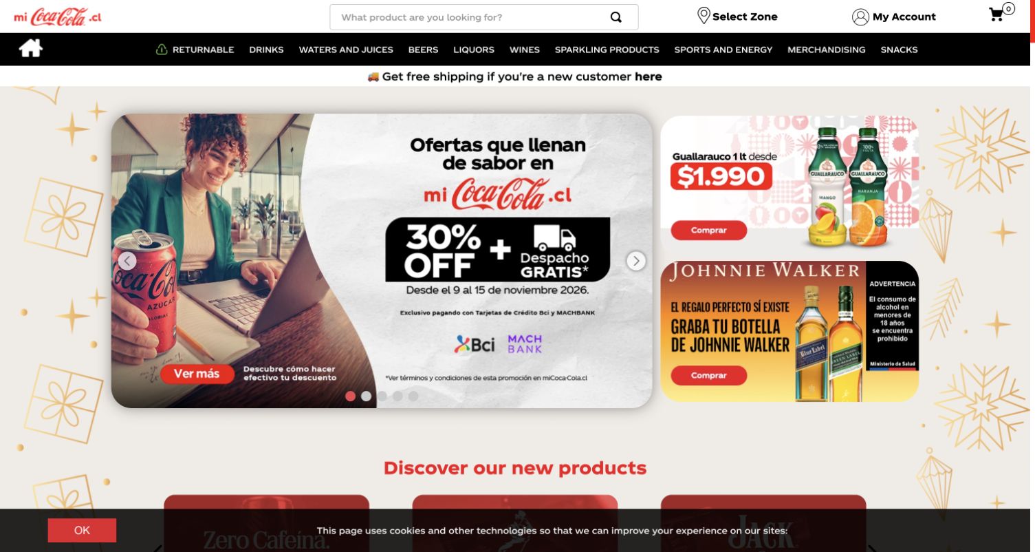
Coca-Cola Andina’s Chilean storefront translates a familiar identity into everyday shopping controls. Search, delivery-zone selection, account and basket sit above a compact dark category bar. The promotional area combines one large payment-related offer with two smaller product campaigns, making the local store feel broader than a single beverage brand. Red buttons and prices connect otherwise different campaign artwork. The screen also demonstrates the cost of multiple overlays: a cookie notice covers the bottom edge while promotional conditions remain small within the images. The cited VTEX story documents the Chilean direct store’s earlier launch; this is not evidence about Coca-Cola’s global corporate systems or every bottler.
What you can learn
Local commerce needs visible service boundaries even when the parent brand is instantly recognizable. Put delivery eligibility and category discovery in the permanent interface, and keep payment or campaign conditions readable without relying on enlarged promotional imagery.
Pros
Delivery-zone selection is a clear header task.
Large and small campaign panels establish a useful hierarchy.
Cons & considerations
The cookie notice overlaps lower content in the capture.
Dense offer conditions compete with prominent discount claims.
Platform source: Official VTEX exact-property project case. The vendor links this exact Chilean bottler DTC property and documents December 2016 launch with VTEX. Historical public-store association, not Coca-Cola global corporate infrastructure. Platform evidence is separate from the direct website screenshot and is not a complete current infrastructure audit.
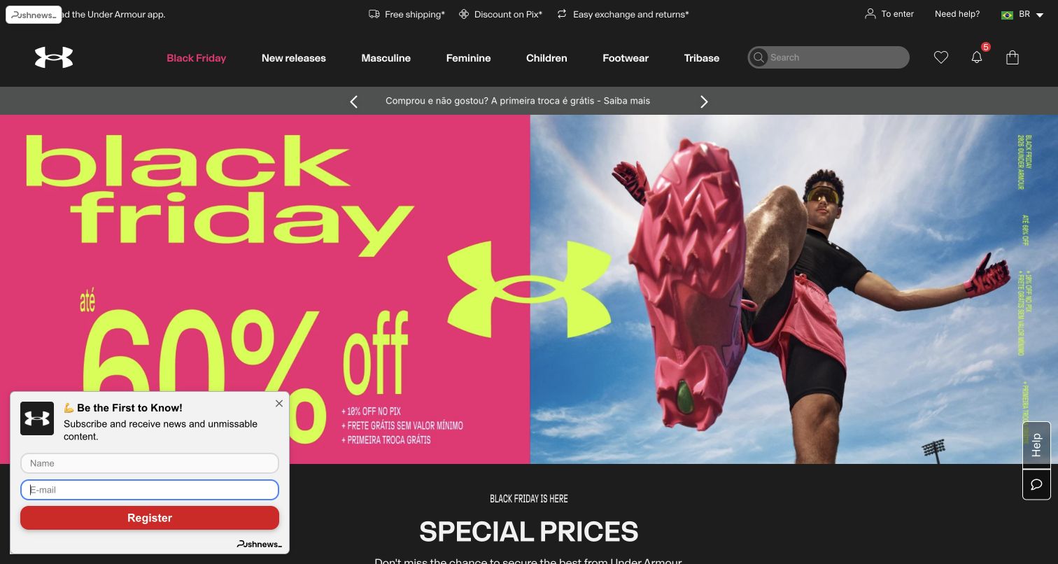
Under Armour Brazil opens with an unusually forceful pink and yellow sale treatment beside an athlete photographed from below. The shoe fills the foreground, giving the campaign a physical sense of movement. A dark header holds audience categories, footwear, search and account tools, while two slim bands communicate delivery, payment and exchange messages. These practical details help connect a global sports identity to local shopping expectations. A small newsletter panel remains visible at the lower left and obscures part of the hero; no information was entered. The vendor case describes Brazil as the first implemented regional VTEX stage with Vulcabras, rather than establishing a platform for the US or worldwide store.
What you can learn
Use distinctive campaign photography to create energy, but give local delivery and exchange information a stable place in the interface. Optional signup prompts should leave both the main message and its next action easy to understand.
Pros
The athlete and product share one coherent visual story.
Local service benefits remain visible above the campaign.
Cons & considerations
The signup panel competes with the opening message.
Very large sale typography can dominate product discovery.
Platform source: Official VTEX exact-property project case. Brazil was the first implemented stage of regional commerce standardization with Vulcabras. Official Under Armour support confirms this Brazilian store. Not the US/global storefront. Platform evidence is separate from the direct website screenshot and is not a complete current infrastructure audit.
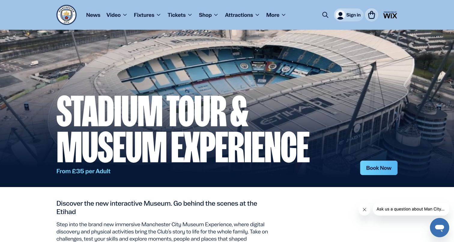
Manchester City’s stadium-tour page keeps the club’s blue navigation while giving the attraction its own unmistakable introduction. An aerial stadium image supports an oversized tour and museum title, a starting adult price and one bright booking button. The next paragraph explains the new museum experience rather than repeating the headline. This is a focused commercial task inside a much broader news, video and ticketing website. The visible Wix sponsorship is branding, not evidence of the booking platform. VTEX’s case identifies the completed first tour-booking phase; it does not establish that the entire club website or merchandise operation uses VTEX. Our bounded audit encountered an access restriction and was not bypassed.
What you can learn
When a purchase journey lives inside a large organizational site, make the offer, price basis and next step explicit in its own introduction. Preserve the broader navigation, but avoid letting sponsorship or parent branding confuse the implementation evidence.
Pros
The experience and starting price are immediately identifiable.
A single booking action anchors the broad hero.
Cons & considerations
The large title leaves limited room for detailed conditions.
The chat prompt overlaps the lower introductory area.
Visible tech stack
Earlier / documented evidence
VTEX
Platform source: Official VTEX exact-property project case. Public stadium-tour and museum booking entry, corresponding to the completed first phase described by VTEX in 2026. Not all mancity.com content, merchandise or future campus plans. Platform evidence is separate from the direct website screenshot and is not a complete current infrastructure audit.
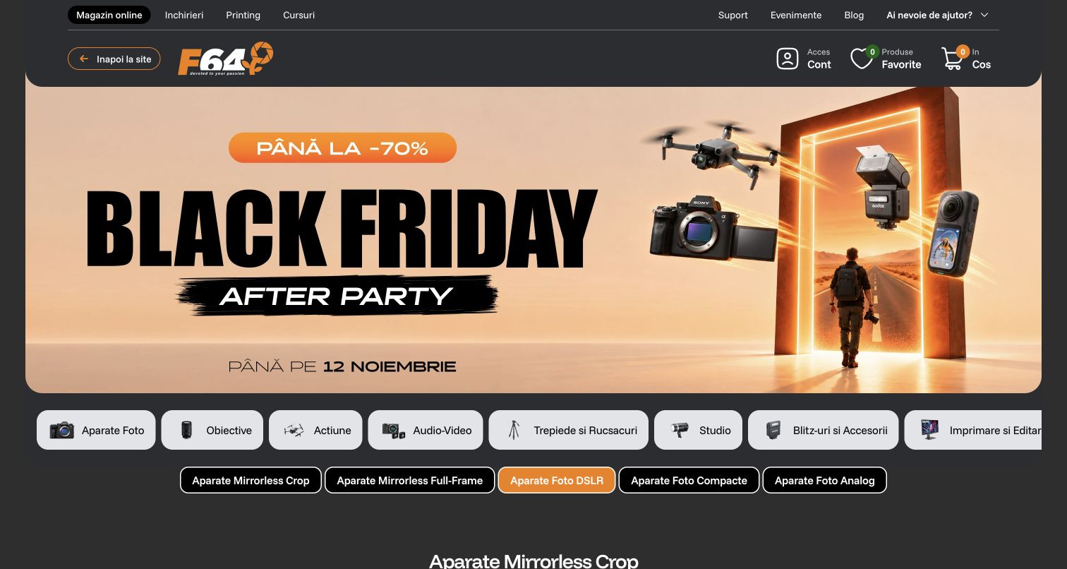
F64’s captured opening is a Black Friday after-party landing page, with cameras, lenses and accessories arranged around a large event headline. Orange accents connect the campaign, logo and selected category. A dark header separates the online shop from rentals, printing, courses and support, acknowledging several reasons a photography customer might visit. Below the hero, illustrated category tabs lead into more technical camera types such as crop, full-frame and DSLR. This is a useful progression from a broad promotion to specialist product language. VTEX’s case documents the Romanian retailer’s commerce relationship since 2018; its future marketplace and language plans are not treated as completed features of the captured page.
What you can learn
Let a seasonal campaign attract attention, then immediately expose the distinctions experienced buyers use to narrow their choice. Keep adjacent services visible without making rental, education and retail customers share an ambiguous first route.
Pros
Technical categories follow the campaign without a long introduction.
Retail and specialist service destinations are visibly distinct.
Cons & considerations
Dense terminology may need explanation for first-time buyers.
The event-heavy opening depends on timely campaign maintenance.
Platform source: Official VTEX exact-property project case. Romanian photography retailer's public store; official case documents commerce platform since 2018 and 2026 results. Future marketplace/multilingual roadmap is not counted as complete. Platform evidence is separate from the direct website screenshot and is not a complete current infrastructure audit.
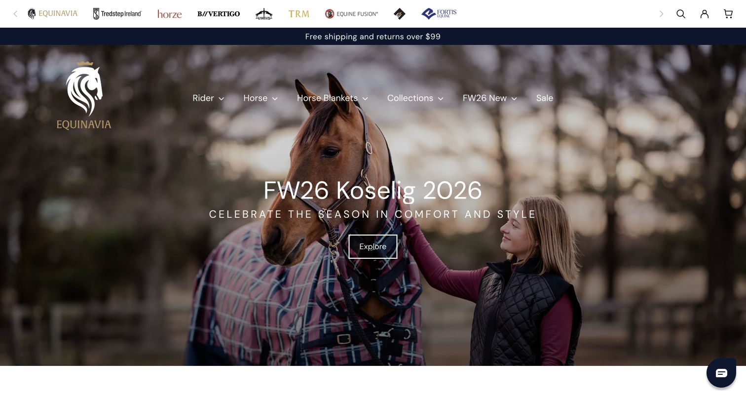
Equinavia places a row of partner brands above a full-width seasonal photograph of a rider and horse. A short shipping message separates those brands from the main navigation, which uses plain audience and product terms such as Rider, Horse and Horse Blankets. The central campaign title and outlined Explore button leave the image room to carry the mood. It is a calm alternative to a discount-led sporting-goods homepage, although the text sits over a detailed photograph. VTEX’s 2020 release documents an earlier Equinavia.com project. The current public audit observes Shopify and Klaviyo references, so this example is explicitly a historical VTEX association rather than a claim that the pictured store still uses that platform.
What you can learn
Use lifestyle imagery to unite a specialist audience, while keeping product and audience categories literal. Retain dated platform evidence honestly when a storefront changes; a useful design review can survive that change without misrepresenting the current implementation.
Pros
Rider and horse categories reflect distinct shopping needs.
The seasonal image communicates the store’s audience quickly.
Cons & considerations
Text over a busy photograph needs careful contrast treatment.
The many brand marks compete with the primary store identity.
Platform source: Official VTEX exact-property project case. The 2020 VTEX release explicitly documents Equinavia.com and its completed earlier migration from Salesforce. Current exact-page audit observes Shopify and Klaviyo references. VTEX is an earlier documented project association, not a current platform claim. Platform evidence is separate from the direct website screenshot and is not a complete current infrastructure audit.
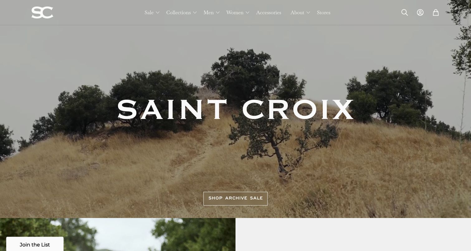
Saint Croix opens with a broad landscape, widely spaced brand lettering and a compact archive-sale button. The top navigation places collections and audience categories alongside About and Stores, while utility icons stay at the far right. This treatment gives the apparel label an editorial atmosphere instead of starting with a grid of prices. The image itself does not explain the garments, so the visitor must use navigation or continue downward to discover the range. A small mailing-list tab occupies the lower corner without taking over the whole screen. The 2020 VTEX release is historical project evidence; the current audit observes Shopify signals. The current screenshot is therefore not represented as proof of a live VTEX backend.
What you can learn
A quiet image-led opening works best when the next shopping action remains obvious and product detail follows promptly. Separate the design lesson from old implementation claims, especially when current source evidence points to a later platform.
Pros
The archive-sale action is easy to distinguish from the image.
Store information has a permanent navigation destination.
Cons & considerations
The landscape alone gives little product context.
Fine white navigation can be difficult over changing imagery.
Platform source: Official VTEX exact-property project case. The 2020 VTEX release documents the Saint Croix luxury-apparel store launch. Current exact-page audit observes Shopify references. VTEX is an earlier documented association, not the current store implementation. Platform evidence is separate from the direct website screenshot and is not a complete current infrastructure audit.
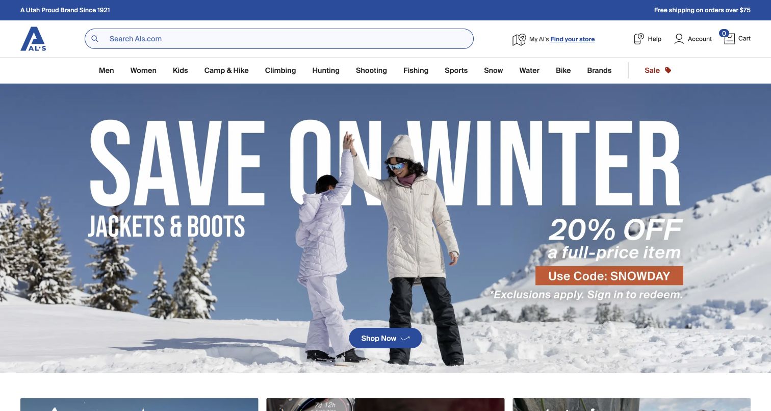
Al’s Sporting Goods balances a broad inventory with a simple seasonal opening. A large search field and store finder dominate the header, followed by activity categories ranging from camping and climbing to snow, water and cycling. The winter campaign shows apparel in use, with a short offer, visible qualification and one shopping button. The scene supplies context for the products without asking the customer to infer which department sells them. A narrow top band reinforces the retailer’s Utah identity and shipping threshold. The VTEX case describes commerce integrated with a deco.cx frontend and CMS; the current audit separately observes HTMX and font references. Those roles should not be collapsed into a single visible-page platform claim.
What you can learn
For a wide sporting catalog, keep activity navigation and search dependable while seasonal imagery changes. Place offer conditions near the action, and treat store finding as a first-class route for customers who may finish their shopping locally.
Pros
Activity-based navigation makes the broad catalog legible.
The campaign combines use context with a clear action.
Cons & considerations
Many categories create a dense desktop navigation row.
A large seasonal hero delays comparison of individual products.
Platform source: Official VTEX exact-property project case. US public sporting-goods store. 2025 case describes VTEX commerce integrated with deco.cx headless frontend/CMS, rather than VTEX authoring every visible component. Platform evidence is separate from the direct website screenshot and is not a complete current infrastructure audit.
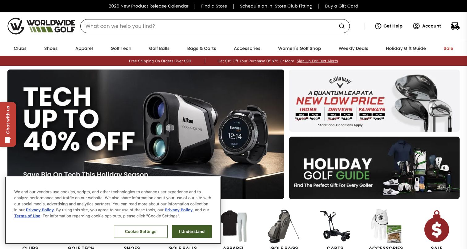
Worldwide Golf Shops gives specialist tasks their own top row: new-product releases, store finding, club fitting and gift cards. Search and practical account controls sit beneath it, followed by familiar golf categories. The opening grid uses one large technology promotion and two smaller panels for equipment pricing and gift discovery. This arrangement offers several intentions without turning every campaign into an equal-size banner. A cookie panel obscures part of the lower grid in the captured state, and a chat tab competes at the side. The vendor story documents a VTEX retail portfolio, but this collection counts only the exact Worldwide Golf public property; related retail brands are not extra examples.
What you can learn
Place specialist services where customers can find them before entering the catalog. A promotional grid should establish one dominant message and a few useful alternatives, while consent and support interfaces should avoid covering the destinations the grid introduces.
Pros
Club fitting and store finding are explicit utility routes.
Unequal campaign panels establish a clear visual hierarchy.
Cons & considerations
The consent panel covers part of the first shopping view.
Several persistent utility layers reduce available campaign space.
Platform source: Official VTEX exact-property project case. Public golf retail storefront. Vendor documents completed VTEX multi-store portfolio and Edwin Watts migration. Count this one public property, not six brands as six independent examples. Platform evidence is separate from the direct website screenshot and is not a complete current infrastructure audit.
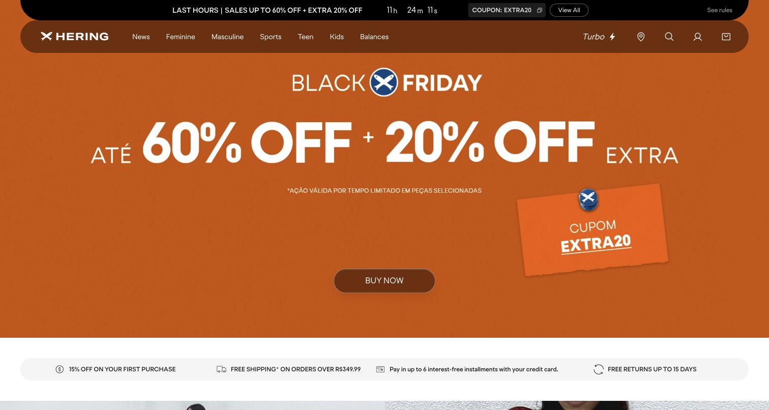
Hering’s Brazilian homepage commits almost the entire opening to one orange Black Friday campaign. A large percentage message, coupon graphic and centered buying action make the offer hard to miss. The rounded navigation container stays within the same palette, while a dark urgency strip separates timing and coupon details from the main artwork. Beneath the hero, a light service row introduces first-purchase, shipping, installment and return information. This consistency makes the page feel deliberate, but its promotional intensity leaves little room for the clothing itself. The official VTEX story names the Brazilian store and completed migration; current Next.js signals describe the sampled frontend, not an independently observed inventory of the commerce backend.
What you can learn
Give a major campaign a disciplined palette and a single route forward, then support it with stable service information. Ensure that offer timing, exclusions and coupon behavior remain understandable without depending solely on large image-based typography.
Pros
The primary promotion and action share a coherent visual treatment.
Service reassurance follows immediately below the hero.
Cons & considerations
Product style is largely absent from the first screen.
Urgency and multiple discount messages require careful interpretation.
Platform source: Official VTEX exact-property project case. Official VTEX case names the Brazilian public store at hering.com.br and documents its completed replatforming. The case hyperlink uses a different host; this review retains the explicitly named Brazilian property and does not infer other domains. Platform evidence is separate from the direct website screenshot and is not a complete current infrastructure audit.
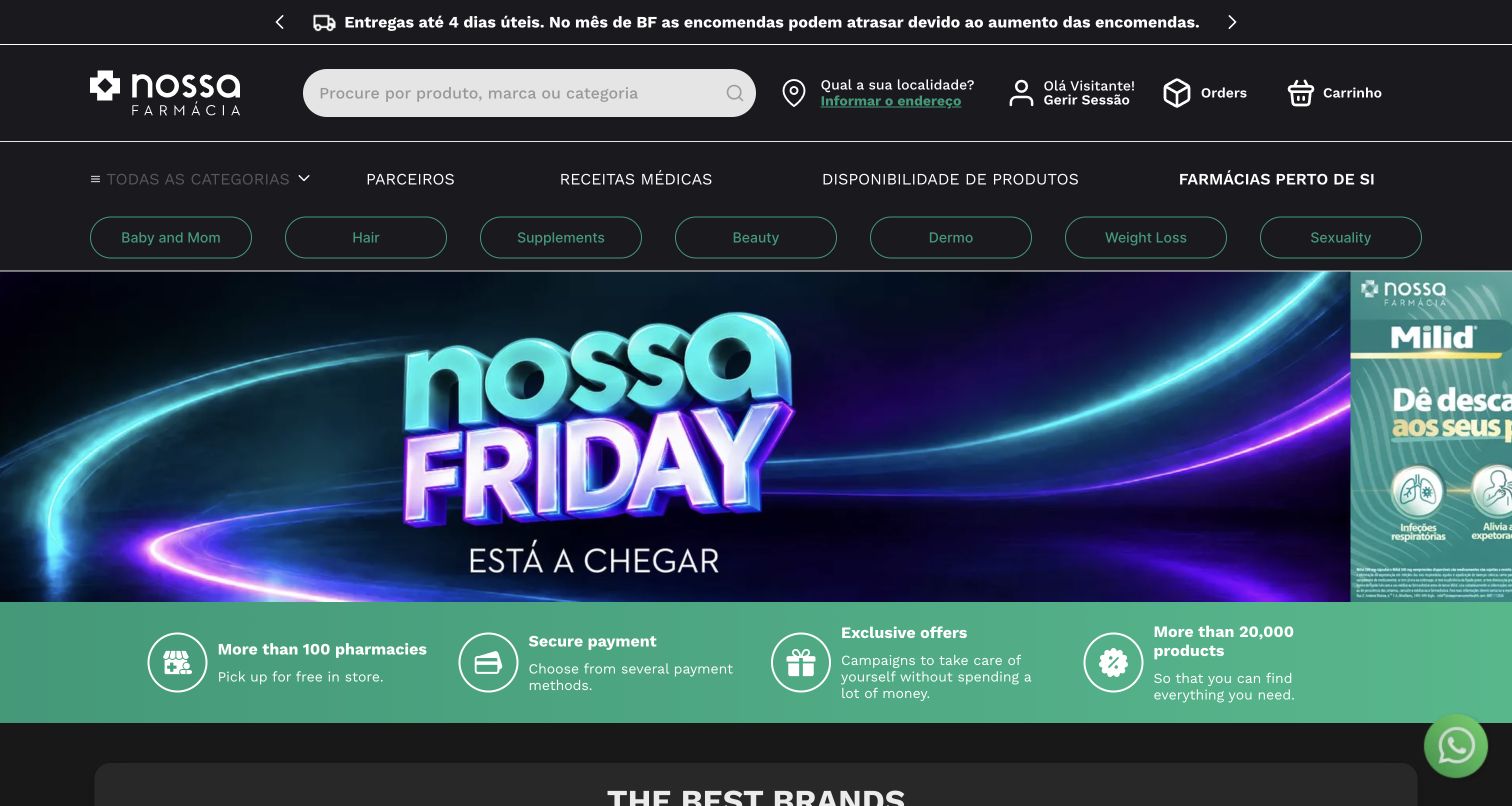
Nossa Farmácia combines a familiar product search with locality, order and cart controls. Its navigation also exposes pharmacy-specific destinations, including product availability and nearby pharmacies, while rounded category links help shoppers reach common wellness departments. The captured seasonal banner is followed by a green benefit strip describing pickup, payment and product breadth. Those are the site’s own messages, not service outcomes verified by this review. A delivery notice above the header acknowledges possible campaign-period delays, which usefully tempers the promotional tone. The VTEX case concerns the Portuguese public storefront and order-management integration. No prescription, medical account or private customer workflow was accessed, and the screenshot does not verify those systems.
What you can learn
Separate general product browsing from local availability and professional-service routes. Put operational limitations near the shopping entry so seasonal promotions do not imply a uniform delivery promise that the rest of the interface must later correct.
Pros
Availability and nearby-pharmacy links reflect practical visitor needs.
The header acknowledges potential delivery delays.
Cons & considerations
Several navigation layers make the opening information-dense.
Health-related categories need clear boundaries beyond promotional copy.
Platform source: Official VTEX exact-property project case. Portuguese public pharmacy/wellness shop, explicitly described as completed VTEX storefront and OMS integration. No private prescription or medical account systems inspected. Platform evidence is separate from the direct website screenshot and is not a complete current infrastructure audit.
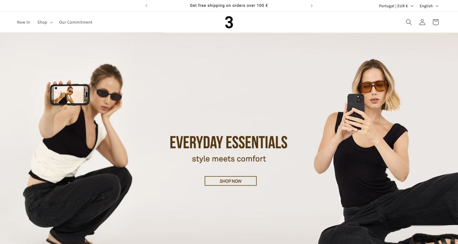
Loja Três uses a spare header, a centered numeral mark and a wide campaign photograph to introduce everyday clothing. The two models frame a short message and outlined shop button, leaving the composition unusually uncluttered for a commerce homepage. Country, currency and language controls appear in the top strip; the captured state shows Portugal and euros, despite entering the retained lojatres.com address. That visible regional context matters more than an assumption about the brand’s home market. VTEX’s case documents an earlier cross-border commerce project, while the current public audit identifies Shopify references. This is a historical association, not proof that the photographed regional storefront currently runs on VTEX.
What you can learn
Make market context visible without overwhelming the main shopping experience. If one domain serves multiple regional states, record the actual captured state and distinguish it from historical implementation evidence rather than treating every country variation as a new website.
Pros
The country and currency context is visible in the header.
The central action has little competing promotional clutter.
Cons & considerations
The broad campaign gives limited detail about individual products.
A regional default may surprise visitors arriving from older links.
Platform source: Official VTEX exact-property project case. Official VTEX story documents an earlier cross-border project at lojatres.com. The current exact-domain capture shows Portugal/EUR and the current audit observes Shopify. This is historical project evidence, not a current VTEX claim or an assertion that the captured regional state is Brazil. Platform evidence is separate from the direct website screenshot and is not a complete current infrastructure audit.
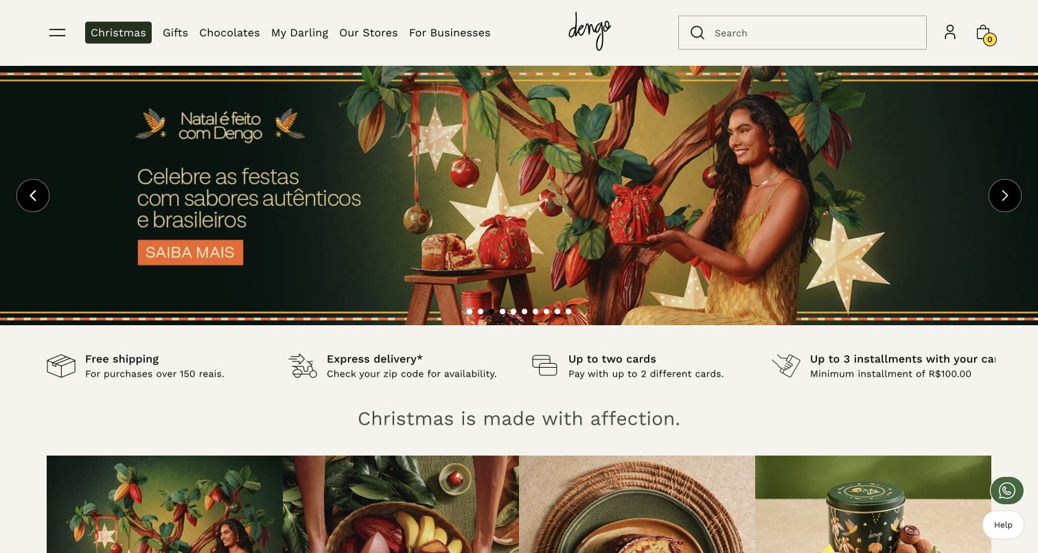
Dengo’s opening campaign pairs a person holding gifts with a large green seasonal panel. The scene emphasizes the occasion and packaging before individual chocolate products, making the first impression feel closer to a gift destination than a grocery shelf. A cream header keeps the brand, navigation and search separate from the saturated campaign color. A benefit row and the beginning of gift cards below the hero give the page a practical continuation. The current audit observes Next.js and delivery signals. The cited VTEX case describes the Brazilian commerce platform and an earlier live-shopping project; neither the screenshot nor that case establishes that every current interactive component uses the same implementation.
What you can learn
When the purchase is occasion-led, let packaging and people explain the emotional context, then provide straightforward routes to actual gift options. Keep the seasonal story distinct from enduring product information so the page remains useful after the campaign changes.
Pros
Gift imagery communicates the intended occasion without lengthy copy.
The restrained header remains distinct from the campaign artwork.
Cons & considerations
The hero delays comparison of individual chocolates and prices.
Seasonal creative needs timely replacement to remain credible.
Platform source: Official VTEX exact-property project case. Brazilian public chocolate store, not separate dengo.com corporate property. Vendor documents VTEX Commerce Platform and pandemic-era live-shopping project; historical scope. Platform evidence is separate from the direct website screenshot and is not a complete current infrastructure audit.
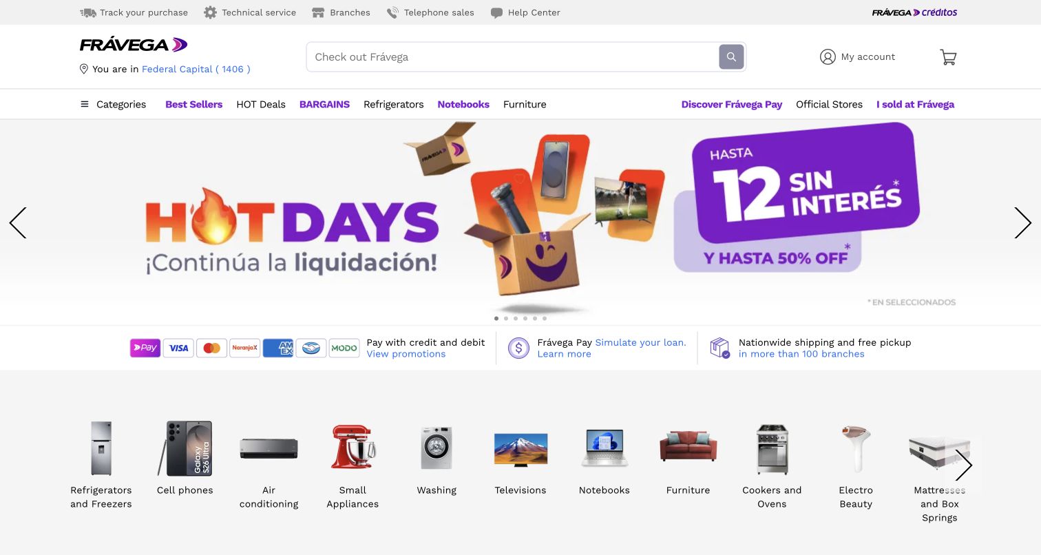
Frávega places a long search field between its purple identity and practical account controls, then uses a compact category navigation row to organize the breadth of the store. The opening Hot Days artwork is unmistakably promotional, but a horizontal benefit strip and illustrated department shortcuts give visitors other ways into the catalog. The layout treats search as a core shopping task rather than a decorative header feature. Its many simultaneous claims and links can still feel busy, especially when promotional artwork and category imagery compete. The official case describes the Argentine B2C and marketplace operation on VTEX; reported fraud or growth results remain vendor and customer claims, not measurements made during this design review.
What you can learn
A general retailer needs clear escape routes from its largest campaign. Keep search prominent and offer recognizable department shortcuts so visitors with a specific purchase in mind can bypass the promotional message without losing their place.
Pros
Search has a large, stable position in the header.
Department imagery offers an alternative to campaign browsing.
Cons & considerations
The opening combines many promotional and utility messages.
Small benefit conditions can be overshadowed by the main offer.
Platform source: Official VTEX exact-property project case. Argentinian public retail/marketplace property, documented as VTEX B2C omnichannel commerce. Antifraud results are vendor/customer claims, not measured by this review. Platform evidence is separate from the direct website screenshot and is not a complete current infrastructure audit.
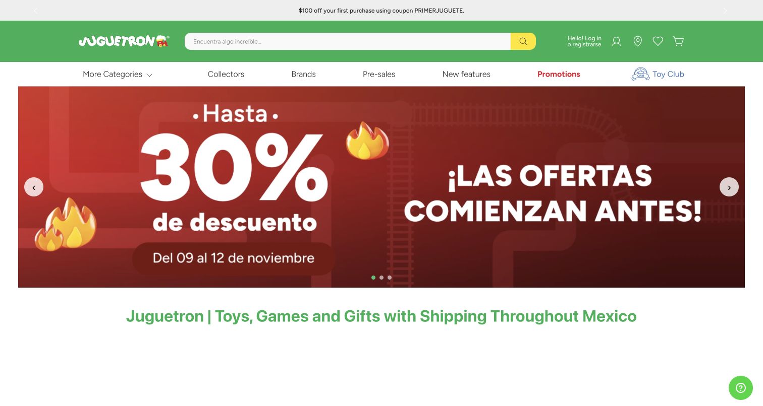
Juguetron’s green header gives search a broad central position while separating account and cart controls. The secondary navigation recognizes several shopping motivations, including brands, collectors, preorders and promotions. A large percentage campaign dominates the captured opening, followed by the beginning of a descriptive store heading. The bright palette suits the category, but the sale graphic communicates much more strongly than any particular toy or age group. The vendor case connects the Mexican Juguetron store with a completed commerce migration that also involved LEGO Stores MX. This review counts the Juguetron property once and makes no claim about LEGO’s global platform or an unrelated similarly named store.
What you can learn
Use audience and buying-intent routes to organize a catalog that spans children’s gifts and adult collecting. A playful visual system can coexist with plain labels, especially when campaign graphics temporarily occupy most of the opening screen.
Pros
Collector and preorder routes recognize specific customer intentions.
The central search field remains easy to locate.
Cons & considerations
A large discount message reveals little about product suitability.
Important category distinctions appear secondary to the campaign.
Platform source: Official VTEX exact-property project case. Official VTEX case documents completed Juguetron/LEGO Stores MX commerce work. Only the exact Mexican Juguetron public store is reviewed and counted, not LEGO global or any similarly named unrelated domain. Platform evidence is separate from the direct website screenshot and is not a complete current infrastructure audit.
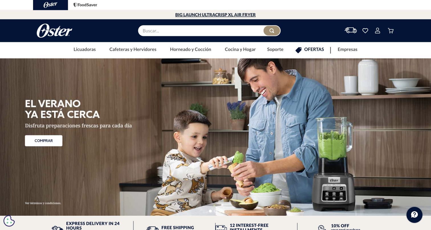
Oster Chile’s captured homepage shows a parent and child preparing food beside a countertop blender. The seasonal message and purchase button sit over the quieter side of the photograph, while the appliance remains part of the activity rather than an isolated cutout. A dark blue header gives search a central position and separates product families from support and business routes. A second brand tab and a slim launch announcement add context above it. The lower benefit strip introduces delivery, payment and signup messages without replacing the primary story. VTEX’s case concerns Chile and other documented Latin American operations; it does not establish the implementation of Oster’s US store.
What you can learn
Show an appliance doing a recognizable job, then keep product categories and support easy to find outside the campaign. Local delivery and payment information should support the scene rather than force the visitor to infer practical details from lifestyle imagery.
Pros
The appliance is shown in a clear everyday context.
Search and support remain visible beside product navigation.
Cons & considerations
Several stacked header bands reduce the available image area.
The initial lifestyle view provides little comparative product detail.
Platform source: Official VTEX exact-property project case. Chilean public appliances store. Vendor identifies completed VTEX operations in Chile and other LATAM markets since 2016, with Chile live-shopping example. Not US store. Platform evidence is separate from the direct website screenshot and is not a complete current infrastructure audit.
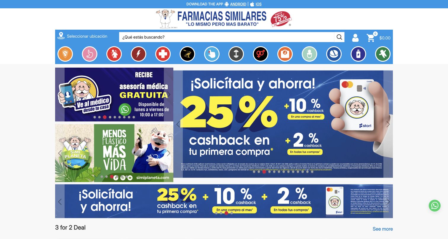
Farmacias Similares uses a blue-and-white header and a row of circular category illustrations before a dense group of promotions. The captured state includes payment-related offers and a pet-focused panel, with a multibuy section beginning below. This gives different campaigns immediate visibility, but it also makes the page harder to read as one coherent sequence. Several category images carry the burden of explaining their destination, so clear text alternatives and labels matter. The review is confined to the Mexican public storefront. The official VTEX case documents an omnichannel commerce relationship; no medical advice, prescription submission, customer account or purchase process was tested, and the visual review does not assess clinical suitability.
What you can learn
When a retail homepage carries many promotions, establish a clear hierarchy and give every category a meaningful text label. Keep public browsing separate from sensitive service workflows, and do not let a cheerful campaign presentation imply medical or operational assurances.
Pros
Category shortcuts appear before deeper promotional content.
Distinct panels can serve different shopping intentions.
Cons & considerations
Several bright offers compete without a strong central priority.
Image-dependent category navigation can be ambiguous without readable labels.
Platform source: Official VTEX exact-property project case. Mexican public pharmacy store; current official case documents VTEX Commerce Platform omnichannel operation. No purchase, prescription submission or account actions. Platform evidence is separate from the direct website screenshot and is not a complete current infrastructure audit.
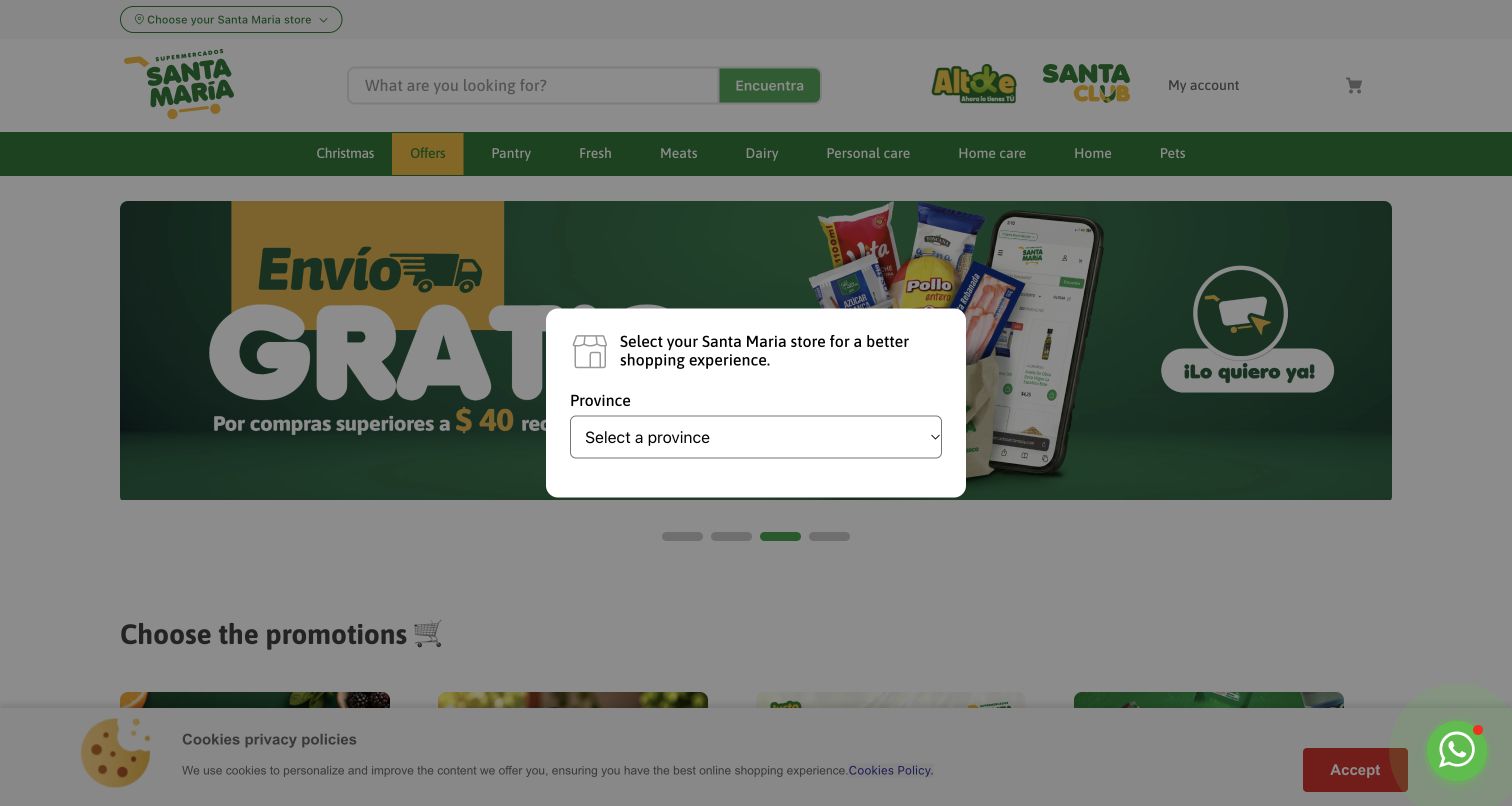
Supermercados Santa María opens with familiar grocery controls: search, account, basket and categories for pantry, fresh food, meat and household needs. Green and yellow branding continues into a delivery campaign and promotional cards. In the actual captured state, however, a province-selection modal covers the middle of the page before a store has been chosen, and a cookie notice remains along the bottom. No province or personal location was supplied. That friction is part of the example rather than something removed from the screenshot. The October 2026 VTEX case documents the Ecuadorian ecommerce project and physical-store integration; it does not verify live stock, delivery eligibility or private ordering behavior.
What you can learn
Explain why location is needed and offer an understandable path through store selection. If browsing depends on that choice, avoid stacking unrelated prompts over the same first screen and make the consequence of an unselected state clear.
Pros
Store choice is treated as a visible part of grocery shopping.
The underlying categories use familiar household shopping terms.
Cons & considerations
The initial modal prevents an unobstructed first view of promotions.
Simultaneous location and cookie prompts increase entry friction.
Platform source: Official VTEX exact-property project case. Ecuadorian public grocery storefront. October 2026 vendor case documents completed VTEX ecommerce and integration of 11 physical stores; no private inventory/order claims inferred. Platform evidence is separate from the direct website screenshot and is not a complete current infrastructure audit.
Kegan has 15+ years of experience working with small businesses, Fortune 500 companies, and everything in between. No development job is too big or too small: he brings the same hands-on attention to a focused improvement, a complete website, or a custom application.
For VTEX projects, he can help with responsive interfaces, reusable components, custom functionality, API connections, and performance-minded implementation. He works directly with clients on scope, design, implementation, testing, and handover, with an emphasis on clear communication and a system that remains practical to maintain after launch.
Show 3 other VTEX developersHide other VTEX developers
H Mart, Coca-Cola Andina and Santa María show different balances between promotions and routine purchasing tools. Give search and category routes consistent placement. Explain location-dependent availability before it changes what shoppers see, and avoid making several unrelated overlays compete at the same moment.
Let product use explain the campaign
Oster, Equinavia and Al’s use people and settings to make products feel relevant. That visual context works best when literal categories, support and shopping actions remain close at hand. Plan image crops and text placement around actual content rather than assuming every campaign photograph has a quiet area for a headline.
Expose specialist decisions early
F64’s technical categories, Worldwide Golf’s fitting route and Manchester City’s booking proposition each recognize a different buying process. Use the language people need to narrow their choice. A specialist store can be approachable without replacing meaningful distinctions with generic promotional buttons.
From references to requirements
Plan the commerce and editorial responsibilities together
Define the content publishing model
Agree who maintains campaigns, category introductions, service notices and regional variations. VTEX’s storefront documentation distinguishes the CMS used by FastStore and headless stores from Store Framework editing tools and legacy interfaces. Confirm the current setup before promising an editor workflow or reusing instructions from an older implementation.
Record which system owns presentation, product information, pricing, availability and order handling. A separate frontend may coexist with VTEX commerce, as the Al’s case illustrates. Define error and stale-data behavior at each boundary, and keep secrets out of browser code. Treat those as project requirements to verify, not capabilities established by a screenshot.
Test the real conditions behind a campaign
Use representative long product names, unavailable items, market changes and expired offers during implementation. Check keyboard navigation, meaningful image alternatives and readable conditions. Keep campaign end states and redirected URLs explicit. A polished hero should not hide an unclear path when a visitor cannot buy the advertised item.
A useful handover demonstration
Ask the actual team to carry out its routine job: publish a realistic update, correct a mistake, preview a narrow screen, and identify who owns an integration failure. For a library or frontend framework, also ask who maintains the content source and deployment. A polished screenshot does not answer those operational questions.
Beyond the screenshot
A practical VTEX storefront planning checklist
Identify the exact country, domain and public shopping property in scope.
List the main visitor tasks before designing promotional modules.
Choose a storefront approach that the team can maintain.
Confirm the CMS and publishing workflow for that actual implementation.
Assign ownership for products, prices, availability and campaign content.
Keep search and category routes useful outside seasonal campaigns.
Explain store selection and delivery limitations before they become surprises.
Make offer conditions readable without enlarging campaign artwork.
Provide useful text labels for image-based category shortcuts.
Test keyboard access, motion controls and meaningful image alternatives.
Plan expired offers, unavailable items and changed regional routes.
Keep optional signup and consent prompts from obscuring essential tasks.
Distinguish documentary platform evidence from current public observations.
Check public links, assets, runtime behavior and live routes after release.
Test with real content, a keyboard, a small screen, slow or failed requests, and the people who will maintain the system. These are planning checks, not an accessibility, security, performance, or search-ranking certification.
Sources & editorial method
How this VTEX collection was reviewed
All 20 examples have direct browser screenshots captured on November 10 UTC, with exact source URLs, dimensions and attribution preserved. Some live DOM labels were translated into English by the existing browser; relevant capture labels disclose that state. Reviews describe the visible public experience without submitting forms, accounts, purchases, bookings or prescriptions. Every exact source received a bounded broad technology-audit attempt; current findings and failed access/size outcomes remain separate from vendor-documented project evidence. Historical VTEX relationships are explicitly labeled where current sources show Shopify. The regional state shown by Loja Três is Portugal/EUR at the retained exact domain, and Santa María is shown before province selection. These are editorial design examples, not service-quality endorsements, measured conversion rankings or compliance certifications.
Every image is an unmodified capture from the actual website, with its source and capture date. Some captures are reused from our shared catalog; their dates remain the original capture dates. None comes from a vendor gallery or a generated reconstruction. Moving imagery and live content can change.
Technology attribution uses public page assets or metadata, official platform documentation, or a cited first-party project case study. Documentary and framework-relationship evidence is identified where used; it is not a complete current backend inventory. A CMS image CDN alone does not establish a full CMS deployment. A library’s presence does not prove which individual controls use it, and a platform label does not establish AI authorship.
The composition notes, lessons, pros and tradeoffs are original editorial observations. We have not measured conversion, traffic, security, performance or accessibility conformance. Website owners retain their brands and imagery; these examples are not our client portfolio. Written, Edited and Curated are independent records, not dates advanced by a build. See our editorial standards or suggest a correction.
Questions worth asking
VTEX website development FAQs
Does every current screenshot prove that the store runs on VTEX?
No. Each property has specific official VTEX project evidence, but screenshots do not reveal a complete backend. Equinavia, Saint Croix and Loja Três are historical associations with current Shopify signals. Other examples may use a separate frontend or document only a regional commerce operation.
How are the five opening brands selected?
The opening sequence uses H Mart, Samsung Brazil, OBI Germany, Coca-Cola Andina Chile and Under Armour Brazil. Their public identities are recognizable independently of their VTEX cases, and each platform claim is limited to the documented store or regional operation.
How do FastStore and Store Framework differ?
VTEX describes FastStore as a headless storefront framework based on Next.js. Store Framework is built on VTEX IO and React and supplies native commerce components. A project should choose around its maintenance, content and integration needs; a visible React or Next.js signal alone does not identify the complete commerce architecture.
Does the Manchester City example cover the entire club website?
No. Its evidence concerns the completed first stadium-tour booking phase. The reviewed public tour and museum entry is not evidence for every news page, merchandise store or future attraction, and visible sponsorship branding is not treated as a platform signature.
Why include store-selection prompts and cookie notices in screenshots?
They are part of the actual public entry experience. Santa María was captured before any province was selected, and no personal location was supplied. Preserving that state lets the review discuss entry friction without fabricating an unobstructed shopping session.
What does an unavailable broad audit mean?
It means the bounded source check could not establish new stack observations for that page. The result and its limits are retained. It does not prove that technologies are absent, justify bypassing restrictions or turn an older customer story into current backend verification.
Are reported business results used to rank these stores?
No. Vendor and customer performance claims remain attributed context, not measurements made for this collection. The reviews focus on visible information structure, practical shopping routes and design decisions that another team can evaluate.
Borrow a clear shopping route or content relationship, then test it against your own catalog and service conditions. Keep the implementation evidence as precise as the interface you want customers to trust.