Definitive guide · Silverstripe website development
Best Silverstripe Websites of 2026 (20 Real-World Examples)
Silverstripe websites that make public services and institutional content usable
These 20 examples compare public-service navigation, institutional information, tourism planning, and the relationship between custom content models and clear pages.
Silverstripe combines a CMS with a flexible framework. The useful planning question is which recurring information deserves a structured model and how editors will maintain it.
Westpac New Zealand, NZ Transport Agency, Fire and Emergency New Zealand, New Zealand Blood Service, and Immigration New Zealand open the collection. Three later examples rely on explicitly dated documentary associations rather than a current generator claim.
Before the examples
What makes good Silverstripe website development in 2026?
Model information around public tasks
Services, eligibility explanations, locations, and documents need consistent fields and relationships. Avoid turning each department’s preferences into a separate page system.
Service changes, consultation dates, and application stages should have clear dates and owners. A fresh homepage image does not refresh an old notice.
Separate evidence from assumption
A public CMS marker or implementation case does not reveal every transactional system. Keep account, application, and third-party handoffs explicit.
The collection · 20 examples
20 Silverstripe website examples worth studying
Seventeen examples have current public CMS or resource evidence. Slovenia’s government portal, Govt.nz, and the New Zealand Law Society retain dated documentary qualifications.
We start with five recognizable brands or organizations: Westpac New Zealand, NZ Transport Agency Waka Kotahi, Fire and Emergency New Zealand, New Zealand Blood Service, Immigration New Zealand. Each attribution applies to the named website property, not every product or website belonging to its organization. This is a curated reading sequence, not a measured ranking.
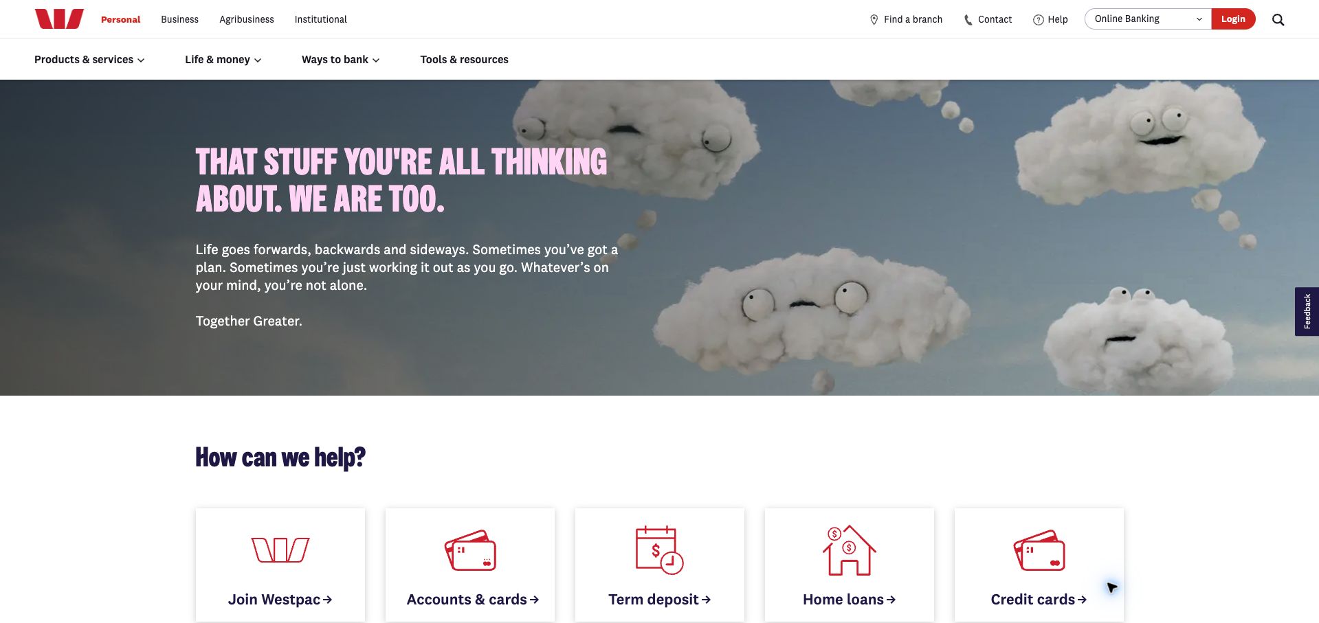
Westpac’s public New Zealand homepage gives a character-led campaign generous space while keeping ordinary banking tasks within reach. Cloud characters and pink display type soften the opening, then a row of red line icons introduces accounts, cards, deposits, and loans. Personal, business, agribusiness, and institutional audiences have their own upper navigation; branch finding and online banking sit at the opposite edge. The result is a useful study in balancing emotional branding with repeat visits. Current Silverstripe metadata supports this public marketing property. It does not establish the platform behind account access, payments, or every Westpac regional website.
What you can learn
Let the campaign establish tone, then give visitors a compact set of recognizable tasks. In a regulated product catalogue, keep utility access, product discovery, and explanatory conditions distinct enough that each can be maintained without obscuring the others.
Pros
Audience tabs acknowledge several customer types without mixing their main journeys.
Repeated icon cards make the product range easier to scan beneath the campaign.
Cons & considerations
The large campaign delays product comparisons for visitors arriving with a specific need.
Rate cards and their conditions require coordinated updates; this review does not assess the products.
Visible tech stack
Earlier / documented evidence
Silverstripe
Platform source: Silverstripe Westpac implementation case. The directly reviewed public page declares Silverstripe CMS 6.2. This evidence is scoped to the pictured public property, not every linked account, booking, or transactional system. Platform evidence is separate from the direct website screenshot and is not a complete current infrastructure audit.
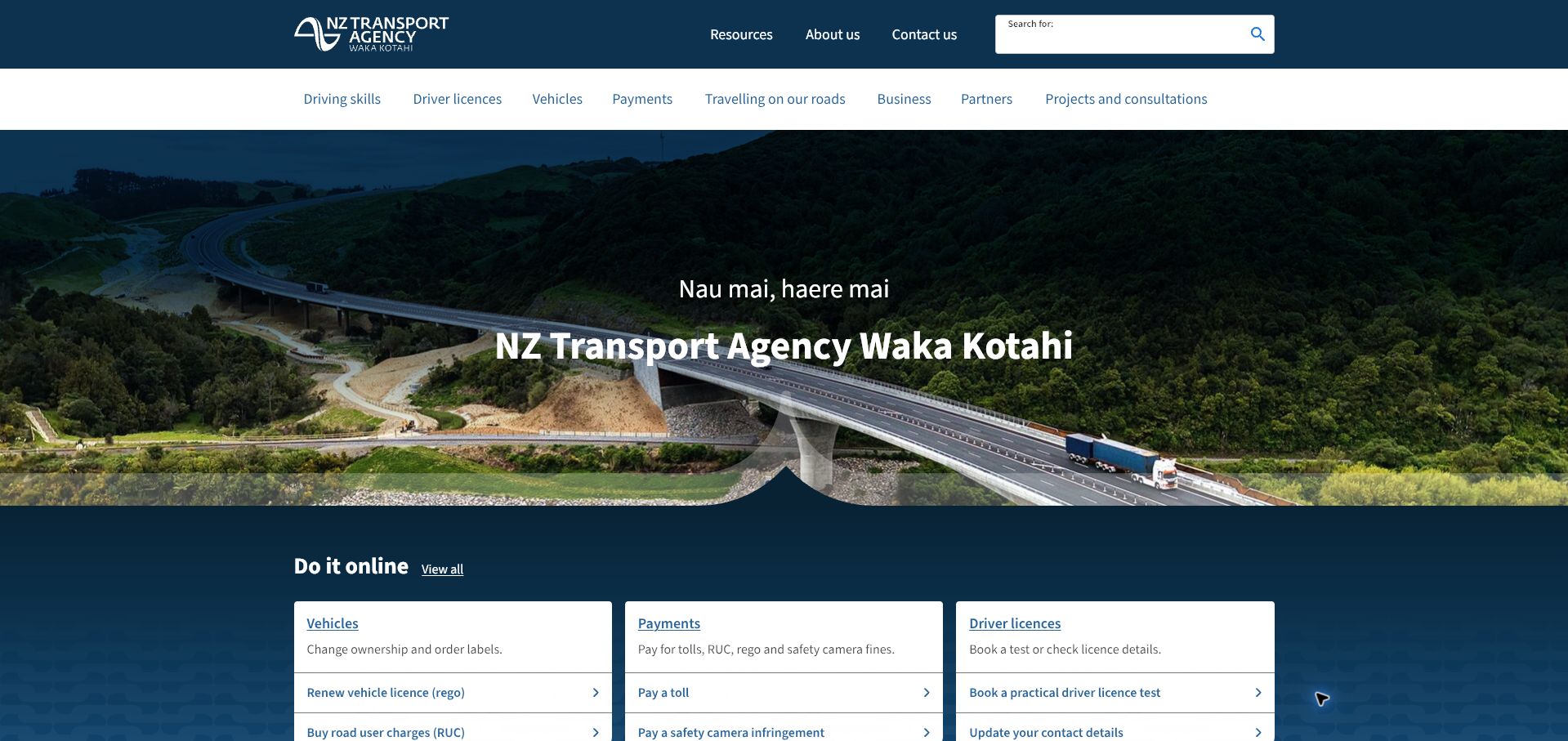
NZ Transport Agency opens with a bridge photograph, a bilingual greeting, and a clearly identified national organization. Its most useful design decision comes directly below: three white service panels divide vehicles, payments, and driver licences. Short explanations and verb-led links turn those broad categories into actions such as renewal, toll payment, or booking a test. A separate navigation row handles the wider information estate, including business, road travel, and consultations. The hierarchy serves both a returning customer and someone researching a transport topic. Silverstripe is declared in the current page metadata, supporting the pictured information homepage rather than every linked transactional application.
What you can learn
Use a small number of task families to organize a complicated public service. Place concrete actions inside each family, and reserve the main navigation for broader exploration so visitors can choose by intention before learning institutional terminology.
Pros
Three service panels give high-frequency tasks a consistent, readable structure.
The search field is prominent and remains separate from the large introductory image.
Cons & considerations
The scenic welcome consumes substantial vertical space before the task links begin.
Separate transaction destinations need their own usability checks beyond this public homepage.
Visible tech stack
Earlier / documented evidence
Silverstripe
Platform source: Silverstripe NZ Transport Agency implementation case. The directly reviewed public page declares Silverstripe CMS. This evidence is scoped to the pictured public property, not every linked account, booking, or transactional system. Platform evidence is separate from the direct website screenshot and is not a complete current infrastructure audit.
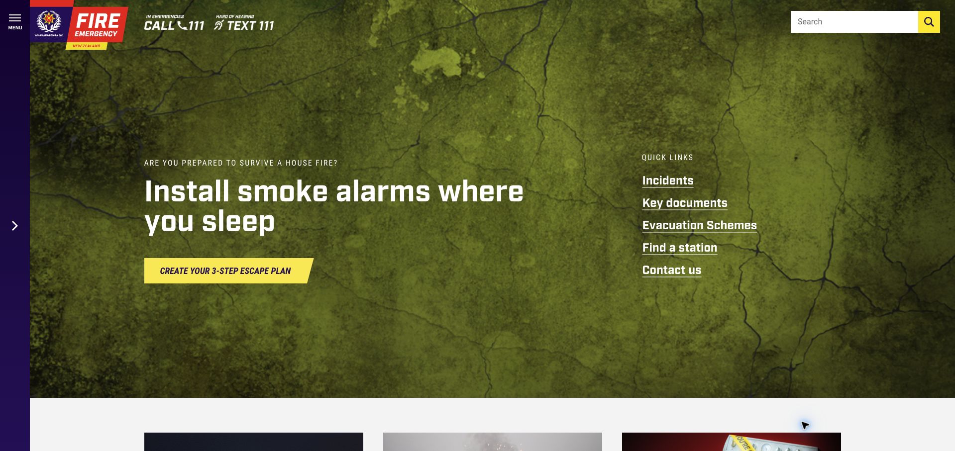
Fire and Emergency New Zealand pairs a dramatic textured background with a direct smoke-alarm campaign. The emergency contact instruction is embedded beside the brand at the top, while a bright yellow action invites visitors to create an escape plan. A right-hand list supplies quick access to incidents, documents, evacuation schemes, stations, and contact information. This combination makes prevention content feel active without forcing every visitor through the same campaign. A narrow vertical menu rail preserves room for the main message but makes the fuller structure less immediately visible. The live homepage identifies Silverstripe CMS, establishing the platform for this public information page.
What you can learn
Keep urgent utility information in a stable location, then let seasonal prevention messages occupy the flexible campaign area. Provide a concise alternative route for visitors whose needs differ from the featured campaign, especially when the full navigation is collapsed.
Pros
The yellow action is easy to distinguish from the image and surrounding links.
Quick links acknowledge operational and informational needs alongside prevention content.
Cons & considerations
The background texture and large image area can compete with smaller text.
The collapsed menu hides the full information structure until a visitor opens it.
Visible tech stack
Earlier / documented evidence
Silverstripe
Platform source: Current public-page Silverstripe generator. The directly reviewed public page declares Silverstripe CMS 5.4. This evidence is scoped to the pictured public property, not every linked account, booking, or transactional system. Platform evidence is separate from the direct website screenshot and is not a complete current infrastructure audit.
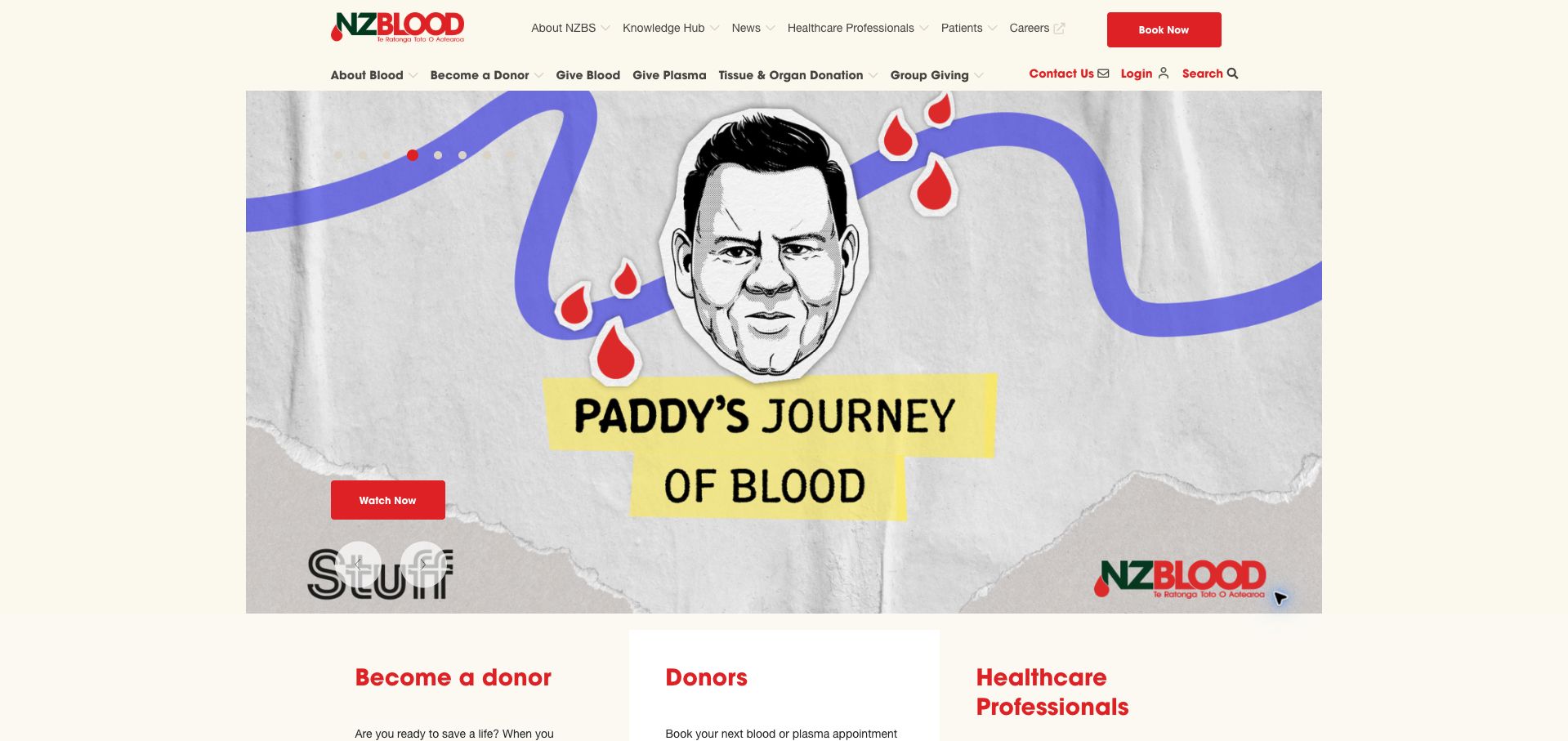
New Zealand Blood Service combines a playful illustrated campaign with a disciplined two-row navigation. A red booking button is visible in the header, while the main menu distinguishes blood, plasma, becoming a donor, and group giving. Immediately below the campaign, separate sections address prospective donors, existing donors, and healthcare professionals. That progression is valuable because the same organization must explain participation, support repeat appointments, and publish specialist information. The capture shows one carousel frame rather than every campaign state. Current Silverstripe metadata confirms the public site; the review concerns its presentation and navigation, without evaluating medical eligibility or the appointment system.
What you can learn
Organize a participation website around the visitor’s stage and relationship to the service. Keep the repeat task visible in the header while giving newcomers a clear explanation route, and label specialist material so it does not overwhelm the general audience.
Pros
Booking access stays distinct from educational and organizational navigation.
Audience sections give three materially different visitor groups their own starting points.
Cons & considerations
The large carousel pushes the audience choices close to the bottom of the initial view.
Campaign artwork carries prominent embedded text, which should have equivalent accessible content.
Visible tech stack
Earlier / documented evidence
Silverstripe
Platform source: Current public-page Silverstripe generator. The directly reviewed public page declares Silverstripe CMS 6.2. This evidence is scoped to the pictured public property, not every linked account, booking, or transactional system. Platform evidence is separate from the direct website screenshot and is not a complete current infrastructure audit.
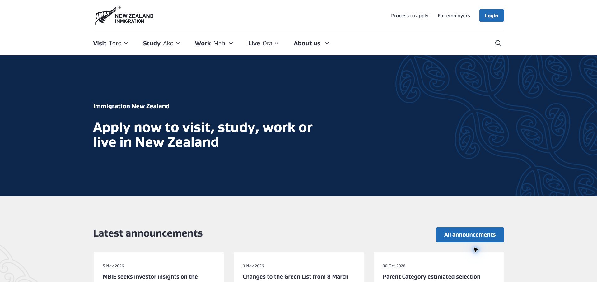
Immigration New Zealand uses a restrained navy hero and four plain-language routes: visit, study, work, and live. Māori labels accompany the English navigation, while process information and employer access sit in a smaller utility row. The homepage then moves into dated announcements, common visa categories, and a visa finder. The result is an information architecture built around reasons for arriving rather than internal departments. The first visit included a temporary welcome treatment; the saved capture shows the settled homepage after optional cookies were declined. Current Silverstripe metadata and the vendor’s migration case support the public website attribution, without extending it to every application system.
What you can learn
Start a complicated eligibility-oriented service with the visitor’s broad intention, then reveal the more precise options and process guidance. Keep dated policy announcements distinct from evergreen navigation so changing information does not destabilize the main routes.
Pros
Four recognizable goals give unfamiliar visitors a manageable starting point.
Announcements include dates and topic labels that help distinguish current notices.
Cons & considerations
The introductory hero contains no equally prominent direct finder control.
Eligibility and application outcomes require separate assessment; this is a design review.
Platform source: Current public-page Silverstripe generator. The directly reviewed public page declares Silverstripe CMS 5.4. This evidence is scoped to the pictured public property, not every linked account, booking, or transactional system. Platform evidence is separate from the direct website screenshot and is not a complete current infrastructure audit.
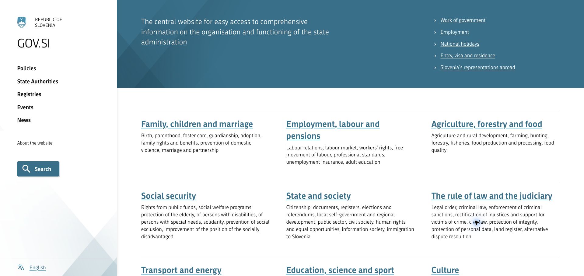
The English GOV.SI portal gives its left rail to institutional navigation and its main canvas to a broad topic directory. Policies, state authorities, registries, events, and news remain visually distinct from subject areas such as family, employment, education, and transport. Each topic heading has a short explanatory paragraph, helping visitors choose without opening several pages. Underlines and thin dividing rules make the directory feel like a reference service rather than a promotional landing page. Innovatif’s Silverstripe showcase documents the government-site consolidation launched in 2022. The current page retains compatible theme resources but exposes no generator; the CMS association is documented, not a new backend confirmation.
What you can learn
Give organizational navigation and public topics different visual homes when both are necessary. Add a compact explanation beneath each topic so people can recognize the relevant area from everyday language rather than relying on department names alone.
Pros
The persistent rail keeps institutional routes separate from the public topic grid.
Descriptions clarify the breadth of each linked heading before navigation.
Cons & considerations
Dense paragraphs can slow scanning across the three-column directory.
The English portal should be assessed separately from the coverage of other language versions.
Platform source: Innovatif case in Silverstripe showcase, launched September 2022. Innovatif documents the GOV.SI consolidation in the official Silverstripe showcase, launched 28 September 2022. The English portal has current /_resources/themes/gov/ assets but no generator; this is a documented CMS association, not independently confirmed current backend use. Platform evidence is separate from the direct website screenshot and is not a complete current infrastructure audit.
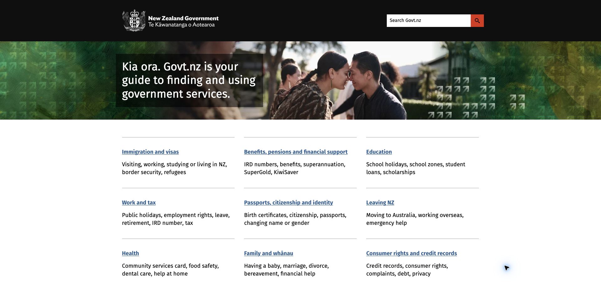
Govt.nz gives the visitor a brief explanation of its purpose, then moves quickly into a three-column directory. Immigration, benefits, education, work, identity, and family appear as readable headings with examples beneath them. The page uses familiar links, substantial whitespace, and restrained rules instead of turning every topic into a large illustrated card. Search has a clear place in the dark header, while government contacts and service tools appear further down. A Department of Internal Affairs article from May 2024 explicitly identifies Govt.nz as Silverstripe-based. Current theme paths are consistent with that account, but no public generator independently confirms the present CMS version.
What you can learn
Describe services through the situations people recognize, and use short examples to disambiguate broad headings. A national directory benefits from predictable text patterns and clear search more than from giving every subject its own decorative treatment.
Pros
The compact introduction leaves substantial space for the actual directory.
Examples beneath headings help translate bureaucratic categories into recognizable needs.
Cons & considerations
Several related topics overlap, so cross-linking remains important after the first choice.
A wide directory requires careful mobile ordering and keyboard navigation beyond the desktop capture.
Visible tech stack
Earlier / documented evidence
Silverstripe
Platform source: Department of Internal Affairs account, May 2024. A Department of Internal Affairs article published 31 May 2024 explicitly identifies Govt.nz as built on Silverstripe CMS. Current dia-theme resources are consistent with the documented implementation but are not conclusive runtime proof. Platform evidence is separate from the direct website screenshot and is not a complete current infrastructure audit.
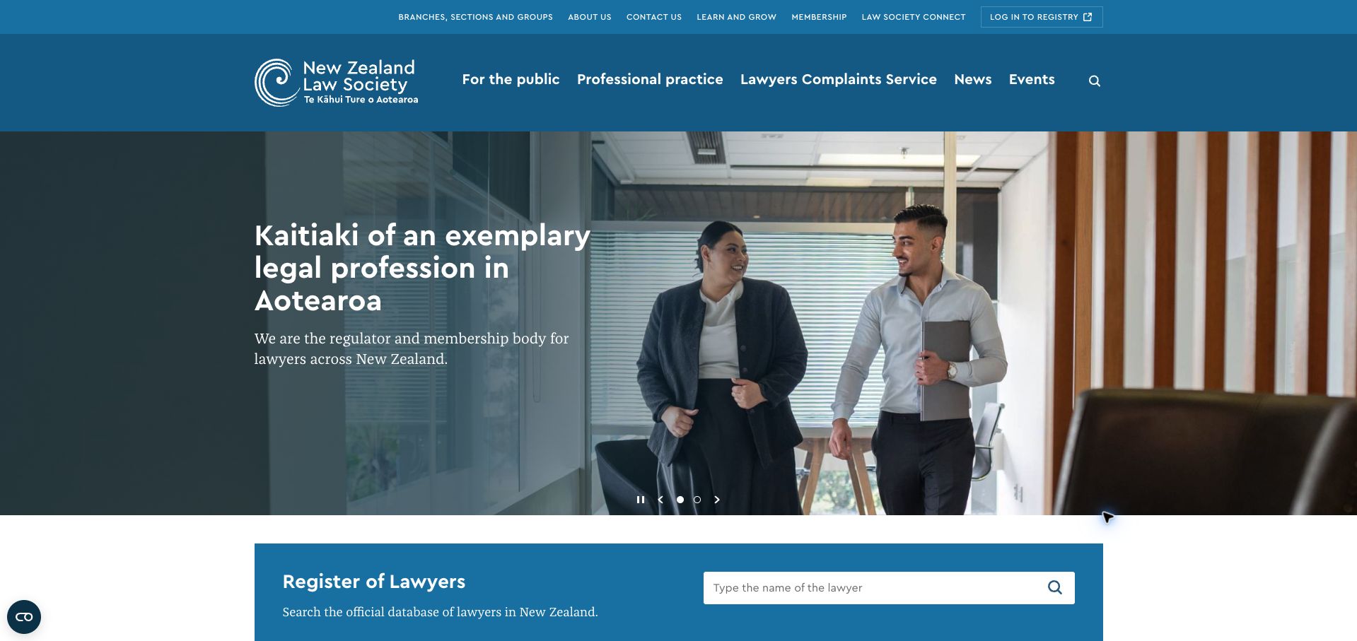
The New Zealand Law Society homepage gives professional identity a strong photographic introduction, but the register of lawyers becomes a concrete next step immediately below it. The main navigation distinguishes public information, professional practice, complaints, news, and events; a slimmer row handles membership and organizational functions. Blue surfaces and restrained typography maintain continuity between the introductory message and the lookup area. The design is useful for organizations serving both a profession and the people who rely on it. Catch’s case study documents a Silverstripe build launched in 2020. The current site retains related resource paths, while this review does not claim a newly exposed CMS generator.
What you can learn
Pair institutional credibility with a useful public action. For a professional body, keep member services available without letting them conceal the routes that help outsiders verify information, understand the organization, or raise a concern.
Pros
The lawyer register turns a broad institutional introduction into a specific task.
Public and professional navigation are named explicitly rather than mixed into one generic menu.
Cons & considerations
Two navigation rows contain many competing destinations in a narrow vertical band.
The large rotating hero can delay the lookup area on shorter screens.
Platform source: Catch Design implementation case, launched mid-2020. Catch Design identifies the pictured lawsociety.org.nz site as a Silverstripe implementation launched in mid-2020. The current page has /_resources/ NZLS assets but no generator; attribution rests on the documented implementation rather than a fresh definitive CMS marker. Platform evidence is separate from the direct website screenshot and is not a complete current infrastructure audit.
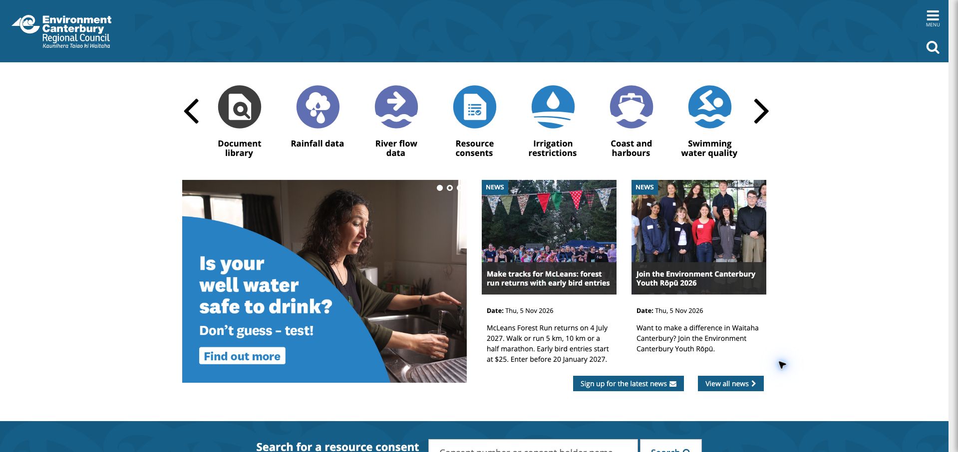
Environment Canterbury starts with an unusually practical row of illustrated shortcuts. Rainfall, river flow, resource consents, irrigation, and swimming-water information are offered before a conventional organizational welcome. Below, a campaign panel and dated news cards add regional context without displacing those service links. The blue header is comparatively compact, with a menu and search control at the edge. This makes the homepage a useful reference for agencies whose repeat visitors often want data rather than background reading. Pikselin documents the Silverstripe implementation, and the current page loads a specifically named Silverstripe extension, providing contemporary support for the platform relationship.
What you can learn
Identify the recurring information jobs that bring people back and give them stable, recognizable shortcuts. Place campaign and news content after those routes, and retain text labels beneath icons so the service remains understandable without interpreting illustrations.
Pros
Named data shortcuts give practical destinations priority in the initial viewport.
Dated news cards offer regional activity without requiring a full-width editorial feed.
Cons & considerations
The horizontal shortcut carousel hides some tools until visitors move through it.
The main organizational navigation is collapsed even on the wide desktop view.
Visible tech stack
Earlier / documented evidence
Silverstripe
Platform source: Pikselin Environment Canterbury implementation case. The directly reviewed public page references named Silverstripe modules: https://www.ecan.govt.nz/_resources/vendor/pikselin/silverstripe-admin-edit-link/client/js/script.js?m=1793755206, https://www.ecan.govt.nz/_resources/vendor/pikselin/silverstripe-admin-edit-link/client/css/EditLink.css?m=1793755206. This evidence is scoped to the pictured public property, not every linked account, booking, or transactional system. Platform evidence is separate from the direct website screenshot and is not a complete current infrastructure audit.
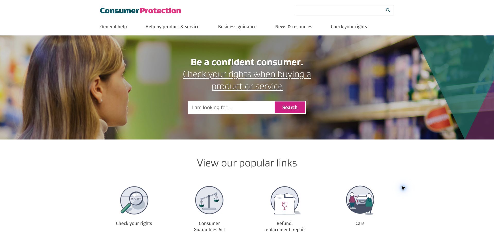
Consumer Protection makes a search field the centre of its opening photograph and follows it with illustrated links to common concerns. The main navigation separates general help, product and service help, business guidance, and resources. This structure acknowledges that a visitor might know either the kind of purchase or the problem they are trying to resolve. A distinct rights-checking route provides another entry point, while news and updates appear further down. The public page declares Silverstripe CMS and the vendor documents its redesign. The review evaluates information organization and visual hierarchy; it does not assess the legal completeness of the guidance or use the site’s forms.
What you can learn
Offer several compatible routes into an advice collection: a visitor’s own words, a recognizable product category, and a common problem. Keep those routes visibly distinct, with a short explanation of what each will help someone find.
Pros
The central search field offers a direct start for visitors with a specific question.
Common-problem illustrations are accompanied by concrete text labels.
Cons & considerations
The header search and hero search duplicate the same apparent function.
Older news remains visible below the main routes, making clear dates especially important.
Platform source: Silverstripe Consumer Protection implementation case. The directly reviewed public page declares Silverstripe CMS 5.4. This evidence is scoped to the pictured public property, not every linked account, booking, or transactional system. Platform evidence is separate from the direct website screenshot and is not a complete current infrastructure audit.
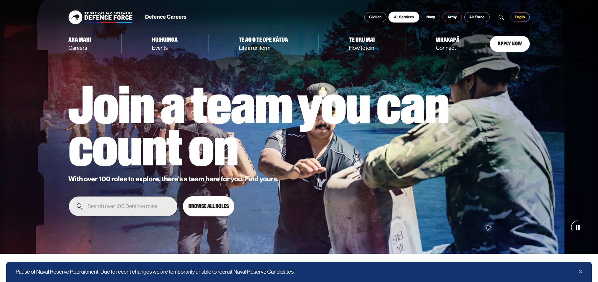
Defence Careers uses immersive imagery and oversized condensed type to introduce a team-oriented recruitment message. Crucially, the hero also contains a role-search field and a browse-all action, so the campaign leads directly into exploration. A service switcher separates Navy, Army, Air Force, civilian, and all-service views, while bilingual navigation addresses careers, events, life in uniform, joining, and contact. A recruitment-status notice remains visible below the hero. Voyage’s case study identifies Silverstripe as the retained CMS, and the current page references a named Silverstripe image module. This attribution concerns the public careers property, not personnel systems or every Defence Force website.
What you can learn
Put a concrete discovery tool inside an aspirational recruitment campaign. Let visitors search a known role or browse the full range, and keep service-specific restrictions visible so campaign enthusiasm does not obscure practical availability.
Pros
Search and browsing offer complementary paths from the introductory message.
Service filters explain the breadth of the organization without crowding the main navigation.
Cons & considerations
Large moving imagery can compete with white text in some frames.
Recruitment notices and application eligibility require ongoing content maintenance and separate functional review.
Platform source: Voyage Defence Careers implementation case. The directly reviewed public page references named Silverstripe modules: https://www.defencecareers.mil.nz/_resources/vendor/heyday/silverstripe-responsive-images/javascript/picturefill/picturefill.min.js?m=1793916210. This evidence is scoped to the pictured public property, not every linked account, booking, or transactional system. Platform evidence is separate from the direct website screenshot and is not a complete current infrastructure audit.
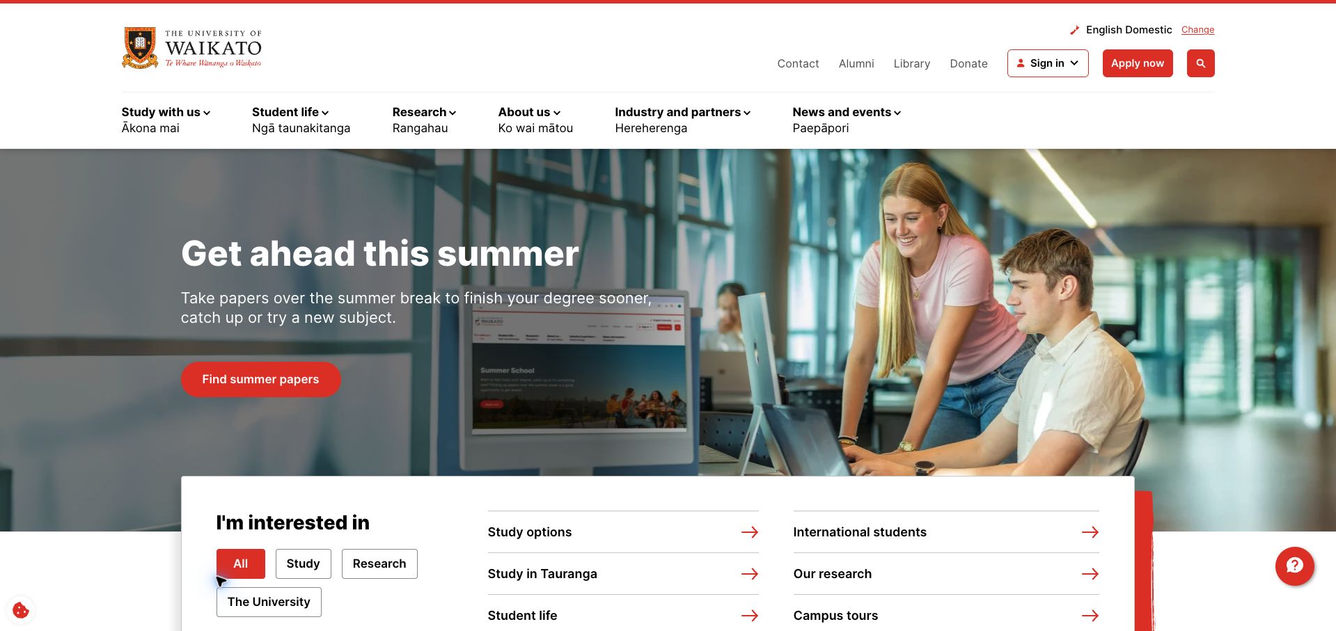
Waikato’s homepage combines a seasonal study campaign with a white interest panel that overlaps the hero. The panel groups links under study, research, and university interests, giving visitors an alternative to the large campaign action. Bilingual main navigation separates student life, research, institutional information, industry relationships, and news. Application access and current-user utilities sit above it. The design shows how a university can promote a timely opportunity while keeping the wider institution navigable. Current metadata identifies Silverstripe CMS, matching the vendor’s university rebuild case. The displayed domestic-language state is part of the captured public experience; other regional variants were not assumed to be identical.
What you can learn
Allow a seasonal recruitment message to coexist with stable audience routes. An overlapping panel can connect the campaign to practical choices, provided the categories are understandable and the same useful links remain available when promotional content changes.
Pros
The interest panel brings useful audience links into the first screen.
Application access is distinct from sign-in and other existing-user utilities.
Cons & considerations
Two navigation rows and an additional interest panel create several competing decision points.
The overlapping panel needs careful responsive handling to avoid covering campaign content.
Platform source: Silverstripe University of Waikato implementation case. The directly reviewed public page declares Silverstripe CMS 6.2. This evidence is scoped to the pictured public property, not every linked account, booking, or transactional system. Platform evidence is separate from the direct website screenshot and is not a complete current infrastructure audit.
Lincoln University’s homepage combines a campus-and-student photograph with a clear enrollment message and a yellow action. The main navigation gives study, student support, Māori participation, partnerships, and research their own places, using paired Māori and English labels. Below the opening, a programme search and subject areas translate the broad invitation into academic choices. The visual language is distinctive: blue branding, warm yellow actions, and a serif headline against documentary imagery. The page’s Silverstripe generator agrees with the vendor’s account of modular content and university-system integration. Those integrations are documented context, not a claim that the photographed homepage tests the student-management system.
What you can learn
Connect an intake campaign to subject-level exploration rather than leaving the visitor with only an application button. A specialist institution can make its range legible through subject groupings while retaining visible routes for support and research audiences.
Pros
The yellow enrollment action stands apart from the blue identity and photographic hero.
Subject browsing supplies a useful next step for visitors still exploring study options.
Cons & considerations
The broad navigation row can be demanding for visitors unfamiliar with university terminology.
A cookie notice occupies the lower edge of the captured first view.
Visible tech stack
Earlier / documented evidence
Silverstripe
Platform source: Silverstripe Lincoln University implementation case. The directly reviewed public page declares Silverstripe CMS. This evidence is scoped to the pictured public property, not every linked account, booking, or transactional system. Platform evidence is separate from the direct website screenshot and is not a complete current infrastructure audit.
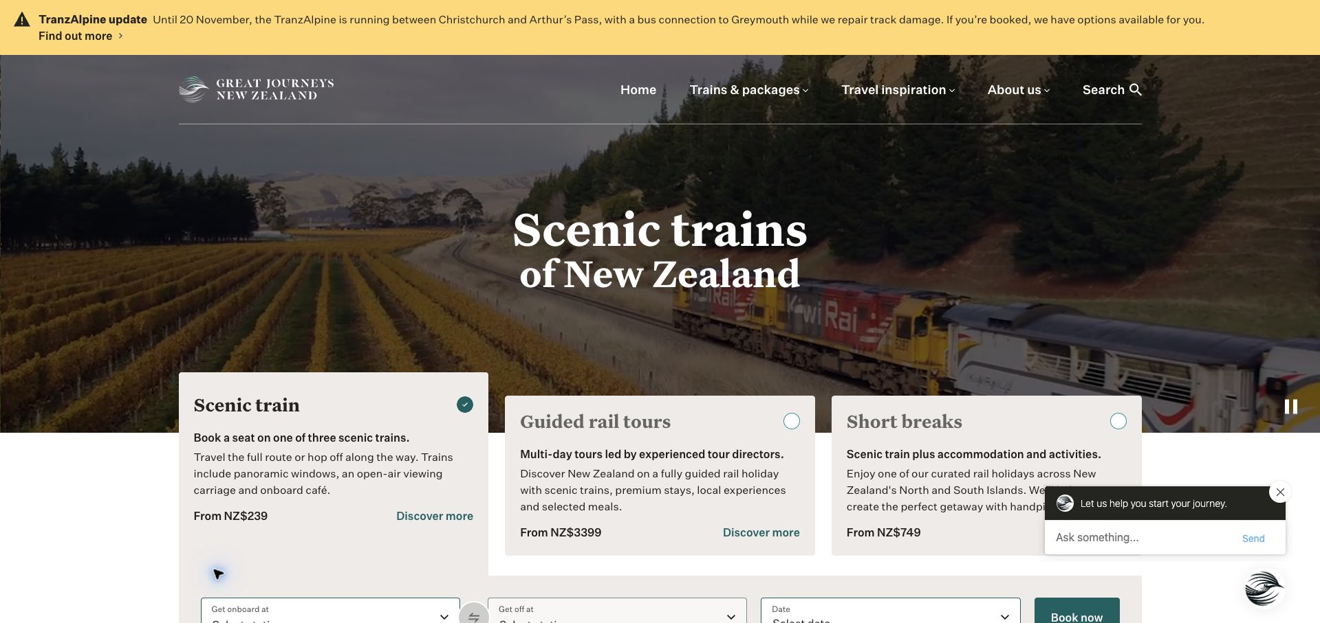
Great Journeys New Zealand places three product choices over the lower edge of a scenic rail hero: a train seat, a guided tour, and a short break. Each card explains what the experience includes, helping visitors distinguish products that could otherwise sound similar. The selected train option leads into a booking panel, while the navigation remains short and focused. A yellow service-disruption notice sits above the branding, giving operational information priority over the promotional view. The current page declares Silverstripe CMS, supporting the exact public property. This review studies the product comparison and presentation, without completing a booking or validating fares and availability.
What you can learn
Explain the difference between related products before asking for dates or destinations. Keep a material service notice outside the promotional carousel so people can discover a limitation without losing the ability to compare the available experiences.
Pros
Three explanatory cards make the product range concrete before booking begins.
The operational notice is visually separate from aspirational travel imagery.
Cons & considerations
The opened chat prompt overlaps part of the lower product area in the capture.
A large hero and several cards leave little initial space for the complete booking controls.
Platform source: Silverstripe Great Journeys implementation case. The directly reviewed public page declares Silverstripe CMS. This evidence is scoped to the pictured public property, not every linked account, booking, or transactional system. Platform evidence is separate from the direct website screenshot and is not a complete current infrastructure audit.
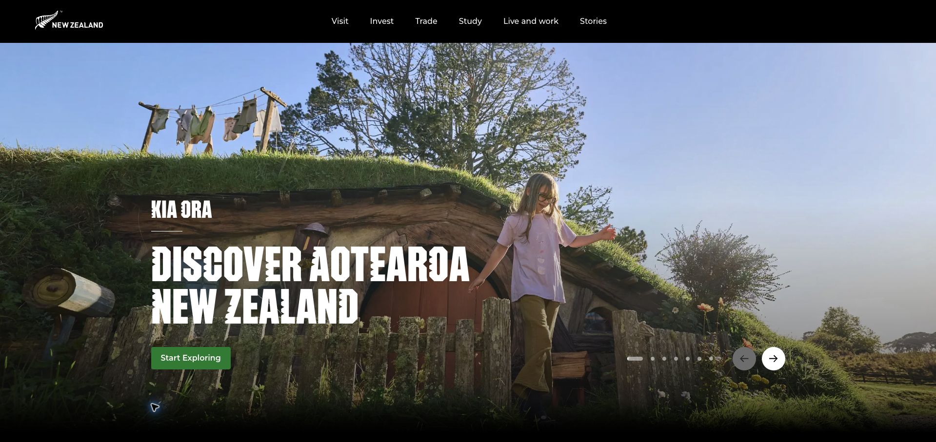
NewZealand.com opens with expansive destination imagery, emphatic display typography, and a single exploring action. The restrained black navigation makes room for several intentions beyond tourism, including investment, trade, study, and living or working in the country. Further down, practical travel groupings cover places, activities, accommodation, and planning before other national opportunities appear. The captured root page is therefore broader than a simple holiday landing page. Its current Silverstripe metadata provides direct platform evidence, while the vendor’s Tourism New Zealand case documents the content-management relationship. Neither establishes the technology of every linked agency or tourism operator.
What you can learn
Use a strong shared identity to welcome several audiences, then make their different intentions explicit. Keep the emotional opening short enough that practical planning categories remain discoverable, and distinguish a national gateway from the services it links to.
Pros
A minimal header preserves room for the visual story without hiding the main audience routes.
Travel content is grouped by familiar planning tasks beneath the hero.
Cons & considerations
The full-height carousel postpones detailed planning information until scrolling.
Broad national navigation can dilute the immediate path for a visitor seeking only travel information.
Visible tech stack
Earlier / documented evidence
Silverstripe
Platform source: Silverstripe Tourism New Zealand implementation case. The directly reviewed public page declares Silverstripe CMS 5.4. This evidence is scoped to the pictured public property, not every linked account, booking, or transactional system. Platform evidence is separate from the direct website screenshot and is not a complete current infrastructure audit.
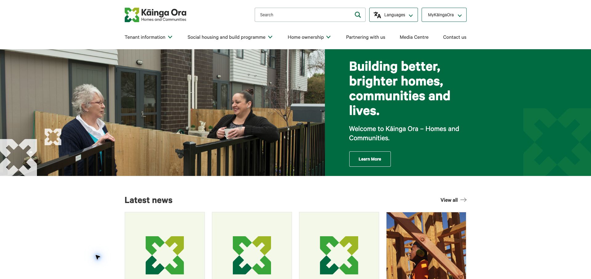
Kāinga Ora pairs a photograph of people outside a home with a solid green message panel. This split composition keeps the white introductory text readable without relying on a dark overlay. Above it, search, languages, and the tenant-account route have distinct controls; the main menu separates tenant information, housing programmes, ownership, partnerships, news, and contact. Dated news follows the hero in a consistent card grid. The current homepage declares Silverstripe CMS, supporting the vendor’s earlier account of a modular public website. The example concerns public information design and does not evaluate housing eligibility, account functionality, or the organization’s service outcomes.
What you can learn
Give a people-centred institution a human introduction while preserving stable task and audience navigation. A solid text panel beside photography can keep the message legible and reusable as images change, especially when editors publish frequent organizational updates.
Pros
The split hero protects text readability while retaining a human image.
Language and tenant-account controls are clearly separated from general information navigation.
Cons & considerations
The introductory action is generic compared with the more specific audience routes above it.
Several news cards use similar brand artwork, making their headlines carry most of the distinction.
Visible tech stack
Earlier / documented evidence
Silverstripe
Platform source: Silverstripe Kāinga Ora implementation case. The directly reviewed public page declares Silverstripe CMS 6.2. This evidence is scoped to the pictured public property, not every linked account, booking, or transactional system. Platform evidence is separate from the direct website screenshot and is not a complete current infrastructure audit.
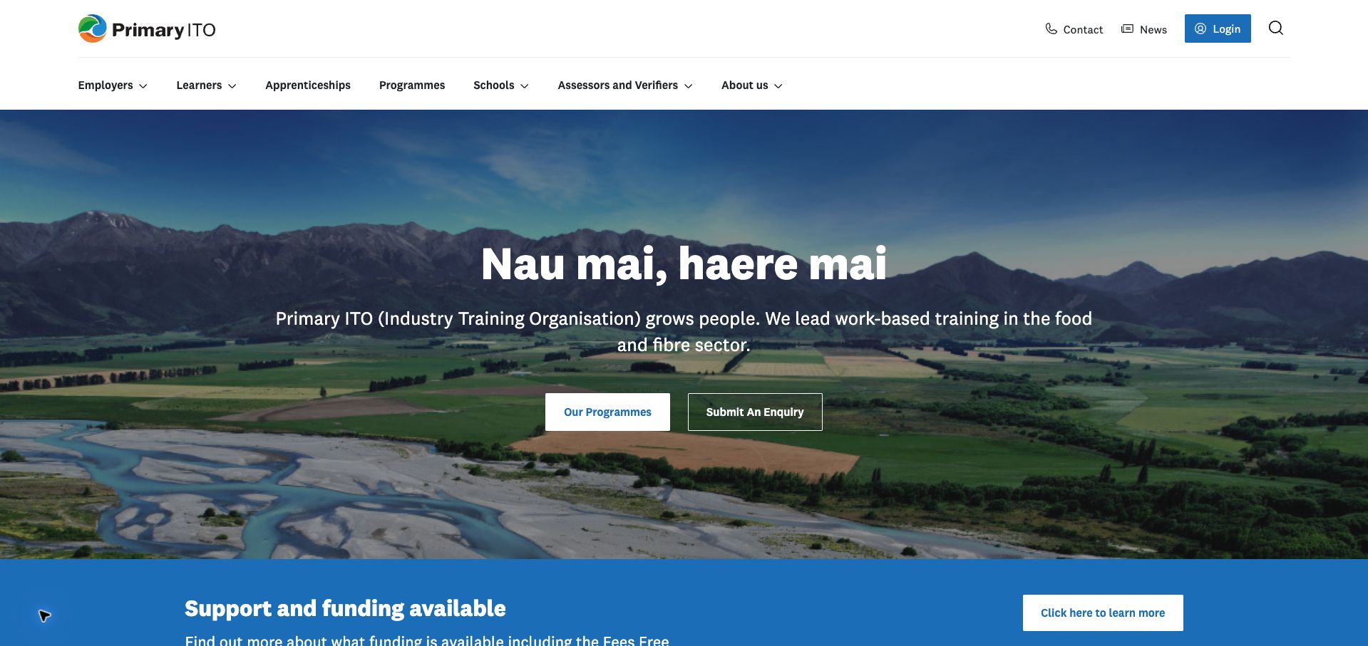
Primary ITO introduces its food-and-fibre focus with a wide rural landscape and a concise description of work-based training. Two central actions lead to programmes and enquiries, while the main navigation explicitly distinguishes employers, learners, schools, and assessors. A funding-information strip sits immediately below the hero, connecting the broad invitation to a practical question. This is a useful example of making several participants in the same training system visible without turning the homepage into an organizational chart. Silverstripe’s case study documents CMS development, and current page assets include Silverstripe content-block and site-banner modules. The public-site evidence does not establish the platform of linked learning systems.
What you can learn
Name the different participants in a service and give the central offer a clear discovery route. Place practical support information close to that offer, while keeping enquiry access secondary for visitors who first need to understand the available programmes.
Pros
Audience labels reflect the different roles involved in work-based training.
Programme discovery and funding information are closely connected in the page sequence.
Cons & considerations
The landscape occupies a large area before specific programmes appear.
The general enquiry action gives less guidance than a clearly described advice or eligibility route.
Visible tech stack
Earlier / documented evidence
Silverstripe
Platform source: Silverstripe Primary ITO implementation case. The directly reviewed public page references named Silverstripe modules: https://www.primaryito.ac.nz/_resources/vendor/nzta/silverstripe-sitebanner/client/javascript/site-banner.js?m=1793892232, https://www.primaryito.ac.nz/_resources/vendor/nzta/silverstripe-sitebanner/client/css/site-banner.css?m=1793892232. This evidence is scoped to the pictured public property, not every linked account, booking, or transactional system. Platform evidence is separate from the direct website screenshot and is not a complete current infrastructure audit.
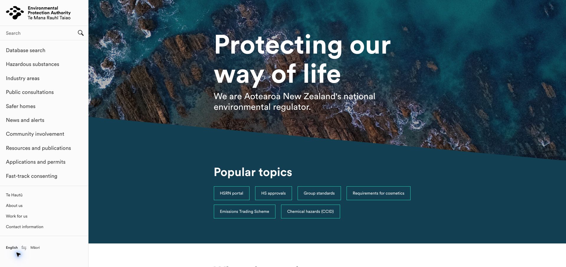
New Zealand’s Environmental Protection Authority gives its desktop navigation a full-height left column. Database search, hazardous substances, consultations, applications, and resources are available without opening a mega menu. The main area begins with coastal imagery and a concise statement of purpose, followed by compact popular-topic buttons. This combination keeps the organization recognizable while acknowledging that many visitors arrive with a specialized task. The current page reports Silverstripe CMS, complementing the vendor’s documented public-site and database-interface work. The review concerns navigation and content presentation, rather than the accuracy of regulatory advice or the operation of any linked permit system.
What you can learn
When a technical information service has many recurring destinations, a stable side navigation can make its breadth visible. Pair that structure with a short set of genuinely useful topic shortcuts, and explain abbreviations where newcomers are likely to encounter them.
Pros
The side rail exposes key regulatory and public-information routes at once.
Popular-topic buttons provide a shorter path into specific recurring needs.
Cons & considerations
Several abbreviations assume prior familiarity with the authority’s terminology.
The persistent sidebar reduces main-content width and needs a different arrangement on small screens.
Visible tech stack
Earlier / documented evidence
Silverstripe
Platform source: Silverstripe EPA implementation case. The directly reviewed public page declares Silverstripe CMS 6.2. This evidence is scoped to the pictured public property, not every linked account, booking, or transactional system. Platform evidence is separate from the direct website screenshot and is not a complete current infrastructure audit.
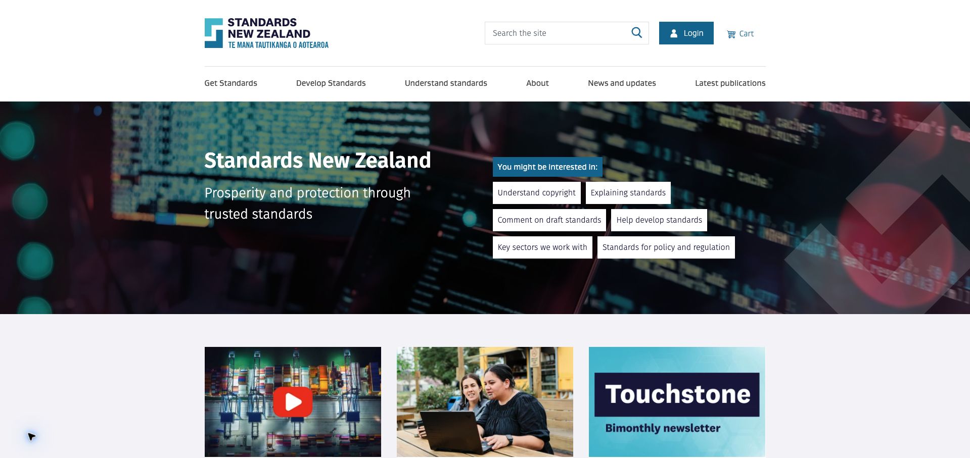
Standards New Zealand organizes its main navigation around three different relationships to standards: obtaining them, developing them, and understanding them. Search, login, and cart access sit above that row, while the hero adds compact shortcuts for copyright, public consultation, policy, and key sectors. Below, introductory media and editorial cards explain the organization’s work. The design is worth studying as a combination of catalogue access and public education, rather than a conventional retail storefront. A current Silverstripe generator corroborates a 2025 government procurement record identifying the website and web shop as Silverstripe-based. This review does not test purchases or licensed-document access.
What you can learn
Separate discovery, contribution, and explanation when a technical catalogue serves several kinds of visitor. Put account and transaction utilities in a predictable location, while using the main page to clarify unfamiliar processes and guide people toward the right section.
Pros
The three principal navigation verbs explain materially different visitor intentions.
Shortcuts connect technical content with common explanatory and participation needs.
Cons & considerations
The hero’s cluster of buttons creates several equally weighted choices.
Search is prominent in the header but the opening does not show catalogue examples or filters.
Platform source: MBIE Standards NZ CMS support procurement, 2025. The directly reviewed public page declares Silverstripe CMS 5.4. This evidence is scoped to the pictured public property, not every linked account, booking, or transactional system. Platform evidence is separate from the direct website screenshot and is not a complete current infrastructure audit.
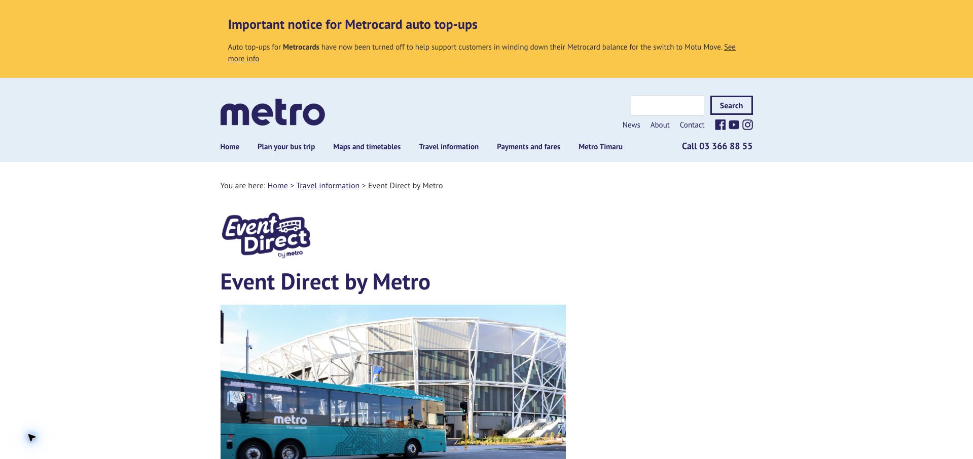
Metro’s Event Direct page sits within the wider transport website but uses its own service mark, heading, and stadium photograph. Breadcrumbs preserve the relationship to general travel information, while an on-page contents list introduces events, operation, pricing, locations, policies, and help. The long-form structure gives a visitor context before moving into an event-specific booking route. A separate network notice remains above the header, showing how sitewide information coexists with a focused service page. Current Silverstripe metadata and the vendor’s May 2026 implementation account support this specific example. The captured page is informational; no route, payment, or booking was submitted.
What you can learn
Give a specialized service enough context to explain how it differs from the general network. Keep event-specific choices downstream of that explanation, and maintain repeated operational details from a common source so the introduction and FAQ cannot drift apart.
Pros
Breadcrumbs and service branding preserve both parent-site context and local identity.
The contents list makes a long information page easier to scan by need.
Cons & considerations
The introductory notice and FAQ show different booking cut-off times and need reconciliation.
The sitewide notice and large image push the service explanation below the first viewport.
Platform source: Silverstripe Event Direct implementation account, May 2026. The directly reviewed public page declares Silverstripe CMS 6.2. This evidence is scoped to the pictured public property, not every linked account, booking, or transactional system. Platform evidence is separate from the direct website screenshot and is not a complete current infrastructure audit.
Kegan has 15+ years of experience working with small businesses, Fortune 500 companies, and everything in between. No development job is too big or too small: he brings the same hands-on attention to a focused improvement, a complete website, or a custom application.
For Silverstripe projects, he can help with content architecture, custom functionality, system integrations, testing, and maintainable handover. He works directly with clients on scope, design, implementation, testing, and handover, with an emphasis on clear communication and a system that remains practical to maintain after launch.
Show 3 other Silverstripe developersHide other Silverstripe developers
Choose the implementation around the operating model
Build structured institutional publishing
Use repeatable content models when many teams publish similar services or resources. Demonstrate ordinary editing with the staff who will own the content.
Add custom behavior only for a real need
Define the visitor problem, data source, failure state, and maintainer before commissioning a bespoke tool. A flexible framework is not a reason to customize everything.
Modernize with a content migration plan
Preserve useful URLs and document relationships, and identify what is obsolete. The migration should improve content accuracy as well as presentation.
From references to requirements
Plan the content and everyday maintenance
Define editorial ownership
Assign service descriptions, documents, notices, and review dates to the relevant team. Make expired or superseded material easy to identify.
Test public information journeys
Use representative tasks such as finding a service, comparing requirements, locating a document, or planning a visit. Avoid testing only the homepage.
Plan releases and recovery
Document preview, approval, deployment, backups, and rollback. Verify integrations in an appropriate test environment without sending real applications.
A useful handover demonstration
Ask the actual team to carry out its routine job: publish a realistic update, correct a mistake, preview a narrow screen, and identify who owns an integration failure. For a library or frontend framework, also ask who maintains the content source and deployment. A polished screenshot does not answer those operational questions.
Beyond the screenshot
Silverstripe project checklist
Define content models.
Assign service owners.
Date operational notices.
Label superseded documents.
Preserve useful URLs.
Clarify transactional handoffs.
Test search and documents.
Review mobile navigation.
Document preview and deployment.
Keep evidence dates separate.
Test with real content, a keyboard, a small screen, slow or failed requests, and the people who will maintain the system. These are planning checks, not an accessibility, security, performance, or search-ranking certification.
Sources & editorial method
How this Silverstripe collection was reviewed
Twenty distinct public properties have direct website captures and original design reviews. The first five are explicitly identified recognizable organizations or established specialists. Platform evidence is scoped to each named property; documentary associations, dated observations, and narrower asset-only signals remain qualified. Captures and technology verification have independent dates. A bounded public stack audit was attempted for every source, preserving inaccessible and unknown results. No private administration or transactions were inspected.
Every image is an unmodified capture from the actual website, with its source and capture date. Some captures are reused from our shared catalog; their dates remain the original capture dates. None comes from a vendor gallery or a generated reconstruction. Moving imagery and live content can change.
Technology attribution uses public page assets or metadata, official platform documentation, or a cited first-party project case study. Documentary and framework-relationship evidence is identified where used; it is not a complete current backend inventory. A CMS image CDN alone does not establish a full CMS deployment. A library’s presence does not prove which individual controls use it, and a platform label does not establish AI authorship.
The composition notes, lessons, pros and tradeoffs are original editorial observations. We have not measured conversion, traffic, security, performance or accessibility conformance. Website owners retain their brands and imagery; these examples are not our client portfolio. Written, Edited and Curated are independent records, not dates advanced by a build. See our editorial standards or suggest a correction.
Questions worth asking
Silverstripe website development FAQs
Does a vendor case study prove current use?
It documents the stated implementation at its date. Without current public signals, keep that association explicitly historical or documentary.
Should every page be custom-built?
No. Reusable models and templates can make a large site easier to maintain and navigate.
What matters in a public-service redesign?
Clear tasks, accurate content, readable documents, reliable search, and an understandable handoff to any transactional system.
Do these reviews assess private banking or government applications?
No. They cover the pictured public pages and their supported platform associations.