Best Tree Service Websites of 2026 (23 Real-World Examples)
Tree care, arborist consulting and vegetation-management sites with practical lessons
A tree-service website should help someone describe a problem without making them diagnose it. These examples show how companies explain local coverage, ongoing care, consulting and removal while giving urgent and routine enquiries different routes.
A mature tree is not just an exterior-design feature. A visitor may be worried about a damaged limb, researching pruning, seeking a report for a building project or arranging ongoing care across several properties. Those intentions need different information and sometimes different teams. A useful website communicates the company’s role, location and assessment process before a long form asks the visitor to choose technical terminology.
This collection spans owner-led local practices, regional contractors, arboricultural consultants and larger vegetation-management organisations. They are included for their public website communication, not as equivalent service providers or a measured ranking. Notice the difference between a canopy photograph, a real work scene and a project account: each can help, but none alone proves qualifications, current availability or the suitability of work on a specific tree. A good brief turns that distinction into clear content rather than adding more reassurance badges.
Before the examples
What makes good tree service website design in 2026?
Route the concern without asking for a diagnosis
Let a visitor describe what they are seeing and what they need help with. Ordinary categories such as pruning, tree removal, health assessment, planting or a report can lead to more detail, but leave room for “not sure.” Separate routine enquiries from genuine urgent-contact arrangements. Explain what the website can request and what requires an assessment; do not make a form appear to confirm immediate attendance or tell visitors to investigate an unsafe situation themselves.
Explain the person and business behind the service
Company registration, professional membership, individual qualifications and contractor licences are different facts. Present the ones relevant to the practice accurately, with current source links where useful, rather than an unexplained row of logos. A named team and a clear explanation of who performs assessments can help visitors understand the working relationship. Do not turn company-provided statements into unqualified promises about safety or outcomes.
Make geography and project context useful
Urban access, property type and local administrative processes can affect how a project is assessed. A concise coverage statement and relevant service-area information help establish fit. Explain which kinds of clients the team serves—homeowners, associations, commercial sites, public bodies or utilities—without inventing separate local offices. Where permissions or reports may be relevant, describe the company’s role and link to the appropriate public authority instead of presenting generic website copy as legal advice.
The collection · 23 examples
23 tree service websites worth studying
Look at how each page distinguishes a routine assessment from urgent contact, and how it supports a specific service with people, process or project evidence. Adapt the information structure to the work the business actually performs.
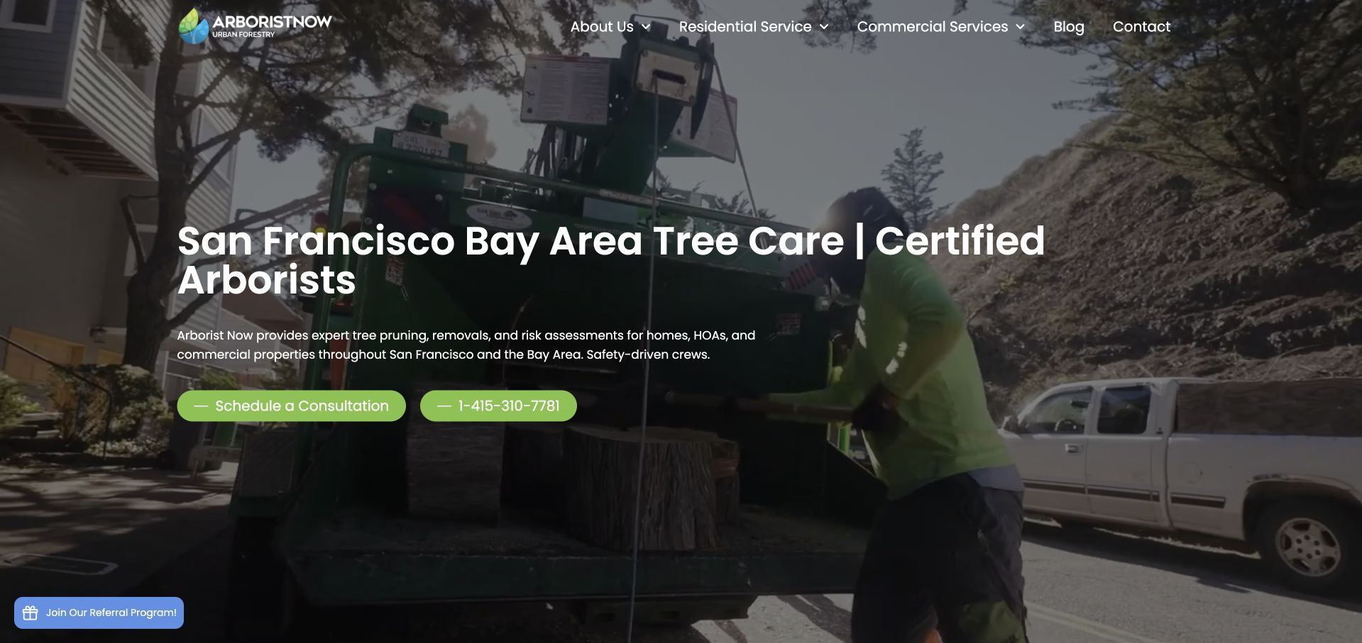
Arborist Now places a direct San Francisco Bay Area tree-care headline over footage of work being performed. The short paragraph names pruning, removal and risk assessment for homes, associations and commercial property, while two green actions distinguish a consultation from a telephone call. The navigation separates residential and commercial services rather than mixing every category into one long row. A dark overlay makes the white text readable against close work footage, while the compact header avoids a wall of competing service links. The approach is useful for a regional specialist: ordinary service language does the explanatory work, with the moving image supporting it rather than replacing it.
What you can learn
Name the actual service and territory before introducing credentials or a contact form. Use work imagery honestly, provide a meaningful still alternative and keep consultation scheduling distinct from any claim about urgent availability.
Pros
The headline and paragraph make services and geography explicit.
Residential and commercial interests have separate routes.
Cons & considerations
The large moving background requires a useful reduced-motion alternative.
A floating referral invitation competes with the otherwise simple contact hierarchy.
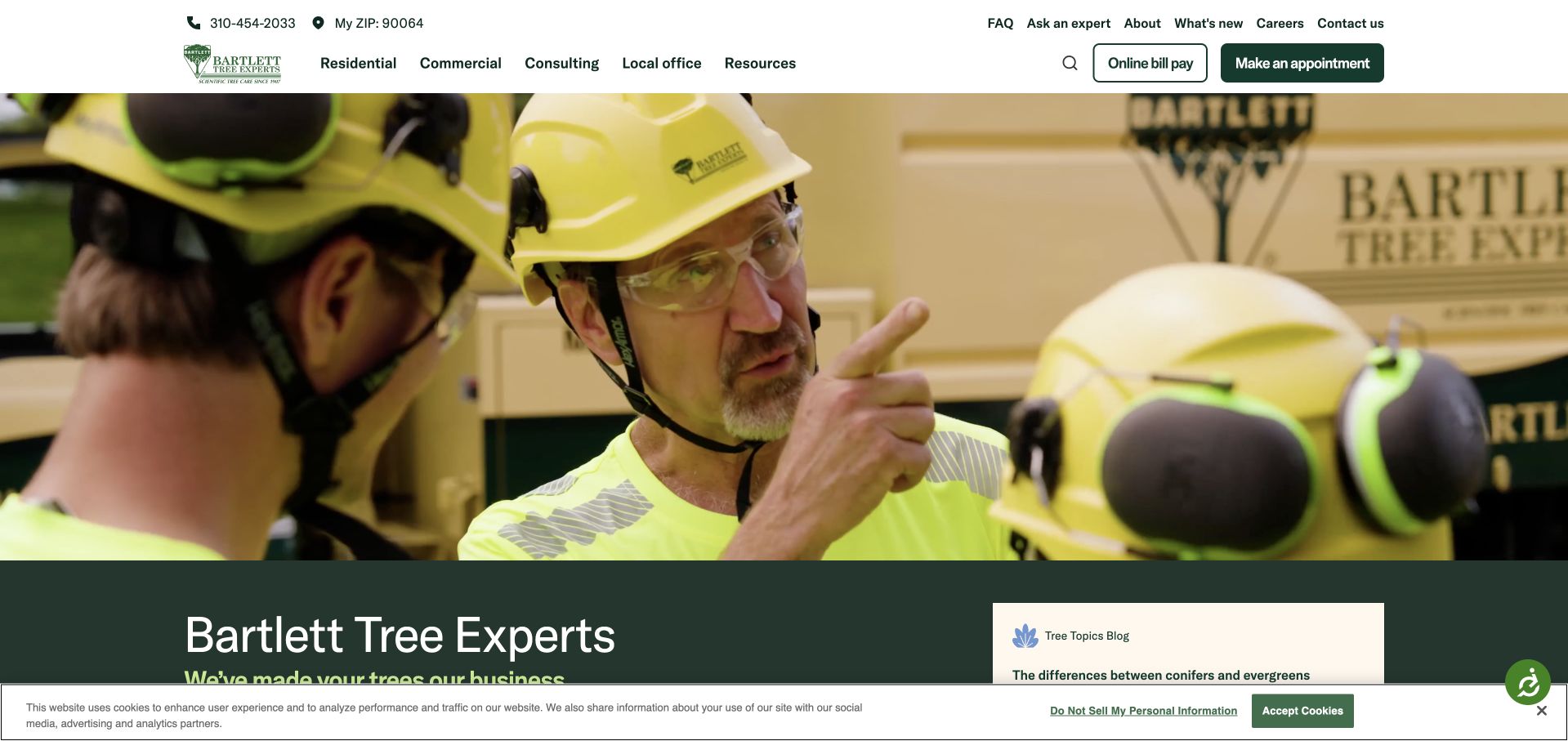
Bartlett opens with a close photograph of helmeted staff discussing their work, then moves into a green information panel naming the business. The header carries a selected postcode, a telephone number, local-office information and a clear appointment action. Residential, commercial and consulting routes sit together without being collapsed into a generic list of tree tasks. Online bill payment has a separate utility role, recognising existing clients. This is a useful reference for a large organisation with local delivery: the people image humanises the brand while the header handles practical location and customer context. The large image does delay the full service explanation until its lower edge.
What you can learn
A national brand still needs an identifiable local office and a straightforward customer-service path. Keep existing-client payments distinct from consultation requests, and do not let a humanising photograph replace an explicit service description.
Pros
Local-office and appointment information is visible in the header.
Existing-client payment is separate from new-service enquiries.
Cons & considerations
The large opening photograph pushes explanatory copy lower down the view.
The privacy strip competes with the first content panel.
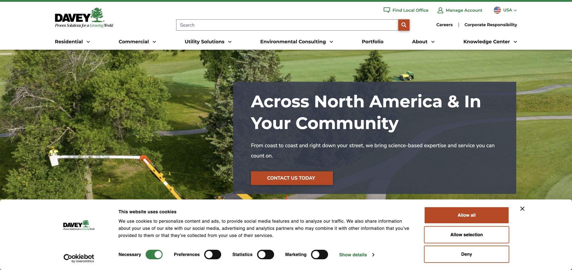
Davey places a dark text card over a broad photograph of a crew operating equipment in a green landscape. The headline connects a continental footprint with community service, while an orange contact control gives the card a clear next action. Residential, commercial, utility and environmental-consulting audiences have separate menu destinations. Search is unusually prominent in the white header, alongside office finding and account access. This supports a catalogue larger than a small residential tree business would need. In the captured view, the privacy panel occupies a substantial strip below the hero, illustrating how a complex site’s supporting interfaces can change the opening composition.
What you can learn
Organise a broad service company by audience when those audiences need different information. Provide search and office finding without asking visitors to understand internal divisions, and preserve room for the actual service explanation when privacy tools are open.
Pros
Distinct audience categories make a large range more navigable.
Office finding, search and account access serve different practical tasks.
Cons & considerations
The broad scale headline gives limited detail about an individual service.
A large privacy panel reduces the visible project context.
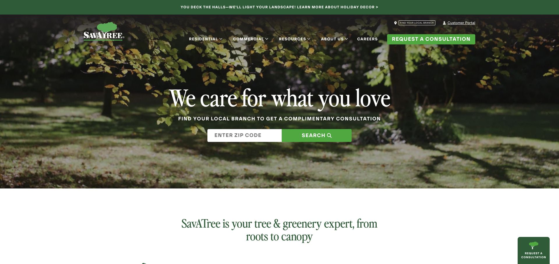
SavATree places a postcode search directly below a short serif headline over a leafy garden photograph. The page asks the visitor to find a local branch before starting a consultation, which makes geography an explicit part of the journey. Residential and commercial navigation remain distinct, while resources, account access and a consultation button support other intentions. The calm photograph and green controls produce a coherent identity. The tradeoff is specificity: the main “care for what you love” message is broad, and the first concrete description of tree and greenery expertise begins below the image rather than within the headline itself.
What you can learn
A local finder is useful when it leads to meaningful office information, not merely another generic form. Pair broad brand language with a concrete service statement, and provide a clear answer for locations outside the supported territory.
Pros
The postcode task is visible and clearly connected to finding a branch.
Resources and existing-customer access remain separate from consultation.
Cons & considerations
The emotional headline needs surrounding copy to explain the service.
The main introduction depends heavily on a location-search interaction.
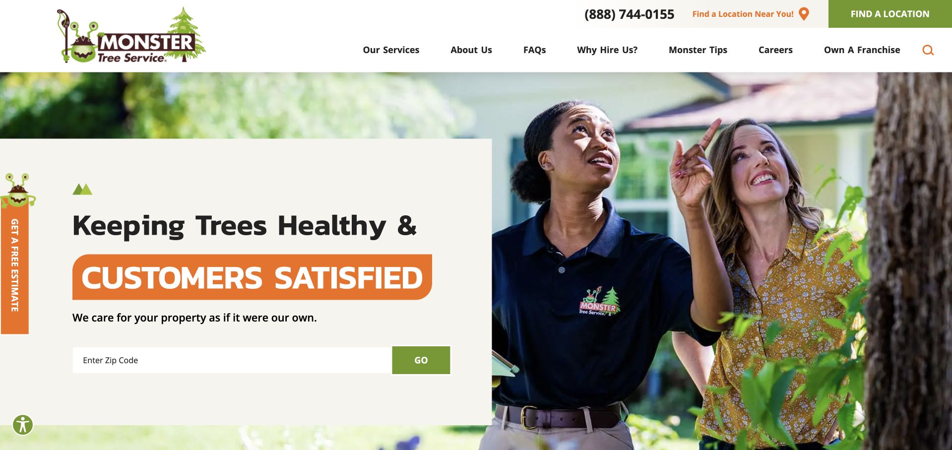
Monster Tree Service uses its illustrated identity beside a photograph of a team member discussing a tree with a homeowner. A cream information card, orange emphasis and green postcode control create a friendly rather than industrial first impression. The header repeats the location-finding task, while services, FAQs, educational tips and franchise information remain separate destinations. The customer conversation is a useful image choice because it frames the service as an assessment rather than simply tree removal. At the same time, the broad satisfaction message communicates less practical scope than a concise list of services or coverage would, and the estimate tab adds another competing contact prompt.
What you can learn
Show the consultation as well as the equipment, particularly for visitors unsure what their tree needs. A franchise finder should explain who provides local service, and general brand promises should be supported by clear service facts.
Pros
The image shows an understandable customer-assessment conversation.
Postcode routing and educational information have clear destinations.
Cons & considerations
The central promise is broad rather than a service description.
A floating estimate tab repeats an intention already available in the header.
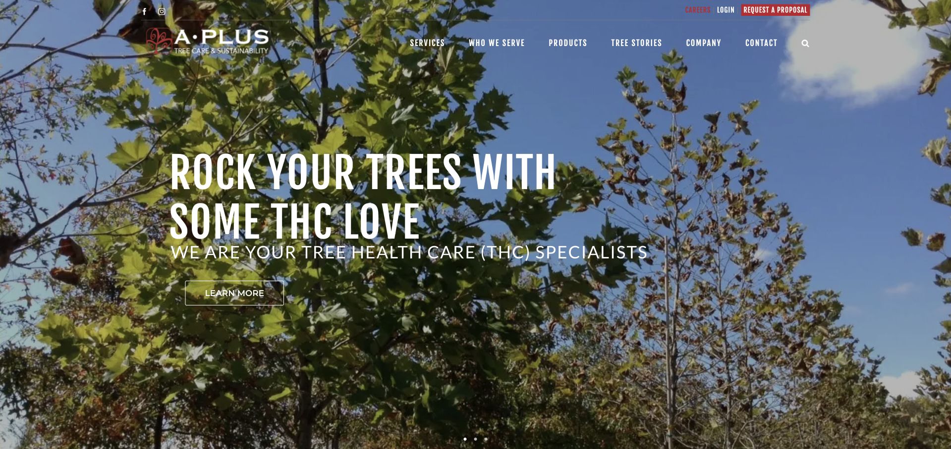
A Plus Tree uses a canopy photograph, condensed white lettering and an informal headline to introduce tree health care. The main menu separates services, audiences, projects, tree stories and company information, while a red proposal action sits above the image. The design is more expressive than the conventional estimate-form sites in this collection, and the plant-health emphasis gives it a specific subject. Its acronym and playful word choice still depend on supporting explanation: a homeowner should not need to know an industry abbreviation to understand the service. The full-screen image also postpones location and delivery information that would establish practical fit.
What you can learn
A distinctive voice can introduce a specialist service, but define the service in ordinary language beside any acronym. Keep project evidence and audience routes accessible, and make coverage visible before someone begins a detailed proposal request.
Pros
The opening foregrounds ongoing tree health rather than only removal.
Projects and audience information have separate navigation routes.
Cons & considerations
The playful headline and acronym require additional explanation.
The opening gives little immediate service-area context.
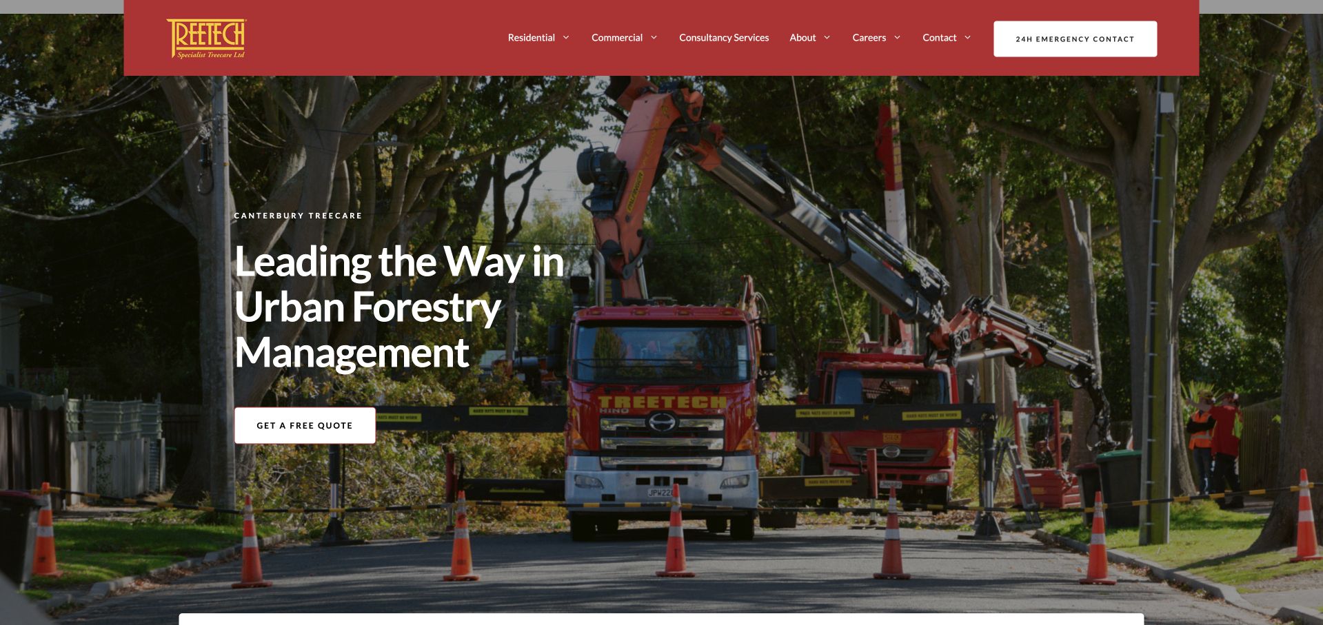
Treetech uses a real street-work photograph showing a branded vehicle, cones and mature trees behind a direct urban-forestry headline. The red header contrasts clearly with the green scene and separates residential, commercial and consultancy services. An emergency-contact control has its own place in the header, while a free-quote action sits in the hero. The image communicates an operating context rather than an anonymous forest, making the example useful for a contractor serving streets and managed urban sites. The broad headline still leaves the specific service menu to navigation, and a large photograph provides limited detail about how the enquiry will be assessed.
What you can learn
Choose imagery that reflects the setting in which the company actually works. Separate routine project quotations from emergency contact, and explain the latter’s real scope and availability rather than allowing a prominent label to imply every request is immediately attended.
Pros
The photograph communicates an urban operational context.
Residential, commercial and consultancy audiences are distinguished.
Cons & considerations
The broad forestry headline does not identify individual service tasks.
The quotation action gives little detail about the assessment process.
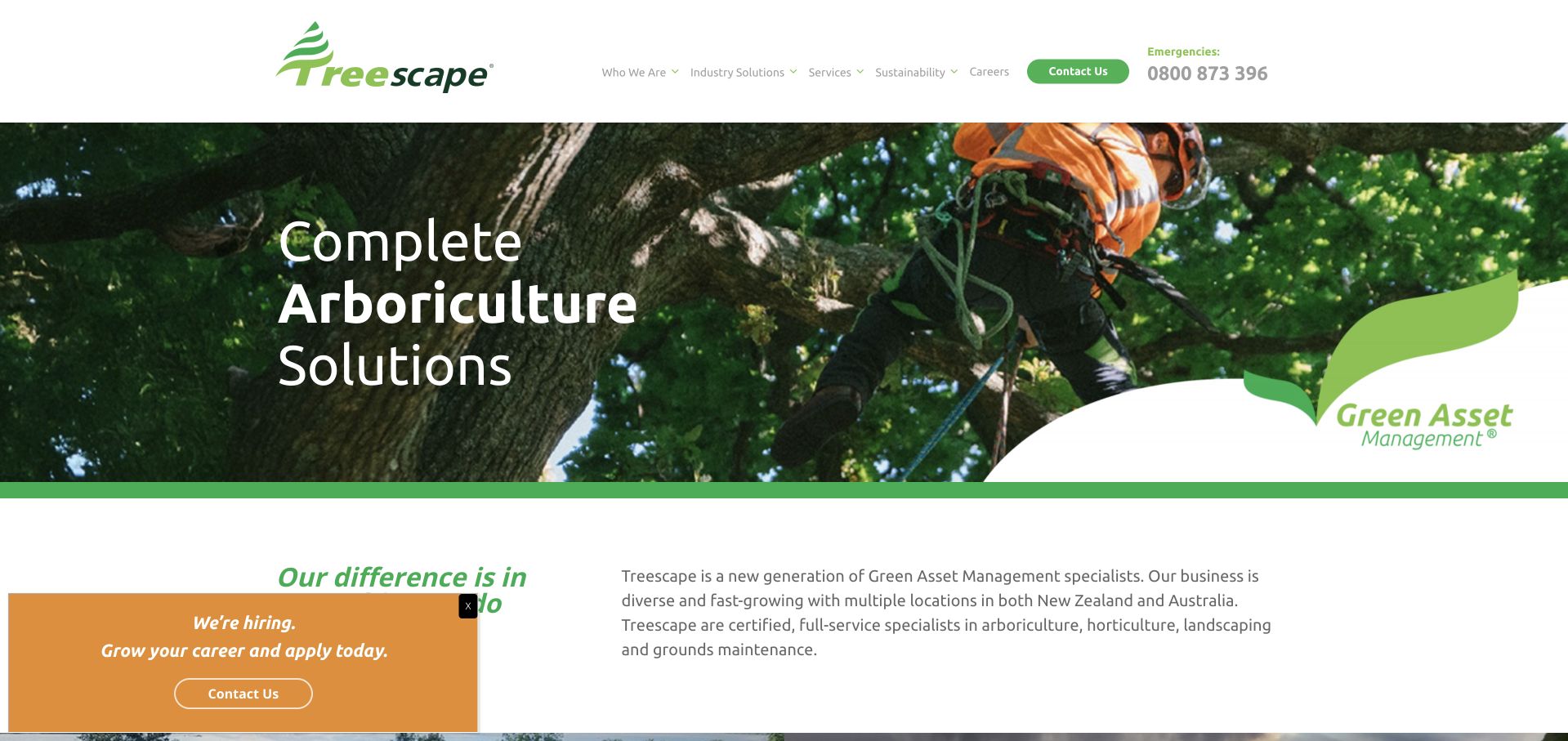
Treescape pairs a canopy-level work photograph with a short arboriculture headline and a curved green brand device. A clean white header separates industry solutions, services, sustainability and careers, with contact and emergency information visible at the right. The introduction below the hero explains a wider green-asset management business, including locations in New Zealand and Australia. This is useful for a company whose work extends beyond a domestic tree-care visit: the site needs room for institutional audiences and a wider service explanation. In the captured state, a recruitment panel sits over the lower content, demonstrating the tension between attracting staff and explaining services to prospective customers.
What you can learn
An umbrella term needs a plain-language explanation close beneath it. Give institutional services and careers different routes, and avoid allowing recruitment prompts to obscure the information a project buyer needs to assess fit.
Pros
Industry solutions and services have separate navigation roles.
Emergency contact remains distinguishable from ordinary contact.
Cons & considerations
The short hero requires the next section to explain the broader business.
A recruitment panel overlays the first explanatory content.
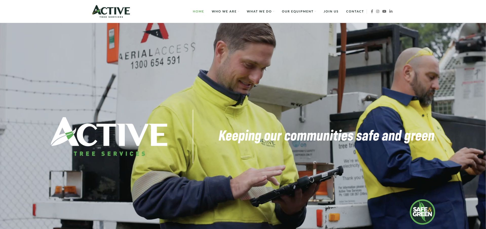
Active Tree Services uses a large staff-and-equipment photograph with a short community-focused line and a prominently repeated mark. The white header is comparatively simple: company background, services, equipment, jobs and contact are separately labelled. Unlike a residential removal homepage, the opening is more about the operating organisation than a quick estimate. That is a meaningful distinction for a vegetation-management business serving broader contracts. The image gives people and process a visible role, but the short slogan does not explain the specific work, territory or customer type by itself. Visitors need to continue into the service pages for those practical details.
What you can learn
A contractor website can lead with operational people rather than a consumer sales form. Support that image with a concise explanation of customer types and service scope so the visitor does not have to interpret machinery as a complete statement of capability.
Pros
People and equipment provide a recognisable operational subject.
The compact menu distinguishes equipment, services and recruitment.
Cons & considerations
The first-screen slogan gives limited detail about the work offered.
There is little visible guidance for a visitor’s first project enquiry.
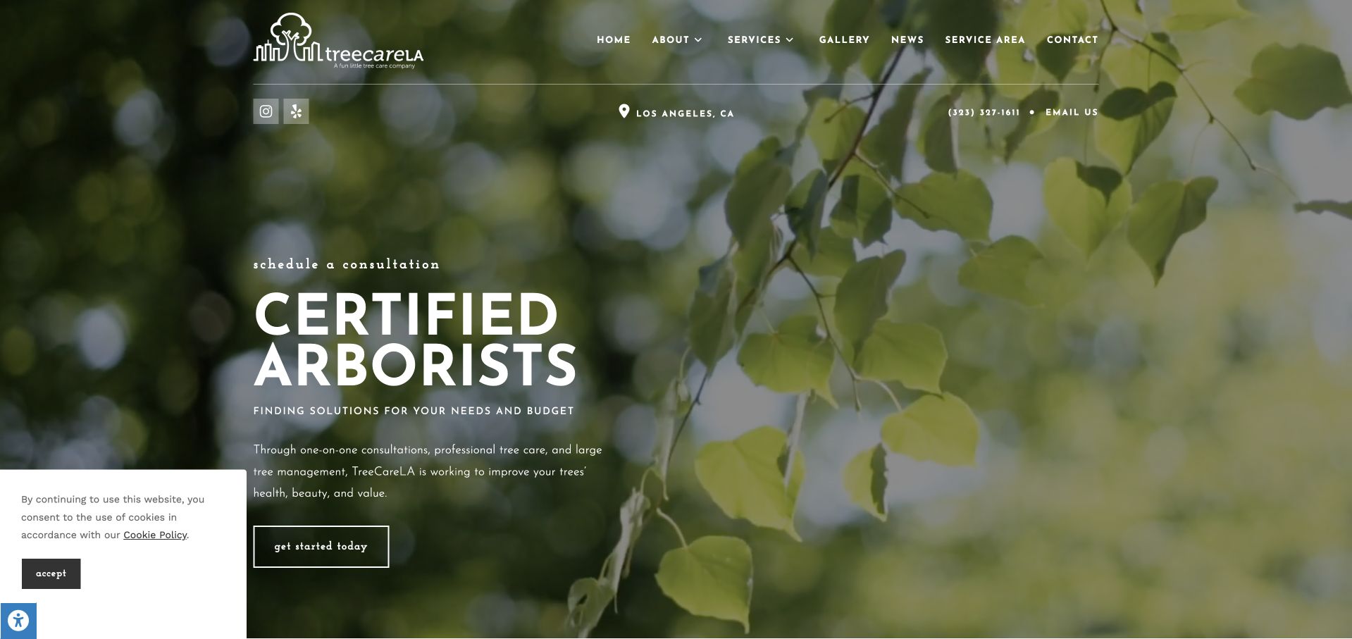
TreeCareLA uses soft-focus leaves, a small illustrated mark and large white arborist typography to create a quieter introduction than the equipment-led examples. Los Angeles and direct contact information sit in a fine utility row beneath the menu. The short supporting paragraph connects one-to-one consultations, professional care and larger tree-management work, while an outlined action invites a first step. Services, a gallery, news and the service area remain visible above. The hierarchy is coherent and understated, although the small supporting copy and fine header text ask for careful contrast and mobile sizing. A cookie card partly occupies the lower-left margin in the captured state.
What you can learn
A calm identity can suit an assessment-led practice when practical geography and service choices remain visible. Keep supporting text readable and describe what a consultation includes rather than using a generic first-step label alone.
Pros
Consultation and ongoing care are connected in the opening explanation.
The service area and gallery have explicit navigation routes.
Cons & considerations
Fine utility text and small supporting copy are comparatively delicate.
The privacy card competes with the lower-left introduction.
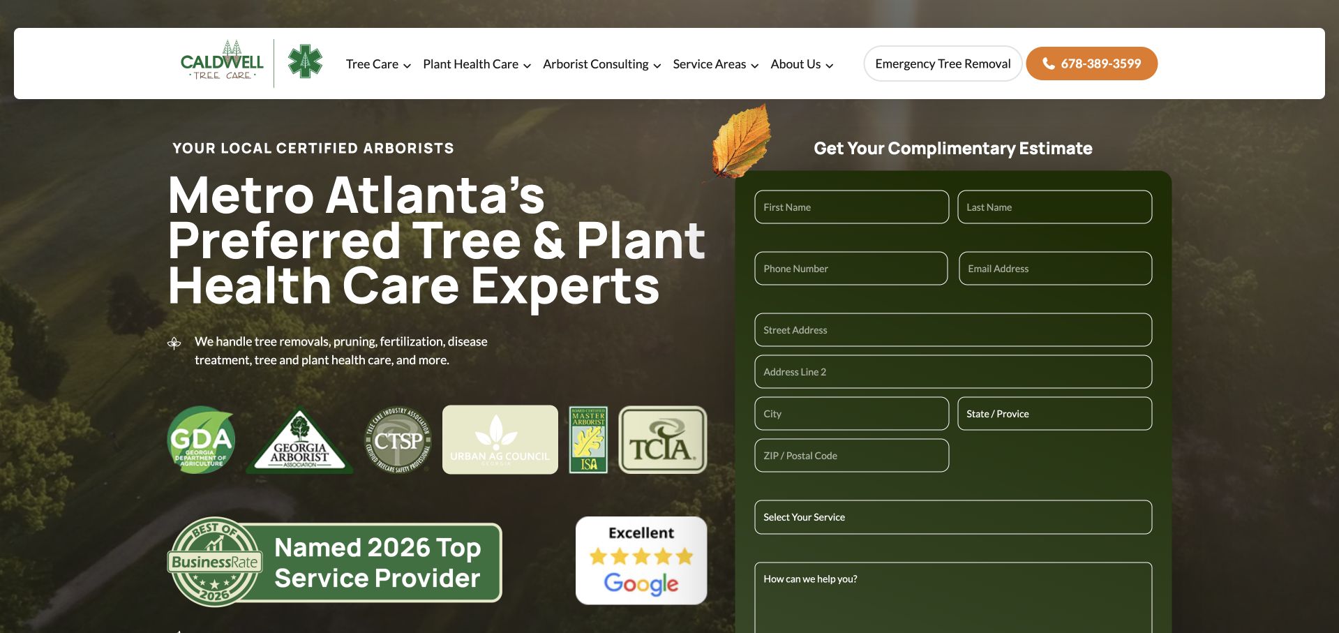
Caldwell combines a wooded aerial background, a direct metro-Atlanta headline and a substantial estimate card. Tree care, plant health and consulting are separately labelled in the header, while an emergency-removal control is distinct from the ordinary telephone action. The form requests contact, property and service details in the first screen, making the commitment visible. Credential marks and review panels sit beside the explanation, giving several forms of reassurance their own visual treatment. The layout is useful for a service range that extends beyond removal, but the number of fields and trust elements creates a dense opening before a visitor has explored the actual service pages.
What you can learn
Qualify an enquiry with only the details the team needs initially. Make the distinctions among tree work, plant care and consulting understandable without requiring visitors to interpret a row of professional logos.
Pros
The header separates three materially different service categories.
Emergency removal is labelled separately from ordinary contact.
Cons & considerations
The full address-and-service form requires considerable early commitment.
Several credential and review panels compete with the main service explanation.
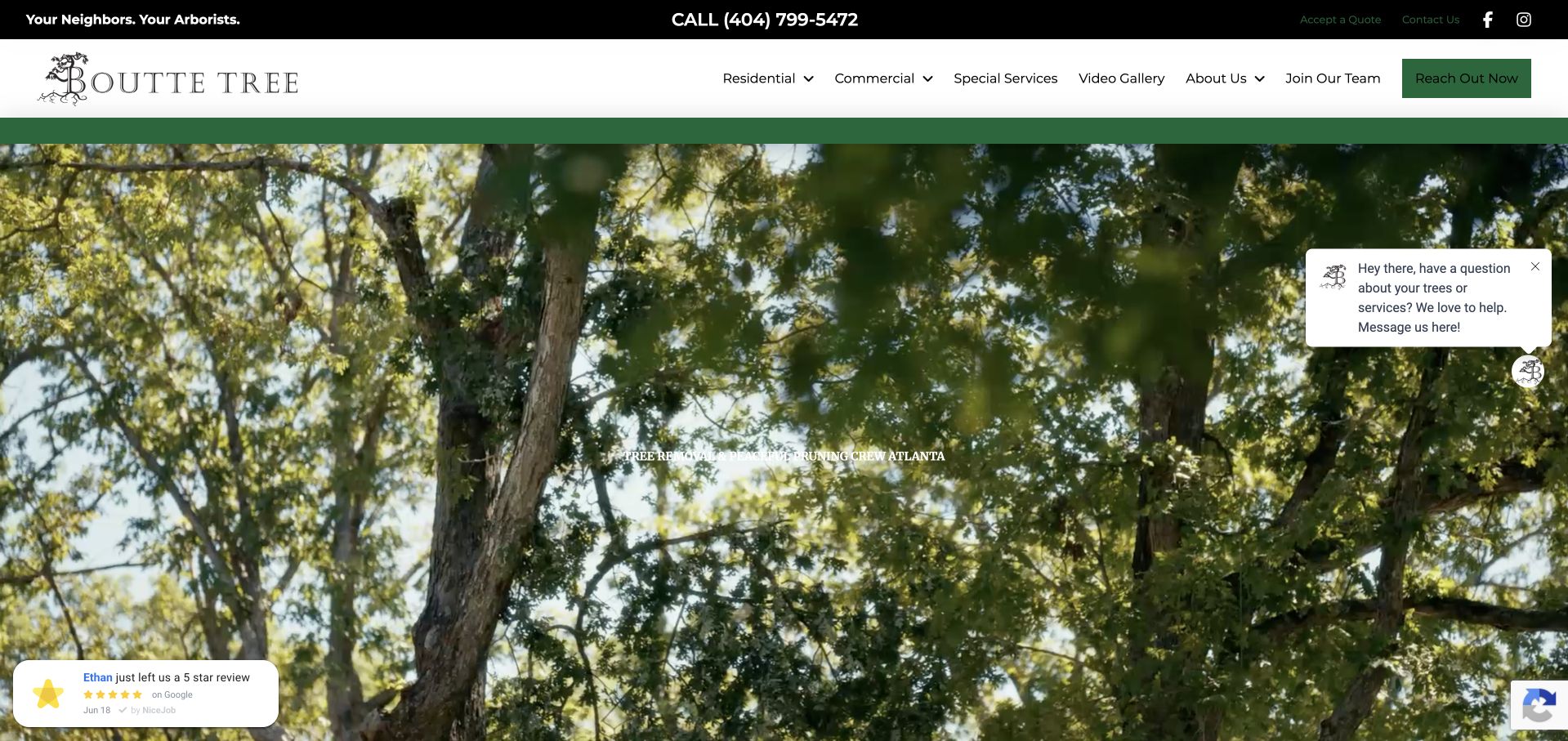
Boutte Tree gives the opening almost entirely to a broad canopy photograph beneath a white header. A small local-arborist introduction sits within the image, while residential, commercial and special services have explicit navigation choices. A video gallery provides a further way to explore the work, and the dark utility strip separates quote acceptance from general contact. This is an image-led approach rather than a lead-form wall. It creates a strong sense of place in the trees, but the main service explanation is much less prominent than the photograph, especially when small assistance and recent-review prompts float over the corners.
What you can learn
If the opening is deliberately visual, keep the service statement readable and make its next action clear. Existing-client tasks such as quote acceptance should remain distinct from a visitor researching whether the business is right for their project.
Pros
Residential, commercial and specialist work are separate menu categories.
Quote acceptance has a different utility role from new contact.
Cons & considerations
The small introductory text is easily lost in the large canopy image.
Floating review and chat prompts compete with the image-led composition.
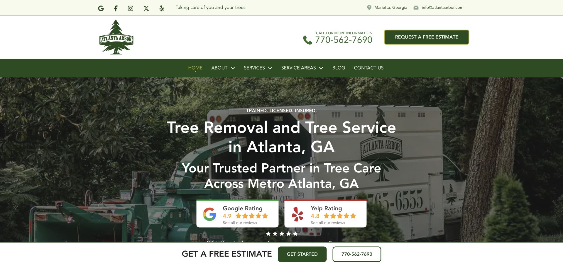
Atlanta Arbor places its service truck and equipment behind a centred removal-and-tree-service headline. Atlanta and the wider metro area are named directly, while the green-and-white header includes a telephone number and estimate action. Review panels from two platforms sit below the headline, separated from the ordinary navigation. A second estimate strip appears at the lower edge of the hero. The operational photograph and clear locality are useful, but the repeated location language and contact controls take space that could explain the difference between removal, pruning and assessment. The visible ratings remain company-presented review summaries rather than independent findings by this collection.
What you can learn
Use the local introduction to establish fit, then develop the service distinctions rather than repeating the same place name. Keep direct contact visible without giving every button and review panel equal prominence.
Pros
The service and metro coverage are explicit.
Branded equipment makes the operating business recognisable.
Cons & considerations
Geographic and estimate messages repeat across several opening elements.
Review panels occupy space that could explain specific service choices.
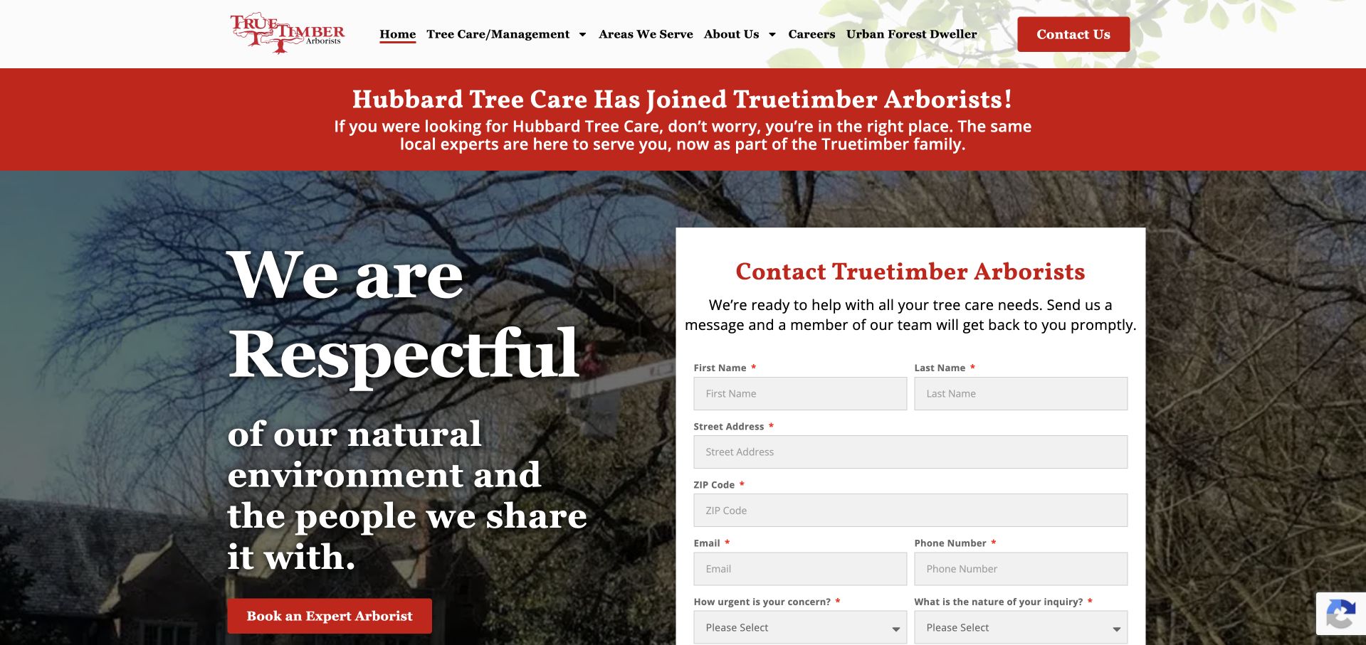
Truetimber places a clear red notice above the hero explaining that Hubbard Tree Care has joined the business. This helps an arriving customer understand the relationship instead of encountering an unexplained new name. A large serif values statement sits over a tree photograph, paired with a substantial white enquiry form. The form asks about urgency and the nature of the enquiry as well as basic contact information. Navigation separates care, areas served and company background. The approach combines continuity communication and enquiry routing, although the broad values statement is less descriptive than the practical questions within the form.
What you can learn
Explain a company transition where returning customers will actually see it. Use enquiry questions to route urgency honestly, but make the current business, service area and relationship to the old brand understandable without requiring a form submission.
Pros
The old-brand relationship is explained prominently.
Urgency and enquiry type are explicit form questions.
Cons & considerations
The large values headline says less about specific services than the form does.
A long first-screen form can overshadow basic research routes.
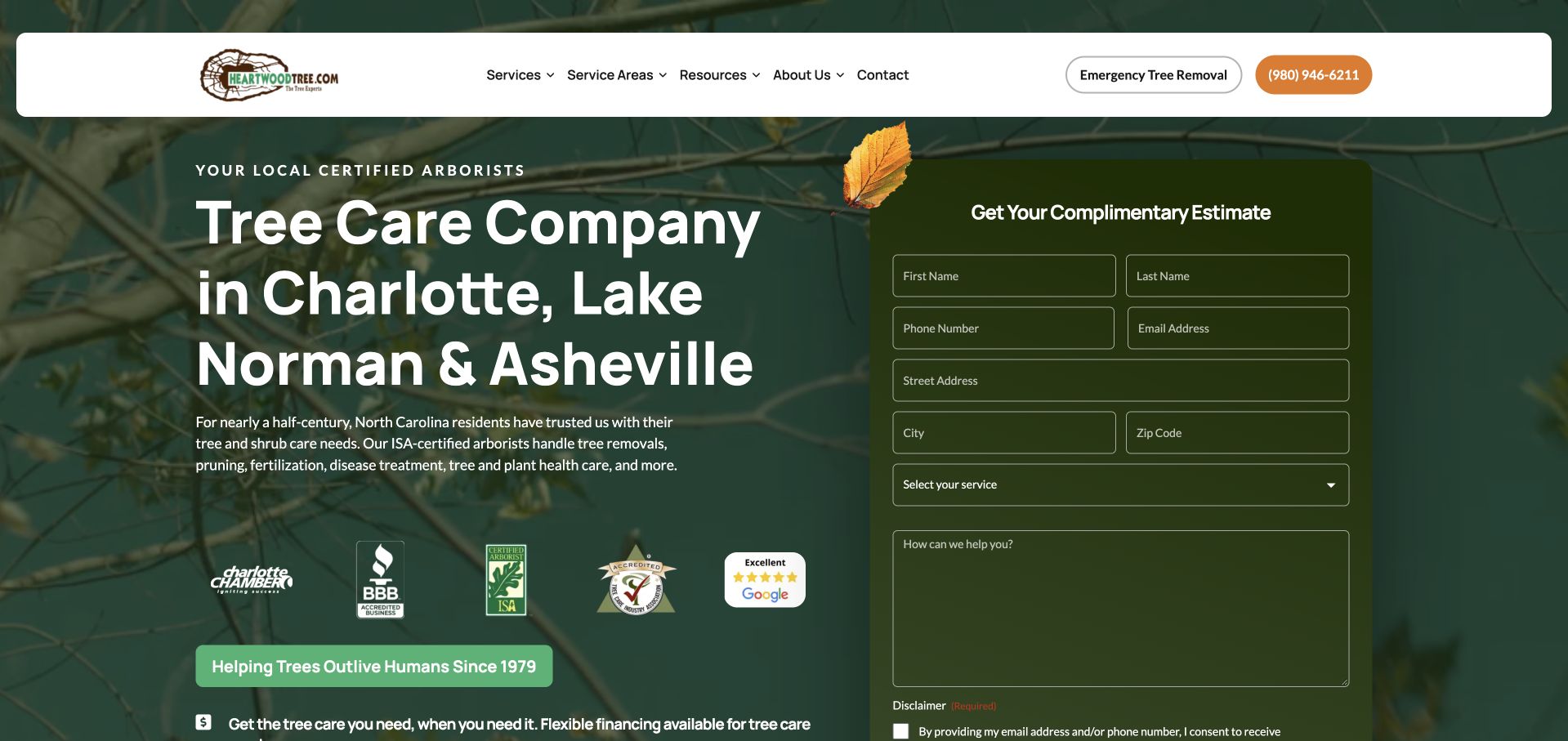
Heartwood uses a leafy dark green background, a large regional headline and a right-hand estimate card. Charlotte, Lake Norman and Asheville are named in the main text, while a supporting paragraph distinguishes pruning, disease treatment, fertilisation and removal. The header separates services, coverage, resources and ordinary contact, with emergency removal given its own control. The form is visible and substantial rather than hidden behind a generic button. Credential and review marks sit below the explanation, and a financing strip adds another commercial message. The information hierarchy is practical but dense, especially for someone still deciding what kind of assessment is needed.
What you can learn
Keep a broad care range understandable in ordinary language before asking someone to select a technical service. Distinguish emergency routing from routine estimates, and limit the initial form to the information needed for the next conversation.
Pros
The headline provides a clear regional context.
The supporting copy distinguishes care and treatment from removal.
Cons & considerations
The long estimate card dominates the opening.
Credential marks, financing and contact controls create competing priorities.
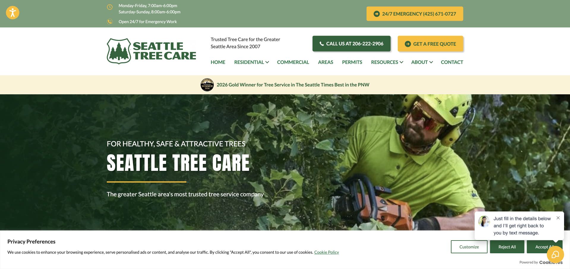
Seattle Tree Care uses a working arborist photograph behind its name and a short tree-health statement. The upper green utility bar states ordinary hours and a separate emergency route, while the white header adds a quotation action and telephone contact. Permits have a dedicated menu destination alongside residential, commercial, coverage and resources. This is useful for an urban service where the administrative context can matter as much as the equipment image. The opening also carries an award strip, a privacy notice and a chat prompt, showing how useful operational information can become crowded when several third-party or promotional layers are visible together.
What you can learn
Publish real operating hours and distinguish urgent arrangements from ordinary requests. A permit-information page should explain the company’s role and direct people to the relevant authority rather than implying a website can approve work.
Pros
Routine hours and the emergency contact have distinct placement.
Permit information is explicitly available in the navigation.
Cons & considerations
Several banners and floating tools crowd the first view.
The broad health statement leaves individual service distinctions to later pages.
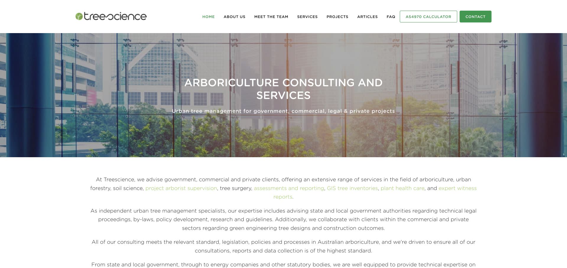
Treescience uses a quiet white header and a photograph of trees within a built environment. The hero explicitly names arboriculture consulting, while the introduction beneath it expands the audience to government, commercial, legal and private projects. A project library, team page, FAQ and a named calculator each have their own navigation route. The composition is more information-led than a quick domestic removal funnel and does not pretend that every enquiry is the same type of work. The text below the image is relatively small and sustained, however, and the technical calculator label assumes a degree of subject knowledge that a general visitor may not possess.
What you can learn
A consultant site should describe the decisions and project stages it supports, not only list credentials. Explain specialist tools in ordinary language and connect them to the appropriate assessment process rather than leaving acronyms to carry the meaning.
Pros
The consulting role and varied client contexts are explicit.
Projects and team information have separate research routes.
Cons & considerations
The specialist calculator label requires contextual explanation.
Long small-type paragraphs make the first explanatory section demanding.
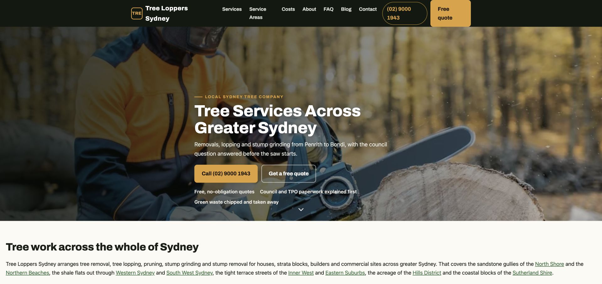
The current page at the Sydney Tree Solutions domain is branded Tree Loppers Sydney. Its opening uses a worker-and-cutting image behind a clear Greater Sydney service headline, followed by a short explanation of removal, lopping and stump grinding. A call action and quotation action sit side by side, while a concise line points to council paperwork before work begins. Service areas, costs, FAQs and company information have separate menu links. The review concerns that current branded page, not an assumed older Sydney Tree Solutions design. Its useful idea is a compact practical introduction, although the working image provides little context about the site or the assessment behind a particular project.
What you can learn
If a public domain uses a different current brand, explain the business identity clearly rather than relying on an old URL. Keep service scope, geography and the assessment process explicit before presenting a quotation as the next step.
Pros
The service range and broad locality are stated together.
Costs, coverage and FAQs have identifiable navigation routes.
Cons & considerations
The domain and current visible brand differ and may require reassurance.
The hero image provides little context about a completed local project.
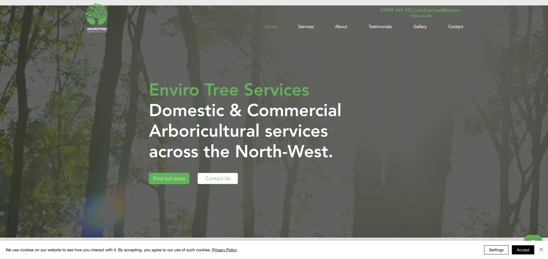
Enviro Tree Services uses a woodland photograph, green accents and a large plain description of domestic and commercial arboricultural work across the North West. The header remains simple, with services, company information, testimonials, a gallery and contact. Two small actions distinguish reading more from contacting the team. The company’s contact information is visible in the upper-right utility area rather than embedded only in a form. The layout communicates scope with little decorative machinery, but the generic forest scene explains less about real working conditions than an actual local project would, and the small navigation and action labels need careful mobile sizing.
What you can learn
A small business can start with a clear service-and-region statement and a useful gallery rather than a complex lead funnel. Use real project context to develop the introduction, and make supporting contact details readable instead of merely present.
Pros
Domestic and commercial service scope is explicit.
The compact menu gives a gallery and testimonials clear destinations.
Cons & considerations
The woodland image does not show the company’s work or people.
The utility contact and small actions are less prominent than the headline.
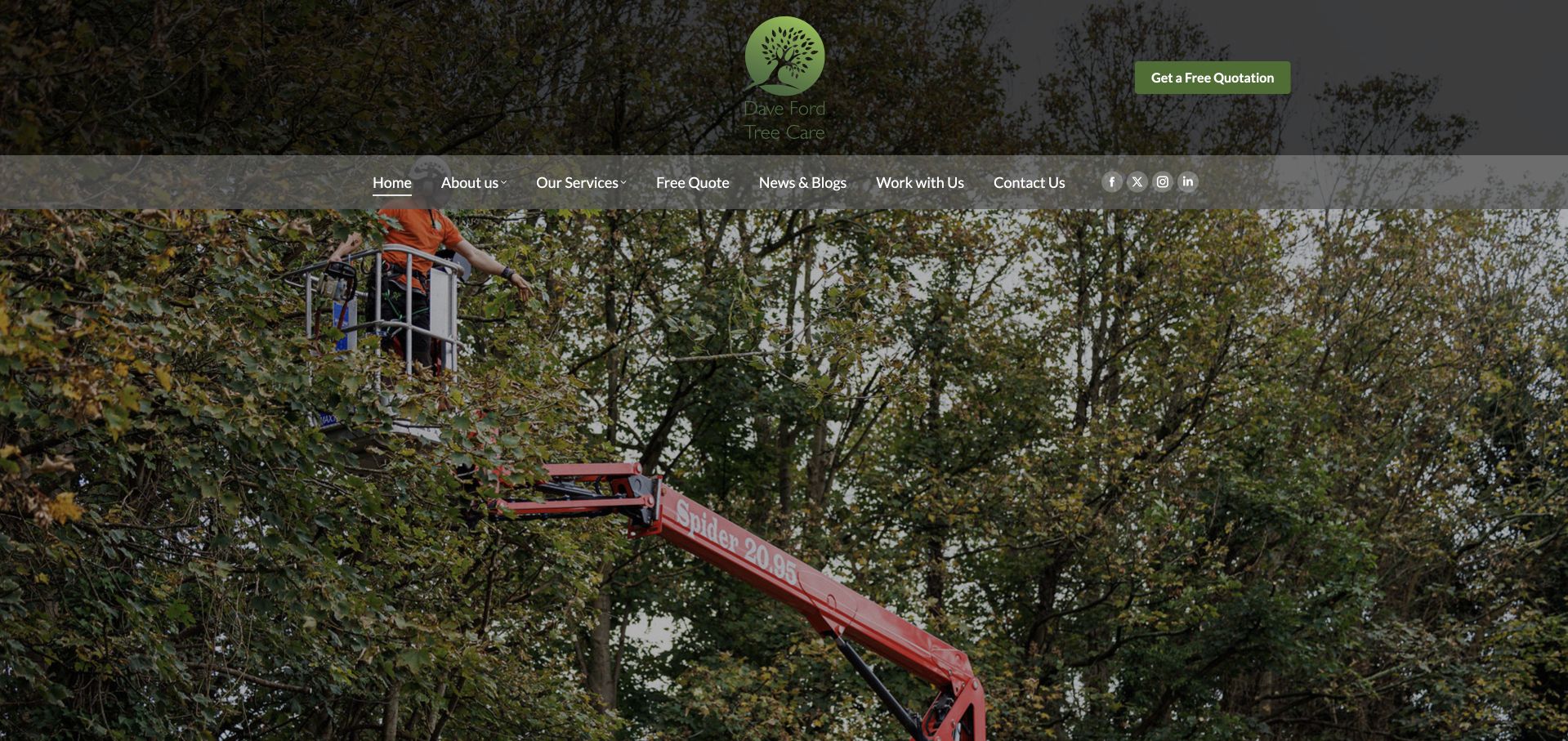
Dave Ford Tree Care gives much of the first screen to a photograph of access equipment working among mature trees. A centred tree mark and dark quotation button sit above a narrow navigation row, creating a recognisable green-and-black identity. Company information, services, news, recruitment and contact are explicitly labelled. The image is useful because it shows the setting and equipment of the work rather than a generic uninterrupted canopy. The limitation is explanatory: the opening relies heavily on that photograph and the business name, with little large service-and-location text to establish fit before the visitor moves down the page.
What you can learn
Real work imagery can provide strong context, but it should accompany a concise service explanation. Keep the enquiry shortcut available and use the following content to explain the assessment, coverage and care options instead of assuming equipment alone communicates them.
Pros
The photograph depicts an operational tree-care setting.
Services, recruitment and general contact have separate routes.
Cons & considerations
The first view gives limited prominent service or geographic detail.
The narrow navigation text competes with a large visually busy image.
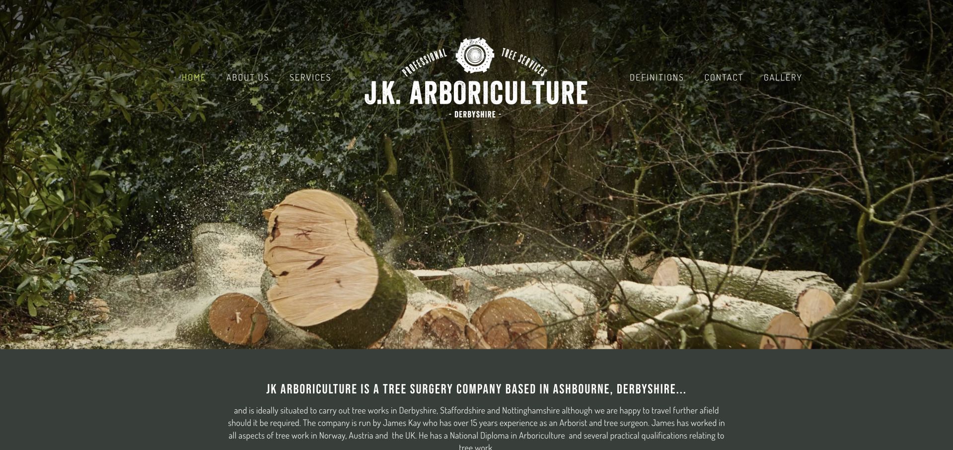
JK Arboriculture uses a freshly cut timber photograph and a strong white illustrated mark rather than a standard house-and-truck hero. The navigation is short and integrated into the image, with services, definitions, contact and a gallery given their own labels. Beneath the photograph, a dark panel names the Derbyshire base and introduces the owner-led practice. The visual identity is distinctive and well connected to the trade, but the large image postpones the practical service explanation and there is no prominent opening quotation action. The definitions route is an interesting research aid for visitors encountering unfamiliar arboricultural terms.
What you can learn
A personal practice can use a distinctive trade image without needing a large corporate template. Bring the service and locality into readable text nearby, and use terminology explanations to support—not replace—ordinary-language service pages.
Pros
The timber photograph and illustrated mark create a coherent identity.
Definitions and a gallery support visitors still researching.
Cons & considerations
The service explanation begins below the large opening image.
There is no strongly differentiated first enquiry action in the hero.
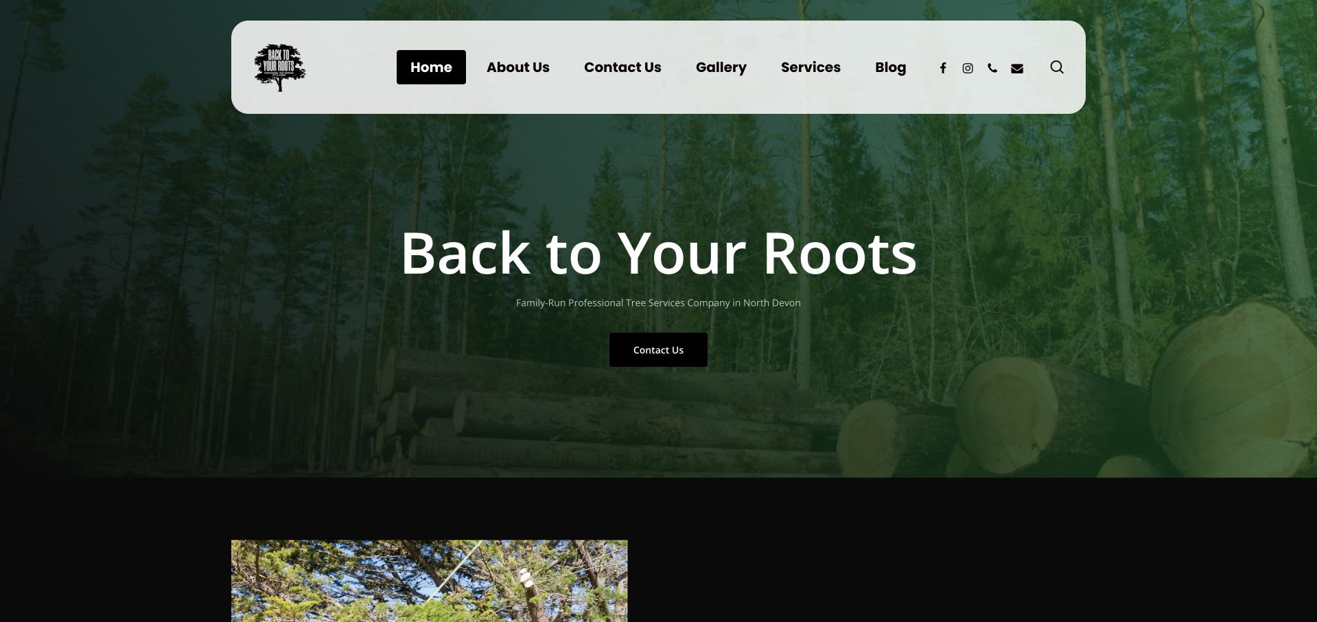
Back to Your Roots uses a dark green forest-and-timber photograph beneath a rounded pale navigation panel. A large plain business name, a short North Devon family-business description and a compact contact button make the opening unusually restrained. Services, a gallery and company information remain visible rather than being hidden inside a long estimate form. The next section begins with a work photograph, introducing a route from the broad brand scene to more concrete evidence. The strongest lesson is consistency: dark green surfaces, a simple mark and direct labels hold together. More specific service information would still make the initial introduction more useful.
What you can learn
A small local practice does not need a complicated conversion layout to be recognisable. Pair a simple identity with a clear locality, then make the next content explain actual services and show accurately captioned work.
Pros
The regional family-business description is visible beneath the name.
Services and a gallery remain available without completing a form.
Cons & considerations
The opening image is atmospheric rather than explanatory project evidence.
The small supporting line carries most of the service context.
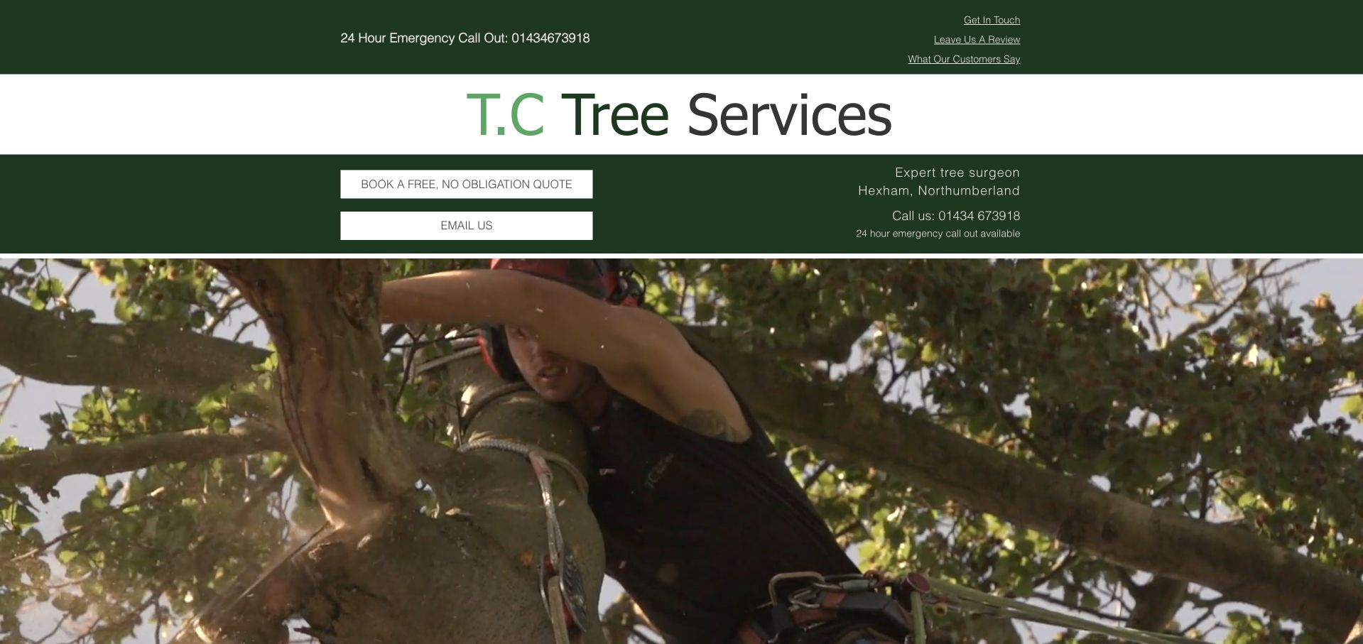
TC Tree Services gives its name a large white band, then uses a dark green strip for quotation, email and local-service information. A real tree-work photograph fills the area below, bringing the working context into view without placing all the text over a busy background. The upper utility row distinguishes an emergency number, general contact and review-related links. The layout is straightforward and practical rather than highly polished. Its useful idea is separating readable service details from the photograph; its limitation is that the many header rows and small underlined utility links make the first screen feel fragmented before the visitor reaches the work itself.
What you can learn
Keep contact information on a stable readable surface, especially over complex tree photography. Consolidate secondary utility tasks and explain urgent-contact availability clearly so the header helps rather than delays the main service journey.
Pros
The local service details are separated from the photograph.
Quotation and email options are explicitly labelled.
Cons & considerations
Several stacked header bands use substantial vertical space.
Small utility links are less legible than the large company name.
Kegan is a freelance web designer and developer with 15+ years of experience helping businesses turn complicated website requirements into clear, maintainable digital experiences. He works directly with clients from planning and design through development, launch, and ongoing support.
For tree service website design, his development approach focuses on tree-work scope, genuine project photography, coverage and access information, responsible assessment expectations, and straightforward site-visit inquiries. The scope can be a targeted improvement or a complete custom build, with responsive layouts, thoughtful content structure, and integrations chosen around the people using and maintaining the site.
Show 3 other tree service website designersHide other tree service website designers
Plan the content around assessment, work and ongoing care
Write the enquiry journey with the office team
List the information needed to route a first conversation: a broad location, contact details, the concern and any useful property context. Decide whether optional photos would help, and explain that people should not approach a hazard to obtain them. Describe whether a submission requests a callback, consultation or quotation, and what happens next. Put actual office hours beside ordinary contact details and maintain any separate urgent line carefully. Avoid publishing an availability promise simply because a template includes one.
Create evidence-rich project and service pages
A short project record can explain the starting concern, the assessment context, the type of work and what happened to the resulting material, where those facts are available and permission allows. Keep locations broad enough to respect clients. Use accurate captions and distinguish stock photographs from the company’s work. Service pages should clarify the difference among pruning, removal, plant-health care, consulting and landscape maintenance without offering a do-it-yourself diagnosis or treating all work as an immediate removal opportunity.
Give long-term clients a reason to return
Many practices perform ongoing care, inspections or management rather than one isolated job. Provide straightforward routes to existing-customer contact, relevant documentation and follow-up enquiries. If the company publishes seasonal articles, assign an expert reviewer and keep recommendations appropriately qualified for location and species. Maintain staff information, coverage and contact arrangements as the business changes. If another company joins the organisation, explain the relationship plainly so returning visitors do not mistake a legitimate transition for a wrong link.
The editing job behind the design
Choose a platform that keeps service and project information dependable
A practical content model may include services, client types, team profiles, qualifications, service areas, projects and articles. Keep credential fields distinct from marketing claims so changes can be reviewed deliberately. Link relevant projects to services without duplicating whole paragraphs across location pages. Test whether staff can correct hours, retire an old urgent-contact number and add a properly captioned project without changing the page layout.
Large work videos and third-party reviews, chat and booking widgets can undermine an otherwise clear page. Use responsive photographs, meaningful alternative text and a useful still image when video is not playing. Test form labels, keyboard access and errors. Treat uploaded property photographs and addresses as personal information with an appropriate handling process. Visible technology notes describe supported public signals; they do not reveal the private estimating, dispatch or arboricultural reporting systems behind a company.
Our WordPress website examples offer a separate look at publishing approaches. A visible platform label is evidence for that named page, not a guarantee that the same system will suit your requirements.
Before the public launch
Tree-service website brief checklist
Name the actual service scope: care, removal, consulting, planting, maintenance or vegetation management as applicable.
Make the coverage area and supported customer types clear without manufacturing local offices.
Separate ordinary hours and response expectations from any genuine urgent-contact arrangement.
Allow visitors to describe an uncertain concern without requiring a technical diagnosis.
Identify the assessment and enquiry process in plain language, including what is and is not confirmed online.
Present relevant qualifications and memberships accurately, with owners responsible for checking them.
Use real project and people imagery with accurate captions and permission to publish.
Explain the practice’s role in reports or permission processes without replacing official authority information.
Provide existing-customer and ongoing-care routes separate from a new quotation form.
Test forms, privacy controls, keyboard access, mobile navigation and video fallbacks using the real content.
These checks are a project checklist, not a performance, legal, security, or accessibility certification. Test real journeys with the people responsible for the website before making claims about the result.
Sources & editorial method
How this collection was selected and reviewed
We inspected public company pages and directly captured the visible designs. Official company sources establish the stated service scope and business identity; reviews discuss presentation, information hierarchy and tradeoffs. Inclusion and Editors Choice are editorial design observations, not independent verification of qualifications, service quality, safety practices, environmental outcomes or commercial performance. The collection distinguishes consulting and large vegetation-management businesses from domestic tree contractors. Public technology evidence does not establish a complete private system inventory.
Each example links to its actual source page. Screenshots are direct browser captures with their own capture dates; moving imagery, announcements and live designs can change. The notes describe observable design choices and conditional tradeoffs, not measured traffic, conversion results, service quality, or accessibility conformance.
Technology labels use public page metadata, asset evidence, or explicitly cited platform documentation. Platform documentation is not a complete current deployment audit. A component reference may be legacy or unused; it is not a complete backend inventory. Unknown stacks are omitted. These sites are editorial examples, not our client portfolio.
Written, Edited and Curated are separate editorial records, not timestamps advanced by a rebuild. Website designs and imagery belong to their owners. See our editorial standards or suggest a correction.
Questions worth asking
Tree Service website design questions
Should a tree company lead with removal or tree care?
Lead with the work the business genuinely performs and the audience it serves. A practice focused on preservation and assessment should not inherit a removal-only template. If both are core services, give them understandable descriptions and separate supporting pages, while allowing a visitor to say they are unsure what is needed.
How should an emergency contact be shown?
Publish only the arrangements the business actually supports: the relevant telephone route, coverage and hours. Distinguish that from an ordinary web enquiry or callback request. The website should not imply immediate attendance or encourage visitors to approach hazards. Have the business review the wording for its real operating process.
What makes a useful tree-work project page?
Explain the initial concern, broad site context, assessment role and type of work, with accurately captioned photographs. Include only facts the team can substantiate and that the client permits you to publish. Avoid exact private addresses, implied diagnoses from an image or unsupported claims that one visual result proves safety or long-term health.
Should the website explain tree permissions?
It can explain what the company helps assess or prepare and point to the relevant authority. Rules vary by location and circumstance, so avoid a universal approval checklist presented as legal advice. Keep official source links current and make clear when a site visit or specialist report is part of the process.
How much should a small arborist site include?
Enough to establish scope, locality, people, evidence and a clear contact journey. A focused service structure, a handful of useful project accounts and accurate practical details can be stronger than a large set of repeated location pages. Expand when there is genuinely different information to support the next page.
Make it easy to explain a concern, understand the business and choose the right next conversation. Clear assessment expectations and honest project context are more useful than a homepage full of generic tree-care promises.