Best Furniture Manufacturer Websites of 2026 (25 Real-World Examples)
Furniture worth making deserves a website that explains how it is made, specified and ordered.
Furniture manufacturer website design has to connect the emotional appeal of a finished room with the practical questions behind a substantial purchase. This collection looks at how makers present their own furniture collections, production stories, configuration choices and routes to a quotation, dealer or online order.
A beautiful chair photograph is an introduction, not a specification. A visitor still needs to understand its scale, materials, available finishes, delivery requirements and relationship to the rest of a collection. An architect may need a drawing rather than a shopping basket. A homeowner may want a sample before discussing upholstery. The strongest manufacturer websites make these different journeys legible without turning every page into a technical catalogue.
Our scope includes workshop-led makers and design brands responsible for producing their own collections, sometimes with specialist manufacturing partners. It does not imply that every brand owns every factory or makes every component in its headquarters country. ClearLake describes custom hardwood furniture; USM explains its modular system and Swiss production; EQ3 distinguishes Canadian upholstery from work with other makers. Those different models deserve accurate explanations rather than a universal handmade label.
Study the examples for communication and interface decisions, not as an independent ranking of furniture quality. Screenshots document particular public pages and moments, including some earlier original captures retained with their dates. A campaign may now be different. We have not ordered the furniture, tested load capacity, inspected factories or validated environmental certifications. A polished website is not evidence that a piece will suit your room, project or budget.
Before the examples
What makes good furniture manufacturer website design in 2026?
Make the piece understandable before making it desirable
Pair room photography with views that reveal the entire object, its proportions and important construction details. A close crop can establish texture, but it cannot tell someone whether a table seats six or whether a cabinet clears a doorway. Provide dimensions in a consistent order, explain which image shows which size and keep measurements available as text. Where a design has several generations, name the current version and distinguish archive information from an orderable product.
Show the relationship between choice and consequence
A finish selector should do more than produce attractive swatches. It should explain which surfaces change, whether the photographed combination is available and whether a choice affects price or estimated timing. Separate solid wood, veneer, upholstery and metal finishes instead of presenting them as interchangeable colours. If photography cannot accurately represent a material, offer a sample route and say why. The useful design pattern is understandable decision-making, not an assumption that a configurator is always necessary.
Give buyers and specifiers different next steps
Direct shoppers, trade customers and project teams do not need identical forms. Make a retail purchase, dealer enquiry, custom quotation and professional download distinct actions. A designer looking for a CAD model should not have to impersonate a consumer to reach it. Equally, a household buyer should not face trade terminology before finding a price or delivery explanation. Keep shared product facts consistent across both journeys so a professional PDF and the live page do not contradict one another.
The collection · 25 examples
25 furniture manufacturer websites worth studying
Compare the editorial manufacturer stories, tightly edited product launches and fuller commercial catalogues below. Notice what each first screen makes easy to understand, then use the practical tradeoffs to decide which pattern fits your own range.
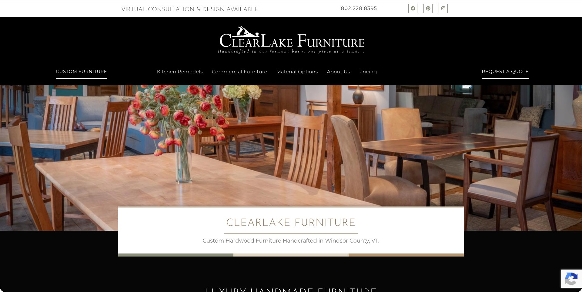
ClearLake’s observed homepage uses a black identity and navigation block above two warm photographs of wooden tables and chairs. A white caption overlaps the images to identify its custom-hardwood offer and Vermont setting. The material, commercial-furniture and pricing routes remain separate from the quotation action. That combination gives a specialist maker a concrete introduction: the visitor can see furniture, understand the kind of business and identify useful information before starting a conversation.
What you can learn
Connect the workshop story to the buying questions a custom piece creates. Keep materials, example work and the quotation process distinct but close enough to follow. An overlapping caption can explain an image effectively when it adds specific context rather than repeating a vague craftsmanship slogan.
Pros
Real furniture photographs make the custom-making offer more tangible than a purely abstract workshop or lifestyle campaign.
Material, pricing and quote routes acknowledge different stages of a considered purchase within the same clear navigation.
Cons & considerations
The tall identity block uses substantial space, so important catalogue and enquiry routes should remain easy to reach on smaller screens.
A room photograph cannot establish exact dimensions, finish options or production timing for a new commissioned piece.
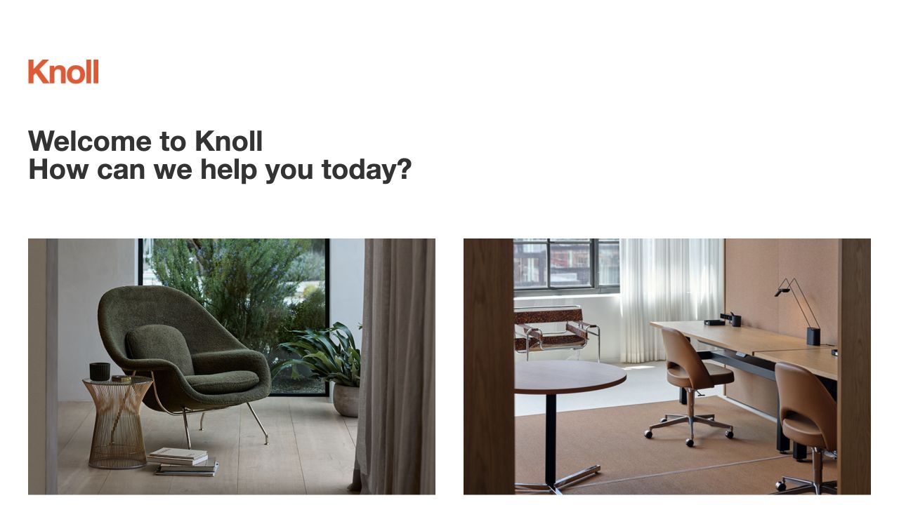
Knoll’s retained opening puts an orange wordmark above two distinct room photographs: a green lounge chair on one side and a desk with office seating on the other. The white space around the greeting makes the furniture imagery feel like the starting point rather than a backdrop for a large promotion. For a manufacturer collection, that pairing establishes breadth while preserving a recognisable design identity.
What you can learn
Use two purposeful contexts to introduce a range, then connect each to the relevant product records. Room photography establishes a setting; dimensions, material choices and specification resources still need their own predictable place rather than being inferred from an attractive interior.
Pros
The paired images communicate different applications without a dense collage of every product family.
A restrained identity and navigation leave furniture, rather than interface decoration, as the main visual subject.
Cons & considerations
If a visitor arrives seeking a particular model, a general room introduction should not replace direct catalogue access.
When products from several ranges share a setting, captions should identify what is actually available from the manufacturer.
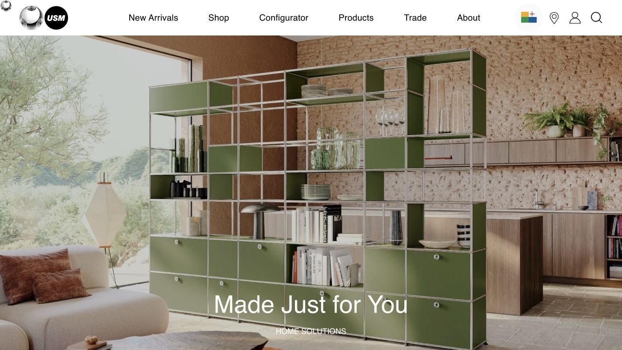
USM’s original capture uses green modular shelving as a strong organising element within a domestic room. A white header separates shopping, configuration, products and trade information, while the lower caption identifies the home-solutions context. Instead of showing dozens of disconnected units, the image makes the system’s visual character understandable in one composed space. The configuration promise is present as a route, not something this screenshot proves works.
What you can learn
Start with a convincing assembled result, then expose the component choices needed to recreate or adapt it. For modular furniture, a useful website connects inspiration to dimensions, finishes and constraints without suggesting that every attractive arrangement is automatically suitable for every room.
Pros
One recognisable shelving arrangement makes a modular system feel concrete rather than abstract.
Separate configuration and trade destinations acknowledge different visitor tasks within the same clear header.
Cons & considerations
A finished-room image alone cannot establish unit dimensions, loading limits or installation requirements for a new arrangement.
If configuration becomes the main route, provide a simpler alternative for visitors who need guidance before choosing components.
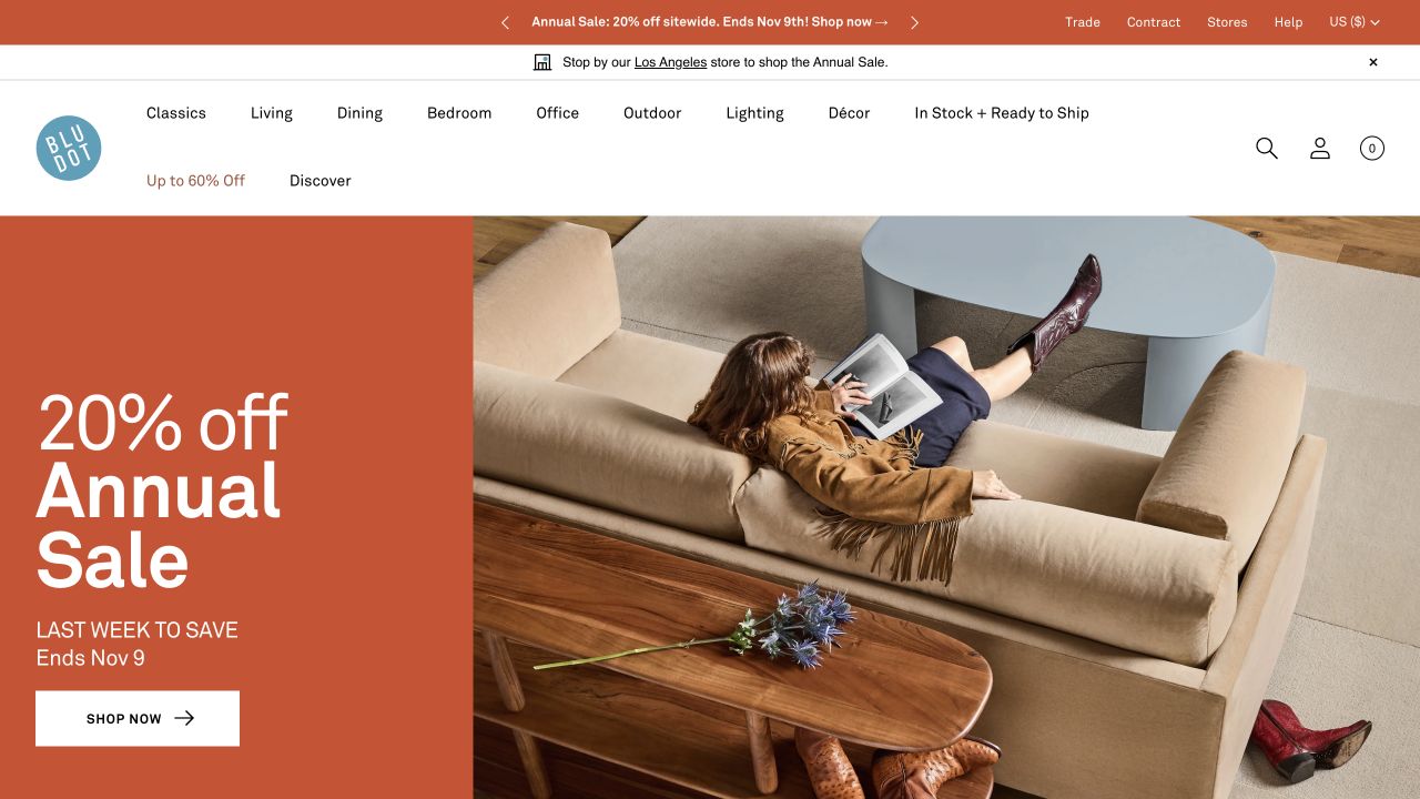
Blu Dot’s retained frame divides attention between a large orange annual-sale panel and an overhead composition of a sofa, person and table. The room categories remain explicit above it, including office and outdoor routes. That gives the campaign a commercial purpose without asking a visitor to recognise every pictured design. For a furniture brand, the useful contrast is between a vivid temporary message and a more durable catalogue structure.
What you can learn
Build promotions on top of a stable product taxonomy rather than rebuilding the entire shopping journey for each event. A manufacturer can use distinctive art direction while still making product families, materials and professional information easy to find once the campaign has done its introductory work.
Pros
The contrasting orange block provides a strong hierarchy without covering the furniture photograph with multiple floating offers.
Room-based categories provide a practical route into a broad range beyond the featured sofa composition.
Cons & considerations
If a campaign dominates the opening, product names and specification routes should remain accessible without deciphering the photograph.
Temporary pricing messages need an owner and end date so an older promotion does not become permanent catalogue information.
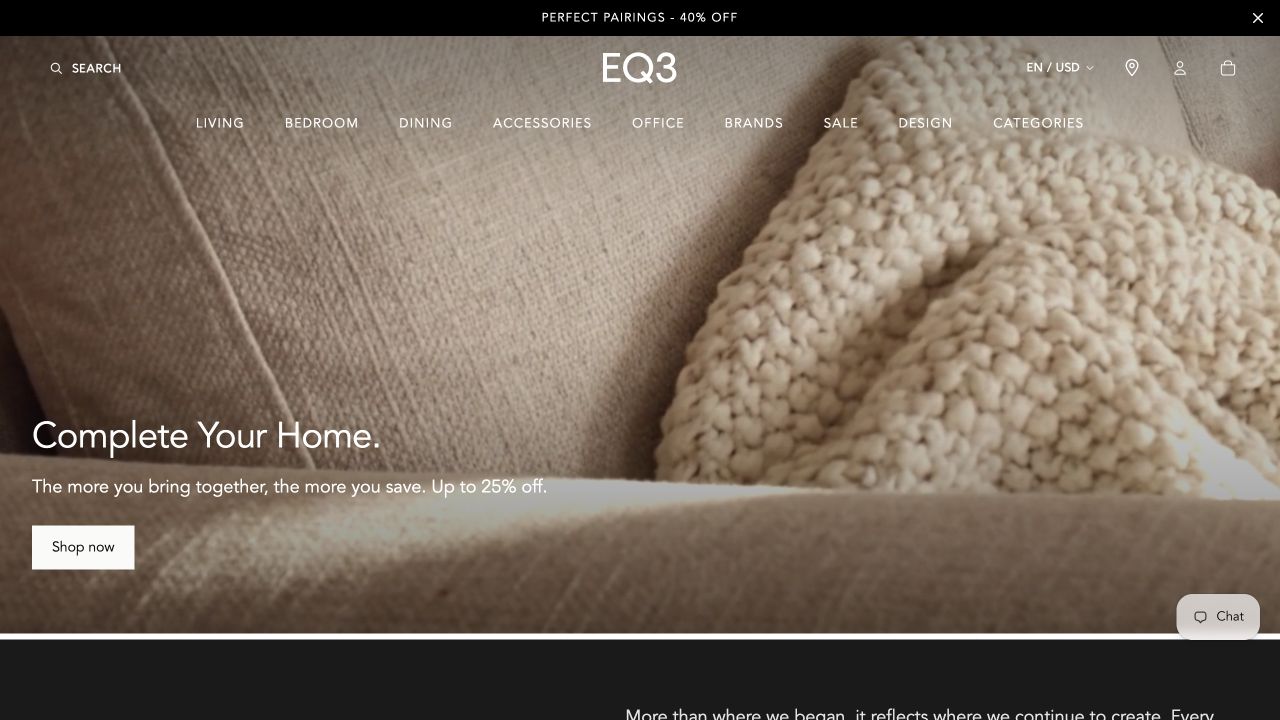
EQ3’s original screenshot gets close to an upholstered surface and a knitted cushion rather than showing a complete sofa. The campaign headline and shopping action sit against that material-focused frame, with a clear product-category header above. It is a useful example of how a maker’s website can introduce the feel of a collection before showing its full geometry. The photograph itself does not establish the fabric composition or an exact orderable configuration.
What you can learn
Treat a texture crop as one layer of the product story, not as a replacement for complete-object views. Link it to clearly named finishes, a representative configuration and reliable measurements so the visual promise can become a properly specified furniture decision.
Pros
The close material view gives upholstery a distinctive visual role instead of reducing the range to small catalogue thumbnails.
The familiar room categories offer another route when a visitor is not interested in the current campaign.
Cons & considerations
A close crop cannot explain the sofa’s overall size, arm profile or relationship to the pictured cushion.
Where fabric appearance matters to an order, provide labelled finish information and samples rather than relying on screen colour.
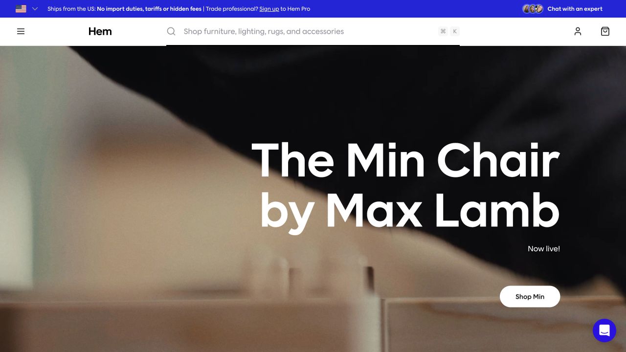
Hem’s retained opening names Max Lamb’s Min Chair over a close process-film frame. The photographed moment does not show an entire chair, so the product name and launch action carry important explanatory weight. A prominent search field sits in the white header, while the blue professional-program strip separates a trade route from the consumer introduction. The result puts collaboration and product discovery alongside one another rather than presenting a purely atmospheric film.
What you can learn
When a launch uses an unfamiliar process or detail image, provide enough naming and context to orient someone who has never encountered the collection. Keep a complete product view and specifications one clear step away rather than making recognition a prerequisite for browsing.
Pros
The product and designer are named directly, giving an otherwise ambiguous closeup a useful catalogue identity.
Prominent search and a distinct professional route accommodate visitors arriving with an existing model or specification task.
Cons & considerations
A process frame should be supported by a complete chair image so shape and proportion do not remain a guessing exercise.
Trade-program promotion can compete with a launch if its purpose and destination are not clearly distinguished from ordinary shopping.
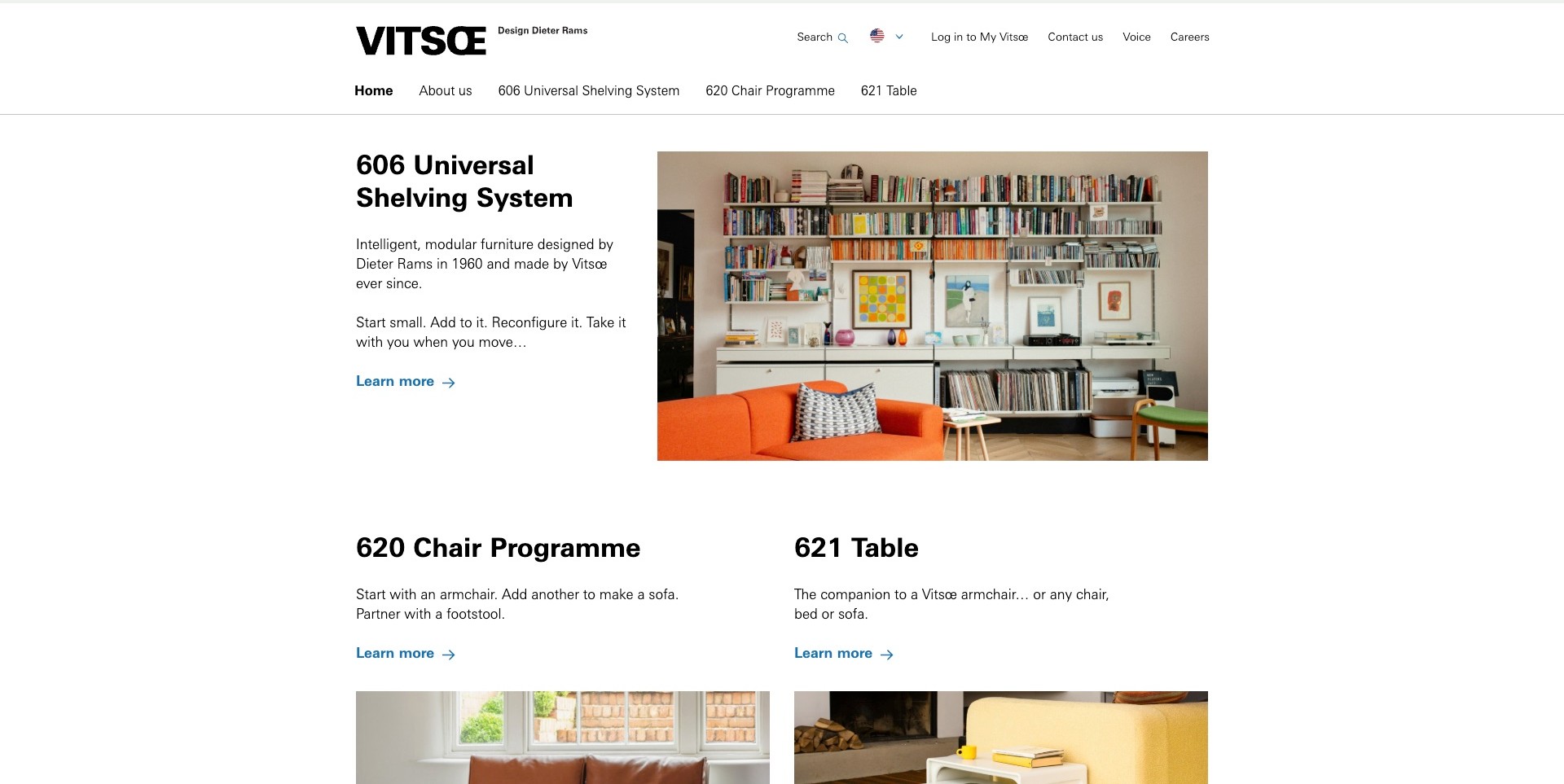
Vitsœ’s observed US homepage gives the 606 shelving system a straightforward introduction: a named product, a short explanation and a photograph of it holding books in a lived-in room. The orange sofa and personal objects supply context without obscuring the shelving. Below, separate headings introduce the chair programme and table. A restrained white grid and blue links make the page feel more like an illustrated product explanation than a rotating lifestyle advertisement. The manufacturer’s few principal systems are visible in the main navigation as well as the body.
What you can learn
Explain a modular offer with a real arrangement and the decisions it enables. Name the system, describe how someone can begin and provide a route to planning assistance. A small, well-organised range does not need to imitate the crowded navigation of a large furniture marketplace.
Pros
The shelving photograph shows everyday use and scale rather than isolating components without context.
Specific product names connect the navigation to the explanatory sections below.
Cons & considerations
A room arrangement cannot substitute for measurements, mounting requirements or a project-specific plan.
A text-led grid may need stronger grouping on narrow screens when images move below their descriptions.
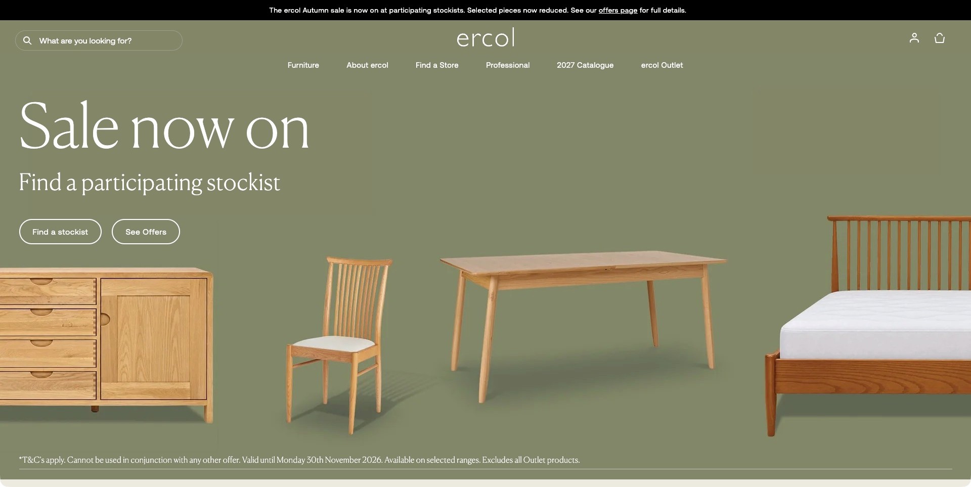
ercol’s observed UK campaign places a wooden cabinet, chair, table and bed against one olive background. The arrangement shows several categories without becoming a collage of unrelated room photographs. Large white promotional type is followed by two distinctly named actions: finding a stockist and viewing offers. Above it, the header retains search, furniture, professional information and a catalogue route. This is a useful manufacturer pattern because the promotion does not pretend that every item is necessarily purchased through the same direct checkout.
What you can learn
Design around the real distribution model. A stockist-led campaign should identify where to investigate participation and terms, while the permanent catalogue remains accessible. Product groupings can communicate the breadth of a collection more clearly than a single atmospheric room that hides what is available.
Pros
Four recognisable furniture types communicate range while retaining a consistent material and background treatment.
Stockist and offer actions separate a location task from learning about the promotion.
Cons & considerations
Time-sensitive sale copy needs a stable replacement when the campaign finishes.
A coordinated arrangement does not show each piece’s dimensions, finish choices or current stockist availability.
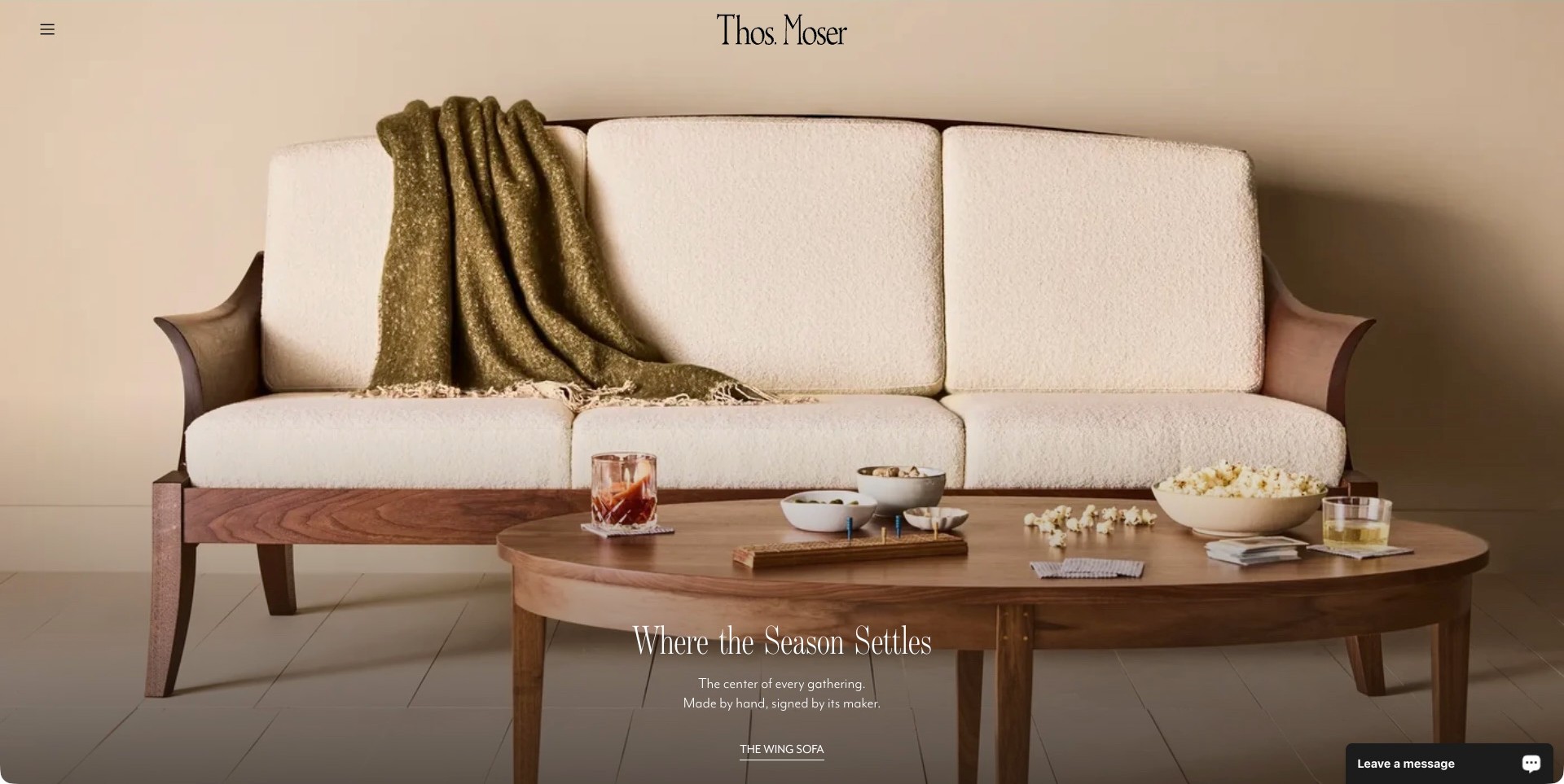
Thos. Moser’s actual homepage frame centres a cream sofa with a visible wooden frame and a rounded wooden coffee table. A green throw, bowls and glasses make the scene feel occupied without concealing the main furniture. The serif wordmark sits above the photograph, while a short seasonal caption and a specific Wing Sofa link sit near its base. The navigation is reduced to a menu icon, so the opening prioritises one product and a domestic mood instead of exposing a large catalogue immediately.
What you can learn
Use styling to explain the object’s place in a room, then name the object clearly. A focused campaign can be effective for a specialist manufacturer when it leads to full photographs, options and ordering information. The atmosphere should begin the conversation rather than carry all the practical explanation.
Pros
The framing keeps the sofa’s wood structure and upholstery visible within a believable living-room setting.
The named product link is more informative than a generic invitation to explore.
Cons & considerations
A collapsed desktop menu can make comparisons between furniture categories less immediate.
Small white copy over a photographic background needs contrast checks across responsive crops and campaign changes.
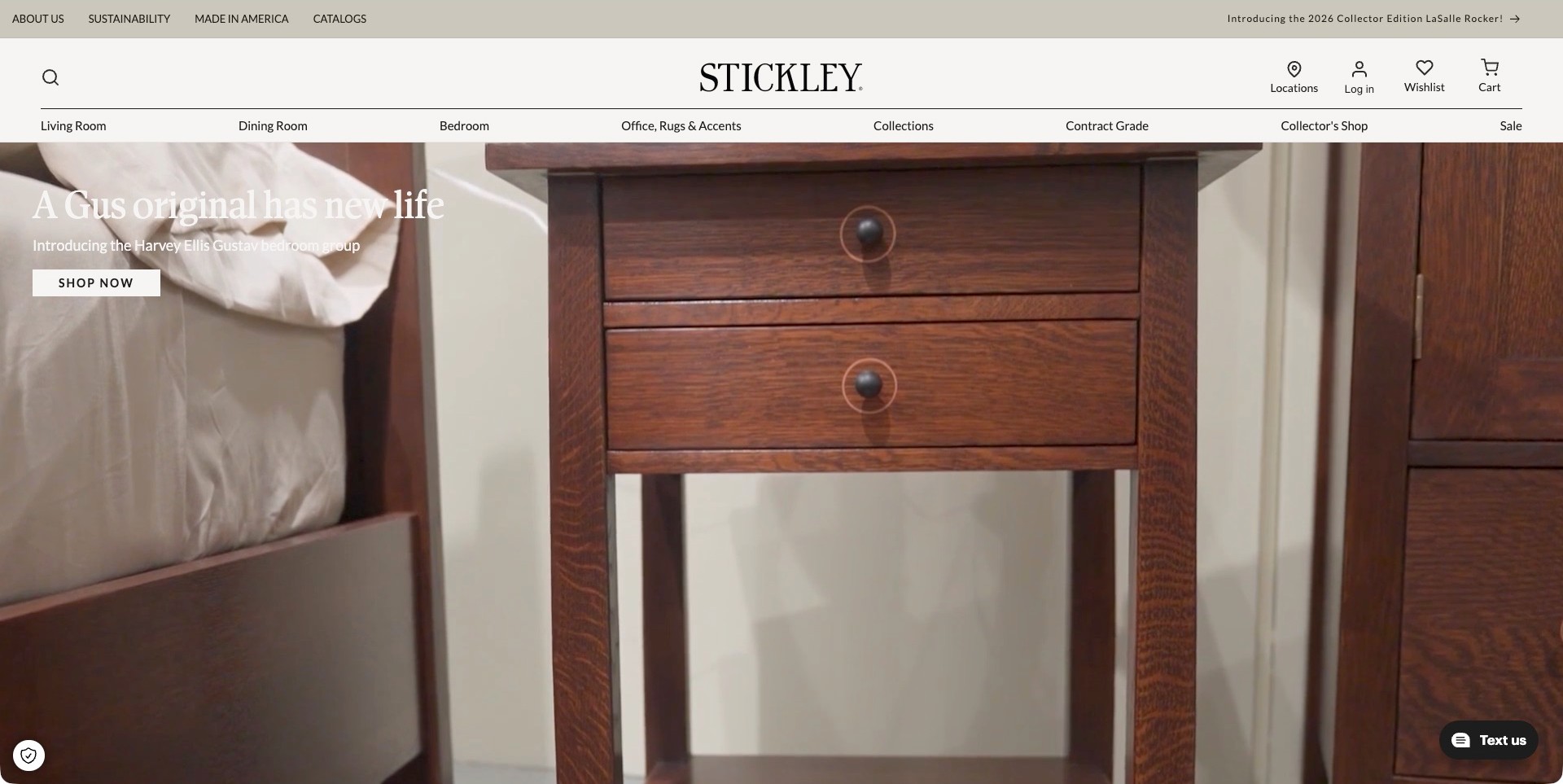
Stickley’s captured campaign shows a bedroom cabinet and drawers closely enough to make the wood tone and round handles prominent beside the bedding. A white headline introduces the Harvey Ellis Gustav bedroom group, followed by a shopping action. The identity header and room categories remain separate above the film. Living, dining, bedroom, office and collection routes make it possible to leave the campaign directly. The close crop creates interest in the material, but the collection name supplies the context that the image alone would not provide.
What you can learn
Pair a close-up with enough naming to explain what the visitor is seeing. Material detail can introduce a collection, but it should lead to full-object photographs, dimensions and finish choices. Keep established room categories visible when a campaign highlights only one small part of the range.
Pros
The campaign identifies a particular bedroom group rather than relying on an anonymous craftsmanship slogan.
Visible room and collection routes support browsing beyond the featured cabinet.
Cons & considerations
Close-up imagery alone may leave a first-time visitor unsure of the complete furniture shape.
Text placed on a changing film needs careful contrast checks across its actual frames and screen sizes.
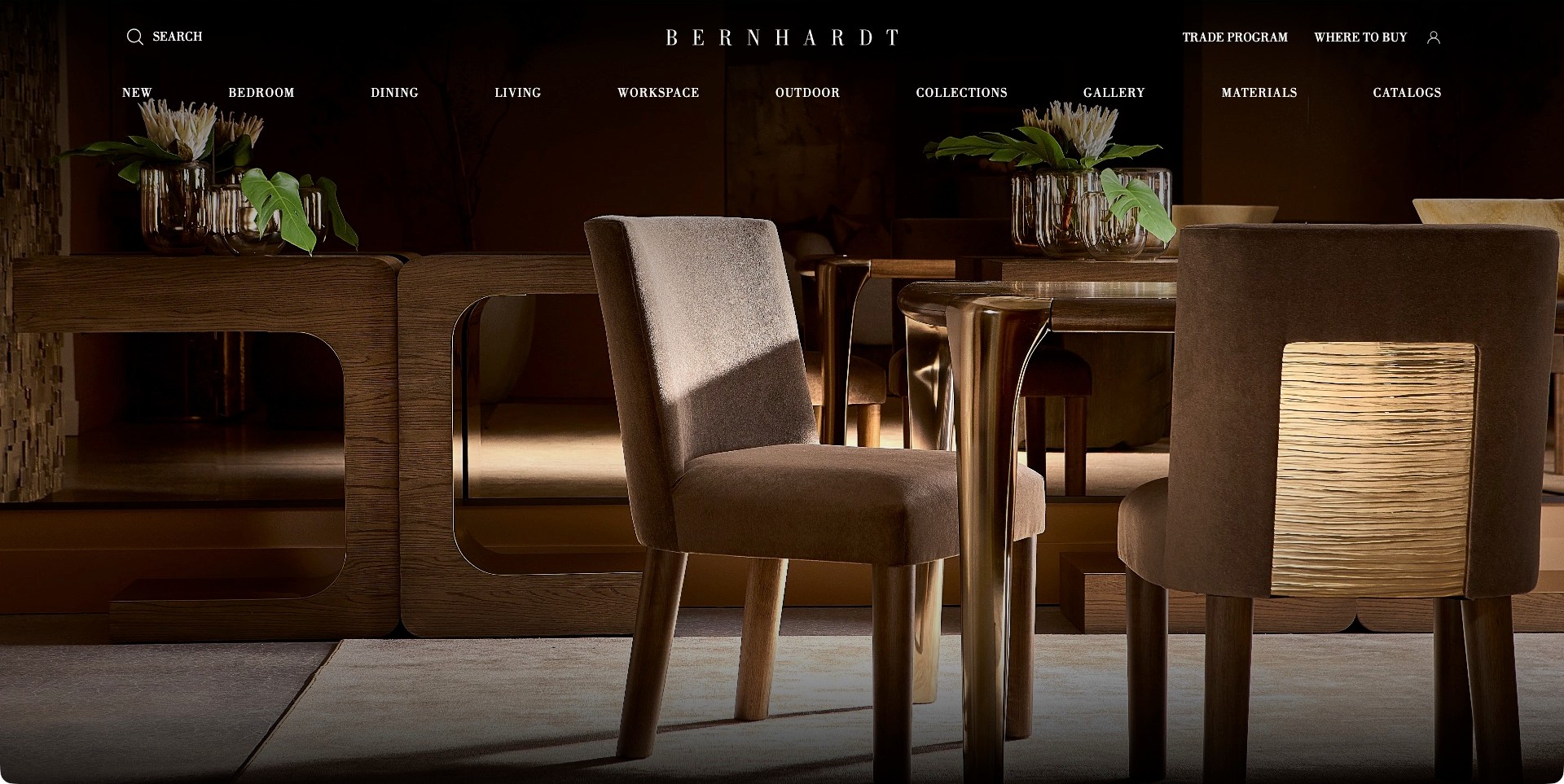
Bernhardt’s observed opening is almost entirely a dark dining-room photograph. Upholstered chairs, a table, a sideboard and large vases create a coordinated setting, while white typography carries the identity and navigation directly over the image. The first screen names bedroom, dining, living, workspace and outdoor categories, alongside materials, catalogues, trade and buying information. There is no central campaign headline or obvious hero button in this frame. The useful pattern is a room-scale introduction with several catalogue routes immediately available.
What you can learn
If a room image does most of the introductory work, make the navigation unusually clear. Visitors should be able to move from the atmosphere to a product family, material reference or buying route without guessing which photographed object is interactive. Name the collection near the image when that connection is important.
Pros
A coordinated room demonstrates relationships between several furniture pieces rather than presenting an unrelated image collage.
Trade, materials and catalogue routes acknowledge research tasks beyond general inspiration.
Cons & considerations
Without a product caption, identifying the exact pieces shown may require extra exploration.
Navigation placed directly over photography needs reliable contrast when campaign images or responsive crops change.
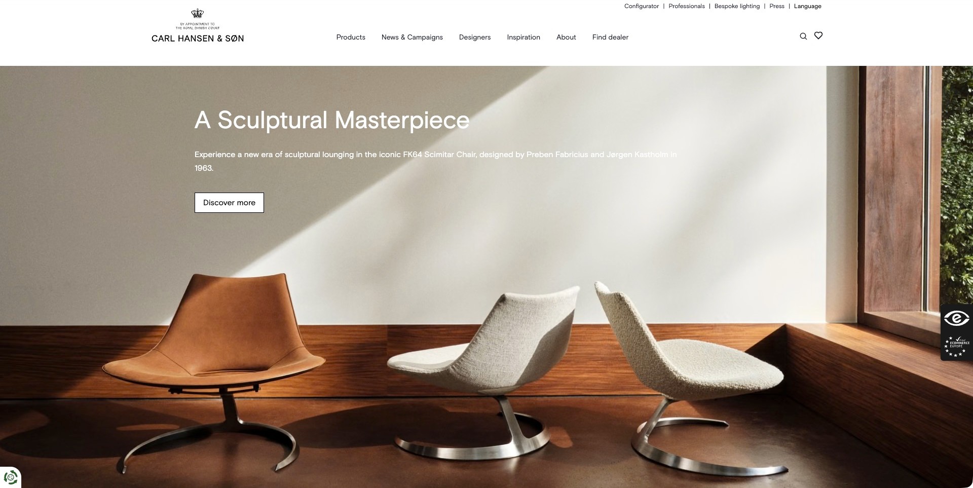
Carl Hansen & Søn’s captured homepage shows three Scimitar chairs in a sunlit room with a pale wall and wooden floor. The campaign names the chair and its designers above a discovery action, while a white header separates products, designers, inspiration and dealer information. A utility row includes a configurator and professional resources. That structure is useful for a manufacturer serving individual buyers and project teams: the sculptural photograph establishes interest, but the navigation signals different ways to investigate or purchase the range.
What you can learn
Give a visually distinctive object a precise identity and a focused next step. Then separate inspiration, configuration and dealer information rather than assuming every visitor is ready for the same enquiry. A beautiful chair image should begin a specification journey, not replace one.
Pros
Multiple views and surfaces make the featured chair’s overall form easier to understand than a single abstract detail.
Dealer, professional and configurator labels distinguish useful tasks within the same header.
Cons & considerations
Long campaign text over a pale image needs testing for contrast and line length on smaller screens.
The photograph does not establish available upholstery, dimensions or suitability for a particular commercial installation.
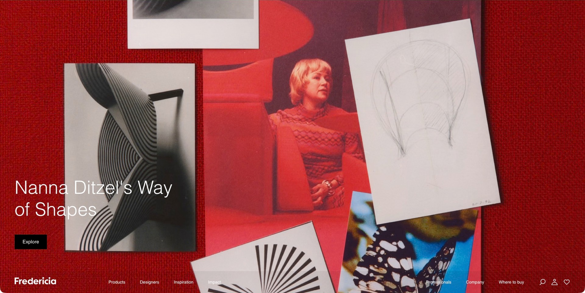
Fredericia’s captured homepage fills the screen with a red collage for a Nanna Ditzel story. A portrait, a chair photograph, a pencil drawing and graphic shapes make the subject tangible before the visitor opens the article. The campaign title and a black exploration button sit at the lower left; the brand and product navigation run along the bottom of this composition. It is an unusually editorial opening for a furniture manufacturer, giving design context more space than a product grid or seasonal price message.
What you can learn
An archive-led story needs concrete visual references, not just a designer’s name. Connect a sketch, object and person through a clear editorial destination, while keeping the route to current products visible. The story should help someone understand the collection rather than force them to read it before browsing.
Pros
A consistent red surface ties several different source images into one recognisable campaign.
Designer, product and professional routes remain available alongside the editorial entrance.
Cons & considerations
Bottom-positioned primary navigation may be less familiar to visitors looking for categories immediately.
An archival collage cannot establish current product specifications or availability without a separate catalogue route.
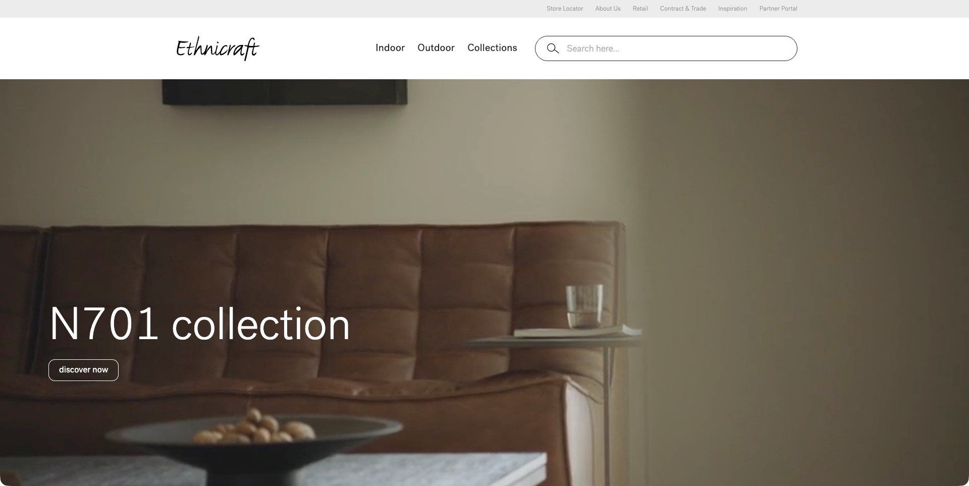
Ethnicraft’s observed US homepage names the N701 collection over a close room-scale view of a brown sofa and side table. The restrained caption has one outlined discovery action, leaving the product image to establish the mood. A broad white header supplies the practical counterweight: indoor and outdoor categories, collections and a prominently sized search field. Store, retail and contract information occupies a separate utility row. That division makes the opening useful to someone arriving for one known item as well as a visitor exploring a collection.
What you can learn
Separate the campaign from the tools people use to find things. A manufacturer with domestic and project audiences can keep the hero focused while making search, category browsing and trade information permanent. Collection names should remain connected to the items, dimensions and finish choices that turn inspiration into a viable shortlist.
Pros
The named collection and single action avoid competing promotional messages in the photograph.
A prominent search field offers a direct alternative to browsing the campaign.
Cons & considerations
A close sofa frame may need a full-object view quickly after the first click.
Regional catalogues should make currency, dealer coverage and availability clear before visitors compare products.
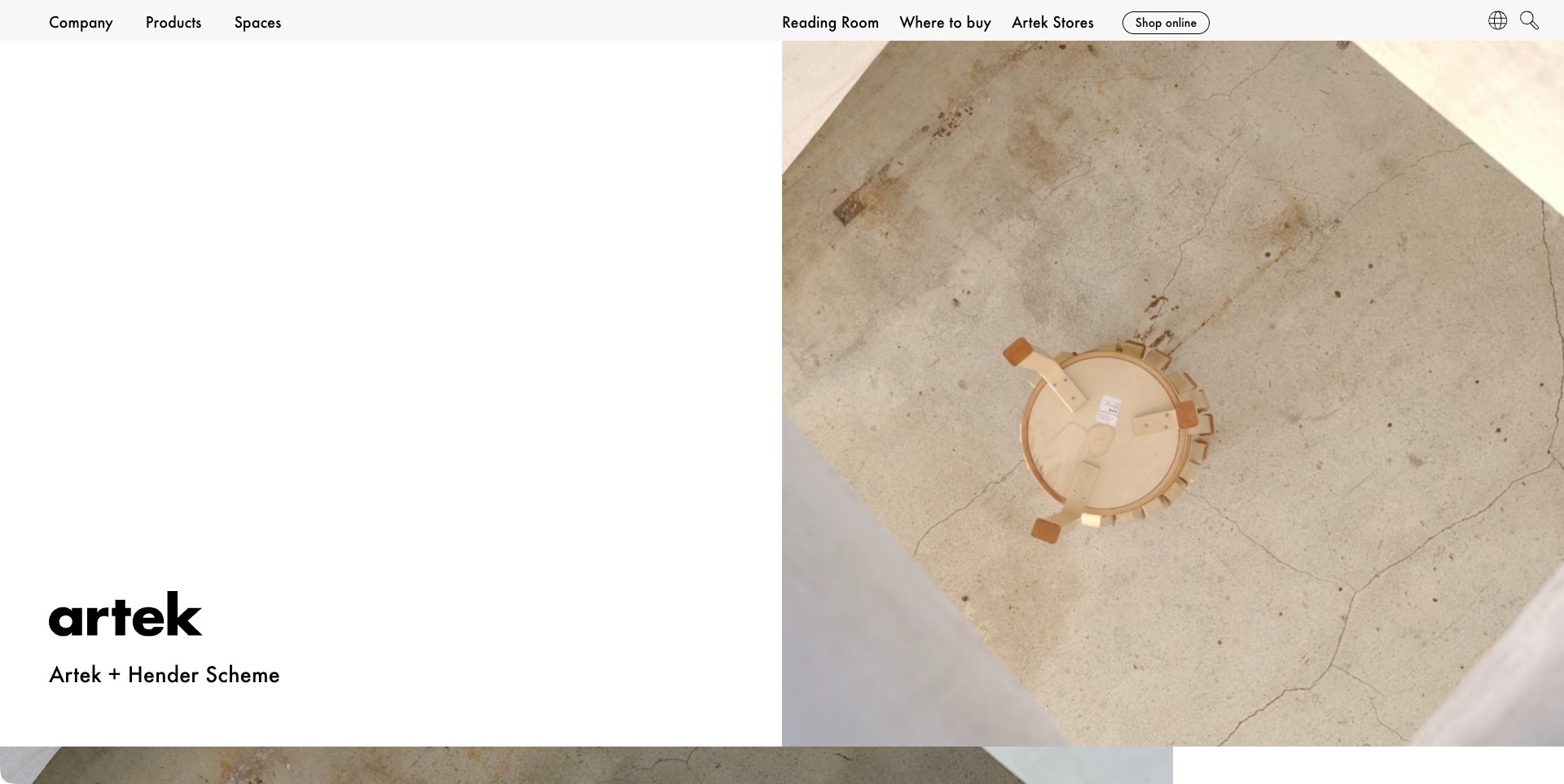
Artek’s captured homepage divides the opening into a white identity field and an overhead photograph of the underside of a wooden stool. The collaboration title sits with the black wordmark near the base of the left column, while the right image gives the object a deliberately unfamiliar perspective. A compact header distinguishes company, products and spaces from reading, store and shopping routes. The result feels like an exhibition introduction rather than a conventional furniture sale, using one image and label to invite further investigation.
What you can learn
An unusual product angle can create interest when the caption makes its subject identifiable. Use that moment as the entrance to a fuller explanation of the collaboration, complete-object photographs and practical information. Keep editorial reading, product browsing and shopping visibly separate so visitors can choose their own level of detail.
Pros
The two-column composition gives the campaign a strong identity without several competing banners.
Reading, product and buying destinations are individually named in the navigation.
Cons & considerations
An underside view alone may not explain the finished object to a first-time visitor.
Large areas of whitespace need responsive testing so useful context is not pushed too far below the image.
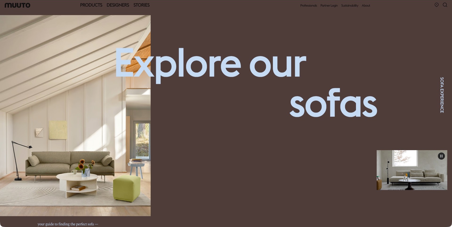
Muuto’s observed opening combines a sunlit living-room photograph with a large brown field and pale blue typography inviting visitors into the sofa range. The image shows a sofa, table, lamp and stool together rather than treating seating as an isolated cut-out. A small integrated film at the lower right has a visible pause control, adding another view without replacing the larger composition. Products, designers and stories sit in the main header, with professional and partner information in a separate group.
What you can learn
A category entrance can be distinctive without losing its place in the catalogue. Use a room to communicate relationships between pieces, then provide clear product information after the editorial introduction. When film adds a second perspective, keep it controllable and ensure the page still communicates its purpose in a single static frame.
Pros
Room-scale photography makes the sofa’s relationship to surrounding furniture easy to study.
The pause control and separate professional navigation acknowledge different viewing and research needs.
Cons & considerations
Oversized typography can compete with the actual furniture if responsive crops are not carefully chosen.
A campaign room does not identify every photographed piece or establish its dimensions and finish options.
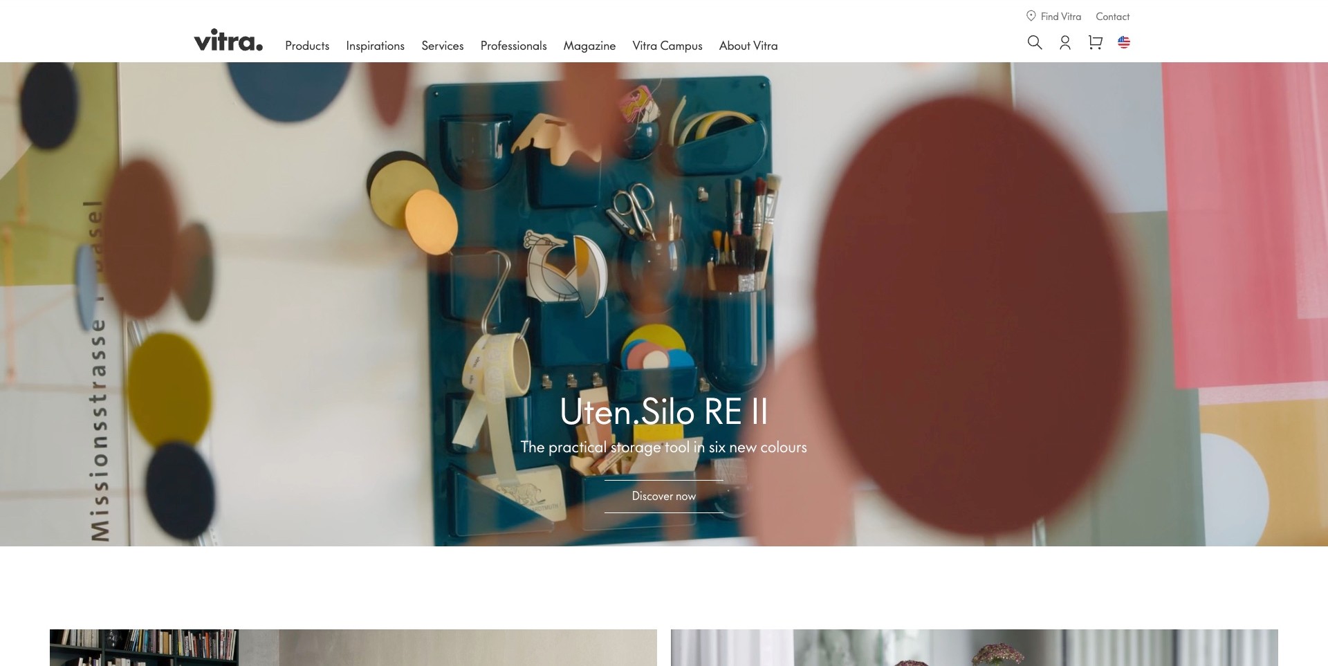
Vitra’s observed US opening features a wall-mounted organiser filled with everyday tools, set behind soft foreground shapes in a colourful campaign film. The centred caption names the storage product and gives it a single discovery action. A compact white header separates products, inspirations, services and professional information from the magazine and campus. This is not a photograph of a complete furniture setting: the actual frame uses a smaller accessory to introduce the brand’s visual world, while the catalogue remains one plainly named navigation choice.
What you can learn
A broad manufacturer does not need to show its entire range in the first image. A named object can introduce an interesting story. Keep the commercial, professional and cultural destinations distinct so that a visitor looking for a chair is not forced through an unrelated editorial journey.
Pros
A named product caption adds useful context to an otherwise highly atmospheric film frame.
The header gives professional services and editorial reading different, recognisable labels.
Cons & considerations
Foreground blur can reduce immediate product clarity if it persists through several campaign frames.
An accessory-led opening needs a quick route to the wider furniture range for visitors arriving with a specific brief.
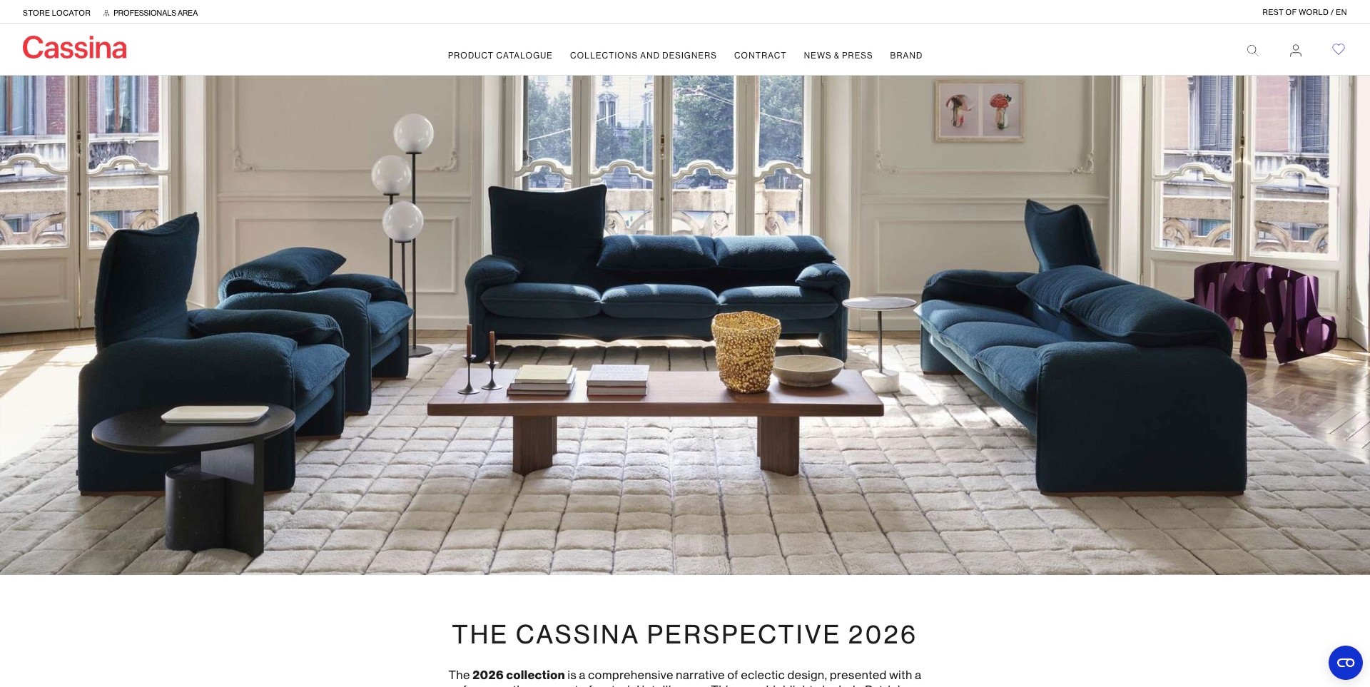
Cassina’s captured international homepage presents blue seating around a low wooden table in a bright, detailed interior. The photograph keeps the different furniture shapes visible without adding a large promotional headline over the cushions. A red wordmark and white navigation band sit above it, and a collection heading begins immediately below. Product catalogue, collections and designers, contract information and brand material have separate routes. The opening makes a room-scale impression while signalling that more structured collection information follows the image.
What you can learn
A complete setting can introduce how pieces work together, but it should not be the only source of product information. Name the collection close to the photograph and retain clear routes to individual objects, professional resources and buying locations. The room begins comparison; it does not define a complete product bundle.
Pros
The bright room and contrasting upholstery keep the main seating shapes distinct from the background.
Collection and contract routes are named separately instead of sharing one vague discovery link.
Cons & considerations
A wide photograph needs deliberate mobile crops so important furniture is not lost at the edges.
Visitors still need item-level names, dimensions and finish information beyond the styled room.
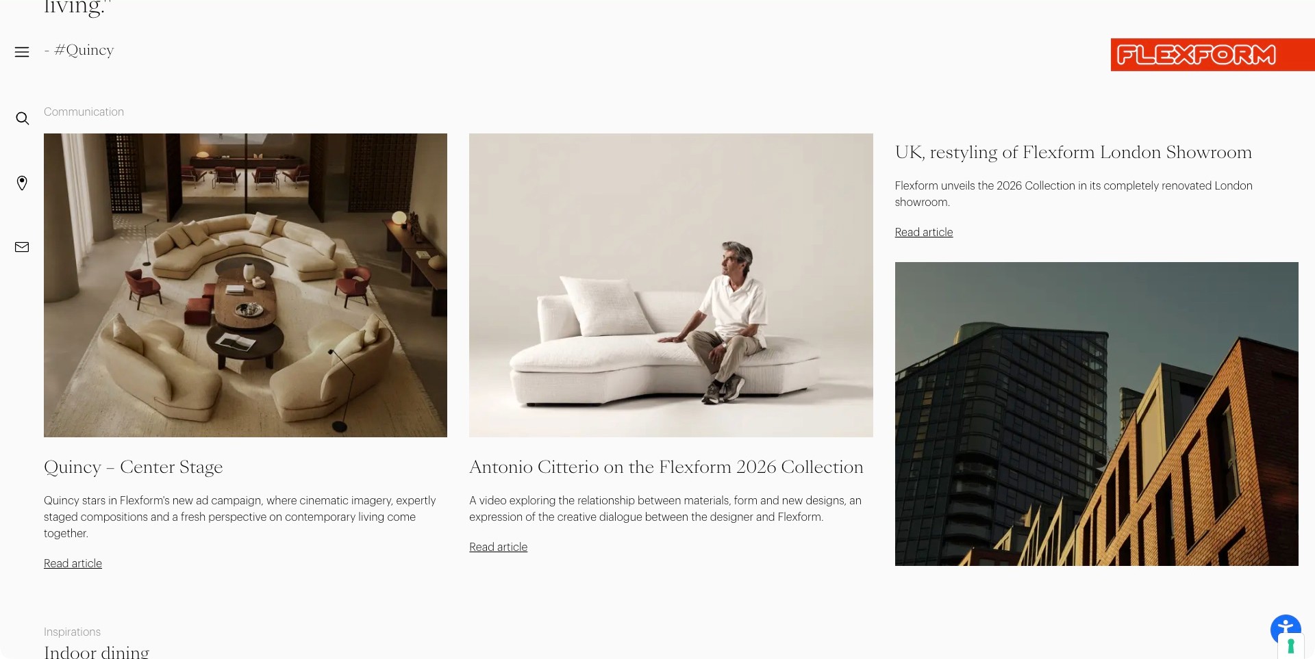
The accepted Flexform view is an ordinary scrolled homepage section, not its opening film. Three editorial columns show a room arranged around curved sofas, a designer seated on a pale sofa, and the exterior of a London showroom building. Each story has its own heading, explanatory text and article link. A slim icon rail and the red identity remain visible. This provides a useful manufacturer-site pattern: product imagery, creative context and a physical destination receive distinct editorial treatments instead of being compressed into one general brand statement.
What you can learn
Name the subject and purpose of each story. A manufacturer can discuss a collection, a designer and a showroom without implying that every article is a product specification. Keep a dependable catalogue route alongside editorial content so someone looking for dimensions or a particular model can continue directly.
Pros
Three different story types are separated through a repeatable column structure.
Captions and introductory text explain why each image is present.
Cons & considerations
Repeated article-link labels need their surrounding headings to remain meaningful.
An editorial grid should not make technical documents or product discovery difficult to locate.
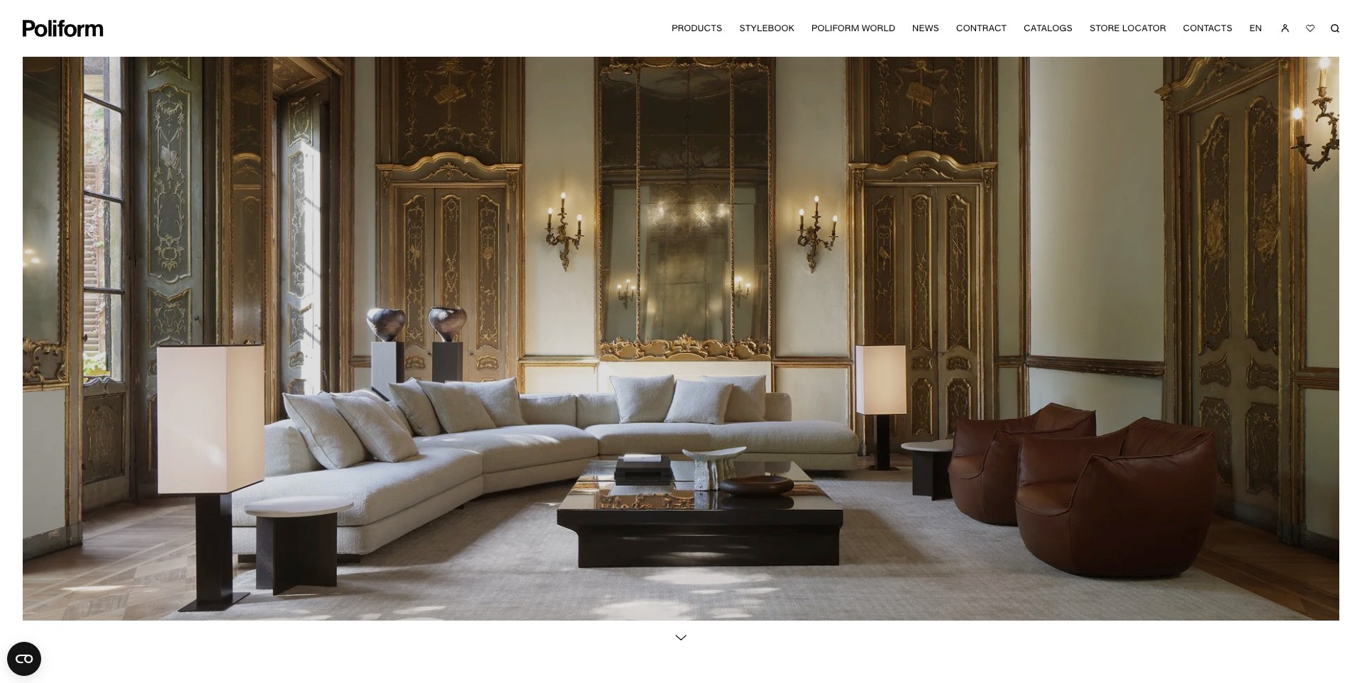
Poliform’s observed opening sets a pale curved sofa, brown armchairs and a low black table inside an ornate room. The contrast between contemporary furniture and the decorative architecture creates the visual argument without a large headline across the scene. A compact white header holds product, stylebook, contract, catalogue and store information, while a small downward indicator suggests more content below. The campaign is useful to study as a room-scale presentation: the furniture is shown in relationship to other objects rather than as a sequence of isolated product cards.
What you can learn
A coordinated interior can communicate a collection’s range, but the next step should make individual pieces identifiable. Keep product research, inspiration and project information distinct. Visitors who admire the room still need dimensions, finish options and a buying route before they can translate that impression into their own space.
Pros
Contrasting upholstery, timber and dark tables keep several furniture types distinguishable within one composition.
Catalogue and contract routes are visible without opening a promotional overlay.
Cons & considerations
A photograph without nearby item labels can make exact product identification slower.
Wide room imagery needs considered mobile crops so the important pieces remain recognisable.
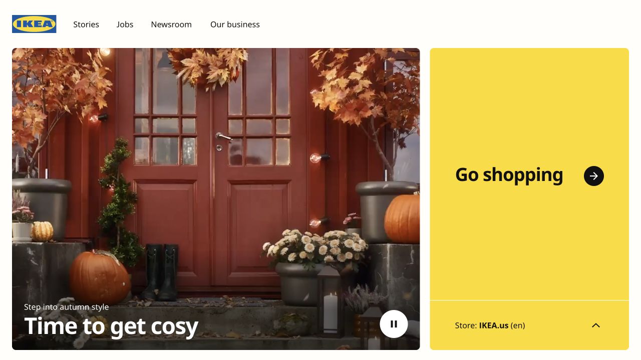
IKEA’s retained global homepage capture pairs an autumn doorway scene with an unmistakable yellow shopping panel. The photograph is seasonal home styling, not a furniture production image. A compact header separates stories, jobs, newsroom and business information, while the shopping panel identifies the selected regional store. The distinction is useful for a furniture brand with global editorial and local shopping destinations. Current official business pages separately explain its range-development, supply and manufacturing roles; the global gateway should not be mistaken for one factory or a single national retailer.
What you can learn
Make the boundary between brand information and local shopping explicit. A visitor should know whether they are reading a global story or entering a catalogue with regional availability and terms. Keep the selected destination visible rather than silently moving them into a market they did not choose.
Pros
A highly contrasting shopping panel gives the regional buying route a clear visual role.
Business and editorial navigation remain separate from the store destination.
Cons & considerations
A seasonal doorway image offers little immediate detail about the furniture range.
Regional handoffs need clear language and market selection so a familiar brand does not conceal a changed catalogue context.
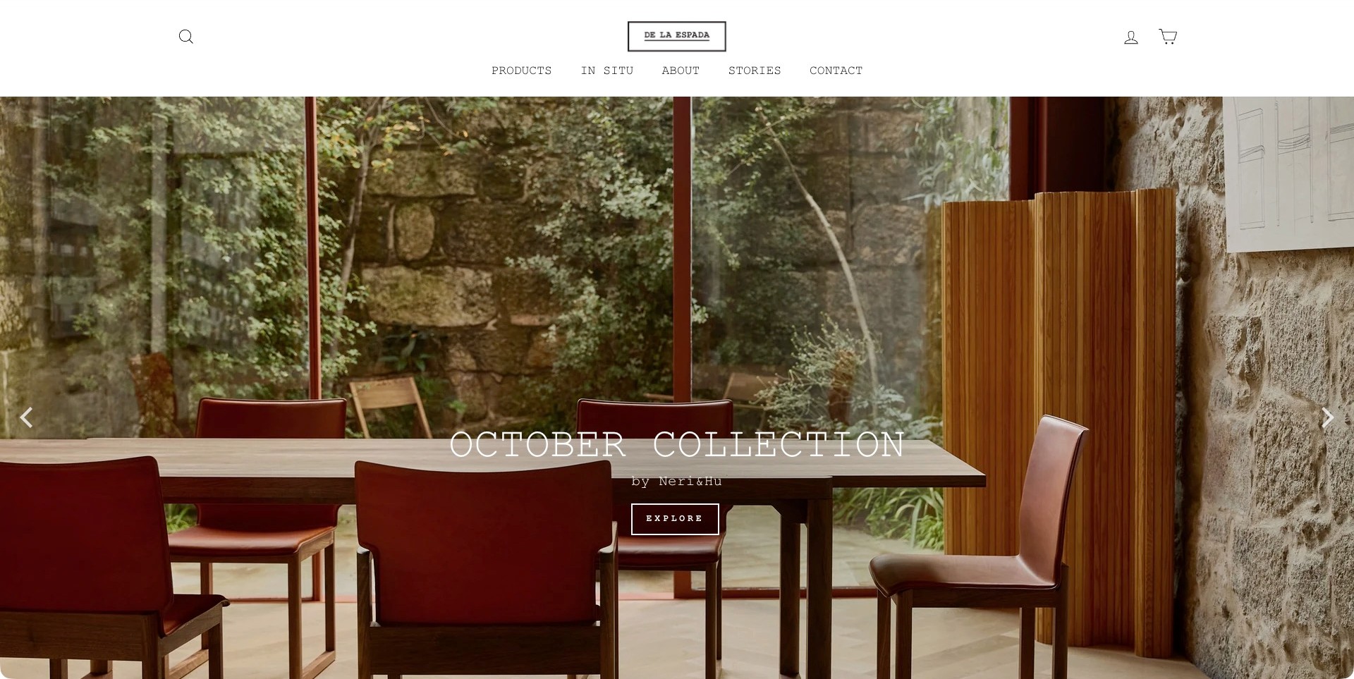
De La Espada’s observed US store opens on a wooden dining table and reddish chairs in a room framed by stone, glass and greenery. A slatted wooden screen repeats the material language of the furniture without hiding its main forms. The caption names the October Collection and its designers, with one exploration action. A restrained white header separates products, in-situ examples, company information, stories and contact. The composition gives the collection a specific setting rather than presenting an interchangeable luxury interior.
What you can learn
Name the furniture and the collection close to the room photograph. An architectural setting is useful when it helps someone understand scale and material relationships, but it should lead to individual objects and practical options. Keep stories and product browsing separate so readers can choose how deeply to investigate.
Pros
The room photograph gives several related pieces a shared context without concealing the dining arrangement.
Specific collection and designer labels make the campaign easier to follow than an anonymous lifestyle message.
Cons & considerations
A fixed room arrangement does not communicate all available sizes or finishes.
The regional store should keep delivery coverage and buying information clear as visitors move beyond the campaign.
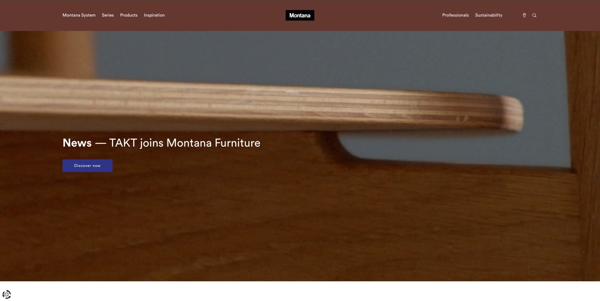
Montana’s captured homepage uses a close wooden-furniture detail behind a news announcement about TAKT joining Montana Furniture. The image is intentionally tight rather than a complete chair or storage installation. A blue discovery button provides the immediate destination, while the brown header keeps the Montana System, series, products and inspiration visible. Professional information occupies a separate position at the right. This is a useful example of a manufacturer treating business or collection news as a campaign while retaining stable product-research routes.
What you can learn
Make news discoverable without making it the only way into the range. Keep established product names and system information available while a temporary campaign runs. If the opening photograph is a material detail, connect it to full-object imagery and a plain explanation of what the announcement changes for visitors.
Pros
The strong brown and blue palette creates a recognisable campaign without several competing banners.
System, series and product navigation remain visible above the temporary news story.
Cons & considerations
A close material view alone may not identify a usable furniture object.
News about brand relationships needs clear follow-through so visitors understand which products and services are actually available.
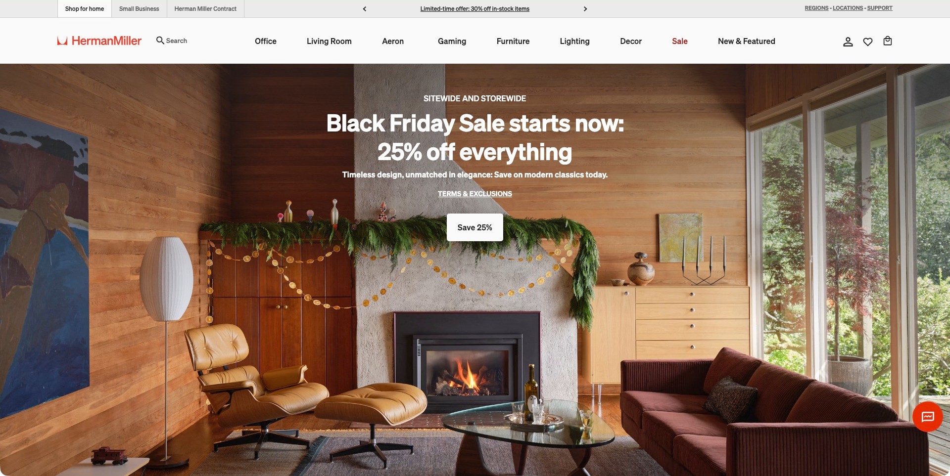
Herman Miller’s observed store campaign shows a wood-panelled living room with a lounge chair, ottoman, sofa and storage around a fireplace. A large seasonal offer sits over the scene, but the two-level header still distinguishes home shopping, small business and contract audiences. Product routes include office, living room, gaming and lighting rather than treating the brand as one famous chair. The useful manufacturer-store lesson is the relationship between a broad room composition and a stable, clearly named catalogue.
What you can learn
A campaign can introduce several furniture types while the header explains how different customers buy. Keep audience labels separate from product categories, and retain direct access to specifications and project information after the promotion. A discount message should not become the only description of the manufacturer’s offer.
Pros
Audience and category labels provide different, understandable ways to enter the furniture range.
A coordinated room shows relationships between seating, storage and lighting without a separate image collage.
Cons & considerations
Large promotional copy can overshadow the product information a first-time visitor needs.
A styled living room does not establish the dimensions, finishes or current availability of its individual pieces.
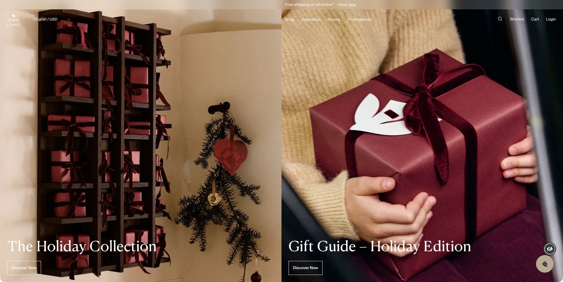
ferm LIVING’s observed US homepage divides the opening between a holiday collection and a gift guide. Dark wooden shelving with red boxes appears on the left; a person holding a wrapped red gift fills the right. These are seasonal homewares images rather than a furniture room or workshop. Matching serif captions and discovery actions connect the two panels, while a restrained transparent header retains shopping, inspiration, rooms and professional routes. The furniture-brand lesson is how a temporary campaign can remain visually coherent with the wider catalogue.
What you can learn
Separate different seasonal tasks instead of placing every message into one banner. Retain stable room and product routes for visitors whose needs are unrelated to the current campaign. A homewares-led opening should still make furniture categories, dimensions and buying information easy to reach.
Pros
The repeated red and warm neutral palette makes two different photographs feel like one campaign.
Room and professional routes remain available beyond the seasonal shopping invitations.
Cons & considerations
Gift photography alone does not explain the furniture range to a new visitor.
Text over two photographic panels needs careful mobile grouping and contrast testing.
Kegan is a freelance web designer and developer with 15+ years of experience helping businesses turn complicated website requirements into clear, maintainable digital experiences. He works directly with clients from planning and design through development, launch, and ongoing support.
For furniture manufacturer website design, his development approach focuses on clear collection and product records, useful dimensions and materials, properly credited designers, specification and dealer discovery, and carefully scoped trade enquiries. The scope can be a targeted improvement or a complete custom build, with responsive layouts, thoughtful content structure, and integrations chosen around the people using and maintaining the site.
Show 3 other furniture manufacturer website designersHide other furniture manufacturer website designers
Plan a manufacturer website around the product lifecycle
Begin with a product-information inventory
List product families before drawing page templates. Record model names, dimensions, variants, material options, assembly requirements, care instructions and the teams responsible for updating each field. Identify which facts belong to a family and which change at the individual configuration level. A sofa collection may share construction information while each module has different dimensions and carton requirements. Repeating everything in free-form copy makes later changes expensive and creates conflicting answers.
Decide how discontinued products remain useful. A person searching for replacement glides or an old assembly sheet should not reach a dead end because the product is no longer sold. An archive page can keep the original identity and support documents while clearly stating that ordering has ended. Distinguish repair enquiries from new sales so a support request reaches an appropriate person without becoming a misleading lead.
Create a photographic sequence rather than one oversized hero
Plan an image set that answers a sequence of questions: what is it, how large is it, how does it behave in a room and what makes its construction distinctive? Begin with a useful complete view, then add context, detail and alternative angles. Label unusual finishes and accessories in captions. If a lifestyle photograph includes another manufacturer’s lighting or props, avoid implying those products are included with the furniture.
Process photographs can be particularly effective for a maker, provided captions identify the actual activity. Show a joint being assembled or a fabric being cut instead of making an unsupported claim about an entire supply chain. Videos should have meaningful static alternatives, and animation should not prevent access to product names or shopping links. An atmospheric film can contribute to the story without becoming the only way to discover the range.
Define a manageable custom-order journey
Before adding a bespoke enquiry form, decide which choices the business can realistically accept. Explain the starting point: adapting an existing design, commissioning a new piece or selecting from an established material palette. Ask for the room, approximate dimensions, intended use and relevant project timing, but do not demand that a visitor design the entire piece in a text field. Accepting an enquiry should not be presented as accepting an order.
Tell people what happens after they send the brief. Acknowledgement, consultation, drawings, quotation and approval are different stages. State when a price becomes firm and where final specifications are confirmed, using the business’s actual process. Avoid a generic instant-price promise if a craftsperson must assess feasibility. If attachments are accepted, explain useful file types and ask people not to include unnecessary private information.
Treat professional resources as maintained products
Architects and interior designers benefit from predictable downloads: dimensioned drawings, finish schedules, care documents, installation information and appropriately labelled digital models. Keep a version date and units close to each file. A model that is visually attractive but scaled incorrectly is a liability for a project team. Ask the people who use these resources which formats matter before investing in a large download library.
Do not confuse a materials narrative with proof of a certification. Where an external certification is relevant, identify the actual product scope, issuing organisation and supporting record. A badge on one chair does not establish the status of every product on the website. Where evidence is unavailable, describe the material or process plainly and leave the unverified claim out. This guide evaluates clarity, not technical or environmental compliance.
Explain delivery without hiding it until checkout
Furniture raises practical access questions that small parcels do not. Explain delivery territories, assembly options, packaging removal and the difference between a general estimate and a confirmed appointment. Ask about stairs, lifts and narrow entrances at an appropriate stage. Provide packaged as well as assembled dimensions when the business has reliable figures. A beautiful product page cannot compensate for an item that does not fit through a customer’s door.
Keep lead-time language precise. Made to order, in stock, available for dispatch and arriving at a warehouse describe different states. A generic delivery banner should not override a configuration-specific estimate. If customers order through dealers, say who confirms price, delivery and aftercare. Link the relevant policy in context rather than expecting everyone to decode a long footer before asking a useful question.
Design for continued ownership, not only first purchase
A manufacturer can build an especially useful website by helping people maintain furniture they already own. Connect each material to an appropriate care guide, explain how to identify a product and provide a route for replacement components when available. Keep instructions specific: advice for an oiled finish may not suit a lacquered one. Do not make a general promise of repairability when the service depends on the model or location.
Plan editorial ownership after launch. Assign someone to retiring promotions, updating specification files, checking dealer links and reviewing forms. Measure whether visitors reach the information they need before judging success only by enquiries. A lower volume of better-specified quotation requests can be more useful than a larger pile of ambiguous messages. Establish the business goal first, then choose measurements that actually reflect that goal.
The editing job behind the design
Choose technology around a reliable furniture catalogue
Use structured product data for repeatable specifications, variant relationships and downloadable resources. The appropriate platform depends on the size of the range, who maintains it and whether sales happen online, through dealers or by quotation. A small workshop may need an excellent catalogue and enquiry process rather than a complex checkout.
Before commissioning a3D configurator, test a simpler flow with labelled images, dimension diagrams and a sample request. Interactive tools need maintained rules, realistic combinations and a useful fallback. Their presence alone does not establish that an order can be manufactured or delivered as shown.
Visible technology labels in this collection are limited to supported public evidence. A frontend asset cannot reveal every back-office manufacturing, inventory or order-management system. Do not select a platform simply because a brand you admire appears to use it; identify your operational requirements and a sustainable maintenance plan first.
Our WordPress website examples offer a separate look at publishing approaches. A visible platform label is evidence for that named page, not a guarantee that the same system will suit your requirements.
Before the public launch
A furniture manufacturer website brief should answer these questions
Which product families and exact configurations will be published at launch?
Which collections are manufactured in-house, and which use production partners?
Does each current model have accurate dimensions, units and finish descriptions?
Can a visitor identify the pictured size and configuration without guessing?
Are material samples available, and is that request separate from a purchase?
Are retail, trade, dealer and custom-project actions clearly distinguished?
Which technical files need version dates and a named internal owner?
How are discontinued models, spare parts and historical care guides handled?
Does delivery information distinguish dispatch timing from arrival estimates?
Are configurable options actually manufacturable in the displayed combinations?
Can important product facts be read without interacting with animation or video?
Who checks catalogue accuracy, broken downloads and expired campaigns after launch?
Which certification claims have product-specific, independently identifiable supporting records?
What information should a useful custom enquiry include before a consultation?
These checks are a project checklist, not a performance, legal, security, or accessibility certification. Test real journeys with the people responsible for the website before making claims about the result.
Sources & editorial method
How this collection was selected and reviewed
We selected publicly accessible websites with current first-party evidence of their own furniture collections or production role. We inspected genuine direct browser captures, retained original capture dates where an existing image was suitable, and wrote a separate review for this manufacturer-specific angle. ClearLake is the explicit editorial selection because the observed page connects a specialist custom-hardwood identity, real furniture photography, material information and a quotation route. The choice is a design judgement, not a factory audit, certification, paid placement or endorsement of workmanship.
Each example links to its actual source page. Screenshots are direct browser captures with their own capture dates; moving imagery, announcements and live designs can change. The notes describe observable design choices and conditional tradeoffs, not measured traffic, conversion results, service quality, or accessibility conformance.
Technology labels use public page metadata, asset evidence, or explicitly cited platform documentation. Platform documentation is not a complete current deployment audit. A component reference may be legacy or unused; it is not a complete backend inventory. Unknown stacks are omitted. These sites are editorial examples, not our client portfolio.
Written, Edited and Curated are separate editorial records, not timestamps advanced by a rebuild. Website designs and imagery belong to their owners. See our editorial standards or suggest a correction.
Questions worth asking
Furniture Manufacturer website design questions
Does a manufacturer need to sell furniture online?
Not necessarily. A workshop producing commissioned pieces may be better served by clear examples, material choices and a structured quotation journey. A repeatable range with reliable configuration, stock and delivery data may suit ecommerce. The website should reflect how the business actually sells rather than forcing every visitor into a cart.
Should prices be visible for made-to-order furniture?
Publish useful pricing information when the business can maintain it accurately. A starting range or clearly described standard configuration can help qualify enquiries, but explain what it includes and which changes require a quotation. Do not display an apparently exact price when important specifications remain undecided.
How much manufacturing detail should appear on the homepage?
Enough to establish the maker’s actual role and direct an interested visitor to a fuller explanation. One specific process image and an understandable caption can be more useful than a broad claim about craftsmanship. Keep the full production story available without delaying the route to product dimensions, finishes or ordering.
Can a website prove that furniture is sustainable or well made?
No. The site can present product-specific evidence, responsible sourcing information and links to identifiable certifications, but appearance is not an independent assessment. This collection reviews the communication and design of public pages; buyers and project teams should verify technical, environmental and contractual requirements separately.
Should an older product page be deleted after discontinuation?
Usually consider an archive first. Existing owners may need instructions, material identification or support. Mark the product as discontinued, remove misleading buying actions and preserve accurate documentation where possible. Redirecting every old model to the homepage discards context and makes maintenance questions harder to resolve.
Borrow the connection between product, process and practical next step. A manufacturer website works best when it gives a promising object enough context to become an informed conversation, specification or order—without asking beautiful photography to answer questions it cannot.