Best Distillery Websites of 2026 (12 Real-World Examples)
Distillery websites that connect a sense of origin with clear product and visit choices
These 12 distillery websites examine production stories, spirit ranges, tour comparison and the difference between a working distillery, a shop and a destination bar.
A distillery website may need to explain a bottle, attract a visitor, support a retailer and introduce a production method. Those audiences can share a story of place, but they do not share the same task. Clear routes to spirits, stockists and visits are more useful than treating every visitor as ready for a purchase.
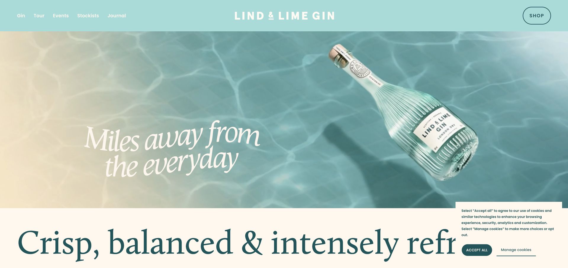
Lind & Lime is our Editors Choice for translating a distinctive ribbed bottle and Leith port story into a coherent turquoise-and-cream website. The bottle gives the site its visual anchor, while tours, stockists and the shop remain separate choices. This is editorial recognition of presentation and information, not a product-quality or drinking recommendation.
Before the examples
What makes good distillery website design in 2026?
Separate visiting from buying a bottle
A production tour, tasting, bar table, retail shop and private event are different experiences. Describe each before showing a booking or shopping action. Publish shop hours separately from tour times, especially when tours run only on selected days.
Make the origin story concrete
Show the real equipment, building, landscape and people when they explain the business. Name process details accurately and distinguish distilling, blending, maturation and bottling claims. Do not let evocative craft language replace factual product information.
Help visitors compare experiences
Put duration, price, location, age restrictions, group limits and what is included near each tour option. Publish accessibility and travel information before the ticket handoff. A beautiful remote destination still needs a realistic arrival plan.
The collection · 12 examples
12 distillery websites worth studying
The examples include product indexes, small craft producers, urban hospitality destinations and dedicated tour pages. Compare how each supports a specific audience rather than assuming one homepage pattern fits every distillery.
Lind & Lime carries the bottle’s pale turquoise and ribbed-glass character into a cream-and-teal website, opening with the actual bottle moving through a watery scene. The navigation separates the gin, tour, events and stockists, while the page connects its voyage metaphor to the port of Leith. Product discovery and visiting are related but visibly different choices.
What you can learn
Build the digital identity from a distinctive real object and its place of origin, then label the practical routes simply. A memorable bottle can anchor the design without turning every task into a product purchase.
Pros
The bottle, color palette and port story form one coherent visual identity.
Tours, stockists and the shop are clearly separate destinations.
Cons & considerations
White navigation over pale turquoise needs careful contrast testing.
Press quotes are supplied as images, so equivalent accessible text is important.
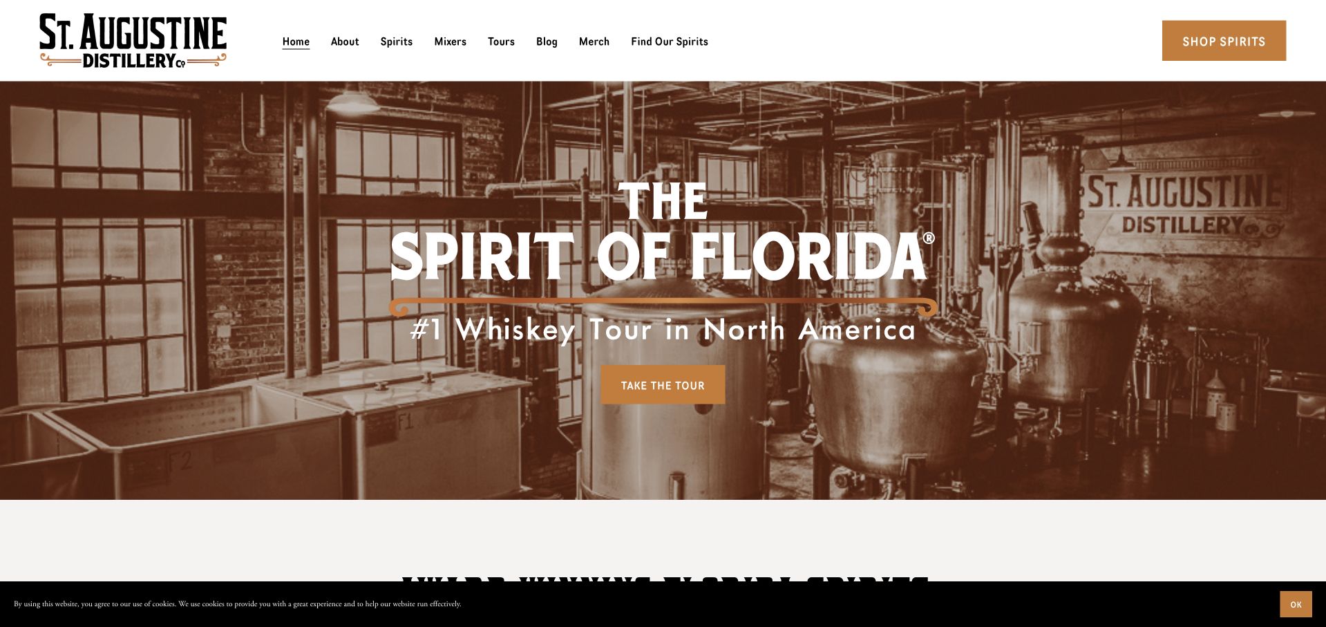
St. Augustine places its restored industrial interior behind a prominent tour action, then introduces the spirit range and the local families behind the business. Guided and self-guided experiences are identified as different formats. The footer also distinguishes retail-shop hours from tour hours, preventing the common assumption that every part of a visitor attraction follows one schedule.
What you can learn
Use the actual production building to establish place, but give each visitor service its own hours and description. A shop being open does not necessarily mean a tour is available.
Pros
The production-space photograph supports a specific local story.
Retail and tour operating times are published separately.
Cons & considerations
The hero relies heavily on a tourism ranking rather than explaining the tour format immediately.
The cookie strip and large hero together reduce first-screen space for practical details.
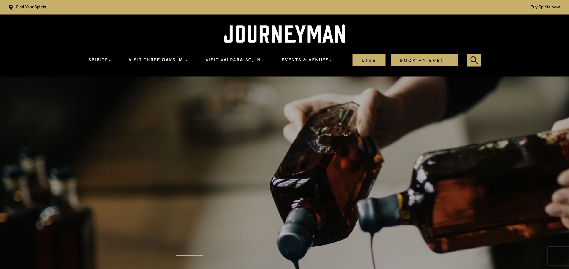
Journeyman organizes its broad offer around the Featherbone Factory in Michigan and the American Factory in Indiana. Each campus receives its own restaurant, tours and event-space routes, and the page even acknowledges their different time zones. The black-and-gold identity and industrial photography connect preservation with contemporary hospitality rather than treating the site as only a bottle catalog.
What you can learn
When a distillery becomes a destination campus, organize by place before activity. Keep restaurant, tour and event information attached to the correct address and time zone.
Pros
The two campuses and their different facilities are clearly distinguished.
Time-zone labeling anticipates a real planning problem between nearby states.
Cons & considerations
The extensive hospitality offer can overshadow the spirits themselves.
Decorative clocks and large media need readable fallbacks when scripts or video have not loaded.
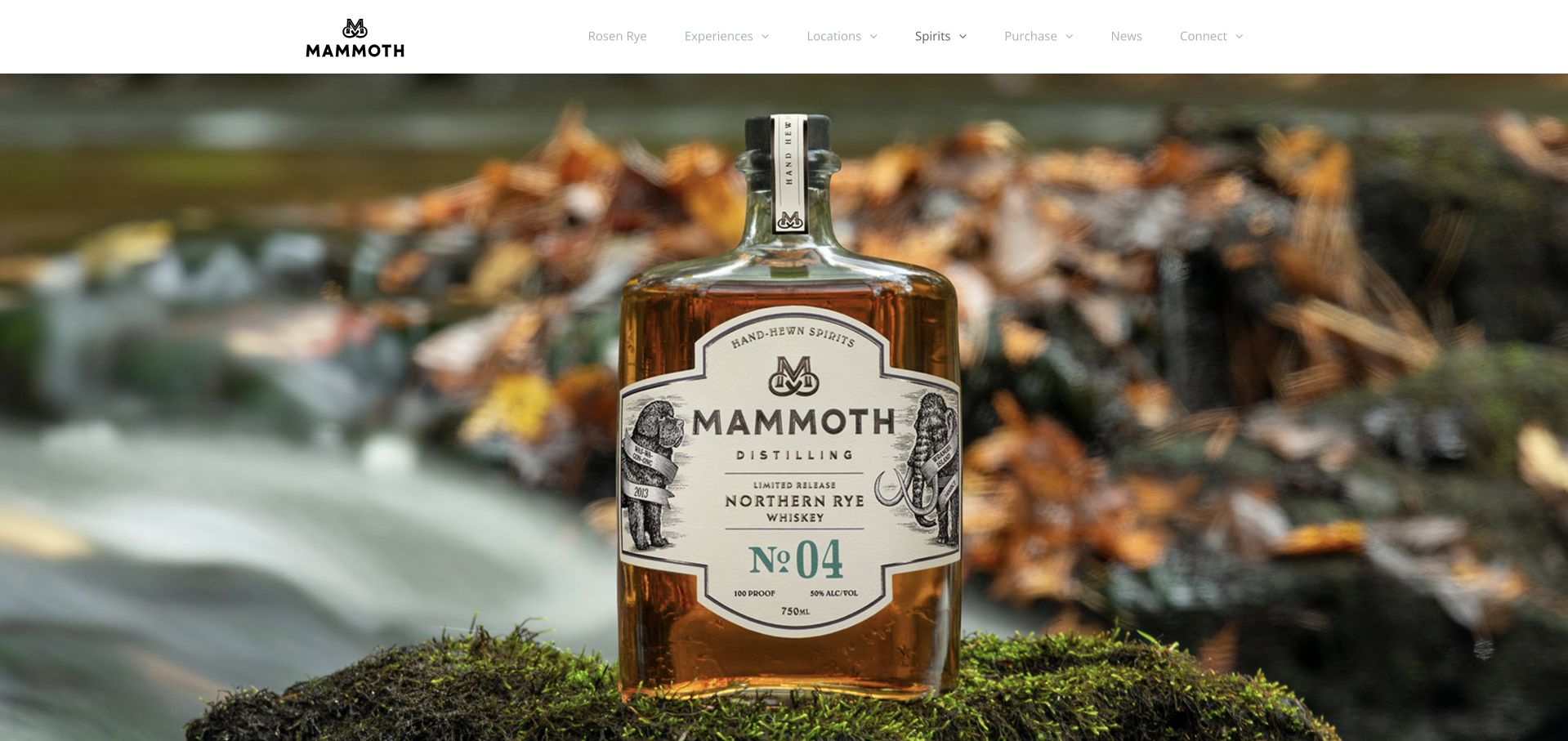
Mammoth gives a Northern Rye bottle almost the entire opening screen, photographed against water, rocks and autumn leaves. A short regional statement ties the spirits to Northern Michigan. Navigation then expands into individual spirits, six locations, blending experiences and purchasing options, allowing a very spare homepage to sit above a much broader information structure.
What you can learn
A release image can set the mood, but the navigation must still expose visiting, store finding and product categories. Pair landscape imagery with a concrete regional explanation rather than leaving place as decoration.
Pros
The bottle and local landscape create a consistent sense of origin.
Buying online and finding a store are different navigation choices.
Cons & considerations
The pale navigation text requires stronger contrast checking.
A past pairing-dinner item remains in the experience navigation and needs date maintenance.
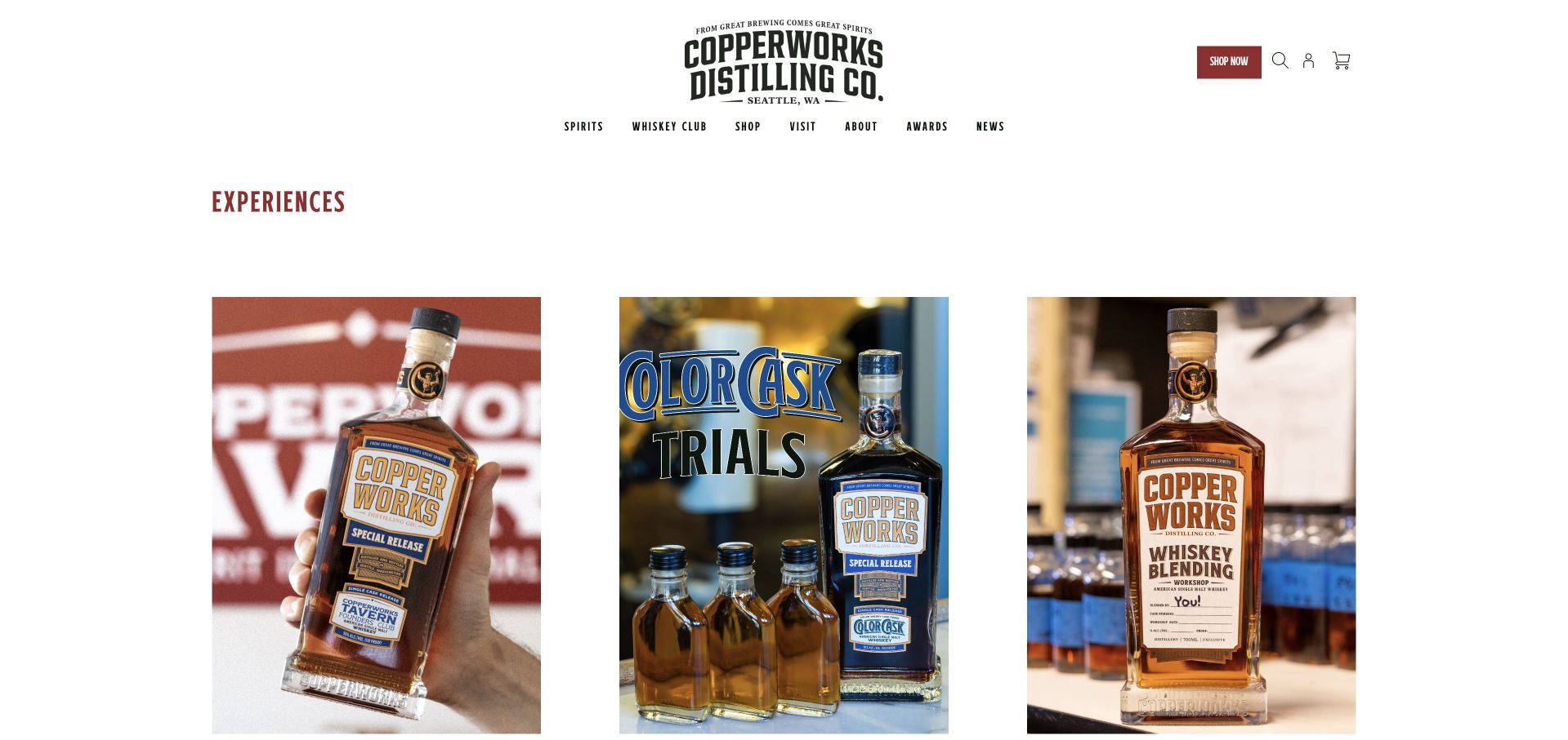
Copperworks lays out its experience range as large photographic cards, from a standard tour and private group tasting to blending and bottle-your-own activities. Prices and the private-tour minimum appear in readable text below the images. Seattle and Kenmore addresses and hours are kept in the footer, supporting a catalog that spans more than one place and activity.
What you can learn
Compare experience formats with descriptive names, prices and minimum group sizes before asking for a date. Make each venue explicit when a distillery offers activities at more than one address.
Pros
The catalog exposes prices and a private-group minimum in text.
Blending, bottling and ordinary tours have distinct entries.
Cons & considerations
Large image cards push their names and prices below the first screen.
The first catalog row mixes a founders club with one-off experiences, so commitment differences need explanation.
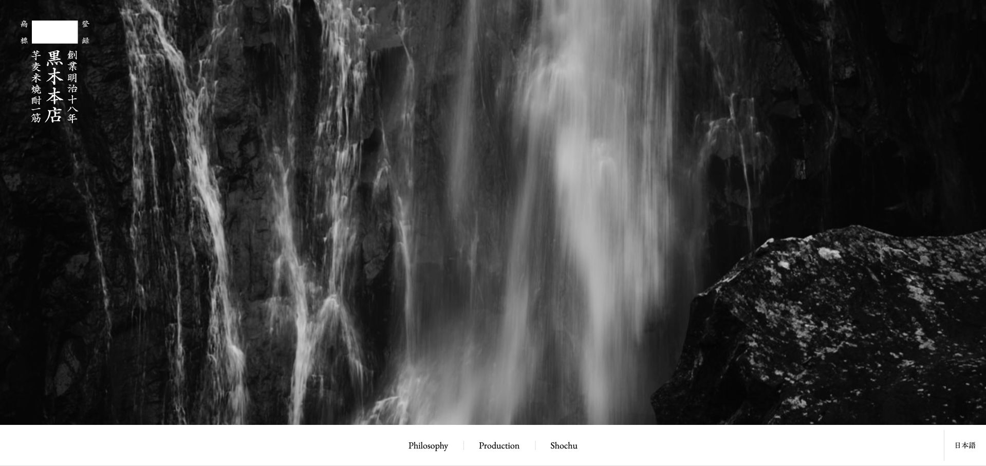
Kuroki Honten opens its English site with a monochrome waterfall filling the screen, a vertical Japanese wordmark and a restrained bottom navigation for Philosophy, Production and Shochu. Below that atmospheric introduction, the public page separates farming, ingredients, production, fertilizer and natural conditions into direct topics, followed by named product links. The site is a brand and production reference rather than an immediate booking or shopping funnel.
What you can learn
Connect a landscape-led introduction to specific explanatory subjects. A production story becomes useful when visitors can navigate directly to ingredients, process and individual expressions rather than reading an uninterrupted craft manifesto.
Pros
The monochrome landscape and restrained navigation create a coherent visual identity.
Production topics and individual expressions have descriptive direct links.
Cons & considerations
The immersive first screen supplies little immediate company or contact context.
Visitors seeking a purchase or visit need more guidance than the brand-led opening provides.
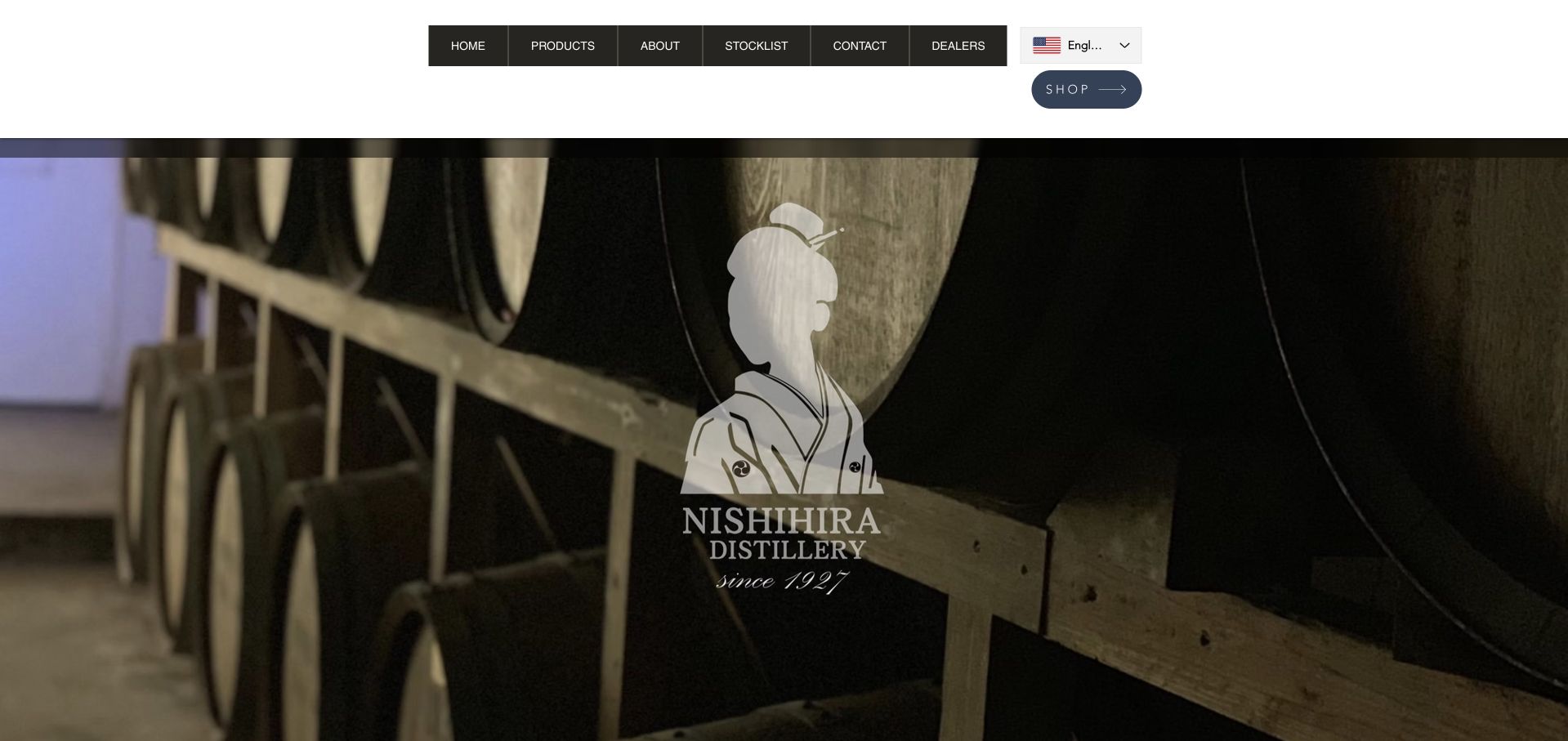
Nishihira’s English homepage places its illustrated identity over a photograph of stacked barrels, then introduces its mission of connecting Amami with the world through kokuto shochu. Products, history, production and a central Naze showroom receive separate sections. The header distinguishes a stocklist, dealers and the shop, while the footer supplies the actual Amami address. This gives a locally specific product an international discovery route without making the first screen a checkout.
What you can learn
Use a translated introduction to explain the product and its place, not just to translate navigation labels. Keep the production story, showroom visit and retail-discovery routes distinct when they answer different international and local questions.
Pros
The English introduction explains the connection between Amami and kokuto shochu.
History, production and the showroom have separate discovery routes.
Cons & considerations
Repeated “more” links give limited context when scanned outside their sections.
Stocklist and Dealers are similar-looking navigation choices that need clear audience definitions.
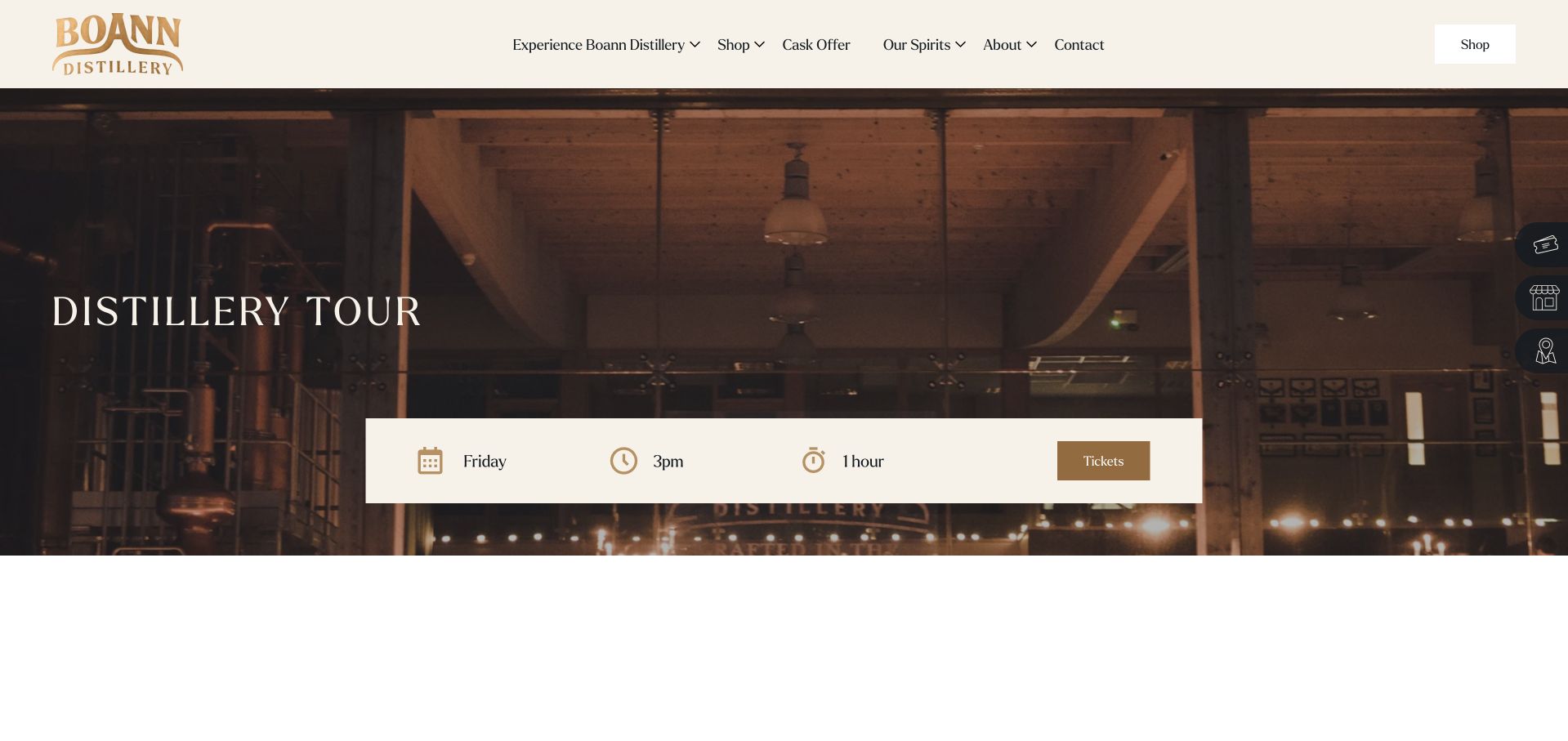
Boann’s dedicated tour page puts Friday, 3pm and one hour in a horizontal fact strip before the longer description. The price, over-18 restriction, directions, shop hours and weekly tour frequency follow in text, with photographs of the building and production areas. It is a useful example of separating visitor-shop opening times from the much narrower tour schedule.
What you can learn
Put day, start time, duration and price together before describing the experience. Repeat the difference between shop access and a scheduled tour so guests do not arrive expecting an unscheduled production visit.
Pros
The schedule and duration are visible as compact facts.
Directions and shop hours support the tour description on the same page.
Cons & considerations
A large photograph-led hero can postpone the price until the next section.
Several floating shop and ticket shortcuts can compete with the main page navigation.
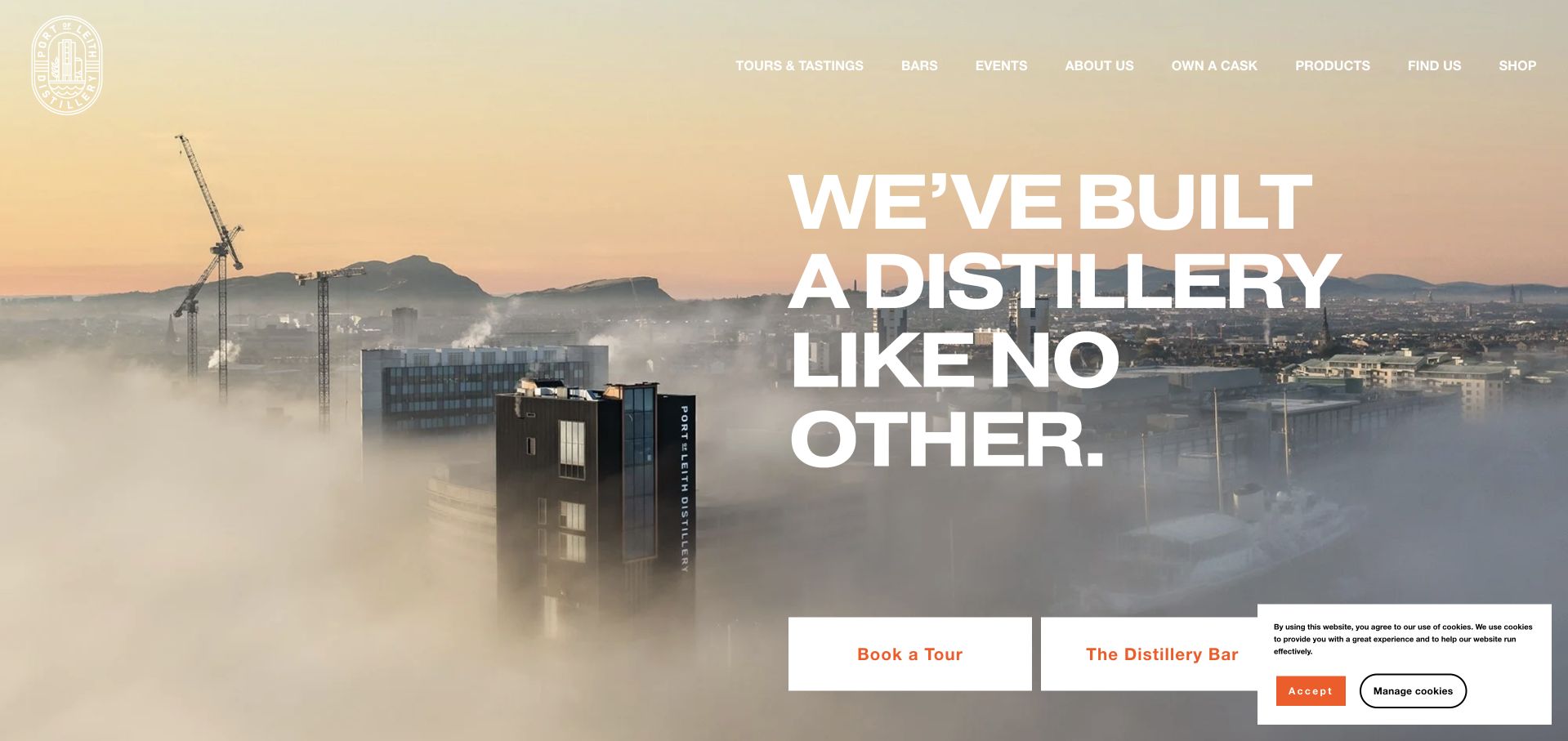
Port of Leith combines a vivid orange identity with its unusual tower architecture and oversized introductory type. The homepage gives the tour, distillery bar and events separate actions, then explains the 90-minute experience and the bar’s different purpose. A founder’s club and private-cask content occupy their own sections rather than being confused with ordinary visitor tickets.
What you can learn
If a building is central to the attraction, show and explain it, then divide the visitor experiences clearly. A bar table, a production tour and a private event should never look like the same booking.
Pros
Tours, bar visits and events have distinct homepage routes.
The flagship tour description includes its duration and operating days.
Cons & considerations
Very large headlines use considerable space before practical information appears.
Private-cask and club offers introduce a more complex decision than an ordinary visit and need careful separation.
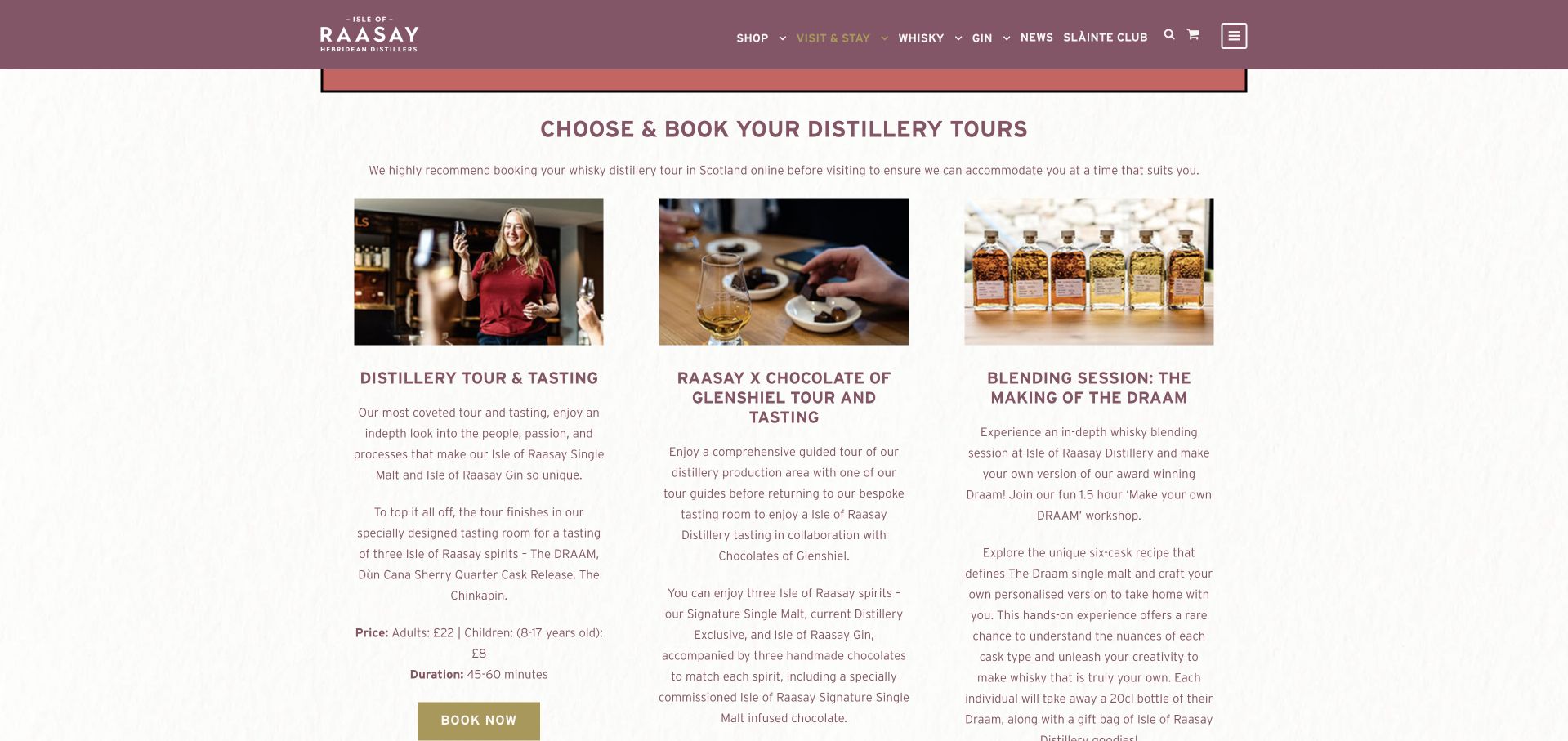
Raasay’s tour page compares several experiences with prices, durations and tasting descriptions, supported by a getting-here route. During the review, it prominently warned that the accessible lift was out of service and production access required stairs. That notice is an important design feature: it gives a visitor material planning information before they reach a booking provider.
What you can learn
Publish access changes where a visitor chooses a tour, not only in a general footer. Remote destinations also need travel information adjacent to duration and price so guests can judge the whole journey.
Pros
Tour options expose price and duration in readable text.
A current lift-fault notice makes an important access limitation visible.
Cons & considerations
The introductory video and text overlap visually in the reviewed desktop view.
Several tour options create a long comparison page that could use a compact summary.
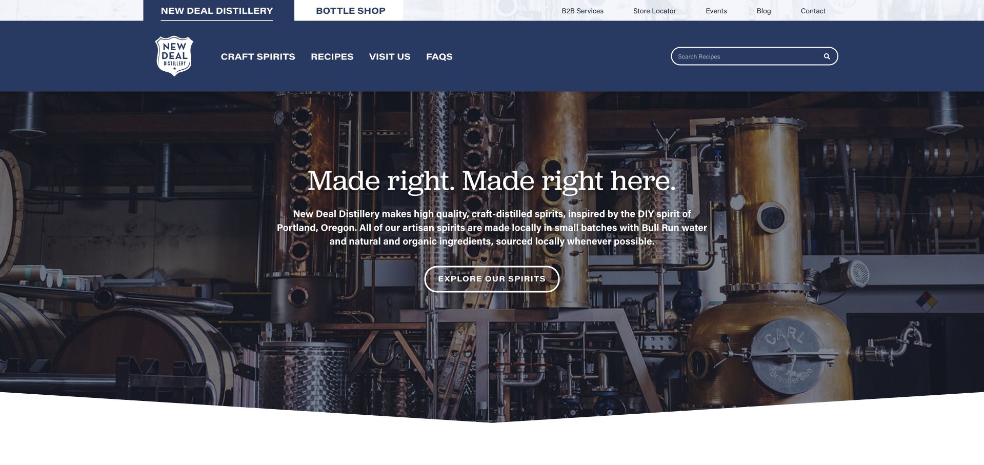
New Deal’s navy header separates the distillery from its bottle shop and exposes recipes, visits, FAQs and a locator. The production-space hero is followed by a specific Portland independence story, shop hours and home-cocktail content. Recipe cards offer a reason to return after the first purchase, while the bottle-shop link makes the retail destination explicit.
What you can learn
Give a distillery website a useful life beyond the first visit. Recipes, stockists and clear bottle-shop hours support different audiences without pretending that all of them are ready to buy a tour.
Pros
The distillery and bottle shop have clearly marked identities.
Recipe content provides practical value tied to the spirit range.
Cons & considerations
Several core actions move to a second domain and need continuity of branding and navigation.
The substantial homepage story can bury the most urgent visit facts for a mobile guest.
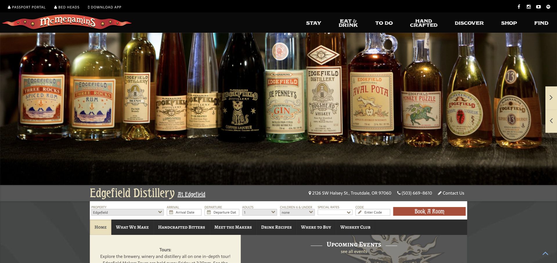
Edgefield’s dedicated page sits within the broader McMenamins identity but gives the distillery its own name, address, bottle photography and tabbed subjects. The text explains the former potato shed and the link to the neighboring winery, while a weekly makers-tour note connects brewery, winery and distillery. It shows both the benefit and the navigation cost of sharing a larger hospitality site.
What you can learn
Give a specialist venue its own address, product story and sub-navigation even when it lives inside a larger resort. Keep unrelated hotel tools from overwhelming the task of planning a distillery visit.
Pros
The distillery retains a named page and specific product navigation.
The makers-tour note explains which production spaces are combined.
Cons & considerations
A room-booking form occupies prominent space on a distillery page.
The parent site’s extensive navigation adds complexity for a visitor seeking only a tour or bottle information.
Kegan is a freelance web designer and developer with 15+ years of experience helping businesses turn complicated website requirements into clear, maintainable digital experiences. He works directly with clients from planning and design through development, launch, and ongoing support.
For distillery website design, his development approach focuses on product and provenance storytelling, responsible age and region handling, visit and tour information, and clear retail or booking handoffs. The scope can be a targeted improvement or a complete custom build, with responsive layouts, thoughtful content structure, and integrations chosen around the people using and maintaining the site.
Show 3 other distillery website designersHide other distillery website designers
Plan the product story and the physical visit separately
Define the public information model
Create consistent fields for spirit category, expression name, production description and availability route. Keep store finding, trade materials and consumer shopping distinct. Availability and shipping eligibility should come from a maintained operational source, not a copied promotional paragraph.
Build a useful experience comparison
List the differences between the standard tour, specialist tasting, workshop and private group visit. Include the correct address and duration. Explain whether the visitor sees a working production area and disclose temporary changes that affect access.
Rehearse a visit without completing a booking
Check that a person can understand the schedule, find directions and identify the right experience before entering details. Remote sites need transport and last-arrival context. Keep access notices current and avoid leaving expired events among active experiences.
The editing job behind the design
Choose systems for products, experiences and editorial accuracy
Use structured product and experience pages with independently maintainable facts. A commerce system may manage products while a booking service manages tour capacity, but the public website should explain the distinction before the handoff. Do not duplicate live availability manually.
Keep responsible-use information and any required age checks intact. Essential visit information should remain readable when media or widgets fail. Public technology evidence identifies only the service observed; an embedded shop or booking link is not proof of the entire site’s underlying system.
Our WordPress website examples offer a separate look at publishing approaches. A visible platform label is evidence for that named page, not a guarantee that the same system will suit your requirements.
Before the public launch
Distillery website planning checklist
Separate spirits, stockists and visits.
Distinguish production tours from bar tables.
Publish tour duration and price.
State the correct experience address.
Separate shop hours from tour times.
Explain age and group restrictions.
Provide access and transport information.
Describe production roles precisely.
Keep temporary closures and event dates current.
Preserve responsible-use and age-verification requirements.
These checks are a project checklist, not a performance, legal, security, or accessibility certification. Test real journeys with the people responsible for the website before making claims about the result.
Sources & editorial method
How this collection was selected and reviewed
These 12 examples match the exact collection count saved before research. The public company pages were opened directly and visually inspected on November 8, 2026 Pacific time; fresh screenshot files were captured on November 9 UTC, as individually dated. Screenshots show actual public pages, including meaningful inner-page sections where appropriate, and are not generated website concepts or vendor-supplied images. Reviews describe observed website design and information, not product or service quality, safety, availability or promised outcomes. Public technology labels are included only with source evidence; unknown stacks remain unlisted. No purchases, reservations, age-verification submissions, inquiries or private forms were completed. Security gates and unrelated or parked domains were excluded. Images and trademarks belong to their owners.
Each example links to its actual source page. Screenshots are direct browser captures with their own capture dates; moving imagery, announcements and live designs can change. The notes describe observable design choices and conditional tradeoffs, not measured traffic, conversion results, service quality, or accessibility conformance.
Technology labels use public page metadata, asset evidence, or explicitly cited platform documentation. Platform documentation is not a complete current deployment audit. A component reference may be legacy or unused; it is not a complete backend inventory. Unknown stacks are omitted. These sites are editorial examples, not our client portfolio.
Written, Edited and Curated are separate editorial records, not timestamps advanced by a rebuild. Website designs and imagery belong to their owners. See our editorial standards or suggest a correction.
Questions worth asking
Distillery website design questions
Should a distillery homepage lead with products or tours?
Choose according to the business’s main audience, but expose both routes when both matter. A local visitor should not have to browse a national product catalog to discover whether the distillery offers tours.
What makes a useful tour page?
A clear description, location, schedule, duration, price and access information help visitors choose. Explain differences between tours and tastings before handing off to the ticketing service.
Can a craft story be specific without becoming technical?
Yes. Show the actual place and explain a few meaningful choices in plain language. Distinguish the business’s own process claims from independently verified facts, and avoid assuming that every expression follows the same method.
Why are some otherwise familiar distilleries absent?
This collection uses public pages that could be directly inspected and captured normally. Candidates behind security or age-verification gates were not bypassed or submitted during this research. The selection is a design study, not an exhaustive industry ranking.
A strong distillery website gives its origin story a practical structure: understandable spirits, clearly differentiated experiences and the information needed to plan a real visit.