Best Cocktail Bar Websites of 2026 (27 Real-World Examples)
Cocktail bar websites that express a point of view without hiding the visit rules
These 27 cocktail bar websites explore atmosphere, menu concepts, location choices and the practical difference between a reservation, a walk-in and a private event.
A cocktail bar can be mysterious in its visual identity without being mysterious about opening hours. Visitors need to know where the entrance is, how seating works, whether food is available and which experience they are choosing. The most useful sites connect their menu’s personality to those ordinary decisions.
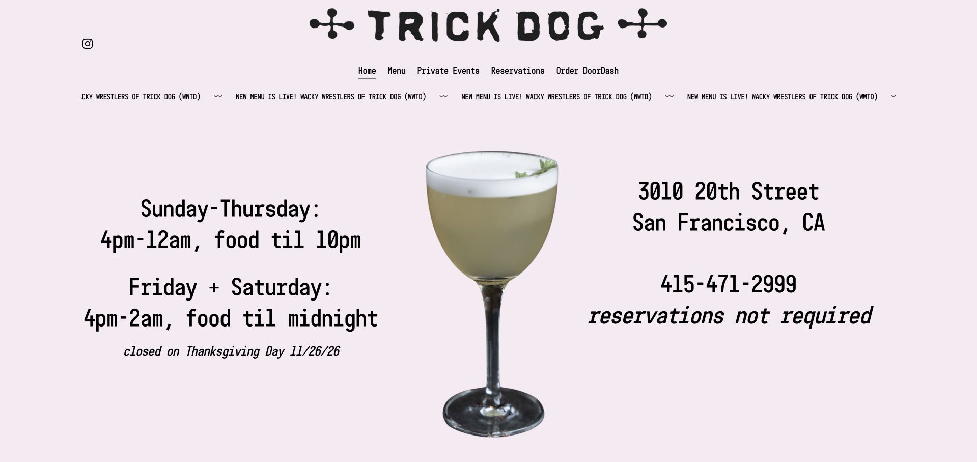
Trick Dog is our Editors Choice for putting a distinctive illustrated drink, lilac background and playful identity beside plain operational facts. Address, hours, menu and the no-reservations policy receive real prominence. The selection recognizes that design balance, not the quality of the drinks or any ranking displayed by the business.
Before the examples
What makes good cocktail bar website design in 2026?
Explain how entry and seating work
State whether the bar takes reservations, welcomes walk-ins, uses a queue or reserves only for special experiences. Distinguish ordinary seating from group or private-event requests. A “Book” action is misleading if it opens only an event inquiry.
Give the menu concept a usable explanation
An illustrated menu or themed cocktail collection can be distinctive, but visitors still benefit from readable names, ingredients, prices and non-alcoholic options where offered. Do not rely exclusively on a large PDF or images of printed pages.
Show the room and publish the exceptions
Real interiors communicate atmosphere, scale and seating more clearly than a generic close-up of a glass. Keep holiday hours, temporary closure notices, kitchen cutoffs and location differences visible near the visit route.
The collection · 27 examples
27 cocktail bar websites worth studying
The collection includes minimal neighborhood sites, elaborate menu worlds and multi-location brands. Compare how each establishes atmosphere while making the next visit decision understandable. One temporarily closed venue is discussed specifically for its public closure communication, not as a currently available booking recommendation.
Trick Dog places a cutout cocktail between large, readable hours and address details on a pale lilac background. The site states that reservations are not required, distinguishes food-service closing times, and displays a dated holiday closure. Menu, private events, reservations, and delivery are direct navigation choices, giving the playful identity a very useful structure.
What you can learn
Make the visiting facts part of the visual composition. A single drink image can carry atmosphere while large text answers where, when, and whether a booking is necessary. Keep the food cutoff and dated holiday exception beside the ordinary bar hours, then make every menu link point to the same current edition as the moving announcement.
Pros
Hours distinguish bar service from food service.
The reservation policy is stated directly.
Cons & considerations
The moving menu announcement competes for attention.
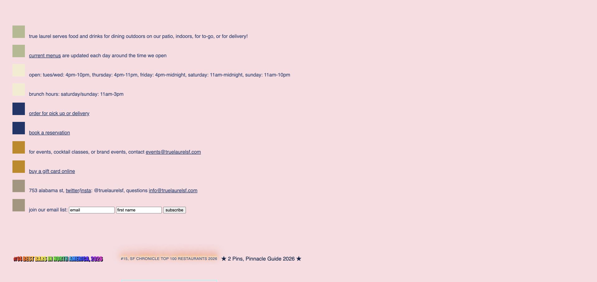
True Laurel uses a pink background and small blocks of color to organize a compact list of useful information. Current menus, opening times, brunch hours, ordering, reservations, events, and the address are all present without a large navigation system. The page even explains when menus are updated, though the understated presentation asks visitors to read carefully.
What you can learn
A highly distinctive bar does not need an elaborate website. Make essential links understandable and explain the update rhythm when the menu changes frequently. Use clear labels within the color blocks to distinguish brunch, ordinary service and event requests, and retain the published update rhythm beside the actual menu destination.
Pros
Current-menu timing is explicitly explained.
The key visiting and event routes fit into a compact page.
Cons & considerations
Small text leaves the hierarchy relatively subdued.
The page provides little immediate photographic sense of the room.
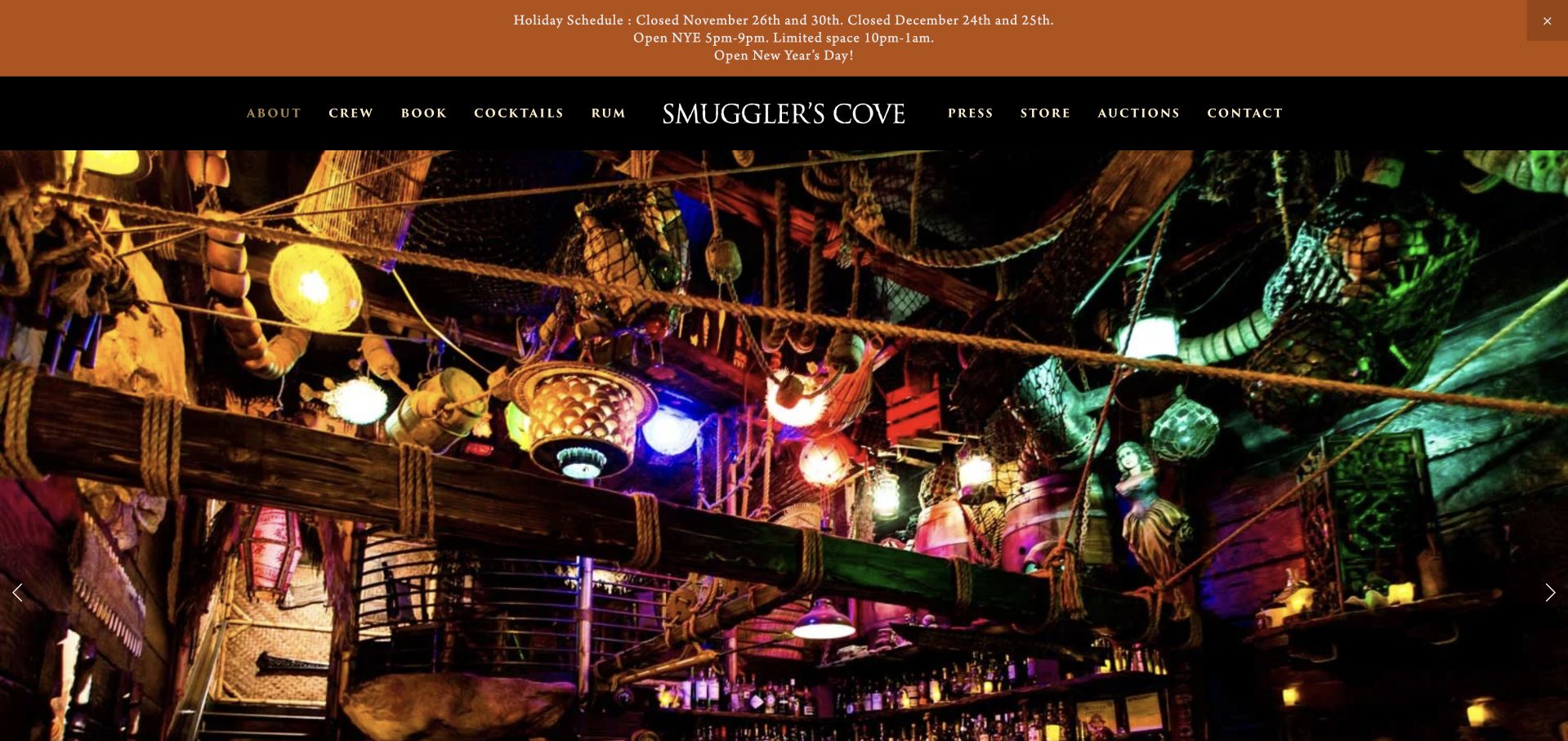
Smuggler’s Cove makes its dense nautical interior the opening subject, framed by a black navigation bar and a holiday-schedule announcement. Cocktails, rum, crew, and contact are separate sections in a long page. The imagery quickly explains the venue’s character, while the text develops its rum focus rather than presenting a generic cocktail-bar introduction.
What you can learn
Photograph what makes the room physically distinctive. Keep the current schedule and drinks information readable outside the images so the theme does not become an obstacle to planning a visit. Give Cocktails, Rum and Crew meaningful headings within the long page, while keeping the holiday notice close to the visit route rather than requiring exploration of the nautical imagery.
Pros
Interior photography communicates a specific atmosphere.
Holiday hours have a visible announcement area.
Cons & considerations
The long single-page structure takes time to explore.
Many top-level links compete with basic visiting information.
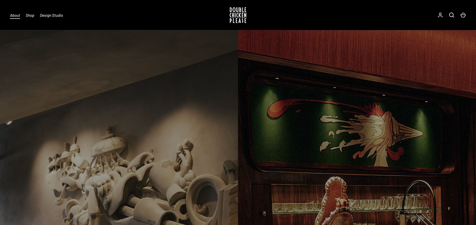
Double Chicken Please divides the homepage into Free Range and The Coop, pairing different room imagery with short explanations and menu links. A Plan Your Visit action and street address ground those concepts in one physical destination. The same site also sells branded products, which supports the wider identity but introduces commerce controls into a visit-planning task.
What you can learn
When one address contains genuinely different experiences, explain the choice before asking for a booking. Give each concept its own menu and retain one clear visiting-information route. Keep Free Range and The Coop identified after menu selection, and separate branded-product checkout from Plan Your Visit so a room choice does not become an unexpected shopping journey.
Pros
The two concepts have separate descriptions and menus.
Plan Your Visit is an explicitly named destination.
Cons & considerations
Merchandise competes with visit planning.
The large room images delay practical policy information.
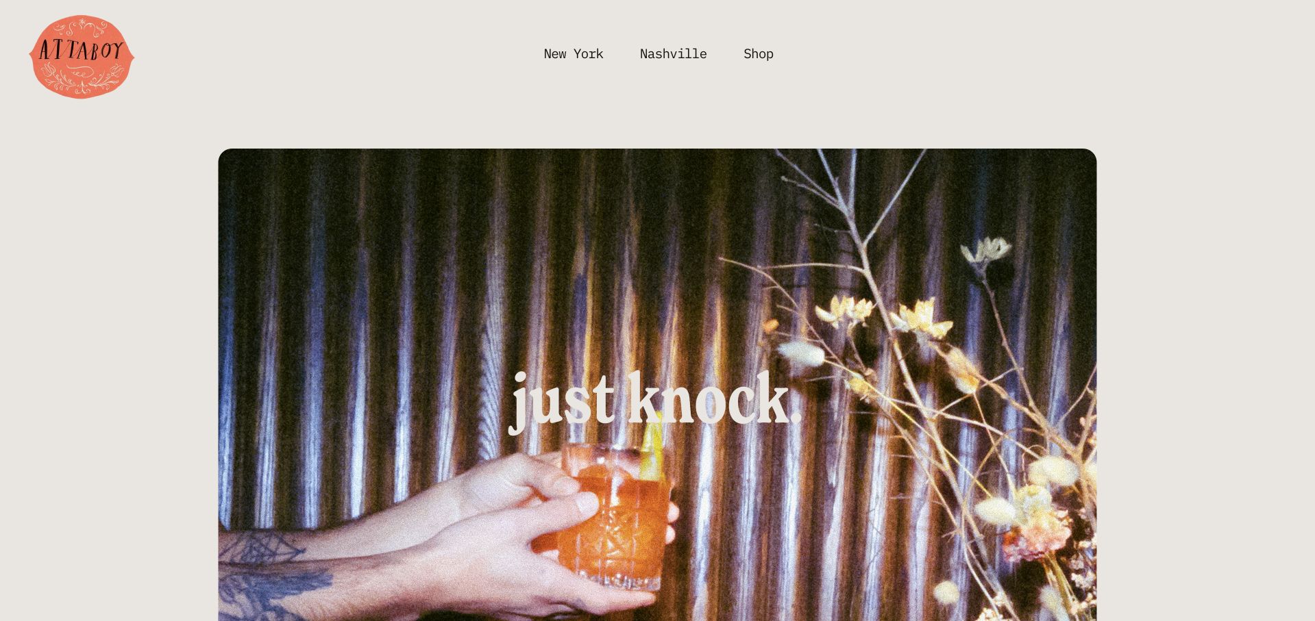
Attaboy uses a sparse entrance, a photograph, and the short instruction to knock, while New York and Nashville are distinct navigation choices. The restraint fits the bar’s identity and avoids a long promotional explanation. It also means that hours, addresses, and local policies depend on visitors choosing the appropriate city rather than reading the homepage alone.
What you can learn
A minimal gateway can work for a known brand when the location choice is unmistakable. Make the next page useful enough to resolve the practical questions deliberately omitted from the entrance. After New York or Nashville is selected, repeat that city near the address and any local visiting policy so the memorable knock instruction never substitutes for operational guidance.
Pros
The two cities are clearly separated.
The short instruction is memorable and specific.
Cons & considerations
The homepage supplies few immediate visiting facts.
The location menus require an extra action before planning.
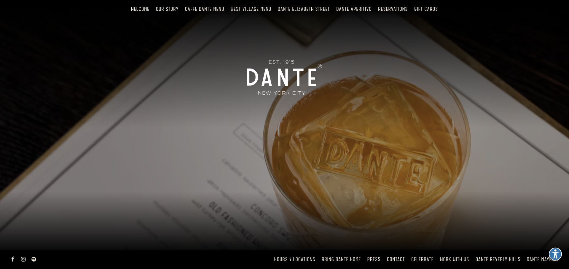
Dante combines a dark, compact navigation row with cocktail imagery and distinct menu destinations for its locations. Booking, events, shopping, and food-and-drink exploration are separate sections, while Hours & Locations remains available in the footer. The page leads with its brand and historical recognition, but visitors still need to choose the correct location for current details.
What you can learn
Use location names wherever menus or reservations differ. A shared brand should not make visitors assume that every venue has the same offer or booking arrangements. Retain the chosen venue name through both menu browsing and reservation handoffs, while treating shopping and larger events as separate interests rather than equivalent table-booking options.
Pros
Location-specific menu names reduce ambiguity.
Events and ordinary table bookings are distinct tasks.
Cons & considerations
The first view prioritizes imagery over current visiting facts.
Several related venue destinations increase the importance of clear labels.
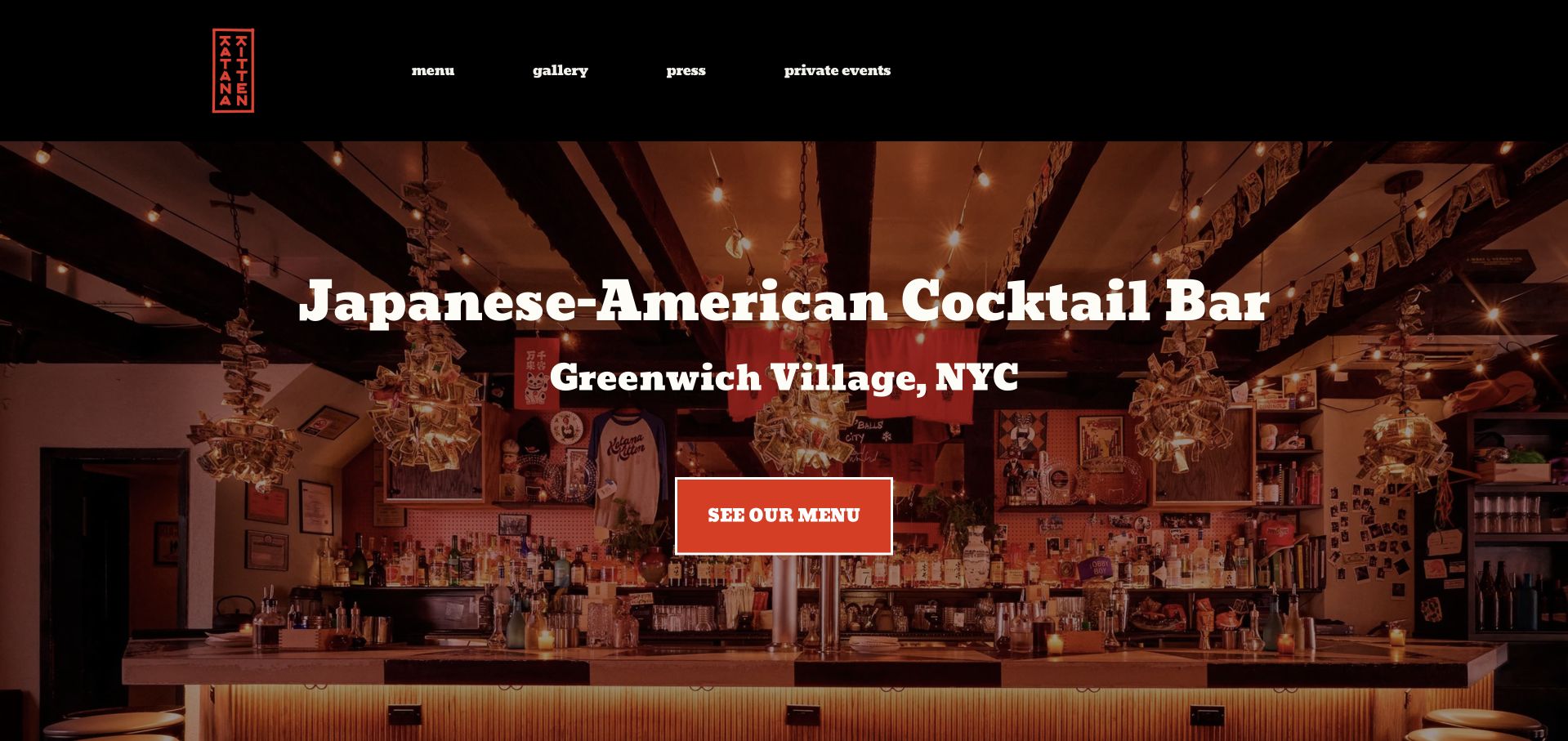
Katana Kitten overlays a warm interior photograph with a plainly stated Japanese-American cocktail-bar identity and Greenwich Village location. A red See Our Menu action is the focal point. The following compact section provides address, hours, contact, and a separate private-event inquiry, allowing the image-led opening to lead quickly into useful facts.
What you can learn
State the concept and neighborhood in direct language, then let the room photograph add character. Keep the menu action distinct from private-event contact. Keep the Greenwich Village identity attached to the menu destination, and provide a short path from the red action to exact address and hours for visitors who are already nearby.
Pros
The concept and neighborhood are explicit.
The menu action is visually prominent.
Cons & considerations
The large photograph delays exact hours.
The private-event route is less prominent than ordinary menu browsing.
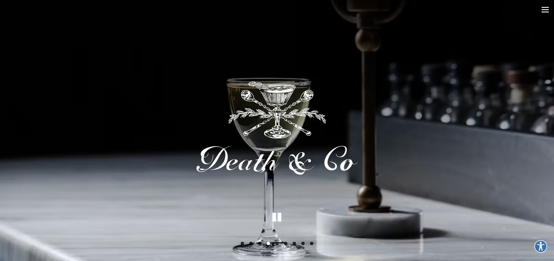
Death & Co opens with a large interior carousel and a compact navigation control, then presents New York, Denver, Los Angeles, and Washington, D.C. as distinct routes. Private events, careers, and merchandise follow as separate sections. The group-level page maintains a consistent atmosphere, but local menus and visiting rules depend on selecting a city.
What you can learn
At group level, make city selection more important than broad promotional copy. Preserve local context as visitors move from the brand homepage to the venue they can actually visit. A New York or Denver visitor should retain that city through menus and private-event information; avoid returning them to the group carousel when they follow a local action.
Pros
City destinations are clearly listed.
The hero gallery includes a pause control.
Cons & considerations
The large carousel delays local information.
Merchandise and recruitment add secondary tasks to the homepage.
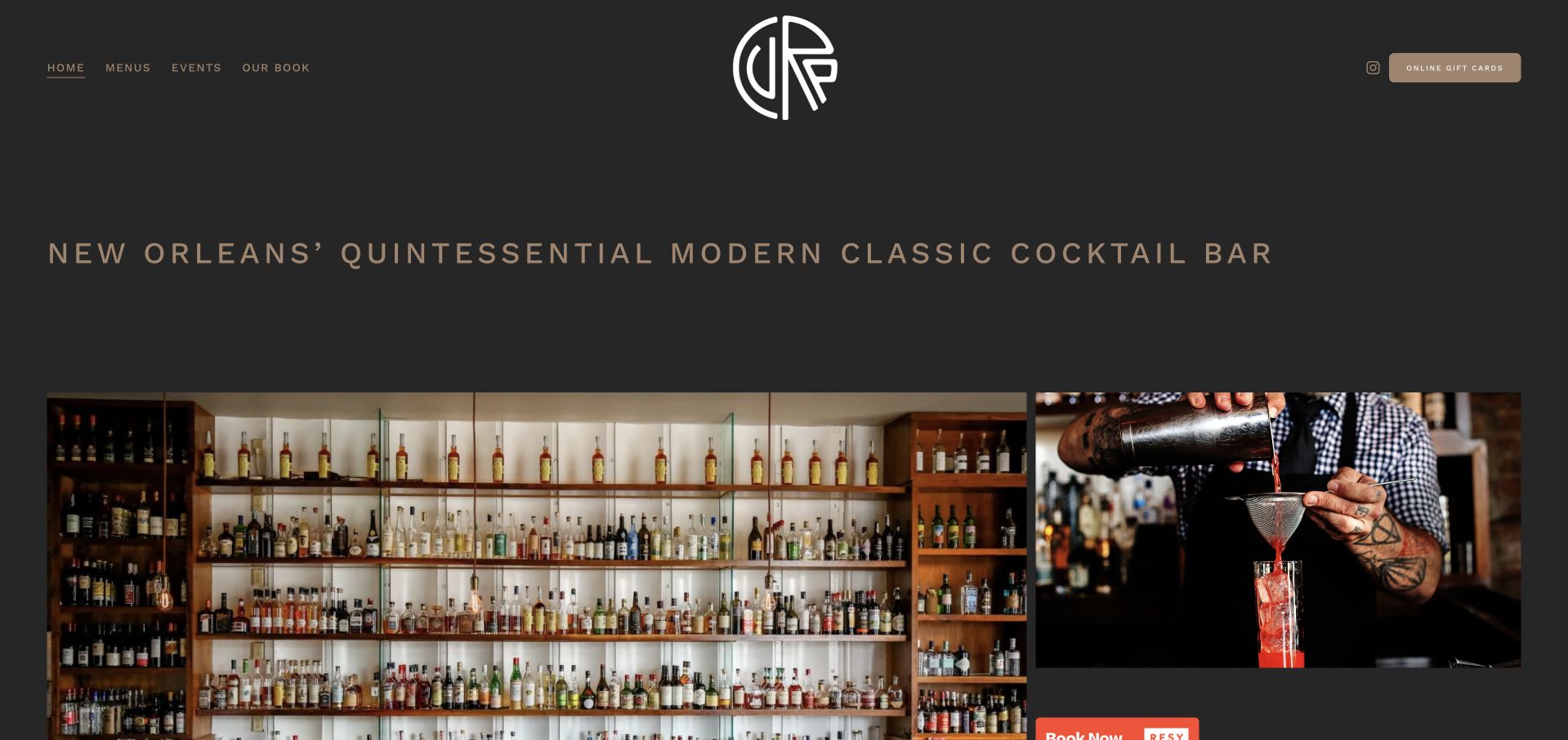
Cure uses a centered identity and a small set of links for menus, events, and its book. A New Orleans positioning statement leads into booking, a short company introduction, photographs, and a compact address-and-hours footer. The page is easy to understand as a single venue, although recognition and background occupy more space than the practical facts initially.
What you can learn
Keep a single-venue navigation small. Pair a clear booking route with plain menu and event links, then publish the exact address and day-specific hours in an easy-to-find block. Give the address-and-hours block a direct route from the opening navigation, allowing a returning New Orleans guest to bypass the book, recognition and gallery material.
Pros
Menus and events are distinct primary links.
The footer groups address, hours, and contact.
Cons & considerations
Historical recognition precedes much of the practical information.
A gallery-led introduction requires scrolling to exact hours.
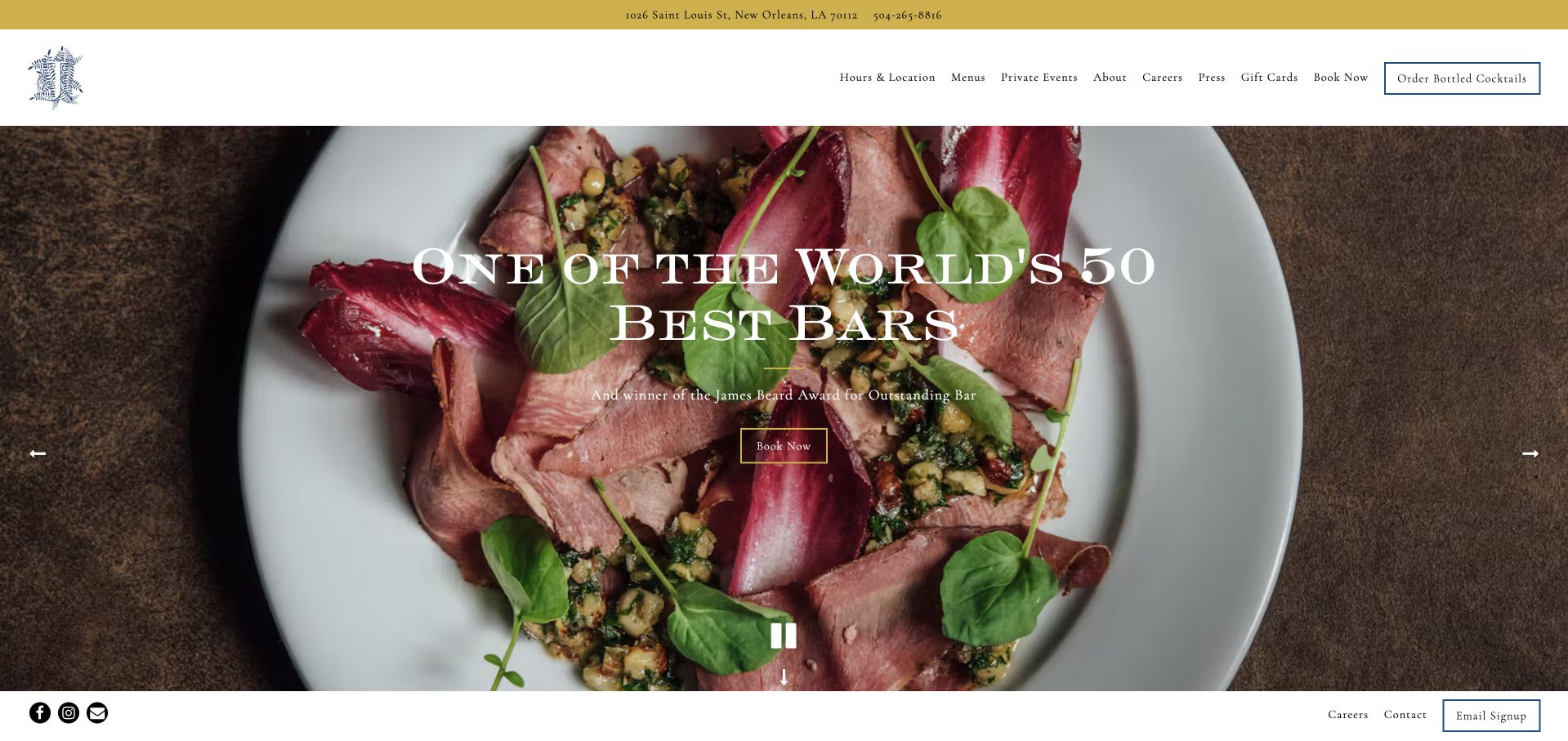
Jewel of the South pairs its ornate identity and interior imagery with a conspicuous Book Now action. Its navigation names Hours & Location, Menus, Private Events, and bottled cocktails, and the homepage provides short food-and-drink and event explanations. The structure is practical even though the hero emphasizes the venue’s own awards language.
What you can learn
Let a bar’s recognition remain supporting context, not the only explanation of the visit. Keep hours, menus, table bookings, and larger celebrations as separately named routes. Keep bottled-cocktail purchasing distinct from Book Now, and let the food-and-drink introduction explain the ordinary visit before private-event options ask the visitor for a larger brief.
Pros
Hours & Location is a primary navigation choice.
Private events and table bookings are separated.
Cons & considerations
The hero leads with recognition rather than the offer.
Multiple commerce and booking routes can compete on arrival.
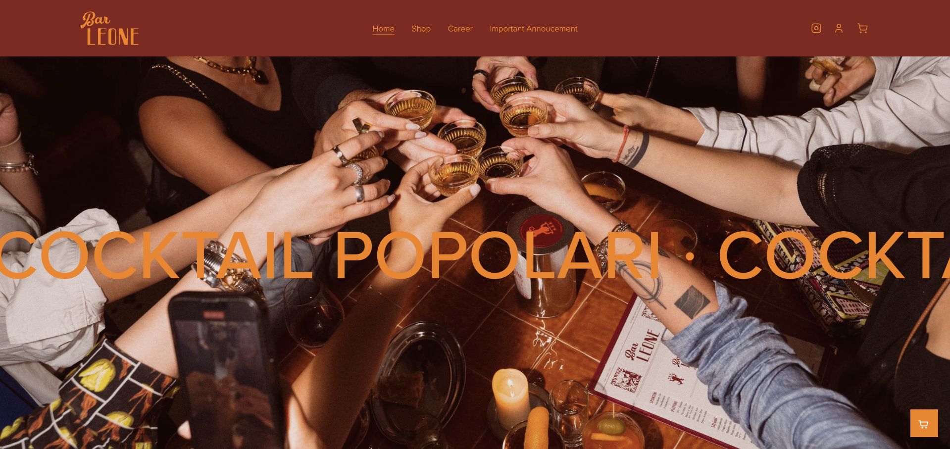
Bar Leone combines a warm red-and-gold palette, a photograph of guests toasting, and oversized moving typography. Beneath the expressive opening, the page becomes concise: a mapped Hong Kong address, grouped opening hours, a no-reservations statement, and contact. The contrast shows how a strong social identity can coexist with a very short planning section.
What you can learn
Use a social image to explain the intended atmosphere, then answer practical questions without extra ceremony. A walk-in policy belongs beside the hours, not hidden behind a booking button. Preserve the mapped address and no-reservations statement as stable text below the moving typography, so the social photograph does not imply a different seating process.
Pros
The no-reservations policy is explicit.
The address links directly to a map.
Cons & considerations
The moving display line can dominate the opening.
The first-screen navigation emphasizes shop and announcements over visiting facts.
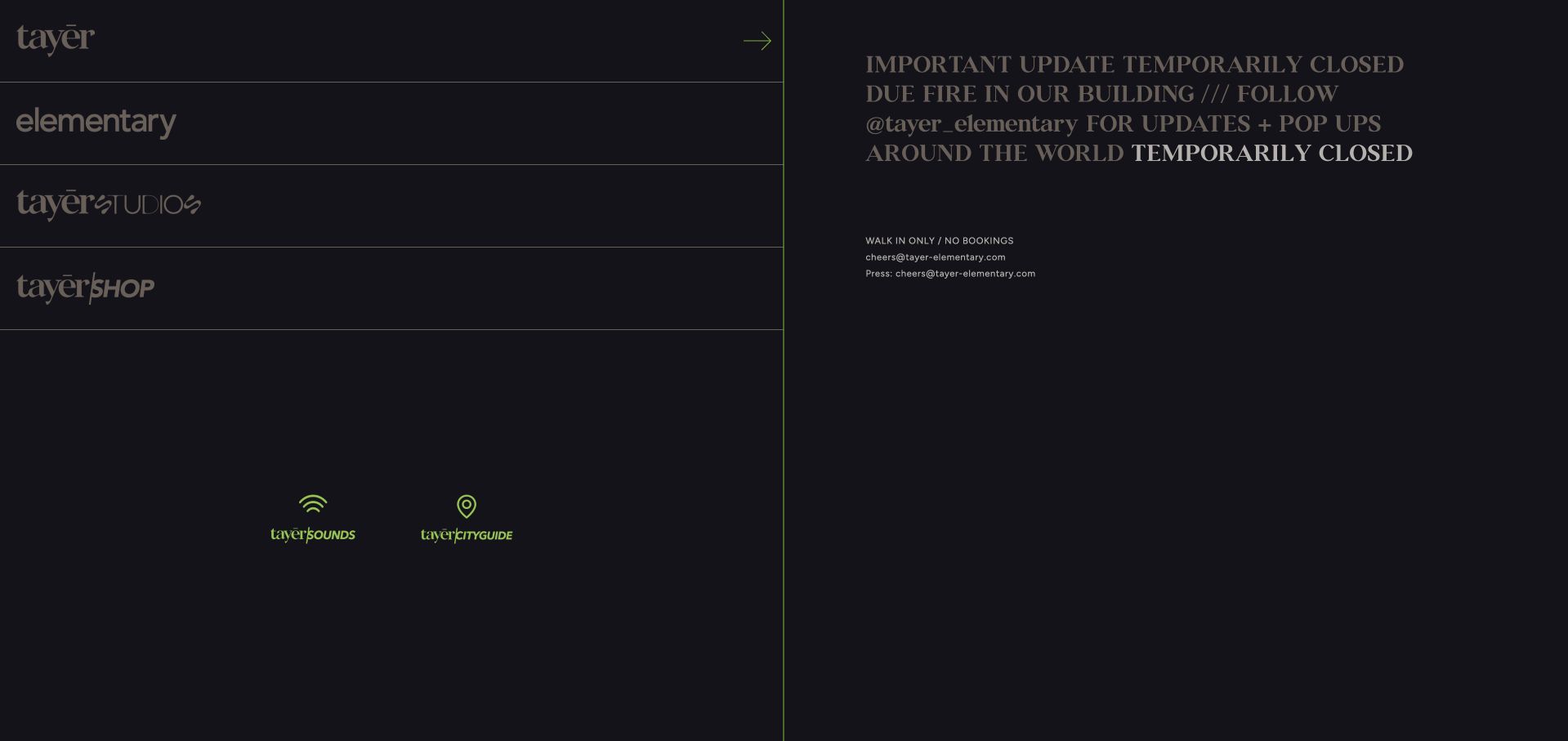
Tayēr + Elementary uses a dark split-panel layout with separate identity routes for the two bars, studio, and shop. At inspection, the principal content was an explicit temporary-closure notice following a building fire, with a route to updates and popups. The current website is useful as an example of operational communication, not as evidence that the physical bar is open.
What you can learn
A major service interruption should replace ordinary promotional messaging. State the status prominently and give one clear update destination without leaving normal booking language to imply availability. Date status updates and distinguish popups from the affected premises; otherwise a visitor may interpret an offsite event announcement as confirmation that the original bar has reopened.
Pros
The temporary closure is clearly disclosed.
The brand branches remain easy to distinguish.
Cons & considerations
The notice relies on a social channel for further updates.
Older walk-in wording beneath the notice can create ambiguity.
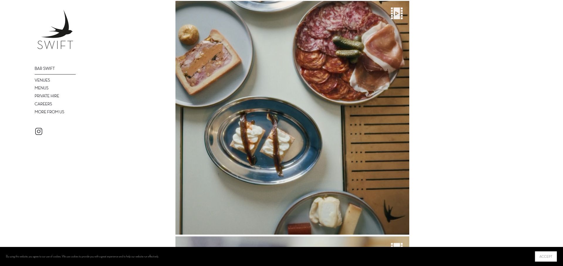
Swift uses a fine-line bird identity and a restrained sidebar, with venue selection, menus, private hire, and careers separated into a small navigation system. The site explicitly names Borough, Shoreditch, and Soho. This quiet presentation keeps the brand coherent, though the sparse entrance makes useful venue content dependent on an additional selection.
What you can learn
A sidebar can keep a small venue group calm and navigable. Make the next location choice explicit and ensure that menus remain associated with the venue where they apply. Keep Borough, Shoreditch and Soho visible in destination headings after selection, and label private hire separately from ordinary menus so the restrained sidebar still supports concrete choices.
Pros
The venue group is named in text.
Menus and private hire are separately labeled.
Cons & considerations
The sparse first view offers limited practical context.
Venue-specific visiting facts require another action.
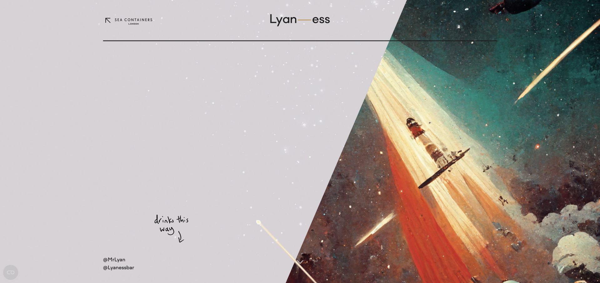
Lyaness uses an illustrated, space-like opening and playful handwritten cues rather than a conventional interior hero. The page explains its ingredient-led approach, separates cocktail and food menus, and provides group-event contact. Booking and walk-in guidance appear in the readable introduction, helping an experimental concept remain approachable without claiming that imagery alone explains the drinks.
What you can learn
Unusual menus need a plain-language explanation. Tell visitors how to choose and distinguish ordinary bookings from group events, while letting visual experimentation remain a layer around those facts. Use short headings to separate the ingredient explanation, booking guidance and group contact, giving readers a practical route through the long introduction without flattening the unusual menu identity.
Pros
The menu approach is explained in readable text.
Food, signature, and special-edition menus are separated.
Cons & considerations
The art-led opening postpones the venue description.
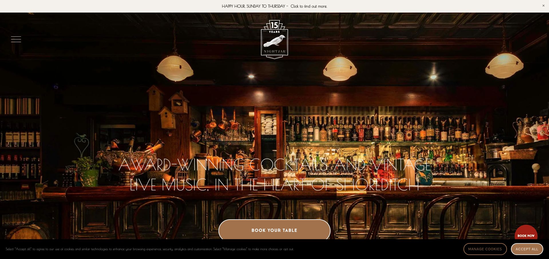
Nightjar introduces its Shoreditch setting and live-music identity over a warm interior photograph, with a prominent table-booking action. Its cocktail cards go beyond names, adding flavor descriptions and ingredient lists. That level of readable menu detail helps the theatrical drinks become understandable, although a large carousel reveals only a portion of the selection at once.
What you can learn
Describe flavor as well as ingredients when drinks have unfamiliar names. Pair the experiential promise with a clear booking route and practical information about the music-led visit. Keep the Shoreditch music context connected to the booking information, and make the drink-card descriptions accessible without requiring visitors to advance through every carousel item.
Pros
Drink cards include flavor descriptions.
The opening identifies Shoreditch and live music.
Cons & considerations
The carousel hides much of the menu initially.
Thin display text over a detailed image needs careful contrast.
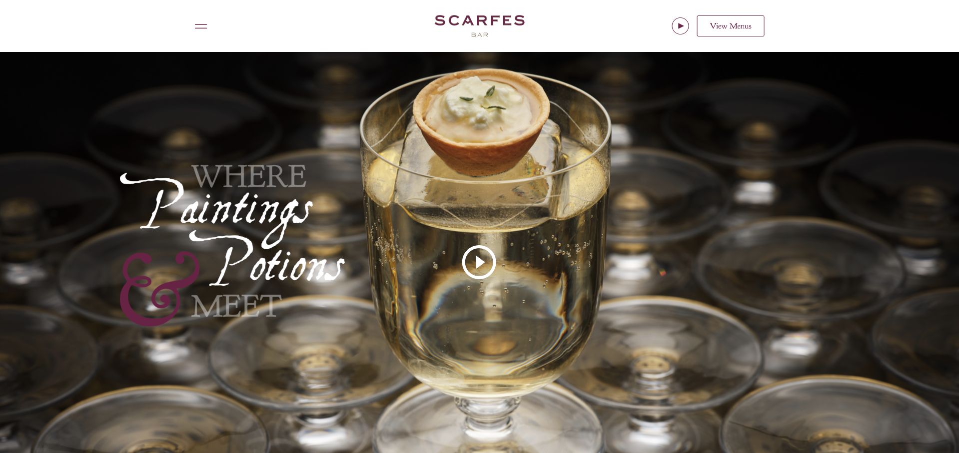
Scarfes Bar connects its painted visual identity with cocktail-menu storytelling and a dated entertainment list. The page separates the team, menus, gallery, and contact, and it explains a walk-in policy with specific reservation exceptions. This turns live music into actionable information rather than simply describing the bar as lively.
What you can learn
Publish performers and dates when entertainment affects the visit. Put reservation exceptions in plain language so a general walk-in message does not mislead hotel guests or larger groups. Treat the entertainment list as dated operational content with an expiry process, and keep the specific reservation exceptions beside the walk-in statement so the two messages remain understandable together.
Pros
Upcoming entertainment includes named dates.
The reservation policy explains exceptions.
Cons & considerations
The cinematic opening delays the policy section.
Music, video, and galleries add several layers of interaction.
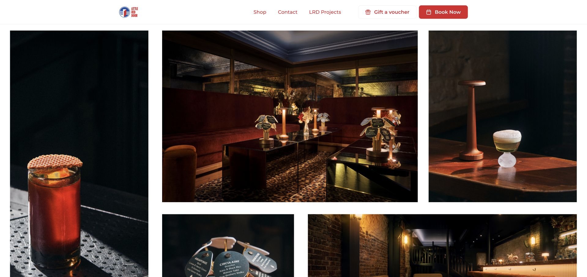
Little Red Door places its address, seven-day opening schedule, and walk-in welcome beside a playful opening statement. Later sections explain its conceptual cocktail approach and a menu organized around French landscapes and climates. The site offers a booking route without letting the concept obscure basic visiting information, although some images use generic alternative labels.
What you can learn
Place the practical facts before the conceptual explanation. A creative menu can reward deeper reading once visitors already know where the bar is and how to visit. Keep the address and walk-in introduction available before the French-landscape menu story, and replace generic image descriptions with the subject or role that each photograph actually serves.
Pros
Address, hours, and walk-in guidance appear together.
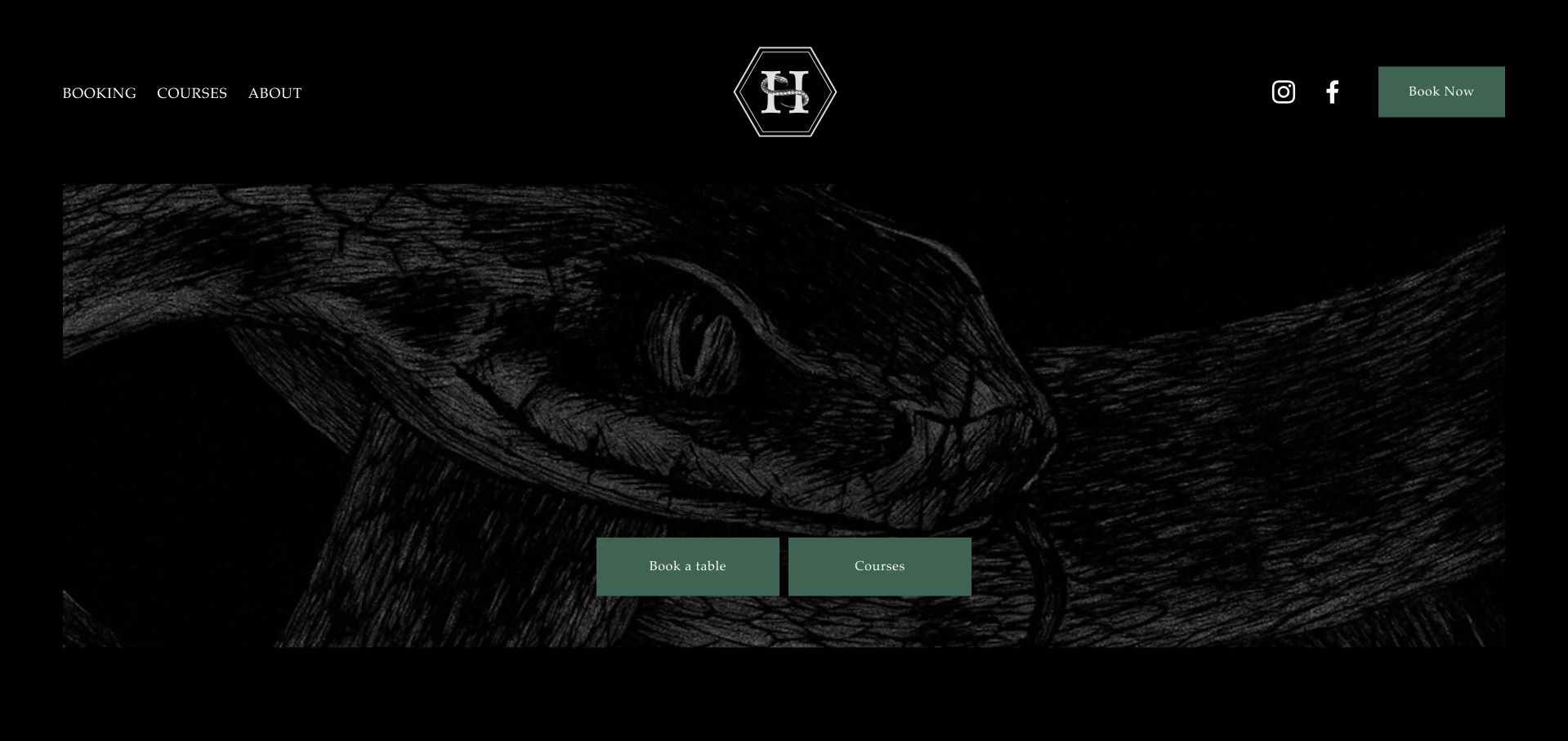
HIMKOK keeps its principal choices focused on booking a table and exploring courses, with company information available separately. A short introduction identifies a Norwegian-flavor approach, while the footer publishes day-specific hours, Oslo address, phone, and email. The compact structure makes the different activities understandable without a large marketing hierarchy.
What you can learn
Separate education or experiences from ordinary table bookings. A concise concept statement and a well-organized location block can do more work than a long list of accolades. Attach the course inquiry to an explanation of the activity rather than the ordinary table-booking path, while retaining the Oslo address and day-specific hours as a stable reference.
Pros
Courses and table booking are distinct choices.
Day-specific hours and location are grouped clearly.
Cons & considerations
The large opening media area postpones the explanation.
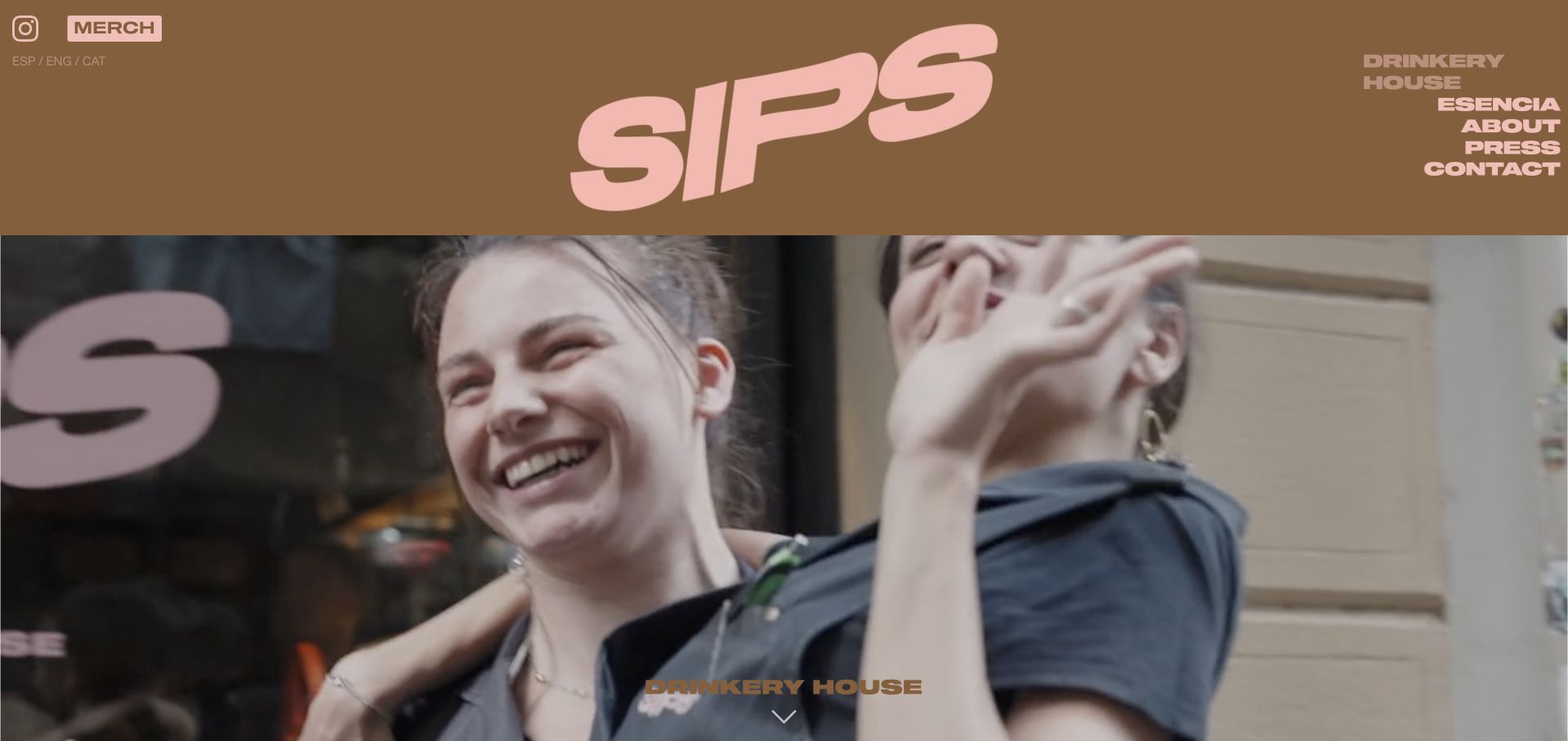
Sips separates Drinkery House from Esencia, then gives the Drinkery House its own pink-and-brown identity and large people-focused film. The dedicated page explains the barrier-free bar concept, publishes opening hours and dress guidance, and identifies the point after midnight when walk-ins apply. English, Spanish and Catalan choices are visible without being buried in a footer.
What you can learn
Give unfamiliar experience names a short explanation and their own practical visit page. Conceptual design becomes more useful when hours, arrival rules and language choices are easy to find.
Pros
The casual bar and tasting concept have separate destinations.
The dedicated page publishes hours and arrival guidance in readable text.
Cons & considerations
The opening view relies heavily on motion media.
The broader gateway was blank during review, making direct concept pages especially important.
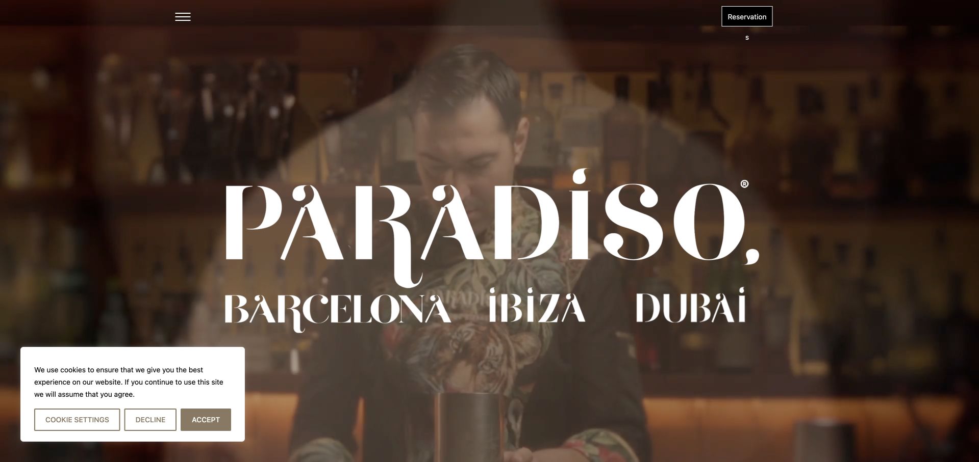
Paradiso uses a dark, highly animated visual world and distinctive display lettering to introduce the bar. Beyond the opening, cocktail entries list ingredients and concise flavor descriptions, while a separate reservation section provides an action. The contrast between spectacle and readable menu information is useful, although the elaborate entrance delays the practical content.
What you can learn
Support a theatrical concept with text that explains what a guest will actually taste. Keep reservation and location information reachable without requiring every visitor to complete the visual story. Offer a direct route to the reservation section and readable cocktail entries alongside the animation, so someone comparing ingredients does not have to repeat the elaborate entrance.
Pros
Cocktail entries include ingredients and flavor notes.
Reservations have a distinct section.
Cons & considerations
The opening loading sequence delays access.
Animation and fragmented display text can complicate scanning.
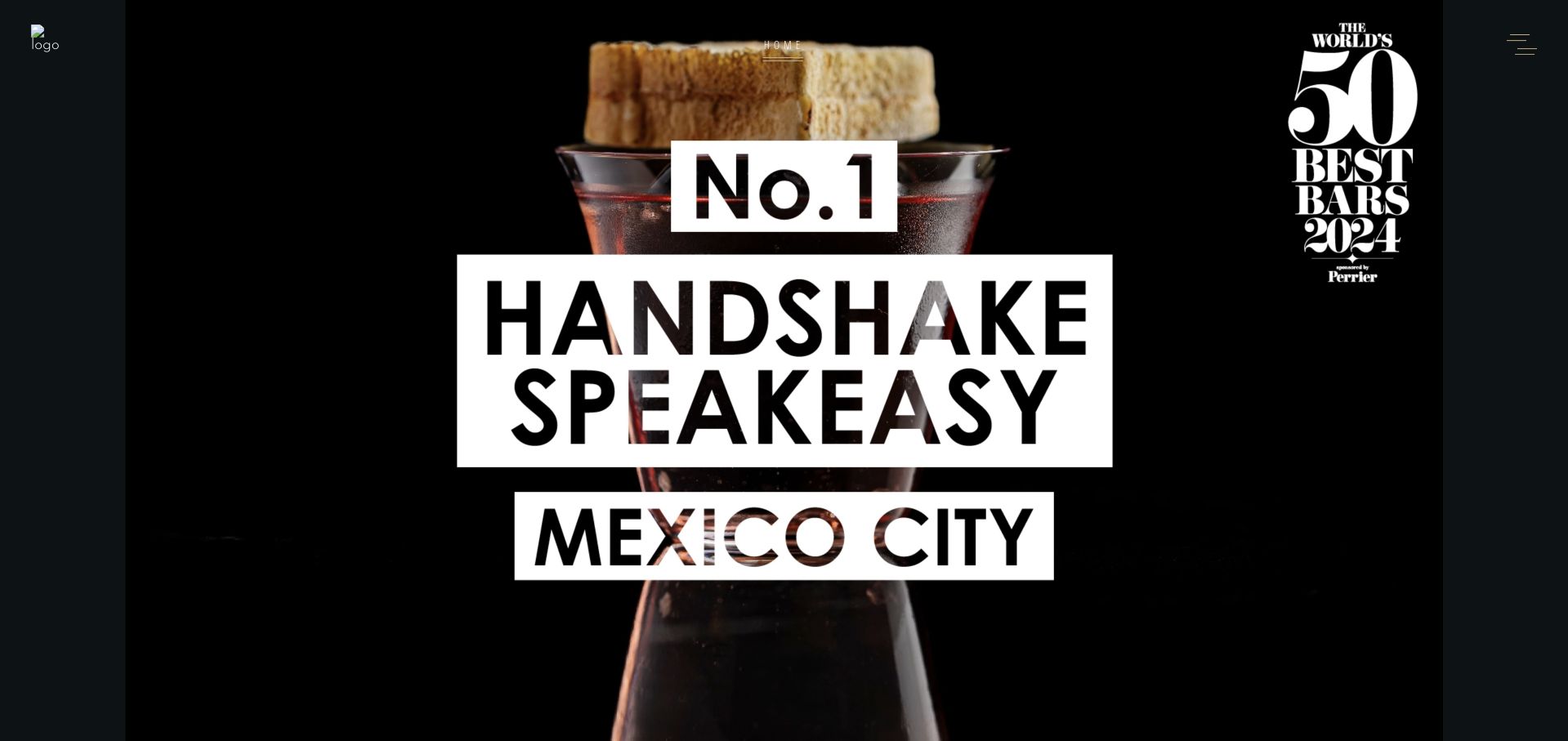
Handshake uses bold black-and-white display typography over a close-up cocktail image and explicitly names Mexico City. The page then presents a reservation section with party size, date, and time controls, alongside a direct reservations email. The streamlined structure emphasizes booking, but provides comparatively little menu or access context on the homepage.
What you can learn
A short booking-led page needs enough surrounding information to make the action informed. Pair party-size and date controls with clear address, menu, and policy destinations before asking for a commitment. Keep the Mexico City context and reservations email beside the date-and-party controls, then provide menu and access information before the visitor moves from browsing into a booking process.
Pros
The city is unmistakable in the opening.
The reservation section has a direct email alternative.
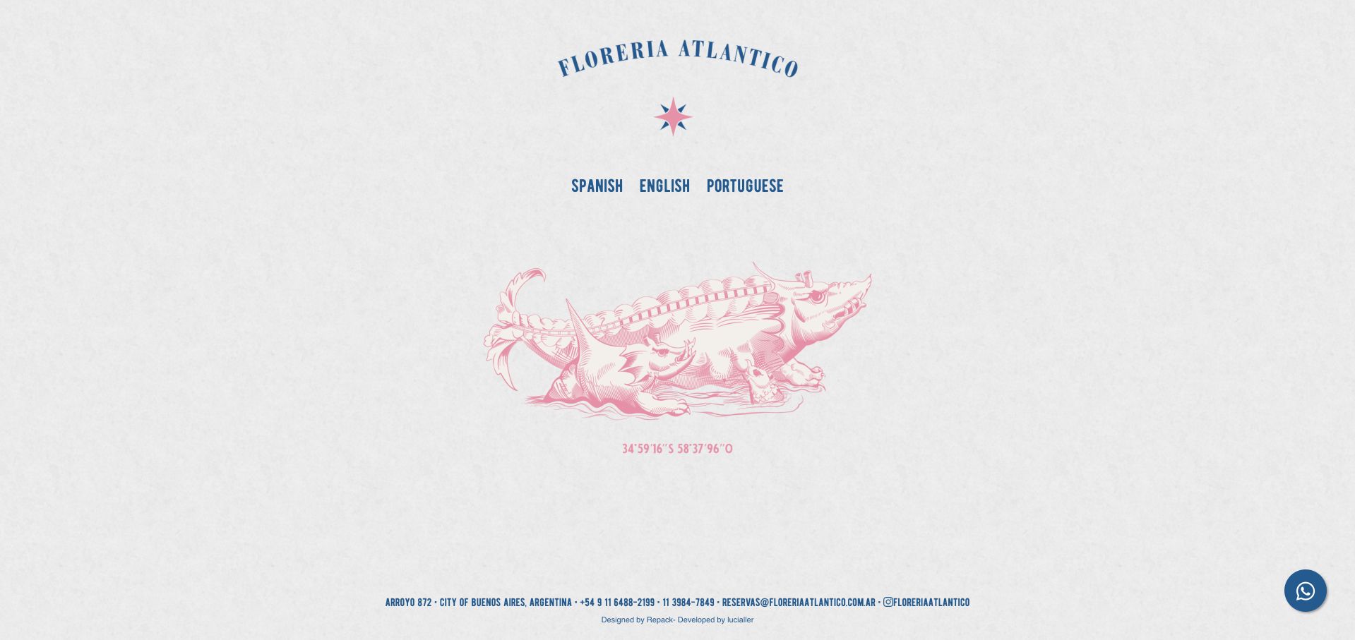
Florería Atlántico begins with a compact blue identity and three language choices on a white field. Its Buenos Aires address, phone numbers, reservation email, and social link remain in a narrow footer, and a WhatsApp route is available. This is a deliberately spare gateway: the next language-specific page must carry the menu and visiting explanation.
What you can learn
A language selector should still provide useful contact and location facts. Keep it obvious that choosing a language leads to substantive venue information, not just another decorative entrance. Carry the selected language through the substantive venue page while retaining the Buenos Aires address, reservation email and WhatsApp alternative, rather than making international visitors restart at another gateway.
Pros
Three language choices are clearly named.
Address and reservation contact remain visible.
Cons & considerations
The gateway provides little immediate menu information.
The extensive white space postpones context for first-time visitors.
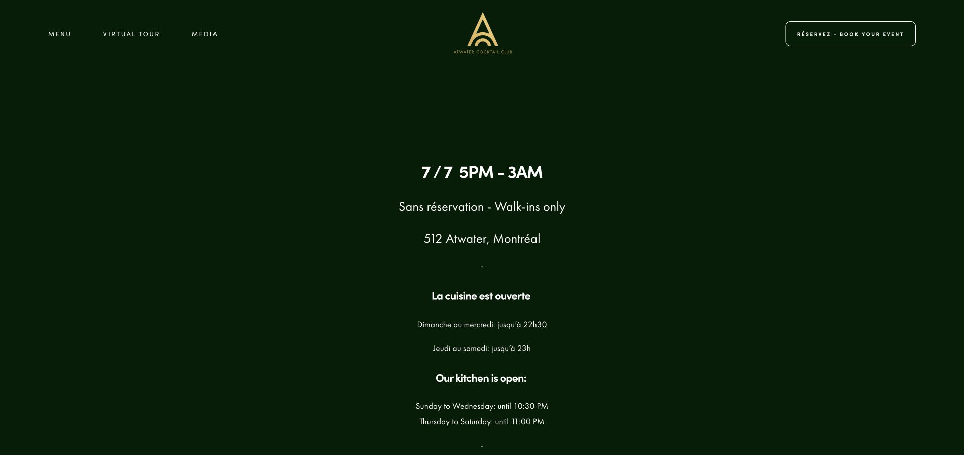
Atwater Cocktail Club states its daily hours, Montreal address, walk-in policy, and maximum ordinary party size near the beginning of the page. French and English text are presented together, including separate kitchen hours. A virtual-tour route and menu link add ways to understand the venue before visiting, while group events have their own contact path.
What you can learn
Publish kitchen hours separately when they differ from the bar. Translate the actual visiting rules, not just the promotional headline, so both language audiences receive the same practical guidance. Keep French and English versions of party-size limits and kitchen cutoffs synchronized; a translated headline alone would not preserve the useful policy information.
Pros
Policies are available in French and English.
Kitchen closing times are distinguished from bar hours.
Cons & considerations
Parallel languages increase the amount of text to scan.
The page includes many secondary group-company links.
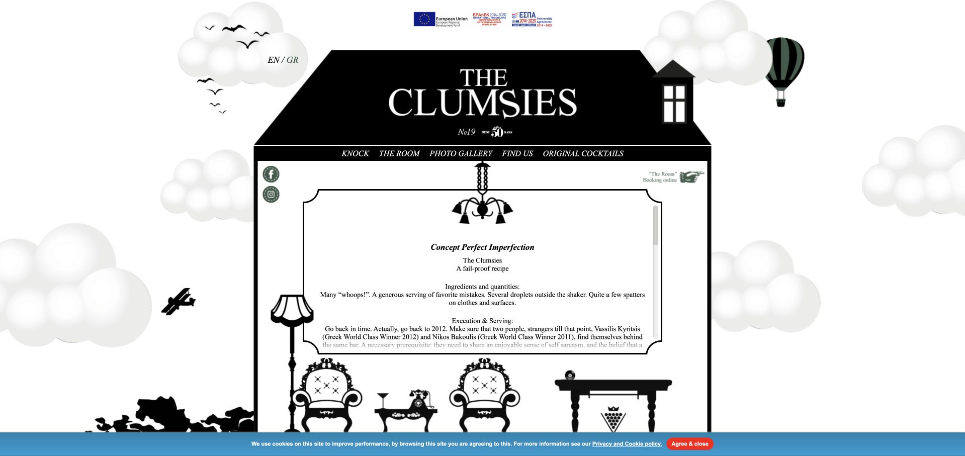
The Clumsies builds its homepage around rooms, objects, and directional links rather than a standard sequence of marketing cards. Knock, The Room, Photo Gallery, and Find Us support the spatial metaphor, while original cocktails have a dedicated route. The idea is memorable, but finding a specific fact requires learning the site’s interaction model.
What you can learn
A navigation metaphor should reward exploration without trapping task-focused visitors. Preserve plain menu and location links alongside the playful room system. Make Find Us and the original-cocktail route accessible without interpreting room objects, and clearly label downloadable menus so the spatial metaphor does not disguise an external or document handoff.
Pros
The room metaphor gives the site a distinctive personality.
Original cocktails and Find Us remain named routes.
Cons & considerations
The nonstandard navigation requires learning.
Menu downloads and deeper information interrupt the spatial experience.
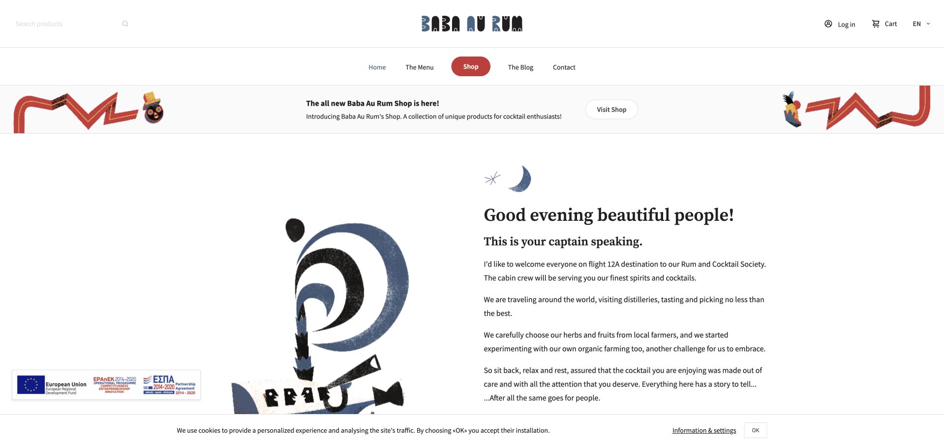
Baba Au Rum frames its introduction as a flight into a rum-and-cocktail society, supported by imagery and a conventional navigation row. Menu, blog, contact, and shop are distinct destinations, while the footer provides an Athens address, daily hours, phone, and directions. The personality is clear, though shopping controls add visual weight to a simple visit-planning task.
What you can learn
A narrative voice can make an established bar recognizable, but keep its practical facts in a predictable place. Separate merchandise browsing from menus and directions. Keep the Athens hours-and-directions block easy to reach from the travel-themed introduction, and identify shop actions explicitly so merchandise browsing does not interrupt an intended bar visit.
Pros
The footer groups visiting details and directions.
The narrative voice is consistent with the rum-focused identity.
Cons & considerations
Commerce controls compete with the venue task.
The long introductory story delays practical details.
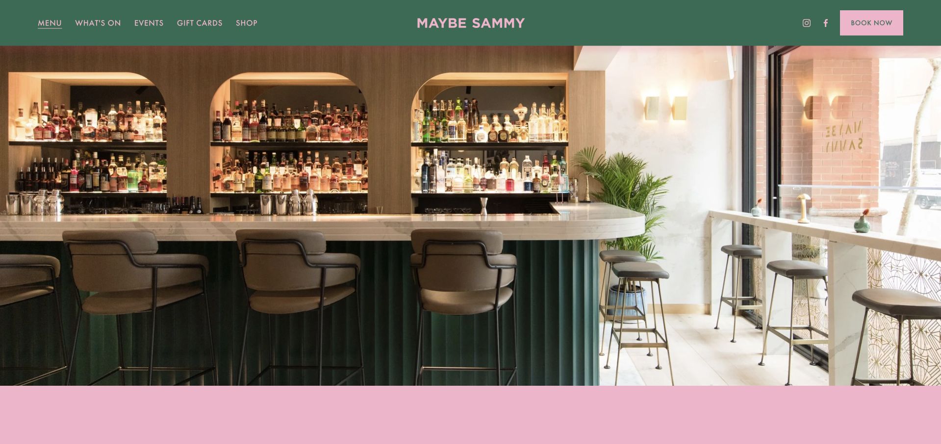
Maybe Sammy connects its Sydney location and mid-century entertainment identity to a Showtime cocktail collection. Individual drinks have named pages inspired by films and television, with a PDF version offered as an alternative. Booking remains a clear header action, and events are separate from the normal visit. The menu becomes content rather than only a downloadable list.
What you can learn
A themed menu can become a useful digital collection when each item has a clear name and destination. Retain a compact full-menu alternative for visitors who want to compare quickly. Connect every film-inspired drink page back to the Showtime collection and full-menu alternative, allowing a visitor to explore one story without losing the ability to compare the range.
Pros
Individual cocktail stories have dedicated pages.
A PDF alternative supports quick whole-menu browsing.
Cons & considerations
Many film-led pages increase the effort needed for comparison.
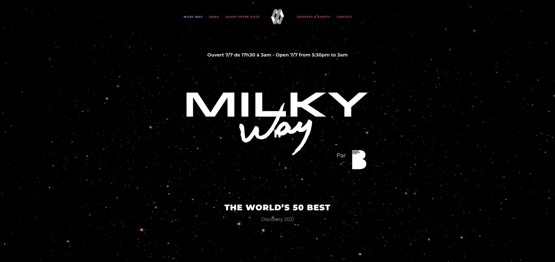
Milky Way uses a star-field backdrop and oversized white identity, then separates cocktail, food, spirits, and late-night menus. Its bilingual pre-visit section clearly explains first-come seating, party-size limits, complete-party arrival, and identification requirements. Group events have a separate inquiry area, so ordinary walk-in rules are not confused with private arrangements.
What you can learn
Give admission expectations the same care as the visual theme. Present ordinary walk-in rules and private-event inquiries separately, with matching practical guidance in each supported language. Keep complete-party arrival, identification and party-size guidance together in each language, and attach late-night food information to its own menu rather than assuming ordinary food hours apply.
Pros
Pre-visit policies are detailed and bilingual.
Late-night food has a distinct menu route.
Cons & considerations
The star-field media is a large decorative layer.
PDF menus require leaving the immediate page content.
Kegan is a freelance web designer and developer with 15+ years of experience helping businesses turn complicated website requirements into clear, maintainable digital experiences. He works directly with clients from planning and design through development, launch, and ongoing support.
For cocktail bar website design, his development approach focuses on readable current menus, hours and location information, clear reservation or walk-in policies, and private-event inquiries. The scope can be a targeted improvement or a complete custom build, with responsive layouts, thoughtful content structure, and integrations chosen around the people using and maintaining the site.
Show 3 other cocktail bar website designersHide other cocktail bar website designers
Plan the guest journey before the theatrical details
Write down the actual seating policy
Resolve group limits, booking windows, walk-in arrangements and late-arrival rules with the team. Publish the same information on the homepage, location page and reservation destination. Contradictory policies create more friction than a plain-looking website.
Design a maintainable menu format
Decide how often the menu changes and who updates the website. A web version can carry core information while a downloadable designed menu preserves the artwork. Date the content and avoid leaving several different “current” menu files in navigation.
Separate experiences and cities
If the brand includes a casual bar, tasting room, upstairs lounge or another city, introduce each in one sentence before asking visitors to choose. Keep address, hours, menu and booking policy attached to that specific place.
The editing job behind the design
Use technology to support the room, not obscure it
Keep critical visit facts as text outside video, maps, social feeds and reservation widgets. Motion should have sensible fallbacks and controls. A dramatic loading sequence that leaves the page blank is a poor trade for a guest trying to find an address on a phone.
Connect a booking provider only after the experience and policies are explained. Label external destinations, test the return path and maintain a direct contact alternative for appropriate questions. A publicly visible provider link is evidence of that service, not proof of the entire website’s implementation stack.
Our WordPress website examples offer a separate look at publishing approaches. A visible platform label is evidence for that named page, not a guarantee that the same system will suit your requirements.
Before the public launch
Cocktail bar website planning checklist
Publish the complete address and entrance guidance.
State reservation versus walk-in policy.
Separate private-event requests.
Keep location-specific menus identifiable.
Provide readable menu essentials.
Identify non-alcoholic offerings when available.
Distinguish kitchen and bar hours.
Show actual room photography.
Keep temporary closure and holiday notices current.
Test motion, contrast and external booking on mobile.
These checks are a project checklist, not a performance, legal, security, or accessibility certification. Test real journeys with the people responsible for the website before making claims about the result.
Sources & editorial method
How this collection was selected and reviewed
These 27 examples match the exact collection count saved before research. The public company pages were opened directly and visually inspected on November 8, 2026 Pacific time; fresh screenshot files were captured on November 9 UTC, as individually dated. Screenshots show actual public pages, including meaningful inner-page sections where appropriate, and are not generated website concepts or vendor-supplied images. Reviews describe observed website design and information, not product or service quality, safety, availability or promised outcomes. Public technology labels are included only with source evidence; unknown stacks remain unlisted. No purchases, reservations, age-verification submissions, inquiries or private forms were completed. Security gates and unrelated or parked domains were excluded. Images and trademarks belong to their owners.
Each example links to its actual source page. Screenshots are direct browser captures with their own capture dates; moving imagery, announcements and live designs can change. The notes describe observable design choices and conditional tradeoffs, not measured traffic, conversion results, service quality, or accessibility conformance.
Technology labels use public page metadata, asset evidence, or explicitly cited platform documentation. Platform documentation is not a complete current deployment audit. A component reference may be legacy or unused; it is not a complete backend inventory. Unknown stacks are omitted. These sites are editorial examples, not our client portfolio.
Written, Edited and Curated are separate editorial records, not timestamps advanced by a rebuild. Website designs and imagery belong to their owners. See our editorial standards or suggest a correction.
Questions worth asking
Cocktail Bar website design questions
Does a cocktail bar need an online reservation system?
Not necessarily. A clearly stated walk-in policy can be more useful than a booking tool that does not match the operation. If only a tasting experience or private room is reservable, label that limitation.
Can the menu be a PDF?
A PDF can preserve the menu’s design, but readable web content is easier to search, enlarge and use on a phone. Offer both where practical and keep dates synchronized.
How should a temporary closure appear?
Give the notice clear prominence, identify affected locations and distinguish confirmed information from an uncertain reopening date. Remove or contextualize booking actions that no longer apply.
Should atmosphere lead the homepage?
It can, provided address, hours and the seating policy remain easy to find. A real-room photograph and one concise concept statement often communicate more than a long autoplay montage.
Let the bar’s character be expressive and the visit information be literal. Guests should understand the experience before they reach a reservation screen or the door.