Best Arts Council Websites of 2026 (21 Real-World Examples)
Arts council websites that connect artists, organisations and the public to useful cultural resources.
Explore 21 real arts council websites, with original observations, genuine screenshots and practical lessons for funding, events, artist resources and community participation.
An arts council website has to serve people with very different levels of institutional knowledge. An artist may be looking for a deadline, an arts administrator for reporting guidance, a parent for a class, and a resident for an event. A strong design gives these people useful starting points without requiring them to understand how the organisation is funded or internally structured.
This collection includes local and regional nonprofit councils alongside state, provincial and national public arts agencies. They are not interchangeable organisations: the useful lesson is how each communicates its actual responsibilities. Reviews concern the public website, not grant eligibility advice, programme outcomes or independently certified accessibility. Princeton’s capture is explicitly a scrolled class-introduction view; all other accepted images are homepage views.
Before the examples
What makes good arts council website design in 2026?
Separate audiences and tasks
Artists, arts organisations, educators, visitors and supporters need different routes. Keep a direct path to recurring services even when the homepage uses an audience selector.
Make dates and status dependable
A grant deadline, event date, news publication and reporting deadline are different fields. Identify open, closed, upcoming, ongoing and archived states rather than relying on a recent-looking card.
Connect the cultural story to a useful action
Show real work with captions, places and credits, then make the next relevant step clear. An inspiring hero cannot substitute for grant guidance, class details or a visitor address.
Communicate access and service changes
Retain application assistance, accommodation guidance and operational notices. Distinguish office, mailing and appointment information, and keep third-party handoffs understandable.
The collection · 21 examples
21 arts council websites worth studying
The random target of 21 was saved before research. Each example has a genuine accepted browser capture and an original site-specific review. The Arts Council of Greater Baton Rouge is the explicit Editors Choice for connecting a memorable regional identity with practical programme pillars.
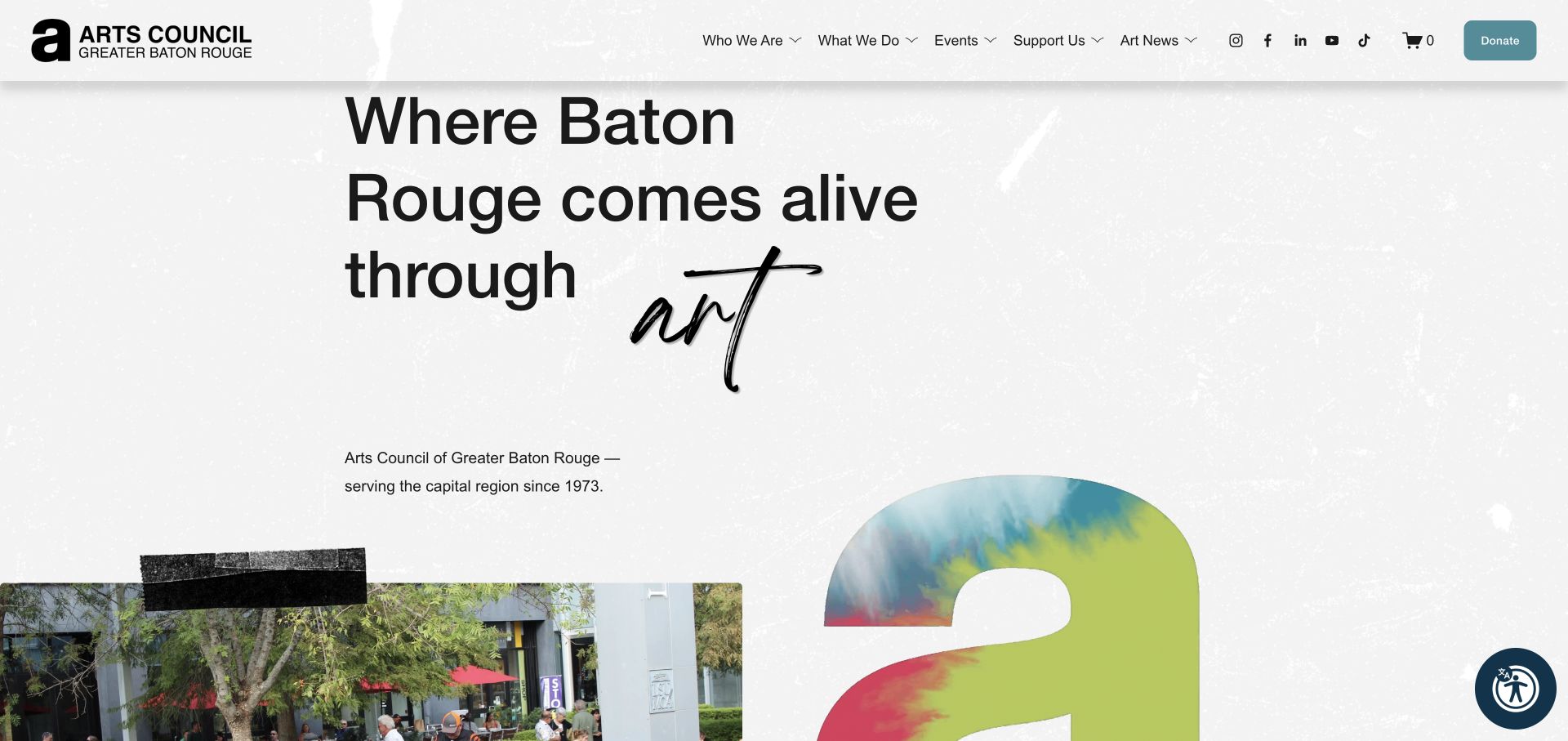
The Arts Council of Greater Baton Rouge combines a textured paper surface, taped photographic collage and handwritten accents with an understandable three-part offer: advocacy, resources, and teaching and training. Those pillars lead to different next steps, while the council explains its ten-parish service area. A calendar, current exhibition and gallery store connect that regional purpose to things people can actually do. This is a strong specialist example because the visual personality supports a clear service structure.
What you can learn
Give the organisation a memorable identity, then translate its mission into a few specific routes. Name the service area and make each programme pillar lead somewhere useful.
Pros
Three programme pillars connect the mission to concrete destinations.
Local photography and collage make the regional identity distinctive.
Cons & considerations
Textured imagery and handwritten accents require careful contrast and small-screen testing.
Footer links and image alternatives need maintenance; one reviewed LinkedIn destination used an administration path.
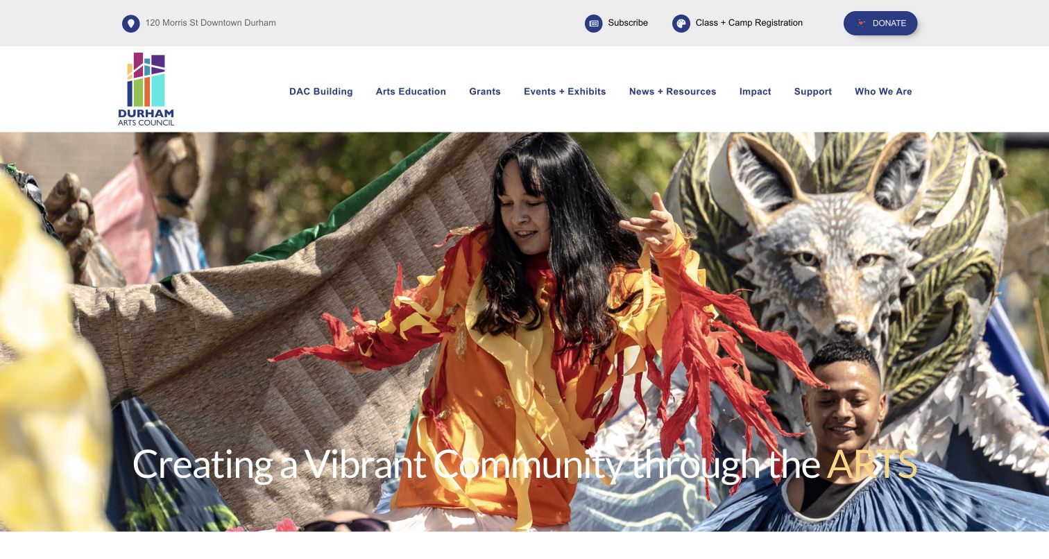
Durham Arts Council pairs lively performance imagery with unusually practical homepage content. Building hours and free-gallery information sit near a task grid covering classes, camps, teaching artists, rental, galleries, grants, volunteering and updates. A dated impact-report route broadens the picture without replacing these everyday tasks. The page serves residents as well as arts professionals, although the registration and catalogue announcements need careful date maintenance.
What you can learn
Use recognisable activities instead of internal department names. If a council operates a building, keep its hours, visitor costs and registration handoffs easy to identify.
Pros
Eight activity routes distinguish learning, visiting, funding and volunteering.
The homepage states building hours and free-gallery access directly.
Cons & considerations
A newsletter popup can interrupt first-time exploration.
Some catalogue announcements mix publication and registration dates, so editorial checks are important.
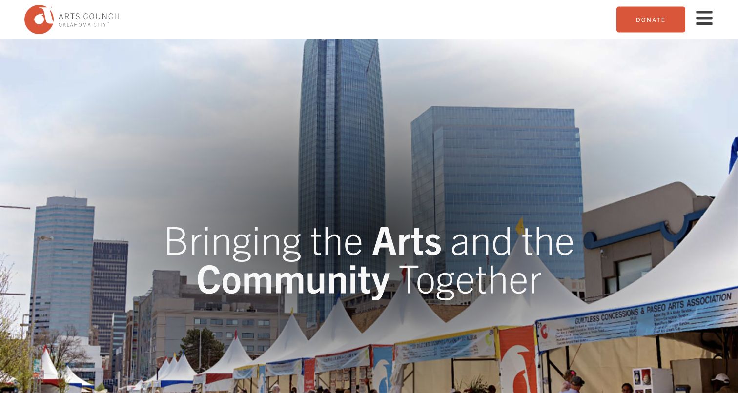
Arts Council Oklahoma City uses a strong orange identity and large festival imagery to establish a public-facing presence. The page then separates Festival of the Arts from year-round Art Moves and All Access Arts programmes, including schools, creative ageing, parks and neighbourhood activity. Current artist stories provide a human perspective. The organisation’s best-known event becomes an entry point rather than the whole explanation of its work.
What you can learn
Let the flagship event attract attention, but give year-round programmes their own names and destinations. A resident should not have to infer the wider service from festival branding.
Pros
Year-round programmes are divided into specific community settings.
Artist profiles connect institutional activity to identifiable people.
Cons & considerations
The very tall photographic hero delays practical programme choices.
A menu control adds a step for visitors seeking a specific recurring resource.
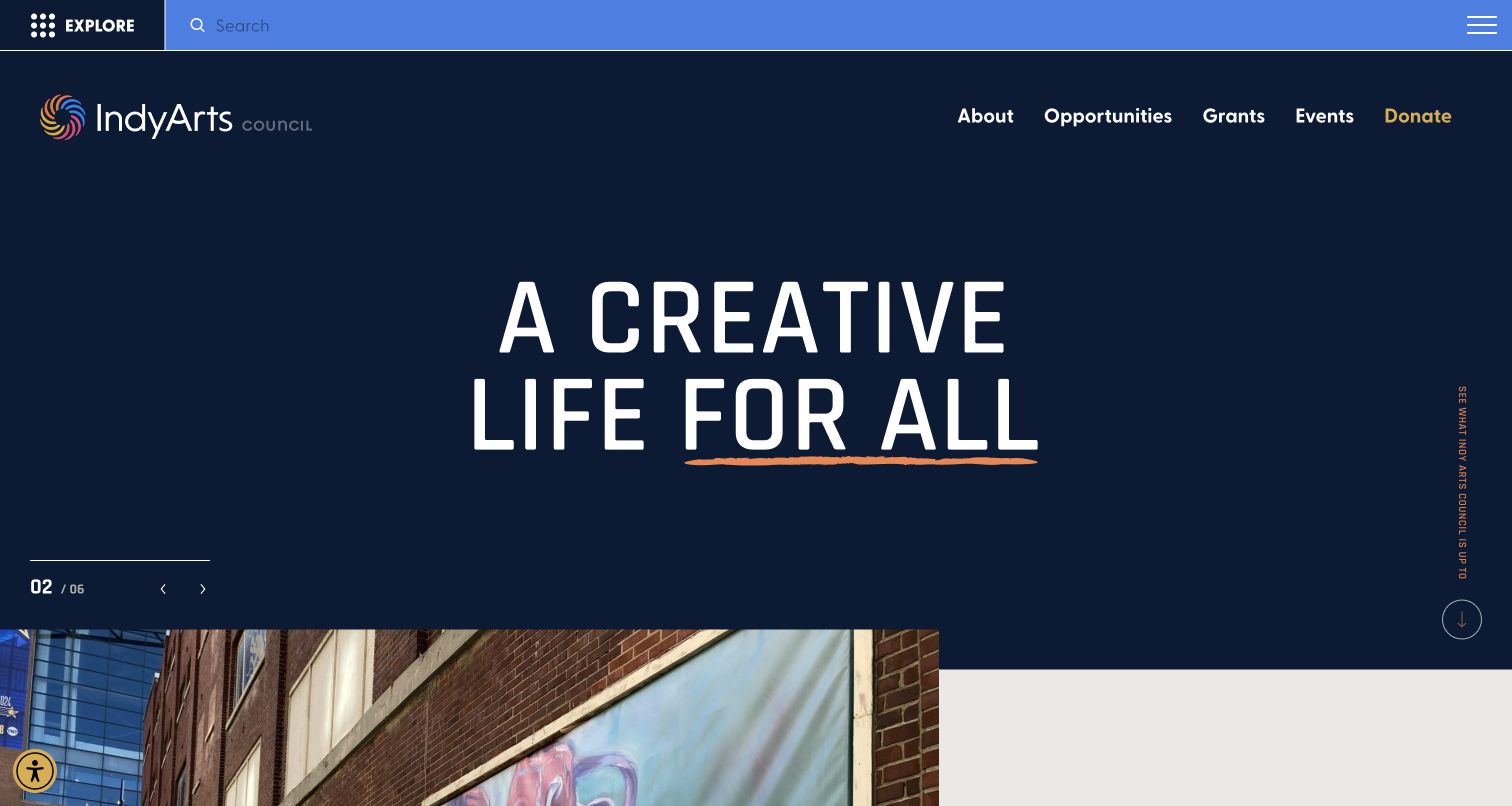
Indy Arts Council uses a navy and orange identity around a short inclusive headline. More importantly, the homepage asks who the visitor is and what interests them, with roles including artist, arts administrator, community partner and neighbour. Artist directories, events, music, public art and resources sit below. The organisation also distinguishes office and gallery hours in its footer. The design acknowledges that one arts website serves several very different intentions.
What you can learn
Use audience language to create starting points without making it the only navigation. Retain direct links for experienced visitors who already know which grant, directory or resource they need.
Pros
The role choices use understandable community and professional language.
Directories, events and resources retain direct routes beyond the selector.
Cons & considerations
A long homepage and multiple discovery systems can feel repetitive.
Role and interest controls need clear keyboard behaviour and useful empty-result handling.
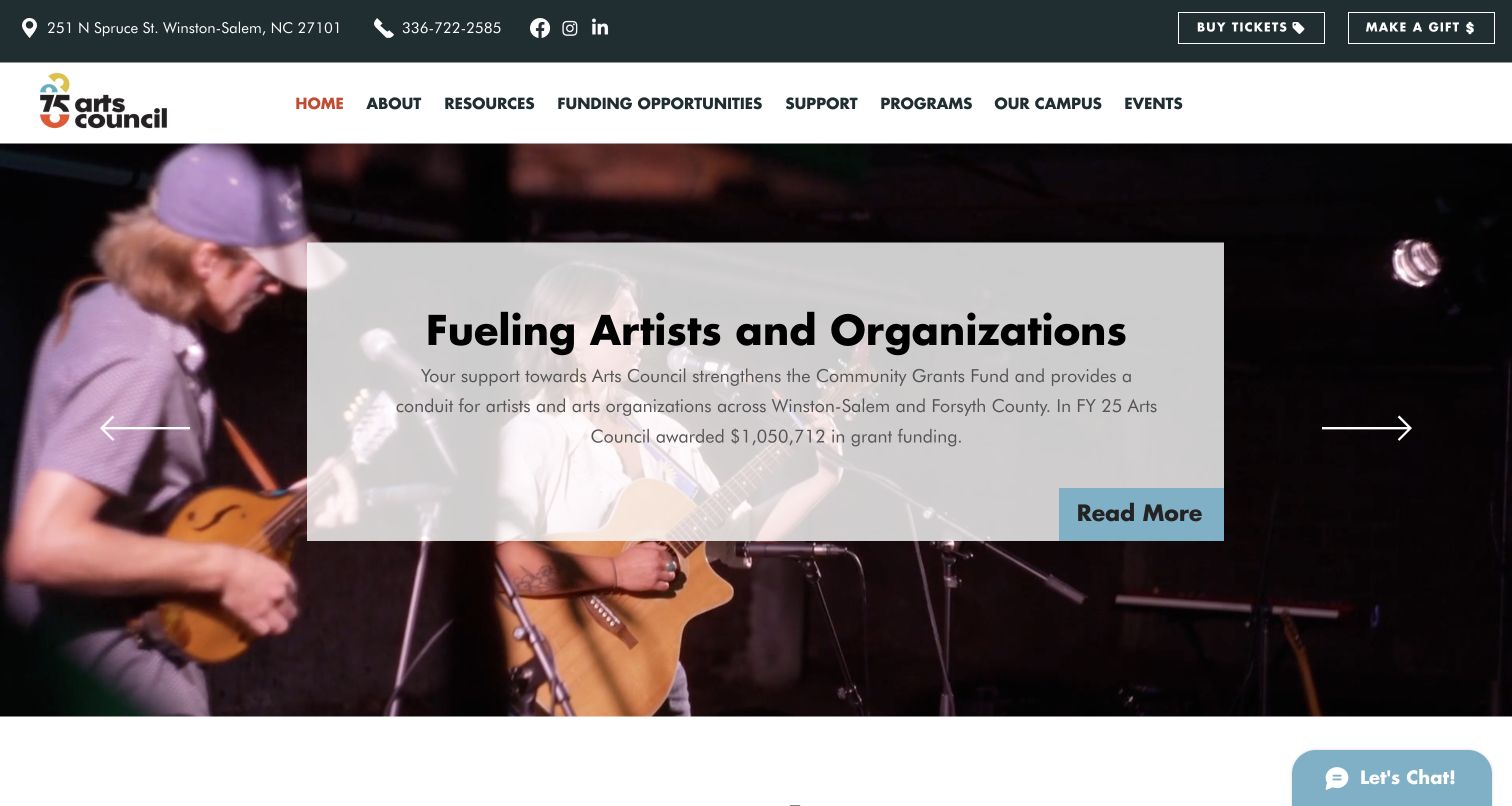
Arts Council of Winston-Salem & Forsyth County brings tickets, donations and telephone details into its upper header, then separates resources, funding, programmes, campus and events. A named leadership statement accompanies community photography. Lower content retains gallery hours, a holiday schedule and a filming notice. The page communicates the organisation’s public role, but its large slideshow and dense navigation make task prioritisation especially important.
What you can learn
Keep venue operations, artist resources and financial support as different journeys. Attribute institutional statements and support the broad mission with maintained opening and contact information.
Pros
Tickets and donations have prominent, separate utility links.
The footer retains gallery hours and a specific holiday-hours resource.
Cons & considerations
A large slideshow competes with time-sensitive service information.
Practical information supplied only through a PDF needs an accessible, maintained alternative.
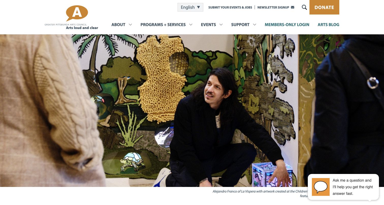
Greater Pittsburgh Arts Council introduces its work with a fully identified local project and photo credit, followed by a resource guide for working artists. Four recurring tasks point to events, jobs, advocacy and research. The page also names contributors in testimonials and distinguishes its mailing address from a public office visit because staff work remotely. These operational details make the organisation’s practical role clearer than a generic cultural-impact slogan would.
What you can learn
Use a real local project to establish context, then expose the services people return for. Clarify whether an address is a mailing destination or somewhere visitors can actually go.
Pros
Events, jobs, advocacy and research have clear entry points.
The remote-working notice prevents confusion about visiting the address.
Cons & considerations
A proactive chat prompt initially obscured part of the photographic context.
Member services and public resources need clear login boundaries.
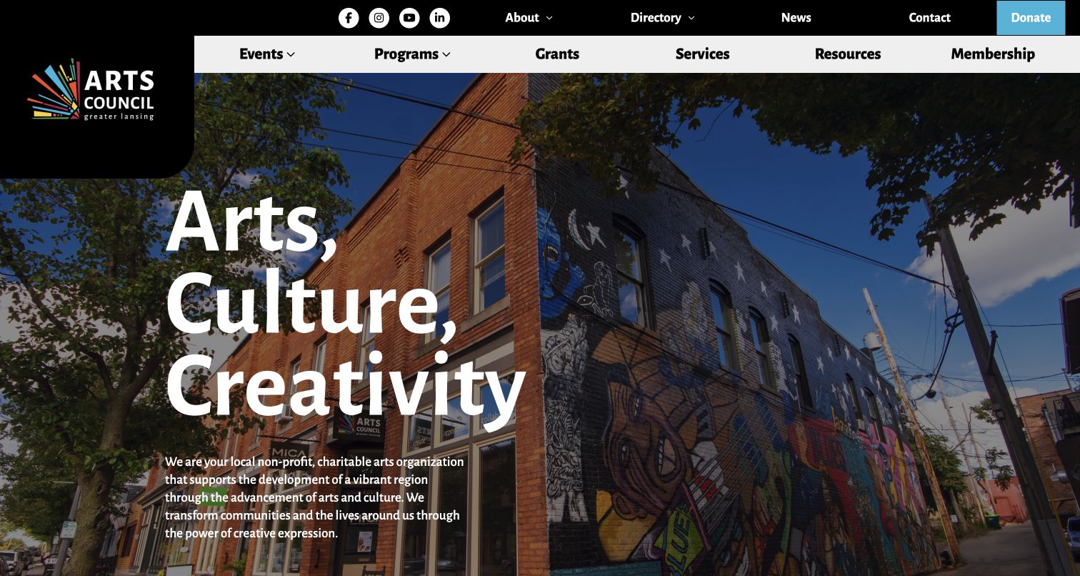
Arts Council of Greater Lansing combines a mural-and-building photograph with a plain explanation of its local nonprofit role. Grants, services, resources and membership are visible in the main navigation, while a task selector offers common actions such as donating, viewing a calendar and contacting the council. A member directory and attributed testimonials support the wider community network. The organisation does not rely on an event feed alone to explain its purpose.
What you can learn
Pair place-based imagery with a short explanation of whom the council serves. Offer shortcuts for recurring tasks while maintaining stable navigation to the complete resource areas.
Pros
The opening explains the local organisation rather than only showing a slogan.
Membership and the member directory are treated as distinct resources.
Cons & considerations
Two rows of navigation create a dense first screen.
Broad labels such as Resources need descriptive landing pages so visitors can predict their contents.
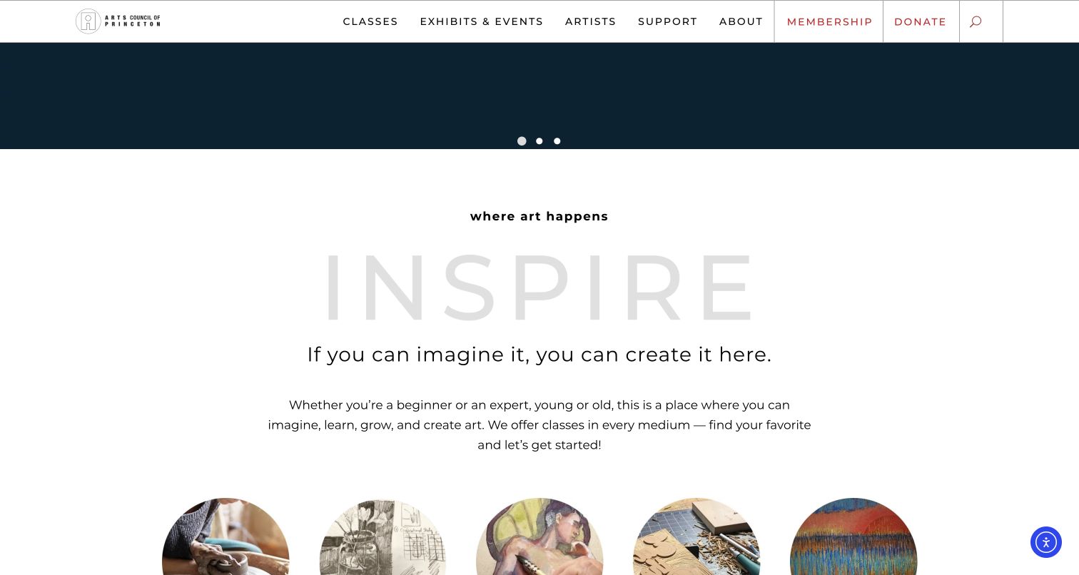
The reviewed Arts Council of Princeton homepage view is scrolled to its class introduction rather than presented as the very top of the page. Its navigation distinguishes classes by age group and links scholarships, policies, exhibits, public art, rental and artist opportunities. Calendar items expose dates and prices or free status. Membership benefits are concrete, including class savings and opportunities to teach or show work. The richness is useful, but the menu needs disciplined hierarchy.
What you can learn
Make class categories, cost context and scholarship information easy to reach before registration. Describe what membership changes for the participant rather than treating it only as a donation tier.
Pros
Age-group class routes are accompanied by policies and scholarship information.
Calendar cards include practical date and cost context.
Cons & considerations
The very extensive menu can overwhelm a visitor with one simple task.
Oversized pale background typography should not undermine reading contrast.
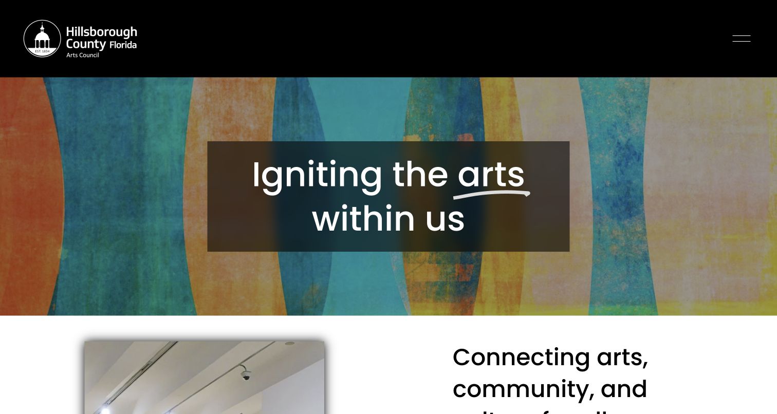
Arts Council of Hillsborough County places a bold institutional statement over a colourful painted surface, then divides its offer among artists, arts lovers and organisations. Those routes lead toward funding, events, education and other resources. A named artist spotlight supplies local context beyond a stock cultural image. The footer also makes an important distinction: a calendar listing does not constitute an endorsement. This is a useful model for an organisation curating third-party opportunities.
What you can learn
Organise the first choices around the audiences you genuinely serve. When publishing third-party listings, explain the council’s role instead of implying every listing has been endorsed.
Pros
The three audience cards distinguish professional and public needs.
The artist spotlight gives the local community a specific human presence.
Cons & considerations
A hidden main menu adds a step to more specialised resources.
Long spotlight biographies benefit from shorter introductions and a full profile route.
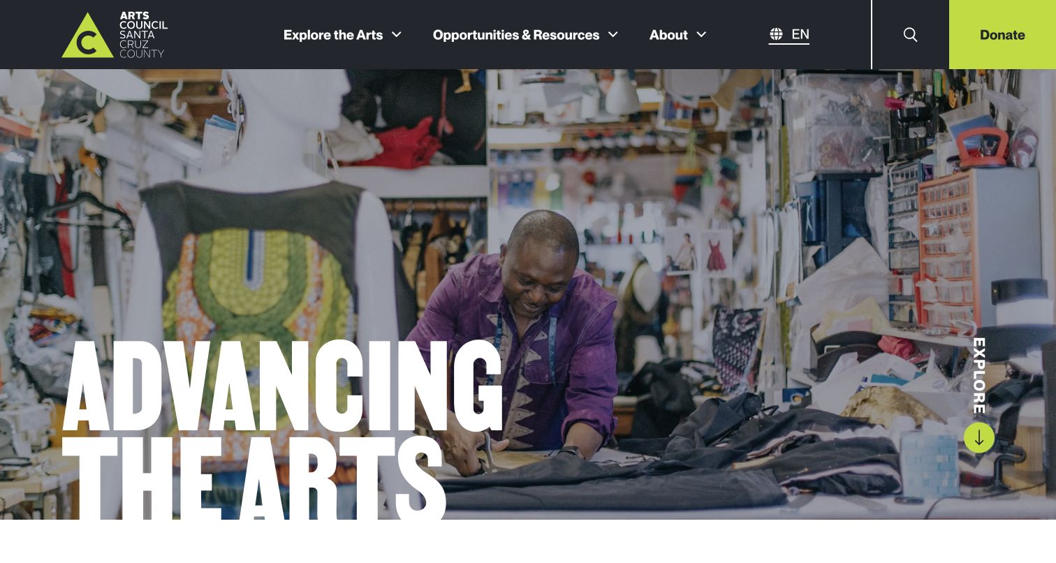
Arts Council Santa Cruz County uses a restrained charcoal header and bright green identity around three primary areas: exploring arts, opportunities and resources, and organisational information. The homepage combines current calls and community stories with separate routes for supporters, artists and arts educators. Its newsletter preferences distinguish general, Tannery, education and grant updates. That segmentation is more useful than asking every visitor to receive the same stream.
What you can learn
Keep the primary navigation short, then separate the actual resource audiences beneath it. Allow subscribers to choose useful subjects and cadences rather than making all updates interchangeable.
Pros
Resource pathways distinguish artists, educators and supporters.
Newsletter choices identify both subject and expected frequency.
Cons & considerations
A seasonal announcement can become distracting when it remains prominent after the event.
External application documents need clear destinations and ongoing link checks.
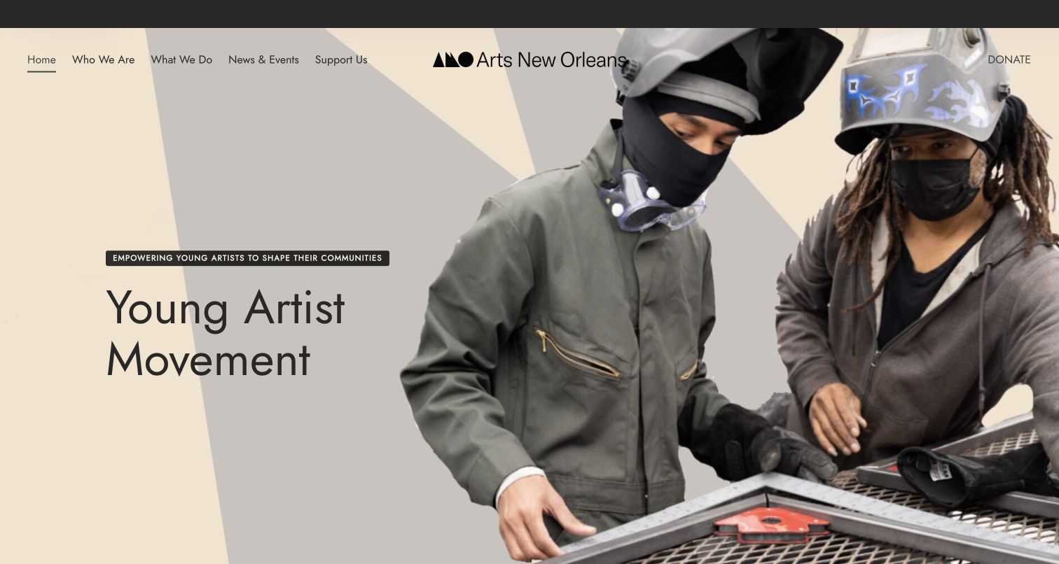
Arts New Orleans combines a cream-and-black identity with large images for LUNA Fête, public art and placemaking, young artists and the arts market. Each slide names a real programme rather than using an abstract creativity message. Supporting content includes attributed accounts of specific projects, and the footer identifies a postal address as a PO box. The design unifies diverse public activities, although essential routes should not depend entirely on the slideshow.
What you can learn
Give each programme an explicit name, purpose and destination. A shared visual identity can hold diverse activities together without forcing visitors to watch every rotating slide.
Pros
The opening connects striking imagery to named public programmes.
Specific project testimonials add context beyond general praise.
Cons & considerations
Important programme entry points can disappear as the carousel advances.
Icon-only social destinations need clear accessible names.
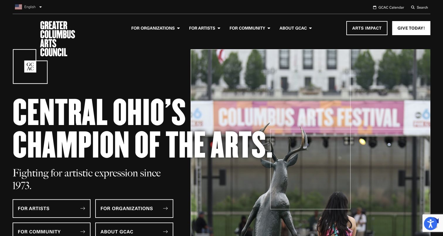
Greater Columbus Arts Council puts artists, organisations, the community and institutional information into four bold homepage choices. The black-and-white identity and credited image give the page a strong visual structure without hiding those routes. Dated news and an explicitly labelled 2025 impact section distinguish current updates from annual reporting. Funding, workshops and studio opportunities remain grouped for artists, while organisational funding has its own path.
What you can learn
Give each audience a clear starting point, then preserve the distinction in the deeper content. Label the reporting period of impact figures so a visually current homepage does not imply new measurements.
Pros
The four entry buttons make the main audience choices immediately visible.
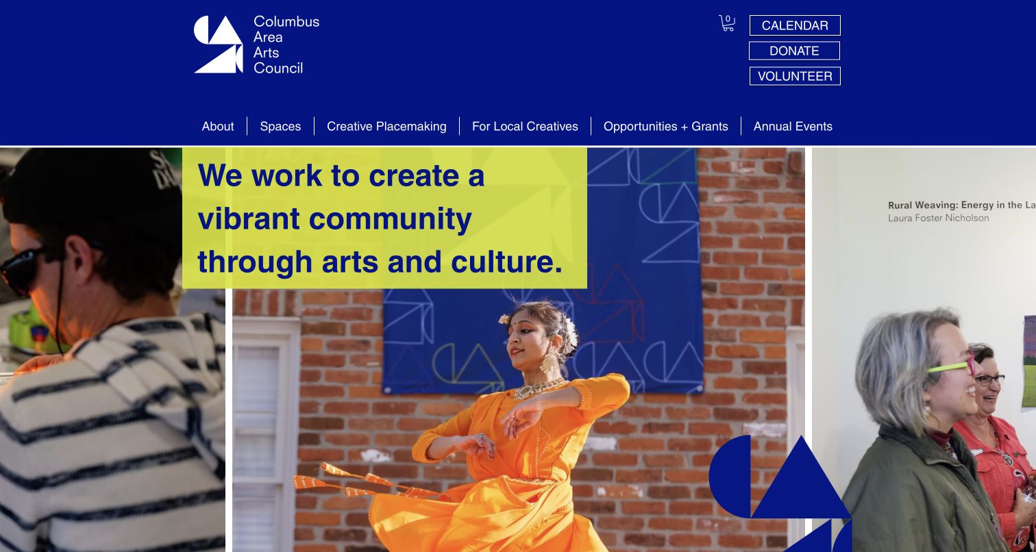
Columbus Area Arts Council uses a deep blue and yellow palette around photographs of local creative activity. Its navigation distinguishes spaces, creative placemaking, local creatives, opportunities and grants. The homepage explains participation and gives accommodation-request guidance with a lead time, while the footer separates office hours from appointment arrangements. These are useful service details for a local arts organisation, though the reviewed street-address link unexpectedly opened an email destination.
What you can learn
Connect each public place or programme with the practical information needed to participate. State how to request accommodations and distinguish a visiting address, email address and appointment process.
Pros
Spaces and placemaking receive their own understandable navigation labels.
Accommodation requests and office arrangements are explained directly.
Cons & considerations
The street-address link should not unexpectedly behave as an email link.
Repeated More labels are less informative than programme-specific link wording.
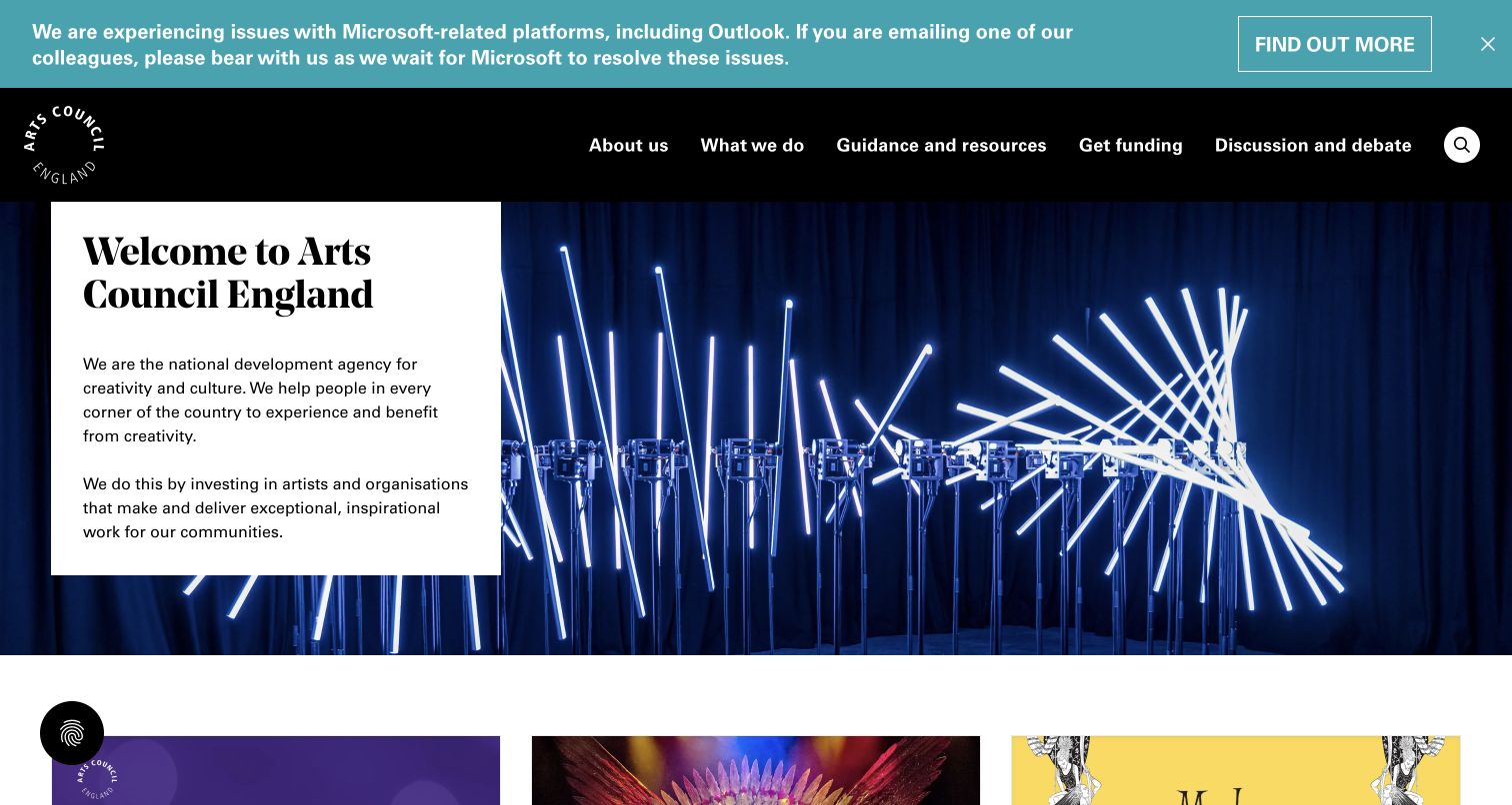
Arts Council England combines a photographic introduction with substantial funding, guidance and organisational navigation. The reviewed page retains a dated notice about a Microsoft Outlook service problem rather than hiding an operational interruption. Funding and application-support routes are available alongside news and policy material. The breadth suits a national organisation, but the information needs rigorous maintenance: one reviewed top-level What We Do link exposed a placeholder destination.
What you can learn
Treat service status and application assistance as part of the public experience. A funding website must make the route reliable as well as visually clear, including its top-level link destinations.
Pros
Funding guidance and application support have explicit destinations.
The operational interruption is communicated in a visible dated notice.
Cons & considerations
Deep national-programme menus create a substantial orientation burden.
A reviewed placeholder destination demonstrates the need for automated and manual link checks.
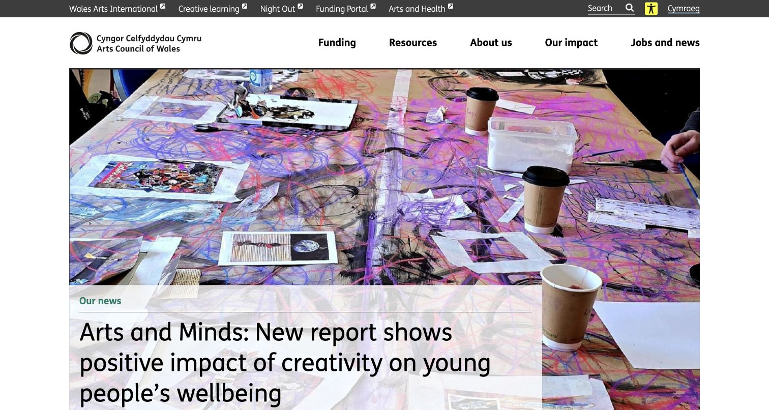
Arts Council of Wales keeps its bilingual identity and Welsh-language route prominent while separating funding for individuals, organisations, creative learning and international work. Resource links include bilingual working and support for people with specific access needs. The homepage’s current report and news imagery demonstrate activity, but visitors still need dependable routes from those stories to the relevant funding guidance. The contrast selector is a feature to study, not evidence of compliance.
What you can learn
Plan language and access support as content architecture, not decorative controls. Keep the application audience clear and explain the support available without requiring a visitor to begin a form.
Pros
Funding pathways distinguish individuals, organisations and learning activity.
Bilingual and access-support resources are named directly.
Cons & considerations
A news-led hero can delay a returning applicant’s most common tasks.
Older calls need unmistakable closed states and accurate deadline context.
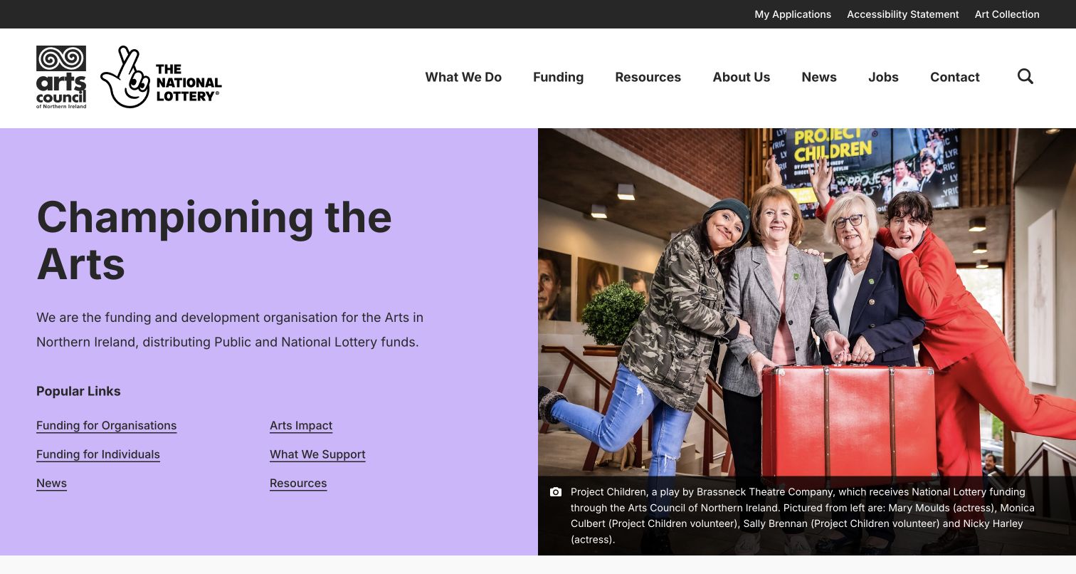
Arts Council of Northern Ireland pairs a lavender mission panel with a photograph whose caption identifies the play, participants and supported context. Six popular links distinguish individuals, organisations, news, impact, supported work and resources. My Applications and accessibility information remain in the utility navigation. The page makes funding and public communication coexist, while demonstrating why impact statistics need reporting-period context rather than numbers alone.
What you can learn
Caption supported work specifically and offer direct links for the two main applicant groups. Keep the application portal recognisable as a separate task from reading about the programme.
Pros
The hero image has meaningful participant and project context.
Popular links distinguish individual and organisational funding journeys.
Cons & considerations
Impact figures need a visible period and source to support interpretation.
Large photography must retain readable labels and captions across viewport sizes.
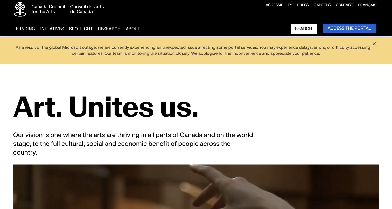
Canada Council for the Arts uses a short institutional headline, bilingual identity and artist-credited media to communicate its national role. Funding routes then distinguish eligibility, profiles, the portal, decisions, assistance and deadlines. A visible service warning about a Microsoft outage is retained near the relevant content. Research, governance and official-language resources supply accountability beyond the campaign message. This is a broad public-service model rather than a small local council template.
What you can learn
Separate the cultural story from the steps an applicant must complete. Keep eligibility, assistance, deadlines and portal status reachable without requiring an account first.
Pros
The funding area exposes several distinct stages of the applicant journey.
An active service warning is not hidden behind ordinary promotional content.
Cons & considerations
The broad menu needs strong landing pages for less experienced applicants.
A film-led introduction should never be the only way to understand the mission.
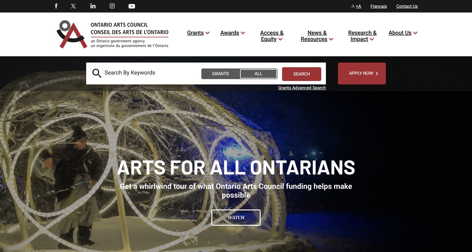
Ontario Arts Council places a keyword search and Grants-versus-All choice near the top of its English-language homepage. Apply Now is separate from informational areas for grants, awards, access and equity, research and impact. A large film promotes the wider arts mission, while dated updates and a labelled fiscal-year impact section provide context. The initial language gateway is explicit, and the application destination is an external handoff rather than an inline form.
What you can learn
Put funding discovery before a long institutional introduction when that is a primary visitor task. Distinguish searching for guidance from entering the actual application system.
Pros
Grant-focused search appears before the large promotional media section.
Access, equity and research are permanent information destinations.
Cons & considerations
A separate language gateway adds an initial step for repeat visitors.
Old updates need clear date hierarchy so they do not appear newly actionable.
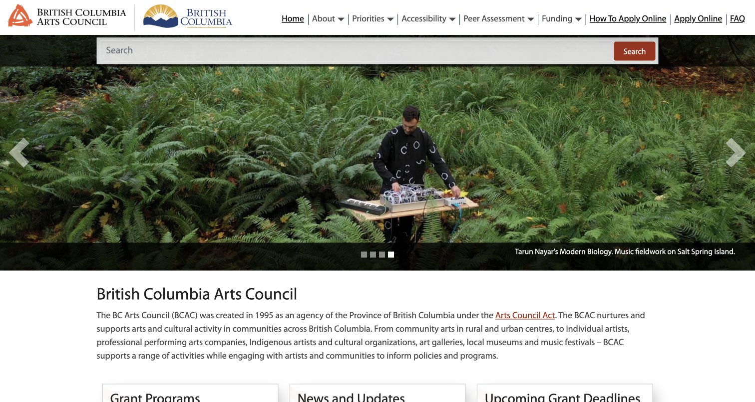
British Columbia Arts Council follows its captioned performance slideshow with three practical columns for grant programmes, news and upcoming deadlines. Programme types receive short explanations, while application assistance and access support are identified as ongoing. The news area openly reports a grant-display issue and a restored email service. Street and mailing addresses are distinct in the footer. The practical structure is valuable, although an older action-plan slide shows why campaigns need expiry reviews.
What you can learn
Keep programme descriptions, current notices and deadlines close together but clearly separated. Explain ongoing support and publish service problems honestly rather than leaving visitors to infer a failure.
Pros
Programme, news and deadline columns support different recurring tasks.
The footer distinguishes the office location from the mailing address.
Cons & considerations
An old action-plan promotion can make an otherwise active site feel stale.
A crowded horizontal menu needs careful mobile and keyboard handling.
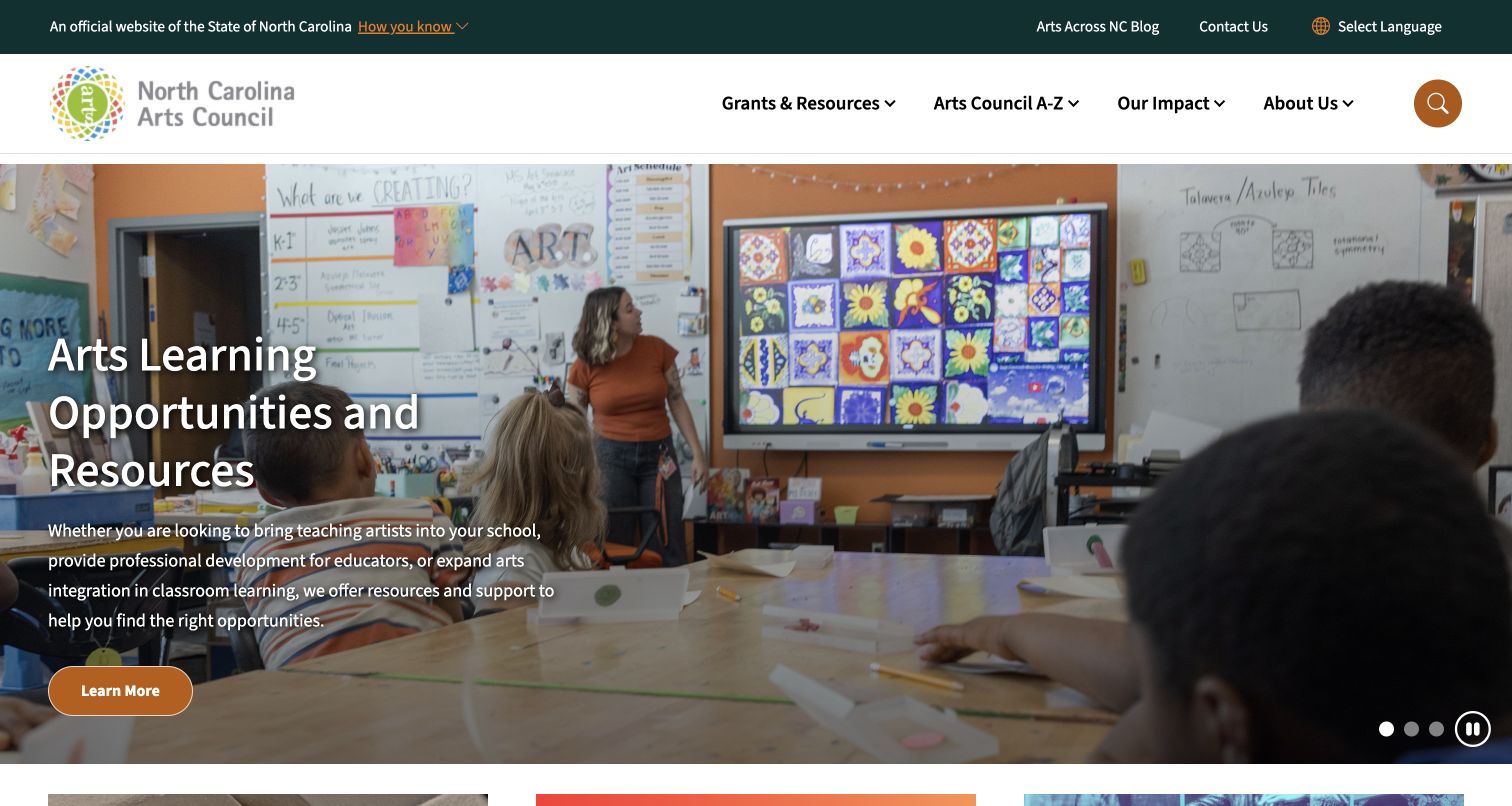
North Carolina Arts Council uses an official state header and four primary areas rather than a sprawling arts-sector menu. The reviewed hero promotes arts-learning resources with a real classroom image and pause control. A dedicated grants dashboard is described as the destination for grant information and report deadlines. Newsletter, podcast and music stories give the wider programme depth. The structure is clear, though some card descriptions are much longer than adjacent items.
What you can learn
Use a dashboard or clear index for frequently changing grant tasks, while keeping editorial stories separate. Give moving promotional content a visible control and a stable text destination.
Pros
A named grants dashboard consolidates funding and reporting information.
The hero includes an explicit slideshow pause control.
Cons & considerations
Very long card summaries reduce the consistency of the content grid.
External newsletter and video destinations need clear handoff expectations.
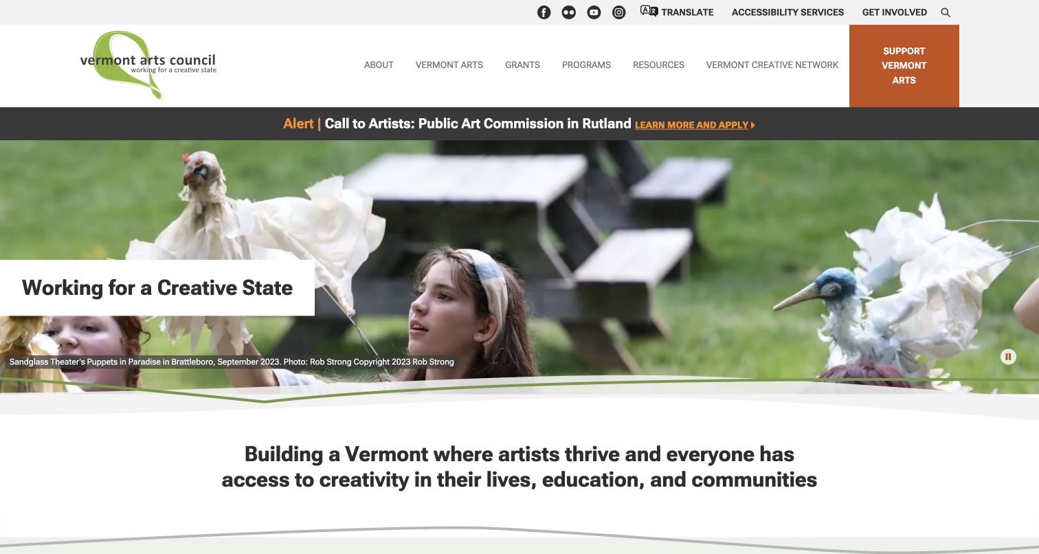
Vermont Arts Council places a current public-art call above a fully credited performance slideshow. The navigation distinguishes grants, programmes, resources and a statewide creative network. Grant descriptions explain that programmes have their own guidance and staff contacts, while features retain publication dates. The footer states that the usual office is closed for repairs and gives an appointment-based alternative. This is a useful example of maintaining honest practical access alongside a broad mission.
What you can learn
Keep urgent calls separate from enduring programme navigation. State temporary office arrangements explicitly and direct programme questions to the relevant guidance instead of a single undifferentiated inbox.
Pros
Grant routes distinguish artists, organisations and arts education.
The temporary office closure includes a clear appointment alternative.
Cons & considerations
The extensive menu requires strong grouping and accessible expansion behaviour.
A residual administrator/date label at the bottom needs editorial cleanup.
Kegan is a freelance web designer and developer with 15+ years of experience helping businesses turn complicated website requirements into clear, maintainable digital experiences. He works directly with clients from planning and design through development, launch, and ongoing support.
For arts council website design, his development approach focuses on funding and opportunity calendars, eligibility guidance, local cultural directories, public program information, and clear application and participation routes. The scope can be a targeted improvement or a complete custom build, with responsive layouts, thoughtful content structure, and integrations chosen around the people using and maintaining the site.
Show 3 other arts council website designersHide other arts council website designers
Plan an arts council website around participation and dependable public service
Give each audience a useful route without trapping them in a persona
Start with a real inventory of services, not a visual sitemap exercise. List the people who need those services and the language they use: an emerging artist seeking a grant, an organisation submitting a report, a teacher arranging a workshop, a resident looking for an event, or a supporter deciding whether to donate. These groups overlap. A teaching artist may also be a parent, event visitor and applicant, so an audience choice should help orientation rather than impose a permanent identity.
Greater Columbus Arts Council makes its four audience routes immediately visible. Hillsborough distinguishes artists, arts lovers and organisations. Indy adds an interest choice to its role selector, while Durham uses direct activity labels such as classes, rental and grants. Those are different solutions to the same underlying problem. Choose the approach that matches the actual content and test whether a first-time visitor can predict the next page from its label.
Keep common services directly reachable from ordinary navigation, search and contextual links. A returning grantee should not have to complete a role selector again to find a reporting deadline. If a programme has its own application system, make that boundary explicit. Reading about a grant, checking eligibility and signing into a portal are related tasks, but they should not be disguised as one identical action.
Build funding information as maintained records rather than recurring announcements
A grant page needs a programme name, intended audience, geographical scope, status, guidance, relevant dates and a clear next step. Explain where application assistance is available and distinguish general questions from technical portal support. Describe selection or eligibility through the council’s approved guidance; the website should not invent simplified promises that the underlying programme does not support.
North Carolina’s grants dashboard makes recurring funding and reporting information a named destination. British Columbia puts programme explanations, service notices and upcoming deadlines in adjacent but separate columns. Ontario gives grant-focused search first-screen priority. Northern Ireland differentiates individual and organisational journeys. These patterns are most useful when the detail records are dependable; a polished index cannot repair inconsistent dates across a news story, downloadable guide and application portal.
Define what happens when a deadline passes. Keep the old cycle identifiable, retain useful decisions or recipient information, and point to the current programme where appropriate. Do not update an article’s displayed date simply to make an expired call look fresh. Assign an owner to every deadline and temporary notice. Provide a deliberate ongoing state for assistance programmes that do not use a single closing date, instead of leaving a date blank and expecting visitors to interpret it.
Make events, learning and local participation practical
Public programmes need their own information model. An event record should identify the place, date, start time, price or free status, booking arrangements and relevant access information. Classes need age or experience context, registration dates and a route to policies or financial assistance. A venue needs its own hours and contact details. Separate these from the council’s administrative office and mailing address; visitors should not have to learn the distinction after arriving at the wrong building.
Durham combines activity routes with building hours and free-gallery information. Princeton groups learning by age and keeps policies and scholarships in the same broader navigation. Columbus Area Arts Council explains accommodation requests, while Vermont states that the regular office is closed for repairs and gives an appointment-based alternative. Pittsburgh explicitly describes remote-working arrangements. These small operational details can matter more to a participant than another promotional headline.
Retain event archives without making them appear bookable. If a calendar accepts third-party submissions, explain the review process and the council’s relationship to the listing. Hillsborough’s nonendorsement distinction is worth studying. Avoid assuming that a public listing proves safety, quality or availability. Make recurring events editable as a series but allow accurate exceptions, such as a cancelled date, temporary venue or revised access arrangement.
Connect identity, local evidence and public accountability
Arts organisations have strong visual material, but using it well means more than filling a hero. Name the artist or programme, identify the place, credit the image and explain what the council actually contributed when that context is available. Do not turn every image of creative work into an implied institutional achievement. If a photograph shows a past event, its caption can retain the historical date while the surrounding site remains current.
Baton Rouge combines a distinctive collage identity with clear programme pillars. Pittsburgh gives its local image a specific project context. Northern Ireland identifies the people and work represented in its hero, and Vermont credits the performance photographs. New Orleans names the programmes behind its large images. These examples offer different visual styles, but the recurring lesson is specificity: real people, places and programme names communicate more than a generic claim that art changes everything.
Public accountability needs equally clear context. Identify the reporting year for impact statistics and link to the underlying report when available. Greater Columbus and Ontario label their reporting periods rather than presenting an undated number as current measurement. Keep governance, organisational information and public resources accessible without letting the homepage become a filing cabinet. A short summary with a well-structured report destination is often more useful than duplicating a full annual document in a news card.
Treat access, reliability and editorial maintenance as ongoing work
Accessibility cannot be established by adding a toolbar, contrast selector or statement alone. Test the actual tasks: opening a menu, reading a deadline, searching programmes, using a calendar, completing registration and requesting support. Review keyboard navigation, focus visibility, colour contrast, motion controls, image alternatives, document accessibility and error messages. Where a third-party portal is involved, make its ownership and support route clear rather than claiming control over an experience the council does not operate.
Service notices are a useful part of this reliability layer. England, Canada and British Columbia visibly communicated email, portal or display problems during review. Do not hide those notices to preserve a pristine visual design. Say which service is affected, offer a useful alternative where one exists and remove or update the notice when the situation changes. Likewise, a temporary office closure should agree with the footer address, visiting information and contact page.
Create a practical maintenance schedule around programme cycles rather than an arbitrary redesign anniversary. Check grant dates, event status, external destinations, registration handoffs, staff information and seasonal promotions. The reviewed collection includes older action-plan promotions, placeholder or unexpected link destinations and lingering seasonal announcements. These are not reasons to dismiss otherwise useful designs; they demonstrate why content ownership, automated checks and periodic human review must accompany the visual system.
The editing job behind the design
Choose technology for reliable programme and opportunity records
A council content system should model programmes, funding cycles, deadlines, events, venues, resources and reporting periods separately. Editors should not need to copy the same deadline into five unrelated text blocks.
Registration, ticketing and grant portals may be separate systems with different privacy and access requirements. Explain each handoff and keep private applicant, payment and accommodation information outside the public editorial templates.
The visible stack is bounded by public evidence and the shared audit process. An embedded video, government hosting credit or supporting script does not identify the entire application architecture. Unknown technologies remain unknown rather than being filled with plausible guesses.
Our WordPress website examples offer a separate look at publishing approaches. A visible platform label is evidence for that named page, not a guarantee that the same system will suit your requirements.
Before the public launch
Arts council website planning checklist
Map artists, organisations, educators, residents and supporters to actual tasks.
Keep repeat services directly reachable without a mandatory audience selector.
Give funding programmes and individual cycles distinct maintained records.
Separate application, event, publication and reporting dates.
Label open, closed, ongoing, upcoming and archived states.
Keep application assistance and technical portal support easy to find.
Include event place, time, price and booking context.
Place scholarships and class policies near the learning journey.
Distinguish venue, office, mailing and appointment information.
Caption local work with accurate programme and image context.
Identify the reporting period behind impact figures.
Maintain service notices, external links and seasonal promotions.
Test menus, search, calendars, documents and third-party handoffs.
Assign an owner to each recurring deadline and operational detail.
These checks are a project checklist, not a performance, legal, security, or accessibility certification. Test real journeys with the people responsible for the website before making claims about the result.
Sources & editorial method
How this collection was selected and reviewed
The target of 21 was drawn and saved before research. Every included public source was read and visually reviewed in Chrome, with a genuine accepted JPEG and actual UTC capture timestamp. The Arts Council of Princeton capture is a keyboard-scrolled class-introduction view; other accepted images show homepage views. Privacy and popup interfaces were handled through ordinary controls or a subsequently observed clean state, never hidden with DOM edits. Operational notices, captions and service warnings remain part of the sources. The review does not certify accessibility, funding outcomes or organisational performance. Broad technology checks remain part of the shared publication process.
Each example links to its actual source page. Screenshots are direct browser captures with their own capture dates; moving imagery, announcements and live designs can change. The notes describe observable design choices and conditional tradeoffs, not measured traffic, conversion results, service quality, or accessibility conformance.
Technology labels use public page metadata, asset evidence, or explicitly cited platform documentation. Platform documentation is not a complete current deployment audit. A component reference may be legacy or unused; it is not a complete backend inventory. Unknown stacks are omitted. These sites are editorial examples, not our client portfolio.
Written, Edited and Curated are separate editorial records, not timestamps advanced by a rebuild. Website designs and imagery belong to their owners. See our editorial standards or suggest a correction.
Questions worth asking
Arts Council website design questions
What should an arts council homepage prioritise?
Start with the services people need: funding guidance, events, learning, artist resources, participation and organisational information. The priority depends on what the council actually does and whom it serves.
Should grants be organised by audience or by programme?
Both can be useful. Audience routes help orientation, while programme records provide the detailed guidance and cycle status. Keep a direct route for returning applicants who already know the programme name.
How should expired opportunities be handled?
Label them as closed or archived and retain useful historical information. Link to the current cycle where appropriate rather than silently changing the displayed date or leaving an old application looking open.
Why is Baton Rouge the Editors Choice?
The reviewed regional council combines a memorable local collage identity with practical routes for advocacy, resources and teaching and training. The choice concerns website communication, not independently measured programme outcomes.
Does an accessibility control prove the site is accessible?
No. A toolbar or contrast selector is only one feature. The actual navigation, content, documents, forms and external handoffs still need testing with relevant standards and user needs.
Start with clear participation routes and dependable programme records. Let local culture shape the identity, while dates, access details and honest service information make the council useful day after day.