Best Artisanal Cheese Maker Websites of 2026 (28 Real-World Examples)
Twenty-eight real cheese-maker websites showing how to connect milk, making, product choice and practical ways to buy or visit.
An artisan cheese website should help visitors understand the maker and choose a cheese without having to decode specialist language or a long farm story first.
A cheese maker may sell through an online shop, a farm counter, independent retailers or a combination of all three. Some also welcome tours or supply restaurants. A useful website makes those arrangements clear. It identifies what the business actually makes, explains meaningful differences among the cheeses and gives visitors an appropriate next step for their location and purpose.
The examples here range from small seasonal farmstead producers to established creameries with broader retail operations. Compare how they use working-farm photographs, product packaging, cut-cheese views, recipes and stockist information. This is a study of website presentation and content structure, not a ranking of flavor, food safety, farming practices or business performance.
Before the examples
What makes good artisanal cheese maker website design in 2026?
Make the range understandable
Explain unfamiliar names with a few useful product facts: milk source, cheese style, maturation, texture, size and availability. Show both the package and the cheese where appropriate. A visitor should be able to distinguish two products before opening several nearly identical pages, while full ingredient, allergen and storage information remains available for the exact item.
Connect the maker story to actual work
Describe the steps the business performs and distinguish making, maturing and retailing. A farmstead maker can explain its own milk and production connection; another creamery can identify its supplying farms without implying ownership. Real process photographs and dated, attributed supporting material are more useful than a broad artisan or sustainability slogan.
Explain how and where to buy
Give online ordering, local pickup, stockists, wholesale and visits their own clear routes when those options exist. State the relevant locations and availability rather than assuming every visitor can use the same shop. Seasonal release dates, delivery windows and opening hours need named maintenance responsibility so the practical information stays aligned with the business.
The collection · 28 examples
28 artisanal cheese maker websites worth studying
Look beyond the large food photographs. The most useful comparisons are how each site names its cheeses, explains the making process and helps a visitor move toward a realistic purchase or visit.
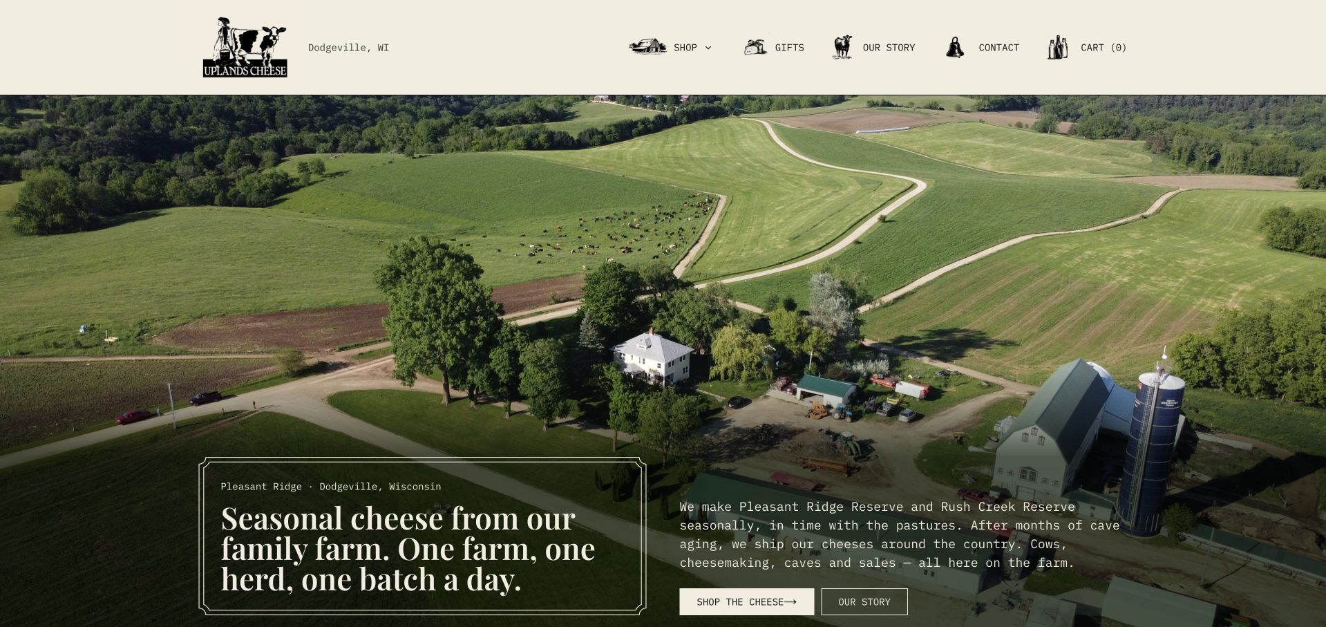
Uplands Cheese explains its working model before asking visitors to shop: one farm, its own herd and seasonal production. The captured page pairs an aerial pasture photograph with restrained cream typography and small illustrated farm details. The two main cheeses then receive distinct style, aging and release information, so the story becomes a practical comparison rather than a general handmade claim. Separate shop and story actions accommodate both returning buyers and curious newcomers. This is a particularly useful model for a small range. The precise release messages and stock-related figures also create a maintenance obligation, especially when a seasonal batch becomes available or sells out.
What you can learn
Make a narrow range understandable through a few meaningful differences, then explain how production affects availability. Give the farm story and the purchase route equal clarity without making either depend on reading the other.
Pros
The farm proposition and location are specific at the top of the page.
Two product profiles clearly distinguish an aged cheese from an autumn release.
Cons & considerations
Seasonal dates and stock-related statements require active maintenance.
The homepage needs product pages to carry detailed storage and delivery information.
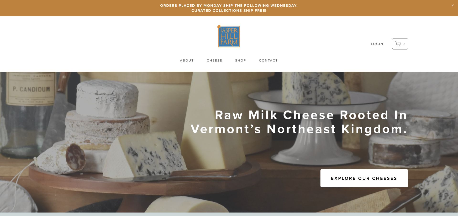
Jasper Hill Farm opens with a substantial arrangement of cheeses and a plainly stated Vermont connection. The composition shows several forms and textures rather than an anonymous countryside scene. The observed page goes on to explain affinage and the relationship between its creameries, farms and aging work, while gifts and club options remain available for shoppers. This combination helps a specialized process become understandable without turning the entire homepage into a technical essay. The large visual opening asks for scrolling before those details arrive, however, and broad environmental or performance statements still need their own supporting documentation.
What you can learn
Show the actual range first and define specialized production terms in ordinary language. Connect the process explanation to the products it affects instead of leaving it as a separate brand story.
Pros
The opening cheese arrangement demonstrates range and texture directly.
The observed copy explains a specialist aging process rather than assuming prior knowledge.
Cons & considerations
The tall hero delays practical product comparison on shorter screens.
Production and environmental claims need evidence beyond attractive farm imagery.
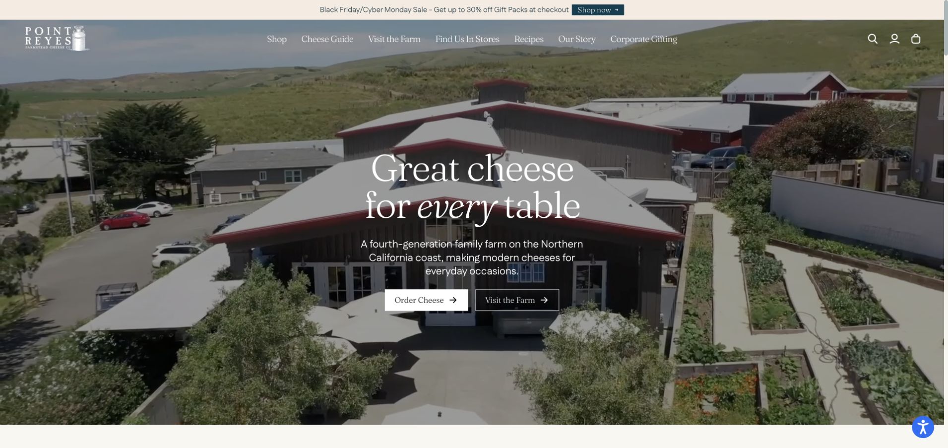
Point Reyes Farmstead Cheese Company uses moving coastal and farm imagery to establish a sense of place, then gives visitors separate routes to order cheese and visit the farm. That distinction is more useful than a single vague discovery button: a gift buyer and a prospective visitor need different information. The observed page supports the range with a cheese guide, recipes and serving ideas, while gift packs offer another shopping entry. The farm setting provides context, but should not have to carry the whole product explanation. The initial consent and newsletter prompts also show why coordinating overlays matters to the first impression.
What you can learn
Separate buying cheese from planning a visit and give each route its own practical details. Use the farm setting to explain provenance while keeping product, delivery and booking information directly reachable.
Pros
Ordering and visiting have clearly different opening actions.
The cheese guide adds flavor, pairing and serving context to the range.
Cons & considerations
Multiple initial prompts can interrupt a clear opening layout.
A scenic video needs a reliable still image and restrained motion behavior.
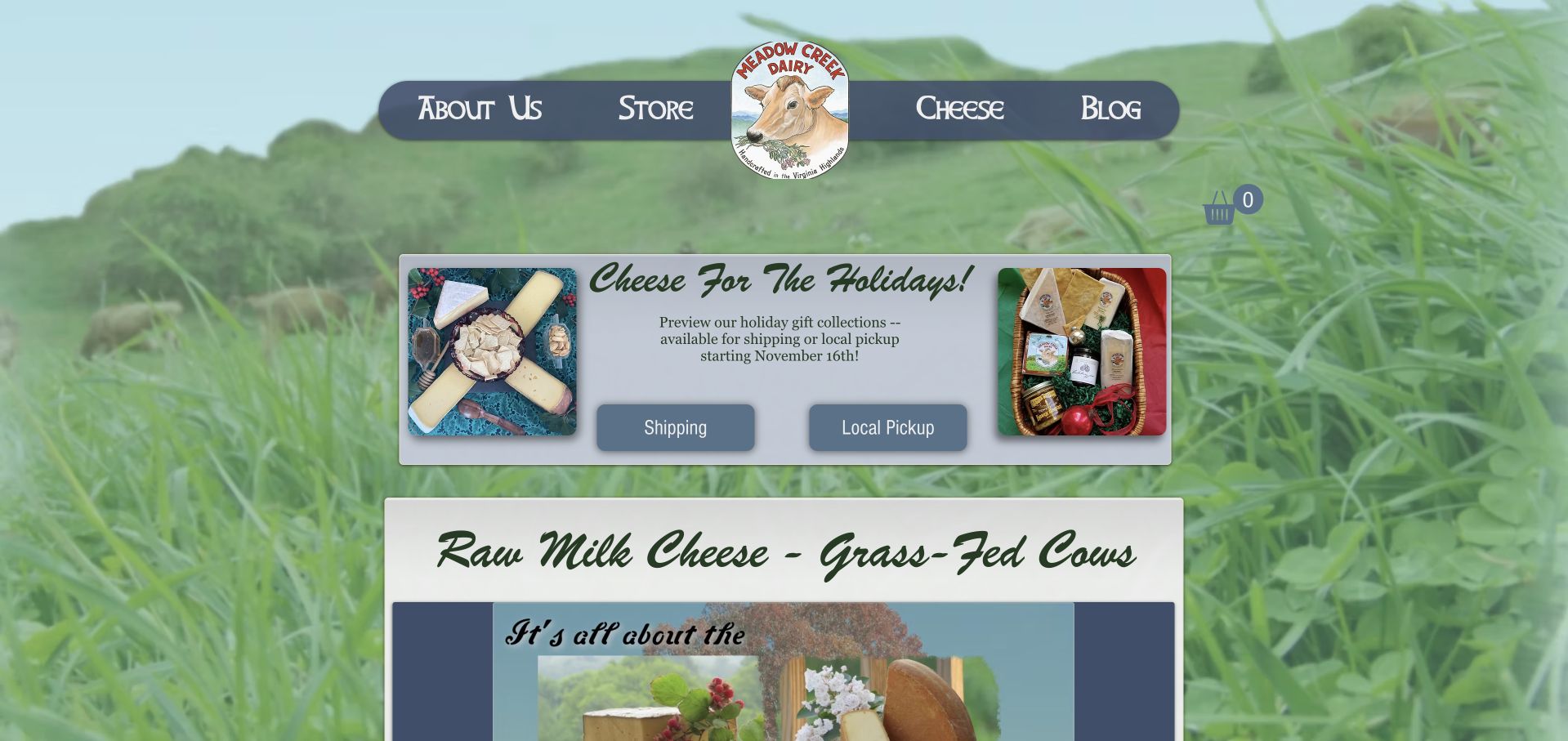
Meadow Creek Dairy places its holiday gift offer within a distinctly farm-oriented design: a cow emblem, pastoral background and compact navigation frame the central content. More usefully, the campaign separates shipping from local pickup and states when fulfillment begins. This makes the seasonal message operational rather than merely decorative. The observed page also connects named cheeses with farm and recipe information, giving visitors a route beyond the gift box. The mixture of background texture, type styles and promotional panels is comparatively busy. Its most transferable lesson is the explicit fulfillment distinction, which should remain easy to read when the seasonal campaign changes.
What you can learn
Put the practical difference between delivery and collection beside the seasonal offer. A small producer can keep a personal visual identity while making dates and fulfillment choices easier to scan.
Pros
Shipping and local pickup are visibly distinguished.
Named cheeses and farm information provide context beyond a temporary gift offer.
Cons & considerations
Several type styles and background treatments compete for attention.
Seasonal fulfillment messages need timely replacement and consistent policy details.
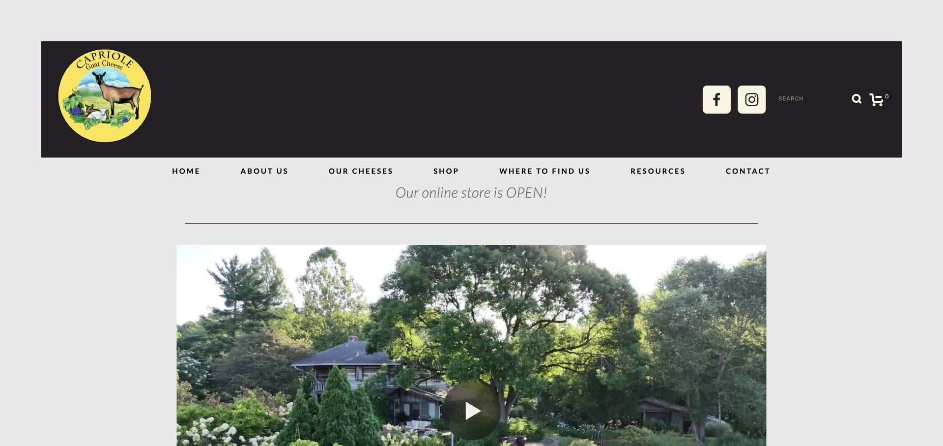
Capriole gives its goat illustration and yellow label a prominent place in a dark masthead, followed by a farm video and a clear store notice. The navigation names cheeses, shopping, stockists and resources separately. In the observed content, cheese education explains topics such as ash and mold alongside individual products, which helps a visitor interpret an unfamiliar appearance instead of assuming it is a defect. The footer also clarifies that the location is not open to the public. The first screen is dominated by video, so the practical value lies in the supporting structure rather than the film alone.
What you can learn
Use a recognizable maker identity, then answer the questions a first-time buyer is likely to have about unfamiliar cheese. State visit restrictions explicitly instead of letting farm photography imply public access.
Pros
Cheeses, stockists and educational resources have separate navigation routes.
The site explicitly explains its public-visit limitation.
Cons & considerations
The large opening video pushes product details below the first view.
Seasonal features need review so old campaign language does not distract from current availability.
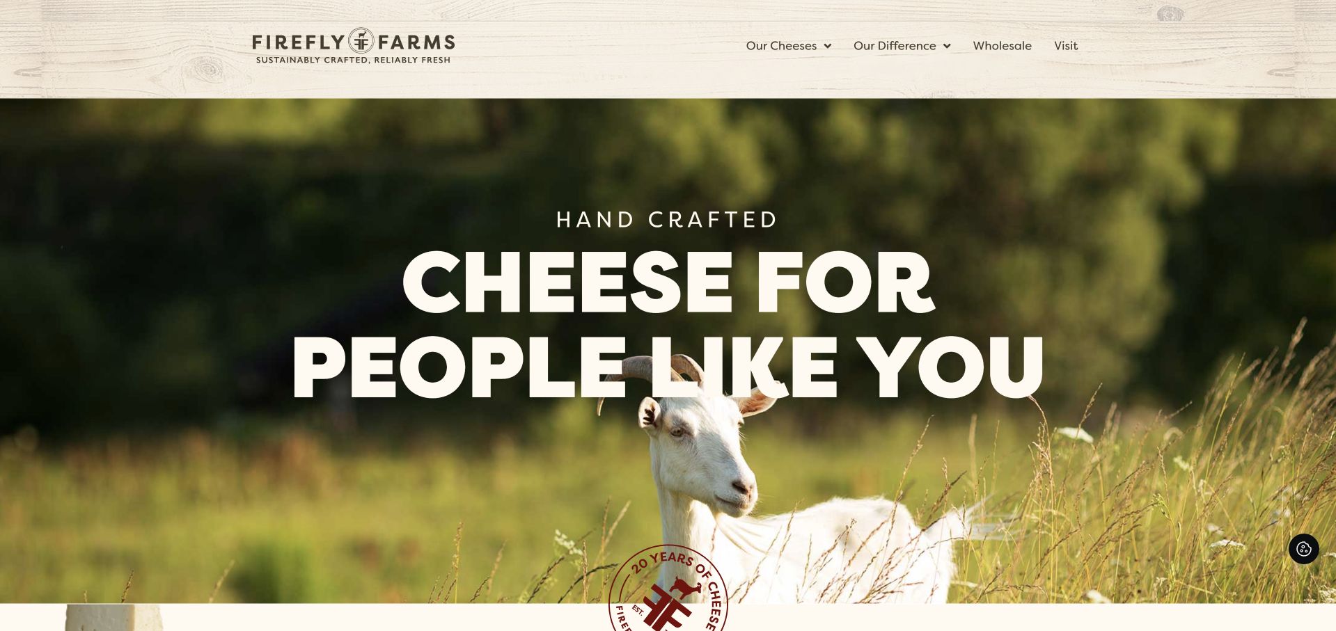
FireFly Farms combines a rustic wood-textured masthead with a large goat-and-pasture image and an emphatic handmade-cheese introduction. The navigation makes room for the cheese range, production differences, wholesale and visiting. The observed visit information distinguishes the retail market from the creamery, a useful detail when a brand operates more than one destination. This helps a shopper or trade buyer choose a route without interpreting a general contact page. The strong opening typography has presence, but the oversized image and initial promotional overlays can delay comparison. Claims about ingredients or farming remain statements to document, not conclusions proved by the design.
What you can learn
Name trade and visitor journeys directly and distinguish the actual locations involved. A farm-led introduction works best when it quickly leads to the range and accurate practical information.
Pros
Wholesale and visiting are visible alongside the product range.
Location distinctions reduce ambiguity between the market and creamery.
Cons & considerations
Large typography and imagery use substantial first-screen space.
Initial promotional and cookie overlays need coordination to avoid competing prompts.
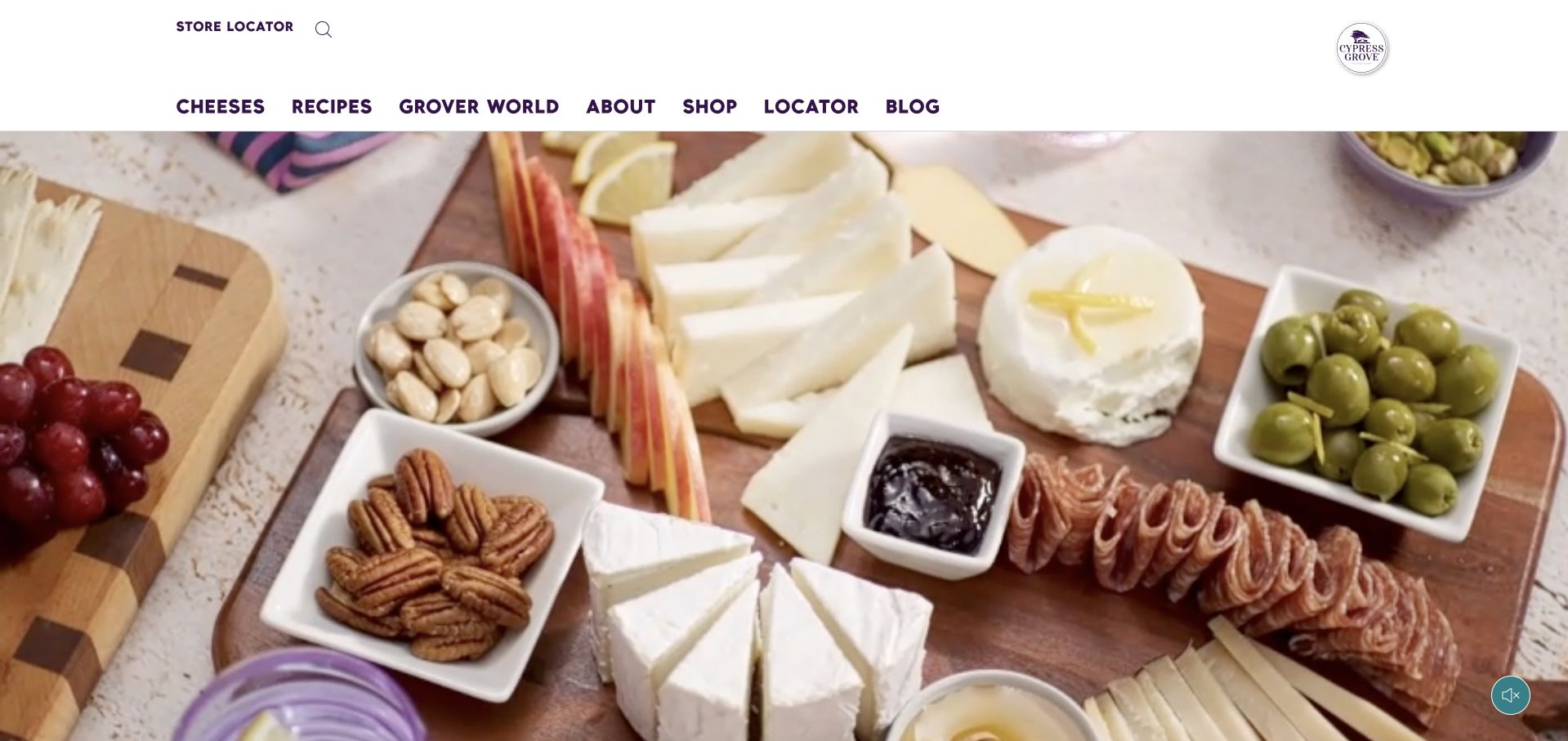
Cypress Grove’s captured opening lets a food-board scene occupy most of the screen beneath a compact white header. The navigation names cheeses, recipes, the brand story, shopping and a locator, while the observed range is divided into fresh, soft-ripened and aged cheeses. Those distinctions give visitors a more useful route than a list of poetic product names alone. Educational and trade information add depth below the visual introduction. The opening scene does not itself provide a strong product explanation or action, however. This example is most useful for its supporting taxonomy and the connection between inspiration, product styles and places to buy.
What you can learn
Organize a cheese range by understandable style as well as individual product name. Keep recipe inspiration and stockist information connected to those products so a visitor can move from interest to a practical next step.
Pros
Product families distinguish fresh, soft-ripened and aged styles.
Recipes and store-location routes are easy to identify in the header.
Cons & considerations
The opening visual offers little explanatory text or direction.
A large media area needs careful loading and mobile cropping.
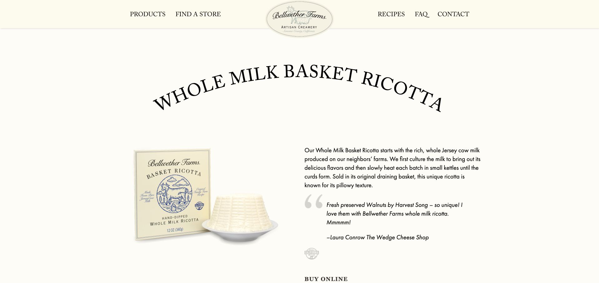
Bellwether Farms’ basket-ricotta page places the packaged product and the drained cheese beside a substantial explanation of its making process. The cream background and large heading leave the item easy to identify, while the copy explains the small-kettle heating and basket draining rather than relying on an artisan label alone. Buying and store-finding routes appear below, with further sections for pairings, nutrition and a sell sheet. This is a product-page example, not the homepage. Its value is the connection between appearance, process and practical use. The long introduction still needs a scannable route to key specifications for visitors who already know what they want.
What you can learn
Explain a production method beside a photograph that shows its result. Keep detailed background available while giving returning buyers a short route to specifications, availability and places to purchase.
Pros
Packaging and the unwrapped ricotta are shown together.
Process, pairing, nutrition and trade information have dedicated supporting sections.
Cons & considerations
A long introductory block can slow access to key product facts.
External buying destinations should be labeled clearly before visitors leave the maker’s site.
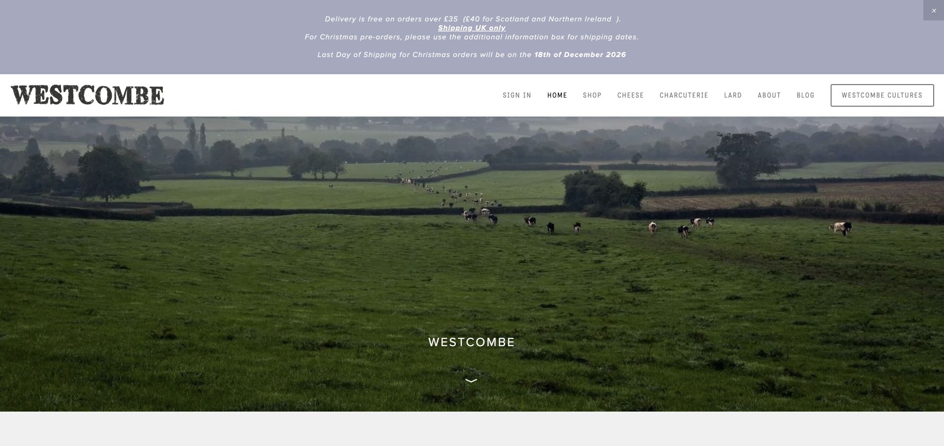
Westcombe Dairy opens on its herd and pasture, using a restrained wordmark and a small central brand introduction rather than a conventional product campaign. The observed content then identifies its cheeses and connects them to making, stockists, the dairy shop and ordering. The approach gives the working landscape a meaningful role in the brand story. It also exposes the trade-off of a very quiet hero: a newcomer may need to scroll before learning which cheeses are made or how to buy them. Delivery notices are useful, but should remain concise enough that they do not compete with the site’s otherwise measured visual tone.
What you can learn
Let the landscape establish context, then identify the actual cheeses and purchase routes promptly. A quiet brand introduction still needs enough information for a visitor who has never heard of the dairy.
Pros
The farm imagery establishes a specific sense of place.
Making, stockists and the dairy shop have distinct supporting routes.
Cons & considerations
The name-led opening delays product explanation.
Prominent delivery notices need concise wording and regular maintenance.
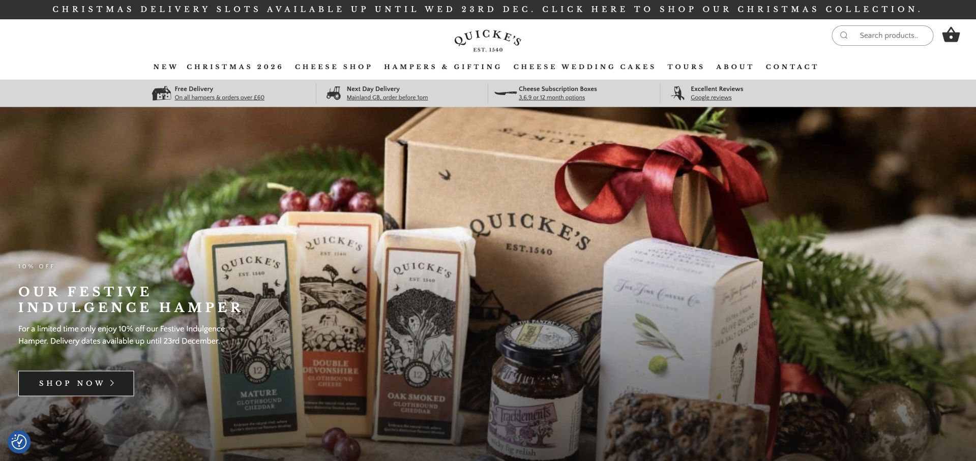
Quicke’s captured homepage uses a well-stocked hamper photograph beneath a broad, carefully spaced header. Seasonal delivery information appears close to the shopping proposition, while the navigation also exposes cheese, gifts, wedding stacks and tours. The observed content explains aged cheddar distinctions and the dairy’s work, so a seasonal visitor can move into the underlying range. This is a useful balance between urgent holiday buying and durable maker information. The collection of announcement messages and widely spaced uppercase navigation is more demanding than the simple photograph suggests; those elements need particular care on narrower screens and during campaign changes.
What you can learn
Keep seasonal gifts connected to the permanent cheese range and explain fulfillment near the offer. Make tours and special orders distinct tasks rather than burying them in a generic shop category.
Pros
The hamper photograph clearly shows a complete gift format.
Cheese, gifts, wedding stacks and tours receive different routes.
Cons & considerations
Several announcement messages compete for first-screen attention.
Long, widely spaced navigation labels need careful narrow-screen handling.
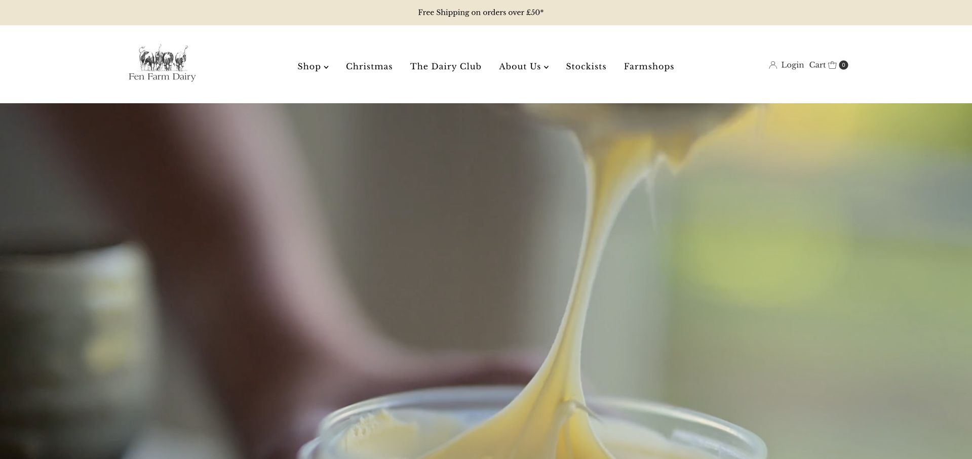
Fen Farm Dairy puts a close view of dairy production behind a simple illustrated identity. Its navigation separates the shop, seasonal products, Dairy Club, stockists and farm shops. The observed content explains the short connection between milking and production, then presents cheeses and other dairy products with both subscription and one-time purchase information. This is worth studying because it makes recurring orders a distinct choice rather than an unexplained checkout surprise. The opening production film is evocative but does not immediately name a cheese. A newcomer still needs concise product context and clear boundaries between the creamery story and the different buying arrangements.
What you can learn
Explain the production connection in concrete terms and make recurring versus one-off orders explicit. Do not let an atmospheric process film substitute for a clear statement of what customers can buy.
Pros
Dairy Club and ordinary shopping are presented as distinct routes.
Observed product cards explain recurring and one-time purchase choices.
Cons & considerations
The opening film does not immediately identify a particular cheese.
Subscription terms and links need consistent wording across embedded shopping components.
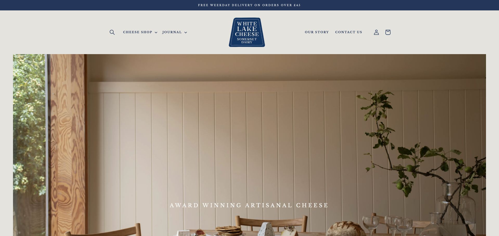
White Lake Cheese gives its opening photograph generous space, with a quiet table setting and a small artisan-cheese introduction. The stronger practical pattern appears in the range below: product cards pair individual names with milk source, cheese style and price. A visitor can distinguish a goat’s-milk hard cheese from a sheep’s-milk soft cheese before opening several pages. Recipe and maker-story routes support further investigation without replacing that comparison layer. The expansive hero contains a large area of empty wall, so it delays the most useful information. The site demonstrates how a simple product-card structure can carry more meaning than a broad award-led headline.
What you can learn
Add milk source and style to product cards so unfamiliar names become comparable. Let the photograph create atmosphere, but keep the decision-making information close enough to serve a first-time visitor.
Pros
Milk type, cheese style and price make product cards informative.
Recipes and the maker story support the range with practical context.
Cons & considerations
The oversized quiet hero pushes product comparison downward.
Award language needs a specific source and scope rather than standing alone.
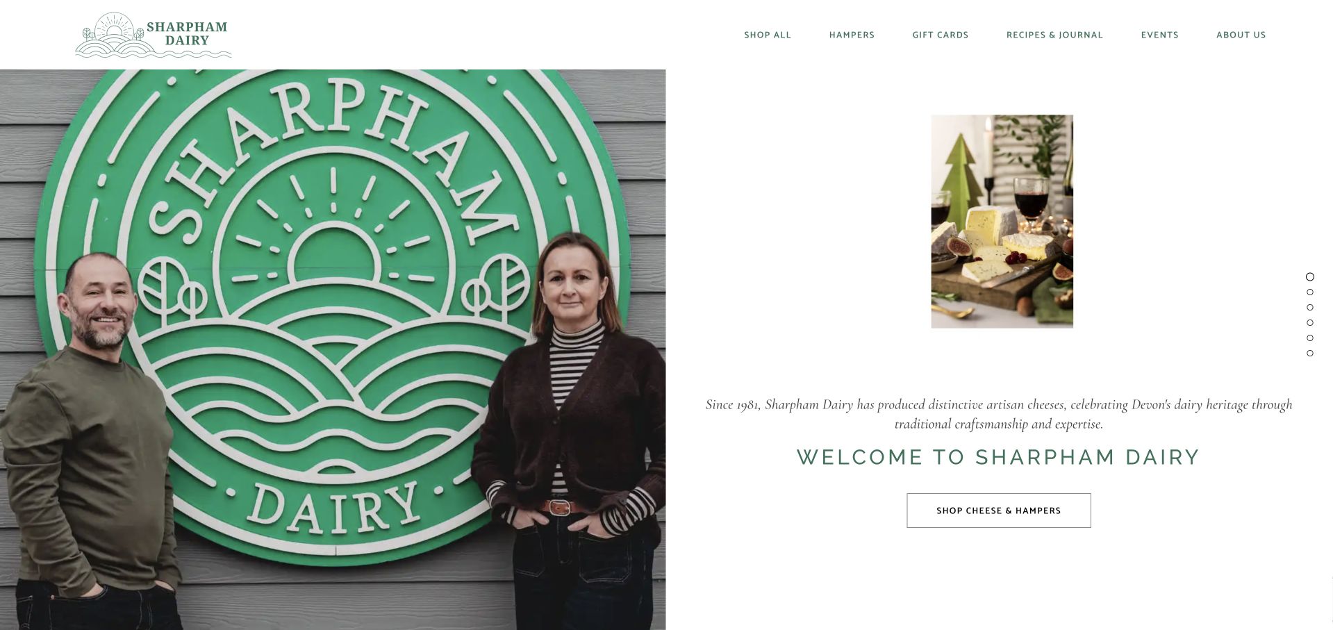
Sharpham Dairy’s captured introduction divides the screen between a people-led photograph and a compact panel containing a product image, a short history and a shopping action. The visual balance gives the business a human presence without relying entirely on a farm panorama. The observed sequence also covers recipes, wedding cheese stacks, accompaniments and hampers. These are genuinely different reasons to visit, but the slide-based presentation makes some routes less apparent than a static overview would. The example is useful for showing how a heritage statement can sit beside a concrete product. Generic continuation labels should be replaced with specific destinations wherever possible.
What you can learn
Pair a short maker history with a real product and a clear next action. If several visitor needs share a carousel, keep equivalent permanent links available so important journeys are not hidden on later slides.
Pros
The split layout brings people, product and story into one view.
The observed site provides separate material for recipes, gifts and wedding stacks.
Cons & considerations
A slideshow can conceal useful routes until a later frame.
Generic continuation labels provide less context than destination-specific link text.
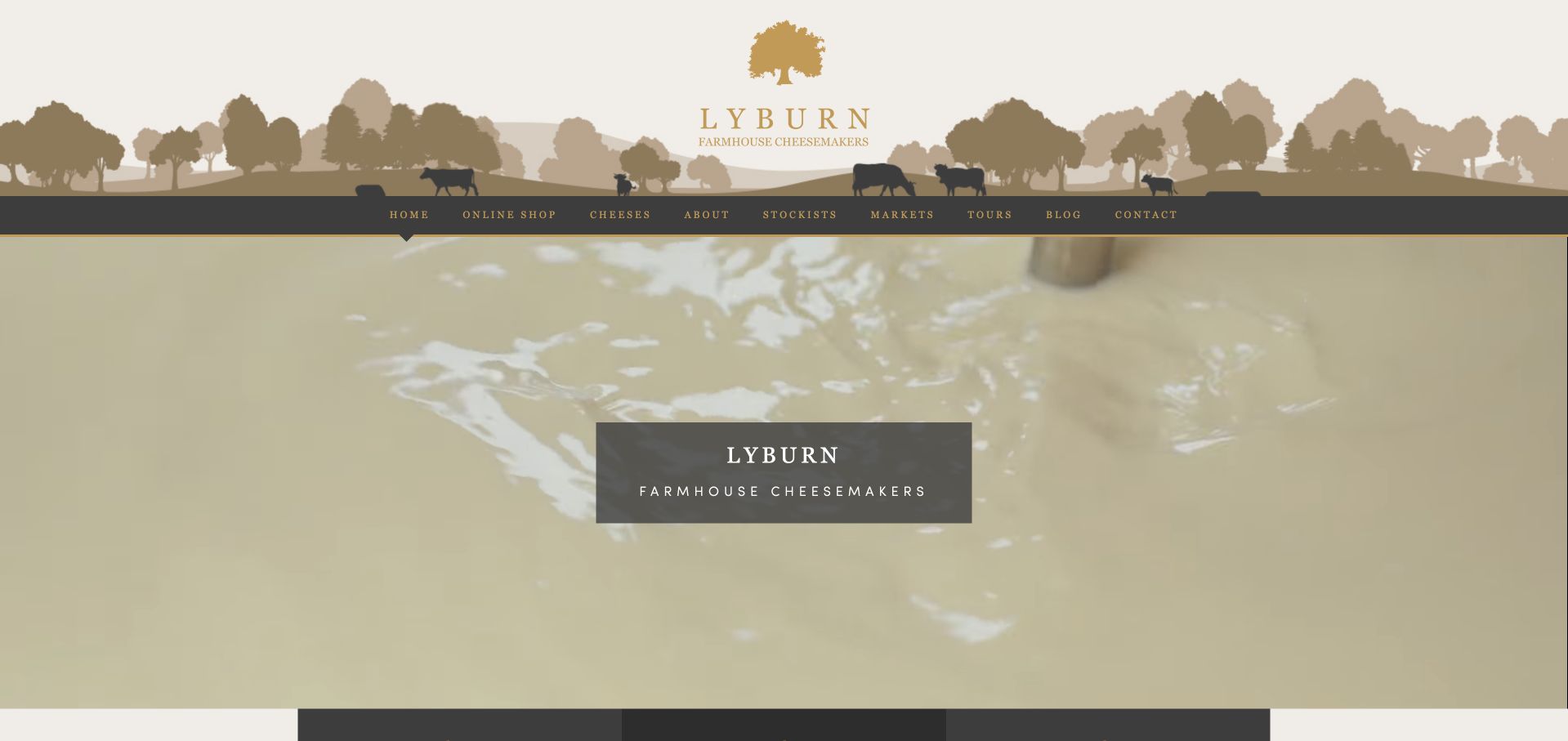
Lyburn Farm uses a distinctive illustrated landscape masthead above footage from the making room. The opening label identifies farmhouse cheesemaking, while the observed copy explains that the cheeses use milk from the farm’s own cows. Shop hours, tours, stockists and markets connect that story to actual ways of finding the products. This is a useful local-business pattern: visitors are not left with only an attractive rural identity and a contact form. The decorative header is tall, and several operational details appear in dense text. The main opportunity is to preserve the farm’s character while making hours, directions and cheese choices faster to scan.
What you can learn
Show the work and explain where the milk comes from, then make local buying and visiting information concrete. Keep practical details in consistent, easy-to-update fields rather than repeating them in several paragraphs.
Pros
Making-room imagery supports the farmhouse proposition directly.
Tours, shop hours, markets and stockists give practical next steps.
Cons & considerations
The decorative masthead takes substantial vertical space.
Repeated operational details need consistency across the homepage and contact information.
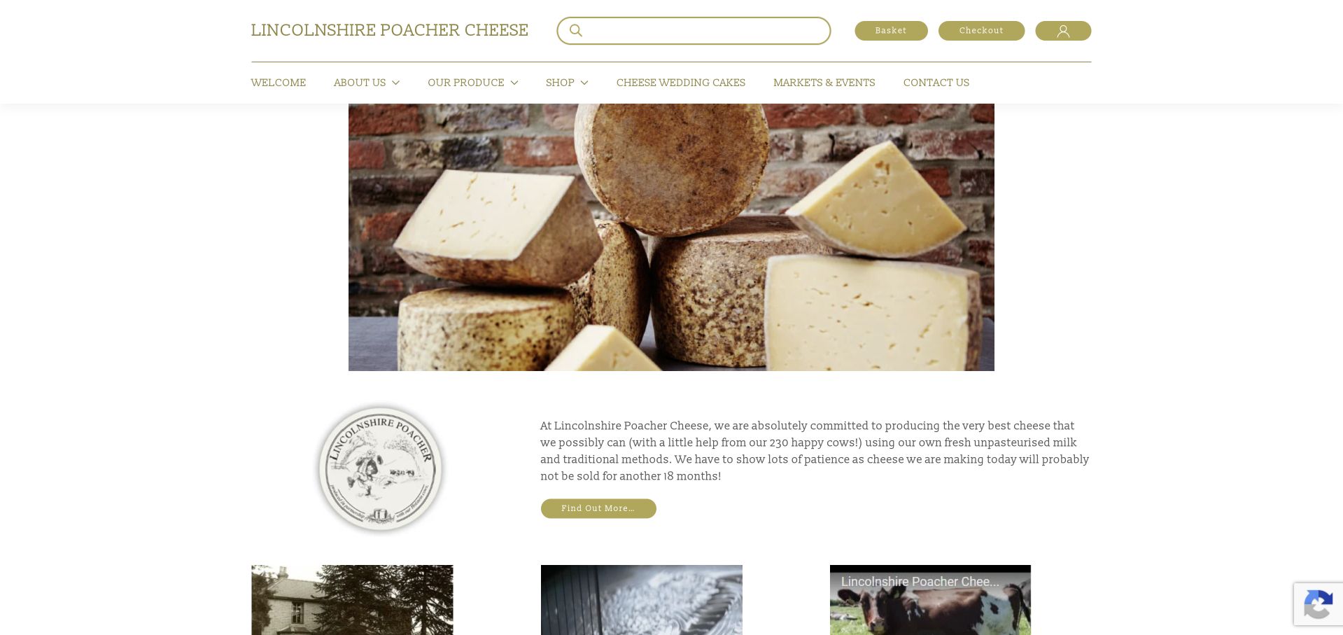
Lincolnshire Poacher places a large photograph of wheels and wedges beside an introduction to its own-milk production. The green-and-cream header includes product search and familiar shop controls, while the observed lower page connects history, making and video stories with a dated market list. The combination serves buyers who want delivery as well as those looking for a local stall. Its product photograph is descriptive, but the adjoining text and secondary information are dense. This is a useful reminder that traditional presentation can remain practical if product search, current market information and the maker story each receive a clear hierarchy.
What you can learn
Combine a recognizable product range with a maintained list of real buying opportunities. Keep the maker story concise at the entry point and let dated market information have its own scannable structure.
Pros
Wheels and cut wedges show the range in a recognizable form.
Product search and market information address different purchasing habits.
Cons & considerations
Long text blocks compete with the main product introduction.
Checkout controls can appear before a newcomer has found a suitable cheese.
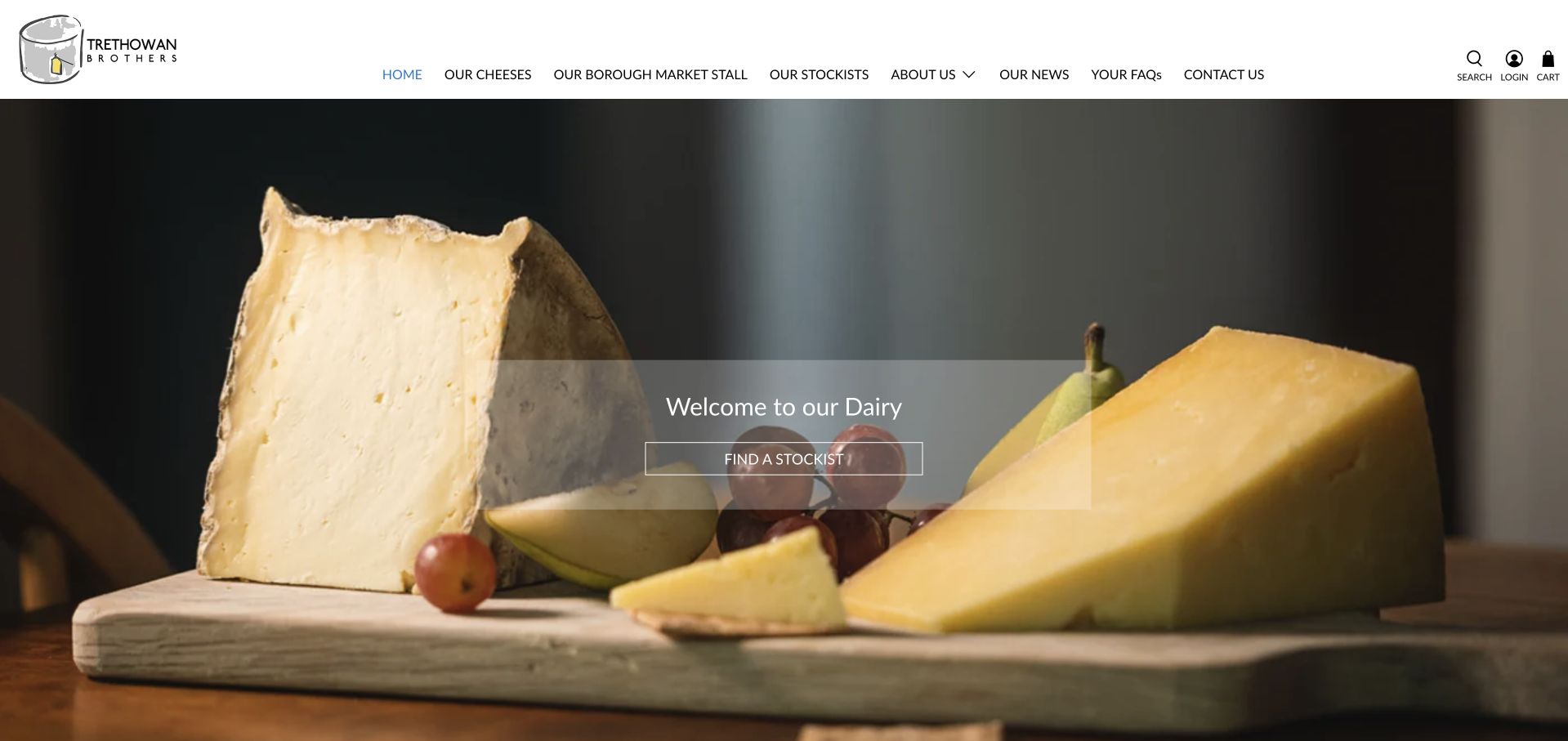
Trethowan Brothers uses a close cheese-and-fruit photograph with a simple welcome panel and a direct stockist action. The header names its cheeses, market stall, stockists, story and FAQs, making the intended next steps clear without pretending every visitor needs an on-site checkout. The observed content introduces Pitchfork Cheddar and Gorwydd Caerphilly and links to making information. This is a useful pattern for a specialist maker with a limited range and a distribution network. The visual welcome is less informative than the navigation, however: naming the two cheeses earlier would help visitors who do not recognize the brand or the products in the photograph.
What you can learn
Choose a buying action that matches the actual business model. A stockist-first maker should make location and retailer information easy to find while explaining its small range in plain language.
Pros
The opening action directly supports finding a retailer.
Cheeses, the market stall and FAQs have explicit navigation labels.
Cons & considerations
The welcome headline does not identify the two cheeses by name.
Stockist records need maintenance so the principal purchase route stays useful.
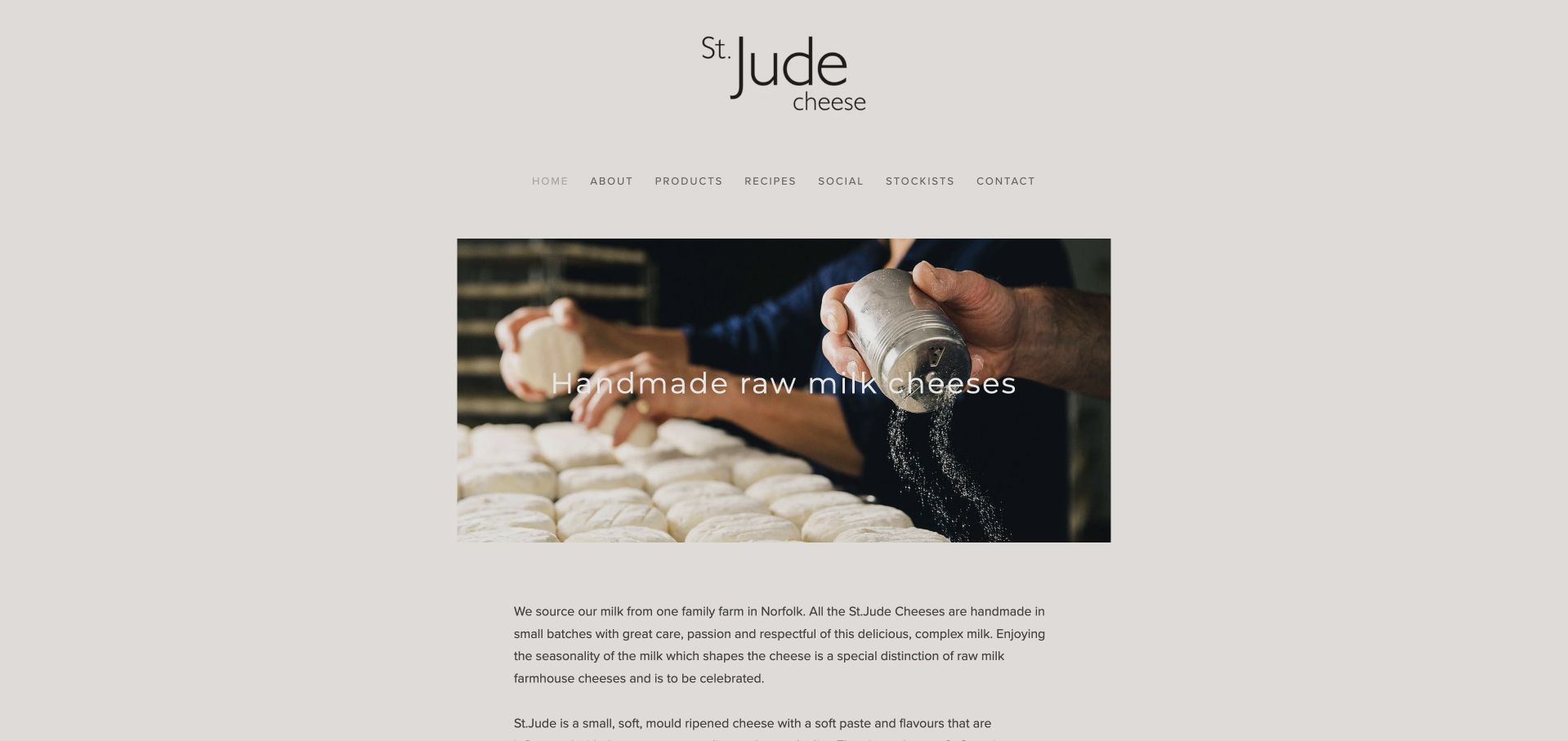
St.Jude Cheese presents a calm, centered page with a large wordmark and a photograph of hands working on small cheeses. A short caption identifies handmade raw-milk cheese, followed by a direct explanation of the milk source, seasonal variation and differences among the four products. The restraint works because there is a specific range to explain rather than a sprawling catalogue. Stockists and contact remain plainly labeled in the navigation. The page gives a clear introduction without aggressive selling, but its small menu text and generous upper spacing are less efficient. The production image should lead naturally to more detailed product and availability information.
What you can learn
A small range can be introduced with one real process photograph and a careful explanation of the differences between products. Keep stockists and product details visible enough that visual restraint does not become uncertainty.
Pros
The production photograph supports the handmade proposition.
The opening copy explains meaningful differences within a small cheese family.
Cons & considerations
Small navigation text requires attention to readability.
Generous top spacing delays the product explanation on shorter screens.
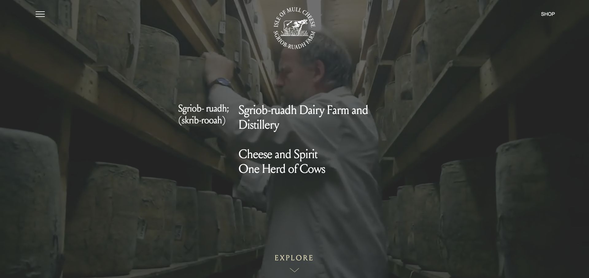
Isle of Mull Cheese presents the farm’s Gaelic name with a pronunciation guide over footage of its working environment. The headline explains that the dairy and distillery share a herd, while the observed content separates the dairy, farm, visits and other production into distinct destinations. This helps a multi-part rural business feel connected without making every activity one undifferentiated shop. Family history and tour information provide further context. The opening menu is concealed behind an icon even on desktop, and the large film delays a direct cheese comparison. Environmental claims remain the business’s statements and need evidence beyond the presentation.
What you can learn
Explain how a diversified farm’s activities relate, then give each a distinct destination. Pronunciation or place context can welcome newcomers, but buying cheese should still have a short and obvious route.
Pros
The opening explains the connection between the farm’s different activities.
Dairy, visits, farm and shop information have separate supporting routes.
Cons & considerations
An icon-only desktop menu hides available destinations until opened.
A large opening film needs a useful fallback and clear product information below.
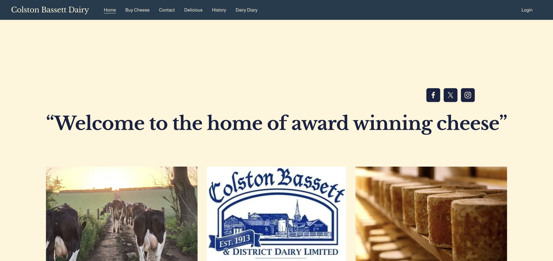
Colston Bassett Dairy pairs a cream-and-blue palette with a three-part visual sequence of herd, identity and cheese. The observed copy identifies Blue Stilton and Shropshire Blue, explains hand-ladling and distinguishes their flavor descriptions. Buying information also acknowledges visitors in the UK and abroad rather than assuming one fulfillment route. The small primary navigation is easy to understand, although the very large opening statement emphasizes awards before explaining the range. This is a useful example of clear product scope within a traditional presentation. Specific process and buying information carries more practical value than repeating broad quality claims.
What you can learn
For a two-product maker, explain the meaningful differences and how visitors in different locations can buy. Keep tradition as context while using the most prominent space to identify the actual range.
Pros
The observed page distinguishes the two cheeses in plain descriptive language.
Buying information recognizes both domestic and international visitors.
Cons & considerations
The oversized award-led headline delays product-specific information.
Repeated quality claims need supporting detail and can crowd a concise story.
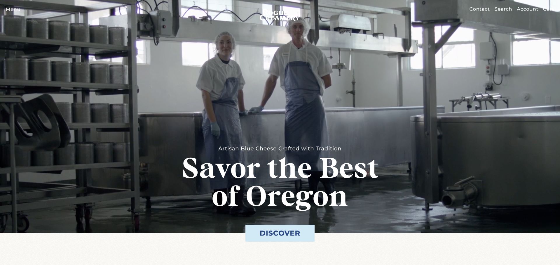
Rogue Creamery opens with its own film, moving through people, historic imagery and the making room beneath a concise artisan-blue-cheese introduction. The observed shopping sections then identify individual cheeses, starting prices, gift sets and a club membership. This gives the atmospheric story a concrete commercial continuation. The heritage material is useful as context, while current production images show the work behind the range. Promotional and review popups initially interrupted the page and were closed normally for the capture. The example therefore offers two lessons: connect a film to useful product records, and do not let several marketing components compete with that introduction.
What you can learn
Follow a heritage or production film with named products and clear purchase options. Coordinate promotional widgets so the maker’s own introduction remains visible and shoppers can reach the range without interruption.
Pros
The film connects people and production rather than relying on scenery alone.
Product, gift-set and club routes are differentiated below the introduction.
Cons & considerations
Multiple initial promotional widgets can obscure the first view.
Video and award claims do not replace product specifications or independently supported evidence.
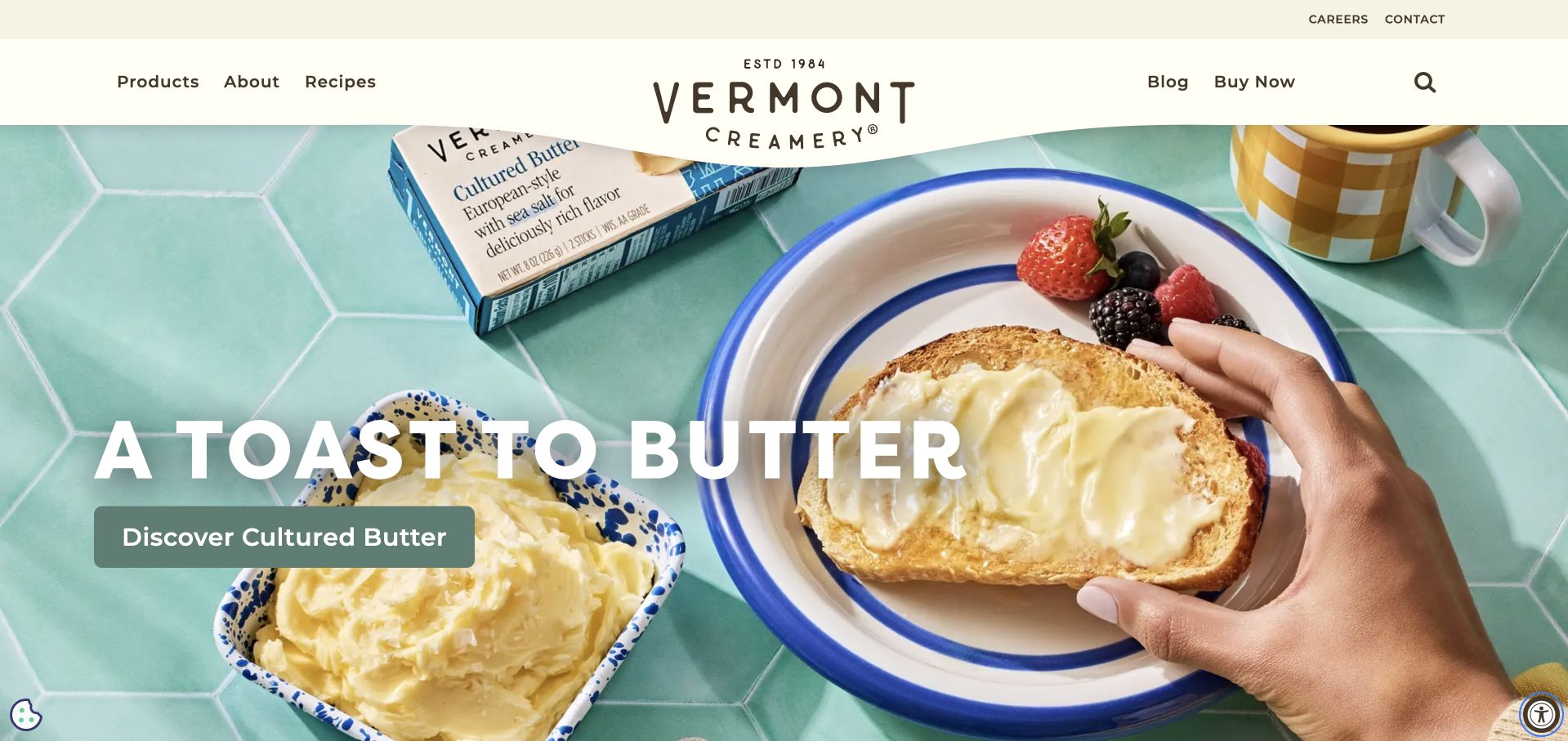
Vermont Creamery’s captured campaign leads with cultured butter, using a bright breakfast photograph and a direct recipe-oriented action. The broader observed page returns to goat cheese, aged cheeses, pairing guides and product information, and groups products by cooking, entertaining and snacking occasions. This is a useful model for a maker whose cheese sits within a wider dairy range. It helps visitors begin with a use rather than requiring them to know a product name. The trade-off is that the first view does not immediately show the cheese offering. Clear category routes and accurate product records must keep that broader range discoverable.
What you can learn
Let recipes and occasions help visitors enter a mixed dairy catalogue, but retain obvious product-type navigation. A campaign for one product should not make the rest of the maker’s range difficult to discover.
Pros
Recipe and occasion categories give practical reasons to explore products.
Goat-cheese education and product information support the broader dairy range.
Cons & considerations
The current opening focuses on butter rather than cheese.
Seasonal recipe features need updating alongside the main campaign.
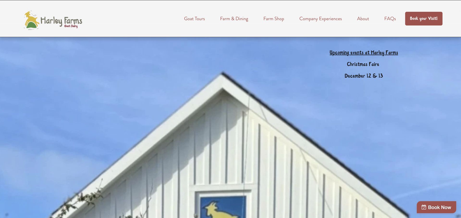
Harley Farms emphasizes visiting rather than an online cheese transaction. Its captured opening uses a farm-building image, an upcoming event notice and a prominent booking link, while the navigation separates goat tours, dining, the farm shop and company experiences. The observed About page confirms its own-goat milk and cheesemaking role, then gives location, regular hours and holiday closures. This makes the farm experience tangible and practical. The homepage itself has relatively little cheese explanation, so visitors interested only in products need a stronger signpost. The example is valuable for its visit hierarchy, not as a model for a full ecommerce catalogue.
What you can learn
When visits are central, make the experience categories, location and opening conditions explicit. Still identify the dairy’s actual products early enough that a visitor understands the relationship between farm, cheese and activities.
Pros
Tours, dining and the farm shop are separate navigation choices.
The supporting About page provides hours, closures and maker context.
Cons & considerations
The opening offers little direct information about the cheeses.
Prominent external booking links need a clear transition and maintained event details.
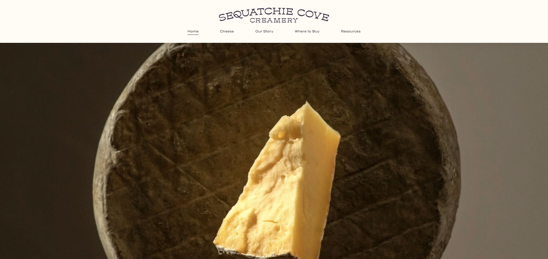
Sequatchie Cove Creamery uses a close, textured cheese photograph under a restrained masthead. The observed page then introduces four varieties with individual descriptions and product links, followed by the Tennessee landscape and maker story. A distinct Where to Buy route acknowledges that visitors may purchase through retailers rather than directly from the homepage. The strength is the focused range: each cheese has room to develop a recognizable identity. The weakness is that the first screen leaves the product unnamed and the descriptive language sometimes favors personality over concrete comparison. Milk, style and availability details should remain easy to locate beneath the expressive names.
What you can learn
Give a small range distinct identities, but pair personality with comparable product facts. Make the route to retailers clear when the homepage is an introduction rather than a direct storefront.
Pros
The limited range receives individual product links and descriptions.
Where to Buy is a clear permanent navigation item.
Cons & considerations
The opening photograph does not identify the cheese it shows.
Expressive descriptions need concrete style and milk information alongside them.
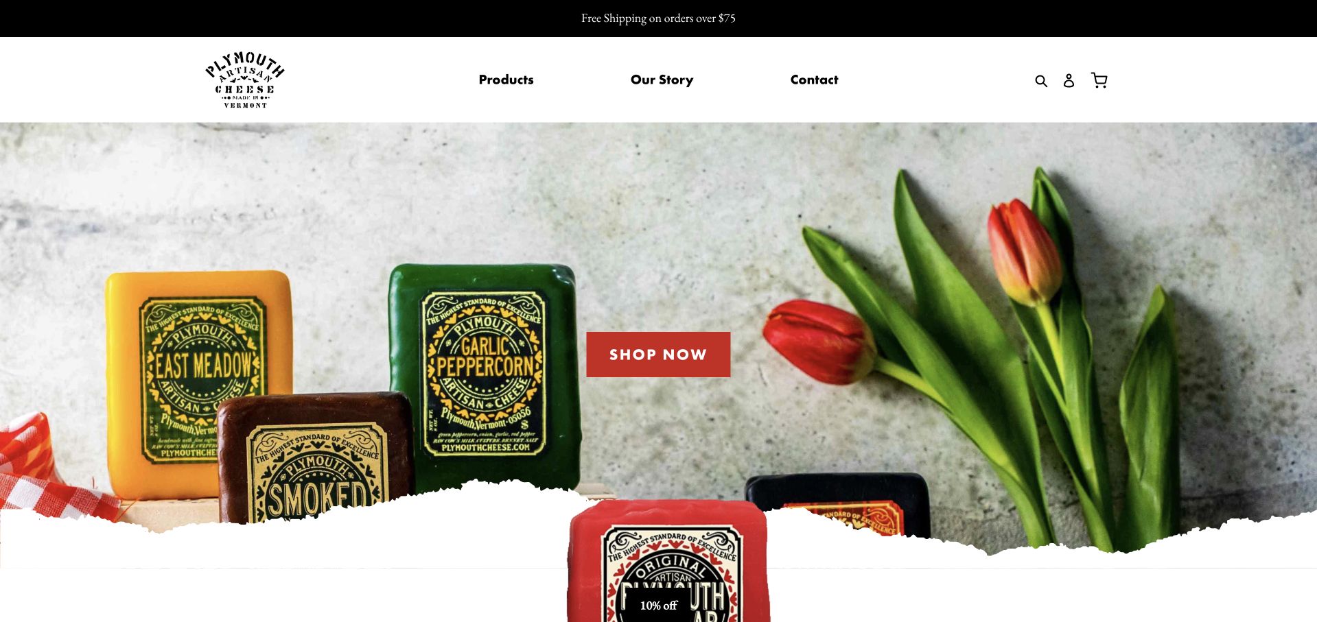
Plymouth Artisan Cheese makes its colored wax and ornate labels the main visual language of the captured homepage. A simple three-item navigation and a contrasting shopping button keep the entrance focused. The observed product links continue the same packaging system across different flavors, while separate story and process routes explain the maker’s background. This is useful when the physical pack is likely to be recognized later in a store. The campaign photograph does not show the unwrapped cheese, however, and some product links rely heavily on imagery. Clear text labels and interior photographs are needed to make the presentation informative as well as distinctive.
What you can learn
Use consistent packaging to build recognition across a range, then provide readable product names and views of the cheese itself. Keep the process story separate from the direct route to shopping.
Pros
The packaging creates a coherent visual identity across flavors.
A short header and contrasting shopping action keep the entry simple.
Cons & considerations
Wrapped products alone do not show the cheese’s interior or texture.
Image-led product links need descriptive labels for browsing and accessibility.
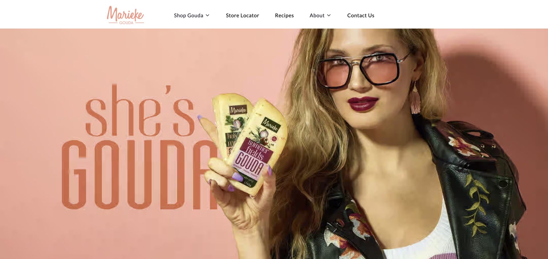
Marieke Gouda’s captured campaign uses a playful portrait, a warm pink background and visibly labeled packaged wedges. The header stays practical with Shop Gouda, Store Locator, Recipes, About and Contact. The observed introduction explains that the business makes cheese from its own farm’s milk and connects the brand to Dutch methods. The clear Gouda label helps a newcomer understand the range despite the expressive imagery. The first screen does not compare ages or flavors, though, and the campaign’s visual text needs supporting accessible copy. Its strongest transferable idea is to keep a recognizable product category visible even when the creative direction is bold.
What you can learn
A distinctive campaign can be playful while the navigation stays literal. Identify the cheese type clearly, then provide product records that distinguish ages, flavors and practical buying options.
Pros
The navigation names Gouda and separates shopping from local availability.
The photographed packaging keeps the product visible within the portrait-led campaign.
Cons & considerations
The opening does not explain differences among ages and flavors.
Important campaign wording embedded in imagery needs equivalent accessible text.
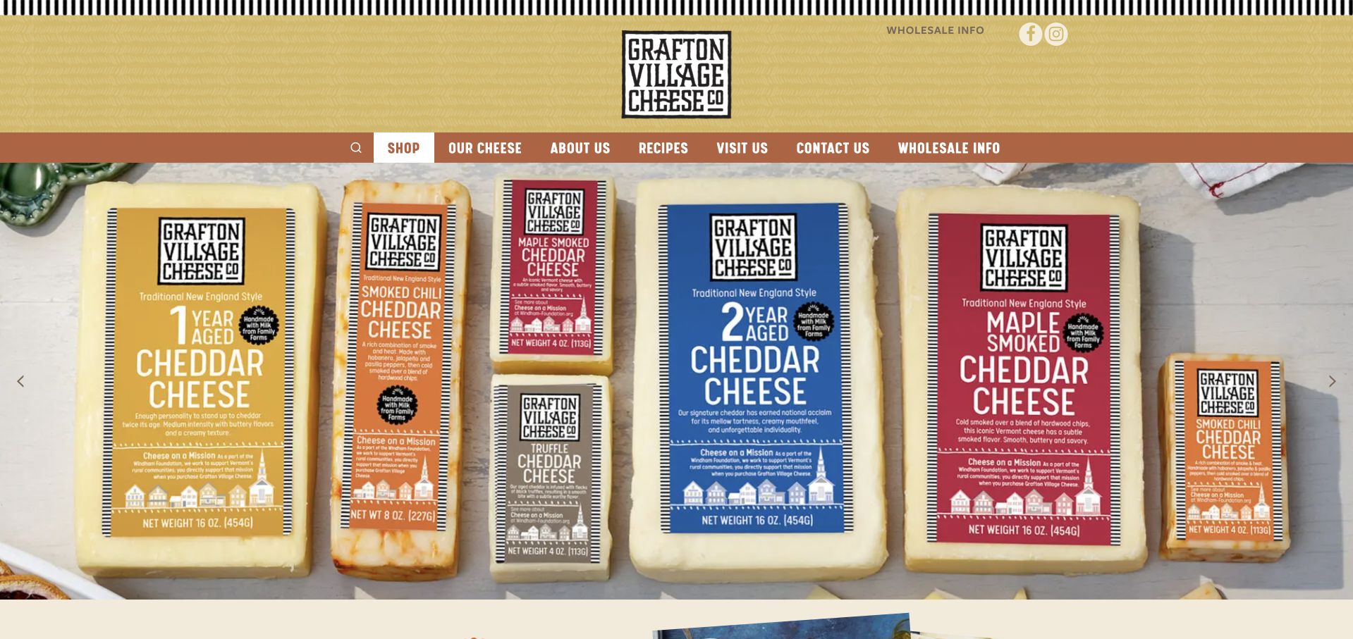
Grafton Village Cheese fills its captured carousel with labeled cheddar packs, making product names and aging distinctions visible within the photograph. The header separates shopping, cheese information, recipes, visits and wholesale, while the observed page also introduces cave-aged products and recipes using named cheeses. This lets different audiences enter without treating a trade inquiry like a retail order. The first view relies on the carousel rather than a separate explanatory headline, and an initial newsletter modal needed dismissal. The useful pattern is the connection among recognizable packaging, product education and recipe use, supported by explicit audience-specific navigation.
What you can learn
Use product packaging to establish recognition, then connect named cheeses to recipes and buying information. Give wholesale its own route and keep the opening explanation available independently of a rotating image.
Pros
Packaging makes names and aging distinctions visible in the opening image.
Retail, visit and wholesale routes are separately labeled.
Cons & considerations
A carousel-only introduction can leave the main proposition implicit.
An initial newsletter modal interrupts product inspection before visitors choose to engage.
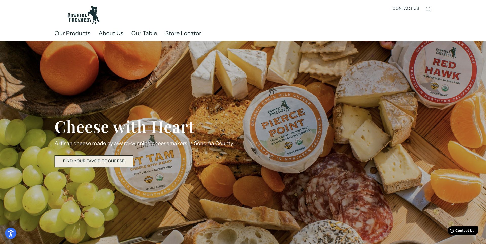
Cowgirl Creamery’s retained capture combines wrapped cheeses and a prepared board beneath a clear creamery identity. The page gives products, the maker story, serving ideas and store finding separate routes, making it useful both for someone planning a board and someone looking for a familiar cheese. The photographed packaging supports recognition while the board shows a possible context of use. For this maker collection, the relevant lesson is how those two views reinforce one another. The image does not provide enough detail to compare ingredients, sizes or individual styles, so product information must remain easy to reach rather than being replaced by the serving scene.
What you can learn
Show the package and a plausible serving context together, then make the individual cheese records easy to find. Inspiration should lead to clear product information rather than ask visitors to identify every item in a styled board.
Pros
Wrapped products and a prepared board connect recognition with use.
Product, story, serving and stockist journeys have distinct routes.
Cons & considerations
A styled board does not supply detailed product specifications.
The main visual needs clear labels for visitors unfamiliar with the range.
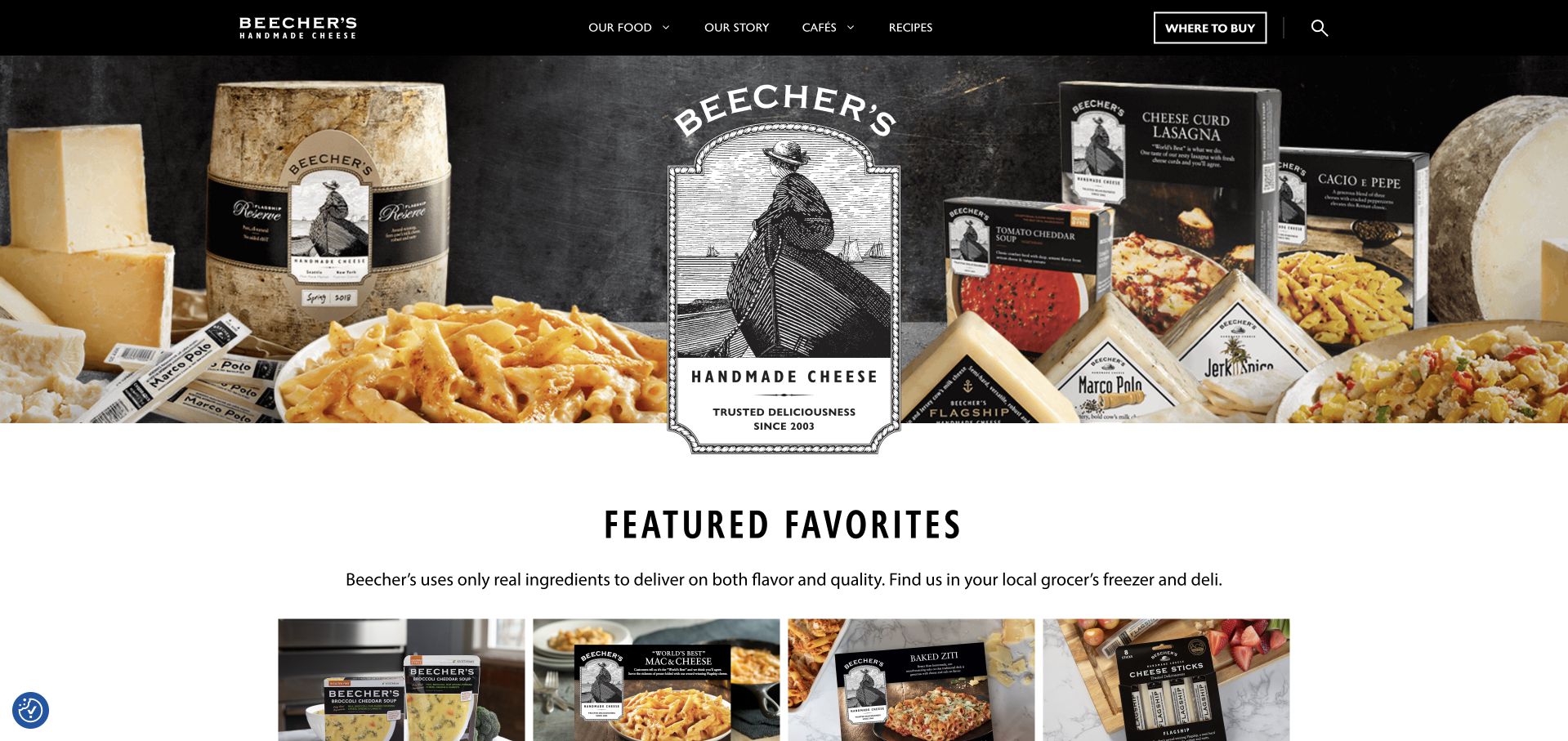
Beecher’s retained homepage capture presents cheeses alongside prepared food, supported by a strong dark header and separate food, story, café, recipe and store-finding routes. This reflects a business where visitors might want a cheese, a meal or a place to visit rather than one uniform shopping task. The range’s packaging and food photography help maintain a common identity across those routes. The practical lesson is to distinguish what is being sold and where it is available. A mixed food presentation also creates ambiguity if product categories are not explicit: a prepared dish should not inherit the ingredients, storage or shipping assumptions of a wedge of cheese.
What you can learn
Separate cheese, prepared dishes and café visits while keeping their shared maker identity visible. Maintain distinct practical product information so a mixed catalogue does not blur ingredients, storage or fulfillment needs.
Pros
The header distinguishes product, café and recipe journeys.
Cheese and prepared-food imagery show several ways to use the range.
Cons & considerations
Mixed product families require clear labeling and separate specifications.
A broad homepage can delay a direct comparison between individual cheeses.
Kegan is a freelance web designer and developer with 15+ years of experience helping businesses turn complicated website requirements into clear, maintainable digital experiences. He works directly with clients from planning and design through development, launch, and ongoing support.
For artisanal cheese maker website design, his development approach focuses on cheese ranges, milk and production details, farm visits, stockists and clear ordering or delivery information. The scope can be a targeted improvement or a complete custom build, with responsive layouts, thoughtful content structure, and integrations chosen around the people using and maintaining the site.
Show 3 other artisanal cheese maker website designersHide other artisanal cheese maker website designers
Plan around the cheeses, the production story and the buying route
Start with accurate product records
List the cheeses the business makes and the distinctions that matter to a new visitor. A small two-cheese range may need a direct comparison; a larger catalogue may need grouping by milk, style or intended use. Keep poetic product names, but do not make them the only way to understand the range.
Create one maintained record for each item with its size, price where sold directly, milk and ingredient information, allergens, storage guidance and availability. Use the maker’s verified product details and appropriate specialist review where needed. Do not apply one cheese’s specifications to a gift box, prepared dish or accompaniment shown beside it.
Plan images that answer different questions. A wrapped product helps recognition in a shop; a cut surface shows the style; a serving scene suggests a use. Label these clearly and avoid letting an elaborate board imply that every pictured item is included in the purchase.
Build a credible production and place story
Map the relationship among milk supply, the making room, maturation and sales. Explain which parts are carried out by the business and which involve partners. A clear, modest description of actual work is more useful than claiming complete control over an entire supply chain without evidence.
Use real photographs with enough context to explain what a visitor is seeing. A pasture can establish place, but a production photograph can also explain a specific process. Keep important explanations in text rather than only inside a video, and give moving imagery an appropriate still alternative.
Connect the story to the relevant cheeses. If a product is seasonal because of production or maturation, explain that where availability is shown. Attribute awards, certification and environmental statements precisely, with dates and scope. The website’s presentation should help a visitor investigate a claim rather than ask them to accept it on visual authority.
Design practical journeys that can be maintained
Choose the first actions around the real operating model. A stockist-led producer needs a reliable retailer route; a farm shop needs location and opening information; a direct seller needs a clear catalogue and fulfillment policy. Avoid copying an ecommerce layout merely because another attractive maker site uses one.
Keep delivery, pickup, subscriptions and visits distinct. Explain what each option includes and how seasonal availability affects it. Use the business’s actual policies for handling and dispatch, and keep those policies available before a visitor commits to an order or booking.
Test common content tasks: find a named cheese, compare two styles, locate ingredients, understand where to buy and check whether the farm welcomes visitors. Review keyboard access, text contrast, image descriptions and narrow-screen navigation during implementation. Coordinate cookie and promotional prompts so several overlays do not hide the first useful information.
The editing job behind the design
Choose a manageable structure for products and maker information
A small maker may need a concise catalogue with stockists rather than a complex online store. Choose tools around the actual sales model and the team’s ability to maintain product records. If direct commerce is appropriate, keep stock, seasonal releases and fulfillment rules connected rather than duplicating them across promotional pages.
Recipes, production stories and visitor information benefit from structured relationships to products and locations. Add subscriptions, wholesale access or booking systems only where the business has clear terms and support capacity. Keep essential information available without requiring a newsletter signup or an account.
The example stacks come from bounded public-source audits and retained evidence. They may identify visible publishing, commerce, library, font or delivery references, but cannot reveal a maker’s complete private systems. Access restrictions and incomplete scans remain recorded as limitations, not a reason to infer an unseen platform.
Our WordPress website examples offer a separate look at publishing approaches. A visible platform label is evidence for that named page, not a guarantee that the same system will suit your requirements.
Before the public launch
An artisan cheese website launch checklist
The opening identifies the cheese maker, its location and the kind of products it makes.
Making, maturation, farm ownership and retail roles are described accurately.
Individual cheeses have clear names, milk and style information, sizes and availability.
Ingredient, allergen and storage details belong to the exact product being described.
Packaging and cut-cheese photographs answer different questions and are labeled clearly.
Gift-box imagery does not imply that unlisted accompaniments are included.
Online ordering, local pickup, stockists and wholesale have appropriate distinct routes.
Visits have accurate locations, opening conditions, booking details and restrictions.
Seasonal releases, market dates and delivery notices have a maintenance owner.
Production, certification, award and environmental claims have appropriate sources and scope.
Product and navigation information remains usable with a keyboard and on a narrow screen.
Consent and promotional prompts do not stack over the main product introduction.
These checks are a project checklist, not a performance, legal, security, or accessibility certification. Test real journeys with the people responsible for the website before making claims about the result.
Sources & editorial method
How this collection was selected and reviewed
We reviewed twenty-eight distinct cheese-maker website examples for this collection on November 11, 2026 Pacific. Twenty-six new direct captures were made on November 12 UTC, still November 11 Pacific; two verified captures retain their original November 9 dates and source records. Bellwether Farms is represented by its basket-ricotta product page; the other captures show public homepage views. Reviews compare navigation, product presentation, making explanations and practical buying or visit routes. Uplands Cheese is the researched Editors Choice for connecting its seasonal farm model to a clear comparison of two cheeses and separate shopping and story routes. This is an editorial website-design selection, not a food-quality, safety, sustainability or service endorsement. Every exact source page has a broad public technology-audit attempt or a retained recorded attempt. Blocked observations remain qualified and do not produce guessed technology claims. No order, booking or form submission was made.
Each example links to its actual source page. Screenshots are direct browser captures with their own capture dates; moving imagery, announcements and live designs can change. The notes describe observable design choices and conditional tradeoffs, not measured traffic, conversion results, service quality, or accessibility conformance.
Technology labels use public page metadata, asset evidence, or explicitly cited platform documentation. Platform documentation is not a complete current deployment audit. A component reference may be legacy or unused; it is not a complete backend inventory. Unknown stacks are omitted. These sites are editorial examples, not our client portfolio.
Written, Edited and Curated are separate editorial records, not timestamps advanced by a rebuild. Website designs and imagery belong to their owners. See our editorial standards or suggest a correction.
Questions worth asking
Artisanal Cheese Maker website design questions
Should a cheese maker lead with the farm or the cheese?
Make the product category clear immediately, then choose the emphasis around the business. A farmstead producer can explain the milk-to-cheese connection, while a creamery with a larger range may lead with product choice. In either case, keep the actual cheeses and the route to buying them easy to find.
What information helps visitors compare unfamiliar cheeses?
Use clear product names alongside milk source, style, maturation, texture, size and availability where relevant. Provide accurate ingredients, allergens and storage information on the exact product record. Tasting descriptions can help orientation, but should not be presented as a guarantee of every visitor’s experience.
Does every cheese maker need an online shop?
No. A producer may primarily sell through stockists, a farm counter or wholesale partners. A well-maintained catalogue and clear buying information can serve that model better than a checkout the business cannot support. Make the available route explicit and keep retailer or opening information current.
How should seasonal cheese releases be presented?
Explain the production or maturation context, then show accurate release and availability information where visitors choose the product. Separate a general seasonal story from a specific current batch. Remove or revise expired messages and make clear what happens when an item is unavailable.
How can a maker combine cheese sales with farm visits?
Use separate routes with information appropriate to each task. A visitor needs location, opening conditions, accessibility and booking details; a buyer needs product and fulfillment information. Farm photographs alone should not imply that the production site is open to the public.
Make the cheese understandable, the maker’s work specific and the next step realistic—whether that means an order, a stockist, a trade inquiry or a visit.