Best Home Inspector Websites of 2026 (13 Real-World Examples)
Home inspection website examples that explain scope, reports and the next step
Choosing an inspector happens under pressure, but a website should not add uncertainty. These thirteen examples show how local specialists and national networks explain service areas, inspection types, reports and scheduling without treating a reassuring photograph as the whole offer.
A buyer may be trying to understand an unfamiliar service before a deadline. A seller may need a pre-listing report, while an agent is arranging access and a homeowner wants a particular test. Start the design with those different questions. The strongest entrance explains where the firm works, what an ordinary inspection includes and how someone can ask for the right appointment.
This collection reviews public website structure and presentation, not the quality of an inspector's work. Company rankings, certifications, review totals, guarantees and report-timing statements are attributed business claims, not independently established findings. A design review cannot verify a building's condition, a professional's licensing or the legal requirements of a transaction. Check current local service details with the provider and relevant qualified professionals.
Before the examples
What makes good home inspector website design in 2026?
State the base scope before the add-ons
Explain what a general home inspection covers and where its limits are. Radon, sewer, mold, pools and other specialist work may be separate services. Visitors should not have to infer inclusions from an undifferentiated icon grid or a national service catalogue.
Show the deliverable
A sample report helps a buyer understand the service more directly than an equipment photograph. Explain how findings, photographs and limitations are presented, when the report is expected and how follow-up questions work. Use a properly anonymized example, not a live client report.
Make coverage and scheduling concrete
Identify the actual service area and offer a phone or contact alternative to online scheduling. A national brand should establish the local office and available services before making a visitor supply detailed property or personal information.
Qualify trust claims
Link professional designations, warranties and review claims to their relevant explanation. State conditions and local variation clearly. A conditional reimbursement program is not the same thing as a guarantee that a property has no hidden defects.
The collection · 13 examples
13 home inspector websites worth studying
Compare each example by how it answers a specific question: finding a local inspector, distinguishing property types, understanding an optional test or learning what happens after the visit. Several pages use video and review widgets. Their unloaded states are part of the observed experience, not evidence of measured performance or service quality.
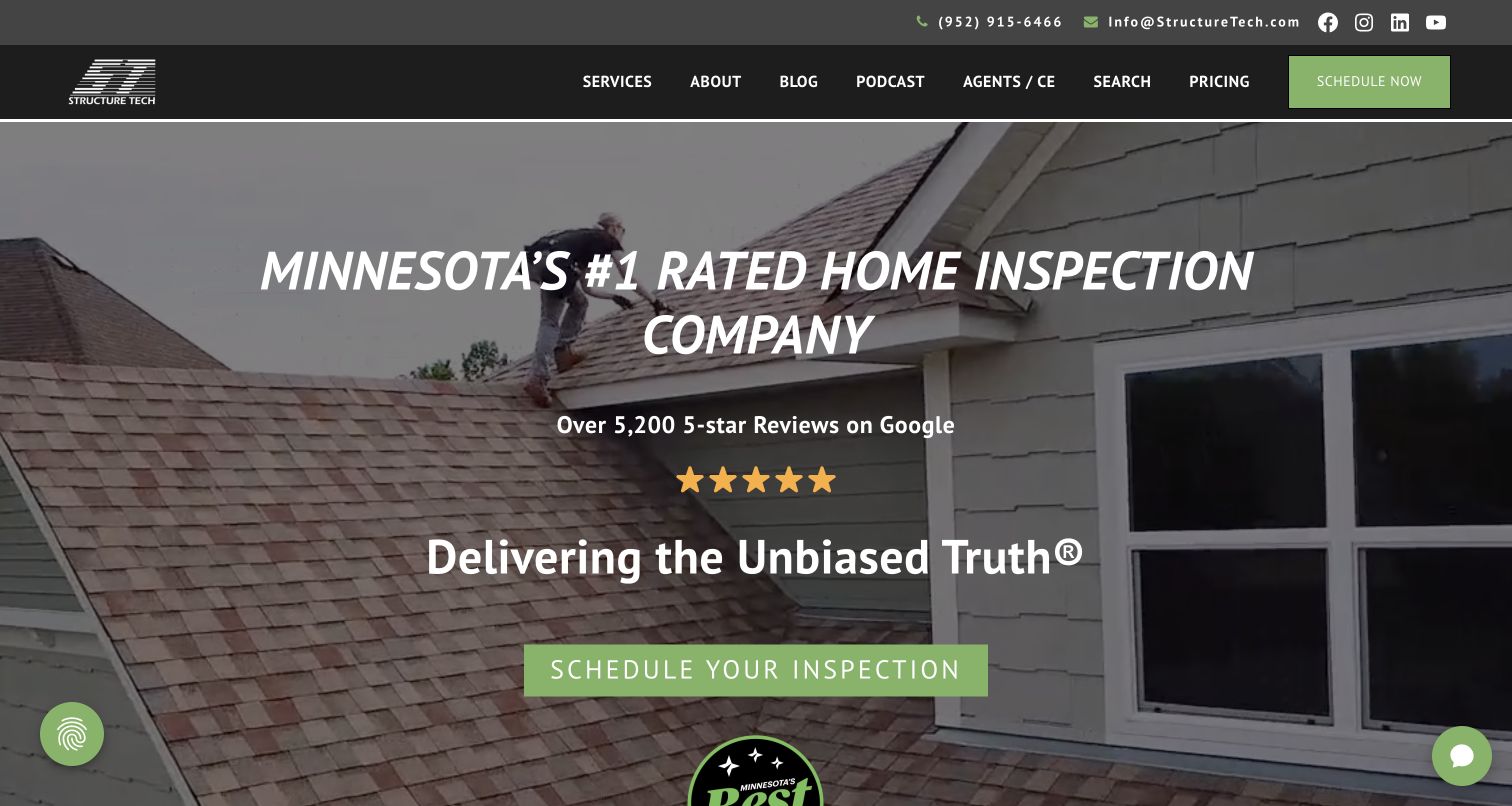
Structure Tech introduces its Twin Cities business with a roof-inspection video, green scheduling controls and a prominently stated review claim. The more useful distinction emerges in the navigation: pricing, a long-running blog, a podcast and agent education all have named destinations. Below the opening, individual service cards separate a home inspection from radon, sewer, chimney and other specialist work. Named team portraits make the local operation tangible. Black navigation and a restrained green accent create a practical, consistent framework around a media-heavy introduction. Its education-first positioning is supported by actual content routes rather than a single reassuring slogan. The site's rankings and review totals remain its own claims, not the basis of this editorial selection.
What you can learn
Treat useful explanations as part of the service, and give them stable navigation rather than hiding them behind a generic resources label. A smaller inspection firm can apply this with a sample report, plain-language pricing policy and a manageable library of specific building questions. Keep those materials distinct from guarantees and marketing claims, and ensure the scheduling button remains available when video is paused or unavailable.
Pros
Pricing, scheduling and technical education have separate, clearly named routes
Local team portraits and a specific service area support the regional identity
Cons & considerations
The tall video opening leaves service scope below the initial viewport
Review and award claims need ongoing source and date maintenance
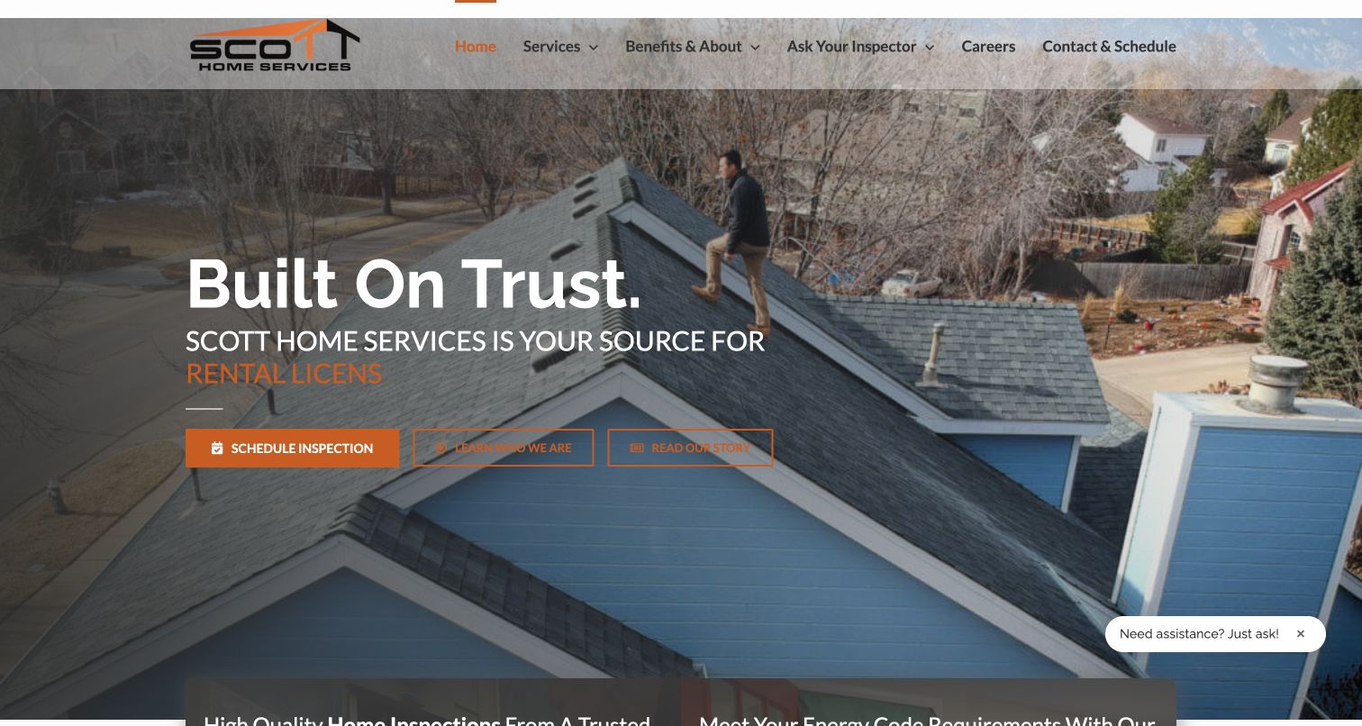
Scott Home Inspection uses an orange-accented roof photograph and a large trust statement to introduce a business that extends beyond purchase inspections. Three hero actions distinguish scheduling from learning about the team and reading its story. The next section divides home inspection, energy services, rental inspections and mechanical design into explicit groups. That separation matters because these audiences need different deliverables. An Ask Your Inspector section then explains articles, contractor information and follow-up questions after the report. Recent illustrated articles make the support promise visible. The rotating service wording in the opening provides variety, although a single captured frame can contain a partly typed phrase; the fixed headline and buttons carry the essential message.
What you can learn
When a firm has several related services, define the audience and outcome of each before building a shared menu. Keep the inspection booking route fixed while rotating supporting copy changes. Follow-up support should name what a client can actually access, who answers and where the request goes; a recognizable program is more useful than a vague promise of ongoing care.
Pros
Separate service groups prevent rental, energy and purchase-inspection work from being conflated
Ask Your Inspector gives aftercare an identifiable destination
Cons & considerations
Animated service text can be incomplete in a still frame or during slow rendering
Three hero actions require clear hierarchy as the layout narrows
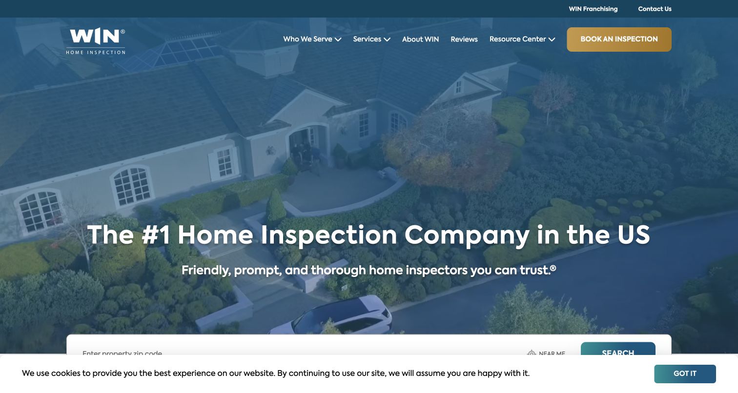
WIN places a postcode search near the opening and separates home buyers, homeowners, sellers and real-estate professionals below it. A blue overlay ties aerial housing imagery to a white wordmark, while a gold booking button stands out in the header. The long page organizes its large inspection catalogue with audience filters and explanations of maintenance checks, reports and specialist equipment. It also states that availability varies between independently operated locations. Those qualifications are important because the national menu is not a promise that every local inspector provides every test. The initial captured cookie strip partly overlaps the locator, illustrating how a useful primary task can compete with consent messaging even in a spacious hero.
What you can learn
Use a locator to establish local availability before presenting a nationwide service catalogue as something immediately bookable. Retain links for people who already know which inspection they need, and explain whether a test is an optional add-on. Test the search with overlays and with location permission refused; a postcode field should remain a dependable alternative to geolocation.
Pros
Ownership-stage routes give different audiences meaningful starting points
Local-availability qualification accompanies the broad service offer
Cons & considerations
The cookie strip competes with the postcode search in the captured view
The extensive catalogue needs careful prioritization on small screens
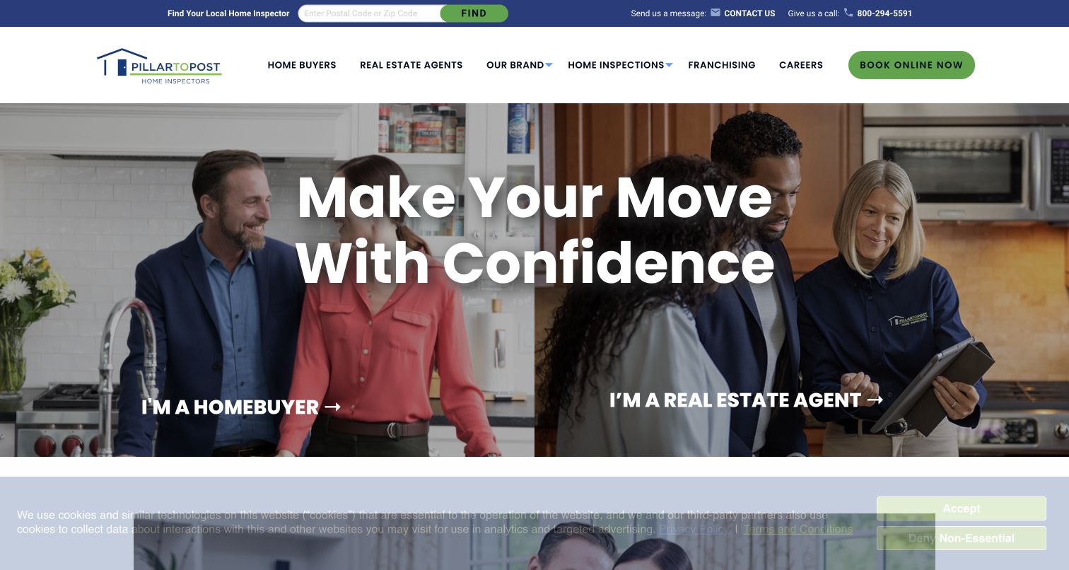
Pillar To Post divides its hero into a homebuyer side and a real-estate-agent side, using people in domestic settings rather than only exterior house photography. The central confidence statement spans both panels, while each panel has its own audience link. A slim top bar provides postcode search, contact and phone access; booking remains distinct in the main navigation. Farther down, the page explains an inspection model, additional services, packages and a three-step booking process. This gives a visitor more than one route into a technically unfamiliar service. The layout also exposes a content-governance issue: package promises, report timing and local availability need to remain aligned across national and local pages.
What you can learn
Audience selection is useful when the resulting pages genuinely answer different questions. Keep the inspector locator and ordinary service navigation available so visitors are not forced to choose an identity first. For a split photographic layout, check text contrast independently on both halves and preserve the correct image-to-link relationship when the panels stack on a phone.
Pros
Homebuyer and agent routes are immediately distinguishable
Local search and booking are available outside the audience panels
Cons & considerations
A large shared headline competes with two photographic focal points
National package and additional-service descriptions require local qualifications
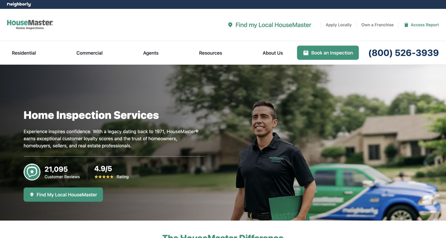
HouseMaster pairs a photographed inspector with a short home-inspection introduction and a local-office action. A two-level header separates service categories from location, report access and franchise-related utilities. The body then gives limited reimbursement, utilities assistance, buyer benefits and the report platform their own cards. This makes the wider client experience easier to scan than a single benefits paragraph. Guarantee conditions are linked to availability and terms rather than presented as identical everywhere. Teal controls, navy utility text and generous white space support a conventional service-company structure. In the observed page, the review module populated after the initial render, a reminder to make the main message independent of third-party review widgets.
What you can learn
Explain ancillary benefits without allowing them to redefine the inspection itself. A report portal, moving-service connection and conditional guarantee are different products and should have different labels and terms. Keep local-office contact available before asking for personal details, and provide a useful initial state when a ratings module has not loaded.
Pros
Report access and local-office discovery have separate utility routes
Benefit cards distinguish reporting tools from conditional guarantees
Cons & considerations
Two navigation rows use substantial vertical space before the main content
Contact and promotional opt-in language needs careful review when forms change
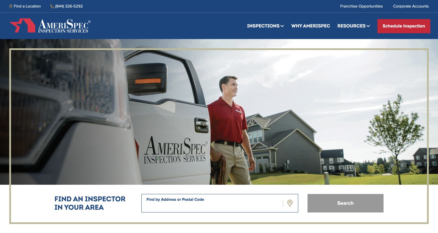
AmeriSpec gives its address-or-postcode locator a full-width white panel beneath a branded inspector photograph. The gold outline visually joins image and search into one module, while the blue header retains inspections, resources and scheduling links. Below, four concise explanations describe inspectors, reports, quality assurance and availability, followed by home, commercial, real-estate-professional and specialist service cards. This is a task-first national entrance rather than a detailed local sales page. The footer explicitly says independently operated franchises can have different prices and services. Awards and external rankings receive their own explanatory link, which is preferable to making the badge the only source of information.
What you can learn
For a network, make local discovery an explicit input-and-action pair and label the accepted location format. Do not make a disabled search button appear usable before the field has enough information. Keep brand-level claims separate from office-specific scope, fees and availability, and ensure the local result can carry the visitor's chosen service context.
Pros
Locator has a clear label and a visually bounded search area
Residential, commercial and specialist work have distinct content routes
Cons & considerations
The large photograph delays substantive inspection detail for visitors comparing scope
National awards can dominate unless their context stays current and accessible
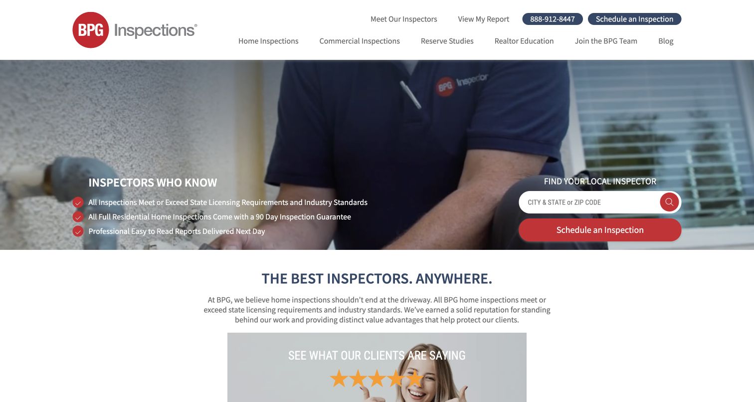
BPG puts local-inspector search and scheduling beside a short checklist over footage of inspection work. The hero is comparatively compact, allowing the next explanatory section and review prompt into the desktop view. Report access and inspector discovery are separate header links, a useful distinction for clients returning after an inspection. Below, homeowner, agent and inspector sections explain different relationships with the company, followed by additional services and online scheduling. Red actions and checkmarks create a consistent signal against the navy and white framework. The page makes specific licensing, guarantee and report-timing statements; these are company representations to verify locally, not design-review findings about inspection quality.
What you can learn
A short list of operational promises can be more useful than an oversized reassurance headline, provided the conditions are maintained and easy to inspect. Separate returning-client report access from new bookings. If recruitment shares the same homepage, label it as a different journey and keep it out of the consumer scheduling flow.
Pros
Compact opening exposes both locator and supporting content quickly
Returning clients have an explicit View My Report route
Cons & considerations
Three different audiences can dilute the consumer path without disciplined ordering
Guarantee and next-day-report statements need clear scope and exceptions
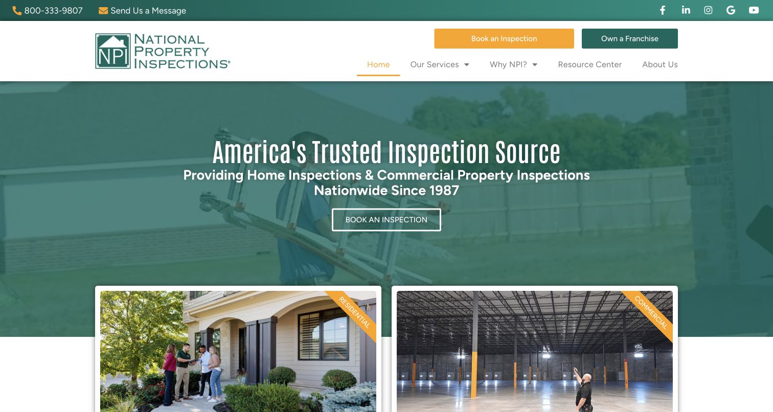
National Property Inspections uses a green-tinted inspection scene and a centered introduction before presenting two large destination cards: residential and commercial. Amber accents connect the booking action, active navigation and corner labels on those cards. The body goes beyond reassurance to explain report delivery, repair-estimate tools, utility setup and a limited warranty, with links for the supporting detail. A component-level inspection carousel describes roof, plumbing, electrical and other areas. This structure makes service categories visible before the page asks visitors to absorb a long set of brand benefits. The same prominence given to franchise ownership in the header is a tradeoff: valuable for recruitment, less relevant to an urgent homebuyer.
What you can learn
Use service categories that correspond to different reports and procurement needs, not merely different marketing language. Keep the basic residential scope readable without operating a carousel, and connect conditional benefits to their terms. For a smaller mixed practice, two well-explained service entrances can be enough; the national scale of the example is not a requirement to copy its full content volume.
Pros
Large residential and commercial cards make the main service split concrete
Supporting tools and conditional warranty have explanatory destinations
Cons & considerations
Recruitment and consumer booking share high-priority header space
A carousel is less direct than a static scope list for comparing inspected systems
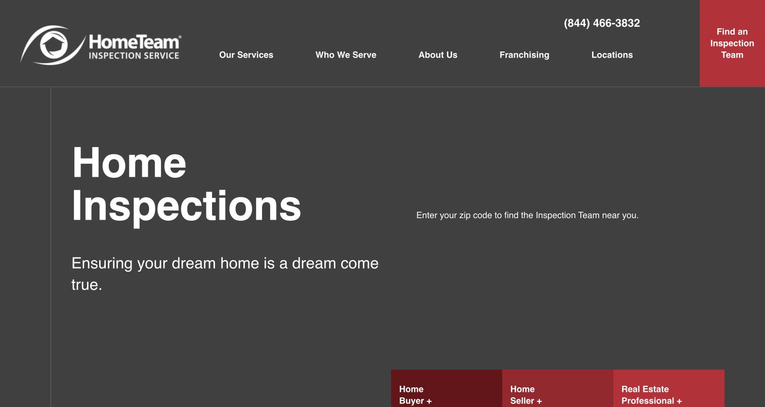
HomeTeam opens with very large white Home Inspections text, a short reassurance line and red audience shortcuts along the lower edge. The navigation uses a single conspicuous red Find an Inspection Team block beside ordinary service, audience and location links. Below the opening, the company explains its team-based approach and separates service descriptions, awards, testimonials and location discovery. The observed browser view had a notable limitation: text invited visitors to enter a ZIP code, but the actual location-entry control was not visible in the captured hero. The ordinary Locations link remained available. This is therefore a useful study in both clear visual hierarchy and the need for a working fallback when an embedded task module does not appear.
What you can learn
A bold typographic introduction still needs the promised task control. Treat locator loading and failure states as part of the design, and include a normal locations page that does not depend on the embedded module. Keep buyer, seller and professional links explicit, then test whether each path explains the inspection rather than simply repeating the homepage.
Pros
Buyer, seller and real-estate-professional shortcuts are clearly named
A conventional Locations link provides a route outside the hero module
Cons & considerations
The observed hero requested a ZIP code without rendering a visible input
Oversized typography leaves little room for service scope in the first view
Inspect-It 1st Greater Phoenix Metro puts its service area and three property categories into a huge navy headline over a recognizable city view. The header's red scheduling button remains visually separate from the main navigation. Below, the page explains the firm's regional coverage and separates residential or luxury inspections, commercial or multifamily work and consulting. Each group combines a short description with a testimonial and detail link. This is more specific than presenting every assignment as an ordinary home inspection. Its flip-card instruction also reveals a usability tradeoff: important information is associated with hover behavior, which needs an equivalent for touch and keyboard users.
What you can learn
Say where the firm works and which kinds of property it inspects before introducing less familiar differentiators. For mixed residential and commercial work, describe the different report scopes instead of relying on prestige labels. Do not make testimonials or essential service explanations available only on the reverse of a hover card; keep the detail destination reachable with a normal link.
Pros
Geography and property categories are explicit in the opening
Consulting has its own route rather than being buried under ordinary inspections
Cons & considerations
The multi-line headline occupies most of the initial viewport
Hover-flip content needs a clear touch and keyboard alternative
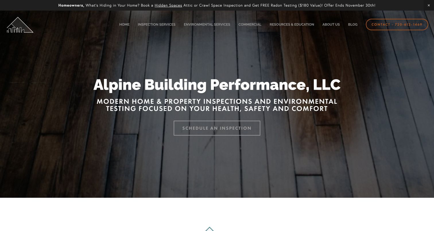
Alpine Building Performance uses dark timber texture rather than a generic stock house to frame its name and health, safety and comfort positioning. A narrow dated announcement promotes a specific inspection offer, while the main navigation divides inspection services, environmental testing, commercial work and education. The body identifies Denver-area coverage and provides separate routes to service explanations and a quote-building tool. Sample commercial reports and practical guides sit within the broader resource structure. This is a content-rich regional practice with a restrained initial visual language. The large menu is useful for specialists but asks a first-time buyer to understand many inspection terms before choosing.
What you can learn
Build the service taxonomy around the questions clients actually bring: a purchase inspection, a particular environmental concern or a commercial assessment. Pair specialist terms with short explanations and keep the general home-inspection route obvious. If using a seasonal offer strip, give it an end date and owner, and do not let the promotion hide permanent scope and service-area information.
Pros
Environmental testing is distinguished from the main inspection service
Quote exploration and sample-report routes support informed comparison
Cons & considerations
The extensive specialist navigation can overwhelm an inexperienced buyer
A time-limited announcement requires coordinated removal after the offer ends
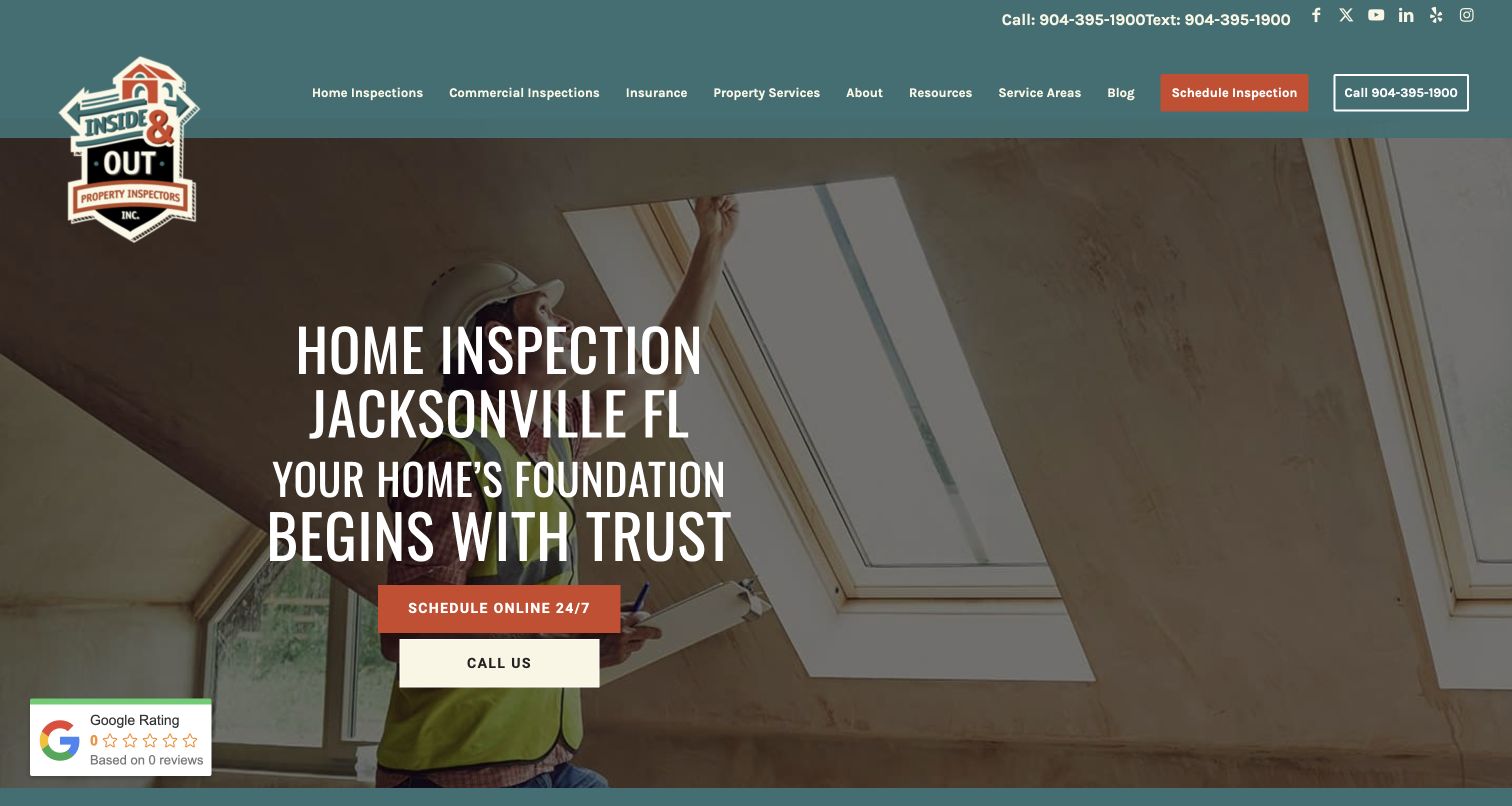
Inside & Out identifies Jacksonville in the first headline and pairs scheduling with a direct call option over inspection imagery. Teal, rust and cream give the page a recognizable local-service identity, including a badge-style logo that extends below the header. A substantial grid then names home, construction, thermography, rental, stucco, wind-mitigation and other services, each with its own explanation and destination. Service-area information includes a map and county groups. This specificity is more useful than an undifferentiated list of tests, though insurance-related and technical assertions require their own qualified review. The captured ratings widget showed an empty state, so the stronger evidence for the design is its clear taxonomy, not the temporary rating display.
What you can learn
Give specialist services their own plain-language explanation and distinguish them from the base inspection. Local geography belongs in visible content, not just page metadata. Review third-party widgets in their unloaded state and avoid showing a zero rating as if it were a real result. Keep call, text and online scheduling labels distinct so visitors know what each action does.
Pros
Service descriptions explain the purpose of individual inspection types
Map and county organization make the coverage discussion concrete
Cons & considerations
A long service grid can delay sample-report and process information
The captured review widget's zero-state presentation could confuse visitors
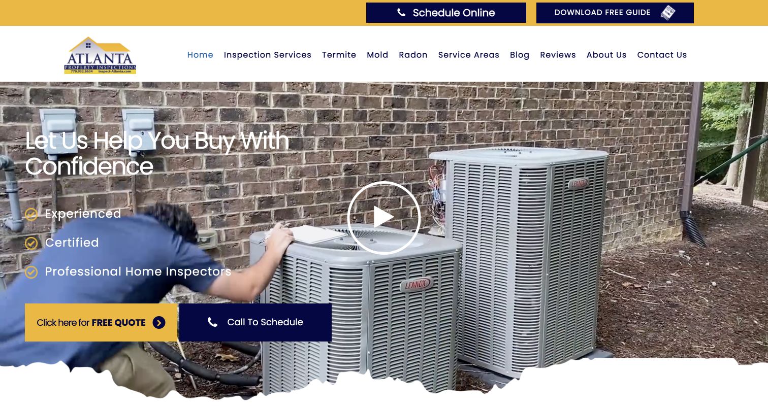
Atlanta Property Inspections uses navy and yellow actions over footage of hands-on inspection work. The hero offers a quote and a phone call, while a top strip adds scheduling and a downloadable guide. The body then turns the service into a three-stage process: scheduling, attending and receiving information, and continued support. Separate navigation links expose termite, mold, radon and service-area pages. This gives prospective buyers a practical account of what happens rather than relying only on an experience claim. The page is lengthy and repeats reassurance in several places; the most reusable pattern is the process explanation, not the volume of sales copy. Legal and guarantee statements on the business site remain claims requiring appropriate professional verification.
What you can learn
Explain what a client should do before, during and after an inspection, including whether attendance is encouraged and how the report arrives. Offer both a human contact route and a clearly labeled online request. If a guide requires personal details, say so before the visitor chooses it and keep essential service information accessible without the download.
Pros
Quote and phone routes accommodate different readiness levels
A numbered process reduces uncertainty about the inspection experience
Cons & considerations
Scheduling, quote and download actions compete for attention above the fold
The long page repeats reassurance that could be consolidated into more specific information
Kegan is a freelance web designer and developer with 15+ years of experience helping businesses turn complicated website requirements into clear, maintainable digital experiences. He works directly with clients from planning and design through development, launch, and ongoing support.
For home inspector website design, his development approach focuses on inspection scope and service-area information, genuine sample reports, clear scheduling expectations, and straightforward inspection inquiries. The scope can be a targeted improvement or a complete custom build, with responsive layouts, thoughtful content structure, and integrations chosen around the people using and maintaining the site.
Show 3 other home inspector website designersHide other home inspector website designers
Plan a home inspection website around the questions buyers actually ask
Map the inspection journey
Write down the questions before booking, before the appointment, during the visit and after the report. Identify which can be answered publicly and which require a conversation about the property. Give the report-access route its own label for returning clients.
Define a service model
For every inspection type, record its purpose, typical deliverable, scope limitations and whether it is included or optional. Have the firm's qualified staff approve technical explanations. Avoid copying environmental or insurance-related claims from a competitor.
Prepare a safe report example
Choose an anonymized sample that shows the actual report format without exposing addresses, client details or private findings. Explain the difference between an illustrative sample and the report a particular property will receive. Check any external report viewer for accessible navigation.
Design local availability first
List cities or coverage boundaries the firm genuinely serves. For a network, determine how postcode search maps to an office and how unavailable areas are handled. Provide a normal location directory or contact route if the embedded search fails or location permission is refused.
Set rules for claims and offers
Assign an owner to review totals, certifications, awards, timing claims and conditional guarantees. Record supporting sources and review dates. Time-limited add-on promotions need an expiry workflow so the homepage, service page and scheduler do not disagree.
Test without creating real appointments
Check menu access, report examples, service-area discovery and phone links on small screens and with a keyboard. Review cookie, chat and review-widget combinations. Use authorized test environments for booking; do not submit real inspection requests as routine design QA.
The editing job behind the design
Choose tools that preserve clear scheduling and report boundaries
The marketing site, scheduling tool and report-delivery system may be separate services. Choose a content system that makes scope, coverage and conditional offers easy to maintain, then document which provider owns availability, confirmations, payments and private reports. A visible booking link does not establish the full platform or its security properties.
Make external transitions understandable and keep sensitive property or client information out of public analytics and screenshots. A small firm's website does not need an elaborate custom application if a reliable, accessible provider handles the operational work. Test empty, loading and unavailable states for locators and review widgets; the main service explanation should remain useful without them.
Our WordPress website examples offer a separate look at publishing approaches. A visible platform label is evidence for that named page, not a guarantee that the same system will suit your requirements.
Before the public launch
Home inspection website planning checklist
Name the actual service area prominently.
Explain the base inspection and its limitations.
Distinguish optional tests from included work.
Provide an anonymized sample report.
State the expected report process without an unsupported guarantee.
Keep returning-client report access separate from new bookings.
Offer a phone or contact alternative to the scheduler.
Give location search a non-geolocation fallback.
Link conditional guarantees to their terms.
Assign sources and review dates to certifications and award claims.
Test navigation, zoom, keyboard use and overlay combinations.
Keep real client data and appointments out of routine website QA.
These checks are a project checklist, not a performance, legal, security, or accessibility certification. Test real journeys with the people responsible for the website before making claims about the result.
Sources & editorial method
How this collection was selected and reviewed
The thirteen examples follow the saved collection target, not a service-quality ranking or complete market survey. Each official public homepage was directly inspected and captured in a browser on the recorded UTC date. Reviews identify a visible pattern, a practical design lesson and conditional tradeoffs. No inspection was booked, form submitted or client report accessed. Editors Choice is an explicit regional-specialist design selection, not a vote result, licensing verification or endorsement of a property's inspection outcome. Technology labels require separate public evidence; an unconfirmed stack remains empty.
Each example links to its actual source page. Screenshots are direct browser captures with their own capture dates; moving imagery, announcements and live designs can change. The notes describe observable design choices and conditional tradeoffs, not measured traffic, conversion results, service quality, or accessibility conformance.
Technology labels use public page metadata, asset evidence, or explicitly cited platform documentation. Platform documentation is not a complete current deployment audit. A component reference may be legacy or unused; it is not a complete backend inventory. Unknown stacks are omitted. These sites are editorial examples, not our client portfolio.
Written, Edited and Curated are separate editorial records, not timestamps advanced by a rebuild. Website designs and imagery belong to their owners. See our editorial standards or suggest a correction.
Questions worth asking
Home Inspector website design questions
What should a home inspector's homepage include?
Start with coverage, the main inspection service, a clear way to ask questions and the scheduling route. Add a sample report and a short account of the process. Specialist tests should be labeled as included or optional rather than left for the visitor to guess.
Should an inspector show prices online?
A transparent pricing page or explanation of the quote factors can help visitors compare. Property size, age, access and optional services may affect a quote. Have the business define and maintain its own policy, and distinguish an estimate from a confirmed booking price.
Is an online scheduler essential?
It can be useful, but it should not be the only contact route. Visitors may have access, timing or scope questions that need a person. Explain whether the tool makes a request or confirms an appointment, and keep the telephone or contact option available if it fails.
How should sample reports be presented?
Use an anonymized example that represents the firm's actual reporting format. Explain what the reader is seeing, including photographs, findings and limitations. Never publish a live client report or suggest that the sample predicts the condition of another property.
Can a website design collection verify an inspector's qualifications?
No. It can describe how a site presents qualifications and where explanations are linked. The relevant licensing body, professional organization and provider must establish current status and applicable requirements. The examples here are design references, not a substitute for due diligence.
A useful home inspection website makes scope and process understandable before asking for an appointment. Lead with local coverage, explain the deliverable and give trust claims the same care as the visual design.