Best Carpet Cleaning Websites of 2026 (22 Real-World Examples)
Carpet-cleaning website design that explains materials, service scope, and the request process without overwhelming the customer.
Study 22 public company pages, from local floor cleaners to specialist textile businesses and larger networks. Compare the communication and interface choices, not the quality or suitability of their cleaning work.
A customer might arrive with a routine cleaning question, an unfamiliar stain, a delicate rug, or a commercial property. Those are different conversations. A useful carpet-cleaning homepage helps the visitor recognize the appropriate service before asking for detailed information.
The strongest brief starts with the actual operating model: on-site work, collection and delivery, specialist assessment, or routing through a local office. The examples show different approaches, but none should be copied as a universal treatment, price, drying-time, health, or booking promise.
Before the examples
What makes good carpet cleaning website design in 2026?
Distinguish the surfaces and relationships
Carpet, rugs, upholstery, drapery, and hard floors are not interchangeable labels. Put the real service categories in readable navigation, and distinguish consumer inquiries from workroom or trade relationships where relevant. Costikyan's literal textile wording is useful because the scope is visible before contact.
Make geography useful rather than decorative
A local service area, multi-state operation, and national network need different routing. State the actual territory clearly, or explain what a ZIP finder checks. A locator should identify a receiving office without pretending that location alone confirms service suitability, price, or an available appointment.
Keep the first request proportionate
A visitor with a material question may not know which service to select. Offer a short inquiry route alongside scheduling when appropriate. Label what follows submission, and let staff clarify details rather than requiring the customer to diagnose a stain or select a treatment themselves.
The collection · 22 examples
22 carpet cleaning websites worth studying
The 22 references include vehicle-led local introductions, calm specialist pages, domestic imagery, compact category panels, and location-based networks. Compare each design with the task and operating model it serves; a national finder is not automatically an improvement for a neighborhood cleaner.
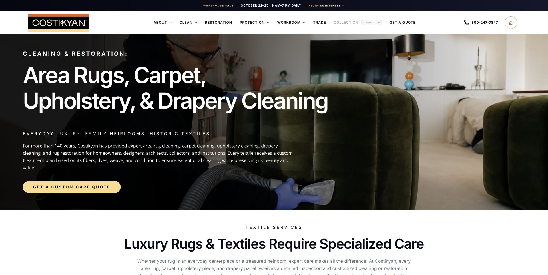
Costikyan uses a dark work photograph with a large, literal heading listing rugs, carpet, upholstery, and drapery. A pale gold custom-care quote action anchors the text, while the restrained white header separates cleaning, restoration, protection, workroom, trade, and education routes. The next section introduces specialist textile care in readable text rather than adding another promotional overlay. This is a useful regional reference because the scope is specific and the photograph relates to the work rather than simply showing a clean living room. The design selection does not establish treatment suitability, restoration results, qualifications, or the condition of an individual textile.
What you can learn
Make specialist scope understandable before requesting contact. Different materials and service relationships need accurate descriptions and appropriate assessment; a broad cleaning label or attractive project image should not imply that one treatment suits every item.
Pros
The literal textile-category heading explains the broader service offer immediately.
A restrained gold action remains clear against the dark work photograph.
Cons & considerations
Detailed work imagery requires careful contrast behind smaller supporting text.
The broad specialist catalog needs distinct inquiry and scope explanations beyond the hero.
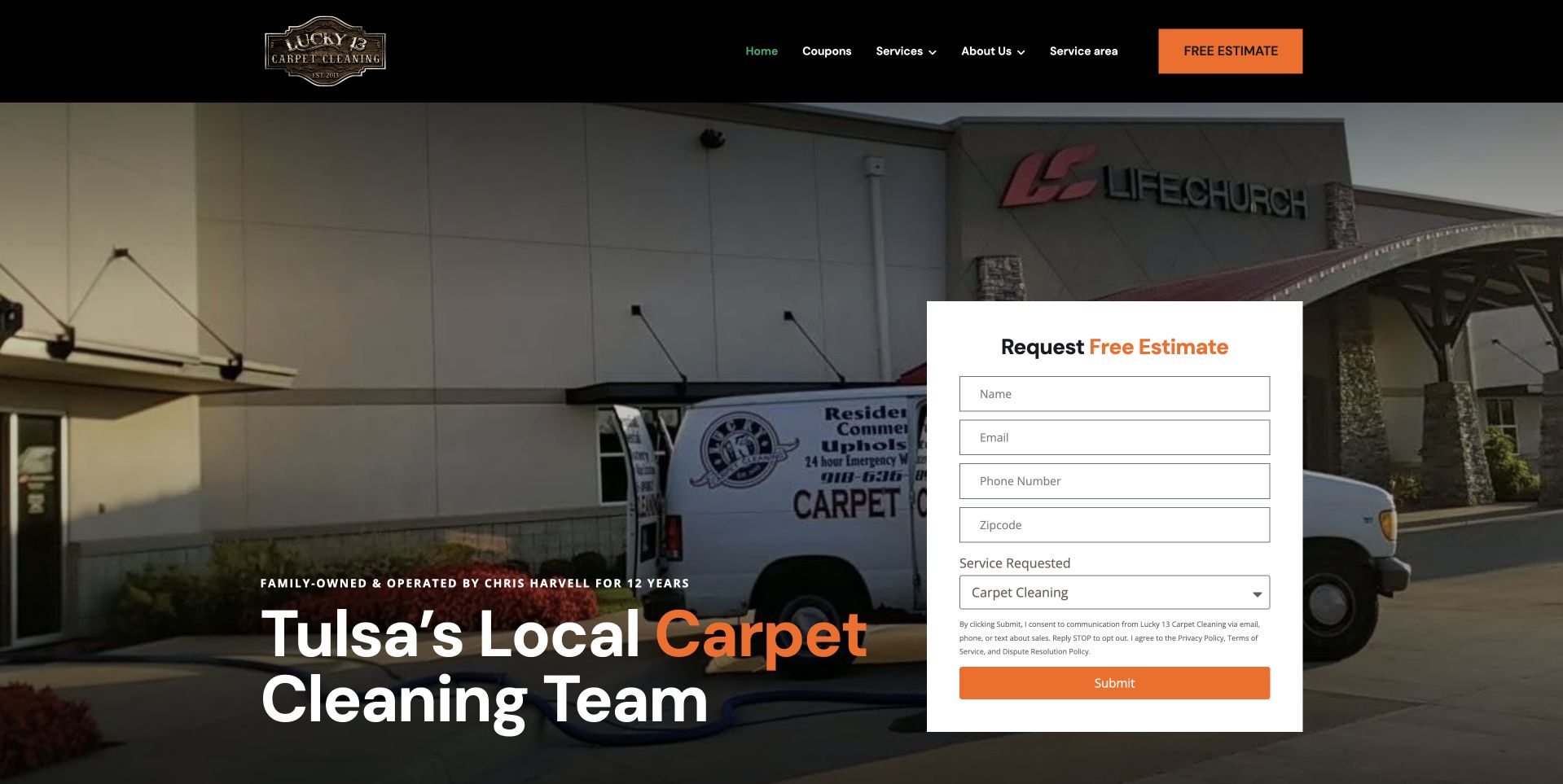
Lucky 13 places a large Tulsa carpet-cleaning heading over a photograph of company equipment and a branded van. A white estimate form occupies the right side, with orange emphasis connecting the form action and highlighted service word. The black header separates coupons, services, company information, territory, and estimates. This illustrates a local operator whose own equipment gives the page a recognizable identity. The form makes the first task unmistakable, but its height also illustrates the tradeoff between immediate intake and a quieter introduction. The company's family-business and experience wording remains its own presentation rather than independently verified service performance.
What you can learn
Keep the first request limited to useful contact and service context. Explain whether it starts a callback or estimate discussion, and do not let a visible form imply that price, treatment suitability, or an appointment has already been confirmed.
Pros
The company vehicle gives the introduction a specific local-business context.
The white form is clearly separated from the detailed background photograph.
Cons & considerations
A tall first-screen form can be demanding on a phone.
Service and territory details still need readable routes for visitors not ready to inquire.
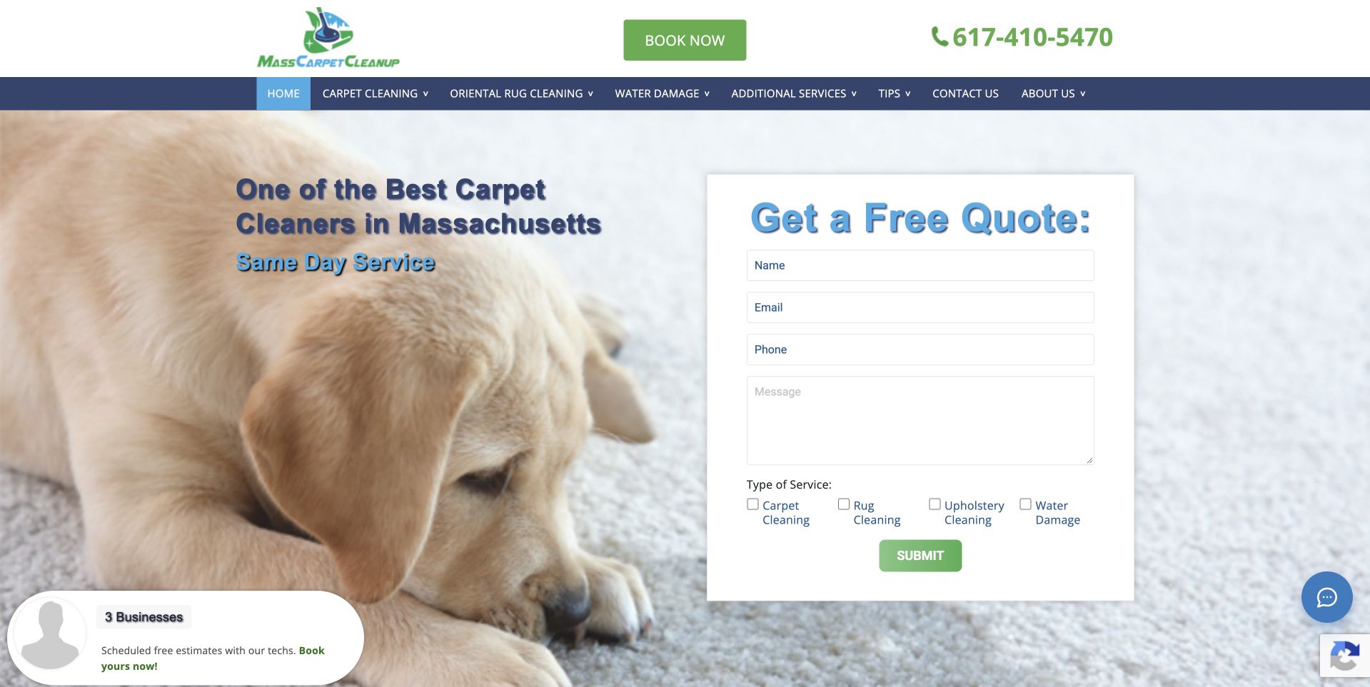
Mass Carpet Cleanup uses a pale pet-and-carpet photograph behind a local cleaning introduction and a white quote form. The green contact action contrasts with the blue service navigation, while telephone and booking routes remain visible above. The form includes service-category choices rather than treating every request as carpet cleaning. This illustrates a mixed household-service catalog with an immediate inquiry route. The soft image establishes a domestic setting, but it should not be treated as evidence for health, safety, or cleaning-effectiveness claims. A small social-proof prompt also demonstrates why optional widgets need to remain subordinate to the task the visitor came to complete.
What you can learn
Give different service inquiries clear labels and make the form's next step explicit. Keep optional proof widgets from covering inputs, and have responsible staff review any pet, health, timing, or treatment claims rather than relying on a friendly photograph.
Pros
A service-choice field acknowledges the broader household catalog.
Telephone and form routes remain visible in the opening screen.
Cons & considerations
Soft photographic backgrounds still need strong contrast for supporting text.
Floating proof and chat prompts can compete with the main request form.
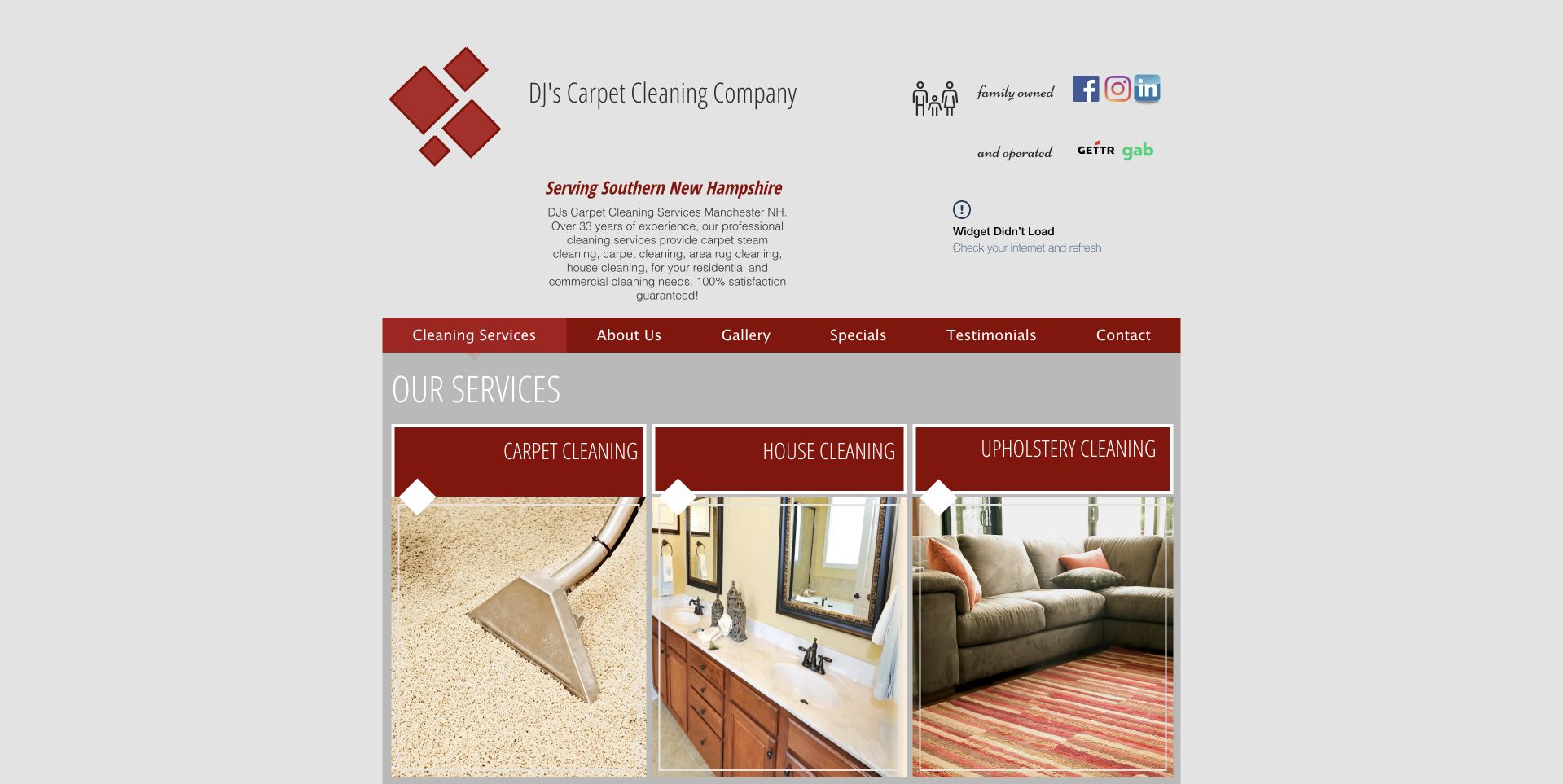
DJ's uses a narrow centered page with the company identity and southern New Hampshire context above a red navigation bar. Three image panels immediately distinguish carpet, house, and upholstery cleaning. This illustrates a small company's underlying service structure rather than a contemporary full-width visual treatment. The categories are concrete, and the modest layout avoids forcing every visitor through the same introductory form. At the same time, the large empty margins and small header details reveal where a refresh could improve reading comfort. A modern version should preserve the clear categories and local facts while increasing type size and simplifying the mobile reading order.
What you can learn
Retain useful service distinctions when updating an older site. Give each image panel an accessible text label and a clear destination, then make contact and coverage easy to find without relying on tiny header copy or a desktop-only column layout.
Pros
Three literal categories make the mixed service offer visible immediately.
The local company context appears before the catalog panels.
Cons & considerations
The narrow layout leaves substantial unused space on a large screen.
Small header details and dense navigation need more generous mobile spacing.
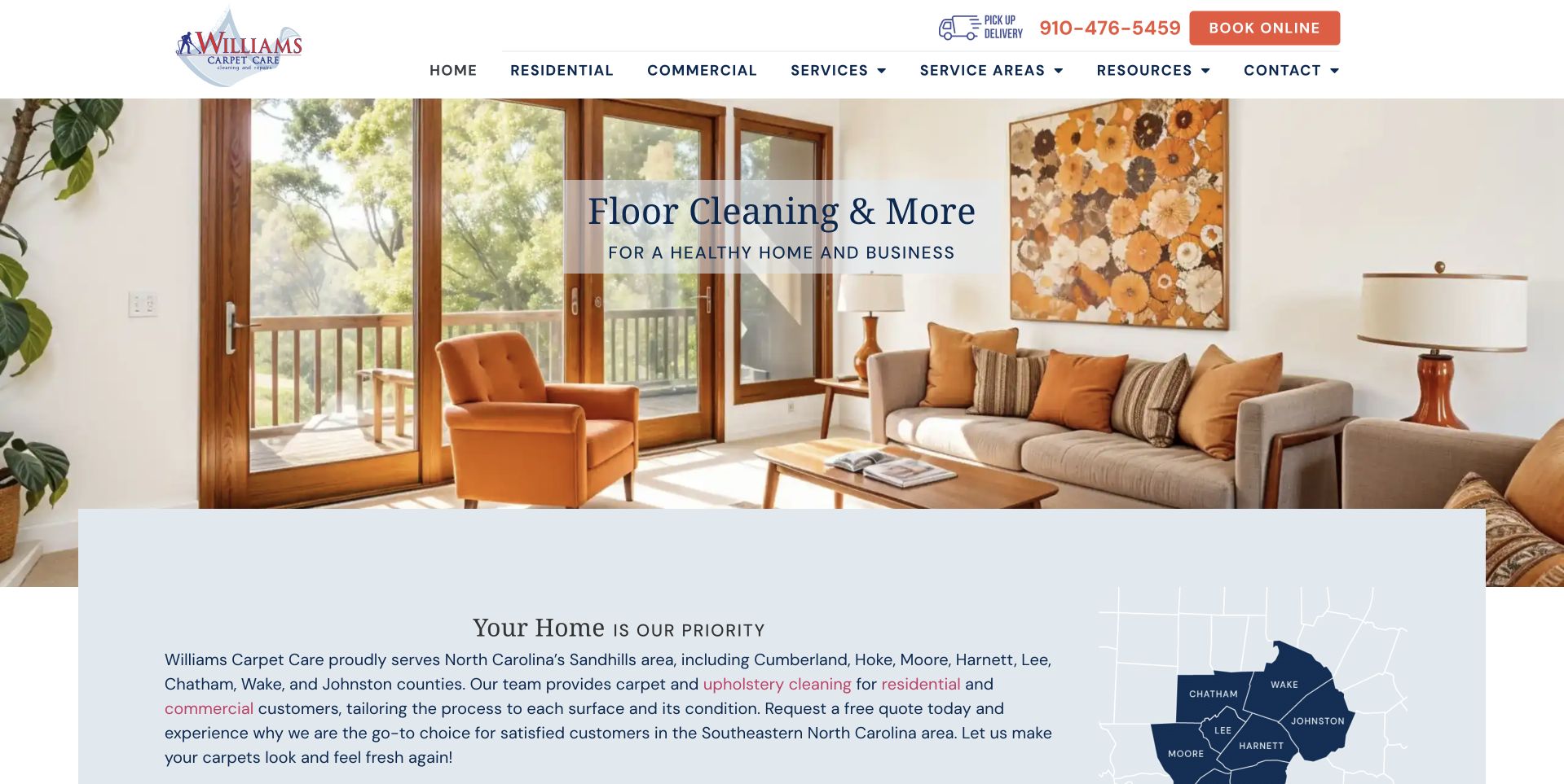
Williams uses a bright living-room photograph beneath a white header with residential and commercial routes. A small floor-cleaning message sits on the image, while a pale blue introduction panel overlaps its lower edge and includes a regional map. This illustrates how a wide service photograph can transition into more specific local information. The page gives the map and explanation their own readable surface instead of placing everything directly on the furniture image. The broad floor-care introduction also leaves room for the catalog to distinguish carpets from other surfaces. The company's quality or health-related wording should remain attributed content rather than an independently established outcome.
What you can learn
Use the interior image as context, then provide literal surface and audience categories. Keep territory information readable in text alongside a map, and give residential and commercial visitors clear routes when their inquiry process differs.
Pros
The overlap panel keeps regional explanation off the detailed interior photograph.
Residential and commercial navigation recognizes different customer contexts.
Cons & considerations
The small hero message can be overshadowed by the large photograph.
Health-oriented wording needs appropriate review beyond a general floor-care promise.
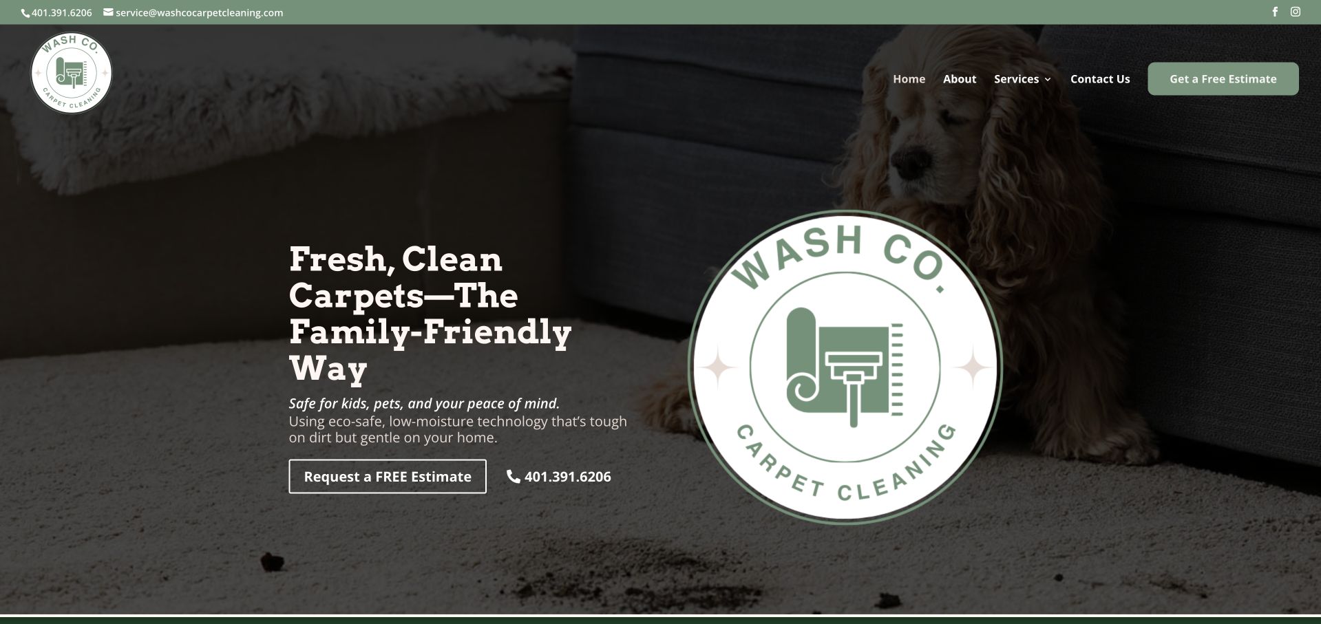
Wash Co. uses a dark carpet-and-pet photograph behind a short white service headline, with a large circular company mark on the right. A green upper strip and pale estimate action repeat the restrained brand palette, while the navigation remains short. This illustrates a small operator that does not need a network locator or a large product-style dashboard. The photograph and company mark establish a recognizable identity, while the telephone and estimate controls provide the practical next step. The public page's family-friendly and safety wording is a business claim, not a conclusion established by the image or this collection. The quieter layout still needs clear service and coverage detail below.
What you can learn
Keep the local offer and contact process literal even when the brand voice is warm. Have qualified staff review treatment and safety descriptions, and avoid treating a pet photograph or a reassuring slogan as evidence of suitability for every household.
Pros
A short navigation and limited green palette keep the opening focused.
Estimate and telephone routes are visible beside the introduction.
Cons & considerations
The oversized mark occupies space that could explain scope or territory.
Safety-oriented claims need specific supporting context rather than imagery alone.
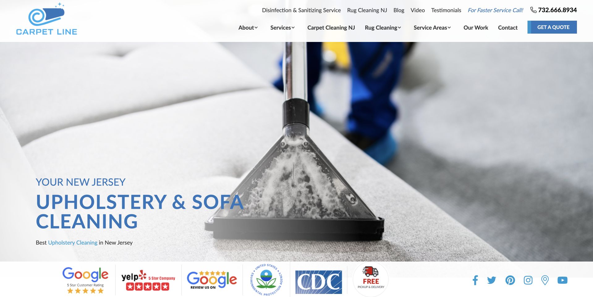
CarpetLine uses a large close-up of upholstery extraction beneath a white-and-blue header. The captured hero names upholstery and sofa cleaning in New Jersey, while the navigation provides separate carpet, rug, service-area, work, company, and quote routes. A row of review and qualification-style marks sits below the photograph. This illustrates an image that shows the service rather than only a finished room. The changing hero can introduce one category at a time, but the static navigation remains important for visitors arriving with a different need. The displayed marks are company-supplied context, not independent verification of cleaning results or a complete explanation of qualifications.
What you can learn
Keep the overall catalog accessible outside any rotating feature. Use task-specific photography with readable labels, and explain the scope and meaning of review or professional marks instead of allowing a badge row to imply universal treatment suitability.
Pros
The close work image makes the featured service immediately recognizable.
Static navigation distinguishes several different textile and cleaning categories.
Cons & considerations
A category-specific slide may not match the visitor’s reason for arriving.
A crowded mark row needs readable sourcing and qualification context.
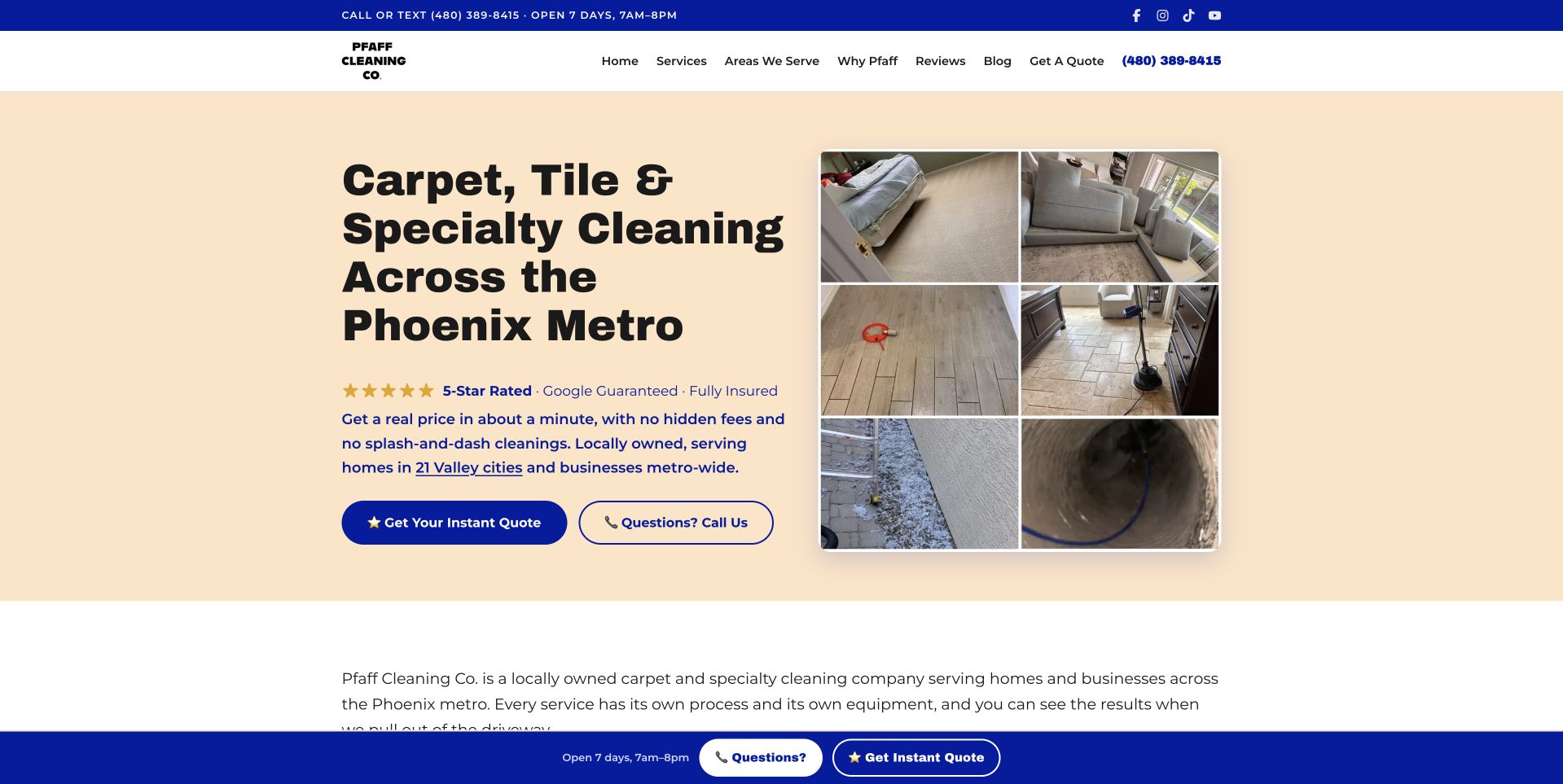
Pfaff uses a peach text surface with a large Phoenix-area cleaning heading and a four-image work collage. Blue quote and telephone actions sit beneath the copy, while a matching blue upper strip provides opening and contact context. The white header separates services, territory, company information, reviews, and quote access. This illustrates a service page that keeps the headline off detailed photography. The collage suggests different surfaces and tasks without asking the visitor to wait for a carousel. A floating contact strip repeats practical access, although repetition should be controlled so it does not crowd the page on a phone. Company rating and qualification statements need their own supporting context.
What you can learn
Use a small work collage to show breadth, then explain each service in text. Keep repeated contact controls consistent and accessible, and avoid using a collage as proof that the same process is suitable for every surface.
Pros
A solid text panel gives the long local-service heading a readable surface.
The small collage communicates several work contexts without rotating media.
Cons & considerations
Repeated top, hero, and floating contact actions can crowd a narrow display.
The collage needs clear service descriptions and accessible image context.
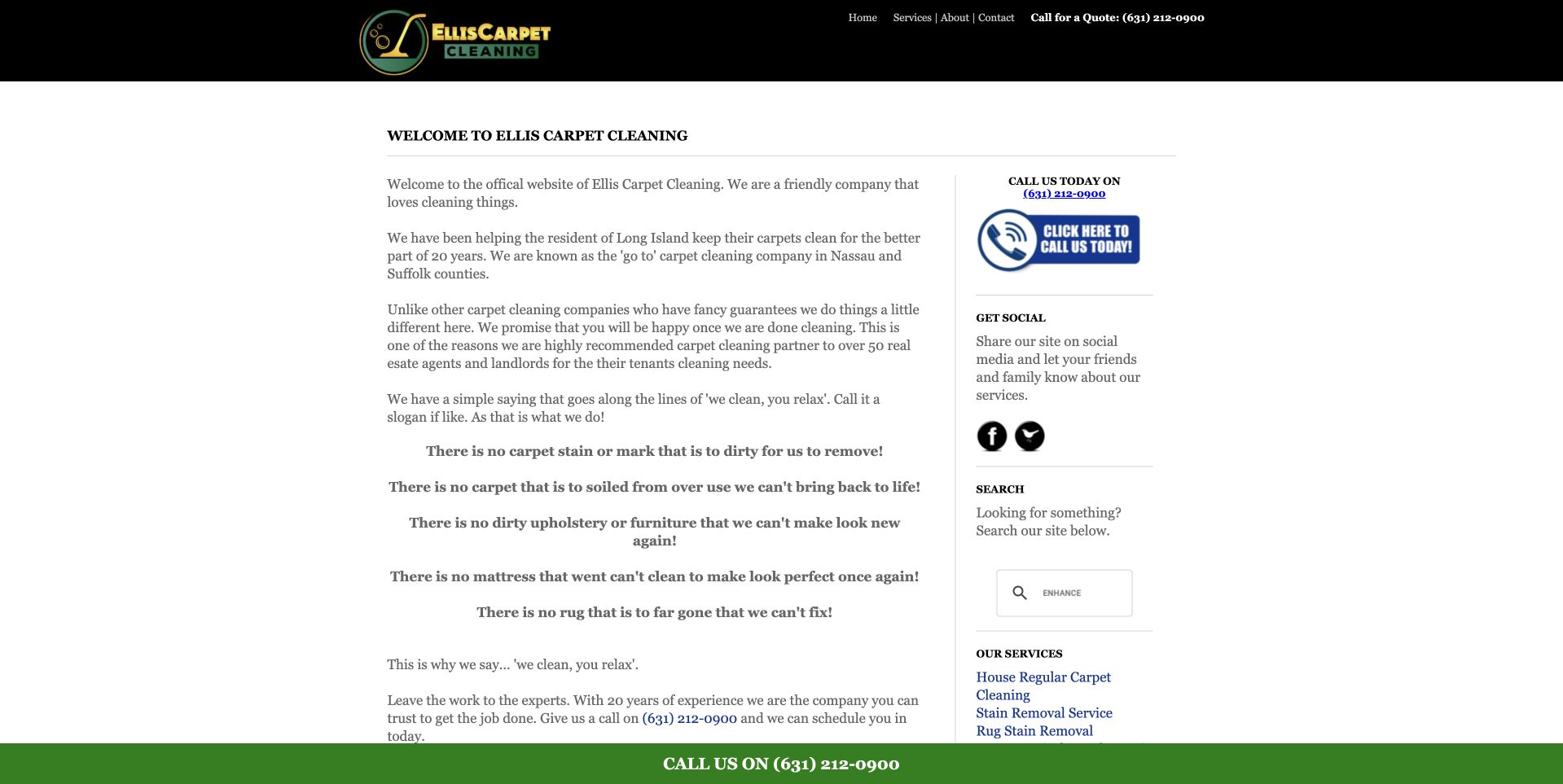
Ellis uses a restrained black header above a narrow, mostly text-based welcome section. A side column provides telephone access, social links, search, and service information, while a green call strip stays along the lower edge. The public introduction identifies a Long Island service context and explains the company's carpet-cleaning focus. This is useful as a content-priority reference rather than a modern photographic showcase. The page shows that local facts and a direct contact route can exist without a large hero. It also exposes the cost of dense small copy: a new visitor has to read several paragraphs before the strongest service and next-step information becomes obvious.
What you can learn
Preserve accurate company facts when modernizing a text-heavy page, but introduce headings, shorter sections, and a clear task hierarchy. Keep telephone labels accessible and ensure that a fixed contact strip does not obscure the content or form controls on mobile.
Pros
The company explanation and contact information appear without decorative distractions.
Service-related links provide a route beyond the welcome text.
Cons & considerations
Dense small paragraphs are difficult to scan quickly.
The narrow main column and sidebar need a simpler single-column mobile order.
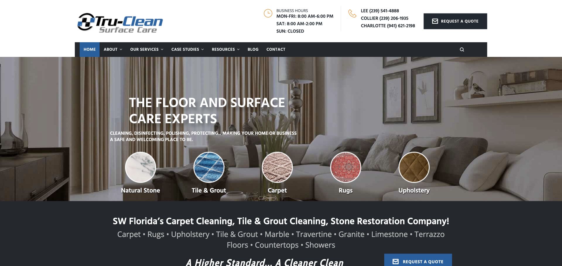
Tru-Clean uses a living-room photograph behind a floor-and-surface-care introduction, with circular category images along the lower part of the hero. Those labels distinguish natural stone, tile and grout, carpet, rugs, and upholstery. The white header provides business hours, telephone context, and a quote route above a darker main navigation. This illustrates a company whose offer is broader than the carpet-cleaning label alone. The circular categories give visitors a way to recognize the relevant surface without loading the introductory paragraph with every material. The supporting regional line below reinforces southwest Florida context, while the detailed service pages need to explain the actual scope and inquiry process.
What you can learn
Use material categories when they correspond to genuinely different services, but avoid implying that a single treatment fits all surfaces. Keep hours and contact information clear, and reserve material-specific suitability questions for the appropriate assessed service conversation.
Pros
The category row makes a mixed surface-care catalog visible immediately.
Hours and telephone information are separated from the main service introduction.
Cons & considerations
Small circular labels can be difficult to read on mobile.
Multiple header layers reduce space for the service explanation on short screens.
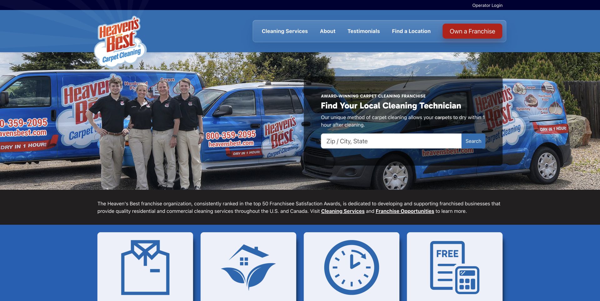
Heaven's Best uses a large photograph of uniformed people beside branded vans. A dark local-technician search panel sits on the right, asking for ZIP, city, or state, while the blue header keeps services, company information, reviews, location, and franchise routes separate. Four large icon panels begin below the image. This illustrates how a network combines recognizable company assets with a concrete routing task. The search card has a clear purpose without becoming a long quote form. The award and drying-time wording remains the company's claim rather than an independently verified outcome for a particular material, household, or local office.
What you can learn
Make the receiving location clear before the service request continues. Keep network promotions and franchise information distinct from customer intake, and explain local scope instead of assuming every office offers identical availability or treatment arrangements.
Pros
The local-technician panel gives a broad network message a specific first task.
Team and vehicle photography establishes a recognizable service identity.
Cons & considerations
Large supporting icon panels require careful responsive sizing.
Network-wide claims need local-office context before a customer assumes eligibility or results.
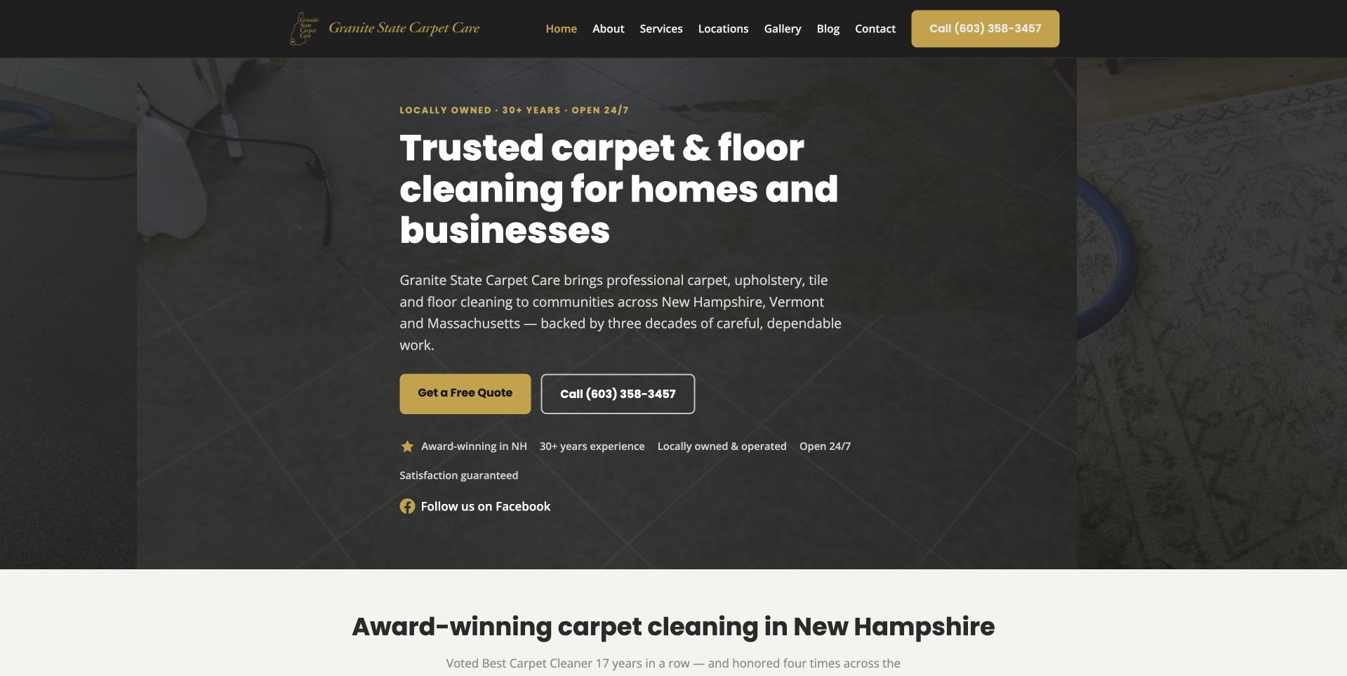
Granite State uses a darkened floor-cleaning photograph with a large white carpet-and-floor heading. A short paragraph names New Hampshire, Vermont, and Massachusetts, followed by gold quote and outlined telephone actions. The charcoal header keeps services, locations, gallery, company, blog, and contact routes visible. This illustrates a regional business that states its territory directly instead of requiring a national-style locator. The image provides a work context, while the solid dark treatment keeps most of the message readable. Small supporting labels and an award-oriented section follow, but those are company statements requiring context rather than proof of service quality.
What you can learn
Keep broad regional coverage precise and maintained for the services actually offered. Use real work imagery as context, while making quote, timing, and qualification information readable beyond a short line of promotional labels.
Pros
The regional paragraph gives the broad cleaning heading geographic meaning.
Gold and outlined contact actions remain distinct against the dark photograph.
Cons & considerations
Several small supporting claims can crowd the lower hero.
A broad multi-state offer needs more detailed service-area information before booking.
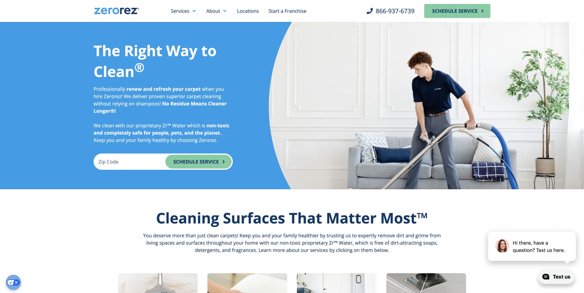
Zerorez uses a bright blue text area beside a photograph of a technician cleaning a sofa. A ZIP field and pale green schedule control sit within the left panel, while the white header keeps service, company, location, franchise, and telephone routes separate. The following section introduces the wider surface-care offer. This illustrates a familiar service photograph paired with a concrete eligibility task. The solid blue area prevents the text from competing with the cleaning equipment and furniture details. The proprietary-process and cleaning-effectiveness wording remains its own marketing content, not a result independently tested by this collection or evidence of suitability for every textile.
What you can learn
Keep the location step narrow and explain what it establishes. Separate the scheduling process from treatment claims, and make sure important service information remains readable without video, promotional overlays, or a detailed understanding of the branded process.
Pros
The solid blue area creates a stable reading surface beside the work image.
The ZIP field makes local routing part of the main task.
Cons & considerations
Proprietary-process language needs a plain explanation of service scope.
A location result should not be confused with a confirmed suitable appointment.
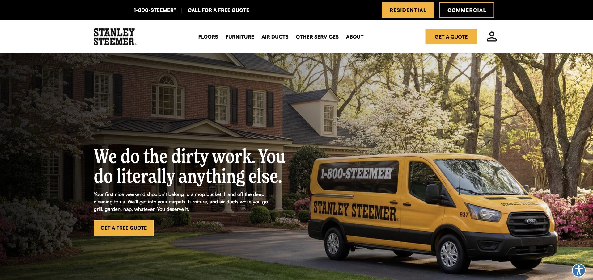
Stanley Steemer uses a photograph of its yellow van outside a home, with a dark text panel and yellow quote action on the left. The upper black strip distinguishes residential and commercial visitors, while the main navigation organizes floors, furniture, air ducts, other services, and company information. This illustrates a broad cleaning catalog that still offers a focused first action. The vehicle itself provides strong brand recognition without a large illustrated logo panel. Optional newsletter and privacy interfaces are part of the public experience but should not obscure the service content. The quote route remains distinct from the later service details needed for a particular property or material.
What you can learn
Keep audience selection and quote inquiry understandable before adding promotional layers. A general quote action should lead to accurate service and location questions, not imply a universal price, treatment decision, or confirmed appointment merely because the form was received.
Pros
Residential and commercial routes are identified separately above the main navigation.
The branded van provides a clear, company-specific photographic subject.
Cons & considerations
Optional newsletter prompts can interrupt the initial service task.
A mixed catalog needs meaningful category and scope information after the broad hero.
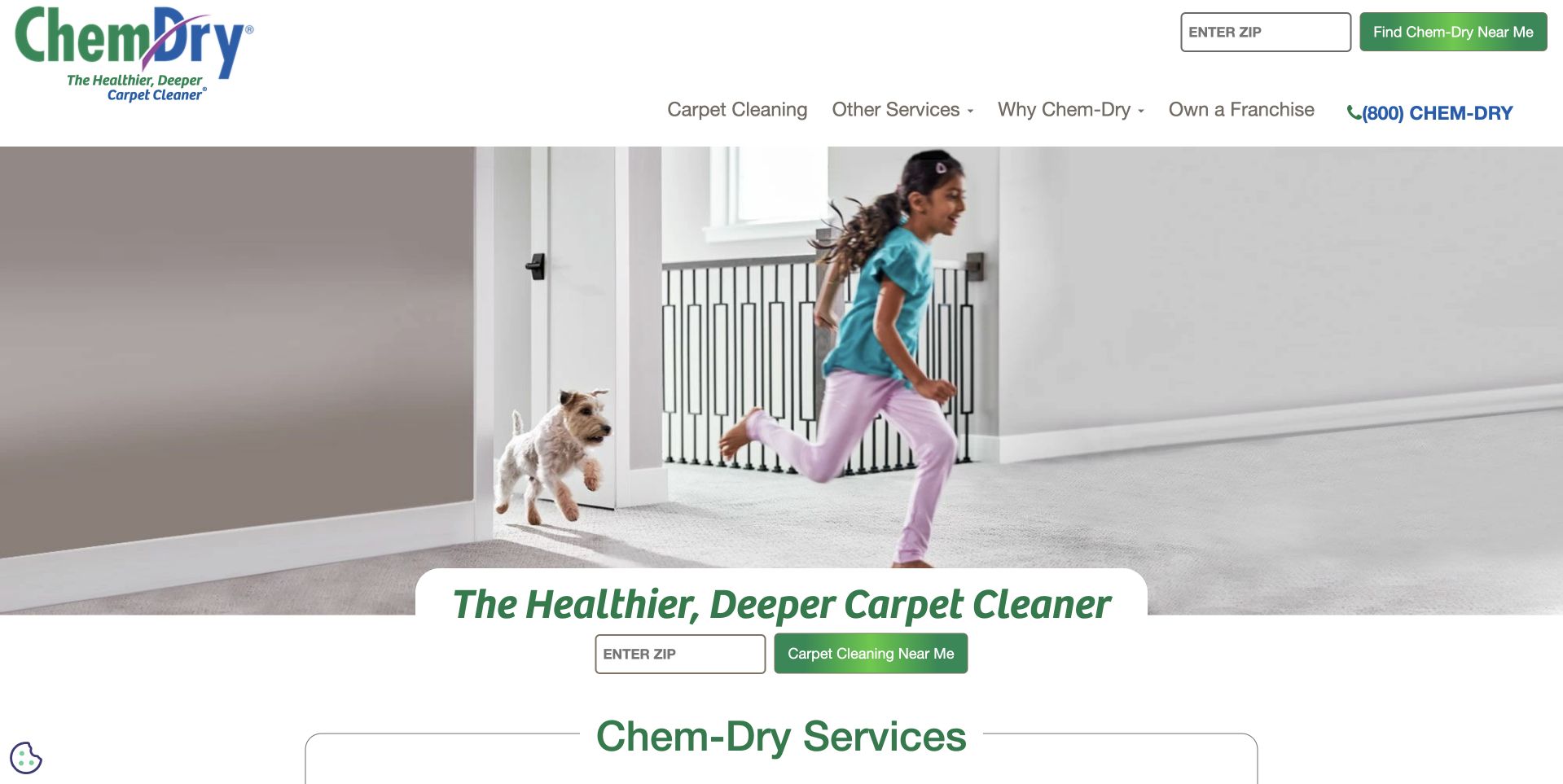
Chem-Dry uses a light photograph of a child and pet in a home, with a green branded-service message and ZIP-based local finder. A second location field remains in the white header beside carpet, other-service, company, franchise, and telephone routes. The service catalog begins below the image. This illustrates a family-oriented visual tone paired with a very literal location task. The image communicates domestic context, but it cannot establish health benefits or suitability for every household. The health and process wording should remain attributed business claims rather than conclusions drawn from the photograph or the design review. Repeated finders also need consistent behavior and labeling.
What you can learn
Use domestic imagery as context while explaining the actual service and receiving location. Keep health-related and treatment claims appropriately reviewed, and distinguish a location check from an agreed service, price, or confirmed cleaning appointment.
Pros
The location finder gives the broad network presentation a concrete next step.
A light photographic treatment keeps the page visually approachable.
Cons & considerations
Two location inputs can feel redundant without consistent labels and results.
Health-oriented wording needs substantiation beyond a child-and-pet photograph.
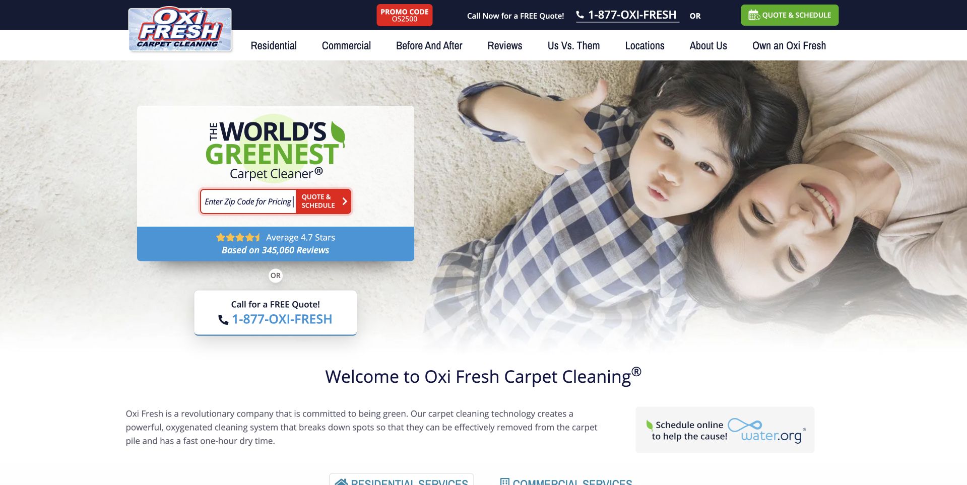
Oxi Fresh uses a small white-and-blue offer card over a pale household photograph. The card combines a branded environmental statement, ZIP entry, quote control, and review summary, while a separate telephone action sits below. The header distinguishes residential, commercial, before-and-after, company, location, and franchise routes. This illustrates how several practical tasks can be organized in a compact hero rather than a full-height form. It also illustrates a density tradeoff: environmental wording, reviews, location, and quote actions compete inside one small surface. Those claims remain company content, not independently verified cleaning, drying, or environmental outcomes in this collection.
What you can learn
Give the location and quote tasks clear priority over promotional claims. Explain the scope of environmental and review statements separately, and keep the later flow explicit about which office receives the request and what has actually been confirmed.
Pros
A compact card groups the main local-routing and quote tasks together.
Residential and commercial paths remain visible in the header.
Cons & considerations
Several claims and controls compete within a small hero card.
Environmental language needs an explained basis rather than a broad superlative.
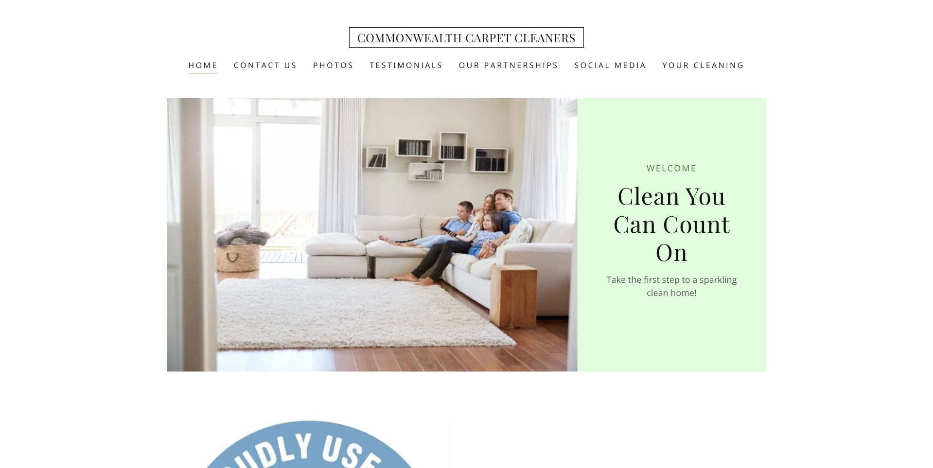
Commonwealth uses a white page with a small wordmark and widely spaced navigation above a split introduction. A household photograph occupies the left, while a pale green panel contains a short serif welcome message. The layout is calm and minimal, with company, contact, photos, reviews, partnerships, social, and cleaning routes above. This illustrates an understated local-business presentation rather than a form-led lead page. The restrained panel leaves room for the photograph, but it also means literal service and territory information must appear clearly in the following content. A short reassurance phrase alone does not explain which work the company accepts or how to arrange it.
What you can learn
Use visual restraint without sacrificing the practical service explanation. Follow the welcome with literal scope, coverage, and contact information, and ensure widely spaced small navigation remains readable and easy to use on a phone.
Pros
The pale panel and serif type create a calm reading environment.
Company photographs and reviews have recognizable navigation destinations.
Cons & considerations
The opening message supplies little immediate service or coverage detail.
Small widely spaced links need a stronger mobile menu and contact priority.
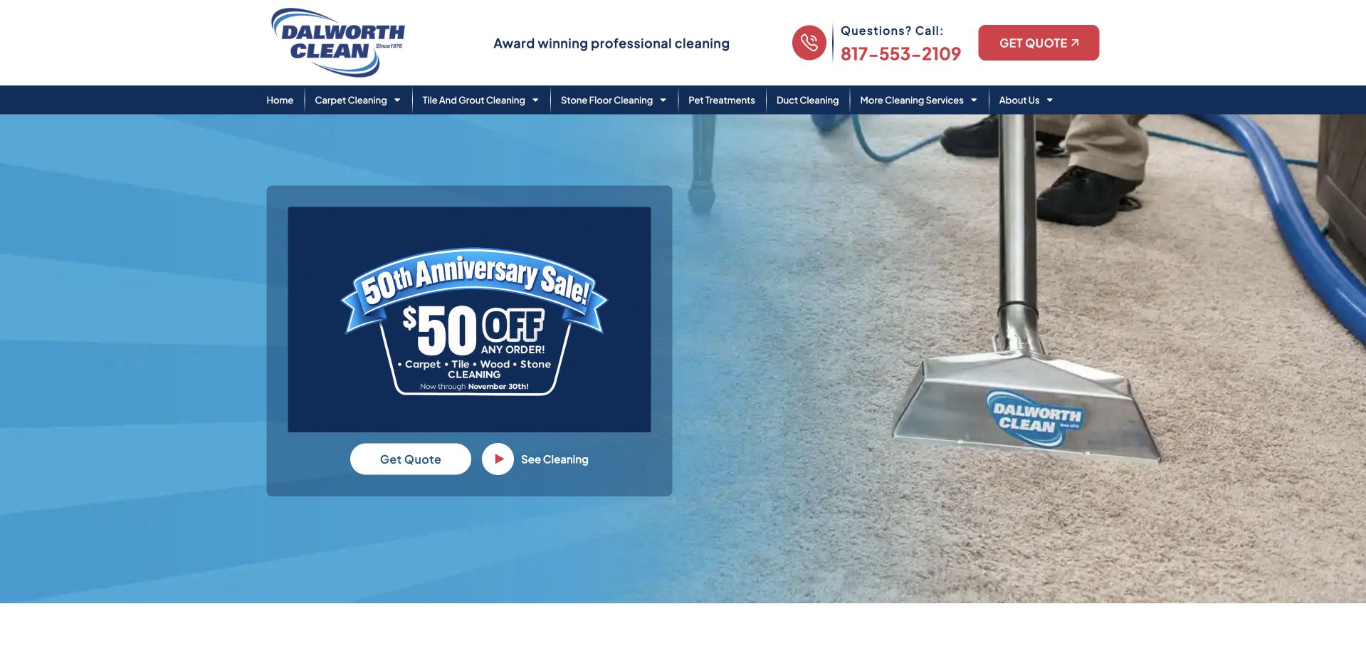
Dalworth uses a large extraction-work photograph beneath a white contact header and navy service navigation. A translucent blue panel holds an anniversary offer, a white quote action, and a video route. The service menu names carpet, tile and grout, stone, pet treatments, ducts, and other cleaning work, making the broader catalog visible above the promotion. This illustrates a regional company that separates the campaign surface from persistent service navigation. The photograph shows the type of work rather than only a finished interior. Any promotional price, anniversary wording, or treatment claim remains company content and needs its own current conditions rather than being treated as a universal quote or outcome.
What you can learn
Keep temporary offers distinct from the stable catalog and maintain their dates and conditions. Let visitors reach scope and quote information without watching video or joining a mailing list, and explain what the inquiry actually confirms.
Pros
The work photograph makes the service context recognizable.
Persistent material-based navigation remains available above the seasonal promotion.
Cons & considerations
A large offer can dominate the underlying service explanation.
Optional email promotions must not obstruct the quote and category routes.
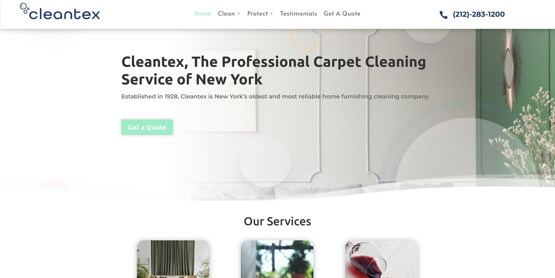
Cleantex uses a pale interior photograph with a large New York cleaning heading and a small green quote action. A white header keeps the telephone prominent while separating cleaning, protection, reviews, and quote routes. The next section introduces service cards within the first screen, avoiding a long intervening company-history block. This illustrates a local brand that uses generous white space without hiding the practical next step. The photograph is subdued enough for the headline to remain readable. The public page's history and reliability statements should remain attributed claims, while the service cards explain the current catalog more concretely than those broad assertions alone.
What you can learn
Let company history support a current service explanation rather than replace it. Keep category destinations literal and readable, and make the quote route describe the next conversation without implying that a broad trust statement establishes treatment suitability.
Pros
The service catalog begins close to the short local introduction.
A prominent telephone remains available beside the compact navigation.
Cons & considerations
The pale quote action needs sufficient contrast against the light image.
History and reliability wording needs context beyond the opening sentence.
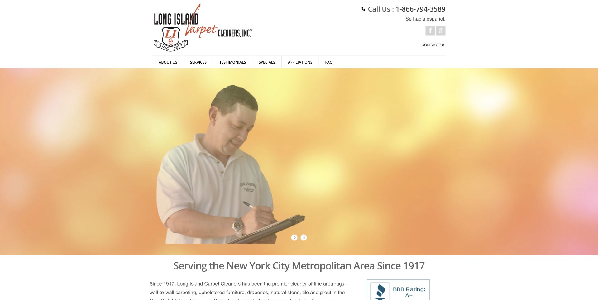
Long Island Carpet Cleaners uses a white header with a large company mark, telephone number, service-area context, and short navigation. A broad photograph of a worker taking notes sits over a warm gradient, with company-history and service information following below. This illustrates a local business that leads with a human service context rather than a first-screen form. The simple composition gives the photograph room, but the large image delays the practical service categories. The long-standing identity is meaningful company context, not independent proof of current cleaning results. A refresh should preserve useful local facts while making category and contact choices more obvious.
What you can learn
Use real service relationships and accurate history to establish identity, then provide literal scope and next-step information. Keep essential details outside a rotating image so visitors can find the right service without waiting for a particular slide.
Pros
Telephone and regional context are visible in the company header.
The human photograph gives the opening a service-conversation subject.
Cons & considerations
The large image postpones detailed service navigation in the page body.
Small header links need more generous responsive spacing.
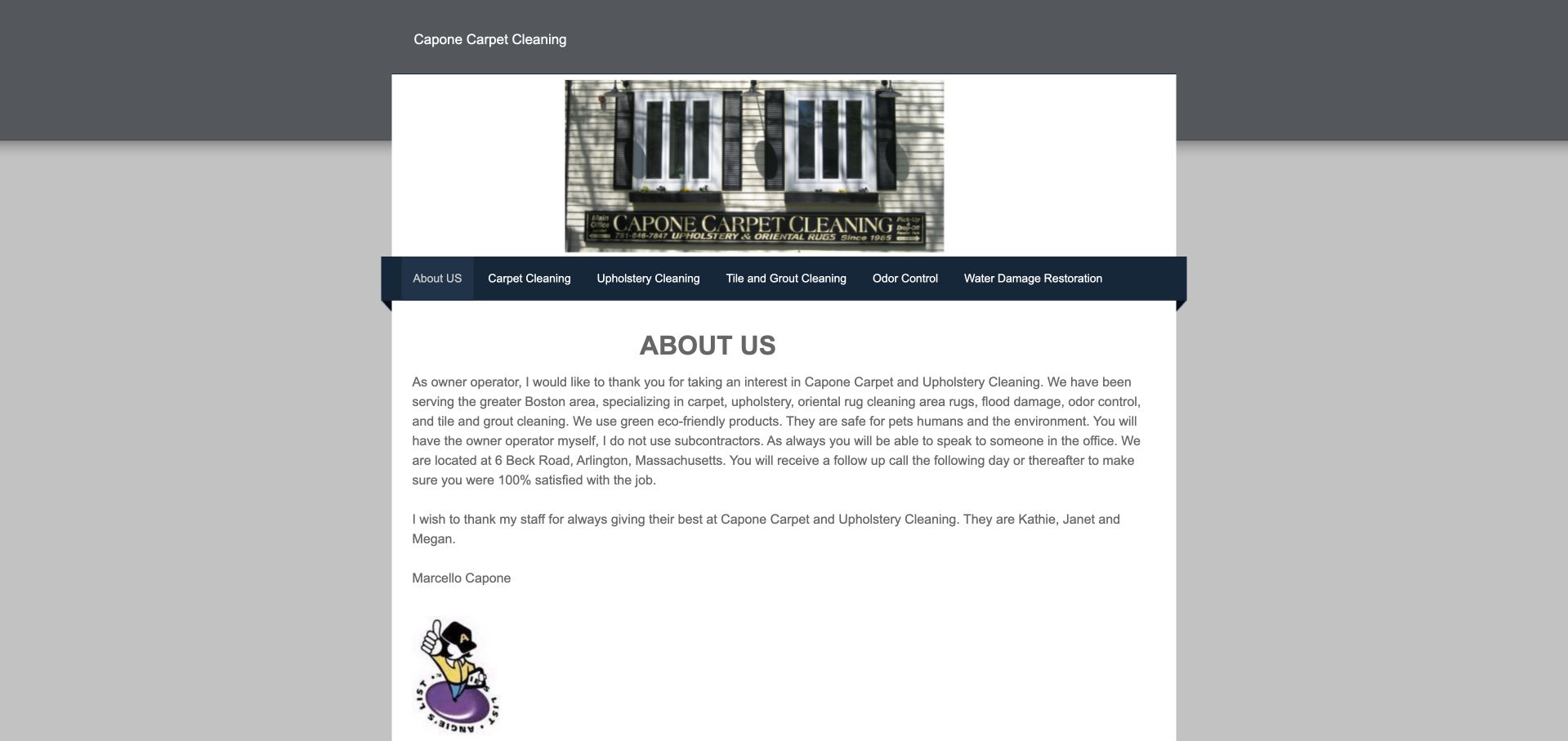
Capone uses a narrow centered page with its company identity above a dark service navigation. The public root opens into an about section, including an owner-signed explanation of the business and its work, rather than a large promotional hero. Service links distinguish carpet, upholstery, tile, odor-related work, and restoration categories. This is useful as a content-priority reference for an owner-operated company. The direct personal account establishes who is speaking, but the small type and narrow reading area reveal where a visual update could help. A redesign can preserve that useful company specificity while introducing clearer service headings, local coverage, and an easier contact route.
What you can learn
Retain the real owner voice when modernizing a legacy site, but organize it around the visitor's task. Keep technical and treatment claims reviewed, and make service and contact information easier to scan than a single dense introduction.
Pros
The owner-signed introduction identifies a specific person behind the business.
Literal service links expose the mixed cleaning catalog.
Cons & considerations
Small text and a narrow column make the opening difficult to scan.
The about-led root delays the main service and inquiry decision.
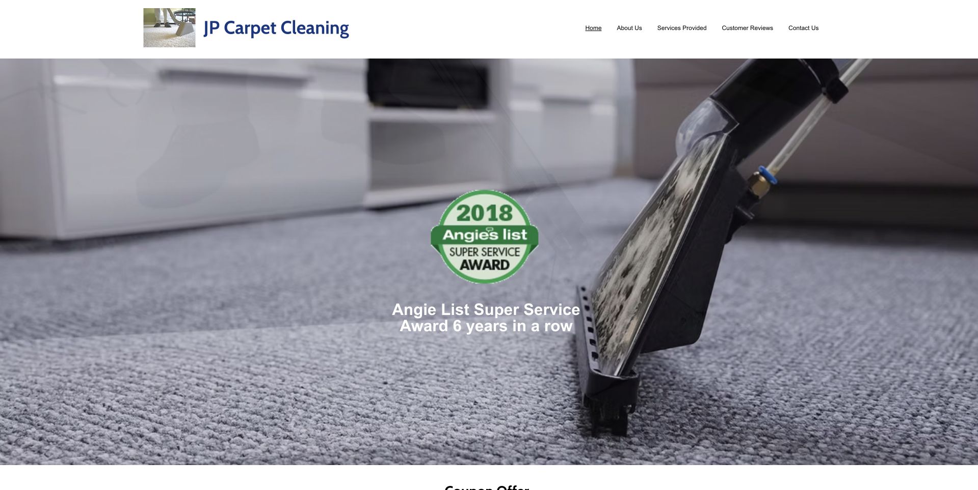
JP uses a close photograph of carpet extraction beneath a white header with company, service, review, and contact routes. An award-style mark occupies the center of the image, while the company name remains visible above. This illustrates a small operator whose service is recognizable without a large written hero. The tradeoff is that the award graphic receives more emphasis than the immediate local scope or contact task. The captured mark contains a historical date, so it should not be interpreted as a current independent rating. A refresh could retain the task-specific photograph while moving dated supporting material into an explanatory section and giving the current service offer stronger priority.
What you can learn
Keep historical awards clearly dated and separate from present service claims. Use the image to establish the work, then provide a literal territory and inquiry explanation rather than expecting a professional mark to answer practical customer questions.
Pros
The extraction photograph makes the cleaning category immediately recognizable.
The header provides clear service, review, and contact destinations.
Cons & considerations
A dated award mark dominates the introduction without enough current context.
The first screen provides little explicit local-service or next-step explanation.
Kegan is a freelance web designer and developer with 15+ years of experience helping businesses turn complicated website requirements into clear, maintainable digital experiences. He works directly with clients from planning and design through development, launch, and ongoing support.
For carpet cleaning website design, his development approach focuses on surface and cleaning-service information, realistic care expectations, genuine project imagery, coverage details, and scheduling inquiries. The scope can be a targeted improvement or a complete custom build, with responsive layouts, thoughtful content structure, and integrations chosen around the people using and maintaining the site.
Show 3 other carpet cleaning website designersHide other carpet cleaning website designers
Plan the service conversation before the booking interface
Map service categories to actual customer questions
Collect the questions staff receive before deciding on navigation. A customer may ask about a sofa, loose rug, fitted carpet, commercial floor, or collection arrangement. Give each genuine service an understandable label and explain what information helps staff respond. Do not generate a separate page for every stain unless the business can maintain useful, accurate scope. Keep material-specific claims under responsible review. The first screen can be concise, but the next page should explain the service relationship, assessment process, and practical limits. Make it easy to ask when a visitor cannot confidently identify the material or service.
Design a modest first inquiry and a clear handoff
Decide whether the form starts a callback, estimate discussion, location check, or appointment request. Those outcomes need different wording. Ask for contact information, general territory, and enough service context to route the inquiry; defer detailed household or access information until it is needed. If photographs are accepted, explain their purpose and avoid implying that an image establishes a final treatment decision. Give a confirmation with the actual next step and a monitored fallback. Test invalid inputs, missing fields, submission failure, and duplicate clicks without sending real customer details during development.
Build a photograph library with material and project context
Company vehicles, equipment, technicians, interiors, and textile details can all help, but they tell different stories. Record image ownership and permission, identify the visible subject accurately, and use captions when a project needs context. Before-and-after pairs require honest comparable presentation rather than dramatic edits. Do not infer health benefits, stain removal, drying conditions, or treatment suitability from a clean-looking room. Prepare responsive image sizes so several service photographs do not slow the opening view. Keep the essential scope and contact text available when images or optional video fail to load.
The editing job behind the design
Choose systems that fit the service workflow
[object Object]
[object Object]
[object Object]
Our WordPress website examples offer a separate look at publishing approaches. A visible platform label is evidence for that named page, not a guarantee that the same system will suit your requirements.
Before the public launch
Carpet-cleaning website brief checklist
List the actual carpet, rug, upholstery, drapery, and hard-floor services offered.
Separate on-site work from collection, delivery, workshop, and trade arrangements.
State local coverage or explain precisely what the location finder establishes.
Label callback, estimate, scheduling, and confirmed booking as different outcomes.
Provide a useful route for customers unsure about their material or service.
Review treatment, health, safety, drying-time, and performance wording with responsible staff.
Record permission and accurate context for every team, vehicle, and project photograph.
Keep optional promotions and chat widgets away from inputs and primary actions.
Make every form label, error message, and confirmation usable with a keyboard.
Explain the purpose of uploads and protect the files after submission.
Test mobile reading order, telephone links, location routing, and failed submissions.
Assign an owner to maintain service scope, coverage, contact information, and claims.
These checks are a project checklist, not a performance, legal, security, or accessibility certification. Test real journeys with the people responsible for the website before making claims about the result.
Sources & editorial method
How this collection was selected and reviewed
These are public-page design observations based on actual viewed captures and company sources, not secret-shopper testing or an assessment of cleaning providers. The collection intentionally includes different scales and service models. Costikyan is the editorial choice for its specific textile-care introduction and restrained work imagery. We do not validate treatment methods, health claims, qualifications, prices, customer ratings, or outcomes. Technology labels require separate public evidence and are not inferred from a page's appearance. A captured interface also does not prove that its scheduling, locator, or form successfully completes a transaction.
Each example links to its actual source page. Screenshots are direct browser captures with their own capture dates; moving imagery, announcements and live designs can change. The notes describe observable design choices and conditional tradeoffs, not measured traffic, conversion results, service quality, or accessibility conformance.
Technology labels use public page metadata, asset evidence, or explicitly cited platform documentation. Platform documentation is not a complete current deployment audit. A component reference may be legacy or unused; it is not a complete backend inventory. Unknown stacks are omitted. These sites are editorial examples, not our client portfolio.
Written, Edited and Curated are separate editorial records, not timestamps advanced by a rebuild. Website designs and imagery belong to their owners. See our editorial standards or suggest a correction.
Make the service understandable, the receiving team clear, and the next conversation predictable. Let genuine textile and company imagery support that information rather than substitute for it.