Best Bicycle Tour Websites of 2026 (17 Real-World Examples)
Bicycle-tour websites that make the place, riding style and practical travel arrangements easier to understand.
Explore 17 real bicycle-tour websites, from regional specialists to international active-travel operators. Study how they connect appealing destinations with riding levels, dates, support and a clear path into the right trip.
A cycling photograph can make almost any road look inviting. A useful bicycle-tour website has a harder job: it must help a visitor understand whether the actual ride, travel format and daily routine fit. Destination is only one part of that decision. Distance, terrain, support, accommodation and departure timing can matter just as much.
This collection includes guided groups, self-guided itineraries, private trips and mixed-activity operators with explicit cycling offers. The reviews preserve those differences. They examine public presentation and information structure, not riding conditions, operational safety or the quality of the holiday itself. A polished page is a design example, not a guarantee about a trip.
Before the examples
What makes good bicycle tour website design in 2026?
Explain the riding experience
Use the operator’s own verified descriptions of distance, terrain, surfaces and support to explain trip fit. A broad difficulty label needs a nearby definition. Distinguish leisurely touring, road riding, gravel and mountain biking when those differences change the experience.
Separate travel formats clearly
Guided, self-guided and privately planned trips involve different expectations. Describe what the traveler organizes and what the operator provides. Make a scheduled departure, a custom inquiry and a confirmed reservation visibly different steps.
Connect inspiration with comparison
Use genuine photography to establish the region and atmosphere, then offer a consistent set of trip details. Visitors should be able to compare duration, riding style and timing without opening a long series of unrelated pages or dismissing repeated promotions.
The collection · 17 examples
17 bicycle tour websites worth studying
These 17 distinct public properties match the saved industry draw. Compare their regional identities, trip finders, riding explanations and ways of organizing independent or guided travel. The explicitly researched Editors Choice concerns website design and communication, not a ranking of tour quality.
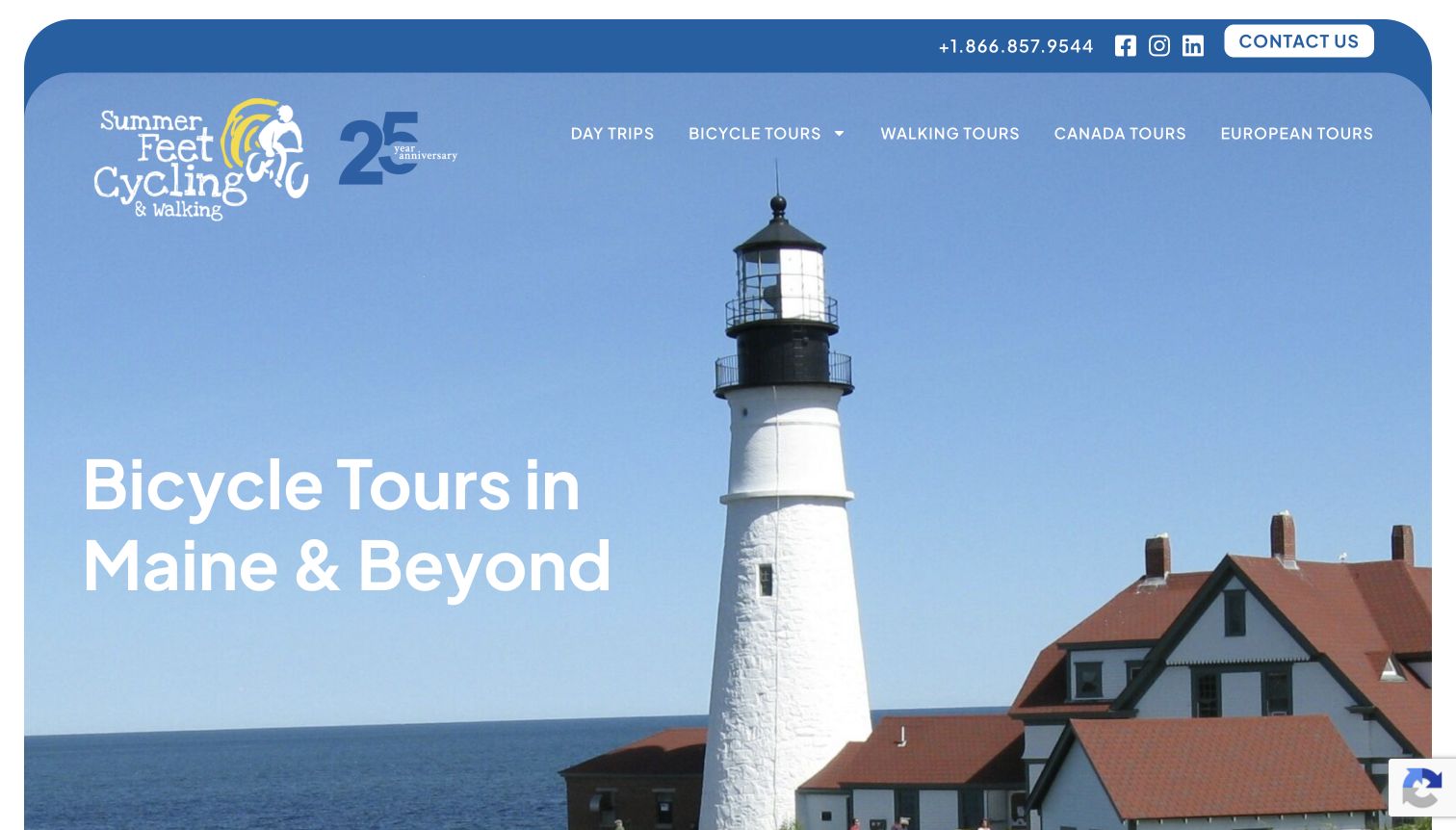
Summer Feet makes its Maine identity visible immediately. The lighthouse photograph, blue frame and illustrated anniversary mark give the entrance a distinct coastal character, while the navigation separates day trips from longer bicycle tours. That distinction matters because visitors planning an afternoon ride need a different starting point from travelers arranging a week away. Further reading adds a practical counterweight to the scenery: the tour-level page describes three riding categories using daily mileage and conversational names. The founder story and team pages make the business feel specific without requiring the homepage to explain every detail. The opening is spacious, though a visitor seeking an immediate trip comparison must move beyond the hero.
What you can learn
Borrow the connection between a place people recognize and a simple explanation of participation. A regional tour operator can use memorable photography first, then link directly to duration, riding expectations and the different ways to travel.
Pros
Separate day-trip and multi-day navigation gives visitors useful starting points.
The linked level guide translates riding expectations into understandable daily distances.
Cons & considerations
The large opening image delays comparison of individual trips.
Playful level names still need the accompanying mileage explanation.
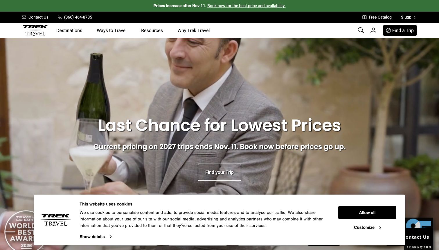
Trek Travel places a seasonal price message at the center of its opening, with a strong Find Your Trip action in the header and another route into the catalog beneath the campaign. The restrained black-and-white navigation helps the promotion stand out, while the moving imagery shows the wider travel experience rather than only bicycles. The public page then offers destination, date and activity choices and distinguishes classic cycling, gravel, self-guided trips and more intensive formats. Those categories give returning riders recognizable ways to narrow a large inventory. The first-visit cookie panel occupies substantial space, and a campaign deadline can dominate the explanation of what makes the actual trips different.
What you can learn
Keep a promotion attached to a stable discovery system. Visitors should still be able to understand the touring formats and find an appropriate trip after the deadline changes or the campaign disappears from the homepage.
Pros
The persistent trip-finder action remains easy to identify.
Distinct cycling formats help organize a large range of experiences.
Cons & considerations
Deadline-led messaging creates another item that must be maintained accurately.
The consent panel competes with the opening campaign for attention.
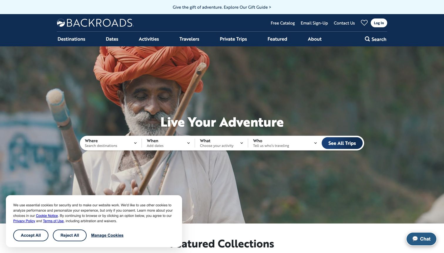
Backroads organizes its opening around four practical questions: where, when, what and who. This makes the trip finder understandable before visitors know the operator’s internal product categories. The broad image area provides atmosphere, and the navy header keeps destinations, dates, activities and traveler groups visible as parallel browsing routes. Cycling sits within a wider active-travel offer, so the activity distinction is important; the homepage should not be read as a bicycle-only catalog. Below the entrance, featured trips and family options offer additional starting points. The observed first visit also included a large cookie panel and a chat prompt, making the otherwise orderly search area feel more crowded.
What you can learn
Frame filters around decisions travelers already understand. A multi-activity business benefits from separating the activity from the destination and party type, so an attractive place does not accidentally imply the wrong kind of holiday.
Pros
Question-based labels explain the purpose of each search choice.
The main navigation provides alternatives to using the central finder.
Cons & considerations
Several simultaneous inputs can slow an undecided first-time visitor.
Consent and chat elements add competition around the opening content.
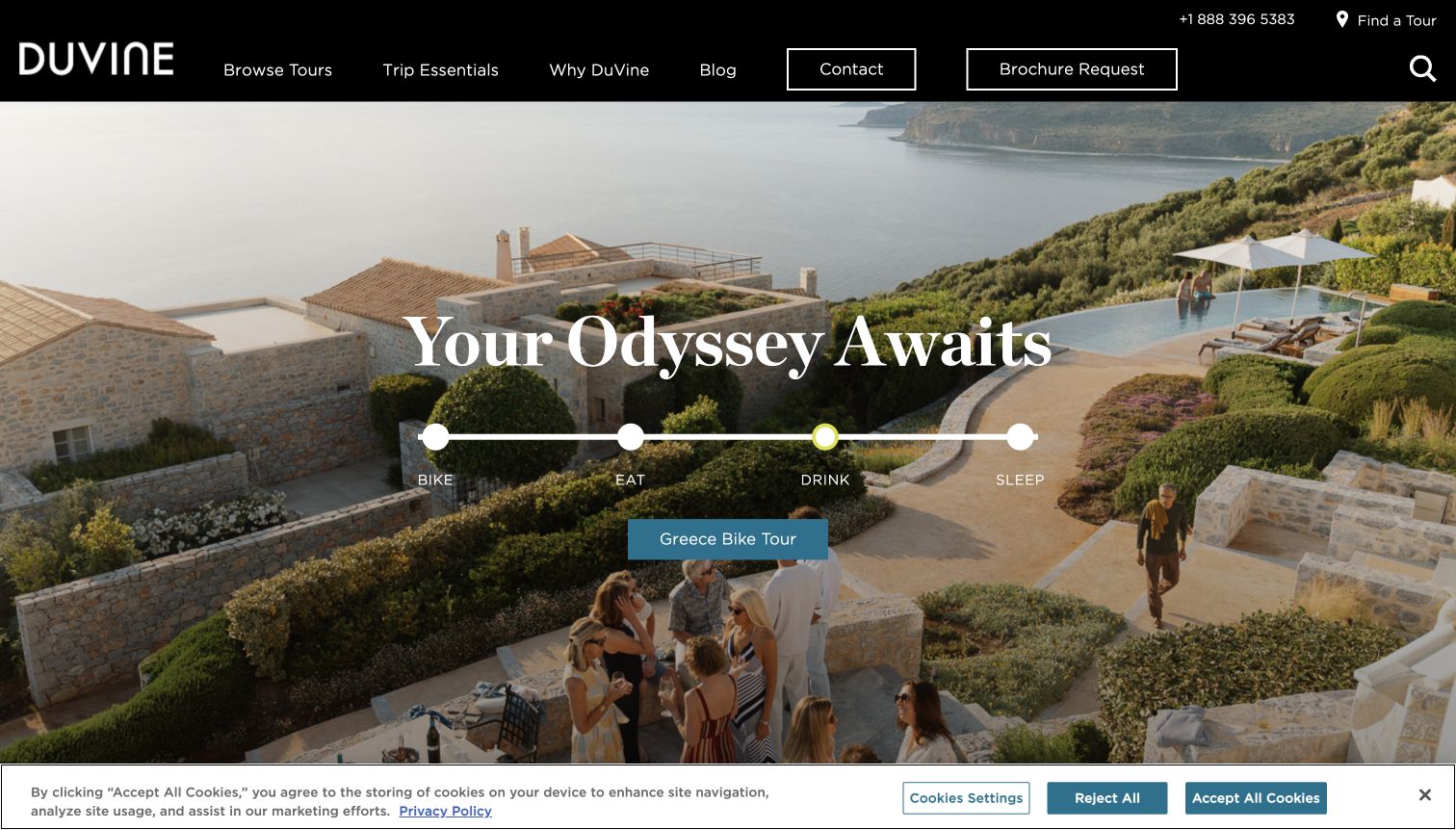
DuVine introduces a cycling holiday through a destination scene and a sequence of bike, eat, drink and sleep themes. The observed Greece promotion uses generous photography, a large serif headline and a clear tour link, giving the page a more editorial feel than a conventional inventory grid. The navigation still provides contact and brochure routes, while the lower finder lets visitors consider destination, dates and levels. The design communicates that riding is one part of a broader daily experience. That is a useful positioning choice, although the atmospheric opening provides less immediate practical detail than a compact itinerary card. The first-visit consent strip also occupies the bottom of the view.
What you can learn
Use an experience sequence to explain a distinctive travel proposition, then connect each promise to concrete itinerary information. Food and accommodation imagery becomes more useful when visitors can relate it to the trip they are considering.
Pros
The four-part experience language gives the brand a coherent organizing idea.
A destination-specific action provides a clear next step from the hero.
Cons & considerations
Practical comparison requires moving past the large promotional scene.
Moving campaigns and consent controls increase the information competing for attention.
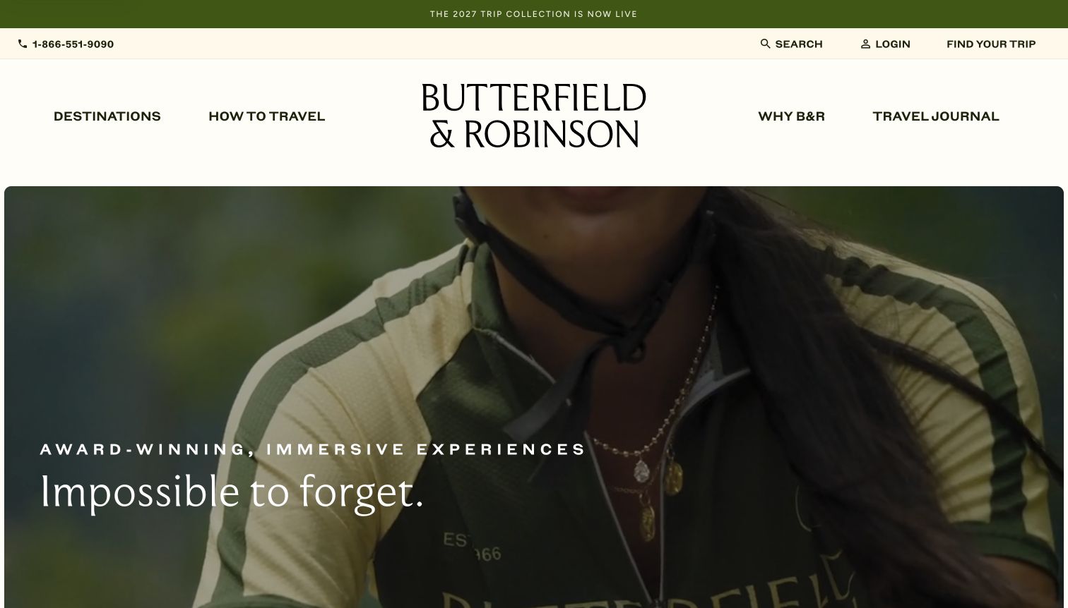
Butterfield & Robinson gives its wordmark and moving imagery considerable space. The cream background, green announcement strip and large serif statement establish a calm editorial tone before the visitor reaches the detailed trip finder. The most useful structural element is the separation of small-group, bespoke and self-guided travel. These describe different planning relationships, not simply different destinations, and their explanations help visitors decide how much independence or customization they want. Cycling belongs within a broader active-travel offering, so the homepage’s imagery alone is not evidence that every journey is a bicycle tour. The generous header and media area also push comparison details below the initial screen.
What you can learn
Explain the way a trip is organized before asking visitors to compare places. A clear distinction between a scheduled group departure and a custom itinerary can prevent mismatched inquiries while preserving an expressive visual identity.
Pros
Travel formats provide a meaningful alternative to destination browsing.
The restrained color palette gives the editorial hierarchy room to work.
Cons & considerations
The tall header and hero delay access to practical trip details.
A broad active-travel message requires clear cycling-specific paths.
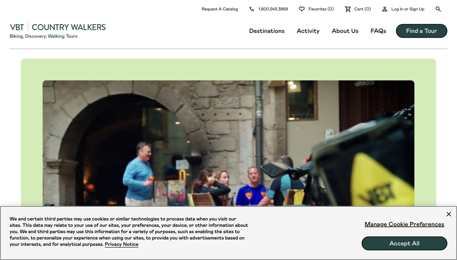
VBT’s current entrance presents VBT and Country Walkers together, with biking, discovery and walking named beneath the wordmarks. A pale green frame around moving travel imagery gives the opening a welcoming character, while Find a Tour remains a distinct dark button in the header. The page offers destination, tour-style and departure-month choices and follows with separate activity cards. That structure is valuable when a visitor arrives expecting cycling but encounters a combined travel catalog. A broad destination map supplies another browsing route farther down. In the observed first visit, the consent banner covered much of the lower screen, and the large media panel left the trip controls outside the captured opening.
What you can learn
When brands or product lines share an entrance, make the relationship explicit and give each activity a direct path. Keep the combined identity from forcing visitors to infer which trips match the reason they arrived.
Pros
Activity labels explain the scope of the combined travel offer.
A visible Find a Tour button provides a consistent catalog route.
Cons & considerations
The initial media area postpones detailed trip comparison.
The first-visit consent banner takes substantial vertical space.
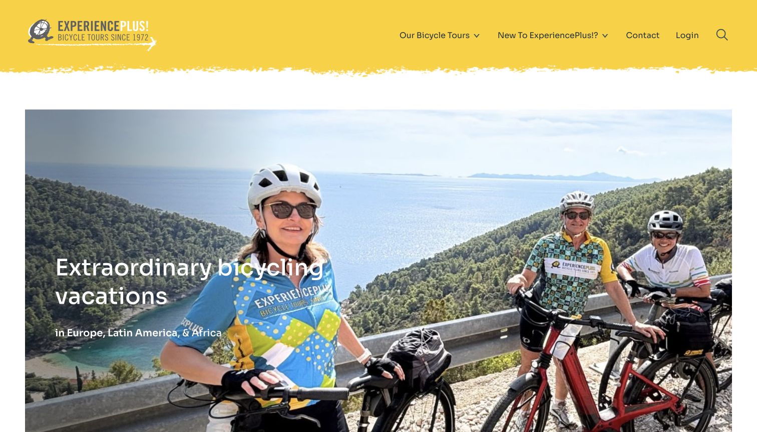
ExperiencePlus! combines a bright yellow header with a straightforward photograph of riders in a recognizable landscape. The opening clearly names bicycle vacations and the broad regions served. More useful than the visual promise is the explanation of touring styles: classic, gravel, bike-and-boat, longer expeditions and self-guided travel are presented with short descriptions of how the experience differs. A comparison link gives visitors a route beyond marketing labels, while tour level appears in the finder alongside destination and date. The site also explains its route-navigation approach. An initial brochure request obscured much of the page; the selected capture preserves a later unobstructed view, with the first-visit evidence retained privately.
What you can learn
Turn specialist terminology into a decision aid. A concise style description should explain what changes for the traveler, and a comparison page can help someone understand the tradeoffs without starting a booking or speaking to sales.
Pros
Tour-style descriptions make a varied cycling catalog easier to interpret.
Level and date choices sit beside destination in the finder.
Cons & considerations
The initial brochure invitation interrupts exploration before trip fit is established.
A long homepage asks visitors to navigate several distinct decision layers.
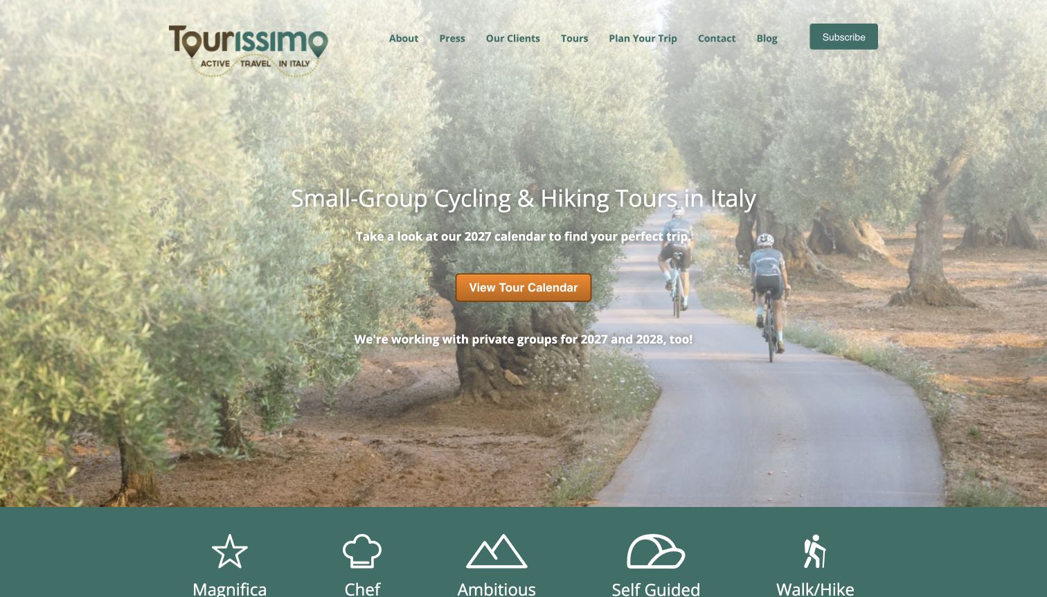
Tourissimo states its scope plainly: small-group cycling and hiking in Italy. The road photograph and orange calendar button support that promise without a large search form in the opening. Below, a row of illustrated categories introduces chef-led, more ambitious, self-guided and walking experiences, while a separate private-tour section distinguishes custom trips, ready-made private options and cycling clubs. This makes a specialist catalog feel varied without pretending to cover everywhere. The founders’ anniversary material adds a personal layer farther down. Some category names are branded rather than self-explanatory, so their usefulness depends on the supporting pages. The light photograph also makes portions of the white introductory text less distinct.
What you can learn
A specialist can lead with a clear geographic commitment and a single useful next step. Organize the remaining choices around the interests and group arrangements that actually change the experience, with explanations beside unfamiliar product names.
Pros
The opening identifies location and activity without vague travel language.
Public and private formats receive separate groups of navigation choices.
Cons & considerations
Branded category names need supporting explanations for new visitors.
White text crosses a relatively bright portion of the hero image.
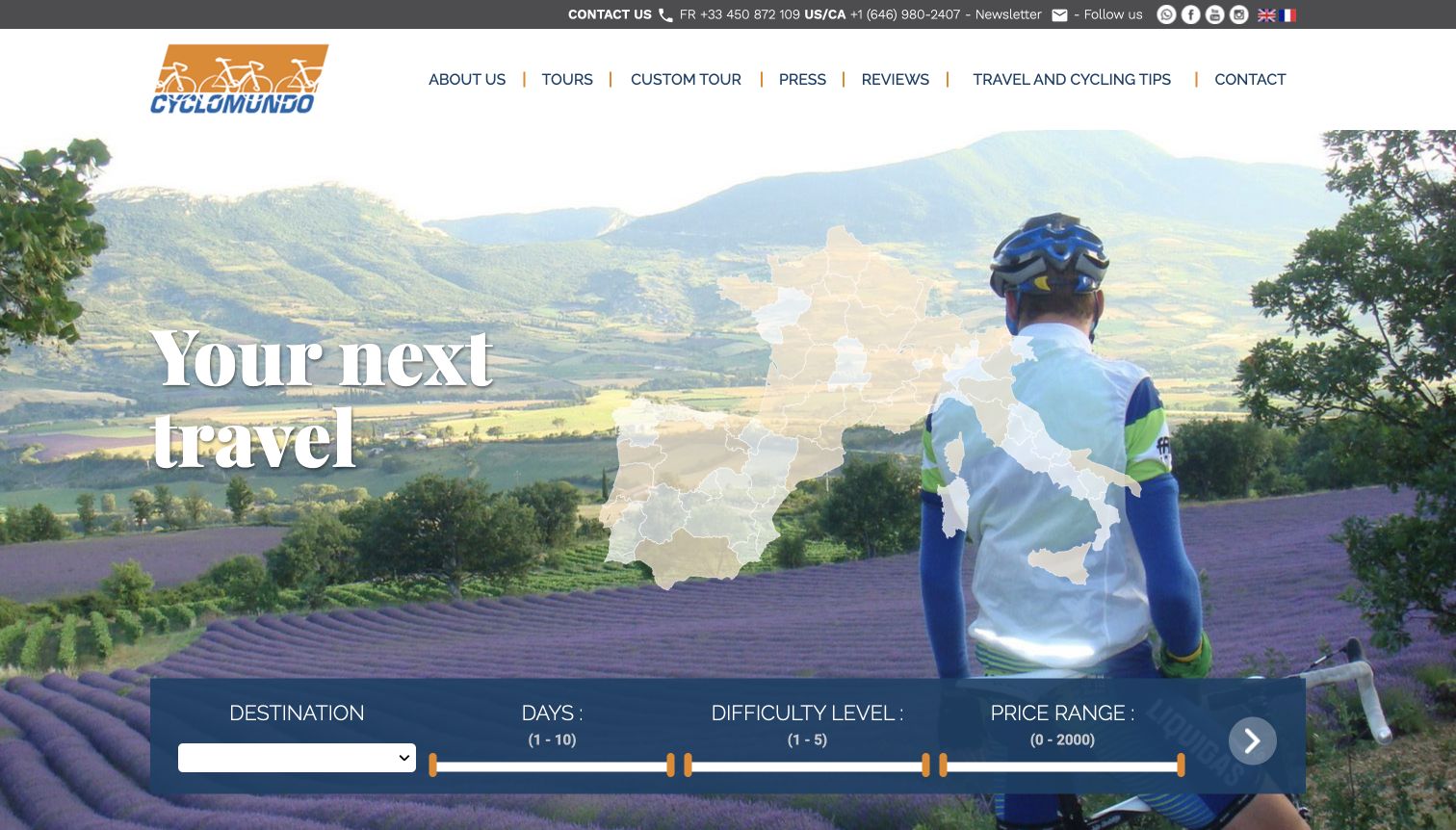
Cyclomundo brings practical filtering into the opening photograph. Destination, duration, difficulty and price appear together beneath a rider and a map-like geographic overlay, giving visitors an immediate sense of the countries and trip variables involved. The introductory copy then distinguishes guided and self-guided cycling and explains the operator’s regional focus. A separate custom-tour area lists logistical components such as luggage transfers and rental bicycles, helping translate customization into concrete services. The interface is denser than the more editorial examples in this collection. Numeric difficulty and price sliders also need context, particularly when a traveler has not yet learned what the levels include or which currency applies.
What you can learn
Expose the variables that genuinely shape trip suitability, but explain their meaning close to the controls. A difficulty scale is useful only when visitors can connect its numbers with distance, terrain and the operator’s own definitions.
Pros
The finder combines practical trip constraints in one visible area.
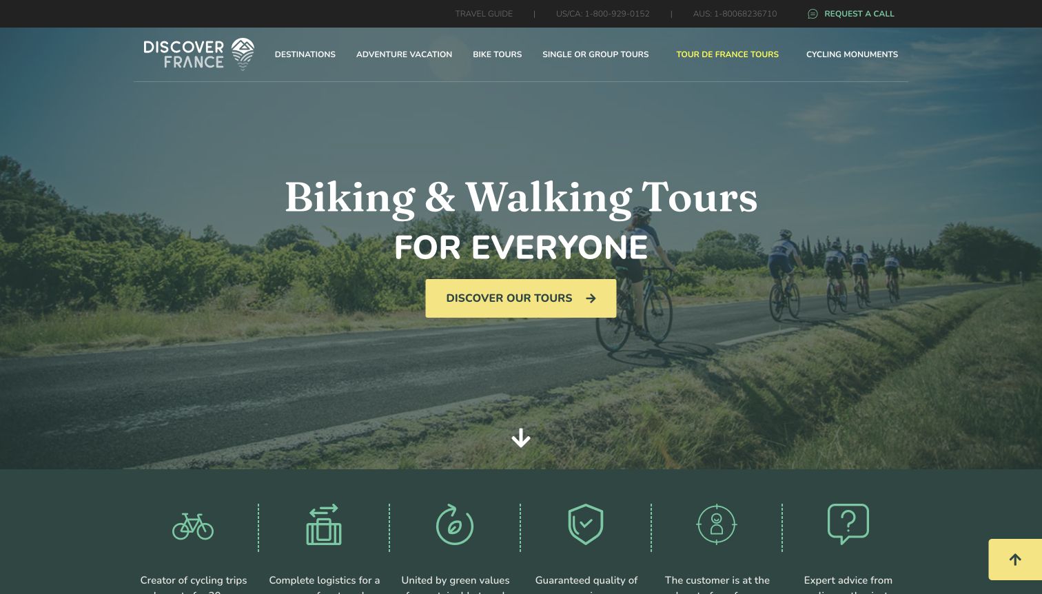
Discover France begins with a direct cycling-and-walking proposition, a road-riding image and one prominent yellow action. A row of service themes follows, moving the visitor from scenery toward logistics and support. Farther down, featured tour cards carry considerably more detail: duration, destination, departure timing, trip format and activity type appear alongside descriptive copy. The contrast between a simple entrance and a detailed catalog is useful for independent travelers who need to understand the arrangement before enquiring. Some cards contain lengthy titles and several overlapping classifications, which can make comparison slower. The broad navigation also mixes destinations, trip formats and major cycling events at the same level.
What you can learn
Let the opening establish the proposition, then make the catalog do the comparison work. Choose a consistent set of fields for every trip card and avoid adding labels that repeat information without helping a traveler decide.
Pros
The main action stands out against the subdued photographic background.
Featured cards expose practical timing and trip-format information.
Cons & considerations
Long titles and multiple classifications make some cards text-heavy.
The navigation combines several different ways of organizing the offer.
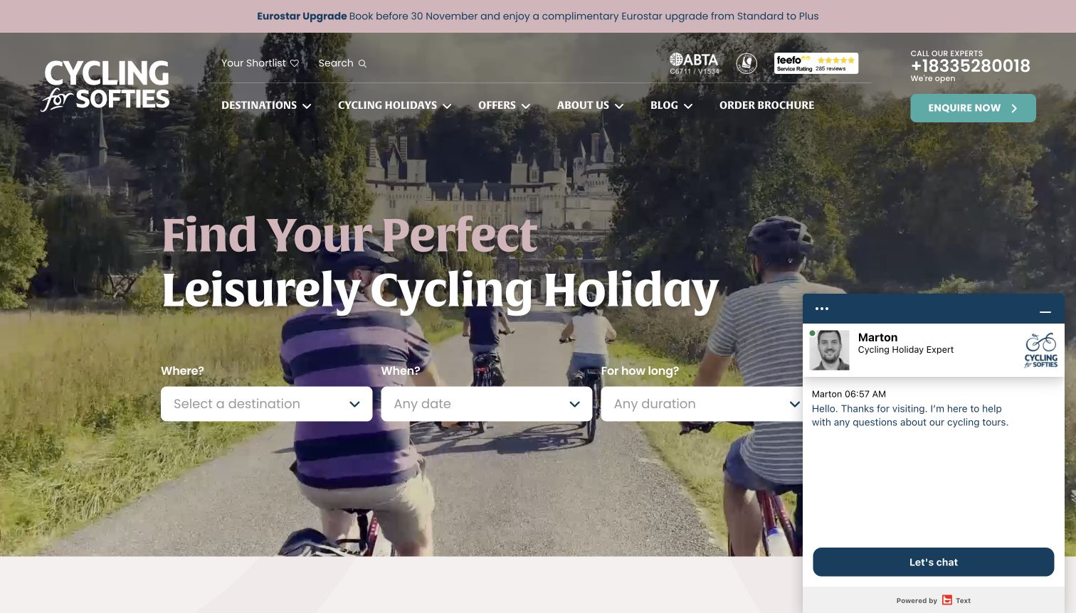
Cycling for Softies makes the intended pace unmistakable. Its large headline describes leisurely cycling, while destination, timing and duration form a short horizontal finder. The imagery includes relaxed travel and accommodation rather than presenting riding as a performance challenge. Supporting sections explain luggage transfer, dining and hotel expectations, and the catalog separates options such as electric-bike holidays, short breaks and bike-and-boat trips. This gives the brand a specific audience without relying on technical cycling language. The selected capture follows an essential-only consent choice, but the chat panel still covers part of the finder. A timed promotional strip adds another message above an already substantial header.
What you can learn
Choose a clear travel pace and support it with practical details. Comfort-oriented language becomes more useful when visitors can see how bags, accommodation and daily organization relate to the independence promised by a self-guided trip.
Pros
The headline identifies a distinct travel preference immediately.
The finder asks only three broad planning questions.
Cons & considerations
The chat panel overlaps part of the opening planning area.
Promotion, reassurance marks and navigation compete within a tall header.
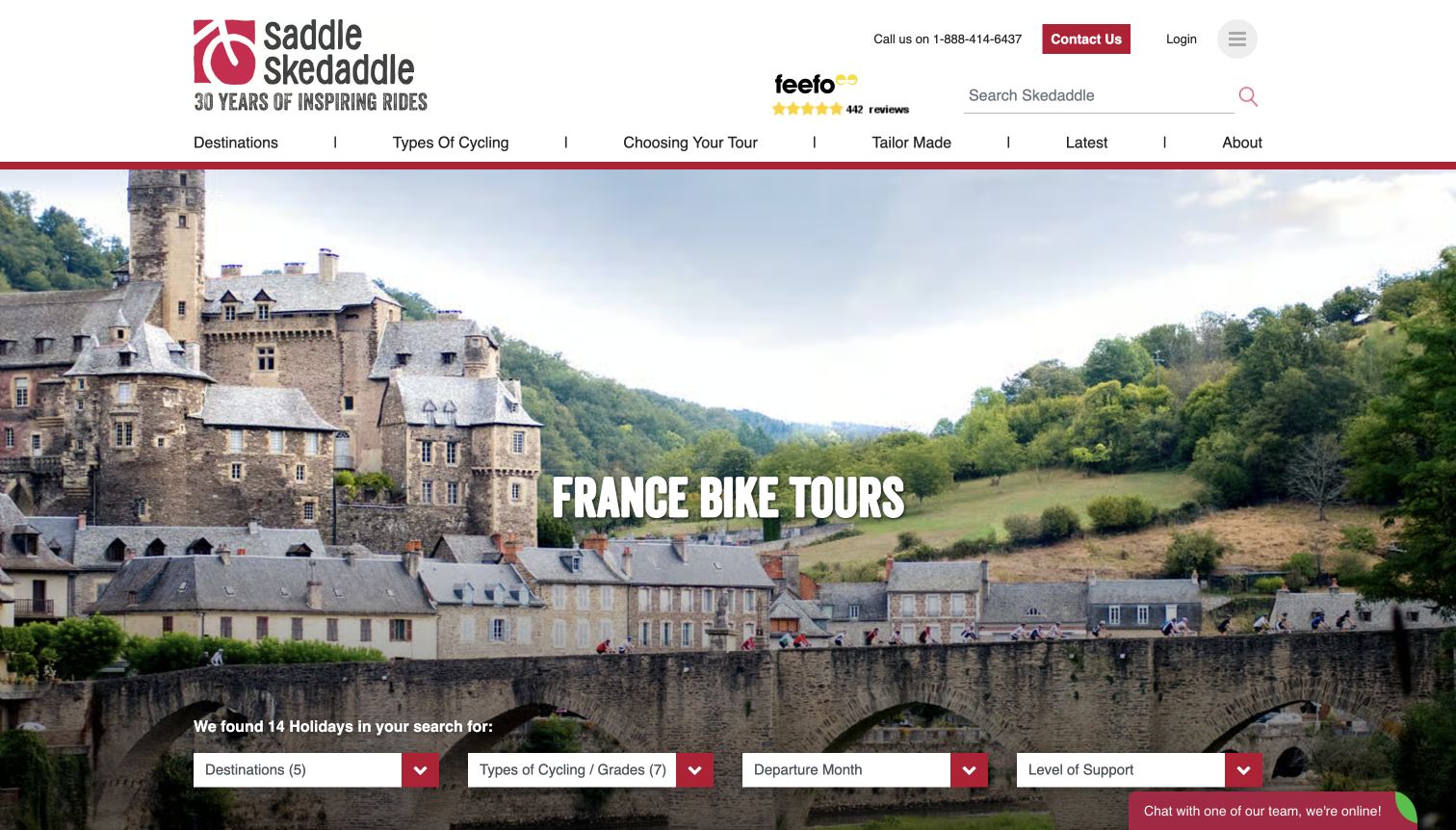
Skedaddle’s France collection is a useful example of a destination landing page rather than a general homepage. A castle-and-river photograph establishes place, while the page title keeps the subject explicit. Filters below the hero cover cycling type and grade, departure month and support level, helping visitors separate a leisurely independent route from a more demanding guided journey. The accompanying copy links to explanations of riding grades and guided versus self-guided formats instead of assuming those distinctions are obvious. The selected capture shows the page after optional cookies were declined. The destination image is large, and a chat prompt remains visible, so the first screen still offers limited space for actual trip results.
What you can learn
Give country pages their own comparison structure. Visitors who already know the destination still need help choosing a riding style, level and support arrangement; those decisions should not require returning to the main homepage.
Pros
Filters reflect meaningful differences between trips in the same country.
Explanatory links help visitors interpret grades and support formats.
Cons & considerations
The large destination hero delays the first detailed results.
The chat prompt adds visual competition around the lower edge.
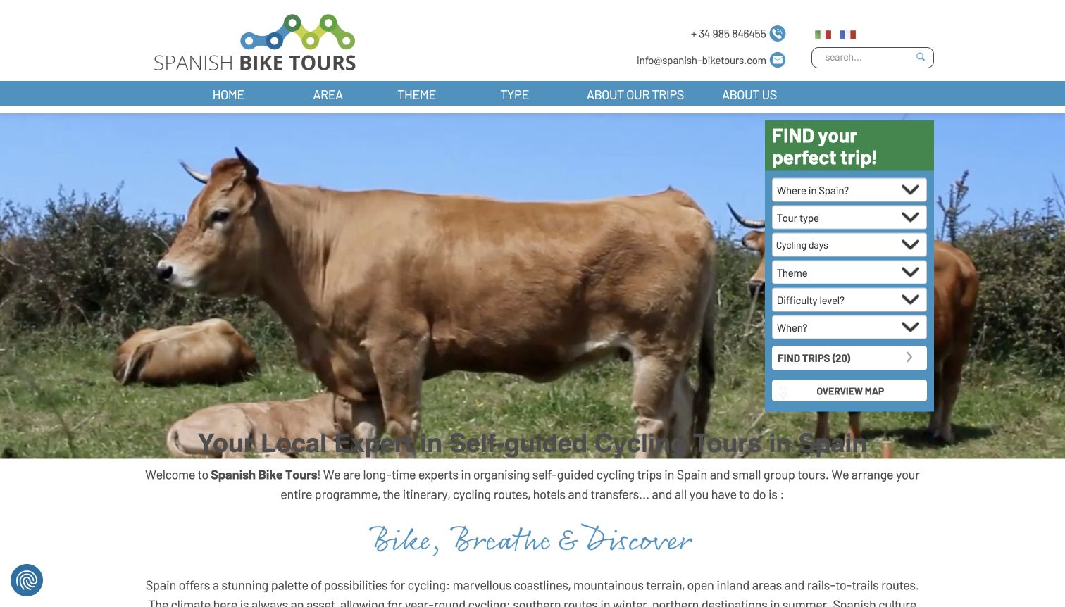
Spanish Bike Tours places a tall finder beside the opening imagery, making region, route type, duration, theme, difficulty and month available in one compact panel. This is a practical approach for a country specialist: visitors can choose a coastal route, a family format or a more demanding trip without treating Spain as a single experience. The lower introduction explains the self-guided arrangement, including route notes, hotels and luggage logistics. Tour summaries add duration and seasonal information. The selected screenshot follows denial of optional cookies and shows the static fallback image. The many finder fields can feel demanding at first, and some labels mix travel themes with geographic categories.
What you can learn
A country-focused operator can organize choice around route shape and travel rhythm as well as region. Keep the initial filters understandable and let visitors begin broadly, then reveal the details that distinguish individual itineraries.
Pros
The vertical finder keeps multiple useful trip constraints together.
Self-guided support is explained through concrete planning components.
Cons & considerations
A large number of initial choices may overwhelm an undecided visitor.
Theme and region labels are not always conceptually separate.
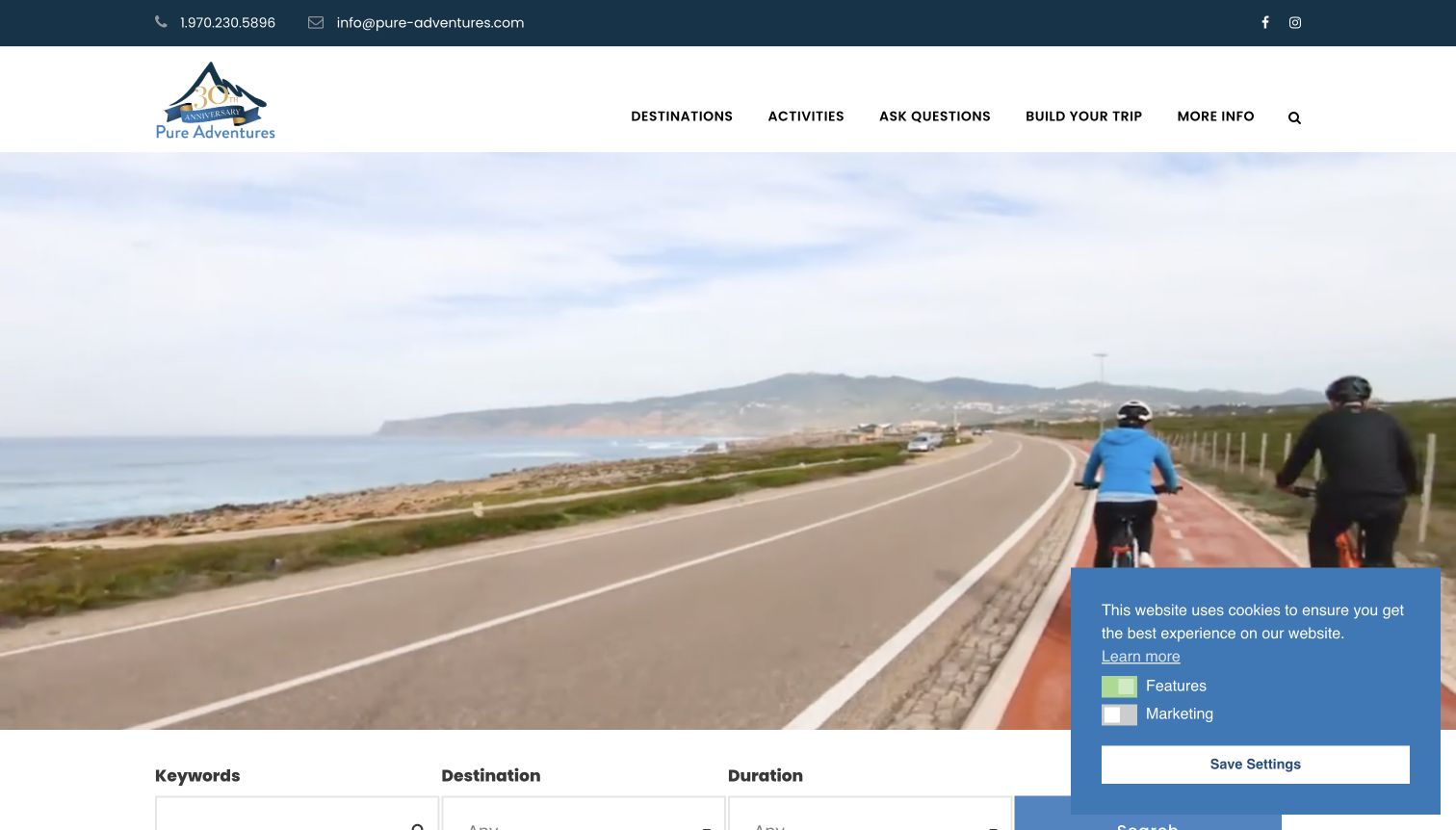
Pure Adventures opens with active-travel imagery and a restrained navigation that includes Ask Questions and Build Your Trip. Those labels acknowledge that some visitors need clarification while others are ready to discuss a customized arrangement. The page describes the difference between private self-guided travel and privately guided options, then presents popular trips with destination summaries and starting-price information. Cycling is central to the examples shown, but the wider activity scope remains visible. The large moving-media area delays the main explanation until farther down the page. A small cookie panel also covers the lower corner, and the pricing cards require careful attention to the stated currency and the particular itinerary.
What you can learn
Give an undecided traveler a route to understanding and a ready traveler a route to planning. Distinguish self-guided logistics from private guiding in ordinary language before presenting both as versions of a single customizable holiday.
Pros
Question and custom-trip routes acknowledge different stages of planning.
The copy distinguishes independent and privately guided arrangements.
Cons & considerations
The large media area places much of the explanation below the opening.
Starting prices need consistent currency and inclusion context.
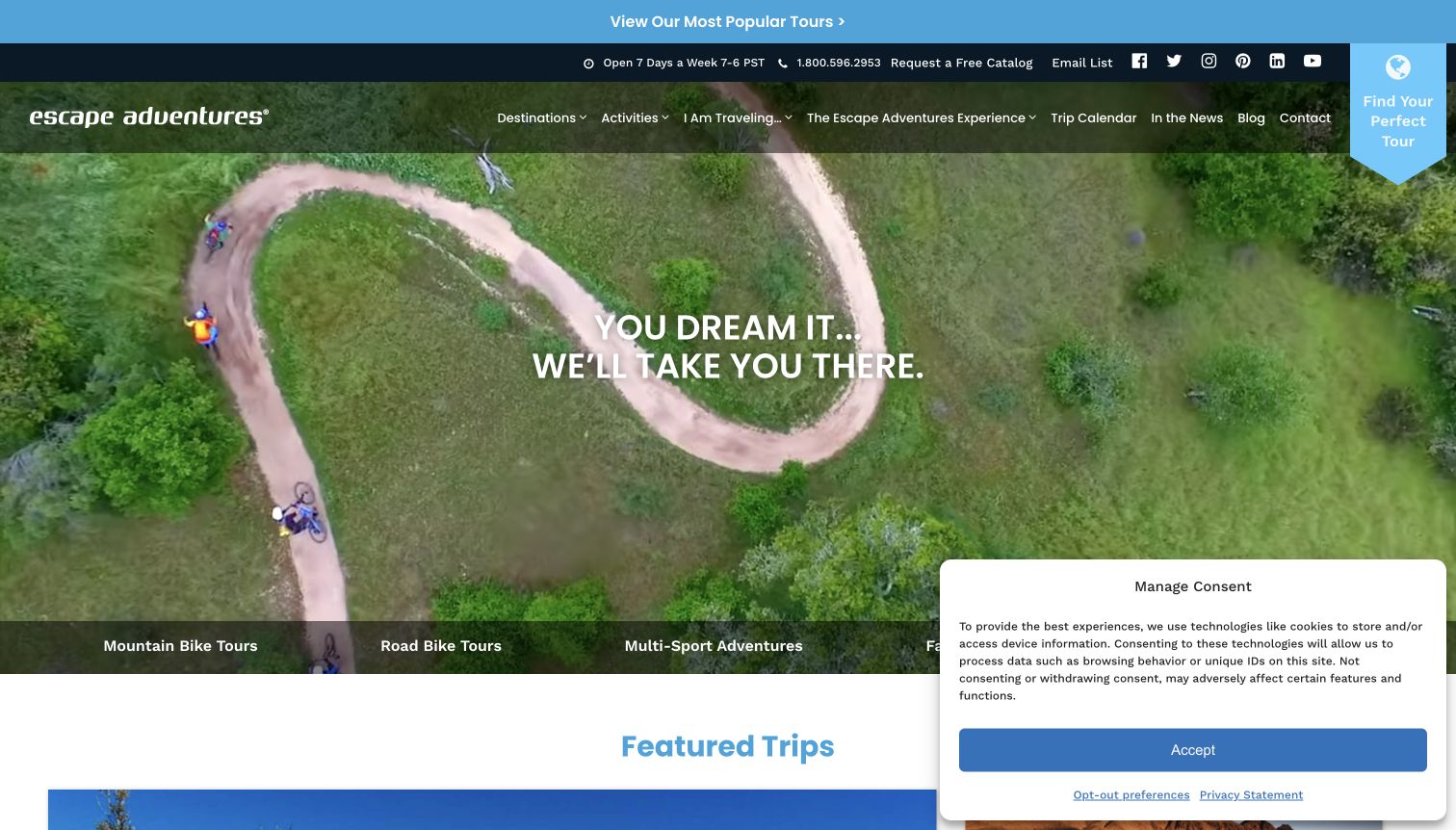
Escape Adventures uses overhead trail imagery to make the riding environment tangible. A blue Find Your Perfect Tour ribbon stays distinct from the main navigation, while a category strip introduces mountain biking, road cycling and multi-sport experiences. The detailed finder goes beyond destination and month to include traveler type, lodging, fitness and elevation. Those are meaningful distinctions for an adventure catalog, where camping and inn-based trips can appeal to different visitors even on similar routes. Featured departures provide a quicker alternative to the full set of filters. The breadth of navigation is substantial, and the observed consent panel covers part of the lower content.
What you can learn
Organize adventure trips around the experience off the bicycle as well as the riding itself. Lodging style and group arrangement can be decisive, but the full filter set should be supported by simpler paths for visitors who are still exploring.
Pros
Activity categories make the range of cycling formats visible.
Lodging and fitness choices reflect meaningful trip differences.
Cons & considerations
The extensive finder can demand many decisions at once.
The first-visit consent panel overlaps the featured-content area.
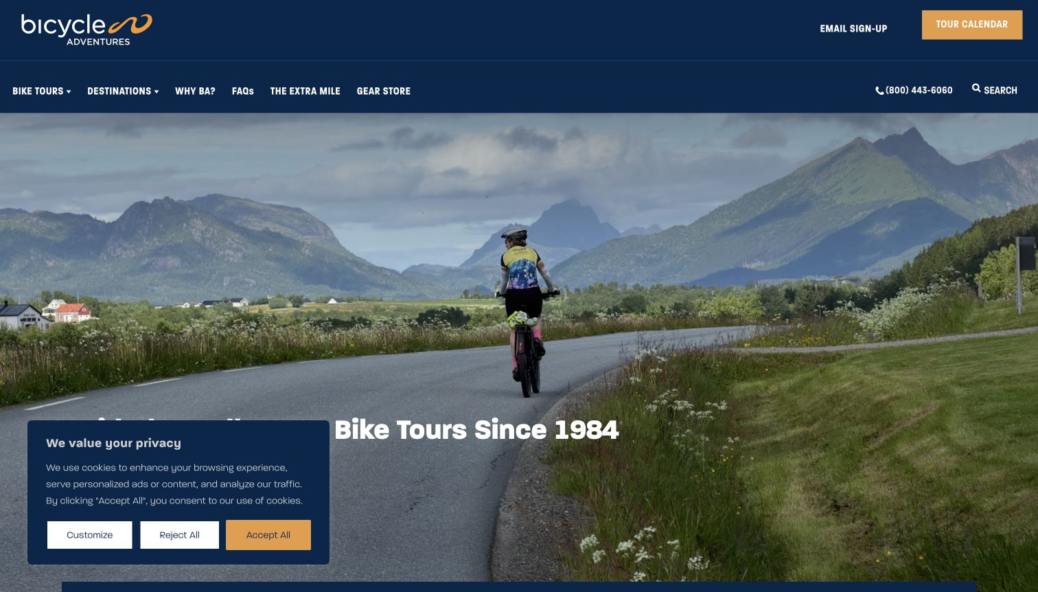
Bicycle Adventures states its main proposition in the opening: guided small-group bike tours. A road-riding photograph gives the statement context, while the navy header separates the tour calendar from the main navigation. The finder asks for destination, departure and level, which keeps the initial comparison tied to practical travel decisions. The page then explains the intended small-group experience and offers destination cards and trip-specific testimonials. Some seasonal featured content includes other activities, so the clear cycling headline remains useful in orienting visitors. On the observed first visit, a consent panel partly obscured that headline. The tall opening also means the first detailed trip cards require scrolling.
What you can learn
State the touring format before adding emotional claims. A concise promise about guidance and group structure gives visitors a useful frame for the calendar, level choices and destination stories that follow.
Pros
The opening clearly identifies the core guided cycling format.
A dedicated calendar link provides a direct planning route.
Cons & considerations
The first-visit consent panel overlaps part of the main statement.
The large hero leaves limited room for detailed trip comparison.
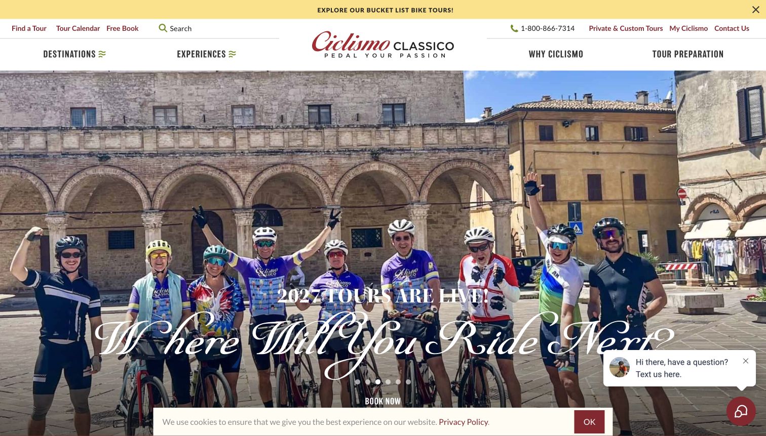
Ciclismo Classico combines expressive typography, rider photography and a rotating set of trip and alumni messages. Its navigation offers a calendar and tour finder alongside regional destinations, while a lower interest section groups experiences around food, longer journeys, group travel and cultural exploration. This gives visitors another way into the catalog when a country alone does not explain what they want from a cycling holiday. The selected screenshot was taken after closing an unsolicited newsletter invitation without entering any information; earlier overlay views remain part of the research record. The large script headline is distinctive, although moving promotions, chat and a cookie notice create a busy first impression.
What you can learn
Use interests to supplement practical trip discovery. Cultural themes can explain why one itinerary feels different from another, but they work best alongside stable dates, riding expectations and a clear route into the actual tour details.
Pros
Interest categories give travelers an alternative to geographic browsing.
The calendar remains directly accessible from the header.
Cons & considerations
The initial newsletter modal interrupts exploration of the catalog.
Rotating promotions and several overlays compete with the main message.
Kegan is a freelance web designer and developer with 15+ years of experience helping businesses turn complicated website requirements into clear, maintainable digital experiences. He works directly with clients from planning and design through development, launch, and ongoing support.
For bicycle tour website design, his development approach focuses on bicycle tour websites that explain routes, trip lengths and riding expectations, with clear ways to compare tours and find practical booking information. The scope can be a targeted improvement or a complete custom build, with responsive layouts, thoughtful content structure, and integrations chosen around the people using and maintaining the site.
Show 3 other bicycle tour website designersHide other bicycle tour website designers
Plan around the rider, the itinerary and the travel format
Define the trip information before designing the finder
Start with a clear inventory of the experiences the business actually offers. Record the destination, route shape, duration, typical riding pattern, surfaces, support arrangement, accommodation style and relevant departure information. Have the operating team approve the descriptions rather than asking a designer to infer them from photographs. A route advertised as easy may mean something different to an occasional rider and a regular cyclist, so explain the business’s own level system with concrete context.
Choose the few fields that make the most useful first comparison. A regional operator with a small catalog may only need consistent cards and links to more detail. A larger catalog may justify filters for destination, date, style and ability. Avoid adding a filter simply because the database contains that field. Every choice should help a traveler rule a trip in or out, and the page should remain useful before any filter is selected.
Keep the vocabulary consistent across the homepage, trip listing, itinerary and reservation service. If an itinerary is called self-guided in one place and private in another, explain how those descriptions relate. A useful content model reduces the need to repeat changing details by hand and gives the team a reliable place to update seasonal information.
Describe the whole day without making unsupported promises
Riding is central, but travelers also need to understand what happens before and after it. Show how the itinerary moves between destinations, how accommodation is organized and what support is included. Explain the distinction between a group that rides with guides and an independent itinerary with prearranged logistics. If bicycle rental, luggage movement or transfers are optional, make the difference visible before a visitor treats them as included.
Use photography that represents the actual offer and keep its context clear. A scenic road image does not establish the surface, traffic conditions or distance of every itinerary. A dining photograph does not explain which meals are included. Link imagery to useful captions or nearby trip facts, and retain the operator’s approved language for preparation and participation. The website should not invent safety advice, medical suitability or accessibility claims.
Present important limitations where they affect the decision. A tour page can link to detailed policies while still giving a concise explanation of the booking process and the information a traveler should confirm. Make it easy to ask a relevant question without implying that an inquiry is a reservation. Treat published customer stories as attributed experiences, not as a substitute for the current itinerary.
Give changing information a clear owner
Cycling-tour catalogs combine durable descriptions with details that change frequently. Destination stories and riding-style explanations may remain useful for years, while departure availability, promotions and prices can change much sooner. Decide which system owns each piece of information and avoid duplicating live inventory in manually maintained banners, cards and articles. A dated campaign should have an explicit review or removal plan.
Design the next step to match the actual process. A button can lead to a trip detail page, an availability service or a custom-planning inquiry, but its label should explain which. Keep the selected trip name visible when a traveler moves into another service. Do not ask for sensitive personal or payment information until the appropriate secure stage, and keep ordinary browsing independent of account creation.
Review the page as an information product after launch. Check that new dates have not left old promotional language behind, that trip levels still match the operating descriptions and that routes to contact or booking remain accurate. Preserve usable content when video, chat, maps or optional cookies are unavailable. A calm, reliable catalog is easier to maintain than a collection of competing seasonal overlays.
The editing job behind the design
Choose publishing and trip tools around accurate itinerary information
Use structured trip records for information that repeats across lists and itinerary pages. Give editors clear fields for travel format, duration, region and level descriptions, with a separate source of truth for changing departure inventory.
Connect to the operator’s approved reservation or inquiry process using consistent trip names and clear action labels. Keep payment and customer information in the appropriate private systems. A public booking link does not reveal the software used for the rest of the business.
Optimize actual source photography and provide useful alternatives to video, interactive maps and chat. The example stacks here come from bounded public-page audits; an unavailable scan is retained honestly rather than replaced with a guessed CMS or hidden booking platform.
Our WordPress website examples offer a separate look at publishing approaches. A visible platform label is evidence for that named page, not a guarantee that the same system will suit your requirements.
Before the public launch
Bicycle-tour website brief checklist
Identify the destinations and actual cycling formats offered.
Distinguish guided groups, self-guided itineraries and private planning.
Explain the operator’s riding-level system in concrete language.
Publish approved distance, surface and terrain context where relevant.
Use a consistent set of fields on comparable trip cards.
Explain duration, route shape and accommodation arrangements.
Separate included services from optional bicycles, transfers or extras.
Keep seasonal schedules distinct from current departure availability.
State the currency and scope of any starting price.
Give promotions an owner and a review or expiry date.
Use actual imagery with permissions, attribution and useful alternatives.
Keep essential information readable without optional media or cookies.
Prevent brochure, chat and promotional overlays from obscuring trip discovery.
Make inquiry, availability and booking actions clearly different.
These checks are a project checklist, not a performance, legal, security, or accessibility certification. Test real journeys with the people responsible for the website before making claims about the result.
Sources & editorial method
How this collection was selected and reviewed
The collection contains 17 distinct public website properties matching the original saved random draw. All received direct browser captures on November 10, 2026, with exact source URLs, timestamps, original image bytes, dimensions and hashes retained. Skedaddle is the exact France destination page; the other selected views are homepages. Some captures retain visible cookie or chat notices. Clearer views after ordinary consent choices or closing a newsletter invitation are labeled, and earlier captures remain private evidence. Reviews are original observations of design and information structure. Every exact source page received a bounded broad technology-audit attempt. No access restriction was bypassed, hidden technology inferred, trip booked, account opened or form submitted.
Each example links to its actual source page. Screenshots are direct browser captures with their own capture dates; moving imagery, announcements and live designs can change. The notes describe observable design choices and conditional tradeoffs, not measured traffic, conversion results, service quality, or accessibility conformance.
Technology labels use public page metadata, asset evidence, or explicitly cited platform documentation. Platform documentation is not a complete current deployment audit. A component reference may be legacy or unused; it is not a complete backend inventory. Unknown stacks are omitted. These sites are editorial examples, not our client portfolio.
Written, Edited and Curated are separate editorial records, not timestamps advanced by a rebuild. Website designs and imagery belong to their owners. See our editorial standards or suggest a correction.
Questions worth asking
Bicycle Tour website design questions
What should a bicycle-tour homepage explain first?
Identify the region and type of cycling experience, then give visitors a clear route to compare trips. Travel format, riding expectations and duration are usually more helpful than a general promise of adventure.
How should difficulty levels be presented?
Use the operator’s approved level definitions and explain what they mean in practical terms. Relevant distance, terrain, surface and support information helps visitors interpret a label. Do not invent suitability or safety claims from imagery alone.
Should guided and self-guided trips share one finder?
They can, if the format is clearly identified and its meaning is explained. Visitors should understand what they arrange themselves and what the operator provides before comparing prices or starting an inquiry.
Does every cycling site need a complex trip search?
No. A small catalog may be easier to browse through consistent cards and a short comparison. Add filters only when they help visitors distinguish genuinely different options, and keep an unfiltered route available.
How should starting prices and promotions be handled?
State the currency, applicable trip and relevant scope, and keep changing availability in its source system. Give time-limited offers a maintenance owner so a prominent campaign does not remain visible after its terms change.
Does an Editors Choice badge endorse the bicycle tour?
No. This is an editorial website-design selection based on public presentation and communication. It does not establish operating quality, safety, accessibility conformance, current availability or a guaranteed travel experience.
Borrow the structure that makes the next decision easier. Build around the real itinerary and riding experience, use the destination imagery with purpose, and let clear trip information carry visitors from curiosity to an informed next step.