Best Asbestos Abatement Websites of 2026 (17 Real-World Examples)
Clear service boundaries, verifiable business identity, relevant project context, and a calm route to a professional conversation.
An asbestos abatement website should help a visitor find the appropriate professional contact without encouraging them to identify, disturb, or handle a material themselves. Clarity and accountability matter more than alarming imagery or absolute safety promises.
This is a website-design collection, not an abatement manual, a contractor recommendation, or a way to diagnose building materials from photographs. The references are useful for studying how a business explains its scope, service area, project process, and contact options.
A homeowner with an unanswered question, a facilities team planning a refurbishment, and a contractor procuring a defined package need different explanations. The design challenge is to give each an understandable route while keeping technical judgments with appropriately qualified professionals and jurisdiction-specific requirements with their authoritative sources.
Before the examples
What makes good asbestos abatement website design in 2026?
Explain what the business does and does not do
Distinguish services such as assessment, testing arrangements, consultancy, removal, and other actual offerings without treating those roles as interchangeable. A visitor should not have to guess whether the company can handle the particular inquiry or where to find an appropriate professional response.
Present credentials with their real scope
Use correct business names, appropriate license or registration information, and genuine verification links where available. State the relevant jurisdiction and responsible entity. A logo or confident headline alone does not establish that a company is qualified for every material, building, or location.
Keep the first contact calm and safe
Describe the normal inquiry route and invite information the visitor already has. Do not instruct someone to collect samples, enter a work area, disturb a material, or take close-up photographs. The website should support professional assessment, not transfer that responsibility to the form user.
The collection · 17 examples
17 asbestos abatement websites worth studying
Study service clarity, restrained visual hierarchy, credential presentation, and contact journeys. These examples do not establish the safety, legal compliance, or quality of any contractor’s actual work.
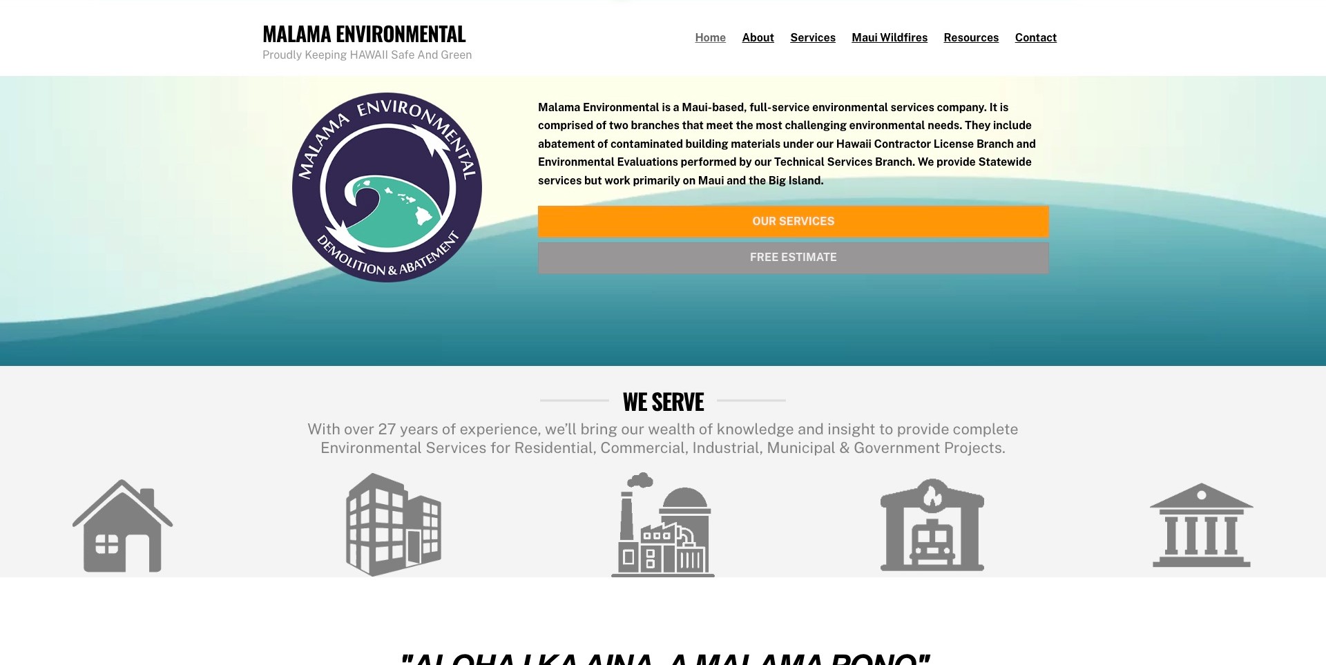
Mālama Environmental puts its Maui identity to work rather than opening with a generic hazard photograph. A large circular island-and-wave mark sits against a teal gradient, while a substantial text column identifies the business, its two branches, and the areas it primarily serves. Two full-width actions distinguish service exploration from an estimate inquiry. Below the hero, a compact row of property-type icons organizes the audience without asking the visitor to diagnose a material. This is a particularly useful smaller regional reference for explaining who is accountable and what kind of conversation the company can support.
What you can learn
Give a specialist business an identifiable place and an understandable service structure before promoting an outcome. Distinguishing contracting from technical evaluations is more informative than letting one broad environmental label imply every professional role is interchangeable.
Pros
The regional mark and introductory copy reinforce a specific business identity rather than an anonymous national promise.
Separate service and estimate actions accommodate visitors at different stages of understanding.
Cons & considerations
The dense introductory column could need shorter paragraphs when adapted for a narrow phone screen.
Light text on colored action bars needs measured contrast checks before copying the palette.
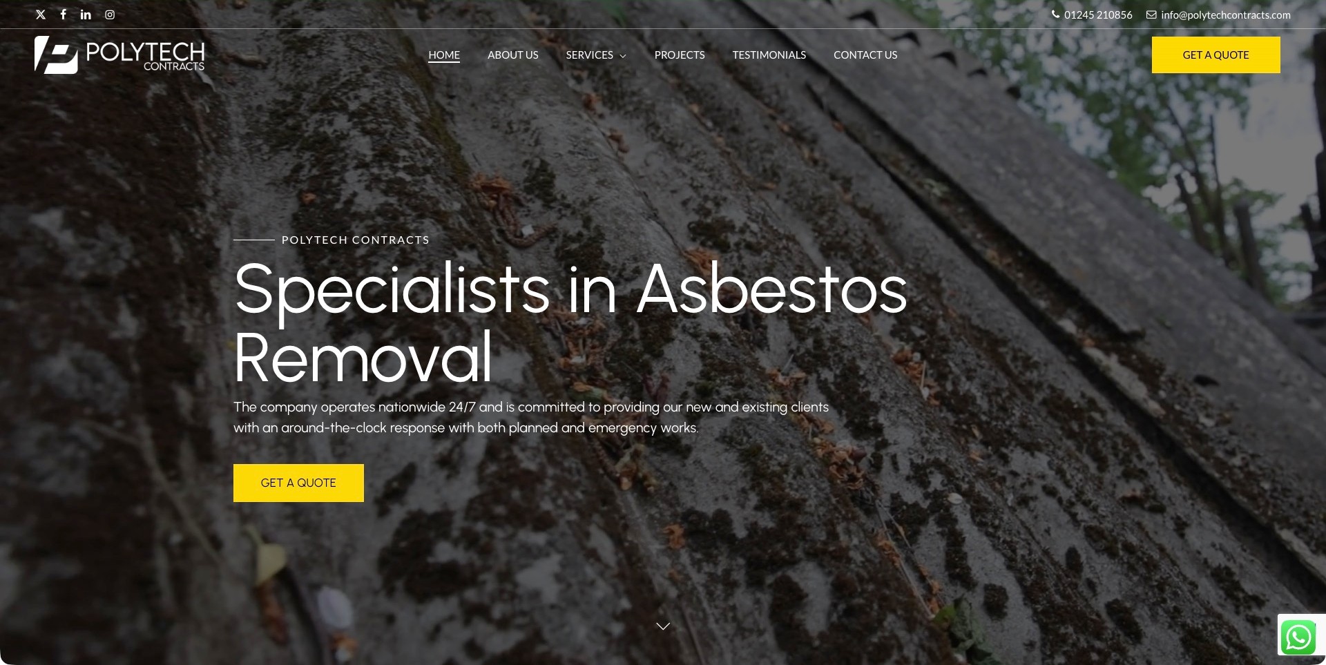
Polytech Contracts places a large asbestos-removal headline over a darkened textured roof image. White navigation, a simple wordmark, and bright yellow quote buttons create a consistent hierarchy, while phone and email sit in a narrow contact strip. Projects and Testimonials have their own destinations rather than becoming a long block inside the hero. The first-party company information identifies a family-run practice, making this a useful specialist reference rather than a generic marketplace. Its national availability and response wording remain business claims. The photograph is not a diagnostic illustration or proof of the material shown.
What you can learn
Use a literal service title and one recognizable action treatment so visitors understand the page before reading detailed capabilities. Let project and company pages supply context without encouraging anyone to identify or handle a material from a photograph.
Pros
The yellow quote treatment is consistent in both the navigation and the hero.
Separate project and company-information routes accommodate research before an inquiry.
Cons & considerations
Textured photography needs enough contrast behind every text and focus state.
Planned and urgent inquiries may need clearer explanations than one shared quote label provides.
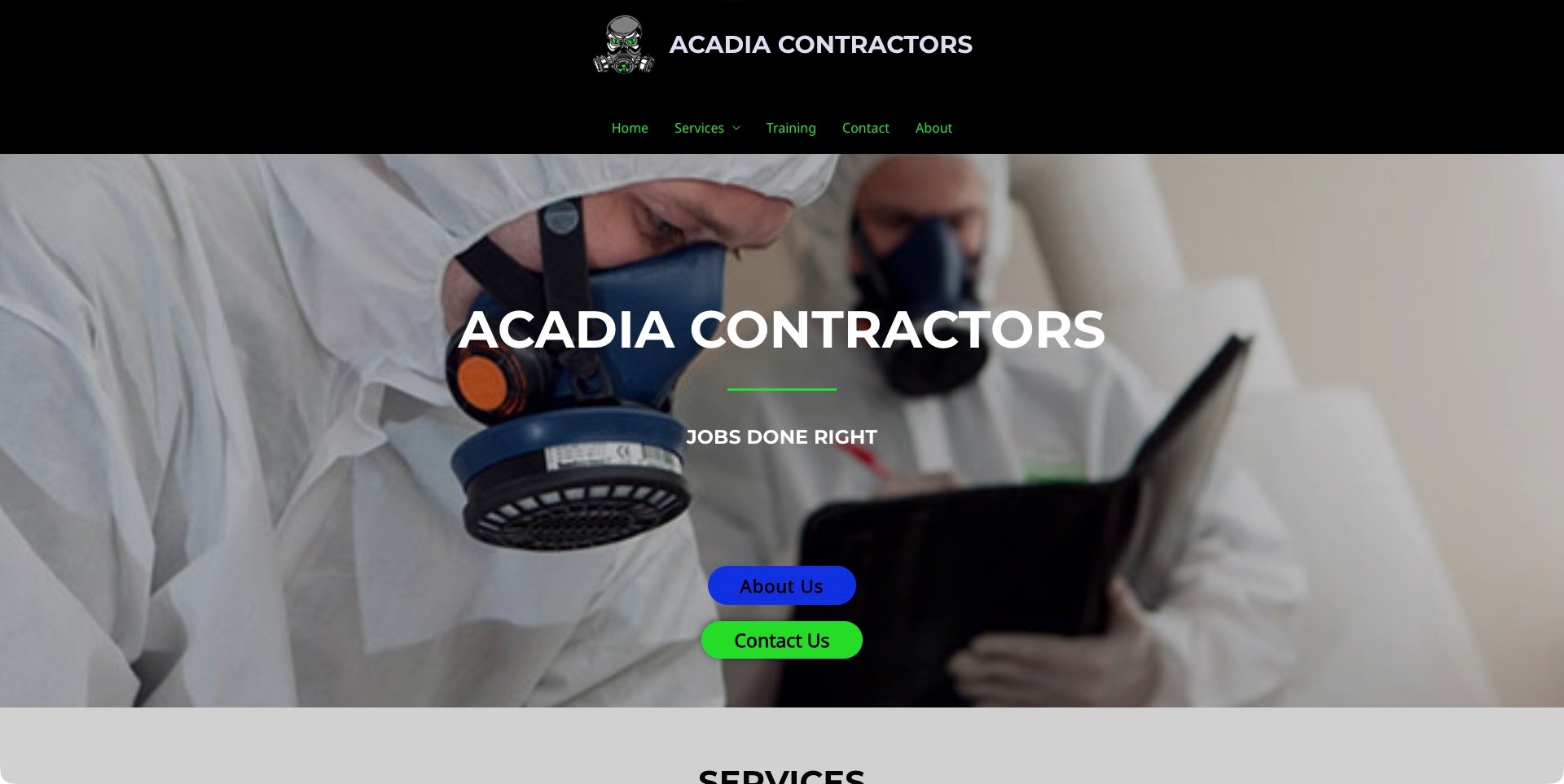
Acadia Contractors uses a black header, a respirator-character emblem, and green navigation to create an memorable identity. The hero then switches to a photograph of protected workers, with the company name and a short slogan centered over it. Blue About Us and green Contact Us buttons provide two obvious next destinations. Its first-party asbestos-removal page establishes the relevant service; the homepage image alone would not establish that scope. The design is useful for studying a compact company introduction that leaves detailed services to the next section rather than filling the hero with an entire capability statement.
What you can learn
A memorable mark can help a visitor recognize the company, but pair it with an explicit route to the actual service explanation. Treat protective clothing as visual context, not evidence of training, compliant work, or a particular project outcome.
Pros
A short navigation separates services, training, company information, and contact without a sprawling menu.
The two hero actions make company research and a direct conversation distinct tasks.
Cons & considerations
A general slogan contributes less practical meaning than a brief service-and-region explanation would.
Colorful buttons over a detailed photograph require contrast and focus-state testing in a new implementation.
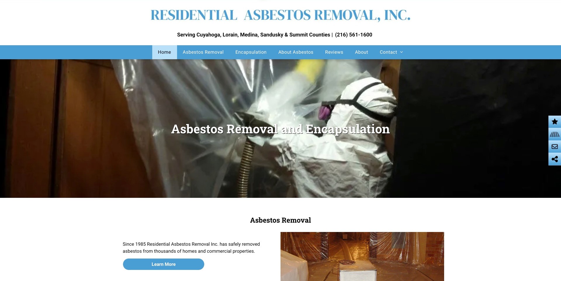
Residential Asbestos Removal places its full company name above a conspicuous line naming five Ohio counties and the telephone number. A simple blue menu distinguishes removal, encapsulation, background information, reviews, and company details. The large hero repeats the two principal service names over a work-context photograph, and the next section begins a more specific explanation beside another image. This is a practical local-business reference because coverage and contact are visible before the visitor scrolls. The company’s statements about experience and credentials remain claims to verify, not conclusions established by the photograph or our website review.
What you can learn
Let a local visitor establish coverage immediately, then distinguish services without asking them to choose a technical treatment themselves. A clear introductory page should help begin a qualified conversation, not turn navigation labels into a self-assessment tool.
Pros
Named counties make the service region more useful than an unexplained map or broad regional slogan.
The main menu separates company background and reviews from the two substantive service destinations.
Cons & considerations
The large photographic hero uses substantial space before the first explanatory paragraph appears.
The floating side rail adds competing icons that may need clearer labels and keyboard testing.
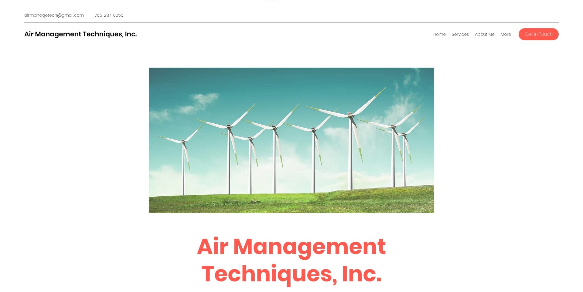
Air Management Techniques gives its company name, email, and telephone number a straightforward place in a white header. A small coral Get In Touch button is visually distinct from the understated navigation. The main view is unusually spacious: a wide wind-turbine photograph is surrounded by white margins, and the coral company heading starts beneath it. Current first-party service information explicitly distinguishes asbestos surveys from remediation and removal. The image cannot communicate those distinctions, illustrating the limits of environmental mood photography for a specific service inquiry.
What you can learn
Keep a calm visual tone, but do not make visitors translate a broad environmental image into a technical service. Bring the precise offering and service region into the first meaningful text so a restrained layout also answers practical questions.
Pros
Direct contact details remain easy to locate without opening a form or a decorative menu.
Generous spacing separates navigation, imagery, and the company introduction into understandable blocks.
Cons & considerations
A wind-farm image does not explain asbestos work and should not be mistaken for company project evidence.
Very light navigation lettering may need a stronger contrast treatment on small or bright screens.
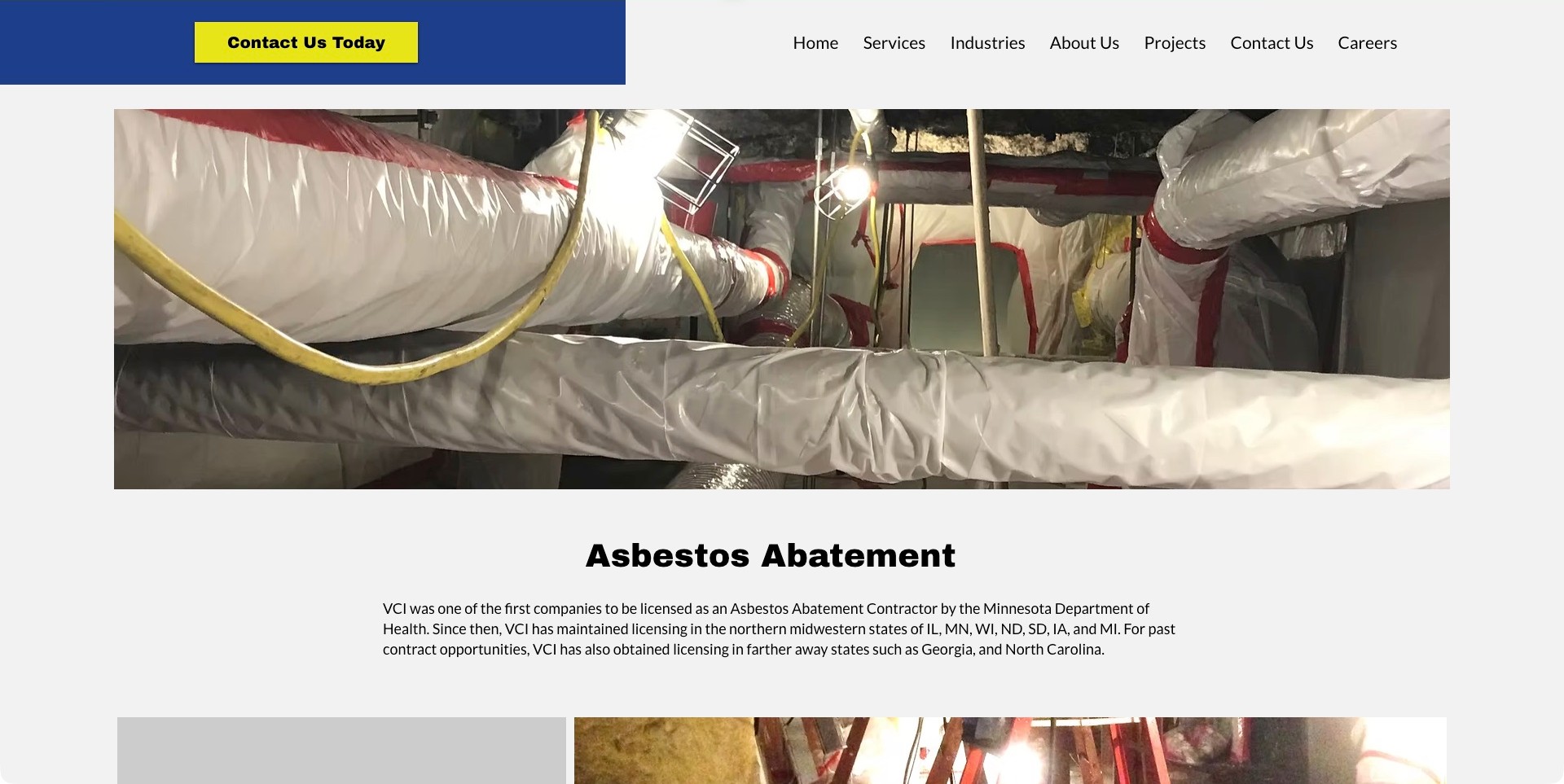
VCI Environmental’s asbestos-abatement page opens with a conspicuous yellow contact action, a simple horizontal navigation, and a wide photograph of wrapped pipework. An unambiguous Asbestos Abatement heading follows the image, with a relatively narrow introductory paragraph and further photographs beginning below it. This arrangement gives the service a dedicated destination rather than relying on a generic hazardous-materials heading. The text names locations and historical licensing claims, which remain the company’s statements rather than independent verification. The clearest design lesson is the progression from relevant visual context into an explicit topic and supporting material.
What you can learn
Use a dedicated service page to give a specific inquiry a stable title and coherent introduction. Explain credentials and geography in their proper scope; a photograph of a work area does not establish the technical method or compliance of a project.
Pros
The service heading is large, literal, and separated clearly from the introductory paragraph.
A prominent contact action stays distinct from the detailed photographic content.
Cons & considerations
The opening navigation gives the service more prominence than the company name in this particular view.
Historical license and multi-state claims require current authoritative checks rather than a designer’s inference.
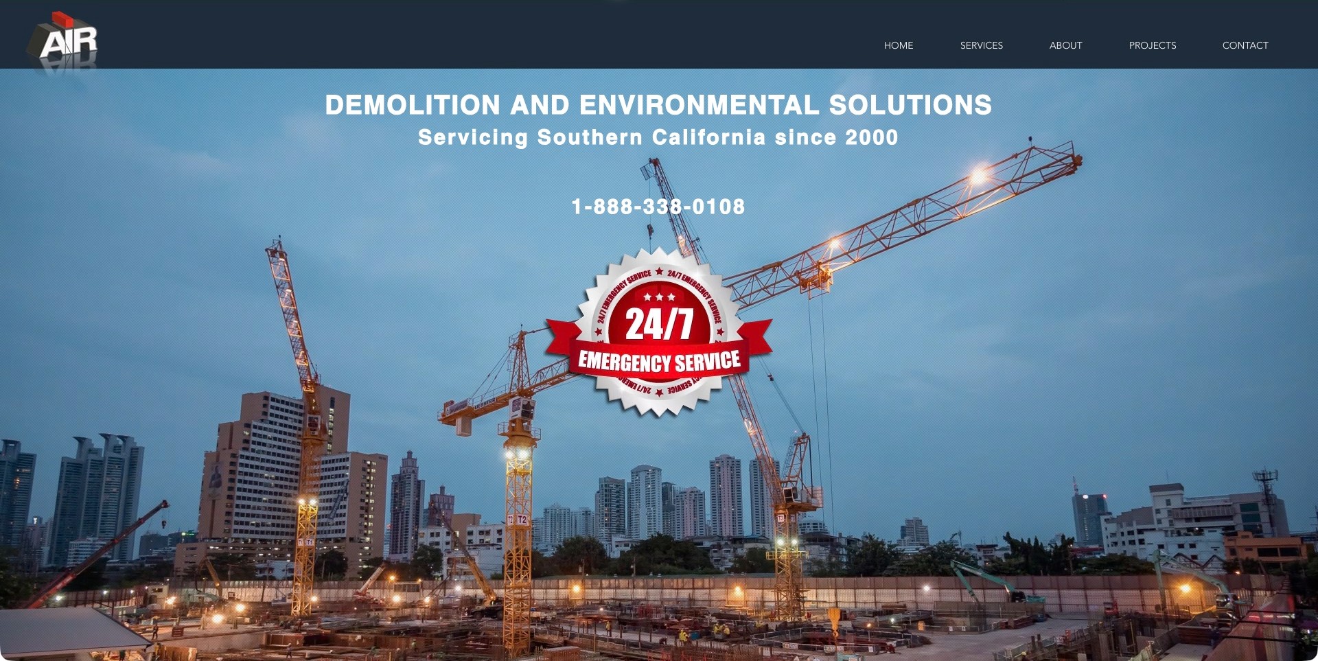
AIR Inc. combines a dark blue header and dimensional logo with a large construction-crane photograph. Its opening copy names demolition and environmental solutions, identifies Southern California, and places a telephone number above an oversized emergency-service badge. Asbestos appears in the company’s first-party service information, not as the hero’s only subject. The page demonstrates an umbrella introduction: establish a recognizable company and region, then let specific service destinations carry the narrower explanation. The bold badge competes with the more useful information about what the visitor can actually ask.
What you can learn
A broad contractor homepage can orient visitors with geography and a clear phone route, but it still needs an explicit path to asbestos-specific information. Emergency branding should describe the company’s real arrangements, not imply that every uncertain inquiry is an emergency.
Pros
The Southern California statement establishes regional relevance before the visitor investigates the service list.
A large telephone number offers a direct alternative to a form-led contact journey.
Cons & considerations
The emergency badge occupies attention that could otherwise clarify a particular service or inquiry process.
Construction imagery alone cannot explain the company’s asbestos role or verify technical competence.
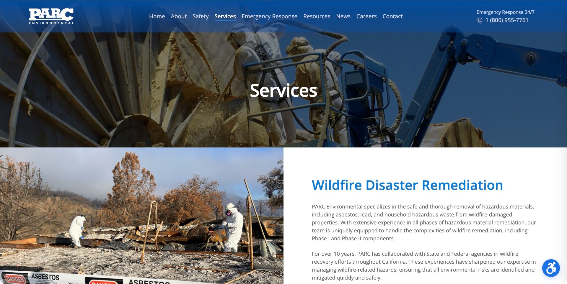
PARC Environmental’s services page uses a blue navigation bar, a worker-and-equipment hero, and a plain Services heading before moving into substantial split image-and-text sections. Wildfire disaster remediation leads the visible content, with an explicit discussion of hazardous-material responsibilities; the page separately provides an asbestos-removal section further down. A clearly identified emergency telephone route remains in the header. The useful reference is the service-index structure: the company connects a named task to a recognizable situation and explains it. The opening photograph is context, not our verification of how a particular site was managed.
What you can learn
When several environmental services share a page, give each a clear heading, context, and distinct scope. Do not expect a visitor seeking an asbestos conversation to infer the relevant route solely from the first, broader disaster-recovery section.
Pros
Large service headings and alternating contextual imagery make a long capability page easier to scan.
The header identifies its urgent contact route instead of hiding the telephone number in the footer.
Cons & considerations
A generic Services hero and wildfire-first ordering can delay a visitor with a narrow asbestos question.
Long explanatory paragraphs need careful mobile spacing and should not become unsupported safety guarantees.
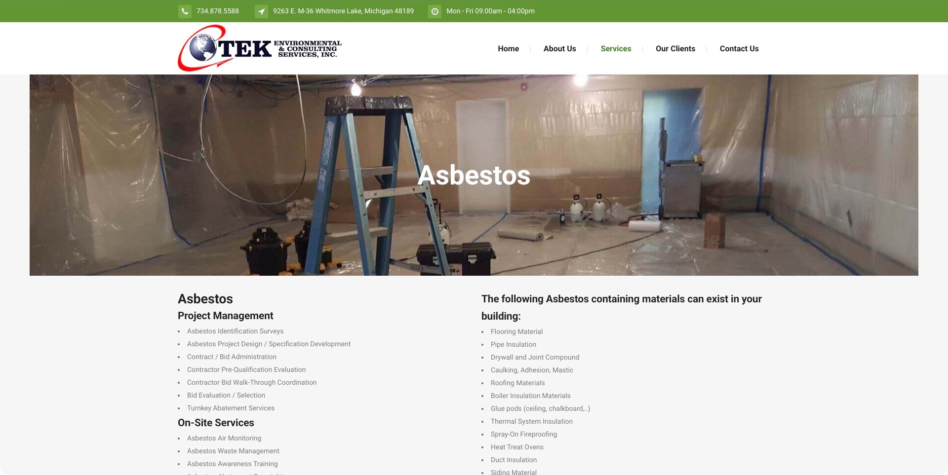
TEK Environmental’s asbestos page gives contact details and office hours a green strip above an ordinary white navigation. A wide work-area photograph introduces the literal Asbestos title. Below it, compact headings separate Project Management from On-Site Services, while an adjacent column presents background material information. The management list names activities such as specifications and bid administration, making the company’s wider consulting role visible. This is a useful information-architecture reference, not evidence that every service is self-performed or appropriate for every project. The image likewise cannot verify a procedure or a building’s condition.
What you can learn
Different professional roles deserve different headings and explanations. A service page should make responsibility easier to discuss with the company, not combine surveys, oversight, removal, and other tasks into an undifferentiated promise.
Pros
Office hours and contact details are visible before the visitor starts reading technical service categories.
Management and on-site headings expose meaningful differences in the company’s stated offering.
Cons & considerations
Dense small list text may be harder to absorb on phones or for low-vision readers.
Background material lists need context so they are not mistaken for a do-it-yourself identification checklist.
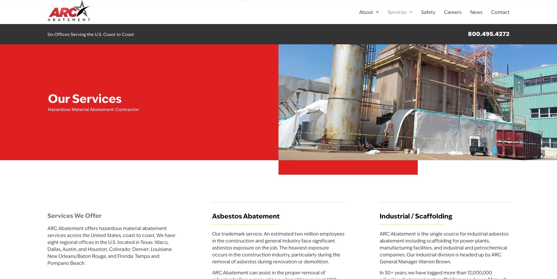
ARC Abatement uses a red text panel beside an industrial-site photograph, with a charcoal coverage-and-phone strip above it. Below the hero, columns separate the service overview, asbestos abatement, and industrial or scaffolding work. The contrast between the large red block and restrained body area makes the content structure obvious without a decorative carousel. This is a useful larger contractor reference for showing multiple capability paths. The visible coverage strip says six offices while body copy describes eight regional offices, a reminder that repeated operational facts need coordinated maintenance rather than being treated as verified coverage.
What you can learn
A service index works best when headings divide real scopes and operational details agree across the page. Treat regional-office counts, statistics, and capability claims as maintained business content, not permanent decorative evidence of competence.
Pros
The split hero separates its short service introduction from a detailed industrial photograph.
Distinct columns expose related capabilities without hiding everything inside a dropdown.
Cons & considerations
Inconsistent office counts can undermine the otherwise clear geographic introduction.
Long capability paragraphs may need shorter sections and explicit destinations for narrow service questions.
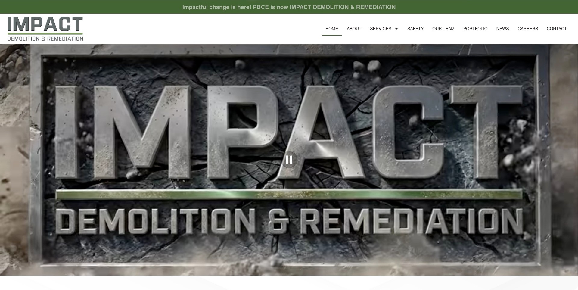
IMPACT Demolition & Remediation places a green rebrand strip above its white header, explicitly connecting the former PBCE identity to the new company name. A very large moving brand sequence dominates the opening view, with ordinary navigation routes for services, safety, people, projects, and contact above it. Its current first-party content explicitly lists asbestos abatement among environmental services. The lesson is continuity: someone following an old company link can understand why the destination now looks different. The cinematic brand treatment is less informative about the precise service than the supporting navigation and content.
What you can learn
Explain a rebrand in plain language before asking visitors to trust a new logo. Preserve clear service and team destinations so returning clients can confirm identity without relying on a large animation or assuming an old business name still represents a separate company.
Pros
The rebrand notice directly explains the relationship between the old and current names.
People, project, and service destinations give researchers several ways to investigate the business.
Cons & considerations
The large animated introduction delays a specific service explanation in the first screen.
Motion requires usable pause controls, reduced-motion handling, and a meaningful still alternative.
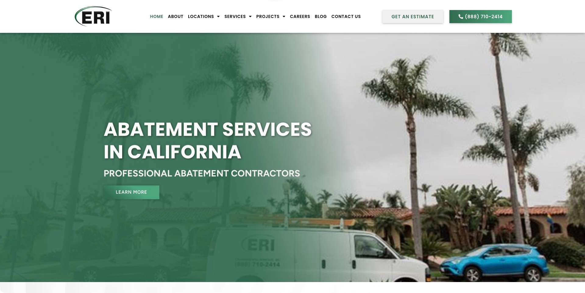
Environmental Remedies places its ERI mark, location navigation, service menu, estimate action, and telephone number in one orderly white header. A green-tinted scene of the company van and a California property supports a large, literal abatement-services headline. The restrained palette gives the page a coherent regional identity without dense badges. Current first-party pages provide more specific asbestos and location information. The homepage illustrates the opening layer of a multi-office website: visitors can identify the broad service and region, then choose whether to research a location, read further, or contact the business.
What you can learn
Separate geographic discovery, service research, and the estimate request instead of treating them as the same task. A regional hero can provide orientation, while detailed pages explain the actual offering and which office can discuss a specific project.
Pros
The header exposes location and project destinations alongside ordinary service and company information.
Estimate and telephone controls offer different contact routes without placing a large form over the photograph.
Cons & considerations
The ERI acronym needs supporting company identification for visitors who arrive without prior brand knowledge.
A general Learn More action could be more explicit about the information on its destination.
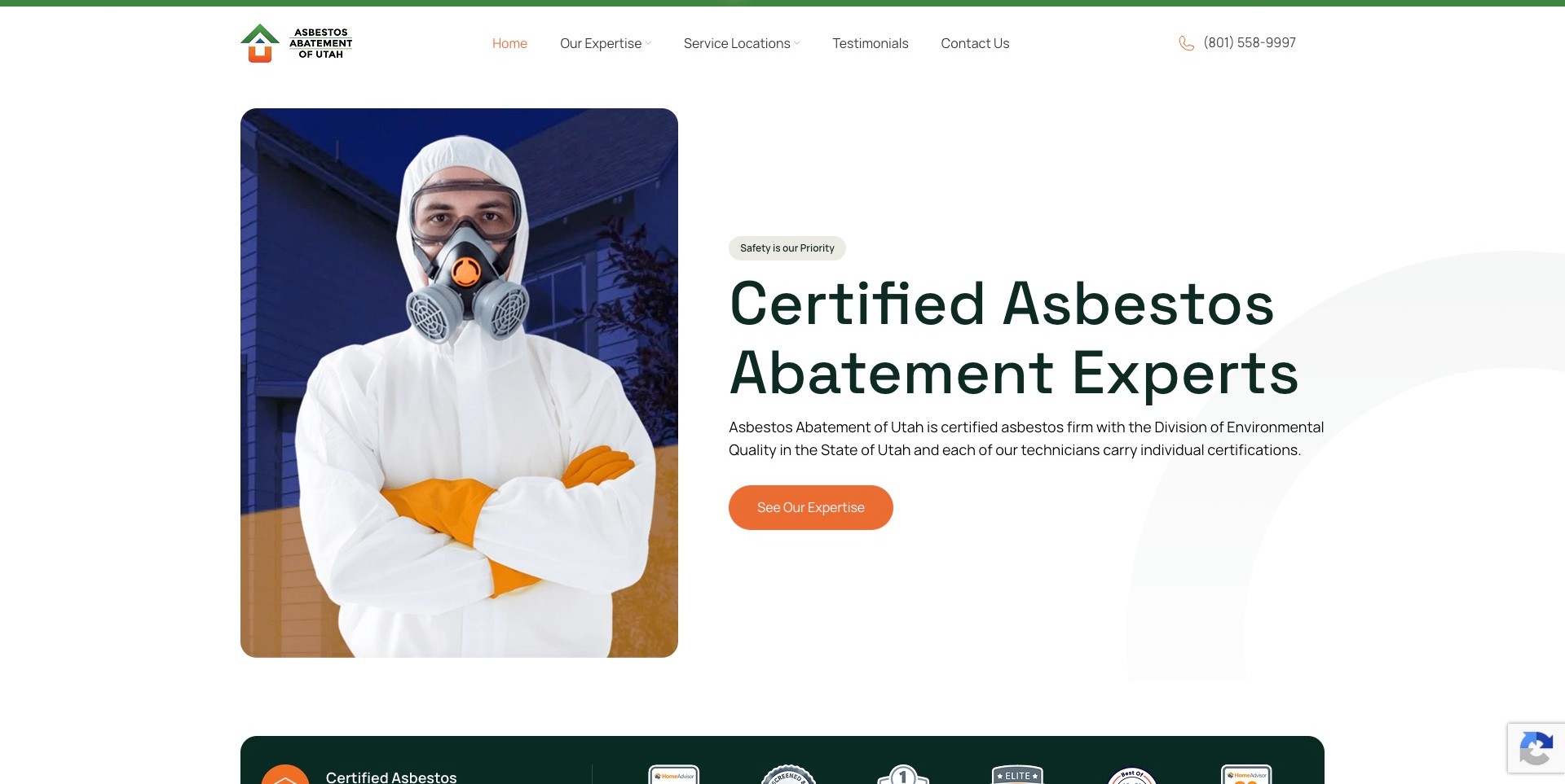
Asbestos Abatement of Utah separates a portrait-format protective-clothing image from a dark green headline and paragraph. The white background, orange action, and restrained rounded shapes make the first screen less crowded. Service Locations and Contact Us are visible in the navigation, with a telephone number at the far right. The opening copy names a specific certification authority; that is a business claim requiring an appropriate verification route, not something our design review confirms. The useful pattern is the division between visual context, service introduction, and the next information step.
What you can learn
Use a short readable introduction and a clear geographic route before adding extensive credentials or promotional panels. If a credential is prominent, make its holder and scope checkable rather than expecting a large headline or a protective-clothing image to prove it.
Pros
Text is placed on a plain background instead of competing with detail in a photograph.
The locations destination helps visitors investigate coverage without interpreting the company name alone.
Cons & considerations
A generic expertise action is less precise than a destination label naming the information it opens.
Certification and testimonial badges need sourced context and must not imply guaranteed project outcomes.
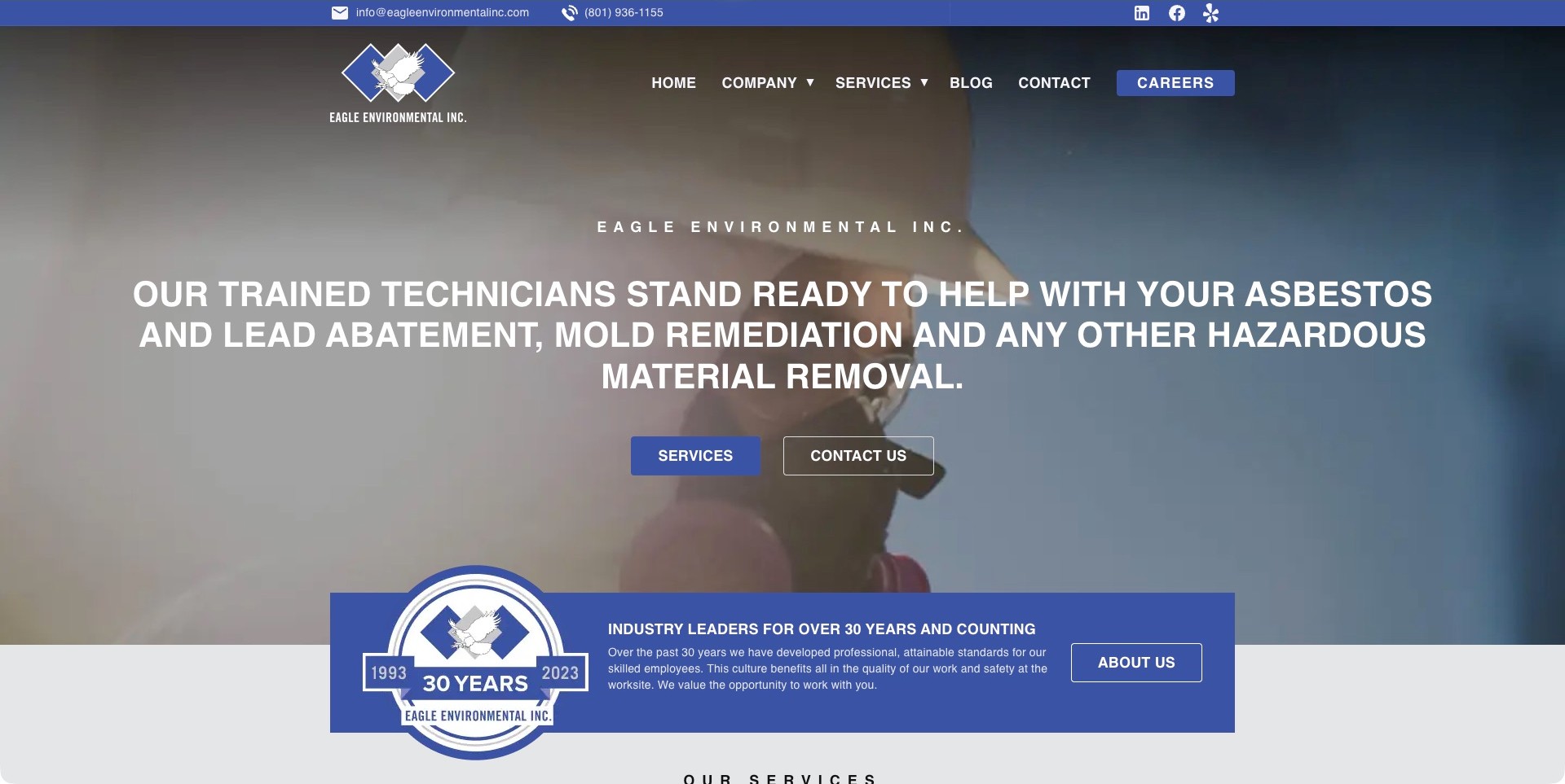
Eagle Environmental uses a blue contact strip above its eagle mark and main navigation. A large white headline names asbestos, lead, mold, and hazardous-material work over a work-context background, with separate Services and Contact Us buttons below. A prominent company-history panel overlaps the lower edge of the hero and points to the About page. This creates a progression from offering to contact to business background, although the long all-capital sentence is demanding. The anniversary artwork presents the company’s account of its background, not independent proof of work quality or current authorization.
What you can learn
Make the broad offering explicit and give visitors a separate way to investigate the company behind it. Keep service names clear, but break long statements into readable units so the desire to mention every capability does not overwhelm the first screen.
Pros
Email and phone remain visible in the upper strip rather than being available only after scrolling.
Distinct service, contact, and company-history actions support different stages of research.
Cons & considerations
A long all-capital headline is harder to scan than a shorter statement with supporting service labels.
The large anniversary panel requires maintenance and should not substitute for current accountable company information.
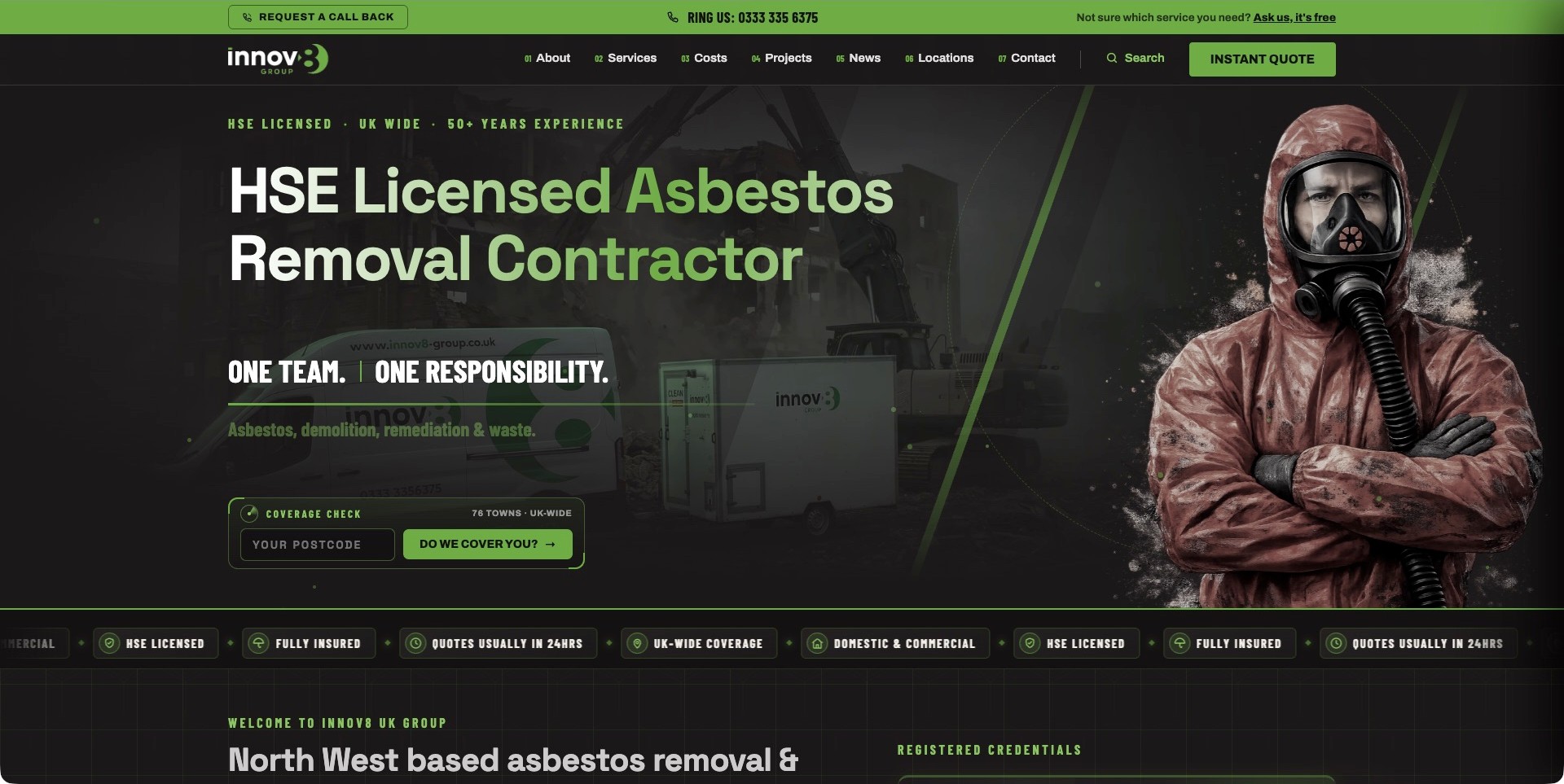
Innov8 UK Group uses a black-and-green identity, a large asbestos-removal headline, and a striking protective-clothing figure alongside a subdued vehicle-and-equipment background. The navigation is unusually task-oriented: Costs, Projects, Locations, and Contact sit alongside company and service information. A postcode coverage control and callback route are visible before the next section begins. The clean capture shows the site after the normal Reject cookie choice. Its licensing, experience, and response statements remain company claims rather than our verification. The reference is the information available before a detailed project inquiry.
What you can learn
Make common pre-contact questions visible in navigation, especially coverage, likely cost context, and project examples. A strong specialist visual identity can support that structure, but should not turn a headline claim into an independent assurance about credentials or a particular job.
Pros
Costs and locations are explicit destinations instead of being concealed behind a general services menu.
A coverage control gives geographic relevance a concrete place in the first screen.
Cons & considerations
Several callback, phone, quote, and coverage controls may compete before a visitor understands their differences.
The dramatic hero imagery should be contextualized and never treated as evidence of safe or compliant work.
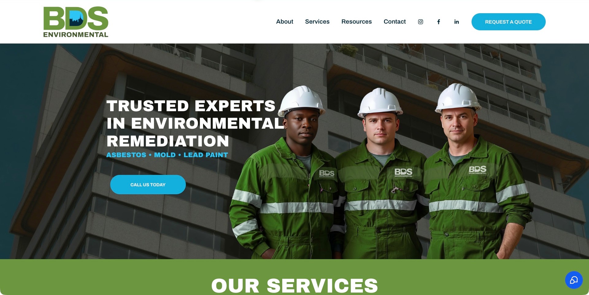
BDS Environmental pairs its large green-and-blue wordmark with a simple white header and a cyan quote button. The hero uses a darkened building background and a staged-looking group image beside a short environmental-remediation headline. A cyan supporting line explicitly names asbestos, mold, and lead paint, so the relevant offering does not depend on interpreting the people or equipment in the image. A Call Us Today action provides an alternative to the quote route, and the next service section begins immediately below. The pictured people’s identities and the image’s production method were not independently established.
What you can learn
Name the actual service categories in text rather than expecting an environmental photograph to explain them. Make phone and written inquiries distinct while keeping company identity and scope visible, and caption team imagery accurately when verified identities are available.
Pros
The material-specific line makes the asbestos offering explicit within a wider remediation business.
A strong shared accent color makes the two main contact routes recognizable.
Cons & considerations
A quote request and phone action need clear expectations about what happens next.
Unidentified promotional people imagery should not be presented as verified staff or project evidence.
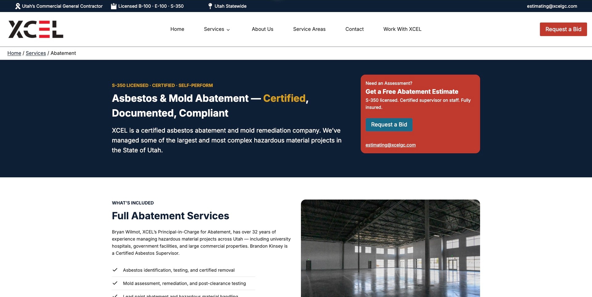
XCEL’s abatement page uses breadcrumbs, a dark blue text-led introduction, and a contrasting red estimate panel. The service title explicitly names asbestos and mold, while the next section identifies people associated with the work and begins a structured list of offerings beside a building photograph. A statewide label and business contact information sit in the top strip. This shows how a general contractor can give specialist work its own hierarchy. Certification, compliance, insurance, and project-scale statements remain company claims; the readable presentation does not independently validate any of them.
What you can learn
A specific service page can make accountability more tangible by identifying the relevant people and separating an inquiry from the explanation. Keep credential scope and project assertions verifiable instead of treating confident copy, a clean building image, or a badge as proof.
Pros
Breadcrumbs explain where the abatement page belongs within a broader contractor service structure.
The estimate panel presents a clear action without replacing the substantive service introduction.
Cons & considerations
The contrast between a free-estimate heading and Request a Bid wording could leave the precise next step unclear.
Dense credential and compliance language needs maintained evidence and appropriate professional review.
Kegan is a freelance web designer and developer with 15+ years of experience helping businesses turn complicated website requirements into clear, maintainable digital experiences. He works directly with clients from planning and design through development, launch, and ongoing support.
For asbestos abatement website design, his development approach focuses on carefully qualified survey and removal scope, geographic availability, service-process explanations, genuine project context, and well-routed assessment enquiries without unsupported health or regulatory-compliance claims. The scope can be a targeted improvement or a complete custom build, with responsive layouts, thoughtful content structure, and integrations chosen around the people using and maintaining the site.
Show 3 other asbestos abatement website designersHide other asbestos abatement website designers
Plan an asbestos abatement website without turning it into do-it-yourself advice
Begin with the visitor’s responsibility rather than a frightening headline
Describe the audiences the business can actually support. A homeowner may not know which professional to contact, while a building manager could already have documentation and need to discuss a planned project. A principal contractor might be checking scope, geographic coverage, and procurement details. Map these situations with the people who answer the company’s inquiries, then identify the minimum information each visitor needs before making contact. Keep the descriptions factual and calm. Avoid a dramatic suggestion that every older property is an emergency or a claim that the website can determine whether a material is hazardous.
Give each situation an obvious route without publishing a maze of nearly identical landing pages. A domestic inquiry, a commercial project, and an existing-client contact can be useful labels when they reflect real differences in service. Define the purpose of each destination before commissioning photographs or illustrations. Make it clear that reading the page is not a professional assessment and that submitting an inquiry is not a confirmed service booking. If the company cannot answer a particular kind of request, provide an appropriate explanation rather than a misleading form that appears to accept every project.
Create a service map with professional oversight
Ask the appropriate qualified person in the business to approve the service inventory and its public wording. Assessment, sampling arrangements, laboratory testing, consultancy, project management, removal, and clearance-related work can involve different responsibilities and third parties. The website should describe what this company genuinely provides and avoid collapsing every role into a single generic promise. Use plain-language introductions followed by the relevant professional contact route. Do not publish a diagnostic checklist, a visual identification chart, or a tutorial explaining how a visitor should collect material. The goal is to clarify who can discuss the question, not to teach the reader to undertake the work.
Build pages around meaningful differences in the inquiry, not around repeating the same location and service keywords. If the company serves both domestic and commercial projects, explain what information the office normally discusses for each without promising that the same process applies to all buildings. Keep other environmental services separate enough to avoid implying that an asbestos inquiry automatically involves mold, lead, demolition, or a particular treatment. A related-services link is useful when it is accurate; a fear-based bundle is not. Record the reviewer, approval date, and next review responsibility in the private publishing workflow.
Make business identity and qualification information checkable
Use the company’s correct legal or trading identity consistently across the header, footer, contact page, and inquiry confirmations. Where publishing credential information is appropriate, state its holder, jurisdiction, and actual scope rather than displaying an unexplained badge. Link to the relevant authoritative verification destination if one is available and suitable for the context. Keep license numbers and related claims under the control of someone who can confirm their accuracy. Do not claim that an association membership means a company has received every regulatory approval or that a website-design review has independently certified the contractor.
Explain the service area in ordinary language and distinguish it from office addresses and past project locations. Work authorization can vary by jurisdiction, so a large coverage map should not quietly imply universal permission to operate. If an inquiry outside the normal area requires discussion, say that clearly. Keep insurance, procurement documentation, and other business materials in an appropriate request process rather than exposing private documents without authorization. The website can make accountability easier to investigate, but it should never present the mere availability of a PDF or badge as a guarantee about a future project.
Choose imagery that informs without staging hazardous work
Use approved company, team, facility, or project imagery with a documented reason for publishing it. A visitor often needs context about the type of building or the company’s role more than a dramatic close-up of a material. Do not ask staff to recreate work for a marketing photograph or ask a prospective customer to enter a restricted area for a better upload. Have the appropriate company expert review captions and images for misleading implications. A photograph of equipment, clothing, or a work area does not independently establish that the work complied with a particular requirement.
For a project example, describe the scope the company actually delivered, the broad property context, and any limitations on naming the client or site. Obtain permission and remove confidential identifiers where necessary. Avoid a casual before-and-after narrative that appears to prove a location is safe solely because an area looks cleaner. If there is an approved completion account, explain its documentary context in words reviewed by the responsible professional. Keep photographs proportionate to their explanatory role, supply meaningful alternative text where relevant, and do not use frightening stock imagery as a substitute for actual company information.
Describe the contact process without prescribing technical work
Write a high-level account of what happens after a visitor contacts the company. Depending on the actual service, the next step might be a conversation about existing documents, the location and nature of the project, or arranging an appropriate professional review. State only the process the business can support. Do not promise an immediate diagnosis from a picture, universal same-day attendance, or an absolute outcome. Keep emergency or urgent-contact wording accurate and have it approved by the responsible people. A marketing designer should not invent technical instructions or response policies to make a call-to-action more persuasive.
Make information requests safe and proportionate. A visitor can describe a concern, provide a location, and mention existing professional documents without being asked to gather new physical evidence. If the office accepts uploads, explain that visitors should provide only material they already have and are authorized to share. Set file limits, privacy controls, and a clear human review process. Never make an upload compulsory for asking a basic question. A phone route and ordinary written inquiry can accommodate someone who is uncertain, needs accessibility support, or cannot use an online document field.
Keep inquiry data limited and the outcome truthful
Design the initial form around contact details, project location at an appropriate level, a short description, and a preferred way to respond. Ask the business which fields are necessary for triage and which can wait until a human conversation. Avoid collecting occupant health details, unnecessary personal information, or confidential building records in an unrestricted general form. Use a clear privacy explanation and route more sensitive documentation through an appropriately secured process. The form should not invite a member of the public to self-certify that a material contains asbestos or that a site is safe to enter.
Define the server-side handling before launch: spam verification, delivery or storage, internal responsibility, access control, retention, and failure reporting. A confirmation should explain what was received and the actual next step without implying that a booking, quotation, or assessment has been completed. Field errors need readable labels and instructions rather than color alone. Test the route with an obviously marked internal test and verify only that authorized test’s result. Keep the communication channel usable when scripts or attachments fail. A decorative success animation is not a substitute for confirming that a real request was accepted.
Keep procurement information separate from a public safety claim
A commercial buyer may need a named project contact, an approved capability statement, or a way to request business documentation. Give that task a clear route without treating a downloadable sales document as a regulatory determination. State whether the material is a general introduction and which team can discuss a specific requirement. Keep private client details and live project records out of public examples. If a document becomes outdated, replace or withdraw it through a documented process rather than allowing search engines and old links to present it as current. Useful procurement design improves access to the right conversation; it does not certify that a company is suitable for every contract.
Give the ongoing website a named editorial owner
Assign responsibility for service wording, credential information, geographic coverage, team details, forms, and project permissions. A change to the company’s actual scope should trigger a review of relevant pages and search snippets, not just a new banner. Keep an approval record for technical statements and a clear correction route. A useful content management system separates public service descriptions from private regulatory and project documentation. It should also make it easy to remove an outdated claim without requiring a developer to rebuild unrelated page sections or exposing a previous private document through a public asset link.
Check the ordinary visitor experience regularly: navigation by keyboard, text contrast, headings, mobile layouts, telephone links, form labels, upload behavior if applicable, and the clarity of confirmation messages. Commission appropriate specialist reviews when making accessibility, security, regulatory, or performance claims; do not infer them from the platform name or the visual design. Review any external verification links when the relevant authority changes its system. Keep backups and administrator ownership documented. The most durable brief is a calm, maintainable information service that directs questions to qualified people rather than a one-time promotional page making promises the business cannot keep.
The editing job behind the design
Choose an accountable publishing and inquiry setup
A conventional content management system can support service descriptions, team information, approved credentials, projects, and contact details. Choose it around who edits and approves those records rather than copying a platform from a competitor’s visible stack.
Keep public content separate from sensitive project documents. Define secure document exchange, authorized access, retention, and any integrations with the appropriate business and security advisers before enabling uploads.
Document inquiry delivery, server-verified spam protection, access control, backups, and update ownership. None of these requirements is established merely by choosing WordPress, a site builder, or a particular framework.
Our WordPress website examples offer a separate look at publishing approaches. A visible platform label is evidence for that named page, not a guarantee that the same system will suit your requirements.
Before the public launch
Asbestos abatement website communication checklist
Confirm the correct business identity and working contact details.
Have a qualified company reviewer approve service descriptions.
Distinguish assessment, testing arrangements, consultancy, removal, and other actual roles.
Remove diagnostic claims and instructions to disturb, sample, or handle materials.
Check credential holders, jurisdictions, scope, currency, and verification links.
Separate office locations, service areas, and past project locations.
Obtain image and project permissions and review captions for misleading implications.
Do not present a photograph as evidence that a building is safe or legally cleared.
Explain the real next step after an inquiry without unsupported response guarantees.
Avoid collecting unnecessary health details or confidential project documents.
Test form labels, accessible errors, spam verification, delivery, and truthful confirmations.
Check mobile and keyboard journeys and provide ordinary contact alternatives.
Assign owners for technical approvals, corrections, credentials, backups, and updates.
These checks are a project checklist, not a performance, legal, security, or accessibility certification. Test real journeys with the people responsible for the website before making claims about the result.
Sources & editorial method
How this collection was selected and reviewed
The editorial lens is public website communication: service boundaries, business identity, relevant project context, restrained presentation, and a safe route to professional contact. Selection does not establish contractor competence, legal authorization for a particular project, material condition, site safety, or an abatement outcome.
Each example links to its actual source page. Screenshots are direct browser captures with their own capture dates; moving imagery, announcements and live designs can change. The notes describe observable design choices and conditional tradeoffs, not measured traffic, conversion results, service quality, or accessibility conformance.
Technology labels use public page metadata, asset evidence, or explicitly cited platform documentation. Platform documentation is not a complete current deployment audit. A component reference may be legacy or unused; it is not a complete backend inventory. Unknown stacks are omitted. These sites are editorial examples, not our client portfolio.
Written, Edited and Curated are separate editorial records, not timestamps advanced by a rebuild. Website designs and imagery belong to their owners. See our editorial standards or suggest a correction.
Questions worth asking
Asbestos Abatement website design questions
Should the website help visitors identify asbestos from photographs?
No. This design brief is not a diagnostic service. Direct questions to appropriately qualified professionals and do not ask visitors to disturb material, collect samples, or enter restricted areas for the website.
Can one page cover testing and removal?
An overview can explain the company’s actual services, but it must distinguish who performs each role and avoid implying that different professional responsibilities are interchangeable. Have the public wording reviewed by the appropriate company expert.
What belongs beside a license or registration badge?
Accurate information about the holder, relevant jurisdiction and scope, with an authoritative verification route where appropriate. A badge alone is not a guarantee about a project or proof of every authorization.
Should customers upload reports through the general form?
Only after the business has defined an appropriate secured process, permissions, access, and retention. A short initial inquiry can often begin without publishing a general-purpose route for sensitive documents.
Does Editors Choice mean the contractor is recommended for work?
No. It is an editorial judgment about observable website communication. It is not a contractor endorsement, safety review, regulatory certification, or assessment of any particular building.
Borrow the calmer explanation, clearer service boundary, or more accountable contact route. Have qualified people approve the final wording and keep project-specific judgments outside the marketing interface.