Best Video Production Websites of 2026 (15 Real-World Examples)
Video-production websites that make creative work, specialist capabilities and the next commissioning step easy to understand.
Explore 15 real production and animation studio websites, from regional campaign teams to commercial filmmakers and motion-design specialists. Compare how they present reels, project credits, services and process.
A production website must demonstrate creative judgment while answering practical questions. Visitors may be comparing visual styles, finding a director, planning a regional shoot or trying to understand whether they need live action, animation or a combination. An impressive reel helps, but it cannot answer every commissioning question alone.
These examples show different ways to connect the work with useful context. The collection includes commercial filmmaking, nonfiction production, animation and regional production support. Reviews focus on public website presentation and navigation, not production quality, campaign performance or suitability for a particular commission. Some screenshots capture a single moment in moving footage; they are not reproductions of an entire reel.
Before the examples
What makes good video production website design in 2026?
Give the work enough context
Pair each featured film with a project title, client or commissioning context where approved, and the studio's actual creative role. A viewer should be able to distinguish a complete production from animation, editing, direction or another contribution without interpreting a silent montage.
Make the production offer specific
Explain the formats, services and geographic scope the team actually supports. Keep live action, animation, post-production and location support distinct when those differences affect a brief. Link the explanation to relevant work instead of relying on a long list of technical terms.
Keep essential journeys outside the reel
Work, studio information and contact should remain usable when video is paused, unavailable or unwanted. Provide a meaningful poster frame, readable labels and a clear inquiry route. Motion can express the studio's taste without becoming the only way to understand its business.
The collection · 15 examples
15 video production websites worth studying
Study the relationship between moving imagery, project credits, service labels and inquiry routes across these 15 public source pages. The Editors Choice recognizes website design and communication; it is not an endorsement of production services or an assessment of campaign results.
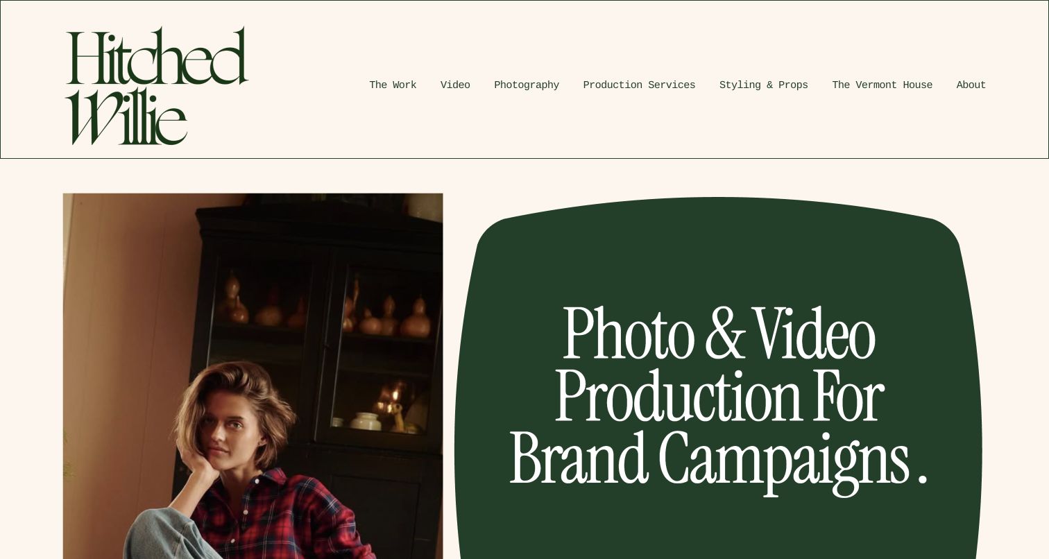
Hitched Willie pairs an oversized, closely stacked wordmark with a warm cream background and a deep green statement panel. The asymmetric opening places campaign photography beside a clear description of photo and video production. Its menu distinguishes video, photography, production services, props and a filming location rather than hiding the business behind a single reel. Farther down, the homepage identifies Maine and New England as its operating context and connects visitors to named projects. The About page introduces Will and Kristin and explains their different roles. Together, these choices give a regional production specialist a recognizable personality while making the practical parts of commissioning a shoot discoverable.
What you can learn
Let the visual identity express the studio's taste, then use literal service labels to explain what it can provide. Geographic context, production support and creative work should reinforce one another instead of competing for the same headline.
Pros
The cream, green and serif treatment creates a coherent editorial character.
Distinct service destinations make the regional production offer understandable.
Cons & considerations
Seven primary navigation choices demand careful handling on smaller screens.
The tall opening pushes geographic detail and project context below the initial view.
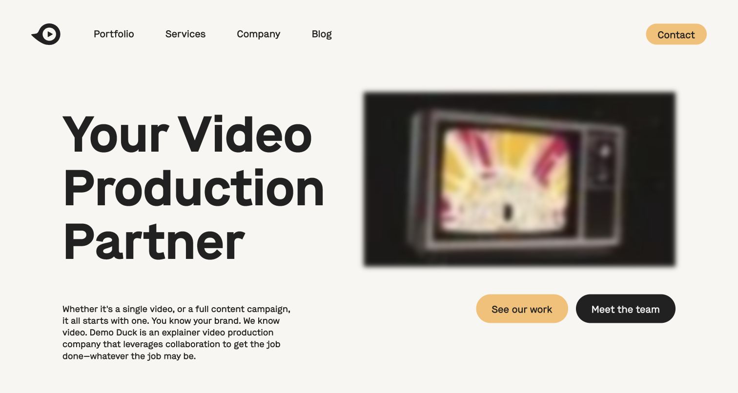
Demo Duck opens with a large left-aligned production-partner statement and a compact paragraph explaining its collaboration model. A framed video preview occupies the other half, with separate work and team buttons underneath. The off-white background and muted yellow accents keep the opening approachable without reducing the scale of the typography. Its navigation uses familiar portfolio, services, company and blog labels, and the lower page distinguishes animation, live action and mixed approaches. That structure is useful for clients who know they need a video but have not chosen a medium. The capture also reveals how much a moving preview's current frame affects the perceived sharpness of the composition.
What you can learn
Pair a plain-language offer with two purposeful next steps: evidence of the work and information about the people. Keep the supporting copy short enough to explain the relationship without making visitors read a production manual before viewing examples.
Pros
Work and team links address two distinct commissioning questions.
The restrained palette gives the large message room to lead.
Cons & considerations
The captured video frame is soft compared with the crisp text.
The oversized headline leaves little project detail in the opening viewport.
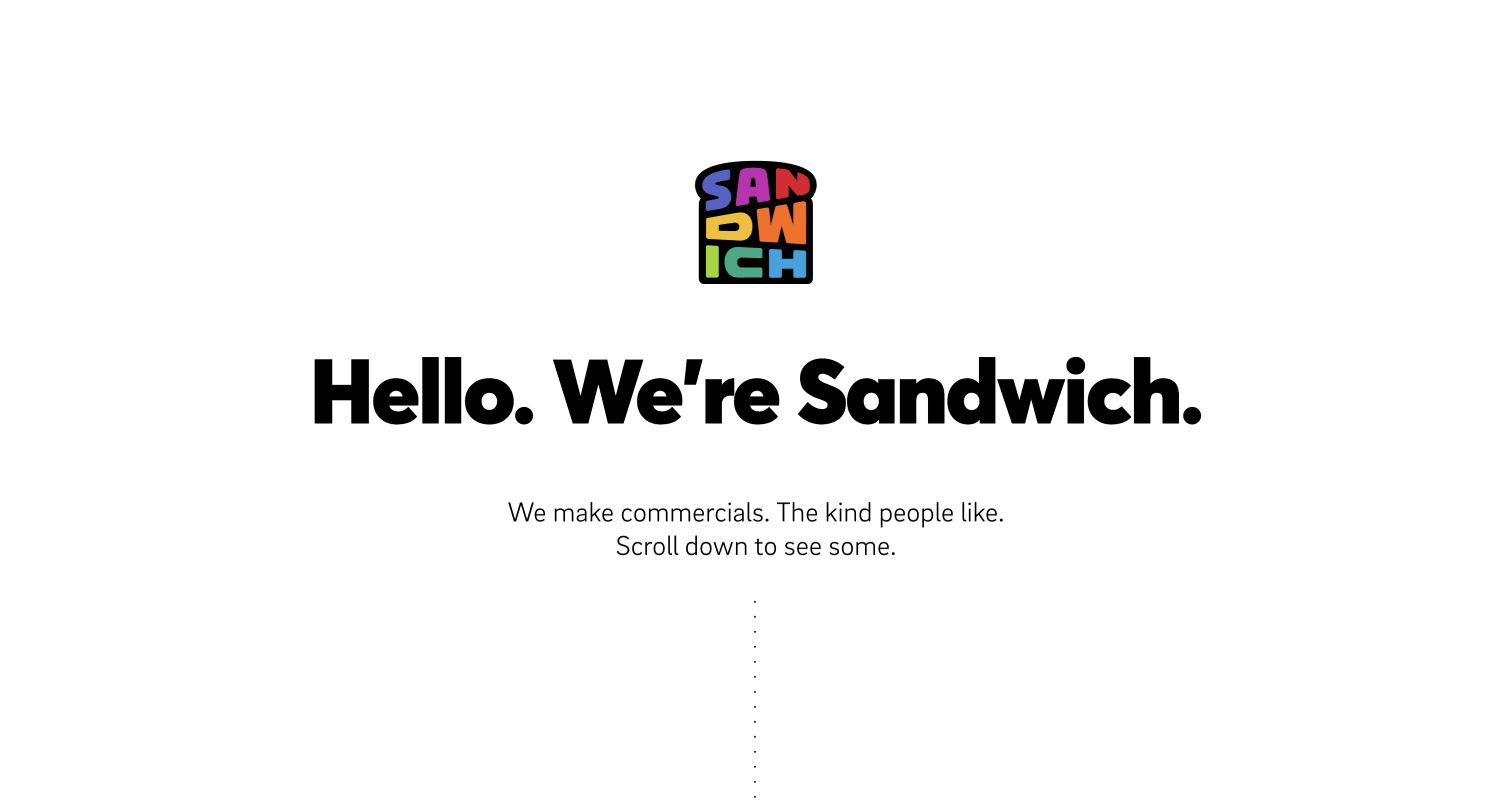
Sandwich begins with a small colorful logo centered over a bold greeting and two short lines about its commercials. A dotted downward cue invites the visitor into the work instead of immediately filling the screen with a reel. The broader page then explains its interest in technology products and presents named projects with client and film titles. Work categories include explainers, testimonials, brand pieces and animation, giving the portfolio more structure than a continuous wall of thumbnails. The opening is particularly useful as a study in tone: the company establishes a human voice using spacing and simple copy, while the detailed project browsing happens farther into the experience.
What you can learn
A memorable introduction can be brief when the portfolio supplies the proof. If the opening asks people to scroll, make the transition to projects obvious and retain direct routes for visitors already looking for a particular style or client example.
Pros
The sparse greeting makes the brand voice easy to absorb.
Named project and format routes give the deeper portfolio useful structure.
Cons & considerations
The first view contains no representative commercial still.
Visitors evaluating capability must move beyond the greeting before seeing evidence.
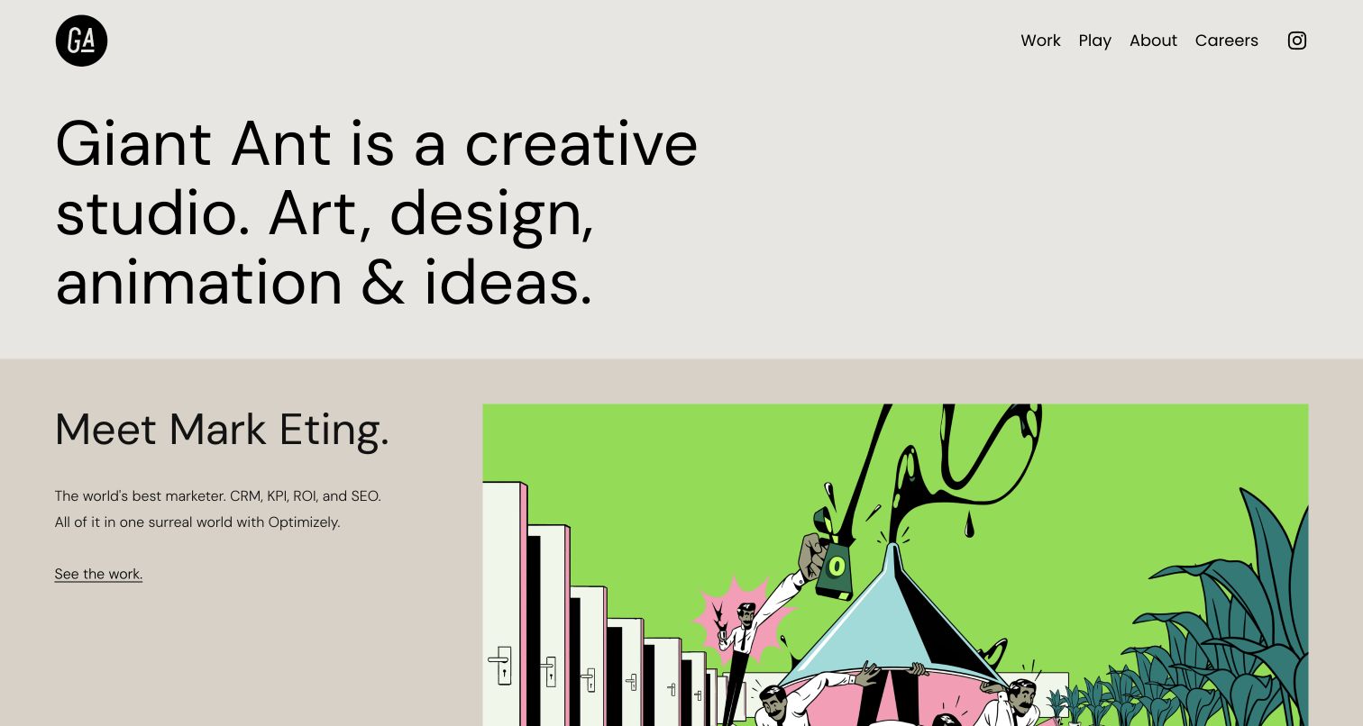
Giant Ant states its creative disciplines in a large, simple sentence, then moves directly into a project story. In the captured opening, a restrained neutral introduction sits above a bright illustrated Optimizely feature. The project name, short explanation and underlined work link appear beside the image rather than being buried inside it. Subsequent homepage entries similarly connect a client, a visual and a small amount of narrative context. This gives the portfolio an editorial rhythm and allows readers to understand why a piece exists before choosing to watch it. The compact header keeps work, experimentation and studio information distinct without creating a dense service directory.
What you can learn
Write a concise setup for each selected project instead of expecting the film thumbnail to explain the brief. Repeating a recognizable text-and-image relationship makes a varied animation portfolio easier to compare without imposing a uniform visual style on the work itself.
Pros
Project explanations make colorful imagery easier to interpret.
Neutral interface styling lets each animation retain its own palette.
Cons & considerations
The long feature sequence requires substantial scrolling.
Immediate pricing or production-process information is not the opening focus.
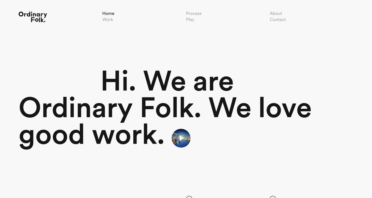
Ordinary Folk uses generous white space and a very large greeting to introduce the studio. Its stacked wordmark sits at the left of a navigation arranged across several compact columns, while a small circular reel preview becomes part of the main sentence. The page then offers separate routes to featured work and the motion-design process. Project entries retain names and client labels, and the menu also makes room for experimental play. The contrast between the immense typography and tiny moving-image invitation is memorable, but it deliberately postpones a conventional portfolio grid. For a production website, the useful idea is the separation between personality, finished work and an explanation of how the studio works.
What you can learn
Use a typographic opening only when it leads clearly into substantive work. Give process and experimental projects their own destinations so a prospective client can distinguish commissioned output from the studio's exploratory creative practice.
Pros
The sparse layout gives the studio a distinctive introductory voice.
Work, process and play are clearly differentiated destinations.
Cons & considerations
The small reel target has less visual prominence than the headline.
Very large text delays detailed project evidence until farther down the page.
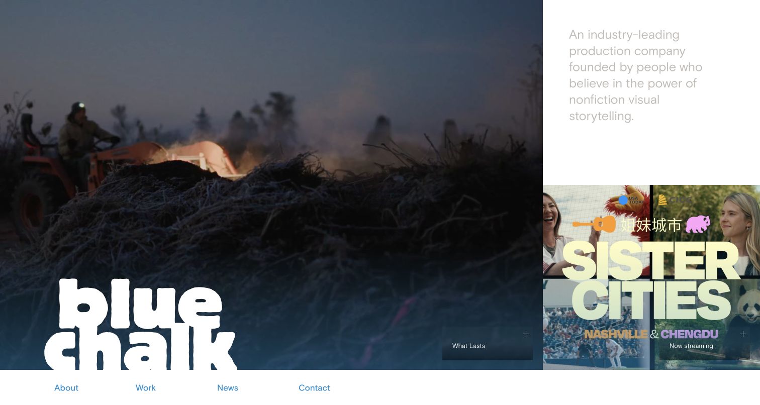
Blue Chalk makes the opening feel like a film-selection surface. A large documentary image fills most of the screen, carrying the oversized white wordmark near its lower edge and a discreet project label nearby. A narrower column combines the company's nonfiction positioning with another film tile, while the primary navigation runs in a separate strip along the bottom of the captured view. This composition gives individual stories more space than generic service claims and makes the studio's subject matter immediately tangible. It also demonstrates the tension between immersive film imagery and the smaller interface labels needed to move through a production portfolio.
What you can learn
Let a small number of strong film images establish editorial direction, but keep titles and destination labels legible independently of those images. A portfolio can feel cinematic while still explaining which story a visitor is about to open.
Pros
The unequal image columns create a strong documentary-focused hierarchy.
A separate navigation strip avoids covering the main film still with menu text.
Cons & considerations
Small project labels can be easy to overlook against imagery.
Light positioning text on white is visually subdued in the captured view.
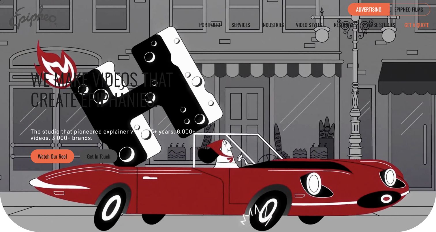
Epipheo places its introductory message over a large animated scene, with an orange reel button and a secondary contact route. The header distinguishes its advertising and film work, then provides portfolio, service, industry and style destinations. Below the expressive opening, the page becomes much more explanatory: it describes the studio, introduces different production styles and organizes content around the audience's journey. That combination is useful when a buyer needs both creative reassurance and a vocabulary for discussing the project. The captured animation frame also exposes a practical weakness of cinematic backgrounds: dark headline lettering crosses dark parts of the scene and loses some separation from the action.
What you can learn
Use the reel to demonstrate range, then provide concise written guidance for people still choosing a format. Protect the message with a dependable text surface or contrast treatment rather than assuming every frame will support the same overlay.
Pros
The service and style routes help inexperienced buyers orient themselves.
Reel and inquiry actions offer both exploratory and direct next steps.
Cons & considerations
Text contrast varies against the animated opening scene.
The extensive lower-page explanation can compete with focused portfolio browsing.
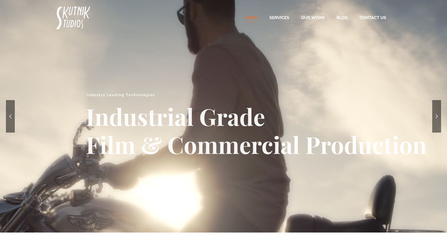
Skutnik Studios leads with a full-width cinematic motorcycle scene, a white wordmark and a large film-production statement. Its compact header keeps services, work and contact easy to identify. The longer homepage then becomes explicit about its New England focus, separating commercial production, corporate work, animation, visual effects and creative direction. Geographic sections describe the regions it serves, giving the broad visual opening a more practical counterpart. This makes the site useful as an example of combining a showreel-like first impression with a substantial service inventory. The interface also shows the limits of that approach: the opening image and large serif lettering compete for attention before the more specific regional explanation appears.
What you can learn
Follow cinematic imagery with a concrete map of capabilities and service territory. Organize those details around commissioning needs rather than relying on equipment terminology alone, and keep a direct work route visible for readers who prefer examples to descriptions.
Pros
The deeper service structure explains several distinct production disciplines.
Regional information connects the portfolio to a defined operating area.
Cons & considerations
White lettering crosses bright portions of the captured film frame.
The lengthy capability and location sections require strong editorial maintenance.
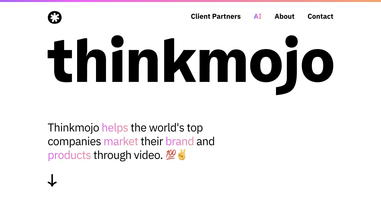
Thinkmojo uses an extremely large black wordmark as the main graphic element of its opening. Beneath it, a compact proposition highlights selected words in pink and finishes with informal symbols, while a downward arrow points toward the work. The navigation separates client partnerships, studio information and contact from the introductory message. Farther down, named Salesforce, Zendesk and Square entries pair videos with short descriptions of their purpose, followed by a broader collection of project titles. The result is a portfolio that establishes personality before showing production evidence. The useful feature is the connection between video work and the product or communication problem it explains.
What you can learn
Introduce the studio in one recognizable voice, then label projects by what they communicate. A small amount of context around a reel or thumbnail helps buyers distinguish product explanation, launch content and broader brand campaigns without reading lengthy case studies first.
Pros
The opening has a clear typographic hierarchy and memorable brand presence.
Named project descriptions add context beyond attractive moving imagery.
Cons & considerations
The oversized wordmark consumes much of the initial screen.
The informal visual tone may need balancing for more formal procurement audiences.
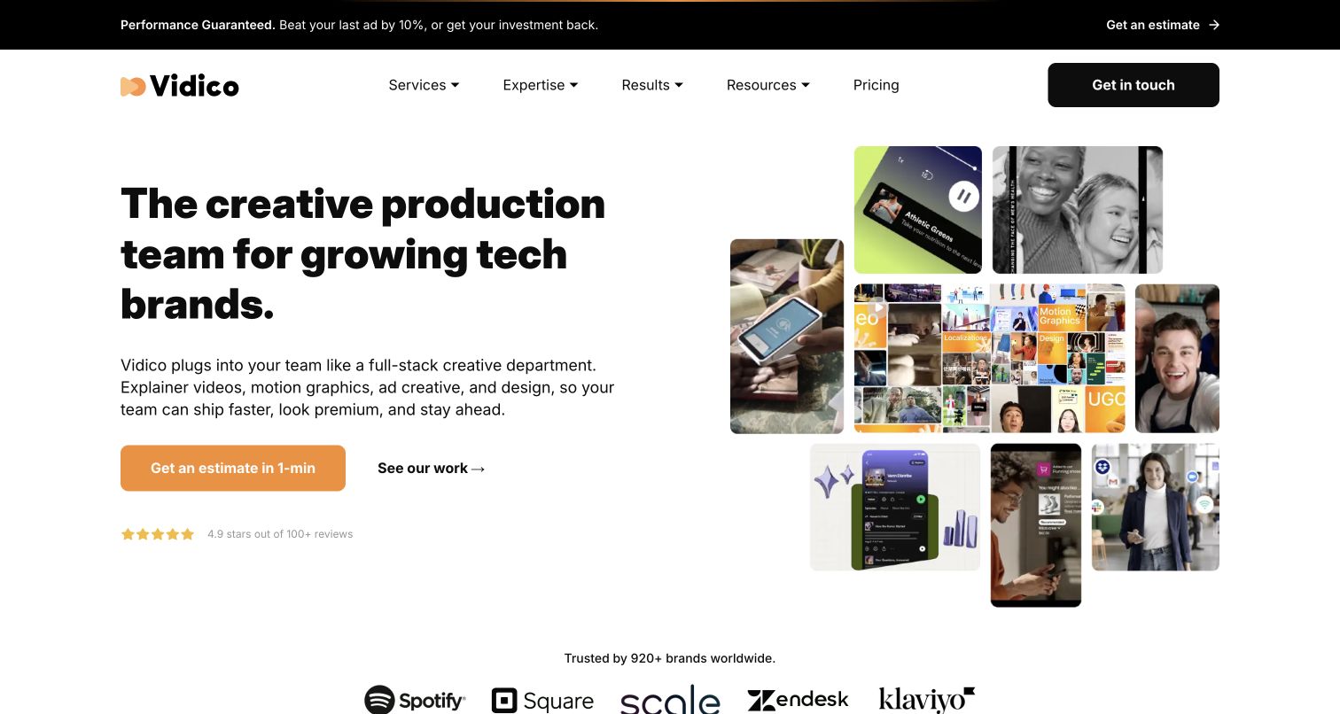
Vidico combines a direct technology-brand headline with a collage of project stills in different proportions. The arrangement suggests campaign range before the portfolio. An orange estimate button and a quieter work link create a clear action hierarchy, while pricing remains visible in the main navigation. The lower page groups examples by industry and connects testimonials to fuller case studies. For a studio website, this is a useful model for presenting production as a coordinated collection of outputs rather than a single finished film. The promotional strip and rating claims add another layer of persuasion, although they also increase the amount a first-time visitor must evaluate.
What you can learn
Show representative output formats alongside a specific audience promise, then let visitors choose between viewing work and discussing scope. Keep commercial claims clearly attributed to their source and avoid letting promotional bands overwhelm the evidence that supports the offer.
Pros
The collage shows a varied production range without hiding the main headline.
Estimate, work and pricing routes support different levels of purchase readiness.
Cons & considerations
The promotional strip competes with the primary navigation and offer.
Small collage panels cannot communicate full project context on their own.
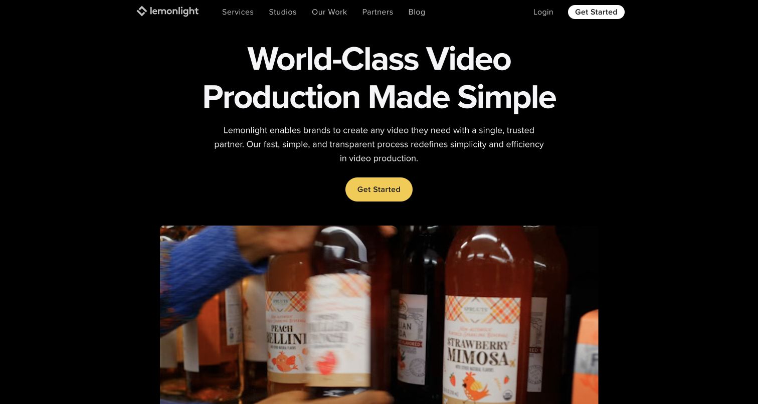
Lemonlight places a white headline and short supporting paragraph on a black background, followed by a yellow action button and a contained video preview. The reel sits below the text instead of running behind it, so changes in the footage do not disrupt the main message. The navigation separates services, studios, work and partner information, and the lower page provides routes for product, testimonial, explainer, event and other video types. That combination helps a production business explain its range of deliverables. The homepage emphasizes simplicity, but its extensive client and portfolio sections still require visitors to decide which evidence is most relevant to their own brief.
What you can learn
Separate the written proposition from the reel so both can remain clear. When the service range is broad, use recognizable output categories to organize the portfolio and connect each category to examples rather than only describing production capacity.
Pros
The contained reel preserves stable contrast for the introductory copy.
Video-type links translate a broad offer into recognizable project needs.
Cons & considerations
The opening promise remains broad until the visitor explores the categories.
A large volume of client and project material can make comparison slower.
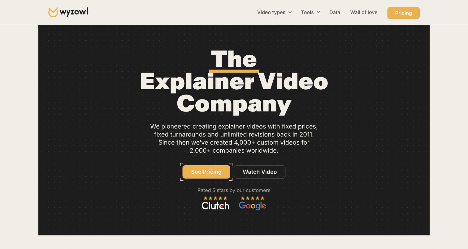
Wyzowl gives its explainer-video positioning a compact, centered stage inside a dark panel. Yellow accents connect the logo, headline underline and pricing action, while a secondary video link offers a creative preview. The introductory paragraph emphasizes the studio's stated approach to pricing, turnaround and revisions. Further down, separate cards explain explainer, demo and testimonial videos before the page moves into process promises, examples and questions. This is useful for a production website that needs to reduce uncertainty around commissioning as well as demonstrate visual taste. The captured opening stays readable without a large autoplay scene, although the supporting claims and ratings still need readers to inspect the underlying details.
What you can learn
Bring commercial questions into the navigation instead of making every visitor request a call first. Pair those routes with representative work and explain the scope behind any broad promise, especially when different video types have different production requirements.
Pros
The pricing route is easy to identify in both header and hero.
Output categories explain the difference between common video commissions.
Cons & considerations
The opening contains little direct visual evidence of finished animation.
Broad process promises need careful qualification on their destination pages.
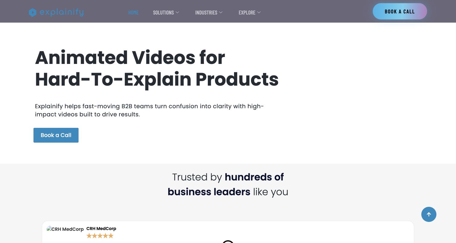
Explainify opens with a clear statement about difficult-to-explain products and a short paragraph identifying its B2B audience. A prominent call-booking button supplies the next step, while the header separates solutions, industries and portfolio exploration. Lower on the page, customer quotations, production styles and a three-stage process add detail to the initial promise. The capture is useful precisely because it is not dominated by a cinematic reel: the site's main organizing idea is the buyer's communication problem. It also reveals a limitation of relying heavily on supplementary media and testimonial modules, with a missing avatar visible near the bottom of the captured view and little finished work in the opening.
What you can learn
Describe the customer's communication problem in language they recognize, then connect it to relevant project examples. Consultation prompts should support that explanation rather than substituting for evidence of the studio's work or the practical steps in its production process.
Pros
The headline clearly identifies the kind of problem the studio addresses.
A simple process sequence helps visitors understand the proposed collaboration.
Cons & considerations
Repeated consultation prompts can make self-directed exploration feel secondary.
A missing testimonial image is visible in the captured source view.
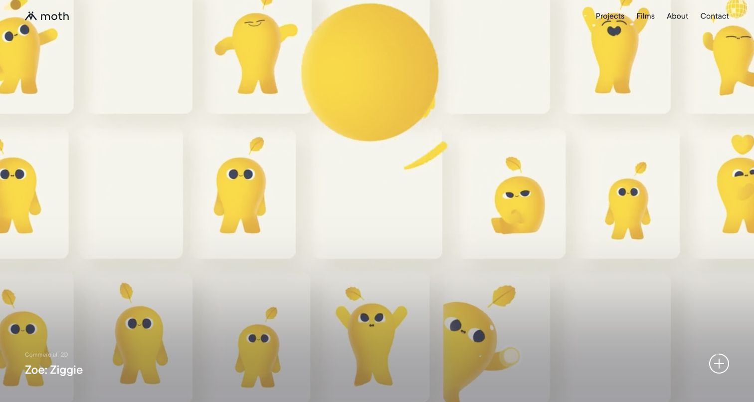
Moth devotes almost the entire opening to a colorful character-animation project. A small logo and four navigation links remain at the top, while category labels, the project title and a circular details control sit near the bottom. In the captured frame, repeated yellow characters form the visual system rather than a separate decorative hero graphic. The broader homepage connects this immersive presentation to project categories, a showreel and a short explanation of the independent London studio's character, branding and motion work. This is a useful portfolio approach when a distinctive visual voice matters more than an immediate service list. Its success still depends on keeping project identity readable over changing scenes.
What you can learn
Allow the project artwork to establish the studio's aesthetic, but retain a persistent title and a clear route into the work. Category labels can provide just enough orientation before a fuller explanation of the commission, technique and creative role.
Pros
The project fills the screen without competing promotional panels.
Compact category and title labels give the animation useful context.
Cons & considerations
Small overlaid text can become less legible against changing artwork.
The studio's service explanation appears after the immersive opening sequence.
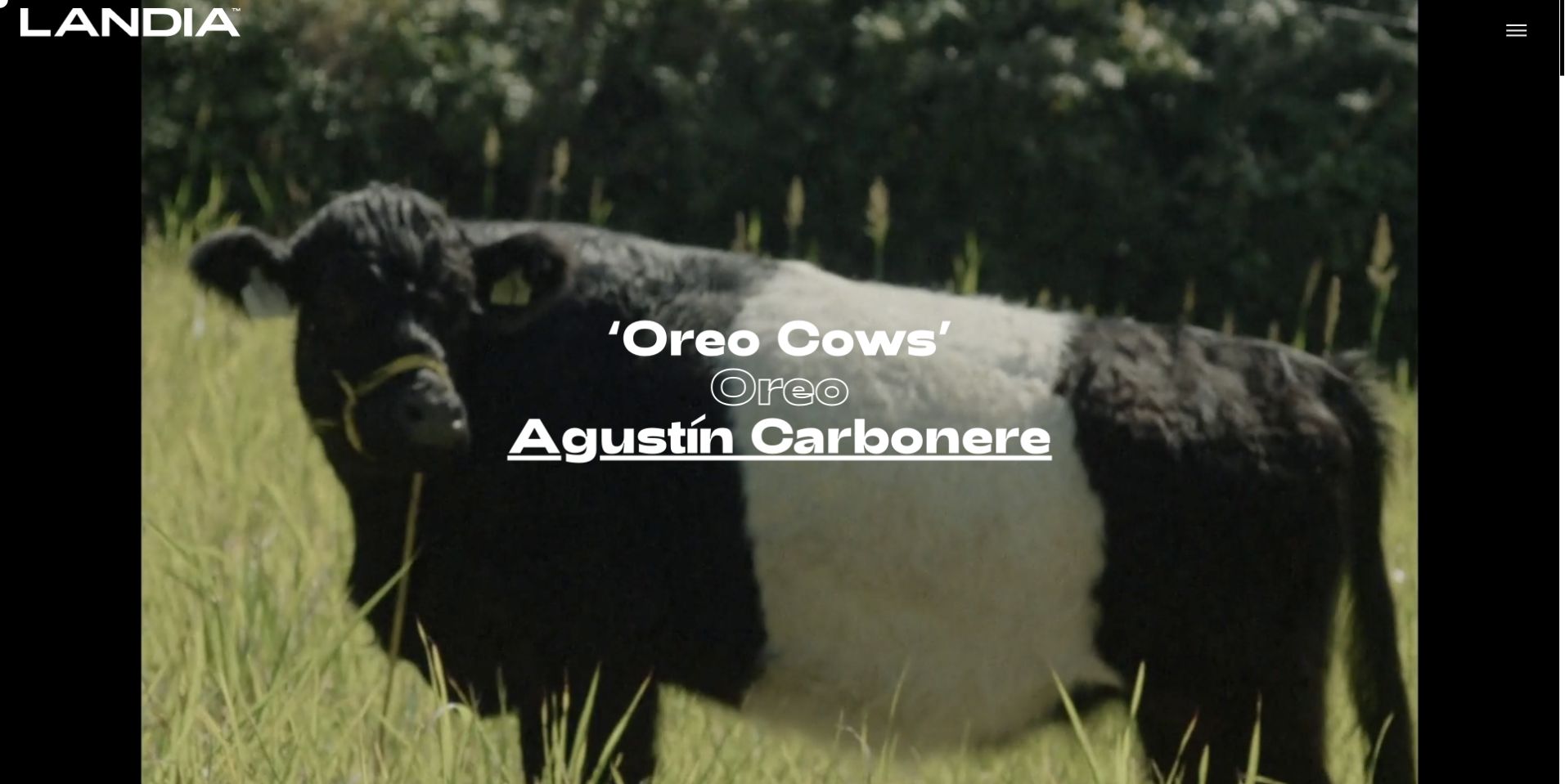
Landia's preserved homepage capture centers a film image beneath three pieces of information: the project title, the client and the director. The large white wordmark remains in the upper left, balanced by a compact menu control on the opposite side. Black margins frame the moving-image area, giving it the feeling of a screening surface rather than a conventional service page. For a video-production collection, the important detail is the hierarchy of credit. The film title and named director form part of the initial composition. This earlier source view therefore provides a useful comparison with studios that lead with a broad company proposition.
What you can learn
Attach meaningful credits to featured films and make the relationship between project, client and creative lead understandable. If the homepage is intentionally immersive, ensure the menu provides a straightforward route to the wider roster and practical company information.
Pros
The credit hierarchy connects the film to a named creative lead.
The restrained frame keeps most of the screen available to the work.
Cons & considerations
The compact menu hides broader navigation until it is opened.
Centered white credits rely on the film frame maintaining enough contrast.
Platform source: Direct public page source; named library reference. Public page source reviewed on 2026-11-03 references the named GSAP library script https://www.landia.com/us/wp-content/themes/landia-theme/assets/js/vendor/gsap.min.js. This is evidence of a loaded frontend component; it does not identify every animation, prove runtime execution, or describe the whole organization’s stack. Platform evidence is separate from the direct website screenshot and is not a complete current infrastructure audit.
Kegan is a freelance web designer and developer with 15+ years of experience helping businesses turn complicated website requirements into clear, maintainable digital experiences. He works directly with clients from planning and design through development, launch, and ongoing support.
For video production website design, his development approach focuses on genuine film and animation portfolios, clear project credits, production-service scope, regional coverage and qualified creative-brief inquiries. The scope can be a targeted improvement or a complete custom build, with responsive layouts, thoughtful content structure, and integrations chosen around the people using and maintaining the site.
Show 3 other video production website designersHide other video production website designers
Plan the website around the work clients need to understand
Choose the portfolio structure before choosing a reel treatment
Start by identifying what a prospective client needs to compare. A director-led production company may organize work around a roster, while an animation studio may emphasize style and a regional team may need to explain locations, crew and production support. Those are different information structures, even when all three use striking film imagery. Write a short list of the decisions visitors should be able to make before they contact the team.
Choose a small set of projects that demonstrate those differences honestly. For each one, record the approved title, client context, production role, useful formats and credits. Do not let a recognizable client logo imply that the studio handled work beyond its documented contribution. A short explanation can make a beautiful frame substantially more useful, particularly when the film's purpose is not obvious without sound.
Then decide how the homepage introduces that library. A reel can show range, a single project can establish a strong voice, and a service-led opening can help less experienced buyers. Keep direct portfolio navigation available in every approach. Avoid forcing visitors to watch a complete sequence before discovering the work relevant to their brief, and preserve sensible links when the featured campaign changes.
Treat motion as content with practical viewing requirements
Plan the video experience alongside the written content rather than adding it after the layout is complete. Identify which clips are decorative, which demonstrate the studio's work and which carry information that visitors must understand. A silent background loop and a full case-study film have different needs. Essential information should also exist in readable text, and films that depend on speech should have appropriate captions or an equivalent accessible explanation.
Choose useful poster frames and keep the page understandable before playback begins. Put controls where viewers can recognize them, avoid unexpected audio and account for people who prefer reduced motion. Test the contrast of overlaid titles against more than one attractive frame; a label that works over a dark scene can disappear when the footage cuts to daylight. A solid text panel or separate caption can be more dependable than an increasingly strong shadow.
Set a practical media budget and decide what loads immediately. The opening should not require every portfolio film to download before navigation responds. Maintain alternate aspect ratios and thumbnails where they improve presentation, without suggesting that a cropped preview is the complete work. Record who can replace the media and check captions, credits and destination links whenever a new project is featured.
Connect creative interest to a useful production conversation
The contact journey should help someone describe a project without demanding a finished production plan. Useful early information may include the intended audience, purpose, deadline, approximate scope and whether the client already has a brief. Explain which details are optional and give people a straightforward way to ask an initial question. Do not make a form imply that a date, quote or crew booking is confirmed merely because it was submitted.
Support that conversation with a clear account of how the studio works. Describe the stages the team actually provides, who handles approvals and which deliverables are discussed during scoping. If the website publishes starting prices or turnaround expectations, explain their scope and keep them reviewed. Avoid copying a competitor's broad promise when the studio's own projects vary substantially in complexity.
Assign responsibility for the portfolio after launch. Project permissions, collaborator credits, showreel dates, team information and production territories can all change. Keep private client documents and submitted briefs outside the public media library. Review the site with realistic conditions such as a paused reel, a missing thumbnail, a long project title or a visitor using a narrow screen. The goal is a clear path from appreciating the work to starting an informed conversation.
The editing job behind the design
Choose a publishing system that keeps films and credits maintainable
Use structured project records for titles, roles, credits, formats and media. A team should be able to update a film without recreating the whole homepage or losing the information that explains its contribution.
Choose video delivery and loading behavior around the actual viewing experience. Poster frames, explicit playback controls and useful text matter as much as visual transitions, especially when a visitor cannot or does not want to play motion.
Keep client briefs, production documents and inquiry records private. The stack evidence below comes from bounded public-page audits; it does not describe a studio's editing tools, internal workflow or complete backend.
Our WordPress website examples offer a separate look at publishing approaches. A visible platform label is evidence for that named page, not a guarantee that the same system will suit your requirements.
Before the public launch
Video-production website brief checklist
State the studio's actual production disciplines and service territory.
Choose portfolio categories that help visitors compare relevant work.
Give featured films clear titles and approved client context.
Describe the studio's real role and credit collaborators accurately.
Provide a useful poster frame and a clear route to each complete project.
Keep navigation and essential information usable without video playback.
Plan captions, readable overlays and reduced-motion behavior.
Avoid unexpected audio and unnecessary automatic media downloads.
Explain the production process and the scope of any pricing statements.
Ask only for information needed to start a useful inquiry.
Keep submitted briefs and client files out of public assets.
Assign owners for project permissions, credits, team details and media updates.
These checks are a project checklist, not a performance, legal, security, or accessibility certification. Test real journeys with the people responsible for the website before making claims about the result.
Sources & editorial method
How this collection was selected and reviewed
This collection contains 15 distinct public production and animation studio properties, matching the original saved industry draw. Fourteen direct browser captures were prepared for this collection. Landia reuses a verified earlier capture with its original November 1 date and new video-production commentary. Every capture was inspected. Reviews address visible website design and source-page information rather than verifying promotional performance claims. Broad public technology-audit attempts are recorded separately; a partial or blocked scan does not establish a complete stack, and a successful browser capture does not bypass a scanner's access restrictions. No inquiry, booking, account action or real form submission was made.
Each example links to its actual source page. Screenshots are direct browser captures with their own capture dates; moving imagery, announcements and live designs can change. The notes describe observable design choices and conditional tradeoffs, not measured traffic, conversion results, service quality, or accessibility conformance.
Technology labels use public page metadata, asset evidence, or explicitly cited platform documentation. Platform documentation is not a complete current deployment audit. A component reference may be legacy or unused; it is not a complete backend inventory. Unknown stacks are omitted. These sites are editorial examples, not our client portfolio.
Written, Edited and Curated are separate editorial records, not timestamps advanced by a rebuild. Website designs and imagery belong to their owners. See our editorial standards or suggest a correction.
Questions worth asking
Video Production website design questions
Should a production website open with a showreel?
A reel is useful when it demonstrates the studio's range quickly, but it is not mandatory. A featured project, a clear service introduction or a concise brand statement can also work. Keep direct routes to relevant projects and contact information available without requiring playback.
What information belongs with a portfolio film?
Include the approved project title, client or commissioning context, the studio's actual role and relevant credits. Explain enough of the brief to make the work understandable, and avoid implying responsibility for parts of the production the studio did not handle.
How should live action and animation be organized?
Separate them when the distinction helps clients find relevant examples or understand the production process. A studio with a smaller portfolio may use simple labels within one work library instead of creating several thin service sections.
Should a studio publish prices on its website?
Publish pricing only when the business can explain the scope and keep it accurate. A useful alternative is to describe the factors that affect a quote and what information helps start the conversation. A contact form should not imply an agreed price or confirmed booking.
Are these studios ranked by production quality or campaign performance?
No. The collection and its Editors Choice assess public website presentation and communication. Screenshots and public source reviews do not establish service quality, creative suitability, commercial outcomes or independently verified performance claims.