Best Payload Websites of 2026 (20 Real-World Examples)
Twenty distinct public websites and campaign properties with documented Payload associations, genuine captures and original design reviews.
A useful content system makes room for different stories without losing structure. These Payload examples range from local campaigns and communities to catalogues, portfolios and public-service information, with the evidence kept specific to each property.
Payload's official documentation describes a TypeScript framework that combines a configurable admin interface, data models and APIs with a Next.js application. The visible website is still a design decision. A developer can use the same underlying content tools for a product catalogue, a magazine, a nonprofit service directory or a campaign hub, provided the model reflects the actual work editors and visitors need to do.
This collection begins with five recognizable brands through explicitly named properties: Mazda New Zealand, ASICS FrontRunner, Blue Origin's Club for the Future, Hello Bello and a German Sonos campaign. Those scopes matter. A vendor case study about an ambassador programme does not prove the brand's retail checkout uses the same system. We reviewed the public pages and captured the actual designs, while recording documentary implementation evidence separately from bounded source observations.
Before the examples
What makes good Payload website development in 2026?
Model the information before arranging the page
Start with the things editors maintain: products, projects, people, locations, issues or events. Payload collections group records around a shared schema. Give repeated information a clear home instead of embedding the same detail in several page sections. Then decide how a page composes those records for a particular visitor.
Keep the creative surface separate from essential facts
Campaign art can change frequently; eligibility, prices, locations and availability need dependable structure. Mazda's campaign and Hello Bello's seasonal panels show why the visual story should not be the only place essential information appears. Define which fields can be expressive and which need consistent labels, validation and ownership.
Design the editing experience as part of the website
An attractive launch page is only one moment in a publishing workflow. Editors need understandable field names, useful defaults, realistic previews and clear distinctions between unfinished and public content. Ask someone who will maintain the site to create a real project or issue, including a long title and a missing optional image, before calling the model complete.
Treat publishing and recovery as deliberate states
Payload supports configurable versions and drafts. Decide which records need history, who can publish them and what recovery should mean when a campaign changes unexpectedly. A retained version is useful only when the team can identify the right record and understand the effect of restoring it.
Study the relationship between each opening screen and its deeper content: campaign and catalogue, preview and membership, visual map and readable explanation. The twenty examples are separate public properties, not twenty pages from one brand.
We start with five recognizable brands or organizations: Mazda New Zealand, ASICS FrontRunner, Blue Origin — Club for the Future, Hello Bello, Sonos — German campaign. Each attribution applies to the named website property, not every product or website belonging to its organization. This is a curated reading sequence, not a measured ranking.
Mazda New Zealand gives its current campaign almost the entire opening screen. An illustrated garage surrounds a red vehicle, while widely spaced white lettering and a burgundy action sit directly over the artwork. The black header remains comparatively restrained, keeping models, finance and dealer routes available without competing with the scene. This combination lets a local promotion feel distinctive while retaining the familiar structure of an automotive brand. Payload's case study concerns this New Zealand website specifically; it does not establish the technology used by every Mazda market or service.
What you can learn
Treat a campaign as a replaceable content layer inside stable navigation. Editors should be able to change the visual story while visitors can still find the practical model and dealer information they expected.
Pros
The hero gives one campaign a strong visual focus instead of dividing attention across several offers.
Persistent practical navigation keeps the image-led introduction connected to the wider shopping journey.
Cons & considerations
Large artwork carries much of the meaning, so a weak replacement could quickly flatten the experience.
The opening promotion postpones detailed vehicle comparisons until visitors choose a deeper route.
Platform source: Scoped documented Payload implementation. Vendor documents Mazda New Zealand website migration to Payload; scope is the New Zealand site, not every Mazda property. Documentary evidence does not prove a complete current backend inventory. Platform evidence is separate from the direct website screenshot and is not a complete current infrastructure audit.
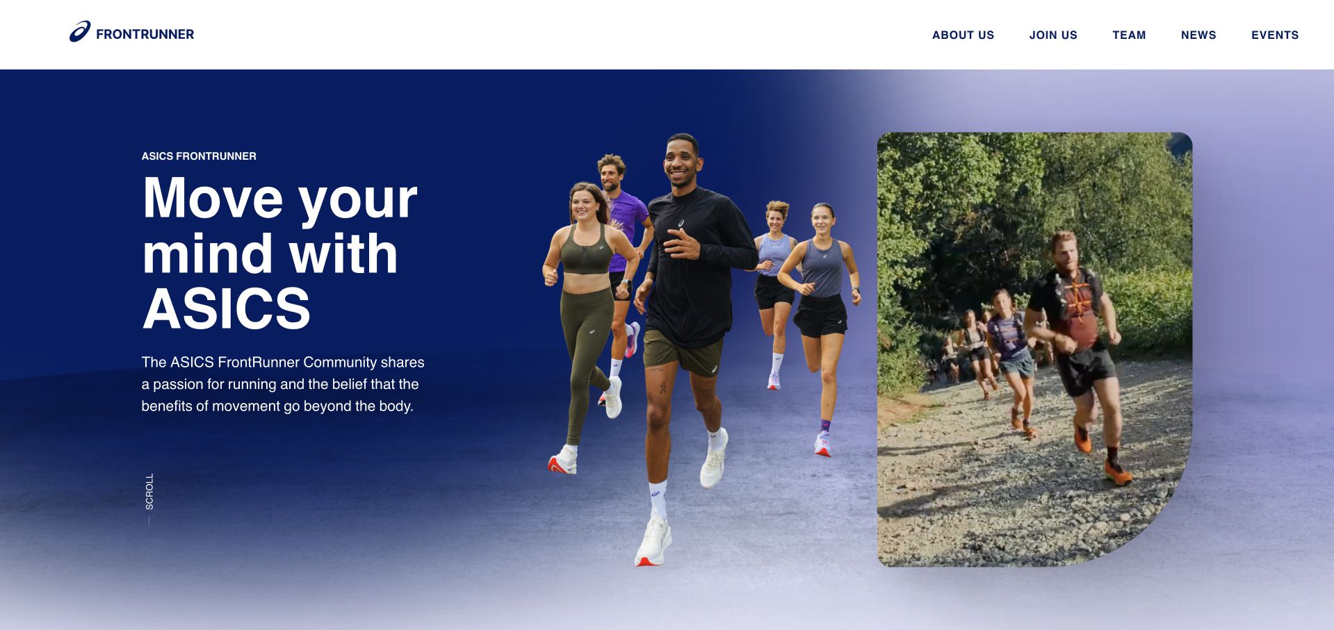
ASICS FrontRunner introduces a running community with a blue and lavender field, a cutout group of runners and a tall rounded video panel. The composition feels active without turning the first screen into a product grid. About, joining, team, news and events provide an immediate programme structure; profiles and a community map make that structure more concrete further down. The retail connection remains visible but distinct. The Payload evidence identifies the multilingual FrontRunner ambassador website, so this review does not extend the claim to ASICS checkout or its complete international retail estate.
What you can learn
Give a community property its own information model. People, locations, stories and events need consistent relationships, while shopping links should remain recognizably separate from participation in the programme.
Pros
Real people and motion establish the programme's social character before a visitor reads lengthy explanatory copy.
The short navigation uses recognizable participation and editorial categories rather than an ambiguous campaign menu.
Cons & considerations
The layered hero asks photography and video to remain well coordinated as content changes.
Visitors seeking eligibility details must continue beyond the broad invitation shown at the top.
Platform source: Scoped documented Payload implementation. Vendor documents the multilingual ASICS FrontRunner ambassador website, not the ASICS retail storefront. Documentary evidence does not prove a complete current backend inventory. Platform evidence is separate from the direct website screenshot and is not a complete current infrastructure audit.
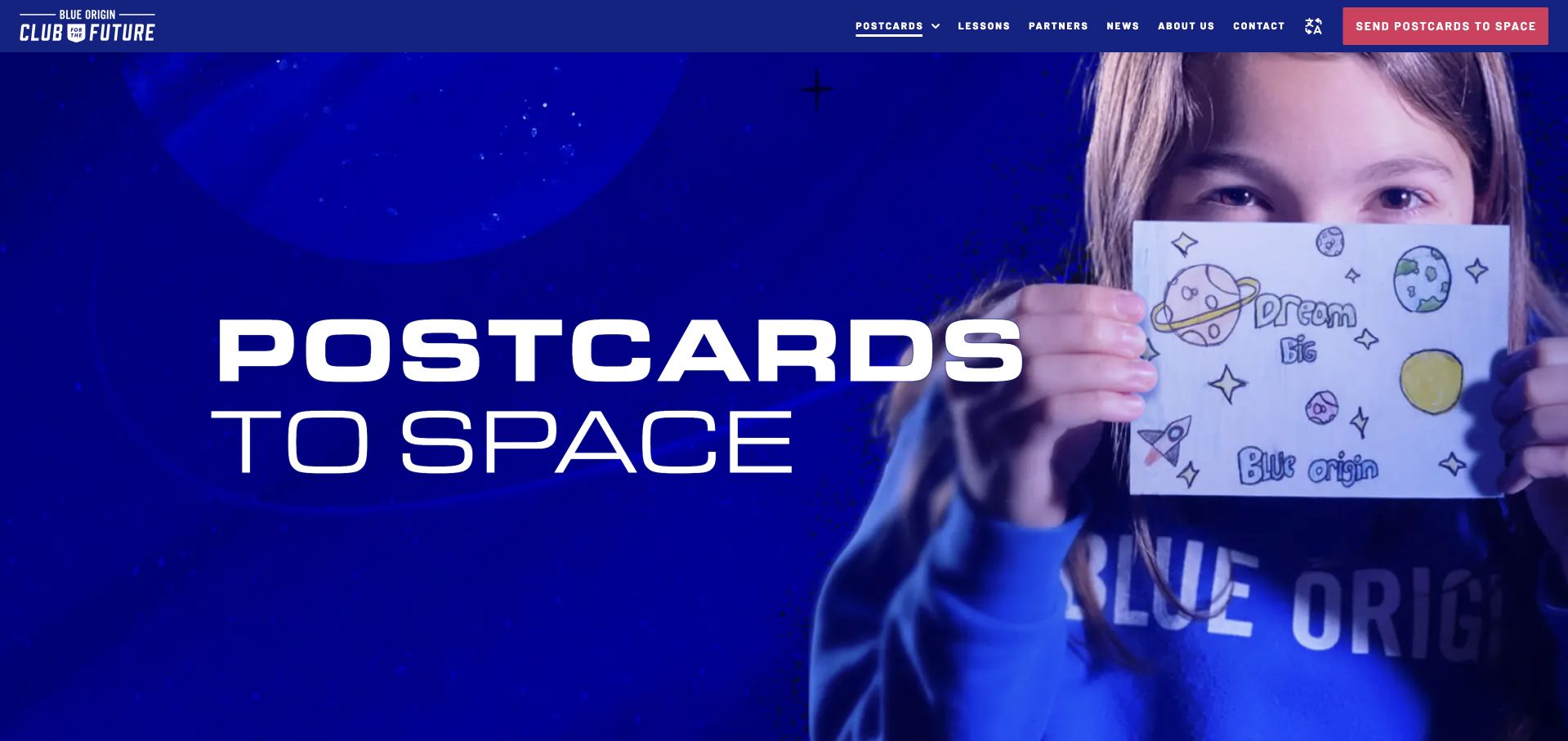
Club for the Future makes a space programme understandable through a child's hand-drawn postcard. Deep blue surroundings and an oversized Postcards to Space heading establish the theme, while a coral action points toward participation. The page then separates ways to take part and explains the journey through a sequence of flight and return stages. That progression connects an exciting promise to something a family or classroom can actually understand. Payload documents this nonprofit website and postcard tool. The broader source audit returned HTTP 429; the clean browser capture and documentary association remain distinct from that unavailable automated observation.
What you can learn
Anchor an unfamiliar process in one recognizable object, then explain its stages. Each step should answer what the participant does and what happens next without requiring an account or submission to understand the proposition.
Pros
The postcard photograph gives the space theme an approachable human scale.
Numbered stages help the page move from inspiration toward a practical explanation.
Cons & considerations
The hero cannot communicate every participation condition on its own.
The programme association does not demonstrate Blue Origin's corporate website technology or every current tool detail.
Visible tech stack
Earlier / documented evidence
Payload
Platform source: Scoped documented Payload implementation. Vendor documents the nonprofit website and student postcard tool; scope is Club for the Future, not Blue Origin corporate infrastructure. Documentary evidence does not prove a complete current backend inventory. Platform evidence is separate from the direct website screenshot and is not a complete current infrastructure audit.
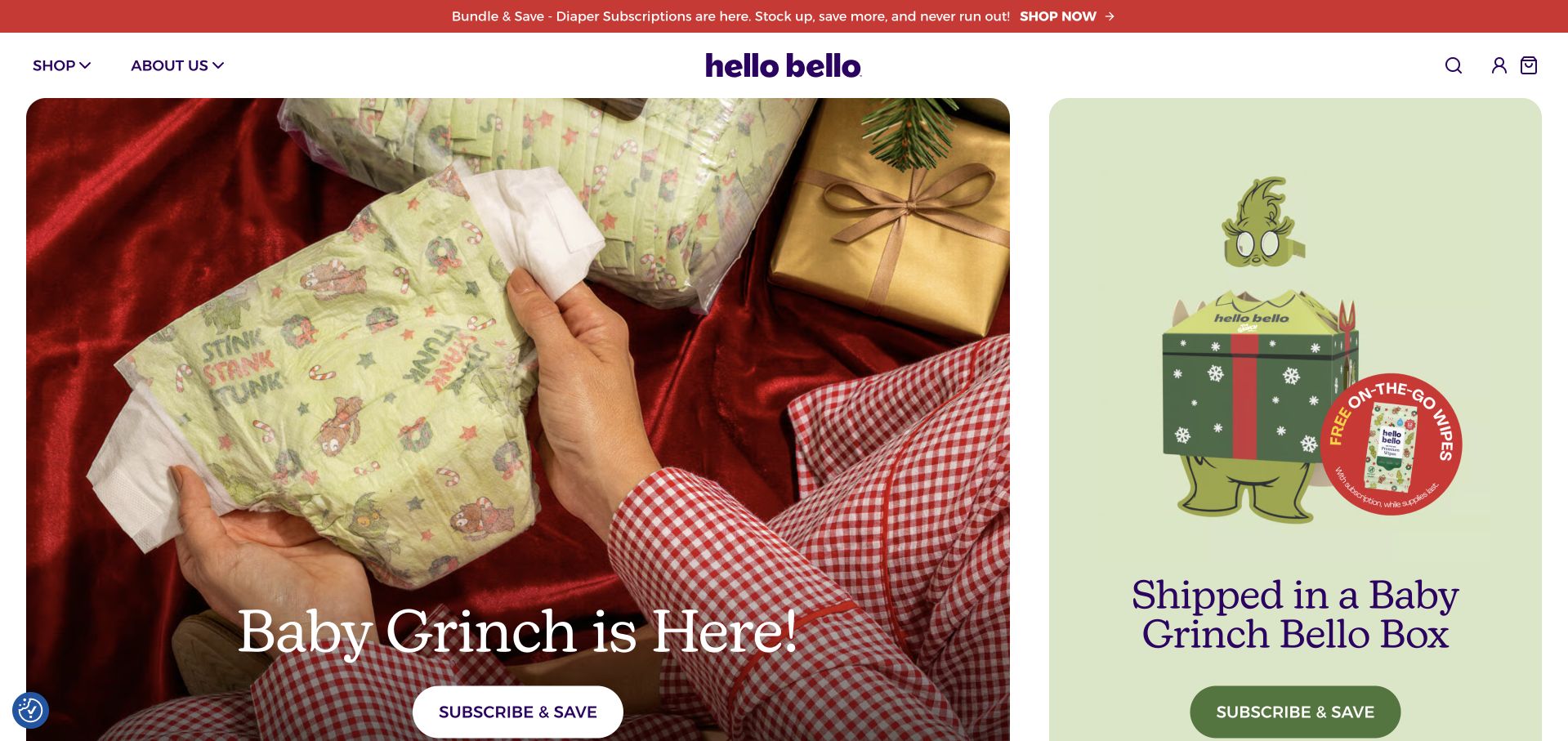
Hello Bello's homepage combines a centered purple identity with playful seasonal merchandising. A festive diaper photograph and a bright illustrated package occupy unequal rounded panels, creating a magazine-like campaign composition rather than a uniform product grid. Subscription actions recur, while lower sections explain product features, prices and what a bundle contains. The useful design tension is between character-driven discovery and the practical explanation a recurring purchase requires. Payload's published story documents the brand's website and app content implementation; it is a historical implementation association, not a claim to have inspected its complete current commerce backend.
What you can learn
Model campaign artwork separately from subscription facts. Editors can refresh the playful surface, but inclusions, billing expectations and product details need a stable place that remains easy to find across seasonal changes.
Pros
Distinctive illustrations and photography make related campaign panels feel connected without making them identical.
Repeated subscription routes are supported by more detailed product and bundle content further down.
Cons & considerations
The opening seasonal story can distract from practical comparisons between purchase options.
Maintaining several promotional surfaces requires care when an offer or licensed campaign ends.
Platform source: Scoped documented Payload implementation. Vendor case study documents ecommerce website and app content implementation; association is documented, not a complete current backend audit. Documentary evidence does not prove a complete current backend inventory. Platform evidence is separate from the direct website screenshot and is not a complete current infrastructure audit.
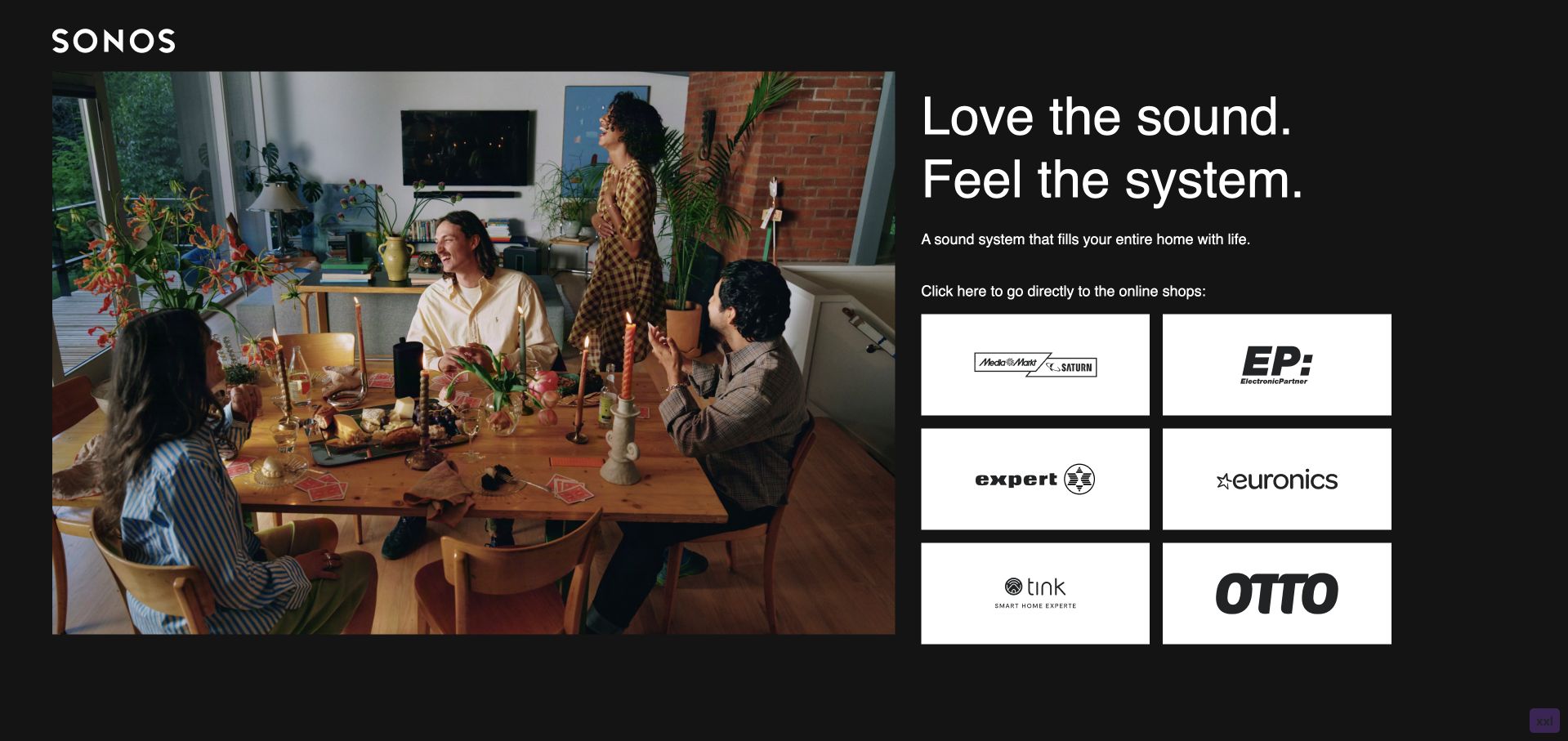
The German Sonos campaign uses a black background and large white wordmark to frame a warm dinner scene. Beside the photograph, a short listening proposition leads into six prominent retailer tiles. The layout makes the next step unusually explicit: visitors can understand the connected-room idea and then choose a seller. Lower content explains configurations and setup rather than pretending the campaign is a full catalogue. Payload documents this named German campaign hub. The association applies to listening-perfected.de, not automatically to sonos.com or the linked retailers. The capture retains the browser's existing English translation of the German content.
What you can learn
A campaign can have a useful endpoint outside its own domain. Explain the product system first, identify the handoff clearly and keep retailer destinations maintainable instead of hiding them behind a generic purchase button.
Pros
The lifestyle photograph supplies an everyday setting for an otherwise abstract connected-audio proposition.
Retailer logos turn the onward choice into a visible, scannable set of destinations.
Cons & considerations
Several equally prominent seller options can leave a visitor uncertain which destination suits them.
This focused campaign provides less product detail than a full manufacturer catalogue.
Platform source: Scoped documented Payload implementation. Vendor documents the German Sonos campaign hub powered by Payload and Next.js; scope does not extend to sonos.com. Documentary evidence does not prove a complete current backend inventory. Platform evidence is separate from the direct website screenshot and is not a complete current infrastructure audit.
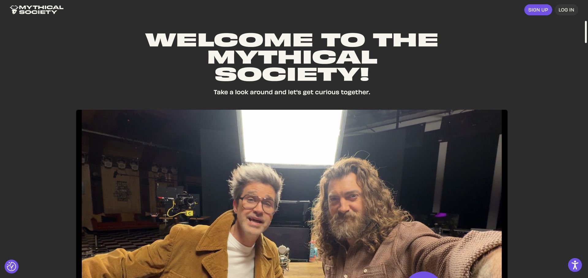
Mythical Society opens with a large cream welcome against charcoal and a video featuring its hosts. The public page establishes the personality of the membership before moving into benefits, plan cards, collectibles and timed content previews. Billing cadence is presented alongside the tiers, helping readers connect the entertainment pitch with the actual type of commitment. The design offers enough publicly visible material to study without entering paid content. Payload's case study documents the membership website and content platform; this review evaluates the public introduction rather than private member features or the value of a subscription.
What you can learn
Separate the preview, entitlement and billing layers of a membership site. A content model should make clear which items anyone can inspect, which benefits belong to a tier and which details govern the recurring commitment.
Pros
The familiar hosts make the welcome more specific than a generic list of membership features.
Plan and preview sections give the public page several concrete ways to explain what joining means.
Cons & considerations
A personality-led opening may provide less context to visitors unfamiliar with the creators.
Collectible and content promises require careful maintenance as availability and release schedules change.
Platform source: Scoped documented Payload implementation. Vendor documents the membership website and content platform implementation. Documentary evidence does not prove a complete current backend inventory. Platform evidence is separate from the direct website screenshot and is not a complete current infrastructure audit.
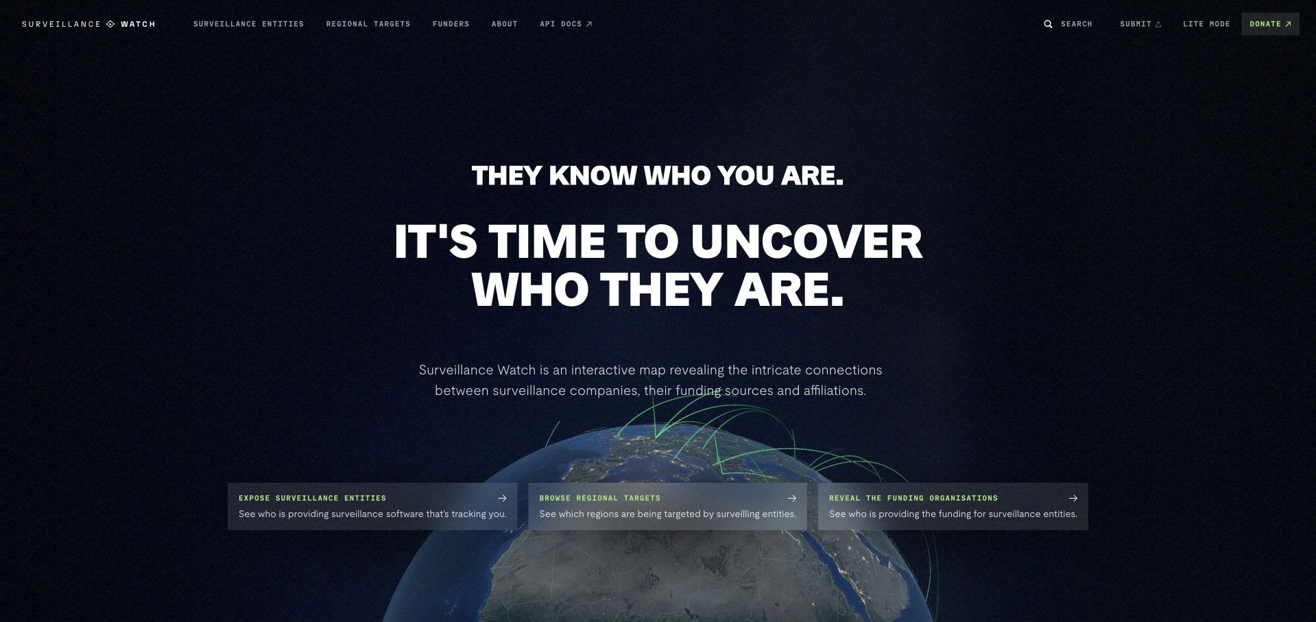
Surveillance Watch places a dark, textured globe behind fine green connections and a bold central mission statement. Three translucent cards offer entry through entities, regions and funders, so the visual network is accompanied by an understandable browsing vocabulary. A compact header includes search and a lite-mode option. The strongest lesson is not the globe alone: it is the way the surrounding labels explain what kind of information the visitor can investigate. Payload and the implementing developer document the public data-visualization website. The review concerns its presentation, not an independent verification of every entity or relationship in the dataset.
What you can learn
Give a rich visualization a small set of editorial entry points. Define the entities and relationships in the content model, then keep search and simpler reading routes available for people who do not begin with the map.
Pros
The three entry cards translate an abstract network into concrete browsing choices.
Search and lite-mode cues acknowledge that a single visual approach will not suit every visitor.
Cons & considerations
A dense animated background can compete with the explanation when attention is limited.
The credibility of a relationship map depends on maintained sourcing beyond its visual polish.
Platform source: Scoped documented Payload implementation. Vendor and developer Humaan document the public data visualization website. Documentary evidence does not prove a complete current backend inventory. Platform evidence is separate from the direct website screenshot and is not a complete current infrastructure audit.
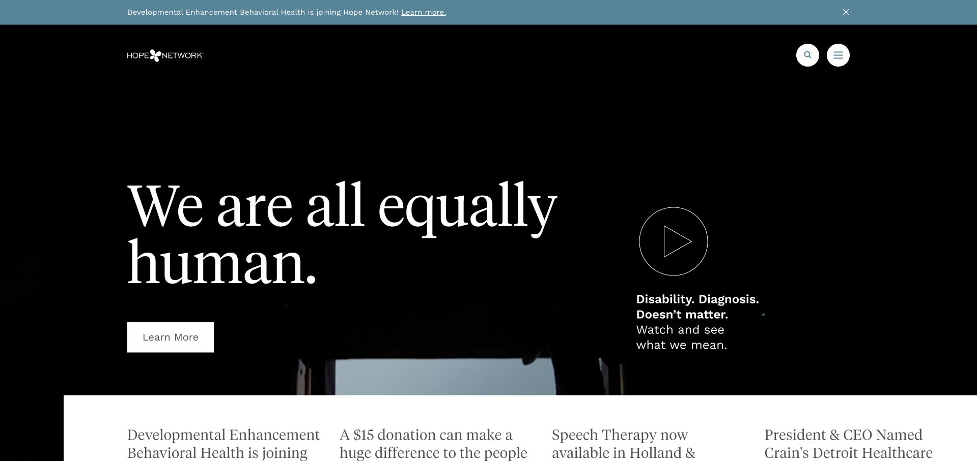
Hope Network leads with a large serif statement about equality over a dark moving hero. A contrasting learning action and an outlined video control provide separate ways into the story. The narrow announcement strip stays visible as ordinary page content rather than covering the screen. Further down, eight labelled service groups break a wide mission into more practical routes, alongside contact and impact-report destinations. That structure matters for an organization whose visitors may arrive with very different needs. Payload's case study documents this nonprofit service website; the screenshot does not assess care quality, programme eligibility or operational outcomes.
What you can learn
Let the mission establish purpose, then organize the next layer around actual service needs. Service records should have clear audience, location and contact relationships so editors can update one programme without rewriting the entire homepage.
Pros
The contrast between expressive typography and structured service groups balances identity with navigation.
Separate report and contact routes support readers who need evidence or practical assistance.
Cons & considerations
A large atmospheric introduction delays the detailed service list.
Broad mission language still needs precise programme content to help visitors choose the correct route.
Platform source: Scoped documented Payload implementation. Vendor documents the nonprofit service website content implementation. Documentary evidence does not prove a complete current backend inventory. Platform evidence is separate from the direct website screenshot and is not a complete current infrastructure audit.
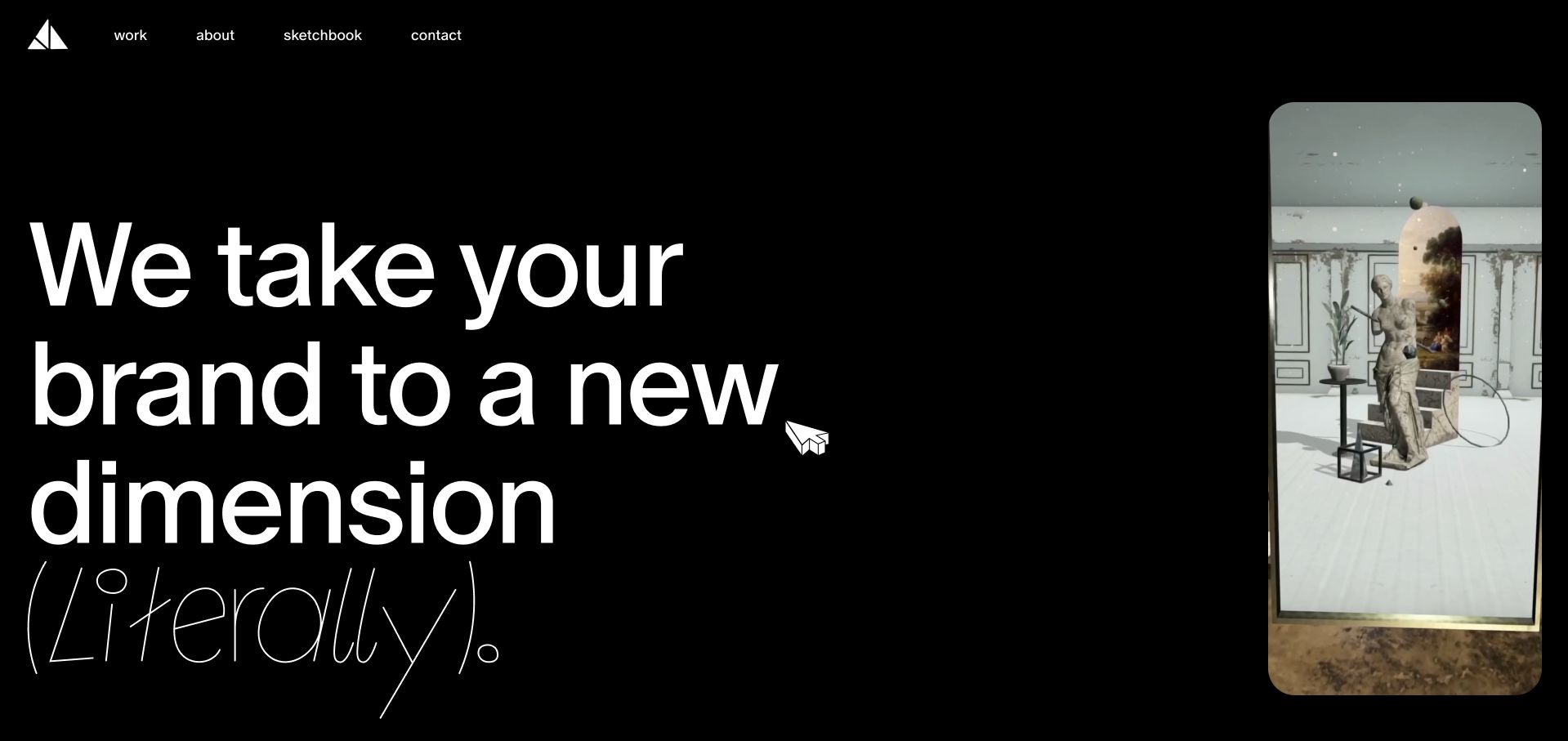
Paper Triangles introduces its studio through enormous white type on black and a tall mobile-format example beside it. The contrast between the bold dimensional headline and a delicate italic aside gives the opening personality, while the visible work, about, sketchbook and contact routes keep the presentation anchored. The page names its augmented-reality focus and points to specific projects rather than relying only on a client-logo wall. Payload's case study documents the agency website's content implementation. The capture follows the normal entry control; no camera permission, lens activation or interactive client experience was required to review this public page.
What you can learn
Show the medium in a controlled preview, then give each project enough structured context to stand alone. A portfolio CMS needs more than video files: project names, roles, destinations and useful still-image alternatives all matter.
Pros
The phone-shaped preview makes the intended format of the studio's work immediately understandable.
A short persistent navigation gives the dramatic opening a conventional route into deeper information.
Cons & considerations
The entry screen adds a step before readers reach the main presentation.
Oversized type and moving examples leave limited room for project context in the first viewport.
Platform source: Scoped documented Payload implementation. Vendor documents the AR agency website content implementation. Documentary evidence does not prove a complete current backend inventory. Platform evidence is separate from the direct website screenshot and is not a complete current infrastructure audit.
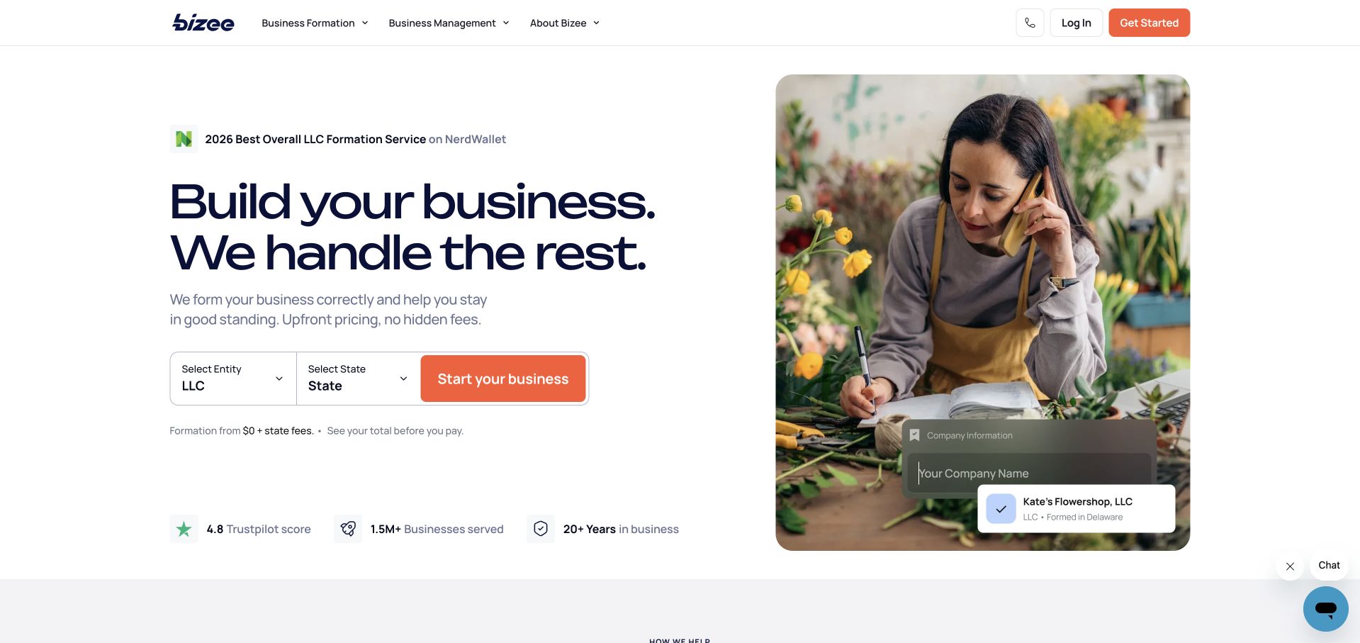
Bizee pairs a navy headline and orange action with entity and state choices. The fee qualification sits directly beneath that path, while a florist photograph and illustrative formation-status cards give the abstract business service a human setting. Lower sections separate formation, protection, running a business and compliance, then explain packages and stages in more detail. The design is useful because its choices are tied to a specific task instead of a vague contact invitation. Payload and the implementing agency document the website migration and redesign. No formation request was submitted, and this review does not evaluate legal suitability or service outcomes.
What you can learn
Keep the conditions that change a service beside the decision that invokes them. Content records for jurisdictions, packages and business stages should remain distinct so a visual campaign cannot accidentally obscure an important qualification.
Pros
Entity and state selectors make the opening action more concrete than a generic start button.
The nearby fee note helps connect the headline offer with its visible limitation.
Cons & considerations
Illustrative status cards can resemble real application progress before a visitor has begun.
Complex jurisdiction-specific services need much more detail than the opening layout can contain.
Platform source: Scoped documented Payload implementation. Vendor and developer Riotters document the website migration and redesign. Documentary evidence does not prove a complete current backend inventory. Platform evidence is separate from the direct website screenshot and is not a complete current infrastructure audit.
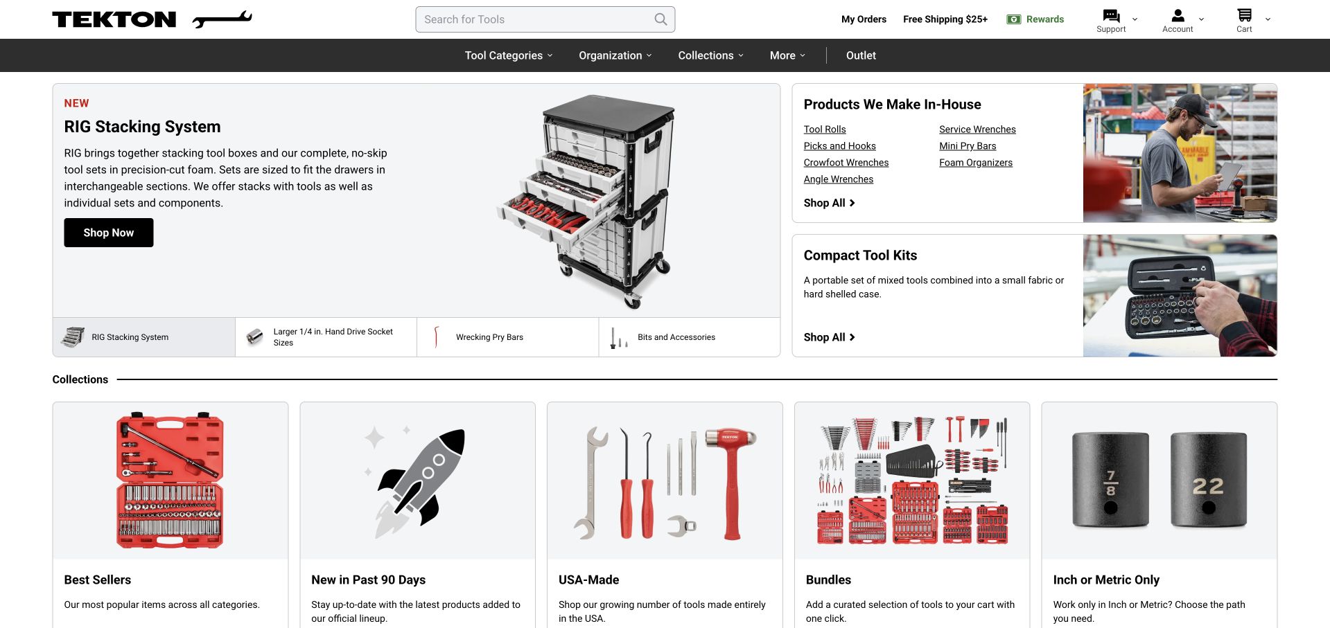
Tekton's homepage is a practical catalogue with an unusually clear hierarchy. A prominent search field sits above a dark category bar, while the main feature explains a stacking system through a product diagram and labelled tabs. Supporting panels introduce manufacturing and a compact kit rather than repeating the same promotional card. Collection routes distinguish best sellers, new releases, bundles and measurement-related choices. Payload documents the hand-tool ecommerce implementation, but the design review stays with publicly visible browsing. It does not test tool quality, checkout behavior or stock accuracy, and a documented platform association is not a complete current architecture inventory.
What you can learn
Model the distinctions customers actually use when choosing technical products. Product families, dimensions, compatibility and system relationships should be structured enough to support search and editorial features without requiring duplicated descriptions.
Pros
Search and category navigation serve visitors who already know what they need.
The annotated product-system feature gives exploratory shoppers more context than a standalone product photograph.
Cons & considerations
The density of catalogue routes can feel less spacious than a campaign-led storefront.
Technical comparisons depend on consistent specifications that cannot be judged from the homepage alone.
Platform source: Scoped documented Payload implementation. Vendor documents the hand-tool ecommerce website implementation. Documentary evidence does not prove a complete current backend inventory. Platform evidence is separate from the direct website screenshot and is not a complete current infrastructure audit.
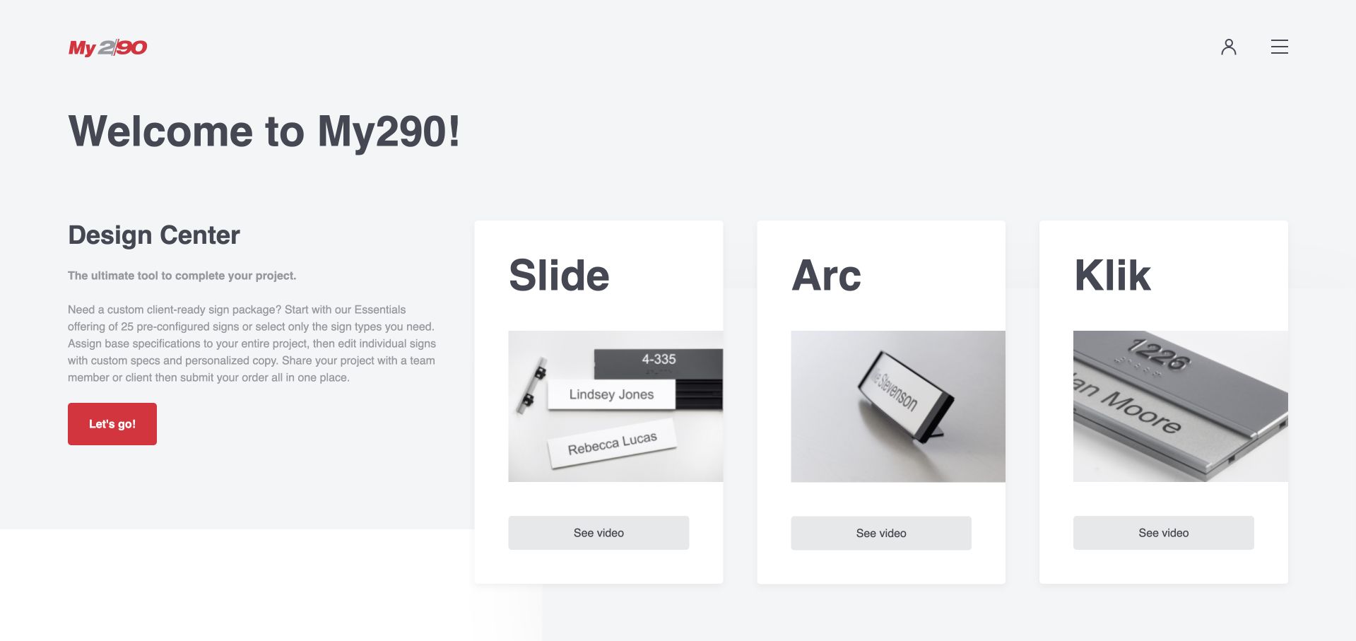
My290 uses a pale grey, utilitarian introduction to explain a sign-design system. A left-hand Design Center description and red start action sit beside three tall cards for Slide, Arc and Klik. Each card combines a close-up of the physical sign with a separate video control, allowing the product families to be compared before a project begins. The explanatory text describes common specifications, individual edits, sharing and ordering. Payload's case study identifies this exact configurator property. The review remains on its public introduction; no project, account, saved design or order was created to obtain the capture.
What you can learn
Explain the structure of a complex tool before asking visitors to use it. Separate product-family content from project state, and show which decisions can be shared across a design before introducing individual exceptions.
Pros
Real sign photographs give the named product families a visible distinction.
The overview describes the broader workflow rather than making the start button carry the entire explanation.
Cons & considerations
The introductory page cannot demonstrate every constraint inside the configurator.
Small visual differences between sign systems may require the supporting videos or deeper specifications to understand.
Platform source: Scoped documented Payload implementation. Vendor documents the exact public sign configurator and ecommerce property. Documentary evidence does not prove a complete current backend inventory. Platform evidence is separate from the direct website screenshot and is not a complete current infrastructure audit.
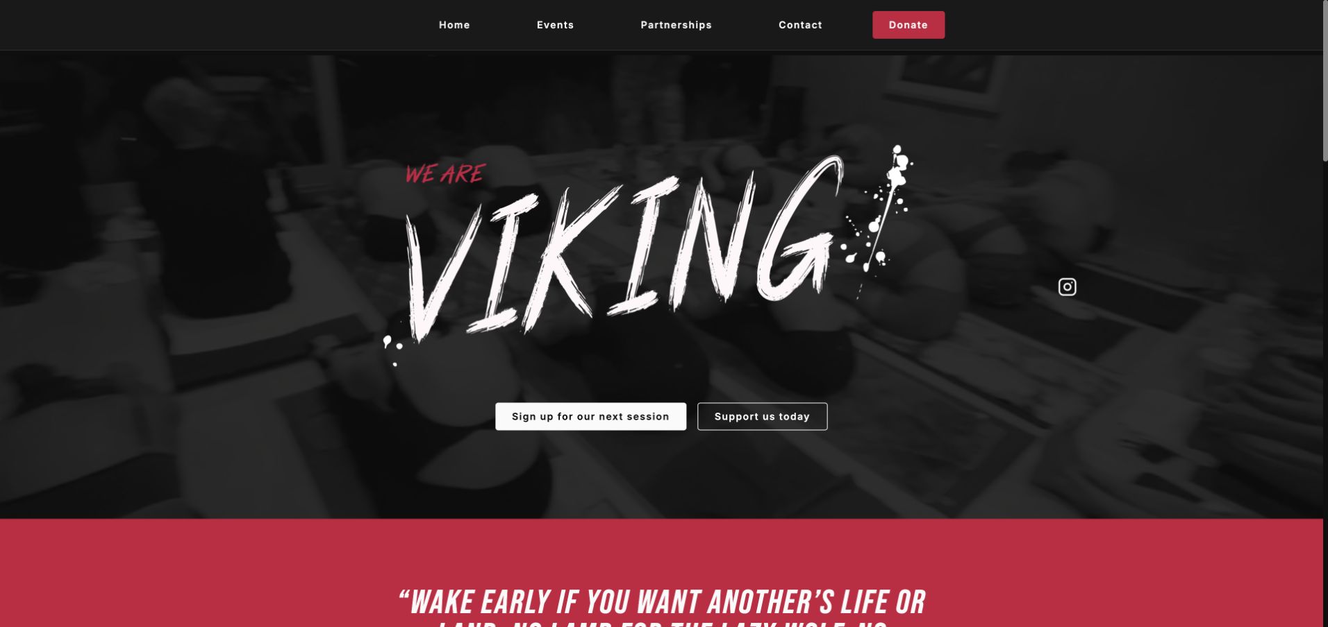
We Are Viking Yoga builds its identity around hand-painted red lettering, black surroundings and a dim studio photograph. Session and support actions are direct, while the wider page explains its community classes and partner enquiries. Crucially, the current schedule states that there are no upcoming events rather than filling the space with stale dates. That empty state makes the page a useful reference for organizations whose activity is intermittent. Payload's case study documents the site, and the public footer also credits PayloadCMS. The review does not infer attendance, instructor credentials or the availability of a class beyond what the page presently states.
What you can learn
Design the no-event state as carefully as the full schedule. An events collection needs expiry rules and a useful explanation of what readers can do while dates are absent, without presenting an enquiry as a confirmed booking.
Pros
The bold red identity distinguishes the community without requiring a complicated navigation system.
The explicit empty schedule avoids making old event content look current.
Cons & considerations
The dark photograph provides limited practical venue detail in the opening view.
A visitor ready to attend must wait for published dates or seek further information.
Platform source: Scoped documented Payload implementation. Vendor documents the yoga studio public website implementation. Documentary evidence does not prove a complete current backend inventory. Platform evidence is separate from the direct website screenshot and is not a complete current infrastructure audit.
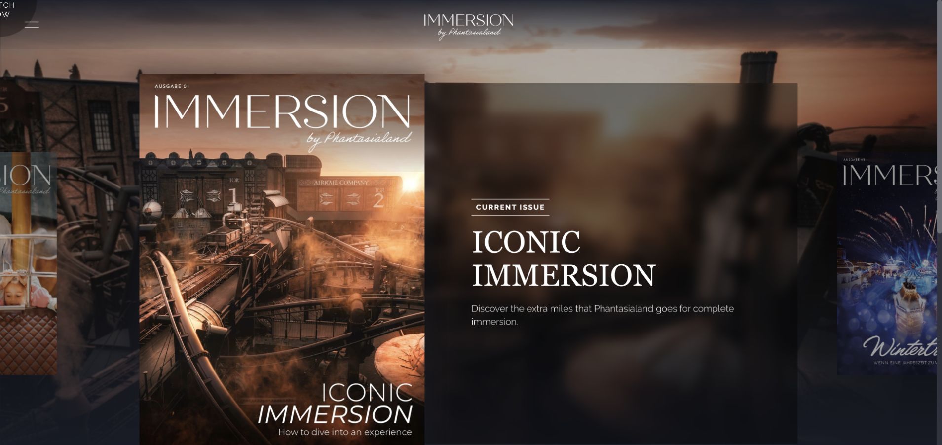
IMMERSION by Phantasialand presents itself as a magazine. An oversized cover overlaps a dark translucent summary, with adjacent cover edges suggesting further issues and a warm themed-land image supplying atmosphere. The current-issue label offers a clear entry point, while a restrained logo and menu avoid turning the opening into a park booking interface. Newsletter content stays separate lower on the page. The implementing partner lists this exact magazine as built with Payload. That evidence does not extend to Phantasialand's ticketing systems or every park website. The capture retains an existing browser translation of the German page without changing language settings.
What you can learn
Give issue-based publishing its own model: cover, edition, summary, stories and archive position. Related commercial destinations can remain available, but the editorial entrance should make reading and browsing previous issues understandable on their own terms.
Pros
Overlapping covers make the publication format recognizable before a reader opens an issue.
The current-issue cue supplies a starting point within a visually rich archive.
Cons & considerations
Carousel-style browsing can conceal the size and structure of the complete archive.
Atmospheric artwork occupies space that could otherwise explain issue contents more directly.
Platform source: Scoped documented Payload implementation. Implementing developer lists the 2023 IMMERSION website in Built with Payload with exact public URL. Documentary evidence does not prove a complete current backend inventory. Platform evidence is separate from the direct website screenshot and is not a complete current infrastructure audit.
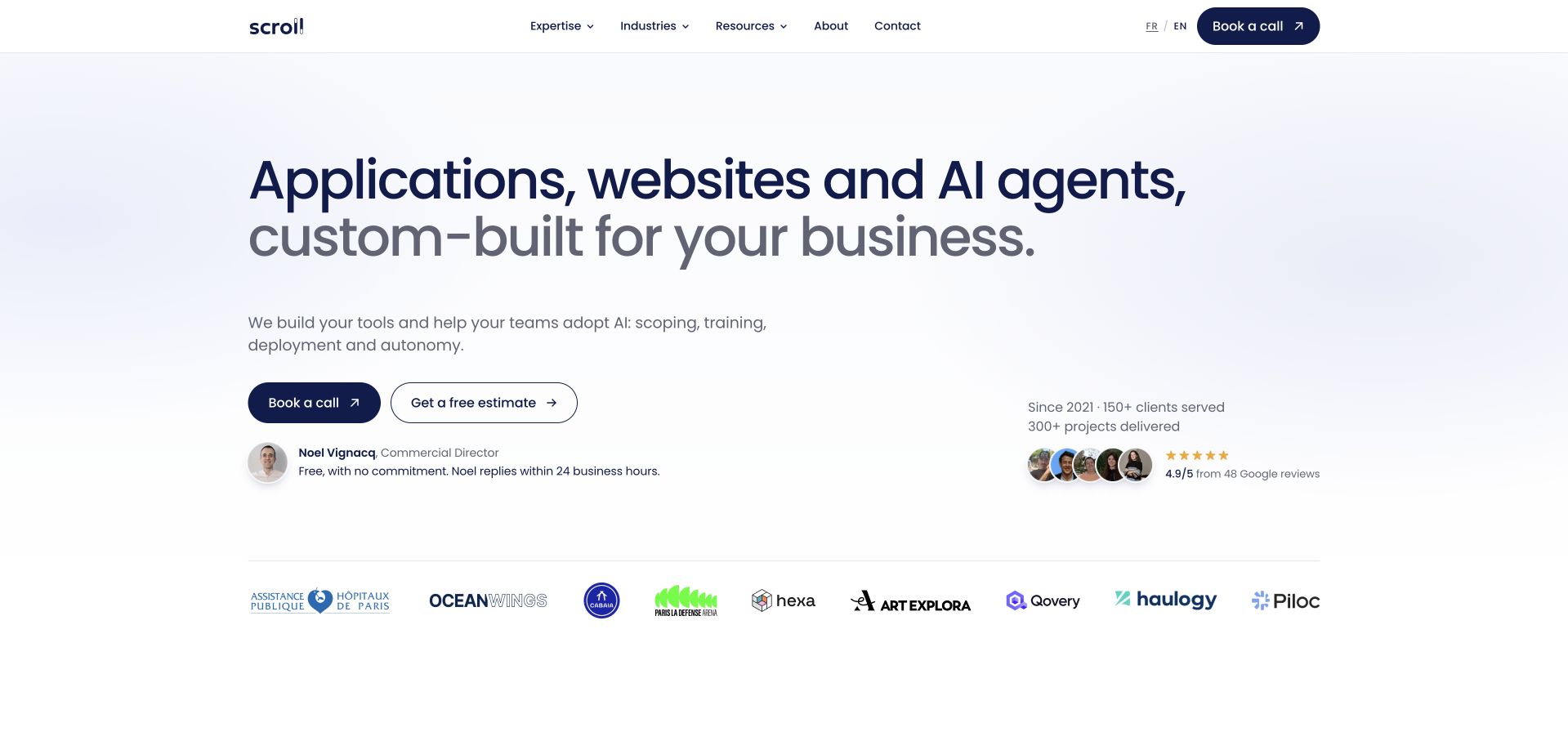
Scroll places a large navy headline on a pale lavender field, then distinguishes its application, website and AI-agent work from the supporting scoping and training services. Two restrained actions offer a call or an estimate. A named contact, portrait and response-time statement make the enquiry route feel concrete, while client logos provide a separate layer of claimed experience. Expertise accordions and project cards continue the explanation below. The agency explicitly documents using Payload for its own website. This does not establish that the client properties represented by logos all use Payload, and the review does not independently certify its response-time or customer-rating claims.
What you can learn
Make a wide service offer navigable by separating deliverables, process and proof. A named contact can clarify who receives an enquiry, while structured project records should explain the actual work rather than relying on logo recognition alone.
Pros
The opening distinguishes the proposed work from the support needed to adopt it.
Two clearly labelled contact paths accommodate visitors at different stages of planning.
Cons & considerations
The headline covers several disciplines and needs deeper examples to establish their differences.
Social-proof figures require maintenance and should not substitute for detailed project evidence.
Platform source: Scoped documented Payload implementation. Developer explicitly documents its own website and content migration, reviewed October 2026. Documentary evidence does not prove a complete current backend inventory. Platform evidence is separate from the direct website screenshot and is not a complete current infrastructure audit.
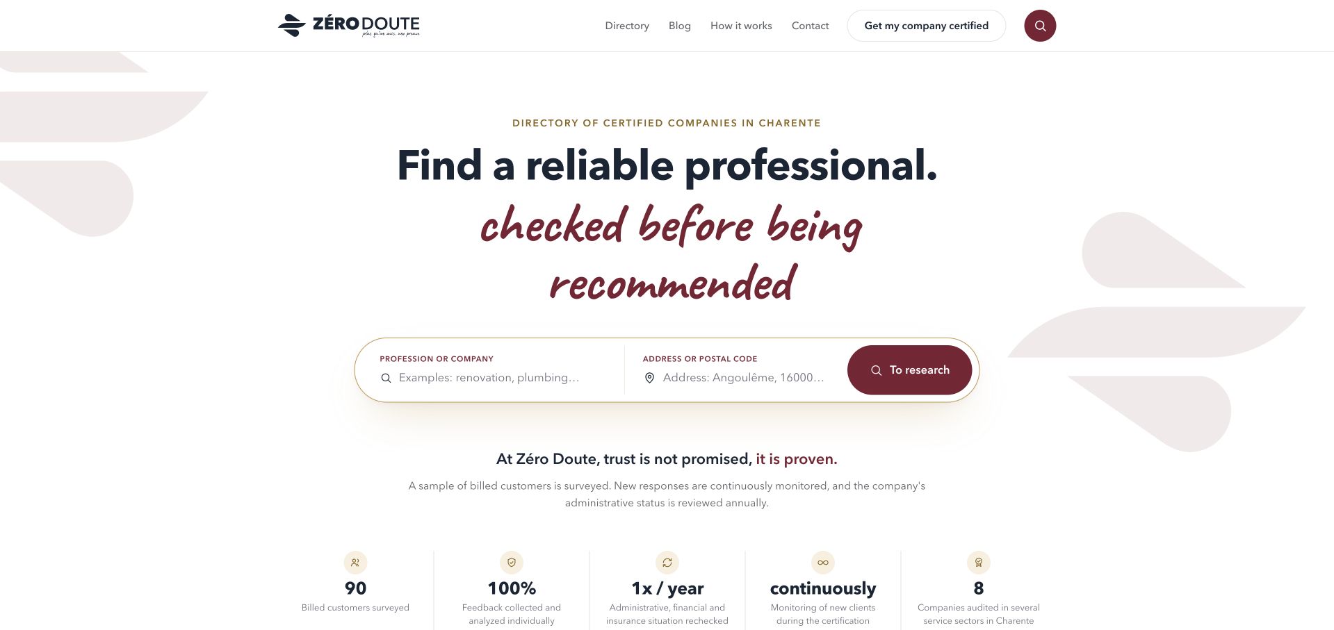
Zéro Doute combines a cream and burgundy identity with paired profession and postcode fields. Immediately below, the page explains its checking approach rather than leaving trust as a decorative badge. Provider cards show locality, service categories, the number of customers consulted and rating dimensions. This makes the directory's editorial structure visible to a visitor before they contact a business. Scroll identifies the exact website as a Payload project. The review studies how the checking process is communicated; it does not independently verify the businesses, ratings or certification claims. The capture includes the browser's existing English translation.
What you can learn
Store the basis of a directory claim alongside the listing. Location, service scope, review method and observation dates need explicit fields so the public interface can explain what a label means instead of merely displaying it.
Pros
Paired trade and location inputs align the search interface with a practical local need.
Methodology and rating dimensions provide more context than an unexplained aggregate score.
Cons & considerations
The strong trust headline can promise more certainty than a visitor should infer from a directory alone.
A small initial listing pool may leave some searches without an appropriate match.
Platform source: Scoped documented Payload implementation. Implementing developer identifies the exact directory website as a Payload project. Documentary evidence does not prove a complete current backend inventory. Platform evidence is separate from the direct website screenshot and is not a complete current infrastructure audit.
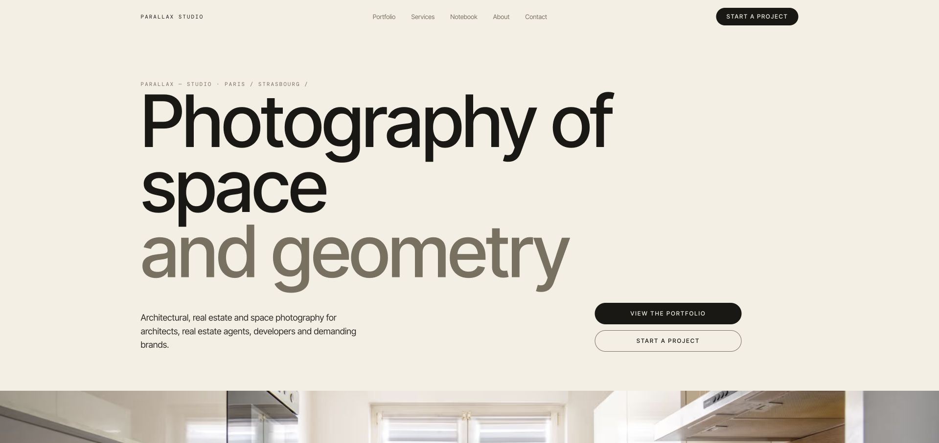
Parallaxe Studio begins with oversized two-tone typography on warm off-white, supported by small monospace details and a pair of portfolio and project actions. The first architectural photograph appears just below the headline rather than competing with it. A numbered slideshow, recent-work cards with client and location labels, and a before-and-after comparison provide several ways to inspect the photographer's approach. Scroll documents the exact website and its Payload-managed pages, projects and images. This review concerns the public portfolio, not the quality of an unseen commission. The screenshot is the opening hero and retains the browser's existing English translation of the French copy.
What you can learn
Give portfolio images structured context. Project type, place, client and photographic approach help viewers understand why a piece matters, while a consistent gallery model lets the work change without erasing its attribution or narrative.
Pros
The restrained palette and large type create a coherent editorial frame for architectural imagery.
Project labels and the method comparison add information beyond a sequence of attractive photographs.
Cons & considerations
The oversized headline pushes most photography beneath the initial viewport.
A moving slideshow requires clear controls and thoughtful still-image alternatives as the portfolio grows.
Platform source: Scoped documented Payload implementation. Implementing developer identifies the exact photography website and Payload-managed pages, projects and images. Documentary evidence does not prove a complete current backend inventory. Platform evidence is separate from the direct website screenshot and is not a complete current infrastructure audit.
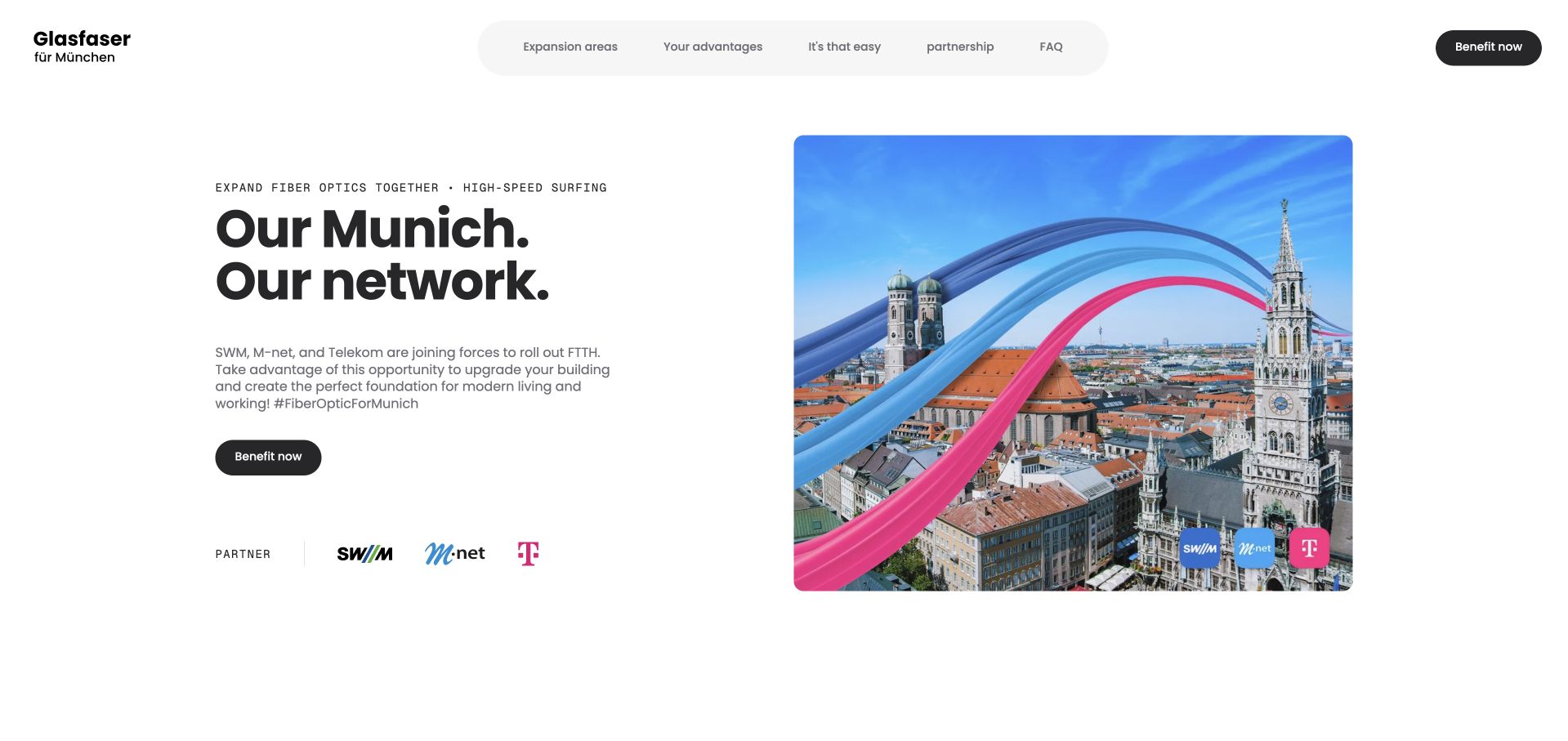
Glasfaser für München pairs a bold local-network headline with a Munich skyline threaded by three colored ribbons. Partner logos sit beneath the explanation, while pill-shaped navigation points to coverage, benefits, process, partnership and frequently asked questions. Below the opening, a map explains rollout areas and a four-step sequence distinguishes the building connection from the later choice of tariff. The implementing developer lists this specific collaboration website as built with Payload. That association does not automatically apply to SWM, M-net or Telekom's other properties. The capture retains the browser's existing English translation; no availability check, agreement or order was submitted.
What you can learn
Structure public infrastructure information around decisions and responsibility. Coverage, installation stages and supplier choice are different content types; keeping them separate helps an editor update rollout information without changing unrelated commercial destinations.
Pros
The skyline and partner treatment establish the local scope of the collaboration quickly.
The process explanation separates infrastructure installation from purchasing an internet tariff.
Cons & considerations
A broad campaign headline cannot answer whether an individual address is eligible.
Rollout dates and linked provider information require ongoing coordination between several organizations.
Platform source: Scoped documented Payload implementation. Implementing developer lists the 2026 fiber-expansion collaboration website in Built with Payload. Documentary evidence does not prove a complete current backend inventory. Platform evidence is separate from the direct website screenshot and is not a complete current infrastructure audit.
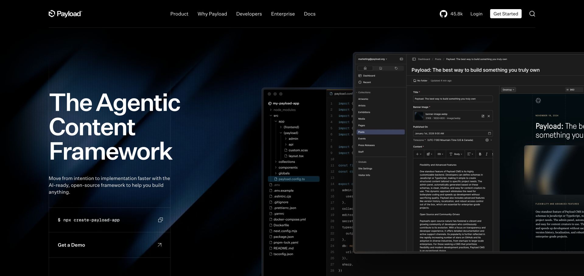
Payload's own website places a large headline beside overlapping code and editor screenshots on a dark blue-textured hero. The installation command and demo route are separate actions, reflecting two different visitors: someone ready to investigate the software and someone seeking a conversation. Below, grouped use cases connect content management, commerce, applications and assets to visible product surfaces. Documentation and the public repository remain accessible from the main navigation. Unlike a logo-based inference, the official website repository explicitly identifies this site as built with Payload. Its documentation pipeline has its own described source workflow, so the evidence should not be flattened into a claim about every service.
What you can learn
Show how a product looks to its different users while keeping their entry paths distinct. Technical documentation, editorial explanation and sales contact can share a content system without being forced into the same call to action.
Pros
Real interface imagery makes the framework's abstract proposition more tangible.
The public repository provides unusually specific implementation evidence for the reviewed property.
Cons & considerations
Overlapping interface panels can be difficult to inspect at smaller sizes.
The broad framework positioning still requires documentation to determine whether it fits a particular project.
Platform source: Scoped documented Payload implementation. The official repository explicitly identifies this exact public website as built using Payload. The repository separately describes its documentation synchronization pipeline; no claim is made about every linked service. Documentary evidence does not prove a complete current backend inventory. Platform evidence is separate from the direct website screenshot and is not a complete current infrastructure audit.
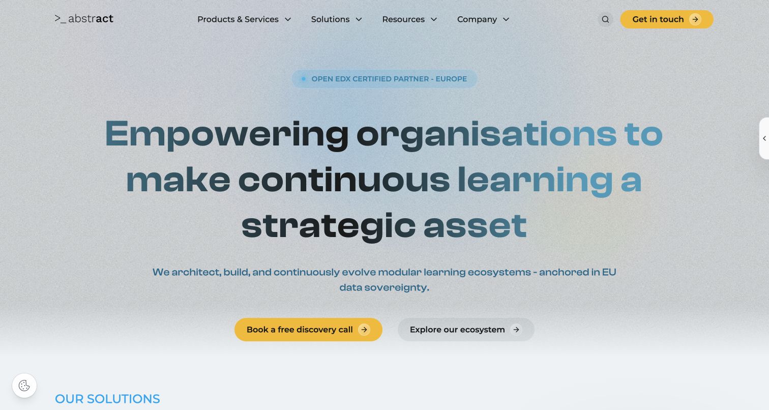
Abstract Technology uses a pale textured background, large teal and black typography, and a yellow discovery-call action. A quieter ecosystem link gives researchers an alternative to contacting sales. Four sector cards distinguish higher education, public institutions, corporate training and nonprofit needs; later sections separate platform work, migration support and analytics. That structure turns a wide technical offering into several understandable routes. The company explicitly states that its own public website is built with Payload and Next.js, providing a direct self-reported implementation source. The review does not certify its compliance statements or advertised efficiency figures, and no free trial or enquiry was activated.
What you can learn
Organize a consultancy's content around the buyer's situation and the work being commissioned. Sector pages and service records should be related, but keeping them distinct prevents every audience from receiving the same list of technical features.
Pros
The contrasting call and research actions accommodate visitors with different levels of readiness.
Sector cards connect a complex learning-platform offer to recognizable organizational needs.
Cons & considerations
The opening mission is broad and depends on deeper pages for specific deliverables.
A promotional trial popup required dismissal before the underlying website could be captured cleanly.
Platform source: Scoped documented Payload implementation. The implementing company explicitly states that its own company website is built entirely with Payload CMS on Next.js. This is a direct self-reported implementation association, not independent certification of hosting, compliance or every integration. Documentary evidence does not prove a complete current backend inventory. Platform evidence is separate from the direct website screenshot and is not a complete current infrastructure audit.
Kegan has 15+ years of experience working with small businesses, Fortune 500 companies, and everything in between. No development job is too big or too small: he brings the same hands-on attention to a focused improvement, a complete website, or a custom application.
For Payload projects, he can help with responsive interfaces, reusable components, custom functionality, API connections, and performance-minded implementation. He works directly with clients on scope, design, implementation, testing, and handover, with an emphasis on clear communication and a system that remains practical to maintain after launch.
Show 3 other Payload developersHide other Payload developers
A campaign needs a clear scope, a beginning and an end. Keep market-specific copy, partner destinations and offers distinct from global brand material. Sonos's retailer handoff and the Munich fiber collaboration demonstrate how a focused property can explain an idea without pretending to contain every transactional system behind it.
Catalogues, directories and configurable products
A catalogue becomes useful when its distinctions match the buyer's questions. Tekton exposes practical shopping routes, My290 introduces product families before a design workflow, and Zéro Doute combines trade with location. Model attributes and relationships explicitly so filters, summaries and detailed pages can share accurate information.
Editorial, community and service websites
People may enter through a story, an event, a service or an archive rather than the homepage. Give those records useful names and destinations. A magazine issue needs a cover and sequence; a community event needs a truthful empty state; a nonprofit service needs enough audience and location context to guide a visitor toward appropriate information.
From references to requirements
Plan for the next editor and the next revision
Write down the exact property boundary
Identify the public website, campaign or regional property being built, and list the separate systems it links to. A marketing page, membership application and checkout can have different responsibilities. Documenting that boundary helps the team avoid misleading technology claims and gives visitors clearer expectations when they move between services.
Use representative content during implementation
Build with a real long title, a short description, an awkward photograph and a record that lacks optional material. Test a directory with no results and an events list without dates. These cases reveal whether the model is genuinely useful or merely arranged around a few unusually polished launch examples.
Assign responsibility for changing facts
Someone must maintain rollout dates, recurring prices, membership benefits, contact destinations and archived campaigns. Identify that person or role for each content type. Separate an editorial description from a claim supplied by a service provider, and record the source when the distinction affects how a reader should interpret the page.
Keep integration and maintenance visible in the brief
A content system does not remove the need to plan hosting, permissions, backups, migrations and external services. Agree how content becomes public, how an interrupted change is reconciled and who owns ongoing updates. The design examples provide ideas for presentation; they do not establish the cost, security or performance of your implementation.
A useful handover demonstration
Ask the actual team to carry out its routine job: publish a realistic update, correct a mistake, preview a narrow screen, and identify who owns an integration failure. For a library or frontend framework, also ask who maintains the content source and deployment. A polished screenshot does not answer those operational questions.
Beyond the screenshot
A practical Payload website checklist
Define the public property's scope and its separate linked services.
List the records editors actually need to maintain.
Give repeated facts one authoritative content location.
Separate campaign artwork from essential product or service conditions.
Keep page and record titles useful in navigation and direct links.
Test long, missing, translated and expired content.
Design empty catalogue and event states deliberately.
Explain the difference between previews, membership and transactions.
Define draft, publication and recovery responsibilities.
Preserve image attribution, context and meaningful alternatives.
Document integration, backup and maintenance ownership.
Check the actual implementation rather than inferring it from a customer logo.
Test with real content, a keyboard, a small screen, slow or failed requests, and the people who will maintain the system. These are planning checks, not an accessibility, security, performance, or search-ranking certification.
Sources & editorial method
How this Payload collection was reviewed
All twenty selected properties were directly reviewed and captured on November 11, 2026 in America/Los_Angeles; their precise UTC capture times and dimensions remain in the source records. Normal site controls dismissed optional-cookie and promotional overlays without altering page content. Several non-English pages were already translated by the browser; those captures are labelled accordingly. Payload vendor case studies, implementing-developer statements and the official website repository establish qualified documentary associations, not a complete current backend inventory. Every selected source has a bounded broad audit record: eighteen newly checked pages, the retained November 8 Pacific audit of Payload's own homepage, and an unavailable HTTP429 attempt for Club for the Future. The clean Club capture was obtained before that audit response; its documentary evidence is retained without inventing a new source observation. First Street's terms gate, OptiTrack's unavailable response, Lucian Light's security interstitial and EmailOctopus's exhausted audit invocation are retained privately as holds and are not published as examples. No account, purchase, submission, membership, upload or camera access was used in this research.
Every image is an unmodified capture from the actual website, with its source and capture date. Some captures are reused from our shared catalog; their dates remain the original capture dates. None comes from a vendor gallery or a generated reconstruction. Moving imagery and live content can change.
Technology attribution uses public page assets or metadata, official platform documentation, or a cited first-party project case study. Documentary and framework-relationship evidence is identified where used; it is not a complete current backend inventory. A CMS image CDN alone does not establish a full CMS deployment. A library’s presence does not prove which individual controls use it, and a platform label does not establish AI authorship.
The composition notes, lessons, pros and tradeoffs are original editorial observations. We have not measured conversion, traffic, security, performance or accessibility conformance. Website owners retain their brands and imagery; these examples are not our client portfolio. Written, Edited and Curated are independent records, not dates advanced by a build. See our editorial standards or suggest a correction.
Questions worth asking
Payload website development FAQs
Does every example prove its current backend is Payload?
No. The records distinguish vendor and developer documentation from bounded public-source observations. A documented implementation supports a specific association, but it does not establish every current dependency, deployment setting or linked service. The scope is stated for each property.
Why are some opening examples campaigns or regional websites?
Those are the public properties named by the supporting evidence. Mazda New Zealand, ASICS FrontRunner and the German Sonos campaign are meaningful websites in their own right. Their association should not be expanded to every corporate, retail or international property belonging to the same brand.
What should a team borrow from these examples?
Borrow a clear content structure, an understandable navigation choice or a useful explanation of the visitor's next step. Then choose the implementation that fits your editors, integrations and operating needs. A polished reference does not guarantee the same result for a different project.
Is a Payload website restricted to one visual style?
No. The reviewed sites include restrained catalogues, expressive portfolios, campaign pages and editorial collections. The content framework and the public interface are separate design concerns, even when they are developed together in one application.
How were blocked sources handled?
Access restrictions were not bypassed. Incomplete candidates remain outside the published collection. Club for the Future has a genuine clean capture and a specific vendor case study, while its later broad audit returned HTTP429; that limitation is retained rather than presented as a successful current stack observation.
Do these reviews certify performance, accessibility or commercial results?
No. They are original design observations on public pages and genuine captures. Product claims, service outcomes, compliance statements and conversion results require separate evidence. The collection does not turn vendor marketing figures or an attractive screenshot into an independent certification.
Start with the content your team must keep accurate, then create a presentation that makes it useful. These examples are strongest where expressive design and a clear editorial structure reinforce each other.