Best Yarn Shop Websites of 2026 (17 Real-World Examples)
Real yarn shop websites that connect inspiring projects with useful material choices, clear shopping information and welcoming local visits.
A beautiful skein is only the start of the decision. These examples show how specialist retailers explain yarn, organise patterns and kits, support learning and help visitors choose between ordering online and coming into the shop.
Yarn shoppers arrive with different kinds of knowledge. Someone replacing a particular color needs a precise product record; someone planning a first sweater may need a pattern, suitable materials and help. The reviewed websites offer different combinations of technical categories, finished-project photographs, maker stories, class listings and store information. Their most useful patterns connect those elements without making every visitor follow the same route.
This collection includes local yarn shops, larger specialist retailers and brands selling their own yarns and patterns online. The reviews concern the actual public pages and captures, not product testing, service quality or verification of every commercial claim. A strong information-design lesson may come from an otherwise imperfect site. Promotions, stock and opening arrangements describe the observation and can change.
Before the examples
What makes good yarn shop website design in 2026?
Support the vocabulary shoppers already use
Offer clear routes by weight, fiber, brand and craft where the assortment supports them. Keep a visible search field for exact product and color names. Explain specialist terms without forcing experienced makers through introductory content.
Connect a finished project to its materials
Show which pattern, yarn base, quantity and other supplies belong together. Distinguish an inspiration photograph from a complete kit, and explain what the price includes before a visitor starts selecting options.
Make availability and ordering conditions explicit
Keep sold-out, preorder and dyed-to-order states distinct. Explain shipping scope, pickup and relevant production timing close to the decision. Do not let a general promotional banner replace product-specific conditions.
Give classes and visits practical detail
Publish maintained addresses, hours, appointment requirements and directions. Class listings should state the topic, date, price, prerequisites and availability where known. A community message becomes more useful when a visitor can see how to participate.
The collection · 17 examples
17 yarn shop websites worth studying
The saved random target was 17, and all 17 examples have direct source captures and original reviews. Espace Tricot is the explicit Editors Choice for connecting named products, dated classes and practical visit information. This is a website-design selection, not a ranking of yarn or service quality.
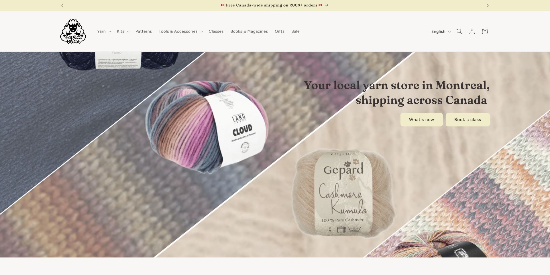
Espace Tricot gives a Montreal shop a useful online counterpart. A cream background and collage of yarn photographs lead into two clear actions: discover new stock or book a class. Canadian brand cards identify the maker, show prices and sometimes add a local tag. The page then connects its own patterns with class listings that expose dates, prices and sold-out states. Those details make learning feel like an available service rather than a vague community promise. Farther down, location information, opening hours and transport guidance help turn interest into a visit. The Canadian shipping message is clear, while visitors ordering from the United States are directed to contact the shop.
What you can learn
Give learning and visiting the same practical specificity as shopping. A dated class card and usable directions can support a local retailer more effectively than an unexplained events link.
Pros
Maker names and prices make featured products easy to compare.
Class availability and visit information support distinct visitor needs.
Cons & considerations
Several carousels ask readers to reveal more content.
Pattern offers need their conditions read carefully.
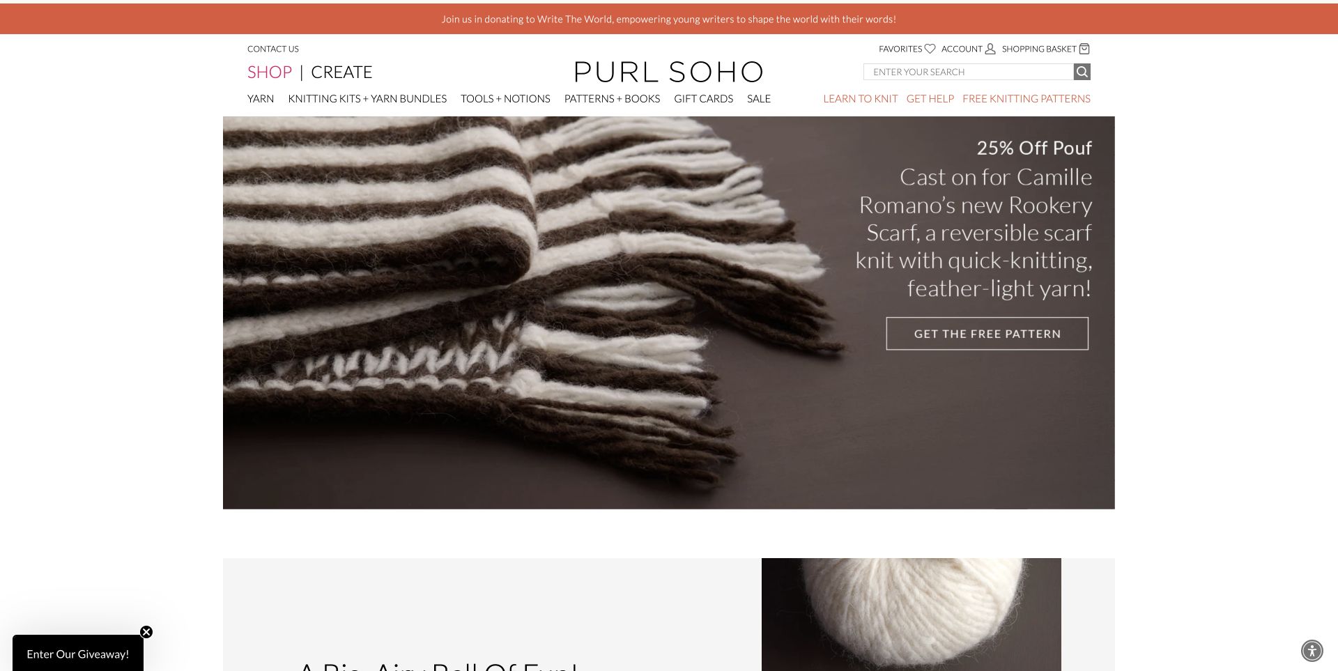
Purl Soho organises its offer around shopping and creating. The opening project photograph shows the texture and scale of a finished scarf, with a free-pattern action that gives the yarn a purpose before asking visitors to compare colors. Product cards then expose fiber-related names, available colors and prices. Kits, patterns and learning resources extend the same relationship between an appealing object and the materials behind it. The help routes include practical knitting support and pattern corrections, useful companions to an extensive project archive. This is an online-store example; the reviewed shop information does not support presenting it as a currently open New York storefront.
What you can learn
Connect each inspiring project to a clear materials and instruction route. Keep corrections and help discoverable so editorial content remains useful after the first shopping visit and during the making process.
Pros
Close textile photography communicates texture and finished scale.
Shop and Create routes accommodate different starting points.
Cons & considerations
Numerous promotional modules make the homepage lengthy.
The initial giveaway prompt interrupts browsing until dismissed.
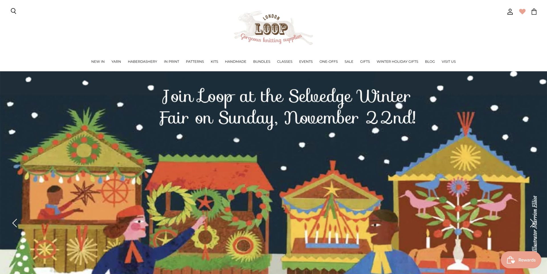
Loop opens with an illustrated event presentation rather than a conventional product grid. The airy layout gives its selection of yarn, kits, haberdashery and handmade objects a distinctive editorial character. Navigation also exposes classes, events, books and the visit page, so the shop is presented as more than a dispatch point for skeins. Featured kits include prices, while coming-soon and preorder labels distinguish future availability from items that can be ordered now. The London address and nearby Underground station provide useful visit context. There is a cost to the breadth: the long navigation and numerous carousel slides require visitors to choose among many equally prominent destinations.
What you can learn
Make a curated assortment feel coherent through consistent imagery and clear availability language. Keep the main shopping and visiting actions easy to recognise even when events and special collaborations compete for attention.
Pros
Illustrated campaigns give the shop a recognisable character.
Preorder labels and travel details answer practical questions.
Cons & considerations
The wide menu creates a substantial initial choice.
A multi-slide hero can conceal relevant announcements.
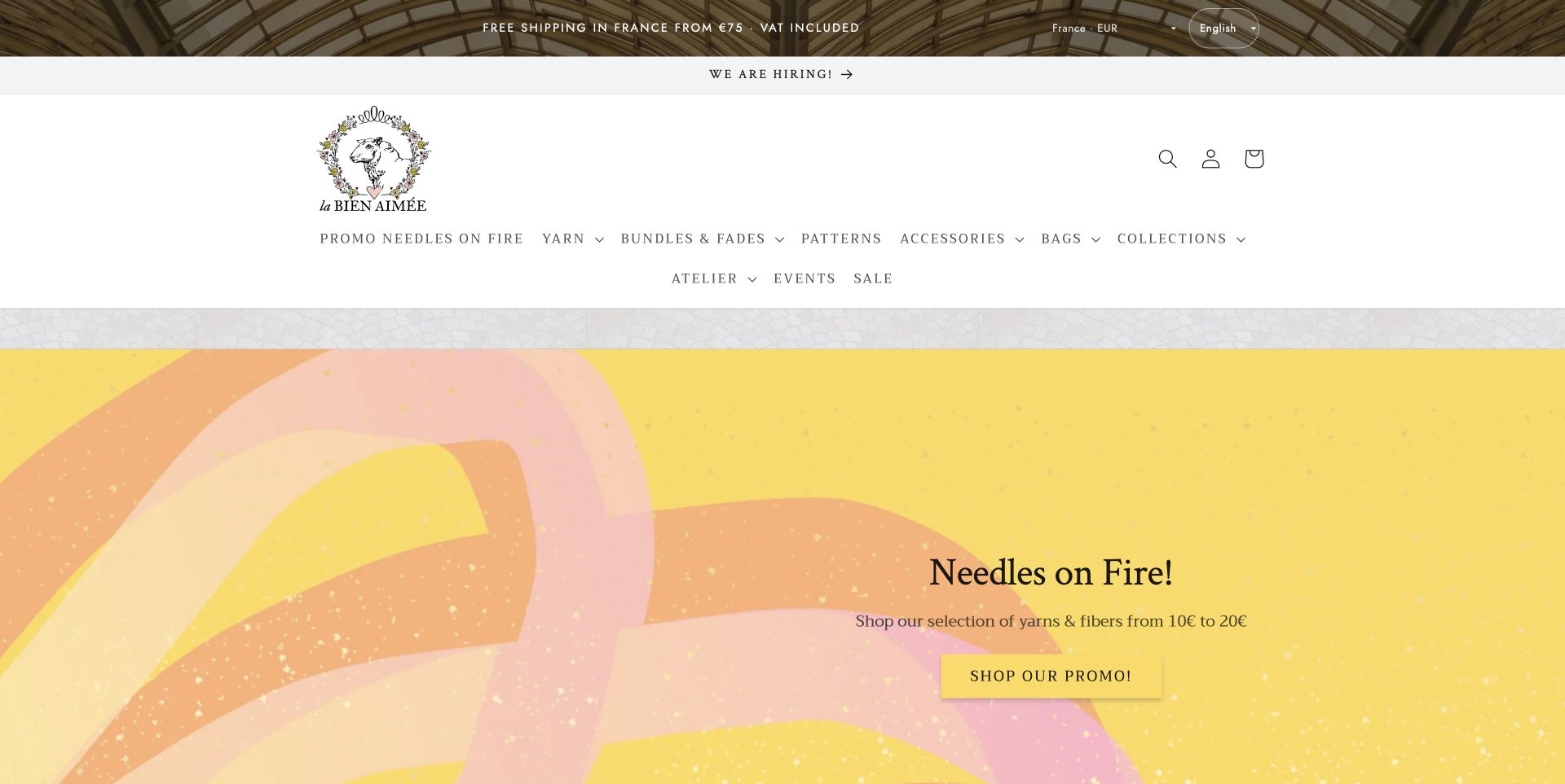
La Bien Aimée pairs a bright yellow identity with generous yarn and garment imagery. Its homepage introduces named yarn bases, weight categories and coordinated bundles, letting a visitor move from a visual idea toward a more specific material choice. The dyed-to-order explanation is especially useful because it connects a production arrangement with the reason someone might want yarn from one dye lot. A lookbook, project features and dated journal material give the assortment a creative context. Care, pattern corrections and shipping information remain available alongside the store. Proprietary base names carry much of the brand character, but a new visitor may need further detail to understand their fiber and weight differences.
What you can learn
Explain an unusual ordering arrangement where the product is introduced. Attractive color stories become more useful when the reader can understand the material, production timing and practical consequences of choosing it.
Pros
Base and weight routes offer complementary ways to browse.
Dyed-to-order copy explains a real purchasing distinction.
Cons & considerations
Branded base names need supporting material explanations.
Repeated editorial and newsletter sections extend the page.
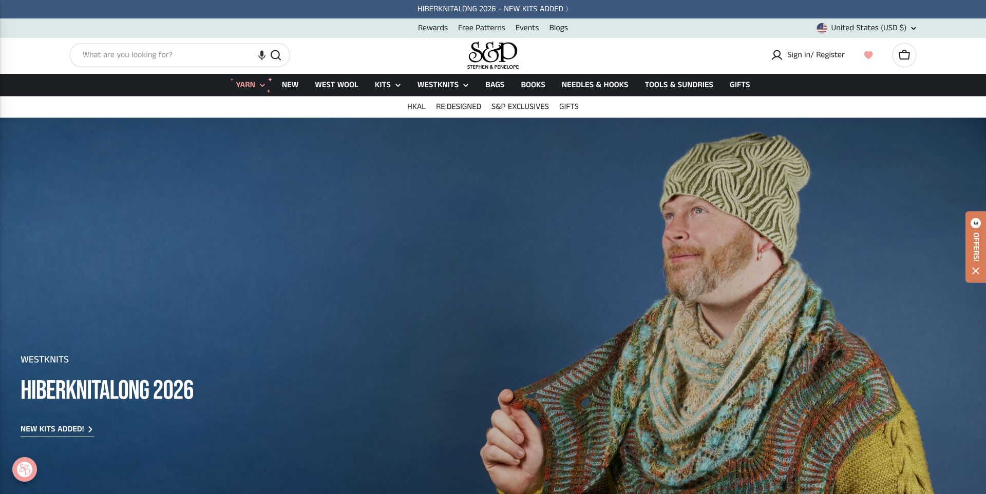
Stephen & Penelope uses a finished knitwear campaign to introduce its store. Large blue-backed photography gives the featured project a clear identity, while coordinated kits make the connection to supplies explicit. Product cards carry vendor names and prices, and the broader navigation offers yarn weights, brand collections, tools and books. The Amsterdam address, opening hours and directions preserve a local-shop route alongside international browsing. Regional currency and shipping messages are visible, although a visitor still needs to read the applicable delivery terms. The homepage has considerable promotional density, with several collections and carousels competing for attention. A discount dialog appeared during review and was closed normally before the accepted capture.
What you can learn
Use a featured project to organise related products without hiding the ordinary catalog. Keep local visit information and destination-specific delivery terms distinct, since the same attractive campaign can serve very different shoppers.
Pros
Coordinated kits connect the campaign to a concrete shopping route.
Maker names and visit details add useful context.
Cons & considerations
Repeated promotions can distract from everyday browsing.
The initial discount dialog covers the opening composition.
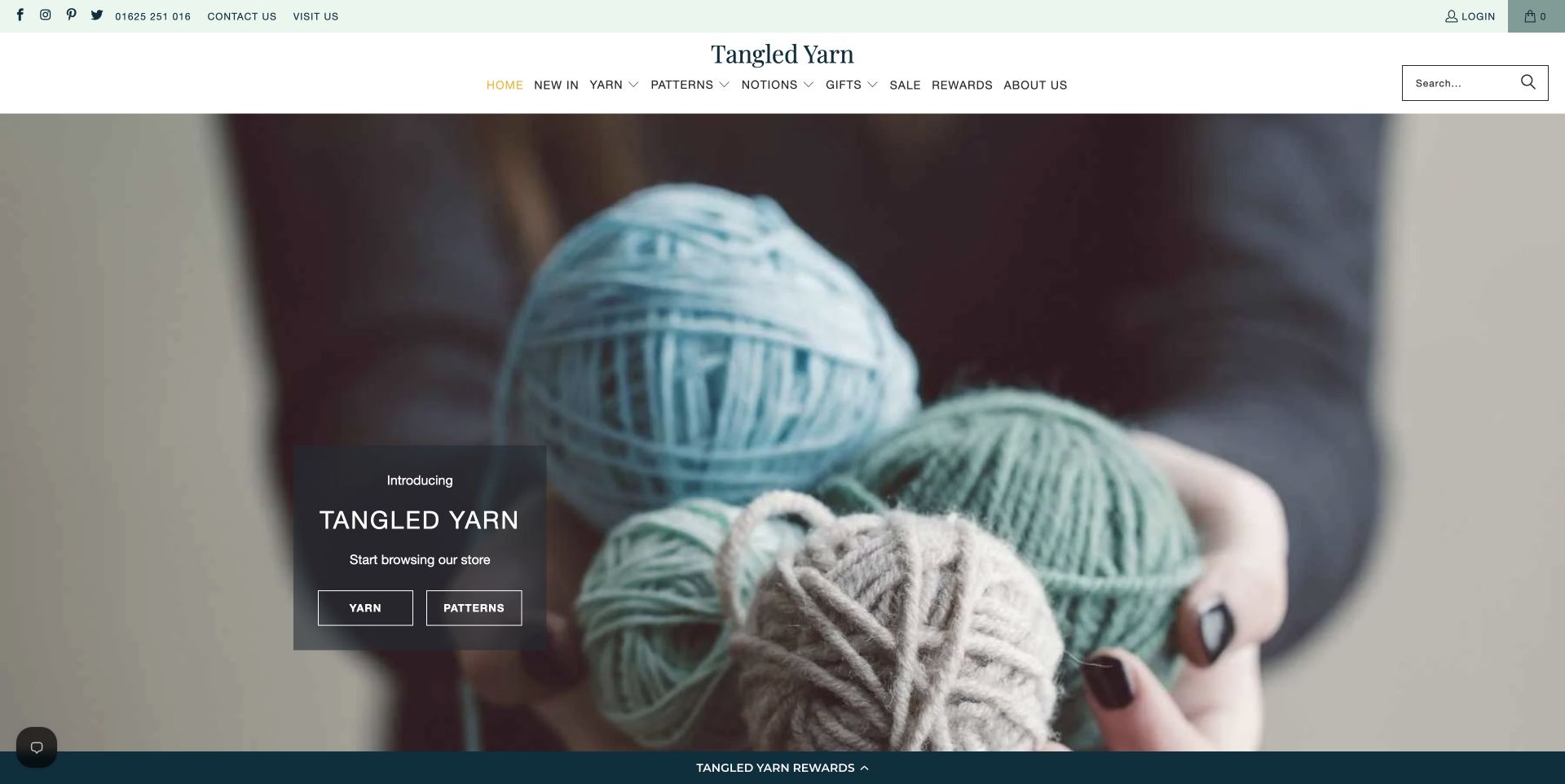
Tangled Yarn starts with a close photograph of yarn held in the hands, placing two simple Yarn and Patterns actions over the image. A restrained serif wordmark and pale green accents leave the product texture prominent. The following introduction identifies the mother-daughter team and its Poynton location, while a PetiteKnit collection brings patterns, suitable yarns and accessories together. Broad Yarn, Patterns and Tools tiles provide another clear route into the assortment. Contact and visit links are visible near the top, with the address and opening hours in the footer. The homepage is stronger at introducing the shop than comparing individual products; pricing and specifications require a further step.
What you can learn
Give a small specialist store a clear opening choice and a specific human introduction. A designer collection can organise related supplies, but should complement straightforward categories and dependable visit information.
Pros
Two opening actions keep the first decision manageable.
The team, location and hours make the store tangible.
Cons & considerations
The large hero delays detailed merchandise information.
Reviews occupy substantial space before the footer.
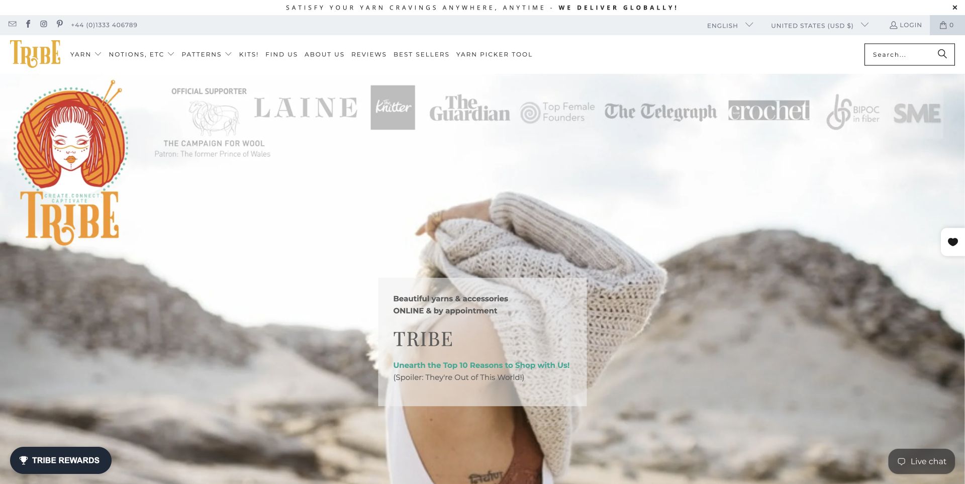
Tribe Yarns combines an illustrated identity, playful copy and large knitwear photography with unusually direct search prompts. The opening text states that shopping is online and by appointment, a useful distinction before someone assumes normal walk-in hours. Category tiles separate yarn, notions, kits, baby projects, undyed fibers and smaller bundles. A Yarn Picker Tool and needle-and-gauge information provide additional routes for visitors who need help choosing. Knit-along features and gift vouchers widen the offer beyond individual skeins. The page also contains a large quantity of reviews, product slides and editorial material, so its distinctive voice sometimes competes with the practical task of reaching a specific item.
What you can learn
An expressive retail voice works best beside plain operational language. State appointment arrangements clearly, retain a visible search field and group the assortment around meaningful project or material choices rather than personality alone.
Pros
Search and category tiles support different browsing habits.
Online and appointment wording avoids a misleading visit expectation.
Cons & considerations
Extensive reviews and carousels make the page long.
Some older blog entries are prominent beside current merchandise.
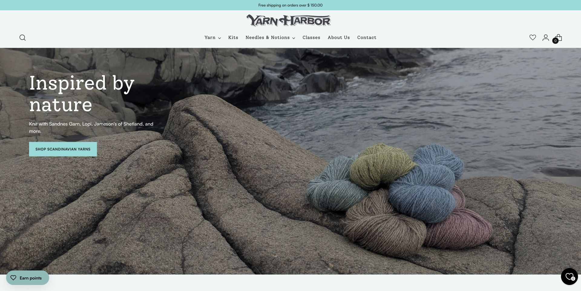
Yarn Harbor makes its Duluth setting part of the visual identity. Skeins photographed against a rocky shoreline introduce Scandinavian yarns, followed by a clear selection of merchandise, tools, kits and classes. New-arrival cards name the manufacturer, show prices and expose color choices without requiring an immediate product visit. A project section pairs a finished idea with relevant supplies. Classes include practical titles, prices and sold-out labels, while the address and weekly hours support a physical visit. Community activity is described separately from shopping. The homepage is substantial, with several product and testimonial carousels, but its strongest feature is the connection between a distinctive regional image and concrete retail information.
What you can learn
Let local imagery establish character, then support it with comparable product facts and usable class information. Community stories should add context while preserving direct paths to buying, learning and visiting.
Pros
Color choices and vendor names improve product-card usefulness.
Class and location information make the local offer specific.
Cons & considerations
The initial newsletter dialog obscures the opening image.
Several carousels increase the amount of browsing required.
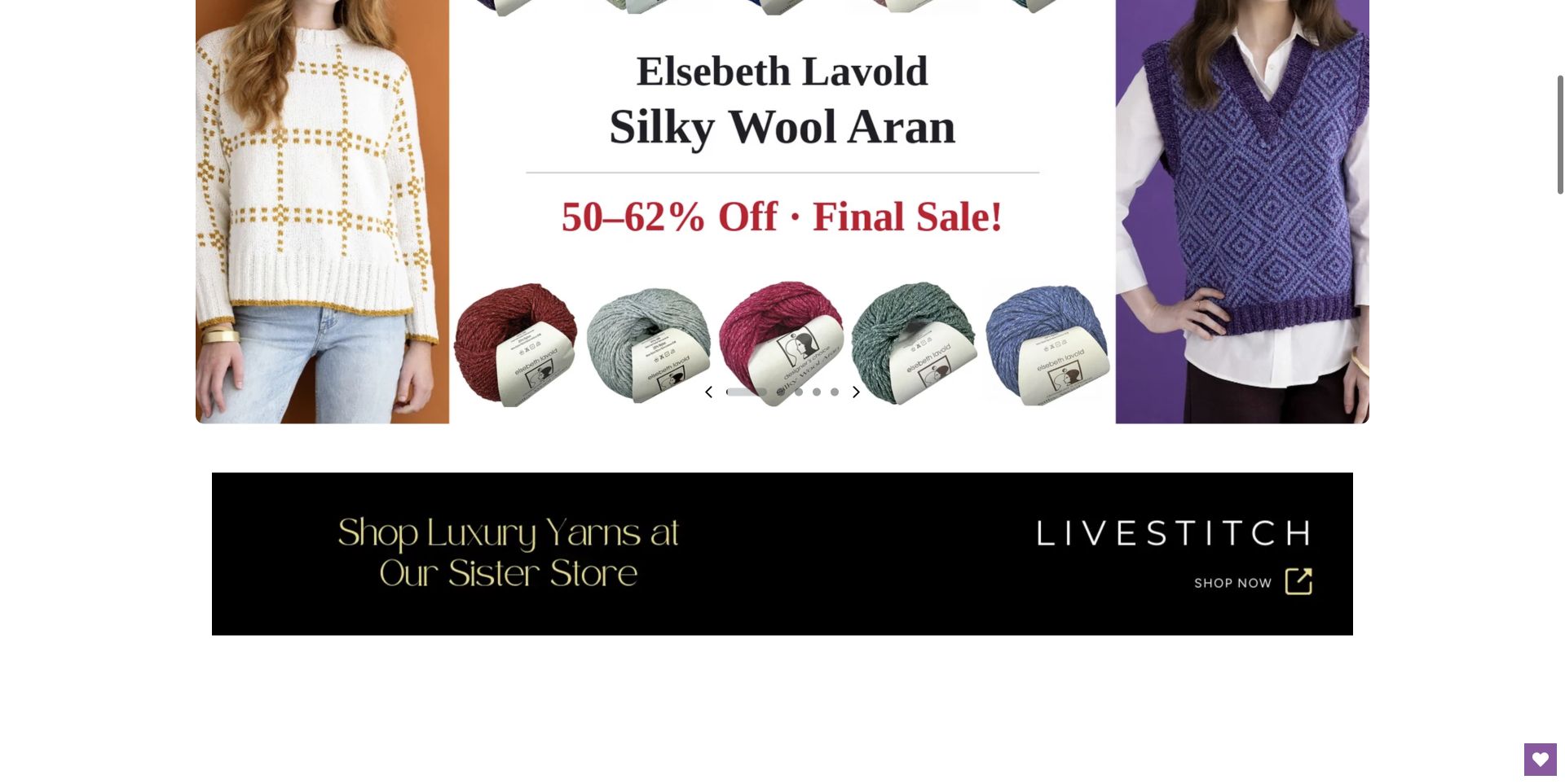
Little Knits presents a dense retail assortment through a large search field, an advanced yarn-search route and prominent sale categories. The homepage gives experienced makers direct links to yarn weights, while product names retain precise color numbers rather than relying on photographs alone. Free-pattern collections offer a project-based alternative to shopping by discount. The accepted capture shows a scrolled promotional section after a normal carousel control was used; the earlier image caught a transition and remains private. This is a deliberately merchandising-heavy presentation, with multiple offers and slides competing for attention. Its practical search and weight routes are more useful than treating the promotional percentages as the only organising principle.
What you can learn
Support bargain browsing with precise product identifiers and technical categories. A sale-led homepage should still help someone locate a particular yarn weight or color without inspecting every changing campaign image.
Pros
Advanced search and weight categories suit specific shopping tasks.
Color numbers distinguish otherwise similar product records.
Cons & considerations
Multiple discount messages compete for visual priority.
The rotating hero can briefly overlap content during transitions.
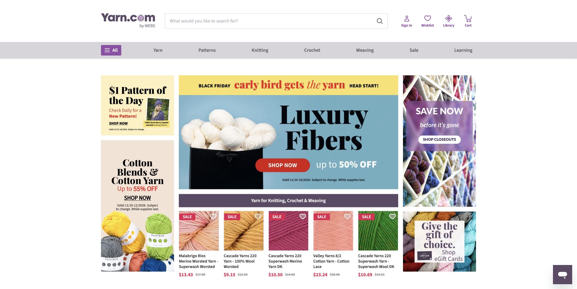
Yarn.com by WEBS uses a compact retail layout to expose several ways into a large assortment. Knitting, crochet, weaving and learning sit in the primary navigation, while brand-led rows give familiar products their own context. Product titles include useful fiber or weight terms and show prices directly on the cards. Separate routes for fiber, type, weight and brand acknowledge that shoppers do not all begin with the same vocabulary. A Northampton store link connects the online catalog to WEBS, and introductory copy explains that relationship. The homepage is highly promotional, with several offer panels visible together. An intrusive prize-style offer and chat message were dismissed before the accepted capture.
What you can learn
Give a broad catalog several consistent classification routes. Brand, fiber, weight and craft can coexist, provided the product names remain informative and promotions do not replace the underlying shopping structure.
Pros
Product titles surface useful material and weight information.
The store relationship and learning route are clearly represented.
Cons & considerations
Multiple simultaneous offers create a busy opening screen.
The initial promotional popup covers the catalog until closed.
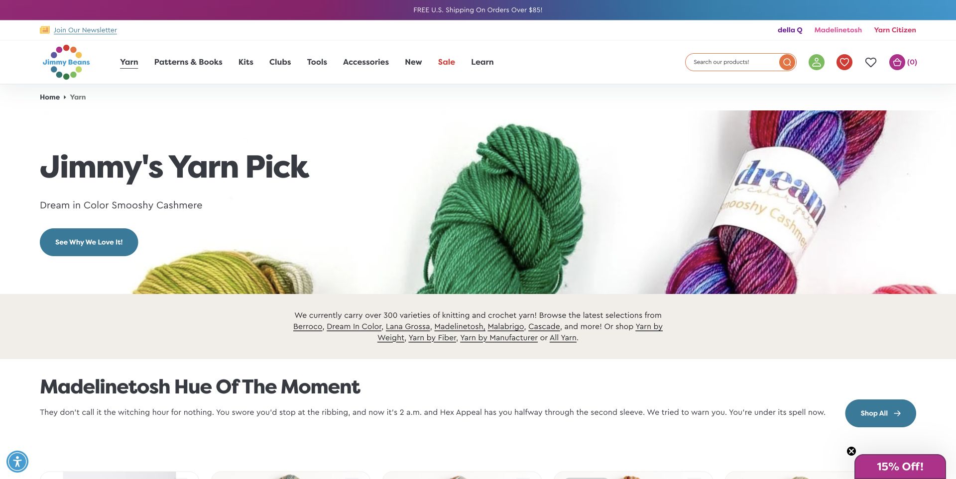
Jimmy Beans Wool's reviewed yarn department opens with one named recommendation and a clear invitation to read why it was selected. The following introduction links directly to yarn by weight, fiber and manufacturer, combining an editorial starting point with practical classification. A featured color campaign then shows related yarn bases and patterns with prices, color names and sold-out states. Breadcrumbs preserve the page's place within the larger store, whose navigation also includes kits, clubs, tools and learning. This department page is more focused than a general homepage, although long product carousels and repeated quick-view actions still make it dense. The newsletter dialog was dismissed before the accepted capture.
What you can learn
Pair a subjective recommendation with objective browsing routes. Visitors who like the featured color should be able to compare its bases, while those with an existing project can go directly to weight or fiber.
Pros
A named pick gives the department an editorial starting point.
Weight, fiber and manufacturer links support precise browsing.
Cons & considerations
Large product carousels repeat many similar records.
A promotional signup dialog interrupts the initial visit.
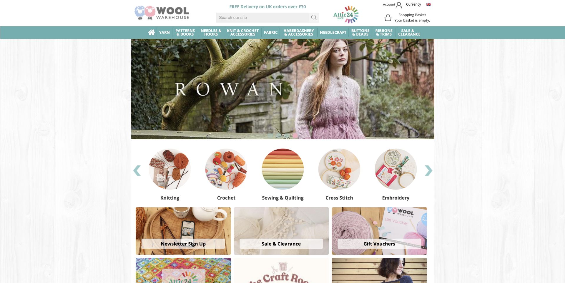
Wool Warehouse fits a wide assortment into a compact central layout. Its header separates yarn, patterns, needles, fabric and other crafts, while illustrated category circles provide another entry point below the promotional banner. Popular-yarn cards include the product name, price and number of available colors, useful information before a shopper opens a range. The homepage also explains the relationship between Wool Warehouse and its Yarnsmiths brand, then offers separate yarn and pattern links. Needle-size and yarn-weight information are available from the footer. The design favors density over spaciousness: several carousels, brand marks and categories sit close together, and important shipping conditions still need to be read beyond the headline offer.
What you can learn
Expose assortment depth with meaningful facts such as color counts. A compact retail layout can remain usable when categories are explicit and educational reference material is easy to find alongside the merchandise.
Pros
Color counts communicate range breadth before the product page.
Craft categories and practical reference links serve different needs.
Cons & considerations
Dense navigation can overwhelm a first-time yarn buyer.
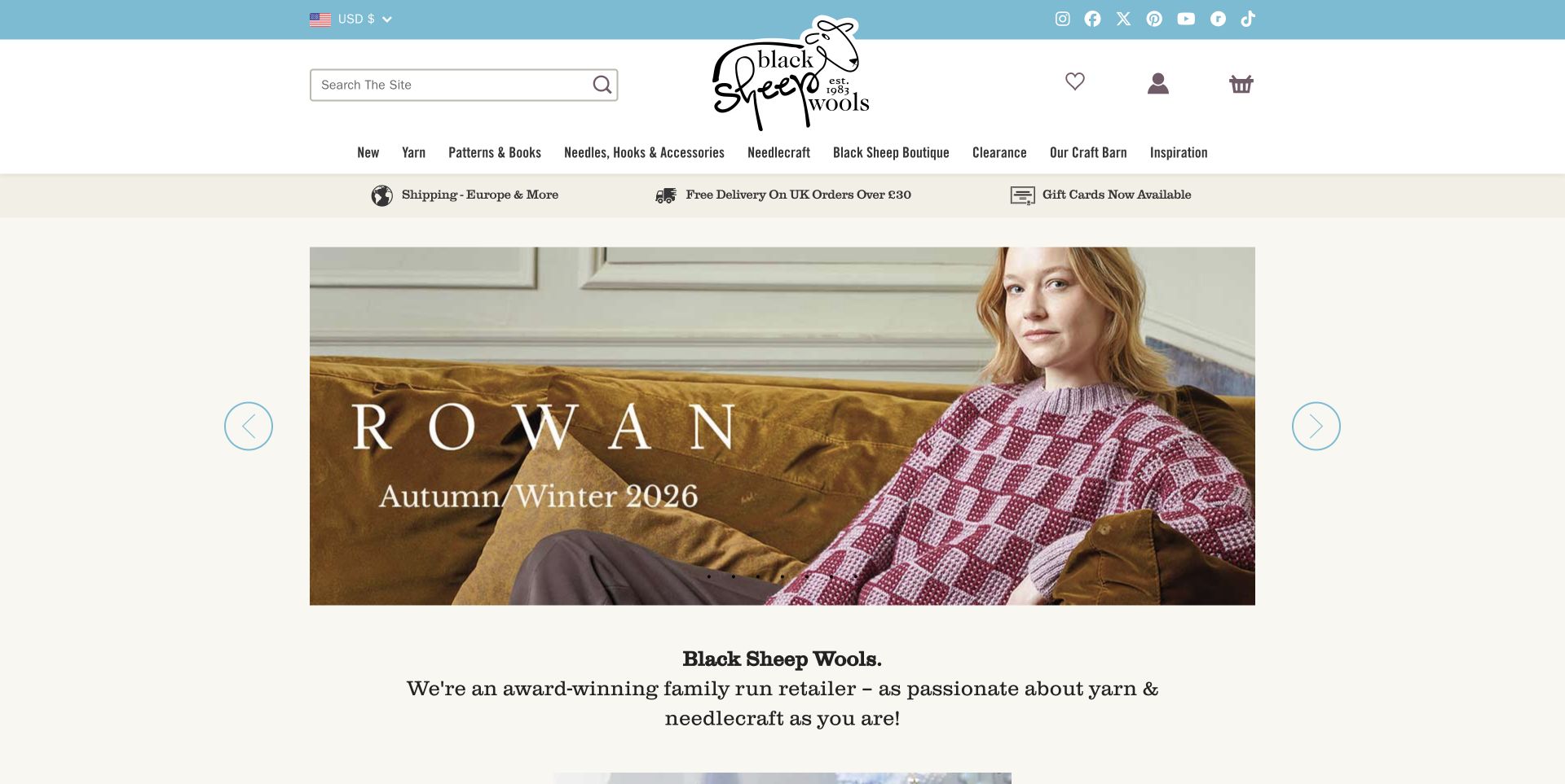
Black Sheep Wools places yarn and needlecraft alongside a clearly named Craft Barn destination. The opening campaign uses finished knitwear and familiar maker imagery, while the following tiles point to workshops, inclusive-sizing patterns, gifts and video inspiration. The Craft Barn section supplies practical visit cues, including parking, toilets and a tea shop, rather than presenting the venue only through atmosphere. Product cards retain prices, and make-alongs, staff projects and a video series provide reasons to return between purchases. These are observed content choices, not independently verified awards or accessibility certification. The main limitation is density: numerous navigation categories and seven hero slides compete with the more practical shop and visit routes.
What you can learn
Describe a physical craft destination through concrete visitor information and connect its activities to useful shopping content. Keep claims scoped and make workshops, products and directions easy to distinguish.
Pros
Visit information extends beyond an address and photograph.
Project and workshop routes support repeat engagement.
Cons & considerations
The broad menu asks visitors to make many choices.
Important campaigns may be hidden within the multi-slide hero.
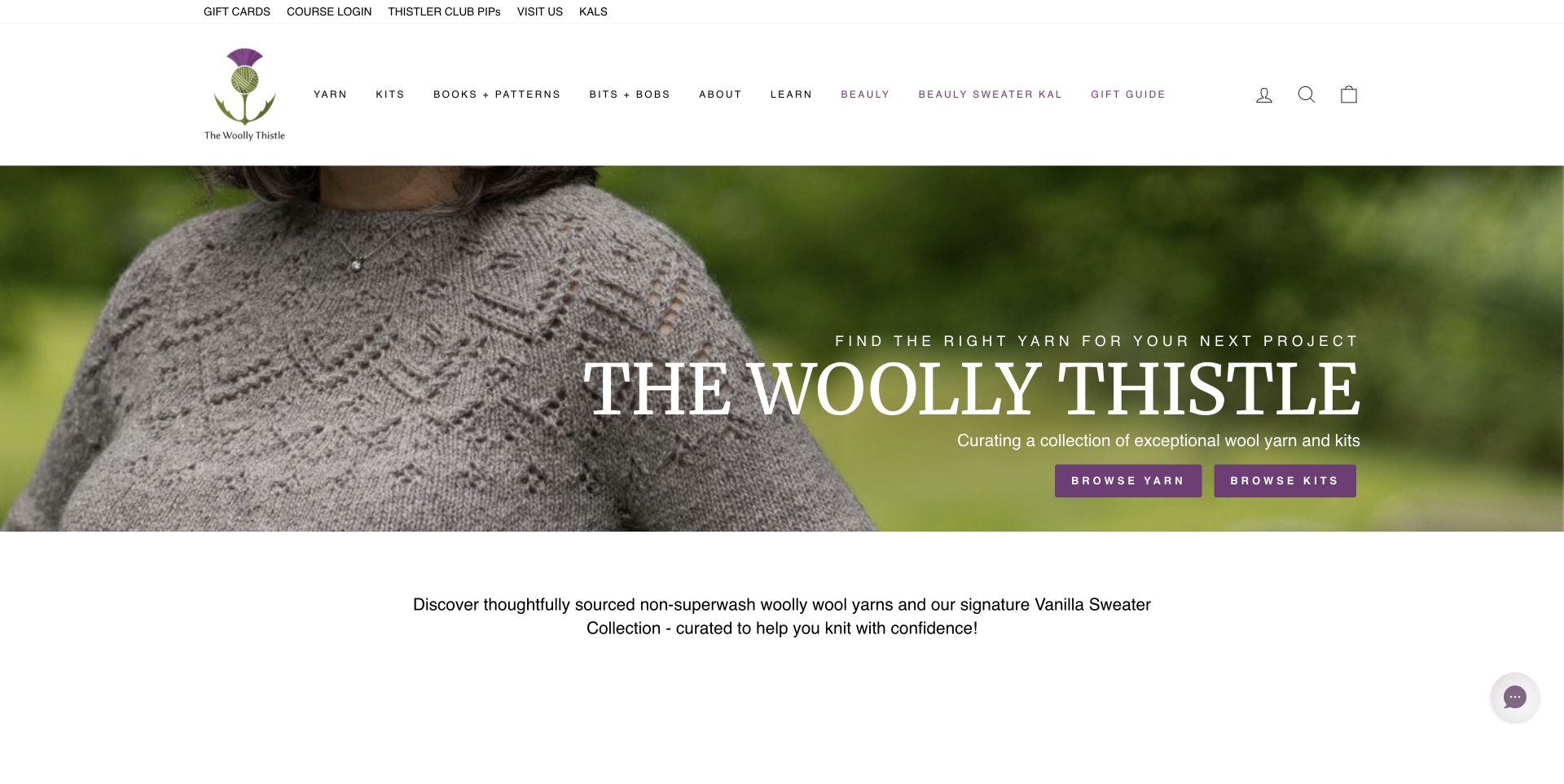
The Woolly Thistle introduces yarn and kits through a calm garment photograph and two direct browsing actions. Its Vanilla sweater collection explains different project goals, from learning fundamentals to exploring mohair or using a thicker gauge. Producer stories then connect the assortment to named makers and places, while weight and fiber routes provide a more technical way to browse. The page distinguishes beginner projects, colorwork, accessories and books, making its curation understandable rather than merely claiming a carefully chosen range. Prices appear on featured kit cards, and dated shopcasts support the editorial layer. The site also presents material and welfare claims that readers should investigate through the linked explanations rather than treat as independently certified by this review.
What you can learn
Connect a specialist assortment to both project difficulty and material information. Named producer stories are useful when they lead to clear product choices instead of replacing practical specifications.
Pros
Project categories explain different learning and making goals.
Producer stories give the assortment a specific editorial focus.
Cons & considerations
The long homepage repeats several paths into the catalog.
Cookie and newsletter prompts required normal dismissal.
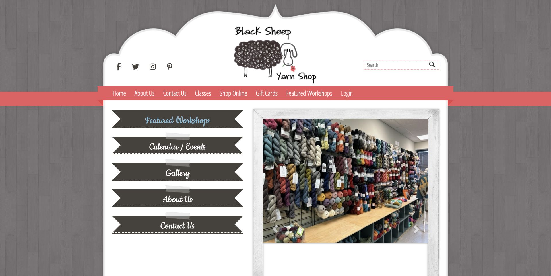
Black Sheep Yarn Shop in Maryland uses a distinctive illustrated frame and store photography to introduce its physical space. Large ribbon-style links point to workshops, the calendar, gallery and contact information, while a separate Shop Online route keeps purchasing available. A prominent notice states the move within the same shopping center and lists the revised opening schedule, reducing an avoidable source of wasted visits. Product categories cover yarn, kits, notions, spinning and weaving. The footer repeats the address and hours. The presentation is more traditional than several other examples, with decorative typography and generic category actions, but its practical strength is the attention given to changes a returning local customer needs to know.
What you can learn
Treat a move or schedule change as essential homepage content. Keep it explicit, reconcile the footer details and give classes, shopping and contacting the store distinct destinations.
Pros
The relocation notice and hours answer immediate visit questions.
Store photography makes the physical assortment tangible.
Cons & considerations
Repeated generic category actions are less descriptive than product-specific labels.
Decorative navigation uses considerable space before the merchandise.
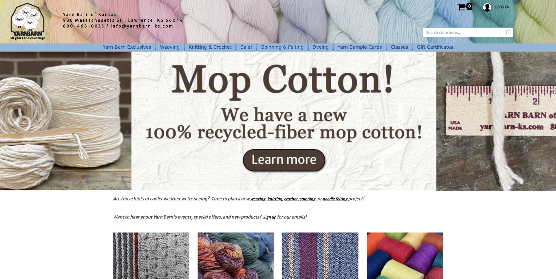
Yarn Barn of Kansas places its address and telephone information directly in a yarn-textured header. The main navigation separates weaving, knitting and crochet, spinning and felting, dyeing, sample cards and classes. That structure acknowledges different equipment and material needs rather than putting every visitor into one undifferentiated yarn list. Featured items mix yarn, books, tools and looms, with item references and prices or price ranges. The homepage also provides store hours and separate telephone-order availability. The layout feels utilitarian, with a large promotional image and dense footer. Some controls have unclear icon text, but the operational information and craft-specific categories offer concrete lessons for a specialist store with a diverse audience.
What you can learn
Organise a mixed fiber business around the activities people recognise, then retain precise product references and contact arrangements. Equipment, yarn and teaching can share a store without sharing an identical browsing journey.
Pros
Craft-specific navigation reflects materially different shopping tasks.
Item references and telephone hours make enquiries more precise.
Cons & considerations
The large promotion delays the product selection below.
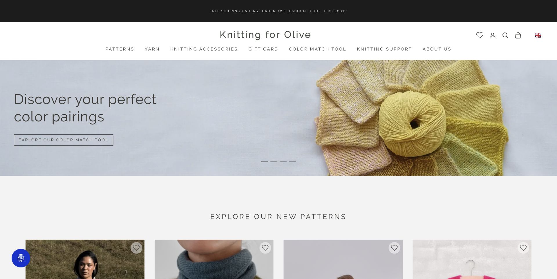
Knitting for Olive makes color pairing part of the main shopping proposition. A restrained wordmark and generous garment and yarn photography lead to a prominently linked color-match tool. New-pattern cards show finished garments and prices, while named yarn families provide another route through the assortment. The homepage explains the relationship between yarn, patterns and knitting support, with language choices available in the header. Material and welfare statements lead toward further explanation; this review observes that communication rather than certifying the claims. Shipping notices and a newsletter promotion required normal dismissal before the accepted capture. The calm visual treatment helps the products stand out, although multiple campaigns and substantial editorial sections extend the browsing journey.
What you can learn
Turn a recurring customer decision into a visible shopping aid. Color coordination belongs near the yarn and pattern routes, with material explanations and support available when a visitor needs greater detail.
Pros
The color-match route gives the store a specific practical focus.
Pattern imagery connects materials to finished garments.
Cons & considerations
Several notices interrupt the initial view before dismissal.
Brand claims need supporting explanations beyond the homepage.
Kegan is a freelance web designer and developer with 15+ years of experience helping businesses turn complicated website requirements into clear, maintainable digital experiences. He works directly with clients from planning and design through development, launch, and ongoing support.
For yarn shop website design, his development approach focuses on clear yarn and pattern records, useful product filters, class and event information, local visit details, and dependable shopping journeys. The scope can be a targeted improvement or a complete custom build, with responsive layouts, thoughtful content structure, and integrations chosen around the people using and maintaining the site.
Show 3 other yarn shop website designersHide other yarn shop website designers
Plan a yarn shop website around the project and the next useful decision
Build a catalog that works for both exact searches and exploration
Start with the information the team can maintain for each yarn: brand, base, fiber composition, weight, length, unit size, care instructions and color identity. Decide which fields belong to a product family and which belong to a particular variant. A color photograph is valuable, but a stable color name or number helps someone recognise the item when asking a question or returning later.
Wool Warehouse exposes color counts on popular-yarn cards, while Little Knits retains precise color numbers in product names. Yarn.com offers complementary routes by fiber, weight, type and brand. These approaches support different intentions without requiring a single ideal browsing journey. Keep labels consistent across search results, category pages and the product record so the same item remains recognisable.
Do not assume that a similar color or nominal weight makes two yarns interchangeable. The website can explain recorded specifications and link relevant guidance without guaranteeing a substitution for every pattern. Preserve unknowns honestly. Give visitors a way to ask a specific question with a product reference, while leaving ordinary browsing available without an account or contact form.
Use projects to explain the assortment rather than obscure it
Purl Soho connects finished projects with patterns and supplies, and The Woolly Thistle organises several sweater projects around distinct making goals. This is useful because a visitor can begin with an object they want to make rather than a technical specification they do not yet understand. The photograph should show the result clearly enough to explain why the associated materials are relevant.
Distinguish a pattern, a yarn bundle and a complete kit. State what is included, which options affect the quantity or price, and whether tools must be purchased separately. A coordinated color campaign can be attractive without being a promise that every item shown is in the basket. Keep the underlying yarn and pattern records accessible for people who already own part of the project.
Plan support beyond the sale. Pattern corrections, care information and learning resources can remain useful long after a promotion ends. Jimmy Beans Wool keeps learning and yarn classification near its featured recommendation; Knitting for Olive gives color matching a visible route. Choose a small number of tools or resources that answer actual customer questions, and explain their limitations rather than implying they replace all individual advice.
Treat the local shop and its classes as maintained information
Espace Tricot and Yarn Harbor show classes with prices and availability alongside merchandise. That makes learning a concrete service rather than an atmospheric claim about community. A class record should identify its subject, actual date, duration, prerequisites, included materials and cancellation arrangements where applicable. Keep a sold-out state informative and provide an appropriate next step without suggesting a place remains available.
Separate a normal store visit from an appointment-only arrangement. Tribe states that its offer is online and by appointment; Black Sheep Yarn Shop prominently explains a move and changed hours. Make these distinctions visible before someone travels. Address, phone links, opening hours and directions should come from maintained fields and agree wherever they appear, including the footer and any dedicated visit page.
Use store photography and local context to support those facts. Yarn Harbor carries a regional landscape into its visual identity, while Black Sheep Wools explains practical Craft Barn facilities. Describe only confirmed arrangements and avoid turning an accessibility statement into a certification. A warm welcome works best when the visitor can also establish whether the store is open and how to participate.
Keep specialist stories and promotions useful and proportionate
La Bien Aimée explains a dyed-to-order arrangement, while The Woolly Thistle introduces named yarn producers. Such stories can clarify why an assortment differs from another store, but they should connect to concrete product and ordering information. Separate a brand statement, a documented specification and an independently supported certification. Do not imply that attractive photography verifies production or welfare claims.
Promotional density is a recurring tradeoff in this collection. Multiple sale panels, carousels, review widgets and signup dialogs can compete with the visitor who simply wants a particular color or the opening hours. Keep the main category and search routes persistent and label offers clearly. A promotion should be dismissible through normal controls, with useful content still available when someone declines it.
Review content as arrangements change. Preorders, production waits, shipping exclusions and seasonal classes have different lifecycles from an evergreen pattern guide. Date genuinely time-sensitive information and remove misleading actions when an offer ends. Preserve useful project material and corrections, but do not make an old campaign look current merely by rebuilding the website. A maintainable editorial rhythm is more valuable than adding new homepage modules without an owner.
The editing job behind the design
Choose tools around reliable product, project and class records
Evaluate a store system by how it manages yarn variants, color identifiers, stock states, related patterns and kit quantities. The team should be able to update a product once and have the same information appear consistently in search, categories and promotional sections.
Classes and physical visits may need different content fields from merchandise. Keep dates, availability, location and appointment information explicit, and explain any handoff to another booking system. Do not test real purchases, registrations or enquiries merely to demonstrate the website.
The visible technology stacks reflect bounded public-source audit attempts rather than a complete architecture inventory. An unavailable scan remains unavailable. Public supporting libraries and delivery references do not prove a hidden backend or explain the quality of the design by themselves.
Our WordPress website examples offer a separate look at publishing approaches. A visible platform label is evidence for that named page, not a guarantee that the same system will suit your requirements.
Before the public launch
Yarn shop website planning checklist
Give yarn families and color variants stable, descriptive identities.
Record verified fiber, weight, length, unit size and care information.
Support browsing by relevant material and craft categories.
Keep search available for exact product and color queries.
Connect finished projects to their actual pattern and supply records.
State what a kit includes and what must be bought separately.
Distinguish available, sold-out, preorder and dyed-to-order stock.
Explain delivery scope, pickup and production timing where relevant.
Keep class dates, prices, prerequisites and availability current.
Make appointment-only arrangements clear before a store visit.
Synchronise addresses, hours and telephone links across pages.
Provide pattern corrections and support without requiring promotional signup.
These checks are a project checklist, not a performance, legal, security, or accessibility certification. Test real journeys with the people responsible for the website before making claims about the result.
Sources & editorial method
How this collection was selected and reviewed
The original random target of 17 was saved before research. Each included public source page was directly reviewed and captured. Optional cookies were rejected where choices were offered, and screenshots show the website without open obstructing popups. Little Knits is shown at a scrolled promotional section; Jimmy Beans Wool is a yarn department page. Every source received a bounded broad public technology-audit attempt; unavailable results are retained without guessing hidden technology. Espace Tricot was explicitly selected for product, class and visit information design, not product quality, service quality or commercial performance. Original capture timestamps are preserved independently of the November 12 editorial work date.
Each example links to its actual source page. Screenshots are direct browser captures with their own capture dates; moving imagery, announcements and live designs can change. The notes describe observable design choices and conditional tradeoffs, not measured traffic, conversion results, service quality, or accessibility conformance.
Technology labels use public page metadata, asset evidence, or explicitly cited platform documentation. Platform documentation is not a complete current deployment audit. A component reference may be legacy or unused; it is not a complete backend inventory. Unknown stacks are omitted. These sites are editorial examples, not our client portfolio.
Written, Edited and Curated are separate editorial records, not timestamps advanced by a rebuild. Website designs and imagery belong to their owners. See our editorial standards or suggest a correction.
Questions worth asking
Yarn Shop website design questions
How should a yarn shop organise its online catalog?
Use the classifications that fit the actual assortment, such as weight, fiber, brand and craft, alongside an exact search route. Keep product and color names consistent across listings and detail pages.
What should a yarn kit page explain?
Identify the pattern, yarn base, quantities and included supplies. Explain which selections change the price and which tools or materials are separate. Do not assume everything in a project photograph is included.
How can a local yarn shop make classes easier to understand?
Give each class a clear subject, date, price, prerequisites and availability where known. Keep sold-out states honest and explain the location, materials and booking arrangements before asking someone to register.
Should an online yarn store promise exact colors?
Show useful photographs and stable color identifiers, but explain relevant limitations rather than guaranteeing an identical appearance on every screen. Product specifications and personal advice can support decisions without promising that every substitution will work.
Why is Espace Tricot the Editors Choice?
Its reviewed homepage connects named, priced products with dated class listings, availability states and practical Montreal visit information. The selection recognises website information design, not independently tested yarn quality or customer service.
Begin with dependable product records and clear routes to shopping, learning and visiting. Use project imagery and the shop’s personality to support those decisions, then maintain the details that help a maker take the next step.