Best Ceramics Shop Websites of 2026 (14 Real-World Examples)
Ceramics shop websites that connect the character of handmade objects to clear choices about form, finish, availability and ordering.
Explore 14 directly reviewed ceramics shops and pottery studios, with practical lessons from independent makers, specialist dinnerware collections and businesses combining retail with studio visits.
A ceramics website has to explain an object through a screen. A photograph can communicate the shape and character of a glaze, but it rarely answers every question about dimensions, quantity, variation, stock and delivery. Good product presentation lets the expressive and practical information work together.
The examples here have different business models. A small maker releasing individual pieces does not need the same navigation as a dinnerware catalog, and a local studio offering classes must distinguish a booking from an object purchase. Start with the actual offer and maintenance capacity of the business before borrowing a large retailer’s layout.
Before the examples
What makes good ceramics shop website design in 2026?
Make the object understandable
Show a recognizable overall view, useful detail and an honest sense of scale. Name the form and finish in text rather than expecting shoppers to distinguish every option from photographs. Describe handmade variation without using it as a substitute for clear product information.
Separate different ways of buying
Stocked pieces, made-to-order work, small releases, sets and professional orders may need different explanations. Label those paths plainly. When the shop also offers classes or visits, separate their dates and booking steps from product availability and checkout.
Give the studio story a useful role
Introduce the maker, process and place with specific photography and concise explanation. Connect that story to the objects being offered. A visitor who already knows the studio should still be able to reach a product category without working through a long introduction.
The collection · 14 examples
14 ceramics shop websites worth studying
Compare how these 14 sites use product photographs, category labels, seasonal campaigns and studio stories. The sequence is an editorial study of website design, not a ranking of ceramic quality or customer service.
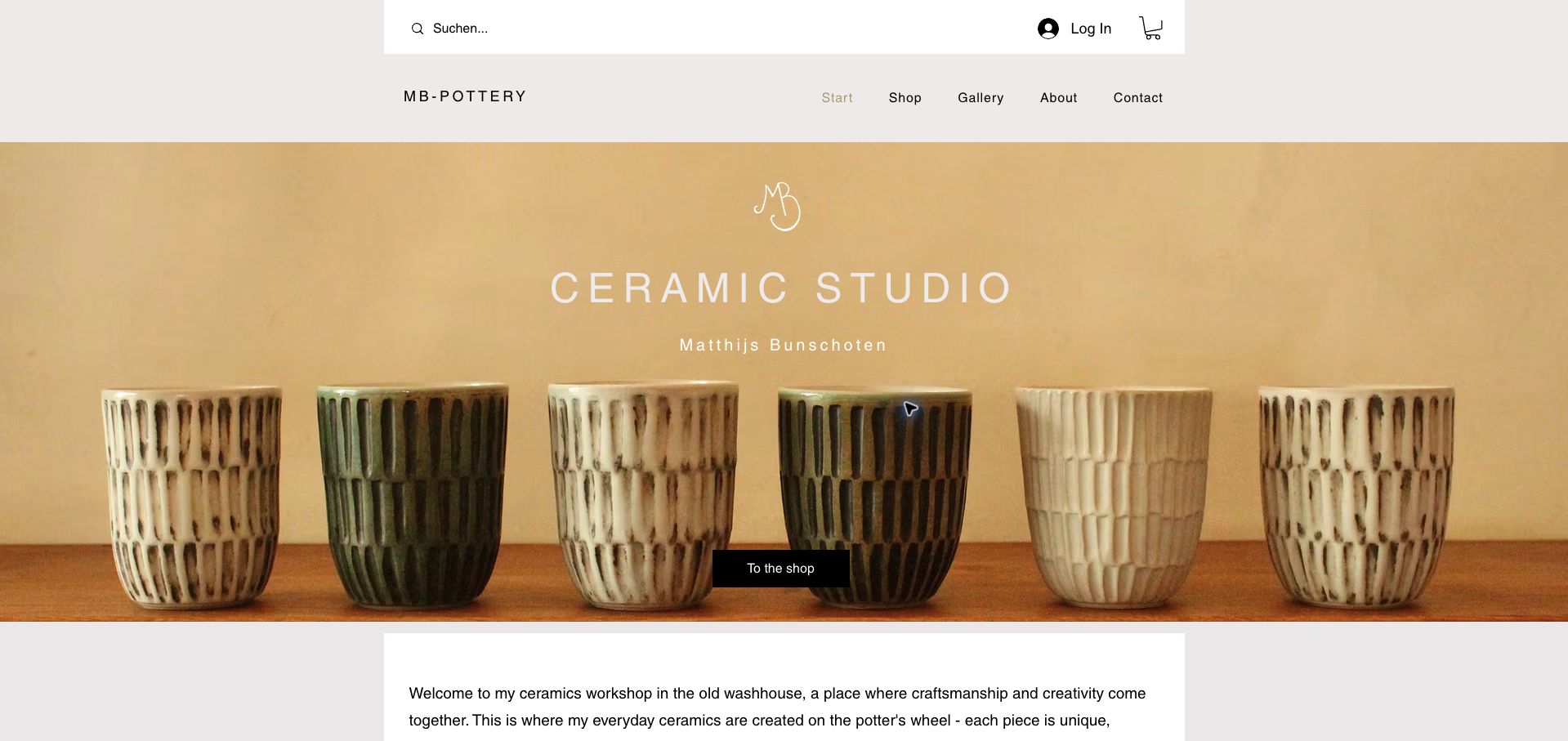
MB Pottery gives six textured cups most of the opening frame, using their repeated shapes to introduce the collection before explaining the studio. The maker’s full name sits below a restrained studio heading, while a black shop button creates a clear next step against the warm photograph. The navigation separates shopping, a gallery, the maker’s background and contact information. That distinction is useful for a pottery business whose visitors may want either an available piece or more context about the work. A short introduction begins immediately below the hero rather than leaving the entire first screen to decoration.
What you can learn
Use a representative group of actual pieces to communicate your visual language, then connect it to one unmistakable shopping action. Keep the personal introduction close enough that visitors understand whose work they are considering.
Pros
The repeated cups reveal meaningful differences in glaze and surface without requiring a product carousel.
The maker’s name, gallery and shop are presented as complementary parts of the same studio.
Cons & considerations
The English page retains a German search placeholder, creating a small language inconsistency.
Individual prices and availability require entering the shop; the hero does not answer those buying questions.
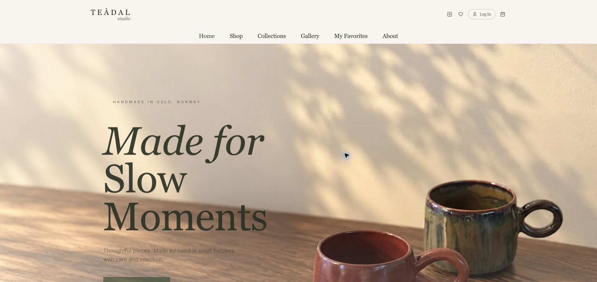
Teàdal Studio introduces its ceramics through warm light, table shadows and a close view of two mugs. The oversized italic headline gives the page a deliberate, unhurried tone, while a small location line establishes Oslo as the studio’s setting. A conventional navigation row still makes the shop, collections, gallery and maker information easy to identify. This is a useful example of letting the products provide the atmosphere rather than adding unrelated decorative imagery. At the captured desktop size, however, the scale of the headline pushes the main action toward the bottom edge, so the first impression is stronger as a brand introduction than as a rapid catalog entrance.
What you can learn
Build the mood around real product textures and lighting, but check that the first purchase route remains visible at ordinary screen heights. A calm aesthetic still needs practical paths for repeat buyers.
Pros
The handmade-in-Oslo line supplies a concrete place and production context.
The palette and photography reinforce the character of the mugs without competing graphics.
Cons & considerations
The large headline consumes substantial vertical space before visitors reach the main action.
Prices, stock and delivery details are not part of the opening view.
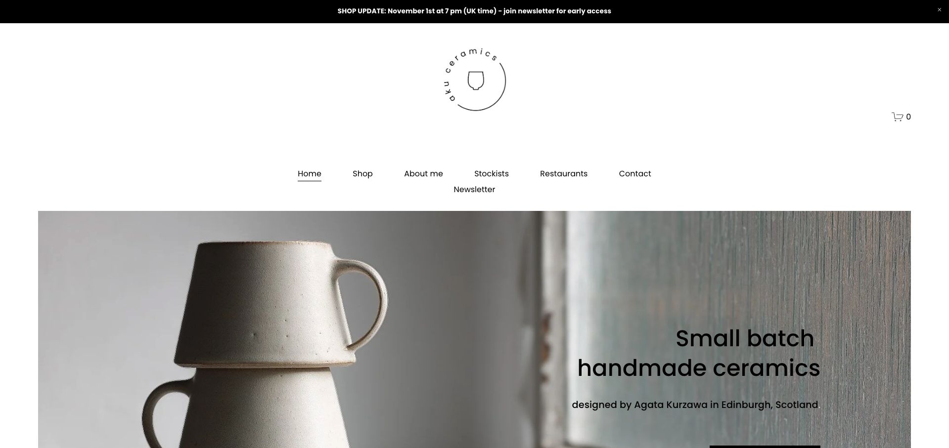
aku ceramics pairs a photograph of stacked mugs with a direct statement about small-batch ceramics and the name of their Edinburgh maker, Agata Kurzawa. The centered circular logo and generous white space give the page a quiet studio character. Navigation includes stockists and restaurants alongside the shop, acknowledging that a ceramic practice can serve several kinds of buyer. The opening promotional strip announces a shop update, which makes release timing visible but also creates a maintenance responsibility once that date passes. This is a helpful reference for a personal practice that wants to explain authorship and availability without a long introductory essay.
What you can learn
Put the maker, place and kind of work near the first product photograph. If stock arrives through scheduled releases, give the announcement an owner and replace it promptly after the release has happened.
Pros
The introductory copy connects a specific person and city to the ceramics.
Separate stockist and restaurant routes recognize trade visitors without hiding the retail shop.
Cons & considerations
The captured update notice refers to November 1, preceding this review date.
A tall logo and navigation area postpones the product introduction on shorter screens.
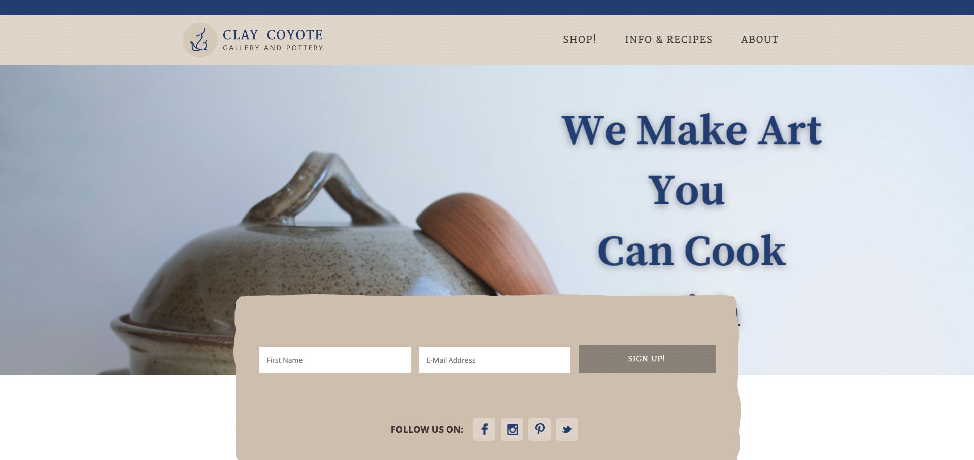
Clay Coyote opens with a covered ceramic cooking vessel and a large statement connecting its art to cooking. That combination answers a useful question quickly: the pottery is presented as something to use, not only display. The cream and blue identity feels consistent across the logo, headline and compact navigation. Shop, information and recipes, and the company background are the primary routes. A large signup panel overlaps the bottom of the photograph, bringing a recurring relationship with the studio into the opening view. The example is especially useful for thinking about how educational content can support unfamiliar products, although the newsletter competes with the first shopping step.
What you can learn
Show the object doing the job you want shoppers to understand, then place supporting recipes or instructions within an obvious route. Give a first-time visitor enough shopping context before making email signup the strongest secondary element.
Pros
The hero establishes a specific practical use for the pictured ceramic vessel.
A short navigation makes the shop and educational material easy to distinguish.
Cons & considerations
The overlapping subscription block occupies a large part of the first view.
The large image headline is partly obscured by that block at the captured viewport.
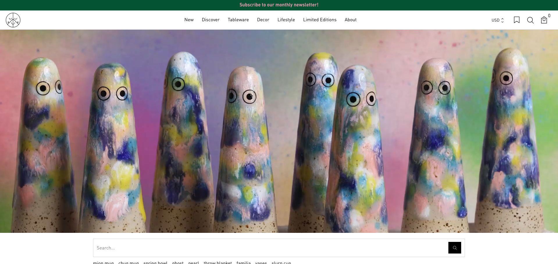
Studio Arhoj lets a row of colorful ceramic figures fill the hero, with their repeated eyes and varied glazes providing the brand’s personality. The restrained white navigation keeps practical categories visible above that expressive image. Immediately below it, search and named product shortcuts give experienced shoppers a faster route to familiar forms. The first visit also showed an international-shipping notice before the unobscured view was captured. That notice addresses a real purchasing concern, but its length temporarily dominates the product presentation. The combination is useful to study because a collectible catalog needs both emotional recognition and exact item discovery; attractive photography alone does not serve a returning buyer looking for a particular shape.
What you can learn
Pair a distinctive collection image with search and understandable product-family names. Communicate important delivery conditions clearly, while allowing visitors to return to the catalog without losing their place.
Pros
The products themselves create a memorable, coherent visual identity.
Search and named shortcuts sit close to the hero rather than being buried in a footer.
Cons & considerations
The initial shipping notice interrupts the opening product view.
An image-led hero provides little explanatory text for visitors unfamiliar with the figures.
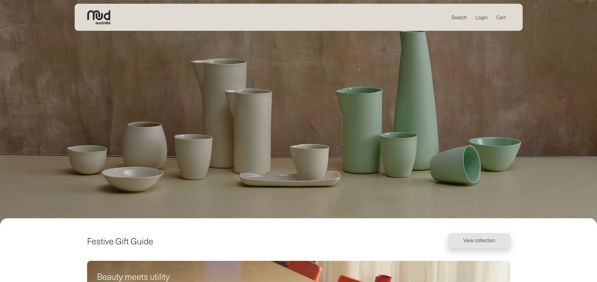
Mud Australia opens with a carefully spaced group of vessels in pale neutral and green tones. The photograph makes differences in height, shape and use visible without turning the introduction into a dense grid. A floating header keeps the logo and account utilities compact, while the seasonal collection title and its action appear in a separate white panel below the image. The following category language connects the objects to dinnerware, serving, decor and lighting. This approach gives a coordinated range room to breathe, although a visitor arriving with a precise product in mind has to move beyond the first screen to reach most category choices.
What you can learn
Use a collection photograph to establish relationships among products, then name the practical categories in ordinary language. Keep the campaign destination distinct from the permanent paths shoppers will use after the season ends.
Pros
The grouped vessels communicate scale and variety within a consistent palette.
The white campaign panel creates a clear boundary between the image and the next shopping action.
Cons & considerations
The opening header emphasizes utilities more than product categories.
A large campaign image means individual product information begins farther down the page.
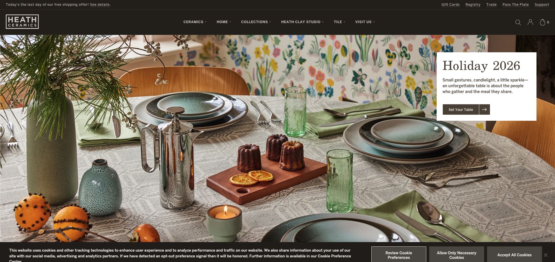
Heath Ceramics introduces its holiday collection with a complete table setting, showing plates, cups and serving pieces in a believable shared context. A white text panel remains readable over the busy photograph and offers a specific table-setting action. The dark header separates the main ceramics and home categories from utility links such as registry, trade and support. That hierarchy is useful for a business with several audiences: household buyers do not have to navigate through professional services to reach the collection. The opening image is rich in context, but the number of header choices and a bottom cookie banner add considerable interface around it.
What you can learn
When lifestyle photography contains many objects, give the main message its own readable surface. Distinguish permanent shopping categories from trade, registry and support tasks so the scene leads to an understandable next step.
Pros
The table photograph shows how different pieces can work together.
The text panel maintains a clear reading area over detailed imagery.
Cons & considerations
Two navigation tiers require more scanning than a small studio catalog.
The cookie interface reduces the visible image area on the first visit.
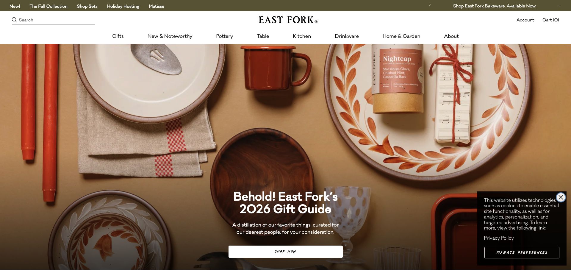
East Fork uses an overhead arrangement of ceramics, linens and gifts to introduce its seasonal guide. A bold white headline and shop button sit over a darker part of the photograph, creating a recognizable campaign entrance. Above it, a broad category row distinguishes pottery, table, kitchen, drinkware and other home goods, while a separate strip surfaces timely collections. The result acknowledges that the shop sells a wider assortment than pottery alone. It is a useful reference for balancing editorial merchandising with normal catalog navigation, though the several promotional and navigation layers make the top of the page busy before a visitor reaches an individual product.
What you can learn
Treat a gift guide as a temporary path through a stable catalog. Give it a strong visual idea, but preserve clear category labels for shoppers whose needs do not match the current campaign.
Pros
The overhead scene connects ceramics to the wider gifting assortment.
Permanent product categories remain visible above the seasonal message.
Cons & considerations
Multiple navigation and promotional rows compete for initial attention.
A first-visit privacy panel covers part of the lower-right campaign image.
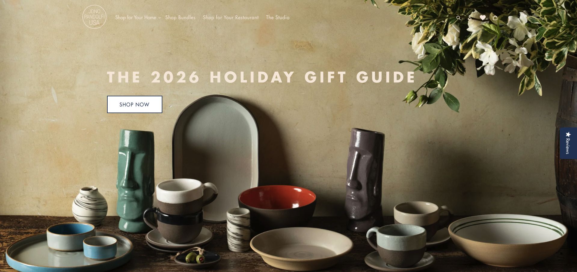
Jono Pandolfi fills the opening view with a still life of bowls, cups, trays and vases, using their material differences to support a holiday gift guide. The navigation makes a valuable distinction between shopping for a home and shopping for a restaurant, alongside bundles and the studio story. That separation is more instructive than simply adding a generic wholesale link at the bottom of a retail page. The primary campaign button has a solid background, making it easier to locate than the lighter navigation text over the photograph. The example shows how the same product identity can support different buying contexts without pretending their requirements are identical.
What you can learn
Name different buyer relationships early, especially when household and professional orders need different information. Keep important controls on reliably readable surfaces instead of depending on whichever part of a hero photograph appears behind them.
Pros
Home and restaurant routes are explicit in the opening navigation.
The product arrangement shows several forms and finishes within one cohesive scene.
Cons & considerations
Light header text can blend into pale areas of the image.
The gift-guide focus delays practical detail about the individual pieces and ordering options.
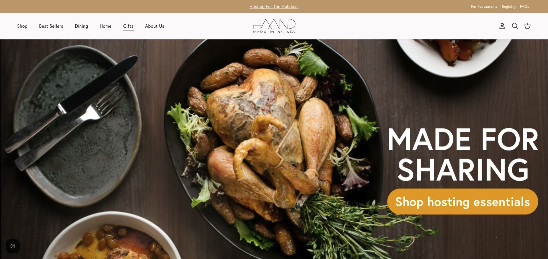
Haand introduces its hosting range with a large overhead meal photograph. A dark platter and related tableware surround the food, making the intended use of the ceramics immediately understandable. The bold hosting action stands out against the image, while a white navigation band gives shoppers conventional shop, bestseller, dining and home routes. Restaurant and registry links sit in a quieter utility strip, serving additional audiences without displacing the retail categories. This is a useful example of occasion-led merchandising: it shows why someone might need the pieces. The tradeoff is that the food occupies much of the visual attention, so the exact ceramics require a closer look.
What you can learn
Use an occasion to give products context, then keep the product itself identifiable. Separate the temporary hosting campaign from stable category, restaurant and registry destinations so repeat visitors can bypass the seasonal story.
Pros
The meal setting explains the role of the serving pieces.
Distinct utility and shopping areas accommodate different customer tasks.
Cons & considerations
Food can visually overpower the pottery being offered.
The large hero gives little immediate information about sizes, individual items or stock.
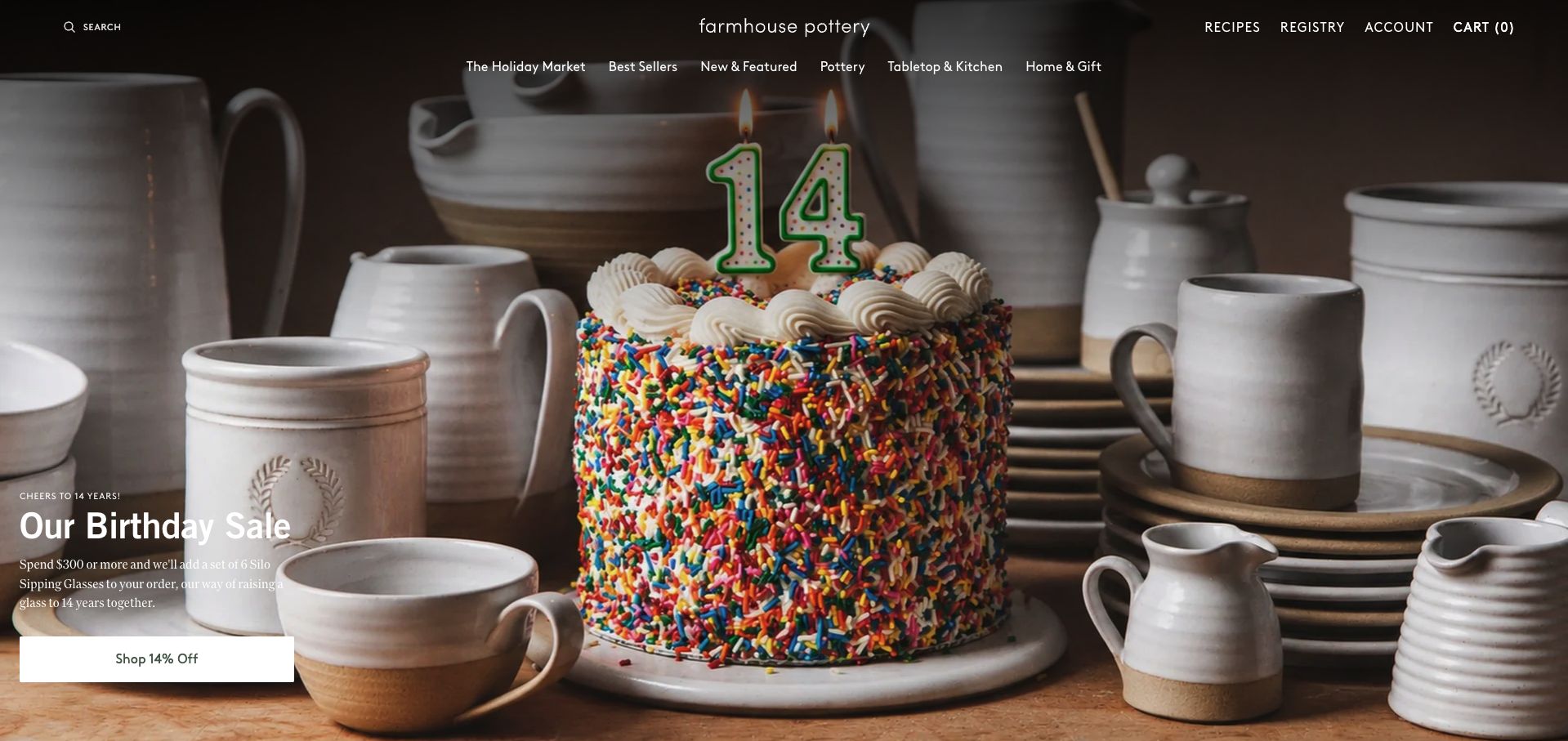
Farmhouse Pottery turns an anniversary into a concrete visual story, placing a birthday cake among its characteristic pale pottery. A compact campaign block explains the offer and provides a strong white shopping button, while the main navigation still separates pottery from tabletop, kitchen and other gifts. The arrangement gives the promotion a relationship to the product rather than treating it as a detached sale banner. It is useful for studying how a familiar range can support a timely campaign. The image remains visually busy, however, and the offer copy is small relative to the full-screen scene, so essential conditions should not rely on that introductory block alone.
What you can learn
Build seasonal or anniversary campaigns from recognizable products, then give visitors a clear route into the relevant assortment. Keep offer details readable and maintained separately from decorative imagery so they remain useful when the campaign changes.
Pros
The anniversary photograph connects the promotion to the pottery itself.
A high-contrast button provides an obvious entrance into the featured offer.
Cons & considerations
Small campaign text is harder to scan over a detailed photograph.
The expansive hero postpones product-level prices and specifications.
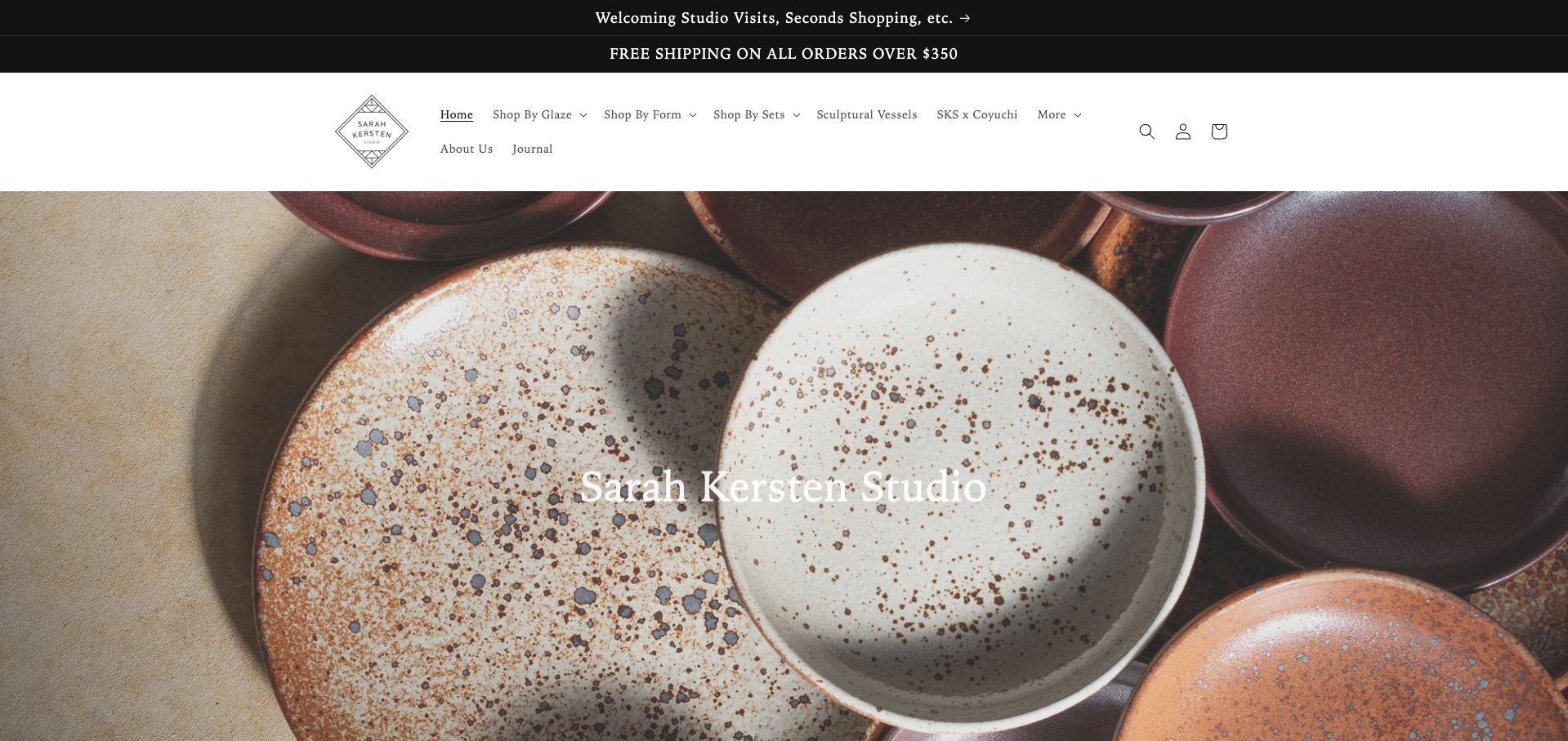
Sarah Kersten Studio makes a close arrangement of glazed plates the main visual introduction. The photograph reveals surface variation and color relationships rather than showing a generic lifestyle scene. More unusually, the navigation offers separate ways to shop by glaze, form and sets, reflecting the different decisions involved in building a dinnerware collection. Studio visits and shipping information occupy narrow announcement bars above it. This is a useful reference for a specialist catalog because a returning customer may know the finish they want while a new customer may begin with the shape. The hero itself is quieter on practical action, leaving the navigation to do most of that work.
What you can learn
Choose catalog entry points around the attributes customers actually compare. For ceramics, shape and glaze can be independent decisions; provide clear routes for both without making one replace the other.
Pros
The category structure supports several realistic ways of choosing dinnerware.
Close product photography makes glaze texture and variation visible.
Cons & considerations
Several announcement and navigation rows reduce the opening space available to products.
The hero repeats the studio name without a distinct shopping action in the captured view.
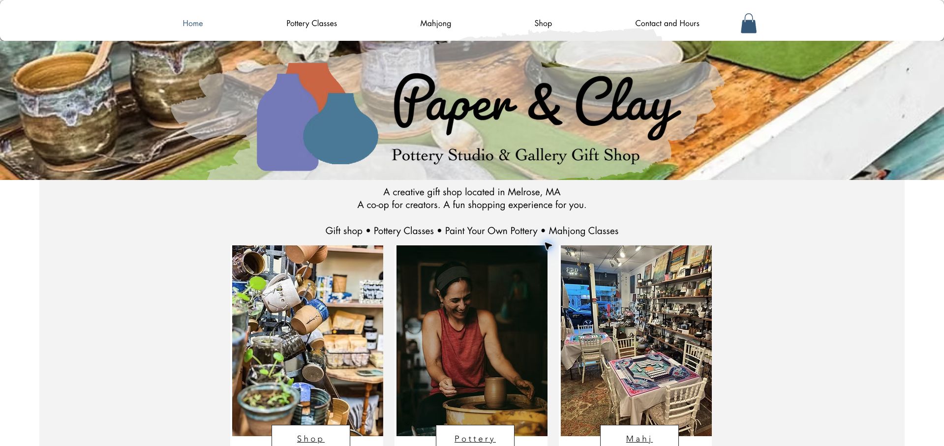
Paper & Clay Melrose clearly identifies itself as a local pottery studio and gallery gift shop, then separates the visitor’s next steps into three photographic cards. The shop, pottery activity and Mahjong routes reflect different reasons for visiting the same place. A compact navigation also includes contact and hours, which matters for a business whose website supports physical attendance as well as online browsing. The photographed shelves and maker give the page a specific setting instead of relying only on abstract craft imagery. The layout is useful for a mixed local business, although its broad activity range means visitors need the labels to distinguish a ceramic purchase from a class booking.
What you can learn
If a studio sells objects and experiences, give each a separate, plainly named route. Keep the town, opening information and contact path easy to find so the website helps someone plan a real visit.
Pros
Three clear cards distinguish shopping from different activities.
The Melrose location and contact-and-hours route establish useful local context.
Cons & considerations
The large logo treatment consumes space before the practical cards.
Online shopping moves to a separate storefront, requiring a clear transition for customers.
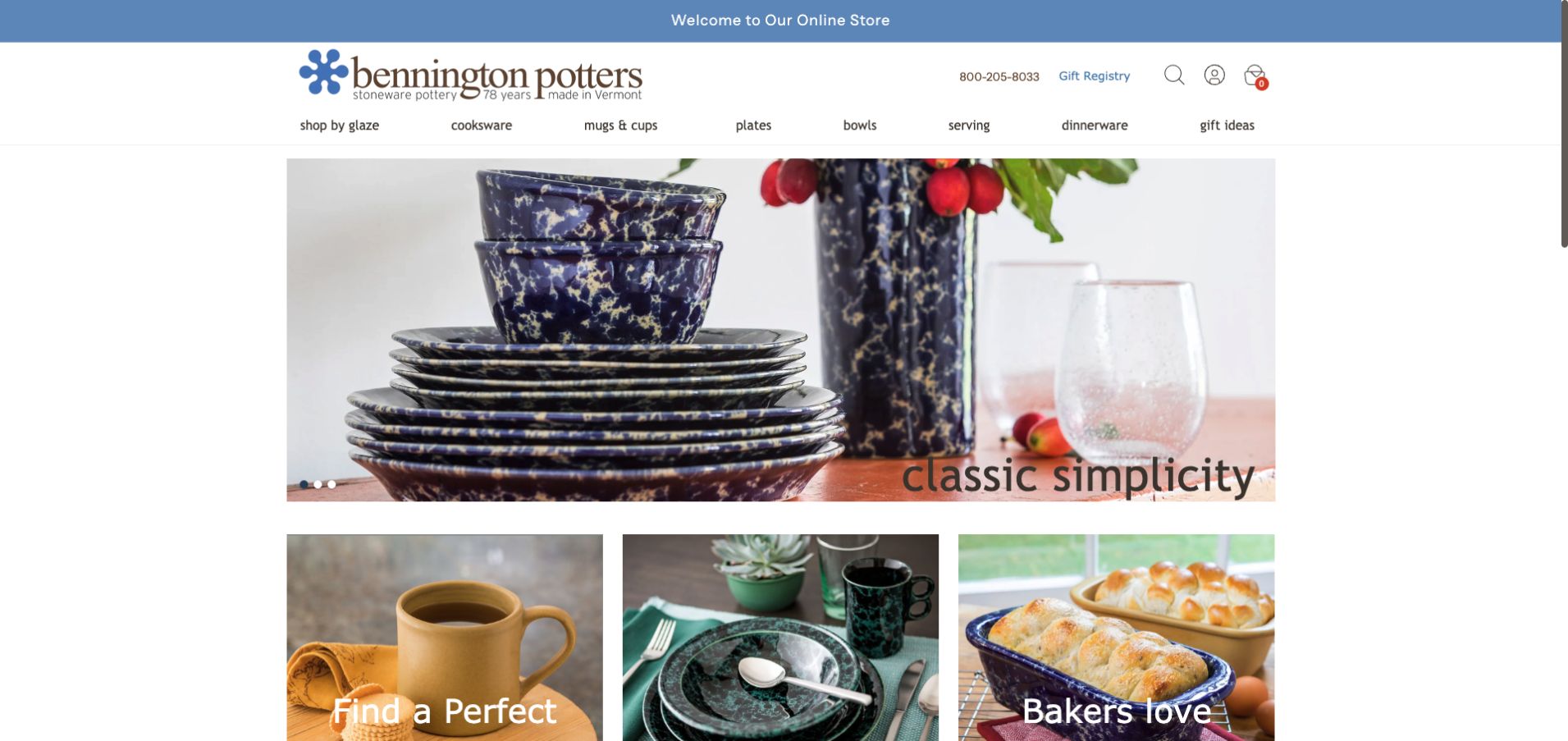
Bennington Potters uses a compact, centered storefront layout to show its recognizable glazed dinnerware. The opening photograph groups plates and bowls together, while the next row begins immediately with additional product-use imagery. Navigation distinguishes glaze, cookware, mugs, plates, bowls, serving pieces and dinnerware, giving customers several direct routes into the range. A telephone number and registry link remain visible near the top. This example is useful because it prioritizes an understandable catalog over a large introductory story. The visual language is conventional, but that familiarity can help repeat buyers locate a known form or finish without working through an editorial campaign first.
What you can learn
For a catalog with repeat purchases, invest in precise category labels and consistent product photography. Let shoppers begin with either a familiar finish or an intended use, and keep assistance close to those decisions.
Pros
The compact layout brings multiple product groups into the first view.
A visible telephone number provides a straightforward route to assistance.
Cons & considerations
The many category labels create a dense horizontal navigation.
The hero relies on a carousel, so its introduction can change between visits.
Kegan is a freelance web designer and developer with 15+ years of experience helping businesses turn complicated website requirements into clear, maintainable digital experiences. He works directly with clients from planning and design through development, launch, and ongoing support.
For ceramics shop website design, his development approach focuses on genuine product photography, maker and studio context, maintained availability, clear dimensions and care information, and dependable shopping handoffs. The scope can be a targeted improvement or a complete custom build, with responsive layouts, thoughtful content structure, and integrations chosen around the people using and maintaining the site.
Show 3 other ceramics shop website designersHide other ceramics shop website designers
Build a storefront around the decisions your buyers actually make
Define the catalog before designing the campaign
List the ways customers describe the work when they ask a question. They may start with a mug, a particular glaze, an existing dinnerware set or a gift for a specific occasion. Those are useful clues for navigation. Give stable product families clear names, then use seasonal stories as additional routes through the catalog rather than replacements for it.
Decide which options belong to one product and which deserve separate listings. A visitor should be able to understand whether selecting a finish changes the photograph, the price, the available quantity or the lead time. If a listing represents a one-off object, say so plainly and show that particular piece. If a photograph represents a repeatable range, explain the relevant variation.
Avoid copying a complex filtering system into a very small collection. A handful of clear categories and well-labeled products may be easier to maintain than dozens of nearly empty facets. For a larger catalog, test whether people can move between form and finish without losing the option they selected. Keep sold-out pieces understandable: an archive can show past work, but it should not look like current stock.
Plan a repeatable product photography and information system
Create a short shot list that works for each kind of object. An overall view introduces the shape; a detail view can show texture or glazing; a carefully chosen context image can explain use and scale. Keep the object recognizable in lifestyle photographs so food, flowers and styling do not obscure what is being sold. Photograph sets in a way that makes the included quantity clear.
Write the essential specifications beside the image. Dimensions, capacity where relevant, materials, finish, included pieces and availability should use consistent labels and units. Ask the maker which care and use statements are supported for that actual product. Do not copy microwave, oven, dishwasher or food-contact claims from another range simply because the objects look similar.
Set an image process that the business can repeat for new releases. Consistent crops help comparison, but preserve enough detail to show the work honestly. Use descriptive alternative text for meaningful images and readable text for product names. Check photographs on a small screen, including a dark glaze against a dark background, and avoid relying on hover alone to reveal a second view or an important option.
Explain the order journey and keep it current
Separate products ready to dispatch from commissioned or made-to-order work. Describe the actual next step for each, including how a customer learns about timing and delivery. A first enquiry about a commission should not look like a confirmed production slot. If ordering moves to another storefront, make the transition recognizable and keep the product names and availability consistent across both places.
If the studio works with restaurants, shops or other professional buyers, provide a distinct route with the information needed to begin that conversation. It may be enough to explain the kinds of orders considered and provide a suitable contact path. Avoid forcing a professional buyer through a consumer basket when the order requires discussion of quantities, finishes or replenishment.
Assign someone to update stock, release dates, temporary closures, classes and shipping notices. Review the entire first visit with consent panels and seasonal offers visible; a beautiful homepage can become difficult to use when several overlays compete. Test an ordinary product, an unavailable option, a failed checkout handoff and a return to the catalog. Use private test modes and fictional information so review work does not create real orders or unnecessary messages.
The editing job behind the design
Choose a catalog the studio can keep accurate
A standard commerce platform may be sufficient for a small collection when it supports the actual stock, variation and fulfilment model. Choose around those requirements and the team’s ability to maintain them.
Keep product facts in one maintained source wherever possible. A separate marketing site, shop and class-booking system should not present conflicting availability or contact information.
Public-page technology observations do not establish a shop’s private inventory, order-management or payment configuration. Preserve that distinction when comparing the example stacks.
Our WordPress website examples offer a separate look at publishing approaches. A visible platform label is evidence for that named page, not a guarantee that the same system will suit your requirements.
Before the public launch
Ceramics shop website brief checklist
Describe whether the shop sells individual pieces, repeatable ranges or both.
Choose clear category labels for form, finish and intended use.
Show the object itself alongside any lifestyle photography.
Keep dimensions, quantities and options readable in text.
Explain relevant handmade variation accurately.
Check each care or use statement with the maker for that product.
Distinguish in-stock, unavailable and made-to-order items.
Keep professional-order enquiries separate when their process differs.
Separate classes and studio visits from object purchases.
Explain transitions to external shops or booking providers.
Test mobile categories, image detail, option selection and error states.
Assign responsibility for stock, campaign and delivery-notice updates.
These checks are a project checklist, not a performance, legal, security, or accessibility certification. Test real journeys with the people responsible for the website before making claims about the result.
Sources & editorial method
How this collection was selected and reviewed
The saved pre-research draw for this collection is 14. All 14 selected source pages have direct browser captures, original design reviews and recorded broad technology-audit attempts. The notes describe visible presentation and practical tradeoffs. We did not purchase products, assess durability, verify care claims or measure the quality of fulfilment. Capture and audit dates describe their own observations and do not make seasonal offers permanently current.
Each example links to its actual source page. Screenshots are direct browser captures with their own capture dates; moving imagery, announcements and live designs can change. The notes describe observable design choices and conditional tradeoffs, not measured traffic, conversion results, service quality, or accessibility conformance.
Technology labels use public page metadata, asset evidence, or explicitly cited platform documentation. Platform documentation is not a complete current deployment audit. A component reference may be legacy or unused; it is not a complete backend inventory. Unknown stacks are omitted. These sites are editorial examples, not our client portfolio.
Written, Edited and Curated are separate editorial records, not timestamps advanced by a rebuild. Website designs and imagery belong to their owners. See our editorial standards or suggest a correction.
Questions worth asking
Ceramics Shop website design questions
Should a ceramics shop lead with a lifestyle photograph?
It can help explain use and atmosphere, but the object should remain identifiable. Pair that photograph with product views and readable specifications rather than asking the scene to answer every buying question.
How should handmade variation be described?
Explain the differences a buyer can reasonably expect for the actual range, using the maker’s own verified information. Distinguish a representative product photograph from a photograph of a specific one-off object.
Do small collections need filters?
Not necessarily. Clear categories may be enough for a small range. Add filtering when it helps people compare a meaningful assortment and the team can keep its product attributes accurate.
Should classes and products share a checkout?
That depends on the actual systems and requirements. Whatever the implementation, make dates, places, item quantities and the meaning of each confirmation clear so visitors understand what they are booking or buying.
Do the examples prove product quality?
No. They are website-design observations, not independent product tests, care certifications or endorsements of a shop’s fulfilment and customer service.
Let the material character of the work attract attention, then give people the practical information they need to understand the object and its next step.