Best Art Supply Store Websites of 2026 (23 Real-World Examples)
Art supply store website examples that make materials, creative possibilities and practical shopping decisions easier to understand.
An art supply store website needs to show what a material can do and help an artist buy the right version of it.
A painter replacing a familiar tube, a beginner choosing paper and a teacher assembling a class list do not need the same opening page. Good art-store design offers direct product search alongside clear routes by medium, surface, brand and project. Inspiration should lead somewhere specific.
These examples include independent specialists, local shops and larger catalogues across several countries. Compare their treatment of colour, technical detail, physical-store services and seasonal merchandising. The collection evaluates website presentation, not product quality, pricing superiority or fulfilment performance.
Before the examples
What makes good art supply store website design in 2026?
Make the material vocabulary useful
Separate paint type, paper surface, brush shape and intended medium in a way that matches the actual range. Keep product names and item numbers searchable. A newcomer may understand watercolour paper before cotton rag or cold pressed; provide short explanations without replacing the precise specification experienced artists need.
Show colour and scale honestly
Use clear photographs of packaging, the material and representative marks or surfaces. Identify the photographed variant, and explain when screen colour differs from the physical product. Do not present an illustrative swatch as a guarantee. Include dimensions, quantity, volume and relevant compatibility close to the buying choice.
Connect online stock to the real shop
Distinguish warehouse availability, local stock and collection eligibility. Put store addresses, opening hours, framing services and classes on clearly labelled routes. Explain oversize, fragile or restricted shipping conditions before checkout rather than burying them behind an optimistic free-delivery headline.
The collection · 23 examples
23 art supply store websites worth studying
Study how these shops balance practical catalogue navigation with the pleasure of discovering a new material, technique or creative project.
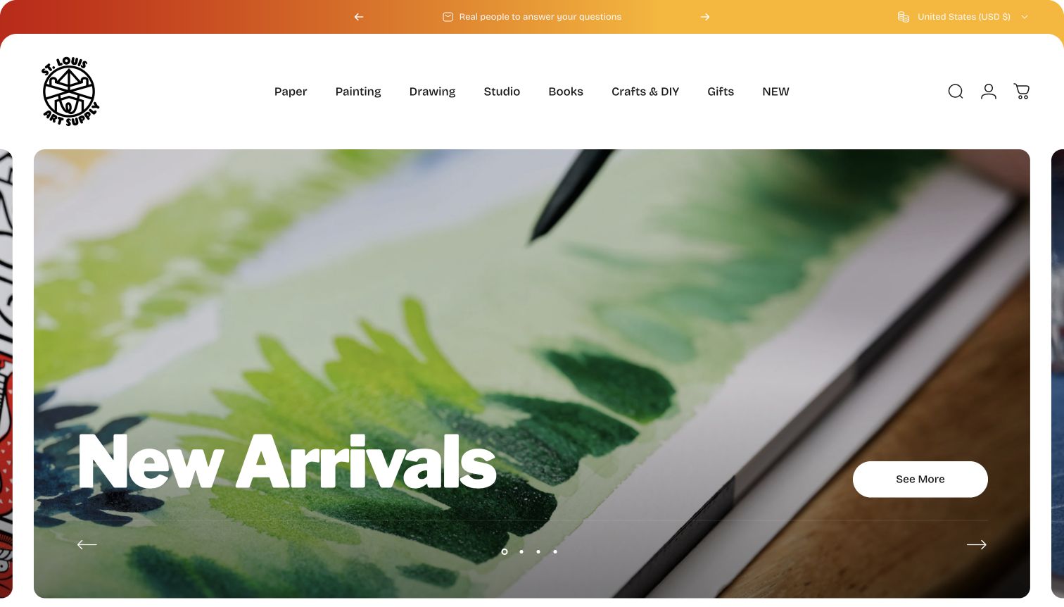
St. Louis Art Supply gives the products room to explain the store. The opening photograph is a close view of painted colour samples, framed by a generous rounded panel and a direct New Arrivals message. Paper, Painting, Drawing and Studio sit in a compact navigation rather than competing with a long wall of promotions. Farther into the homepage, Federal Color products and specialist imports establish a recognisable point of view. The About page identifies the business as an independent retailer and small-batch manufacturer, so this personality has an explicit source beyond the styling. The result feels like a selected studio shelf rather than an undifferentiated warehouse.
What you can learn
Use material demonstrations and specific product explanations to express curation. A smaller shop can make its selection intelligible without claiming to stock every brand or competing solely on discounts.
Pros
Close photography makes colour and texture central to discovery.
Clear material departments support shoppers who already know their medium.
Cons & considerations
The large opening panel postpones individual product comparisons.
Unfamiliar ranges still need detailed compatibility guidance beyond the homepage.
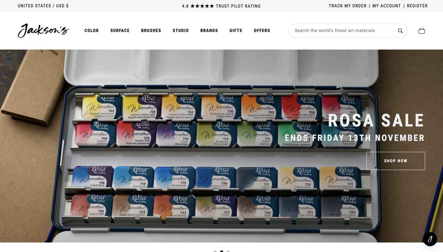
Jackson’s Art puts a long search field and medium-based navigation above a broad product photograph. In the captured page, a Rosa watercolour promotion uses the tin and colour arrangement as the main visual information, while a compact outlined action keeps the next step obvious. Colour, Surface, Brushes and Studio describe practical studio decisions rather than vague lifestyle themes. The page’s detailed category structure is the more transferable feature: artists can approach the same shop through their material, preferred brand or a current offer. Promotional dates and prices belong to the observed campaign, not a permanent claim about value. The restrained white framing prevents the extensive catalogue from looking entirely promotional.
What you can learn
Give experienced artists precise entry points before introducing seasonal campaigns. Keep the search, medium and surface routes stable while rotating the homepage merchandising around them.
Pros
Material terminology suits practical replenishment and comparison tasks.
Product-led imagery makes the featured range immediately understandable.
Cons & considerations
A rotating campaign can distract from a visitor’s specific supply list.
The breadth of categories can feel demanding for complete beginners.
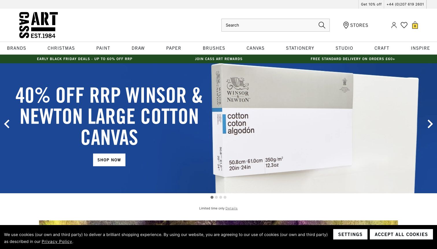
Cass Art uses assertive white lettering against a saturated blue promotion, with the canvas product occupying the other side of the hero. A wide search field, store link and material departments remain visible above it. This gives the homepage two useful levels: shoppers with a list can navigate directly, while browsing visitors get a single clear campaign. The wider page also exposes inspiration, gift cards and store information, connecting the shop to making art rather than presenting every visit as a discount hunt. The captured offer is time-specific; the design lesson is its contrast and composition, not the advertised percentage. A slim cookie strip at the bottom illustrates the competing demands on the initial screen.
What you can learn
Reserve the strongest type and colour for one campaign, then keep routine catalogue controls calm. Give local store and learning routes a permanent place beside transactional navigation.
Pros
Large lettering makes the featured campaign easy to scan.
Search and store access remain independent of the promotional image.
Cons & considerations
The hero gives little space to comparing several materials at once.
Promotional and privacy strips reduce the first screen’s usable area.
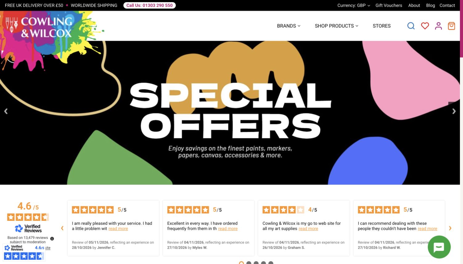
Cowling & Wilcox lets its splattered multicolour logo extend beyond the otherwise restrained header. Brands, Shop Products and Stores form a short primary menu, while search and account controls sit separately. The captured special-offers panel repeats the playful palette through large abstract shapes and a concise headline. Beneath it, a visible review strip introduces customer feedback before the material categories and buying articles. This hierarchy is useful for a retailer that wants character without asking every navigation label to become a graphic element. The tradeoff is that the simplified menu hides a considerable product range behind another interaction. The review score is displayed by the source site; it is not independently verified here.
What you can learn
Let a distinctive brand element carry the personality, and keep shopping labels conventional. Pair the compact header with strong category cards so that simplicity does not make the range harder to discover.
Pros
The colourful mark creates a memorable identity without recolouring every control.
Separate store and catalogue routes support both local and online visitors.
Cons & considerations
Only a few departments are visible before opening the product menu.
Promotions and the review strip push detailed materials farther down.
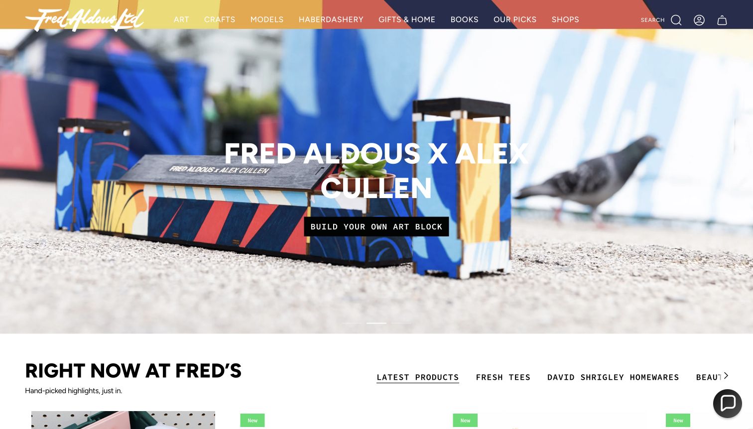
Fred Aldous opens with a creative collaboration rather than a generic grid of discounts. The photographed building kit and named maker connect a product to a visual idea, while the handwritten-style identity and colourful header suit the shop’s mix of art, craft, models and haberdashery. The Right Now at Fred’s section continues that editorial approach through selected products and themes. This is useful when the range crosses several hobbies: a visitor can browse a point of view before committing to a department. Art remains an explicit navigation choice, but it shares space with gifts, books and home products, so specialist replenishment is less dominant than discovery on the opening screen.
What you can learn
Use a real collaboration or a well-explained selection to introduce breadth. Keep the practical art-material route visible so a compelling feature does not turn a supply shop into an opaque lifestyle catalogue.
Pros
Named creative work gives the opening feature a concrete subject.
Department labels make the shop’s wider craft range understandable.
Cons & considerations
The featured collaboration can overshadow routine studio supplies.
A mixed gift-and-hobby range requires careful category boundaries.
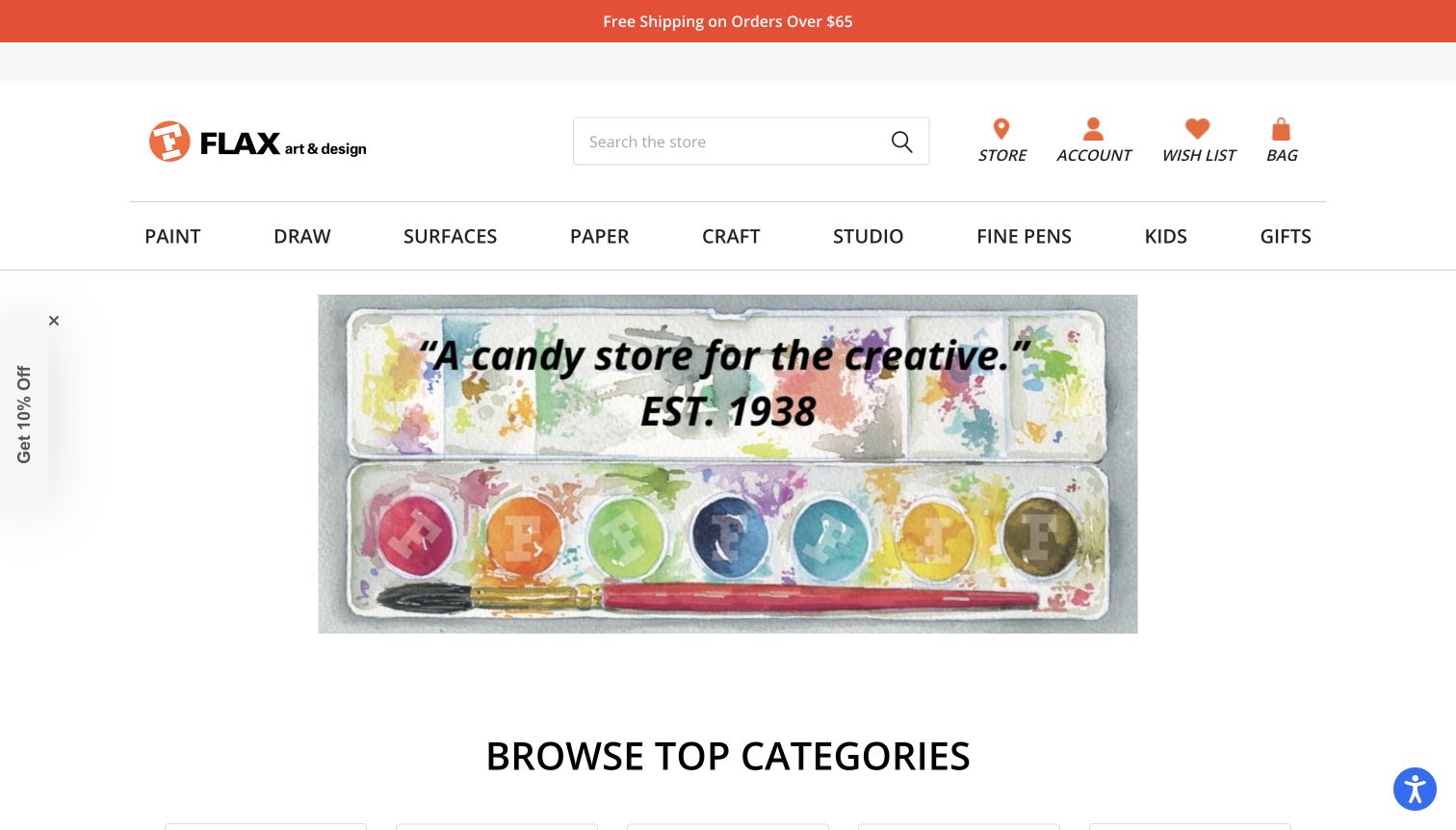
FLAX art & design combines a prominent search field with an unusually explicit department row: Paint, Draw, Surfaces, Paper, Craft, Studio, Fine Pens, Kids and Gifts. The central watercolour illustration supplies colour and warmth, while the surrounding white space keeps the header legible. Category imagery begins below the feature, so the visitor can move from inspiration to an actual material without reading a long introduction. The separate emphasis on paper, surfaces and fine pens reflects different shopping tasks instead of hiding them inside an all-purpose supplies label. The design also leaves room for the store’s local character. Its strongest lesson is the relationship between a friendly illustration and a practical, almost inventory-like navigation.
What you can learn
Choose department names from the questions shoppers ask at the counter. Use one expressive image to set the tone while preserving clear access to less glamorous but frequently needed materials.
Pros
Specific departments reduce ambiguity between paper, surfaces and drawing tools.
The uncluttered framing gives the illustration and search useful prominence.
Cons & considerations
The opening artwork communicates mood more than product specifications.
Nine departments need careful handling when space becomes limited.
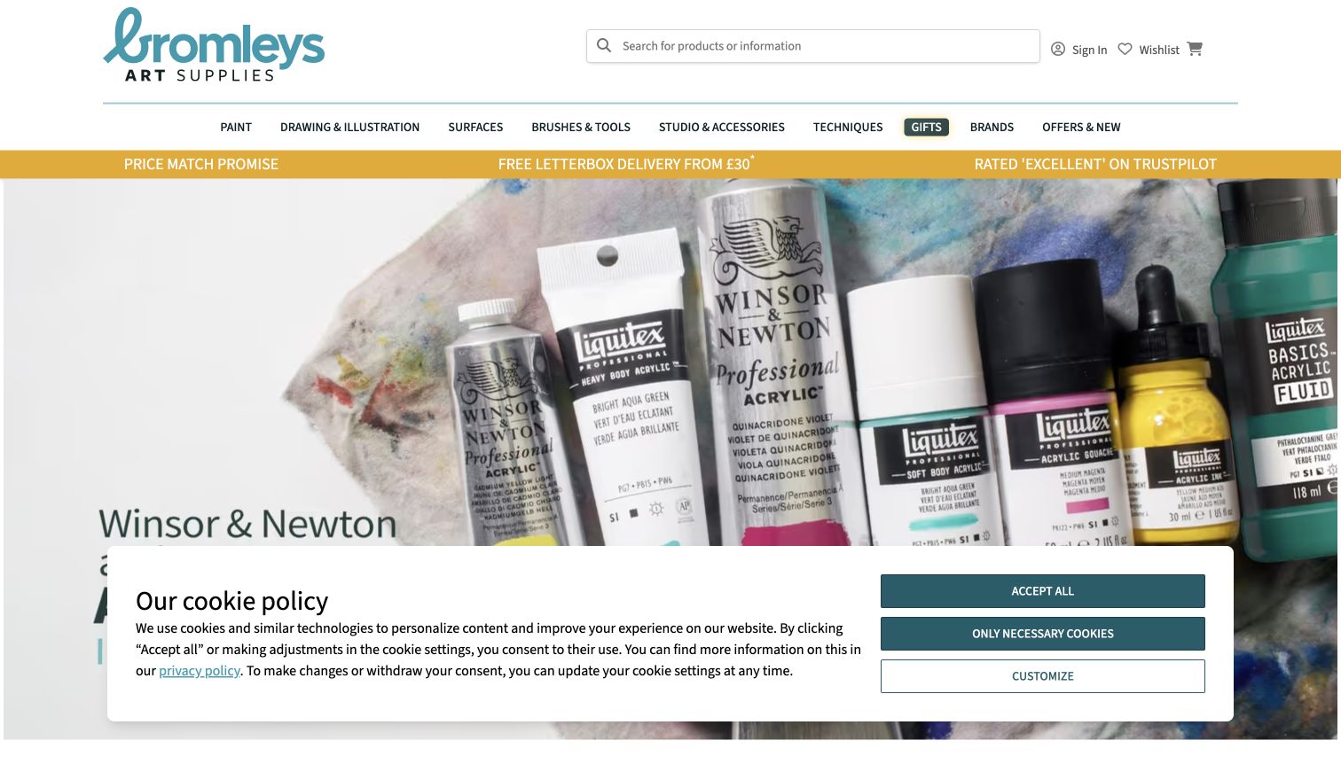
Bromleys places its teal identity beside a long search field, with a detailed materials navigation and a contrasting utility strip below. The captured hero enlarges an acrylic paint tube until the product itself becomes the composition. This is a useful alternative to unrelated studio imagery: the visitor immediately sees what kind of stock is being promoted. New arrivals and range information farther down provide a route into individual items. The breadth extends beyond paint into the equipment and surfaces that support a project, so category wording matters as much as the campaign. A sizeable cookie panel was visible in the capture and illustrates how an otherwise clear opening can lose substantial space to secondary interfaces.
What you can learn
Make replenishment search conspicuous and organise tools alongside consumables. Use recognisable pack shots or material demonstrations for campaigns, then keep required notices from dominating the same screen.
Pros
The large search field supports precise product and brand queries.
A close product image gives the campaign a tangible material focus.
Cons & considerations
The visible cookie panel occupies a substantial part of the viewport.
A wide technical range can overwhelm shoppers without a defined project.
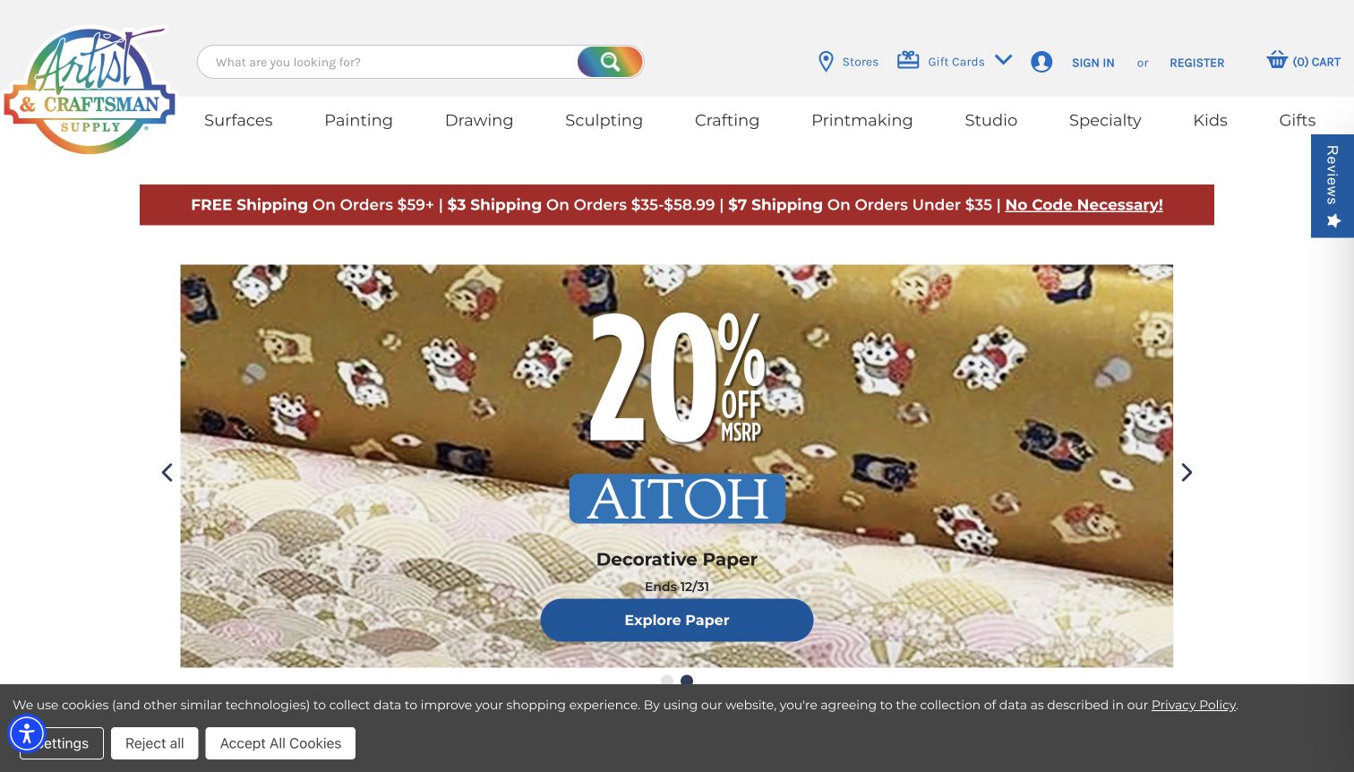
Artist & Craftsman Supply pairs a rainbow identity with a wide search bar and a department row that includes printmaking, sculpting and specialty materials. The captured Aitoh paper feature uses richly patterned sheets as both the background and the reason to explore. It is a strong example of selling an unfamiliar category through its visual possibilities rather than a block of descriptive copy. Shipping thresholds are separately displayed in the header, while the product feature remains the main destination. The range is broad, but its labels recognise different kinds of makers. That specificity is worth borrowing even if a smaller store has fewer products. The homepage still asks the visitor to move deeper for paper dimensions and material suitability.
What you can learn
Give specialist practices their own understandable entry points. Let the featured material demonstrate its possibilities, but connect it to a catalogue that explains dimensions, formats and intended uses clearly.
Pros
Printmaking and sculpting are visible rather than buried under generic craft.
Patterned paper creates an immediate connection between material and creative use.
Cons & considerations
The large visual feature delays product-level size and price comparison.
Utility and cookie strips compete with the colourful product presentation.
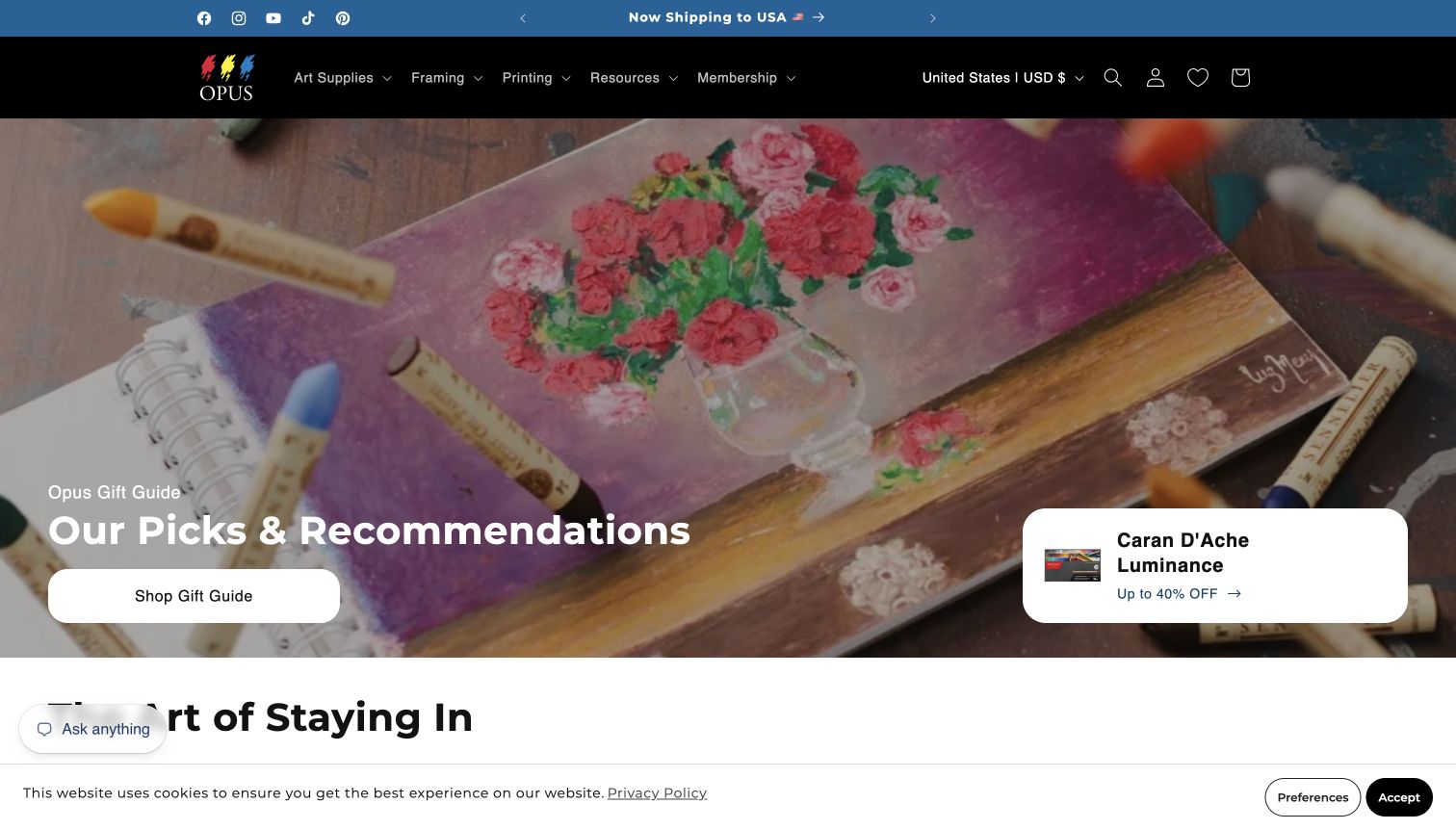
Opus Art Supplies uses a dark header to frame a painterly studio scene. Art Supplies, Framing, Printing, Resources and Membership sit together, making the shop’s service and educational roles visible alongside products. The captured seasonal gift feature shares space with a smaller promotional card, while the page continues into themed material selections. This arrangement is useful for a retailer whose customers need both supplies and help finishing or presenting a work. Country and currency controls are explicit in the header; the capture reflects the displayed regional view rather than a claim that every offer applies everywhere. The service-led navigation is the lasting idea, even when the homepage campaign changes.
What you can learn
Organise a local creative business around the complete project journey. Keep supplies, finishing services and learning routes distinct, and explain region-specific pricing or membership conditions where they become relevant.
Pros
Framing and printing have equal visibility with the shopping department.
Studio imagery connects the catalogue to an actual making environment.
Cons & considerations
The additional promotional card creates competing points of attention.
Membership and regional pricing need clear explanations beyond the first screen.
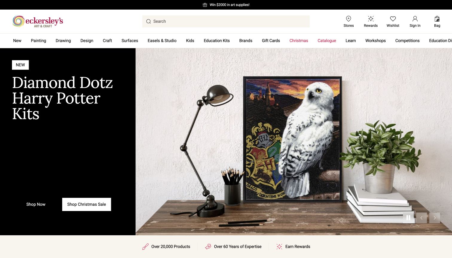
Eckersley’s Art & Craft gives its main navigation substantial breadth, including materials, learning, workshops and an education division. The captured hero splits a dark text panel from a bright craft-product image, creating a clear promotional action without erasing the search and store controls above. The separation is useful because schools, workshop participants and individual shoppers may arrive with very different questions. Those routes are named directly instead of being hidden in the footer. The large seasonal feature demonstrates how to introduce a particular project, although it temporarily emphasises craft kits over the store’s wider fine-art range. The page is best studied for audience navigation and the relationship between retail products and educational content.
What you can learn
Identify distinct customer tasks before choosing the homepage campaign. Give schools and learners a clear route, while keeping product search available to experienced shoppers who need a specific material immediately.
Pros
Education and workshop links acknowledge audiences beyond casual shopping.
The split hero keeps its text separate from the busy product photography.
Cons & considerations
A craft-led campaign can underrepresent the fine-art range initially.
The extensive navigation needs disciplined grouping to avoid visual overload.
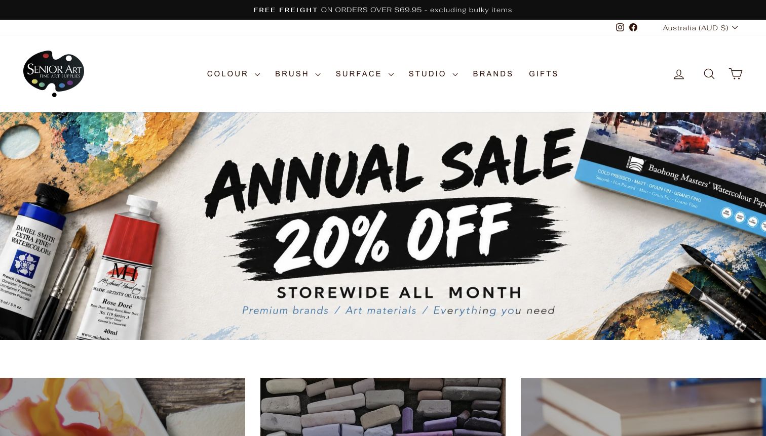
Senior Art Supplies combines a restrained white header with short material labels: Colour, Brush, Surface and Studio. The captured sale feature uses painted lettering and a spread of materials, followed by visual category tiles. That combination makes the promotion energetic without turning the navigation into another advertisement. Further product features, including paper and brush ranges, provide more specific reasons to investigate. The site describes a family-owned selection; the review focuses on how that selection is communicated, rather than independently judging the products. The opening offer is temporary, but the department structure is durable. In particular, Surface is a useful umbrella when a shop sells more than conventional drawing pads.
What you can learn
Keep the permanent shopping architecture independent of sale artwork. Broad material groups can work when their next level explains formats clearly and gives specialist products enough descriptive context.
Pros
Short department labels leave the header easy to scan.
The visual category row connects the campaign to practical browsing.
Cons & considerations
A large sale message can obscure the store’s selection criteria.
Broad labels such as Surface require informative subcategories for newcomers.
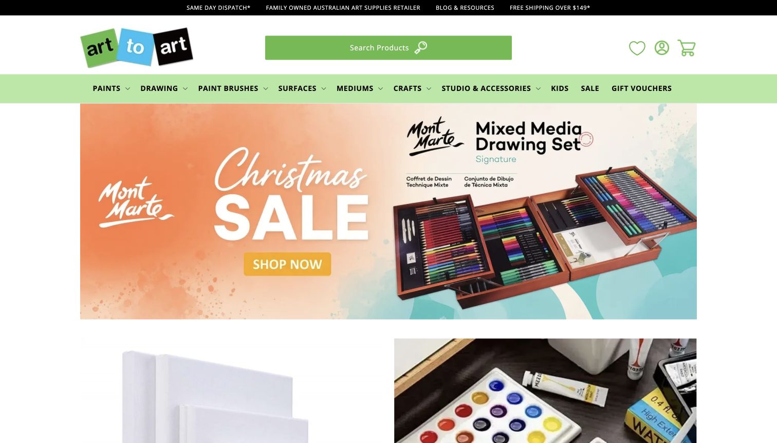
Art to Art uses lime green across its identity and search area, giving the header a strong visual signature. Material categories sit beneath, while the captured feature shows a mixed-media drawing set in a seasonal promotion. Additional image tiles create several routes into the range without requiring visitors to understand a long introductory narrative. Utility information communicates the retailer’s Australian focus and points to delivery and resources. The useful design choice is the prominence of product search: it remains a substantial part of the page rather than a tiny icon beside a dominant hero. The bright colour attracts attention, although it also competes with colourful product photography and promotional text.
What you can learn
Choose a recognisable accent and assign it a functional job, such as search or selected categories. Support regional shoppers with clear delivery information rather than relying on a location claim alone.
Pros
A large labelled search area is easy to identify immediately.
Product imagery makes the featured drawing set concrete and inspectable.
Cons & considerations
The vivid header and seasonal photography compete for attention.
Promotional tiles need clear labels to distinguish projects from product departments.
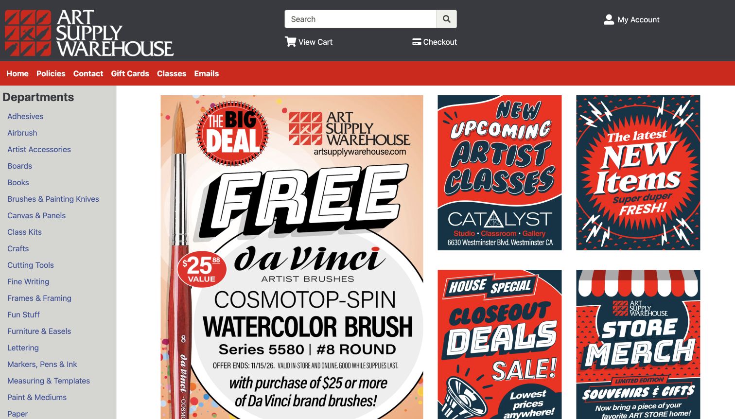
Art Supply Warehouse keeps a long department list visible down the left side of the homepage. The rest of the screen is a compact collection of promotions, illustrated panels and routes to classes, new items and closeouts. It is visually busier than many of the other examples, but the permanent category rail has a clear purpose: a shopper can go straight to the material they need without opening a hidden menu. Local classes and art-show content give the store a role beyond fulfilment. The design is worth studying as a practical catalogue interface rather than a minimalist brand page. Its density also makes hierarchy and consistent type sizes especially important.
What you can learn
A visible category rail can suit a large inventory when repeat visitors arrive with specific lists. Distinguish shopping, classes and community events clearly so that a dense page still has predictable pathways.
Pros
Persistent departments reduce the need to reopen navigation repeatedly.
Classes and local art activity give the shop context beyond transactions.
Cons & considerations
Multiple promotional panels compete rather than forming one clear focal point.
Small labels and tightly packed content demand more scanning effort.
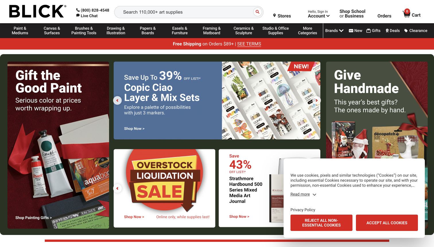
Blick Art Materials uses a broad search field, detailed departments and a red utility strip to establish a familiar large-catalogue shopping structure. The captured homepage combines several seasonal product and gift panels, including paint and marker features, rather than relying on one full-screen image. The wider navigation includes school and business pathways and order-related utilities. This is useful for studying how a retailer can support institutional and repeat purchasing alongside casual inspiration. It also shows the tradeoff of a heavily merchandised homepage: many offers are visible, but their competing scales and colours ask the visitor to filter quickly. The displayed discounts remain campaign observations, not verified comparisons with other sellers.
What you can learn
Separate repeat-order utilities and institutional needs from seasonal merchandising. A multi-panel homepage can work when each tile names a distinct task and the search field remains the simplest route for a known product.
Pros
Search and department access remain prominent above the campaign tiles.
School and business routes recognise purchasing needs beyond individual browsing.
Cons & considerations
Several promotions dilute the opening screen’s visual focus.
The cookie card overlaps some lower-right content in the captured view.
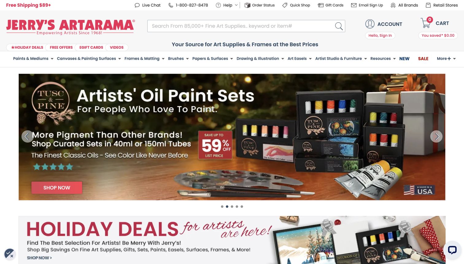
Jerry’s Artarama gives considerable header space to help, order status, brands, stores and quick shopping. Its search explicitly supports keywords and item numbers, acknowledging repeat buyers who already know their materials. The captured seasonal paint-set feature then provides a clear campaign for browsing visitors, using product packaging and a prominent action. This mix is useful for a specialist retailer with an extensive range and many returning customers. The practical controls are visible, but the number of utility links increases the amount of information above the products. The design works best as a study in separating operational shortcuts from promotional content, rather than a model for adding every possible link to a small shop.
What you can learn
Include item-number search and order tools only where they support real customer habits. Group those utilities consistently so seasonal merchandising can change without forcing regular customers to relearn the interface.
Pros
Item-number search directly supports replenishment and repeat purchases.
Store and customer-service routes are visible before entering the catalogue.
Cons & considerations
Numerous utility links make the opening header visually dense.
A large seasonal offer can dominate more specialised material choices.
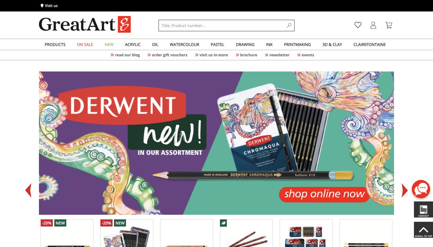
GreatArt places technique labels such as Acrylic, Oil, Watercolour, Pastel, Drawing, Ink and Printmaking across the header. A second row separates the blog, vouchers, physical store, brochure and events from product navigation. The captured Derwent feature uses a colourful illustration and pencil set to demonstrate the advertised range, with product cards beginning immediately underneath. The two-tier structure is the main lesson: the catalogue and the retailer’s supporting services are both visible without mixing their labels into one list. The homepage still contains several promotional layers, and its newsletter overlay had to be dismissed during research. Study the navigation and material presentation while recognising the interruption cost of those additional interfaces.
What you can learn
Use artistic media as durable navigation when they match the inventory. Put store information and educational resources on a separate row, and avoid allowing newsletter acquisition to interrupt the initial catalogue task.
Pros
Technique labels give artists direct routes to familiar material families.
The service row keeps local events and information visible but distinct.
Cons & considerations
Promotional overlays can interrupt browsing before a shopper evaluates products.
Two navigation rows require careful spacing on smaller screens.
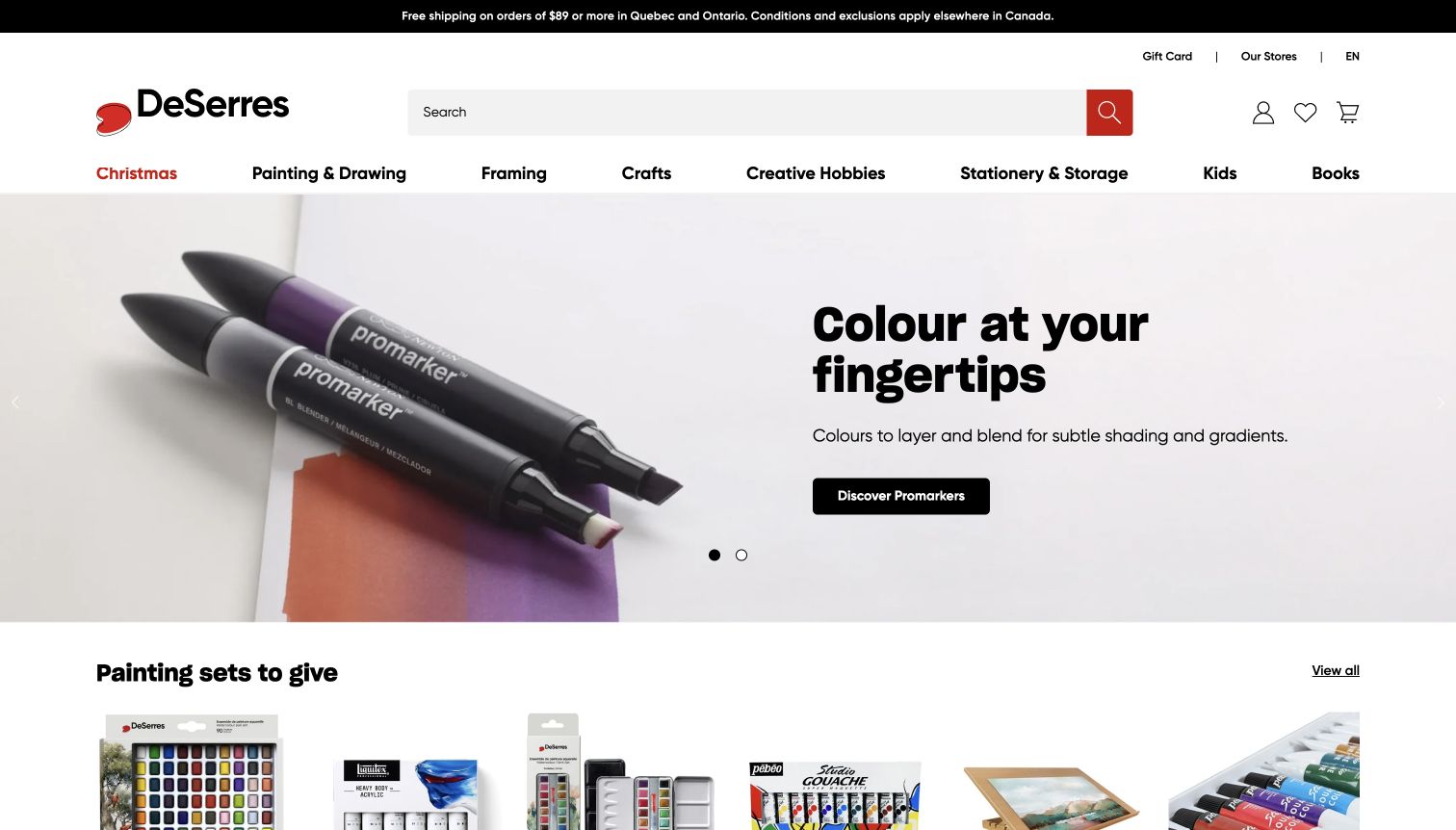
DeSerres uses a close photograph of markers and colour work to make the featured medium immediately visible. A short headline and specific call to action sit over a spacious composition, framed by a clean header with a wide search field. The department labels distinguish painting and drawing, framing, creative hobbies, stationery and children’s activities. This balance is useful for a store that spans serious materials and accessible projects: the photography supplies the invitation, while the categories provide the route to the right level of detail. Store, gift-card and language controls are also exposed. The opening screen is attractive, but comparing individual nib types or colour sets still requires moving into the catalogue.
What you can learn
Show a material being used or displayed clearly, then connect the image to an accurately labelled range. Keep practical search, language and store routes available alongside the inspiration-led feature.
Pros
The marker photograph gives colour and product form a clear visual role.
Distinct departments help separate art materials from framing and creative hobbies.
Cons & considerations
The generous hero postpones detailed product comparisons.
A broad mixed range needs clear guidance when visitors do not know the medium.
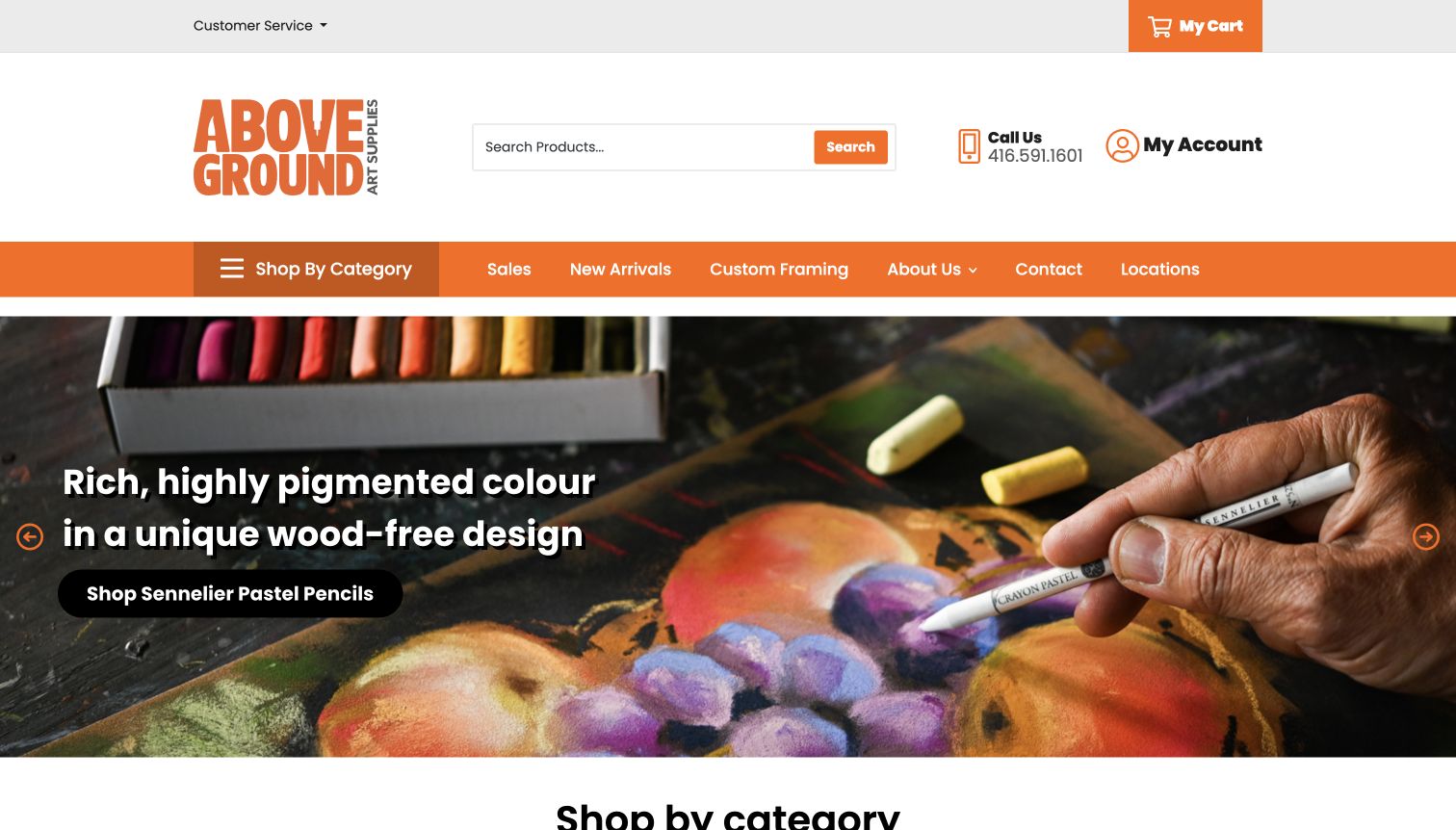
Above Ground Art Supplies puts search, a telephone contact and account access in a generous white header, followed by an orange navigation bar. The captured feature shows a hand using a pastel pencil, with the material and resulting colour both visible. Its action names Sennelier Pastel Pencils directly, which is more useful than an unexplained Shop Now button. Custom Framing and Locations are separate navigation choices, connecting the online range to physical services. The image is doing real explanatory work, but the large header takes considerable vertical space before the catalogue begins. This example is strongest for a local retailer that wants its homepage to make one particular material feel understandable and inviting.
What you can learn
Pair a demonstration photograph with a range-specific action. Keep local services visible, but audit the amount of header space so that essential product routes do not disappear below the opening image.
Pros
The photograph shows both the tool and the marks it produces.
Custom framing and store locations remain distinct from product shopping.
Cons & considerations
The tall header delays the start of the actual catalogue.
A single featured medium cannot explain the shop’s complete range.
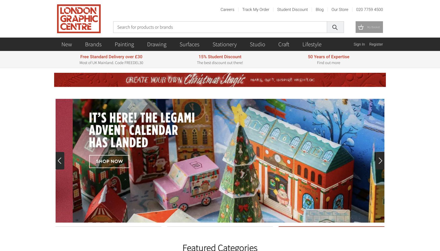
London Graphic Centre places a strong boxed wordmark beside a wide product search, then separates material departments from practical links such as the store, student information and order tracking. The captured seasonal feature presents a detailed illustrated advent calendar, with a second promotional strip above it. Below the hero, featured categories mix acrylic paint, pastels, pencils and Japanese stationery. That combination reflects the shop’s crossover between art materials and design-led desk products. The homepage also gives the print shop and editorial articles their own routes. It is useful as a reference for a destination shop with several related audiences, though the stacked seasonal elements make the opening more campaign-heavy than product-specific.
What you can learn
Make related departments explicit instead of treating every creative product as the same category. Give the physical shop and print services clear routes, while keeping seasonal features from crowding out evergreen material browsing.
Pros
Search and material navigation remain easy to identify above the seasonal feature.
Print services and store information extend the site beyond standard product listings.
Cons & considerations
Two promotional layers consume substantial space before featured categories.
The art-and-stationery crossover can dilute a specialist shopper’s first impression.
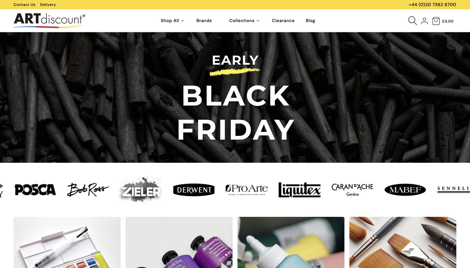
ARTdiscount opens with a charcoal photograph and a concise Black Friday message, using yellow accents to connect the campaign to its identity. The header is comparatively sparse: Shop All, Brands, Collections, Clearance and Blog sit alongside search and account icons. A row of genuine brand marks and large material-category images follows the hero, giving shoppers alternate ways to enter the range. This is useful for a catalogue where customers often arrive knowing either a manufacturer or a medium. Educational articles farther down discuss concepts such as tone and hue, adding a learning route beyond offers. The tradeoff is that the sparse header makes the actual material departments less visible until scrolling or opening a menu.
What you can learn
Offer brand and medium routes together when both match real buying habits. Use educational content to answer material questions, and keep sale imagery clear without allowing the promotion to become the only explanation of the shop.
Pros
Brand marks and material imagery support two distinct browsing approaches.
The limited yellow accent keeps the dark campaign composition readable.
Cons & considerations
Material departments are not individually visible in the top navigation.
A search icon is less immediately prominent than an open search field.
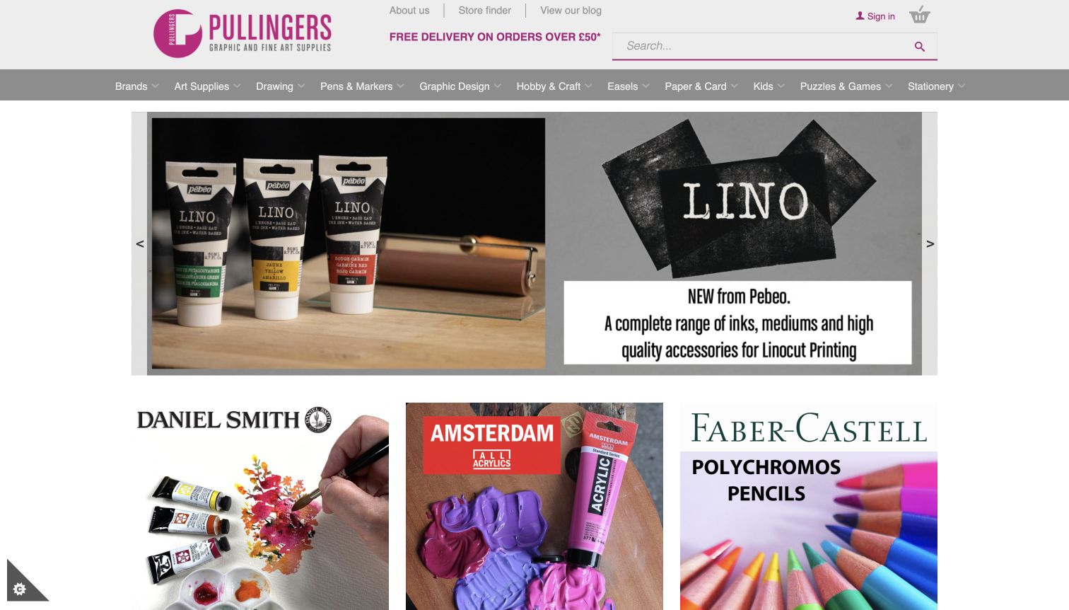
Pullingers uses a compact pink identity, a long search field and a broad row of departments above a product-led carousel. The captured feature shows lino-printing inks and tools, while the panels below introduce watercolours, acrylics and coloured pencils with recognisable packs and material demonstrations. This approach makes the page feel like a set of useful catalogue entrances rather than a long brand story. Store finder and delivery information are easy to locate, and the wider categories include graphic design, easels, paper and card. The density is functional for a stocked art shop, although the many departments and mixed promotional typography create more visual work than a tightly edited specialist homepage.
What you can learn
Build category entrances around real product families and the work they support. Keep store and delivery information close, and use a consistent caption structure so different manufacturers’ artwork does not fragment the page.
Pros
Product-family panels explain what lies behind each promotional link.
Store finder and search support visitors with practical shopping intentions.
Cons & considerations
A long category row can be difficult to scan without clear grouping.
Different supplier graphics introduce inconsistent typography and visual emphasis.
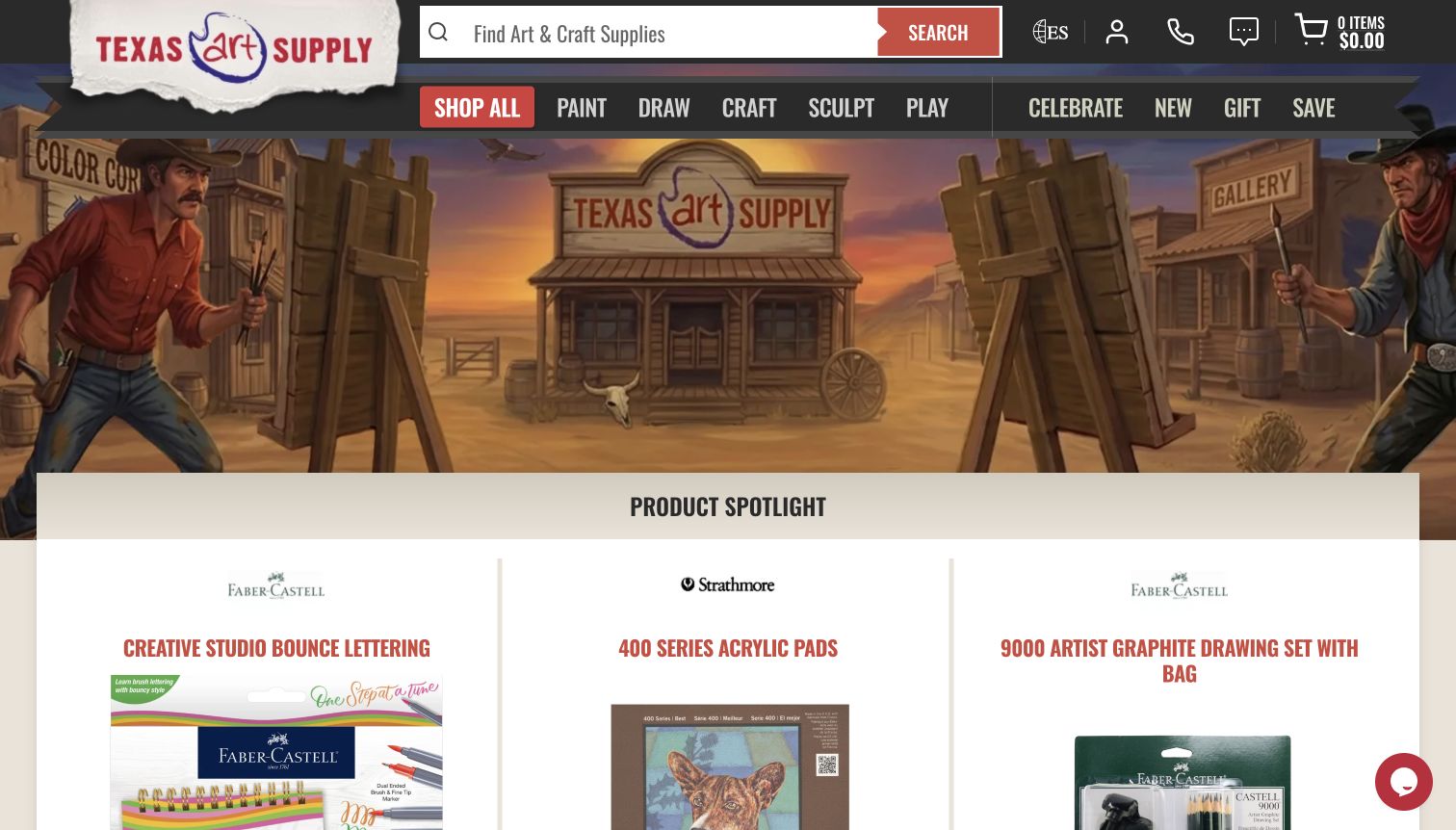
Texas Art Supply uses a Western-themed illustration to establish a regional identity, but keeps a large search field and short action-like departments above it: Paint, Draw, Craft, Sculpt and Play. Product Spotlight cards begin immediately below the scene, bringing the visitor back to concrete materials and prices. The captured cards include lettering and drawing supplies, while the wider page exposes brands, trending products and store locations. The lesson is how an expressive setting can coexist with direct catalogue routes. The illustration does not itself explain product specifications, and the condensed uppercase type is used extensively, so clarity depends on keeping the surrounding choices short and consistent.
What you can learn
Give a distinctive visual theme a limited role and return quickly to products. Task-based departments can simplify a broad range when the next level provides the precise sizes, media and brands shoppers need.
Pros
Short creative-task labels make the main departments approachable.
Product Spotlight immediately reconnects the themed hero to actual supplies.
Cons & considerations
The illustrated setting contributes little technical product information.
Extensive condensed uppercase typography can reduce comfortable scanning.
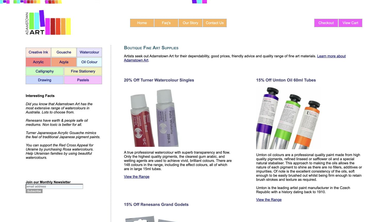
Adamstown Art takes a notably direct approach: a colourful department grid sits at the left, while two columns introduce specialist paints and other materials through photographs, descriptive paragraphs and range links. The captured page includes watercolour and oil products with details about formats and intended characteristics. It is less visually polished than many contemporary retail sites, but the amount of material explanation is useful. Visitors are not asked to infer everything from a lifestyle photograph. The persistent medium links also make the shop’s focus clear. Its wide columns, small text and long sequence of offers are important limitations to study; rich information still needs a comfortable reading and comparison structure.
What you can learn
Preserve useful material detail while giving it a modern, readable hierarchy. Separate format, medium and handling notes into consistent fields, and make the next product-range link obvious without relying on a wall of promotional paragraphs.
Pros
Specific descriptions give unfamiliar specialist materials meaningful context.
The persistent medium grid exposes the catalogue’s central categories.
Cons & considerations
Long text columns demand sustained reading before comparison becomes easy.
Small text and wide layouts can be difficult on narrow or zoomed views.
Kegan is a freelance web designer and developer with 15+ years of experience helping businesses turn complicated website requirements into clear, maintainable digital experiences. He works directly with clients from planning and design through development, launch, and ongoing support.
For art supply store website design, his development approach focuses on art supply store websites that connect materials, media and skill levels with practical product comparisons, delivery information and in-store visits. The scope can be a targeted improvement or a complete custom build, with responsive layouts, thoughtful content structure, and integrations chosen around the people using and maintaining the site.
Show 3 other art supply store website designersHide other art supply store website designers
Plan an art supply site around real shopping tasks
Map a useful sample of the inventory
Start with a paint range, a paper range, brushes and a bulky studio item. Identify which attributes shoppers actually compare and which vary by SKU. Keep colour, size, finish and pack quantity distinct. This small sample exposes catalogue problems before thousands of products are imported.
Separate replenishment from exploration
Give returning shoppers dependable search, category links and clear variant selection. Offer beginners material explainers, starter projects and carefully scoped comparisons. Educational content should link to relevant products without implying that every project requires the most expensive option.
Define who maintains changing information
Assign responsibility for stock, prices, class dates, store hours and expiring campaigns. Preserve accurate product specifications when promotions change. Build a simple process for correcting a wrong swatch, discontinued colour or delivery exception so that attractive photography does not hide stale information.
The editing job behind the design
Choose catalogue tools that respect product detail
Select an ecommerce system that can represent the actual variant structure and inventory sources. Test a paint with many colours, paper sold in different sizes and an item available only for local collection. Search and filtering should understand those attributes without turning each variation into an unrelated product page.
Use a maintainable content system for technique articles, workshop information and store services. Keep product data, promotional copy and educational claims separately editable. A visible platform reference in an example is a public-source observation, not proof that the same platform will solve your catalogue or stock workflow.
Our WordPress website examples offer a separate look at publishing approaches. A visible platform label is evidence for that named page, not a guarantee that the same system will suit your requirements.
Before the public launch
Art supply store website launch checklist
Check material, size, colour, quantity and unit labels on representative product variants.
Verify that search finds exact product names, brands and item numbers.
Label photographed variants and explain the limits of screen colour.
Confirm local collection, store stock and warehouse availability are distinguished.
State fragile, oversize and restricted shipping exceptions before checkout.
Keep store hours, workshop dates and service contacts current.
Check keyboard access, visible focus, zoom and mobile variant controls.
Expire seasonal offers and remove broken links to discontinued ranges.
Keep customer details and operational stock records out of public content exports.
These checks are a project checklist, not a performance, legal, security, or accessibility certification. Test real journeys with the people responsible for the website before making claims about the result.
Sources & editorial method
How this collection was selected and reviewed
We reviewed the official public store pages on November 11, 2026, comparing material navigation, product presentation, local-service routes and promotional hierarchy. St. Louis Art Supply is the Editors Choice for its focused material photography, understandable departments and explicit specialist retail identity. This is an editorial design selection, not a service-quality ranking. Public technology audits cover bounded source-page evidence; unavailable or blocked evidence does not establish a hidden platform.
Each example links to its actual source page. Screenshots are direct browser captures with their own capture dates; moving imagery, announcements and live designs can change. The notes describe observable design choices and conditional tradeoffs, not measured traffic, conversion results, service quality, or accessibility conformance.
Technology labels use public page metadata, asset evidence, or explicitly cited platform documentation. Platform documentation is not a complete current deployment audit. A component reference may be legacy or unused; it is not a complete backend inventory. Unknown stacks are omitted. These sites are editorial examples, not our client portfolio.
Written, Edited and Curated are separate editorial records, not timestamps advanced by a rebuild. Website designs and imagery belong to their owners. See our editorial standards or suggest a correction.
Questions worth asking
Art Supply Store website design questions
Should an art shop organise products by brand or medium?
Usually both are useful, but they serve different tasks. A repeat buyer may know a brand and colour number, while a beginner starts with a medium or project. Keep one underlying product record and offer consistent routes to it rather than creating conflicting duplicates.
How should a website show paint colours accurately?
Use consistent lighting and clearly identify the photographed colour and surface. Provide the manufacturer’s documented colour name and code, and explain that screens and printing conditions affect appearance. A photograph or digital swatch should not promise an exact physical match.
Does a small art supply shop need a large promotional hero?
No. Clear search, understandable categories and a few well-explained material selections can be more useful. If a large hero is used, make its destination specific and keep routine shopping routes visible.
How can local services fit into an online art shop?
Give framing, printing, classes and store visits their own labelled routes. Explain which location provides each service, how to ask a question and whether appointments or collection arrangements apply. Do not make shoppers infer those details from a general contact page.
Can technology labels identify the whole ecommerce setup?
No. Public pages can expose a platform, library or delivery service, but that does not reveal every inventory, payment or back-office integration. Use the visible evidence as a scoped observation and choose your own system around the actual editing and fulfilment requirements.
Borrow the clear material categories, useful demonstrations and honest product detail. Build the structure around the artists and practical shopping questions your own store serves.