Best Cabinet Maker Websites of 2026 (22 Real-World Examples)
Cabinet maker websites that turn room photographs into useful evidence about design, materials, scope and the process of discussing a project.
Compare 22 directly reviewed cabinet makers and fitted-furniture businesses, from regional workshops to larger kitchen specialists. Study how they introduce their work, explain their services and help a prospective client prepare a useful enquiry.
A beautiful kitchen photograph can attract attention without explaining who designed it, what the workshop made or which services a customer can request. A cabinet maker’s website needs to connect the finished room to the business behind the work.
The examples here cover different scopes, including kitchens, cabinetry, joinery and related fitted furniture. They are design references rather than interchangeable providers. The useful question is how each site helps a visitor understand its offer, recognize relevant work and begin an appropriate conversation.
Before the examples
What makes good cabinet maker website design in 2026?
Explain the actual project scope
State what the business designs, makes, supplies or installs, and where it works. If other collaborators handle parts of a project, describe those roles accurately. A room photograph should not imply that one workshop delivered every visible element.
Turn photographs into readable project evidence
Pair overall room views with relevant details and concise captions. Explain the brief, the work completed and the decisions that matter. Avoid relying on a gallery of unlabeled images to communicate the difference between a new kitchen, a fitted wardrobe and a furniture commission.
Make the first enquiry understandable
Tell people what information is useful at the beginning and what happens after they get in touch. Distinguish a preliminary discussion from a quotation, site survey or confirmed production slot. Give the enquiry route a clear place beside the relevant work.
The collection · 22 examples
22 cabinet maker websites worth studying
Study how these 22 sites use room photography, project categories, workshop stories and contact routes. Editorial order is about website design; it does not establish workmanship, pricing, delivery reliability or suitability for a particular project.
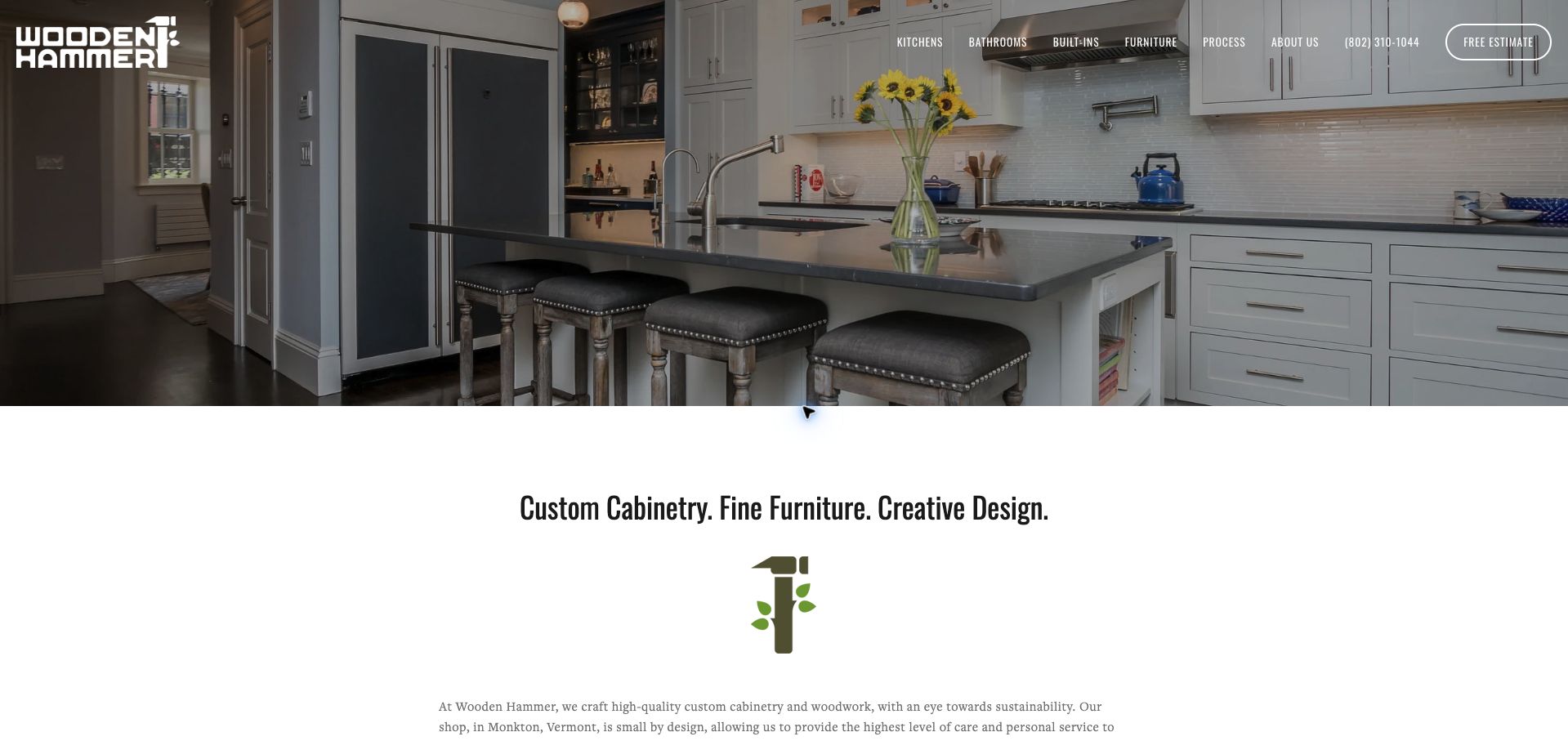
Wooden Hammer puts an installed kitchen across the opening view, then quickly introduces its custom cabinetry, furniture and design work in a separate white section. The distinctive hammer-shaped identity connects the header to the introduction without becoming the only content. Kitchen, bathroom, built-in and furniture links describe recognizable project types, while a telephone number and outlined estimate button remain close to the navigation. The text identifies a workshop in Monkton, Vermont, giving the visual portfolio a practical local context. This is a useful example of balancing the finished room with a clear explanation of who makes the work and how to begin.
What you can learn
Pair a representative installation with plain project categories and an obvious inquiry route. Put the workshop’s location and actual scope near the photograph so an attractive image also helps qualify an inquiry.
Pros
The project categories translate the workshop’s capabilities into familiar customer needs.
A visible phone number and estimate link provide two clear contact routes.
Cons & considerations
White navigation sits over a detailed photograph and depends on the image remaining dark enough.
The opening view does not explain the information needed for an estimate.
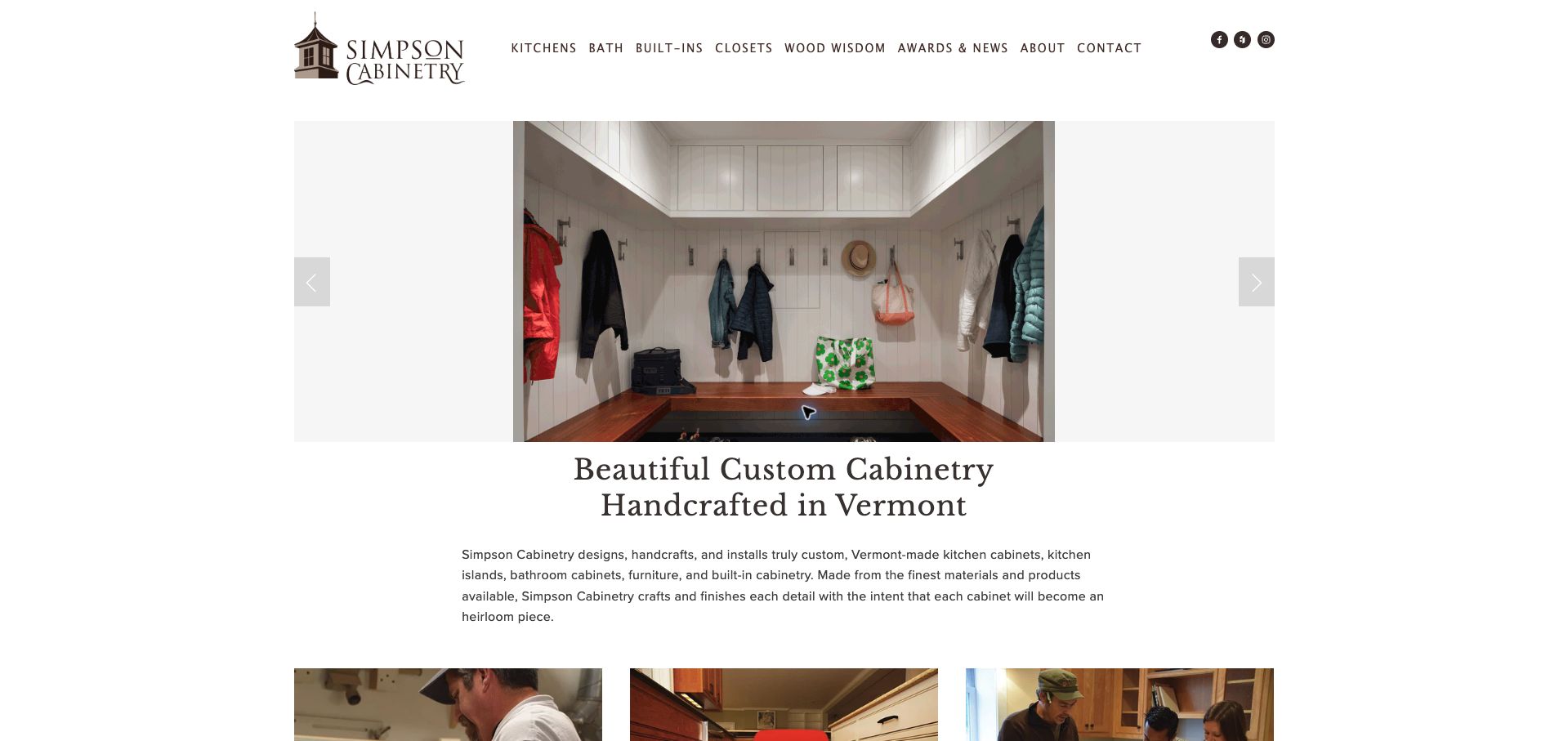
Simpson Cabinetry uses a restrained white page, a compact illustrated logo and a large central project carousel. The captured slide shows a mudroom installation rather than another kitchen, making the broader range of built-in work visible. Immediately below it, a prominent serif heading identifies custom cabinetry made in Vermont, followed by a concise description of the work. The navigation separates kitchens, baths, built-ins and closets, and includes an unusually helpful Wood Wisdom destination. This approach gives photography room to establish the product while retaining a straightforward explanation for someone encountering the company for the first time.
What you can learn
Show a variety of real applications without making visitors guess the service categories. Put the workshop’s identity beneath the image and give educational material a descriptive label that a first-time buyer can understand.
Pros
The mudroom photograph demonstrates storage work beyond the kitchen.
The heading supplies both the service and the production location.
Cons & considerations
The carousel’s changing photographs can produce different first impressions.
The contact link has the same visual weight as several secondary destinations.
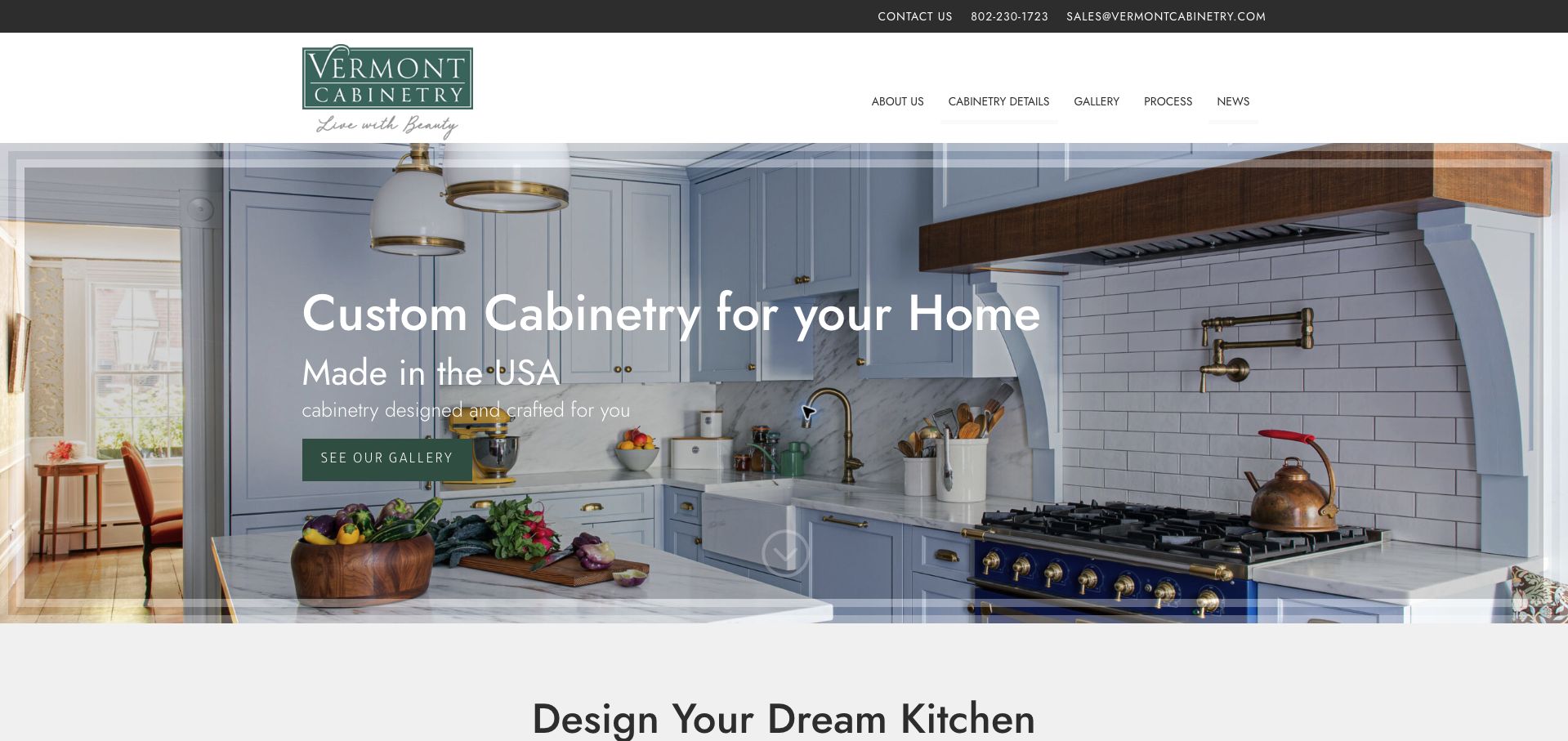
Vermont Custom Cabinetry combines a green identity with a bright kitchen photograph and an immediate gallery button. A narrow utility strip keeps the telephone number, email and contact link visible above the main navigation. The main message identifies custom cabinetry for the home and its American production context, while the second section begins to introduce kitchen planning. The photographic frame is decorative, but the underlying task is simple: inspect the work before starting a conversation. This is a useful reference for a manufacturer whose prospective customers need to see examples before they can describe the finish or layout they want.
What you can learn
Give early-stage buyers an obvious portfolio route and keep contact details nearby. Separate practical navigation from the hero image so the route into project information stays consistent when the featured photograph changes.
Pros
The green gallery button provides a clear action against the pale kitchen.
Contact details remain available in their own utility strip.
Cons & considerations
The decorative border and overlapping text compete with details in the cabinetry photograph.
A gallery invitation alone does not establish budget, territory or project timing.
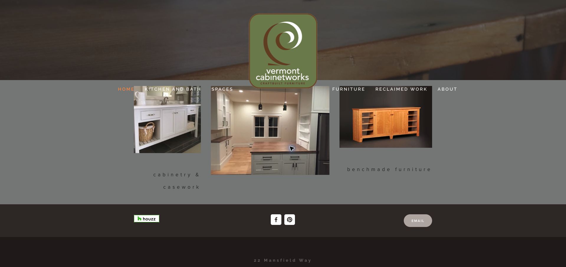
Vermont Cabinetworks presents a large maker’s mark above a compact set of project photographs. Its navigation distinguishes kitchen and bath work, spaces, furniture and reclaimed work, reflecting different reasons to commission the same shop. The page describes custom furniture and cabinetmaking for Vermont and New England, with native hardwoods and reclaimed lumber as part of the stated approach. The captured layout brings cabinetry and furniture into the same view, making their relationship visible. It feels closer to a workshop portfolio than a showroom campaign, though the unusual spacing and muted backgrounds make some labels less immediate than they could be.
What you can learn
Organize a mixed workshop portfolio around the kinds of commission visitors recognize. Give reclaimed materials their own explanation, and make category labels as readable as the photographs they introduce.
Pros
Cabinetry and freestanding furniture appear as distinct but related capabilities.
The service region is explained in the introductory text.
Cons & considerations
Wide letter spacing makes small category labels slower to read.
The large identity occupies substantial space before practical project details.
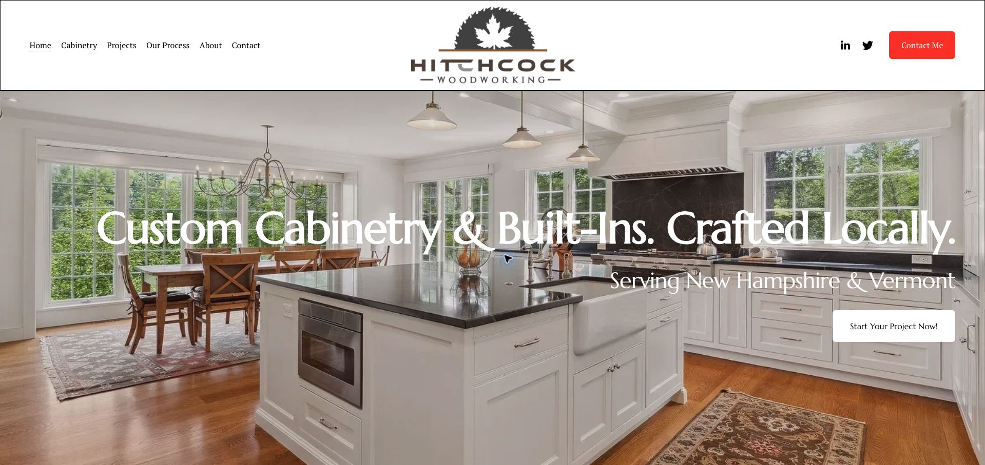
Hitchcock Woodworking states its cabinetry and built-in focus in a large headline over an installed kitchen. A second line names New Hampshire and Vermont, and the main project button gives visitors a direct next step. The white header separates navigation from the photograph, while process and project destinations provide useful alternatives to an immediate inquiry. The room image communicates the scale and setting of the work effectively. The inspected page also exposes unfinished template details: the prominent Contact Me link points to an example email, and social links reference the website platform. Those issues are a useful reminder that a visually convincing launch still needs a destination audit.
What you can learn
Make service and territory explicit, then verify every contact and social destination before publishing. A strong project photograph cannot compensate for a primary contact action that points to a placeholder.
Pros
The region and type of work are immediately understandable.
Process and project links support visitors who are not ready to inquire.
Cons & considerations
The prominent header contact link uses an example email address in the inspected page.
Template social destinations undermine the otherwise specific local presentation.
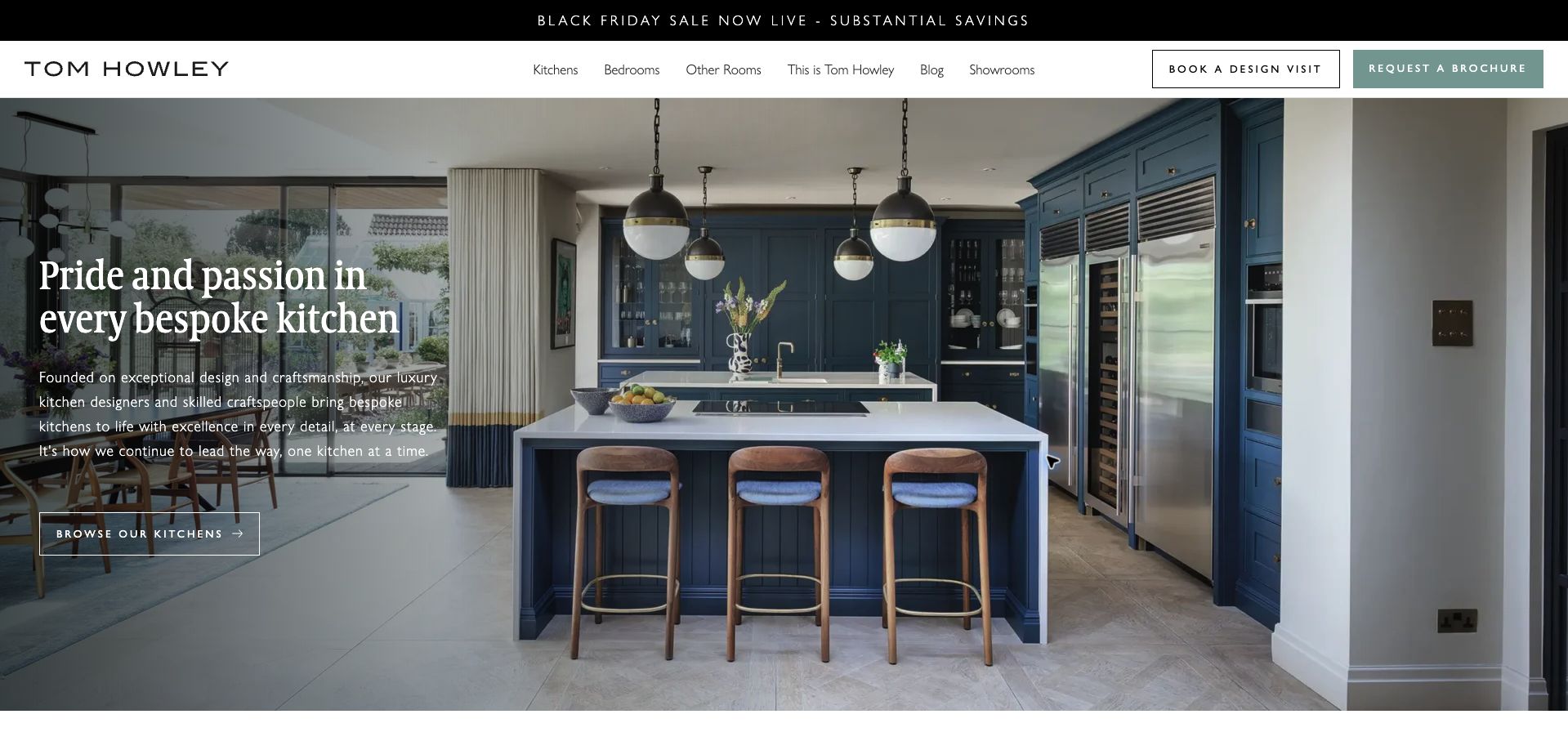
Tom Howley places a generous kitchen photograph beneath a compact header, with a large introductory headline and a quieter route to browse kitchens. The header offers two stronger actions: booking a design visit and requesting a brochure. That combination recognizes that prospective customers arrive at different stages rather than forcing every visitor into the same inquiry. A narrow seasonal promotion sits above the navigation, leaving the main room image to communicate the design character. The initial consent dialog obscured much of the page until required cookies were selected; the saved unobstructed view shows how much of the experience depends on handling that first interruption well.
What you can learn
Offer distinct next steps for inspiration, information gathering and a serious design conversation. Keep the action hierarchy clear when promotional notices and privacy controls are also present.
Pros
Brochure and visit actions accommodate different levels of readiness.
The kitchen image supplies context for the cabinetry’s scale and finish.
Cons & considerations
The initial consent dialog substantially interrupts the visual introduction.
Several simultaneous calls to action can dilute the main browsing route.
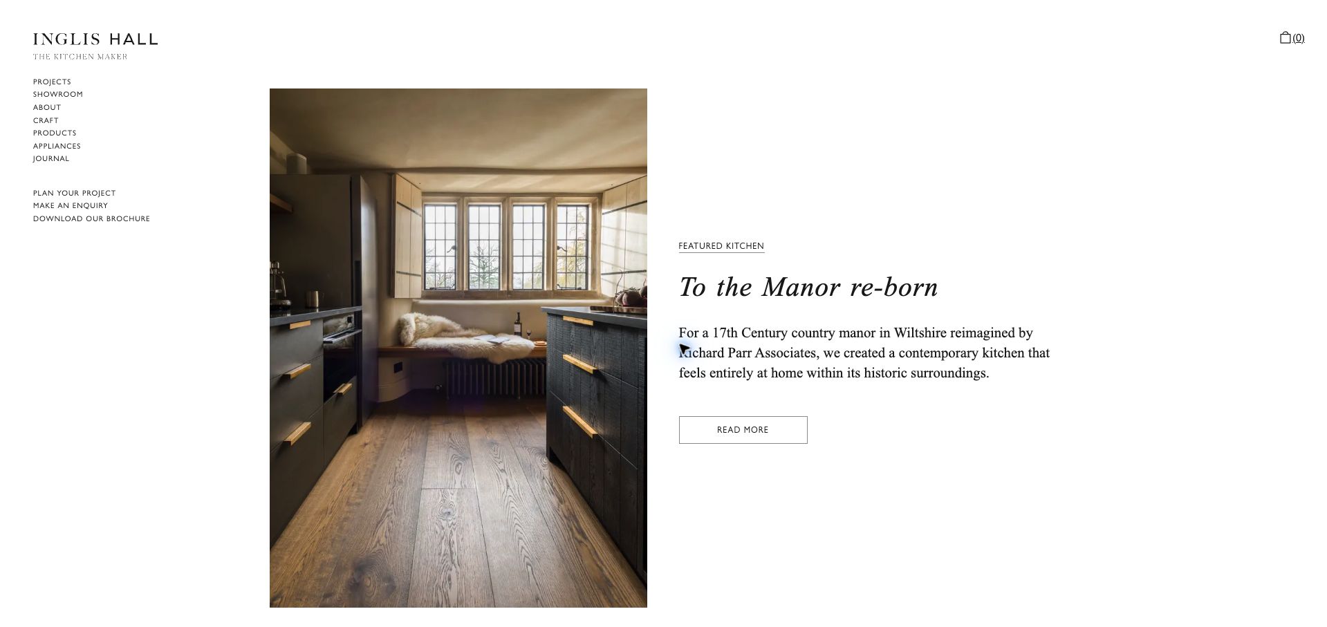
Inglis Hall gives a single kitchen project a portrait photograph and a short editorial introduction, leaving a generous white margin around both. The opening story explains the relationship between the contemporary kitchen and an older manor house, turning the image into a design problem rather than an anonymous luxury scene. A compact left navigation keeps projects, craft, planning and inquiries visible without overlaying the photograph. The approach rewards a visitor who wants to understand the thinking behind the work. Its restrained typography and understated button are less immediate for someone who simply wants a quick quote, but that tradeoff is clear and consistent.
What you can learn
Use a real project to explain a specific design challenge, then connect the story to process and inquiry routes. Give the photograph and explanatory copy complementary roles instead of repeating a broad quality claim.
Pros
The introduction explains why the featured kitchen fits its setting.
The left navigation distinguishes inspiration, craft and project planning.
Cons & considerations
Small navigation text requires more attention than a conventional larger menu.
The restrained Read More button provides a less forceful next step than a prominent inquiry action.
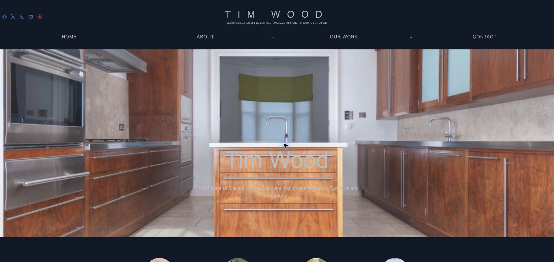
Tim Wood uses a dark navy header and a widely spaced name to establish a personal design practice. The opening kitchen image gives the cabinetry immediate visual scale, while the accompanying descriptor explains that the work includes handmade kitchens, furniture and interiors. The navigation is deliberately short, with About, Our Work and Contact as the main destinations. Farther through the public page, projects are grouped into kitchens, bedrooms, bathrooms and freestanding furniture. The structure is useful for a maker whose commissions cross room boundaries. The captured hero text, however, blends into the pale cabinetry, demonstrating why fine typography still needs a reliable contrast treatment.
What you can learn
Let the maker’s identity unify several kinds of commission, but organize the portfolio into concrete uses. Test text against the actual hero image rather than assuming a subtle overlay will remain readable.
Pros
A short main menu keeps the first decision manageable.
The descriptor explains the relationship between cabinetry, furniture and interiors.
Cons & considerations
The hero’s pale lettering has weak separation from the photograph.
The broad portfolio needs supporting project descriptions to establish individual scope.
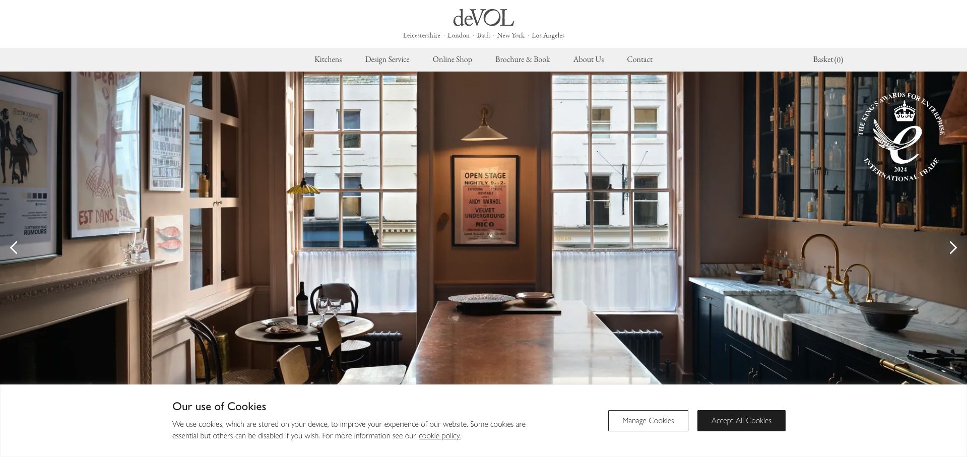
deVOL fills most of the opening view with a richly detailed interior, while a restrained white header keeps the name and navigation separate from the photograph. Kitchens, design service, online shop, brochure and contact are distinct destinations, making the business model easier to understand than a single generic Products label would. The room image presents cabinets as part of an occupied home rather than an isolated sample. A visible carousel control indicates that the opening scene can change. The cookie banner occupies a full strip at the bottom of the first visit, which preserves most of the photograph but reduces the amount of introductory content visible below it.
What you can learn
Separate the commission process from smaller online purchases in the navigation. Use a complete room to communicate atmosphere, then provide enough concrete product and service information that the image is not doing all the explanatory work.
Pros
Design service and online shopping have separate, plainly named routes.
The header remains readable without relying on the image behind it.
Cons & considerations
The carousel makes the introductory scene variable.
The large photograph and cookie strip postpone practical details below the opening view.
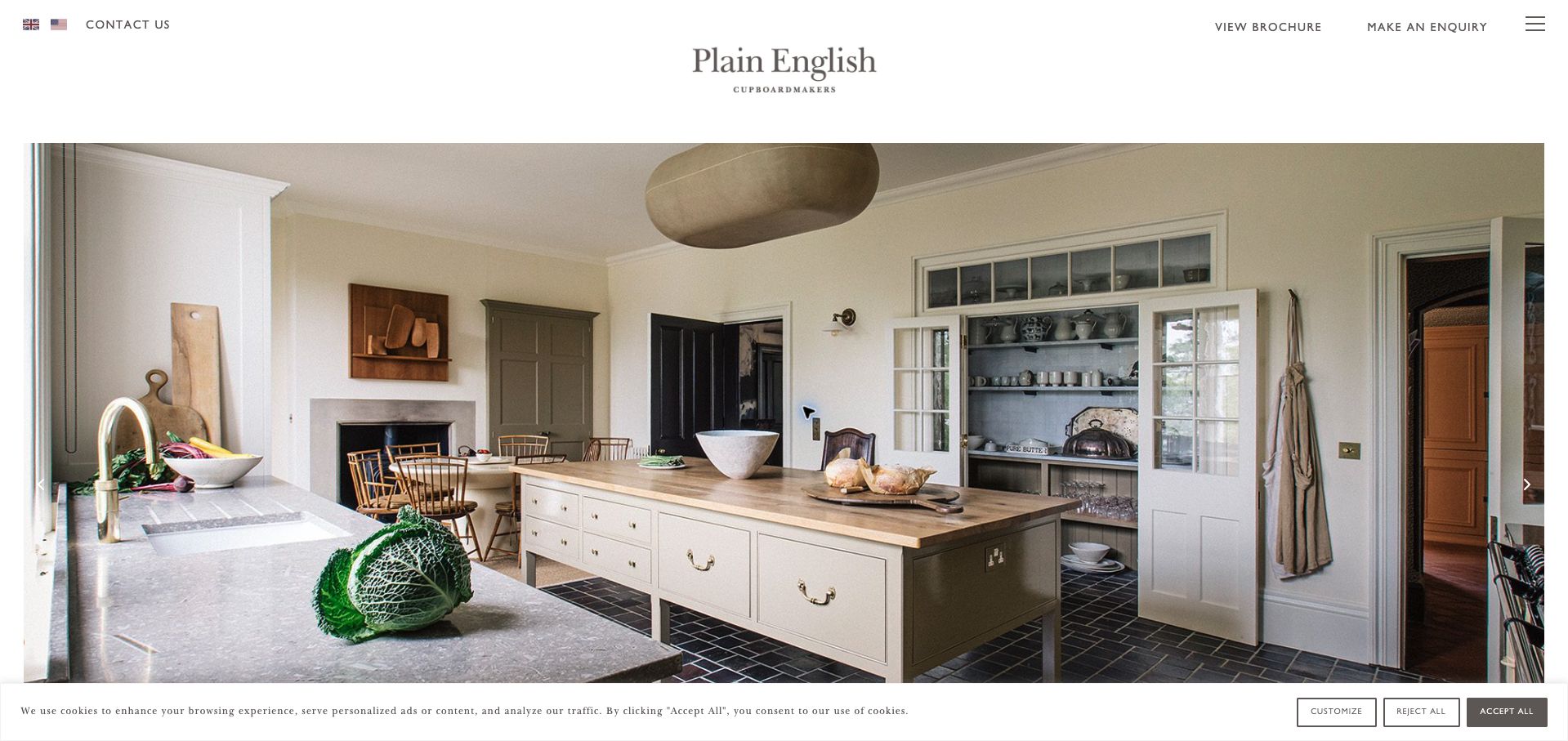
Plain English uses a centered wordmark, generous white space and a large kitchen photograph to create a calm introduction. The image includes everyday objects, shelving and an island, showing how the cabinetry relates to a usable room. Contact, brochure and inquiry links sit along the top edge, while the broader navigation is behind a menu icon. Country links make the regional site choice visible. This is a useful study in restraint: the page does not cover its product with a large sales headline. The cost of that restraint is that a new visitor must look beyond the image to understand the process and specific range.
What you can learn
Allow real room photography to establish the visual character, but keep inquiry and regional routes easy to find. A quiet homepage still needs clear explanations of the work elsewhere in the journey.
Pros
The photograph shows cabinetry in a plausible everyday setting.
Brochure, contact and inquiry links remain available outside the hidden menu.
Cons & considerations
The menu icon conceals most of the information structure on desktop.
The opening view provides little explanation of project scope or the commissioning process.
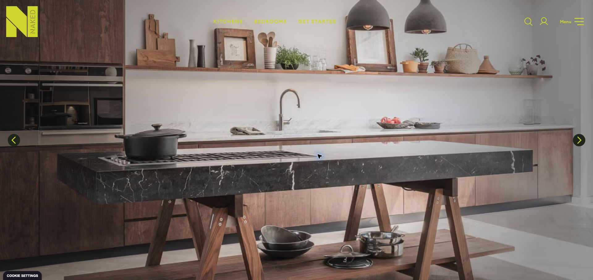
Naked Kitchens places a bold geometric identity and bright accent color over a full-width kitchen scene. The visible menu is short, prioritizing kitchens, bedrooms and getting started, while search, account and a broader menu sit to the right. The public navigation includes portfolio, colors and samples, which are practical ways to move from inspiration toward a material decision. The first cookie dialog covered the center of the room; after declining optional cookies, the cabinetry becomes the dominant subject. The example is valuable for studying a distinctive identity that does not rely on a long opening headline, although the colored text must compete with a detailed background.
What you can learn
Use a recognizable visual identity consistently, then connect it to useful selection tools such as colors and samples. Make sure the first image remains understandable with the actual consent interface in place.
Pros
Portfolio, color and sample routes support concrete product decisions.
The compact primary menu keeps the initial navigation focused.
Cons & considerations
Bright navigation lettering varies in contrast across the room photograph.
The initial consent overlay interrupts the main visual introduction.
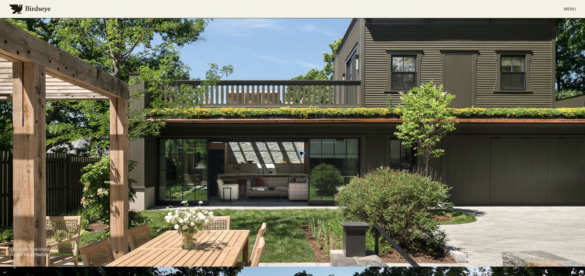
Birdseye introduces the practice with large project photographs and concise project names and locations. The opening view uses a pale header and a compact menu control, allowing the building image to dominate. Its cabinetmaking relevance is established by the separate woodwork team page, which explicitly describes cabinetry, doors and millwork alongside the broader architectural practice. This distinction matters: the homepage is a reference for presenting the context of bespoke work, not a narrowly focused cabinet catalog. It shows how a multidisciplinary company can connect craftsmanship to complete environments, while also illustrating the extra navigation required for a visitor interested only in the woodshop.
What you can learn
When cabinetry is one part of a larger practice, make the specialist service easy to reach from the broader project portfolio. Explain the connection between the finished building and the work actually undertaken by the shop.
Pros
Project names and locations make the imagery more specific than an anonymous slideshow.
The dedicated woodwork page provides a clear basis for the cabinetry service.
Cons & considerations
The homepage does not immediately explain the woodshop’s scope.
Most service navigation is hidden behind a compact menu control.
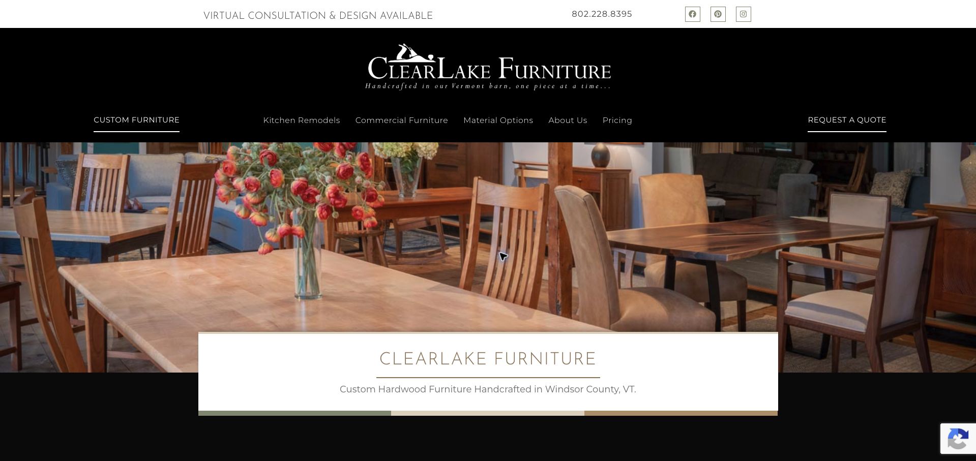
ClearLake Furniture combines a black brand header with a photograph of handcrafted dining furniture. The navigation makes kitchen remodels, commercial furniture, materials and pricing visible alongside the main custom-furniture offering. A top strip advertises virtual consultation and displays a telephone number, while Request a Quote occupies a separate position at the right. The page identifies the workshop’s Vermont setting, giving the image a concrete production context. This is a useful reference for a cabinet maker whose work extends beyond fitted kitchens. It balances a strong photographic introduction with several practical planning routes, though the tall header leaves less room for explanatory content on the first screen.
What you can learn
If a workshop serves several related markets, name those routes directly and include materials and pricing information where it can help qualify inquiries. Keep consultation options close to ordinary contact details.
Pros
Kitchen, commercial and material routes are visible without opening a menu.
A pricing destination acknowledges an important early planning question.
Cons & considerations
The tall header consumes a substantial portion of the first view.
The furniture-led hero requires the navigation to explain the cabinetry offering.
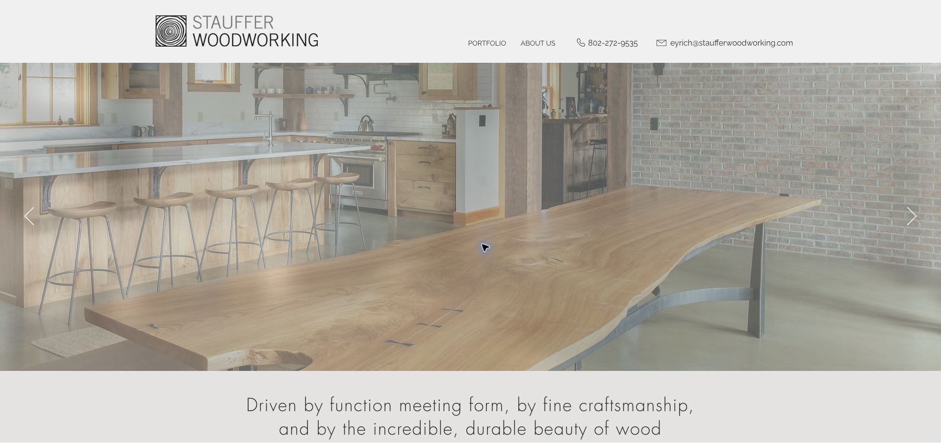
Stauffer Woodworking places a broad photograph of a kitchen and live-edge counter beneath a simple pale header. The image shows material, joinery and room context together, while the next section begins with a statement about function, form and wood. The navigation is unusually compact, centered on a portfolio and company information. A telephone number and named email address remain visible, which makes the site feel connected to an actual workshop rather than a generic lead form. The introductory text identifies custom cabinetry, furniture and interiors in Montpelier, Vermont. The approach is useful for a small shop, although more explicit project categories could help visitors find the most relevant work faster.
What you can learn
Let a real material detail demonstrate the character of the work, then make personal contact straightforward. Add clear project labels so a compact portfolio still supports visitors looking for a particular room or service.
Pros
The photograph connects a distinctive surface to a complete installation.
Direct phone and email details are prominent in the header.
Cons & considerations
The minimal navigation gives little immediate indication of the portfolio’s categories.
The first view does not explain the steps or information required to commission work.
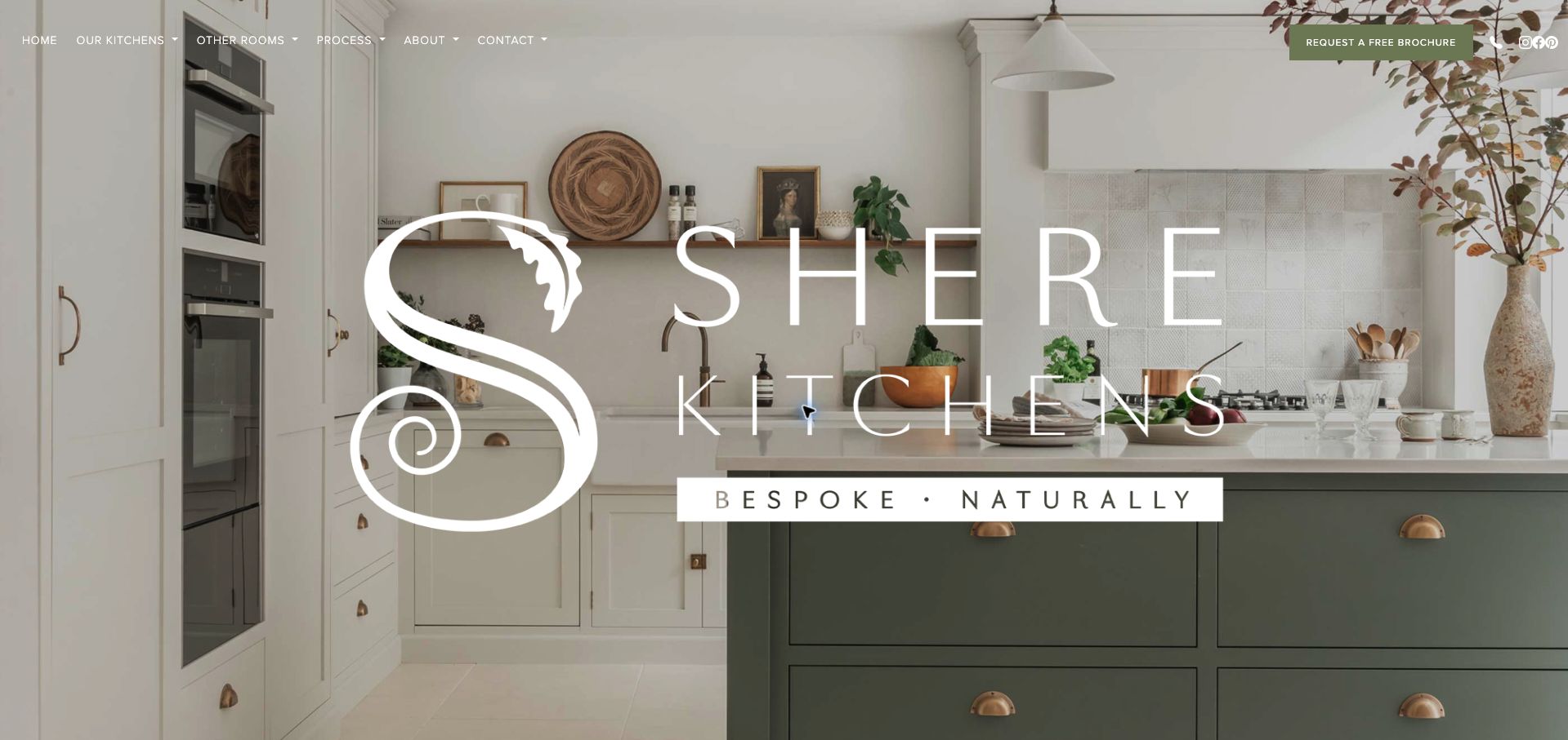
Shere Kitchens makes its name and decorative mark unusually large over a pale kitchen photograph. A thin top navigation separates kitchens, other rooms, process and company information, with a contrasting brochure button at the right. Below the opening scene, the page identifies Guildford and Surrey and explains its focus on kitchen extensions and period-property renovations. The visual treatment is memorable and closely tied to the room’s muted palette. It also demonstrates the tradeoff of a brand-dominated hero: visitors see the name before they learn the practical scope of the service, so the supporting introduction and process route carry important explanatory work.
What you can learn
Use a strong identity to make a workshop memorable, but bring its territory and project types close to the opening image. Give process information enough prominence to support visitors who need more than inspiration.
Pros
The brochure action is clearly differentiated from the surrounding menu.
The page provides regional and project-type context beneath the hero.
Cons & considerations
The oversized mark obscures a large part of the cabinetry photograph.
Small white navigation depends on the image contrast remaining suitable.
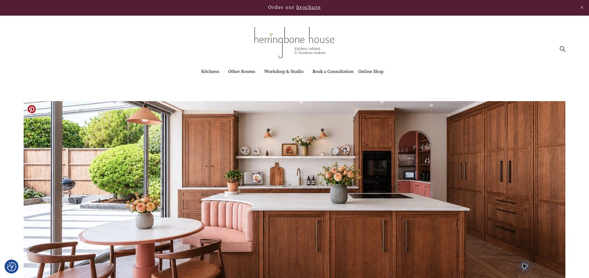
Herringbone House uses a spacious white header, a delicate wordmark and a warm wood kitchen photograph to introduce its work. The navigation distinguishes kitchens, other rooms, the workshop and studio, consultation, and an online shop. That separation is useful because commissioning fitted joinery and buying an interior object involve different decisions. The homepage’s broader description explicitly connects handmade kitchens to whole-home joinery. On the first visit, a promotional overlay and cookie banner competed with the image; the later unobstructed capture shows the calmer underlying layout. The example therefore offers both a coherent visual reference and a reminder to review the complete first-visit experience.
What you can learn
Separate commissioned work from retail shopping and explain how related rooms belong to the same practice. Keep promotional overlays from delaying the portfolio experience that attracted the visitor in the first place.
Pros
The navigation distinguishes project consultations from online purchases.
The warm room image supports the stated whole-home joinery direction.
Cons & considerations
The initial promotional overlay interrupted the first view of the work.
A tall header pushes much of the photograph and explanation below shorter screens.
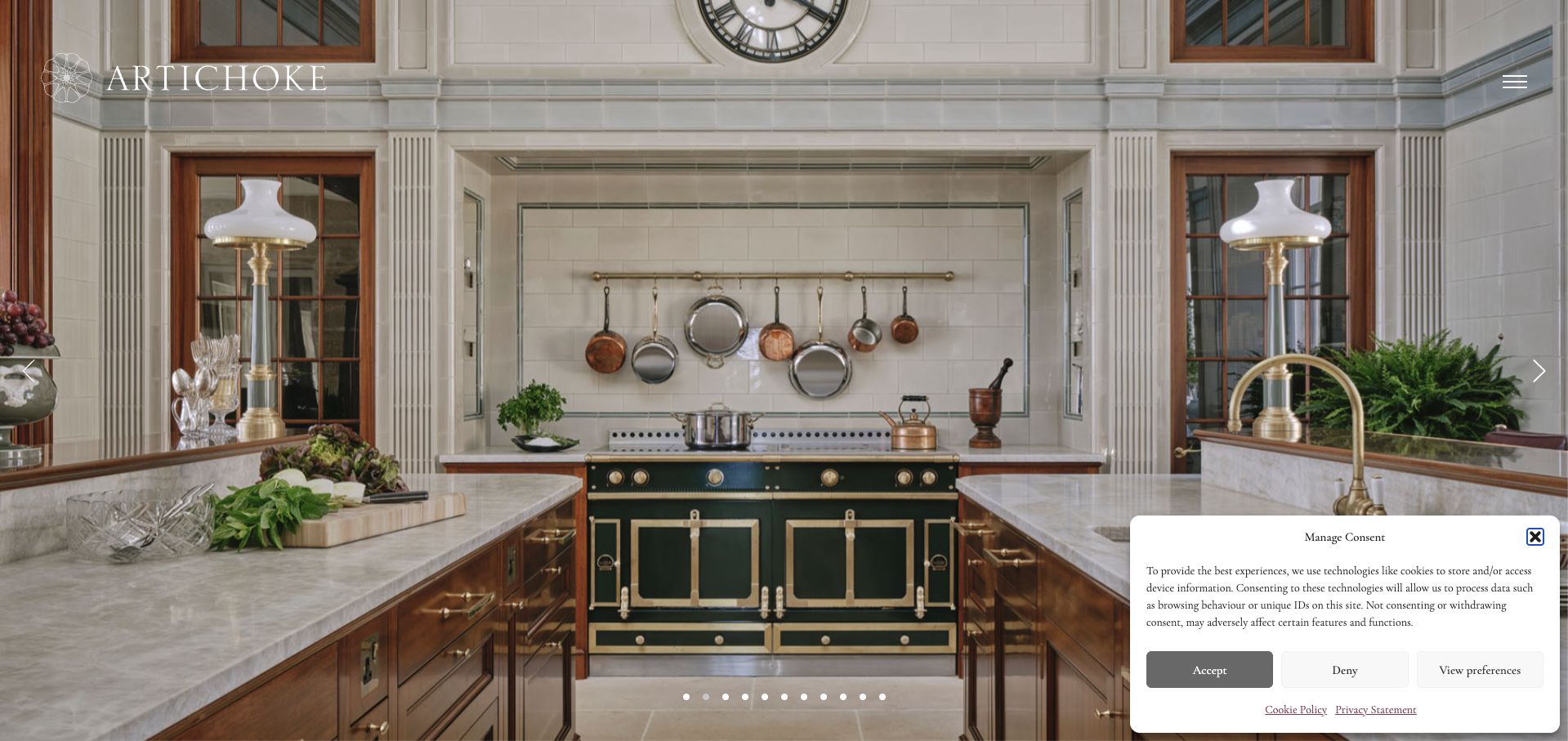
Artichoke opens with a full-screen interior that shows cabinetry, windows, architectural details and furniture as a connected environment. A light wordmark sits at the upper left, with a compact menu at the right and carousel indicators along the bottom. The public page then organizes work into room categories, including kitchens and other interiors. This presentation is useful for a workshop whose value is in the relationship between fitted elements, rather than a catalog of individual cabinet doors. The photograph provides rich visual evidence of that approach, but the minimal opening copy makes visitors rely on subsequent sections to understand the scope and next step.
What you can learn
Show architectural joinery in context when that relationship is central to the work. Pair immersive images with clear service categories and a readily available inquiry route so the visitor can move from admiration to a useful question.
Pros
The wide interior view shows how fitted elements relate to the room architecture.
Room categories offer a practical structure beneath the photographic introduction.
Cons & considerations
The consent panel covers part of the opening image on a first visit.
The small menu control hides most service and contact routes initially.
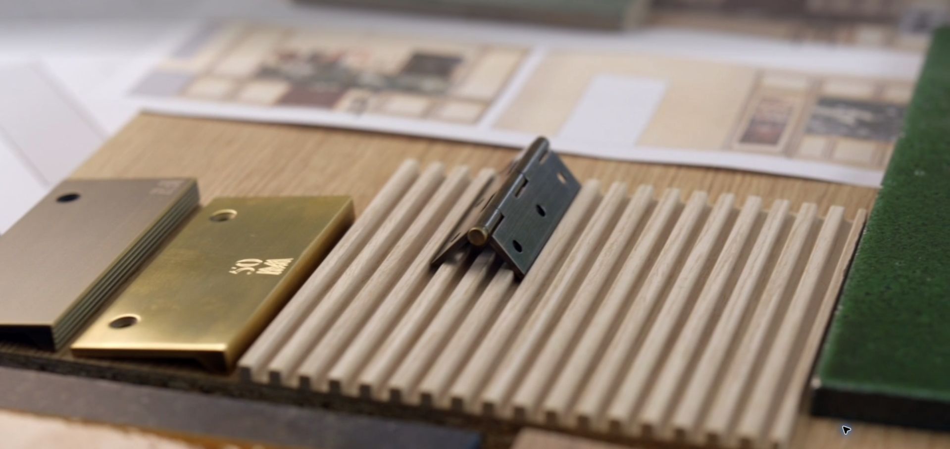
Martin Moore’s opening presentation uses full-screen moving imagery, with the captured frame focusing closely on samples and hardware. This makes the material and making process the immediate subject instead of a conventional headline and button. The inspected page also contains project portfolios, made-to-measure kitchens, collections, showrooms and several consultation routes, so the site has practical information beyond the film. The contrast between those two modes is the useful lesson here. A cinematic opening can establish atmosphere and attention to detail, but visitors arriving with a specific task should not have to wait for a sequence before they can understand or navigate the service.
What you can learn
Use original process footage to reveal details that a finished-room photograph cannot show. Keep navigation, a pause option and a clear route into project information available alongside the film rather than depending on its timing.
Pros
Close material imagery communicates a different aspect of cabinetry than a standard room hero.
The public page provides separate portfolio, showroom and consultation destinations.
Cons & considerations
The captured opening frame shows no persistent navigation or explanatory text.
A moving introduction can delay visitors who already know what information they need.
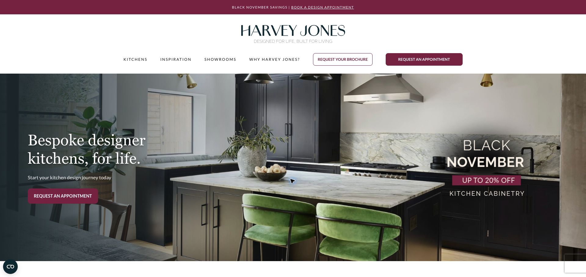
Harvey Jones places a spacious white navigation area above a dark kitchen photograph. The principal message and appointment button occupy a shaded panel at the left, while a seasonal promotion appears within the scene on the right. Brochure and appointment actions are also distinguished in the header, allowing visitors to choose between collecting information and arranging a conversation. The color treatment connects the campaign strip, buttons and promotional image without changing the basic navigation structure. This is a useful example of keeping a service journey recognizable during a sales campaign, although repeating the appointment action in several places can make the page feel more promotional than exploratory.
What you can learn
Keep stable service navigation intact when introducing a seasonal offer. Make the route to a brochure or portfolio available for visitors who are not yet ready to book a design appointment.
Pros
The shaded text panel protects legibility against the room photograph.
Brochure and appointment actions have distinct labels and treatments.
Cons & considerations
Multiple promotional elements compete with the underlying design story.
The first view emphasizes appointments before explaining the planning process.
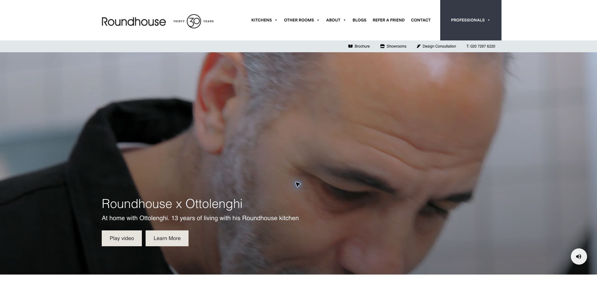
Roundhouse leads with a film-based story about a named client’s kitchen, supported by a short explanation and separate Play Video and Learn More actions. The main navigation remains in a white band above it, and a second utility row provides brochure, showroom, consultation and telephone routes. This allows the story to carry the visual interest without becoming the only way to use the site. The captured frame shows the person rather than the cabinetry, demonstrating the changing emphasis of moving imagery. The example is useful for a maker with a real story to tell, provided that the relationship and claims are accurately documented and the practical routes remain visible.
What you can learn
Give a genuine client story a clear written alternative and keep ordinary inquiry routes outside the video. Make the story about specific experience and context rather than turning it into an unsupported promise for every future project.
Pros
The film has a separate Learn More route for visitors who prefer reading.
Brochure, showroom and consultation links remain visible above the story.
Cons & considerations
A moving frame may show little cabinetry at the moment someone arrives.
The dense combination of main and utility navigation requires careful small-screen treatment.
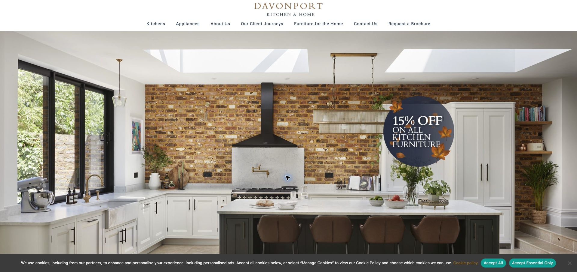
Davonport combines a compact centered identity with a wide kitchen photograph and a plainly organized navigation row. Kitchens, appliances, company information, client journeys, furniture and contact each have distinct routes. The image shows cabinetry in a room with visible architectural character, helping visitors understand the work as part of an interior rather than an isolated product. The Client Journeys label is especially useful for a custom service because it promises an explanation of how a project unfolds. A promotional graphic and cookie strip occupy parts of the first view, so the opening is more campaign-focused than the otherwise restrained header suggests.
What you can learn
Include a project-journey route alongside the portfolio so visitors can learn what commissioning actually involves. Maintain a clear distinction between the permanent service explanation and a temporary promotional message.
Pros
Client Journeys gives the custom process a visible place in the navigation.
The room photograph establishes scale and architectural context.
Cons & considerations
The promotional graphic competes with the cabinet details in the photograph.
The initial cookie strip reduces the space available for introductory information.
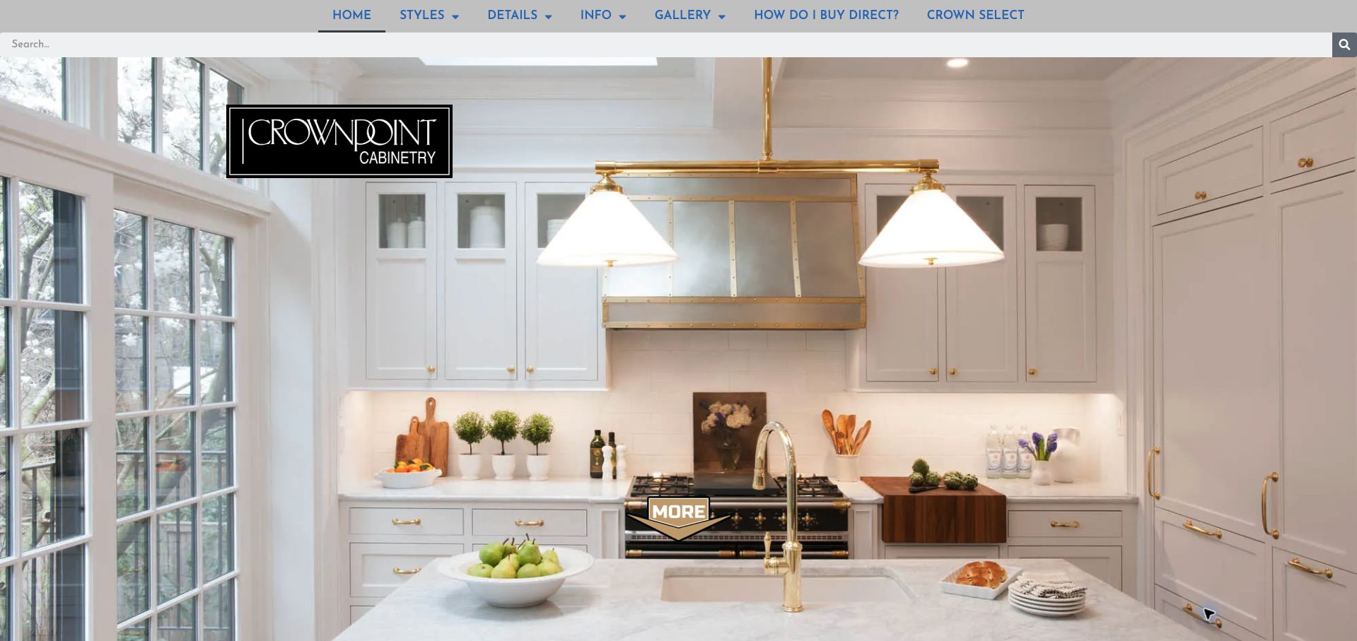
Crown Point Cabinetry puts a large kitchen photograph beneath a compact blue navigation row and a full-width search field. Alongside styles, details and galleries, the menu asks how to buy directly, addressing a practical question that can otherwise be buried in an FAQ. The public page explains its custom-cabinetry offer and presents material details such as drawers and cabinet interiors farther down. This makes the site useful for studying a manufacturer that must explain both the product and the purchasing relationship. The opening image remains the visual focus, though the generic More prompt is less informative than a specific invitation to inspect a style or project.
What you can learn
Surface the buying process when it differs from visitors’ expectations. Pair attractive room imagery with concrete information about materials and ordering, and give continuation links descriptive labels.
Pros
The direct-buying question appears in the main menu rather than being hidden.
Search and galleries provide different routes into the product information.
Cons & considerations
The opening More prompt gives little indication of the destination.
An inspected gallery link points to a staging hostname, reinforcing the need for destination checks before launch.
Kegan is a freelance web designer and developer with 15+ years of experience helping businesses turn complicated website requirements into clear, maintainable digital experiences. He works directly with clients from planning and design through development, launch, and ongoing support.
For cabinet maker website design, his development approach focuses on genuine installed-project galleries, material and process information, service-area details, and useful cabinetry project inquiries. The scope can be a targeted improvement or a complete custom build, with responsive layouts, thoughtful content structure, and integrations chosen around the people using and maintaining the site.
Show 3 other cabinet maker website designersHide other cabinet maker website designers
Help visitors connect an attractive room to a realistic project conversation
Define the business offer before organizing the portfolio
Begin by listing the work the business actually wants to discuss. Kitchens, utility rooms, wardrobes, individual furniture and architectural joinery may require different information. Use those distinctions when they help a prospective client find relevant examples, rather than arranging every project in one undifferentiated image feed.
Clarify the delivery model. A workshop may design and make cabinetry, collaborate with an independent designer, supply components or provide a wider installation service. Describe the real arrangement without implying that every service is included in every project. Give locations and service areas enough context to help a visitor decide whether an enquiry is appropriate.
Make portfolio categories match those promises. A finished room can be a useful introduction, but captions should identify the relevant scope and collaborators where known. Keep past work separate from speculative concepts or showroom displays. If the business has only a few strong projects in a category, a small, well-explained collection is more useful than repeated photographs presented as many separate commissions.
Explain decisions behind the finished photographs
Choose images that show both the room and the cabinetry. An overall view establishes the setting, while selected details can explain a storage arrangement, material transition or particular piece of joinery. Do not add close-ups simply to increase gallery length; each image should help a visitor understand something about the work.
Write a concise project introduction with the client’s approved information. It can describe the brief, the role of the workshop and a few relevant design decisions without revealing private household details. Avoid inventing before-and-after outcomes or attributing a whole renovation to one supplier. Use accurate credits for photography and collaborators, and keep permissions with the project record.
Materials and finishes should be named only when verified. A photograph cannot establish every specification, and a sample seen on one screen may look different in person. Present images as references for a conversation, not a promise of an identical result. Give customers a clear way to discuss requirements without turning a portfolio caption into a technical guarantee or a substitute for project-specific drawings.
Design the enquiry and maintenance process together
Ask the team which initial questions actually help it route a request. Project type, approximate location, the customer’s stage and a short description may be more useful than a long form demanding detailed measurements before a discussion. Explain any optional uploads and keep private plans or photographs out of the public portfolio workflow.
Describe the next step accurately. A received enquiry is not necessarily a quotation, a survey appointment or a place in the production schedule. If the business offers showroom visits or consultations, explain how those are arranged and keep the relevant opening or appointment information current. Provide an ordinary contact alternative when the form is unavailable.
Plan who will update the site after launch. Completed projects, workshop changes, team details, showroom arrangements and temporary notices all need owners. Test the site with a long project title, a small screen and a gallery that has not loaded yet. An image-rich design should still expose useful text and contact routes. Keep performance expectations grounded in actual measurements rather than assuming a minimal-looking page is automatically fast.
The editing job behind the design
Support a useful portfolio without creating an editing burden
Choose a project-content structure that editors can maintain with consistent titles, scope notes, images and credits. Reusable fields are usually more useful than a different custom layout for every small update.
Plan responsive image generation and sensible gallery loading around the actual photography. Preserve a usable text and navigation experience when media is slow or unavailable.
Public-page stack evidence does not reveal the workshop’s design software, manufacturing equipment, scheduling tools or internal estimating system. Do not infer those systems from a website framework.
Our WordPress website examples offer a separate look at publishing approaches. A visible platform label is evidence for that named page, not a guarantee that the same system will suit your requirements.
Before the public launch
Cabinet maker website brief checklist
List the project types the business actually accepts.
Explain design, making, supply and installation responsibilities.
Identify the relevant service territory and visit arrangements.
Use portfolio categories that reflect distinct customer needs.
Pair overall room images with purposeful detail photographs.
Confirm project scope, material descriptions and collaborator credits.
Keep concepts, showroom displays and completed work distinguishable.
Retain permissions for photography and customer information.
Ask only for useful initial enquiry context.
Explain what an enquiry acknowledgement does and does not confirm.
Test galleries, captions, long titles and contact routes on small screens.
Assign an editor for new projects, opening details and temporary notices.
These checks are a project checklist, not a performance, legal, security, or accessibility certification. Test real journeys with the people responsible for the website before making claims about the result.
Sources & editorial method
How this collection was selected and reviewed
The collection retains its saved random target of 22. Each selected source page was directly inspected and captured, with an original review and a bounded broad public technology-audit attempt. Where a broader architecture or furniture business appears, the supporting source identifies relevant cabinetry or woodwork rather than assuming it from the company name. Reviews assess website communication, not workmanship, construction compliance, prices, customer outcomes or project delivery. Capture dates and unavailable audit results remain explicit in the underlying evidence.
Each example links to its actual source page. Screenshots are direct browser captures with their own capture dates; moving imagery, announcements and live designs can change. The notes describe observable design choices and conditional tradeoffs, not measured traffic, conversion results, service quality, or accessibility conformance.
Technology labels use public page metadata, asset evidence, or explicitly cited platform documentation. Platform documentation is not a complete current deployment audit. A component reference may be legacy or unused; it is not a complete backend inventory. Unknown stacks are omitted. These sites are editorial examples, not our client portfolio.
Written, Edited and Curated are separate editorial records, not timestamps advanced by a rebuild. Website designs and imagery belong to their owners. See our editorial standards or suggest a correction.
Questions worth asking
Cabinet Maker website design questions
Is a large gallery enough for a cabinet maker’s website?
A gallery shows appearance, but brief project descriptions help explain scope, materials and the workshop’s role. A smaller collection with useful context can communicate more than many unlabeled photographs.
Should kitchens and other fitted furniture have separate pages?
Separate them when they represent meaningful differences in the offer and there is enough relevant information. Avoid creating thin category pages simply to repeat the same images under different labels.
What should a first project enquiry ask for?
Collect the context the team actually needs to begin a discussion, such as project type, location and stage. Detailed measurements or private documents can follow through the business’s appropriate process when needed.
Can a project image stand in for material specifications?
No. Name materials and finishes only when verified, and use images as visual references. Project-specific details should be discussed and documented through the maker’s normal design and quotation process.
Does inclusion endorse a maker’s workmanship?
No. The collection studies website design and communication. It does not independently assess construction quality, delivery performance, prices or suitability for a particular commission.