Best Bespoke Tailor Websites of 2026 (25 Real-World Examples)
Study 25 bespoke-tailor and custom-clothing websites for clear service distinctions, useful process information and distinctive editorial presentation.
A tailoring website should make the house style visible and the commission process understandable. Beautiful cloth and fashion photography cannot explain construction choices, fittings or appointment arrangements on their own.
Tailoring brands often combine several offers: bespoke commissions, made-to-measure or other custom services, ready-to-wear collections, shirting and accessories. Those categories do not describe the same process. Good website design helps a visitor understand what can be bought immediately and what requires consultation, measurements and production. A familiar heritage street name or a close photograph of handwork can establish context, but it is not a substitute for a factual service explanation.
The 25 examples below include smaller independent practices, shirtmakers and broader clothing brands with tailoring services. This is an editorial design collection, not an assessment of garment quality or an independent verification of every construction claim. Where a brand offers several methods, we keep the distinction visible. Use the examples to clarify your own service, location and publishing requirements rather than assuming a luxury aesthetic requires an opaque customer journey.
Before the examples
What makes good bespoke tailor website design in 2026?
Describe the actual construction offer
Use terminology the practice can explain accurately. If several custom methods are offered, give each its own scope rather than treating bespoke as a universal synonym for anything fitted. Tailors’ Keep’s public services page is useful for its explicit distinction between programmes and process stages. The lesson is to explain your own offer plainly, not to copy that practice’s methods or production times.
Separate commissioned work from retail shopping
A lookbook, product grid and appointment calendar serve different intentions. Keep ready-to-wear collections and accessories distinct from services requiring fittings, while maintaining a coherent brand identity. Explain the next step before a visitor enters personal details. If an appointment is a request rather than a confirmed slot, say so instead of implying that the calendar has completed the entire arrangement.
Give place and travel information practical meaning
Name the shop or showroom and explain where appointments occur. A travelling fitting schedule needs current dates, locations and an appropriate enquiry route. Heritage and city imagery can provide atmosphere, but it should not leave an international visitor guessing how many visits are involved or whether a particular service is offered through a trunk show. Keep these facts current and owned by the practice.
The collection · 25 examples
25 bespoke tailor websites worth studying
The examples below show craft-led introductions, paired bespoke-and-retail routes, seasonal fashion campaigns and straightforward small-practice mastheads. Compare the relationship between imagery and service explanation before borrowing a layout or a heritage tone.
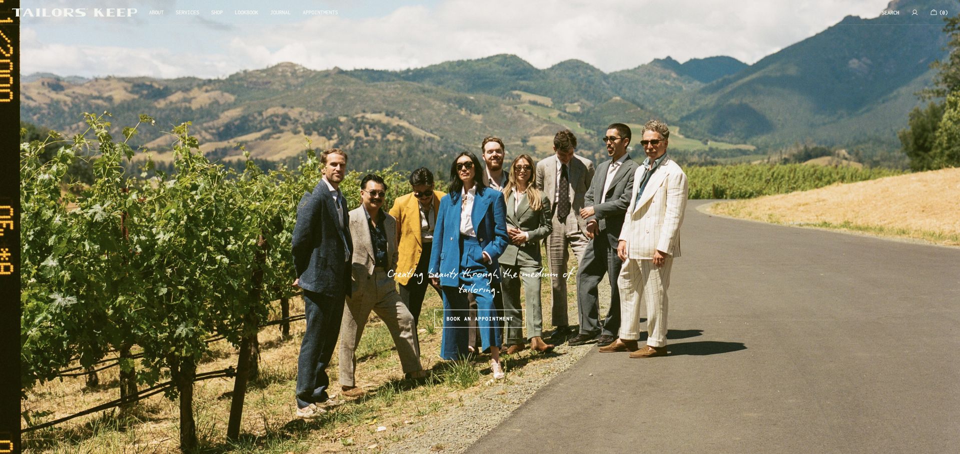
Tailors’ Keep opens with a wide outdoor group photograph and a very restrained white wordmark. A narrow vertical story treatment introduces the collection, while appointment routes connect the editorial image to the actual tailoring service. The official content distinguishes true bespoke work from semi-bespoke and shirting rather than treating every custom garment as identical. This San Francisco and Palo Alto specialist is our editorial first choice for that relationship between imagery, service distinctions and local visiting information, not an assessment of garment quality.
What you can learn
Let a lookbook express the house style, then explain how clients commission work. Keep construction methods, fittings and location choices explicit, and distinguish ready-to-buy accessories from garments that require an appointment and a separate production process.
Pros
A lookbook introduces the house style without generic luxury imagery.
Named service distinctions support comparison before an initial appointment enquiry.
Cons & considerations
Fine overlaid navigation needs contrast across changing responsive photographic crops.
Campaign imagery cannot explain fitting schedules or specific construction methods.
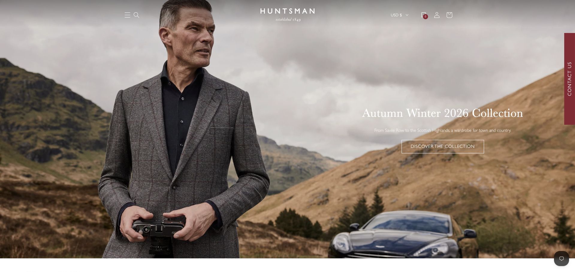
Huntsman uses a broad landscape photograph with a suited model, a restrained white wordmark and a seasonal collection message. A vertical visit route sits at the edge while the main image offers a collection action. The composition combines a heritage brand frame with contemporary fashion photography rather than beginning with a long historical introduction. This is useful for a business offering both commissioned tailoring and retail collections. The distinction matters: a current collection image does not by itself explain the process or availability of bespoke work.
What you can learn
Separate browsing a collection from commissioning a garment. Keep appointments, construction and fitting information accessible alongside retail actions, and make seasonal photography lead to the relevant current collection rather than an unrelated general contact page.
Pros
A landscape gives the seasonal campaign one recognisable visual atmosphere.
A separate visit route coexists with current collection-browsing actions clearly.
Cons & considerations
Fine white navigation needs contrast against changing pale photographic areas.
Seasonal retail campaigns must stay distinct from bespoke commission information.
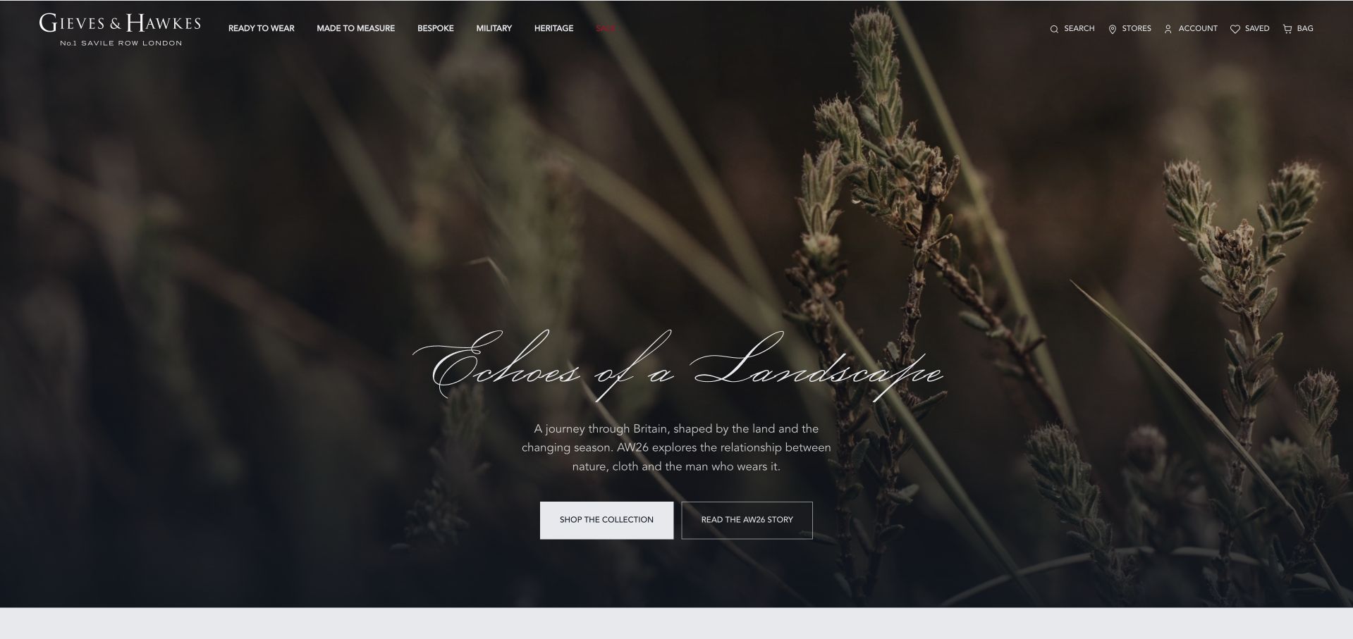
Gieves & Hawkes uses a close landscape image, delicate script headline and two adjacent actions for the collection and its story. The wordmark and navigation remain small over the darker upper part of the photograph. The composition is quieter than a conventional suit-model campaign, relying on texture and seasonal mood. Its strongest lesson is the explicit difference between browsing garments and reading editorial context. Neither route should be confused with a bespoke consultation, which requires its own process information beyond the campaign image.
What you can learn
Give editorial stories and retail collections different labels. A visitor who wants to learn about the house should not be sent directly into a product grid, while someone ready to browse clothes should not have to read an entire campaign narrative first.
Pros
Separate collection and story labels clarify two different browsing intentions.
Landscape detail gives the seasonal campaign a coherent visual identity.
Cons & considerations
The scene reveals little about the actual clothing being promoted.
Fine script needs contrast across photographic changes and responsive crops.
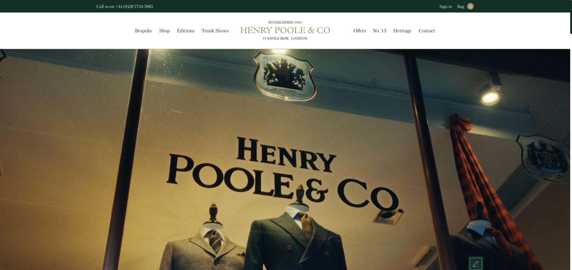
Henry Poole uses a close photograph of the shop window and gold lettering beneath a white header and dark green utility strip. The physical name becomes part of the image, giving the opening a tangible sense of place without a long history paragraph. Bespoke, shop, tailoring and visit-related routes remain available above. The result feels rooted in an actual premises rather than a general luxury campaign. It is useful for studying how a longstanding tailor can introduce heritage through a specific, recognisable visual detail.
What you can learn
Use a real shop detail to establish identity, then explain the commission process in ordinary language. Visitors still need to know how appointments, fittings and trunk shows work; a recognisable street or window should not be treated as a substitute for that practical information.
Pros
A shop window connects the identity to a physical place.
A stable white header separates navigation from the warm photograph.
Cons & considerations
An exterior detail cannot explain the practical commission process itself.
Small labels need mobile spacing and readable, high-contrast text treatment.
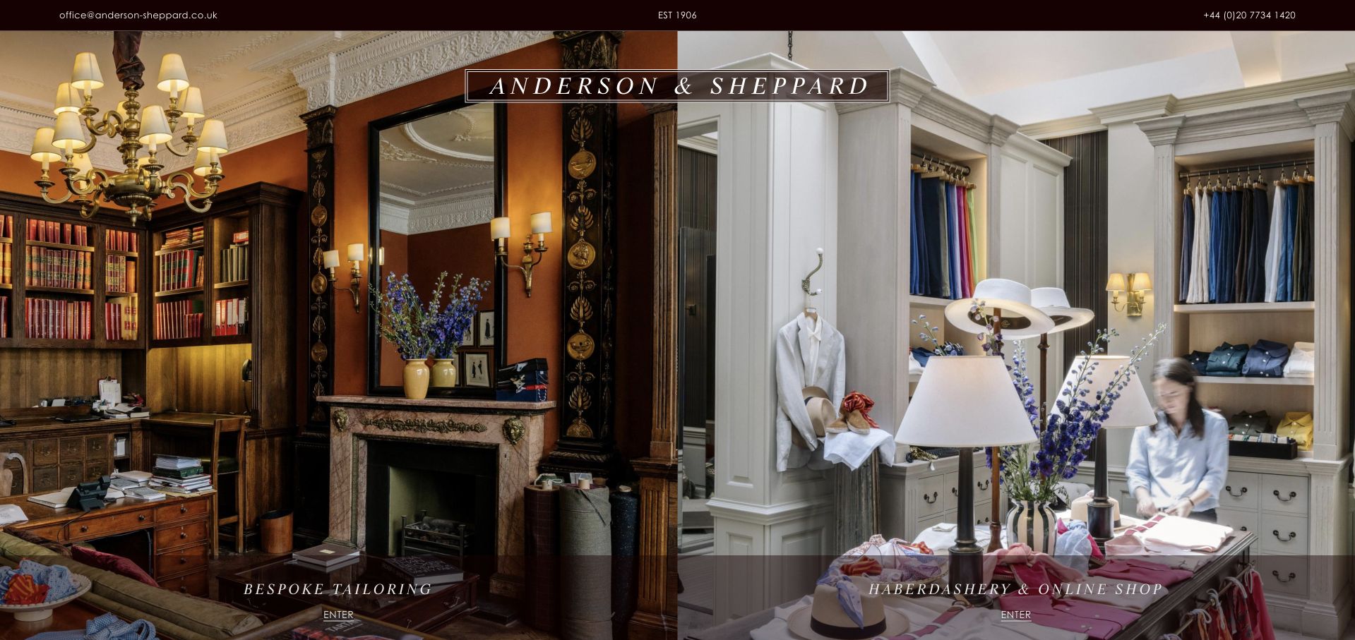
Anderson & Sheppard divides the opening into two large interior photographs. One side introduces bespoke tailoring, while the other identifies the haberdashery and online shop. The split gives each part of the business a concrete setting and a clear label rather than hiding the distinction inside a complex menu. A narrow header leaves most of the screen to the interiors. This is a useful reference for separating two related but operationally different customer journeys without making the brand feel like two unrelated websites.
What you can learn
When bespoke service and retail products coexist, make the distinction visible before the first click. Explain appointments and fittings on the service side, and ordering or delivery on the shop side. Do not assume a visitor knows which garments can be purchased immediately.
Pros
Equal panels clearly separate commissioned tailoring from the retail shop.
Literal labels explain the distinction without relying on interior photographs.
Cons & considerations
Split images need a deliberate stacked arrangement on mobile screens.
Both destinations still need practical appointments or online-ordering information separately.
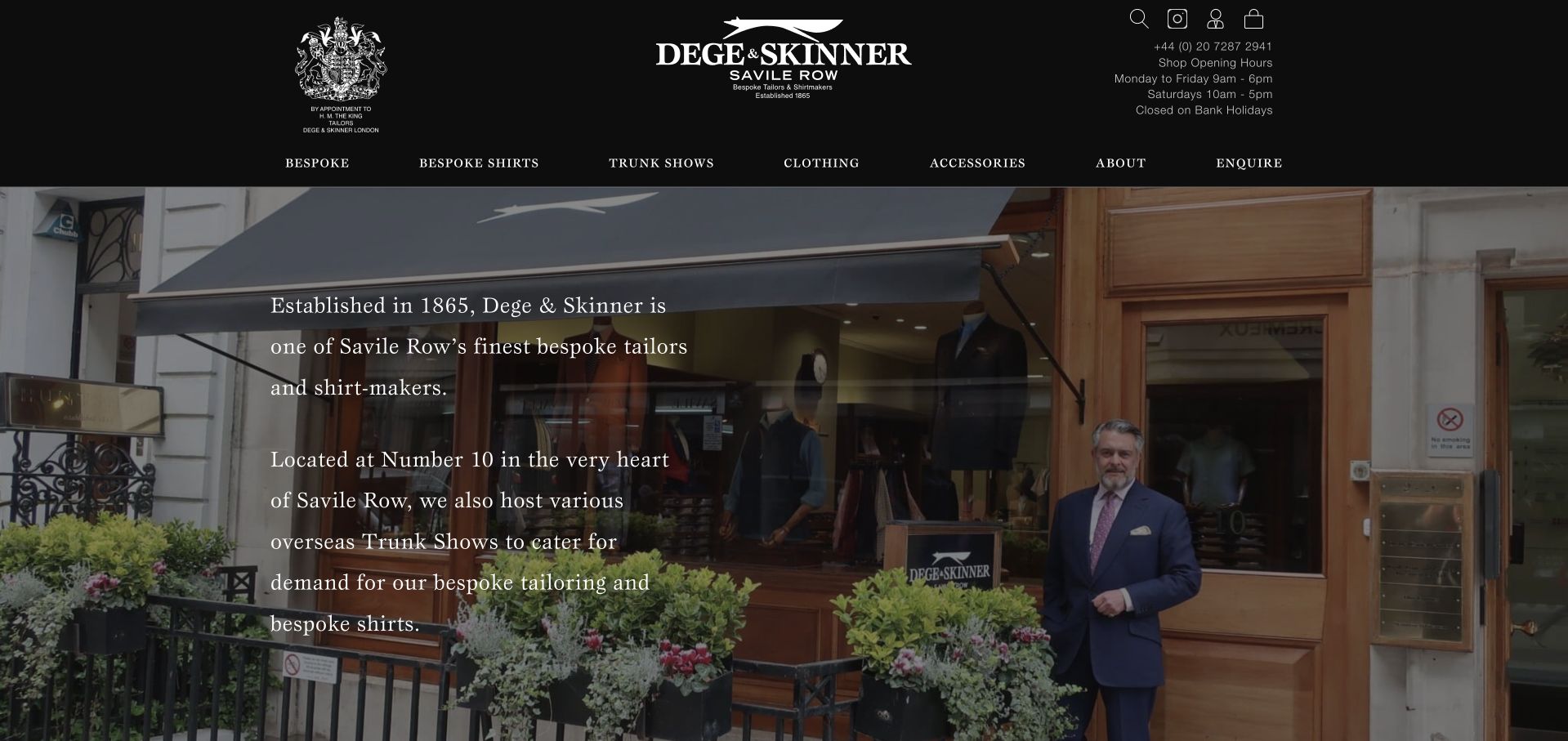
Dege & Skinner uses a shopfront photograph beneath a black header with a white crest and wordmark. A translucent dark text panel provides a short introduction over the image, while the navigation names bespoke, shirts, trunk shows and other services. The page makes the physical business visible before asking visitors to enquire. Its heritage statements are the publisher’s own account; the screenshot demonstrates the way those claims are presented, not an independent assessment of quality. The central design lesson is the direct relationship between place, service categories and contact.
What you can learn
A shopfront can establish authenticity while a short panel supplies context. Keep construction and appointment information separate from heritage language, and make trunk-show locations and dates easy to verify rather than expecting international clients to understand the business from its London address alone.
Pros
An actual shopfront gives the introduction a specific physical context.
Service labels distinguish bespoke work, shirts and travelling appointments clearly.
Cons & considerations
A translucent panel needs dependable contrast over detailed architectural photography.
Heritage statements cannot replace practical commission and fitting information themselves.
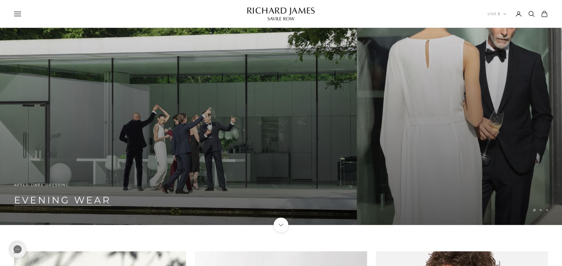
Richard James places a split eveningwear campaign beneath a narrow white header. One photograph shows a group in a modern setting while the other gives a closer formalwear view. A small collection label sits near the image edge, and Book an Appointment remains available in the header. The page has the visual confidence of a fashion retailer while preserving a service route. It is useful for studying a mixed business model in which buying a current collection and commissioning tailoring should remain distinct, clearly explained actions.
What you can learn
Keep a retail campaign connected to its collection while preserving a literal appointment label. Explain what the appointment covers before requesting details, and avoid implying that every photographed garment follows the same bespoke, made-to-measure or ready-to-wear process.
Pros
Split imagery gives both wider styling context and formalwear detail.
An appointment route offers an alternative to seasonal collection browsing.
Cons & considerations
Edge captions need mobile placement that preserves their text readability.
Fashion campaigns cannot explain construction options or the fitting process.
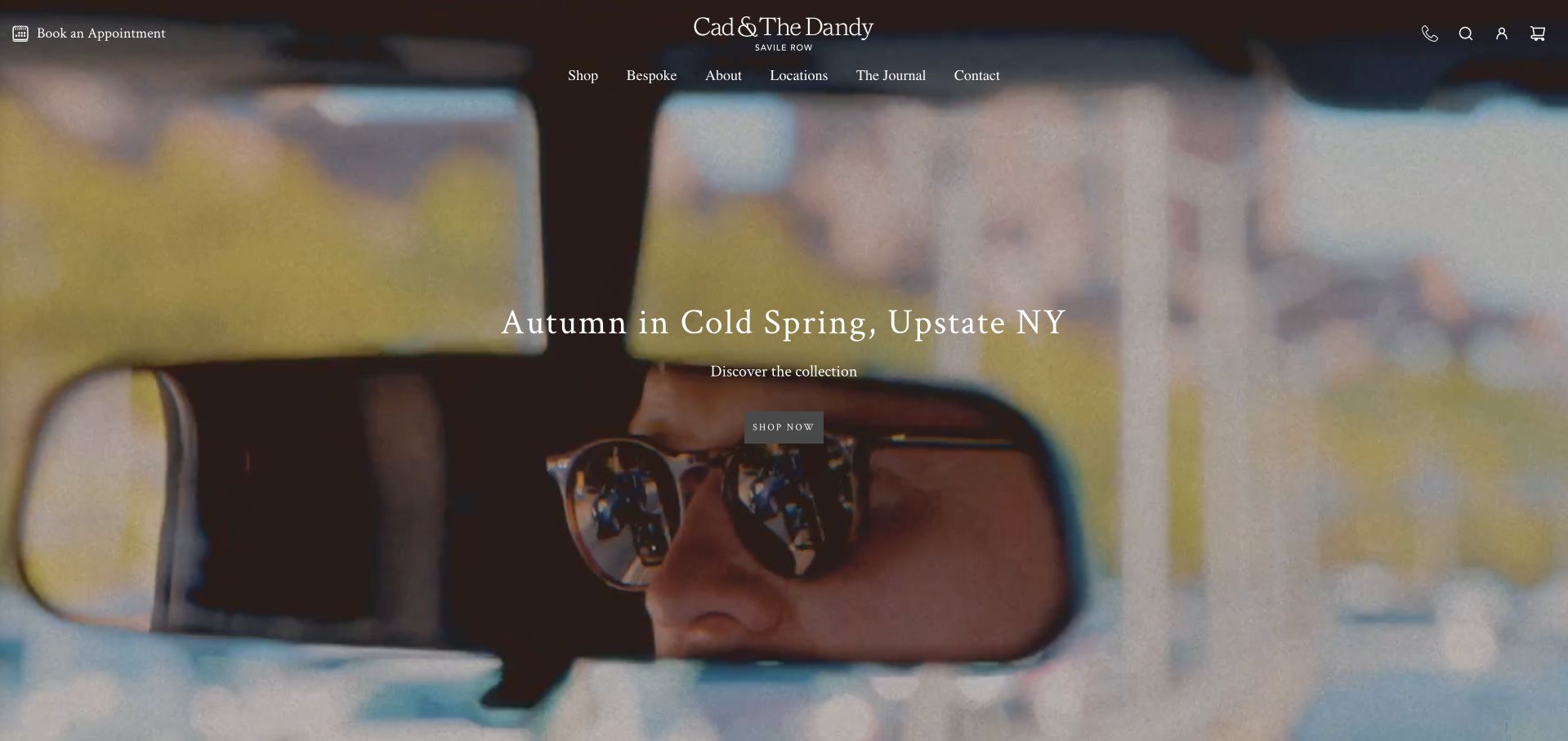
Cad & The Dandy uses a close seasonal photograph with a short location-based campaign title. The dark header contains conventional shop, bespoke and location routes, while the wordmark remains centred above the image. The opening behaves like an editorial story rather than a price-led service page. This gives the brand character without discarding practical navigation. The useful distinction is between the campaign’s visual world and the actual tailoring service: a photograph of a styled collection does not itself explain construction, appointments or how long a commission takes.
What you can learn
Let the campaign provide personality while the navigation explains the service. Keep shop, bespoke and location routes literal, and use the following pages to describe fittings and construction. Visitors should not have to interpret an editorial story before learning how to arrange a commission.
Pros
A short location title gives the campaign specific editorial context.
Literal service navigation supports visitors who bypass the seasonal story.
Cons & considerations
White overlaid links need contrast across all responsive photographic crops.
Editorial imagery cannot explain construction, pricing or current fitting arrangements.
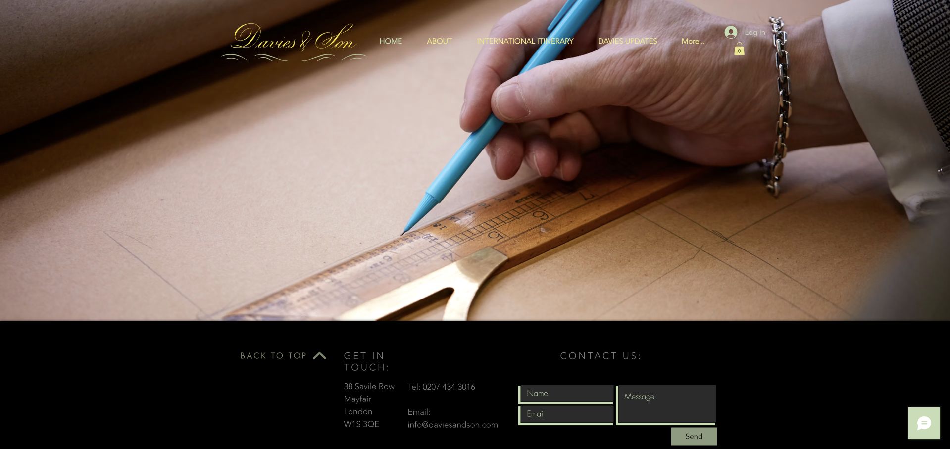
Davies & Son opens with a close photograph of a hand marking a pattern, using the material and tool as the main visual story. A fine gold wordmark sits over the image, while a dark contact section begins immediately below. The page is more compact and service-oriented than many expansive retail campaigns in this collection. It is useful for showing how a specialist practice can make the work itself visible. The photograph illustrates a craft process; it does not independently verify how every garment offered by the business is produced.
What you can learn
A craft image should lead into an explanation of the actual service. State how a visitor arranges a consultation, what the process includes and which contact route is appropriate. Keep the form labelled and optional rather than making it the only place practical questions can be answered.
Pros
A close cutting image introduces a concrete and specific process.
Contact information starts promptly rather than following several full-screen campaigns.
Cons & considerations
Fine gold text needs dependable contrast over the detailed photograph.
A craft detail cannot explain the full commissioning process alone.
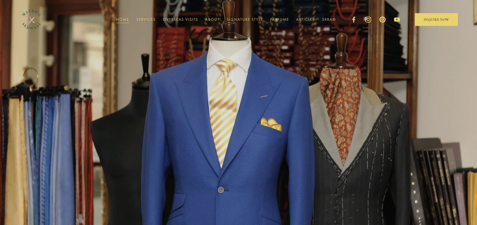
Maurice Sedwell uses a vivid blue suit on a mannequin against a shop interior, framed by a cream header and gold-toned branding. A small bright enquiry action sits at the upper right, while service and company navigation remain separate. The colour choice makes the opening immediately recognisable without a large slogan. It is useful for studying how a specific garment can introduce a tailor’s visual identity. The photograph should still be distinguished from the practical details of commissioning work, which require their own clear public explanation beyond the hero.
What you can learn
A striking garment can attract attention without covering the image in promotional text. Connect it to a clear service introduction and explain appointment, fitting and construction options. Avoid suggesting that a mannequin photograph is a live inventory listing or a complete account of the tailor’s range.
Pros
A vivid blue garment supplies one unmistakable visual focal point.
A visible enquiry action provides a practical route beyond imagery.
Cons & considerations
Fine gold labels need contrast against both cream and photography.
One mannequin photograph cannot explain the full service range itself.
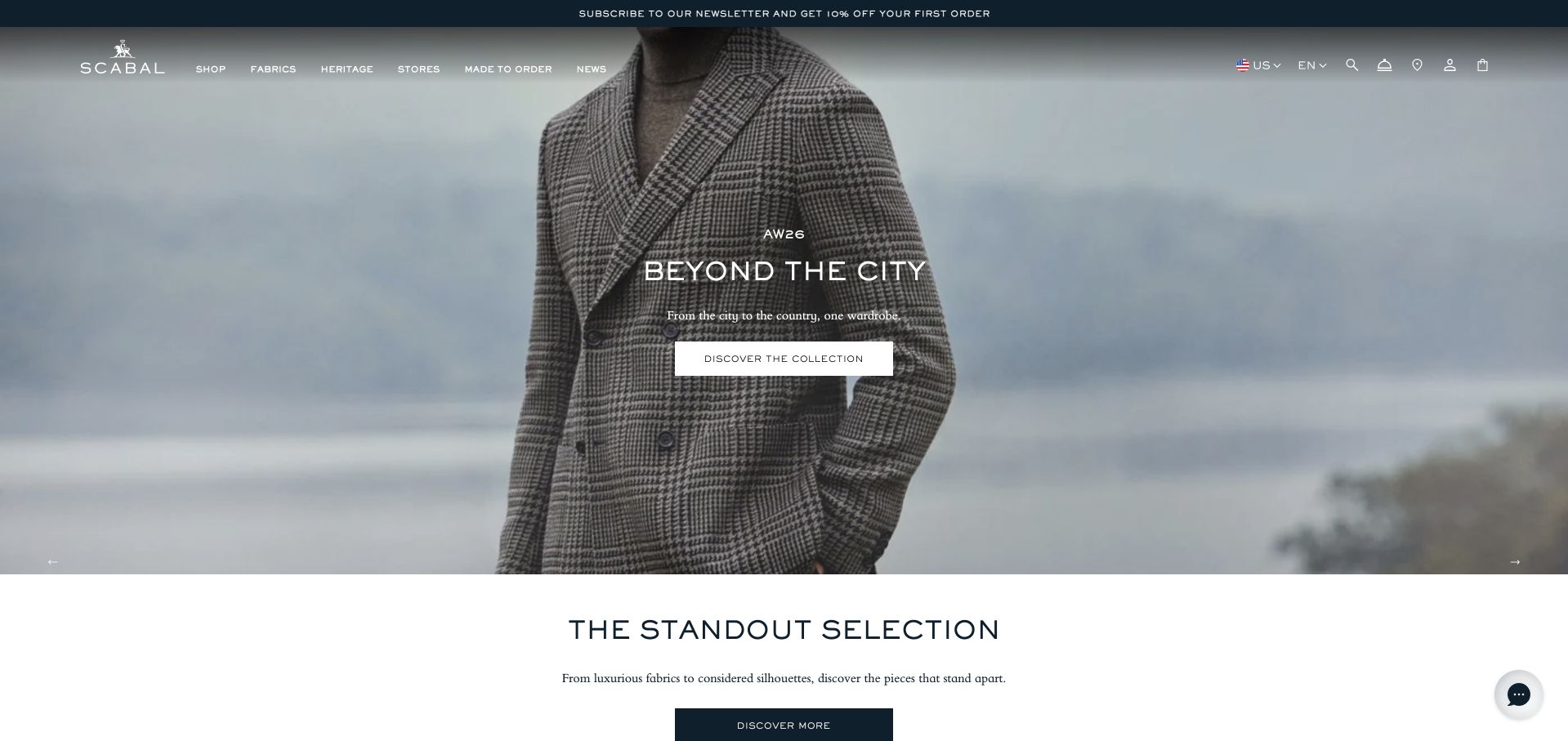
Scabal opens with a seasonal suit photograph and a short collection statement beneath a restrained light header. A white action sits centrally over the image, while the next section begins with a separate collection heading. The composition is clean and garment-focused rather than full of heritage claims. This is useful for a brand whose wider business includes both cloth and clothing: the navigation must help visitors distinguish those routes. The public fashion image is a design reference, not proof of the construction or availability of every garment associated with the brand.
What you can learn
Keep cloth, retail clothing and tailoring appointments as distinct information paths. A seasonal campaign should lead to the relevant current collection, while a client seeking commissioned work needs a separate explanation of the fitting process and where the service is offered.
Pros
One collection message gives the fashion image a clear purpose.
The next section transitions promptly into more structured collection browsing.
Cons & considerations
Cloth and clothing routes need careful labelling to avoid confusion.
A campaign photograph cannot confirm garment stock or construction method.
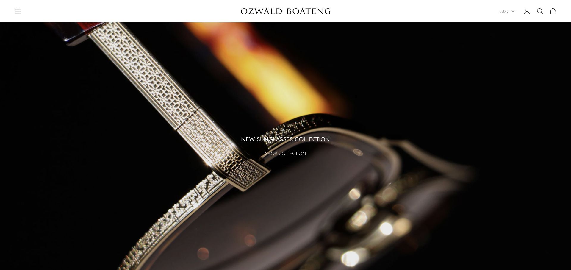
Ozwald Boateng uses a close accessory-detail photograph against a dark background beneath a white header and centred wordmark. The reflective material and sharply defined pattern supply most of the visual interest, while a small collection message remains central. The opening is more like a fashion editorial than a conventional tailoring-service introduction. It is useful for studying a distinctive designer identity, but the retail campaign and commissioned tailoring should not be conflated. Visitors need a clear route from this visual introduction to the specific product or service they actually want.
What you can learn
A dramatic detail image can establish a designer’s visual language, but it should lead to a clearly named destination. Preserve separate collection, product and tailoring-service routes, and explain appointments in plain language rather than asking visitors to infer the business model from the campaign.
Pros
Close material detail gives the campaign a distinctive visual subject.
A white header provides stable branding above the darker photograph.
Cons & considerations
An abstract detail reveals little about the complete garment itself.
Small overlaid copy needs contrast across the reflective image surface.
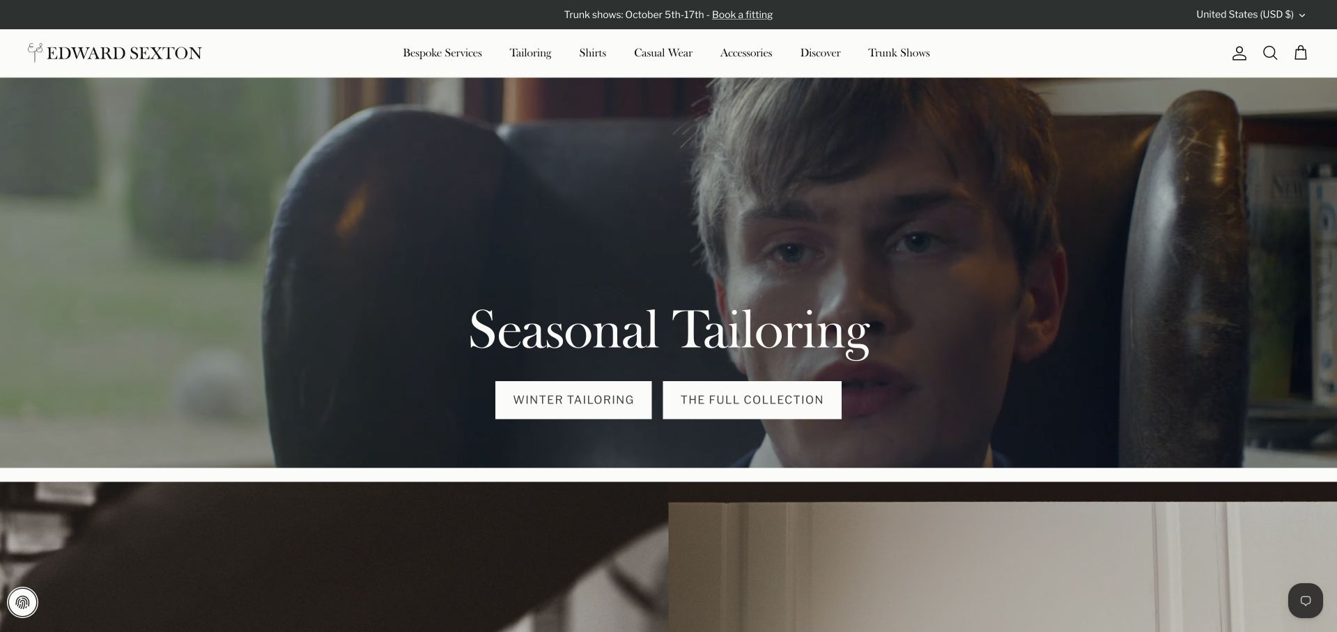
Edward Sexton uses a close tailoring-related photograph beneath a fine white header. A large Seasonal Tailoring headline sits centrally, followed by two clearly named collection actions. Bespoke, tailoring, clothing and trunk-show routes remain distinct in the navigation. The page is useful for studying how a house can present seasonal retail content while maintaining a commissioned-service identity. The current root was captured as its own public page after settling; the review does not treat an earlier temporary collection redirect as the final source or infer the construction of photographed garments.
What you can learn
Keep collection labels precise when several kinds of clothing share a homepage. A visitor should know whether they are browsing current retail pieces, learning about bespoke work or arranging a trunk-show appointment before entering a form or beginning an order.
Pros
Precise collection actions explain two different seasonal browsing destinations clearly.
Bespoke and trunk-show routes remain separate from retail campaign navigation.
Cons & considerations
Seasonal dates and collection references need active editorial maintenance throughout.
Fine header labels need careful mobile spacing and readable sizing.
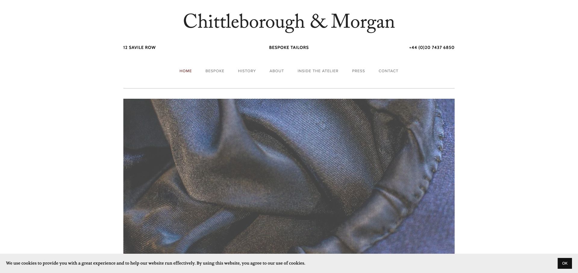
Chittleborough & Morgan uses a large black serif masthead on white, followed by a concise service descriptor, address, telephone number and small navigation row. A close garment photograph begins below. The hierarchy is unusually direct: the visitor learns the business name and physical contact context before encountering the fashion image. This is useful for studying a small practice that does not need a complex ecommerce-style introduction. The visual simplicity still depends on clear supporting pages explaining bespoke work, appointments and the practical process for a new client.
What you can learn
A straightforward masthead can communicate more than a vague luxury slogan. Keep the service description and contact details visible, then use detailed photographs to support an explanation of the work. Make sure the restrained navigation remains readable rather than shrinking it to preserve white space.
Pros
Name, service and contact details establish a clear practice identity.
White space separates the typographic introduction from the garment detail.
Cons & considerations
Very small navigation can undermine an otherwise direct public introduction.
A close garment image cannot explain commission and fitting arrangements.
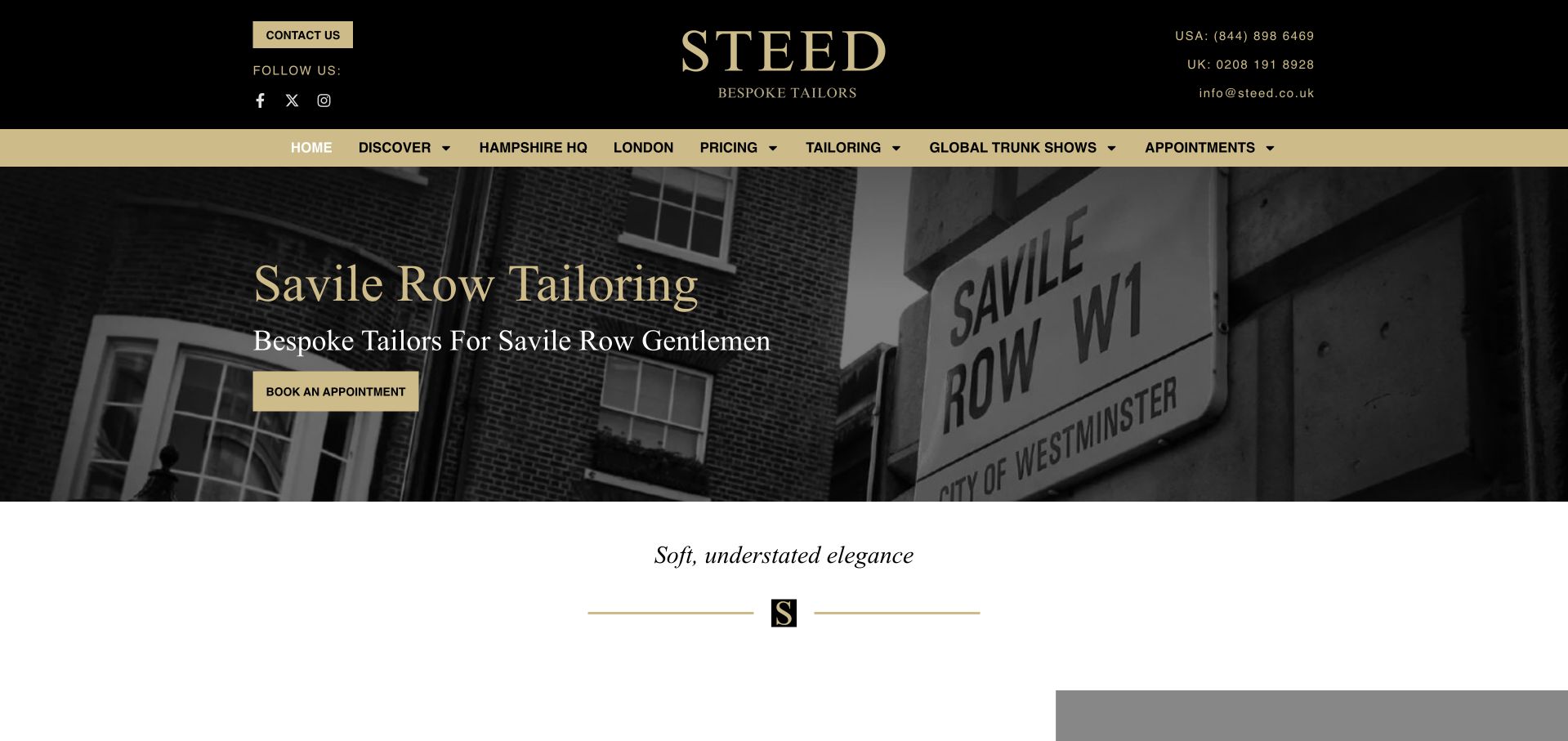
Steed uses a black-and-gold header above a monochrome street-sign photograph and a literal Savile Row Tailoring heading. An appointment action sits within the hero, while locations, pricing, tailoring and global trunk shows have explicit navigation labels. A short elegance statement begins below on white. The combination is practical and recognisable: place, service and next action are all present in the first view. The design is useful for clients who may visit a shop or meet the tailor through a travelling schedule, provided current dates are clearly maintained.
What you can learn
Keep local appointments and travelling services easy to distinguish. Publish current trunk-show locations and dates in readable text, and explain what a first appointment covers. A familiar tailoring street name provides context, but it does not remove the need to explain the process to newcomers.
Pros
Pricing and trunk-show routes support practical research before an enquiry.
A literal heading connects the street photograph to the service.
Cons & considerations
A dense two-level header needs deliberate mobile grouping and spacing.
Street imagery cannot establish construction methods or current appointment availability.
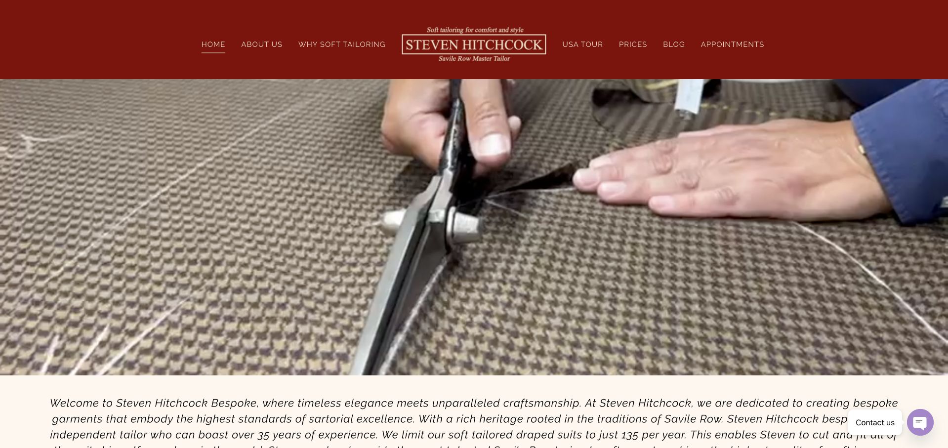
Steven Hitchcock uses a close photograph of shears moving through cloth beneath a dark red header and centred wordmark. The main navigation names the tailoring offer, trunk shows and appointments, while a written introduction begins immediately below the image. The composition foregrounds the work rather than a polished fashion-model campaign. This is useful for a named craft practice whose process deserves explanation. The photograph illustrates a cutting scene; it does not establish that every garment associated with the business follows the same method or production arrangements.
What you can learn
Connect process photography to a clear explanation of the service. Name the construction approach, fitting stages and appointment arrangements in readable text, and keep travel dates current. A close craft image should make the process understandable rather than simply serving as a generic symbol of quality.
Pros
Cutting-room photography provides a specific subject for a craft-led introduction.
A written overview follows promptly beneath the large process photograph.
Cons & considerations
A close process image does not show the finished silhouette.
Small red-header navigation needs contrast and generous mobile touch targets.
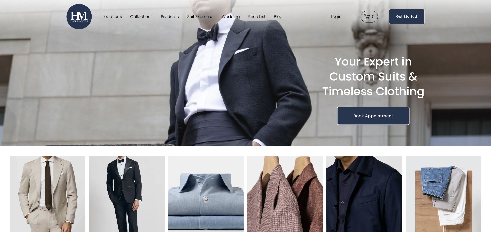
Hall Madden pairs a large formalwear photograph with a clear custom-suit introduction and a blue Book Appointment action. The compact header includes locations, collections, products and price-list information. A row of garment-category images starts immediately beneath the hero, giving visitors a quick overview before they commit to a consultation. This is useful for studying how a custom-clothing business can explain a service while still supporting product browsing. The official content distinguishes tailoring options; the homepage photograph does not independently establish which construction method a particular pictured garment uses.
What you can learn
Show enough of the product range to orient visitors, then explain how custom work is commissioned. Keep price and location information available before booking, and describe construction options plainly. A product grid and an appointment service should feel connected without being mistaken for the same transaction.
Pros
A clear appointment action connects the introduction to custom service.
Price and location routes support comparison before a consultation begins.
Cons & considerations
Product categories must distinguish immediate purchases from commissioned garments clearly.
Formalwear imagery cannot explain the business’s different construction tiers itself.
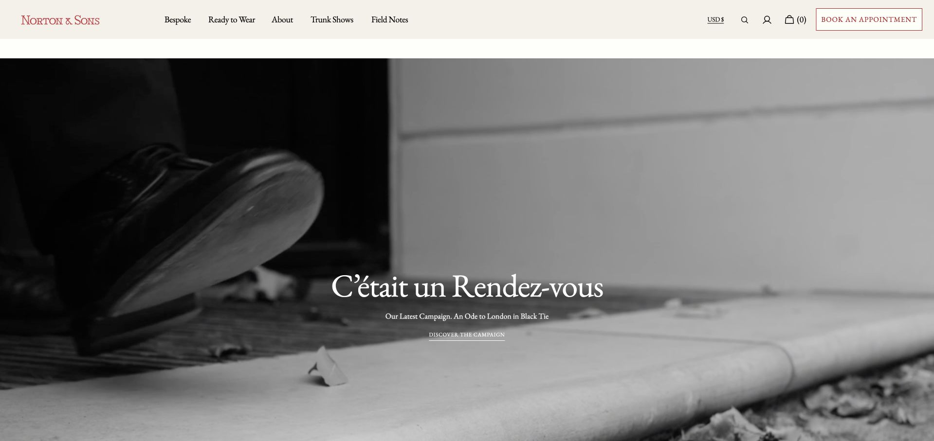
Norton & Sons uses a monochrome close-up of work on cloth beneath a pale header and small red wordmark. A short French campaign phrase sits within the image, while Book an Appointment remains visible in the top-right navigation. Bespoke, ready-to-wear, about and trunk-show routes have separate labels. The opening is restrained but not empty: the craft scene gives the page a concrete subject. It is useful for studying how a tailor can combine a quiet visual identity with distinct commissioned and retail routes without a dense first-screen explanation.
What you can learn
A workshop scene should lead to service information that a new client can understand. Keep bespoke and ready-to-wear routes separate, explain appointments and use plain language around any campaign phrase. The visual atmosphere should not require specialist tailoring knowledge to navigate.
Pros
Bespoke and retail labels distinguish two different clothing journeys clearly.
An appointment action remains visible within a stable pale header.
Cons & considerations
A non-English campaign phrase may be less informative to newcomers.
Workshop imagery cannot explain fitting stages or construction options alone.
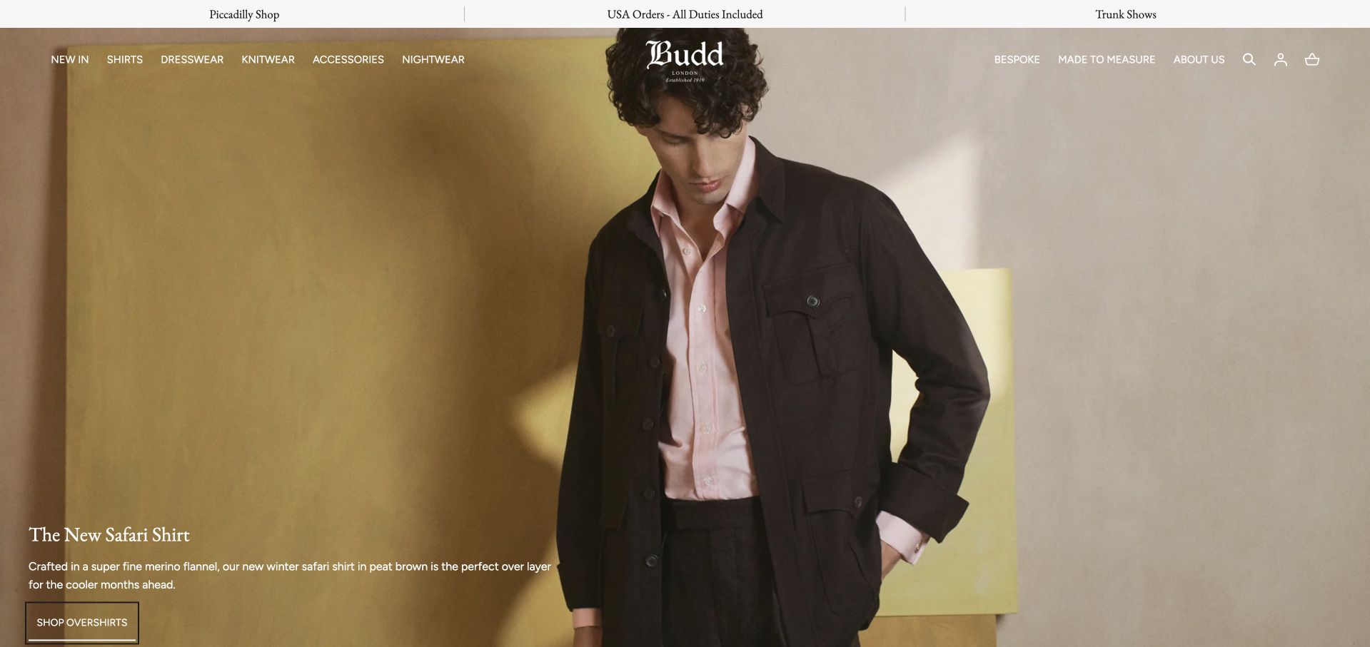
Budd uses a warm shirt-focused fashion photograph beneath a gold-toned header and white script wordmark. The main campaign names a particular shirt style and provides a direct discovery action. Navigation separates shirts, dresswear, accessories and the bespoke service, while an announcement strip carries shop and travel-related information. This is useful for studying a shirtmaker rather than a general suit tailor: the site must distinguish a fitted commission from a ready-to-wear purchase. The campaign photograph establishes the current visual story, not the availability or construction of every shirt offered.
What you can learn
Give bespoke shirting its own clear explanation beside retail categories. A visitor should understand whether a shirt can be ordered immediately or requires measurements and fittings. Keep temporary shipping and trunk-show notices current without allowing their promotional overlays to obstruct ordinary collection browsing.
Pros
A named shirt campaign gives the specialist offer concrete context.
A separate bespoke route distinguishes commissions from ready-to-wear retail categories.
Cons & considerations
Promotional popups can obstruct otherwise straightforward collection and service browsing.
Shipping and trunk-show announcements need accurate scope and active maintenance.
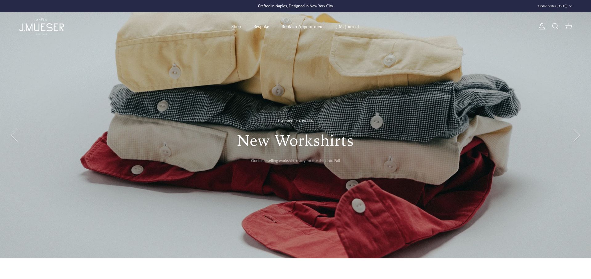
J. Mueser’s settled opening shows folded workshirts beneath a compact white wordmark and a thin announcement strip. A small New Workshirts title sits centrally over the product arrangement, while the wider navigation provides service and collection routes. The page demonstrates how a tailoring brand can lead with a retail category without abandoning its bespoke identity. It is useful precisely because the two models need careful separation. The current shirt campaign is not evidence that every product or pictured outfit belongs to the same construction or commission process.
What you can learn
Let seasonal retail campaigns lead to the relevant products while keeping bespoke information explicitly labelled. Explain appointments, fittings and production separately from ordinary online ordering. Closeable newsletter prompts should remain secondary to the practical routes visitors use to distinguish those two kinds of transaction.
Pros
A folded-product arrangement makes the current shirt campaign understandable immediately.
A restrained wordmark preserves room for conventional service navigation routes.
Cons & considerations
A retail-led hero delays the explanation of commissioned tailoring initially.
Newsletter flyouts should never block practical ordering and appointment information.
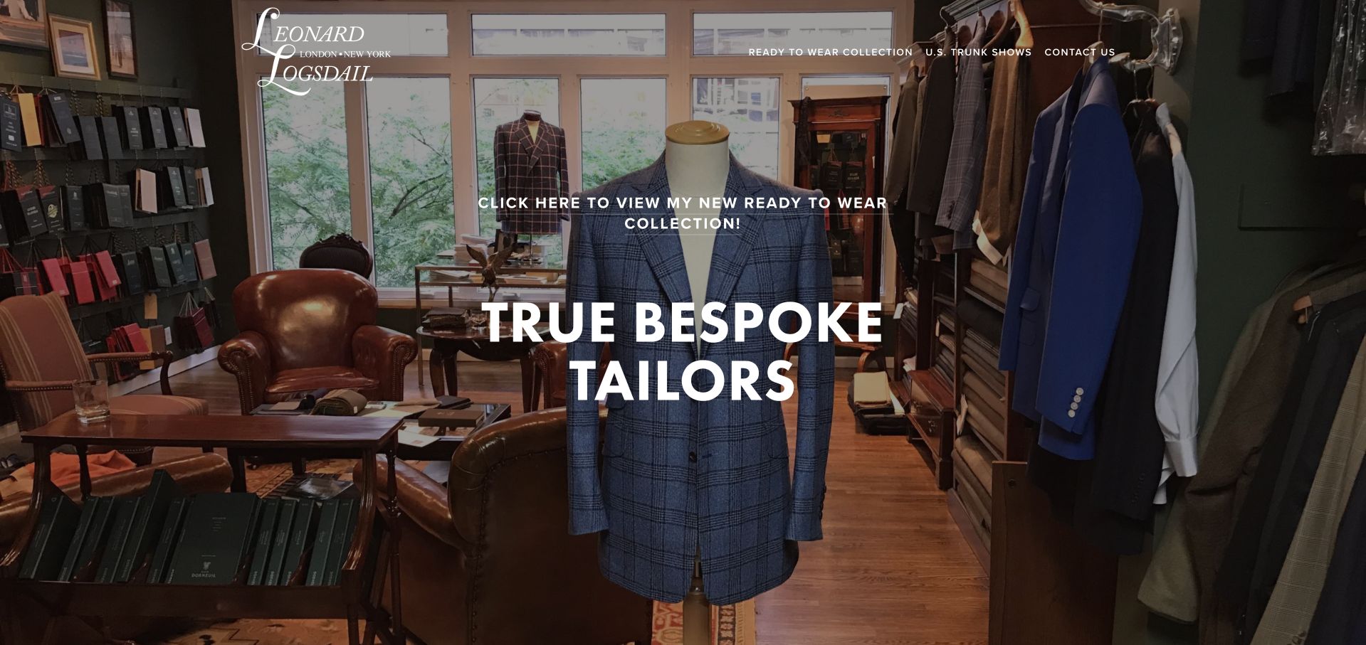
Leonard Logsdail uses a shop-interior photograph with a large True Bespoke Tailors statement and a separate invitation to view ready-to-wear. The physical workroom setting gives the service a concrete context, while the header keeps shop, about and contact routes available. This is useful for a small practice extending beyond commissioned work: the page explicitly signals that the retail collection is a different destination. The photograph and headline communicate the publisher’s positioning, not an independent verification of production methods for every garment displayed or sold by the business.
What you can learn
State bespoke and ready-to-wear as separate options before the visitor chooses a route. Explain the commission process, fittings and contact arrangements on the service side, and keep product availability and online-ordering information on the retail side rather than blending both into one general enquiry.
Pros
A shop interior gives the named practice tangible physical context.
A separate ready-to-wear invitation distinguishes retail browsing from bespoke work.
Cons & considerations
Large text needs contrast across the detailed interior photograph throughout.
A bespoke headline cannot independently verify garment construction methods itself.
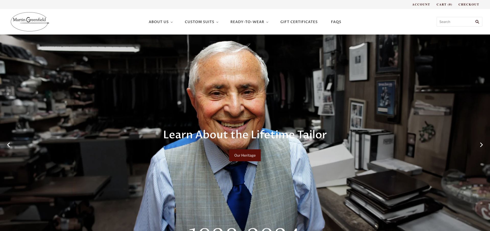
Martin Greenfield Clothiers opens with a workshop portrait and a short invitation to learn about the tailor’s heritage. A restrained white header separates custom suits, ready-to-wear, gift certificates and FAQs. The portrait gives the opening a human subject rather than a generic suit campaign, while the navigation makes the current business routes visible. This is useful for studying how a maker’s story can introduce a clothing company. The heritage presentation should remain distinct from current staffing, production arrangements and the conditions of today’s retail or custom services.
What you can learn
A founder story needs a clear bridge to the current business. Explain which services are available now, separate custom work from retail products and keep historical images accurately contextualised. Heritage can establish identity without implying that every present-day garment was made by the person shown in an archival portrait.
Pros
A named maker’s portrait gives the heritage story human focus.
Custom and retail labels preserve practical routes beyond the history.
Cons & considerations
Historical imagery needs context about current staffing and production arrangements.
Heritage cannot replace current fitting, ordering and availability information itself.
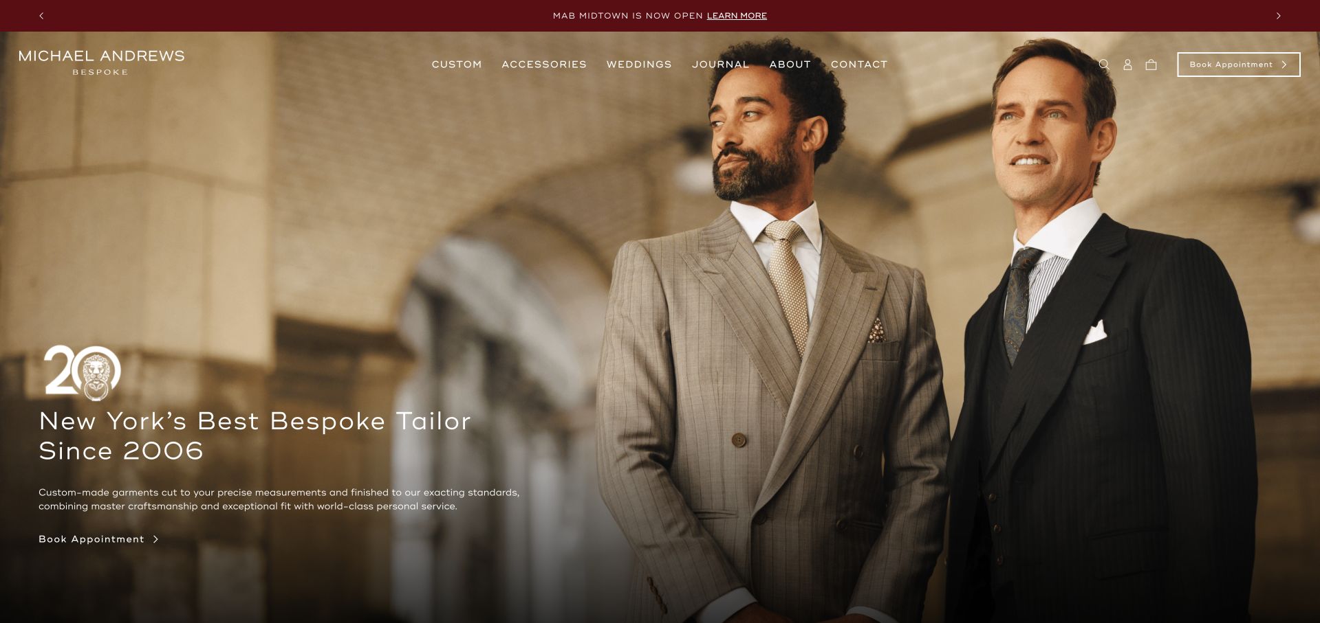
Michael Andrews uses a warm formalwear photograph beneath a maroon announcement strip and restrained white navigation. An anniversary treatment and a short New York tailoring statement sit at the lower left, with a booking route nearby. The opening combines a recognisable local identity with contemporary styling rather than a long heritage narrative. It is useful for studying a custom-clothing business that wants to look polished without making the first screen a catalogue. The image remains a campaign reference, not proof of a particular construction method or an individual client’s likely fitting experience.
What you can learn
Keep the local service identity explicit while letting the photograph establish style. Explain garment options and the appointment process on the following pages, and distinguish a general custom-clothing claim from the particular construction methods available for different commissions.
Pros
A city statement connects the fashion image to local service.
Restrained branding gives the warm portrait a coherent visual frame.
Cons & considerations
Anniversary and superlative statements need context rather than implied ranking.
Formalwear imagery cannot explain specific construction options or fitting stages.
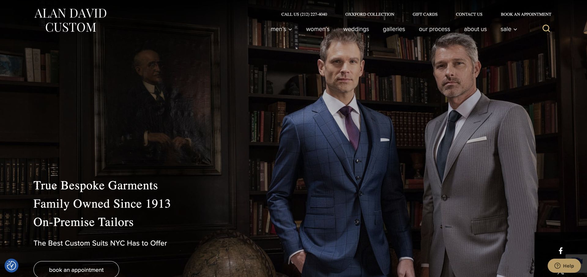
Alan David uses a dark shop-interior portrait of two suited figures, with a large bespoke-service statement and an appointment action nearby. A white wordmark and compact navigation sit over the darker upper part of the image. The opening prioritises the service rather than a seasonal collection. FAQs and explanatory content follow on the public page, providing a route beyond the headline. This is useful for a practice whose visitors need to understand how commissioning work differs from buying a standard retail suit, without treating the site’s own claims as independent verification.
What you can learn
A literal service headline should lead into an equally clear process explanation. Keep fittings, timing and construction options readable before the appointment form, and distinguish publisher claims from factual descriptions. Let FAQs answer common commissioning questions rather than repeating only promotional reassurance.
Pros
A literal service headline makes the intended journey understandable immediately.
Explanatory content below creates room for practical commissioning information too.
Cons & considerations
Overlaid links still need dependable contrast and visible keyboard focus.
Bespoke claims require factual explanations of construction and fitting arrangements.
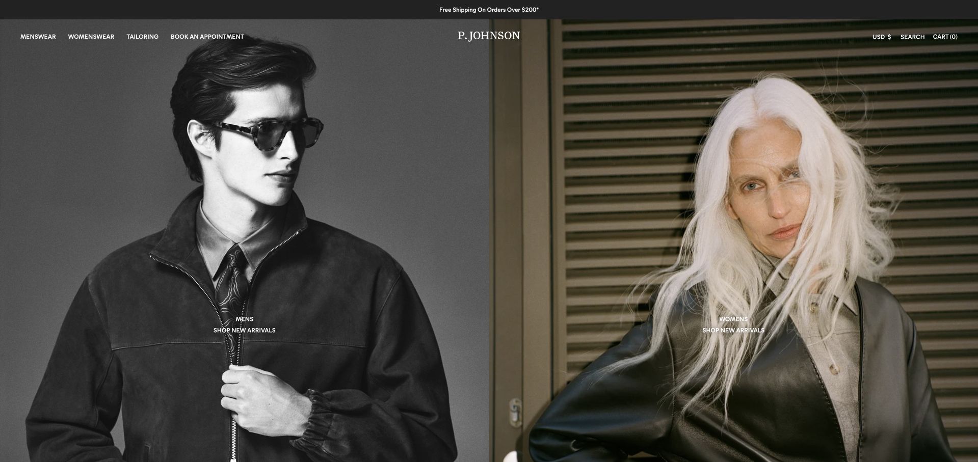
P. Johnson uses two adjacent fashion photographs beneath a fine overlaid header. The wordmark sits between the panels, while ready-to-wear, showrooms and Book an Appointment remain explicit routes. The observed US-facing page is a current regional destination rather than a universal statement about every showroom. Its design connects a contemporary fashion identity with a service model that includes custom tailoring. The split imagery is useful for showing stylistic range, but it does not establish which construction option or appointment arrangement applies to a particular garment in the current collection.
What you can learn
Keep regional and service context clear alongside a fashion campaign. Separate retail collections from custom appointments, explain the showroom choice before requesting visit details and avoid using bespoke as an interchangeable label for every form of made-to-measure or custom work offered by the business.
Pros
Coordinated photographs show stylistic range without an automatic slideshow interface.
Showroom and appointment labels connect fashion presentation to practical service.
Cons & considerations
Fine overlaid navigation needs careful contrast across responsive photographic crops.
Regional campaigns cannot establish every showroom’s construction and fitting arrangements.
Kegan is a freelance web designer and developer with 15+ years of experience helping businesses turn complicated website requirements into clear, maintainable digital experiences. He works directly with clients from planning and design through development, launch, and ongoing support.
For bespoke tailor website design, his development approach focuses on garment and alteration services, fitting-process explanations, craftsmanship imagery, and appointment inquiries. The scope can be a targeted improvement or a complete custom build, with responsive layouts, thoughtful content structure, and integrations chosen around the people using and maintaining the site.
Show 3 other bespoke tailor website designersHide other bespoke tailor website designers
List the actual garment types, construction options and appointment routes. Decide which terms need explanation for a newcomer, then create concise service pages in plain language. State what a first conversation covers and how the practice explains timing and price. Do not imply that a photograph verifies construction. Where a method or production claim is important, have the people responsible for the work review the wording before it becomes permanent marketing copy.
Connect appointments, locations and production information
Map the practical route from initial interest to a fitting discussion, identifying any third-party scheduling handoff. Keep showroom information, travel dates and contact routes consistent across the site. Avoid promising a universal number of fittings or a fixed completion time unless the practice can support that statement accurately. Special-event enquiries need realistic process information rather than a campaign image that suggests every commission can be arranged at short notice.
Build an editorial system the practice can maintain
Plan a small set of content types for services, collections, journals, locations and travel events. Give seasonal campaigns review dates so an old collection does not remain the only introduction to the current business. Maintain credits and permissions for model, workshop and client photographs. Keep archival portraits accurately contextualised; a founder image should not imply that the same person makes every garment sold by the present-day business.
The editing job behind the design
Choose tools around service truth and editorial control
[object Object]
[object Object]
[object Object]
Our WordPress website examples offer a separate look at publishing approaches. A visible platform label is evidence for that named page, not a guarantee that the same system will suit your requirements.
Before the public launch
Bespoke-tailor website launch checklist
Describe the actual construction options without using bespoke as an interchangeable generic label.
Separate commissioned services from ready-to-wear products, accessories and ordinary retail ordering.
Explain the first appointment and whether the visitor is requesting or confirming a time.
Name showrooms and provide practical location details before a prospective client travels.
Keep trunk-show dates, destinations and available services in one maintained schedule source.
Provide useful price and timing context without promising an unsupported universal completion date.
Distinguish current campaigns from archival photographs, past collections and historical founder portraits.
Use permissioned client and model imagery with accurate context and appropriate credits.
Test fine typography, photographic contrast and menu targets across smaller mobile screens.
Keep service information available without autoplay video or a rotating image sequence.
Label enquiry fields and keep private fitting records out of general marketing workflows.
Assign owners to collections, service descriptions, location changes and expired travel notices.
These checks are a project checklist, not a performance, legal, security, or accessibility certification. Test real journeys with the people responsible for the website before making claims about the result.
Sources & editorial method
How this collection was selected and reviewed
Reviews are original observations from public-page inspection and actual dated browser captures. The collection includes shirtmakers and mixed retail businesses with relevant tailoring services; it is not a measured craft-quality ranking. Publisher production claims remain attributed. Technology notes are source-qualified observations rather than complete operational inventories.
Each example links to its actual source page. Screenshots are direct browser captures with their own capture dates; moving imagery, announcements and live designs can change. The notes describe observable design choices and conditional tradeoffs, not measured traffic, conversion results, service quality, or accessibility conformance.
Technology labels use public page metadata, asset evidence, or explicitly cited platform documentation. Platform documentation is not a complete current deployment audit. A component reference may be legacy or unused; it is not a complete backend inventory. Unknown stacks are omitted. These sites are editorial examples, not our client portfolio.
Written, Edited and Curated are separate editorial records, not timestamps advanced by a rebuild. Website designs and imagery belong to their owners. See our editorial standards or suggest a correction.
Questions worth asking
Bespoke Tailor website design questions
Should a tailor use bespoke in every headline?
Only where it accurately describes the relevant service. Explain the practice’s actual methods and distinguish them from other custom or retail options. A clear service description is more useful to a newcomer than applying one prestigious term to every garment in a mixed catalogue.
Can the homepage lead with ready-to-wear?
Yes, if the bespoke or custom service remains easy to identify and the two journeys are clearly explained. A seasonal product campaign should lead to the relevant retail collection, while appointments need their own process information rather than being treated as another checkout option.
How much process detail should be public?
Enough to explain the first conversation, the role of fittings, the available construction choices and how timing is discussed. Avoid fixed promises the practice cannot maintain. Keep private client measurements, photographs and commission records within the appropriate protected operational process, not public marketing content.
Should we publish a price list?
Provide useful context the practice can keep accurate, whether that is a current starting range, a structured service explanation or a clear account of what affects the quote. Avoid a precise-looking price that silently excludes essential conditions or implies every commission has the same cost.
What is the best way to present trunk shows?
Use current location and date records with a clear appointment route and an explanation of the services offered there. Remove expired promotions promptly or move them into an accurately labelled archive. Do not assume a visitor understands how a travelling fitting relates to the main workshop or showroom.
Use the collection to connect house style with practical clarity. A distinctive photograph can introduce the work, while accurate service terms, current location information and a straightforward appointment route help a prospective client understand whether to begin a conversation.