Best Home Appraiser Websites of 2026 (13 Real-World Examples)
Appraiser websites that explain the assignment before asking someone to order a report.
Study independent practices, regional firms and adjacent valuation platforms for useful purpose, coverage and process communication—not as recommendations about professional competence or property value.
Someone may arrive knowing they need an estate, divorce, private-sale or lending-related valuation without understanding the terminology of an appraisal engagement. A useful website gives that person a recognizable starting point, explains the next conversation and identifies the practice’s actual coverage.
This collection begins with a regional residential practice and includes both individual-service websites and larger valuation networks. Those are different operating models. The reviews identify the distinction so a platform’s institutional workflow is not mistaken for a local appraiser’s private-client service.
Before the examples
What makes good home appraiser website design in 2026?
Start with the reason for the inquiry
Visitors often know the situation more readily than the report type. Use plain purpose labels, then explain how the appraiser clarifies intended use, timing and scope. A routing page should not imply that every situation receives the same report or that a general form has already created an accepted assignment.
Make the professional and the coverage identifiable
A named team, real service area and clear contact route are more useful than an anonymous claim of local expertise. Explain whether the visitor is contacting a practice, a management company or a professional network. Keep office and individual information current without suggesting that a photograph proves competence or independence.
Explain the process without promising the result
Show how a request becomes a discussion of scope, scheduling and delivery. Avoid promising a particular value, tax result, settlement outcome or lending decision. The website can clarify the service relationship; it should not turn educational information into advice for an individual property or legal situation.
The collection · 13 examples
13 home appraiser websites worth studying
Notice which examples serve private homeowners and which coordinate institutional valuation work. Borrow the communication pattern that matches the actual practice.
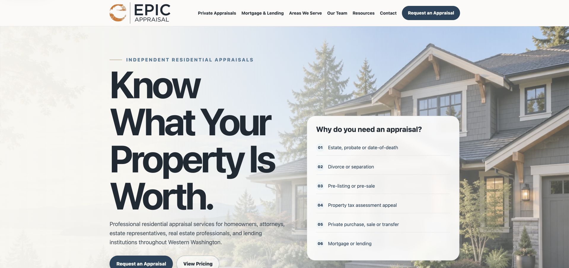
Epic Appraisal places a large plain-language valuation headline beside a residential photograph and a short list of reasons someone might need an appraisal. Estate, divorce, pre-listing, tax appeal, private transaction and lending contexts are visible before a visitor has to understand report terminology. Request and pricing routes sit beneath the introduction, and the page continues through a staged process, team information and coverage. This makes the website useful as a communication example: it explains the assignment context before collecting detailed information. Its regional Western Washington identity and named team establish a specific practice rather than an anonymous national valuation platform.
What you can learn
Start with the visitor’s reason for contacting an appraiser, then explain scope, intended use, timing and coverage. A clear website can reduce confusion without promising a particular value or legal outcome. Keep assignment-specific information and confidential documents out of a general introductory form.
Pros
The purpose list gives private clients recognizable starting points without requiring technical appraisal vocabulary.
Pricing, process, team and coverage routes complement the opening rather than relying on awards alone.
Cons & considerations
A long page with several audiences needs strong internal navigation and concise section introductions.
Review and award statements remain the practice’s own presentation, not independent verification of appraisal quality.
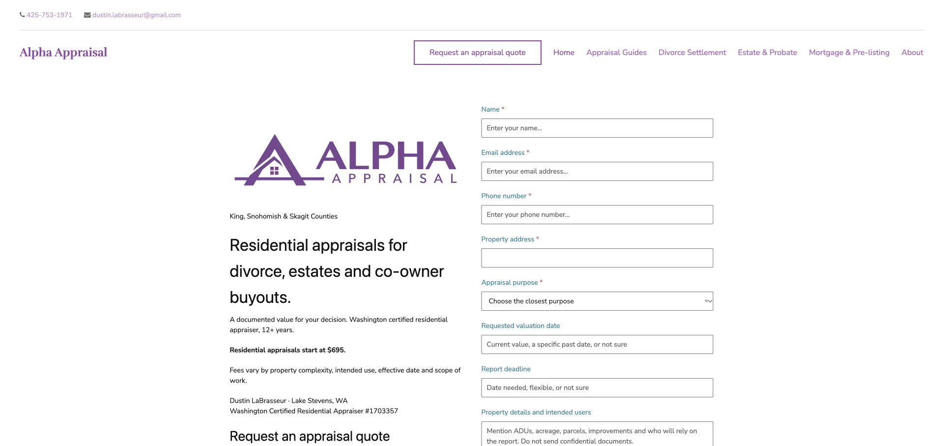
Alpha Appraisal uses a sparse white page, purple brand accents and a compact service description beside a detailed request panel. The opening identifies residential work for divorce, estates and co-owner buyouts, giving the inquiry a narrower scope than a generic real-estate headline. Navigation exposes appraisal guides, owner situations, examples and pricing. The page is useful for studying directness: the business explains the kinds of situations it handles and makes a request route immediately available. The tradeoff is visual density in the form column, which asks the visitor to understand several assignment details before exploring the rest of the page.
What you can learn
A specialist practice can gain clarity by naming the situations it accepts rather than claiming to serve every valuation need. Put a short explanation of intended use and next steps beside the request, and provide help for visitors who do not yet know the correct assignment terminology.
Pros
The opening states a specific residential assignment focus instead of leaving scope to a generic service menu.
Guides and pricing routes let a visitor investigate before completing the request panel.
Cons & considerations
A long form can feel demanding before a visitor understands which details are genuinely needed initially.
The very restrained visual hierarchy gives the large request column more weight than the supporting explanation.
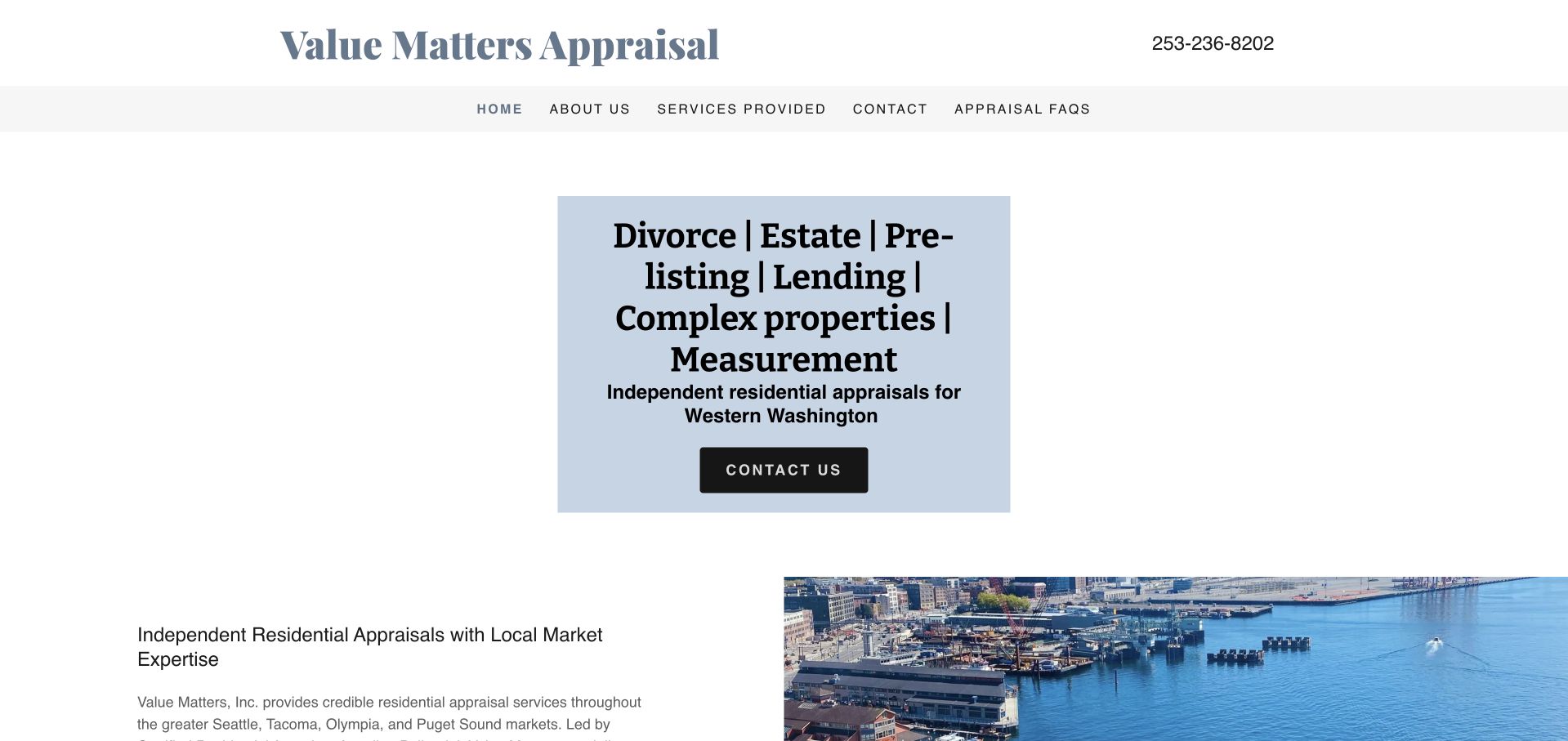
Value Matters uses a simple wordmark, a concise navigation row and a pale-blue service panel naming common appraisal purposes. An understated regional image and a local-service description follow rather than dominating the opening. The telephone number is visible at the top, and company information is available as a separate destination. This is a useful alternative to a cinematic property website: the page prioritizes what the practice does and how to contact it. Its more conventional typography and layout are not inherently a weakness, but they place greater responsibility on spacing, hierarchy and clear explanations of the different assignment types.
What you can learn
An independent appraiser does not need an elaborate visual system to communicate effectively. Name the actual coverage and services, make contact easy and explain the differences between assignment purposes in ordinary language. Use regional imagery as context rather than as evidence of valuation expertise or a promised result.
Pros
The service panel makes several common inquiry reasons visible without a large navigation interaction.
A visible telephone route supports visitors who would rather clarify the assignment before using a form.
Cons & considerations
A dense line-separated service list can be harder to scan than individually labeled destinations.
The restrained presentation needs stronger hierarchy to distinguish the primary next step from general background information.
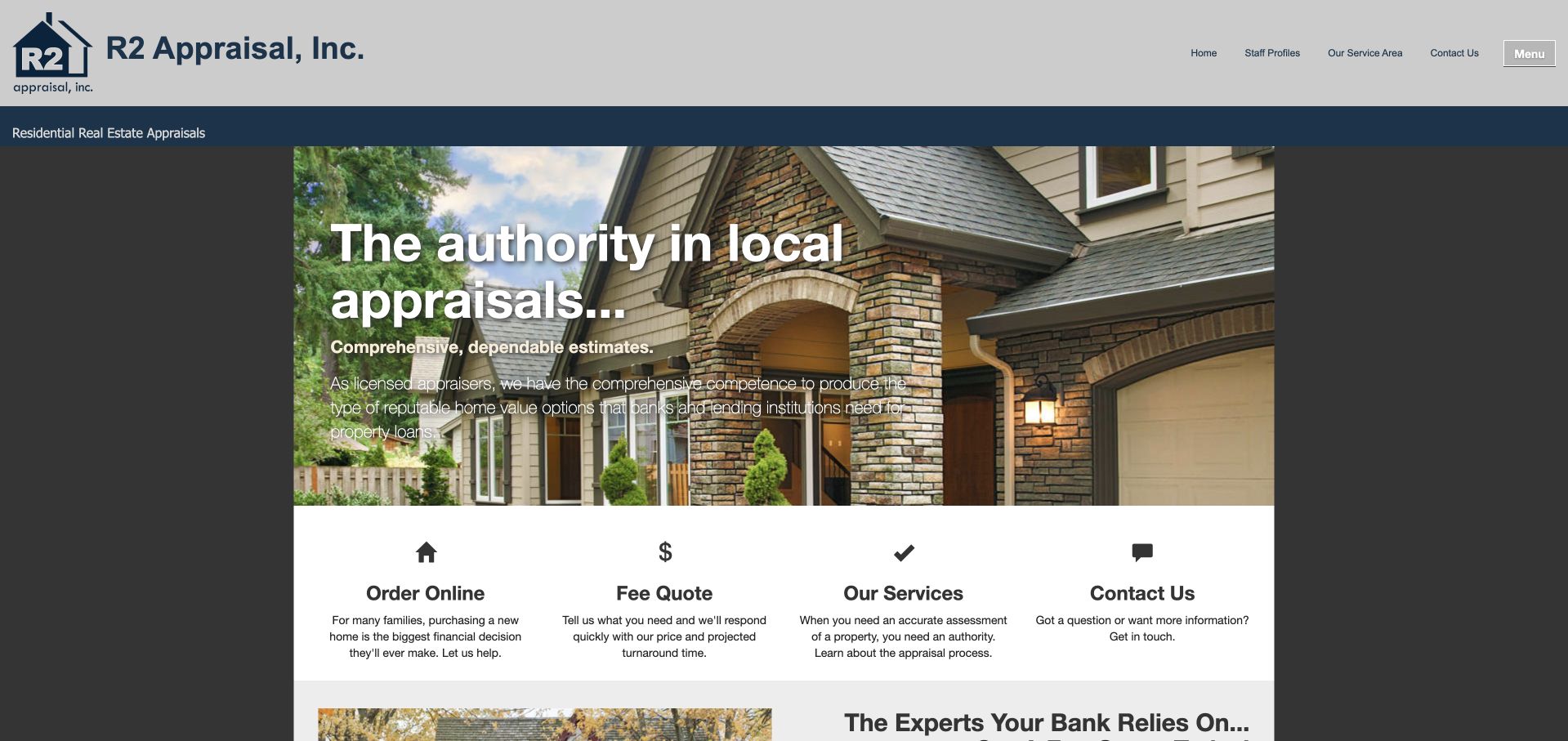
R2 Appraisal presents a house photograph and a local-appraisal introduction, then immediately follows them with four shortcuts: ordering, fee quote, services and contact. Each shortcut has a simple icon and a short explanation, so the visitor can compare the tasks without opening a menu first. The header also retains staff, service and company information. The useful pattern is the transition from a broad credibility statement to an explicit action layer. It is a conventional layout, but the homepage does not force every visitor into the same form or assume that someone requesting a quote already knows the full assignment scope.
What you can learn
Give an appraisal site separate routes for learning about services, clarifying a fee and starting an order. Explain what each route requires, preserve an easy human contact option and make sure the page distinguishes an initial request from acceptance of a specific appraisal assignment.
Pros
The four shortcuts provide recognizable tasks with text explanations rather than relying only on icons.
Service and staff information remain available before a visitor commits to an ordering route.
Cons & considerations
A large local-authority headline requires specific coverage and team detail to become meaningful.
Several small shortcut explanations may need larger text and simpler stacking to remain readable on mobile.
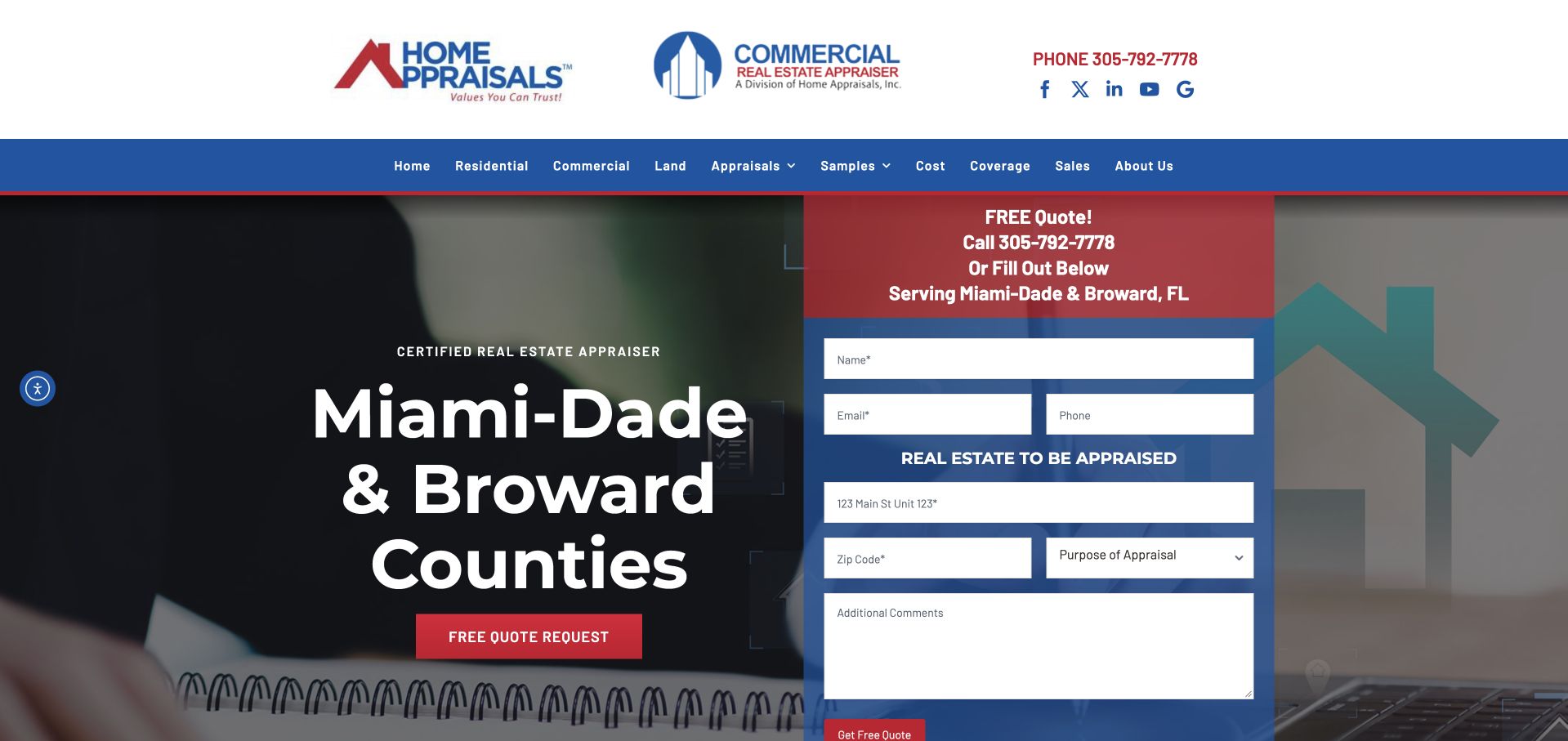
Home Appraisals Inc. makes Miami-Dade and Broward coverage the main opening message. A quote panel sits beside it, using contrasting red and blue sections to distinguish contact details from property information. Separate residential and commercial brand marks appear in the header, and navigation names land, appraisal types, samples, cost and coverage. The website is useful for studying explicit scope: a visitor sees the service area before investing time in an inquiry. The prominent form also exposes the challenge of asking for enough assignment context without overwhelming someone who is still learning what kind of appraisal they need.
What you can learn
Put the service area near the request route and separate basic contact information from property context. If several property types are accepted, give each a clear explanation. Avoid treating a general quote request as permission to collect confidential documents or as confirmation that an assignment has been accepted.
Pros
The opening names the local coverage area directly rather than hiding it in the footer.
Cost, samples and coverage are visible navigation destinations for visitors who need context before requesting a quote.
Cons & considerations
A large multi-field form can compete with the explanation of appraisal purpose and process.
Several brand marks and a dense navigation row require careful simplification on smaller devices.
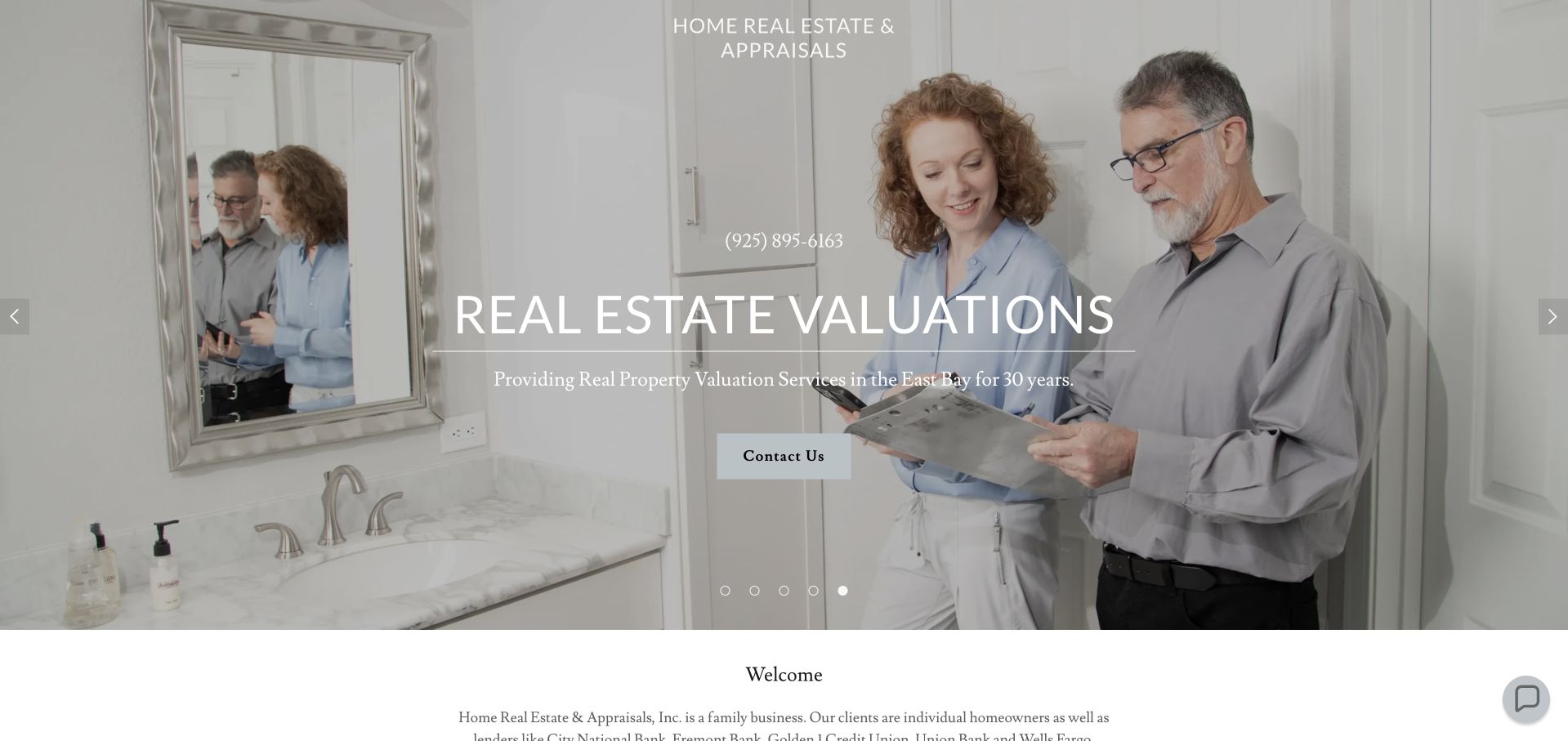
Home Real Estate & Appraisals cycles through team photographs in regional and property settings, with a centered valuation heading and a direct contact action. The introductory content identifies a family business and follows with company information, staff and service-area detail. The page is useful for studying a human introduction that does not depend on a stock house image or a dashboard illustration. The actual people become part of the business identity, while the contact section provides the practical county coverage. Because the brand also names real estate, the subsequent content must clearly explain the scope of the appraisal service rather than assuming the two roles are interchangeable.
What you can learn
Use a genuine team image when it helps visitors understand who they will contact, then connect it to names, roles and service coverage. If a practice has several professional activities, explain their boundaries and keep an appraisal request distinct from other property-service inquiries.
Pros
The team photograph gives the local practice an identifiable human presence rather than anonymous property imagery.
The contact content supplies specific county coverage and hours that support the broader regional introduction.
Cons & considerations
White text over the landscape requires dependable contrast across image crops and smaller screens.
A combined real-estate and appraisal identity needs clear role explanations to prevent confusion about the requested service.
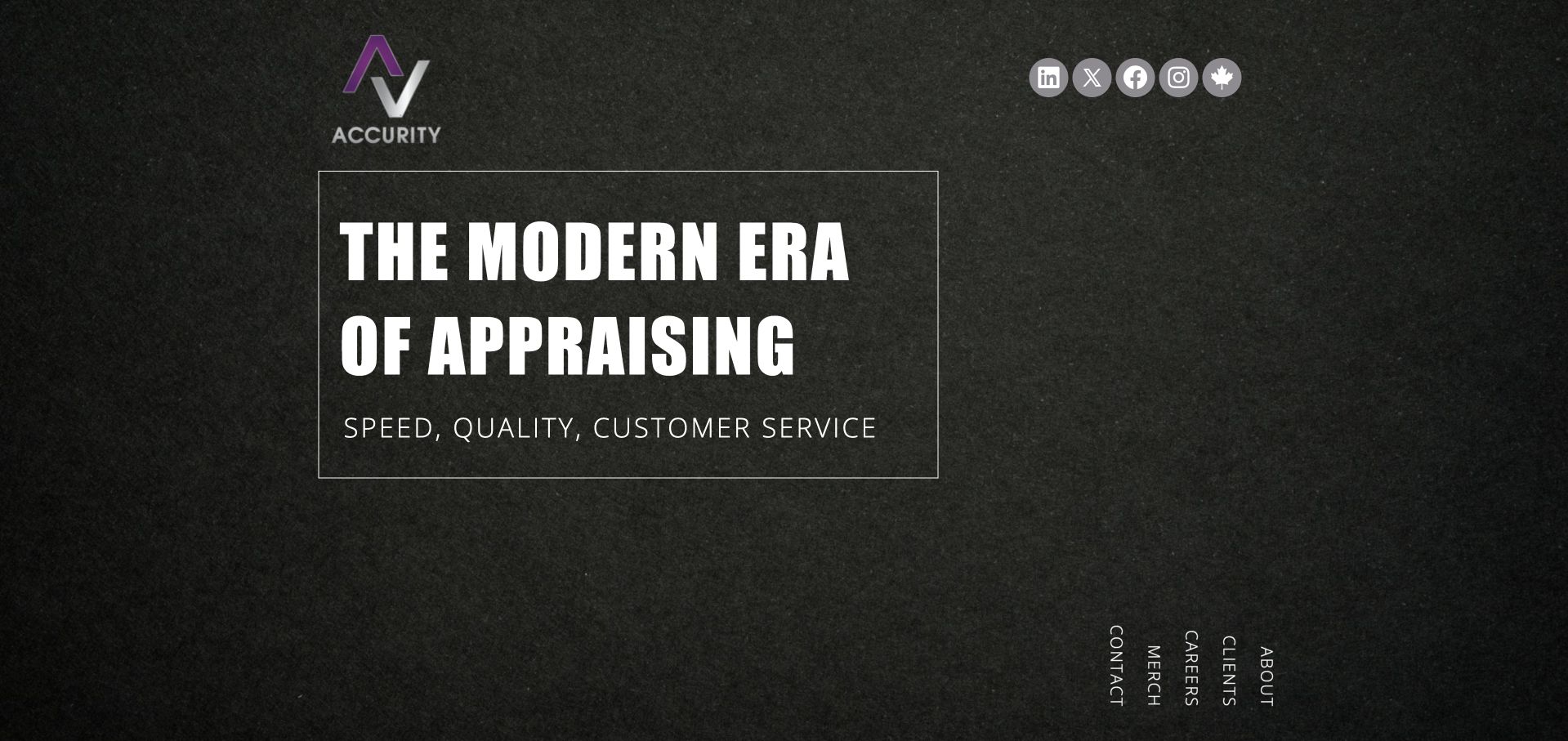
Accurity uses a dark textured background, a compact colored monogram and a large condensed typographic statement. Service, career, client and company navigation is arranged unusually near the lower edge of the opening rather than as a conventional horizontal header. The result feels more like a brand introduction than a direct residential quote page. It is useful as a contrast to small local appraisers: the visual priority is a modern appraisal identity, with practical destinations requiring more exploration. That distinction should guide anyone borrowing the layout, since a homeowner with a specific local request may need more immediate coverage and contact information.
What you can learn
A bold typographic opening can establish a recognizable identity, but essential service discovery should not depend on unconventional navigation. Explain whether visitors are contacting a local practice, a network or a corporate team, and make location, assignment scope and the relevant next step available in plain language.
Pros
The restrained dark palette gives the monogram and headline a clear visual relationship.
The opening avoids pretending that a generic property photograph explains the organization’s appraisal role.
Cons & considerations
Unconventional lower-edge navigation adds discovery effort for users seeking a quick service or contact route.
A broad modernity statement supplies little practical information about coverage, assignment types or the inquiry process.
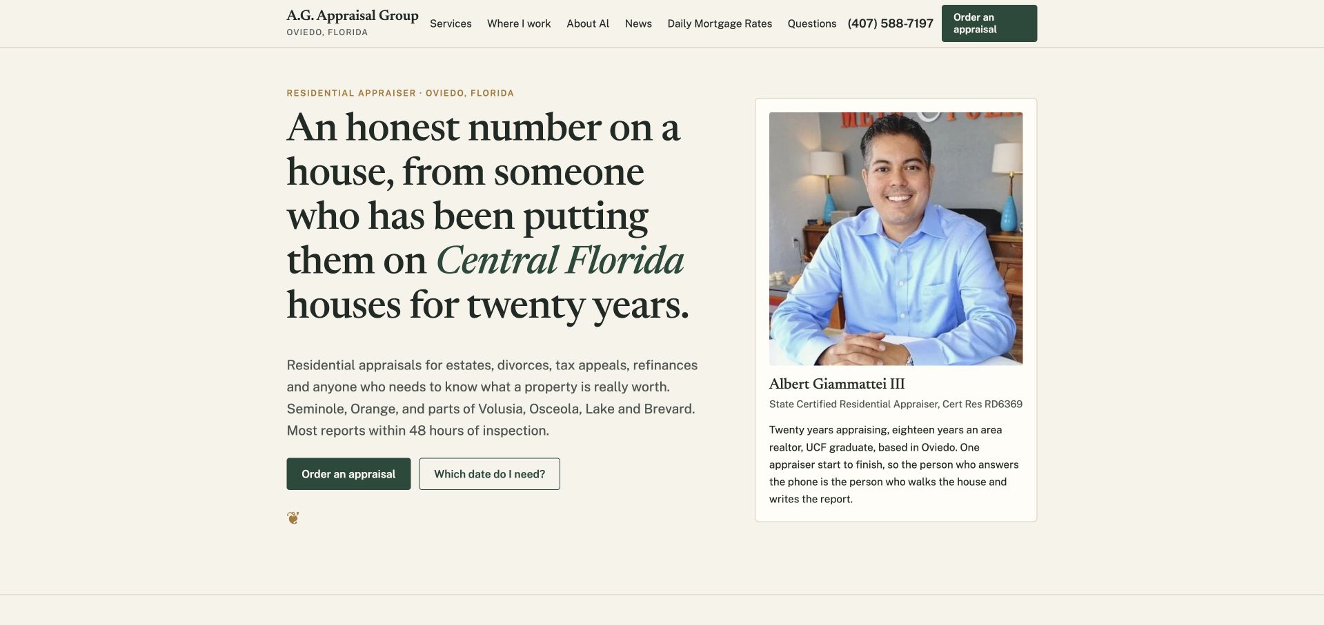
A.G. Appraisal Group uses a cream background, editorial serif typography and a portrait card naming Albert Giammattei III. The main paragraph identifies Central Florida coverage and common residential assignment contexts, while two actions distinguish ordering from a date-related question. The page continues with explanations about valuation differences and property-tax timing. The useful communication pattern is the connection between a named professional, a specific geography and an explanation-led service page. Its confident copy is the practice’s own, not an independently verified statement about report accuracy, turnaround or the outcome of a legal or tax matter.
What you can learn
Put the responsible professional and service area near the introduction, then answer the questions that commonly block an inquiry. Keep educational material clearly separate from advice on an individual property, and explain how intended use and effective date are clarified during the actual engagement process.
Pros
The portrait card connects the service description to a named professional and a stated local practice.
The secondary question route recognizes that some visitors need assignment context before they can place an order.
Cons & considerations
A long display headline can occupy substantial space before the detailed service scope is read.
Date and property-tax explanations require careful maintenance and should not be mistaken for individualized legal or tax advice.
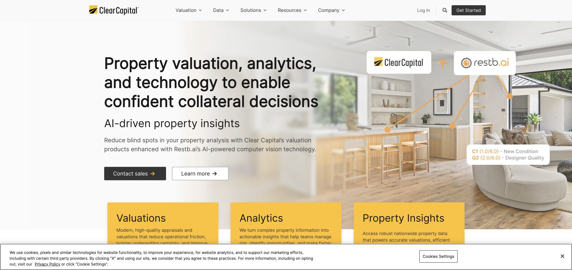
Clear Capital’s homepage introduces valuation, analytics and property-insight services beside a residential interior and an AI-related product reference. Bright yellow category panels appear beneath the opening, making the offering structure visible early. The header separates valuations, data, solutions, resources and company information. This is an adjacent institutional platform example, not a local appraiser selected to provide a homeowner’s private report. Its value in this collection is the clear distinction between a service, a data product and an insight tool. The page gives those categories separate destinations instead of using the word appraisal to describe every part of the business.
What you can learn
When a valuation organization offers both human services and technology products, label those differences explicitly. Explain the audience and output for each route, and avoid implying that a digital estimate, an analytics product and a commissioned appraisal report are interchangeable simply because they concern the same property.
Pros
The yellow category panels make the offering structure easier to scan beneath the broader introduction.
Data and valuation destinations are separated in navigation rather than collapsed into one generic service group.
Cons & considerations
An institutional platform homepage may be a poor direct template for an individual homeowner’s inquiry.
AI-related product messaging needs precise scope so users do not assume every output is a formal appraisal.
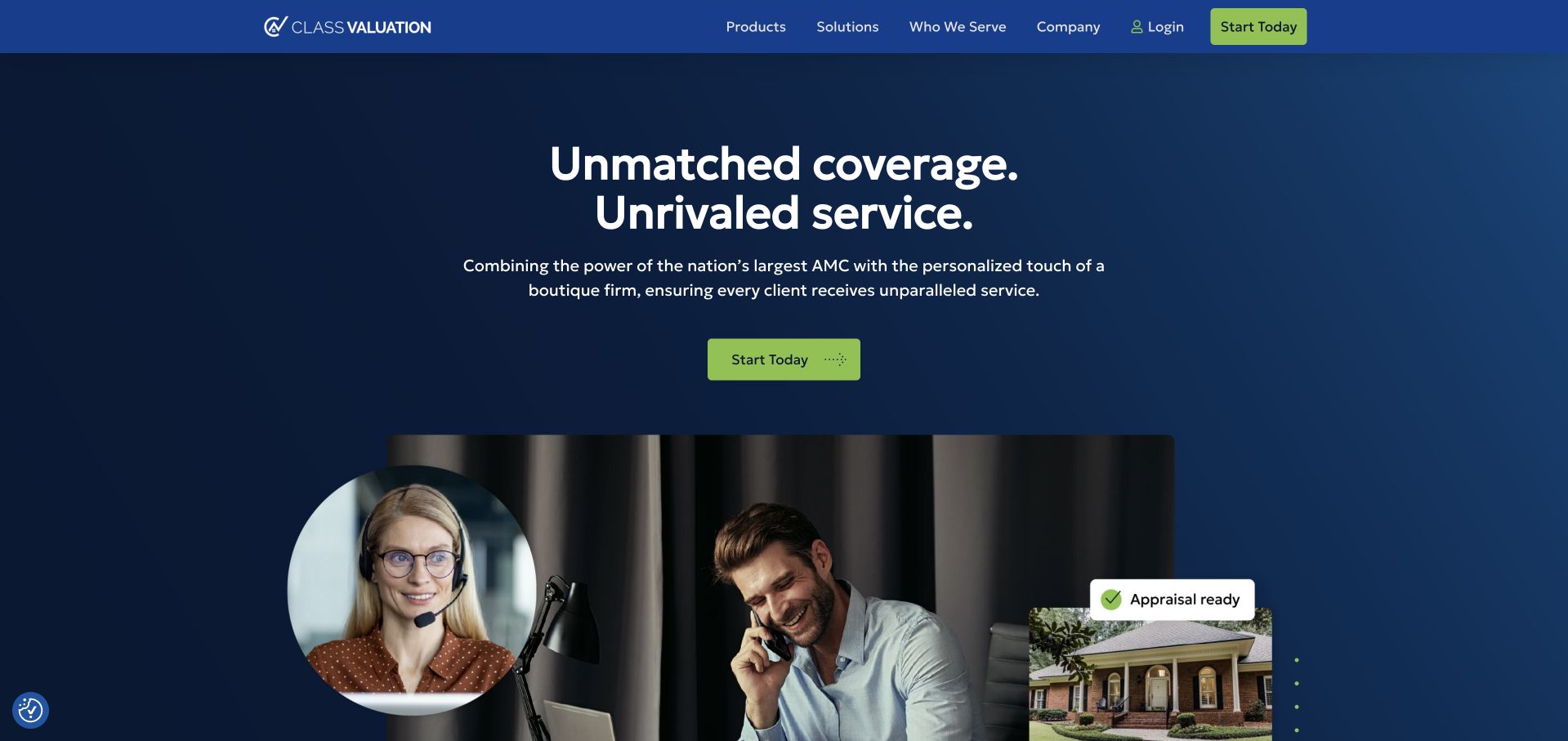
Class Valuation uses a blue opening, a short coverage-oriented headline and a contrasting start action. Supporting imagery combines people, property and process notifications, suggesting a coordinated service rather than a single local office. The navigation distinguishes products, solutions, audiences, company information and login. The page then asks who the organization is right for, making audience qualification part of the structure. This is an appraisal-management example adjacent to local appraisal practice, and its inclusion concerns that communication pattern rather than a claim that it directly accepts every private homeowner assignment or provides a particular valuation result.
What you can learn
A management platform should explain who orders, who performs the work and how the relationship differs from contacting an individual practice. Give lenders and appraisers separate routes, and describe the scope of a start action before requesting account or property information.
Pros
Audience qualification appears as a dedicated section rather than being left to an ambiguous contact form.
Product, solution and login routes distinguish new-business exploration from existing account access.
Cons & considerations
Coverage and service superlatives require supporting context and do not establish the quality of any individual report.
Small interface illustrations can suggest a process without explaining the actual responsibilities or assignment terms.
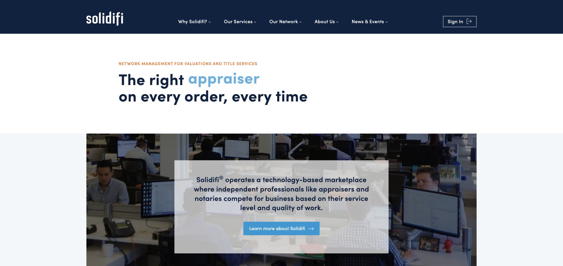
Solidifi uses a restrained navy header and a concise headline about matching an appraiser to an order. A supporting visual introduces the organization’s network model, explaining that independent professionals complete work for business clients. The header separates the network, services, company information and sign-in. This is useful because it makes the service relationship more explicit than a generic appraisal slogan would. It is still an adjacent network example rather than a local practice recommendation. The relevant design lesson is how the page explains the role of the platform before asking users to explore the wider service inventory.
What you can learn
If the business coordinates a network, say so clearly and distinguish the platform from the professional completing an assignment. Organize account access, new-client information and professional-network routes separately, and avoid language that makes a matching service sound like a guarantee of an individual report’s outcome.
Pros
The supporting explanation makes the independent-professional network model visible near the opening.
Sign-in is separated from service exploration, which helps returning users avoid the new-business path.
Cons & considerations
A concise matching proposition still needs detail about scope, geographic availability and the relevant client relationship.
A network-oriented homepage may not answer the private-assignment questions a homeowner brings to a local appraiser site.
HarrisonBowker uses a dark architectural image, a restrained serif headline and teal accents. The opening pairs a request-an-appraisal action with a find-a-local-office route, explicitly separating an inquiry from geographic discovery. Services, news, company information and contact remain in the header, while invoice payment has a separate utility position. The design is useful for studying how a professional valuation business can communicate broader coverage without erasing the importance of local contact. The page’s national-expertise language is a positioning statement; the visual review does not assess professional competence, independence or the result of any assignment.
What you can learn
When a valuation firm spans several offices, make office discovery a first-class task. Explain how a visitor’s property location and purpose determine the next contact, and keep existing-client payment tools separate from a new appraisal request so the two workflows do not compete.
Pros
Requesting an appraisal and finding an office are visibly different actions with distinct purposes.
Invoice payment has a utility position rather than being confused with a new-service inquiry.
Cons & considerations
A dark architectural background needs reliable contrast for small header and supporting text.
Broad coverage language requires current office and assignment information before it becomes practically useful.
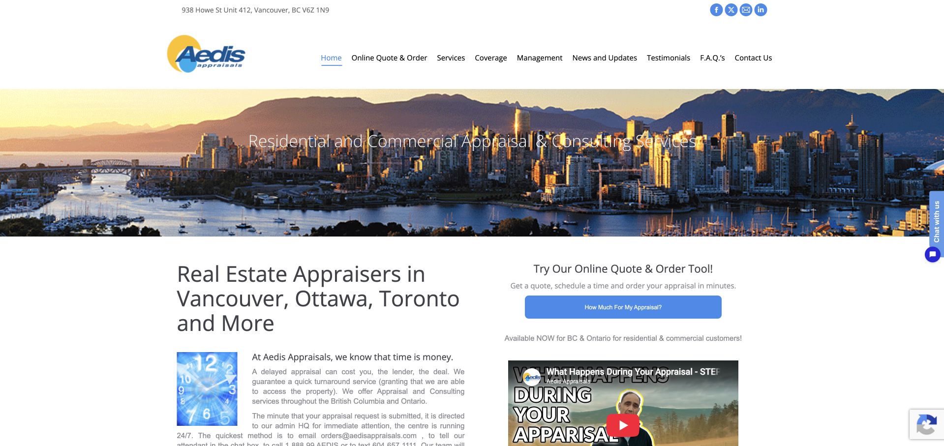
Aedis Appraisals uses a wide Vancouver skyline, a visible telephone route and a navigation row that includes services, coverage and an online quote or order option. The next section names several cities and places a compact quote panel beside introductory service text. This makes geography a useful part of the page rather than a decorative skyline reference alone. The website is worth studying for the relationship between a regional image and explicit coverage information. It also shows the complexity of combining residential, commercial and management content, which requires more careful explanation than a single generic appraisal headline can supply.
What you can learn
Use city imagery as context, then state the actual coverage and property types in text. Keep a quick quote route available, but explain when further assignment details are needed and distinguish a preliminary inquiry from acceptance of a report engagement or any promised valuation outcome.
Pros
The introduction names real locations instead of relying solely on a recognizable skyline to establish coverage.
The quote shortcut is visible in both navigation and the opening content sequence.
Cons & considerations
Several property and management categories can confuse visitors unless their boundaries are explained clearly.
Small embedded video and quote elements need careful mobile sizing and accessible labels.
Kegan is a freelance web designer and developer with 15+ years of experience helping businesses turn complicated website requirements into clear, maintainable digital experiences. He works directly with clients from planning and design through development, launch, and ongoing support.
For home appraiser website design, his development approach focuses on assignment types, coverage areas, professional information, and straightforward appraisal inquiries. The scope can be a targeted improvement or a complete custom build, with responsive layouts, thoughtful content structure, and integrations chosen around the people using and maintaining the site.
Show 3 other home appraiser website designersHide other home appraiser website designers
Plan an appraisal website around purpose, scope and a careful handoff
Give each accepted assignment context a clear explanation
Begin by listing the work the practice actually accepts. Residential, commercial, land, lending and private-purpose assignments should not be blended into one generic valuation page if they involve different audiences and processes. Ask the appraiser which initial questions most often need clarification. Use those questions to shape the navigation and service explanations, rather than importing a large list of report terms from another firm’s menu. An accurate narrow scope is more useful than the appearance of unlimited coverage.
Create purpose-led pages only where the practice can provide meaningful information. A page can explain who usually makes the inquiry, what the initial discussion covers, what information is useful and how the practice confirms whether it can help. Keep this as a description of the engagement process, not advice about a dispute, estate, tax filing or lending decision. Have the responsible professional review every explanation. Avoid assigning a universal report type, effective date or timeline through website copy before the relevant circumstances have been discussed.
Make the relationship between the different routes explicit. A homeowner may need a general inquiry, while a lender or existing client may use a separate ordering system. The homepage should not suggest that these are interchangeable. Explain whether the visitor is approaching an independent practice, a valuation company or an appraisal-management platform. If a network coordinates professionals, identify that role clearly. A visitor should be able to understand who receives the request and what happens next without knowing the internal structure of the appraisal industry.
Use people, coverage and examples with accurate context
Put actual service coverage in text near the request route. City, county and property-type information should reflect the work the practice can currently consider, not simply the locations that could generate search traffic. If coverage depends on the assignment, explain that confirmation occurs during the inquiry. A recognizable skyline can establish a setting, but it cannot tell a visitor whether a specific property is accepted. Keep the image and the operational statement separate so one is not mistaken for evidence of the other.
Name the professionals and describe their roles using approved, current information. A portrait should connect to a real team member rather than function as a generic trust symbol. Have the practice verify any credential wording and the scope it describes. The design review does not independently establish professional competence, licensure or suitability for a particular engagement. Similarly, a review badge or award should have its own source context and should not imply a guarantee about a report’s conclusions.
If showing a sample report, remove private information and obtain the necessary permission. Better still, prepare an explicitly fictional or appropriately redacted teaching example reviewed by the practice. Explain what the sample illustrates and what it does not. Do not expose property-owner details, signatures, account identifiers or confidential assignment material to make a page look more convincing. Keep image captions accurate about whether they show a generic property setting, a team member or a specific approved case. The goal is to explain the service, not to make unsupported claims about valuation accuracy or outcomes.
Keep the first request useful, limited and maintainable
Define the first response process before designing the form. The practice may need basic contact information, the property’s location, a broad reason for the inquiry and relevant timing context. The purpose of those fields is to help the team decide what to clarify next, not to collect a full legal or financial history through a public message box. Explain required and optional fields in ordinary language. Provide a way to say that the visitor does not yet know an answer, rather than forcing inaccurate selections simply to submit the request.
Separate a quote request from an order and from formal acceptance of an engagement. The on-screen confirmation should describe the actual next step without inventing a turnaround or promising that the practice has accepted the assignment. Give a clear alternative if the form fails. Where a separate secure client system is used, explain its purpose before sending users there. Do not ask people to email sensitive documents just because that seems easier to implement than an appropriate handoff.
Review the form and service pages with the people who handle inquiries. Test whether a visitor can identify coverage, understand the practice’s role and find a contact route without a mouse. Use visible labels, readable errors and a narrow-screen layout that does not bury instructions beneath a large photograph. Assign responsibility for team changes, coverage updates, form delivery and external ordering links. A successful appraisal website makes the first conversation more informed; it does not establish a property’s value, resolve a legal or tax question or guarantee a particular result for the person making the inquiry.
The editing job behind the design
A small practice usually needs clear content and a secure service handoff
Choose a maintainable CMS for service, coverage, team and educational pages. Link to an existing ordering or client system when that is the appropriate place for assignment information. A custom portal is a separate operational project, not a decorative feature to add simply because a national valuation company has one.
Use lightweight images, readable purpose labels and a short initial request. If uploads are genuinely needed later, design their access and handling deliberately rather than attaching an unrestricted file field to the public form. Public technology signals in this collection do not reveal the internal report-writing, valuation or client-record systems.
Our WordPress website examples offer a separate look at publishing approaches. A visible platform label is evidence for that named page, not a guarantee that the same system will suit your requirements.
Before the public launch
Appraisal website brief checklist
Identify the actual practice, network or appraisal-management role before choosing the homepage message.
List accepted property types and assignment contexts with the responsible professional.
Use plain purpose labels and explain the first conversation without prescribing an individual assignment.
State current geographic coverage in text and identify when the team must confirm availability.
Connect portraits to named, approved team roles and current professional information.
Explain what happens after submission without inventing a delivery or acceptance commitment.
Avoid inviting confidential legal, financial or identity details into a general message box.
Review any sample reports for permission, redaction and an explicit explanation of their purpose.
Keep awards and review statements sourced without treating them as valuation-quality guarantees.
Test labels, errors and request completion with a keyboard and a narrow screen.
Assign ongoing owners for coverage, team details, ordering links and inquiry delivery.
These checks are a project checklist, not a performance, legal, security, or accessibility certification. Test real journeys with the people responsible for the website before making claims about the result.
Sources & editorial method
How this collection was selected and reviewed
Public websites and direct captures were reviewed on November 9, 2026. The collection evaluates content and interface decisions, not professional competence, property value, legal or tax outcomes. Larger valuation and management platforms are explicitly identified as adjacent models. Primary pages establish the role and setting; capture records preserve the actual view and date.
Each example links to its actual source page. Screenshots are direct browser captures with their own capture dates; moving imagery, announcements and live designs can change. The notes describe observable design choices and conditional tradeoffs, not measured traffic, conversion results, service quality, or accessibility conformance.
Technology labels use public page metadata, asset evidence, or explicitly cited platform documentation. Platform documentation is not a complete current deployment audit. A component reference may be legacy or unused; it is not a complete backend inventory. Unknown stacks are omitted. These sites are editorial examples, not our client portfolio.
Written, Edited and Curated are separate editorial records, not timestamps advanced by a rebuild. Website designs and imagery belong to their owners. See our editorial standards or suggest a correction.
Questions worth asking
Home Appraiser website design questions
Should an appraiser’s homepage show every report type?
Not necessarily. A concise list of accepted assignment contexts can be easier to understand, with technical detail on the relevant pages. Use the practice’s actual scope and have the responsible professional review the wording. Avoid publishing a large menu that suggests work the practice does not accept.
Can the website promise a value or a tax-appeal outcome?
The design should not make that promise. This guide concerns how a practice explains its service and inquiry process. It does not assess a property or provide legal, tax or financial advice. Keep educational material separate from the professional work required for an individual assignment.
Is an online quote request the same as placing an order?
The interface should make the distinction clear. Explain whether submission requests a conversation, a preliminary quote or another step. Do not present a general form confirmation as acceptance of an appraisal engagement unless that is genuinely the approved process and its terms are communicated appropriately.
Should we publish sample reports?
Only with appropriate permission and careful review of private information. A clearly labeled fictional or properly redacted example can explain report structure. It should not expose client material or imply that every assignment has the same format, scope, conclusions or intended use.
Why include valuation platforms alongside local appraisers?
They offer useful contrasting communication patterns, such as audience routing and account access. They are not interchangeable business models. The reviews identify institutional and management platforms so their workflows are not mistaken for a private homeowner contacting an independent local practice.
Make it easy to understand the practice, its coverage and the next conversation. Specific scope is more useful than promising certainty through a polished property image.