Best Masonry Contractor Websites of 2026 (14 Real-World Examples)
Masonry websites that connect material craft with clear project scope
Masonry website design should make the company’s actual contribution understandable. These examples range from local stonework practices to architectural specialists and commercial restoration groups, with one supplier reference for the material-research side of the journey.
A homeowner seeking a repaired garden wall, an architect specifying stonework and a building owner researching facade restoration need different information. A generic craftsmanship statement cannot route all three well. Name the work, region and professional role, then show projects with captions that explain what the business actually delivered.
This collection reviews public website presentation, not construction quality or technical suitability. Architectural stone, new masonry, repair, restoration, inspection and material supply are distinct roles. The individual reviews identify those differences, including the supplier example. A dramatic building image should never imply responsibility for every visible element or independently establish the condition, safety or performance of masonry.
Before the examples
What makes good masonry contractor website design in 2026?
Separate the kinds of masonry work
Use categories visitors can understand: new stonework, restoration, repair, architectural stone, landscape features or commercial masonry where appropriate. Explain specialist terms without turning the page into technical advice. Inspection and construction should not be merged into an ambiguous service claim, and a supplier catalogue should not imply a contracting offer.
Caption the actual contribution
A single project may involve architects, engineers, fabricators, installers and landscape teams. Describe which part the company delivered and credit collaborators accurately. Broad location and material context help readers compare projects without publishing a private address. Use close detail alongside overall views when it clarifies the work.
Make fit and assessment clear
State the real service region and the types of project the business wants to assess. Explain the first conversation, useful photos or documents and what requires a site visit. Do not ask a visitor to diagnose structural or moisture problems from a web form, and do not imply that a photograph supplies a reliable technical conclusion.
The collection · 14 examples
14 masonry contractor websites worth studying
Study the relationship between project images, service categories and scope explanations. The examples offer design lessons, not interchangeable masonry services or independent endorsements of workmanship.
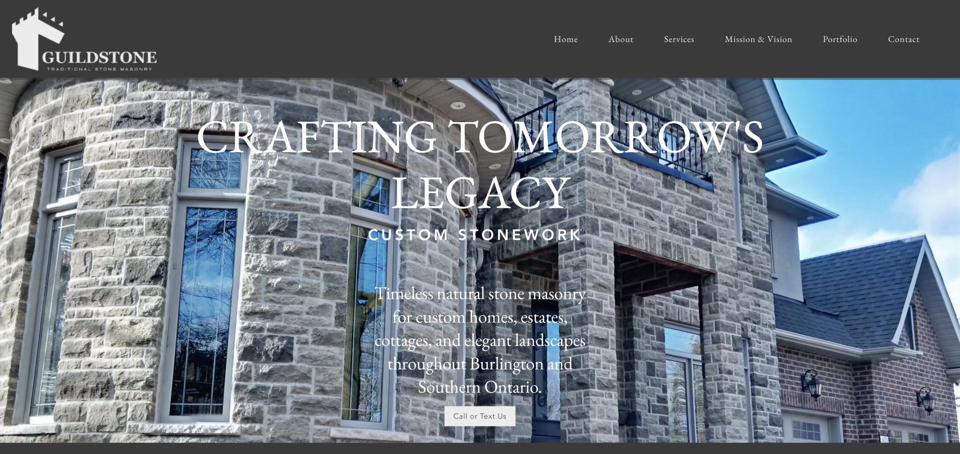
Guildstone combines a charcoal header, castle-like mark and a full-width stone-facade photograph with restrained serif navigation. The opening names custom stonework and identifies Burlington and Southern Ontario rather than implying a national service. Its body distinguishes exterior facades, fireplaces, landscape stonework and cottage projects, while the about section explains an intentionally limited project scale. The service-area list is concrete and the portfolio captions identify materials and features. This makes it a useful smaller-specialist reference: the design communicates a recognisable masonry niche, and the supporting copy explains the kind of projects the business wants to discuss.
What you can learn
Use the website to define a specialist’s scope before asking for an enquiry. Name the stonework, region and project context accurately, then give each image a caption that identifies the actual contribution. Editorial recognition here concerns that website presentation, not independent verification of construction quality, durability, licensing or the suitability of a material for another property.
Pros
The opening names both the masonry niche and the regional service area.
Portfolio captions explain stone features rather than presenting anonymous attractive houses.
Cons & considerations
The long single-page structure asks readers to scroll through substantial brand-story copy.
The founder narrative could identify the responsible person more explicitly alongside the contact details.
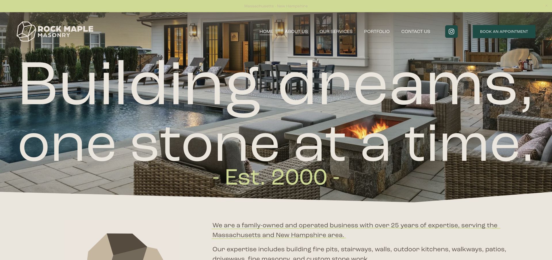
Rock Maple Masonry uses a forest-green, cream and lime identity with a graphic rock-like mark above a large outdoor project photograph. Oversized cream lettering and a curved lower edge give the page a distinctive visual shape. Massachusetts and New Hampshire coverage is visible early, while an appointment action supplies the practical next step. The company story names its family leadership rather than leaving the brand anonymous. The opening is useful for showing masonry as part of an outdoor living space, but the pool, landscape and building context should not be mistaken for evidence that the company delivered every element shown.
What you can learn
Credit the masonry contribution within a wider landscape project. Explain whether the work involved walls, paving, steps or other specific elements, and identify the project context without disclosing a private address. Strong outdoor photography works best when a caption helps readers understand the actual scope instead of relying only on a large lifestyle headline.
Pros
Regional coverage appears early enough for visitors to assess basic service fit.
The distinctive green-and-cream palette gives outdoor project imagery a coherent brand frame.
Cons & considerations
Very large lettering reduces space for initial detail about the specific masonry services.
A broad outdoor scene needs captions clarifying the company’s contribution to the project.
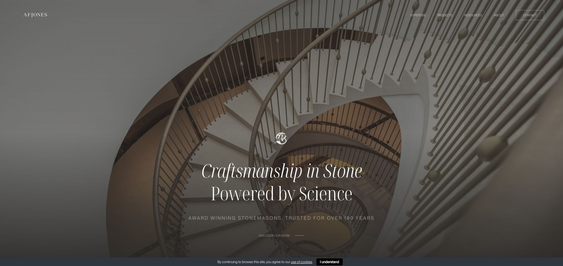
AFJONES Stonemasons uses a striking monochrome spiral-staircase image, slim white navigation and a centred serif statement to introduce its architectural work. The stone geometry supplies visual drama without added decorative illustration. Projects and expertise are separate destinations, making it possible to browse work or understand the practice’s capabilities. The restrained treatment gives the material and construction form room to read clearly. It is a useful reference for a specialist whose portfolio includes technically distinctive stonework, while also illustrating why the following pages need to explain project responsibilities and professional context rather than letting a dramatic photograph carry every claim.
What you can learn
Choose a project image that demonstrates the kind of work the business actually undertakes, then describe the contribution accurately. Architectural stone may involve designers, engineers, fabricators and installers; a case study should identify those roles where relevant. A visual review cannot establish structural performance or compliance from the shape and finish of a staircase.
Pros
The staircase geometry provides a memorable visual identity rooted in the actual material.
Separate project and expertise routes support both visual browsing and service research.
Cons & considerations
The sparse opening gives limited information about coverage or initial project qualification.
White overlaid navigation needs consistent contrast across all project images.
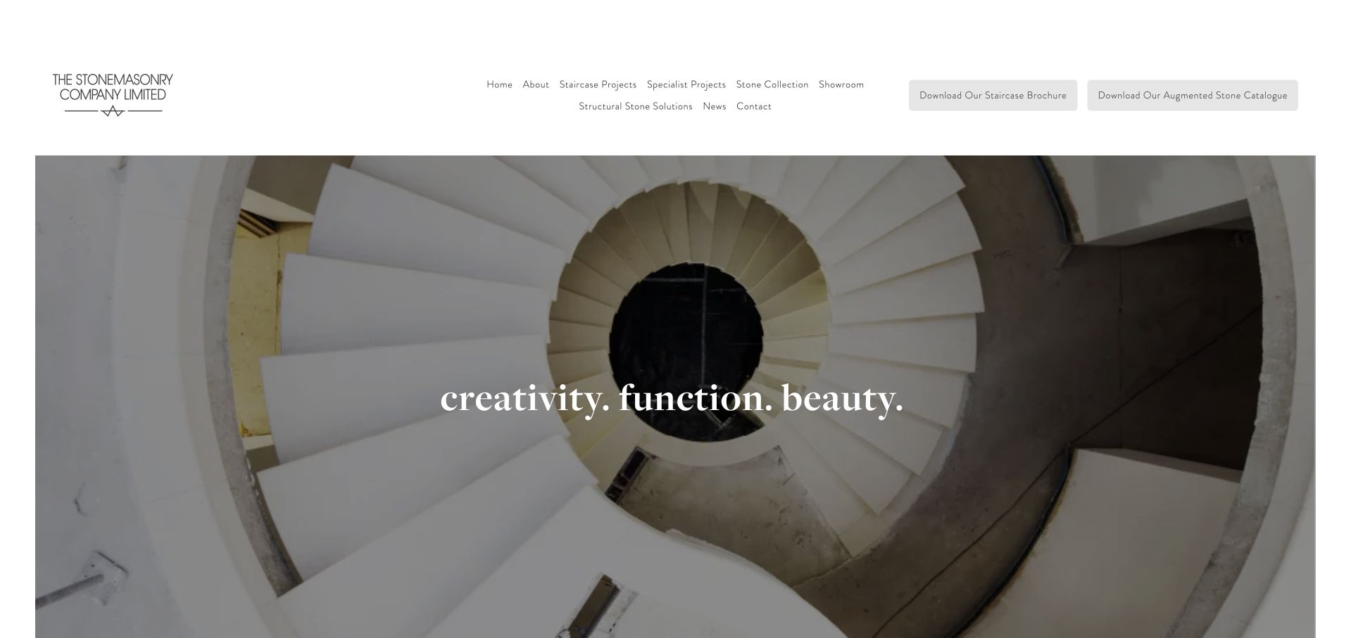
The Stonemasonry Company places a large inset spiral-staircase image beneath a spacious white header. Small, carefully spaced navigation separates staircase projects, specialist projects, stone collections, showroom and structural-stone solutions. Two brochure actions give professional researchers a distinct route beyond the central image. The short serif message leaves the stone geometry visible, creating a quiet architectural presentation rather than an overt sales landing page. This is useful for studying how specialist service names can make a highly visual site more informative, although the breadth of the header can make the first choice feel less obvious for a homeowner unfamiliar with stone construction terminology.
What you can learn
Keep technical service names connected to plain explanations and documented projects. A staircase image can attract attention, but readers still need to know what the company designs, makes or installs and when other professionals are involved. Brochures should support accessible on-page information rather than becoming the only place to understand the service.
Pros
Specialist project types and stone collections are explicitly separated in the navigation.
The inset photograph preserves the staircase’s form without covering it in large copy.
Cons & considerations
The broad header presents many specialist choices before a simple service overview.
Brochure buttons need clear file information and an accessible alternative to downloads.
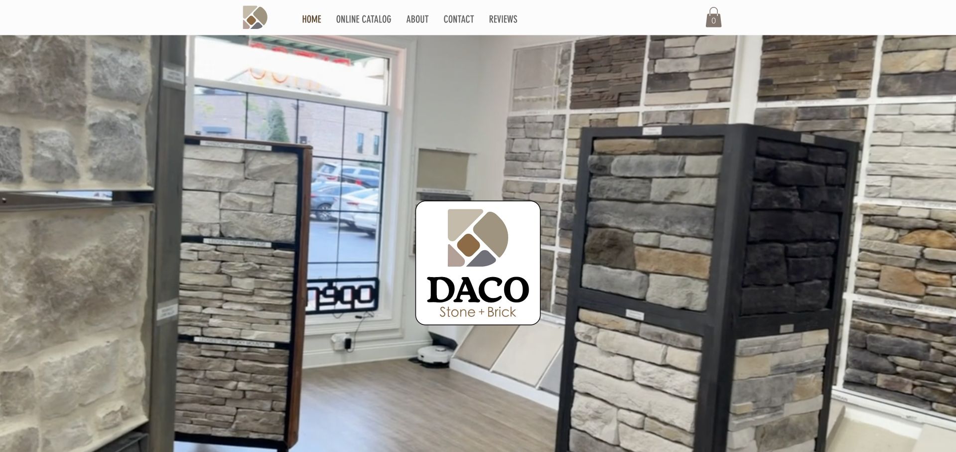
Daco Stone uses a showroom-like interior image with a large central stone-and-brick logo and a compact upper navigation. The opening foregrounds materials rather than a contracting crew or a completed installation claim. That distinction matters: this is a supplier reference within the masonry collection, not a claim that the business is a general masonry contractor. The site is useful for observing how stone and brick options are organised and how a physical product setting can establish category relevance. Its photograph shows the range as part of an in-person research experience, though the oversized identity leaves relatively little explanatory text in the opening view.
What you can learn
Contractors can borrow a supplier’s clear material vocabulary without implying they manufacture or stock those products themselves. Link project images to the relevant material information and explain who supplies, specifies and installs it. A showroom image should lead to practical visiting and product details, while service businesses need their own scope and coverage information alongside those references.
Pros
The showroom setting establishes a tangible stone-and-brick product research context.
A compact navigation avoids overwhelming the initial material-led presentation.
Cons & considerations
The large central logo covers much of the opening product environment.
Supplier catalogue patterns do not substitute for a contractor’s project and service-scope evidence.
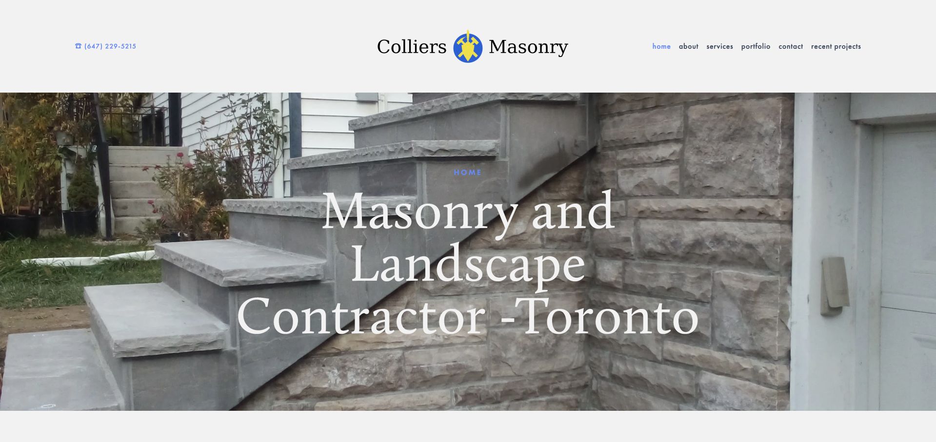
Colliers Masonry uses a white header, a black serif company name and a blue-and-yellow craft mark above a stone entrance photograph. A narrow blue utility strip gives direct telephone contact, while the central white headline places the service in the Toronto area. The visual tone is traditional and straightforward, with masonry imagery doing more work than decorative graphics. The page’s useful feature is the immediate connection between region, trade and contact method. It is less specific about the exact project shown, so portfolio captions and service descriptions need to explain which masonry elements the company delivered and what kinds of enquiries fit its offer.
What you can learn
A small contractor does not need a complicated hero to establish relevance. Name the trade, coverage and next step clearly, then use projects to show different scopes such as repair, restoration or new work. Keep those categories distinct so a homeowner does not assume that one attractive entrance photograph demonstrates every possible masonry service.
Pros
Regional language and a visible phone route make the initial service check straightforward.
The restrained white header leaves the stone project photograph as the main visual evidence.
Cons & considerations
The opening project image has limited immediate scope or material context.
White text over a detailed stone background needs careful contrast and placement.
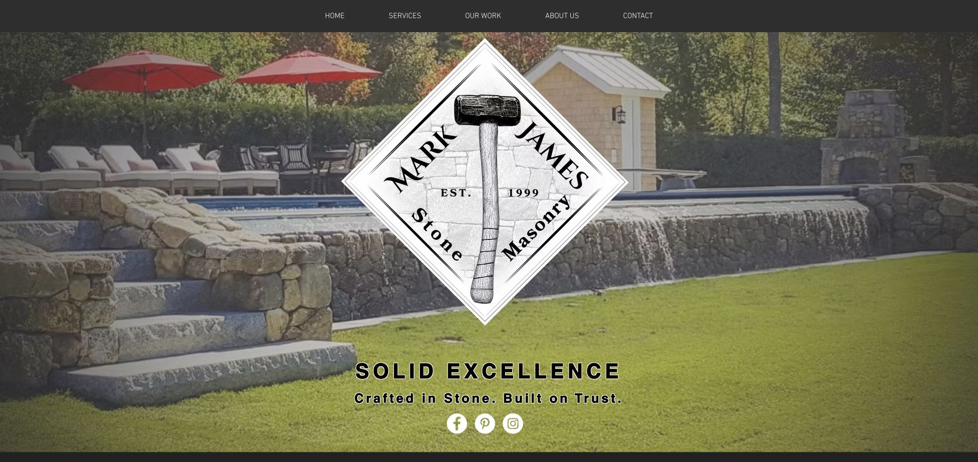
Mark James Stone Masonry places its diamond-shaped tool-and-stone mark over a substantial landscape masonry photograph. A simple charcoal navigation links to services, work, company story and contact within the page. The image shows walls, steps and an outdoor gathering setting, giving the material a clear residential context. The about content names founder Mark James Mullen and places the practice in New Hampshire, while service sections distinguish restoration, new construction and custom work. The identity is unusually prominent, so the useful lesson is how an individual craft practice can present a coherent offer without needing a large multi-level catalogue.
What you can learn
For a founder-led masonry business, connect the person, region and documented work in plain language. Captions should clarify the actual stone elements delivered within a larger landscape. A one-page structure can work when anchors are descriptive, service categories are specific and contact information remains reachable without forcing readers through every portfolio image first.
Pros
The company story identifies a real founder and regional business context.
The simple navigation gives services, project work and contact distinct destinations.
Cons & considerations
The very large logo obscures a substantial part of the opening masonry photograph.
The initial slogan provides less service detail than the sections further down.
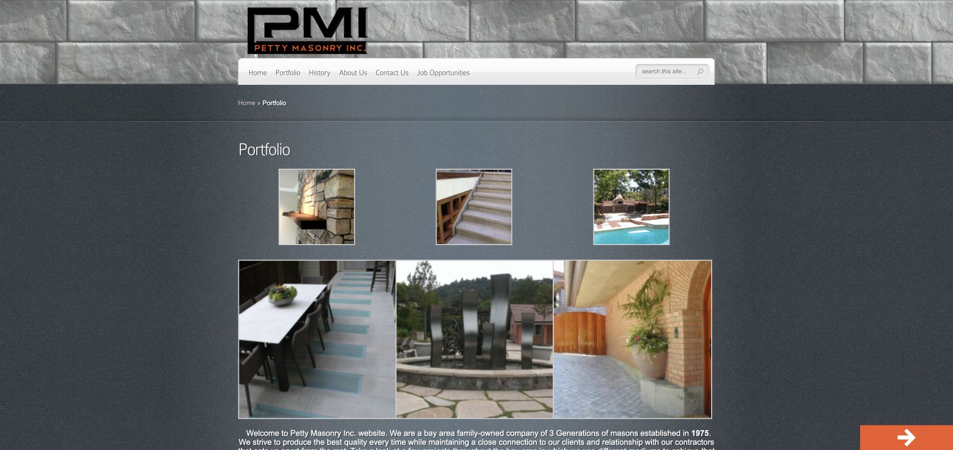
Petty Masonry uses a stone-textured header, orange-and-black identity and a dark content area with multiple project photographs. Rather than a single cinematic hero, the opening immediately exposes several views of completed work and a portfolio heading. The layout has an older, fixed-width character, but its practical strength is the early visibility of different masonry applications. Visitors can begin comparing the work without first navigating through a broad lifestyle statement. The site is useful for a small contractor who has project evidence but a modest editorial budget, while showing where clearer captions, spacing and responsive typography would improve the experience.
What you can learn
A modest gallery can be genuinely useful if each image explains the work. Group masonry projects by recognisable scope and include concise material and context notes. Avoid treating a large number of photographs as a substitute for a clear service statement, and ensure the image grid remains readable and keyboard accessible on narrow screens.
Pros
Several project views appear immediately instead of being hidden behind an introductory animation.
The portfolio-led structure provides a direct route to the company’s visible work.
Cons & considerations
The fixed-width, dark presentation feels comparatively cramped on a large display.
Project images need stronger captions to explain scope rather than relying on appearance alone.
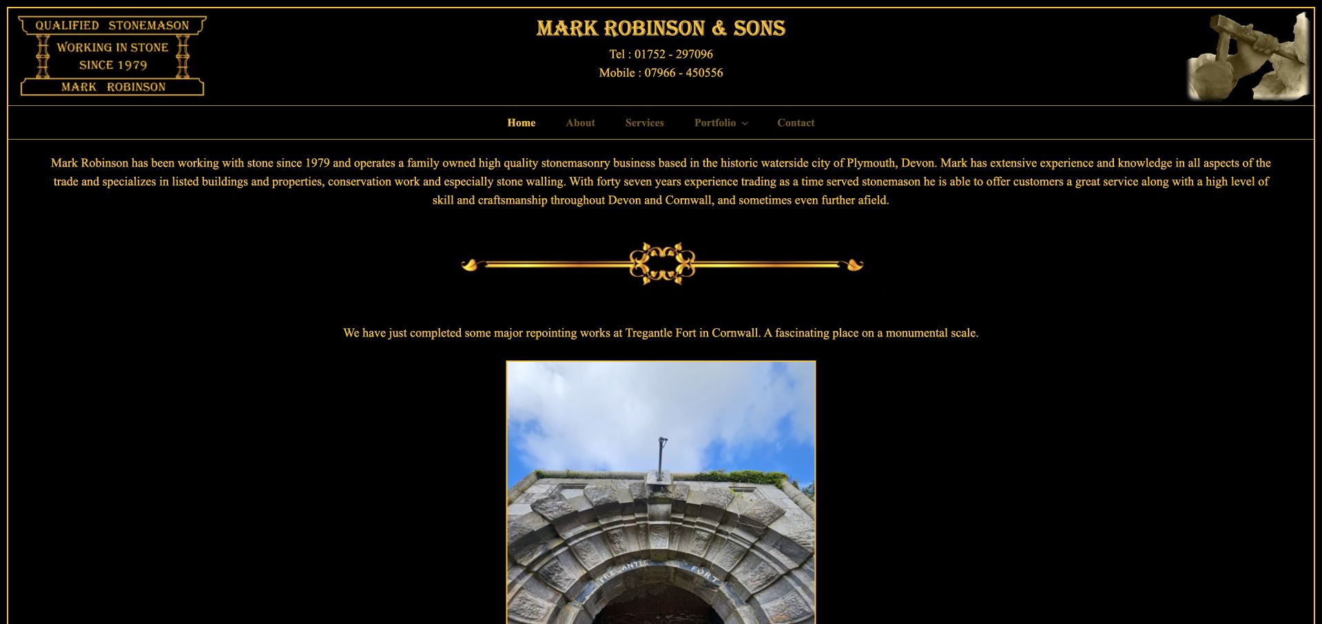
Mark Robinson & Sons uses a black-and-gold identity with a carved-stone-style mark and dense introductory writing. The page foregrounds the person and craft story rather than adopting a generic contractor template. Project reporting and images follow, including work presented with more narrative context than a simple gallery thumbnail. That makes the site useful for studying how a traditional masonry practice can communicate experience through documented work. The tradeoff is reading effort: long lines, relatively small text and a substantial opening narrative make it harder to scan quickly for service scope, location and the most relevant project type.
What you can learn
Personal experience becomes useful website content when it is tied to specific, accurately described projects. Edit the story into readable sections with headings, concise summaries and captions that distinguish restoration, repair and new stonework. Heritage context should inform the explanation without implying that a design review independently verifies conservation standards or technical suitability.
Pros
The personal narrative gives the masonry practice an identifiable voice and context.
Project reporting supplies more detail than a purely image-only portfolio could.
Cons & considerations
Dense paragraphs and long line lengths make early scanning comparatively difficult.
Service and contact information need stronger hierarchy within the extensive narrative presentation.
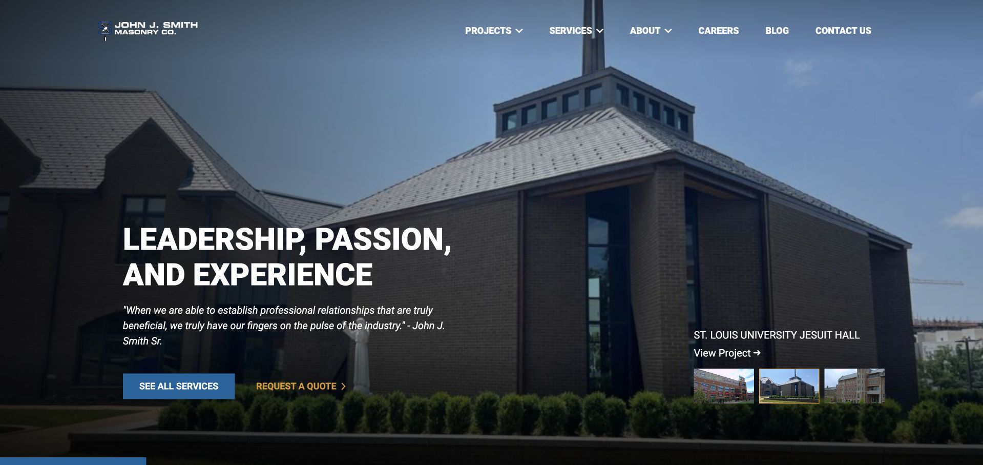
Smith Masonry places a blue-and-grey architectural photograph behind a white company mark and a direct opening statement. A blue service action and yellow quotation button create a clear hierarchy against the more restrained background. Small project previews at the lower edge introduce further work before the visitor leaves the first screen. The image scale and building context suggest a commercial-project presentation rather than a small domestic repair offer. The useful design lesson is the connection between a clearly framed service proposition and visible project browsing, with the supporting pages needed to explain the actual construction scope and professional relationships.
What you can learn
Commercial masonry case studies should identify the project type, region and the company’s role, not imply responsibility for every part of a large building. Use descriptive service labels and a practical quotation route that accommodates project documents without demanding them before basic fit is established. Keep public portfolios separate from private tender or client information.
Pros
Contrasting blue and yellow actions distinguish service research from requesting a quotation.
Small project previews give readers an immediate route into further work.
Cons & considerations
The architectural opening needs captions clarifying the masonry contribution to the building.
White text over a detailed facade image requires careful contrast across the hero.
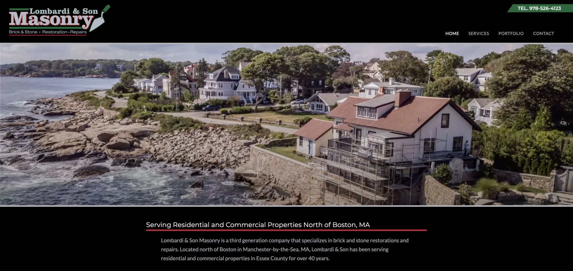
Lombardi & Son Masonry uses black, green and white branding above a broad coastal residential image. The company identity is prominent, while a green telephone ribbon supplies a recognisable contact route. Supporting copy names restoration and repair rather than relying only on a generic stonework promise. That is useful because visitors may arrive with an existing masonry problem rather than a new landscape idea. The page’s overall style is straightforward and service-led, though the large property scene needs context so readers can distinguish the business’s actual masonry work from the surrounding house, landscape and coastal setting.
What you can learn
Repair and restoration deserve distinct information from new construction. Explain the kinds of enquiries the company assesses and what a site visit helps establish, without diagnosing a wall or chimney from an online description. Pair each project photograph with a clear account of the actual work and preserve a simple contact route for visitors who do not know the technical terminology.
Pros
Restoration and repair are named as meaningful service categories rather than implied capabilities.
The green telephone treatment gives the practical contact route a clear visual role.
Cons & considerations
The broad property photograph does not immediately identify the specific masonry contribution.
The oversized company identity leaves less room for an initial service explanation.
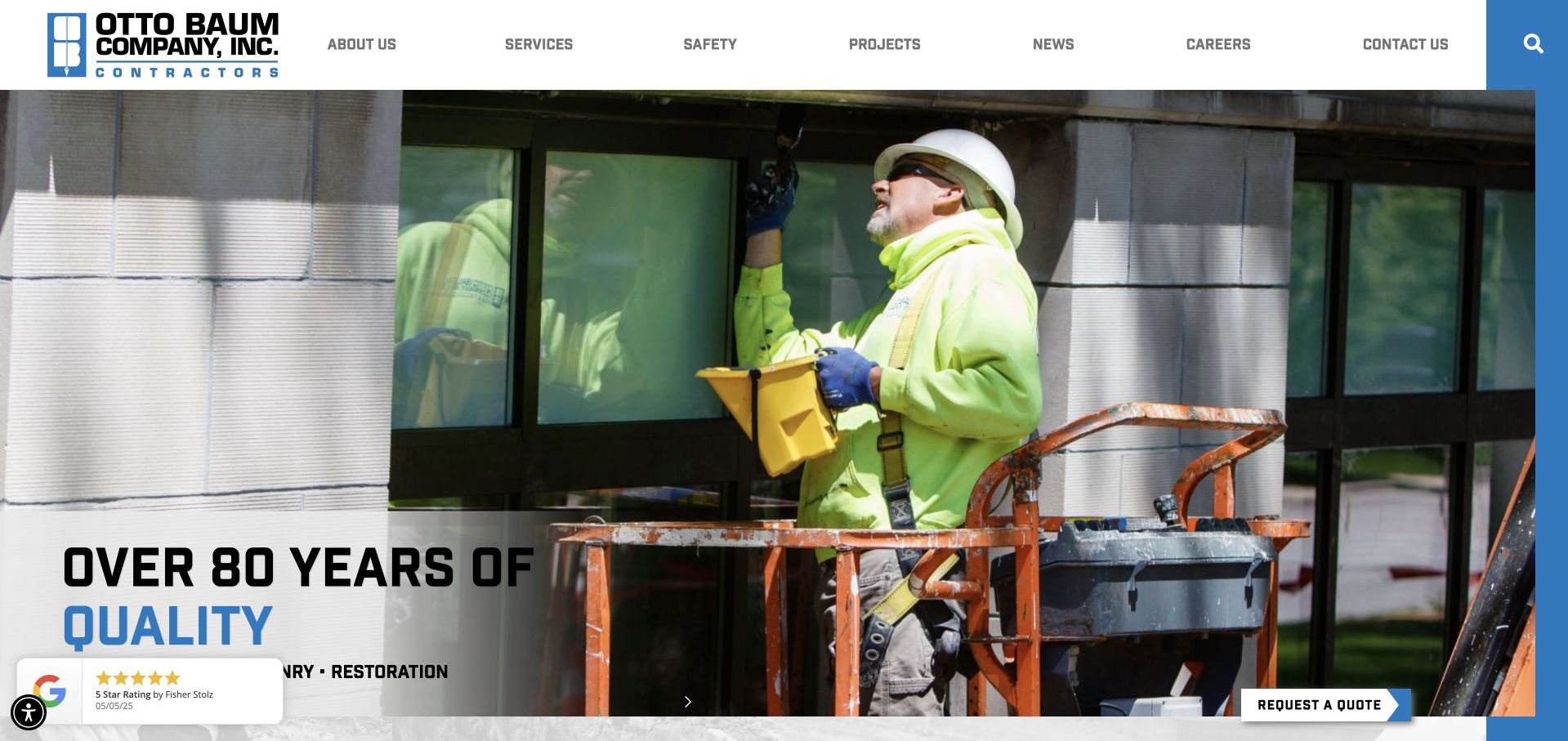
Otto Baum uses a white header, a bold blue wordmark and a large photograph of masonry work underway. The opening combines blue-and-black headline text with a dark translucent supporting panel, keeping the service message readable over the building image. The wider navigation includes construction disciplines beyond masonry, so readers need to distinguish the company’s various roles rather than assuming every project is the same type of work. The captured scene is useful because it shows labour and process, not just a finished facade. Supporting project records are still needed to explain location, scope and the relationship to other contractors.
What you can learn
A commercial contractor can show work in progress to make its role more tangible, provided safety and technical claims are not inferred from a photograph. Separate masonry from civil or other construction services with clear labels and project examples. A broad capability statement should lead to documentation describing what the company actually delivered in each case.
Pros
The work-in-progress photograph makes the construction activity more explicit than a finished-building image.
Strong blue branding gives the headline and service route clear visual emphasis.
Cons & considerations
Multiple construction disciplines require careful separation for a masonry-specific visitor.
The overlaid supporting panel covers some of the work details within the photograph.
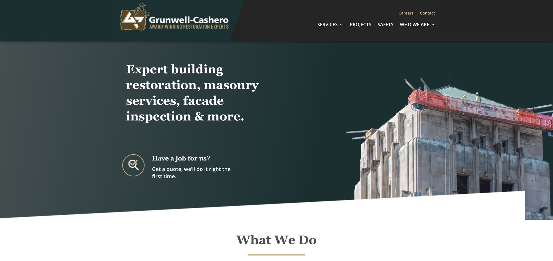
Grunwell-Cashero uses a charcoal-and-sage composition with a building image on the right and large serif service language on the left. Gold accents identify the enquiry route, while rounded boundaries soften what could otherwise feel like a dense industrial presentation. The opening distinguishes historic preservation, masonry restoration and facade inspection instead of treating them as interchangeable building work. That specificity is useful for owners and project professionals trying to understand which kind of conversation they need. The design is more structured than a full-photo hero, leaving room for the service taxonomy to be read before entering the project portfolio.
What you can learn
Keep inspection, restoration and preservation distinct in both navigation and project records. They involve different purposes and professional responsibilities, and a visual review cannot establish the technical conclusions of an inspection. Use concise project summaries to show the building context, the company’s role and the documented work without exposing private owner or tender information.
Pros
The opening separates several related building-restoration tasks in readable language.
The split composition gives service text its own stable area beside the building image.
Cons & considerations
The broad specialist offer still needs plain explanations for nonprofessional building owners.
Project imagery requires captions identifying the exact restoration or inspection contribution.
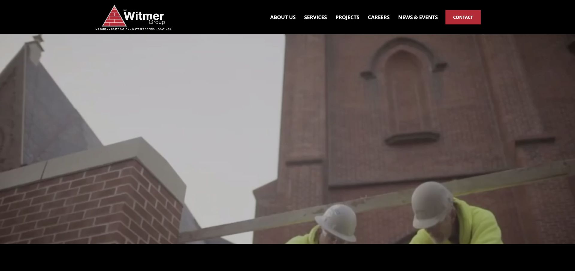
The Witmer Group uses a slim dark header, white wordmark and red contact action above large footage of masonry-related work. The emphasis is on people and activity rather than a polished empty building, making the company’s role feel tangible. Its navigation supports a broader group of project and service information, so the opening is a practice-level introduction rather than a single masonry specification. The restrained identity gives the work footage room to dominate. The useful design lesson is the use of actual activity as context, while the following pages must still explain scope, project type and the responsibilities of the teams involved.
What you can learn
Use work footage to support a service explanation, not to substitute for it. Commercial masonry visitors need identifiable capabilities, project records and a suitable enquiry route. Provide pause or reduced-motion behaviour, maintain readable navigation over every frame and avoid treating a visually convincing construction scene as independent proof of quality, compliance or project outcomes.
Pros
The work footage makes the people and construction activity part of the company story.
A restrained header and red contact action create a clear visual hierarchy.
Cons & considerations
Motion-led imagery provides limited written service detail within the first captured screen.
Video backgrounds need efficient loading, stable contrast and accessible playback control.
Kegan is a freelance web designer and developer with 15+ years of experience helping businesses turn complicated website requirements into clear, maintainable digital experiences. He works directly with clients from planning and design through development, launch, and ongoing support.
For masonry contractor website design, his development approach focuses on specialist service descriptions, material and restoration projects, service areas, and project inquiries. The scope can be a targeted improvement or a complete custom build, with responsive layouts, thoughtful content structure, and integrations chosen around the people using and maintaining the site.
Show 3 other masonry contractor website designersHide other masonry contractor website designers
Plan a masonry website around evidence, responsibilities and regional fit
Write a precise capability statement
Document the materials and work the business genuinely undertakes, including any size, region or project-type parameters it can state reliably. Keep heritage work, repairs and new construction distinct. If design, engineering or specialist inspection is provided by someone else, explain that boundary. Avoid implying professional qualifications from a logo, a tool photograph or a polished architectural project image.
Create project records before building a gallery
For each project, record the scope, broad setting, material information, date context, collaborators and image permissions. Caption what can be observed without claiming a technical outcome that has not been documented. If a photograph shows a whole house or public building, identify the company’s contribution. A smaller set of well-explained projects is more useful than a large anonymous wall of stone photographs.
Design a proportionate project enquiry
Separate domestic enquiries from professional project or tender conversations where their information needs differ. Ask enough to establish coverage and broad scope, while making drawings and photo uploads optional until they are genuinely needed. Explain what happens next and provide a direct contact alternative. Keep private client documents, addresses and tender information out of public portfolios and unsolicited external tools.
The editing job behind the design
Use technology that keeps specialist work understandable
A masonry content model can include services, materials, project records, regions, team credentials and supporting documents. Relate projects to capabilities without duplicating paragraphs across many local pages. Editors should be able to correct a scope note, add a credited photograph or update coverage independently. Brochure downloads should have useful on-page summaries rather than becoming the only explanation of the business.
Large building images, video backgrounds and detailed galleries need efficient loading and accessible controls. Write descriptions that explain the image’s purpose and keep text readable against stone textures. Public technology notes show only supported visible evidence; they do not establish how a contractor handles private project files, inspections, tenders or customer records behind the website.
Our WordPress website examples offer a separate look at publishing approaches. A visible platform label is evidence for that named page, not a guarantee that the same system will suit your requirements.
Before the public launch
Masonry contractor website brief checklist
State the exact masonry, stonework, restoration, repair or supply services offered.
Separate inspection and design responsibilities from fabrication and installation roles.
Name genuine coverage and project-fit parameters without inventing local offices.
Explain specialist materials and service terms in language nonprofessional owners can understand.
Give each project a descriptive title, broad setting and accurate scope note.
Identify the company’s contribution within larger architectural or landscape projects.
Record collaborator credits, photographer information and permission for every public image.
Show both overall context and relevant detail without implying technical conclusions from appearance.
Describe what an initial enquiry or site assessment helps establish.
Keep domestic and professional project routes distinct when their requirements differ.
Test image galleries, document links, mobile navigation, keyboard access and upload guidance.
Assign ownership of service updates, project records, contact expectations and private-document handling.
These checks are a project checklist, not a performance, legal, security, or accessibility certification. Test real journeys with the people responsible for the website before making claims about the result.
Sources & editorial method
How this collection was selected and reviewed
We inspected official public websites and captured the visible pages directly. Guildstone’s official service and about information supports its regional specialist scope and intentional project focus for the opening editorial selection. The list distinguishes contractors, architectural specialists and the material-supplier reference. The W3C image tutorial informs purposeful descriptions. Selection does not verify workmanship, structural performance, conservation standards, credentials or private infrastructure.
Each example links to its actual source page. Screenshots are direct browser captures with their own capture dates; moving imagery, announcements and live designs can change. The notes describe observable design choices and conditional tradeoffs, not measured traffic, conversion results, service quality, or accessibility conformance.
Technology labels use public page metadata, asset evidence, or explicitly cited platform documentation. Platform documentation is not a complete current deployment audit. A component reference may be legacy or unused; it is not a complete backend inventory. Unknown stacks are omitted. These sites are editorial examples, not our client portfolio.
Written, Edited and Curated are separate editorial records, not timestamps advanced by a rebuild. Website designs and imagery belong to their owners. See our editorial standards or suggest a correction.
Questions worth asking
Masonry Contractor website design questions
Should a masonry contractor show only finished projects?
Finished views are useful, but accurately contextualised work-in-progress images can help explain the company’s role too. Identify the project and actual contribution, obtain permission and avoid suggesting that a photograph proves safety, quality or technical compliance. A clear scope note matters more than the image format.
How should repair and restoration be organised?
Give them distinct explanations when the business genuinely offers both. Describe the types of enquiries assessed and the relevant project evidence. Do not ask owners to diagnose a problem or imply that every visible condition has the same solution. Explain what requires an appropriate professional inspection or site visit.
Is a stone supplier relevant to a contractor website brief?
It can offer useful catalogue and material-research patterns, but its role must remain explicit. Supplying stone is not the same as designing or installing it. A contractor can link to product information while separately explaining its own scope, coverage and responsibilities within the project.
What should architectural stone case studies include?
Describe the setting, actual contribution, materials where documented and relevant collaborators. Explain the project in readable terms without claiming responsibility for the entire building. Keep technical conclusions attached to their real professional sources rather than inferring structural performance or conservation suitability from an impressive image.
Does a small masonry company need a complicated website?
No. A focused service structure, clear region, well-captioned projects and understandable contact step can be sufficient. A one-page site works when anchors and scope are clear. More pages are useful only when they contain distinct information that the business can maintain accurately.
Begin with precise scope and honest project evidence. Let the stonework provide visual character while the website explains who does what, where the business works and how a suitable conversation begins.