Best Massage Therapy Websites of 2026 (30 Real-World Examples)
Massage therapy websites that make service, practitioner and location choices understandable
These 30 massage website examples focus on treatment-menu clarity, practitioner introductions, studio information and appointment expectations—not on evaluating clinical effectiveness.
A massage website should explain the available appointments without asking visitors to diagnose themselves. People need to compare the business’s service descriptions, session lengths, locations and practitioners, then understand how to ask an appropriate question. Health-related language, testimonials or a polished room photograph are not independent evidence of suitability or results.
MASAJ is our Editors Choice for combining a distinctive studio identity with separate treatment and location routes. The inspected page distinguishes its London studios, introduces a team-discovery route and gives a temporary Shoreditch relocation its own notice and address. That operational clarity is particularly transferable: a visitor should not book the right service at yesterday’s location.
Before the examples
What makes good massage therapy website design in 2026?
Explain appointments without outcome promises
Describe the format, duration, pricing and practitioner context in plain language. Identify when a visitor should contact the business rather than choose from a label alone. Do not turn a service name, customer quotation or marketing phrase into a guarantee about treatment results.
Connect practitioners to the correct setting
Introduce the actual team and distinguish studio, clinic and mobile appointments where offered. State which location or service a booking link refers to. A broad team page is less useful if the visitor cannot determine where a particular practitioner works.
Keep first-visit and change information visible
Explain arrival timing, what the appointment duration refers to, contact options and appointment-change policies. Give temporary premises, closures or altered hours visible notices near the booking route. Keep personal intake information out of ordinary marketing forms.
The collection · 30 examples
30 massage therapy websites worth studying
The examples cover individual practices, specialist studios, broader wellness venues and larger groups. Compare how each explains the appointment and next step; the visual review is not a recommendation of any treatment, practitioner or advertised health claim.
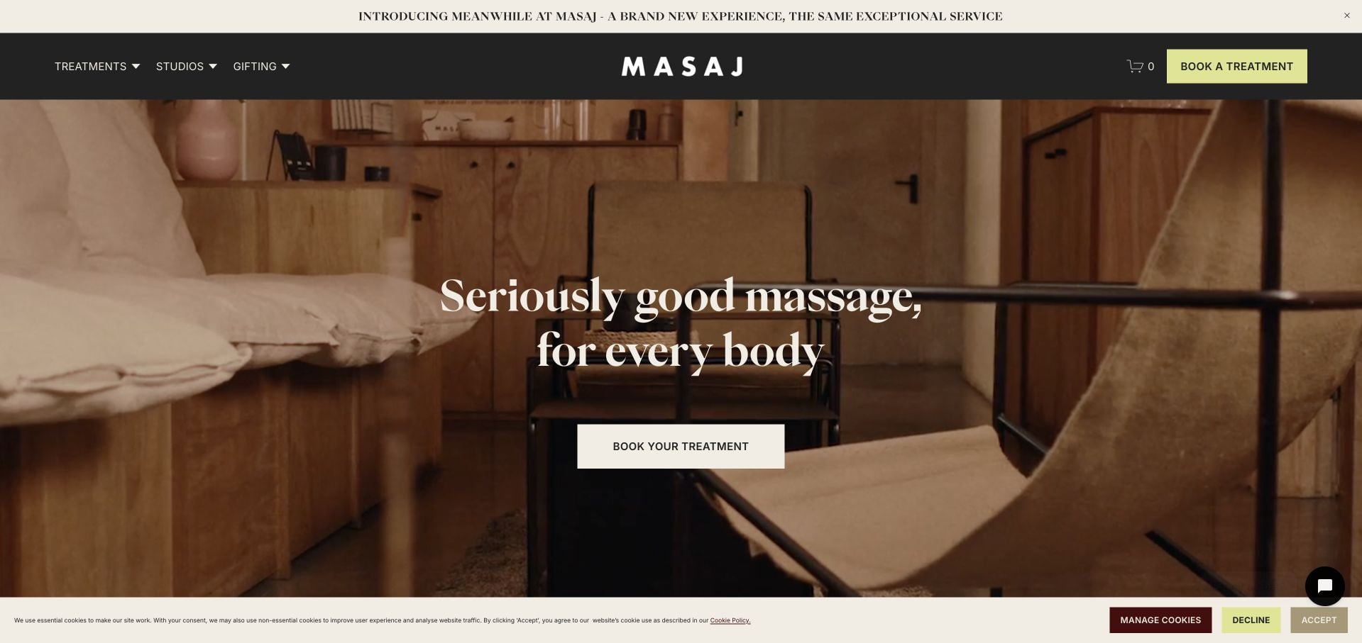
MASAJ combines a warm photograph of its studio with cream type and a restrained yellow-green booking action. The short header distinguishes Treatments, Studios and Gifting, so the atmosphere does not become the entire explanation. Lower cards use recognizable names such as relaxing, deep tissue, focus-area and sports massage, with separate discovery routes. The site also explains the difference between a couples appointment and an individual visit. Its relatively short opening is worth borrowing, while the privacy controls and additional brand announcement compete for attention above it. This is a selection for website presentation, not a treatment recommendation.
What you can learn
Begin with a recognizable room and a concise appointment invitation, then organize treatments by terms a new visitor can understand. Keep location choice separate from the treatment comparison when several studios share one brand.
Pros
Treatments, Studios and Gifting form a compact, understandable navigation.
The service cards use specific appointment names rather than only abstract wellness language.
Cons & considerations
Privacy controls and the announcement strip reduce the available first-screen space.
Prices and exact studio logistics require further exploration.
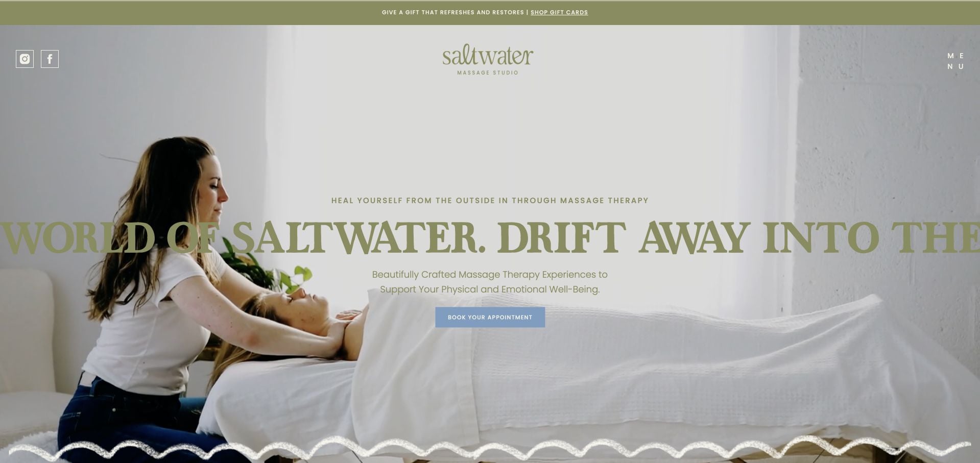
Saltwater Massage Studio uses muted olive and cream surfaces, a large flowing serif headline and an organic wave at the edge of the opening. A blue appointment action provides a useful contrast to the softer brand colors. The inspected page separates therapeutic, prenatal and body-treatment interests, with team, policies and location routes available elsewhere. It is an unusually expressive small-business presentation, but the long repeated moving phrase is harder to scan than a static introduction. Some shop and editorial destinations are still labeled as forthcoming rather than presented as complete resources.
What you can learn
Use the typography to create character while keeping the appointment action plain and visually distinct. Avoid letting decorative repeated text replace a stable service description, and clearly distinguish unfinished destinations from available information.
Pros
The appointment button is distinct from the muted visual system.
Services, people and practical policies have separate routes.
Cons & considerations
The oversized moving text can be difficult to scan quickly.
Forthcoming shop and blog labels make some navigation less immediately useful.
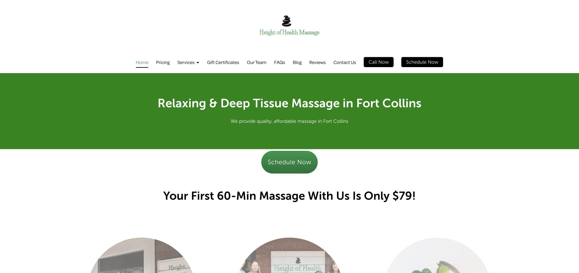
Height of Health Massage states Fort Collins and its principal service types in a large green introductory panel. The page gives a specific first-visit duration and offer, rather than an unexplained percentage discount. Pricing, Services, Team and FAQs are available in the header, with separate call and scheduling actions. The inspected testimonials have date context, and the footer supplies local contact information. The header is tall and contains many links, so the clarity of the offer comes with a comparatively large navigation footprint.
What you can learn
Tie an introductory offer to a named duration and booking route, and give ordinary pricing its own destination. Keep the local service description readable without allowing an expanding navigation to dominate the first screen.
Pros
The opening names the city, service category and introductory appointment duration.
Pricing, team and FAQs are direct navigation destinations.
Cons & considerations
The tall header consumes substantial first-screen space.
Numerous menu choices compete with the two contact actions.
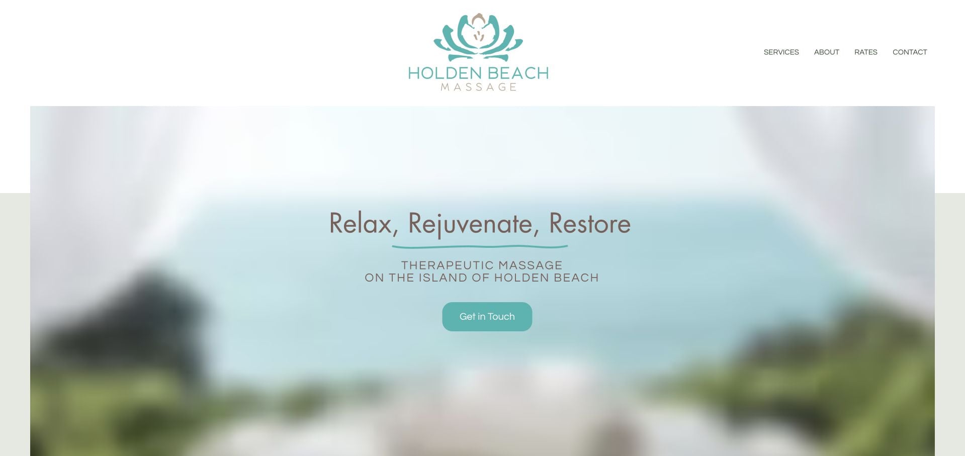
Holden Beach Massage uses a coastal photograph and turquoise accents to introduce appointments at a private studio or a vacation home. A short menu exposes Services, About, Rates and Contact. The inspected page introduces both David and Kelley Morris, then provides a simple duration-and-price comparison and direct contact details. That makes the service model more concrete than the atmospheric opening alone. The lengthy personal biographies add warmth but also require substantial scrolling before all practical details are encountered.
What you can learn
Explain where an appointment happens before collecting an inquiry, particularly when mobile and studio visits are both offered. Keep a short price-and-duration table near that explanation, with longer personal history as supporting material.
Pros
The site distinguishes vacation-home appointments from the private studio.
A simple table pairs appointment durations with prices.
Cons & considerations
Long biographies lengthen the route to later practical details.
The broad coastal hero carries less service detail than the sections below.
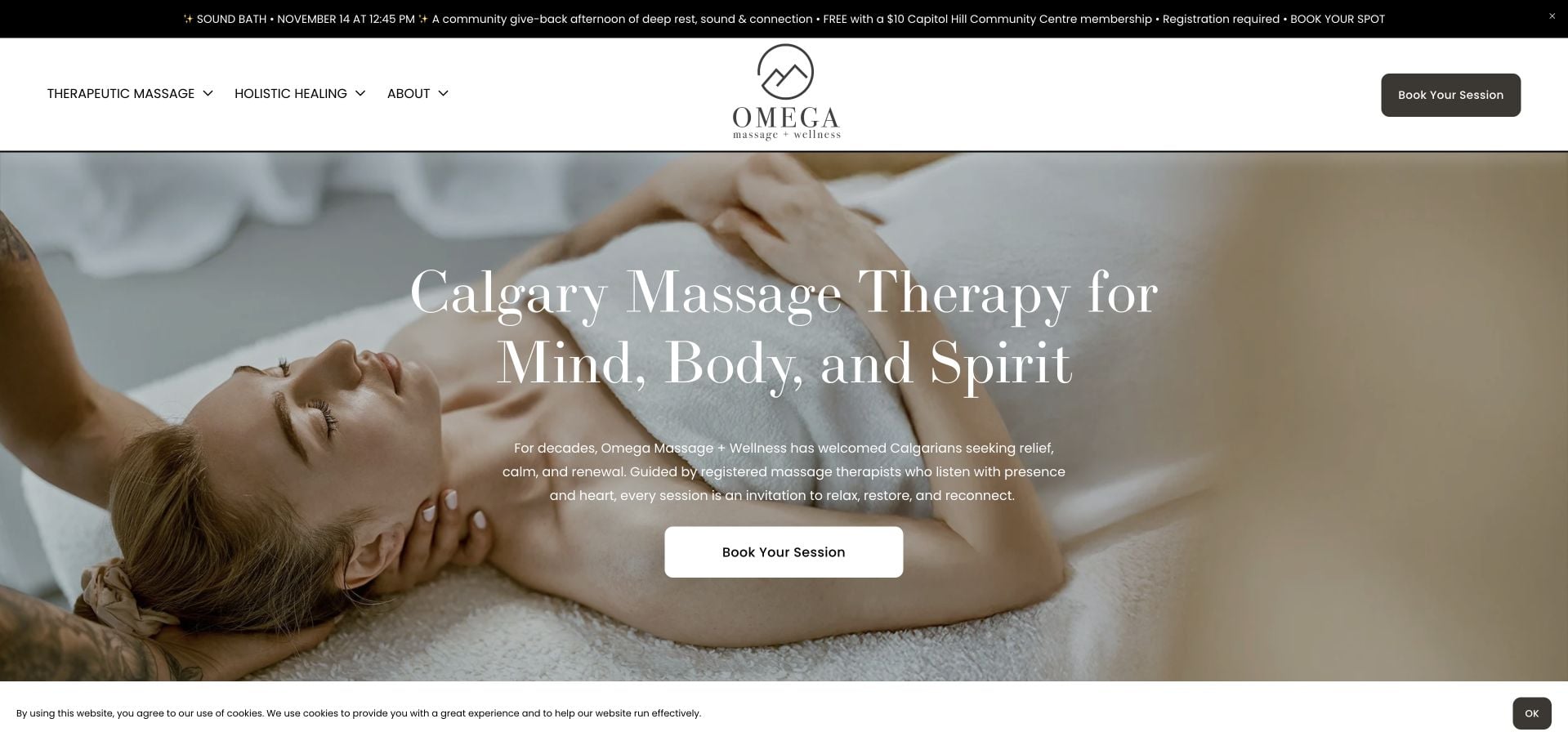
Omega Massage + Wellness uses a close treatment photograph, generous serif typography and a short Calgary introduction. Its navigation distinguishes therapeutic massage from holistic offerings, while the booking action remains visually separate. A current community event notice gives its date and registration condition. Later service lists and named customer quotations add detail. The long mission and values material makes the page more expansive, and the broad wellness terminology needs careful qualification. This review considers how the site organizes its offer, not the evidence behind individual treatment claims.
What you can learn
Separate materially different service families before presenting a combined booking system. If an event notice is timely, include the date and participation condition, and retire it promptly once it no longer helps visitors.
Pros
The two main service families are distinct navigation choices.
The event notice includes a date and registration context.
Cons & considerations
Mission and values content extends the page considerably.
Broad wellness language needs concrete service explanations alongside it.
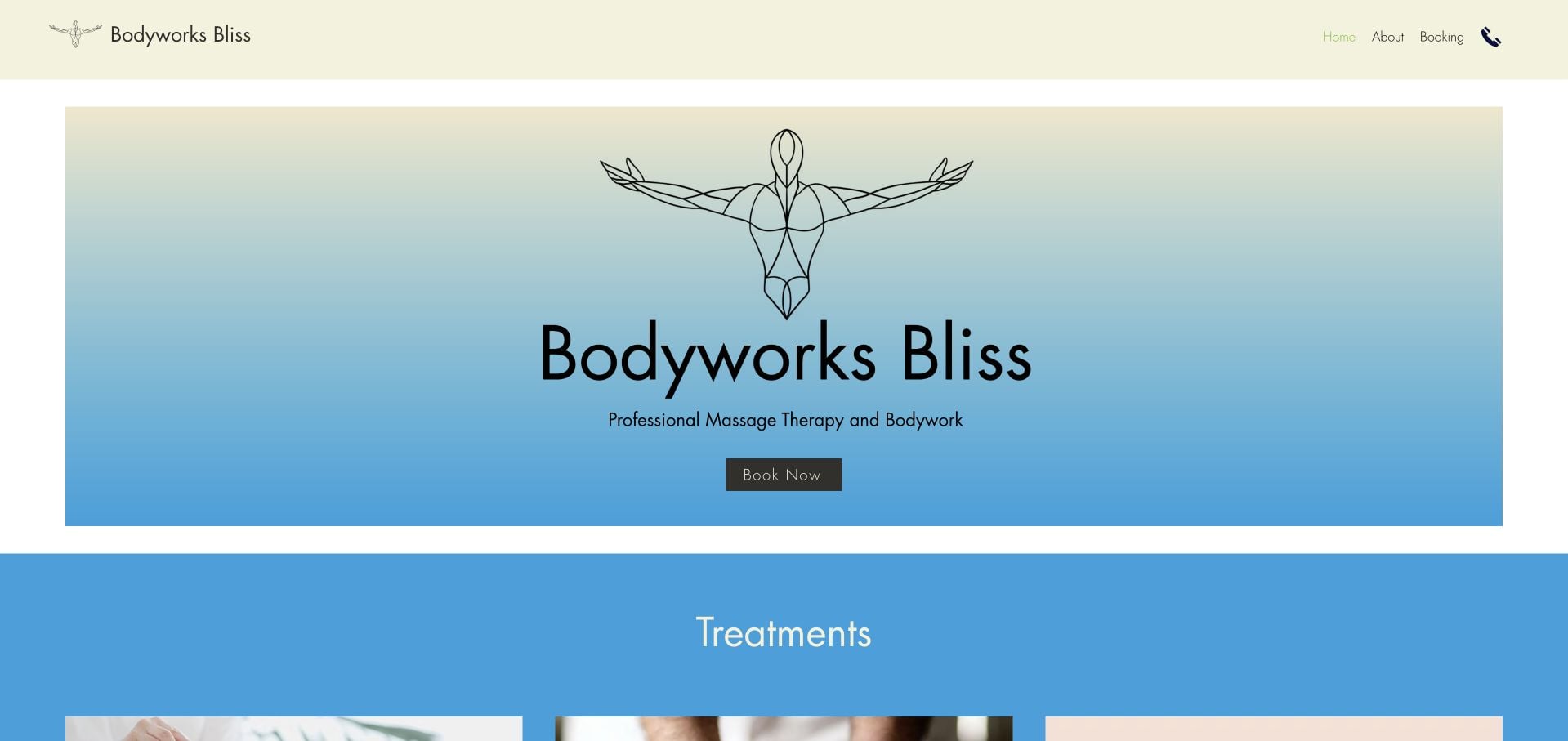
Bodyworks Bliss uses a cream-and-blue presentation, a simple line illustration and an uncomplicated Book Now action. The header has only Home, About and Booking. The body groups appointments into relaxation-centric, advanced and wellness families, followed by a customer quotation and a brief Provo introduction. Address, phone and opening hours give the small site useful operational depth. The category labels are broad, however, and the minimal opening does not supply a direct price comparison. Treatment descriptions remain the business’s own claims, not an independent clinical assessment.
What you can learn
A small practice can organize its first site around a few clear tasks. Make broad service categories lead to specific appointment information, and keep contact details and hours visible even when the design is deliberately minimal.
Pros
The short navigation makes booking easy to identify.
The footer includes address, phone and opening hours.
Cons & considerations
Broad treatment-family labels require further explanation.
Prices and durations are not visible in the main introduction.
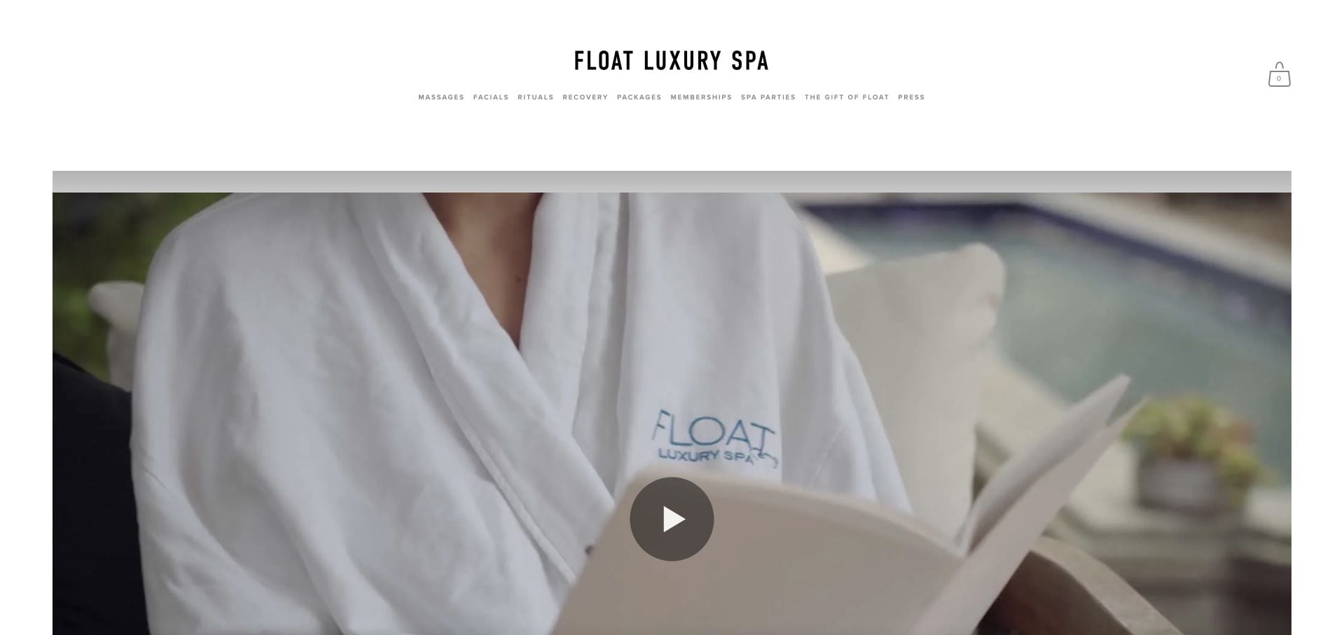
Float Luxury Spa’s main entry first asks visitors to choose a location. The reviewed downtown page then exposes Massages, Facials, Rituals, Recovery and Packages in its navigation, with a more atmospheric mission-led body. Real interior imagery and a reservation route connect the brand to a visit. The page also discusses another beachfront property, so the geographic context needs attention. It is a useful example of a location gateway, but the distinction between the shared brand, downtown page and sister locations should remain unmistakable throughout booking.
What you can learn
Once a visitor chooses a location, preserve that choice in the page heading and appointment handoff. Do not let cross-promotion of another property make the current address or reservation destination ambiguous.
Pros
The brand entry explicitly distinguishes its locations.
The downtown page separates several treatment and package categories.
Cons & considerations
Cross-promotion of another property can blur the local context.
A mission-led introduction delays detailed appointment comparison.
Rub Massage Austin introduces Glen Taylor in first person and explains that appointments take place with one therapist in a private studio. The monochrome working portrait and peach booking action give the opening a restrained identity. The inspected page includes a specific suite address, parking and elevator notes, appointment-only status and weekly hours. Services and About / Rates are plain navigation options. The large opening photograph occupies considerable space before the fuller written explanation, and one prominent attributed testimonial is much older than the current page context.
What you can learn
Explain who conducts the appointment and where it happens before presenting an abstract brand promise. Arrival details such as parking, floor access and appointment-only status are useful content, not merely footer decoration.
Pros
The solo-practitioner model is described explicitly.
Arrival information includes parking, elevator and suite context.
Cons & considerations
The large portrait delays the fuller service explanation.
An older testimonial needs its date context kept clear.
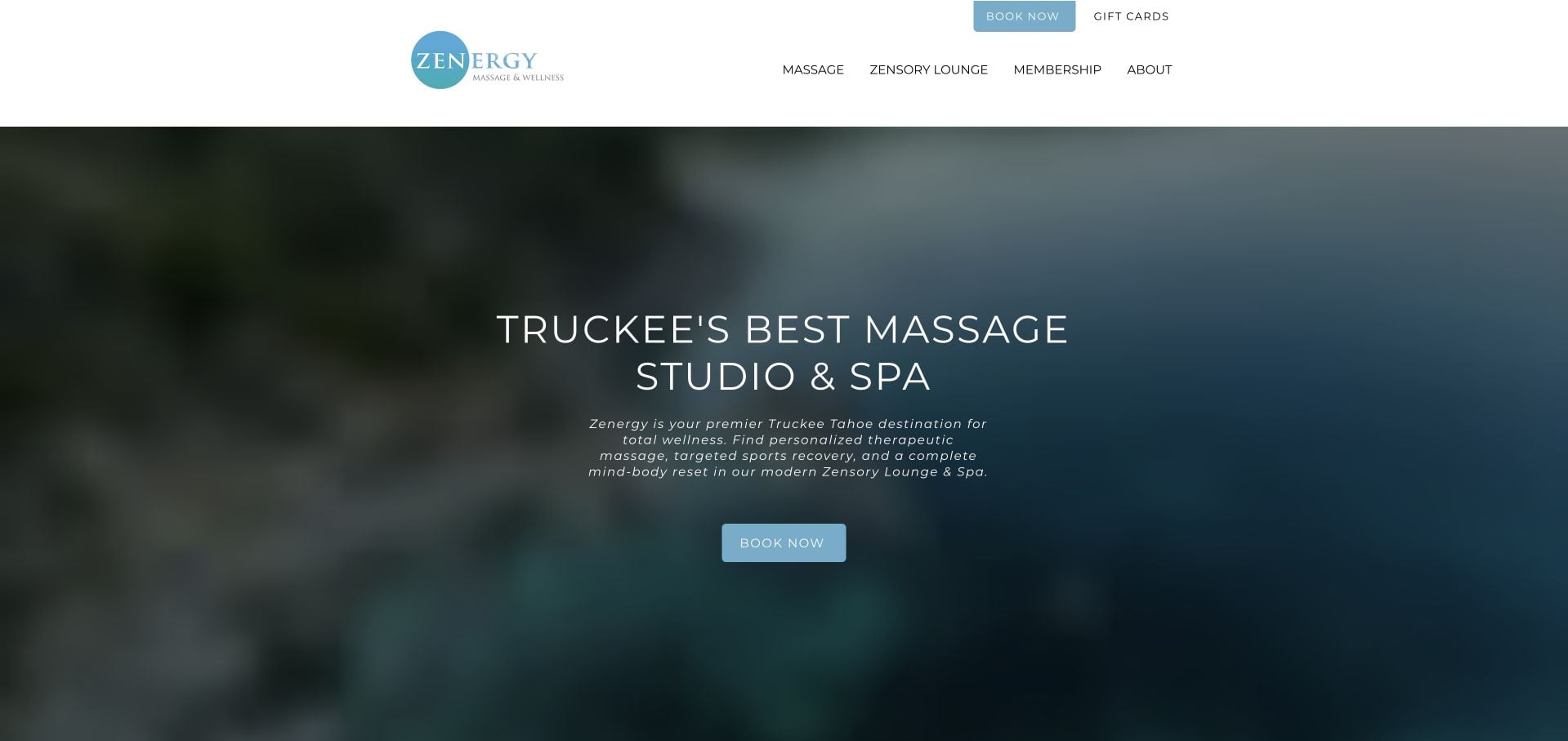
Zenergy names Truckee and Tahoe in its introduction and gives booking, pricing and contact alternatives early in the page. Massage appointments have visible duration-and-price cards, while the Zensory Lounge is explained as a different offer with its own session and group pricing. That distinction is more useful than treating all facilities as interchangeable appointments. The long wellness narrative and repeated testimonials lengthen the page, and specialized branded terminology requires explanation. The design lesson concerns comparing offers, not endorsing the health claims attached to them.
What you can learn
Keep individual appointments and shared-facility sessions separate in the service hierarchy. Explain duration, group size and pricing units together so a visitor can understand the difference before entering the scheduler.
Pros
Massage cards show duration and price together.
The lounge offer explains a different pricing and group model.
Cons & considerations
Repeated testimonials and long narrative content increase scrolling.
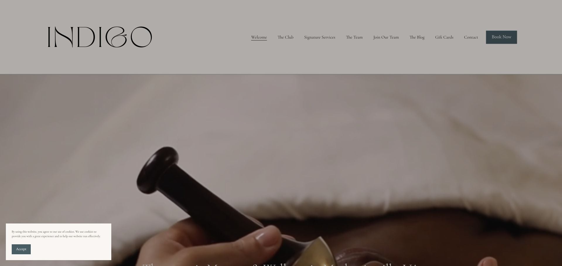
Indigo combines a quiet neutral identity with a Mechanicsville introduction and a menu of named signature appointments. Each branded name is accompanied by a more ordinary description, such as therapeutic massage or a scalp-focused session. Team and booking routes remain separate from the membership invitation. That translation helps the naming system serve the visitor rather than only the brand. Some newer offerings are marked as forthcoming, and the large opening image gives limited immediate price context. The site’s treatment claims are not independently evaluated by this design review.
What you can learn
Pair every signature name with an understandable service description. Keep forthcoming options visibly distinct from currently bookable appointments so the visual menu does not imply availability that the business has not confirmed.
Pros
Signature names have explanatory service labels.
Team and booking destinations remain accessible beside membership promotion.
Cons & considerations
Some forthcoming offerings interrupt a fully actionable service list.
The first view does not supply detailed price comparison.
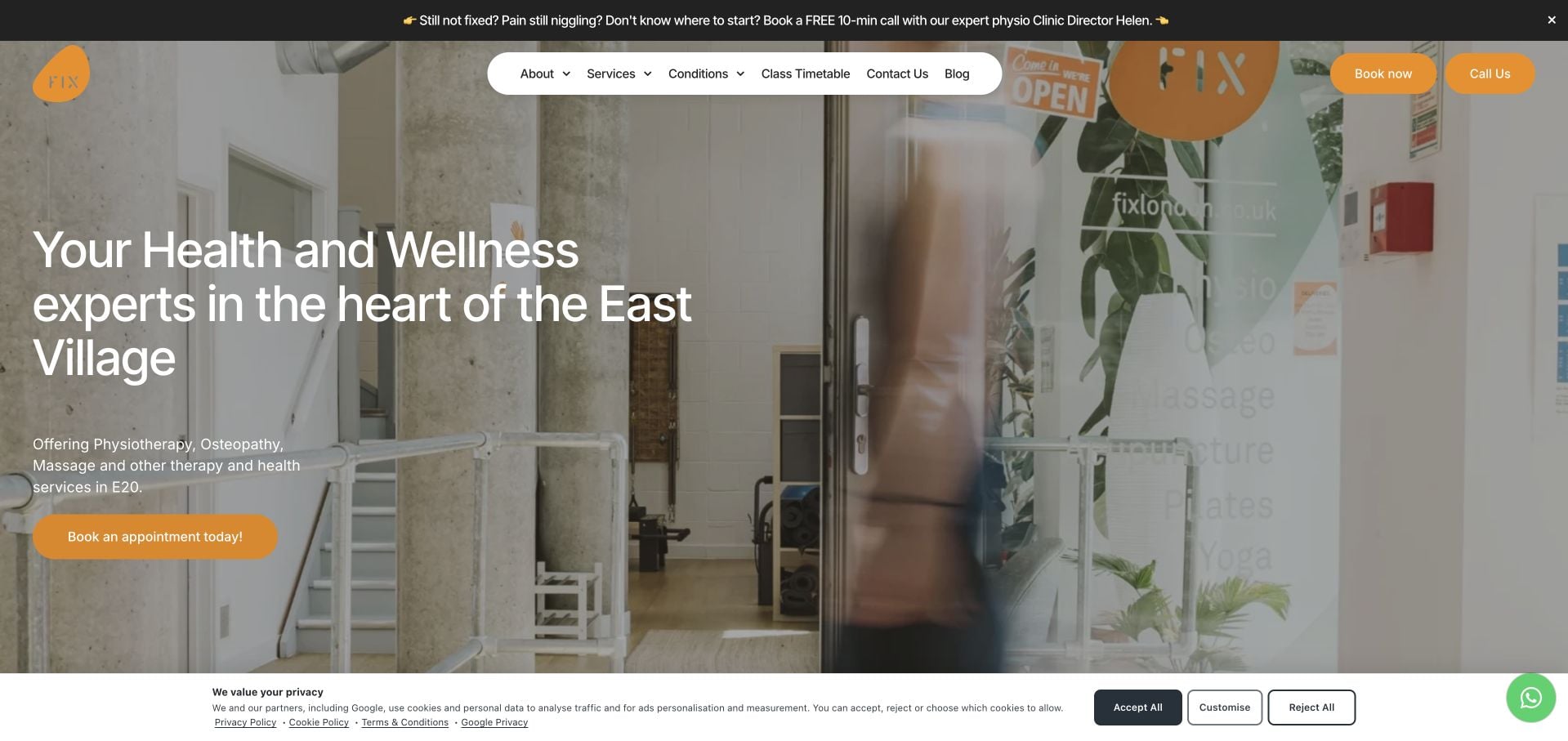
FIX London makes its East Village location and multidisciplinary offer explicit in the opening. The inspected page lists massage alongside physiotherapy, osteopathy and other services rather than implying a massage-only practice. A substantial named team directory gives each person’s role, while Fees, appointment and introductory-call interests have clear destinations. The orange-and-white visual system keeps the many categories connected. The breadth of the service list is also its main challenge: a massage visitor has to identify the relevant practitioner within a much larger clinical and class-based offer.
What you can learn
A mixed practice should identify the service discipline and relevant professional rather than sending every visitor into one undifferentiated appointment list. Keep class timetables and clinical appointments clearly separated where the process differs.
Pros
The opening states the location and multidisciplinary scope.
Named team records distinguish individual professional roles.
Cons & considerations
The broad service catalog can overwhelm a visitor with one specific task.
Multiple appointment and introductory-call actions need careful priority.
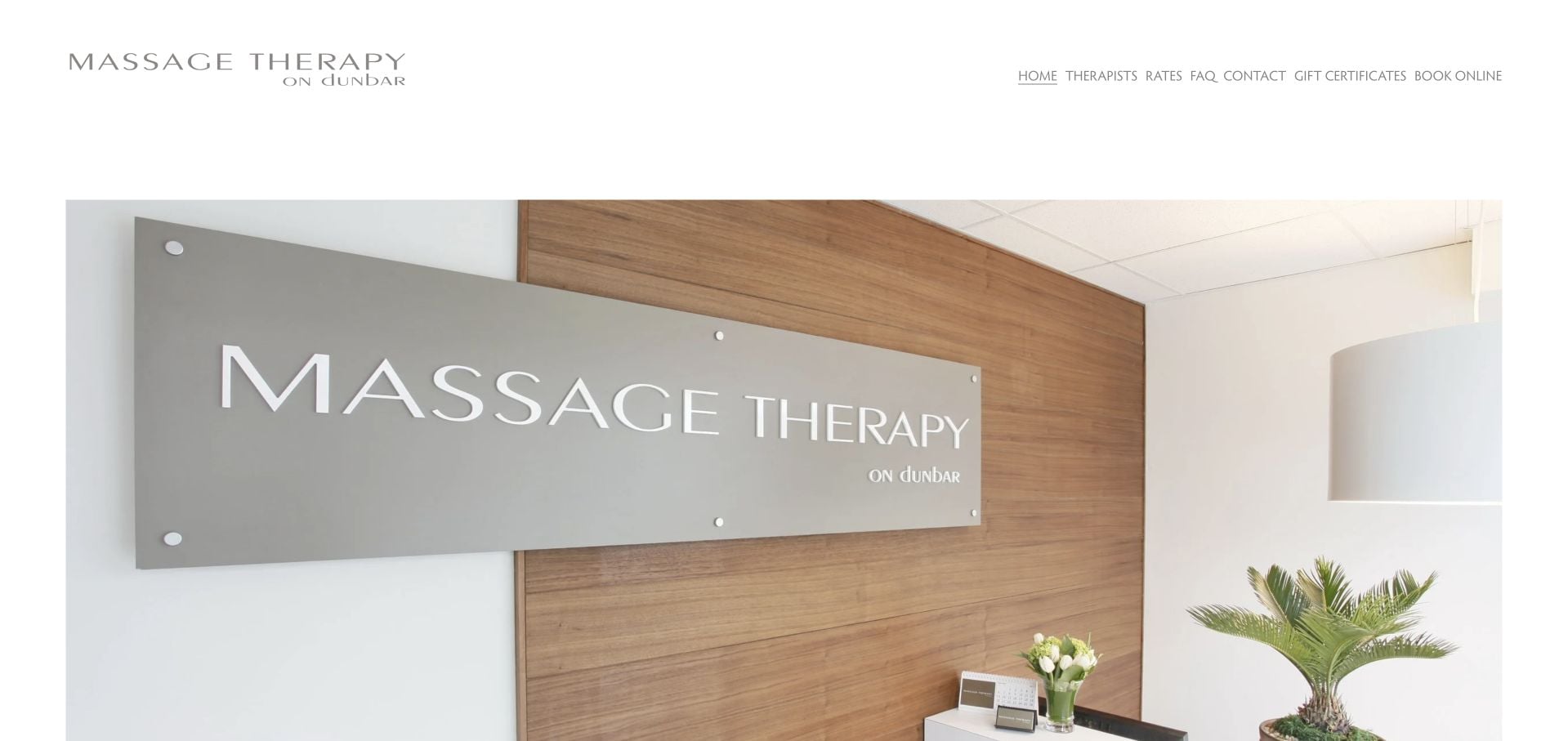
Massage Therapy on Dunbar keeps the homepage unusually spare, using a large interior photograph beneath a small wordmark and six straightforward navigation choices. Therapists, Rates, FAQ and Contact are easy to recognize, with Book Online separated as the principal action. The footer supplies the Vancouver street address and phone number, plus a clearly labeled second location. The restraint makes the practical routes legible, but the homepage itself offers little written introduction to appointment types or the people a first-time client will meet.
What you can learn
Minimal content can still be organized well when the menu answers real questions. Add a concise service and team introduction so the room photograph is not responsible for explaining the entire practice.
Pros
Rates, therapists and FAQ have plain navigation labels.
The footer identifies the current address and a separate second location.
Cons & considerations
The homepage offers very little written service orientation.
A new visitor must open another page to compare appointment choices.
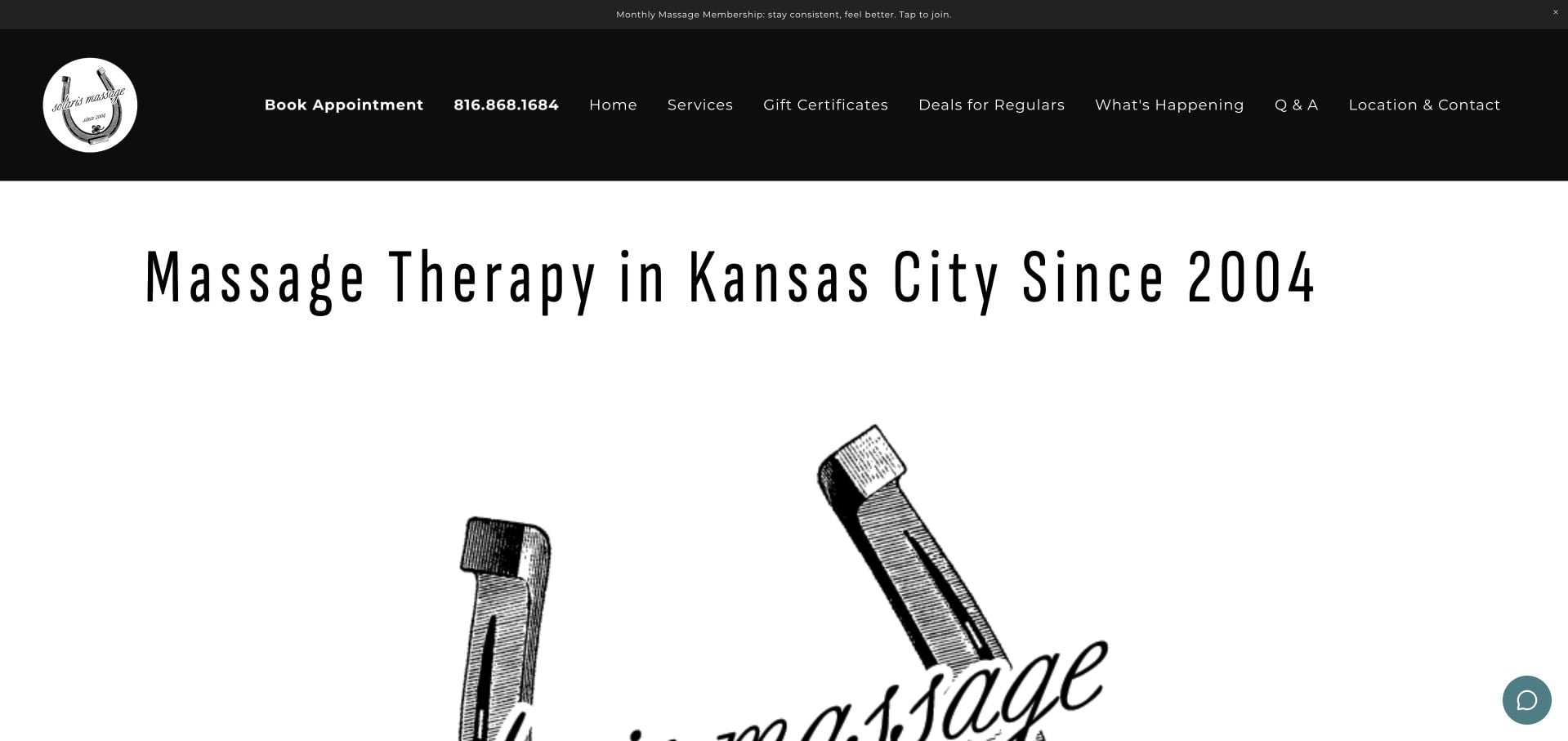
Solaris Massage places Kansas City in a strong black-and-white introduction, with separate booking and gift-certificate actions. Two prominent duration-and-price lines give a useful anchor before the expanded service categories. Individual, couples and specialty options are explained separately, with appointment-only status and a location route available. The page also promotes memberships and regular-client deals. That combination is useful to compare, but it requires careful hierarchy so that a straightforward first booking is not overshadowed by programs aimed at returning customers.
What you can learn
Give visitors a baseline duration and price before introducing memberships or packages. Separate couples and specialty appointments when their scheduling or pricing differs from an ordinary individual session.
Pros
The page presents an immediate duration-and-price anchor.
Individual, couples and specialty appointments have distinct explanations.
Cons & considerations
Regular-client promotions compete with the first-time appointment route.
The larger service story takes more reading than the opening comparison.
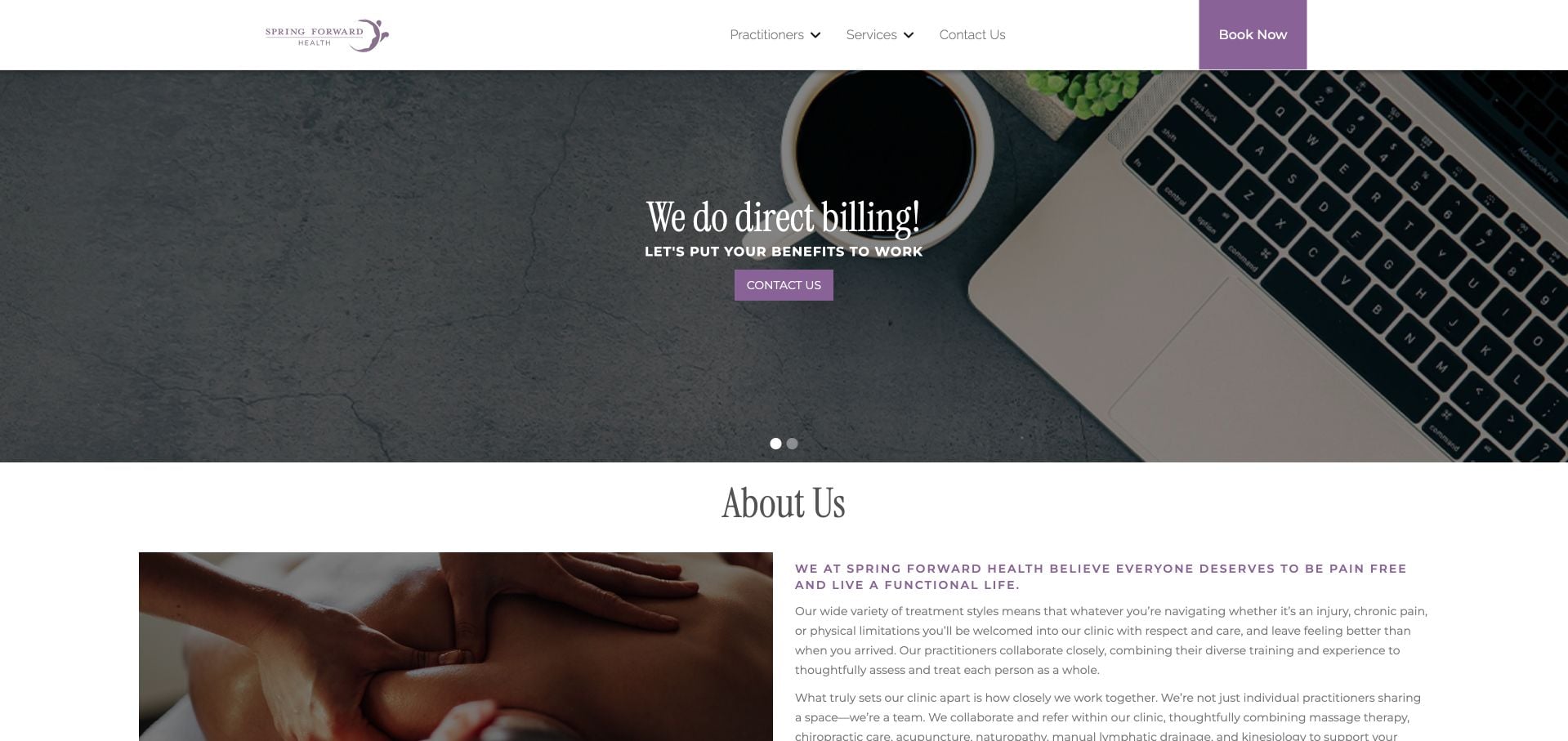
Spring Forward Health uses a strong direct-billing message as its first practical hook, supported by a compact booking action. The inspected page explains the collaborative practice model and lists named practitioners and service disciplines. A specific Waterloo address and day-by-day opening hours make the visit concrete. The page includes massage alongside other care types, so it should be read as a multidisciplinary example. The direct-billing claim needs individual eligibility context, and the broad team-and-service lists can be difficult to scan without a clearer service-to-person connection.
What you can learn
Use payment or benefits information as an invitation to confirm details, not a universal coverage promise. Connect each service to the relevant practitioner and preserve address and hours as easily scanned operational content.
Pros
Named practitioners and service disciplines make the team visible.
The footer provides a specific address and day-by-day hours.
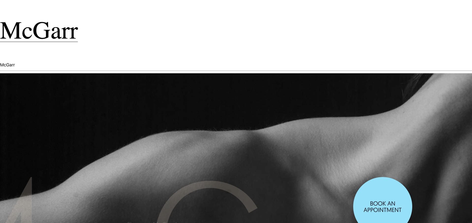
McGarr Massage Therapy pairs stark black-and-white treatment photography with a large wordmark and a contrasting circular appointment action. Shannon McGarr is introduced by name and location, and the inspected content explains how a session is personalized rather than asking a new visitor to choose a technique unaided. A three-part philosophy gives the personal practice a structured narrative. The moving list of modalities and extended explanations add reading and motion, so the useful borrowing opportunity is the clarity of the person and process rather than every decorative element.
What you can learn
If customers do not need to select a technique in advance, explain that plainly. A personal practice can build an understandable appointment journey around the provider and the process instead of a long unexplained list of modalities.
Pros
The therapist is identified by name and location.
The page explains how appointment choices are personalized.
Cons & considerations
The repeated moving modality list adds unnecessary motion.
The long philosophy section can delay practical visit details.
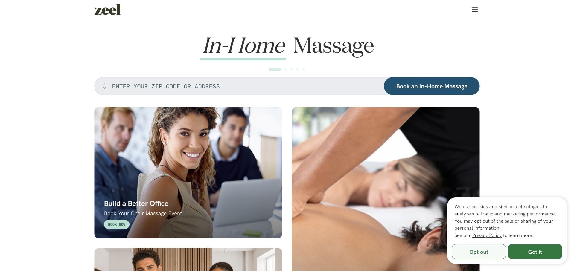
Zeel divides its opening between in-home massage, workplace chair events and spa staffing. The choice is operationally meaningful because each audience needs a different booking or inquiry process. The inspected page also contains location-dependent pricing, program information and detailed cancellation and payment questions. This is a platform example rather than a local therapist homepage. The breadth is useful to study, but the changing panels, support widget and multiple programs require strong labels to prevent the personal appointment route from blending into organizational and provider interests.
What you can learn
Separate audiences whose request processes genuinely differ. Location-dependent pricing should make its assumptions clear, and a consumer appointment route should not share an ambiguous action with staffing or employer inquiries.
Pros
The first choices distinguish in-home, workplace and staffing interests.
Payment and cancellation questions receive detailed answers.
Cons & considerations
Many programs and changing panels compete for attention.
Pricing depends on location and must be interpreted in that context.
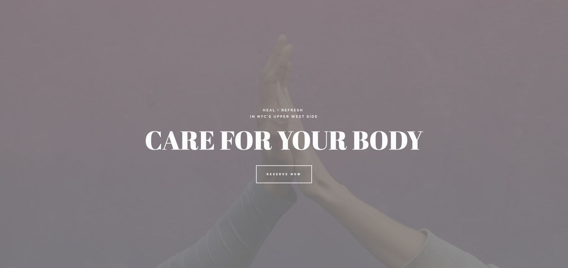
Remedy Wellness uses muted mauve surfaces, restrained typography and an Upper West Side introduction. The inspected page moves beyond atmosphere into clear appointment-duration and price tables, then distinguishes multi-session packages and their time limits. What to Expect and Team are visible routes alongside reservations. The information is useful, although a lengthy set of treatment and package tables takes effort to compare. Several different wellness offers share the same sequence, so a new visitor needs clear grouping rather than a single continuous list of prices.
What you can learn
Put duration, price and package validity together. Keep the ordinary single-session choice easy to find even when prepaid packages and additional service types occupy much of the page.
Pros
Session durations and prices are shown together.
Package explanations include relevant validity periods.
Cons & considerations
The number of pricing tables can make quick comparison difficult.
Several distinct treatment interests share a long page sequence.
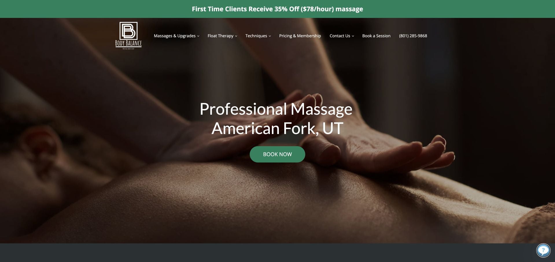
Body Balance Massage & Float names American Fork in the hero and offers a direct booking action beneath it. The inspected page distinguishes the first massage, first float and ready-to-book journeys, acknowledging that visitors have different information needs. Pricing and Membership have a plain menu destination, while a visible new-client offer specifies its unit. The many treatment explanations expand the page significantly. Medical or wellbeing claims in that copy are the business’s statements; this review is about the useful separation of newcomer education from immediate appointment access.
What you can learn
Let first-time visitors learn what to expect without blocking returning customers from booking. Treat massage and float appointments as separate choices wherever preparation, facilities or scheduling differ.
Pros
First-massage and first-float routes address different newcomer questions.
The header includes a direct pricing and membership destination.
Cons & considerations
Long treatment explanations reduce scanning efficiency.
The promotional offer needs its conditions kept clear and current.
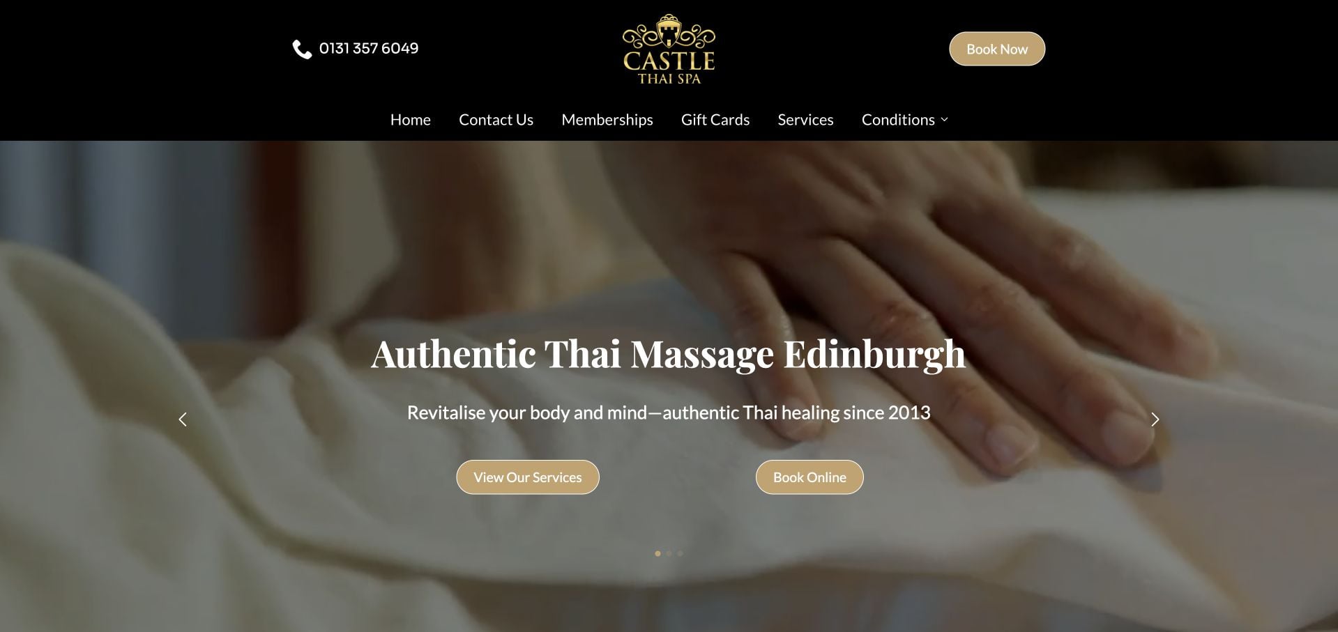
Castle Thai Spa identifies Edinburgh and Thai massage in the opening, pairing a treatment photograph with separate service and booking actions. The page distinguishes several appointment interests and provides memberships and gift cards as their own routes. This is useful for a specialty practice that needs to explain its offer rather than relying on an unfamiliar name. Repeated hero panels and extensive condition-led language create a longer, less stable reading experience. The review considers that presentation, not the clinical assertions made in the service descriptions.
What you can learn
State the specialty and city before introducing branded packages. Keep a stable written service explanation available alongside any changing hero, and distinguish a treatment description from claims about outcomes.
Pros
The opening names both the specialty and the city.
Services, booking, memberships and gifts have distinct routes.
Cons & considerations
Repeated hero panels make the introduction less stable.
Extensive condition-led copy requires careful qualification and editorial upkeep.
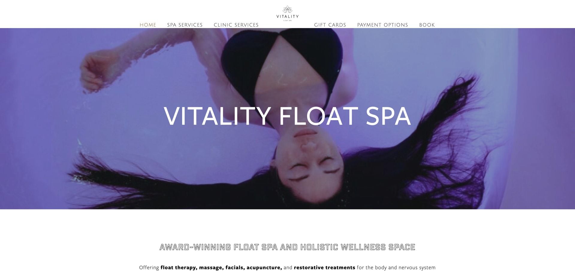
Vitality Float Spa uses a vivid purple treatment image above a concise Richmond introduction. The inspected navigation separates spa services from clinic services, while Pricing & Services, payment options and booking remain available. Popular-service links provide a shorter route through an otherwise extensive menu. The two-part facility context is useful, but the volume of categories and payment options makes the navigation busy. A visitor choosing a massage still needs to understand which part of the business conducts the appointment. This is an information-architecture observation, not a health-service endorsement.
What you can learn
When one brand includes separate facilities or service disciplines, make that distinction visible before booking. Offer a small set of common tasks without hiding the fuller treatment and price information.
Pros
Spa and clinic interests are explicitly separated.
Popular-service links shorten the route through a large menu.
Cons & considerations
Numerous categories and payment options crowd the navigation.
The appointment’s facility context needs to stay clear throughout the handoff.
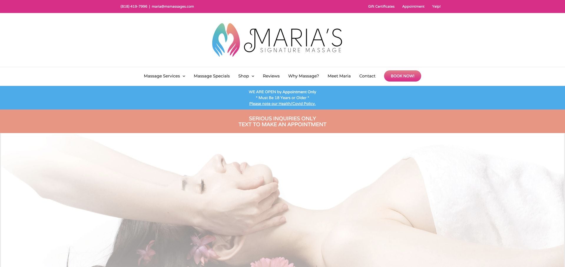
Maria’s Signature Massage names Glendale and gives direct personal contact information in the utility area. The inspected page explicitly asks visitors to text for appointments and states that visits are appointment-only. Meet Maria, services and contact routes support the personal practice model, while arrival information includes nearby parking. The page is busy with promotional strips, testimonials, product language and multiple appointment invitations. Those elements make it a useful contrast to quieter examples: clear contact instructions can coexist with a hierarchy that still needs simplification.
What you can learn
Use action labels that reflect the actual appointment process, including text-based requests. Keep useful arrival information, but reduce repeated promotions and distinguish operational instructions from broad treatment claims.
Pros
Text-based appointment instructions are explicit.
Address and parking information support the real visit.
Cons & considerations
Multiple promotional strips compete with the principal appointment instruction.
The long page mixes products, testimonials and service information.
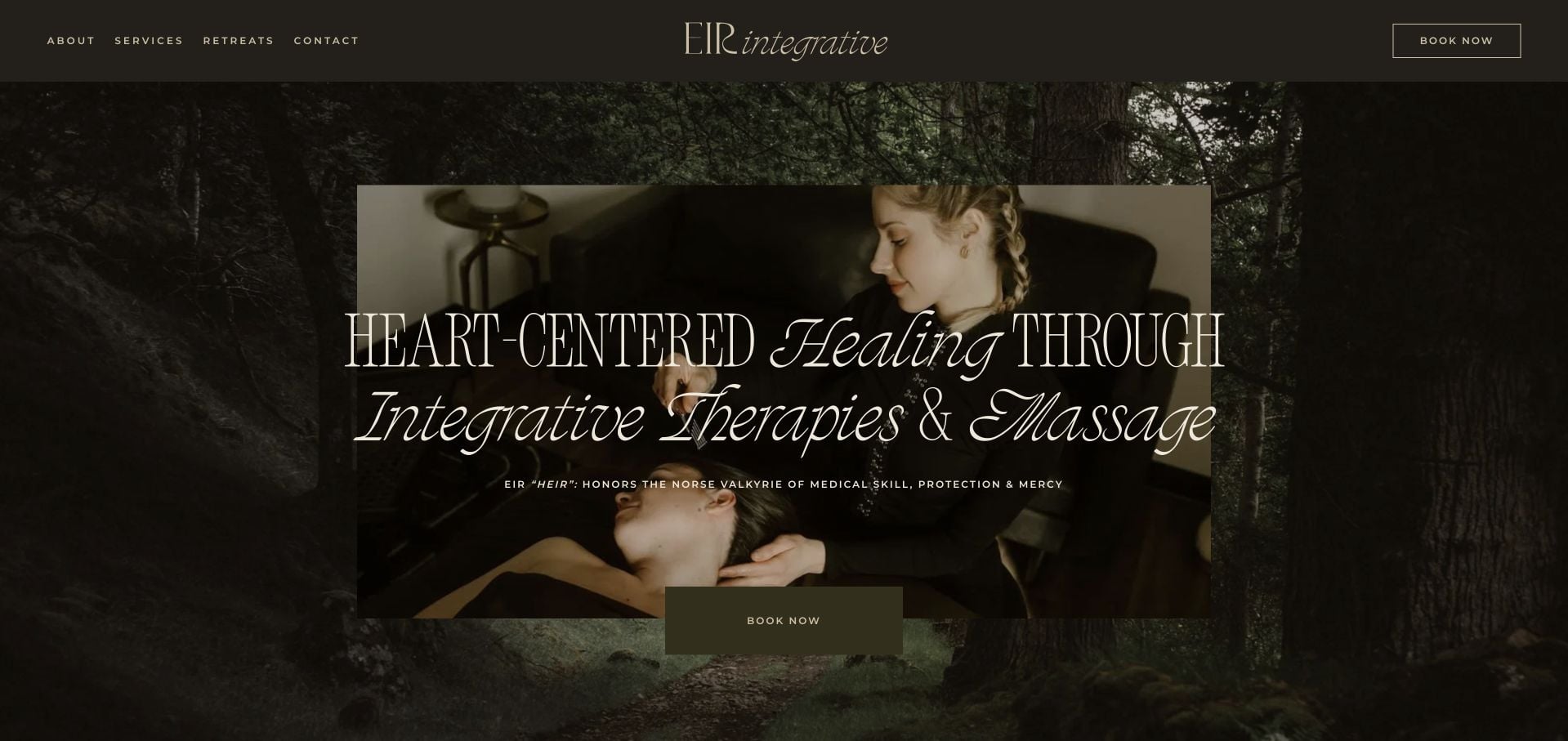
EIR Integrative uses dark olive surfaces, expressive serif typography and atmospheric treatment imagery. A short menu provides About, Services, Retreats and Contact, with Book Now kept separate. The inspected body introduces Elaina Wagner and distinguishes massage, spa, nutrition and yoga interests. The identity is specific rather than broadly clinical. It also relies heavily on abstract wellness language and long uppercase passages, which can make concrete appointment comparison harder. The useful lesson is about communicating a point of view without letting it replace clear service scope.
What you can learn
A strong personal philosophy should sit beside ordinary descriptions of what can be booked. Preserve readable paragraph treatment and a practical service menu so visitors do not have to infer the appointment from the mood or terminology.
Pros
The provider is introduced by name.
A short header separates the main service and retreat interests.
Cons & considerations
Abstract wellness language can obscure concrete appointment differences.
Long uppercase passages require more reading effort.
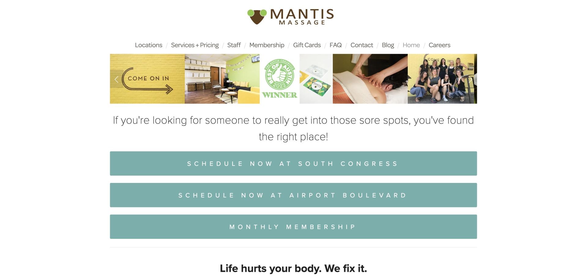
Mantis Massage puts separate South Congress and Airport Boulevard scheduling actions near the top, followed by a membership route. The visual system uses mint accents and a narrow image strip rather than a conventional luxury-spa opening. Its conversational copy explains the intended audience in everyday situations, while Staff, Services + Pricing and FAQs have clear labels. A very long set of customer stories extends the page. The design lesson is the early branch decision and distinctive voice, not an endorsement of the strong treatment-outcome claims in the body copy.
What you can learn
Put the relevant location choice before scheduling and keep service prices directly accessible. A conversational voice can be specific without requiring a long sequence of testimonials to explain the appointment model.
Pros
Separate scheduling actions distinguish the two branches.
Services + Pricing and Staff are literal, useful menu labels.
Cons & considerations
The extensive testimonial sequence makes the page lengthy.
Strong outcome language needs careful review rather than imitation.
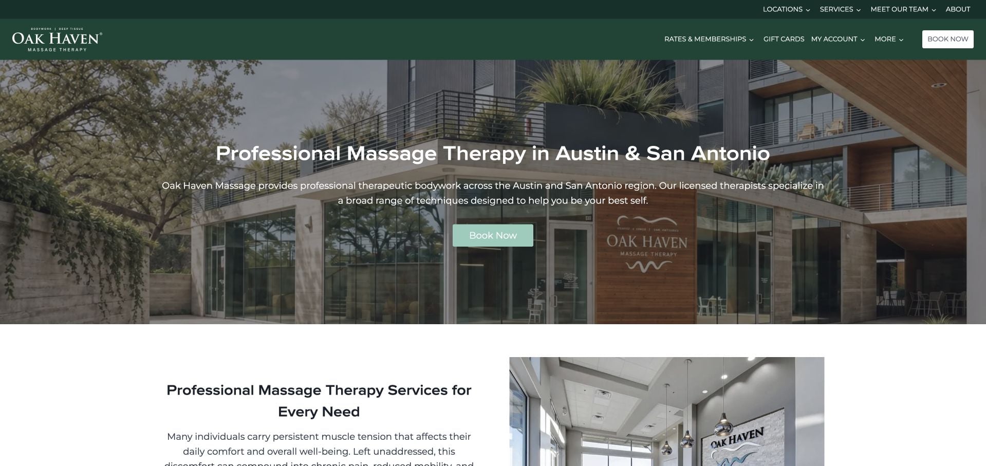
Oak Haven Massage names Austin and San Antonio in its opening and gives booking a consistent green-accented treatment. The inspected page distinguishes popular services from additional modalities, with a separate route to rates and memberships. A named-team destination and location directory support the wider regional model. The structure is useful, but several paragraphs repeat broad therapeutic positioning before reaching more concrete decisions. A large service catalog also requires careful plain-language explanations so first-time clients are not left to choose solely by technical appointment names.
What you can learn
Group a broad menu by common appointment decisions, then make local rates and providers easy to reach. Replace repeated general claims with information that changes which appointment or location a visitor should select.
Pros
The regional scope is explicit in the opening.
Rates, memberships, team and locations have dedicated navigation routes.
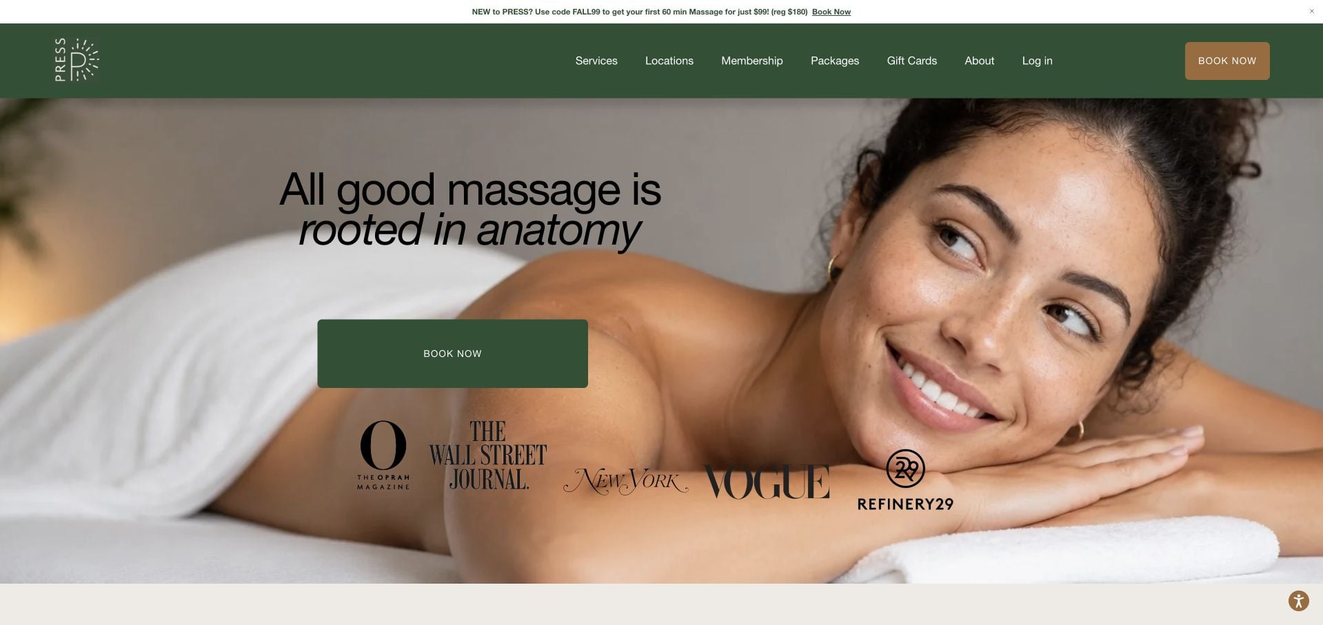
PRESS Modern Massage pairs a close treatment portrait with an anatomy-led introduction and a green appointment action. The inspected page gives its first-visit offer clear conditions, then shows service cards with durations and prices. Membership is treated as a separate choice, and HSA/FSA language is qualified rather than presented as universal coverage. Location links preserve the multi-studio context. Several promotional and payment interests appear on the same page, so maintaining the hierarchy matters as much as adding detailed information. The review does not independently assess treatment-effectiveness claims.
What you can learn
Show duration and price directly on service cards, and put introductory-offer conditions beside the offer. Treat eligibility-based payment information as something to confirm, not a promise that applies to every visitor.
Pros
Service cards combine treatment, duration and price.
The introductory promotion includes its redemption conditions.
Cons & considerations
Offers, membership and payment messaging compete for attention.
The multi-location booking handoff still needs clear branch context.
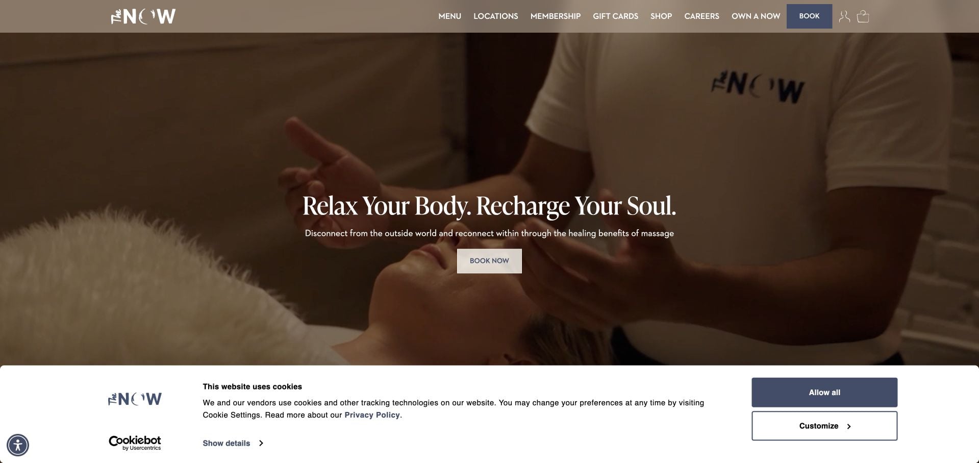
The NOW Massage uses warm treatment imagery and a calm neutral palette beneath a compact menu. The inspected page distinguishes core massages from optional enhancements, then explains membership frequency, session length and credit handling. This is useful for seeing how a branded appointment system can be unpacked into more concrete choices. Locations and Book remain accessible, but shopping, franchise and career interests add competing audiences. Some branded service names need ordinary explanations, and the privacy panel occupies part of the initial view.
What you can learn
Explain the base appointment before the add-ons and membership program. Keep duration and credit rules readable, and ensure that a local booking route stays distinct from franchise, career and product-shopping interests.
Pros
Core appointments and enhancements are separated.
Membership explanations include session length and credit context.
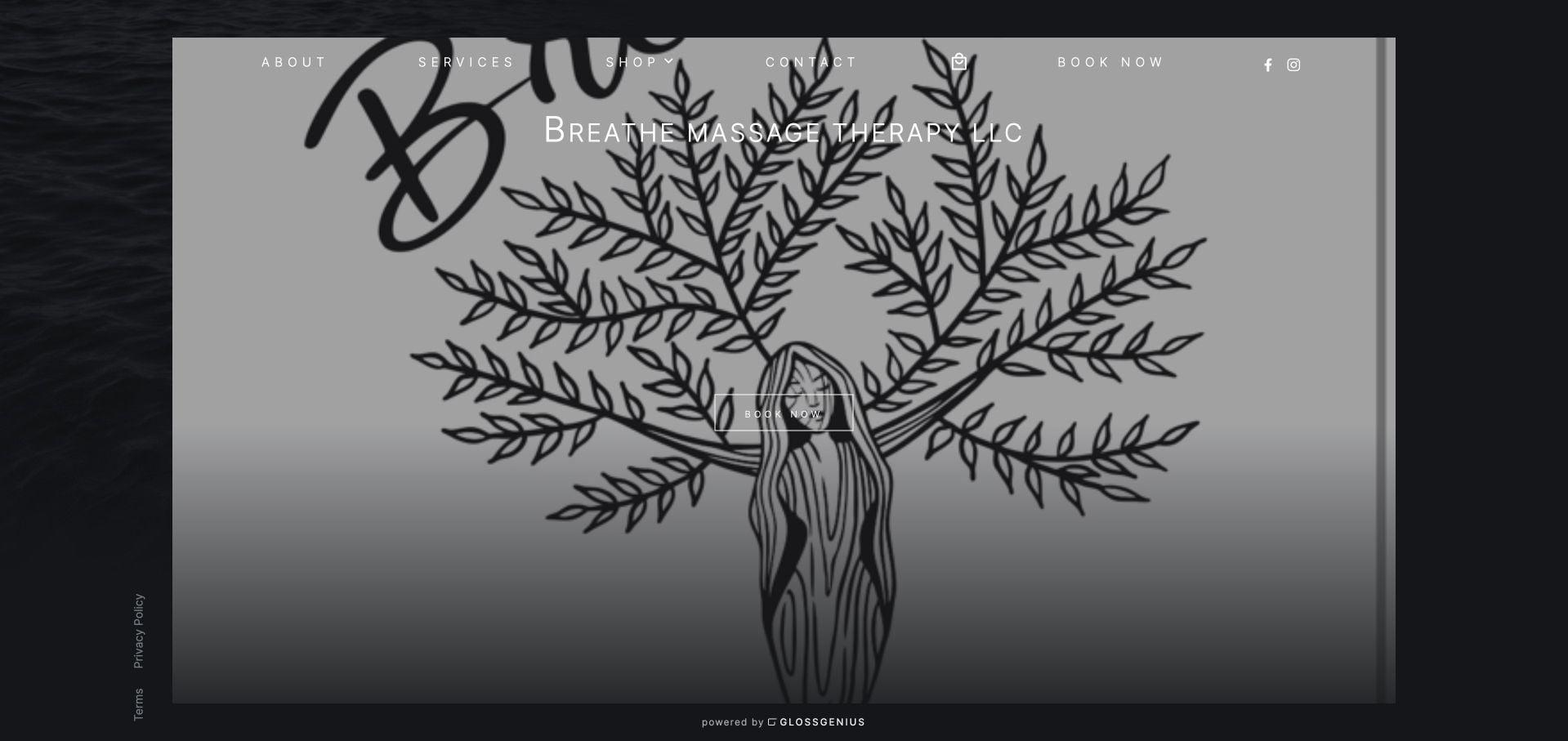
Breathe Massage Therapy uses a GlossGenius-hosted page with a large botanical brand illustration and a prominent Book Now action. About, Services, Shop and Contact form a compact navigation, giving the small site a recognizable operating structure without a long marketing homepage. It is useful as a baseline for a practice that needs a working public appointment presence. The sparse introduction offers little local or service context on its own, and the shared platform layout gives less room for a distinctive educational or editorial journey.
What you can learn
Even a minimal hosted appointment page benefits from the practice’s own imagery and clear service navigation. Add enough location and provider context that the booking button is not the only meaningful information on the first visit.
Pros
The appointment action is prominent within a short navigation.
The botanical mark supplies a specific visual identity.
Cons & considerations
The first page provides little detailed service or location context.
The shared hosted layout limits a more bespoke editorial introduction.
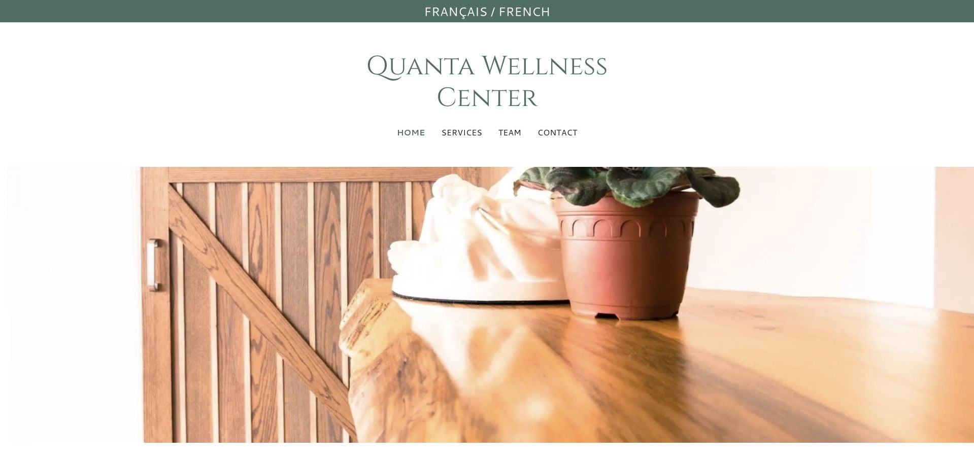
Quanta Wellness Center exposes a French-language route at the top of an otherwise English introduction. A quiet interior photograph and short header lead toward Services, Team and Contact. The inspected body explains the Pointe-Claire practice, then repeats those two principal discovery tasks: what the business offers and who works there. Policies and contact details complete the operational layer. The visual restraint is useful, but the large introductory spacing and general language delay a concrete appointment comparison, and the privacy notice adds another substantial block to the page.
What you can learn
Make language choice visible before the visitor commits to reading. For a team practice, keep service discovery and practitioner discovery distinct, then connect them clearly before the appointment request.
Pros
The alternate-language route is easy to identify.
Services and Team are separate, plain-language destinations.
Cons & considerations
General introductory copy delays detailed appointment choices.
Large spacing and the privacy notice extend the practical reading journey.
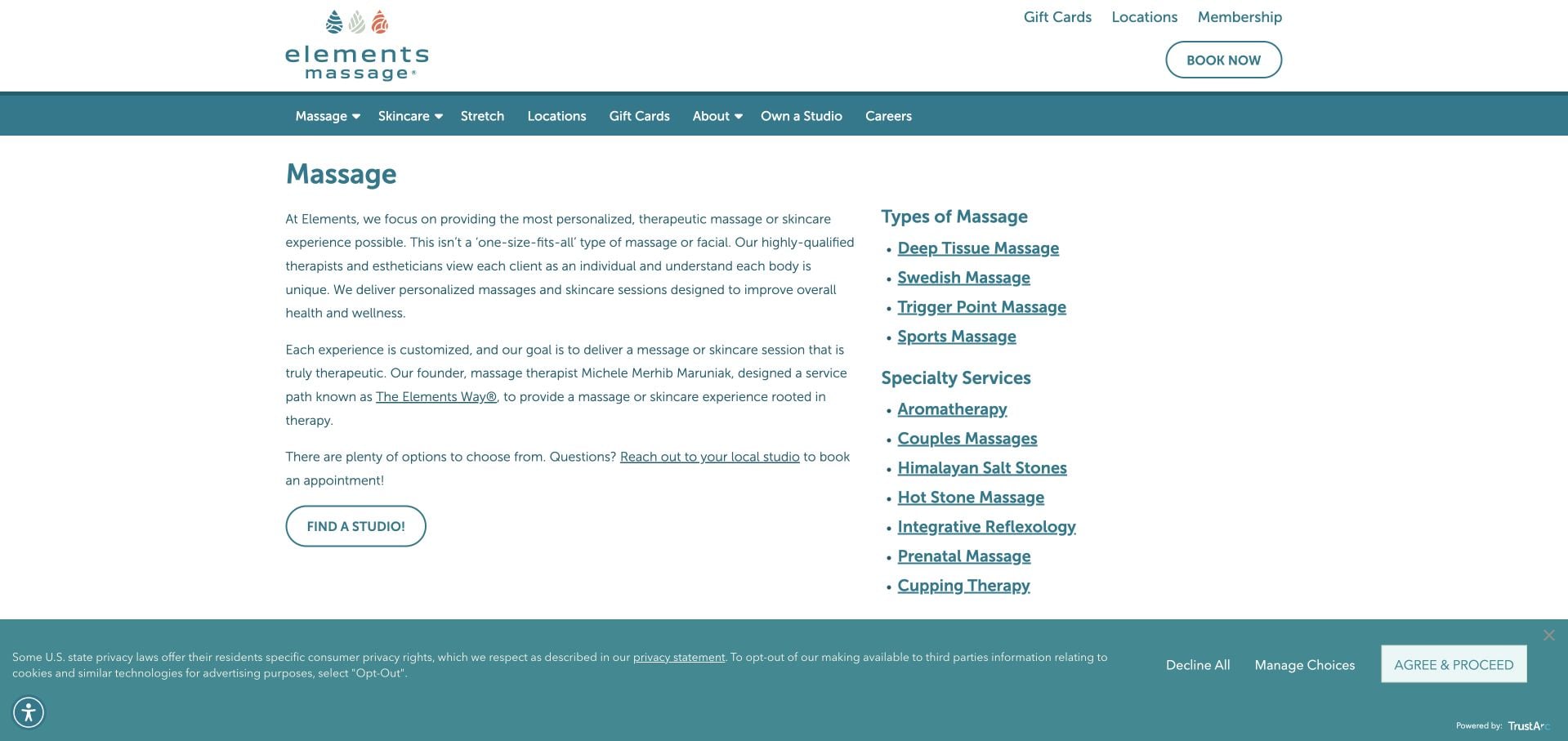
Elements Massage’s reviewed massage page is a service index, not the corporate homepage. It combines a concise introductory explanation with links to core massage types and a separate list of specialty services. A Find a Studio action correctly acknowledges that actual appointment availability and rates are local decisions. The plain structure makes the taxonomy easy to inspect. Its main limitation is the reliance on additional pages for detailed comparison: many visitors will still need help choosing between similarly described techniques before they can select a studio and time.
What you can learn
Use a service index to organize a broad offer, but keep the local appointment handoff explicit. Do not imply that national descriptions establish every branch’s rates, service availability or session details.
Pros
Core and specialty service categories are visibly separated.
Find a Studio preserves the local context of the appointment.
Cons & considerations
Visitors must open further pages to compare the options in detail.
The large taxonomy may be unfamiliar to a first-time client.
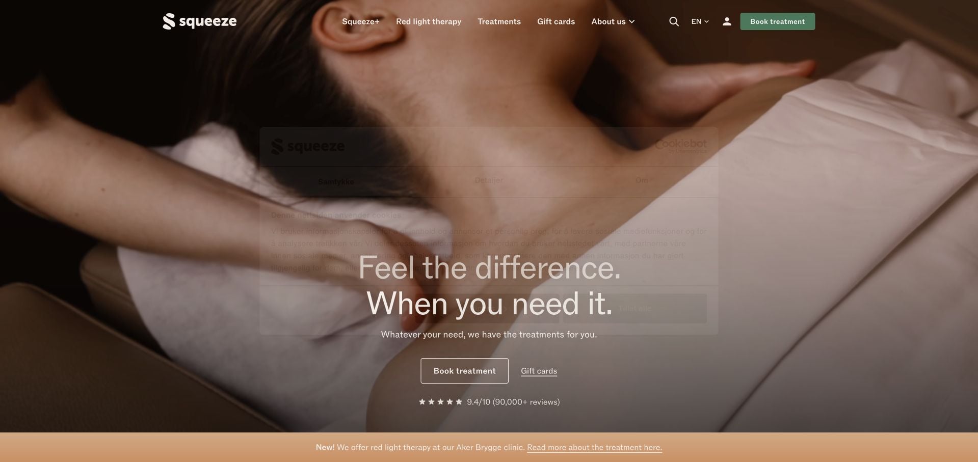
Squeeze Norway’s English page pairs a warm treatment photograph with separate appointment and gift actions. The inspected service cards provide recognizable body-area and session-length distinctions, followed by starting prices. Its subscription section explains flexibility, unused minutes and cancellation rather than presenting a monthly price in isolation. The detailed FAQs are useful operational content. The first view also includes a substantial Norwegian privacy panel, and the membership material is extensive enough to compete with the ordinary single appointment. This example is the Norwegian business, not the unrelated US brand of a similar name.
What you can learn
If a subscription changes cancellation, credit or pricing rules, explain those differences together. Preserve an obvious single-appointment path so visitors are not forced to understand membership before they can make a first booking.
Pros
Service cards pair duration and starting-price context.
Subscription rules explain flexibility and unused appointment minutes.
Cons & considerations
The privacy interface does not match the English content language.
Extensive membership content can overshadow an ordinary first booking.
Kegan is a freelance web designer and developer with 15+ years of experience helping businesses turn complicated website requirements into clear, maintainable digital experiences. He works directly with clients from planning and design through development, launch, and ongoing support.
For massage therapy website design, his development approach focuses on plain-language service scope, practitioner introductions, accurate fees and arrival information, and careful appointment-system handoffs. The scope can be a targeted improvement or a complete custom build, with responsive layouts, thoughtful content structure, and integrations chosen around the people using and maintaining the site.
Show 3 other massage therapy website designersHide other massage therapy website designers
Agree the service names, session lengths and price basis with the people providing the appointments. Clarify whether a listed duration includes conversation or changing time. Provide a route to discuss questions rather than building a website quiz that implies a diagnosis.
Map locations and service formats
List fixed studios, shared premises and mobile coverage separately. Keep practitioner availability and booking destinations attached to the relevant place. If a location changes temporarily, publish the new address, affected dates and the relationship to the usual studio.
Separate commercial offers from ordinary booking
Memberships, packages and gift vouchers can introduce different payment and redemption arrangements. Explain their inclusions and limits before purchase. A visitor should understand whether a transaction buys credit, a series of sessions or an actual reserved appointment.
The editing job behind the design
Use scheduling tools with clear boundaries
Keep service explanations, team introductions and location information readable without entering an account or completing intake. Use a structured content system so prices and temporary-location notices can be updated consistently. Treat accessibility, readable type and straightforward navigation as part of communicating a calm, understandable visit.
Choose an appointment workflow that separates public inquiries from private intake and reflects the business’s real staffing and locations. Explain external handoffs and provide an appropriate contact alternative. Published technology labels should reflect visible evidence only; a linked scheduler is not proof of the complete implementation stack.
Our WordPress website examples offer a separate look at publishing approaches. A visible platform label is evidence for that named page, not a guarantee that the same system will suit your requirements.
Before the public launch
Massage website planning checklist
Explain service formats without outcome guarantees.
Publish session lengths and price context.
Clarify what appointment time includes.
Introduce actual practitioners.
Attach practitioners to locations and services.
Distinguish studio, clinic and mobile visits.
Keep temporary-address notices prominent.
Provide first-visit and appointment-change guidance.
Separate voucher purchase from appointment reservation.
Use an appropriate private route for intake information.
These checks are a project checklist, not a performance, legal, security, or accessibility certification. Test real journeys with the people responsible for the website before making claims about the result.
Sources & editorial method
How this collection was selected and reviewed
These 30 examples match the collection count saved before research. The editorial team directly inspected the public company pages and recorded source URLs, visible text and screenshot provenance in the supporting capture manifest. Direct browser captures are individually dated; the collection may also reuse an existing direct capture of the same primary property without changing its original capture date. The guide-level narrative was prepared from that inspected evidence. Reviews describe website design, service information and navigation, not professional competence, safety, treatment effectiveness, availability or promised outcomes. Business claims, testimonials and badges are not independent verification. Public technology labels require source evidence; unknown stacks remain unlisted. No appointments, purchases, inquiries or private intake forms were completed for this review. Parked, blocked, empty and unrelated pages were excluded. Website imagery and trademarks belong to their respective owners.
Each example links to its actual source page. Screenshots are direct browser captures with their own capture dates; moving imagery, announcements and live designs can change. The notes describe observable design choices and conditional tradeoffs, not measured traffic, conversion results, service quality, or accessibility conformance.
Technology labels use public page metadata, asset evidence, or explicitly cited platform documentation. Platform documentation is not a complete current deployment audit. A component reference may be legacy or unused; it is not a complete backend inventory. Unknown stacks are omitted. These sites are editorial examples, not our client portfolio.
Written, Edited and Curated are separate editorial records, not timestamps advanced by a rebuild. Website designs and imagery belong to their owners. See our editorial standards or suggest a correction.
Questions worth asking
Massage Therapy website design questions
How should a site help visitors choose a massage?
Explain the business’s service categories, session formats and practical differences. Provide a direct route for questions when the visitor is uncertain. The website should not diagnose a condition or promise that a named treatment will be suitable or effective.
Should practitioner qualifications appear on the site?
Relevant, current professional information can help explain who provides the appointment. Present it accurately and in context, without implying that a title alone proves a specific outcome. This collection does not independently verify professional credentials.
What should a temporary studio move communicate?
Identify the affected studio, temporary address, relevant dates and the correct booking route. Repeat the location context where someone is likely to act, and retire the notice when it no longer applies.
Can gifts and memberships share the booking button?
They should be distinguishable. Explain whether someone is buying credit or reserving time, how redemption works and which published conditions apply. Keep ordinary appointment selection accessible without requiring a membership purchase.
A thoughtful massage website makes the appointment understandable while leaving questions of personal suitability and professional advice to the appropriate conversation.