A useful bus website helps a passenger choose a journey, find the right stop and recover an existing ticket. These sixteen examples show how coach brands and local bus networks organize those decisions.
Bus websites serve different travel situations. An intercity passenger may need a dated seat reservation; a commuter may need the next departure and a local fare; an airport traveler may first need the correct terminal. A charter customer has a different inquiry entirely. Start by identifying those situations before borrowing the appearance of a booking form.
This collection reviews sixteen distinct public website properties using direct browser captures and specific observations. It includes individual carrier brands, local networks and a network booking portal. Related brands may share interface patterns, but each property is assessed in its own passenger context. The reviews do not establish service quality, fare availability, operating ownership or successful checkout.
Before the examples
What makes good bus company website design in 2026?
Make the boarding point unambiguous
A city name is rarely enough. Explain the stop, terminal, landmark or station that a passenger must reach. Keep that location visible as the journey moves from search to ticket and day-of-travel help.
Support passengers after purchase
Give booking retrieval, changes, tracking and service updates recognizable entry points. A passenger standing at a stop should not need to begin another ticket search to find help.
Explain which product is being sold
Separate reserved seats, local tickets, travel passes, airport transfers and charters. Show the conditions that materially change the decision, including route scope, validity, eligibility and assistance arrangements.
Keep essential tasks available
Promotions, cookies and app invitations can obscure a well-designed interface. Preserve access to journey planning and support, and make optional offers easy to dismiss without completing a form.
The collection · 16 examples
16 bus company websites worth studying
The examples below compare observed page structure, passenger labels and visible task entry points. Use them to identify an appropriate pattern for your own service, then validate it against actual routes, ticket rules and support needs.
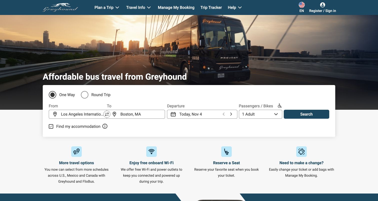
Greyhound places a wide white booking card against a photograph of its coach, then follows it with four compact benefit explanations. The card makes trip type, origin, destination, date and passenger choices visible together. Manage My Booking and Trip Tracker remain in the header, so someone with an existing ticket has a route that does not begin with another search. The following benefits explain seat reservations and changing a ticket, which address practical uncertainties as well as selling the journey. The page also acknowledges schedules shared with FlixBus; this is a branded passenger entry point, not evidence of an entirely separate operating or reservation system.
What you can learn
Keep ticket discovery and ticket recovery equally recognizable. Explain the next useful action for an existing passenger, and make any optional accommodation offer visibly separate from the bus search so the main task stays understandable.
Pros
The form and existing-booking links serve different stages of travel.
Short benefit blocks connect amenities with concrete passenger tasks.
Cons & considerations
The prechecked accommodation option adds a separate commercial decision to a bus search.
Compact fields can truncate long boarding-point names, increasing the need for a clear selected-location summary.
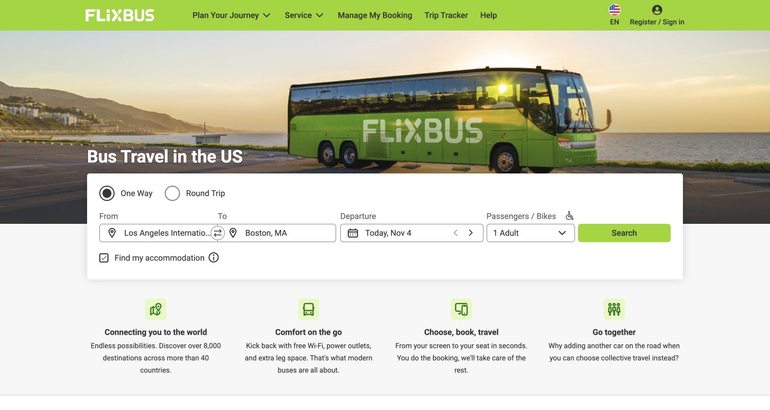
FlixBus uses a bright green header and coach photograph around a compact, familiar route-search layout. Its first benefit row broadens the story from booking to network reach, onboard comfort and traveling together. Below, an app section connects digital tickets with live tracking. The homepage is a useful example of maintaining a recognizable search structure while presenting a particular brand and market. Its content explicitly discusses integration with Greyhound, and the two reviewed homepages share strong interface similarities. Designers should study that consistency as a passenger convenience without mistaking it for proof that the brands have identical fares, services or operating arrangements on every route.
What you can learn
Build a reusable search pattern whose regional labels, passenger rules and help links remain explicit. Preserve the current market and language through the journey, and distinguish promotional network totals from the actual services available for a selected trip.
Pros
The green search action is visually connected to the brand.
The app promotion explains ticket and tracking use rather than offering only a download badge.
Cons & considerations
A global network message can be less useful than immediate local boarding information.
The accommodation checkbox introduces an additional product before route results appear.
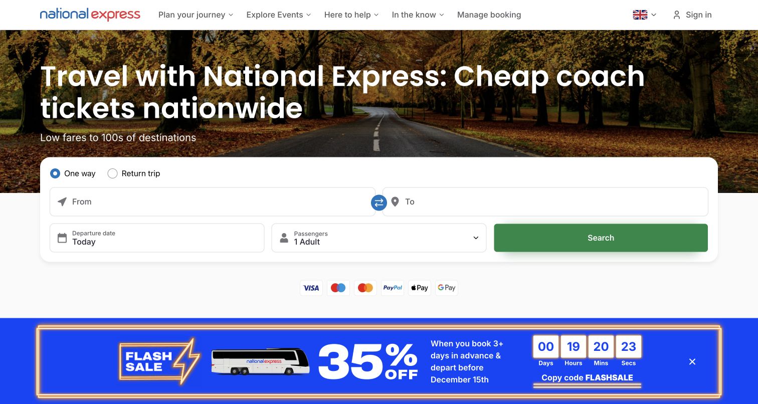
National Express uses a large two-row booking panel beneath an autumn-road hero. Origin and destination receive generous horizontal space, while departure date, passengers and search occupy a separate row. This gives the primary task room to breathe even when the page is promoting a sale. Farther down, named shortcuts lead to stop finding, timetables, booking management and coach tracking. Airport and event content then provides additional ways into the network. During review, cookie and promotional overlays appeared before the clear page could be captured. Those interruptions illustrate a real tradeoff: a strong underlying booking hierarchy can still be delayed by layered campaign presentation.
What you can learn
Protect the route-search area from repeated interruptions. Keep service shortcuts available after a campaign changes, and present fare conditions near the promotion so a low-price message does not replace the information needed to plan an actual journey.
Pros
The search fields have a clear hierarchy and ample visible space.
Stop finding, timetables and tracking are named as separate tasks.
Cons & considerations
Stacked consent and promotional overlays interrupted the initial visit.
A countdown campaign competes strongly with calmer planning and support content.
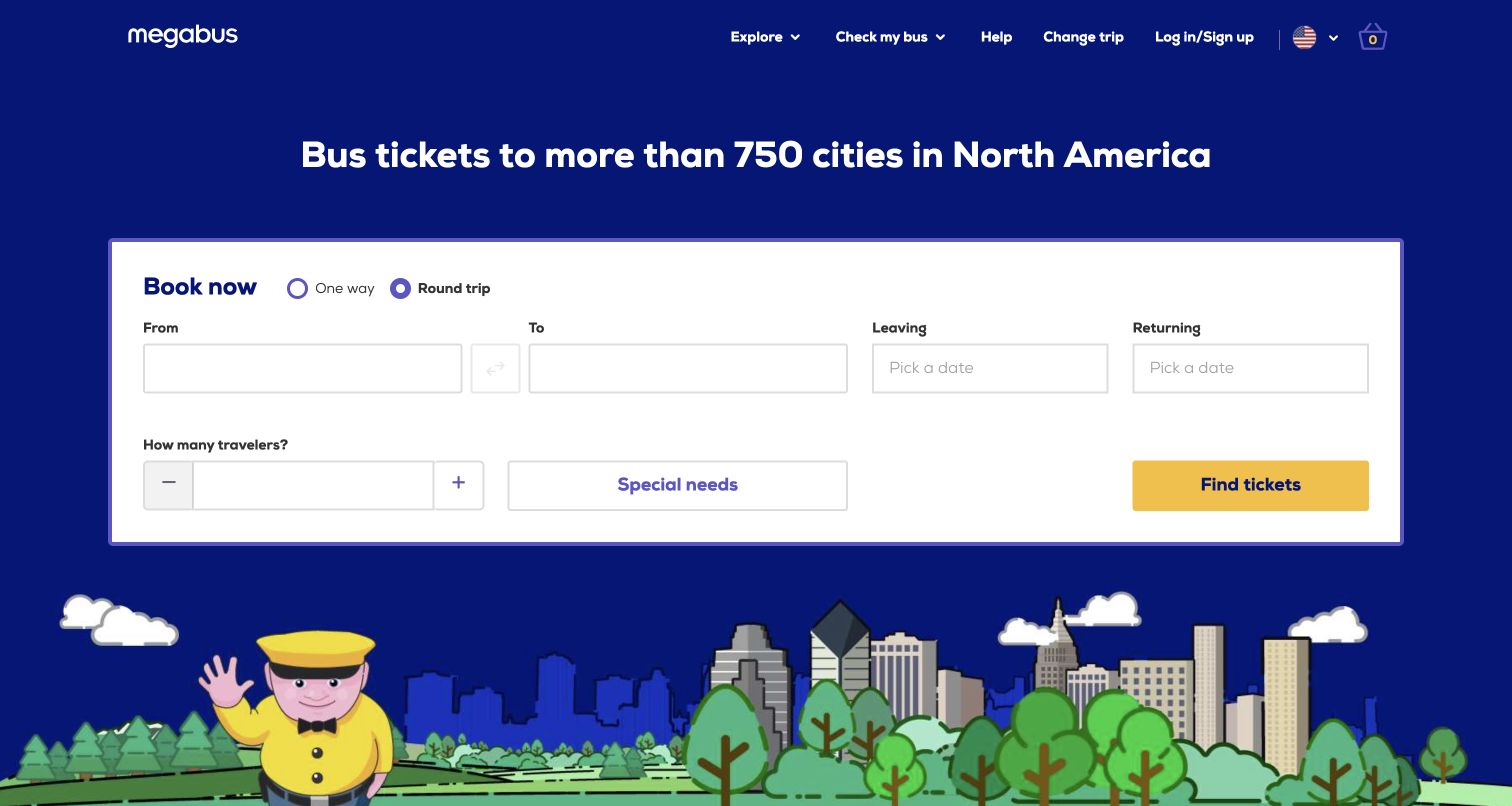
Megabus makes a large white booking form the dominant object on a blue illustrated background. One-way and round-trip choices sit above origin, destination, dates and traveler controls, with a yellow ticket-search button supplying the strongest action color. The form also exposes a Special needs control rather than relegating that topic entirely to the footer. Across the header, Check my bus and Change trip address needs after purchase. The playful skyline and driver illustration add a recognizable tone without requiring a photographic hero. This is useful for a brand whose immediate digital job is helping a traveler assemble a route inquiry before reading destination marketing.
What you can learn
Treat the booking form as the main piece of content and give every optional path a descriptive label. Assistance choices should explain what information is needed and how requests are handled before a traveler commits to a ticket.
Pros
The high-contrast form remains the clear visual starting point.
Existing-trip changes and bus checking have visible header entries.
Cons & considerations
Several equal-sized inputs require a careful mobile reading order.
The broad Special needs label would benefit from precise explanations in the next step.
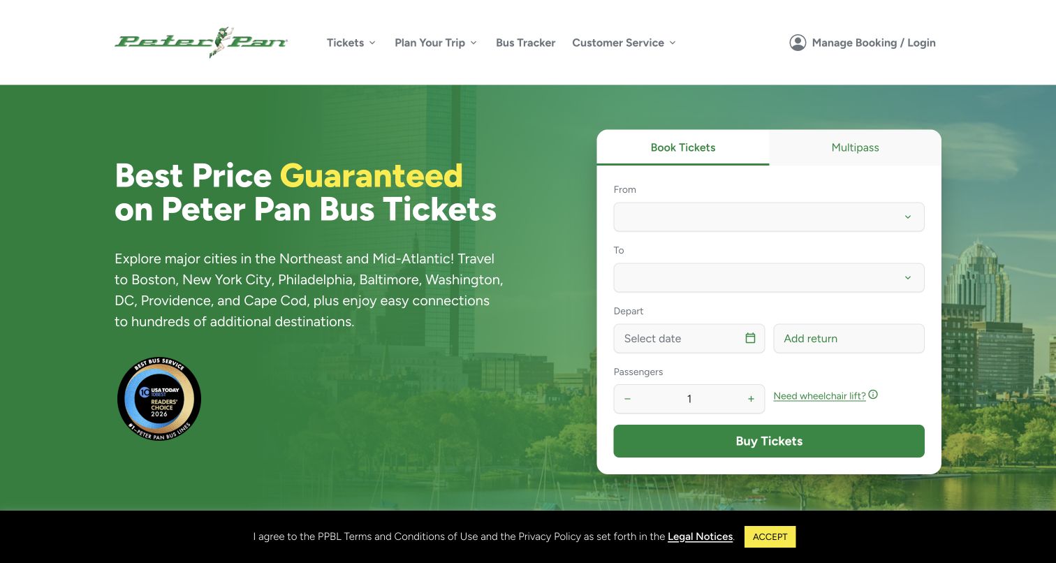
Peter Pan pairs a green regional-travel message with a tall white booking card. Book Tickets and Multipass appear as separate tabs, making a repeat-travel product visible without blending it into the ordinary date-and-passenger fields. A wheelchair-lift question appears within the booking area, and the header includes Bus Tracker and Manage Booking. Lower on the page, a network-map and stop-search section helps connect the brand promise to actual places. A bottom notice referencing terms of use and privacy remained visible during observation; no agreement was accepted. The useful design pattern is the proximity of regional coverage, ticket products and assistance questions, rather than any claim about completing a purchase.
What you can learn
Show the region served in plain language, then separate single journeys from repeated-travel products. Place boarding-access questions where they can affect the itinerary, with a clear explanation of availability and any advance arrangements.
Pros
The booking card distinguishes ordinary tickets from Multipass.
Wheelchair-lift information is introduced beside the journey controls.
Cons & considerations
The tall form needs careful stacking to avoid excessive scrolling on smaller screens.
A persistent legal notice competes with the lower part of the opening view.
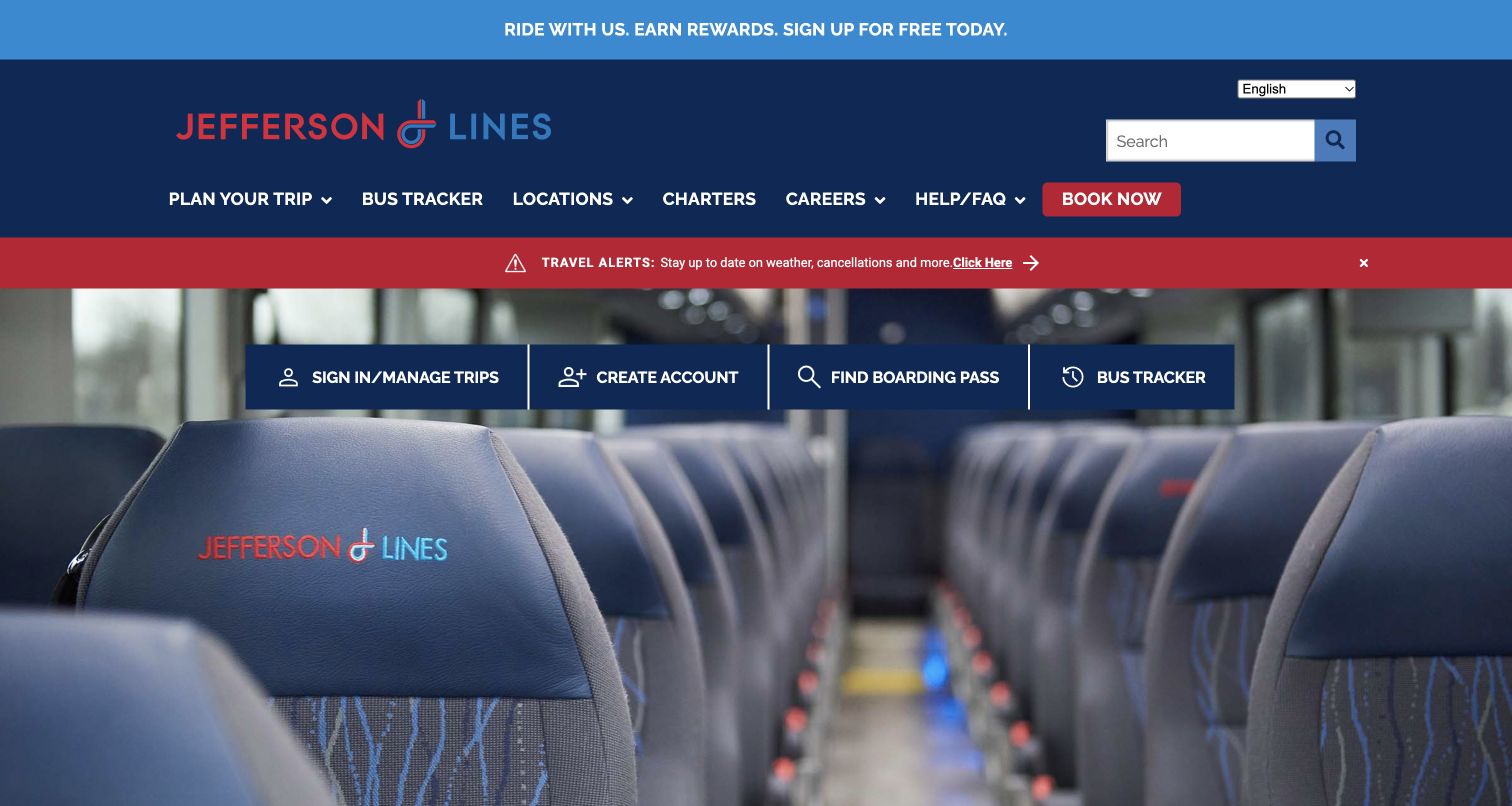
Jefferson Lines opens with a coach-interior photograph and a prominent row for signing in, creating an account, finding a boarding pass and tracking a bus. Above that, a red travel-alert strip calls attention to weather and cancellations, while the header retains a red Book Now action. This arrangement gives unusually strong visibility to the practical needs of someone who has already arranged travel. The following modules cover bus stops, alerts and trip planning. In the captured first view, the interior image and account-related shortcuts occupy most of the screen rather than a fully visible route form, so the page is especially instructive as a service-navigation example.
What you can learn
A passenger website should support the moment before boarding as deliberately as the moment before purchase. Give boarding-pass retrieval and tracking plain names, and reserve a consistent alert position that operational teams can update quickly.
Pros
Finding a boarding pass has its own plainly labeled shortcut.
The travel-alert strip stands apart from the main navigation.
Cons & considerations
Account creation receives similar prominence to urgent passenger tasks.
The large interior photograph pushes other planning information beyond the first screen.
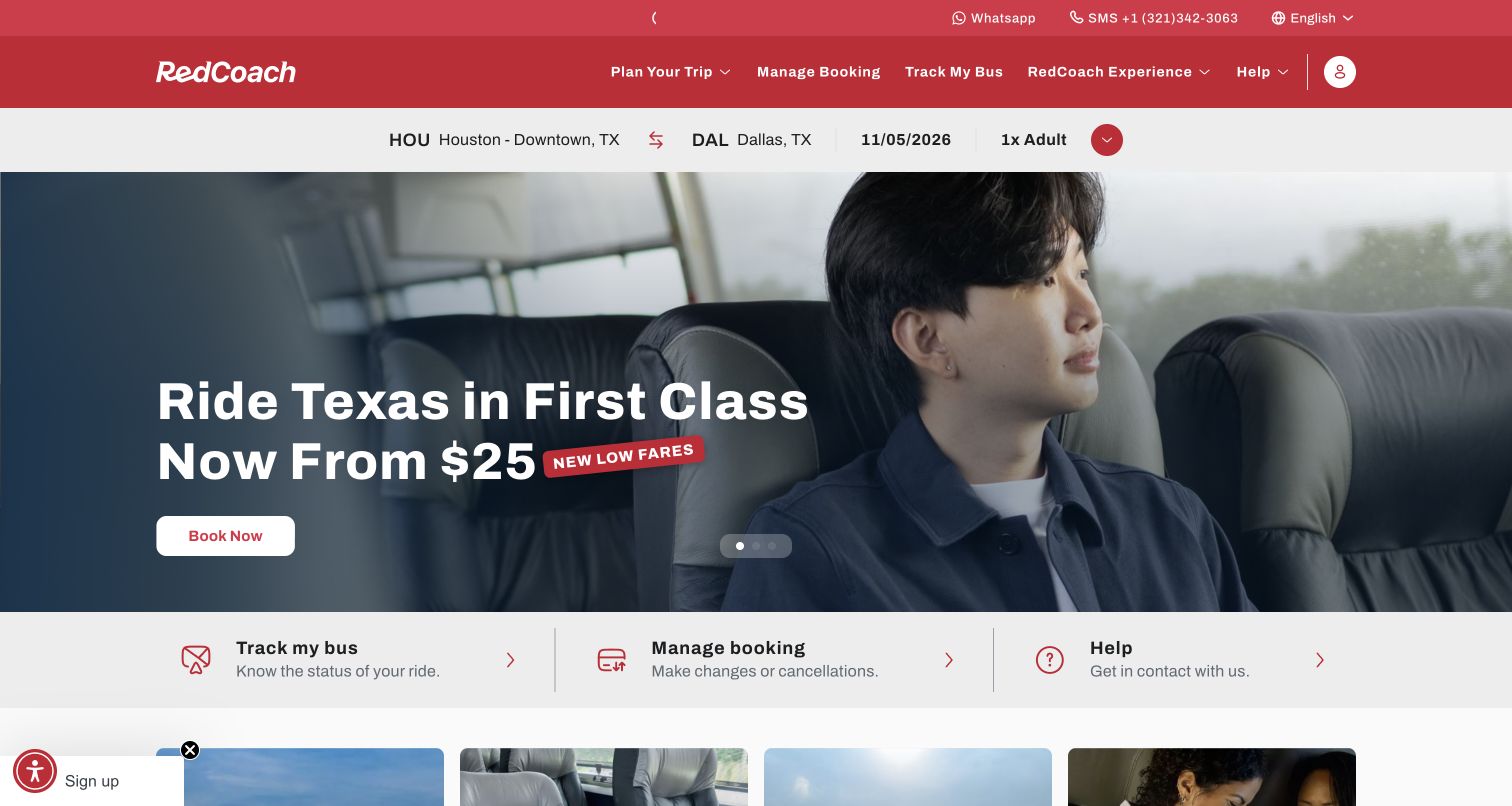
RedCoach uses passenger photography and a first-class travel message to make comfort part of the opening proposition. A compact itinerary strip sits below the red navigation, and three service links immediately beneath the hero lead to tracking, booking management and help. Additional cards explain routes, the onboard experience, discounts and loyalty. The page therefore combines a premium travel story with a short path back to an existing trip. An email-signup overlay appeared during the visit and was dismissed without submitting information. That observation matters to the design review because the promotion temporarily covered both the itinerary context and the central comfort message.
What you can learn
Use photography to demonstrate the experience being sold, but keep itinerary context readable and editable. Let returning travelers reach tracking or changes directly, and delay optional marketing invitations until they no longer obstruct essential travel decisions.
Pros
Tracking, booking changes and help form a concise service row.
The visual focus on passengers supports the comfort proposition.
Cons & considerations
The signup overlay interrupted the first visit.
Abbreviated city codes in the itinerary strip depend on accompanying full place names for clarity.
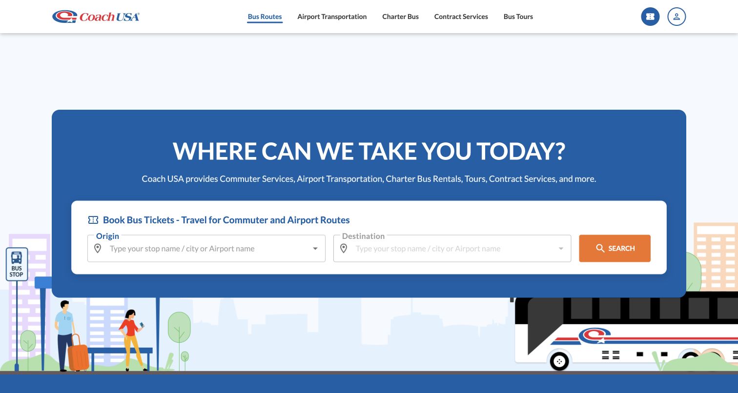
Coach USA introduces its range of services in a blue panel and limits the initial booking form to origin and destination. The destination remains unavailable until an origin is chosen, making the dependency visible before a search can begin. The header separates airport transportation, charter bus, contract services and tours, while the main page develops airport links and other service cards below. An illustrated bus-stop scene supplies context without overwhelming the form. This is a useful reference for a transport business that sells both scheduled seats and services requiring a different inquiry process. The page's strength is the distinction between those service categories, not a single generic booking button applied to everything.
What you can learn
Separate scheduled tickets from charter and contract inquiries early. If a destination field depends on the origin, explain that dependency in text and ensure the next available choices are easy to understand with a keyboard or screen reader.
Pros
Service categories describe materially different customer needs.
The simple opening search avoids asking for every detail at once.
Cons & considerations
The disabled destination control needs an explicit instruction when encountered alone.
The broad range of services can dilute the main task unless labels remain specific.
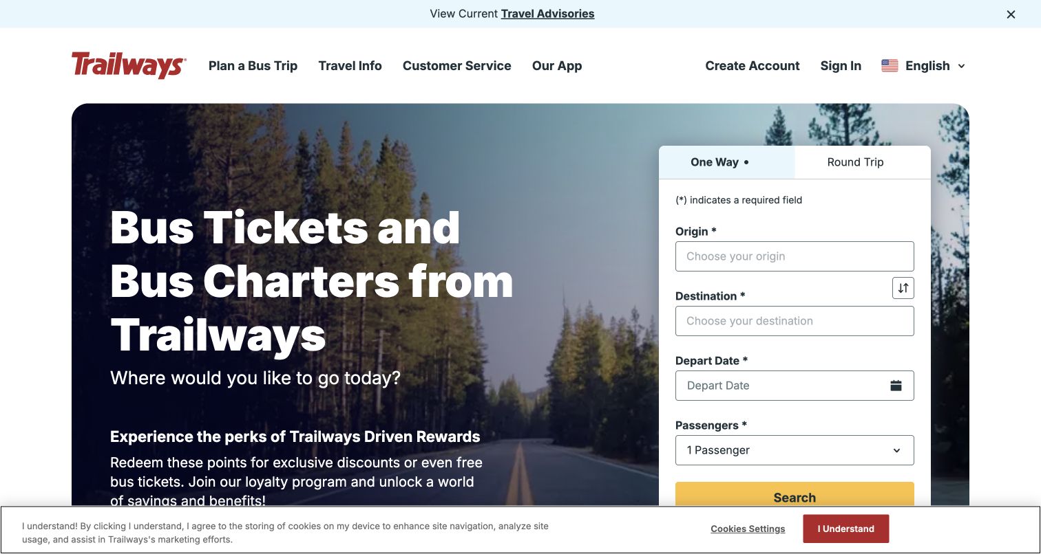
Trailways places a tall booking form beside a road-through-the-forest photograph and a large ticket-and-charter heading. Required origin, destination, departure date and passenger fields are plainly labeled, with one-way and round-trip choices above them. The captured page also identifies multiple providers in its network content and offers boarding-pass retrieval, bus tracking and charter links. That provider context is essential when reviewing this website: it represents a passenger portal across a network, not a promise that every displayed service uses one fleet or one set of conditions. The loyalty message occupies substantial hero space, sharing attention with the immediate search task.
What you can learn
When tickets can involve different operators, explain the actual provider before purchase and keep its boarding, baggage and assistance rules connected to the selected journey. Preserve easy retrieval of the boarding pass after the sale.
Pros
Required fields and trip type are visible in the opening form.
The page openly names network providers instead of implying a uniform fleet.
Cons & considerations
Loyalty messaging takes space beside the primary journey task.
A partner network requires careful presentation of operator-specific conditions in later steps.
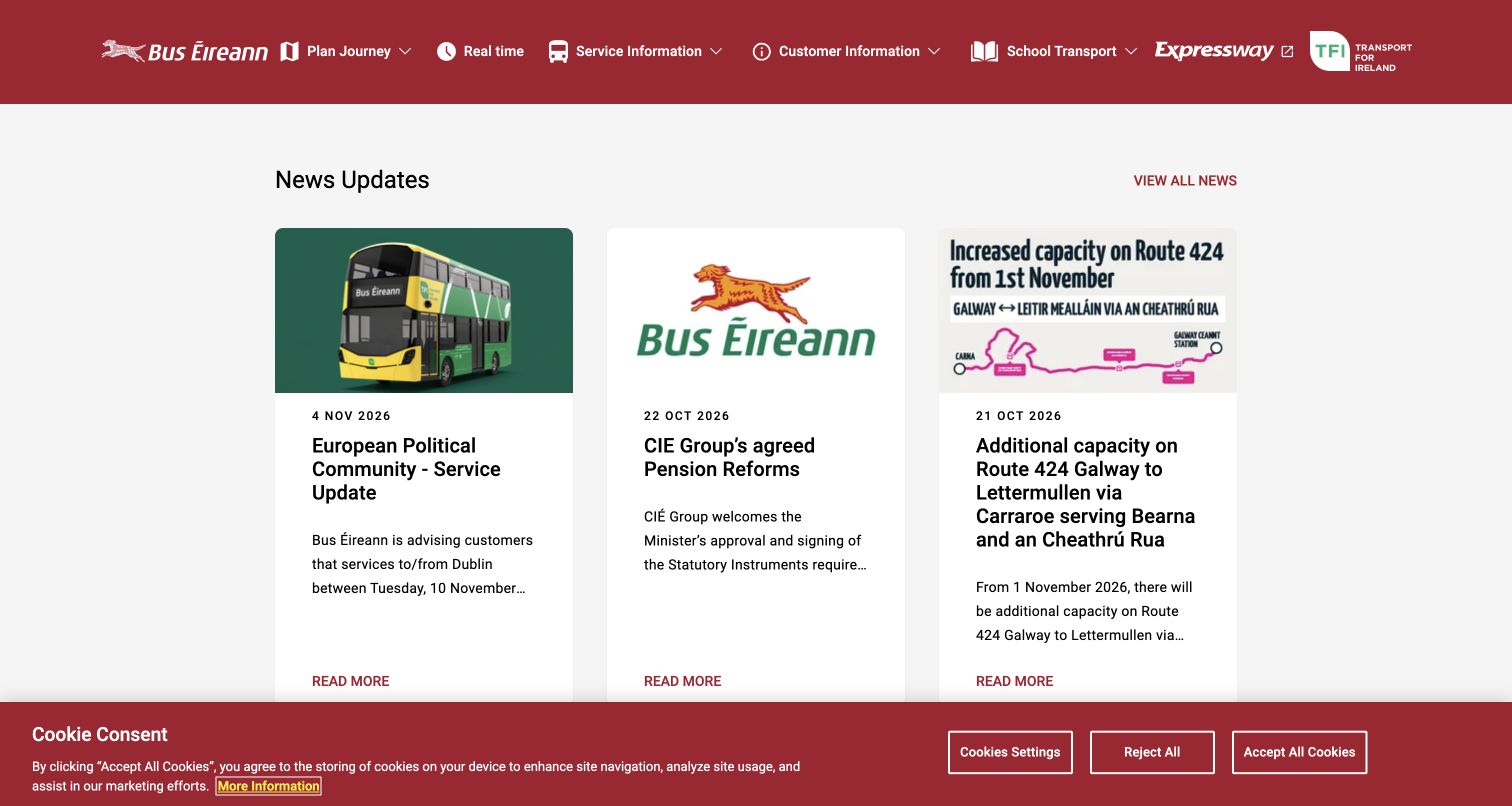
Bus Éireann's reviewed homepage begins with dated news cards beneath a concise red navigation bar. The cards mix a service-impact announcement, organizational news and a route-capacity update. Below, service updates identify affected route numbers, followed by routes and timetables, real-time information and city-service collections. The navigation distinguishes school transport and the Expressway passenger service, reflecting different audiences and products. This is a valuable counterpoint to the large booking heroes elsewhere in the collection: the homepage functions as an information hub for an operating network. Its limitation is that corporate news can share prime space with more immediate passenger needs.
What you can learn
Build service information around affected routes, dates and a next action. Give urgent passenger notices a stronger hierarchy than organizational news, and explain when a ticketing or service link moves to a related brand or separate system.
Pros
Dated updates make the freshness of published information visible.
Timetables, real-time information and school transport have distinct entry points.
Cons & considerations
Corporate news shares the first content row with service changes.
Route-number lists need a concise description of the impact to be useful at a glance.
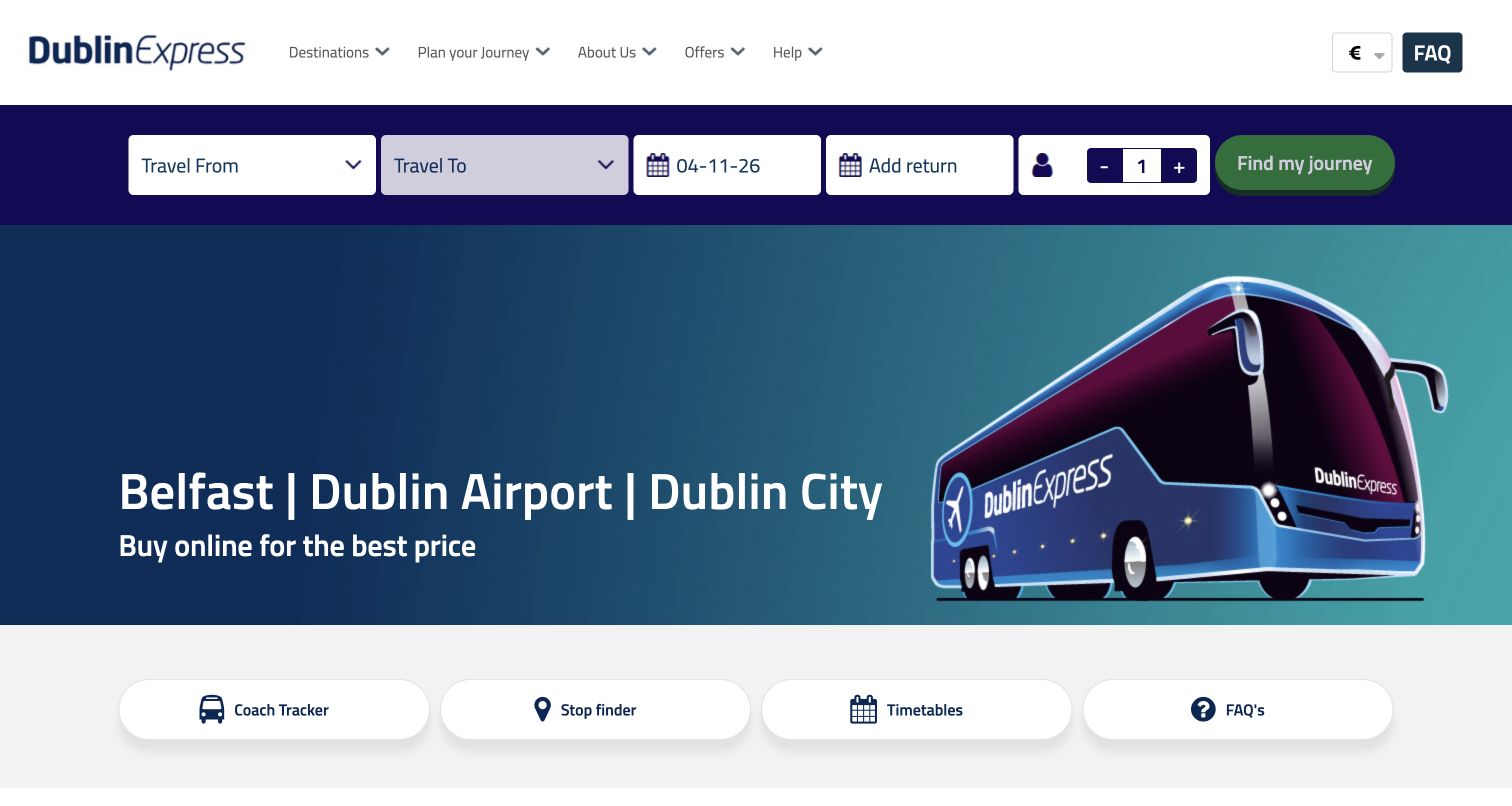
Dublin Express places a horizontal booking bar directly beneath the navigation and states its Belfast, Dublin Airport and Dublin City coverage in the hero. The origin selector distinguishes airport terminals and city stops, often adding nearby landmarks to help a visitor recognize a location. The destination field depends on the chosen origin, and the page follows the hero with coach tracking, stop finding, timetables and FAQs. This specificity is especially useful for an airport transfer, where the wrong terminal or boarding location can matter more than a broad destination slogan. The page also gives currency a visible control, supporting the cross-border context without requiring an account.
What you can learn
For airport transfers, treat terminal and stop naming as core product information. Pair street or stop names with recognizable landmarks, explain dependent destination choices and provide a direct route to the boarding location and current coach status.
Pros
Terminal choices and landmark descriptions add useful geographic precision.
Four large service shortcuts sit directly below the hero.
Cons & considerations
The dense horizontal form needs careful treatment at narrow widths.
A disabled destination and search action can appear unexplained until an origin is selected.
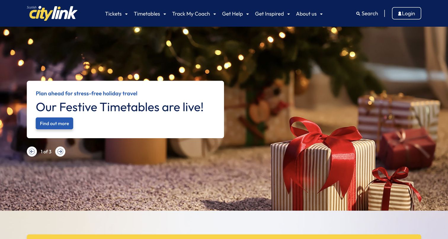
Scottish Citylink uses its opening carousel to promote festive timetables, airport travel and a rail partnership. The captured slide places a white timetable announcement over a seasonal photograph, with the main navigation preserving tickets, timetables and coach tracking as separate categories. Below, destination inspiration and popular journeys connect the wider Scotland travel story to booking links. This homepage is useful for studying how an operator can turn a seasonal operational change into a prominent campaign. The tradeoff is that the first screen privileges the announcement over a fully visible route-search form, so frequent passengers depend on clear navigation and predictable access to timetables.
What you can learn
Give time-sensitive timetable changes a recognizable place without making every passenger read a campaign. Keep the permanent ticket, tracker and route hierarchy stable, and connect destination content to a specific journey rather than leaving it as inspiration alone.
Pros
Timetables and coach tracking have distinct top-level labels.
The festive announcement makes a seasonal planning issue highly visible.
Cons & considerations
The carousel can hide a relevant message behind another slide.
A large campaign hero delays direct route entry for passengers who already know their destination.
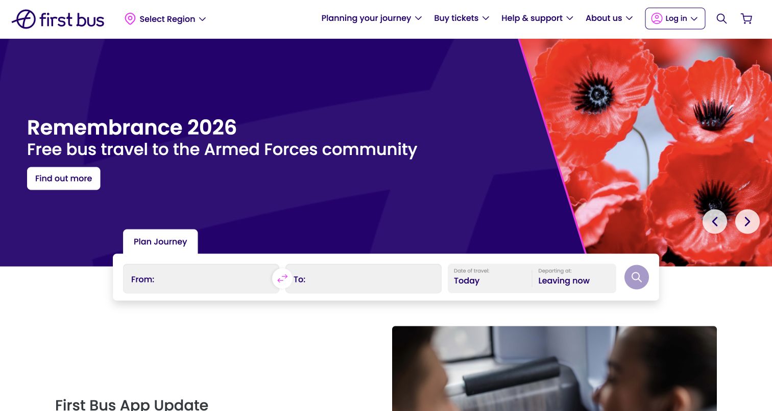
First Bus puts Select Region next to the logo, making geographic context part of the header rather than a hidden preference. A journey-planning panel overlaps the lower edge of the campaign hero and asks for From, To, travel date and departure timing. Its current defaults are readable as Today and Leaving now. The page then includes an app-update notice with help links, showing that operational support for digital products also belongs in the public website. This is a useful local-bus pattern: the rider may need a journey suggestion and area-specific fare information rather than a reserved intercity seat. Campaign content still occupies a large portion of the opening view.
What you can learn
Keep the selected service area visible and make it easy to change without losing a journey. Distinguish planning from purchasing, and publish clear support information when an app or ticketing change affects regular riders.
Pros
Region selection sits in a prominent, predictable header position.
The planner exposes both travel date and departure timing.
Cons & considerations
The campaign hero consumes substantial space before the planner.
A regionless first visit needs clear guidance about which fares and service details apply.
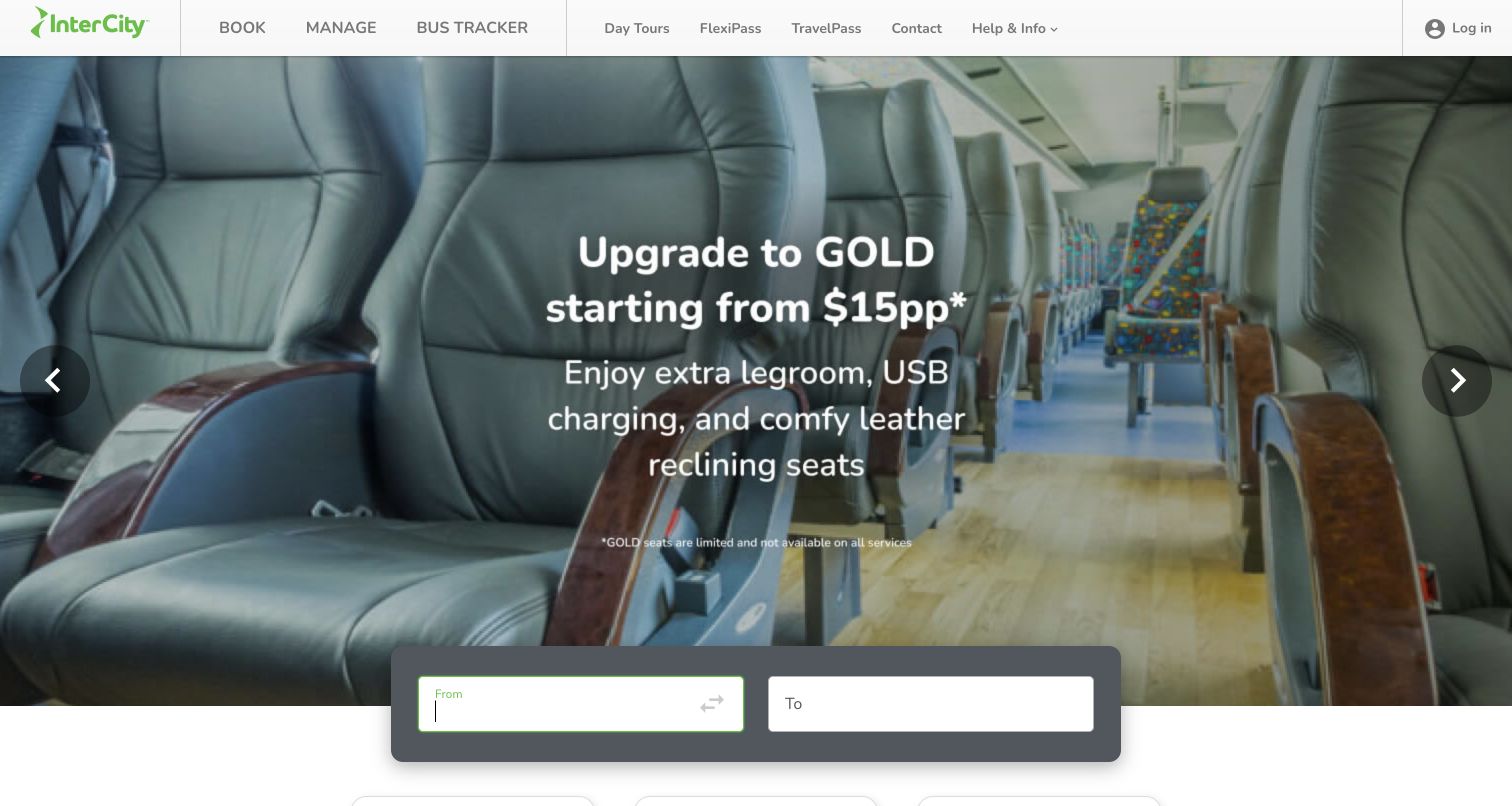
InterCity's opening page pairs a coach-interior campaign with a compact From and To panel. The header gives Book, Manage and Bus Tracker a direct, short vocabulary, then separates day tours and two pass products. Below the hero, FlexiPass is described around travel hours and building an itinerary, while TravelPass is presented as a planned itinerary with flexible timing. Those descriptions are the instructive part of the design: similarly named products need a visible difference in how they work. The first panel asks little of the visitor, although the large campaign image means the product comparison and detailed journey choices sit farther down the page.
What you can learn
Use a small initial route decision when it helps travelers get started, then explain pass products through their actual constraints. Compare hours, itinerary structure and flexibility consistently so a traveler can choose without decoding branded names.
Pros
Book, Manage and Bus Tracker provide a concise task-based header.
The pass descriptions distinguish flexible routing from a predefined itinerary.
Cons & considerations
The two-field opening panel gives limited indication of the steps that follow.
A large rotating campaign can delay discovery of the pass comparison below.
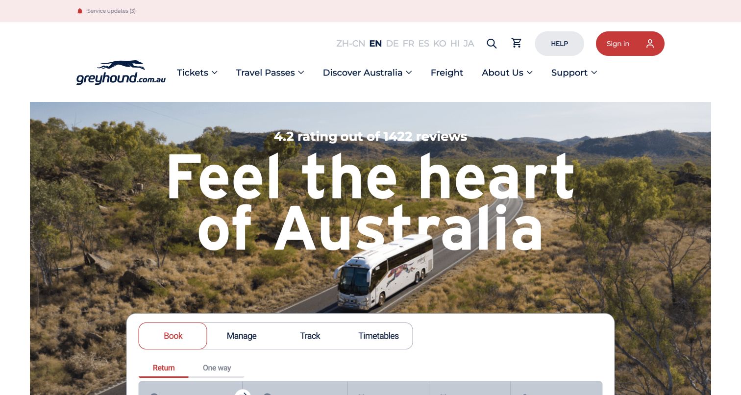
Greyhound Australia's homepage gives a large landscape photograph and travel message substantial space, then overlaps a white passenger panel with four tabs: Book, Manage, Track and Timetables. The booking controls include return or one-way travel, locations, dates and passengers, while lower content develops passes by duration and destinations by region. A service-updates link appears above the main navigation. The grouping is useful because it recognizes that the same traveler returns with different needs over time. This Australian property is reviewed on its own observed interface; its familiar brand name is not a basis for assuming the same products or conditions as the North American website.
What you can learn
Group related passenger tasks in a stable location and make the active tab unmistakable. When selling travel passes, explain duration and geographic scope together, then keep service updates accessible before a traveler starts a new purchase.
Pros
Booking, management, tracking and timetables share one identifiable module.
Pass cards pair duration with a geographic travel proposition.
Cons & considerations
The tall hero leaves some booking controls below the captured first screen.
Large travel messaging can overshadow the small service-updates link above the header.
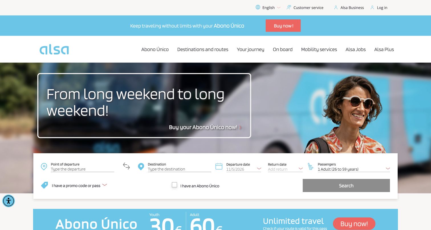
ALSA's English homepage places a route-search strip across the lower edge of a campaign photograph. Alongside departure, destination, dates and passengers, the form includes a promo-or-pass option and a specific Abono Único checkbox. The same pass is explained through a prominent campaign and a pricing block below, connecting the marketing message to a concrete choice inside the journey flow. Additional shortcuts lead to passes, ticket management and bus location. This makes the page useful for studying how an operator can introduce a specialized fare product without removing the ordinary route search. The observed interface also mixes Spanish product terminology with English navigation, which requires clear eligibility explanations.
What you can learn
Connect fare-product promotion to the relevant search control, and explain who can use the product before applying it. Keep translation, age categories and restrictions consistent across campaign copy, selection fields and the eventual fare result.
Pros
The promoted pass has a corresponding control inside the search form.
Ticket management and bus location are available as separate shortcuts.
Cons & considerations
Product names in another language need an immediate plain-language explanation.
Several pass and promotion choices increase the amount of information beside the basic journey fields.
List the actual services the business offers: scheduled intercity seats, local routes, airport transfers, passes, tours and charter hire. Identify which can be searched or bought online and which require an inquiry. Give each a distinct promise and destination so passengers do not arrive at the wrong workflow.
Define the location model
Agree on stable identifiers for cities, terminals, stops and route groups. Include local aliases and recognizable landmarks in suggestions. Decide how to display several stops in the same city and how to explain an unavailable destination after an origin is selected. Test the names with people unfamiliar with the network.
Make fare and pass rules comparable
Describe validity, geographic scope, passenger age groups, changes and refunds in consistent terms. Explain whether a pass guarantees a seat or requires later reservations. Keep branded product names connected to plain descriptions, especially when an international visitor reads a translated page.
Design the day-of-travel experience
A traveler may arrive on a small screen with limited connectivity and an urgent question. Prioritize the boarding point, ticket retrieval, service status and contact route. Explain whether tracking is live or scheduled and what to do if a feed is unavailable. Do not make an app the only path to essential help.
Give service notices an operating process
Define who publishes notices, which routes and dates they affect, and when they are reviewed or removed. Distinguish cancellation, diversion, stop relocation and general news. Connect each notice to a useful passenger action and keep major warnings separate from sales campaigns.
Validate integrations and difficult states
Test ambiguous place names, no services, sold-out departures, invalid dates, assistance requests, expired sessions and failed data feeds. Follow the full transition between the marketing site, ticket provider and account tools. Use an authorized test environment for purchases and verify keyboard access, focus behavior, readable errors and enlarged text.
The editing job behind the design
Choose technology for reliable passenger tasks
The public website may combine a content platform, a third-party ticket widget, maps, tracking and customer-support tools. Define their responsibilities and failure behavior before selecting a visual theme. Keep route descriptions and service notices maintainable without depending on the availability of the sales system. A content editor should understand where a notice will appear and when it expires.
Public page technology observations do not establish a reservation backend, dispatch system or operator relationship. Evaluate a proposed integration against actual stop identifiers, fare products, language requirements and accessibility behavior. Require understandable loading and error states, and preserve journey context when a passenger moves between systems.
Our WordPress website examples offer a separate look at publishing approaches. A visible platform label is evidence for that named page, not a guarantee that the same system will suit your requirements.
Before the public launch
Bus company website planning checklist
The site distinguishes scheduled tickets, passes and charter inquiries.
The selected region, market and language remain visible.
Origin and destination suggestions identify specific stops or terminals.
Dependent or disabled controls explain what information is needed next.
Dates, passenger categories and assistance options have clear labels.
Fare and pass restrictions are explained in consistent language.
A booking search does not imply a seat has been reserved.
Ticket retrieval, changes and tracking have direct public entry points.
Service notices identify affected routes, dates and a next action.
Optional promotions do not block essential passenger tasks.
Partner or ticket-provider transitions preserve useful journey context.
The complete journey is checked on mobile, with a keyboard and with enlarged text.
These checks are a project checklist, not a performance, legal, security, or accessibility certification. Test real journeys with the people responsible for the website before making claims about the result.
Sources & editorial method
How this collection was selected and reviewed
We reviewed sixteen distinct official public bus and coach website properties, including a network booking portal, using the saved sixteen-example target. Direct captures retain their source URL, actual capture date, dimensions and attribution. Access-protected pages were excluded. Reviews describe visible layout, wording and passenger entry points; no tickets were purchased, no inquiry or booking forms were submitted, and no claims of operational reliability or accessibility conformance were tested. Related brands are treated as separate website properties rather than assumed to be independent operators.
Each example links to its actual source page. Screenshots are direct browser captures with their own capture dates; moving imagery, announcements and live designs can change. The notes describe observable design choices and conditional tradeoffs, not measured traffic, conversion results, service quality, or accessibility conformance.
Technology labels use public page metadata, asset evidence, or explicitly cited platform documentation. Platform documentation is not a complete current deployment audit. A component reference may be legacy or unused; it is not a complete backend inventory. Unknown stacks are omitted. These sites are editorial examples, not our client portfolio.
Written, Edited and Curated are separate editorial records, not timestamps advanced by a rebuild. Website designs and imagery belong to their owners. See our editorial standards or suggest a correction.
Questions worth asking
Bus Company website design questions
Should every bus homepage lead with a booking form?
A booking form is useful for reserved intercity travel, but local passengers may first need a timetable, stop or service update. Choose the opening hierarchy from the most common passenger tasks and keep existing-trip help visible alongside sales.
How should a bus website describe boarding locations?
Use the actual stop or terminal name with enough geographic context to distinguish similar places. Landmarks can help unfamiliar visitors, but they should supplement a precise location. Keep the confirmed boarding point consistent across search, ticket details and travel-day support.
What belongs in a travel-pass comparison?
Explain duration, geographic coverage, eligible services and whether a separate seat reservation is needed. Distinguish flexible routing from a fixed itinerary and show relevant age or residency eligibility. A product name alone rarely explains the passenger’s commitment.
How should a network portal present different carriers?
Identify the operating provider for the selected service and connect its baggage, boarding, assistance and change conditions to the journey. A consistent booking interface should not imply that every provider has the same rules or onboard amenities.
Do the reviews prove the booking flow works end to end?
No. The reviews document public pages and visible task entry points. Payment, ticket delivery, cancellation behavior and detailed accessibility require separate authorized testing, preferably with test data and a supported test environment.
Choose a structure that fits the service you operate. The strongest bus website makes the route, boarding point, ticket conditions and next source of help understandable at each stage of travel.