Best Mintlify Websites of 2026 (20 Real-World Examples)
Twenty genuine documentation properties with current platform evidence and practical lessons for navigation, public reference, onboarding and assistant interfaces.
A managed documentation platform can remove publishing work, but it cannot choose a useful information hierarchy or keep examples correct on its own. These Mintlify references show how teams make those editorial and interface decisions visible.
Mintlify provides a managed documentation experience with MDX content, structured navigation and API-reference capabilities. Its official navigation guidance distinguishes groups, tabs, product areas, versions and languages. Use those controls to express the reader's actual decisions rather than treating every available navigation feature as something a project must enable.
Anthropic's Claude Code documentation, Coinbase Developer Documentation, X, HubSpot's docs and Replit open this collection. All twenty captured documents currently declare Mintlify in their public generator metadata. The captured scope is the named documentation route: neither an organization-wide customer logo nor a separate corporate homepage is treated as proof of a complete technology stack.
Before the examples
What makes good Mintlify website development in 2026?
Choose one primary organizational pattern
The official navigation guide recommends choosing a primary root-level pattern before nesting other elements. Start with whether readers choose a product, a learning mode or a release. Claude Code's surface-specific setup and Coinbase's product families show why several useful dimensions still need a deliberate hierarchy.
Treat interactive reference as a real API boundary
Mintlify's API playground can generate endpoint pages from specifications and send actual requests. Plan examples, authentication, environment labels and permissions deliberately. An attractive request panel is not automatically a sandbox. Documentation QA can inspect structure and code without creating accounts, moving money or sending production requests.
Maintain one explanation across repeated entry points
Reusable snippets support shared content within MDX. Use them for genuinely shared prerequisites and explanations, then give each quickstart enough local context. A snippet strategy needs review ownership too: changing shared setup information can affect many articles at once, while a product-specific limitation should not disappear into generic reusable prose.
The examples span customized developer gateways, conventional article libraries, code-first quickstarts and product-support journeys. Compare the entry decision each makes: using versus building, learning versus reference, a product family versus a specific implementation surface. Assistant controls are part of the observed interface, not a substitute for evaluating the underlying content.
We start with five recognizable brands or organizations: Anthropic Claude Code documentation, Coinbase Developer Documentation, X Developer Platform, HubSpot developer documentation, Replit documentation. Each attribution applies to the named website property, not every product or website belonging to its organization. This is a curated reading sequence, not a measured ranking.
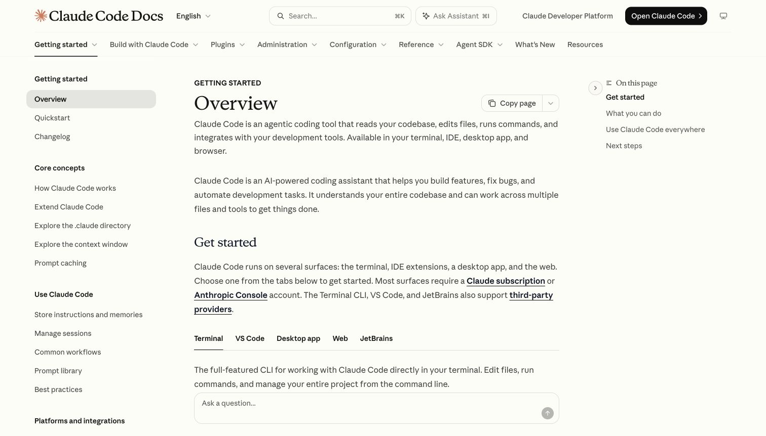
Claude Code's overview uses a warm, restrained article design with a broad top-level product navigation and a detailed left outline. The introduction moves into setup tabs for different surfaces rather than one universal installation block. A short right outline keeps the current article's sections visible, while copy-page and assistant controls sit near the reading area. The public documentation is visibly distinct from the separate product marketing page.
What you can learn
Choose a primary navigation axis before adding a long sidebar. Mintlify's tabs and groups can distinguish product areas from topics, but setup surfaces should remain explicit within the relevant article. Preserve readable headings and ordinary links alongside assistant features. Keep the public overview useful without asking a question or opening the product. When interfaces change, update screenshots, tab descriptions and linked requirements together so a newcomer does not combine instructions from different surfaces.
Pros
Surface-specific tabs acknowledge materially different setup paths.
Concepts, everyday use and integrations are clearly grouped in the sidebar.
Cons & considerations
A wide product menu and detailed sidebar need careful behavior at intermediate widths.
A persistent assistant field requires overlap and focus checks against lower article content.
Platform source: Current public document generator. The public document inspected on 2026-11-06 declares meta[name="generator"] content="Mintlify". This current publisher-provided signal identifies the captured documentation property, not the organization's corporate site, the documented product's implementation or every private service. Platform evidence is separate from the direct website screenshot and is not a complete current infrastructure audit.
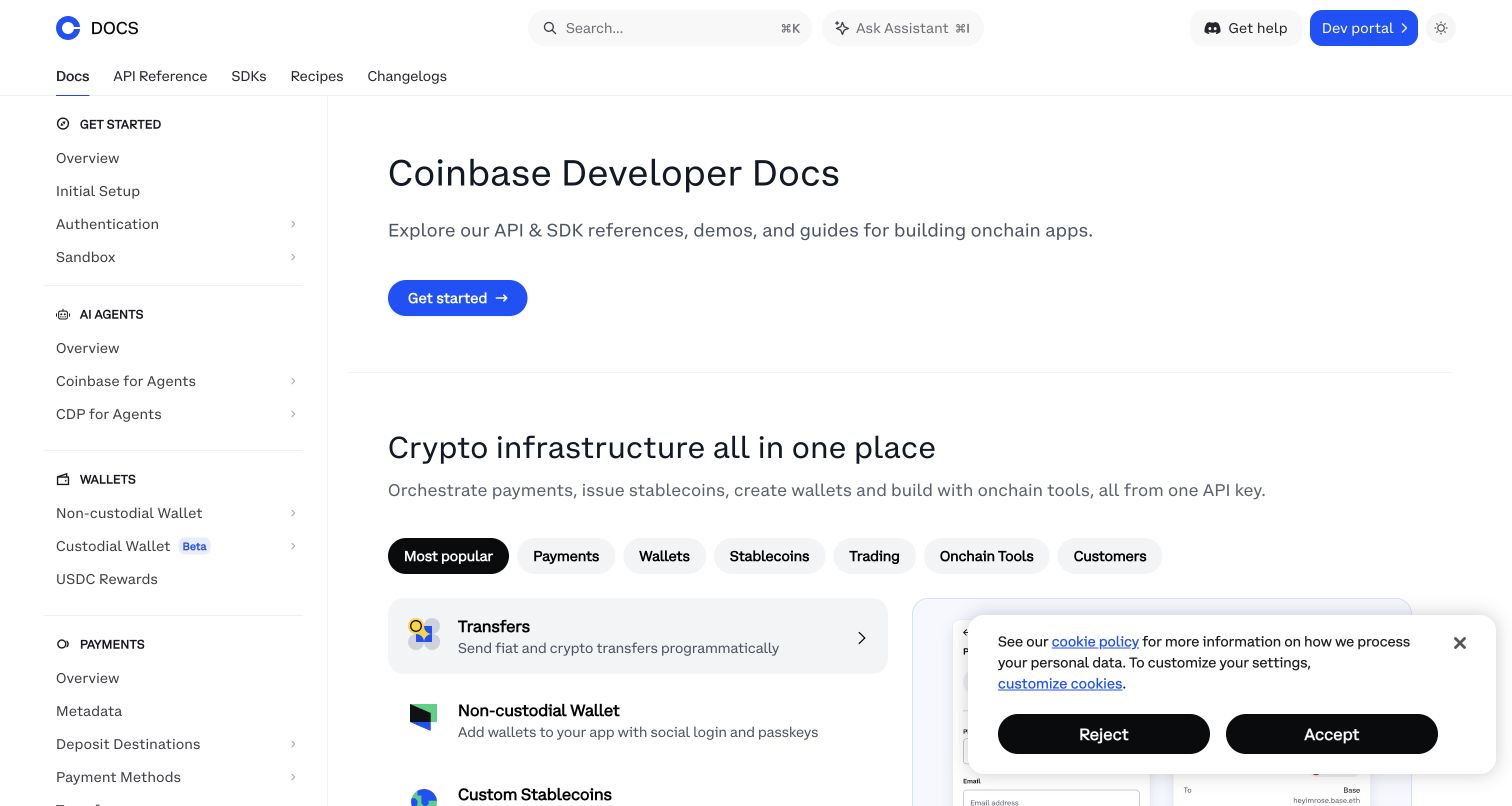
Coinbase's developer documentation introduces its resource library before a filterable product area. Docs, API Reference, SDKs, Recipes and Changelogs appear across the header, while the left outline groups onboarding and product families. Search and an assistant are separately labeled. The captured cookie panel covers part of the lower product region, showing the practical effect of a consent state on a custom documentation homepage.
What you can learn
Keep the platform overview separate from exact endpoint reference and language-specific SDK guidance. Mintlify can support those layers, but product filters need understandable defaults and maintained destinations. Preserve shared setup requirements without repeating contradictory instructions across every family. Test consent panels alongside the catalog and use safe static examples during QA; browsing financial infrastructure documentation does not authorize executing transfers, creating wallets or sending requests through an embedded API tool.
Pros
The header separates reference, SDK and recipe reading modes.
Product-family groups help a broad platform retain recognizable local context.
Cons & considerations
A long family taxonomy can make the current onboarding position harder to find.
The captured consent panel obscures part of the catalog and needs responsive collision testing.
Platform source: Current public document generator. The public document inspected on 2026-11-06 declares meta[name="generator"] content="Mintlify". This current publisher-provided signal identifies the captured documentation property, not the organization's corporate site, the documented product's implementation or every private service. Platform evidence is separate from the direct website screenshot and is not a complete current infrastructure audit.
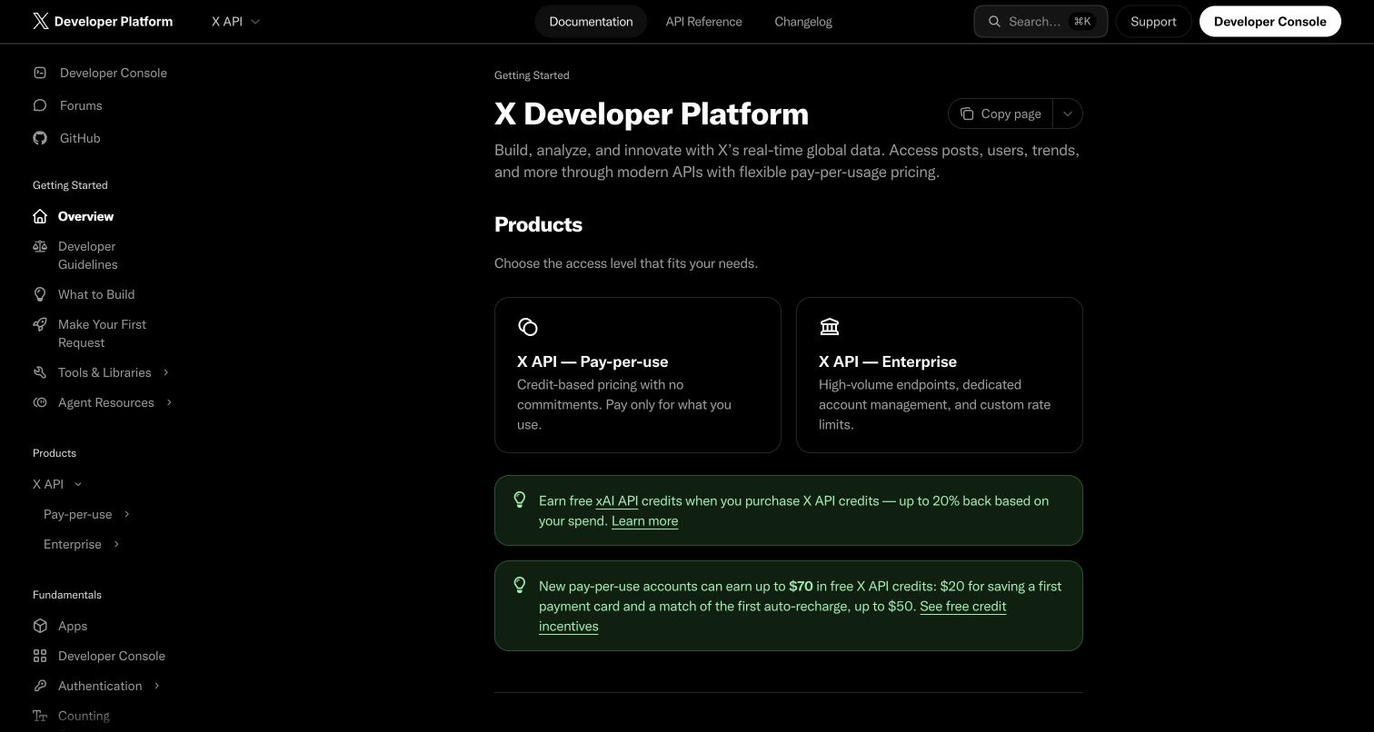
X's developer overview uses a black interface, a persistent left outline and separate Documentation, API Reference and Changelog tabs. Two opening cards distinguish access levels, followed by promotional callouts and quickstart resources. The developer console is consistently separate from the public page. Search and copy-page controls remain available, but the dark styling gives the property a markedly different character from other Mintlify examples.
What you can learn
Treat access and pricing information as maintained product content, not decorative campaign copy. Mintlify can place introductory guides and endpoint reference together, but the transition to a developer console should remain explicit. Keep ordinary quickstart links visible even when offers expand. Test muted text and card borders in the dark theme, and review campaign expiry and eligibility separately from the documentation structure. This design review does not validate commercial terms or execute any API requests.
Pros
Documentation and exact API reference are distinct persistent destinations.
Access-level cards make the first product decision more concrete.
Cons & considerations
Several promotional callouts can delay the practical first-request route.
Muted gray text and thin borders need contrast testing across viewing conditions.
Platform source: Current public document generator. The public document inspected on 2026-11-06 declares meta[name="generator"] content="Mintlify". This current publisher-provided signal identifies the captured documentation property, not the organization's corporate site, the documented product's implementation or every private service. Platform evidence is separate from the direct website screenshot and is not a complete current infrastructure audit.
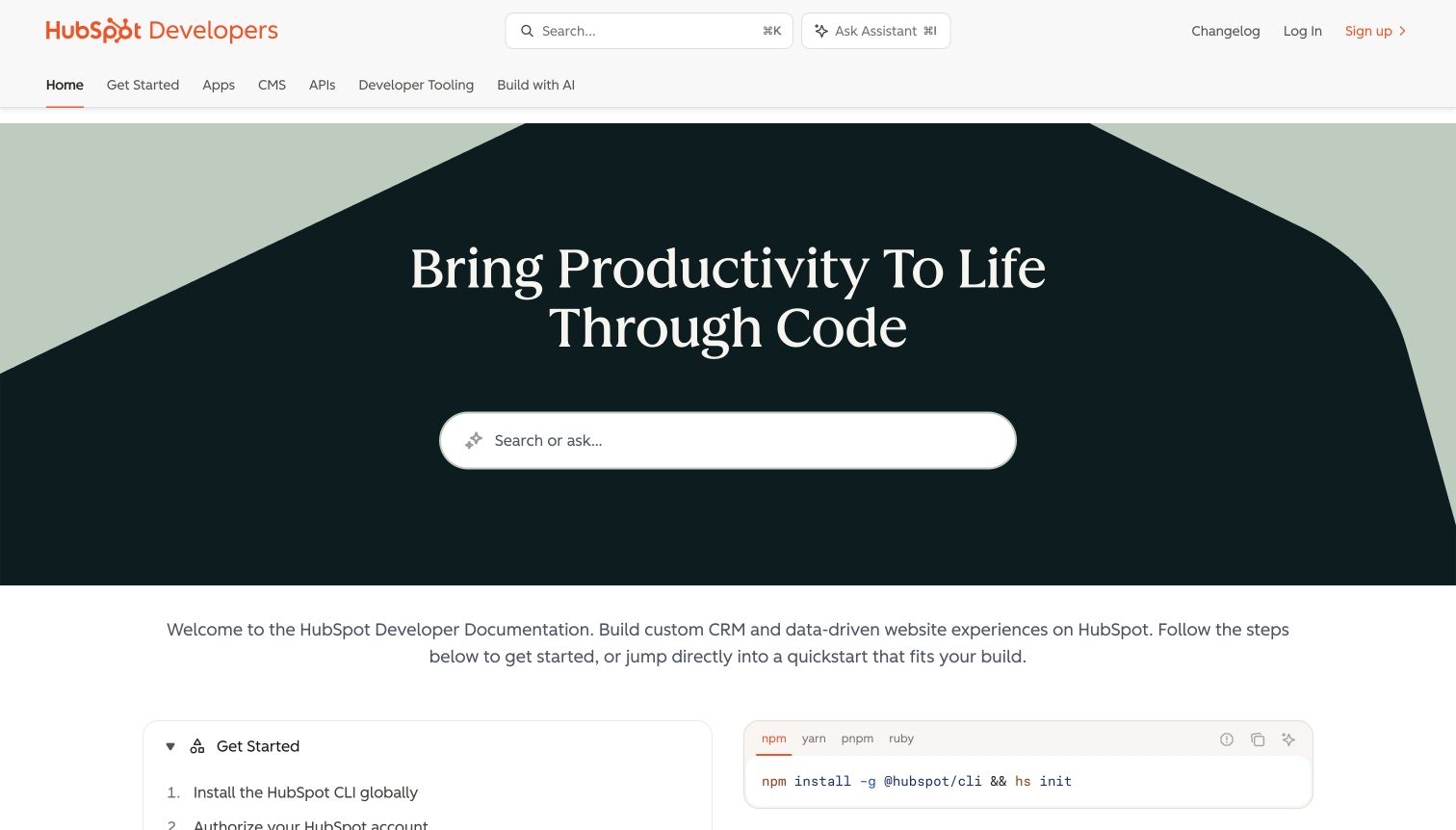
HubSpot's documentation homepage places a large search-or-ask control inside a geometric dark hero. A second navigation row distinguishes setup, apps, CMS, APIs and developer tooling. Below the welcome text, a guided sequence sits beside package-manager command tabs. The design is substantially customized, yet the public reference paths remain ordinary labeled links rather than being hidden behind the search interaction.
What you can learn
A Mintlify front door can prioritize search without making a question box the sole navigation model. Give the major product areas clear routes and maintain a short default setup sequence for readers who prefer browsing. Keep account authorization instructions separate from website exploration. Compare the documentation property with the organization's marketing pages carefully: the current Mintlify marker on the docs route does not establish the implementation of the developer homepage or the wider CRM platform.
Pros
Major product areas remain directly reachable beside the prominent search experience.
The setup sequence connects explanatory steps with concrete command examples.
Cons & considerations
A tall custom hero can push useful onboarding details below shorter viewports.
Command tabs need careful labeling and validation as supported installation methods change.
Platform source: Current public document generator. The public document inspected on 2026-11-06 declares meta[name="generator"] content="Mintlify". This current publisher-provided signal identifies the captured documentation property, not the organization's corporate site, the documented product's implementation or every private service. Platform evidence is separate from the direct website screenshot and is not a complete current infrastructure audit.
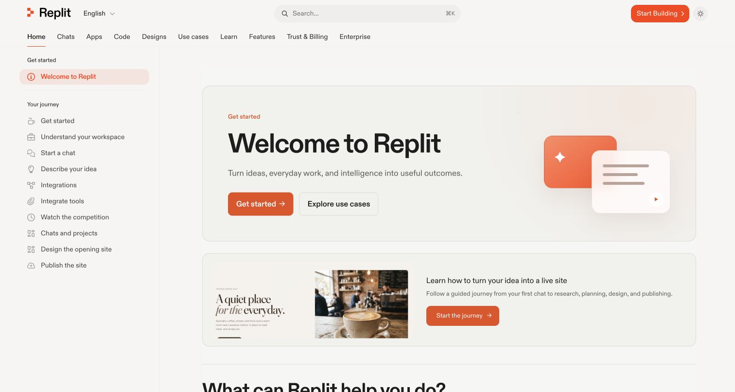
Replit's welcome page combines a warm hero card with a second card showing a concrete guided website project. The left outline presents the reader's journey in sequence, while the top row separates chats, apps, code, designs, learning and administrative information. Get Started and Explore Use Cases are different actions. The page emphasizes orientation and progression rather than immediately presenting an API endpoint list.
What you can learn
Use Mintlify for product education as well as developer reference, but keep the learning sequence small enough to follow. A concrete example project can give abstract onboarding a destination without requiring visitors to start an account workflow. Distinguish task-based use cases from the product-area taxonomy, and connect them deliberately. When product names or surfaces change, review both navigation layers and the guided journey together rather than allowing three competing maps of the same experience.
Pros
A concrete example makes the learning journey easier to imagine.
Sequential sidebar labels provide a clear alternative to the broad product tabs.
Cons & considerations
A large number of top-level areas may overwhelm a first-time visitor.
Guided-project imagery needs maintenance so it continues matching the current product interface.
Platform source: Current public document generator. The public document inspected on 2026-11-06 declares meta[name="generator"] content="Mintlify". This current publisher-provided signal identifies the captured documentation property, not the organization's corporate site, the documented product's implementation or every private service. Platform evidence is separate from the direct website screenshot and is not a complete current infrastructure audit.
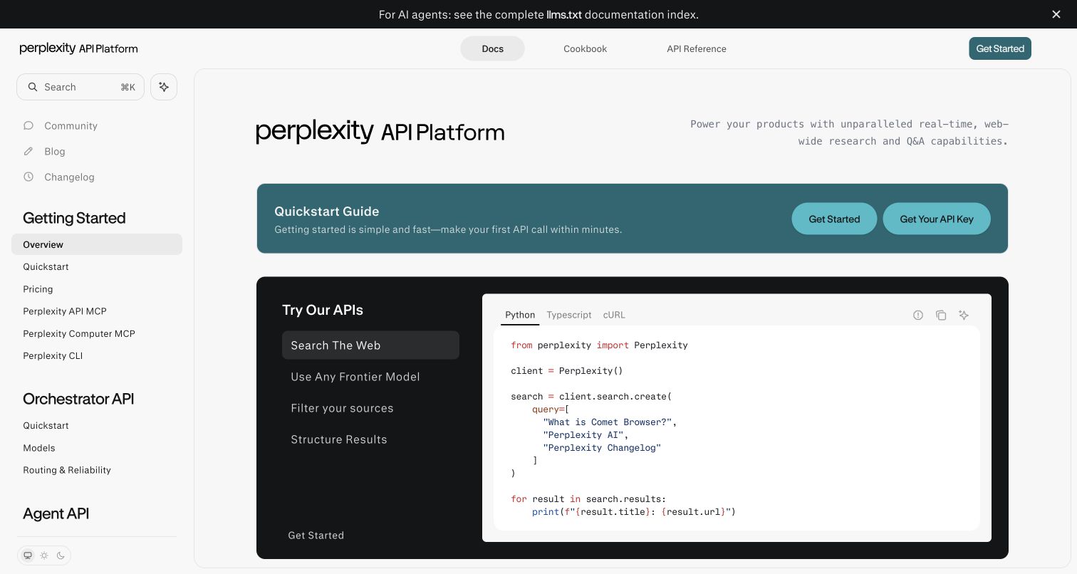
Perplexity's overview frames a quickstart strip above a dark example panel. The panel combines capability choices with Python, TypeScript and cURL tabs, while the main navigation separates Docs, Cookbook and API Reference. A left outline exposes setup, pricing and several API families. An agent-documentation banner sits at the top, giving machine-readable resources a visible place without replacing the ordinary reading interface.
What you can learn
Separate the selected capability from the selected code language so a reader always knows what changed. Mintlify components can support this explanatory matrix, but its states need consistent labels and tested examples. Keep the quickstart useful without running a live request or entering an API key. Give agent-readable links a stable supporting role rather than expanding them into an additional primary navigation layer that crowds the human learning path.
Pros
The example panel connects a capability choice with a concrete code shape.
Cookbook and exact API reference are separately accessible.
Cons & considerations
Multiple capability and language states require disciplined example maintenance.
A broad API sidebar and top banner can consume significant reading space on smaller screens.
Platform source: Current public document generator. The public document inspected on 2026-11-06 declares meta[name="generator"] content="Mintlify". This current publisher-provided signal identifies the captured documentation property, not the organization's corporate site, the documented product's implementation or every private service. Platform evidence is separate from the direct website screenshot and is not a complete current infrastructure audit.
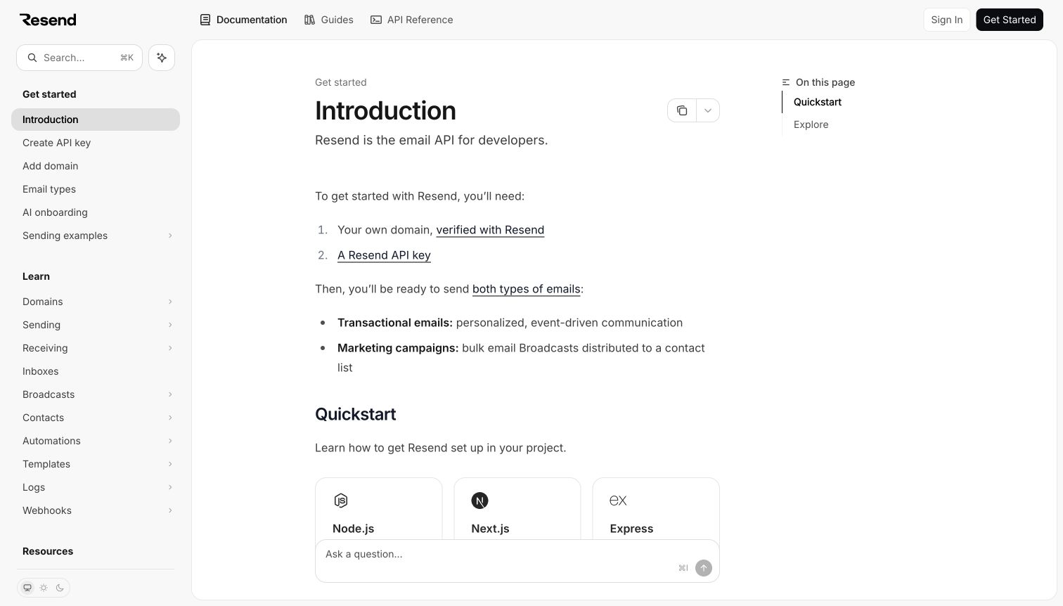
Resend's introduction states the service's role, then lists the domain and API-key prerequisites before a grid of quickstarts. Documentation, Guides and API Reference are distinct in the top bar. The sidebar separates starting steps, product learning and resources, while a short right outline keeps the current page simple. A persistent assistant field occupies the lower reading area in the captured state.
What you can learn
Explain shared prerequisites once before branching into framework-specific instructions. Mintlify can reuse content and maintain multiple quickstarts, but the introductory page still needs a clear ordering. Distinguish public setup explanations from account actions that create credentials or verify a domain. Preserve ordinary links for readers who do not use the assistant, and test the floating field against the first row of quickstart cards at different heights and zoom levels.
Pros
Prerequisites appear before readers choose a language or framework guide.
The navigation distinguishes general guides from exact API material.
Cons & considerations
A large quickstart grid may need grouping as supported integrations grow.
A persistent assistant field can overlap low-positioned cards on short screens.
Platform source: Current public document generator. The public document inspected on 2026-11-06 declares meta[name="generator"] content="Mintlify". This current publisher-provided signal identifies the captured documentation property, not the organization's corporate site, the documented product's implementation or every private service. Platform evidence is separate from the direct website screenshot and is not a complete current infrastructure audit.
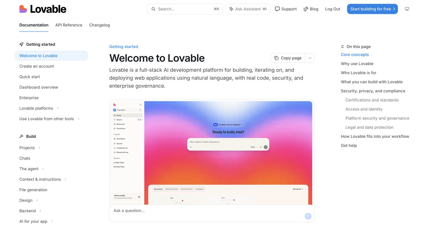
Lovable's welcome page combines a plain product introduction with a large interface image. The left navigation follows a broad lifecycle from building and connecting to collaboration, hosting and administration. Documentation, API Reference and Changelog remain separate across the top. A right outline previews the overview's conceptual and policy-related sections, while an assistant entry remains visible near the lower content region.
What you can learn
Use Mintlify's groups to connect product education with practical operational tasks, but keep the first-visit route shorter than the complete feature map. Maintain interface imagery and the corresponding text as one editorial unit. Separate policy explanations from the implementation claims they describe; a documentation page is not an independent security or compliance audit. Test ordinary browsing without the assistant and make external product and signup transitions recognizable before a visitor shares information.
Pros
Lifecycle grouping connects creation, collaboration and publication tasks.
API reference and changelog have persistent routes separate from the overview.
Cons & considerations
A very broad sidebar can make introductory guidance harder to locate.
Large interface screenshots and a floating assistant need responsive overlap and readability checks.
Platform source: Current public document generator. The public document inspected on 2026-11-06 declares meta[name="generator"] content="Mintlify". This current publisher-provided signal identifies the captured documentation property, not the organization's corporate site, the documented product's implementation or every private service. Platform evidence is separate from the direct website screenshot and is not a complete current infrastructure audit.
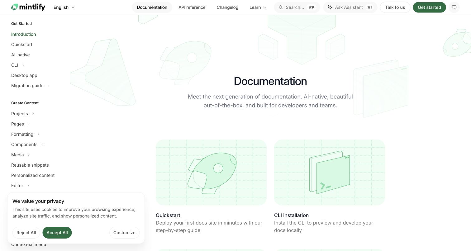
Mintlify's documentation opens with a pale illustrated introduction and two large routes into quickstart and local development. A persistent outline groups content creation, site management, agent features and reference material. Documentation, API Reference and Changelog remain visible in the header alongside search and assistant controls. The captured cookie panel covers part of the lower sidebar, making the real reading state less pristine than a product showcase.
What you can learn
Evaluate the platform through the publishing responsibilities it exposes, not just the polish of its own theme. Define who owns navigation, reusable snippets, API specifications and review workflows before enabling optional assistants. Preserve a complete browsing path if those features are unused. Include consent states in the layout brief and distinguish a current public generator marker from an independent verification of hosting reliability, security controls or the outcomes claimed in customer stories.
Pros
The navigation separates writing content from managing the documentation property.
Quickstart and local-development routes acknowledge different contributor needs.
Cons & considerations
A large feature taxonomy can obscure the smallest successful first publishing task.
The captured consent panel covers sidebar content and needs testing alongside other persistent controls.
Platform source: Current public document generator. The public document inspected on 2026-11-06 declares meta[name="generator"] content="Mintlify". This current publisher-provided signal identifies the captured documentation property, not the organization's corporate site, the documented product's implementation or every private service. Platform evidence is separate from the direct website screenshot and is not a complete current infrastructure audit.
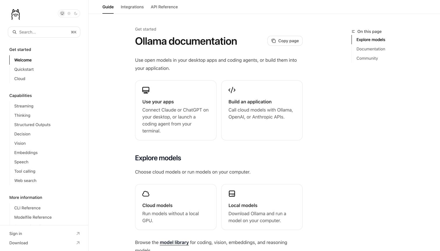
Ollama's documentation avoids a large hero and begins with two practical cards: using existing apps and building an application. A second pair distinguishes cloud and local model routes. Guide, Integrations and API Reference are visible above the article, while the sidebar groups capabilities and platform instructions. The restrained black-and-white identity keeps the opening focused on choosing the correct kind of task.
What you can learn
Identify the reader's role before presenting a large capability list. Mintlify's article layout and cards can make this decision explicit without a separate marketing page. Keep local and hosted paths distinct and link each to maintained requirements. Do not treat an integration logo or compatibility reference as evidence for another product's publishing stack. Test the small top tabs and longer sidebar at narrow widths so role-based orientation survives when the desktop columns collapse.
Pros
The first two cards distinguish using a tool from developing an integration.
Cloud and local choices receive concrete, separate entrances.
Cons & considerations
Broad capability lists can still overwhelm readers after the initial role choice.
Cross-provider compatibility descriptions need precise scope and ongoing editorial review.
Platform source: Current public document generator. The public document inspected on 2026-11-06 declares meta[name="generator"] content="Mintlify". This current publisher-provided signal identifies the captured documentation property, not the organization's corporate site, the documented product's implementation or every private service. Platform evidence is separate from the direct website screenshot and is not a complete current infrastructure audit.
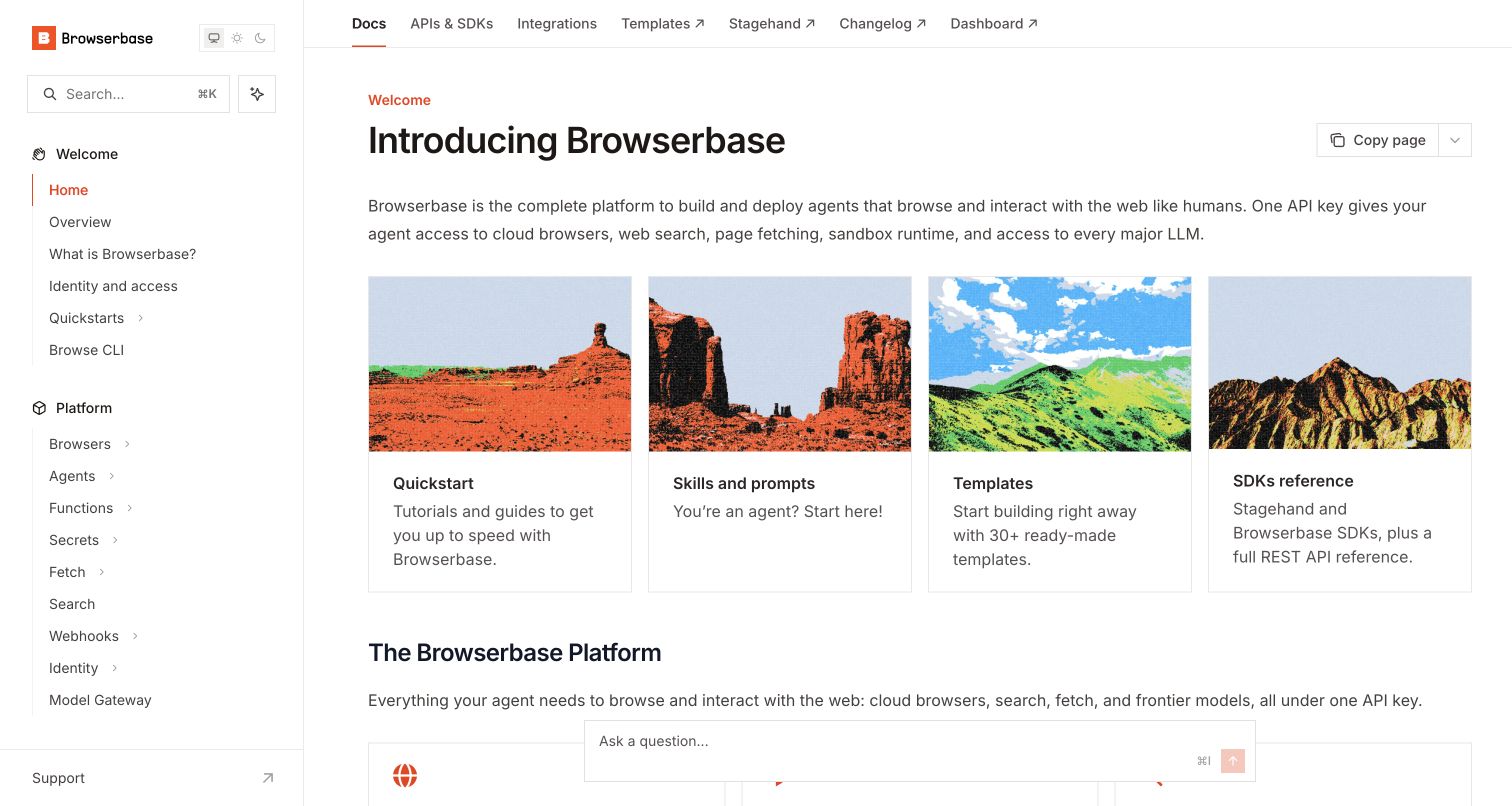
Browserbase's introduction pairs a concise platform explanation with four image-topped resource cards. Quickstart, skills and prompts, templates and SDK reference have distinct destinations. The left outline groups the platform, use cases and operational topics, while a horizontal row separates docs, APIs, integrations and external properties. The imagery supplies character, but the most important distinctions are the labels beneath it.
What you can learn
Build the resource map around different jobs rather than presenting every feature as another card. Mintlify can keep public guides, API reference and external templates connected, but clearly mark transitions to a dashboard or another documentation property. Preserve text equivalents for scenic imagery and test the persistent assistant against card destinations. During review, keep demonstrations read-only unless explicitly authorized; the subject matter of an automation platform does not grant permission to submit forms or bypass access controls.
Pros
Resource cards distinguish first learning from exact SDK lookup.
External destinations are visibly marked in the horizontal navigation.
Cons & considerations
A large platform sidebar needs grouping discipline as operational topics expand.
Decorative card imagery and a floating assistant can displace practical details on short screens.
Platform source: Current public document generator. The public document inspected on 2026-11-06 declares meta[name="generator"] content="Mintlify". This current publisher-provided signal identifies the captured documentation property, not the organization's corporate site, the documented product's implementation or every private service. Platform evidence is separate from the direct website screenshot and is not a complete current infrastructure audit.
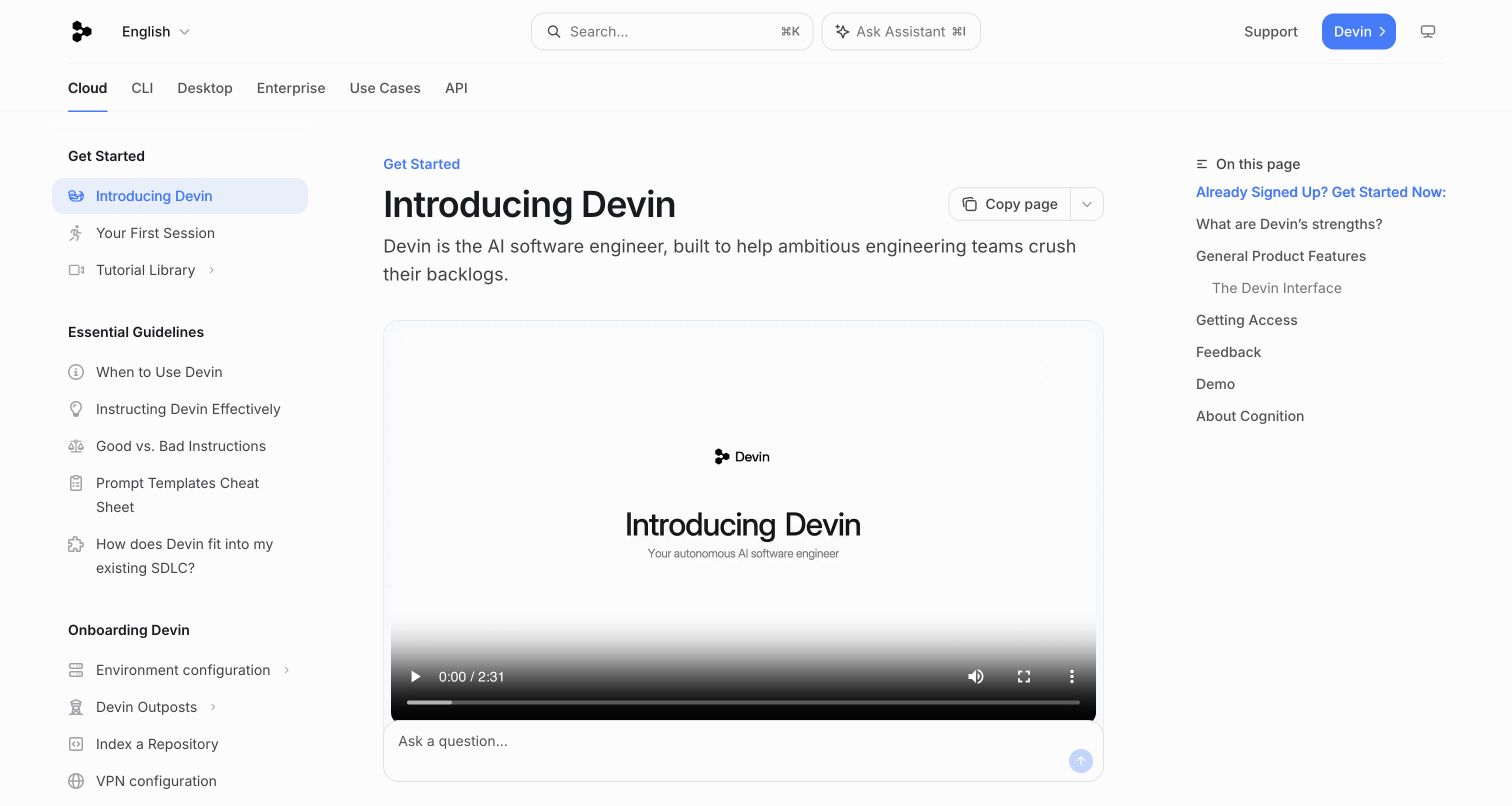
Devin's introduction places a large explainer video beneath a concise heading and description. Cloud, CLI, Desktop, Enterprise, Use Cases and API are separate top-level routes. The sidebar includes first-session material, instruction guidelines and onboarding tasks before a longer product library. The right outline previews access and feedback sections, while an assistant field shares space with the video's lower controls in the capture.
What you can learn
Use Mintlify's documentation structure to explain where a new product fits before listing every feature. Keep essential written orientation available without playing the video, and make platform-specific setup paths explicit. Guidance on appropriate tasks and effective instructions deserves its own maintained content rather than only promotional claims. Test video controls, keyboard focus and assistant overlap together. A public product description should not be treated as independent proof of autonomous capability or suitability for every software task.
Pros
Usage guidelines appear near onboarding rather than being buried in advanced reference.
Top-level routes distinguish materially different product surfaces.
Cons & considerations
A large video can postpone written setup information on shorter screens.
The persistent assistant field needs collision testing with media controls and captions.
Platform source: Current public document generator. The public document inspected on 2026-11-06 declares meta[name="generator"] content="Mintlify". This current publisher-provided signal identifies the captured documentation property, not the organization's corporate site, the documented product's implementation or every private service. Platform evidence is separate from the direct website screenshot and is not a complete current infrastructure audit.
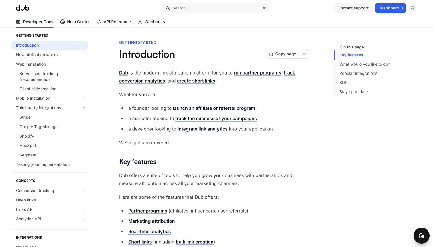
Dub's introduction explicitly names several reader roles before describing core capabilities. Developer Docs, Help Center, API Reference and Webhooks are separate top tabs. The left outline exposes server-side and client-side setup, common integrations and testing guidance. A short article outline provides local orientation, while the main page remains mostly prose and ordinary links rather than a large decorative campaign.
What you can learn
Let different reader roles share an introduction without forcing them into the same implementation path. Mintlify's tabs and sidebar groups can separate product help from developer material, but keep cross-links deliberate and maintained. Explain technical recommendations in the relevant guide rather than implying one universal choice through a card label. Keep analytics and tracking instructions separate from privacy approval; a documentation review should not install trackers or transmit real visitor data merely to test navigation.
Pros
The introduction acknowledges non-developer audiences without removing technical routes.
Implementation testing has a visible place in the sidebar.
Cons & considerations
Several audience and capability lists can make the introduction longer than necessary.
Tracking-related examples require careful privacy review when adapted to a real implementation.
Platform source: Current public document generator. The public document inspected on 2026-11-06 declares meta[name="generator"] content="Mintlify". This current publisher-provided signal identifies the captured documentation property, not the organization's corporate site, the documented product's implementation or every private service. Platform evidence is separate from the direct website screenshot and is not a complete current infrastructure audit.
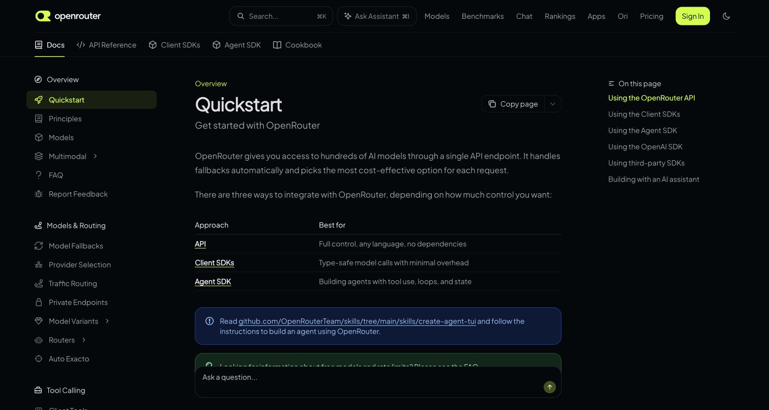
OpenRouter's quickstart uses a dark interface with a compact comparison table for API, client SDK and agent SDK approaches. The second navigation row distinguishes those resources from a cookbook. A detailed left outline covers models, routing and later features, while the current article's right outline previews implementation options. The table makes an architectural choice visible before readers move into longer examples.
What you can learn
Use Mintlify's article content to explain why several integration paths exist, not simply to display more code tabs. Keep the comparison concise and link each approach to maintained requirements. Separate the product's model and marketplace navigation from the documentation taxonomy so repeat readers retain their place. Test table wrapping, dark-theme contrast and assistant overlap; these small details determine whether an otherwise helpful choice remains readable on a narrow viewport.
Pros
The comparison table gives each integration approach an understandable role.
SDK and cookbook destinations are distinct from the general guide.
Cons & considerations
A busy corporate header and deep sidebar can compete with the quickstart's local structure.
Dark supporting copy and compact table text need contrast and responsive testing.
Platform source: Current public document generator. The public document inspected on 2026-11-06 declares meta[name="generator"] content="Mintlify". This current publisher-provided signal identifies the captured documentation property, not the organization's corporate site, the documented product's implementation or every private service. Platform evidence is separate from the direct website screenshot and is not a complete current infrastructure audit.
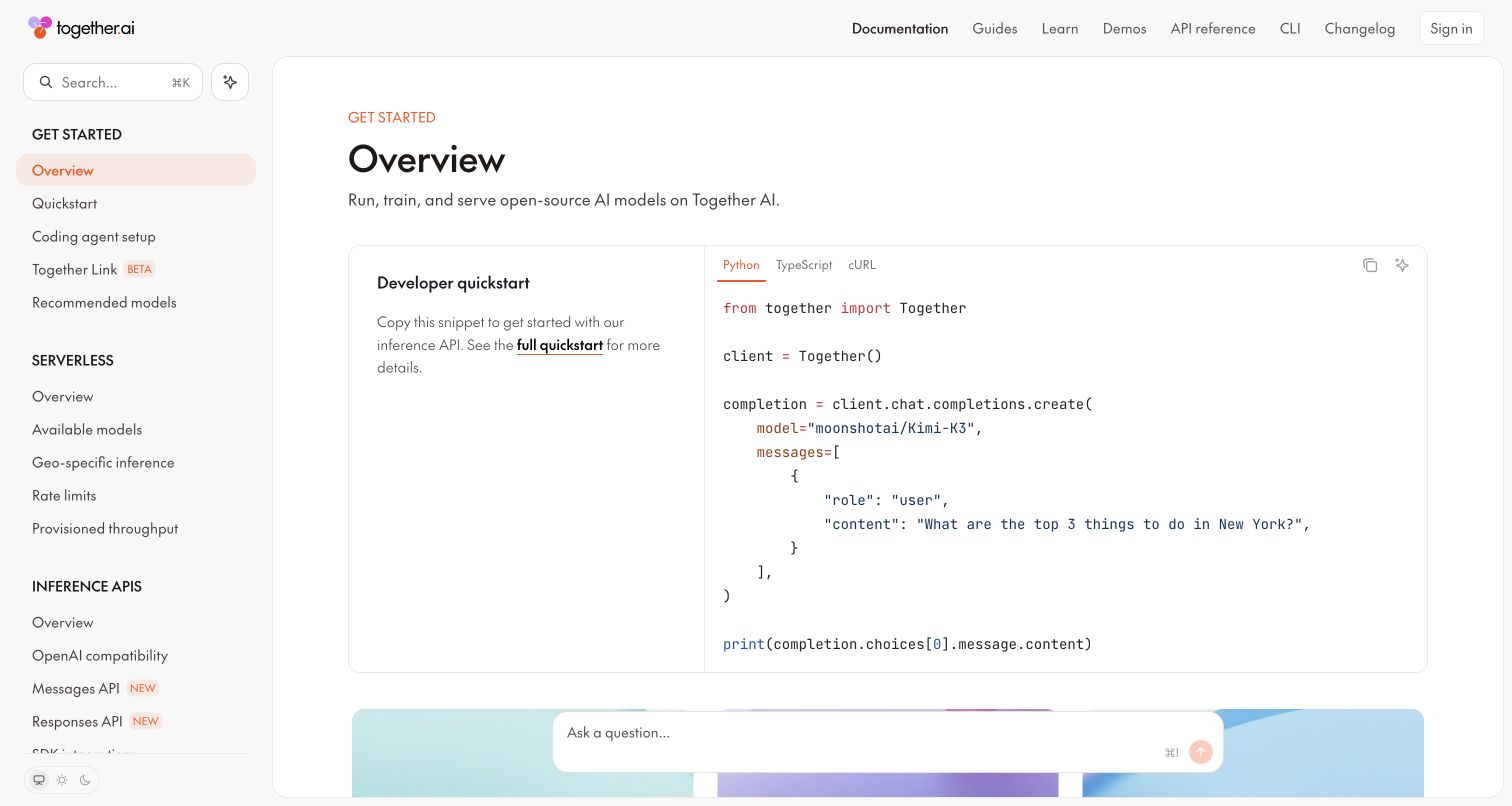
Together AI's overview pairs a short quickstart explanation with a large language-tabbed code panel. The header separates guides, learning, demos, reference, CLI and changelog, while the sidebar groups serverless, inference and later deployment topics. The first example gives the page a concrete center despite that breadth. A persistent assistant field sits below the code panel in the captured reading state.
What you can learn
Use a shared quickstart to anchor a broad Mintlify library, then route specialized deployment needs into their own sections. Keep code language, model identifier and endpoint context explicit and reviewed together. A snippet is not a safe test environment by itself; website QA should not send billable requests or real prompts without authorization. Check that assistant controls do not obscure the next instruction, and preserve a useful route from the introductory example to the full reference.
Pros
The overview connects a simple explanation directly to a concrete request example.
Reference and CLI material remain separately discoverable in the header.
Cons & considerations
A broad service taxonomy can make advanced and introductory material appear equally urgent.
Model names and copyable examples require maintenance as availability and supported behavior change.
Platform source: Current public document generator. The public document inspected on 2026-11-06 declares meta[name="generator"] content="Mintlify". This current publisher-provided signal identifies the captured documentation property, not the organization's corporate site, the documented product's implementation or every private service. Platform evidence is separate from the direct website screenshot and is not a complete current infrastructure audit.
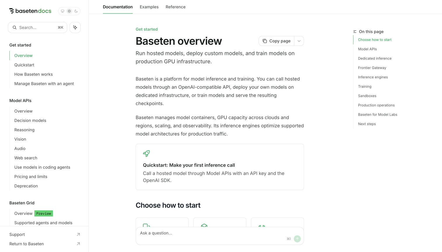
Baseten's overview starts with a plain description and several short explanatory paragraphs before a prominent quickstart card. The article then offers a choice of starting paths. Documentation, Examples and Reference are kept distinct above it, while the left outline groups model APIs, inference and training topics. The short right outline gives a useful map of the overview without repeating the entire sidebar.
What you can learn
Make the first successful task concrete while acknowledging that not every visitor needs the same infrastructure path. Mintlify cards and groups can separate hosted-model use from custom deployment guidance, but each path needs accurate prerequisites and cost context. Keep preview labels attached to the relevant material. Test long operational topics through direct entry URLs, since an expert may arrive below the overview and still need enough context to recognize the selected service.
Pros
A prominent quickstart gives the broad platform description an actionable center.
The article outline remains much shorter than the full product taxonomy.
Cons & considerations
Several introductory paragraphs may delay the simplest starting choice for an experienced reader.
Preview features and production guidance need clear separation as the platform evolves.
Platform source: Current public document generator. The public document inspected on 2026-11-06 declares meta[name="generator"] content="Mintlify". This current publisher-provided signal identifies the captured documentation property, not the organization's corporate site, the documented product's implementation or every private service. Platform evidence is separate from the direct website screenshot and is not a complete current infrastructure audit.
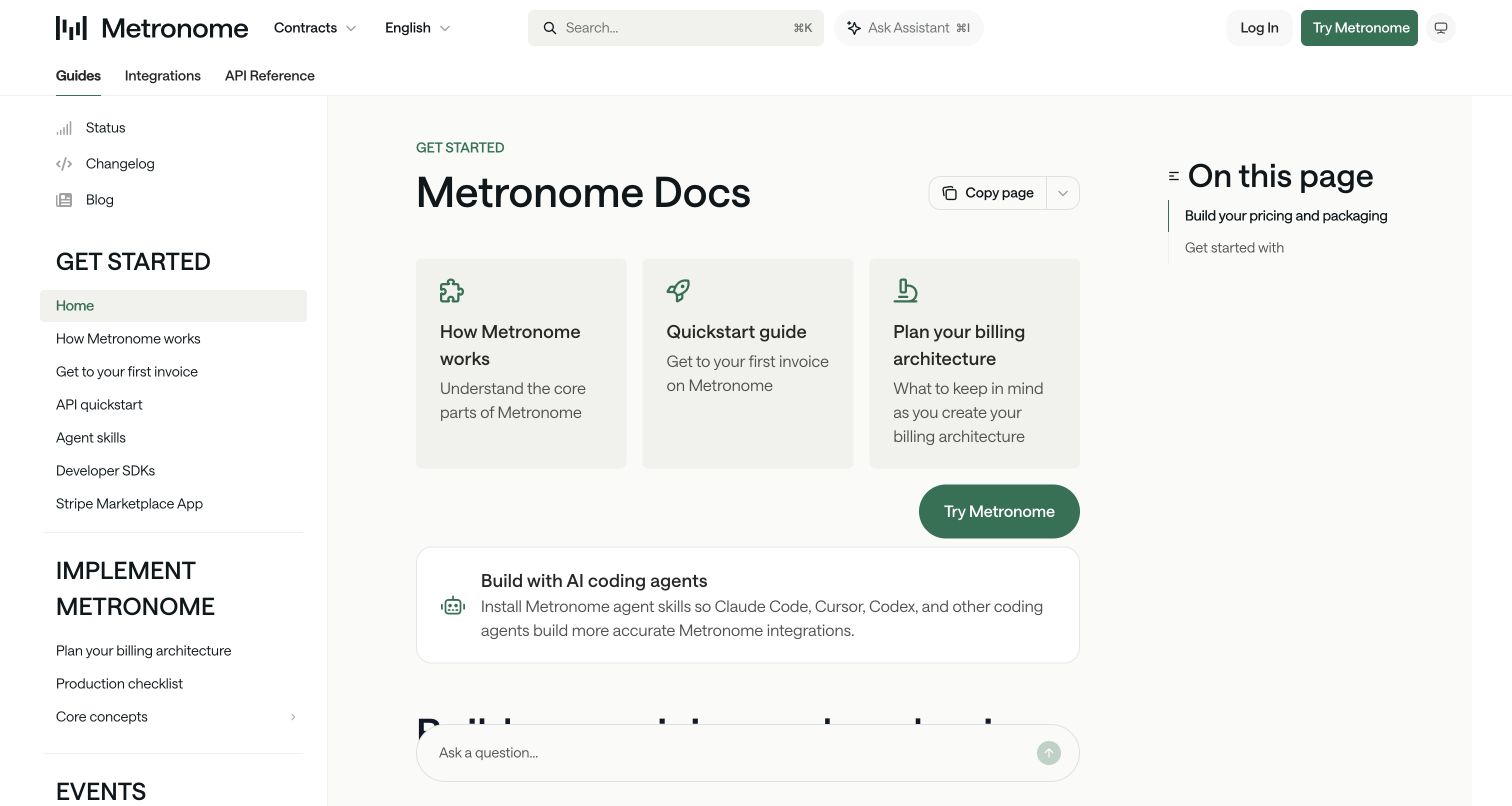
Metronome's documentation homepage presents three cards for understanding the system, reaching a first invoice and planning a billing architecture. A separate callout introduces coding-agent resources. Guides, Integrations and API Reference are top-level destinations, while the sidebar groups implementation, events and pricing topics. The opening recognizes that a technically successful request and a considered implementation plan are not the same task.
What you can learn
Use Mintlify's custom overview content to distinguish explanation, execution and planning. Maintain those three paths as connected resources rather than competing landing pages. A product or contract selector needs clear context when documentation differs by model. Keep examples and QA separate from live invoicing or commercial actions. Test the hierarchy of large sidebar headings, article cards and a persistent assistant so supporting interface features do not crowd the initial planning choice.
Pros
The opening gives architectural planning equal visibility with the quickstart.
Integrations and API Reference remain distinct persistent destinations.
Cons & considerations
Large sidebar headings consume considerable vertical space as topic groups accumulate.
A contract selector can be confusing unless the page makes its effect on content explicit.
Platform source: Current public document generator. The public document inspected on 2026-11-06 declares meta[name="generator"] content="Mintlify". This current publisher-provided signal identifies the captured documentation property, not the organization's corporate site, the documented product's implementation or every private service. Platform evidence is separate from the direct website screenshot and is not a complete current infrastructure audit.
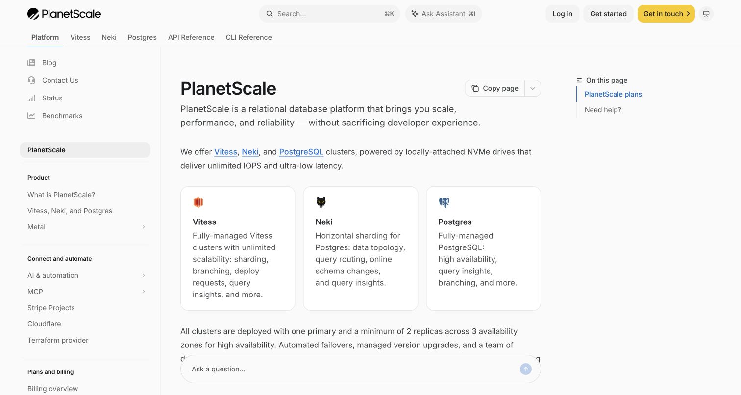
PlanetScale's overview introduces the platform before three cards for its database-family options. Platform, product families, API Reference and CLI Reference each appear across the header. The left outline keeps platform, connection, plans and security material together, while a short right outline points to plans and help. The design is restrained, but its product-specific branching is more important than a decorative hero.
What you can learn
Use Mintlify navigation to keep shared account and platform information separate from engine-specific instructions. Explain the product choice before readers copy connection examples, and maintain links across all parallel documentation sections. Treat performance and reliability statements as publisher claims requiring their own evidence, not results proven by the page design. Check the card descriptions and fixed assistant at high zoom so differences between products remain readable when the three-column card row stacks.
Pros
Product-family choices appear both in the overview and persistent navigation.
API and CLI reference have explicit, separate destinations.
Cons & considerations
Technical comparisons need sufficient context to avoid making the first product choice seem trivial.
A floating assistant can obscure lower overview text on a short reading viewport.
Platform source: Current public document generator. The public document inspected on 2026-11-06 declares meta[name="generator"] content="Mintlify". This current publisher-provided signal identifies the captured documentation property, not the organization's corporate site, the documented product's implementation or every private service. Platform evidence is separate from the direct website screenshot and is not a complete current infrastructure audit.
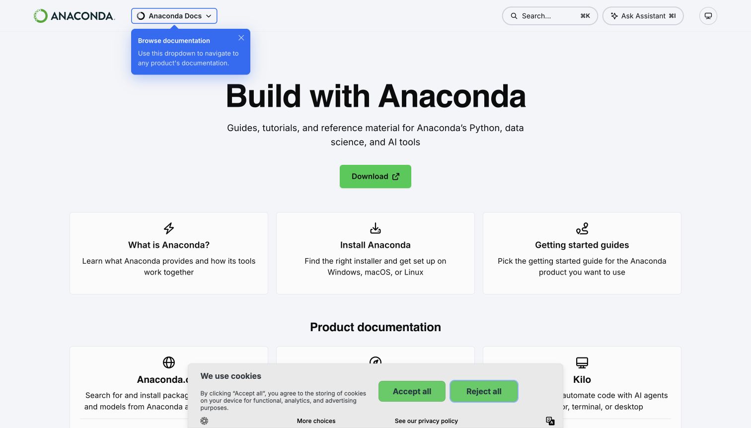
Anaconda's documentation homepage asks three practical questions through cards: what the ecosystem is, how to install it and where to find a product-specific getting-started guide. A broad product index follows. The header keeps a documentation selector, search and assistant controls compact. A visible navigation tip explains that selector, while a cookie panel covers part of the lower product region in the actual capture.
What you can learn
A Mintlify product-family gateway should orient visitors before exposing every tool's full sidebar. Make the selector's scope clear and preserve direct links for readers who prefer the index. Keep legacy product paths labeled and maintain installer instructions independently from conceptual overviews. Test first-visit tips and consent panels together, not only after dismissing them, because the additional layers can obscure exactly the product cards they are intended to help someone find.
Pros
The three opening cards distinguish conceptual learning, installation and product discovery.
A product-family index supports visitors who do not yet know the correct documentation section.
Cons & considerations
A navigation tip and cookie panel can compete with the first-visit content.
A growing family of current and legacy tools needs disciplined naming and archival context.
Visible tech stack
Earlier / documented evidence
Mintlify
Platform source: Current public document generator. The public document inspected on 2026-11-06 declares meta[name="generator"] content="Mintlify". This current publisher-provided signal identifies the captured documentation property, not the organization's corporate site, the documented product's implementation or every private service. Platform evidence is separate from the direct website screenshot and is not a complete current infrastructure audit.
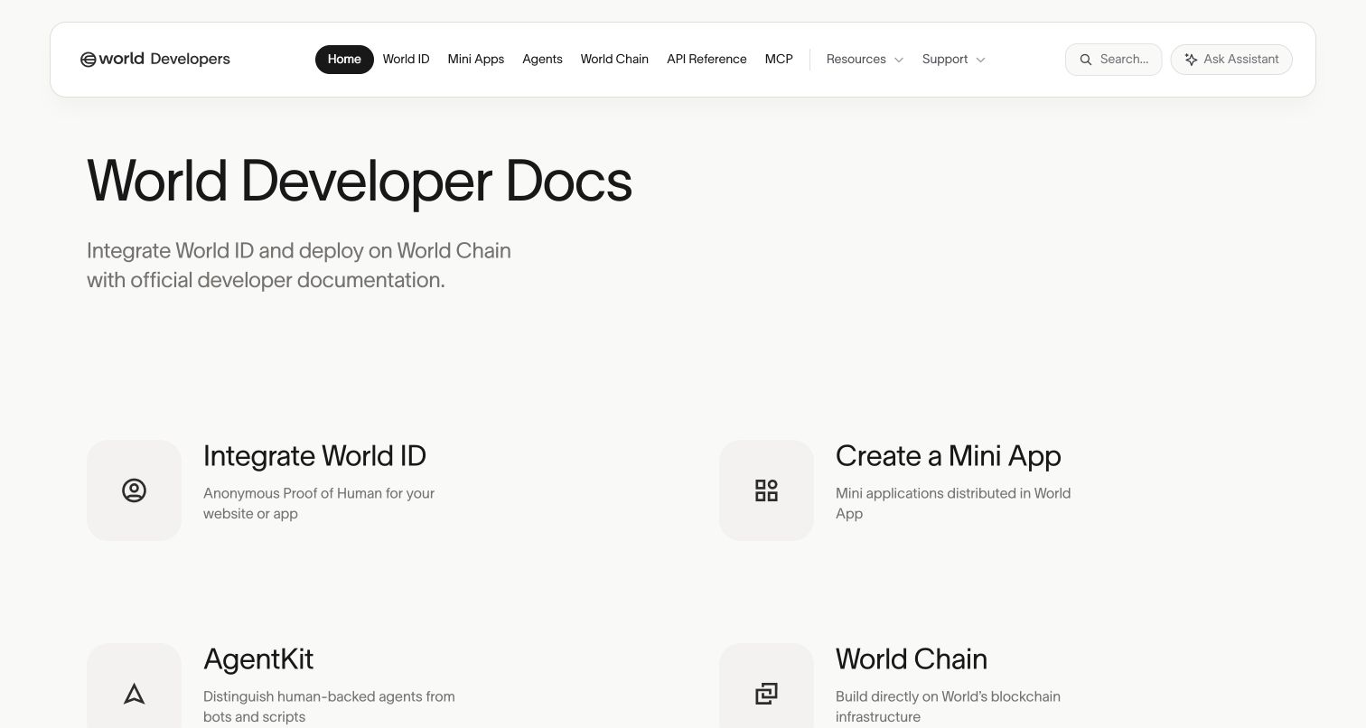
World's developer homepage uses an unusually open layout with a rounded navigation bar and four large task-led entrances. The introduction gives the property a clear developer scope, while the top bar separates product areas from API Reference and MCP. Supporting developer stories and technical updates follow later. The opening is closer to a product gateway than a conventional article-and-sidebar documentation screen.
What you can learn
Mintlify can support a custom gateway when the first decision is which product area to explore. Keep each task label concrete and ensure its destination supplies the necessary requirements and limitations. Preserve ordinary documentation routes alongside stories and update feeds. Distinguish identity and financial-system descriptions from independently verified privacy or outcome claims, and keep browsing read-only; the presence of a documentation playground is not permission to authenticate, transact or submit personal information.
Pros
Four task-led entrances make the ecosystem's major paths visible.
API reference remains directly accessible beside the product-area navigation.
Cons & considerations
Very large spacing can delay secondary resources on smaller screens.
Technical updates and product cards need coordinated maintenance so the gateway does not mix incompatible generations.
Platform source: Current public document generator. The public document inspected on 2026-11-06 declares meta[name="generator"] content="Mintlify". This current publisher-provided signal identifies the captured documentation property, not the organization's corporate site, the documented product's implementation or every private service. Platform evidence is separate from the direct website screenshot and is not a complete current infrastructure audit.
Kegan has 15+ years of experience working with small businesses, Fortune 500 companies, and everything in between. No development job is too big or too small: he brings the same hands-on attention to a focused improvement, a complete website, or a custom application.
For Mintlify projects, he can help with content models, frontend integration, editorial workflows, migrations, and maintainable deployment. He works directly with clients on scope, design, implementation, testing, and handover, with an emphasis on clear communication and a system that remains practical to maintain after launch.
Show 3 other Mintlify developersHide other Mintlify developers
Match the documentation entrance to the product and its readers
A practical article introduction
Resend and Ollama begin with prerequisites or clear task choices. This is useful when visitors need a dependable next step more than another product campaign. Keep the introduction readable and keep account actions separate.
A multi-product developer gateway
Coinbase, Anaconda and World expose several product paths. Preserve a shared overview and make the switch into a specific product's documentation explicit, including any different requirements or release context.
A guided product-learning experience
Replit and Lovable combine public education with operational topics beyond an API. Keep the first journey concise, then let deeper sections explain administration, collaboration and publication without overwhelming new readers.
From references to requirements
Specify the content, access and interaction responsibilities
Map public reading and authenticated action separately
Identify which routes are ordinary documentation, which lead to an account product and which can send requests. Keep documentation login, API credentials and dashboard transitions recognizable. Review permissions with appropriate specialists rather than inferring them from a polished public theme.
Design human and machine-readable outputs together
Mintlify documents generated llms.txt and full-text resources, with visibility affected by authentication settings. Check the content actually exposed, preserve release context and link to maintained source pages. Discoverability resources do not guarantee that an assistant's answer will be correct or appropriate.
Verify real interface combinations
Test narrow screens, keyboard navigation, zoom, code tabs, copy controls, search and failure states. Include first-visit tips, consent panels and floating assistant fields together. Maintain content and examples through a review workflow instead of treating a successful deployment as proof of a successful learning experience.
A useful handover demonstration
Ask the actual team to carry out its routine job: publish a realistic update, correct a mistake, preview a narrow screen, and identify who owns an integration failure. For a library or frontend framework, also ask who maintains the content source and deployment. A polished screenshot does not answer those operational questions.
Beyond the screenshot
Mintlify documentation planning checklist
Choose the main product, learning-mode or release navigation axis.
Keep guide, API-reference and SDK reading paths distinguishable.
Explain shared prerequisites before branching into quickstarts.
Label external dashboards and account actions clearly.
Define safe examples and sandbox boundaries before enabling live requests.
Assign review owners for shared snippets and API specifications.
Review machine-readable outputs and access settings together.
Test consent, first-visit tips and assistant controls alongside article content.
Test with real content, a keyboard, a small screen, slow or failed requests, and the people who will maintain the system. These are planning checks, not an accessibility, security, performance, or search-ranking certification.
Sources & editorial method
How this Mintlify collection was reviewed
Twenty official public documentation properties were independently opened, inspected and directly captured in an ordinary browser on November 6 UTC. Each current document declared Mintlify in its generator metadata. The first five brands also have official platform customer stories scoped to the documented properties, not just logo appearances. Claude Code's domain root redirected to marketing, so its official Read Documentation link was followed to the actual docs route; HubSpot's separate /docs property was captured rather than assigning Mintlify to its developer marketing homepage. Original reviews examine visible design, not private configurations, customer-story outcome metrics or live API behavior. No forms, assistant questions, account workflows or requests were submitted.
Every image is an unmodified capture from the actual website, with its source and capture date. Some captures are reused from our shared catalog; their dates remain the original capture dates. None comes from a vendor gallery or a generated reconstruction. Moving imagery and live content can change.
Technology attribution uses public page assets or metadata, official platform documentation, or a cited first-party project case study. Documentary and framework-relationship evidence is identified where used; it is not a complete current backend inventory. A CMS image CDN alone does not establish a full CMS deployment. A library’s presence does not prove which individual controls use it, and a platform label does not establish AI authorship.
The composition notes, lessons, pros and tradeoffs are original editorial observations. We have not measured conversion, traffic, security, performance or accessibility conformance. Website owners retain their brands and imagery; these examples are not our client portfolio. Written, Edited and Curated are independent records, not dates advanced by a build. See our editorial standards or suggest a correction.
Questions worth asking
Mintlify website development FAQs
Does a Mintlify customer logo prove that the whole company's website uses it?
No. This collection records the exact documentation property and its current public generator signal. Official cases provide supporting scope for the opening brands, but do not establish the implementation of every corporate page or application.
Is an API playground always safe to test?
No. The official documentation describes a playground that sends real requests. Confirm the environment, permissions and possible effects before execution. This collection inspected public pages without creating resources or sending live API calls.
Should an assistant replace the sidebar?
An assistant can offer another route, but readers still need ordinary links, useful headings and maintained reference material. Test the documentation without entering a question and make the source and context of any generated answer understandable.
Do machine-readable files guarantee accurate AI answers?
No. They provide another way to discover and read documentation. Correctness still depends on source quality, coverage, version context and the consuming system. Review exposed content and authentication behavior as part of the publishing process.
Use Mintlify to support a documentation workflow your team can govern. Clear paths, accurate examples and visible boundaries between reading and action give the polished interface its practical value.