Best Film Distributor Websites of 2026 (21 Real-World Examples)
Film distributor websites that connect a distinctive catalogue with a clear next step
A distributor’s website has to serve people who want very different things from the same film: a screening, a ticket, a review copy, a classroom licence, an acquisition conversation or simply a good film to watch.
A film distributor is not always a cinema, a streaming service or a production company, though the same organization can operate in several of those areas. That distinction matters in the website. An audience member arriving from a trailer needs a release and viewing route; an exhibitor needs booking information; an educator may need an institutional licence rather than a consumer rental. A striking still is an effective invitation, but it should lead into a catalogue whose language and actions explain the relevant relationship.
This collection studies real distributor and distribution-associated websites with different catalogue sizes, audiences and business models. The useful comparison is how each presents films and directs a visitor, not whose releases are best or whose site generates the most ticket sales. Original screenshots retain their real capture dates. Current official material is used to qualify the distribution role, while visible public technology evidence is kept separate from any inference about internal rights management, booking systems or delivery operations.
Before the examples
What makes good film distributor website design in 2026?
Separate watching a film from booking or licensing it
Use actions that describe the actual transaction. Tickets, streaming, physical editions, theatrical booking, community screenings and educational licensing are not interchangeable. Give a visitor a clear route for each service the distributor genuinely offers, and identify when an external cinema, platform or licensing partner handles the next step.
Make release and catalogue context easy to scan
A title, image and short synopsis need supporting context. Release status, territory, director, language, runtime, accessibility information and permitted viewing routes can answer different questions. Publish only accurate, maintained facts and make their scope explicit; a release available in one country should not quietly look available everywhere.
Build a recognizable editorial voice without burying practical information
Campaign art, trailers, typography and writing help a distributor communicate its point of view. Keep film titles and navigation readable alongside that expression. A bold launch campaign should not make the catalogue archive, booking contact or accessible text description disappear.
The collection · 21 examples
21 film distributor websites worth studying
Look at the transition from a campaign image to a useful film record. Compare catalogue organization, release labels, audience routes and the amount of context supplied before the visitor has to leave for another platform.
Grasshopper Film pairs a white, carefully spaced header with a full-width still from zi. The pictured campaign names the film, its director and its now-playing status, followed by a simple More Info action. The header’s In Theaters, Watch and Educational labels do an important job before the visitor reads any synopsis: they distinguish different reasons to visit the distributor. Transmissions and Info remain available without turning the top area into an administrative directory. The thin campaign lettering feels deliberately quiet, although its readability depends on the changing picture beneath it. The screenshot shows an invitation into the release, not a completed viewing or licensing journey.
What you can learn
Separate audience tasks in ordinary language before adding more promotional detail. A concise film campaign can then focus on one title while the header preserves alternative viewing and institutional routes. Check title contrast against the actual stills rather than assuming one text treatment suits every campaign.
Pros
Theater, viewing and educational routes are distinguished.
The director credit adds context.
Cons & considerations
Thin text over photography may be difficult to read on a different frame.
A more-info label may need a clearer destination description in a complex catalogue.
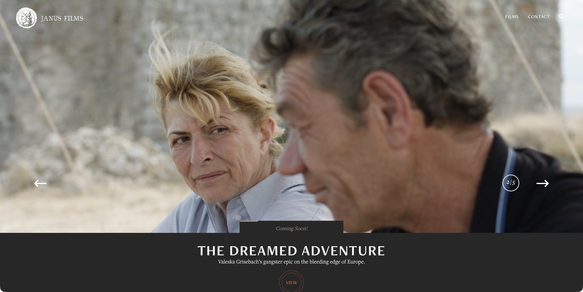
Janus Films lets a large still from The Dreamed Adventure occupy most of the opening screen, with its restrained wordmark and Films and Contact links placed above. The title and short description sit in a dark panel beneath the image rather than competing with faces in the photograph. A coming-soon label and numbered carousel indicator identify the pictured promotion as one release within a wider programme. The composition is particularly useful for studying how campaign imagery can remain spacious while the film still gets a distinct text record. It does not make theatrical booking or territory information visible in this first frame.
What you can learn
Give the campaign image and the functional film information their own space. Preserve a clear title, release stage and catalogue route even when the artwork changes, then connect that introduction to maintained screening or booking details rather than asking an image to answer every question.
Pros
A dark panel keeps the title readable outside the still.
The header preserves catalogue and contact routes.
Cons & considerations
A very large hero may delay the wider catalogue for visitors seeking another title.
The opening campaign alone cannot establish current screenings or booking rights.
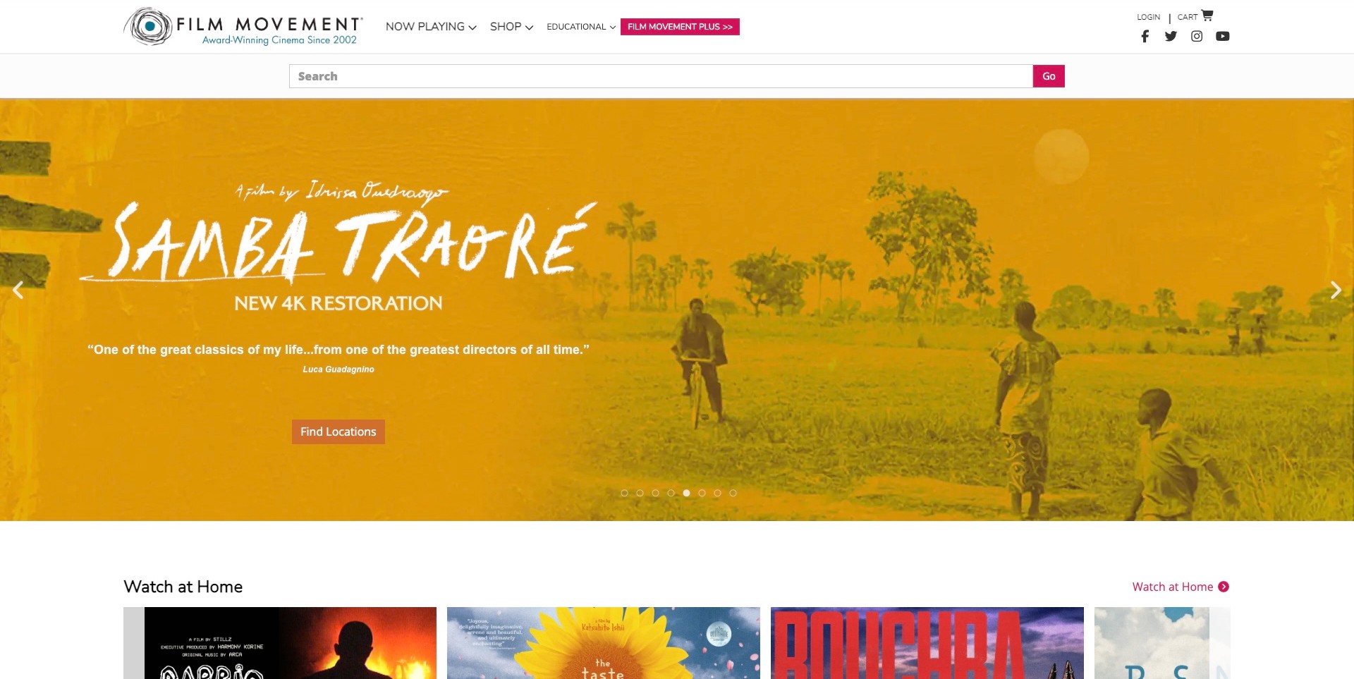
Film Movement gives Samba Traoré a warm, poster-like restoration campaign while keeping a substantial functional header above it. Now Playing, Shop and Educational sit beside a visibly separate Film Movement Plus route; a wide search field gives a visitor another way into the catalogue. The pictured campaign includes a restoration label and a Find Locations action, so the opening is more specific than an unexplained poster. A Watch at Home row begins immediately below, introducing another release stage without requiring a different brand entrance. The tradeoff is density: catalogue search, account links, commerce and promotion all compete for a newcomer’s initial attention.
What you can learn
Make the distribution route explicit near the promoted title. A restoration, theatrical run and home-viewing option can share the same catalogue, but each needs an accurately labelled next step. Keep the header’s useful distinctions while resisting the temptation to give every secondary utility equal visual weight.
Pros
Restoration and location labels clarify the campaign.
Search supports visitors seeking a particular title.
Cons & considerations
A dense header may take more effort to scan on smaller screens.
Availability information still needs to be maintained beyond the campaign artwork.
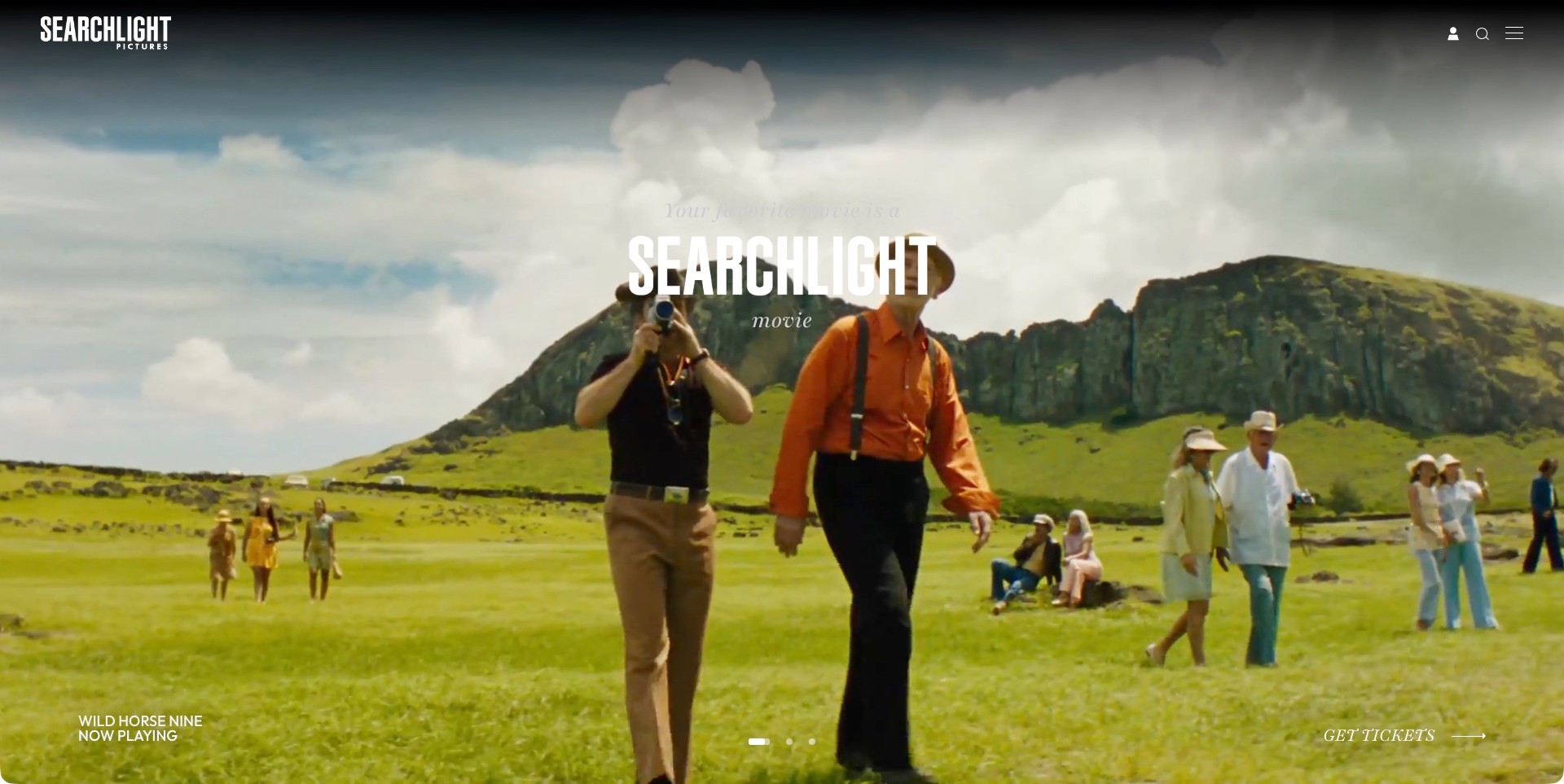
Searchlight Pictures uses a cinematic landscape frame for its Wild Horse Nine promotion, keeping the company wordmark in the upper corner and the film’s title and now-playing status near the lower edge. A Get Tickets action occupies the opposite corner. The arrangement allows the image to dominate while leaving a recognizable commercial next step visible. Search, an account symbol and a menu icon form a very compact utility group rather than a full row of catalogue categories. The central Searchlight treatment reinforces the distributor’s identity, but it is the quieter film label that tells a visitor which release the current frame concerns.
What you can learn
An immersive campaign still needs a stable relationship between title, release status and action. Keep those elements understandable when the image or carousel frame changes. If the main navigation is reduced to icons, make the catalogue and company routes discoverable without requiring users to infer what each symbol means.
Pros
Film and ticket labels sit apart from the central branding.
The header gives the campaign room.
Cons & considerations
Small edge-positioned information may be easier to overlook than the large imagery.
Icon-only navigation can conceal useful catalogue choices from a first-time visitor.
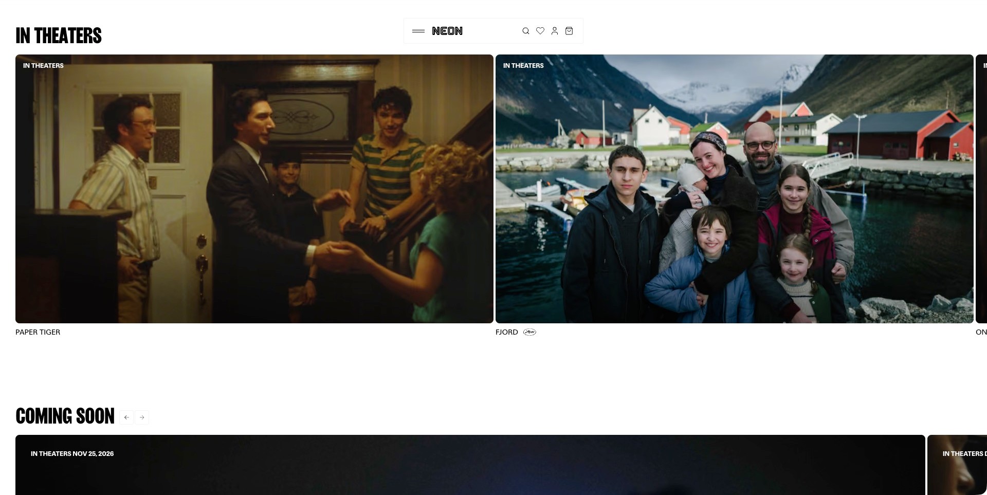
NEON opens with a white catalogue-like surface rather than one dominant full-screen campaign. The pictured In Theaters section places large stills for Paper Tiger and Fjord beside one another, with concise titles below. A Coming Soon heading begins the next group, while a compact central navigation keeps the brand present without using a tall corporate header. This approach makes release stage part of the page’s organization instead of relying entirely on a changing promotional headline. The horizontal card treatment suggests more films beyond the visible area, so the design needs understandable continuation and a usable route to each record. The picture alone does not establish territory-specific screenings.
What you can learn
Organize a release slate by the decisions visitors need to make, then give each film a clearly named entrance. Large cards can preserve a cinematic feel without requiring a single winner in the hero. Keep titles and release labels as dependable text, and test how the catalogue is discovered without dragging or hovering.
Pros
Current and upcoming releases have distinct headings.
Adjacent stills introduce several films.
Cons & considerations
Horizontally continuing cards may hide releases from some visitors.
A release-stage heading does not establish local ticket availability.
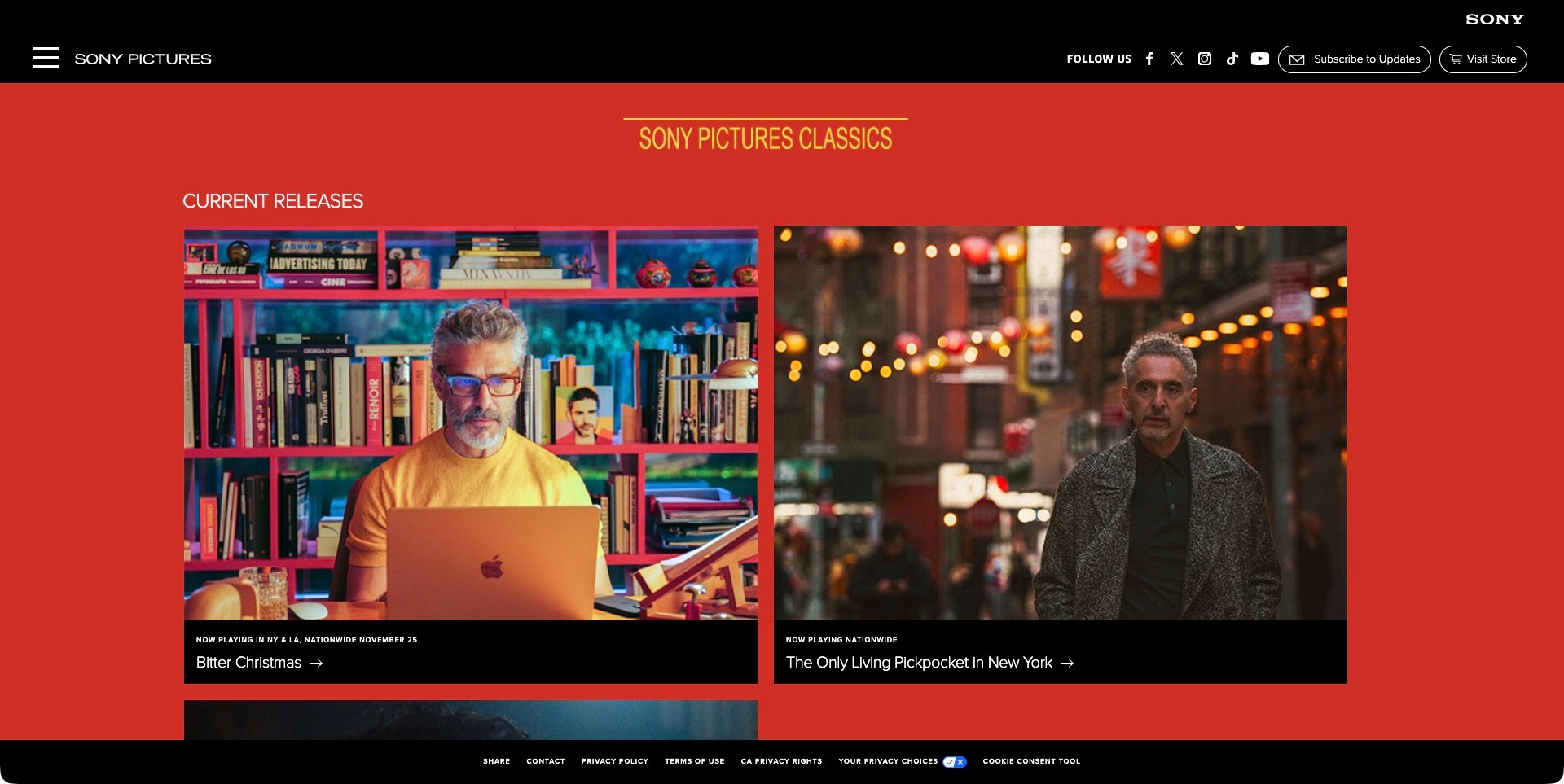
Sony Pictures Classics uses a vivid red field beneath a black corporate header, with two large current-release cards visible together. Bitter Christmas and The Only Living Pickpocket in New York each have a separate black information strip beneath their images. That separation lets campaign photography carry atmosphere while the title and release wording remain in predictable places. The distributor’s own heading distinguishes the section from the broader Sony Pictures identity above it. The result is a useful alternative to a single rotating promotion: visitors can compare several releases in one glance. Practical catalogue navigation is less explicit in the pictured header, which relies partly on a menu control.
What you can learn
Treat each current release as a consistent record even when its artwork differs dramatically. A repeated title strip can make a visually varied slate easier to understand. Preserve ordinary catalogue and contact routes alongside the corporate identity, and scope dates or rollout language to the market they actually describe.
Pros
Information strips separate titles from photography.
The red section clearly distinguishes the distributor’s release slate.
Cons & considerations
Menu-led navigation may make the deeper catalogue less immediate.
National rollout wording still requires maintained territorial context.
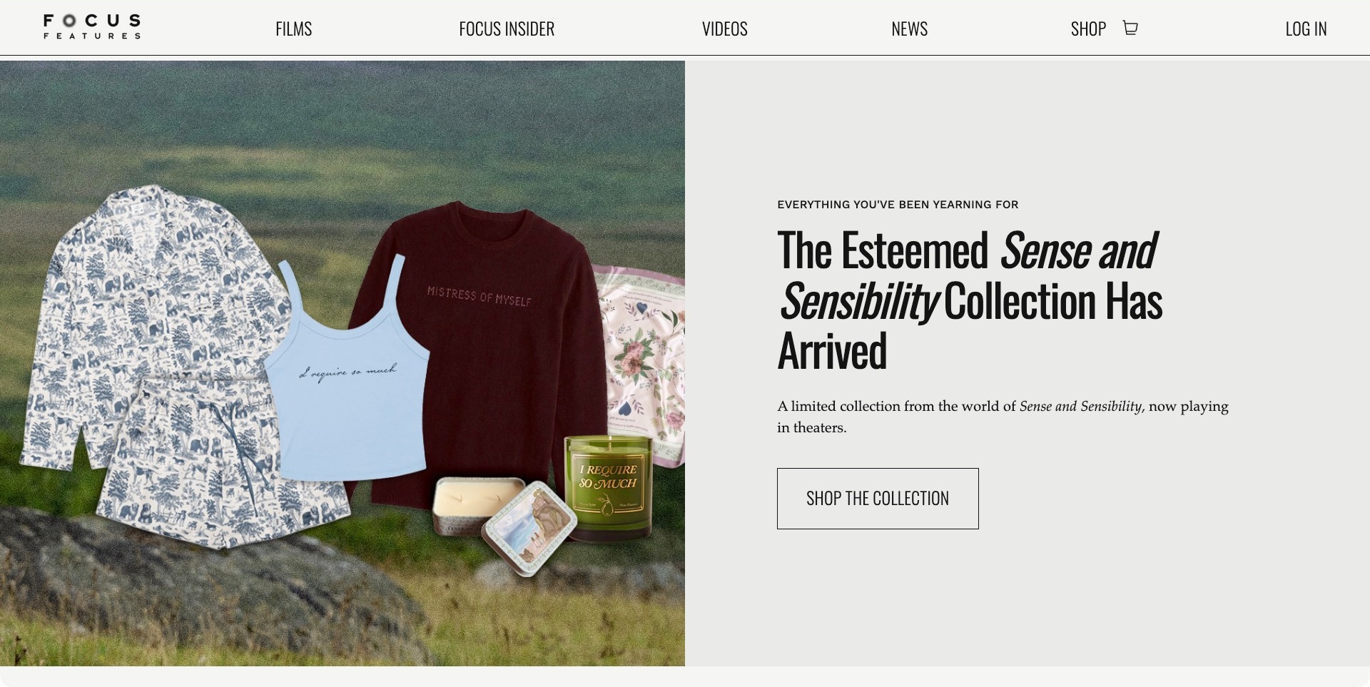
The captured Focus Features view is a scrolled homepage merchandise feature, not its opening film hero. A split panel pairs Sense and Sensibility products with a large collection headline, a short explanation and a Shop the Collection action. The persistent header keeps Films, Videos, News and Shop visibly distinct. This is useful for studying how a distributor can offer a secondary commercial path without pretending that merchandise is the same task as finding a screening. The composed product image and restrained text panel give the feature a clear identity. The screenshot does not establish stock, fulfilment or a successful purchase, and its position below the homepage opening matters to the comparison.
What you can learn
Keep campaign extensions visibly separate from the primary film record and viewing route. Use a dedicated feature with a descriptive action rather than making every visitor infer whether an image leads to tickets, a trailer or a shop. Preserve catalogue navigation when someone moves into merchandise-related content.
Pros
A split layout separates products from the explanatory action.
Films and Shop remain distinct.
Cons & considerations
A merchandise-led frame does not explain screening availability.
Stock and fulfilment cannot be inferred from a promotional feature.
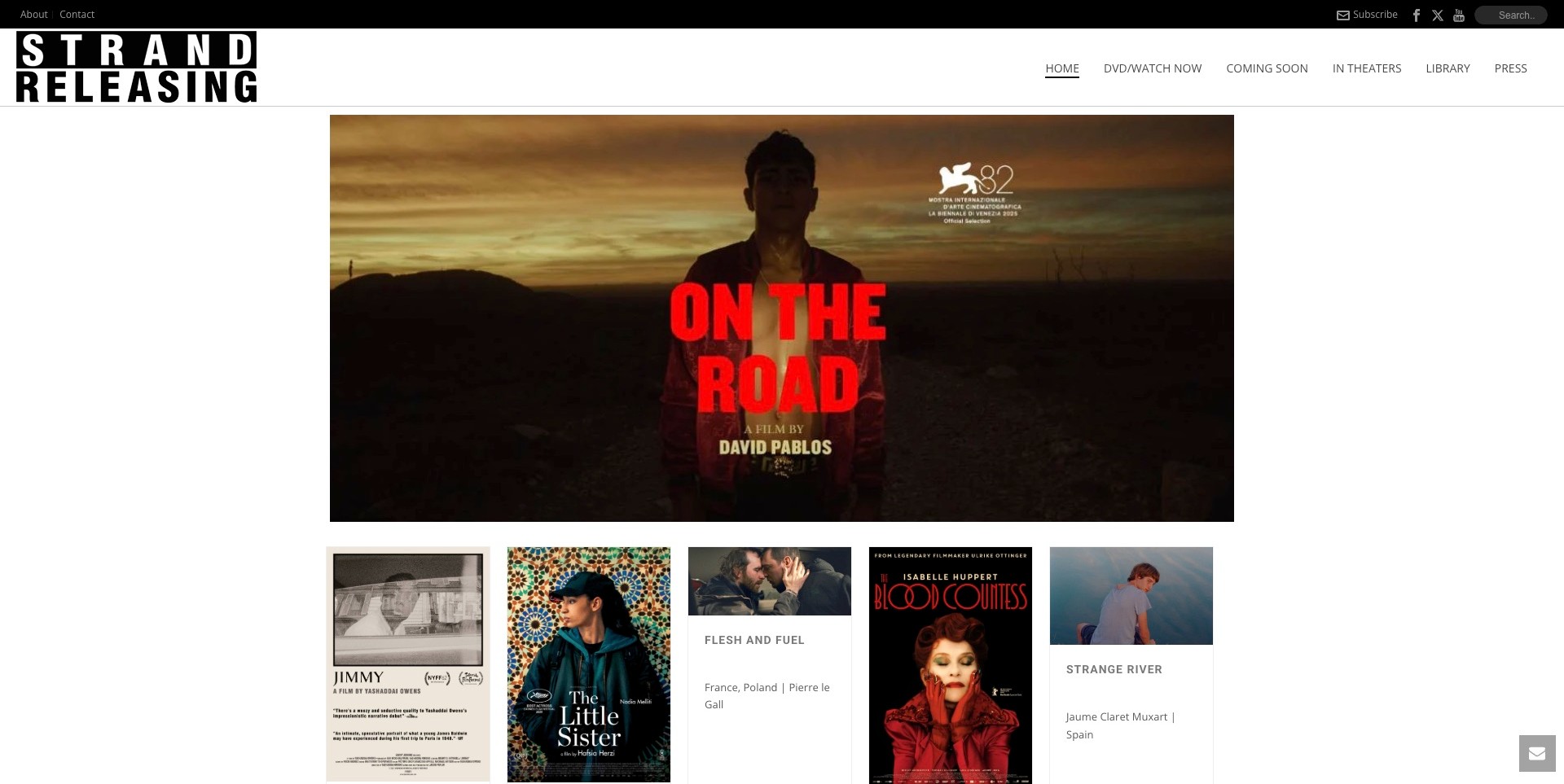
Strand Releasing places an On the Road campaign image inside a generous white page rather than stretching it across every edge. A row of smaller film cards begins directly below, so the site introduces a promoted title and a wider selection in the same view. Its header distinguishes DVD/Watch Now, Coming Soon, In Theaters, Library and Press. Those labels distinguish different catalogue audiences. The strong black wordmark holds the identity together while individual posters retain their own visual styles. Some title information remains embedded in artwork, and the visible mix of card heights gives the row a less uniform rhythm than a strict poster grid.
What you can learn
Use a focused campaign feature without forcing the entire catalogue below several screens of promotion. Give different access routes plain labels and preserve readable film titles outside posters where possible. Let artwork vary, but use consistent supporting information so visitors can identify a release even when its poster lettering is small.
Pros
Viewing, library and press routes are distinguished.
A card row introduces catalogue breadth.
Cons & considerations
Artwork-heavy titles may be harder to scan at small sizes.
Mixed card proportions can make related release details less predictable.
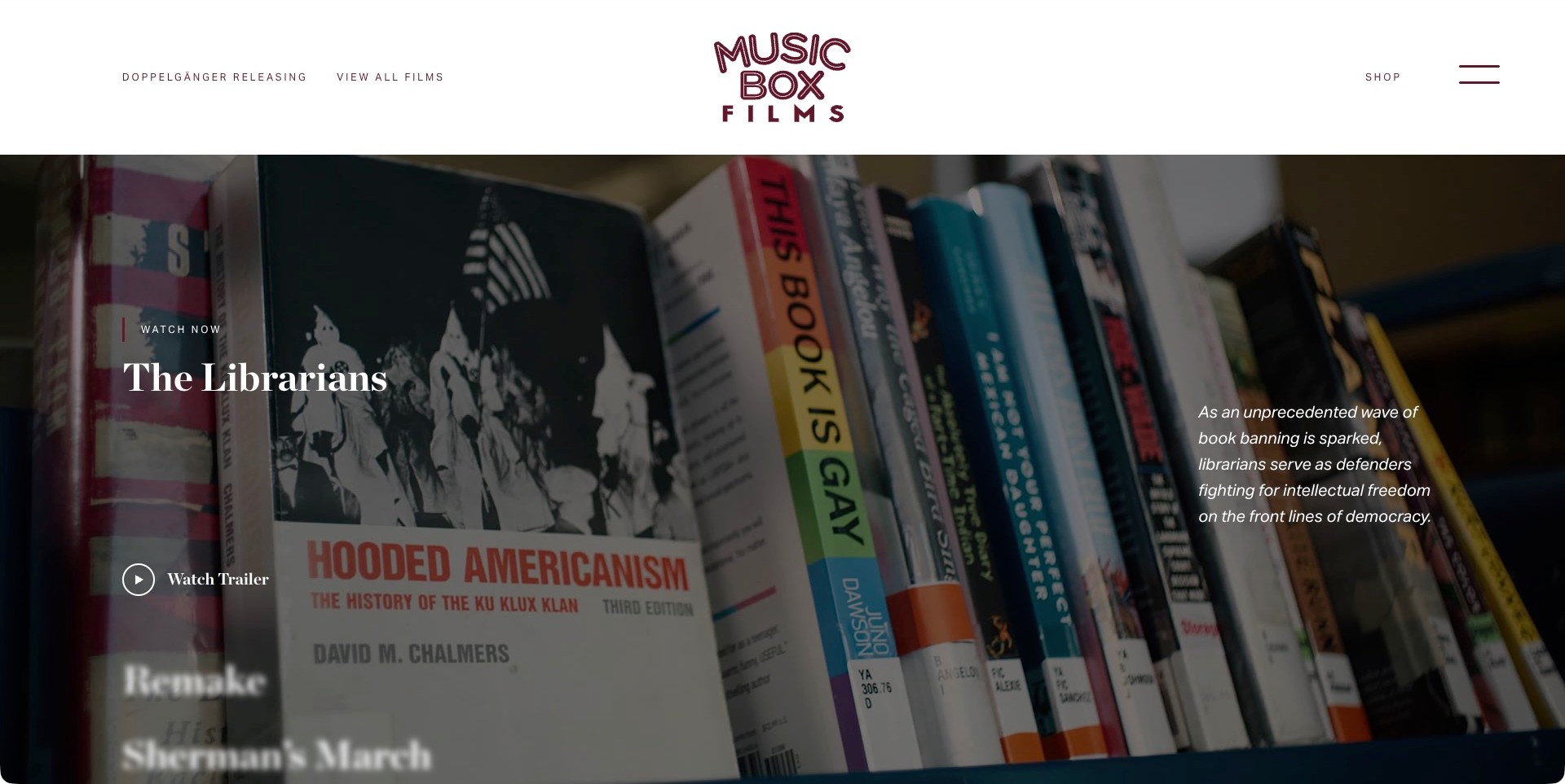
Music Box Films introduces The Librarians with a large bookshelf image beneath a spacious white header. The film title and trailer action sit on the left, while a short description occupies its own area on the right. That arrangement allows the subject of the documentary to become understandable before a visitor leaves for a trailer or another page. View All Films remains an explicit header route alongside the separate shop and menu controls. The composition connects campaign atmosphere with editorial explanation. It is still only a release entrance: the pictured first view does not spell out institutional bookings or establish where a visitor can watch in a particular territory.
What you can learn
Give a promoted film enough original context to make its subject intelligible without autoplay. A short synopsis and a plainly named trailer action can serve different levels of interest. Keep the broader catalogue available and avoid treating an evocative still as a substitute for viewing or booking information.
Pros
The synopsis adds context alongside the image.
View All Films leads beyond the hero.
Cons & considerations
Text over changing photography needs consistent contrast review.
The opening promotion does not settle local viewing or licensing options.
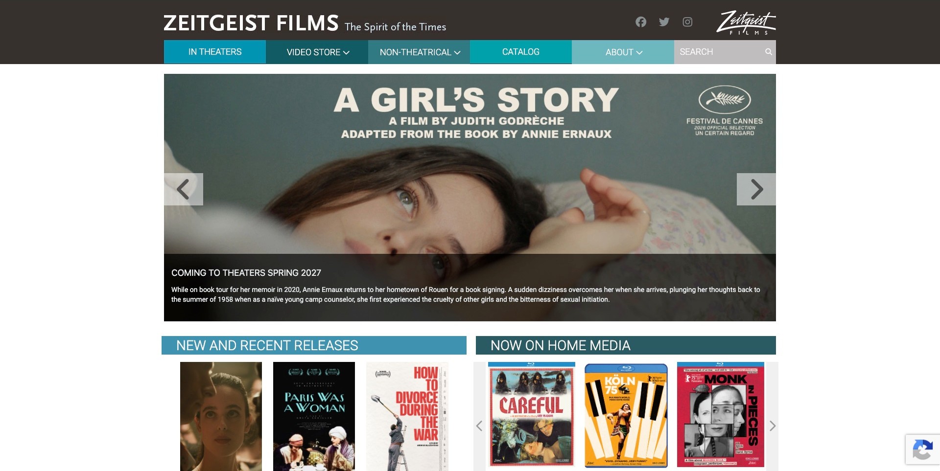
Zeitgeist Films uses a compact, colour-blocked navigation to distinguish In Theaters, Video Store, Non-Theatrical and Catalog. The pictured A Girl’s Story campaign sits within a bounded content width, with a release-stage strip over its lower edge. Immediately below, New and Recent Releases and Now on Home Media form separate groups of posters. This is a practical catalogue-first approach: visitors can recognize that new theatrical promotion and home-media browsing are different tasks without opening a menu. The page is visually denser than the full-screen campaign examples, and some poster text becomes small in the lower rows. The pictured release date is captured information, not an independent guarantee about a future screening.
What you can learn
Make catalogue divisions reflect actual access routes, then keep the labels consistent between navigation and page sections. A dense release page can remain understandable when its hierarchy is explicit. Publish important dates and titles as maintained text rather than relying entirely on campaign graphics or miniature poster lettering.
Pros
Theatrical, non-theatrical and home-media routes are explicit.
Separate lower headings make two release groups recognizable.
Cons & considerations
Dense poster rows may require clearer small-screen hierarchy.
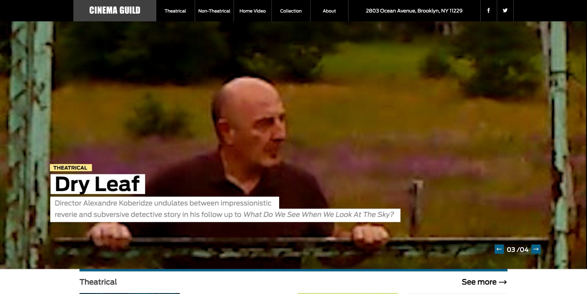
Cinema Guild overlays the pictured Dry Leaf campaign with solid white text blocks rather than thin lettering directly on the image. The theatrical label, title and short description remain distinct against the deliberately grainy film frame. Its black header names Theatrical, Non-Theatrical, Home Video and Collection, providing several practical entrances before a visitor chooses the promoted release. A numbered indicator and small controls identify the hero as part of a sequence. The useful design lesson is the contrast between a highly atmospheric image and dependable information surfaces. The screenshot does not demonstrate the carousel’s keyboard behaviour or identify the current rights available for every film.
What you can learn
Build a campaign treatment that tolerates images with very different tonal ranges. A solid title surface can retain personality while making a film easier to identify. Keep access categories explicit, and connect them to maintained title records rather than implying that one dramatic still explains booking or licensing.
Pros
Solid title blocks remain readable over the film image.
Theatrical and non-theatrical routes are explicitly separated.
Cons & considerations
Long overlay descriptions may occupy significant space on small screens.
A catalogue entrance does not establish booking rights or availability.
Well Go USA’s pictured Dear You hero places a very large white title over a darkened film still. A Film Details button sits on the left, while a smaller illustrated trailer panel sits on the right. The header remains compact, with Films, Hi-YAH!, About Us and search. This is useful for studying how a distributor can invite both immediate trailer viewing and a more informative film-page visit without giving the two actions identical presentation. Carousel indicators reveal that the opening campaign is part of a broader slate. The large image establishes atmosphere, but the opening frame supplies little synopsis or screening context for someone unfamiliar with the title.
What you can learn
Distinguish a trailer invitation from the page that explains the film. Give both descriptive labels and preserve a direct catalogue route. A cinematic hero can be concise when the next page supplies maintained release, territory and viewing information; it should not become the only place where a film is identifiable.
Pros
Film details and trailer have distinct entrances.
A bold title remains recognizable.
Cons & considerations
The image-first opening provides limited narrative or practical context.
Small carousel indicators may be less discoverable than ordinary catalogue navigation.
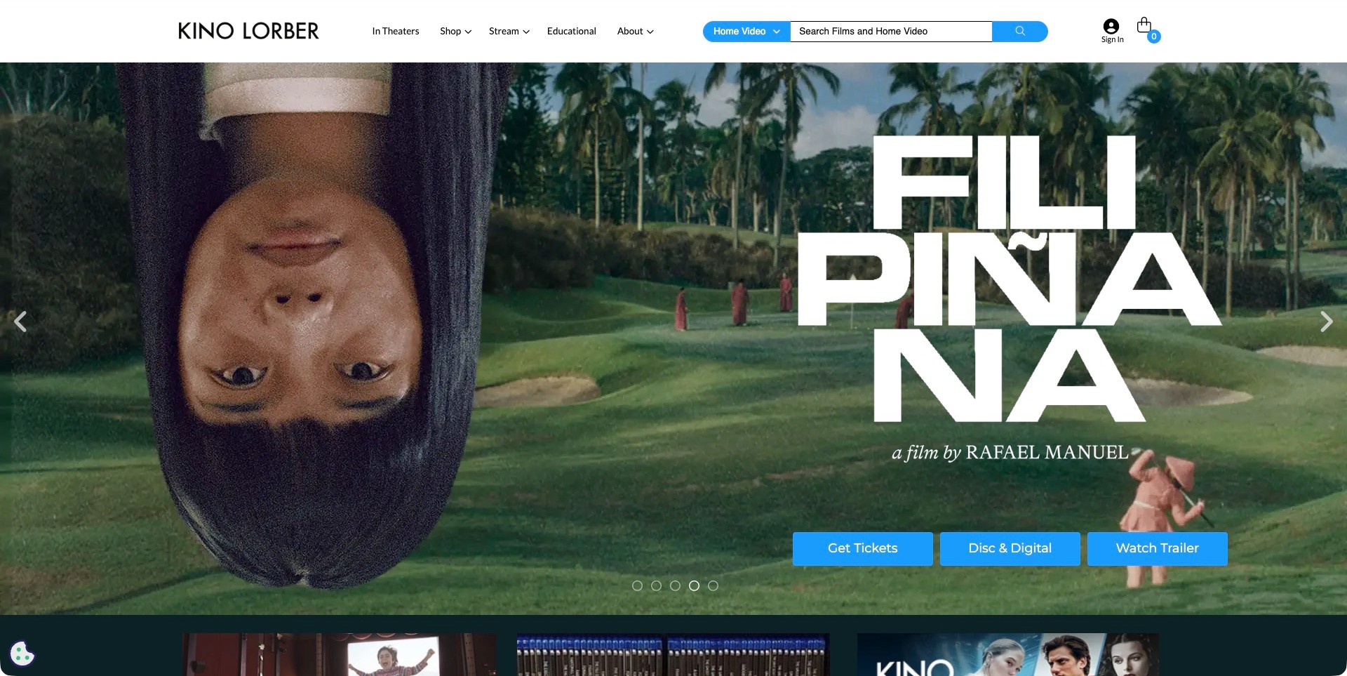
Kino Lorber pairs the pictured Filipiñana campaign with three blue actions: tickets, disc and digital, and trailer viewing. The upper white header separately names In Theaters, Shop, Stream and Educational, and a search area identifies a home-video scope. That makes the site particularly useful for studying how one distributor can support several types of access without reducing all interest to a generic Watch button. The large campaign artwork retains its own visual voice beneath the restrained utility area. The breadth of the header and the three parallel actions also create a prioritization challenge. The public presentation does not establish which editions or screenings are available in a visitor’s market.
What you can learn
Name access routes according to the actual transaction and keep them connected to the same film record. Make search scope understandable instead of silently mixing products, films and institutional licences. Test the header and campaign together on small screens so breadth does not become a dense block of competing controls.
Pros
Tickets, editions and trailer are distinguished.
Educational access remains separate.
Cons & considerations
Several parallel access routes can become dense at narrower widths.
Public actions alone do not confirm territorial availability or stock.
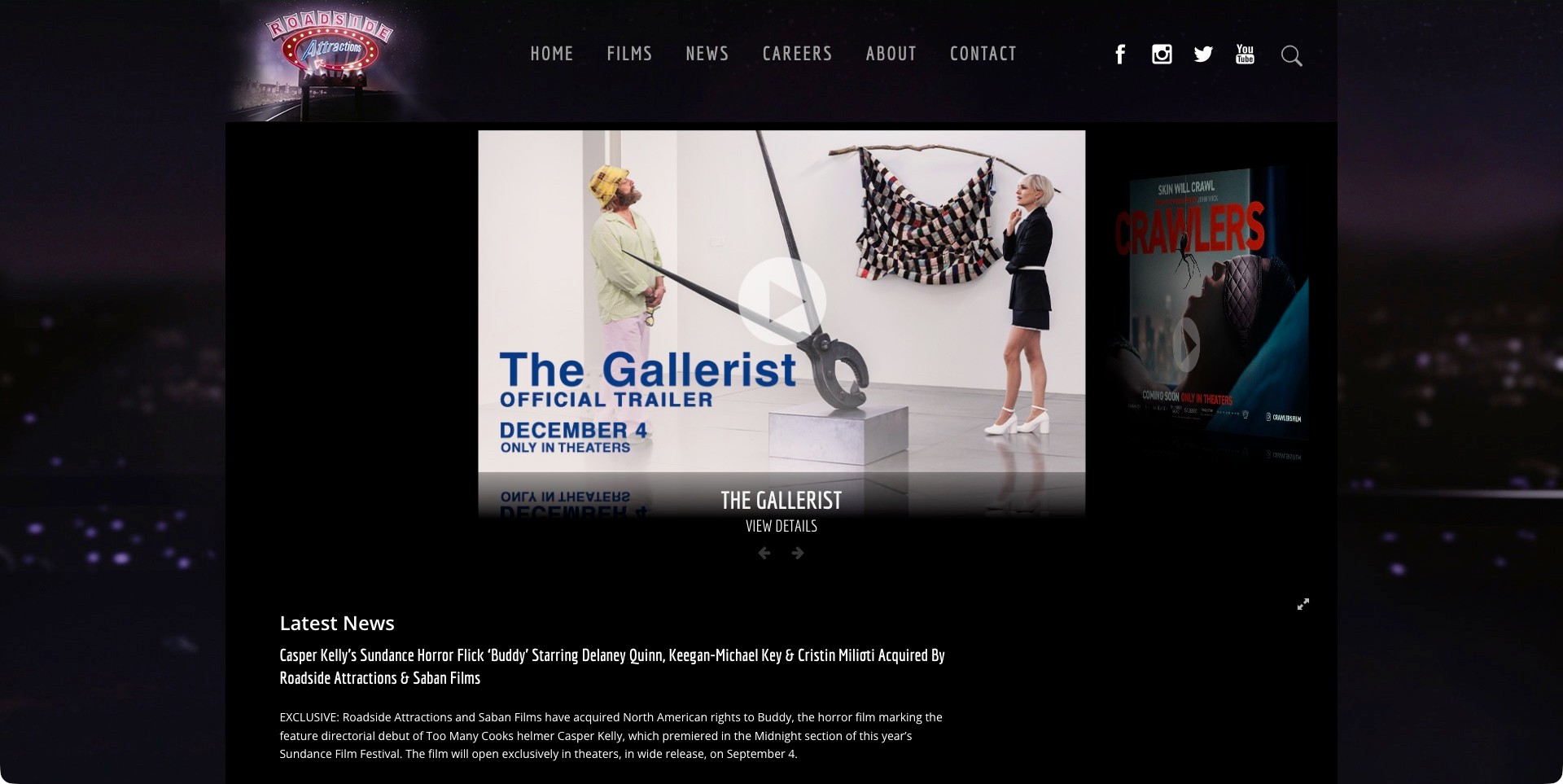
Roadside Attractions frames its catalogue with a dark, night-road visual identity and a sign-like wordmark. The pictured central feature promotes The Gallerist trailer, with a neighbouring film angled to suggest another carousel item. A separate View Details label appears below, while Latest News begins underneath the feature. The combination gives the distributor a recognizable setting without making every release adopt the same artwork style. It is also a useful example of an older, more theatrical carousel treatment alongside ordinary Films and Contact links. Some controls and secondary text are subdued against the dark surface, and the frame itself does not provide a complete synopsis or a screening finder.
What you can learn
A strong distributor identity can surround individual campaigns rather than being imposed on their images. Keep the trailer, title record and catalogue routes distinguishable, and check control contrast carefully. Use news to add context, not as a substitute for maintained film information or a clear next viewing step.
Pros
A recognizable identity connects the page.
Trailer and film-details labels indicate different next steps.
Cons & considerations
Dark secondary controls may be less immediately noticeable.
A prominent trailer does not supply complete release or booking context.
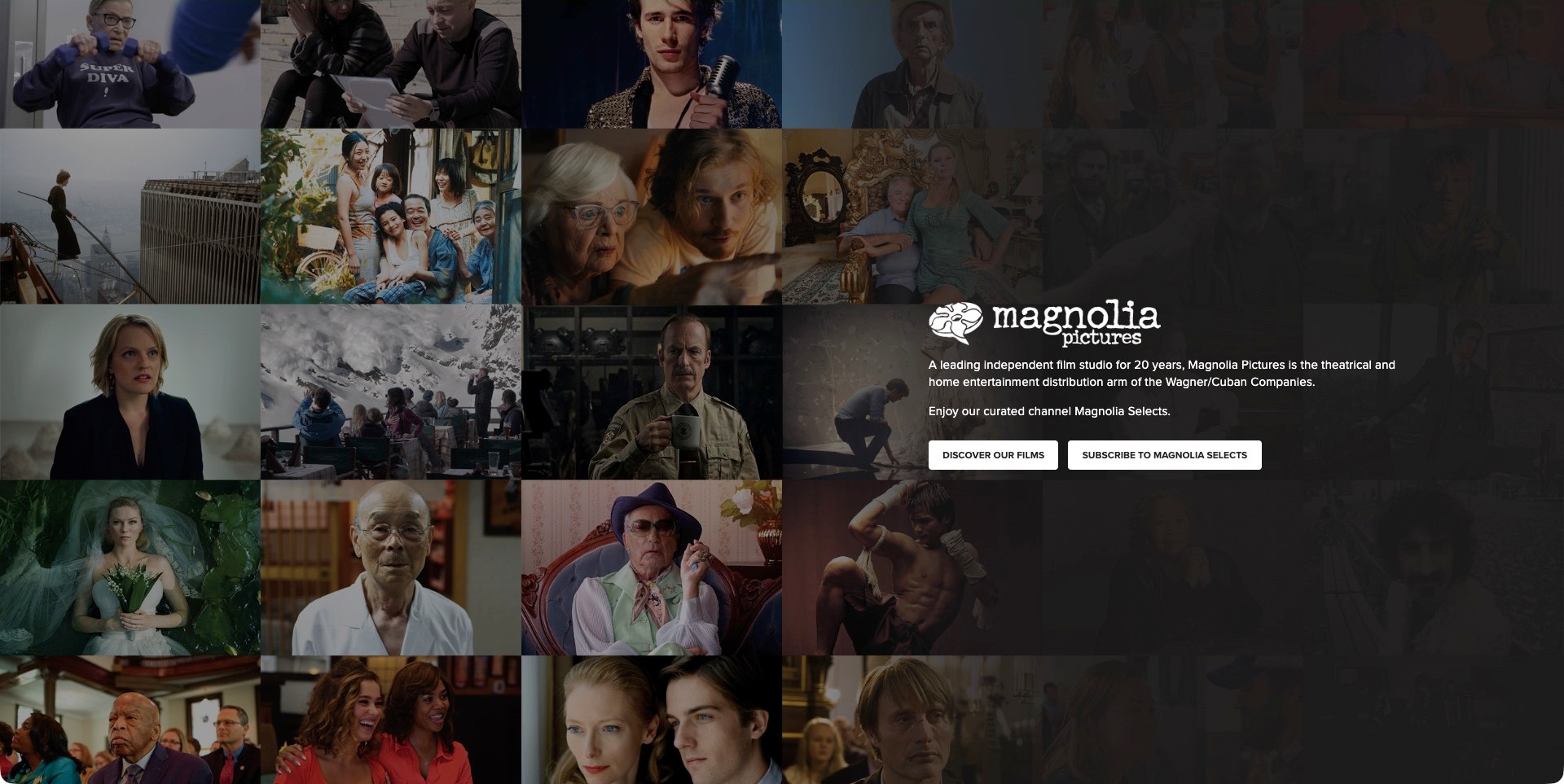
Magnolia Pictures’ current landing page uses a montage of film images behind a dark gradient and a compact company introduction. The text identifies theatrical and home-entertainment distribution, followed by separate actions for discovering films and subscribing to Magnolia Selects. Unlike a release-first homepage, the pictured page introduces the distributor’s range and business relationship before directing someone onward. The native source redirects from the older magpictures.com address to the actual magnoliapictures.com page shown here; the review concerns that destination, not an invented copy of the former site. The montage conveys breadth, although an unfamiliar visitor cannot identify every title from the image alone.
What you can learn
When a landing page primarily directs people between services, state what the organization does and label the destinations clearly. A company introduction and a subscription offer should not become indistinguishable. Preserve a useful catalogue route for visitors who want a specific film, and avoid treating a visual montage as searchable film information.
Pros
The text explicitly describes the distribution role.
Catalogue discovery and subscription have separate actions.
Cons & considerations
The montage does not identify every pictured film.
A minimal gateway may add an extra step for title-specific visitors.
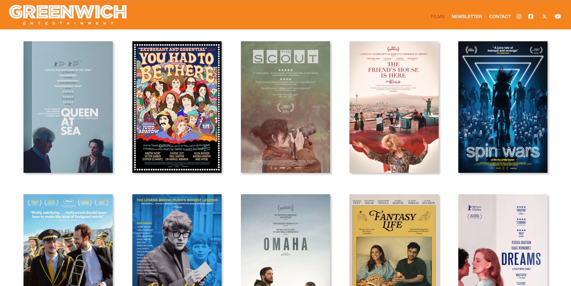
Greenwich Entertainment’s pictured Films page places five posters across each row beneath an orange header. Queen at Sea, You Had to Be There and other titles retain their individual campaign artwork within a consistent grid. Films, Newsletter and Contact keep the structure compact. This is a useful contrast with full-screen video heroes: the visitor immediately sees catalogue breadth and can recognize several releases without waiting for a rotation. The tradeoff is dependence on poster lettering, which varies considerably in size and contrast. A poster’s awards and review language belong to the film campaign, not an independent assessment by this design collection.
What you can learn
A consistent catalogue grid can give varied films equal structural treatment without flattening their identities. Add dependable text labels and useful film records so the poster is not the only way to identify a title. Where the collection is large, give search or other maintained routes a deliberate role rather than expecting endless visual scanning.
Pros
The grid shows several films immediately.
Orange framing unifies varied artwork.
Cons & considerations
Poster lettering alone can be difficult to read at small sizes.
A visual directory does not explain each title’s current viewing rights.
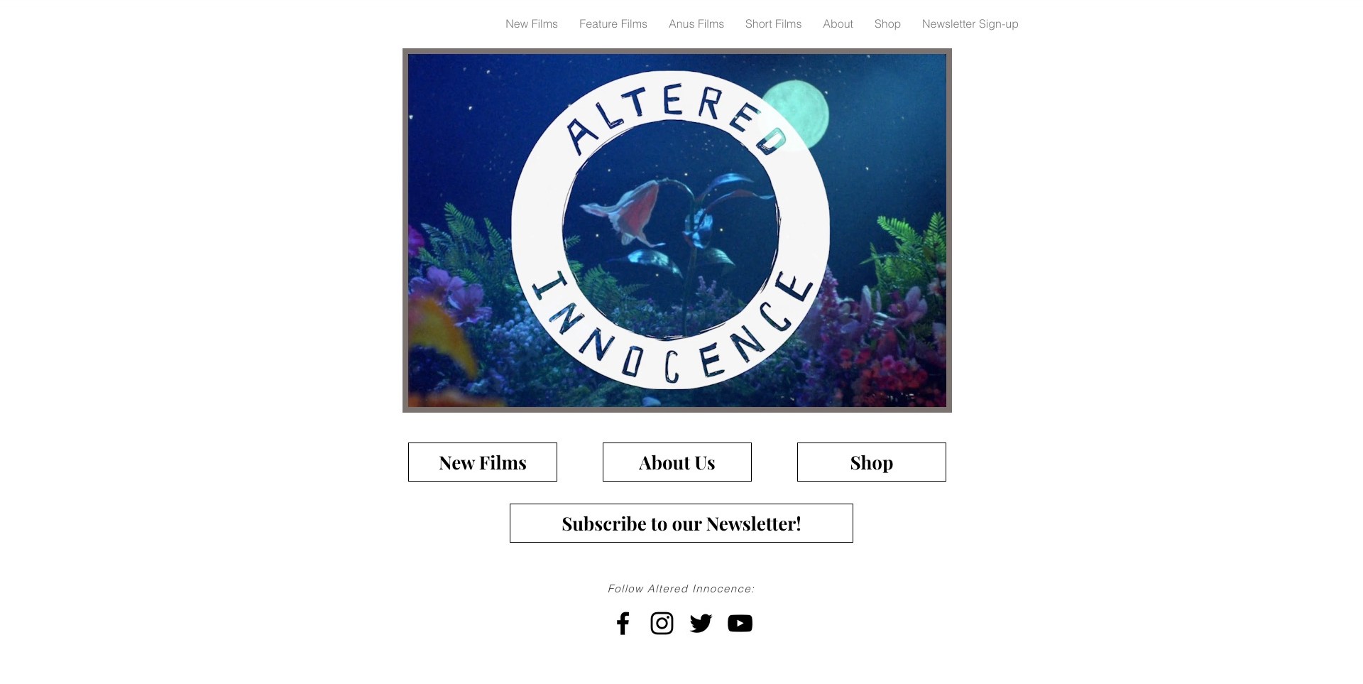
Altered Innocence’s pictured homepage centres a circular wordmark over an aquarium scene, surrounded by a generous white page. New Films, About Us and Shop appear as large outlined buttons below, followed by a newsletter action and social links. Upper navigation adds film categories. The main image is an identity treatment rather than a named film campaign, so the site asks visitors to choose a catalogue or company route before learning about individual releases. That simplicity is useful for a specialist distributor with a clear point of view. The review does not treat the aquarium imagery as a film still or infer how the underlying shop and mailing list operate.
What you can learn
An identity-led entrance can remain useful when its next actions are explicit and limited. Make New Films and Shop genuinely different destinations, keep category labels understandable and ensure a static fallback retains the brand and navigation. The film catalogue must eventually supply the factual detail the opening intentionally leaves out.
Pros
Large buttons make choices explicit.
Brand identity stays distinct from film artwork.
Cons & considerations
The opening does not introduce a specific current release.
Repeated upper and lower navigation may need careful small-screen hierarchy.
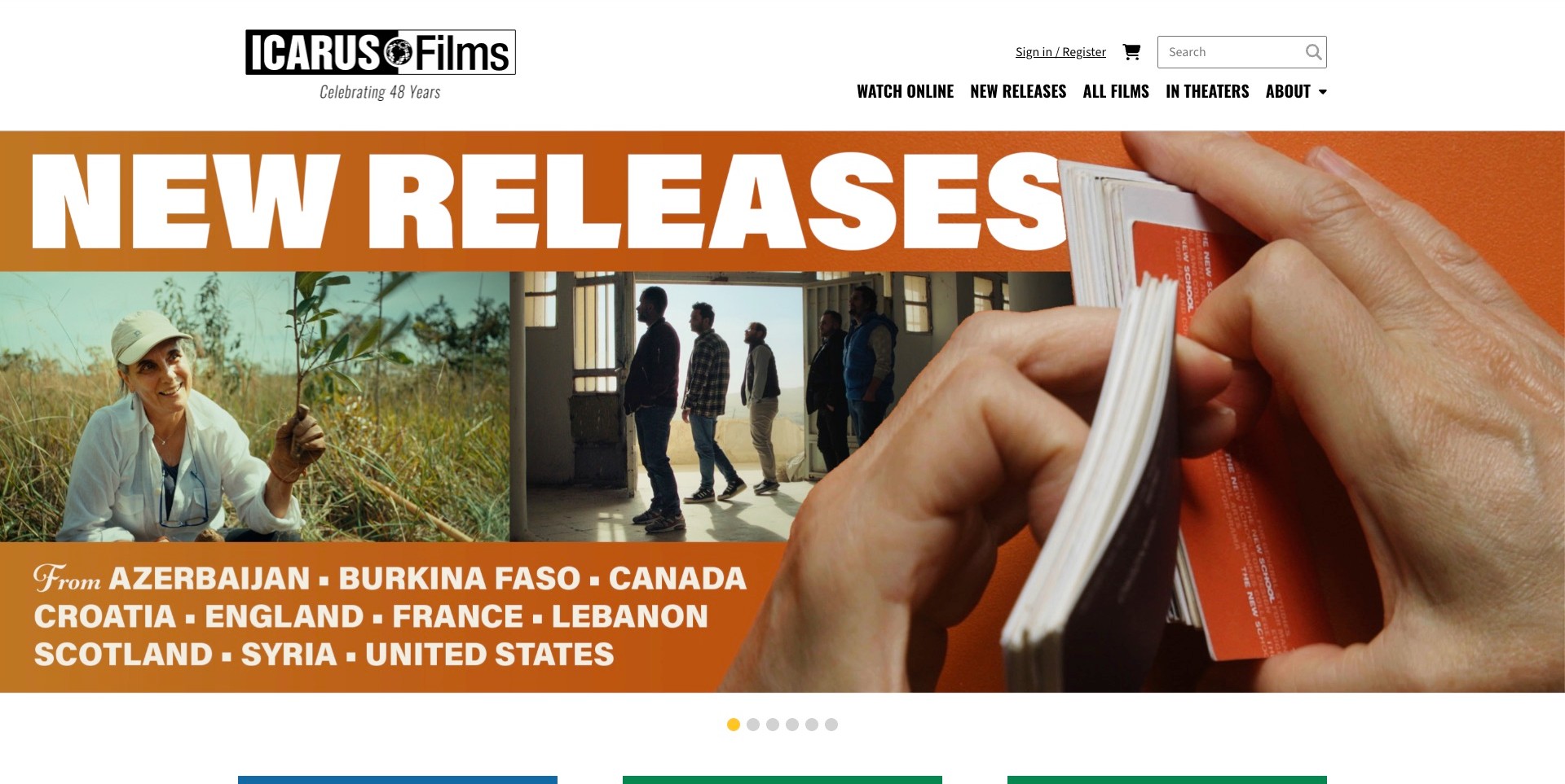
Icarus Films pairs a white utility header with a bold orange New Releases montage. The captured artwork combines film images with a hand turning a printed catalogue, giving the promotion a tangible editorial character. Watch Online, New Releases, All Films and In Theaters are named plainly across the header, with search and account controls separated above. This is useful for studying how a substantial archive can stay visible even while a new season receives the leading image. The large illustrated announcement does not name every title in the first view, and the screenshot cannot establish institutional licences, account permissions or the success of a checkout.
What you can learn
Keep the archive and the current release selection available as different entrances. A seasonal campaign can communicate breadth, but individual film records need searchable titles and accurately scoped actions. Separate consumer viewing, institutional use and any account-related process rather than relying on one generic catalogue label to explain all forms of access.
Pros
Search and All Films preserve archive access.
Viewing and theatrical labels distinguish access contexts.
Cons & considerations
The large announcement postpones individual title information.
Account and catalogue controls do not establish licensing availability or purchase success.
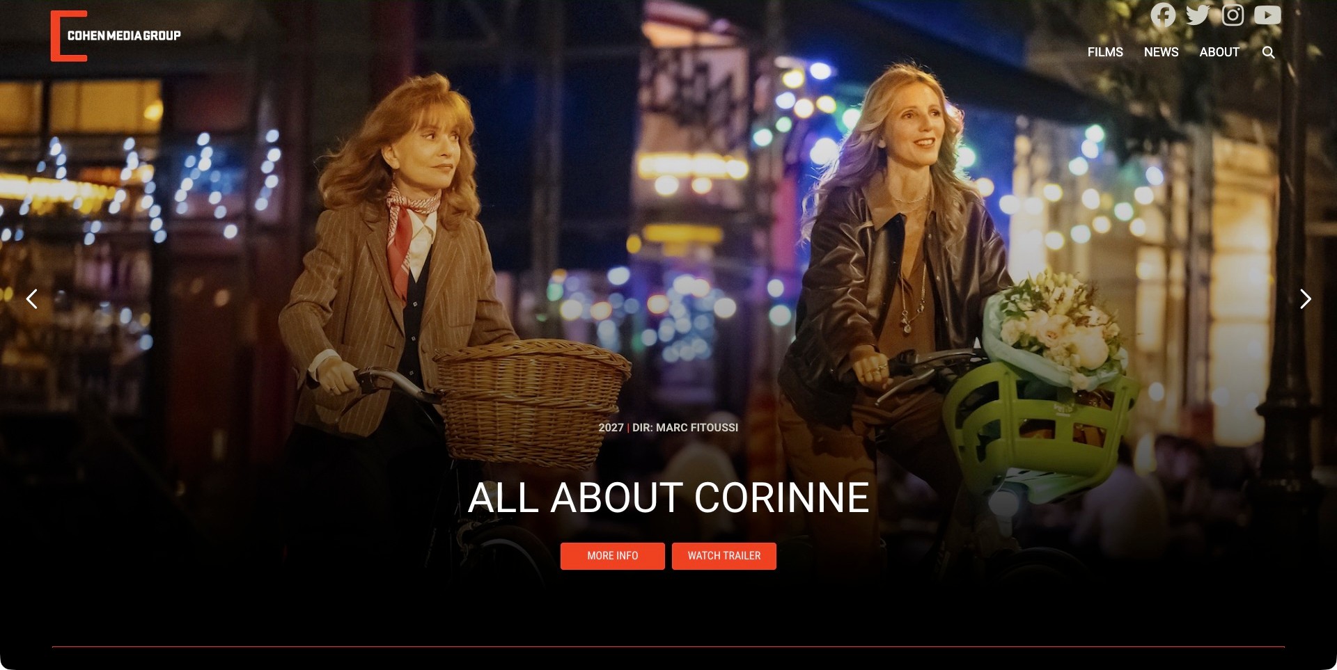
Cohen Media Group’s pictured hero promotes All About Corinne with a wide night-time bicycle scene. The title, director and year sit above two orange actions for information and trailer viewing, while a compact upper navigation retains Films, News, About and search. The dark lower gradient gives the campaign labels their own readable space without removing the sense of place from the still. This is useful for comparing how a distributor separates learning about a film from watching promotional media. The hero remains a campaign entrance, not a complete title record; current theatrical dates, regional availability and booking details require further maintained information.
What you can learn
Give the two most useful campaign actions distinct names and keep a dependable film record behind them. A photograph can create atmosphere while a modest text area supplies identity and context. Review every new campaign against the same readability standard, especially when the brightest part of a still moves behind navigation or titles.
Pros
Information and trailer actions are distinguished.
The lower gradient gives title information a predictable area.
Cons & considerations
A full-screen promotion gives little immediate catalogue breadth.
A year and trailer action do not establish a current local screening.
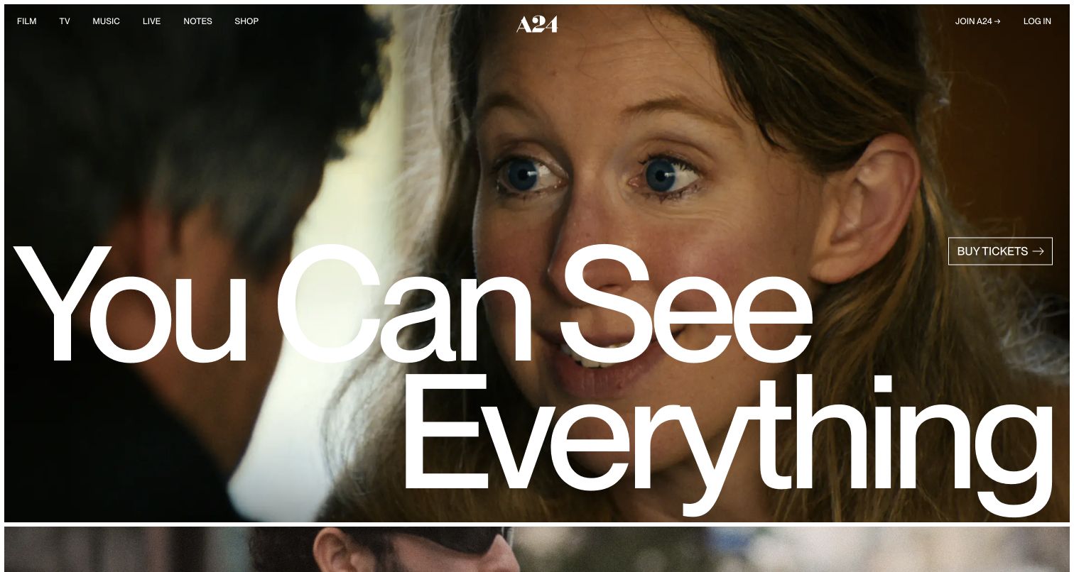
A24’s retained opening capture gives most of the screen to a campaign image and large promotional lettering. A header separates Film, TV, Music, Live, Notes and Shop; a ticket action supplies a practical next step. The site is useful for studying how a recognizable editorial identity can connect several creative activities without making every page look like a corporate directory. This is an earlier genuine capture, not a claim that the current homepage still promotes the same image or release. The wide range of header categories also means visitors need a clear sense of which route concerns films and which concerns another part of the business.
What you can learn
Use a consistent identity across different activities while keeping their purposes explicit. A distribution catalogue, an editorial article and a shop should not become interchangeable simply because they share campaign art. Give individual films maintained records and keep ticket or viewing actions scoped to the release and market they actually concern.
Pros
The header distinguishes creative activities.
A ticket route accompanies the campaign.
Cons & considerations
Large campaign lettering can dominate the useful release context.
An earlier promotional frame does not establish today’s screenings or catalogue state.
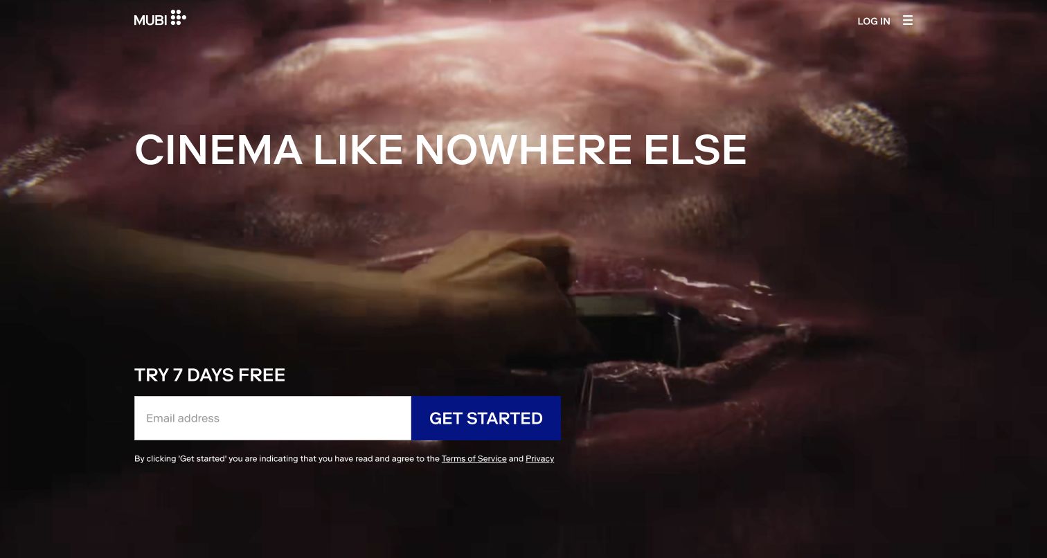
MUBI’s retained US entrance uses a cinematic still behind a concise viewing proposition and an email-led trial action. The page presents a consumer service first rather than an exhibitor booking directory. That distinction is important: MUBI’s official explanation identifies streaming, production and distribution activities, but the pictured screen demonstrates the public streaming entrance, not every part of that business. The restrained composition creates a clear first task and leaves much of the frame to the image. It offers less immediate information for someone researching distribution, individual release rights or institutional access. The original date and regional path remain explicit; this is not a fresh homepage capture.
What you can learn
Match the opening route to the audience the page genuinely serves. A consumer subscription entrance can be clear without becoming evidence for theatrical booking or other rights. Keep alternative company and film information discoverable, and describe any trial or subscription in current terms supplied by the actual service rather than copied from an old screenshot.
Pros
One task gives the entrance focus.
Restrained layout foregrounds film imagery.
Cons & considerations
An email-led entrance may delay title-specific research.
The regional streaming view does not demonstrate theatrical or institutional licensing.
Kegan is a freelance web designer and developer with 15+ years of experience helping businesses turn complicated website requirements into clear, maintainable digital experiences. He works directly with clients from planning and design through development, launch, and ongoing support.
For film distributor website design, his development approach focuses on clear film and release records, theatrical and home-viewing distinctions, rights and booking information, useful filmmaker credits, and maintainable catalogue discovery. The scope can be a targeted improvement or a complete custom build, with responsive layouts, thoughtful content structure, and integrations chosen around the people using and maintaining the site.
Show 3 other film distributor website designersHide other film distributor website designers
Plan a distributor website around titles, territories and audience tasks
Define the distribution activities the website actually represents
Start with an inventory of the organization’s current activities rather than a proposed homepage. Theatrical distribution, repertory bookings, home entertainment, digital release, educational sales and international sales may involve different teams and agreements. Record which services belong to this business, which belong to a partner and which are historical. A catalogue can contain a film without every form of rights being available through the same enquiry route. The public website should explain those distinctions in everyday language without exposing confidential agreements.
Choose navigation labels from the questions real visitors bring. A person asking where to watch should not have to interpret a rights-sales category. Equally, a cinema programmer should not need to complete a consumer subscription journey to find a booking contact. The organization can keep a distinctive tone while using straightforward labels for films, in cinemas, watch at home, bookings and company information. Only include routes supported by a real service and a team responsible for maintaining them.
Create one dependable record for each film
Treat the film page as a maintained record, not just a campaign poster exported to the web. Define fields for the title, alternate title where needed, director, synopsis, release information, language, subtitles, runtime, credits and relevant viewing or booking actions. A distributor working across several territories may need territory-specific records or clearly labelled variations. Avoid applying one release date globally when it only describes a particular market. When information changes, the catalogue should have an obvious place to update it.
Keep long descriptive copy separate from functional facts. A synopsis can preserve the film’s tone while a compact information area answers practical questions. Trailers, still galleries, press materials and screening links should be associated with the correct title. If a restoration or new edition differs from an earlier release, explain the edition instead of creating nearly identical pages with no context. Credits and image permissions belong in the editorial process; a film still should not become an untraceable decorative asset.
Design the homepage for a changing release calendar
A distributor’s priorities change as titles open, move to home viewing or return for a repertory run. Build a small set of reusable campaign treatments rather than a one-off homepage that requires redevelopment every week. Decide how many current films can be promoted at once and what happens to a campaign when its release stage changes. A film can remain in the catalogue even when it no longer needs the leading position. Editorial prominence should be an intentional, revisable choice.
Use an actual mix of titles to test the design. A short title, a long translated title, a portrait poster and a wide still should all remain understandable. If a rotating hero is used, keep the film name and next action available without requiring a visitor to wait for a particular frame. Motion and video can support a campaign, but a static poster or still with useful text must continue to work when playback is unavailable or a visitor prefers less movement.
Make the catalogue useful beyond the opening campaign
Plan how someone will find a film whose title they only partly remember. Search, year, director, genre, release status and collection can be helpful when the catalogue is large enough to justify them. Use controlled categories and maintain their meanings. A filter called available should state whether that means theatrical booking, home viewing or another form of access. The goal is not to add every possible facet; it is to reduce genuine uncertainty without making visitors learn an internal database.
Curated collections offer a different route from search. A season, filmmaker focus or subject collection can introduce titles that a visitor would not have requested by name. Give those collections a clear editorial rationale and keep the individual film records connected to them. Archive pages need useful headings and stable links, not only infinite image feeds. A small specialist catalogue can often communicate its perspective more effectively through a few well-explained collections than through an elaborate filtering interface.
State territory and availability at the point of action
Rights, release windows and platform availability can vary by territory. Put the relevant limitation near the viewing or booking action rather than relying on a distant disclaimer. A country selector should explain what it changes and should not trap someone who needs information about another market. If the website sends a user to an external cinema or streaming service, label that destination and avoid implying the distributor controls its prices, account requirements or accessibility features.
Create an editorial owner for availability information and a sensible review process. An old buy-tickets button can become misleading after a release ends, even if the film page itself remains useful. The website may offer a general where-to-watch route, a current screenings list or an enquiry when no public viewing link is maintained. Choose the option that the team can actually support. Do not describe a catalogue entry as universally available merely because a page or trailer remains online.
Give exhibitors and institutional audiences a direct route
An exhibitor, festival, library or educator may need details that do not belong in the consumer campaign hero. Provide a clearly labelled booking or licensing section that explains the kinds of requests accepted, relevant territory, expected information and appropriate contact. A useful initial brief might include the title, venue, location, proposed date, audience and screening type. It should not promise that submitting a form grants permission or confirms availability; those decisions require the distributor’s actual process.
Keep institutional licensing distinct from consumer access. A rented stream or purchased disc is not presented here as permission for a public screening. Explain the route to ask the rights holder or authorized representative about the intended use. If an outside licensing service manages that work, identify it accurately. The website can reduce repetitive enquiries by clarifying scope without attempting to replace the relevant agreement, legal advice or a conversation about a particular proposed screening.
Organize press materials without leaking private access
Public press pages can contain a synopsis, approved credits, downloadable stills and an appropriate press contact. Private screeners, embargoed material and restricted files need a different access process. Do not put a private screener link in a public structured-data field, image caption or casually shareable page merely because the visible design hides it. Define which assets are public and who can approve changes. A polished download area does not itself establish the security of its files.
Name downloads so a journalist or programmer can identify the title and asset after saving them. Include usage or credit information where the distributor supplies it. Keep files proportionate and avoid a large compulsory archive when someone only needs one approved still. If an external press system is involved, make the transition understandable and test the public handoff. This collection reviews the visible presentation, not the successful delivery of screeners or any private press authentication.
Make trailers and imagery work with readable information
Film websites naturally rely on images, but essential context should remain text. Give meaningful stills appropriate alternatives where needed, preserve readable titles and avoid using a poster image as the only source of a release date. Provide available captions or other accessibility information for video according to the actual media and publishing process. Do not infer that a film or a third-party player has an accessibility feature merely because a decorative symbol appears nearby.
Set realistic media budgets for the people who will use the site. A large desktop film reel may not be an appropriate first download on every device or connection. Supply responsive images, sensible poster frames and a usable layout before optional media finishes loading. Keep controls distinguishable from campaign artwork, and review keyboard access and reduced-motion behaviour in the actual implementation. A screenshot can demonstrate composition; it cannot prove these interactions or establish compliance.
Plan the editorial workflow for a living catalogue
Ask who will add a new title, approve its wording, publish release links and retire campaign material. Separate draft and public states and make it possible to preview a real film record before publication. Record the source of factual information, the owner of each action link and any territory restriction. This is especially useful when several teams contribute to the same catalogue. The content model should reduce duplicated entry rather than creating independent copies of the same film facts across many pages.
Use stable URLs and maintain redirects when a title or catalogue structure changes. Link a campaign feature back to its underlying film record so it remains intelligible after the homepage moves on. An archive deserves deliberate editing, not an automatic dump of old promotional fragments. Review broken platform links, missing assets and obsolete contact routes as ongoing maintenance. Choose a publication schedule the team can sustain rather than one that makes every page look current without actually checking it.
The editing job behind the design
Choose technology around the catalogue and publishing workflow
A content platform should support structured film records, controlled categories, territory-specific information, related releases and editorial previews. A small specialist distributor and a large multi-market catalogue may need very different systems; the public design does not establish the size or architecture behind either.
Keep consumer commerce, cinema ticketing, screening bookings, institutional licences and private press access separate in the technical brief. They can connect to the same film record without pretending they are one transaction or that a public enquiry completes a rights agreement.
Treat visible stack items as evidence of public delivery components, not a complete inventory of rights databases, asset delivery, internal booking tools or production systems. Do not choose a platform solely because a distributor’s campaign page uses a particular frontend library.
Our WordPress website examples offer a separate look at publishing approaches. A visible platform label is evidence for that named page, not a guarantee that the same system will suit your requirements.
Before the public launch
A practical film distributor website checklist
Define the distribution activities and territories represented by the site.
Separate audience viewing routes from booking and licensing enquiries.
Publish one dependable record for each title and relevant edition.
Keep release dates and availability scoped to the correct market.
Supply readable film titles and functional information outside artwork.
Choose useful catalogue categories and maintain their definitions.
Give exhibitors and educators an accurately labelled contact route.
Distinguish public press materials from restricted screeners.
Record asset permissions, credits and editorial responsibility.
Keep campaign media usable when video does not play.
Review external viewing and ticketing links as releases change.
Preserve stable film URLs and maintain redirects after restructuring.
Test essential navigation and actions on real small-screen devices.
Name the person responsible for catalogue and contact maintenance.
These checks are a project checklist, not a performance, legal, security, or accessibility certification. Test real journeys with the people responsible for the website before making claims about the result.
Sources & editorial method
How this collection was selected and reviewed
The examples are editorial selections of genuine public websites associated with film distribution. We compare visible catalogue organization, campaign presentation, audience routes and practical information. Current official pages qualify the distribution role, and original captures keep their actual dates and scope. We do not test private booking systems, purchase licences, measure ticket conversion or infer the full technical infrastructure. Editors Choice recognizes a specific public design approach, not film quality, commercial success or rights availability.
Each example links to its actual source page. Screenshots are direct browser captures with their own capture dates; moving imagery, announcements and live designs can change. The notes describe observable design choices and conditional tradeoffs, not measured traffic, conversion results, service quality, or accessibility conformance.
Technology labels use public page metadata, asset evidence, or explicitly cited platform documentation. Platform documentation is not a complete current deployment audit. A component reference may be legacy or unused; it is not a complete backend inventory. Unknown stacks are omitted. These sites are editorial examples, not our client portfolio.
Written, Edited and Curated are separate editorial records, not timestamps advanced by a rebuild. Website designs and imagery belong to their owners. See our editorial standards or suggest a correction.
Questions worth asking
Film Distributor website design questions
What should a film distributor homepage prioritize?
Show the organization’s current editorial focus, make the promoted titles identifiable and give visitors an understandable next step. The right balance depends on whether the site primarily serves audiences, exhibitors, institutional buyers or several groups. A campaign image should connect to a useful film record rather than replace it.
Does every film need its own page?
A stable title page is useful when it holds maintained facts, relevant assets and viewing or booking routes. The required depth varies by catalogue and rights. Avoid creating many nearly identical pages merely for search visibility; give each record information that helps someone understand that particular title or edition.
Should the website sell tickets directly?
Only if direct ticketing is actually part of the business and supported operationally. Many distributors appropriately send people to cinemas, platforms or partners. Explain who handles the next step and keep those links current rather than implying that the distributor operates every external checkout.
Can a consumer rental link also serve an educational screening?
Do not present those uses as interchangeable. Direct a school, venue or organization to the relevant institutional or public-screening enquiry process. The website should explain the route to ask about permission, not imply that viewing access automatically settles the proposed use.
How much animation should a film website use?
Enough to support the work without making titles, navigation or practical actions depend on playback. Plan for a strong still frame and readable text, then test the actual performance and accessibility of optional media. Attractive screenshots alone do not establish that a moving interface works well.
Borrow how these distributors connect a film’s visual identity to clear catalogue information. Then build the audience, booking and editorial routes your own organization can maintain.