Best Birdwatching Tour Websites of 2026 (15 Real-World Examples)
Birdwatching tour websites that connect memorable wildlife imagery with useful destinations, dates and trip expectations.
Explore 15 real birdwatching tour websites, from regional specialists to worldwide operators. Compare how they organize itineraries, explain different birding styles and help travelers investigate the experience before making an inquiry.
A close view of an unfamiliar bird can spark interest in a place. A useful birdwatching website then explains how the trip works: when it runs, which habitats it visits, how demanding the days may be and what kind of traveler it suits. Attractive photography and practical planning information need to work together.
These examples cover local outings, small-group holidays and wider wildlife programmes with an explicit birding offer. The reviews compare website presentation and navigation. They do not assess guiding quality, travel safety, ecological outcomes or the likelihood of seeing a particular species.
Before the examples
What makes good birdwatching tour website design in 2026?
Let visitors choose by experience as well as place
Destination, month and trip style answer different questions. Distinguish relaxed birding, intensive species-focused itineraries, photography and broader wildlife travel where those differences are real. Use labels that the operator can explain consistently across the catalogue.
Turn a trip into understandable commitments
Put duration, dates, walking expectations, transport, accommodation and pricing basis within reach of the invitation. A beautiful species photograph should lead to an itinerary with practical context rather than being the only explanation of the offer.
Give field evidence a clear place
Named guides, dated reports and attributed photographs help readers investigate the operator. Separate past observations from future expectations, and explain availability language without turning it into a guarantee of sightings or an unsupported endorsement.
The collection · 15 examples
15 birdwatching tour websites worth studying
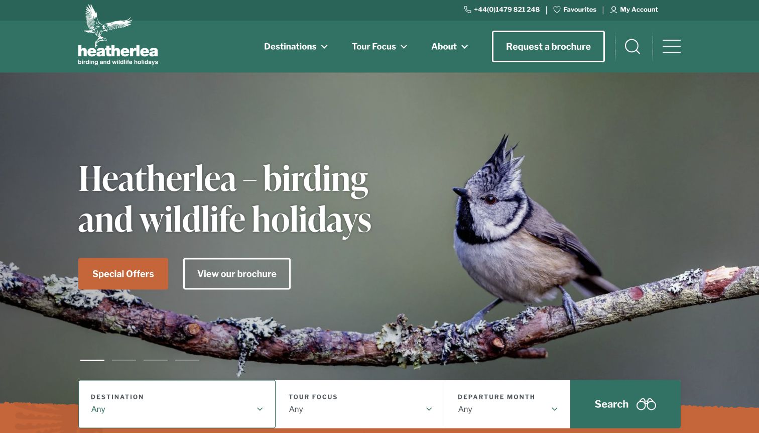
Compare 15 distinct operators through their homepages, catalogue navigation, field-report routes and planning cues. Heatherlea is the researched Editors Choice for its clear combination of destination, tour focus and departure month, supported by a recognizable Scottish specialist identity.
Heatherlea puts a crested tit against a spacious photographic background, then uses a deep teal header and large white lettering to make the offer easy to recognize. The useful detail is the search strip immediately below: destination, tour focus and departure month describe three different ways someone might choose a holiday. Its focus vocabulary includes beginners, easy walking and short breaks, so a visitor need not begin with a particular country in mind. Scottish destinations retain a visible place alongside overseas trips. Brochure and special-offer routes provide alternatives to a direct inquiry without displacing the main finder.
What you can learn
Build the first search around meaningful differences in the experience. Birders may know their available month or preferred walking pace before choosing a destination; those needs deserve equal status in the browsing structure.
Pros
The finder translates broad travel interest into understandable planning criteria.
A distinctive bird photograph and restrained palette establish a clear specialist identity.
Cons & considerations
Several header utilities compete with the central tour navigation.
Detailed inclusions and physical demands still require inspection of individual itineraries.
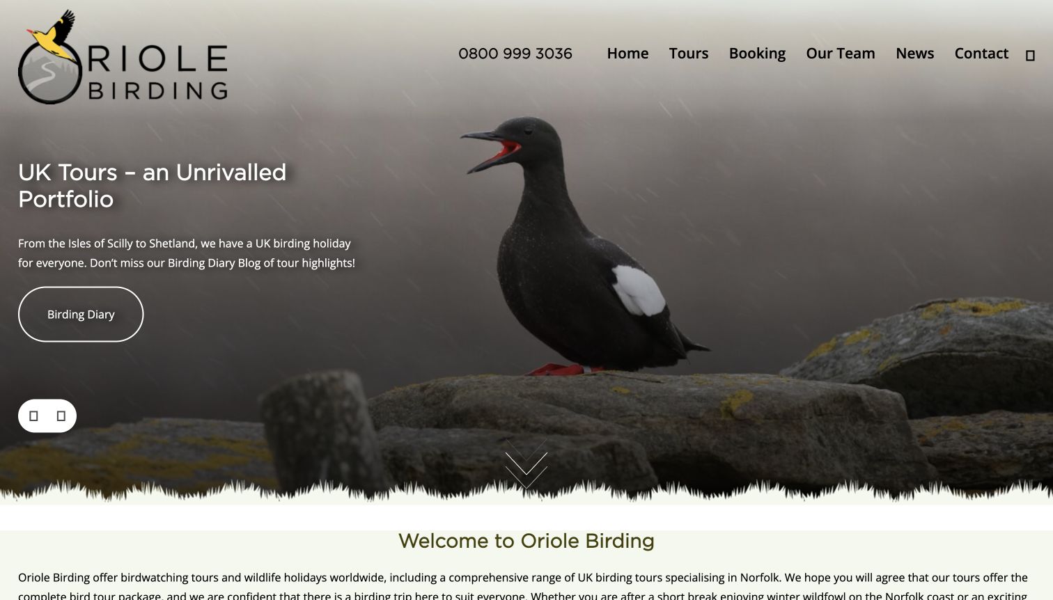
Oriole Birding uses a large bird photograph as the first impression, with a UK Tours headline and a Birding Diary action layered over the scene. The header keeps the phone number and ordinary labels such as Tours, Booking and Our Team visible against the image. Below that introduction, the page explains the business and provides forthcoming tours, giving the photographic presentation somewhere practical to lead. The diary route also treats past field experience as useful editorial material rather than relying entirely on sales cards. In the captured view, a few small interface icons appear as empty squares, an observable weakness in an otherwise direct layout.
What you can learn
Connect striking wildlife imagery to a specific browsing choice and dated field material. A regional starting point helps a modest catalogue feel approachable, while clearly labeled navigation supports visitors who already know what they want.
Pros
The UK tour emphasis makes the opening offer specific.
Team, booking and diary information are easy to identify by name.
Cons & considerations
Some small icons did not render clearly in the observed viewport.
The full trip comparison begins below a large photographic opening.
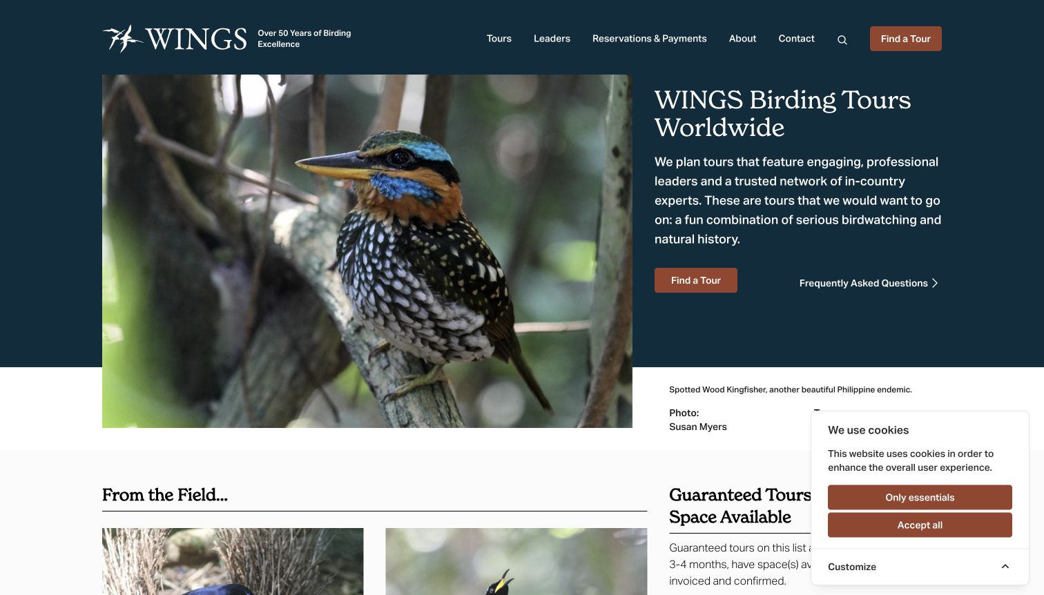
WINGS divides its introduction between an attributed bird photograph and a concise description of its worldwide tours. The photograph is not anonymous decoration: its caption identifies the bird, photographer and relevant destination. A dark blue header gives Tours, Leaders and Reservations distinct positions, while Find a Tour and frequently asked questions form two useful next steps. Further down, the page separates field updates from guaranteed departures with space available, and explains what that availability category means. That editorial distinction is valuable for someone choosing around limited vacation dates, although the actual status must still be checked on the operator's current itinerary.
What you can learn
Give photographs informative captions and define commercial status labels. Readers can appreciate the bird while understanding where it was seen, and compare departure information without treating an unexplained badge as a promise.
Pros
Image credit and destination context turn the hero into a useful example.
Leaders and practical reservation resources sit beside tour discovery.
Cons & considerations
A consent notice occupies part of the lower corner in the capture.
Several availability concepts require careful reading beyond the introductory screen.
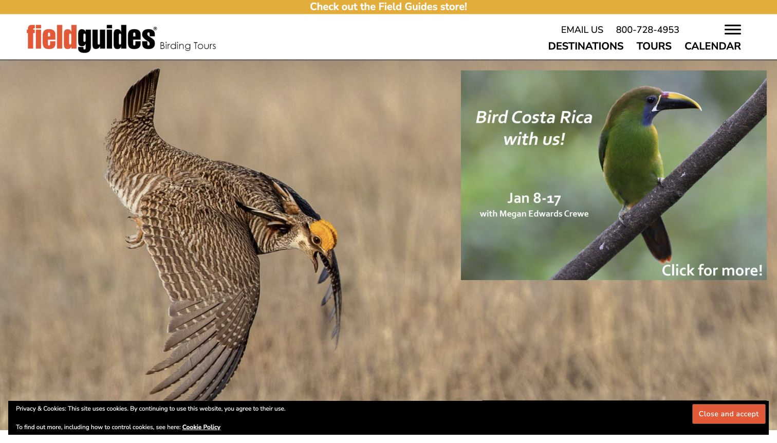
Field Guides places Destinations, Tours and Calendar prominently beneath its compact header, giving visitors several straightforward routes into the catalogue. The opening photograph is overlaid with a separate featured-tour panel containing a destination image, departure dates and a named guide. That combination connects spectacle with an identifiable trip instead of leaving the hero as a generic nature scene. Further down, tour reports and guide information make past departures part of the research experience. A store promotion and the featured trip both ask for attention near the top, however, and the cookie strip reduces the unobstructed area of the captured screen.
What you can learn
Keep destination browsing and chronological browsing equally accessible. When featuring a trip, attach the leader and date to the invitation so readers can move from visual interest to practical investigation with less searching.
Pros
Destinations, tours and calendar labels clearly distinguish browsing approaches.
Named guides and report links give the catalogue an editorial dimension.
Cons & considerations
The layered feature image competes visually with the background photograph.
Promotional and consent elements add noise around the main tour choices.
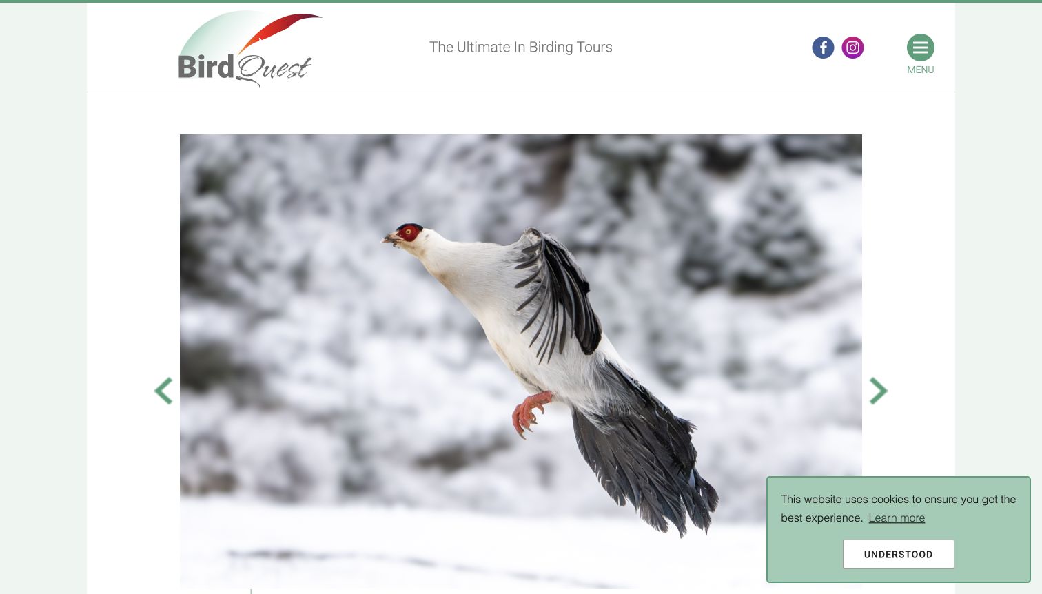
Birdquest frames a large pheasant photograph within a pale, restrained page and keeps its logo and slogan above the image. The minimal opening is visually calm compared with sites that place several filters over the hero. Its underlying navigation is much more extensive, organizing tours across continents, countries and revised itineraries. That depth can serve a visitor with a specific destination in mind, while current news and reports provide another way to discover the offer. The contrast is the main design lesson: the first screen feels simple, but the practical choice architecture is hidden behind a compact menu and the photograph occupies most of the available space.
What you can learn
A broad catalogue can use a quiet visual introduction, but the next action must remain obvious. Pair an expressive photograph with an unmistakable route to destinations or dates rather than expecting every visitor to open the menu.
Pros
The bird image receives ample space and has a clear visual focus.
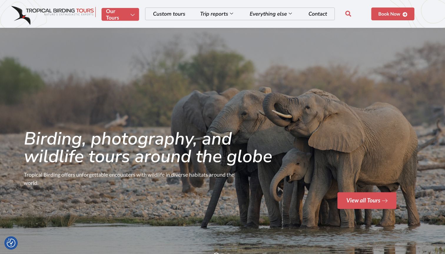
Tropical Birding opens with elephants at the water's edge, a broad wildlife scene paired with copy that names birding, photography and wildlife tours. The red accents make the tour action easy to distinguish against the photograph and pale header. Its useful organizing idea appears in the finder: tour type is separate from region, country and time of year. The categories distinguish ordinary birding from birding with a camera and photography-focused trips, acknowledging that those travelers may want different pacing. Tour cards then add duration, style and a price basis. The broad hero is inviting, although it does not immediately show the birding specialization visually.
What you can learn
Classify trips by the activity experience as well as the destination. A photographer's time requirements can differ from a species-focused birder's; making that distinction visible is more helpful than placing every trip in one undifferentiated grid.
Pros
Activity labels reveal a meaningful difference between tour formats.
Strong red actions remain recognizable beside extensive wildlife photography.
Cons & considerations
The first image communicates general wildlife more directly than birds.
Several useful comparison details appear only after the hero section.
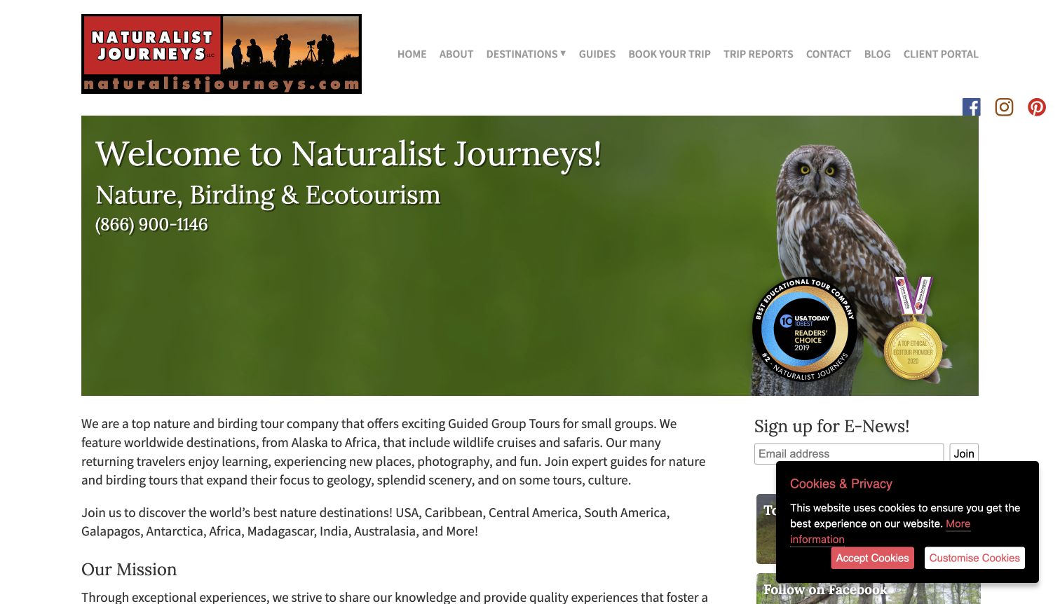
Naturalist Journeys presents a straightforward welcome beside an owl photograph and follows it with an explanation of its nature and birding focus. The desktop layout combines a main editorial column with a sidebar for contact and newsletter functions. Upcoming trips are written as readable links with dates and named leaders, while recent reports and a featured guide connect the offer to people and field material. The dated award graphics visible in the hero are distinguishable from current trip information, but they take valuable space. An initial newsletter overlay interrupted the first visit; the retained capture records the clear page on the subsequent inspected visit.
What you can learn
Use names, dates and reports to make a tour catalogue feel concrete. Keep promotional interruptions restrained so the useful editorial structure remains accessible to a first-time visitor who is still deciding whether the operator fits.
Pros
Upcoming trip links combine destination, date and leader without complicated cards.
Reports and guide profiles support further research beyond the sales introduction.
Cons & considerations
Sidebar forms compete with the principal reading column.
Older award graphics and an initial signup overlay distract from current departures.
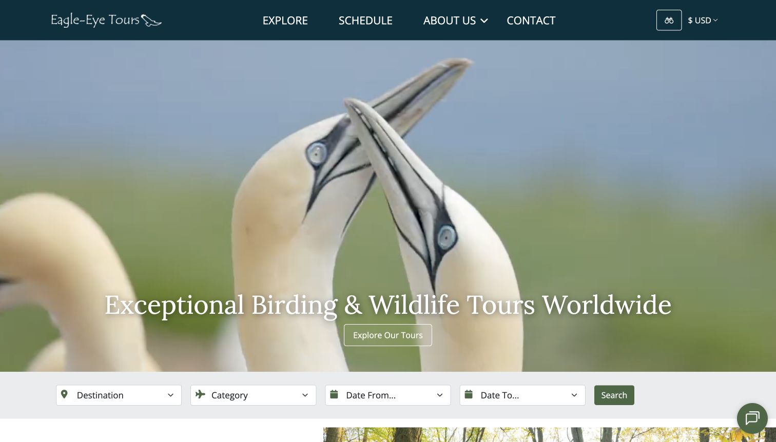
Eagle-Eye Tours uses a full-width bird scene below a compact dark header, then places a practical search row directly at the base of the hero. Destination and category sit beside separate start and end month fields, making a travel window part of discovery. The page distinguishes land tours from ship trips before showing regional destination cards, so those very different formats do not become interchangeable thumbnails. A currency selector in the header supports an international audience. The captured image is a moment from moving media, and the heading stretches across much of its width; the search row provides the more stable functional anchor.
What you can learn
Put time constraints near geographic choices when departure dates matter. Distinguish fundamentally different travel formats early, then let the catalogue add detail rather than forcing visitors to discover that distinction after opening several trips.
Pros
The date range is visible without entering a separate advanced-search page.
Land and ship categories provide a useful first division of the offer.
Cons & considerations
Moving imagery makes the opening composition less predictable.
The long hero heading leaves less room for concise practical supporting information.
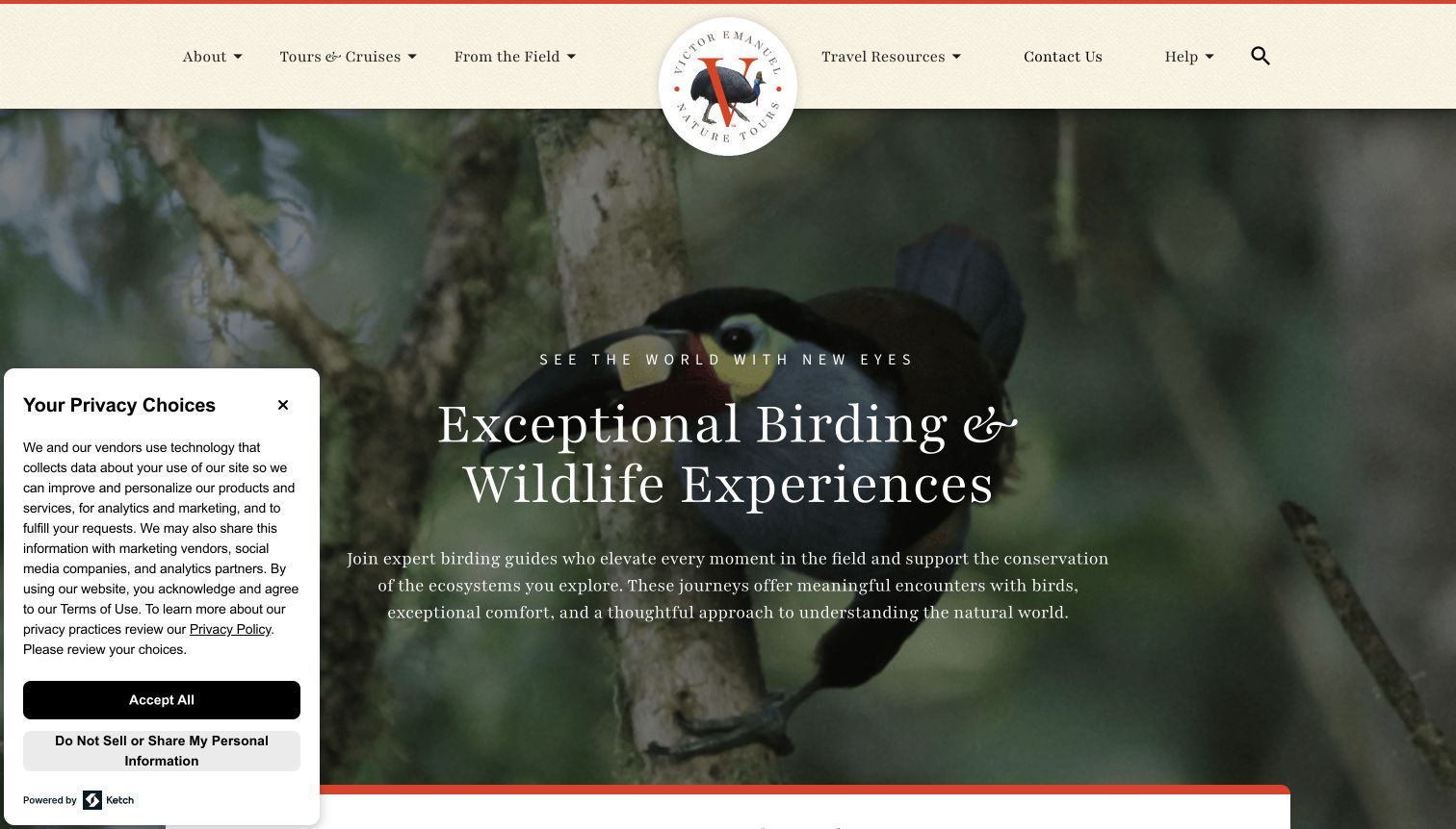
Victor Emanuel Nature Tours uses a centered round logo, cream navigation and a large bird image to establish a distinctive editorial tone. The headline and supporting paragraph explain the experience before an exploration tool asks how the visitor likes to travel. Popular trip shortcuts offer an alternative to completing that search. Further down, featured departures attach dates and explicit Open or Full labels to named itineraries, making status part of the catalogue rather than an afterthought. The opening is generous and atmospheric, but the practical finder begins near the lower edge of the viewport, and a large privacy panel occupies the left side in the retained capture.
What you can learn
Offer a guided search alongside a few specific trip shortcuts. Clear departure status helps comparison, provided it is maintained and remains tied to the exact itinerary rather than becoming a timeless promotional claim.
Pros
Featured trips pair names, dates and understandable status labels.
The visual identity feels consistent across the logo, navigation and headline.
Cons & considerations
The large privacy notice reduces the visible introductory area.
Practical discovery follows a substantial amount of atmospheric hero content.
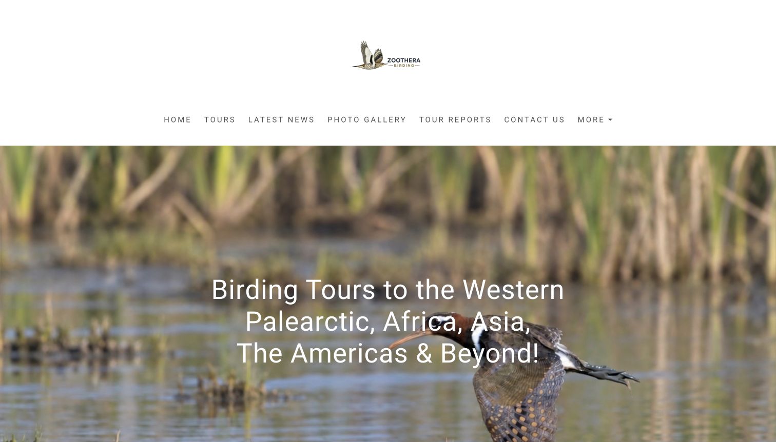
Zoothera Birding begins with a spacious white header and a bird photograph carrying a broad geographic headline. Its navigation names Tours, Latest News, Photo Gallery and Tour Reports directly. Below the hero, the writing becomes much more specific, introducing new itineraries through target species, seasons and named locations. That shift from general introduction to detailed field language makes the page relevant to committed birders who already have an interest to pursue. It also creates a long reading experience with several different link treatments and large blocks of text. Readers seeking a quick comparison of dates or difficulty must move to the programme or individual tour information.
What you can learn
Specific species and seasonal observations can differentiate editorial tour copy. Organize that detail under clear itinerary summaries so specialist readers retain the richness without making every visitor read a long homepage before comparing options.
Pros
Plain navigation labels expose the programme and supporting reports.
The editorial copy gives concrete reasons to investigate particular destinations.
Cons & considerations
The introductory header and hero consume considerable vertical space.
Long news-style sections are less convenient for rapid trip comparison.
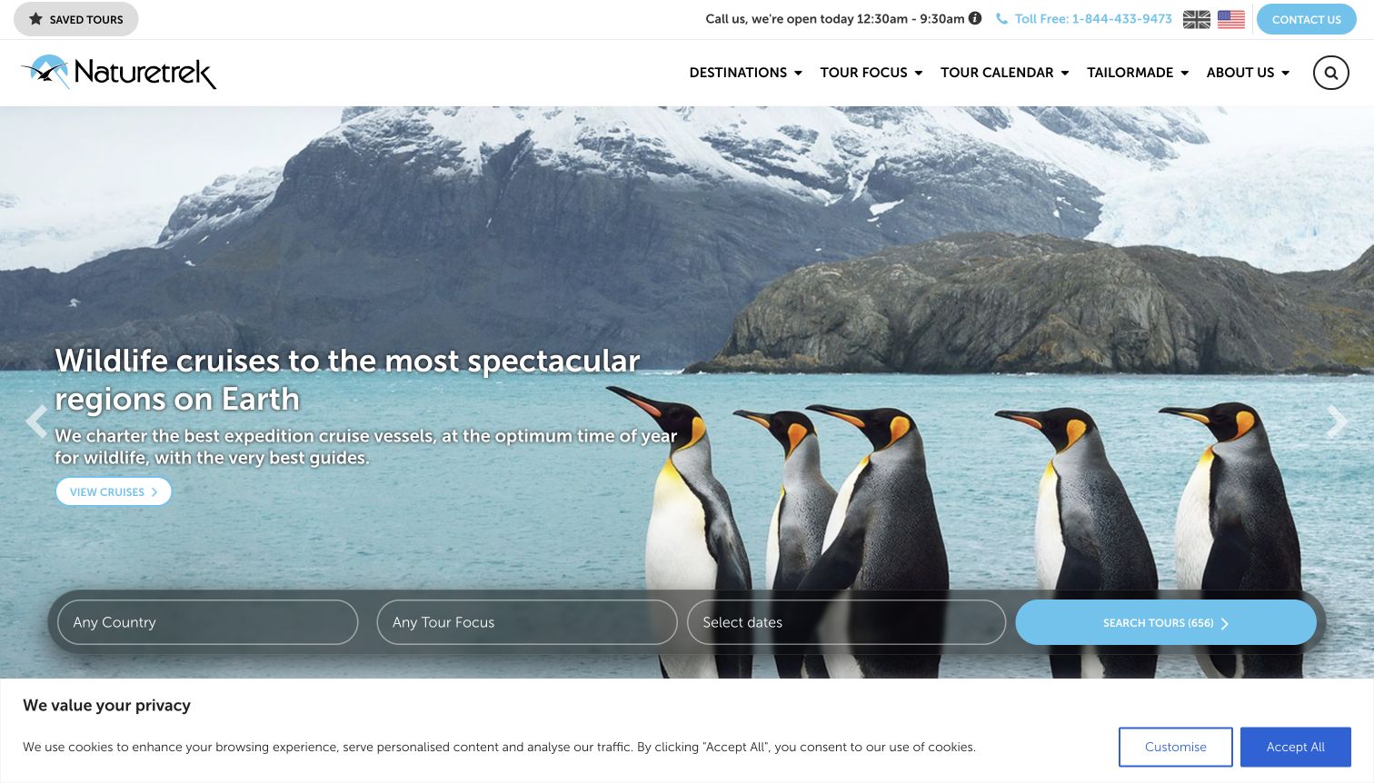
Naturetrek places destinations, tour focus and calendar navigation above a rotating wildlife scene. A translucent search bar stretches across the lower hero with country, focus and date choices, followed by a tour-count action. In the retained frame, penguins and a cruise message show how the same structure accommodates a wider wildlife offer. Birdwatching remains an explicit focus within that broader catalogue rather than being inferred from the images. Saved tours and localized telephone information are useful returning-visitor utilities, although together they make the header busy. The consent banner also claims a full strip along the bottom of the first screen.
What you can learn
For a large wildlife catalogue, keep the search structure consistent while making the chosen activity explicit. A reusable finder can connect varied photographs and campaigns to the same predictable comparison process.
Pros
Country, activity focus and dates form a clear combined browsing structure.
Calendar and saved-tour utilities support visitors researching over several sessions.
Cons & considerations
The broad wildlife campaign may require birders to choose their focus explicitly.
Header utilities and the consent strip reduce the space available to the main content.
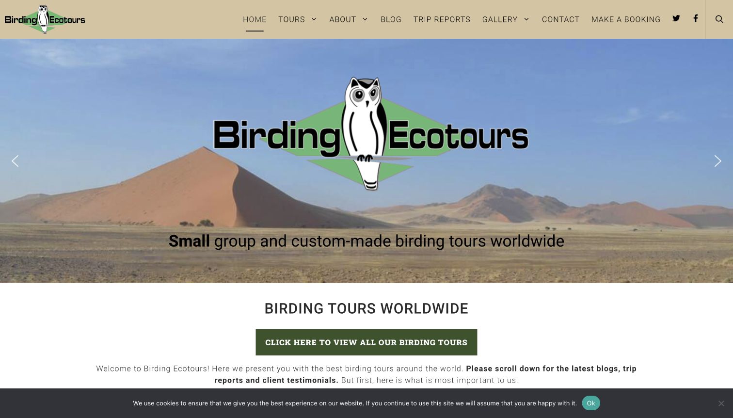
Birding Ecotours gives its owl logo and small-group positioning a large place in the hero, then follows with a prominent invitation to view all birding tours. The main navigation distinguishes tours, reports, a gallery and a booking route. Its catalogue has extensive geographic organization, while the homepage continues into conservation statements, recent articles and trip reports. This approach makes the specialist subject unmistakable and gives readers material beyond individual sales pages. The tradeoff is a considerable amount of content to scan, and the oversized logo repeats information already present in the header instead of immediately showing several comparable departures.
What you can learn
A clear catalogue action can anchor a content-rich specialist site. Keep explanatory articles and reports available, but use hierarchy to distinguish evidence, company statements and the practical route to an itinerary.
Pros
The tour catalogue action is large and easy to recognize.
Reports and topical articles support research at different levels of commitment.
Cons & considerations
Repeated branding occupies a substantial part of the opening image.
Extensive geographic navigation and editorial sections can make the page feel dense.
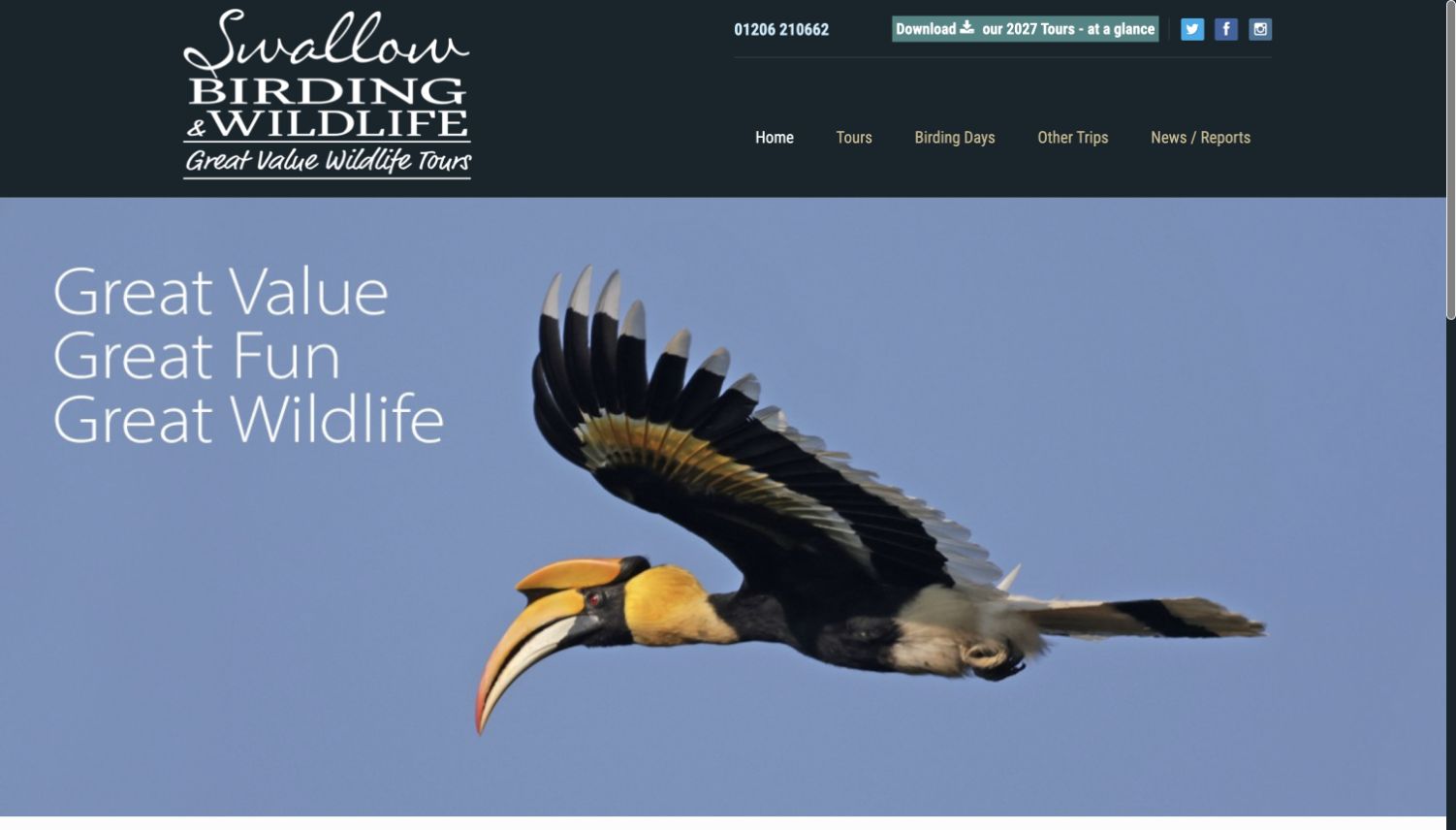
Swallow Birding & Wildlife combines a dark header with a large flying-bird photograph and a short three-line message. Its navigation separates Tours from Birding Days and Other Trips, a useful distinction for visitors who want a local outing rather than a longer holiday. The introduction explicitly addresses different ability levels and identifies the small-group focus. A downloadable annual programme is visible at the top, while the footer offers destination and activity links. The opening composition is confident, but the very large photograph delays the explanatory content, and several image-based links carry less descriptive visible context than the primary menu.
What you can learn
Give day trips their own recognizable route when commitment and travel distance differ from a holiday. A concise annual overview can help returning clients, but core dates and trip details should also be easy to browse on the site.
Pros
Day outings are clearly separated from longer tours.
The header provides a prominent route to the annual programme.
Cons & considerations
The first photograph takes most of the initial viewport.
Image-led routes below the introduction need clearer descriptive link context.
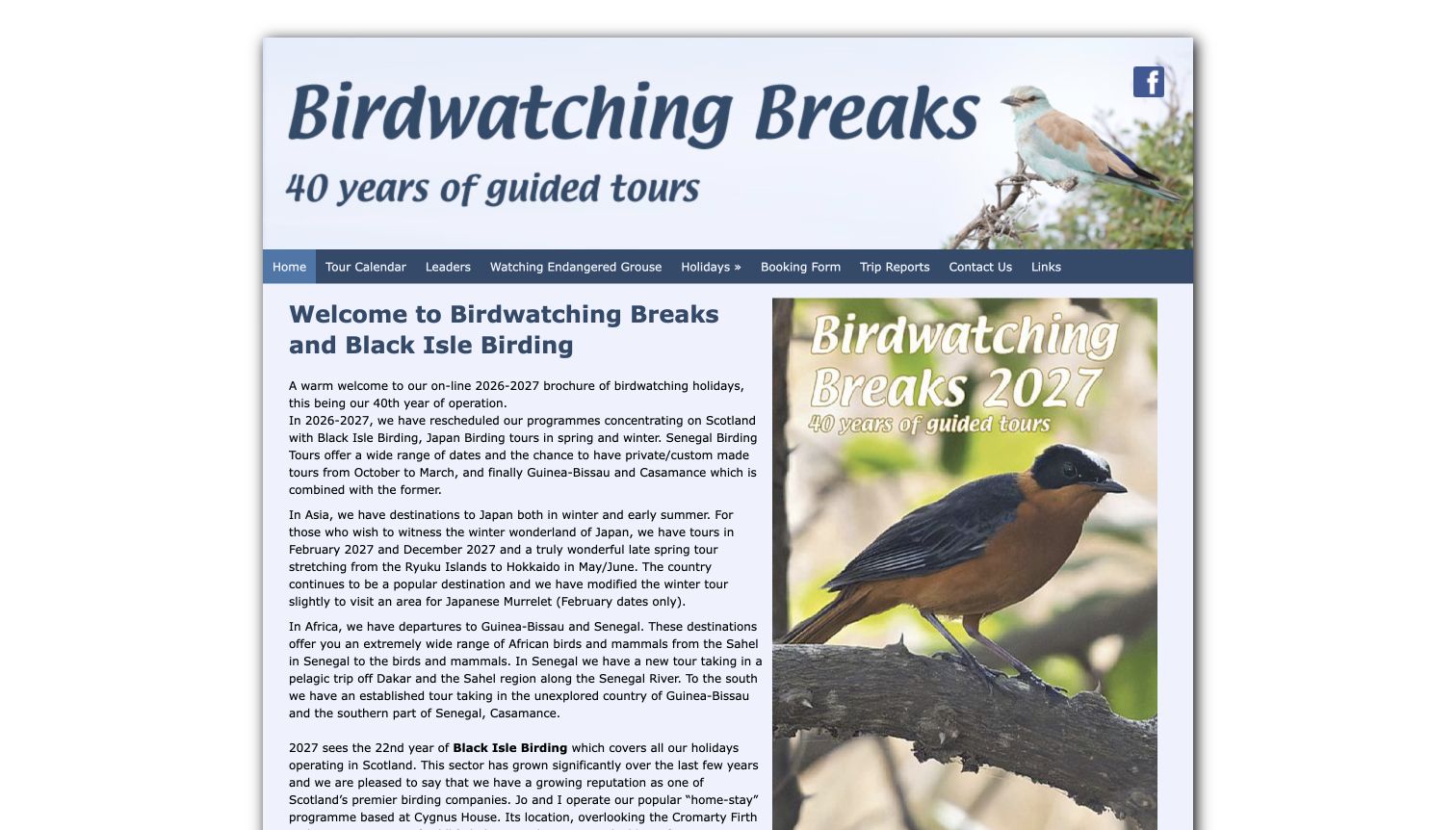
Birdwatching Breaks uses a narrow, centered brochure layout with a large illustrated header and a simple blue navigation bar. The welcome is signed by Mark Finn and explains the current programme in prose, including the relationship with Black Isle Birding. A cover image sits beside that introduction, reinforcing the printed-brochure character. Calendar, leaders, trip reports and a dedicated endangered-grouse information link give the small site useful depth. The personal explanation helps establish who is speaking, but its long paragraphs ask visitors to extract destinations and changes manually. The modest text size and fixed-looking composition also feel less adaptable than a structured tour summary.
What you can learn
A personal welcome can explain a specialist programme well, especially when the offer changes. Support that voice with scannable destination and date summaries so readers do not have to reconstruct the catalogue from a letter.
Pros
The calendar, leaders and reports are directly named in the main navigation.
The introduction explains the relationship between the two birding brands.
Cons & considerations
Long paragraphs make changes and destinations harder to scan.
The compact brochure composition leaves limited space for large readable text.
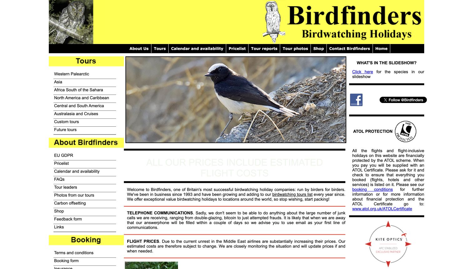
Birdfinders has a bright yellow identity, a central bird slideshow and sidebars that expose much of its catalogue at once. Calendar and availability, price list, reports, leaders and booking information are visible as ordinary text links rather than hidden inside a large menu. The page also publishes dated updates and explains the basis of estimated flight costs. This is a useful reference-oriented approach for returning customers who know the information they need. Its density is also the main limitation: several columns, notices, images and repeated links compete for attention, while the captured flight-cost headline has very faint contrast against the white background.
What you can learn
Retain direct access to practical reference pages, but give each one a clear role. Pricing assumptions and dated updates are valuable only when readers can find and read them without negotiating excessive visual competition.
Pros
Calendar, pricing and reports have immediately identifiable destinations.
The page makes changing travel-cost assumptions part of its public information.
Cons & considerations
Several dense columns and repeated navigation links weaken the reading hierarchy.
The pale flight-cost headline is difficult to read in the observed frame.
Kegan is a freelance web designer and developer with 15+ years of experience helping businesses turn complicated website requirements into clear, maintainable digital experiences. He works directly with clients from planning and design through development, launch, and ongoing support.
For birdwatching tour website design, his development approach focuses on destination and departure navigation, itinerary records, field reports and qualified travel inquiry guidance. The scope can be a targeted improvement or a complete custom build, with responsive layouts, thoughtful content structure, and integrations chosen around the people using and maintaining the site.
Show 3 other birdwatching tour website designersHide other birdwatching tour website designers
Plan a birdwatching website around the trip decisions
Map the different ways people choose a birding trip
Start with the questions the operator actually receives. Some travelers have a destination in mind, while others have a free week, a preferred level of walking or an interest in photography. Map those needs before choosing the homepage layout. A short regional programme may need a clear calendar and a few trip pages; a worldwide catalogue may need filters. The interface should reflect the offer rather than imitate the largest competitor.
Define trip types in ordinary language. Explain what a relaxed itinerary, a birding-with-camera holiday or an intensive species-focused tour means in practice. Keep the labels consistent across cards, filters and detail pages. If the distinction concerns pace, time in the field or the balance between birds and other wildlife, say so explicitly. A label alone cannot help visitors compare experiences when different pages use it differently.
Keep several paths into the same accurate itinerary information. A destination page, chronological calendar and editorial story can all lead to one maintained trip record. Avoid copying dates, prices and availability into several disconnected places. If a printed annual programme is offered, keep the current web itinerary easy to find as well, and make clear which information readers should consult before booking.
Give the itinerary enough practical and seasonal context
Use a consistent trip summary that covers the intended audience, dates, duration, principal locations and activity expectations. Describe early starts, walking, transport and accommodation through information approved by the operator. A prospective traveler should understand the likely shape of a day without reading a long promotional introduction first. Provide a clear route to ask about individual needs without promising that every itinerary can accommodate every request.
Explain the basis of prices and inclusions beside the relevant offer. Distinguish land arrangements from flights and identify where current terms, supplements and booking conditions can be reviewed. If a tour is marked guaranteed or has places available, define the label and keep it connected to a maintained departure record. Availability can change quickly, so archived stories and old brochures should not silently stand in for current booking information.
Use species and seasonal details carefully. A past report can explain what a group observed under particular conditions, while an itinerary can describe the habitats and possibilities that shape a future trip. Keep those roles separate. Avoid implying that a photograph or earlier species list guarantees a sighting. The design should make the operator’s qualifications readable rather than hiding them beneath an unqualified headline.
Build a useful editorial library around the catalogue
Organize trip reports by destination and date, with a clear connection to the relevant current itinerary where one exists. Name the author or guide and credit photographs appropriately. Reports can show the character of a trip in a way a sales page cannot, but they should retain their historical context. A future reader needs to know whether a document describes last season, an older route or a departure that is no longer offered.
Give the people behind the programme a credible public introduction. Guide profiles can explain relevant interests and experience using supported information, while a regional operator can describe its local base and approach. Keep these profiles current and avoid converting an enthusiastic biography into a promise of service quality. The website should help readers identify who they may travel with and where to ask practical questions.
Keep photography readable and the enquiry path calm. Provide descriptive captions where they add destination or species context, and preserve useful text when a video or slideshow is unavailable. Avoid showing a subscription interruption before visitors understand the offer. Forms should explain what happens next and collect only appropriate details; a general marketing page does not need to gather sensitive travel information merely to let someone browse.
The editing job behind the design
Choose publishing tools that support a changing tour programme
Model departures separately from evergreen destination and itinerary descriptions. Dates, capacity labels, pricing basis and guide assignments need clear editorial ownership, while historical reports should keep their original context.
Connect catalogue filters to meaningful fields such as region, month, duration and activity style. Preserve readable itinerary pages and ordinary links so the core offer remains accessible if optional widgets or moving media fail.
The technology observations accompanying these examples come from bounded public-page audits. They identify supported public signals only and do not establish a company’s hidden booking system, complete infrastructure or conservation practices.
Our WordPress website examples offer a separate look at publishing approaches. A visible platform label is evidence for that named page, not a guarantee that the same system will suit your requirements.
Before the public launch
Birdwatching tour website brief checklist
Identify whether the offer is a day trip, regional holiday or longer expedition.
Provide understandable destination and date browsing.
Distinguish birding, photography and broader wildlife formats where relevant.
Explain the intended experience level and physical demands.
Show duration, departure dates and a clear pricing basis.
Keep inclusions, exclusions and supplements easy to investigate.
Define availability and guaranteed-departure labels.
Attach practical details to one maintained itinerary record.
Name guides where their assignment is actually confirmed.
Credit photographs and explain useful species or location context.
Date reports and distinguish past observations from future possibilities.
Provide current web information alongside downloadable brochures.
Keep enquiry and newsletter actions distinct.
Make core trip information usable without optional media or marketing widgets.
These checks are a project checklist, not a performance, legal, security, or accessibility certification. Test real journeys with the people responsible for the website before making claims about the result.
Sources & editorial method
How this collection was selected and reviewed
We directly inspected these public homepages on November 11, 2026, comparing tour navigation, departure information, field-report routes and the relationship between imagery and practical planning. The collection includes specialist birding operators and broader wildlife businesses with an explicit birdwatching offer. Heatherlea was selected after comparison for its destination, tour-focus and month controls and clear regional identity. Captures preserve the actual observed viewport, including consent notices and frames from moving media. Every included exact source page received a bounded broad public technology-audit attempt. The editorial assessment concerns website design and communication, not guiding standards, travel safety, conservation performance or guaranteed wildlife sightings.
Each example links to its actual source page. Screenshots are direct browser captures with their own capture dates; moving imagery, announcements and live designs can change. The notes describe observable design choices and conditional tradeoffs, not measured traffic, conversion results, service quality, or accessibility conformance.
Technology labels use public page metadata, asset evidence, or explicitly cited platform documentation. Platform documentation is not a complete current deployment audit. A component reference may be legacy or unused; it is not a complete backend inventory. Unknown stacks are omitted. These sites are editorial examples, not our client portfolio.
Written, Edited and Curated are separate editorial records, not timestamps advanced by a rebuild. Website designs and imagery belong to their owners. See our editorial standards or suggest a correction.
Questions worth asking
Birdwatching Tour website design questions
What should a birdwatching tour homepage explain first?
Identify the places and kinds of trips offered, then provide a clear way to browse dates or suitable experiences. A memorable bird photograph works best when it leads to practical itinerary information.
Should every operator use a detailed search tool?
No. A small programme can be easier to understand through a clear calendar and a few consistent trip pages. Use filters when the catalogue is large enough to justify them and when the underlying information can be maintained reliably.
How should birding and photography tours be distinguished?
Explain the actual differences in pace, time at locations and intended experience. Give those distinctions consistent labels and supporting details rather than assuming that a camera icon explains the itinerary.
What makes a trip report useful on the website?
A report should retain its date, destination and author or guide context. Link to the relevant current itinerary where appropriate, while making clear that previous observations do not guarantee future sightings.
How should departure availability be presented?
Tie the status to a specific maintained departure and define any special labels. Provide a route to current details and confirmation, and avoid presenting archived availability as a current offer.
Does Editors Choice recommend the operator’s guiding service?
No. It recognizes observed website design and communication. It does not independently verify the quality of guiding, travel safety, ecological outcomes or the likelihood of seeing a particular bird.
Borrow the practical structure behind the photographs. Help visitors connect a birding interest to a place, a season and an understandable trip before inviting them to take the next step.