Definitive guide · ProcessWire website development
Best ProcessWire Websites of 2026 (20 Real-World Examples)
Twenty real public websites with direct screenshots, original design reviews and carefully scoped ProcessWire showcase evidence.
ProcessWire gives developers control over how structured content becomes a public website. The examples here range from university services and research libraries to arts organizations, a hotel and activity catalogues. Their useful common ground is not one visual style, but the decisions that connect content to a visitor’s next task. Official showcase records document the named implementations; the current captures show the public designs without pretending to reveal private backends or exact deployed versions.
A flexible CMS is most useful when the project has a clear content model. An exhibition needs dates and visit information, a research resource needs a format and author, and a tour needs enough detail to compare it with another trip. These websites show different ways to expose that structure. Some use large photographs to establish context; others put search or a catalogue first. Neither approach succeeds merely because it uses a particular platform.
The collection opens with the Peggy Guggenheim Collection, the Australian Antarctic Program, the University of Florida IFAS Assessment service, the University of Washington’s New Student & Transfer Programs and UC Chile. The institutional names refer to these specific public properties. Later examples introduce smaller organizations and specialist services. Each review pairs visible strengths with concrete tradeoffs rather than treating an official showcase listing as a design award.
Before the examples
What makes good ProcessWire website development in 2026?
Model the information readers compare
ProcessWire organizes content through pages, templates and fields. Use those structures to capture meaningful differences: a resource format, a date range, a price unit or a language. Before drawing a card, list the facts that help a visitor decide whether to open it. Give editors appropriate fields for those facts instead of hiding everything in a long body-text area. The content model should serve both the public task and the people maintaining the site.
Choose whether the opening view should orient, help someone find a record, introduce a place or invite a particular action. Several examples combine an expressive photograph with a stable row of practical links. Others place a search field or comparison cards first. Judge that decision against the visitor’s purpose. A large image should earn its space by explaining something; it should not make hours, eligibility or product conditions unnecessarily difficult to find.
Make changing content safe to present
Design for the material that will arrive after launch: unusually long titles, missing images, expired events, different currencies and translated text. A content-driven layout needs a useful fallback for each. Keep dates and source labels visible where recency matters, and distinguish an archive from a current announcement. The reviewed pages include both strong editorial structures and visible maintenance problems, a reminder that good presentation depends on ordinary publishing discipline as well as the initial design.
The collection · 20 examples
20 ProcessWire website examples worth studying
These twenty properties have documented ProcessWire showcase associations. Their current public pages were reviewed independently, and broad public stack audits were retained separately. The showcase may describe an earlier implementation; inclusion does not establish a current CMS version or every connected service’s architecture.
We start with five recognizable brands or organizations: Peggy Guggenheim Collection, Australian Antarctic Program, University of Florida IFAS Assessment, University of Washington New Student & Transfer Programs, Pontificia Universidad Católica de Chile. Each attribution applies to the named website property, not every product or website belonging to its organization. This is a curated reading sequence, not a measured ranking.
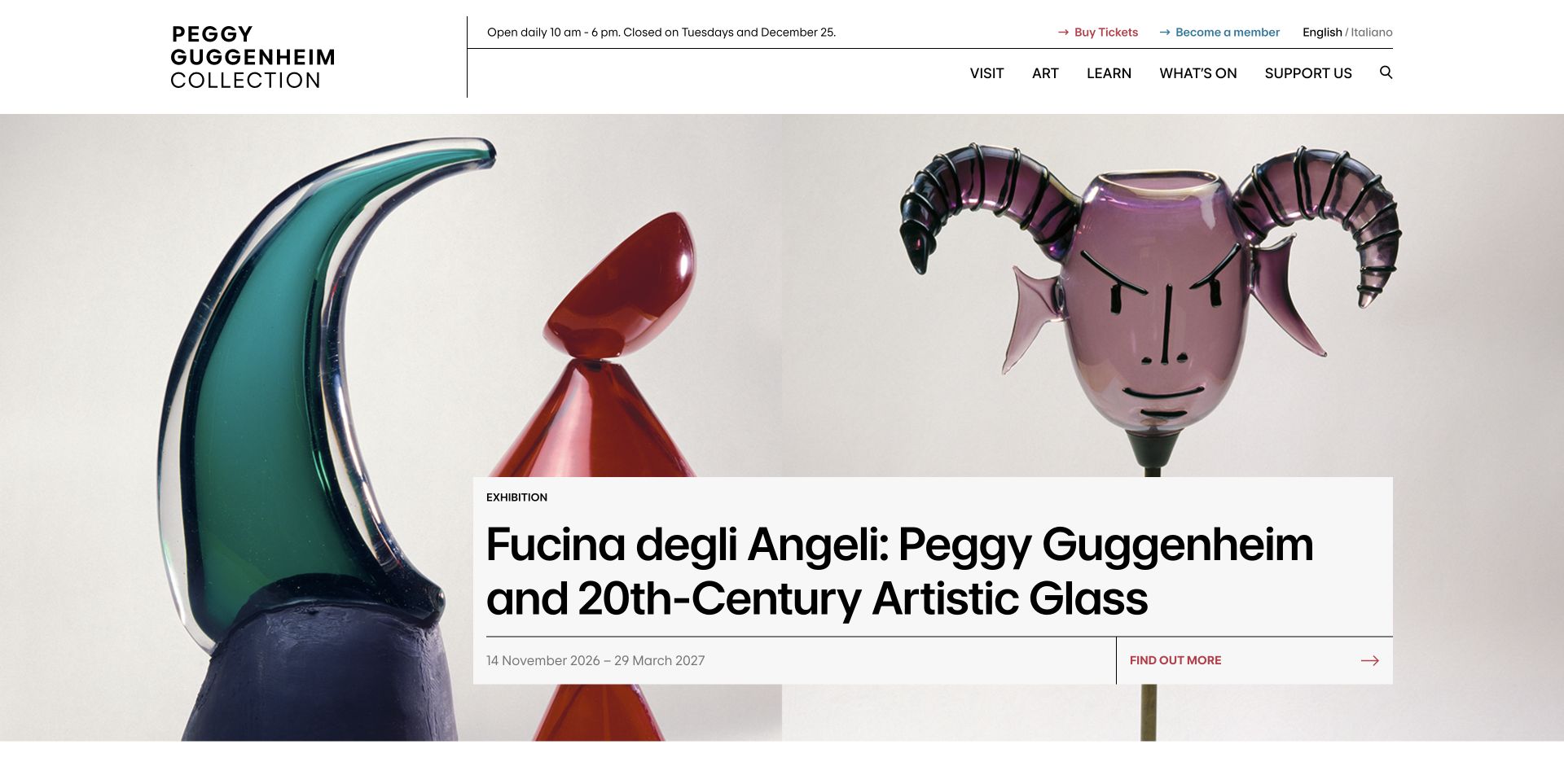
The Venice museum combines an editorial white header with a large exhibition image and a sharply bounded information card. Opening hours and the regular closed day appear before the visitor enters the exhibition story. Tickets and membership also remain distinct from the subject navigation, so the page can serve a person planning tomorrow’s visit and someone exploring the collection. The current exhibition card supplies a title, date range and detail link instead of asking the photograph to explain everything. Further sections introduce learning, events and accessibility. This is a review of the Peggy Guggenheim Collection property, rather than a claim about the presentation of the entire museum network.
What you can learn
Place operational facts near cultural content. A visitor should be able to understand what is showing and whether a visit is possible without switching between unrelated parts of the site.
Pros
Opening information is prominent before the exhibition feature.
The image and dated card provide complementary context.
Cons & considerations
Several navigation choices compete in the compact header.
Large exhibition imagery postpones some practical information until scrolling.
Platform source: Official ProcessWire showcase record. The official ProcessWire showcase names the Peggy Guggenheim Collection website in Venice and credits Basilico. This is the named museum property, not every Guggenheim website. Official ProcessWire showcase association with the named public property, reviewed separately from its current design. The showcase can describe an earlier implementation; it is not access to a private backend, a verified current version, or proof that ProcessWire caused the visible layout. Platform evidence is separate from the direct website screenshot and is not a complete current infrastructure audit.
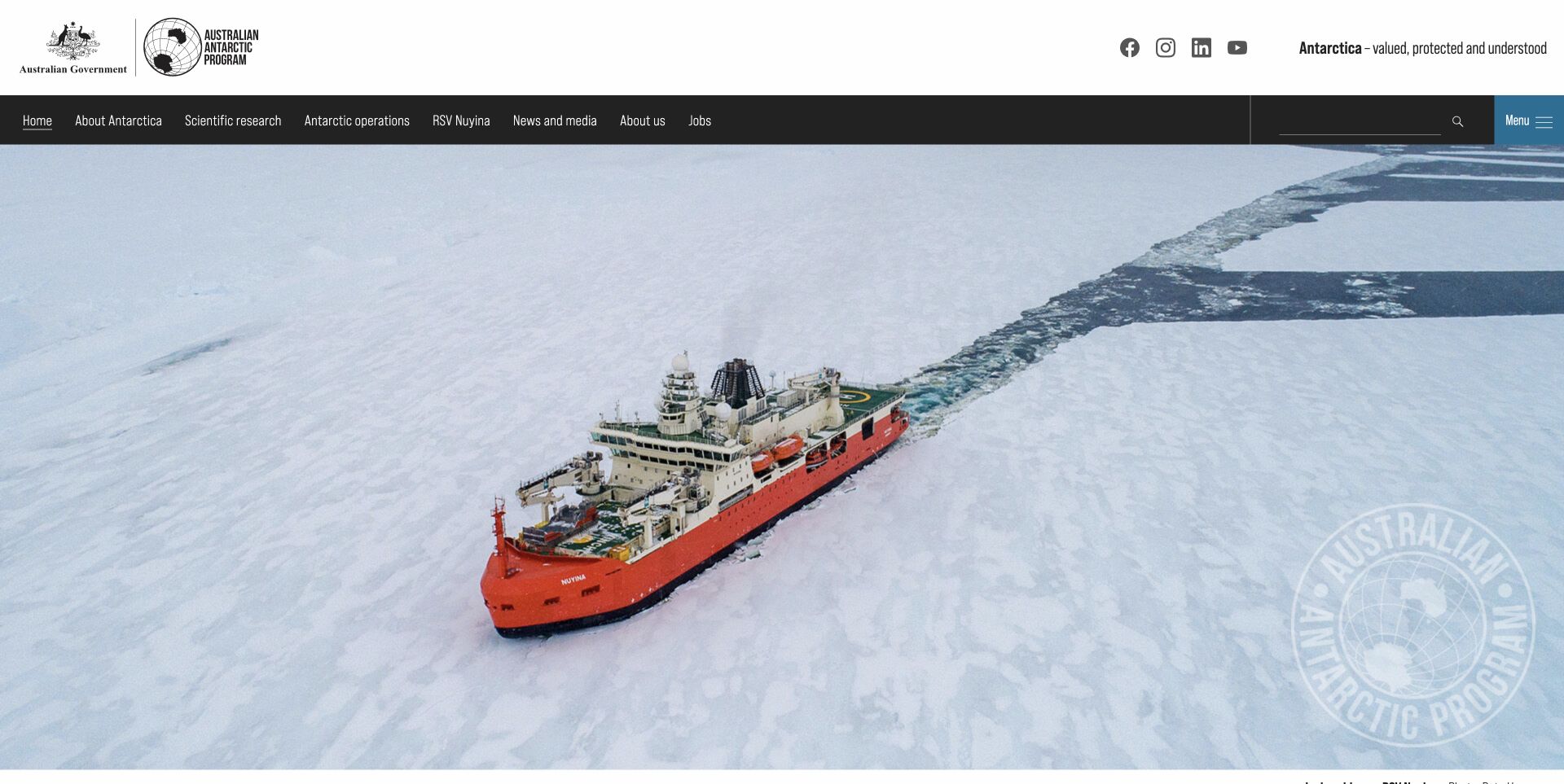
The Australian Antarctic Program leads with an expansive icebreaker photograph, but its government identity and subject navigation remain plainly visible above it. The contrast between a restrained white masthead and a black navigation bar makes the organizational frame easy to separate from the visual story. Search sits alongside the subjects rather than replacing them. Below the opening image, dated news and links to station webcams turn an impressive setting into material people can investigate. The page also exposes research and employment routes, reflecting different reasons to arrive. The credited imagery is particularly useful here: the photograph is presented as a documented view of the programme, not an unexplained decorative landscape.
What you can learn
Give a broad institutional site a steady navigation layer above changing stories. Let photography establish place while labels and dates explain which information is current and where the reader can go next.
Pros
Clear government identity anchors the presentation.
News and webcam routes offer different levels of exploration.
Cons & considerations
The large hero delays the news list.
Seven subject headings require readers to choose among broad categories.
Platform source: Official ProcessWire showcase record. The official showcase identifies the Australian Antarctic Program public website, with implementation credited to the Australian Antarctic Division team and visual design to The 20. Official ProcessWire showcase association with the named public property, reviewed separately from its current design. The showcase can describe an earlier implementation; it is not access to a private backend, a verified current version, or proof that ProcessWire caused the visible layout. Platform evidence is separate from the direct website screenshot and is not a complete current infrastructure audit.
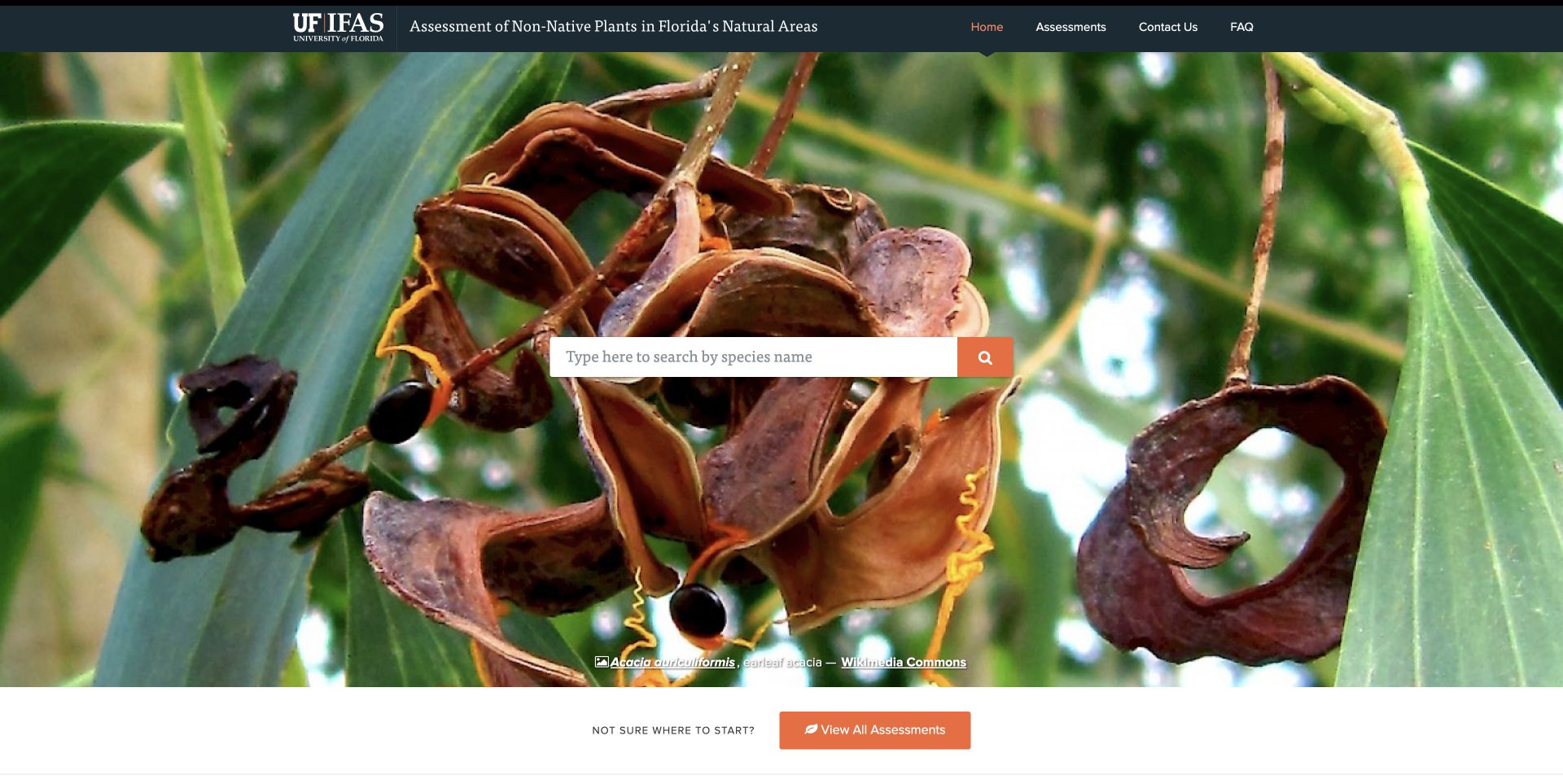
The IFAS Assessment homepage centers its purpose on a plant photograph and a species search. University branding occupies the upper edge, while the service title explains that this is a focused assessment resource rather than the university’s general homepage. A small set of navigation links and an all-assessments route provide alternatives for people who do not arrive with a species name. The photographic attribution and methodological explanation support the page’s reference character. Its footer retains an older update statement, which should not be read as a current date for every assessment. The interface is useful as a study in giving a narrow research tool a clear entrance without surrounding it with unrelated campus marketing.
What you can learn
Start specialist reference pages with the object people actually need to find. Keep a browsable list and the assessment method nearby so a search box does not become the only explanation of the resource.
Pros
The primary search is visually central.
Institutional identity and a focused service title work together.
Cons & considerations
Small search labeling could be more explicit.
The older footer date leaves update responsibility unclear.
Platform source: Official ProcessWire showcase record. The official showcase names assessment.ifas.ufl.edu and credits Tom Reno Design. The association concerns this non-native plant assessment service, not all University of Florida websites. Official ProcessWire showcase association with the named public property, reviewed separately from its current design. The showcase can describe an earlier implementation; it is not access to a private backend, a verified current version, or proof that ProcessWire caused the visible layout. Platform evidence is separate from the direct website screenshot and is not a complete current infrastructure audit.
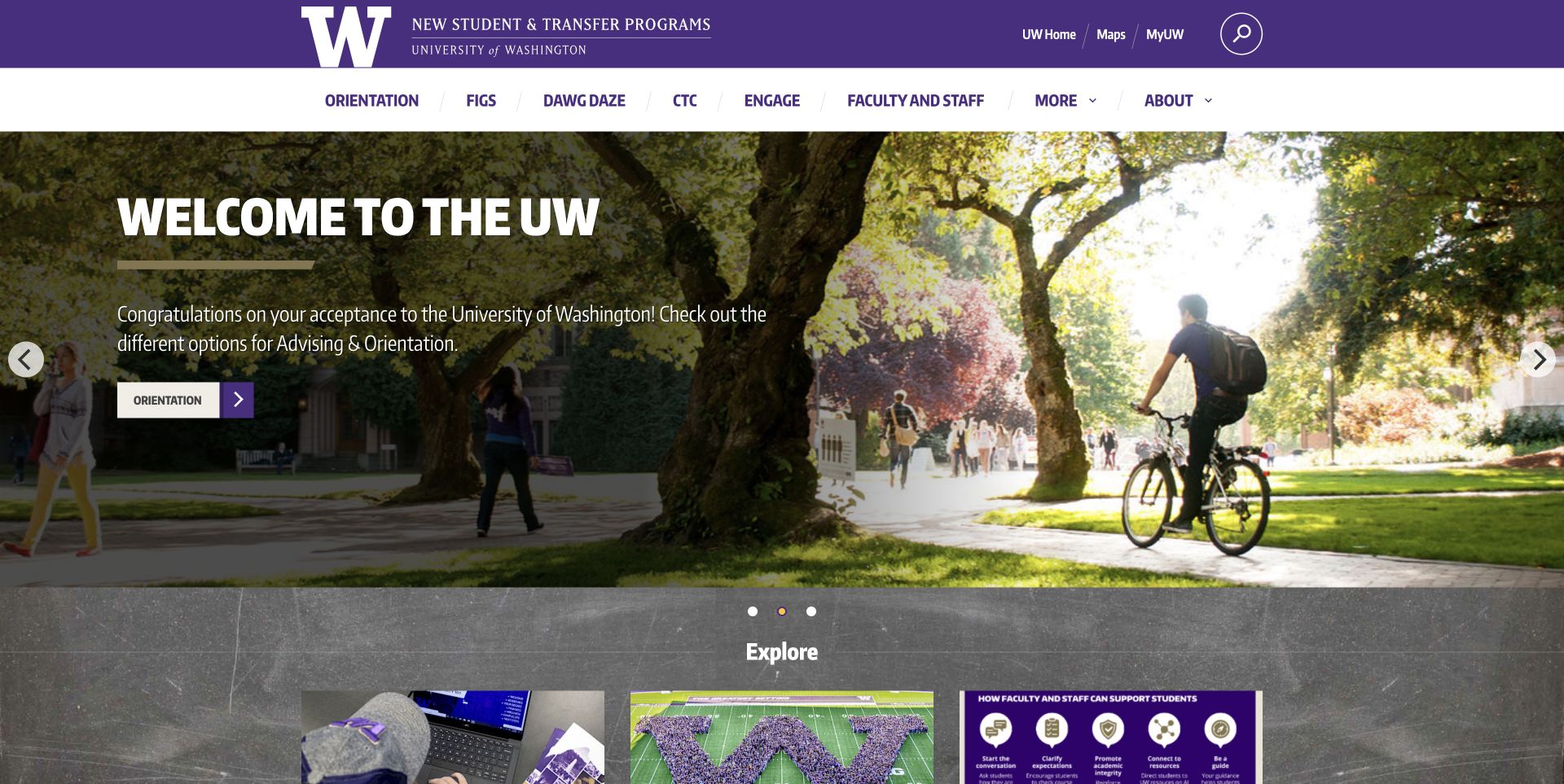
New Student & Transfer Programs uses the University of Washington’s purple identity around a large welcome photograph and a set of direct student routes. The page names the programme’s transition from First Year Programs, helping returning visitors understand why an older address now leads here. A substantial navigation row introduces its services before the larger promotional content. Three exploration cards then break the welcome into choices, so the photograph is followed by something a student can act on. The visual language remains recognizably institutional while concentrating on a particular stage of university life. This narrow property is more useful to study than treating every university department as if it shared one homepage or one technical implementation.
What you can learn
Explain a renamed service where returning users will see it. Pair the welcome message with clear task destinations, and preserve the connection to the parent institution without making visitors decode its internal structure.
Pros
The rename is acknowledged in public copy.
Exploration cards turn the welcome into routes.
Cons & considerations
Eight navigation choices create a busy first decision.
The large photo occupies space before detailed service information.
Platform source: Official ProcessWire showcase record. The official showcase names the former First Year Programs website. Its linked address redirects to nstp.uw.edu, whose public text confirms the programme rename. The record is an earlier implementation association with this continuing property, not current-version proof or a university-wide claim. Official ProcessWire showcase association with the named public property, reviewed separately from its current design. The showcase can describe an earlier implementation; it is not access to a private backend, a verified current version, or proof that ProcessWire caused the visible layout. Platform evidence is separate from the direct website screenshot and is not a complete current infrastructure audit.
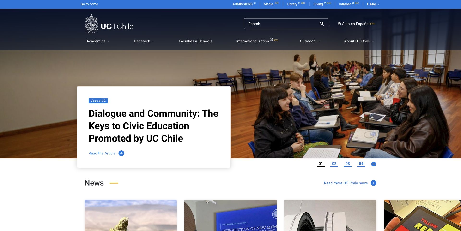
The university’s native English homepage combines a navy institutional header with a lecture-hall photograph and a white editorial card. The crest and utility links establish the source immediately. Links marked ES make some Spanish destinations explicit, an important distinction for a gateway that does not promise every connected service in English. A Study With Us section separates degree, exchange and doctoral routes instead of treating all prospective students as one audience. The main feature supplies a visible pause control, allowing readers to settle the changing presentation. The useful design relationship is between an international welcome and the practical routes beneath it, rather than the size of the hero alone. The capture shows the site’s own English edition, not a browser translation.
What you can learn
Treat language changes as navigation information. Make the gateway useful in its own language, then label destinations that move people into another edition before they follow the link.
Pros
Language labels clarify several outbound destinations.
Study routes distinguish different applicant intentions.
Cons & considerations
A large editorial feature postpones some application detail.
The number of utility links adds density around the main navigation.
Platform source: Official ProcessWire showcase record. The official showcase identifies www.uc.cl. The capture shows its native English edition on that same institutional property; the association does not establish technologies used by separate university systems. Official ProcessWire showcase association with the named public property, reviewed separately from its current design. The showcase can describe an earlier implementation; it is not access to a private backend, a verified current version, or proof that ProcessWire caused the visible layout. Platform evidence is separate from the direct website screenshot and is not a complete current infrastructure audit.
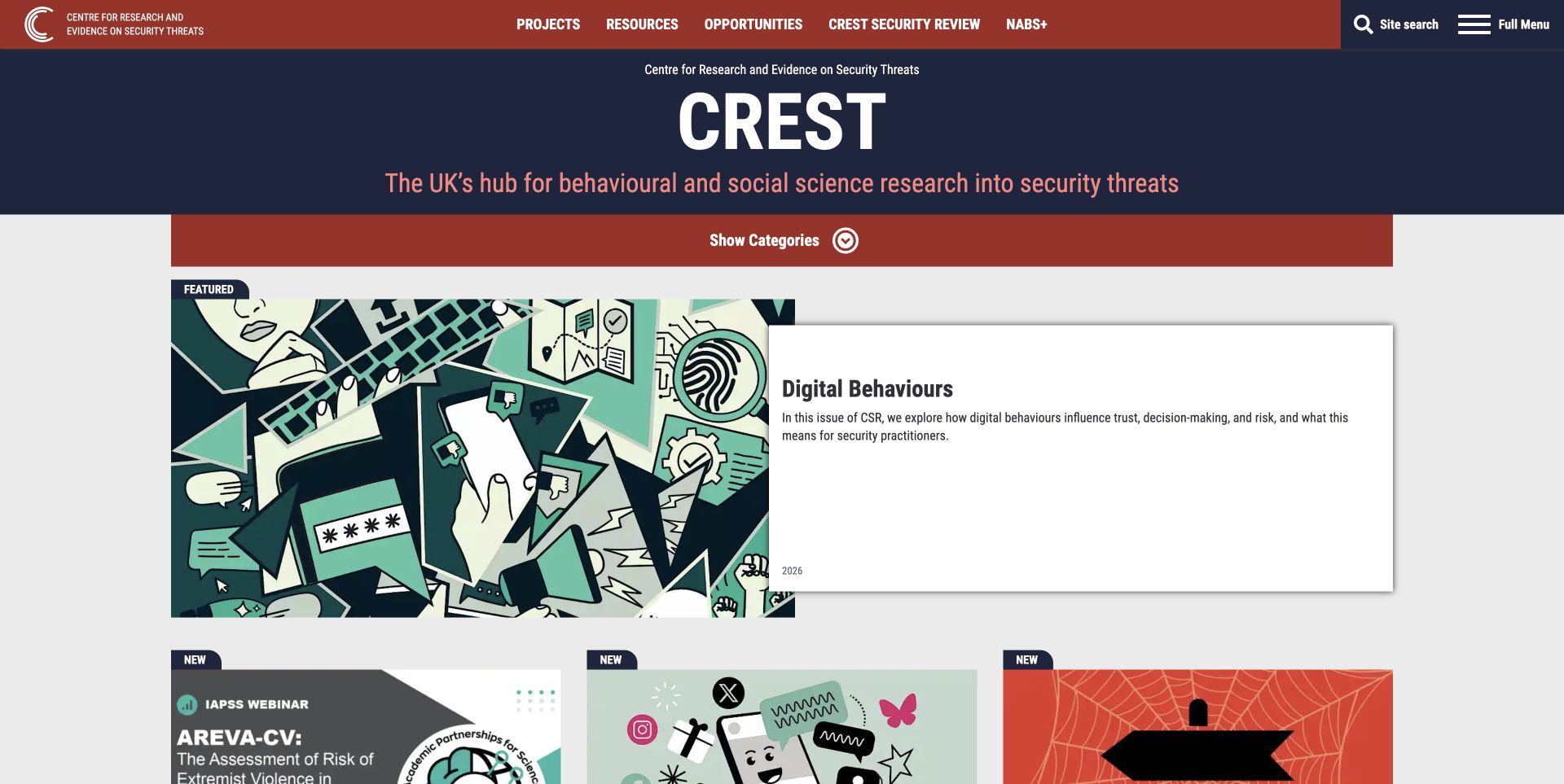
CREST introduces its full institutional name above a large acronym and a plain description of its research focus. The red and navy identity frames a featured magazine story with an illustration on one side and a white summary panel on the other. Beneath it, resource cards identify formats such as reports, guides and readouts, alongside authors or programme labels and reading times. Those details tell a visitor what kind of material a click will open. Search is explicitly labeled in the header, while a separate category control offers subject browsing. The page therefore supports both a known research question and more exploratory reading. The design review concerns those information choices, not the validity of individual research findings or operational security advice.
What you can learn
Give a research library more than an article title. Resource type, authorship and a short description let readers assess relevance before opening a long document or a specialist report.
Pros
Format labels help distinguish different resources.
Search and category browsing have separate entrances.
Cons & considerations
Several programme acronyms presume prior familiarity.
The featured summary panel uses considerable space for a short introduction.
Platform source: Official ProcessWire showcase record. The official ProcessWire showcase index explicitly names CREST Research at crestresearch.ac.uk and credits millipedia. The inspected public homepage has the same institution and developer credit. This documents the public research publishing property, not private research systems. Official ProcessWire showcase association with the named public property, reviewed separately from its current design. The showcase can describe an earlier implementation; it is not access to a private backend, a verified current version, or proof that ProcessWire caused the visible layout. Platform evidence is separate from the direct website screenshot and is not a complete current infrastructure audit.
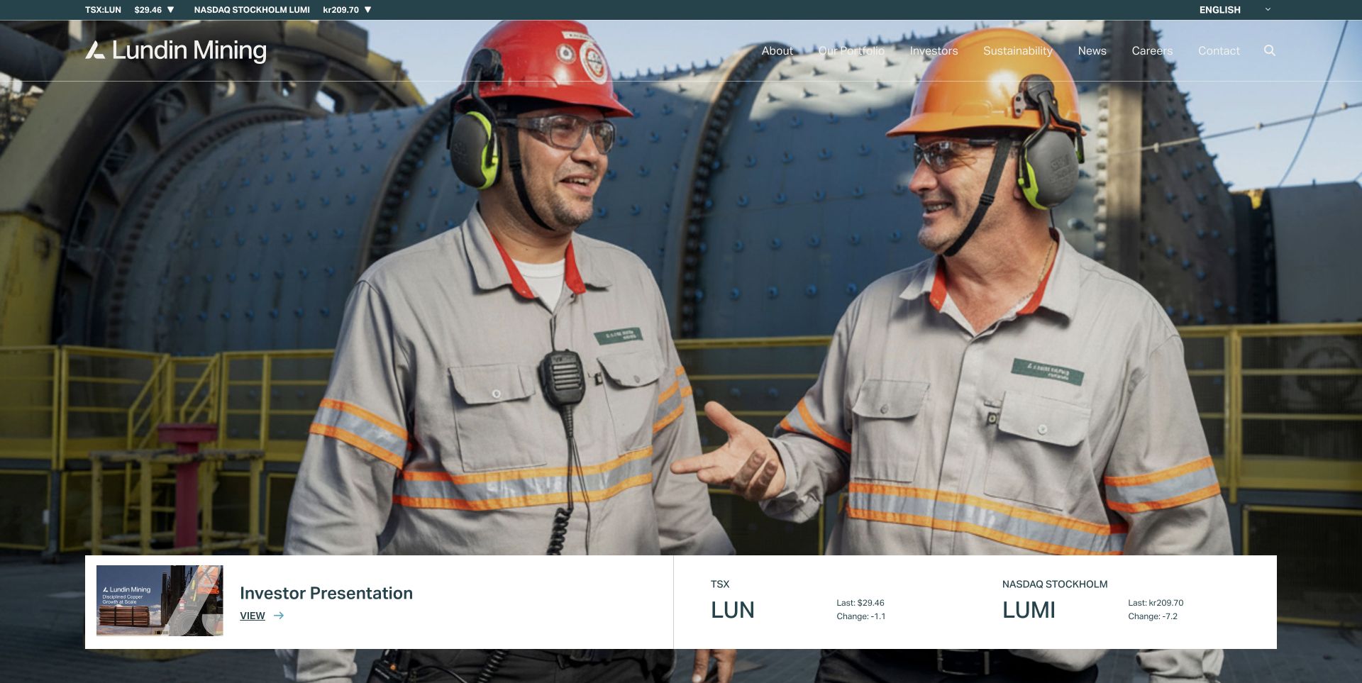
Lundin Mining places its white wordmark and navigation over a photograph of people in an industrial setting. A thin market-information strip sits above that visual field, while a white panel at the bottom introduces an investor presentation. These layers address different intentions: understanding the company, checking investor information and locating a specific document. The photography gives the corporate message a tangible environment, but the navigation remains responsible for explaining the business. The reviewed page uses several broad categories, so a newcomer still needs to choose between company information, operations and investor material. Market figures are part of the observed interface; this review does not verify them or treat their prominence as evidence of financial performance.
What you can learn
Separate time-sensitive investor material from the durable company story. Make document destinations clear and review text contrast against every image used behind navigation, especially when a hero can change.
Pros
The presentation link creates a practical next step.
Industrial photography supplies context beyond a generic corporate statement.
Cons & considerations
White navigation crosses bright areas of the photograph.
The quotation strip adds another information layer above an already broad menu.
Platform source: Official ProcessWire showcase record. The official showcase names the Lundin Mining corporate website and credits Adnet Communications. This association does not establish the systems behind market quotations, investor documents or mining operations. Official ProcessWire showcase association with the named public property, reviewed separately from its current design. The showcase can describe an earlier implementation; it is not access to a private backend, a verified current version, or proof that ProcessWire caused the visible layout. Platform evidence is separate from the direct website screenshot and is not a complete current infrastructure audit.
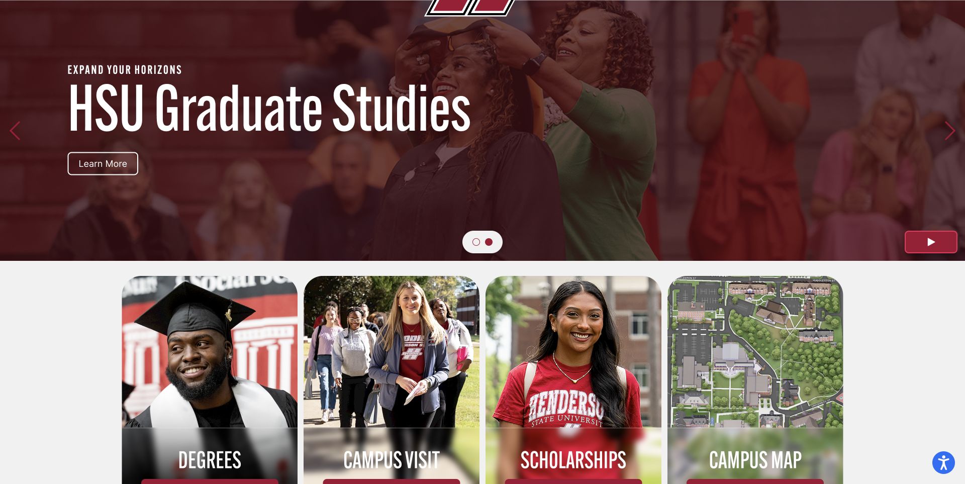
Henderson’s captured view shows the graduate-studies feature above four rounded task cards: degrees, campus visits, scholarships and the campus map. The separation matters because each card answers a different prospective student question, while the larger feature gives one campaign room to speak. The university’s broader page also includes audience navigation, application and donation routes, and news and events. The screenshot is deliberately a scrolled view after using the site’s own slideshow pause control; it does not pretend to show the entire header. Once the moving feature settles, the relationship between the campaign and the persistent task choices becomes easier to study. The useful pattern is a stable set of practical options beneath changing recruitment material.
What you can learn
Keep the recurring student tasks available when a campaign changes. A striking feature can introduce a programme, but degrees, cost support and visiting information should not depend on which slide happens to be visible.
Pros
Four cards use concrete task labels.
The site supplies a normal slideshow pause control.
Cons & considerations
Automatic transitions can interrupt reading.
Campaign prominence may push broader university information below the first view.
Platform source: Official ProcessWire showcase record. The official showcase explicitly names hsu.edu and credits Henderson State University. The scope is the public university website, not authenticated student or administrative systems. Official ProcessWire showcase association with the named public property, reviewed separately from its current design. The showcase can describe an earlier implementation; it is not access to a private backend, a verified current version, or proof that ProcessWire caused the visible layout. Platform evidence is separate from the direct website screenshot and is not a complete current infrastructure audit.
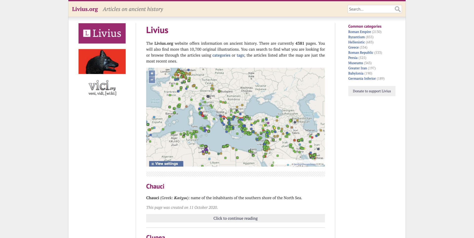
Livius presents a dense reference homepage with a restrained beige and purple palette. Its central introduction leads into a geographic map, while a category list provides another route through the ancient-history material. Search is available for someone who already knows a name or subject. The surrounding columns include partner information and recent-article links, giving the page the feel of an established archive rather than a campaign landing page. Visible article dates include older material, so the page should be understood as a reference collection rather than a continuously updated news feed. The map is the most distinctive browsing device: it lets a reader approach the archive spatially, without first translating their interest into the publication’s category vocabulary.
What you can learn
Support different starting points in a large archive. Geography, subject categories and search can complement one another, provided the page explains their scope and does not confuse older reference material with new reporting.
Pros
The map offers a spatial browsing alternative.
Category counts help communicate the breadth of the archive.
Cons & considerations
Several columns compete for attention.
Older dates need context so readers understand the publication’s maintenance state.
Platform source: Official ProcessWire showcase record. The official showcase lists www.livius.org as an ancient-history resource. It does not name its developer or a platform version; neither is inferred from the public design. Official ProcessWire showcase association with the named public property, reviewed separately from its current design. The showcase can describe an earlier implementation; it is not access to a private backend, a verified current version, or proof that ProcessWire caused the visible layout. Platform evidence is separate from the direct website screenshot and is not a complete current infrastructure audit.
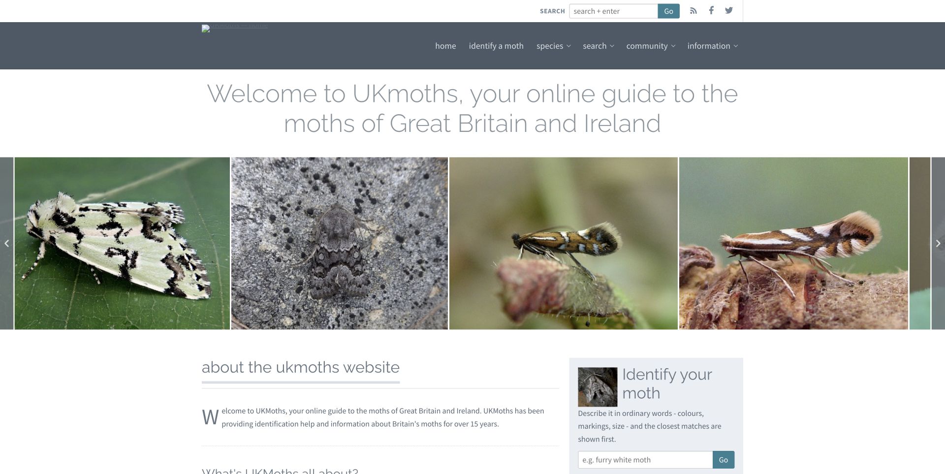
UKMoths uses a row of moth photographs to establish its subject before offering search and an identification entrance. The restrained white and grey layout leaves room for the images and explanatory text rather than imposing a promotional story on the reference material. Named and credited photographs provide useful context, and the page distinguishes the practical identification task from broader browsing. Its header logo did not load in the reviewed capture, a visible defect retained in the evidence rather than repaired for presentation. The page is consequently useful for both its focused information structure and the reminder that small asset failures can weaken an otherwise direct reference entrance. This design review does not verify species identifications or replace specialist advice.
What you can learn
Use representative images to explain a reference collection, then give readers a clearly labeled way to narrow it. Check persistent identity assets independently of the many photographs that make up the content.
Pros
The subject is immediately clear from the image row.
Search and identification offer complementary starting points.
Cons & considerations
The header logo was broken when reviewed.
Small, pale navigation text deserves closer readability testing.
Platform source: Official ProcessWire showcase record. The official showcase describes the UKMoths rebuild using ProcessWire and credits Ian Kimber. Its relative wording about the rebuild is not treated as a current deployment date or version. Official ProcessWire showcase association with the named public property, reviewed separately from its current design. The showcase can describe an earlier implementation; it is not access to a private backend, a verified current version, or proof that ProcessWire caused the visible layout. Platform evidence is separate from the direct website screenshot and is not a complete current infrastructure audit.
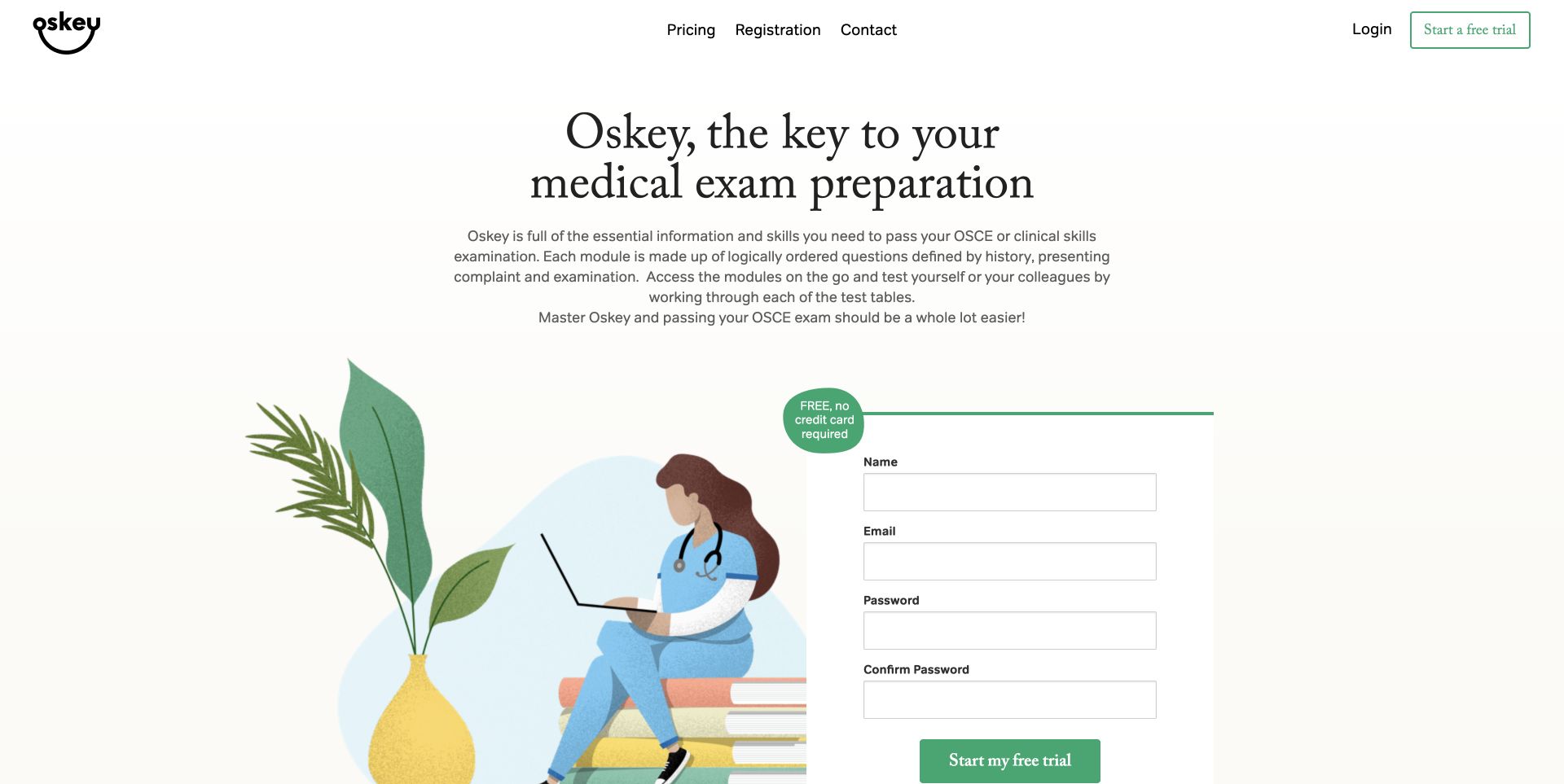
OSkey’s cream background, large serif heading and green illustration make the revision product feel approachable before the reader reaches its more detailed content. A four-field trial form sits directly in the opening composition, accompanied by a note that a credit card is not required. Pricing and registration remain available in the navigation, while sections below distinguish modules from approaches and show how access is packaged. That progression makes the commercial structure visible rather than leaving all terms behind registration. The prominent form is also a tradeoff: a visitor encounters the request for personal information before seeing much of the learning material. The review concerns the presentation of an educational product, not the clinical accuracy of its content or a promise of examination success.
What you can learn
Explain both the content and the commitment near a trial invitation. Give cautious visitors enough public detail to assess fit before asking them to create an account or provide personal information.
Pros
Trial conditions appear beside the form.
Two content families help explain the product structure.
Cons & considerations
Registration occupies the opening screen.
An illustrated introduction offers less immediate evidence than a visible lesson sample.
Platform source: Official ProcessWire showcase record. The official showcase names oskey.co.uk and credits Castus. This documents the public revision-product property; authenticated course delivery and clinical accuracy were not inspected. Official ProcessWire showcase association with the named public property, reviewed separately from its current design. The showcase can describe an earlier implementation; it is not access to a private backend, a verified current version, or proof that ProcessWire caused the visible layout. Platform evidence is separate from the direct website screenshot and is not a complete current infrastructure audit.
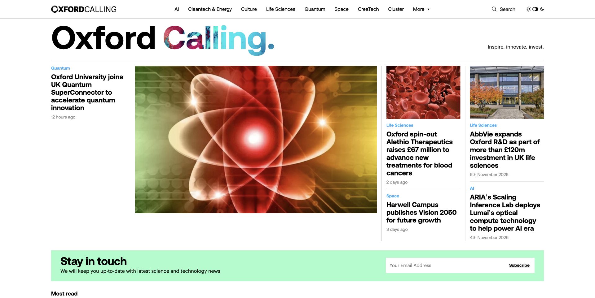
Oxford Calling organizes its homepage like a publication rather than a single institutional brochure. A large lead image and headline sit beside smaller stories, with categories and dates helping readers separate subjects and recency. The animated identity introduces color into an otherwise restrained black-and-white masthead. A sector row provides routes into areas such as energy, life sciences and quantum, while search offers a more direct alternative. Further down, the cluster map and newsletter extend the experience beyond the lead story. The design is particularly useful for studying the relationship between a regional narrative and a browsable index of activity. Those navigation choices are visible evidence; promotional claims about the region’s competitive position were not independently measured.
What you can learn
Combine editorial stories with a durable subject structure. A changing front page can introduce current work, while sector navigation and a map help readers find organizations and topics after the featured story changes.
Pros
Dates and categories support scanning.
The map offers a different route into regional information.
Cons & considerations
Motion in the masthead can distract from reading.
Specialist sector terms may need more explanation for newcomers.
Platform source: Official ProcessWire showcase record. The official showcase names Oxford Calling, identifies Enterprise Oxfordshire as the project organization and credits Castus. The association concerns this public innovation publication. Official ProcessWire showcase association with the named public property, reviewed separately from its current design. The showcase can describe an earlier implementation; it is not access to a private backend, a verified current version, or proof that ProcessWire caused the visible layout. Platform evidence is separate from the direct website screenshot and is not a complete current infrastructure audit.
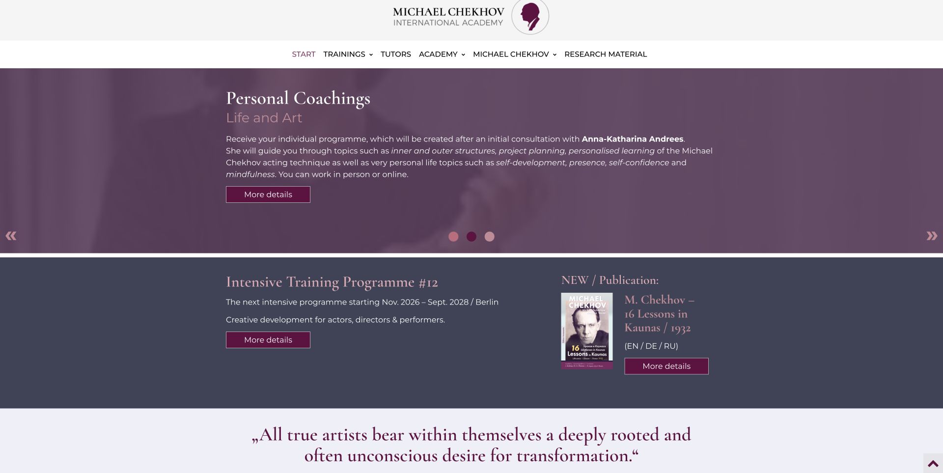
The academy uses a purple feature panel, serif typography and a centrally placed identity to create a presentation connected to performance. The accepted capture shows the personal-coaching feature after normal carousel navigation, with a short explanation and a detail link. Training, tutors and research remain separate navigation choices. Lower sections introduce intensive programmes and a publication, allowing the visitor to move beyond the opening promotion. This variety is valuable, but the page needs careful editorial coordination because workshop information and recurring classes are described in several places. The capture is a slightly scrolled view with no cookie overlay; it records the actual feature rather than blending several slides. The review does not assess the teaching method or promise a particular learning outcome.
What you can learn
Give each training offer a distinct purpose, audience and next step. Keep dates and recurring schedules consistent wherever they appear, and use descriptive links so readers know which offer they are opening.
Pros
The visual identity suits the performance subject.
Navigation distinguishes teaching from people and research.
Cons & considerations
Repeated detail-link labels give limited destination context.
Carousel controls and repeated scheduling information need careful maintenance.
Platform source: Official ProcessWire showcase record. The official showcase names chekhovacademy.com, describes its training and workshop presentation and credits webdecker.de. No private enrolment or teaching system is inferred. Official ProcessWire showcase association with the named public property, reviewed separately from its current design. The showcase can describe an earlier implementation; it is not access to a private backend, a verified current version, or proof that ProcessWire caused the visible layout. Platform evidence is separate from the direct website screenshot and is not a complete current infrastructure audit.
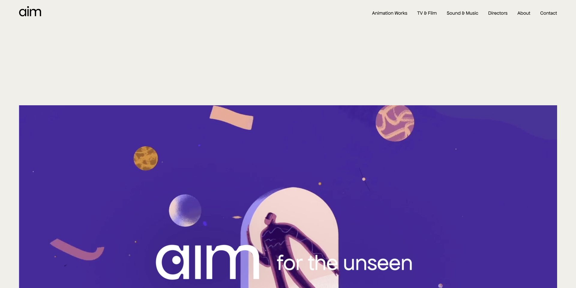
AIM Creative Studios keeps its interface unusually spare: a small black identity, a short navigation row and generous cream space lead into a vivid purple showreel. The restraint gives the moving work room to carry the character of the studio. Project cards below name clients and distinguish a quick playback route from a fuller project view. That distinction is useful because a visitor may want either an immediate visual sample or the context behind a commission. The first screen does not explain the service in much detail, so the design relies on the work and subsequent navigation to establish fit. Client names are observed portfolio labels, not independent verification of the scope or outcome of each engagement.
What you can learn
Separate a fast portfolio preview from the case-study route. Motion can demonstrate craft, but a potential client still needs a stable way to understand the brief, contribution and contact path without watching every film.
Pros
Quiet interface elements give the work prominence.
Quick-play and project links support different viewing intentions.
Cons & considerations
Large empty space delays the first work sample.
A media-led introduction offers little immediate service explanation.
Platform source: Official ProcessWire showcase record. The official showcase names AIM Creative Studios at aimcreativestudios.com and credits ED Design. This association concerns the studio portfolio, not the software used to produce its animation. Official ProcessWire showcase association with the named public property, reviewed separately from its current design. The showcase can describe an earlier implementation; it is not access to a private backend, a verified current version, or proof that ProcessWire caused the visible layout. Platform evidence is separate from the direct website screenshot and is not a complete current infrastructure audit.
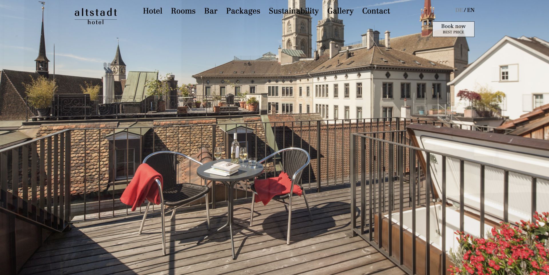
Hotel Altstadt’s English entrance gives almost the whole viewport to a rooftop terrace and the surrounding Zurich setting. A restrained serif navigation sits over the photograph, with hotel, rooms, bar, packages and practical subject links kept short. The language switch and outlined booking link occupy the upper edge, making the two most immediate visitor decisions visible. The approach is atmospheric rather than explanatory: it invites exploration of the place before presenting room detail. The booking destination is a separate service, so the ProcessWire association concerns the hotel’s public presentation rather than that transaction system. The screenshot was taken after dismissing the site’s notice through its normal control, leaving the actual photograph and navigation unobstructed.
What you can learn
Let a strong location image establish atmosphere, then give essential decisions a dependable home. Review navigation contrast against the photograph and make the transition to an external reservation service understandable before a guest commits.
Pros
The photograph establishes a specific sense of place.
Language and booking routes remain easy to locate.
Cons & considerations
Black text crosses a varied photographic background.
Sparse opening copy leaves practical comparisons for later pages.
Platform source: Official ProcessWire showcase record. The official showcase links the exact English Hotel Altstadt page and credits pan-x. This is evidence for the hotel presentation property, not the separately hosted booking engine. Official ProcessWire showcase association with the named public property, reviewed separately from its current design. The showcase can describe an earlier implementation; it is not access to a private backend, a verified current version, or proof that ProcessWire caused the visible layout. Platform evidence is separate from the direct website screenshot and is not a complete current infrastructure audit.
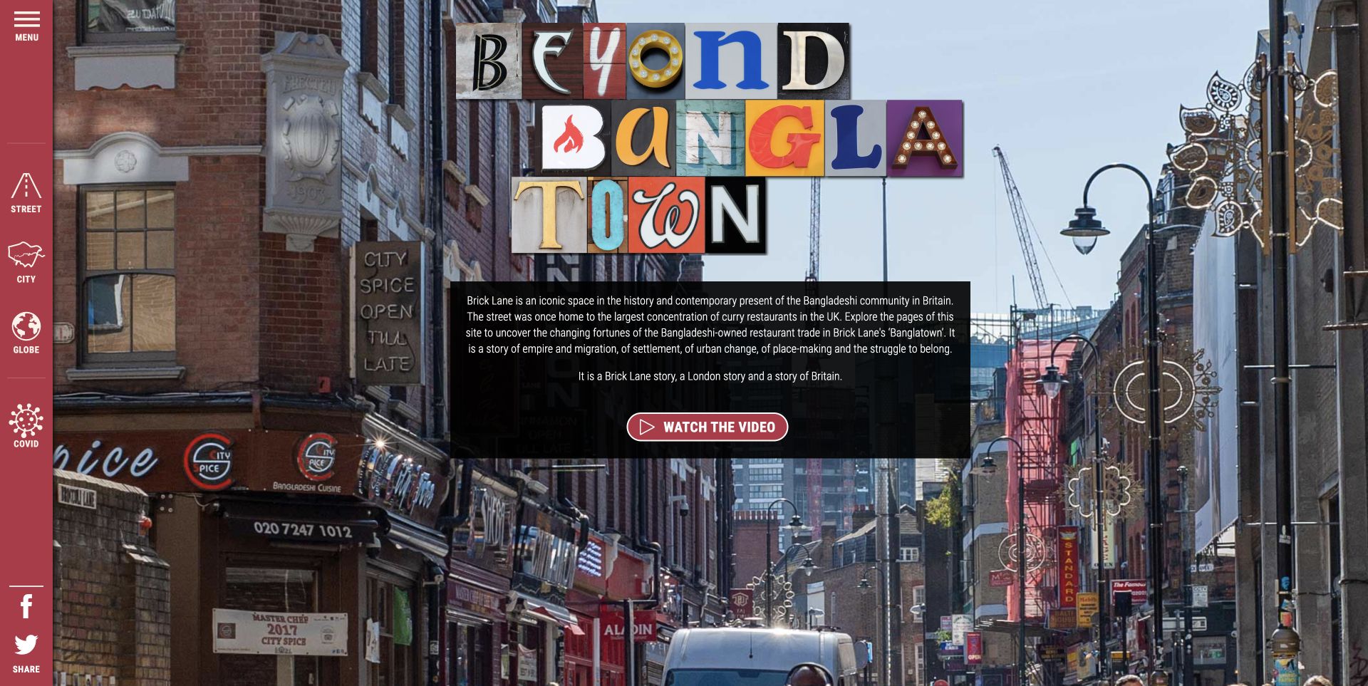
Beyond Banglatown starts with a Brick Lane street photograph and a title assembled in the spirit of shop lettering. A translucent introduction panel explains the project and offers a video route, while a narrow red rail provides access to Street, City, Globe and Covid sections. The relationship between the photograph and those scales is the central design idea: readers can begin with a place and then broaden the questions they explore. Further navigation includes voices, data, teaching resources and project context. This is a public research presentation, not a claim that a photograph alone establishes the identity or experience of every person shown. The layered typography is expressive, although the busy background makes smaller explanatory text work harder.
What you can learn
Use a concrete place to introduce a complex research story. Then explain the browsing structure clearly enough that readers understand how local accounts, wider data and project context relate to one another.
Pros
The streetscape gives the project a tangible starting point.
Several scales offer a meaningful narrative structure.
Platform source: Official ProcessWire showcase record. The official ProcessWire showcase identifies beyondbanglatown.org.uk as the public research-storytelling project. The website presentation is distinct from the underlying research methods or private participant data. Official ProcessWire showcase association with the named public property, reviewed separately from its current design. The showcase can describe an earlier implementation; it is not access to a private backend, a verified current version, or proof that ProcessWire caused the visible layout. Platform evidence is separate from the direct website screenshot and is not a complete current infrastructure audit.
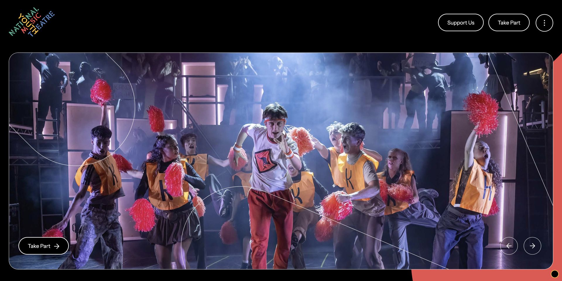
National Youth Music Theatre places a colorful identity on a black field and uses a large production photograph to make the performance context immediate. Support Us and Take Part remain prominent pill-shaped routes above the image, separating two audiences before the visitor opens the full menu. Lower content introduces auditions, workshops, actor-musician opportunities and backstage participation. These routes broaden the story beyond the people visible on stage. The page also supplies safeguarding information and an age range in its supporting content, details that matter for a youth organization even when they do not dominate the hero. The design review concerns this public participation journey; no audition, donation or account process was completed or evaluated.
What you can learn
Pair the excitement of a performance photograph with clear participation choices. A youth arts site should make the paths for performers, backstage contributors, supporters and families understandable without relying on one generic invitation.
Pros
Support and participation have distinct entrances.
Backstage routes broaden the representation of theatre work.
Cons & considerations
The large production image delays practical eligibility detail.
The overflow menu hides some routes until another interaction.
Platform source: Official ProcessWire showcase record. The official showcase names nymt.org.uk and credits Internet Dreams Studio. This concerns the public theatre and participation website, not private auditions or participant records. Official ProcessWire showcase association with the named public property, reviewed separately from its current design. The showcase can describe an earlier implementation; it is not access to a private backend, a verified current version, or proof that ProcessWire caused the visible layout. Platform evidence is separate from the direct website screenshot and is not a complete current infrastructure audit.
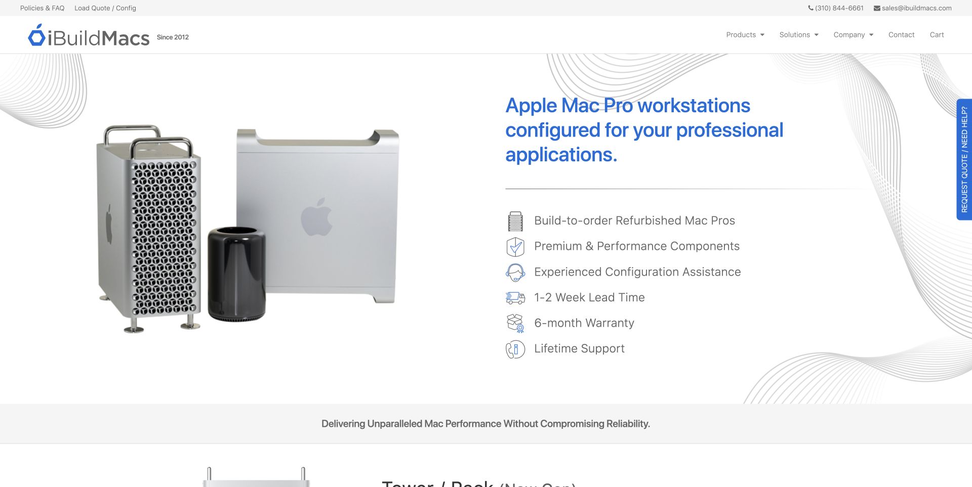
iBuildMacs divides its opening screen between recognizable computer photographs and a service explanation supported by a row of concise promises. Utility links cover policies, quotes and contact, while the main navigation separates products, solutions and company information. The product sections below become more specific, showing model years, condition, warranty language, base prices and configuration links. That detail is useful for a buyer comparing machines that may look similar but differ substantially in specification. It also gives the page a denser rhythm than a simple product landing page. Older dated testimonials remain visible in the material reviewed; they should not be interpreted as fresh evidence of present service quality. No configuration was purchased or submitted during this review.
What you can learn
Expose the comparison details that change a buying decision before the product page. Keep condition, model year and warranty terms distinct from promotional claims, and provide an explanation path for less technical readers.
Pros
Model information supports meaningful comparison.
Policy and contact routes are readily available.
Cons & considerations
Dense specifications assume some buyer knowledge.
Older testimonials need clear date context rather than an impression of recency.
Platform source: Official ProcessWire showcase record. The official showcase names ibuildmacs.com and credits Jonathan Lahijani. It documents this public computer retailer property, not Apple websites or the internal purchasing system. Official ProcessWire showcase association with the named public property, reviewed separately from its current design. The showcase can describe an earlier implementation; it is not access to a private backend, a verified current version, or proof that ProcessWire caused the visible layout. Platform evidence is separate from the direct website screenshot and is not a complete current infrastructure audit.
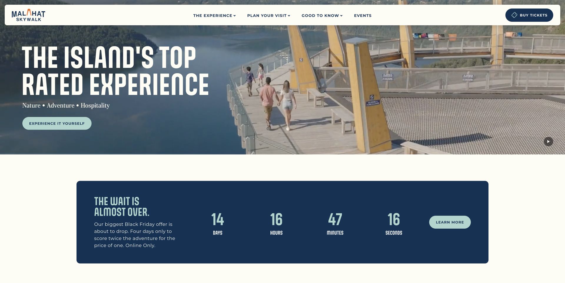
Malahat SkyWalk uses a sweeping view of the forest, tower and water to explain the attraction before visitors read much copy. A floating cream navigation keeps planning categories, events and ticket access visible over the scene. The accepted view was captured after pausing the site’s own video and closing its seasonal alert through the normal control. The underlying page provides hours, weather, accessibility and group information, which are necessary counterparts to the visual invitation. A promotional block below the hero introduces another layer of urgency. The review does not verify the attraction’s rating claims or ticket availability; it studies how the page moves from a memorable setting to the information needed to decide whether and when to visit.
What you can learn
Keep practical visit information close to the scenic promise. Seasonal closures and access details need clear, maintained destinations even when a temporary alert is dismissed, and ticket links should not be the only useful next step.
Pros
The landscape explains the attraction visually.
Planning and ticket routes remain prominent.
Cons & considerations
Large video imagery postpones some practical details.
Promotional urgency can compete with essential seasonal information.
Platform source: Official ProcessWire showcase record. The official showcase identifies malahatskywalk.com as a ProcessWire website. The association covers the attraction website, without establishing its external ticket provider architecture. Official ProcessWire showcase association with the named public property, reviewed separately from its current design. The showcase can describe an earlier implementation; it is not access to a private backend, a verified current version, or proof that ProcessWire caused the visible layout. Platform evidence is separate from the direct website screenshot and is not a complete current infrastructure audit.
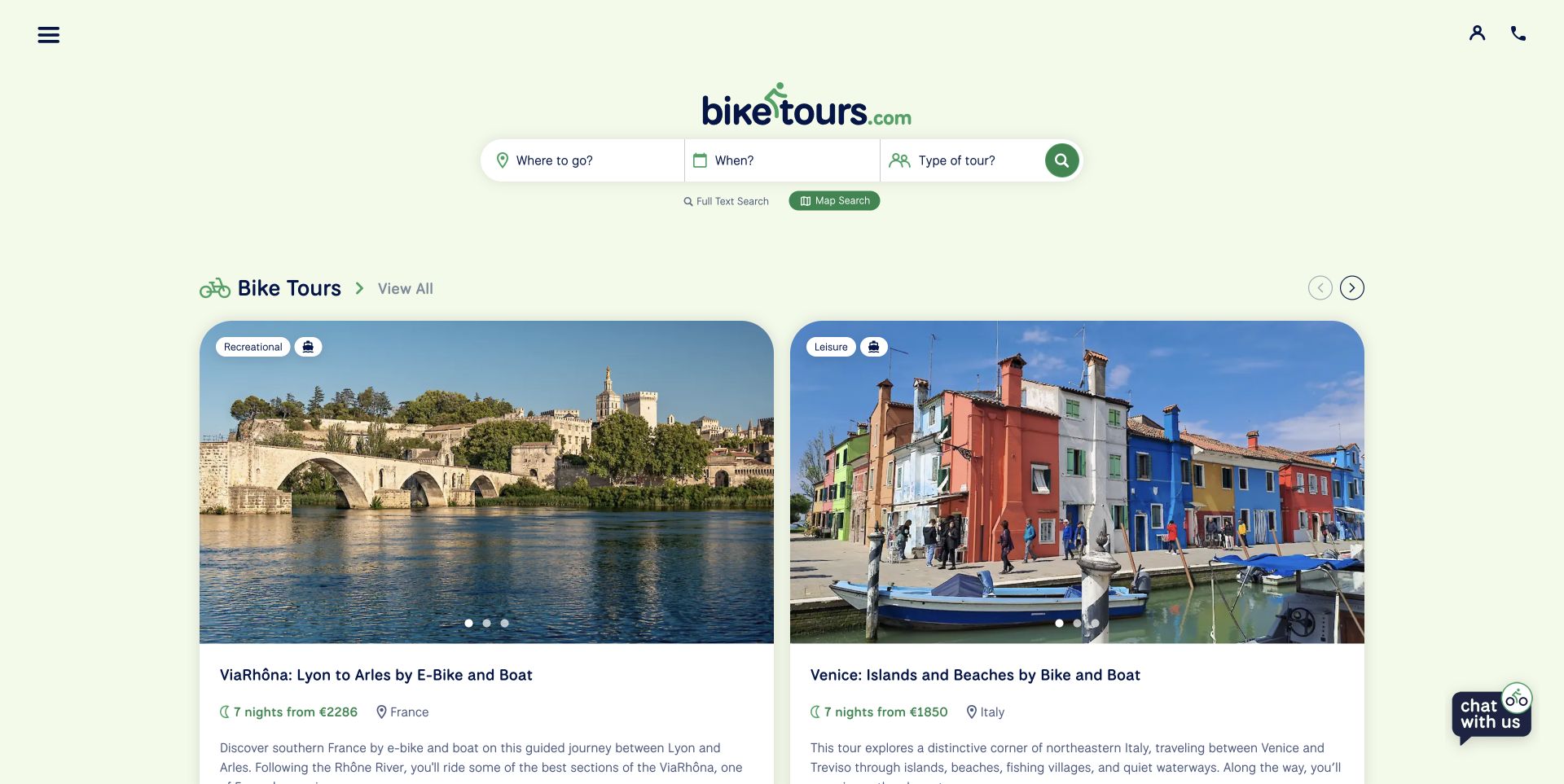
BikeTours.com organizes the opening search around three understandable decisions: where to go, when to travel and what kind of trip to take. Keyword and map alternatives accommodate visitors who approach the catalogue differently. Large tour cards then show activity level, duration, country and price beside photographs and a short description. These fields make the cards useful comparison units rather than image links with vague titles. The pale green presentation keeps the travel imagery prominent, while help and preparation resources provide routes for visitors who are not yet ready to choose. A collapsed chat launcher sits at the edge without covering the reviewed content. Prices and travel conditions are observed interface details, not recommendations or independently verified offers.
What you can learn
Design catalogue cards around the choices people actually compare. Keep filters, map exploration and plain-language summaries connected, and make currencies and activity expectations clear before a visitor moves into a booking process.
Pros
Search reflects distinct planning decisions.
Tour cards expose useful comparison fields.
Cons & considerations
The main menu is compact even on desktop.
Different currencies require careful reading across results.
Platform source: Official ProcessWire showcase record. The official showcase names www.biketours.com and credits Jan, Diogo, Pete and Ryan. It documents the public tour discovery property, not every operator or booking service linked from it. Official ProcessWire showcase association with the named public property, reviewed separately from its current design. The showcase can describe an earlier implementation; it is not access to a private backend, a verified current version, or proof that ProcessWire caused the visible layout. Platform evidence is separate from the direct website screenshot and is not a complete current infrastructure audit.
Kegan has 15+ years of experience working with small businesses, Fortune 500 companies, and everything in between. No development job is too big or too small: he brings the same hands-on attention to a focused improvement, a complete website, or a custom application.
For ProcessWire projects, he can help with responsive interfaces, reusable components, custom functionality, API connections, and performance-minded implementation. He works directly with clients on scope, design, implementation, testing, and handover, with an emphasis on clear communication and a system that remains practical to maintain after launch.
Show 3 other ProcessWire developersHide other ProcessWire developers
Choose an implementation around the content and team
Build deliberate public templates
ProcessWire template files receive content through its API and run as PHP. The official documentation emphasizes that developers generally create the output markup. That freedom makes the public interface a project responsibility: define meaningful headings, readable labels, stable links and accessible controls. Prototype representative content before expanding the template set. A small number of well-defined patterns is easier to maintain than many subtly different layouts whose purpose editors cannot explain.
The field system includes repeatable groups, image fields, options and multilingual text. Choose a structure that fits the information rather than exposing every possible setting to editors. Repeated course dates, tour facts or resource metadata can benefit from consistent inputs, while an expressive project story may need more editorial room. Test the editing task with real material, including an incomplete record, so the team understands what must be supplied before a page becomes public.
A public site may hand off to a booking engine, an application portal, video hosting or a separate learning system. Document those boundaries before implementation. Decide who maintains destination links, language changes, error messages and privacy choices. A working CMS page does not establish that the next service works or shares its technology. The hotel and university examples are useful reminders to review the transition itself, including what readers are told before leaving the public property.
From references to requirements
Plan the publishing work as carefully as the layout
Start with a representative content inventory
Collect real examples of the material the team publishes. Include the awkward cases: a closed event, a resource without an image, a long institutional title and a page with a second language. Record who owns each item and which facts must stay current. Use the inventory to choose navigation labels and reusable presentation patterns. This grounds the design in actual publishing work and exposes missing information before it becomes an empty card in production.
Assign roles and review responsibilities
ProcessWire’s access control connects users, roles, permissions and templates. Translate the organization’s actual responsibilities into that model, keeping routine editing separate from wider administration. Document who checks public dates, replaces missing assets and retires old information. Verify the intended access with representative accounts in an appropriate test environment. The CMS can express permissions, but the project still needs a clear human process for corrections, departures and urgent updates.
Keep repeatable checks for the risks the site actually has: image availability, canonical links, comparison units, old events, translated destinations and external-service handoffs. Review keyboard interaction and motion controls separately from the screenshot. Use a rollback plan for template and module updates, and keep the publishing team informed about changed fields. A successful response from the homepage is only one signal; a broken identity image or misleading event state can still undermine the experience.
A useful handover demonstration
Ask the actual team to carry out its routine job: publish a realistic update, correct a mistake, preview a narrow screen, and identify who owns an integration failure. For a library or frontend framework, also ask who maintains the content source and deployment. A polished screenshot does not answer those operational questions.
Beyond the screenshot
A practical ProcessWire website checklist
Name the main visitor tasks before choosing the opening layout.
Define the fields that distinguish each type of content.
Make dates, formats, conditions and comparison units explicit.
Test templates with long titles, missing assets and archived material.
Keep practical routes available when promotional features change.
Label language changes and external-service handoffs.
Provide understandable search and useful browsing alternatives.
Check motion controls, keyboard operation and focus behavior separately.
Assign responsibility for updates, permissions and corrections.
Retain original source evidence and actual screenshot dates.
Verify public links and assets after template or module changes.
Test with real content, a keyboard, a small screen, slow or failed requests, and the people who will maintain the system. These are planning checks, not an accessibility, security, performance, or search-ranking certification.
Sources & editorial method
How this ProcessWire collection was reviewed
Twenty distinct public properties were directly inspected and captured on November 12–13, 2026 UTC during the November 12 Pacific morning batch. Each association is supported by an official ProcessWire showcase record naming that property; CREST is listed in the official showcase index. The former UW First Year Programs address was reconciled with its redirect and the public programme-rename explanation. UC Chile uses its native English edition. Screenshots are unaltered direct browser captures with source URLs, timestamps, dimensions and accepted hashes retained. Optional consent was rejected where controls were available, and ordinary close or pause controls removed obstructing notices or settled motion. Henderson, the Chekhov academy and Malahat have explicitly labeled scrolled views. UKMoths retains the broken header image actually observed. All selected pages received bounded broad public technology audits. No access restriction was bypassed, and conflicting or retired candidates were not used. No accounts, enquiries, bookings, applications or purchases were submitted. The reviews describe visible presentation and practical design tradeoffs, not measured performance, verified promotional outcomes or proof of an exact current backend.
Every image is an unmodified capture from the actual website, with its source and capture date. Some captures are reused from our shared catalog; their dates remain the original capture dates. None comes from a vendor gallery or a generated reconstruction. Moving imagery and live content can change.
Technology attribution uses public page assets or metadata, official platform documentation, or a cited first-party project case study. Documentary and framework-relationship evidence is identified where used; it is not a complete current backend inventory. A CMS image CDN alone does not establish a full CMS deployment. A library’s presence does not prove which individual controls use it, and a platform label does not establish AI authorship.
The composition notes, lessons, pros and tradeoffs are original editorial observations. We have not measured conversion, traffic, security, performance or accessibility conformance. Website owners retain their brands and imagery; these examples are not our client portfolio. Written, Edited and Curated are independent records, not dates advanced by a build. See our editorial standards or suggest a correction.
Questions worth asking
ProcessWire website development FAQs
Do all of these websites still run the same ProcessWire version?
No such claim is made. Official showcase records document particular implementations, sometimes from an earlier generation. Current public screenshots do not reveal a private backend or prove that an old version remains deployed.
Does ProcessWire impose one visual style?
No. Its template system gives developers control over the public output. The varied designs here illustrate project decisions; they are not a shared theme or proof that the CMS alone produced the result.
Why include a university service rather than its main homepage?
The evidence names the specific public property. IFAS Assessment and UW New Student & Transfer Programs have their own purposes and interfaces. Their inclusion does not establish the technology of every website belonging to either university.
Are the public stack audits complete architecture inventories?
No. They sample public responses and permitted linked assets. A successful audit can record visible libraries or delivery services while leaving the private backend unknown. The implementation association remains separately qualified.
Were forms, bookings and paid services tested?
No. The review covers public presentation and navigation. It does not verify an application, purchase, booking, clinical claim or authenticated learning experience.
Why show a visible defect in a screenshot?
The captures document the real site at a recorded time. The broken UKMoths header image is described as a limitation rather than repaired or concealed. Honest observations are more useful than a fabricated ideal version.
Borrow the clear task routes, useful comparison fields and carefully labeled content. Choose the publishing structure around your own material and team, and keep every technology claim tied to the property and evidence that supports it.