Best Agricultural Cooperative Websites of 2026 (17 Real-World Examples)
Farmer-owned agricultural cooperatives with useful approaches to member services, local operations and the story of shared ownership.
An agricultural cooperative website should make it clear who owns the organization, who it serves and where each visitor needs to go next.
A cooperative website can serve several audiences at once: existing farmer-members, prospective members, food buyers, local customers, job applicants and people researching the organization. Some cooperatives sell familiar consumer products; others concentrate on grain, farm inputs or regional services. The public site needs to explain that model rather than assume that everyone understands what membership or farmer ownership means.
This collection studies how genuine agricultural cooperatives communicate their identity and organize useful journeys. It is not a financial comparison or an assessment of member returns, agricultural advice, product quality or governance performance. The design lessons concern clear audience routes, transparent organizational information, relevant resources and the relationship between a cooperative’s public story and everyday member tasks.
Before the examples
What makes good agricultural cooperative website design in 2026?
Explain ownership in ordinary language
State the cooperative relationship clearly and connect it to a fuller explanation of membership and governance. Do not use farmer photographs as a substitute for explaining who owns the organization or imply that every featured supplier is automatically a voting member.
Separate member tasks from public exploration
Make account access, location information and relevant service contacts easy to find without forcing a consumer or prospective member into the same journey. Public storytelling and operational tools can support each other while remaining distinct.
Show the actual business model
A dairy brand, citrus marketing cooperative and regional farm-services organization have different needs. Explain the products and services genuinely offered instead of borrowing another cooperative’s complete menu or treating the word cooperative as a single industry template.
Keep timely information clearly dated
News, meeting notices, location hours and market-related information can change quickly. Identify their source and time context, assign an owner and avoid making an old update look current merely because it remains visible on the homepage.
These 17 genuine agricultural-cooperative websites compare regional service organisations with broader cooperative systems. Look at how each explains ownership, distinguishes audiences and connects its public identity to practical member and customer tasks. The pictured sources include homepages and substantive organisational pages; each review identifies the actual view rather than treating them as identical page types.
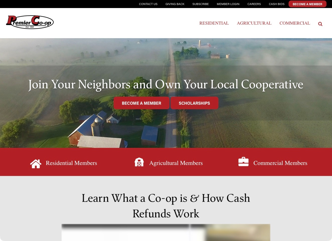
Premier Cooperative places residential, agricultural and commercial destinations in the main navigation, then repeats those audiences in a contrasting red row below its rural photograph. The opening message explicitly invites local cooperative ownership, with membership and scholarship actions kept distinct. Immediately afterward, a section begins explaining the cooperative model and cash refunds. The useful pattern is consistency between the organisation’s identity and its audience routes: a household customer is not expected to decipher a farm-only department menu, while an agricultural visitor can still recognise a direct destination for relevant services.
What you can learn
Explain what cooperative participation means while allowing different customer groups to find their own practical information. Repeating a small set of meaningful audience categories can connect navigation, introduction and service pages. Keep membership explanations separate from promotional figures, and describe the actual eligibility and terms instead of implying an individual financial result.
Pros
The same three audience labels connect primary navigation and opening cards.
Membership and scholarship actions have clearly different purposes.
Cons & considerations
If financial benefits are promoted, explain their conditions and time context on the destination.
If text overlays a changing photograph, test readability across every responsive crop.
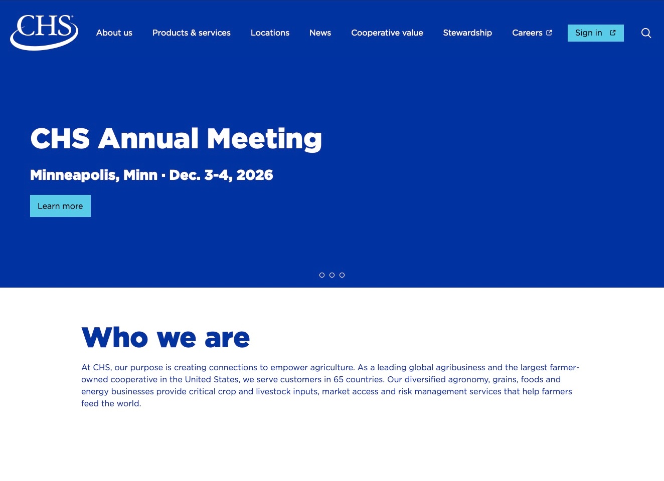
CHS uses a deep-blue opening with a white wordmark and a simple annual-meeting announcement. The date, place and next action are readable without a photograph competing for attention. Below that campaign area, a white section explains the organisation and explicitly identifies its farmer-owned cooperative model. The navigation separately names products and services, locations, cooperative value and sign-in. The useful design pattern is the relationship between a timely owner-facing message and an evergreen explanation of the business, with an existing customer’s account route kept distinct from general exploration.
What you can learn
Give a current meeting or announcement a clear destination without letting it replace the permanent explanation of the organisation. Differentiate learning about cooperative ownership from investigating a service or entering an account. Keep event information maintainable and avoid treating financial or patronage headlines as promises about an individual member’s result.
Pros
The meeting introduction states a date, location and specific next action.
Cooperative information and account sign-in have distinct navigation labels.
Cons & considerations
If a campaign leads the homepage, retire or replace it when its date passes.
If several business areas sit behind one service label, make their differences clear on the destination.
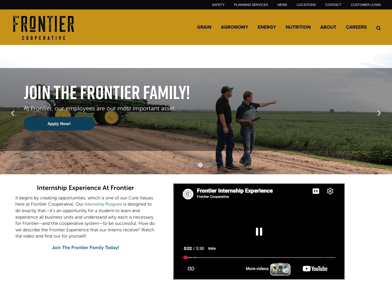
Frontier Cooperative pairs a mustard-yellow brand header with a dark utility row containing locations, contact and customer login. Grain, agronomy, energy and nutrition are named in the main navigation. At capture time, a recruitment message overlays a field photograph, with a direct application action. A written internship introduction and inline video follow beneath it. The useful structure is the coexistence of that temporary recruitment emphasis with permanent agricultural service routes, allowing a visitor interested in the organisation’s work to find a different path from someone considering employment.
What you can learn
Keep recurring customer tasks available when the homepage is serving a recruitment campaign. A cooperative can explain employment and training without expecting members to navigate through that story to find a location or department. Supporting media should supplement a useful written explanation rather than become the only way to understand the next step.
Pros
Agricultural departments are named independently of the recruitment campaign.
Locations, contact and account access remain visible in the utility navigation.
Cons & considerations
If video carries essential information, provide an equivalent readable explanation.
If campaign slides change, test the contrast and meaning of their actions across each frame.
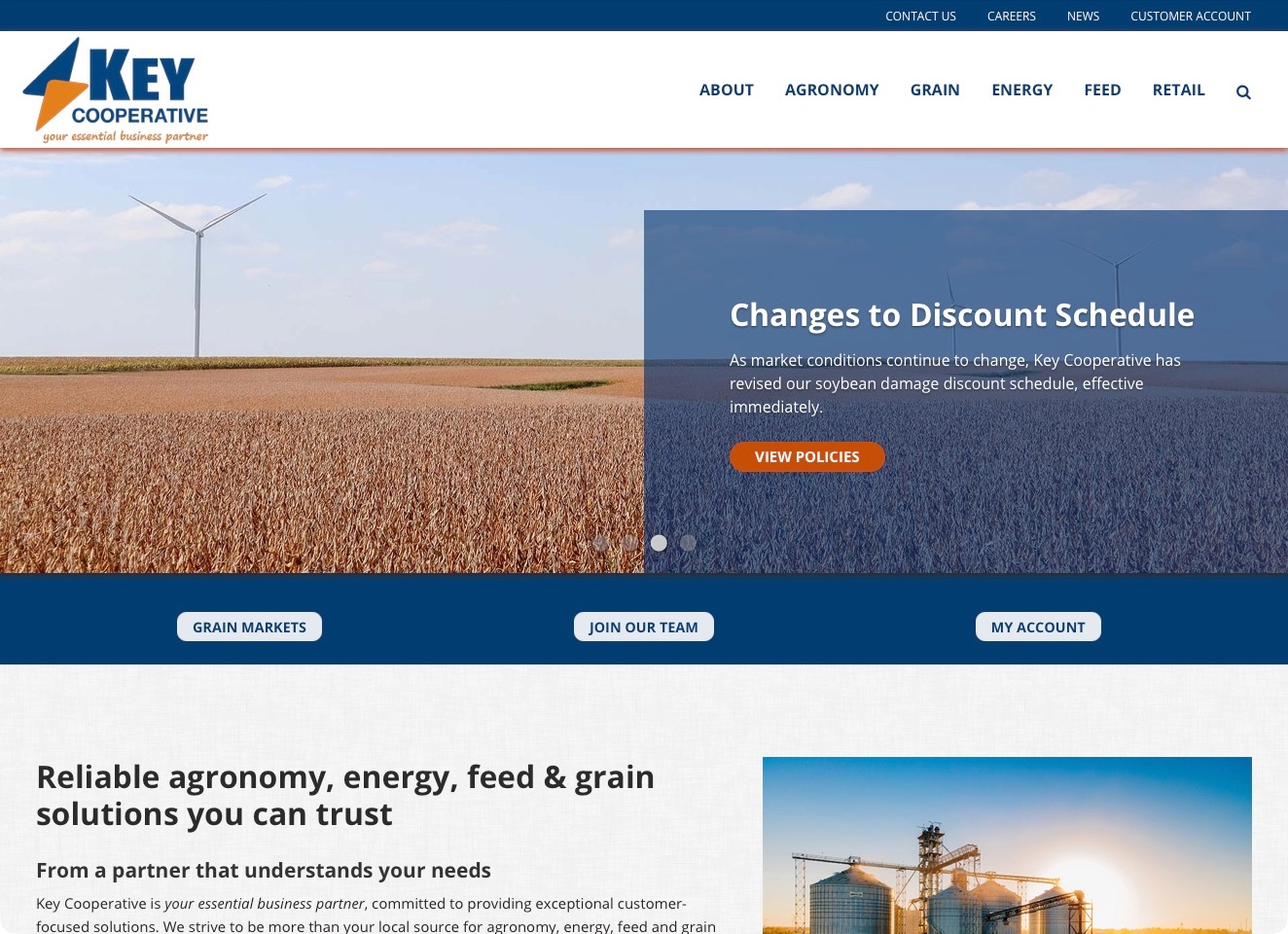
Key Cooperative uses a blue utility strip and white brand header, with agricultural departments kept separate from contact, news and customer-account links. The captured introduction highlights a policy update over a field photograph, with a direct route to the policies rather than a vague invitation to learn more. Immediately below, grain markets, recruitment and account access form another clearly labelled action row. The useful pattern is the distinction between something that has changed and the tasks a returning customer still needs to perform, supported by an explanatory service introduction farther down.
What you can learn
Connect an operational announcement to the actual policy or resource it concerns. Keep that announcement separate from permanent account and service navigation so its eventual removal does not break the usual customer journey. A pictured policy update communicates where to investigate details; it is not an independent interpretation of the policy’s financial effect.
Pros
The policy-update action names the relevant destination directly.
Account access and grain-market information remain distinct recurring routes.
Cons & considerations
If an announcement says immediately, supply an unambiguous effective date on its destination.
If several action rows compete, preserve a clear priority on narrow screens.
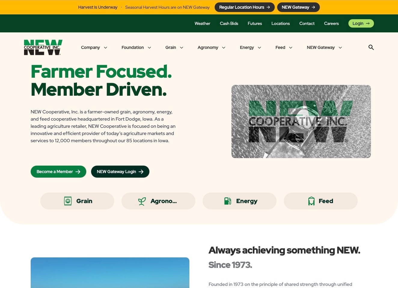
NEW Cooperative uses cream backgrounds and strong green typography to introduce farmer ownership and its Iowa-based agricultural offer. The opening paragraph names grain, agronomy, energy and feed rather than leaving the headline to explain the business alone. Become a Member and the existing gateway login are separate actions, with department shortcuts beneath them. A seasonal-hours strip sits above the utility navigation. The useful design structure is the connection between a newcomer’s membership question and a returning user’s practical task, while both remain visible within the same recognisable cooperative identity.
What you can learn
Explain the organisation’s model before asking a new visitor to join it. Keep membership information distinct from a current account login, and label the operational tools that existing customers may need repeatedly. A seasonal notice should connect to maintained hours information without becoming the only route to a location or customer system.
Pros
The introduction explicitly names both farmer ownership and the agricultural departments.
Membership and existing gateway login are different opening actions.
Cons & considerations
If multiple header rows are necessary, test their hierarchy on smaller screens.
If shortcut labels truncate, keep the department names understandable without guessing.
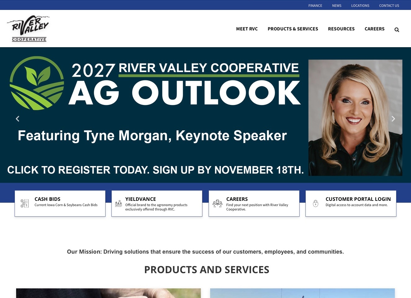
River Valley Cooperative places its identity in a white header beneath a blue utility strip. The captured campaign promotes an agricultural-outlook event with a named speaker and a registration deadline. Below it, four descriptive cards distinguish cash bids, a product brand, careers and customer-portal login before the products-and-services section begins. Those labels and explanations identify different reasons for visiting, rather than presenting every destination as another promotional button. The event supplies a timely lead, while the supporting structure keeps recurring operational tasks within reach.
What you can learn
Build permanent task routes underneath a campaign so an event is not the only useful doorway. Name the destination and add a short explanation when a brand or tool may be unfamiliar. Keep registration context and dates on the relevant event page, and do not turn a product card or market link into an implied performance recommendation.
Pros
Task cards pair their labels with brief explanations of their purposes.
The event message states a registration deadline rather than an undated invitation.
Cons & considerations
If a campaign is image-based, retain its essential information as readable text.
If an event remains prominent, update its status when registration closes.
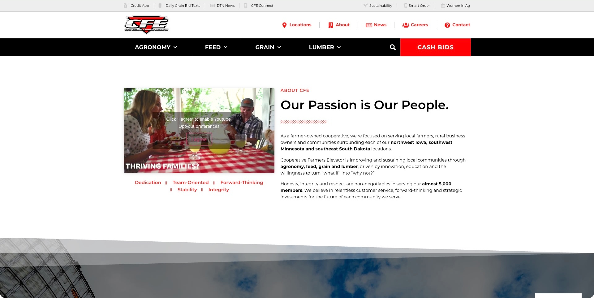
Cooperative Farmers Elevator’s About page combines a red-and-black department navigation with a two-column introduction. The text identifies farmer ownership, the service territory and four agricultural departments, while a family photograph anchors a video placeholder on the left. That embedded player explicitly asks for separate consent; the substantive ownership explanation remains readable without playing it. Utility links for ordering, bid texts and a member connection sit apart from the organisational navigation. The useful pattern is a cooperative identity that is explained in ordinary text alongside practical routes, rather than communicated only through a rural image.
What you can learn
Make the ownership story useful to someone deciding whether the organisation serves their location and needs. Keep departments and recurring member tasks discoverable from an informational page. If an optional video adds context, the surrounding copy should still explain the offer when that external media is not enabled.
Pros
Farmer ownership and the regional service area are stated together.
Agricultural departments remain visible above the organisational introduction.
Cons & considerations
If optional media is privacy-gated, provide a useful text equivalent without requiring playback.
If utility navigation grows, keep its task labels distinct from public company information.
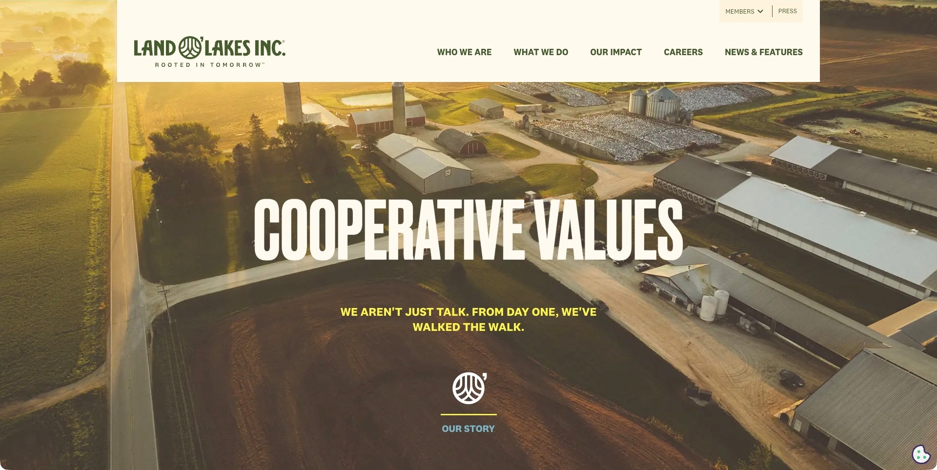
Land O’Lakes uses an aerial farm photograph beneath a cream navigation panel and a large cooperative-values headline on its Who We Are page. An illustrated story cue leads into the organisation’s history, while the header separates identity, business activities, impact, careers and news. Members have a smaller utility route rather than being placed inside the public story. Further source content explains farmer and agricultural-retailer ownership. The useful pattern is an ownership narrative with its own location and visual identity, not a consumer product page being treated as the whole cooperative.
What you can learn
Give the cooperative model a clear explanation without making an existing member read the story to find their tools. A large agricultural organisation can maintain separate identity, operational and consumer journeys. Connect a values-led opening to concrete ownership information rather than relying on a landscape or a slogan alone.
Pros
Member access is distinguished from the main public information routes.
The ownership story has a recognisable destination within the wider navigation.
Cons & considerations
If the opening photograph fills the screen, make the explanation below easy to reach.
If narrative sections use motion, keep their meaning available in a stable reading order.
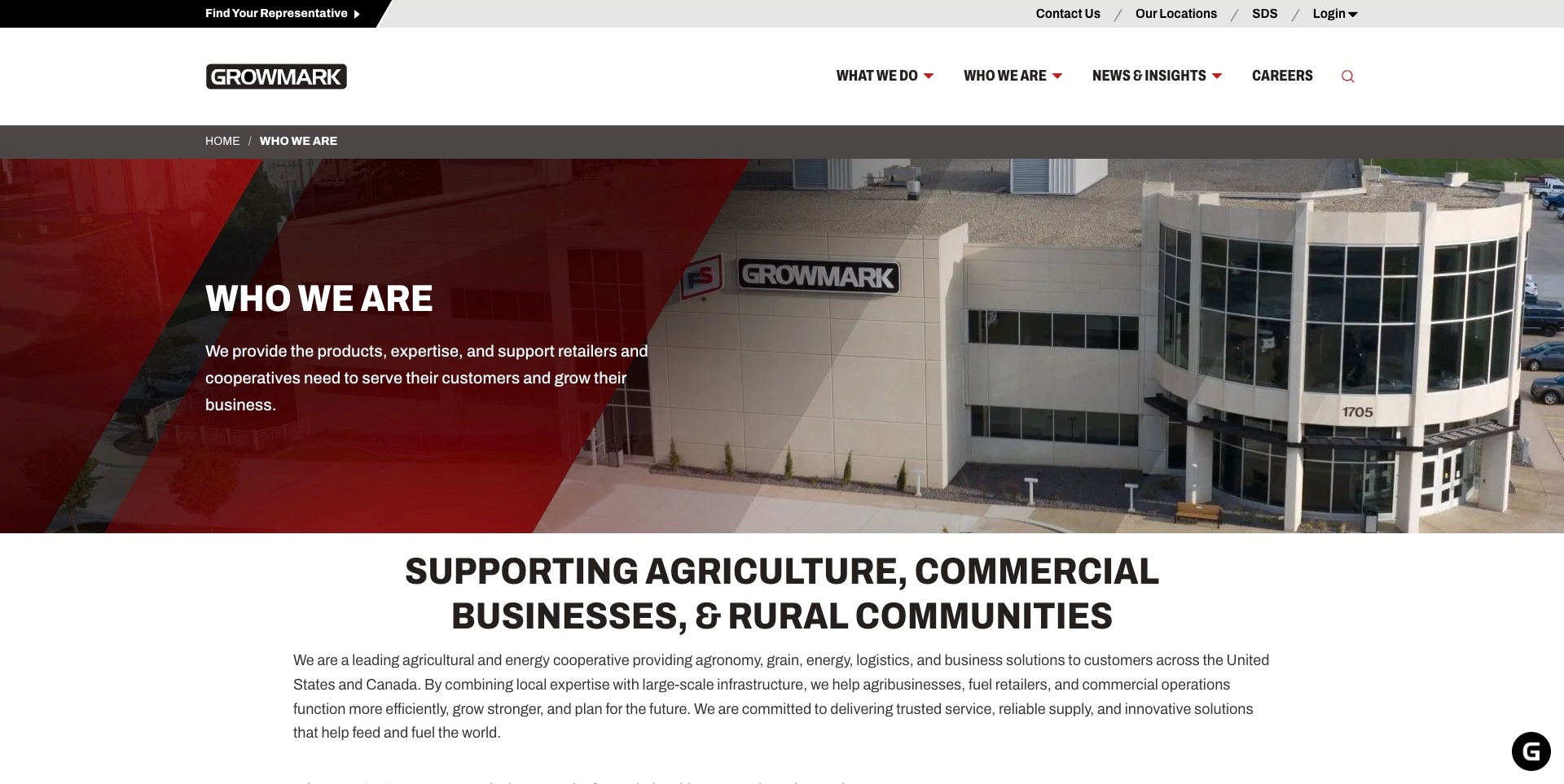
GROWMARK’s Who We Are page pairs an angular red text panel with a photograph of its building. A short introduction identifies retailers and cooperatives as the audience being supported. Below it, a prominent heading and paragraph explain the agricultural and energy scope. The header separates organisational information from business activities and news, while a utility strip offers representative finding, locations, contact and login. The useful design pattern is a network organisation naming its place in the agricultural chain, rather than presenting every service as a direct offer to the same customer.
What you can learn
Explain the relationships behind a cooperative system before listing its many activities. A member business, a retailer and an individual customer may need different routes. Keep local contact and representative tasks visible, and use the organisational page to clarify who provides what rather than letting the network’s scale become the whole message.
Pros
The lead explicitly names the retailer and cooperative audience.
Representative and location routes sit apart from the organisational narrative.
Cons & considerations
If several businesses share the network, clarify the relevant company before a contact handoff.
If an introduction lists many services, link each to a more specific explanation.
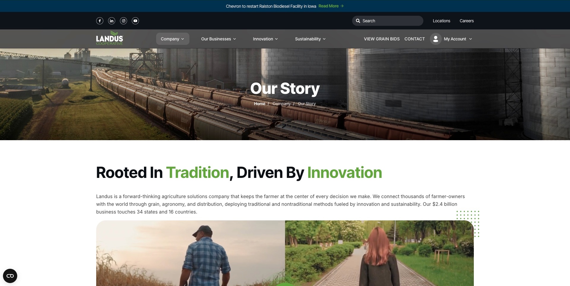
Landus’s story page opens with a rail-and-grain-facility photograph, a page title and a breadcrumb. A green-and-black introduction follows, identifying farmer-owners and the grain, agronomy and distribution scope. The dark header separates company information from businesses, innovation and sustainability, while grain bids, contact and account access remain visible. A news strip sits above that navigation. The useful pattern is a narrative page that belongs to the working cooperative site, rather than sending a customer through history to reach an operational task.
What you can learn
Give organisational history a clear place without making it the only account of the business. Connect the story to departments and member tasks, and distinguish dated news from the permanent introduction. Growth and scale figures need source context rather than being treated as evidence of a member’s future benefit.
Pros
The breadcrumb explains where the story sits within company information.
Grain bids and account access remain available from the narrative page.
Cons & considerations
If several header rows compete for attention, test the hierarchy on smaller screens.
If company history includes changing figures, show the relevant date and maintain them separately.
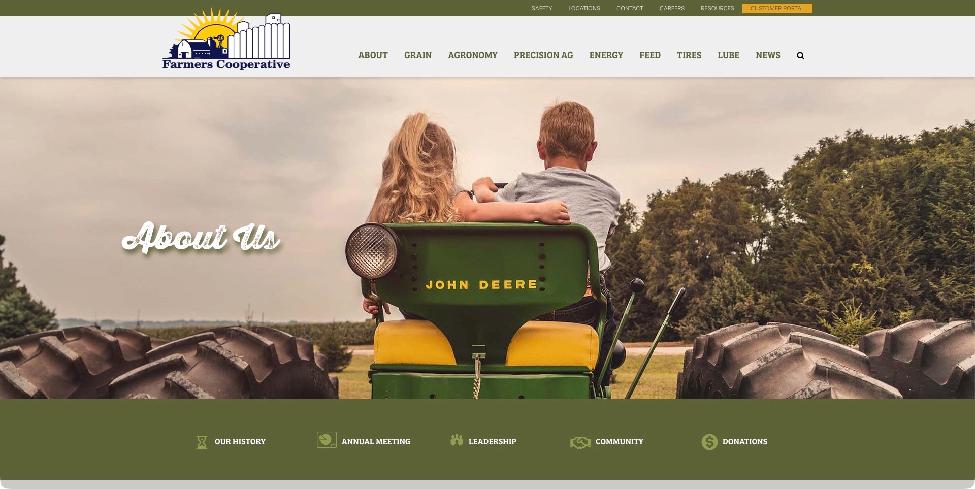
Farmers Cooperative’s About page places a wide photograph of children on a tractor below an olive-and-white header. Agricultural departments are named across the navigation, with locations, resources and the customer portal in a smaller utility strip. Directly beneath the photograph, a row separates history, the annual meeting, leadership, community and donations. The longer public page contains the corresponding organisational information. The useful pattern is a familiar regional identity connected to distinct information tasks, instead of treating a long About page as a single undifferentiated story.
What you can learn
Give members and public visitors a way to reach the particular organisational information they need. Governance, a meeting record and a community request are different tasks, even when they share one page. Keep the agricultural service routes separate and maintain dates on meeting material rather than implying that every historic item is the next event.
Pros
The overview provides labelled routes to governance and community sections.
Customer portal access is distinct from the main public department navigation.
Cons & considerations
If the photograph fills most of the first screen, keep section shortcuts easy to reach.
If meeting records span several years, distinguish reporting periods from upcoming events.
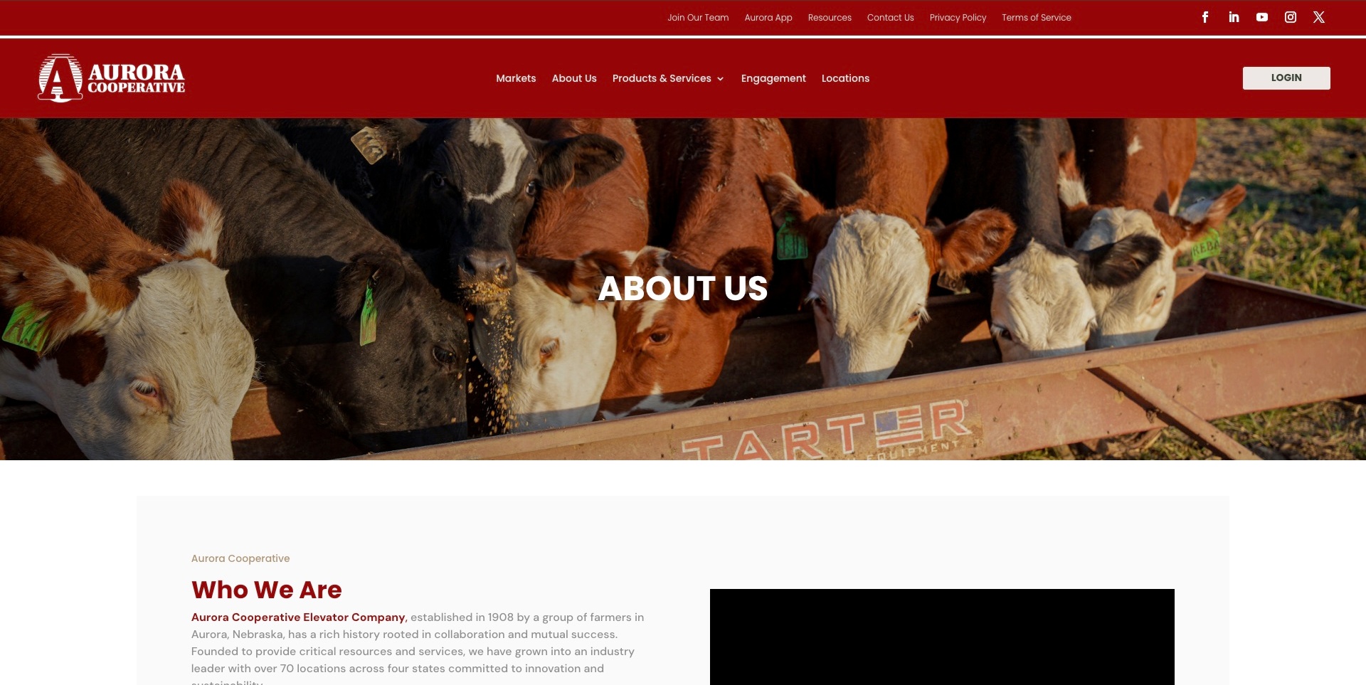
Aurora Cooperative’s About page uses a deep-red header above a wide cattle photograph. The navigation distinguishes markets, products and services, engagement and locations, with account login kept separate on the right. A written organisation introduction begins beneath the photograph and describes the farmer-founded cooperative. Further public content names board and executive roles. An inline media area is also present, but its playback is not established by this view. The useful pattern is the relationship between a regional agricultural identity, a readable background explanation and distinct routes for recurring customer tasks.
What you can learn
Use an organisational page to explain the cooperative and the people responsible for it, not simply repeat the homepage image. Keep service, location and account journeys available while someone investigates the background. Essential context should remain in text when a video is stopped, unavailable or not chosen by the visitor.
Pros
Markets and location finding are visible outside the organisational narrative.
The public page distinguishes background information from named leadership roles.
Cons & considerations
If livestock imagery leads a broader offer, explain the other service areas promptly.
If important information uses pale text, test readability across screen sizes and display settings.
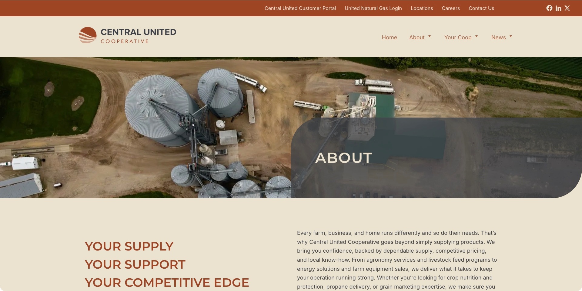
Central United Cooperative’s About page pairs a cream-and-rust identity with an aerial grain-facility photograph. Customer portal and natural-gas login routes occupy the utility row, while the main navigation keeps the public categories concise. A text section beneath the image introduces farm, home and business needs, followed by service links and an explanation of the combined organisation. Membership information has its own route farther down the page. The useful pattern is a current identity with an account of its scope and origins, rather than leaving visitors to reconcile older company names themselves.
What you can learn
When organisations combine, explain the current identity and keep existing customer tasks clearly labelled. A new brand should not obscure where someone signs in or which regional service they need. Separate the cooperative-model explanation from promotional benefit claims, and link membership information to the actual requirements rather than implying automatic eligibility.
Pros
The public page explains the organisations behind the current cooperative.
Account tools are separated from the main informational categories.
Cons & considerations
If legacy service logins remain, explain the destination before the handoff.
If services span farm and home audiences, help visitors reach the relevant local department.
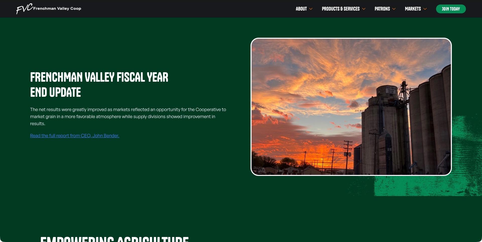
Frenchman Valley Coop’s About page places a fiscal-year update beside a sunset photograph of its grain facilities. The dark-green background connects the two columns, while an explicit report link identifies the chief executive as its source. Products and services, patrons, markets and joining have distinct header routes. Further public content explains the regional agricultural scope, names directors and presents membership questions. The useful pattern is an organisational page that makes a current-looking member communication easy to find without disguising it as the entire account of the cooperative.
What you can learn
Give a member update a clear destination and identify the underlying report. Keep its reporting period and source separate from permanent information about departments, territory and membership. A visually prominent financial summary is communication to study, not independent evidence of performance or a promise about an individual patron’s result.
Pros
The update links to a specifically identified report rather than ending with a vague claim.
Patron information and joining are separate navigation destinations.
Cons & considerations
If a fiscal update leads the page, state its reporting period near the summary.
If links sit on a dark brand background, test their contrast and focus appearance.
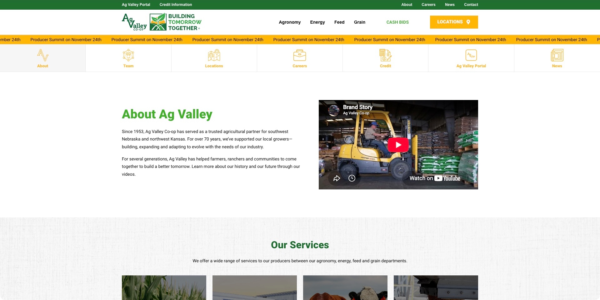
Ag Valley Co-op’s About page places two introductory paragraphs beside a stopped brand-story video thumbnail. The text identifies the Nebraska and Kansas service region, while a service section begins immediately below. Agronomy, energy, feed and grain are named in the main header; portal, credit, locations and other organisational routes also appear in a separate shortcut row. A yellow event strip sits above that row. The useful pattern is a compact background introduction surrounded by concrete tasks, rather than expecting every visitor to watch a video to understand the organisation.
What you can learn
Keep the regional scope and basic service explanation available in text, with optional media adding context. Members looking for a location, account or department need direct routes even from an About page. Separate a temporary event announcement from those recurring tasks, and give the announcement a clear maintenance owner.
Pros
The written introduction names the service region without requiring media playback.
Departments, locations and account tools are directly labelled.
Cons & considerations
If multiple shortcut rows repeat destinations, keep the hierarchy consistent on mobile.
If an event strip moves or repeats, provide stable content and appropriate motion controls.
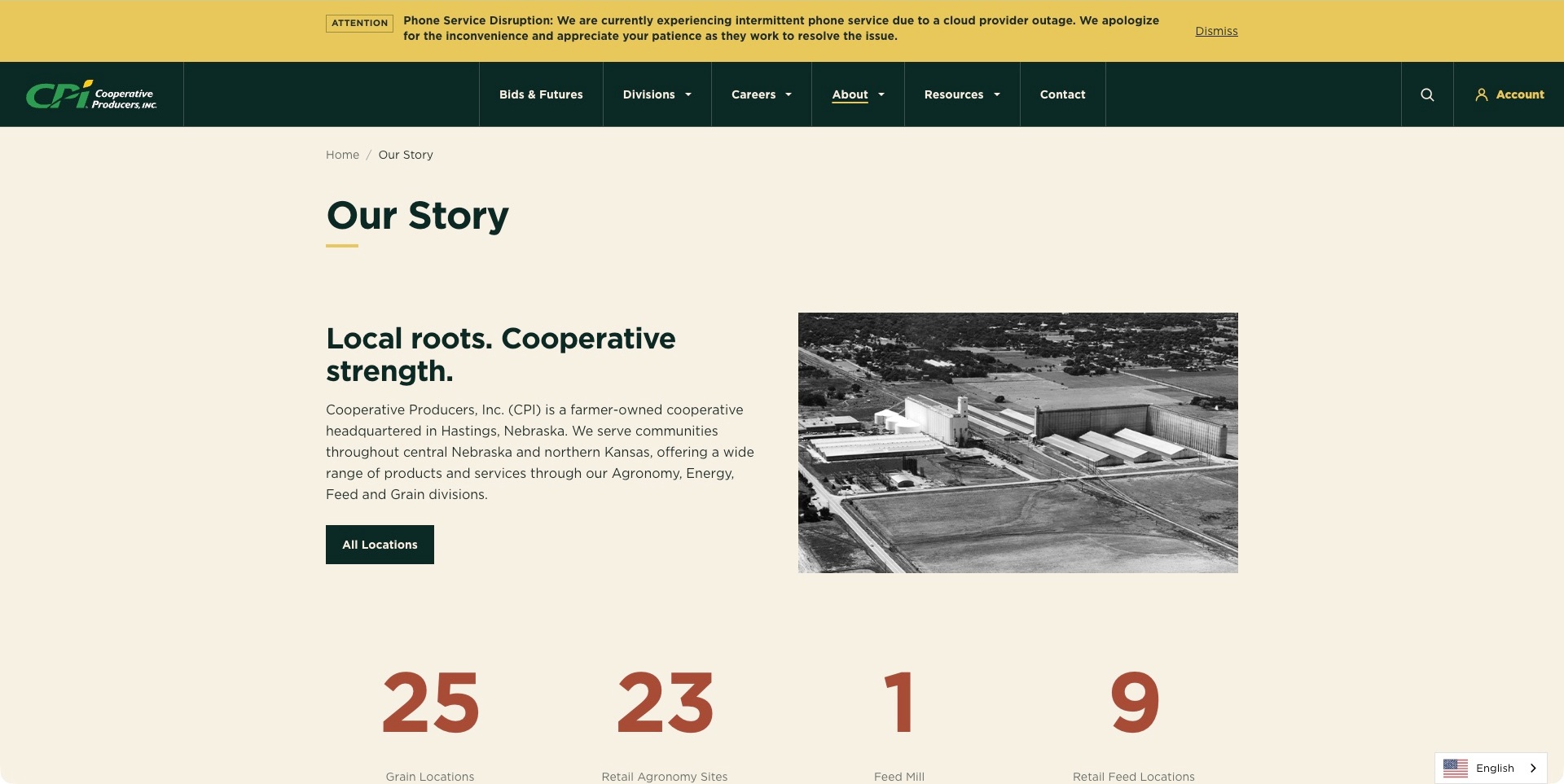
CPI’s story page uses a cream background, dark-green typography and a black-and-white photograph of grain facilities. The introduction explicitly identifies farmer ownership, the headquarters, service region and agricultural divisions. A location action sits directly beneath that explanation, with service-category counts following below. A yellow operational notice is separately positioned above the main navigation, rather than replacing the story. The useful pattern is an organisation answering basic identity and territory questions before asking a visitor to investigate values, history or a broad promotional message.
What you can learn
Connect the cooperative explanation to a practical local next step. Knowing the ownership model is useful, but a farmer also needs to establish whether the organisation serves their area and department. Keep operational notices separate from evergreen copy, and give any changing facility figures a maintenance process rather than treating them as permanent design decoration.
Pros
Ownership and the regional service scope are explicitly stated together.
The introduction leads directly to a location-finding route.
Cons & considerations
If an operational notice remains visible, keep it current and provide appropriate contact alternatives.
If facility counts change, maintain their labels and source context alongside the figures.
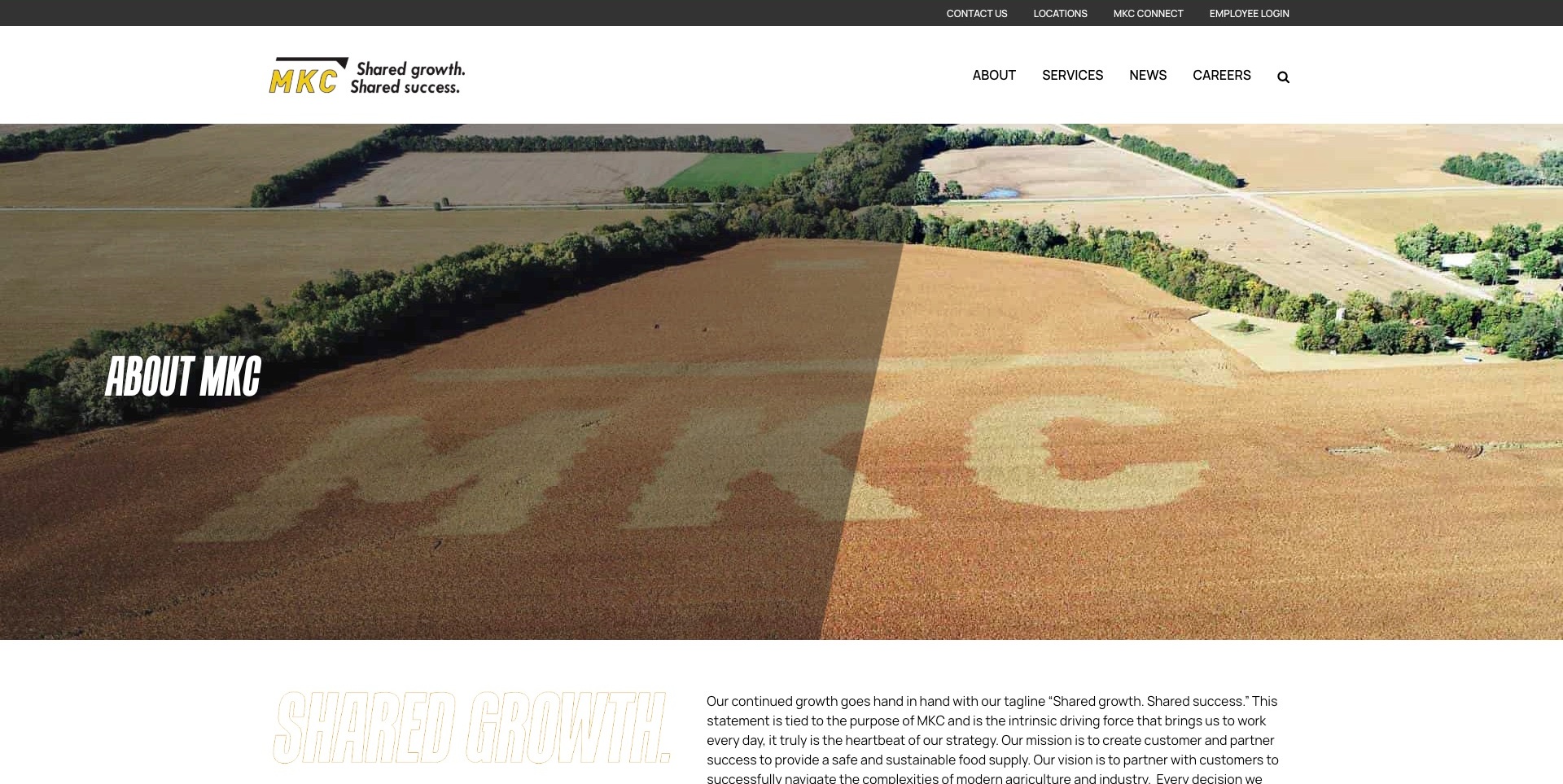
MKC’s About page places a wide farmland photograph beneath a white header and gold-and-black identity. Public categories remain compact, while locations, customer connection and employee login occupy a separate utility row. The page continues from its growth-led introduction into the farmer-owned organisation’s background, partnerships and business information. Later sections distinguish doing business, credit applications and membership, with electronic and paper-document routes. The useful pattern is a broad identity page that eventually answers practical participation questions instead of leaving membership as an unexplained brand promise.
What you can learn
Separate the story of a cooperative from the steps required to use its services or become a member. A customer account, an employee login and a membership application are not interchangeable destinations. Give each route a meaningful label and explain requirements near the decision, without treating potential member benefits as guaranteed individual outcomes.
Pros
Customer and employee tools are separately labelled in the utility navigation.
The public page distinguishes business participation from membership information.
Cons & considerations
If a large landscape precedes the details, keep practical routes easy to find.
If applications use an external workflow, explain the handoff and preserve the stated alternative formats.
Kegan is a freelance web designer and developer with 15+ years of experience helping businesses turn complicated website requirements into clear, maintainable digital experiences. He works directly with clients from planning and design through development, launch, and ongoing support.
For agricultural cooperative website design, his development approach focuses on clear cooperative ownership and service scope, local department and facility discovery, practical member tools, dated governance information, and distinct public enquiries and protected account handoffs. The scope can be a targeted improvement or a complete custom build, with responsive layouts, thoughtful content structure, and integrations chosen around the people using and maintaining the site.
Show 3 other agricultural cooperative website designersHide other agricultural cooperative website designers
Plan an agricultural cooperative website around members, customers and shared ownership
Begin with the cooperative model and the people it serves
Ask the organization to describe its ownership and membership structure before planning the page hierarchy. A cooperative can work directly with individual producers, through member organizations or through a combination of relationships. Explain the actual model in language a new visitor can follow. Do not assume that a familiar food brand communicates the legal or practical meaning of membership on its own.
CHS explains farmer ownership and its relationship with both producers and member cooperatives. Land O’Lakes presents its cooperative identity alongside separate business areas and member access. These are different communication problems, not a requirement that every cooperative lead with a consumer campaign. Decide which explanation belongs on the homepage and which details need a dedicated ownership or membership page.
Map the priority audiences and their first useful actions. Existing members may need a portal or local contact; a potential member may need eligibility and process information; a buyer may need product or ingredient details. Make those routes recognizable without exposing private member records. The public website should help visitors find the right relationship rather than imply that every enquiry follows the same application or purchasing process.
Organize products and services around the real operating footprint
Inventory the services that are actually offered, the locations responsible for them and the geographic boundaries that matter. A regional cooperative’s agronomy, feed, grain and building-supply services should not become one undifferentiated list if customers need different people or facilities. Cooperative Farmers Elevator explains those departments alongside its regional focus, making the business model more understandable than a broad promise to support agriculture.
For a cooperative serving several customer groups, connect practical buying information with the ownership story. Premier gives residential, agricultural and commercial members distinct routes, while Key distinguishes membership information from account tools. The transferable lesson is to let a visitor act on a product or service interest without losing the context of the organization behind it. Do not turn every service page into a repeated corporate-history essay.
Distinguish brands, subsidiaries, local organizations and external partners carefully. A familiar logo can represent a product family rather than a separate cooperative, and a member organization may have its own website and contact process. Describe those relationships where the visitor needs them. Do not imply that a regional office provides every service shown at group level or that a shared brand guarantees identical local availability.
Build member information and governance into the content structure
Create a clear public route to membership information, leadership and relevant governance material. Explain what a prospective member can learn publicly and what requires an existing account or direct conversation. Public committee and board pages need accurate roles and a maintenance process, not just portrait cards. Review who approves updates when elections, appointments or organizational changes occur.
Key explains membership classes and shows its board separately from ordinary account access. GROWMARK provides membership, location and representative routes within a wider business structure. These examples suggest that governance and operational navigation should be deliberate parts of the site rather than material hidden behind a general about page. Their presence alone does not independently establish how well the organization is governed.
Keep formal documents identifiable by purpose, date and scope. Meeting information, annual reports, policies and membership resources should not compete as an unlabelled pile of PDFs. Provide accessible summaries where useful without silently replacing the formal document’s meaning. A dated financial or patronage announcement needs appropriate context and should not be repurposed as a promise about an individual member’s future outcome.
Use farm stories and timely resources with clear editorial boundaries
Gather stories with the people featured rather than treating rural imagery as interchangeable decoration. Record permission for names, photographs and personal details, and explain the relationship between the farm and the cooperative. A story can show the organization’s human context without making a universal claim about every member, production practice or customer experience. Keep captions and accessibility text specific to the image actually used.
Separate evergreen explanations from rapidly changing information. Grain-market headlines, bids, agronomy updates, seasonal hours and meeting notices have different review needs from an ownership-history page. Identify the source and time context of market information and explain any relevant limitations. A website design should not make third-party information look like an individualized recommendation or guarantee that a displayed figure is still actionable.
Create a manageable publishing rhythm rather than a news section that requires constant invention. Reuse genuine member questions as prompts for helpful explanations, but have appropriate staff review technical or operational content. Archive outdated notices so they do not appear to be the next event. Keep original publication and substantive review dates distinct instead of refreshing every article when a navigation link changes.
Make everyday tasks dependable and private information deliberate
Test the site with practical tasks: locate a facility, find a service contact, understand membership, reach an account portal and identify the right product enquiry. Use a phone as well as a desktop, because someone may be checking hours or contact information away from an office. A seasonal campaign should not push a frequently needed operational link so far down the page that members struggle to find it.
Keep public enquiries, membership discussions and authenticated account activity clearly separated. Explain when a link leaves the marketing site and enters a portal operated under a different process. Do not collect account numbers, financial details or confidential farm records through a general contact form simply because those fields might be useful later. Define the appropriate secure exchange and retention process before building an upload feature.
Assign owners for locations, contact routing, resource dates, membership explanations and governance changes. Test external portal links and third-party feeds without using real member credentials or altering someone’s saved preferences. A straightforward publishing system is valuable when local teams can maintain accurate information without needing a developer for every holiday-hours change. Visual consistency should support that reliability rather than obscure the differences among audiences.
The editing job behind the design
Choose publishing tools for public content and distinct member systems
Model locations, services, products, people, news and documents as connected content. A facility record should identify the services actually available there, while a service page can point to relevant locations. Avoid manually copying the same contact details into many pages that will drift apart when a role changes.
Keep the public content system separate from authenticated member accounts, commercial transactions and farm records unless there is a defined integration requirement and suitable controls. An observed marketing-site technology does not reveal the software used to manage membership, payments, grain handling or agricultural operations.
Prefer reliable search, accessible navigation, clear document handling and an understandable editorial workflow. Treat market widgets, map embeds and social feeds as optional services with their own availability and privacy implications. Important contact details and explanations should still work when an external component is unavailable.
Our WordPress website examples offer a separate look at publishing approaches. A visible platform label is evidence for that named page, not a guarantee that the same system will suit your requirements.
Verify the organization’s actual cooperative and membership structure.
Explain farmer ownership without relying only on photographs or slogans.
Identify existing members, prospective members, customers and buyer tasks.
Separate member access from general public enquiries.
Map actual products and services to the relevant locations.
Clarify relationships among brands, subsidiaries and member organizations.
Keep membership, leadership and governance routes understandable.
Label formal documents by purpose, date and scope.
Record permissions and relationships for featured farmer stories.
Date seasonal notices and identify sources of market-related information.
Avoid individualized financial or agricultural promises in general content.
Protect private member, account and farm information.
Test location discovery, portal links and contact routing on mobile and keyboard.
These checks are a project checklist, not a performance, legal, security, or accessibility certification. Test real journeys with the people responsible for the website before making claims about the result.
Sources & editorial method
How this collection was selected and reviewed
The original 17-example industry target was drawn and saved before research and has not been rerolled. Current first-party descriptions establish the agricultural-cooperative scope of the distinct organisations. Actual public websites were examined for ownership explanations, service and audience routes, organisational information and member tasks. Every example has a genuine direct browser capture and original source-specific review, with the actual source URL, UTC capture time, decoded dimensions and independently computed image hash. Six earlier accepted images and their records remain unchanged; eleven resumed captures keep their later UTC dates. Only native browser toolbars were cropped away, never source content, consent layers or loading frames. Four obstructed unpublished candidates were replaced by separately researched genuine cooperatives without changing the original count; held attempts remain in private history. Editors Choice is an explicit design judgment about Premier Cooperative’s ownership explanation and consistent residential, agricultural and commercial audience routes, independent of contact availability. These observations do not independently verify financial results, patronage benefits, agricultural recommendations, product quality, governance, operational performance or digital accessibility. Unknown technologies remain omitted pending separate public evidence.
Each example links to its actual source page. Screenshots are direct browser captures with their own capture dates; moving imagery, announcements and live designs can change. The notes describe observable design choices and conditional tradeoffs, not measured traffic, conversion results, service quality, or accessibility conformance.
Technology labels use public page metadata, asset evidence, or explicitly cited platform documentation. Platform documentation is not a complete current deployment audit. A component reference may be legacy or unused; it is not a complete backend inventory. Unknown stacks are omitted. These sites are editorial examples, not our client portfolio.
Written, Edited and Curated are separate editorial records, not timestamps advanced by a rebuild. Website designs and imagery belong to their owners. See our editorial standards or suggest a correction.
Questions worth asking
Agricultural Cooperative website design questions
Should the homepage focus on members or consumers?
That depends on the cooperative’s actual business model and priority tasks. A food brand may lead with products while keeping its farmer-ownership explanation visible. A regional services cooperative may prioritize locations, departments and member resources. Both need clear routes for their other audiences.
What makes this different from a general agriculture website?
The cooperative relationship is central. The site should explain who owns the organization, who can participate and how public information connects with member and customer tasks. It should not simply add a cooperative label to a generic farm-services template.
Should market information appear on the homepage?
Only when it serves the intended audience and can be maintained with clear source and time context. Distinguish third-party information from the cooperative’s own notices and avoid presenting a displayed figure as individualized advice or a guaranteed available transaction.
Does every cooperative need an online member portal?
No. Account functions should follow genuine operational needs and appropriate privacy controls. A clear link to an existing system can be more useful than rebuilding sensitive functions inside the marketing site. Do not collect private member information through a general form by default.
Are these examples a ranking of cooperative benefits?
No. They are editorial website-design references. The collection does not compare member returns, validate governance, recommend agricultural products or predict the results of joining a particular organization.
Borrow the clear ownership explanations, distinct audience routes and useful local information. Let the website make cooperative participation and customer tasks easier to understand without implying that good presentation proves organizational performance.