Best Pizza Restaurant Websites of 2026 (23 Real-World Examples)
Pizza restaurant websites that connect a recognizable place with the right way to order
These 23 pizza restaurant examples examine food identity, branch-specific information, readable menus and the separation of dining, takeout, catering and shipping.
A pizza website often serves someone who has already decided what to eat. The remaining questions are practical: which location, which menu, which size, and whether to dine in, collect or receive a delivery. A strong visual identity helps recognition, but it should not make those choices harder.
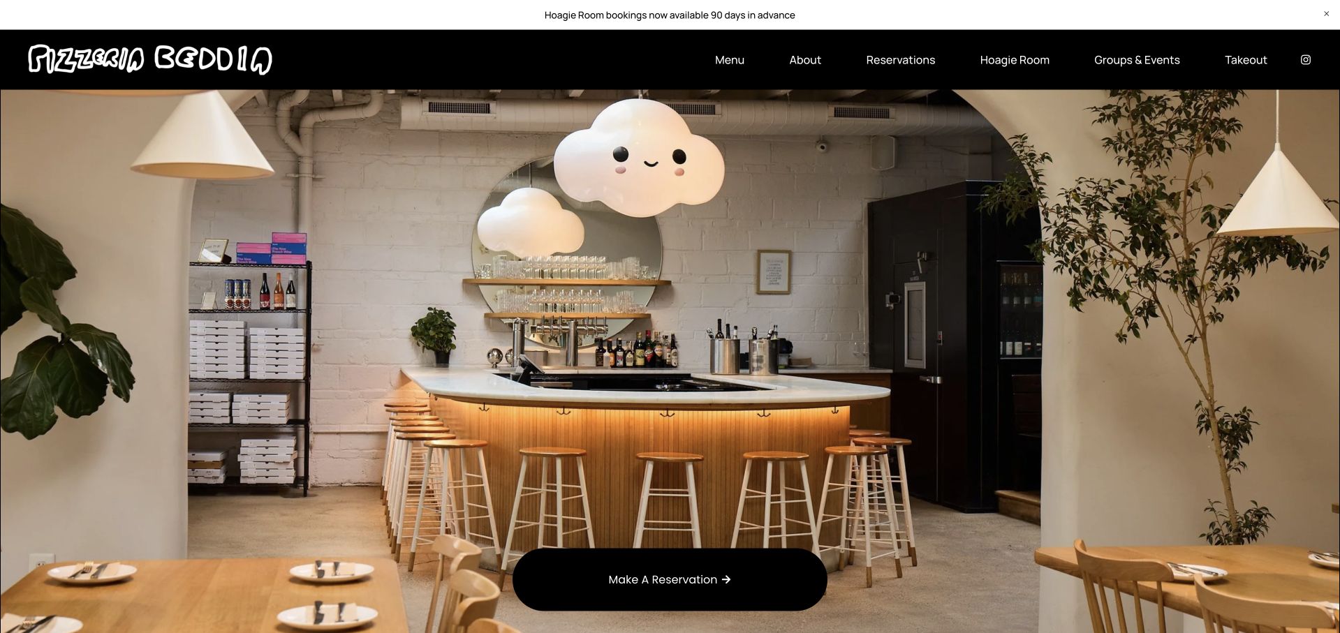
Pizzeria Beddia is our Editors Choice for using its actual Fishtown room and distinctive cloud lights to establish a specific place, then separating reservations, takeout, the Hoagie Room and group pizza experiences. The useful idea is not to imitate its typography; it is to give genuinely different visits their own explanations.
Before the examples
What makes good pizza restaurant website design in 2026?
Make the buying format explicit
Slices, whole pies, dine-in, pickup, delivery and frozen shipping involve different menus and timing. Label each route accurately. Do not make “Order now” hide a nationwide product shipment when a local visitor expects tonight’s dinner.
Keep menu details readable and local
Explain sizes, styles, ingredients and current prices where possible. A branded pie name alone may mean little to a new customer. Keep branch differences visible, particularly when one location is takeout-only or offers a smaller menu.
Publish real operating constraints
State last seating, phone-order windows, reservation arrangements and sold-out policies when they affect the visit. Give holiday notices an owner and an expiry date. Honest constraints are more useful than an always-available-looking button.
The collection · 23 examples
23 pizza restaurant websites worth studying
Compare the examples by how well they support a hungry first-time visitor and a returning regular. The collection deliberately includes compact independent sites as well as larger restaurant groups, because their information problems differ.
Pizzeria Beddia makes its Fishtown dining room the opening image, including the unusual cloud lights and long counter, rather than presenting an anonymous pizza close-up. A spare black header holds the hand-drawn identity and reservation action. Below, the Hoagie Room and Pizza Party explain distinct experiences instead of hiding every group behind one inquiry link.
What you can learn
Photograph the details that make the actual room recognizable, then give each kind of visit its own plain-language route. Personality is more useful when it helps guests choose an experience.
Pros
Distinctive interior photography communicates a specific place.
Reservations, takeout and group experiences are separately labeled.
Cons & considerations
The Hoagie Room advance-booking windows differ between the banner and body, so operational copy needs reconciliation.
A photograph-led first screen leaves menu details for the next click.
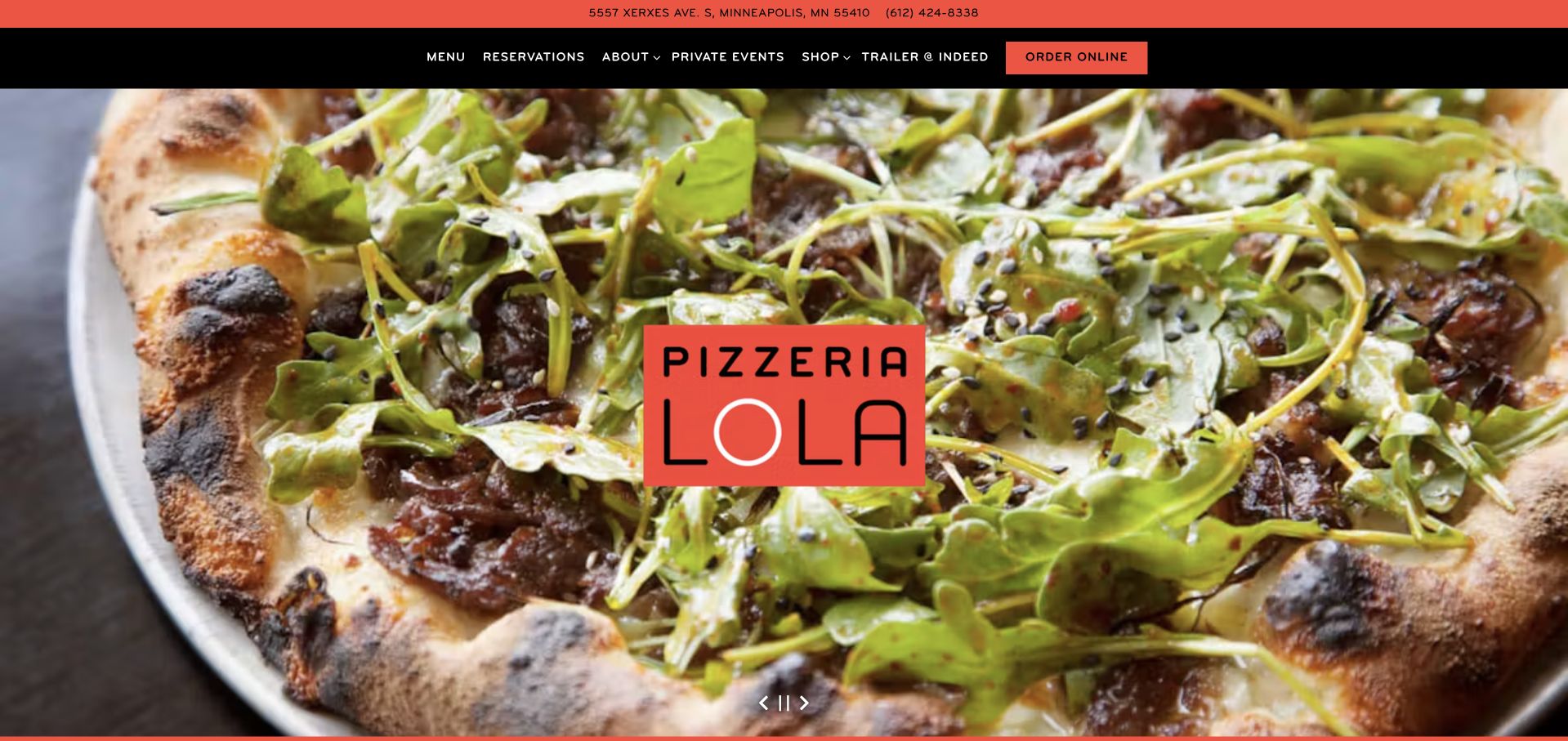
Lola pairs a simple location-and-phone strip with a bold black navigation bar and a large photographic carousel. The story introduces Ann Kim and the dog behind the name, while reservation, takeout, take-and-bake and merchandise paths remain distinct. The result is a recognizable neighborhood voice supported by useful transaction labels.
What you can learn
A founder story need not interrupt a hungry visitor. Put address, menu and order choices in stable navigation, then use the story to explain why the restaurant feels different. Keep takeout and take-and-bake destinations explicitly named after the handoff; the shared Ann Kim story should not imply the same preparation or fulfillment process.
Pros
The utility strip exposes address and phone immediately.
Order types and reservations are not collapsed into a vague contact action.
Cons & considerations
Eight carousel images require restraint for people who want a quick answer.
Multiple purchasing formats need clear availability information on their destination pages.
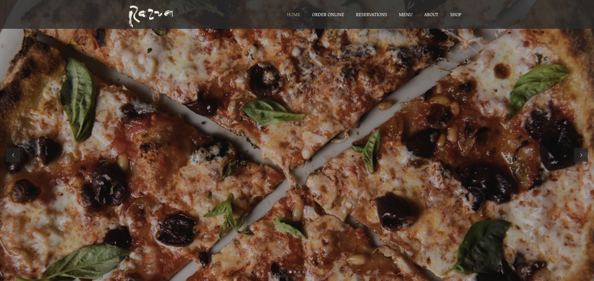
Razza opens with an unusually close view of a finished pizza and only a handful of navigation choices: ordering, reservations, menu, about and shop. The Jersey City address and hours give the atmospheric opening a practical foundation. The homepage also clarifies that outdoor seating follows different service and reservation rules from the dining room.
What you can learn
Keep the main navigation as focused as the menu, but publish exceptions such as outdoor service beside the visit information so guests do not assume every seat works the same way.
Pros
A tightly cropped food photograph establishes the product immediately.
Outdoor seating rules are stated rather than left for guests to infer.
Cons & considerations
The large image delays detailed menu content below the first screen.
Shop, ordering and reservations still lead into separate journeys that should retain clear context.
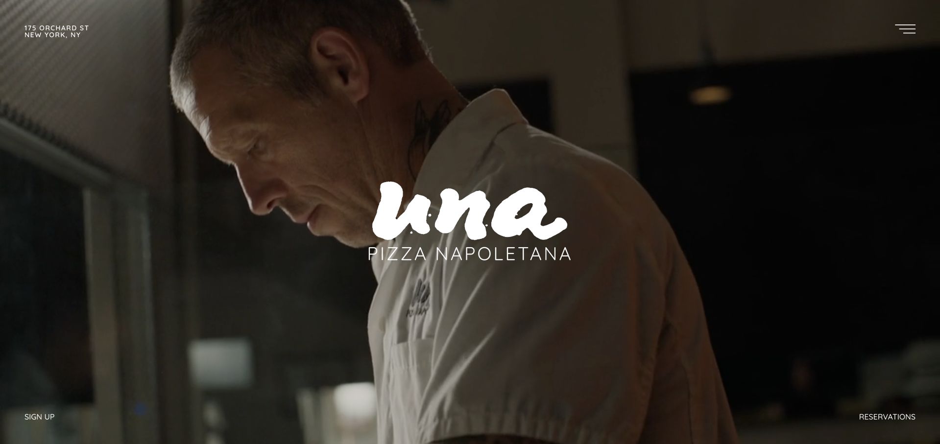
Una uses a nearly monochrome presentation, a compact identity and very few immediate choices. The Orchard Street address and reservation route carry more weight than an expansive marketing narrative. During this review, a dated closure notice took priority, showing how a minimal site can still make an operational exception unmistakable.
What you can learn
A highly reduced website can work when it preserves the essential visit facts and gives temporary changes a visible place. Minimalism should reduce choices, not remove necessary information. Date the closure notice and keep the Orchard Street reservation context visible, so an intentionally minimal entrance still distinguishes ordinary operation from a temporary exception.
Pros
The restrained identity avoids competing promotional messages.
A specific closure notice gives important operational news prominence.
Cons & considerations
A dominant notice can obscure the restaurant introduction until dismissed.
Sparse navigation puts pressure on the menu and reservation destinations to answer common questions.
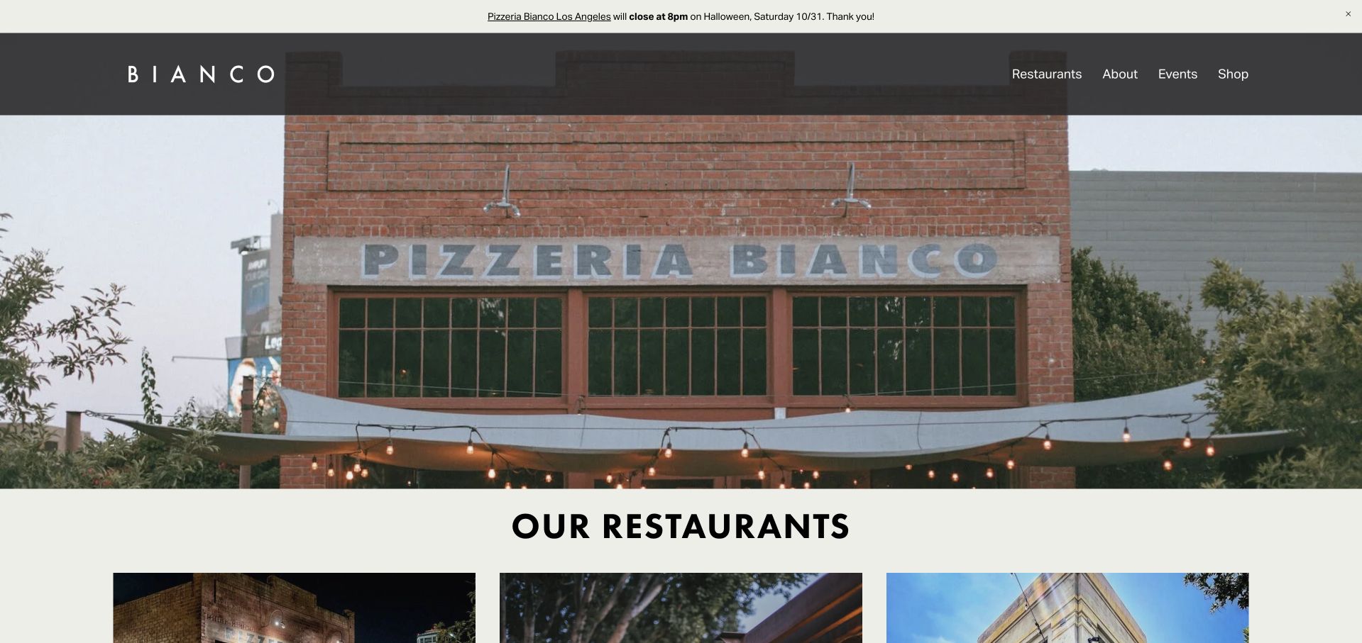
Bianco presents its restaurant family through location cards with addresses, phone numbers and links to hours, menus and reservations. Phoenix, Los Angeles and related concepts remain identifiable rather than being blended into a generic brand story. The Chris Bianco introduction and nationwide shipping link sit alongside this practical location structure.
What you can learn
When a chef or restaurant family expands, organize the homepage around actual places first. Each card should explain what the visitor can do at that address before the shared story takes over. Retain Phoenix or Los Angeles through each card's menu and booking route, with shipping clearly labeled as a different purchase from visiting that restaurant.
Pros
Location cards keep addresses and next steps together.
Nationwide shipping is distinguished from a local restaurant visit.
Cons & considerations
A dated holiday announcement needs timely removal after the occasion passes.
Several related restaurant names can still require explanation for a first-time visitor.
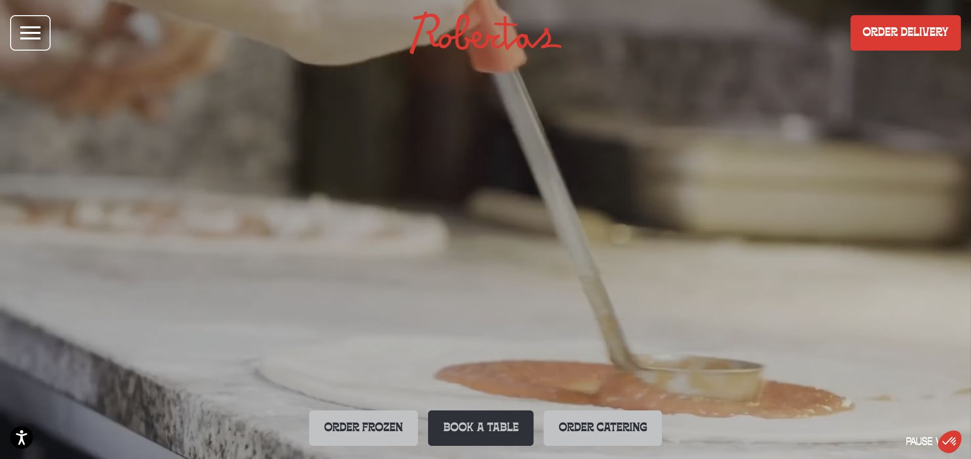
Roberta’s combines loose illustrations, pizza-and-cocktail imagery and an informal voice with prominent table, catering and delivery actions. Location references stretch across several cities, while events and frozen pizza extend the brand beyond a normal dining reservation. A video pause control adds a useful practical detail to the lively presentation.
What you can learn
Keep the humor in illustration and language while labeling the functional choices literally. A playful restaurant still benefits from unmistakable booking, delivery and location routes. Carry the selected city into delivery and event destinations, while keeping frozen-pizza shopping distinct from the table action in the playful, illustration-led interface.
Pros
Table, delivery and catering choices are clearly separated.
The media presentation exposes a pause control.
Cons & considerations
A growing mix of restaurant, event and retail offers can dilute the main dining task.
Visitors must confirm the relevant city before treating a promotion as locally available.
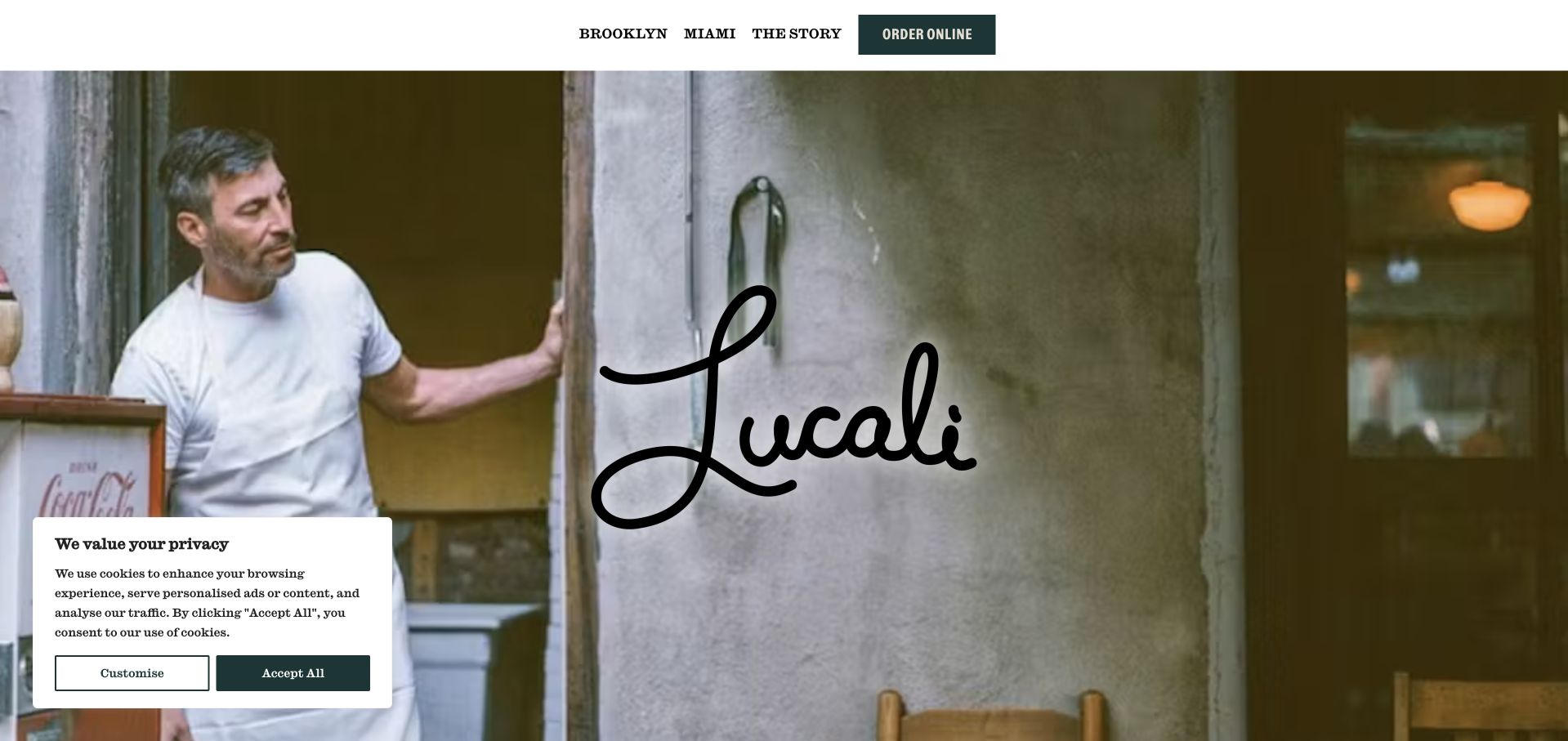
Lucali leads with a photograph of a person outside the recognizable storefront, then explains Mark Iacono’s connection to the former neighborhood candy store. Brooklyn and Miami are explicit navigation destinations, with ordering kept separate. The design draws its identity from the founder and building rather than from a large set of promotional modules.
What you can learn
Use the real people and architecture behind a restaurant when they explain its identity. Keep location choices outside the story so visitors can move directly to the practical information they need.
Pros
The storefront image makes the business feel geographically specific.
Brooklyn and Miami are clearly distinguished in navigation.
Cons & considerations
The story-led opening does not immediately show a complete menu.
Guests still need the location pages for the rules that govern an actual visit.
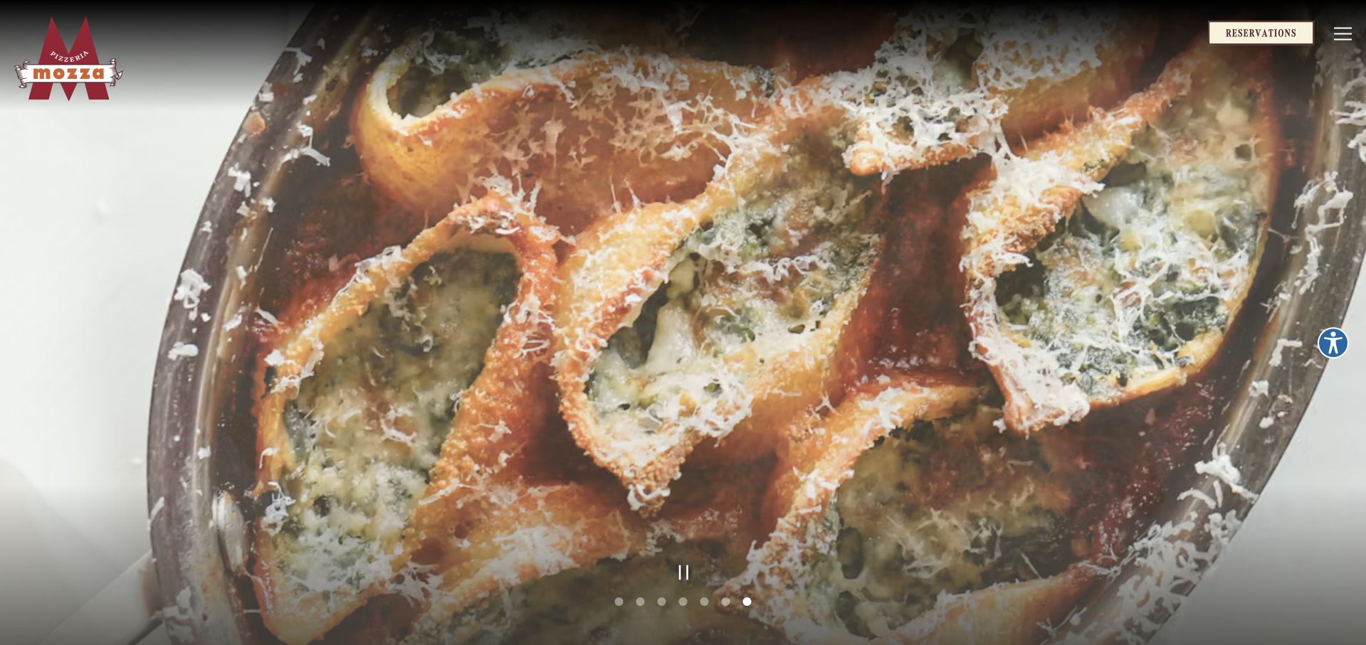
Mozza gives its food photographs most of the first screen, with a compact reservation action and a concealed broader menu. Nancy Silverton’s introduction follows, while the Los Angeles menu, Mozza2Go and private catering are separate destinations. The page treats taking pizza home as a different service, not merely a duplicate reservation button.
What you can learn
Build clear boundaries between the dining room and takeout operation, even when they share a culinary identity. A guest should know which route changes the menu, pickup process or service format. Keep the Los Angeles dining-room and Mozza2Go headings explicit on their destination pages, especially when a guest arrives through the concealed navigation rather than the food carousel.
Pros
The photographic presentation has a clear food focus.
Mozza2Go is differentiated from dining-room reservations.
Cons & considerations
The minimal header requires opening navigation for many practical tasks.
A large carousel is less direct than a static menu preview for a time-pressed guest.
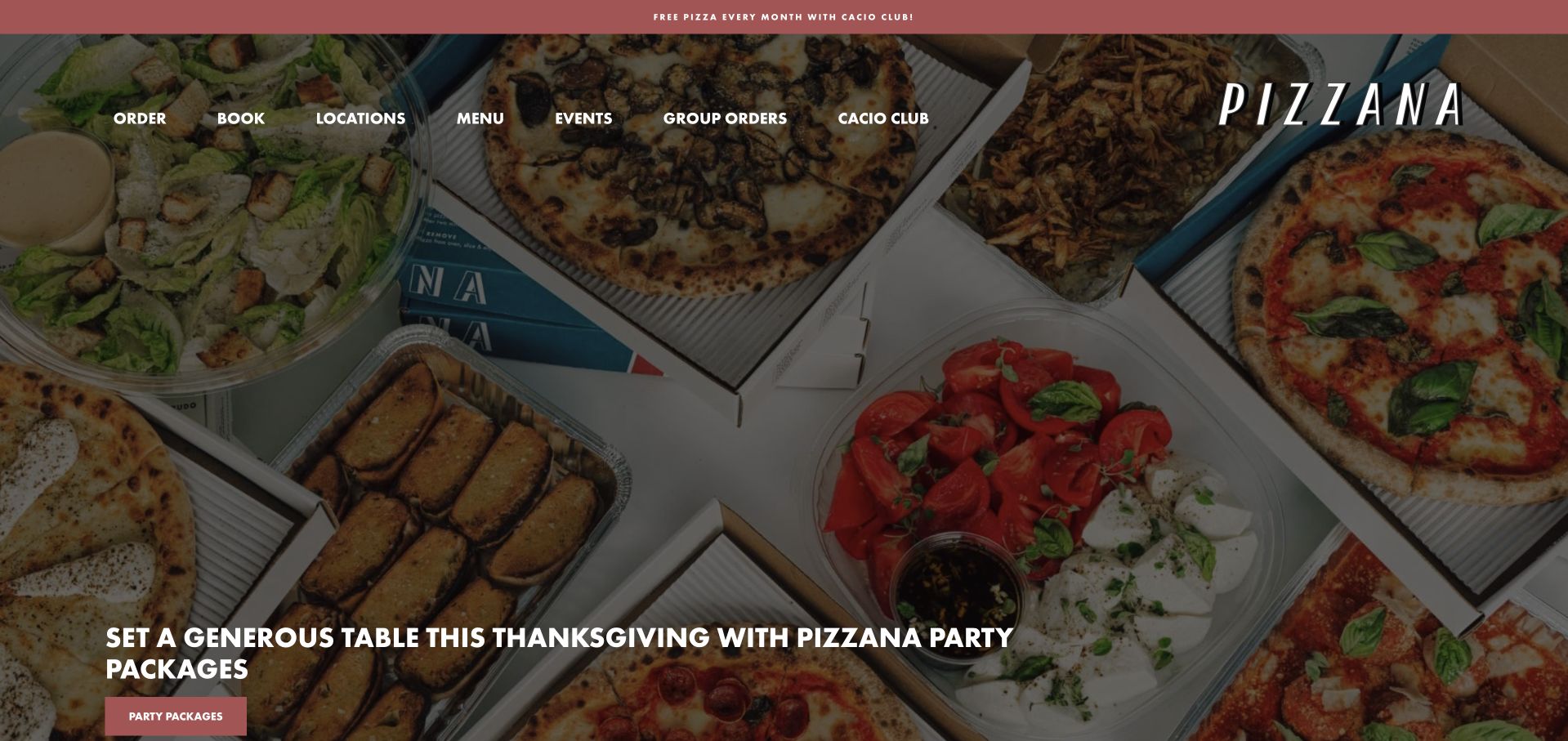
Pizzana’s header accommodates ordering, bookings, locations, events and group orders, while the page explains its two-day dough process. Restaurant visits, nationwide shipping and the Cacio Club are distinct propositions. The review also encountered a prominent club promotion, an example of how a membership message can compete with an otherwise clear dining journey.
What you can learn
If a restaurant adds subscriptions or shipping, explain those offers without letting them displace the main visit and menu tasks. A distinctive production detail is stronger than a generic quality slogan.
Pros
The dough process gives the food story a concrete subject.
Local ordering and nationwide shipping have different routes.
Cons & considerations
The club overlay can interrupt a visitor who only wants a table.
An expanded header needs a clear hierarchy as more services are added.
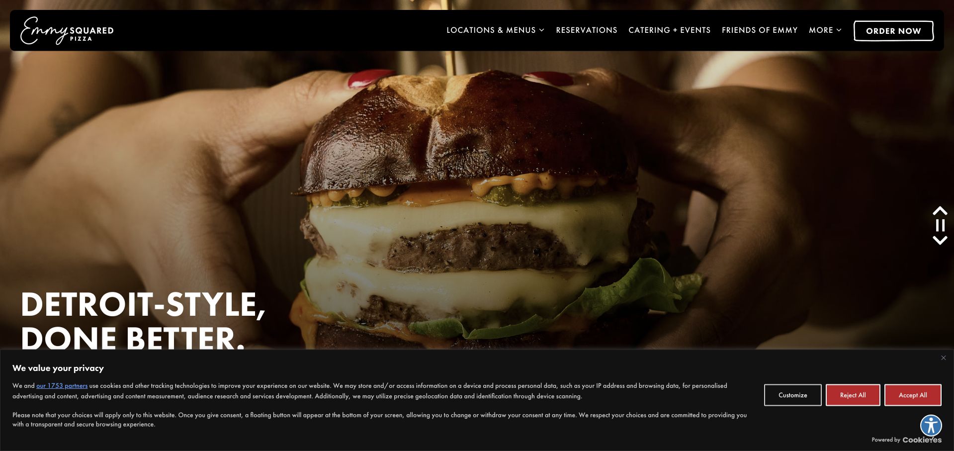
Emmy Squared introduces Detroit-style pizza while also showing the burger offer, avoiding the assumption that every visitor already knows the menu. Locations, reservations, rewards and ordering appear in the header, and group dining has a dedicated path. Product previews make the restaurant’s two main food categories easier to recognize before opening a complete menu.
What you can learn
Show the signature menu categories on the homepage, then route visitors to the appropriate location for availability. Brand-wide enthusiasm should not replace store-specific operating details. Attach the Detroit-style pizza and burger previews to the chosen restaurant's current menu, instead of making the national homepage imply identical local choices.
Pros
Pizza and burger previews clarify the breadth of the offer.
Group dining and ordinary reservations are separately addressed.
Cons & considerations
Several loyalty and transaction choices can compete in a crowded header.
A multi-location visitor must still check that menu items and services apply locally.
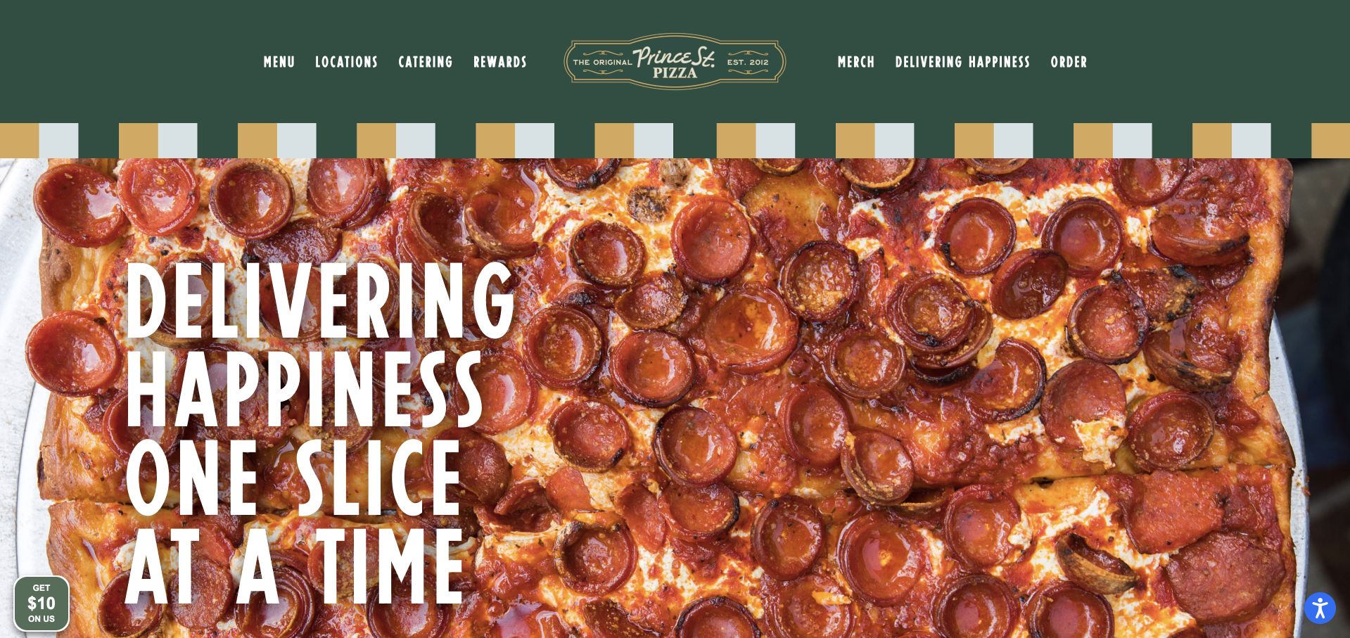
Prince Street uses deep green, gold accents and a strong wordmark around menu, location and ordering actions. Its introductory copy distinguishes slices, whole pies and Sicilian squares, while pickup, delivery and national shipping occupy different routes. The design translates a recognizable shop identity into a more extensive location and rewards structure.
What you can learn
Name the formats people actually buy—slice, square, whole pie—before sending them to an ordering service. Distinguish shipping from local delivery so the word “order” does not hide different expectations. Keep slices, Sicilian squares and whole-pie descriptions beside the relevant local menu, and label national shipping before a visitor expecting tonight's delivery leaves the restaurant journey.
Pros
The product formats are described in everyday terms.
Local fulfillment and national shipping are separated.
Cons & considerations
A media-heavy opening can make the practical content feel lower on the page.
Rewards and merchandise add secondary decisions before a first-time diner has chosen a location.
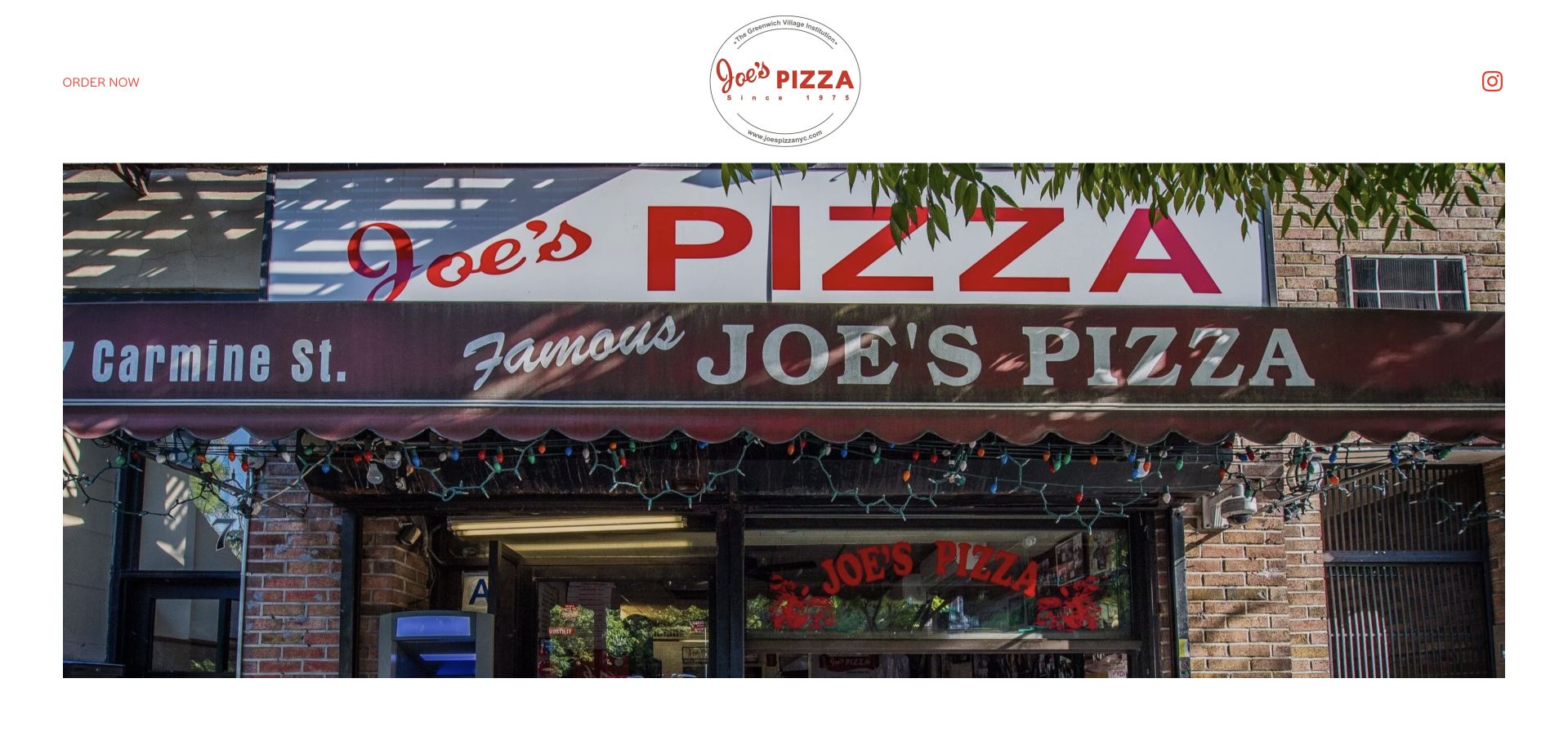
Joe’s keeps the homepage exceptionally basic: a large storefront photograph, a compact identity, an order action and location links, followed by the founder story. There is little decorative interface between the visitor and the actual shop. The strength is recognition and directness rather than a large content system or elaborate interactive menu.
What you can learn
A simple site can feel credible when the photograph, name and location are unmistakably real. Preserve direct ordering and address access before adding visual effects or promotional sections. Let each location link supply the exact address and ordering destination before the founder narrative continues, preserving the storefront-led page's directness for a returning customer.
Pros
The actual storefront establishes a strong sense of place.
A small number of immediate choices keeps the interface easy to scan.
Cons & considerations
The sparse presentation offers little menu detail before the next step.
A simple page still needs deliberate mobile and location-information maintenance.
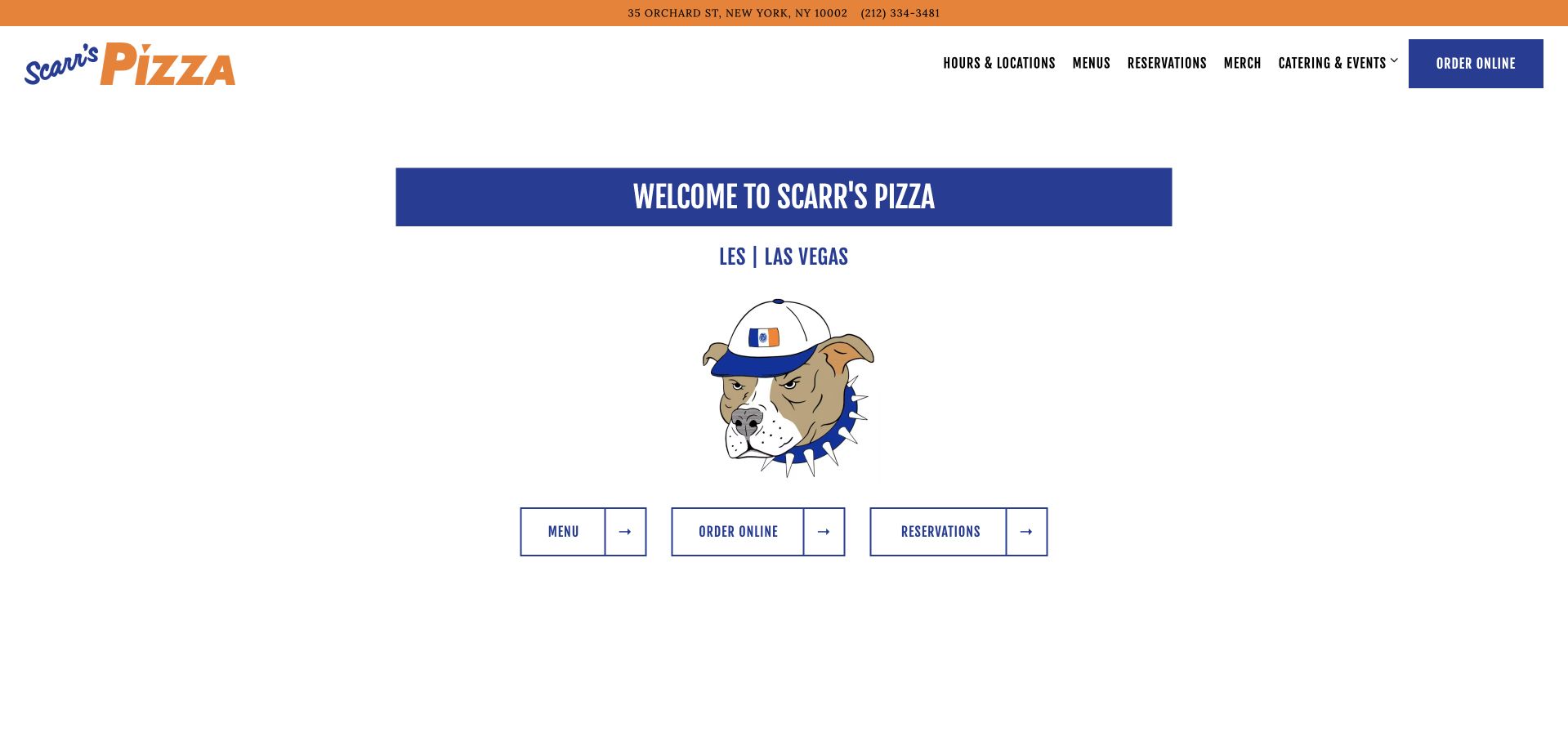
Scarr’s starts with a bright orange address-and-phone strip and a straightforward navigation bar for menus, reservations, merchandise, events and ordering. The welcome copy distinguishes the Lower East Side and Las Vegas locations. Its usefulness comes from keeping the basic visit facts above the more atmospheric restaurant presentation.
What you can learn
Place location and phone information in a persistent utility area, then make expansion explicit. A guest should never have to infer which city an order or reservation button belongs to. Keep Lower East Side and Las Vegas labels visible at ordering and reservation handoffs, rather than letting the orange utility strip establish context that disappears on the next page.
Pros
The address and phone appear before promotional content.
Menus, reservations and catering use recognizable labels.
Cons & considerations
The two-city structure needs clear location context on every transaction destination.
Merchandise and events can distract from the first-time menu task if given equal emphasis.
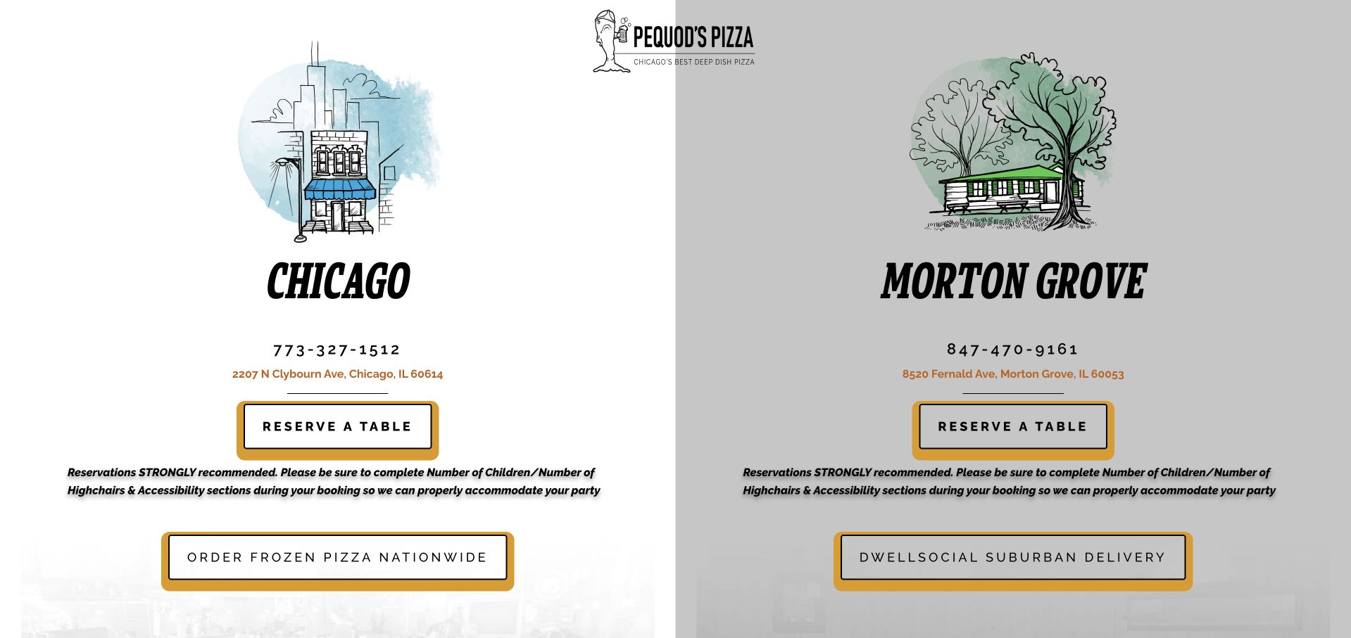
Pequod’s uses two illustrated location panels for Chicago and Morton Grove, each with its own address and phone number. Reservation and delivery routes accompany the choice instead of assuming one shared operation. The reservation guidance also addresses children, high chairs and accessibility needs, turning practical questions into visible planning information.
What you can learn
When two branches operate differently, make the branch choice the homepage structure. Put reservation preparation details beside the booking route instead of leaving them for a confirmation email. Carry Chicago or Morton Grove into reservation guidance, keeping the relevant phone, high-chair and accessibility questions attached to the branch actually selected.
Pros
Each location is paired with its own address and contact details.
Reservation guidance anticipates practical group and accessibility questions.
Cons & considerations
A split gateway gives little immediate space to menu photography.
National shipping and local delivery should remain clearly differentiated as the offer grows.
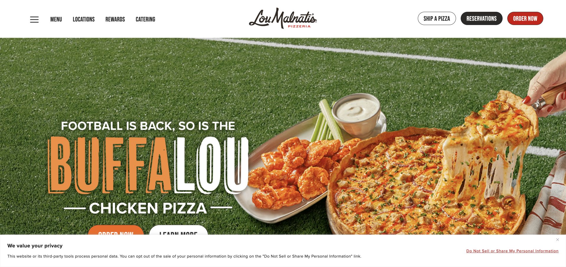
Lou Malnati’s balances a large seasonal pizza campaign with a service-heavy header for locations, menus, catering, reservations, rewards and ordering. The page distinguishes deep dish from thin crust and connects the brand’s history to several current buying formats. A large privacy panel was visible during review, demonstrating the real space consent tools can occupy.
What you can learn
A growing restaurant site needs a task hierarchy, not just more buttons. Make the pizza styles clear and distinguish a local dinner from a shipped product before introducing rewards.
Pros
Different pizza styles are explained rather than assumed.
Catering, local orders and shipping have identifiable routes.
Cons & considerations
The privacy panel competes with a large campaign hero on a first visit.
The number of service choices can overwhelm a guest who has not selected a location.
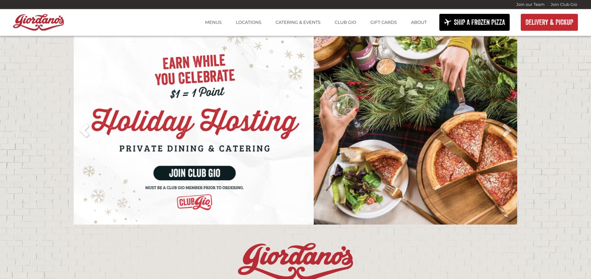
Giordano’s uses a holiday-hosting carousel to introduce ordering while the header separates shipped frozen pizza from local pickup and delivery. Further down, stuffed deep dish, thin crust and tavern-style categories receive their own explanations. The page is useful as an example of teaching a menu distinction rather than relying on a photograph alone.
What you can learn
Explain what makes the signature product structurally different, then connect that explanation to the correct local menu. Shipping deserves its own route because preparation and timing differ from restaurant service. Use the stuffed, thin-crust and tavern-style explanations to support the local menu choice, while making frozen-shipping preparation distinct from immediate restaurant fulfillment.
Pros
Pizza-style descriptions help unfamiliar visitors make sense of the menu.
Frozen shipping is distinguished from immediate local fulfillment.
Cons & considerations
A seasonal carousel needs ongoing campaign maintenance.
The extensive brand narrative can slow a visitor seeking only nearby hours.
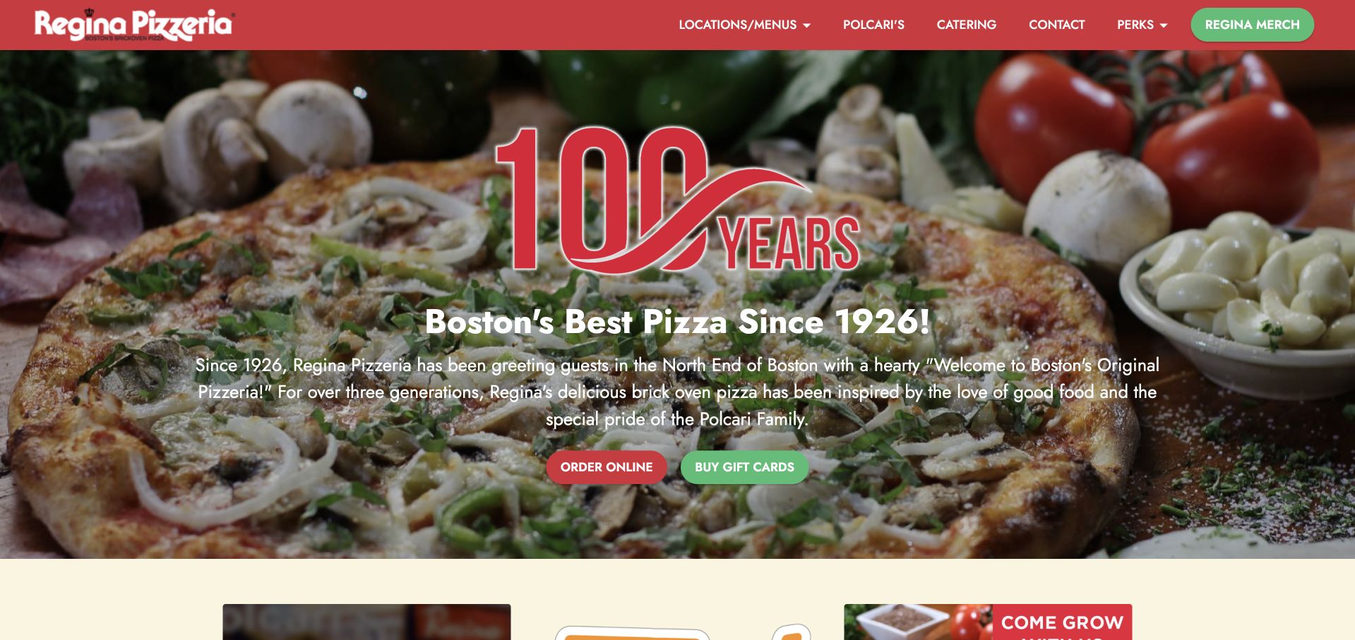
Regina combines a large pizza image and centenary message with a red navigation system for locations, menus, catering and ordering. The story roots the brand in Boston in 1926, while the reviewed seasonal menu publishes prices and pizza sizes in text. The loyalty material is detailed, but the core restaurant tasks remain identifiable.
What you can learn
Pair heritage with current, readable menu information. A founding year provides context; prices, sizes and the correct location give the guest what they need to act now. Keep sizes and prices associated with the relevant seasonal menu and branch, so the Boston centenary story does not imply identical current options everywhere.
Pros
The menu exposes sizes and prices in readable text.
History and present-day location tasks occupy distinct sections.
Cons & considerations
Loyalty information adds considerable detail to an already broad site.
A centenary campaign must not obscure differences among branch menus or hours.
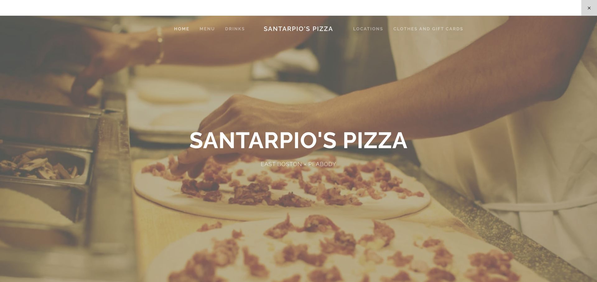
Santarpio’s opens with hands making pizza and names East Boston and Peabody directly over the image. A short single-page structure connects menu, drinks and locations, with readable prices and build-your-own information. The page also warns that not every beer is offered at both locations, a useful operational detail within a compact site.
What you can learn
A short page can answer substantial questions if its menu is text rather than an image. State branch exceptions explicitly, and give each location a complete hours schedule. Give East Boston and Peabody parallel location blocks, making the published beer exception and any missing hours information easier to recognize before planning a visit.
Pros
Menu prices and topping choices are readable without a PDF.
Location-specific drink availability is acknowledged.
Cons & considerations
The Peabody hours information is less complete than the East Boston listing.
A single-page structure offers limited room for detailed access or ordering guidance.
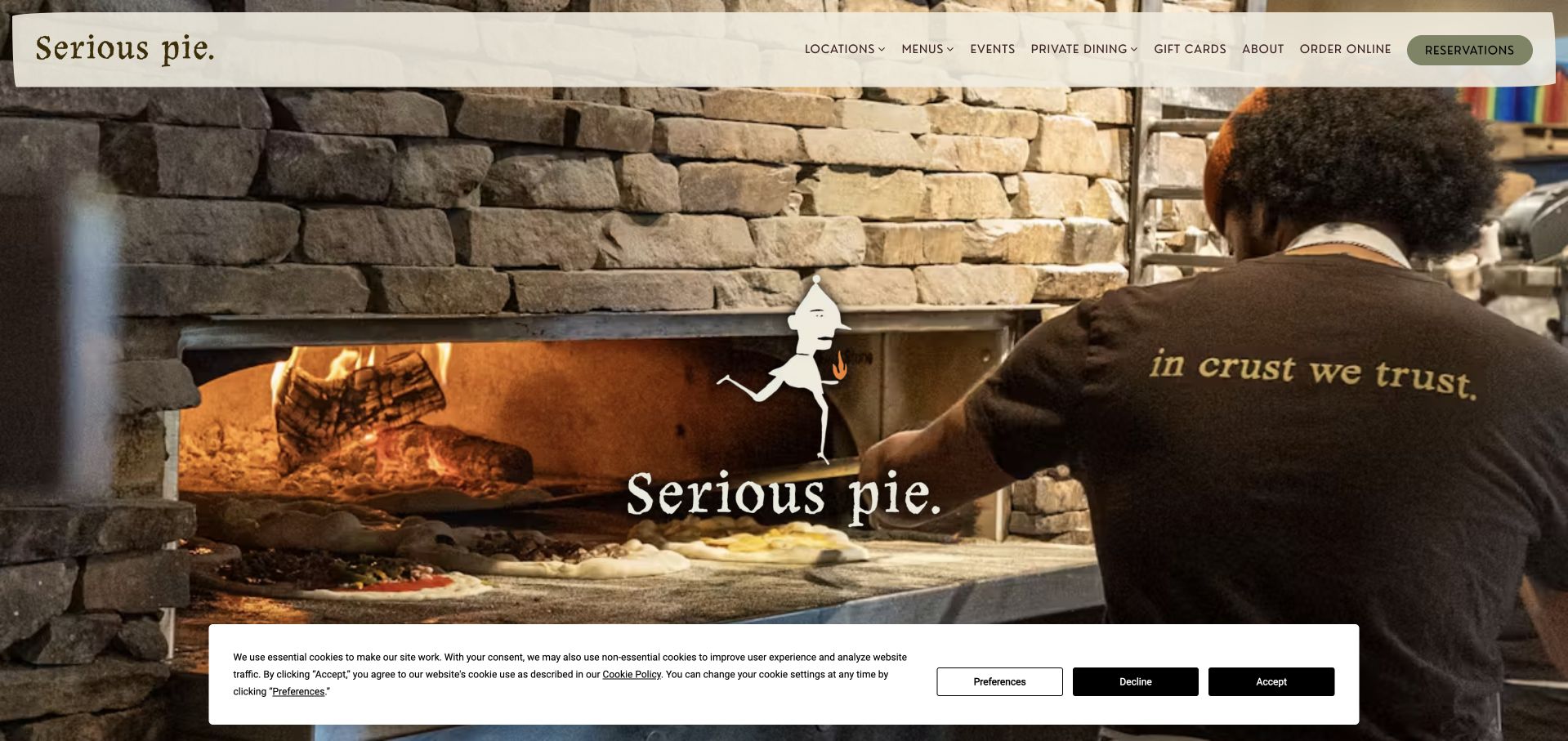
Serious Pie shows a cook loading the oven, tying the brand to an actual preparation process rather than a generic food montage. Downtown, Ballard and Totem Lake have explicit routes, while reservations, ordering and private events remain separate. The page also distinguishes hosting a group from bringing food home.
What you can learn
Show the process that makes the restaurant recognizable, then connect each practical action to a location. Group dining and takeaway solve different problems and should not share one ambiguous inquiry button. Carry Downtown, Ballard or Totem Lake into the order destination, and keep private-event inquiry distinct from takeaway so the oven photograph leads to the appropriate service.
Pros
The oven image gives the craft story a visible subject.
Branch, reservation and private-event routes are clearly named.
Cons & considerations
Cookie controls occupy part of the first-visit screen.
A large image-led opening delays specific menu details.
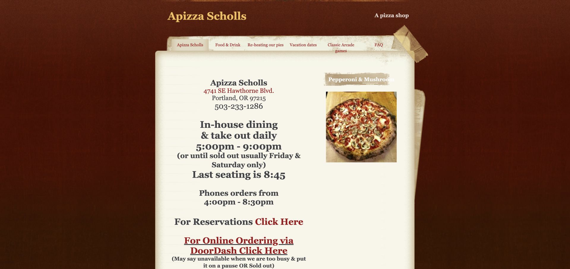
Apizza Scholls uses textured paper styling and a compact, information-dense layout rather than an expansive campaign hero. Address, dine-in hours, phone-order windows and last-seating guidance appear together. It openly explains sold-out conditions, paused ordering and why voicemail is not an order channel, with reheating and arcade information nearby.
What you can learn
Operational honesty can be a design asset. Publish the actual ordering window, capacity limits and fallback instructions so a guest understands what to do when the kitchen is busy. Group dine-in hours, phone-order windows and last seating into a compact summary, then explain sold-out and voicemail rules immediately below rather than scattering the exceptions across separate paragraphs.
Pros
Specific order and seating windows reduce guesswork.
Sold-out and voicemail policies are stated directly.
Cons & considerations
The dense, nostalgic layout requires careful scanning.
Multiple ordering rules would benefit from a concise mobile-first summary.
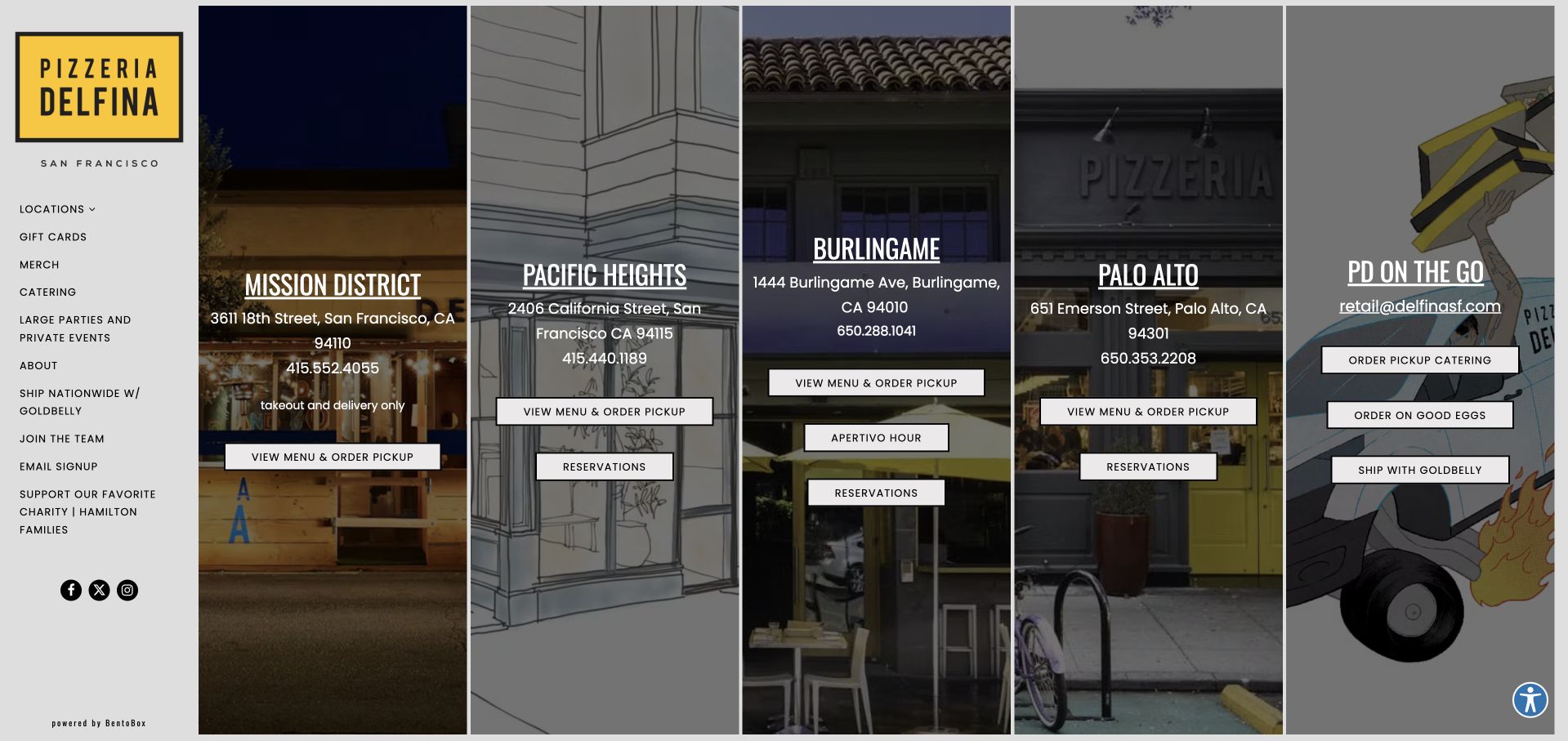
Delfina fills the main page with tall panels for Mission District, Pacific Heights, Burlingame and Palo Alto, followed by a retail-and-catering panel. Addresses, phone numbers and menu-order buttons sit directly over location photography or illustration. The Mission panel explicitly identifies takeout and delivery only, while other panels expose reservations.
What you can learn
Let each location card carry its actual service model. A shared brand does not mean every branch offers seating, reservations or the same ordering process. Preserve the Mission takeout-only distinction on every menu and order destination, while reservable branches retain their own address and seating actions rather than inheriting a shared generic button.
Pros
Location details and actions are kept in the same panel.
The takeout-only branch is clearly distinguished from reservable dining rooms.
Cons & considerations
Narrow desktop panels can become text-heavy as more services are added.
The very visual gateway leaves broader food and founder context to separate pages.
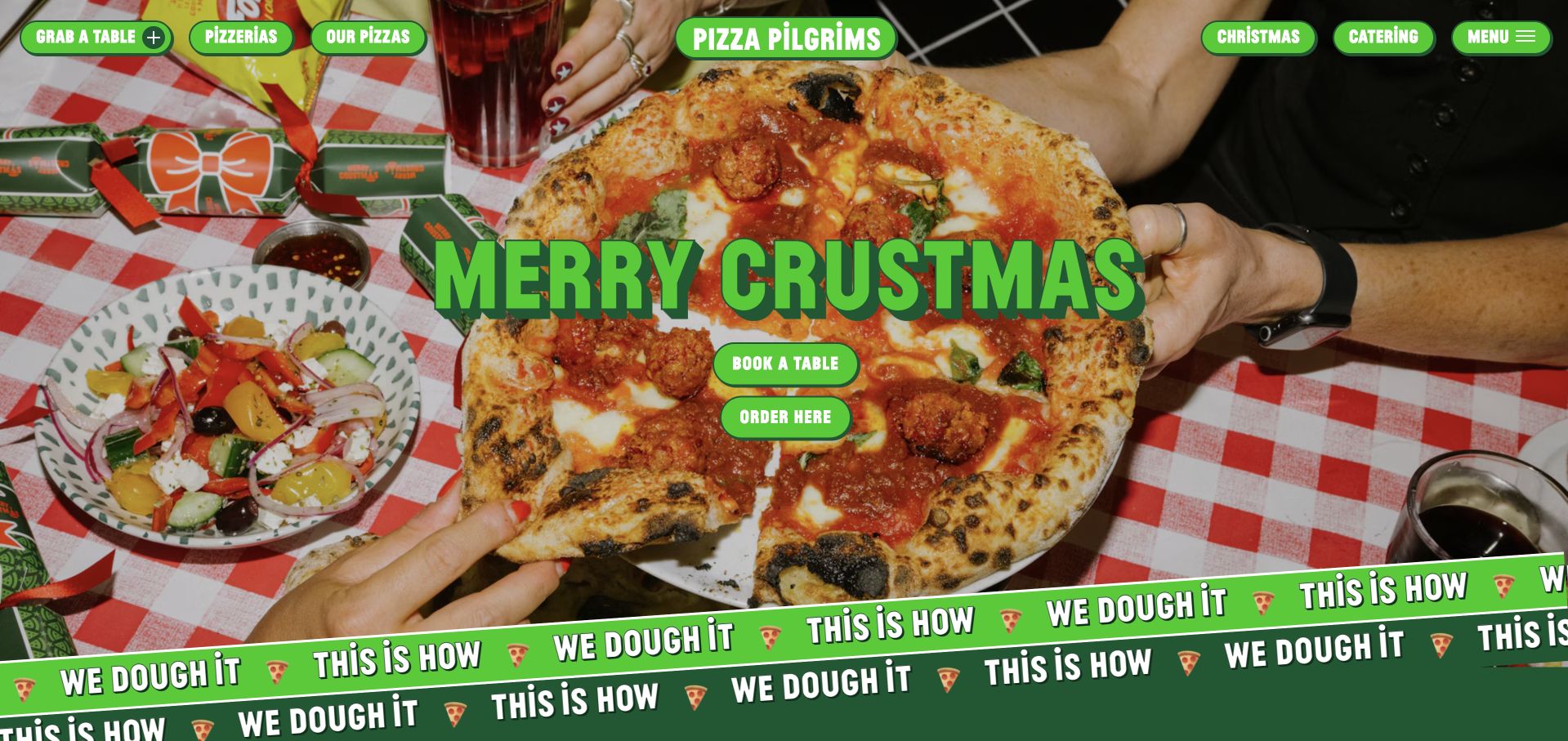
Pizza Pilgrims combines bright green rounded buttons, checkered-table photography and a seasonal “Crustmas” campaign. Beneath the energetic surface, it separately describes tables, classes, groups of eight or more and catering, including a starting group-menu price. The founder journey and pizza-making story support the identity rather than replacing the practical routes.
What you can learn
Use expressive typography and playful copy around clear service categories. Publish thresholds such as group size and starting price so the visitor can choose the right route before opening a form. Keep the eight-person group threshold beside the group-menu price, and separate classes from table booking so the Crustmas campaign does not obscure which activity a form will request.
Pros
Groups, classes and ordinary tables have distinct explanations.
The booking copy explicitly says walk-ins remain available.
Cons & considerations
Moving decorative bands and large campaign imagery can add visual noise.
Seasonal language needs prompt updating after the promotion ends.
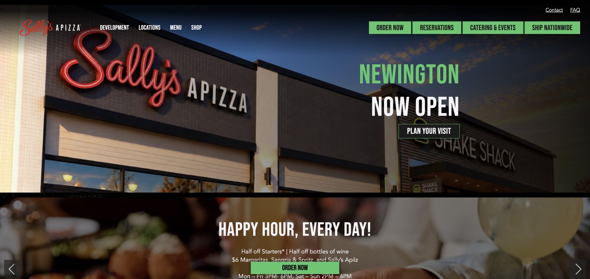
Sally’s leads with a new-location announcement while keeping local ordering, reservations, catering and nationwide shipping separately visible. Its menu carousel explains the ingredients behind familiar and less familiar pies, including the difference between tomato sauce and mozzarella versions. Location-specific happy-hour exclusions are published rather than implied to apply everywhere.
What you can learn
A growth announcement should still help existing guests act. Keep core order routes visible and explain exceptions beside a promotion so a brand-wide campaign does not mislead local diners. Retain the New Haven happy-hour exclusion beside the campaign wherever it appears, while keeping the new-opening announcement separate from location-specific menus, reservations and immediate ordering.
Pros
Menu descriptions clarify differences among signature pies.
Promotion exclusions explicitly identify the New Haven exception.
Cons & considerations
A new-opening hero prioritizes expansion over the needs of returning diners elsewhere.
Multiple carousels and transaction routes can lengthen a quick menu visit.
Kegan is a freelance web designer and developer with 15+ years of experience helping businesses turn complicated website requirements into clear, maintainable digital experiences. He works directly with clients from planning and design through development, launch, and ongoing support.
For pizza restaurant website design, his development approach focuses on readable food and dietary information, location-specific hours, and separate delivery, pickup, reservation, and catering connections. The scope can be a targeted improvement or a complete custom build, with responsive layouts, thoughtful content structure, and integrations chosen around the people using and maintaining the site.
Show 3 other pizza restaurant website designersHide other pizza restaurant website designers
Plan the route from appetite to the correct location
Inventory every menu and fulfillment route
Document which locations offer tables, slices, collection, delivery, catering and shipped products. Attach each ordering link to a location and format. Eliminate duplicate buttons that lead to different systems without explaining the difference.
Choose photographs that identify the restaurant
A close pizza photograph shows the product; a storefront, oven or dining-room detail shows the place. Use both deliberately. Avoid a carousel of near-identical pies when one strong image and useful menu content would answer more questions.
Test a busy-night scenario
Check the site when ordering is paused, reservations are full or the kitchen sells out. A visitor should understand whether walk-ins, another branch or a later collection time are possible. Test long topping lists and phone links on a small screen.
The editing job behind the design
Keep the menu and ordering relationship reliable
Use a maintained source for transactional prices and availability, with readable menu information on the public website. If a separate ordering platform is necessary, retain location context and explain pickup versus delivery before the handoff.
Make locations and operating exceptions structured content the team can update quickly. Reserve elaborate motion for parts of the site that do not prevent menu access. Do not infer a complete platform stack from the ordering provider or a visual template.
Our WordPress website examples offer a separate look at publishing approaches. A visible platform label is evidence for that named page, not a guarantee that the same system will suit your requirements.
Before the public launch
Pizza restaurant website planning checklist
Make the location choice explicit.
Separate dine-in, pickup and delivery.
Distinguish frozen shipping from local orders.
Publish menu sizes and descriptions.
Keep branch-specific prices identifiable.
State reservation and walk-in arrangements.
Explain sold-out and paused-order states.
Show the real food, room or storefront.
Maintain holiday and last-seating information.
Test the external order handoff on a phone.
These checks are a project checklist, not a performance, legal, security, or accessibility certification. Test real journeys with the people responsible for the website before making claims about the result.
Sources & editorial method
How this collection was selected and reviewed
These 23 examples match the exact collection count saved before research. The public company pages were opened directly and visually inspected on November 8, 2026 Pacific time; fresh screenshot files were captured on November 9 UTC, as individually dated. Screenshots show actual public pages, including meaningful inner-page sections where appropriate, and are not generated website concepts or vendor-supplied images. Reviews describe observed website design and information, not product or service quality, safety, availability or promised outcomes. Public technology labels are included only with source evidence; unknown stacks remain unlisted. No purchases, reservations, age-verification submissions, inquiries or private forms were completed. Security gates and unrelated or parked domains were excluded. Images and trademarks belong to their owners.
Each example links to its actual source page. Screenshots are direct browser captures with their own capture dates; moving imagery, announcements and live designs can change. The notes describe observable design choices and conditional tradeoffs, not measured traffic, conversion results, service quality, or accessibility conformance.
Technology labels use public page metadata, asset evidence, or explicitly cited platform documentation. Platform documentation is not a complete current deployment audit. A component reference may be legacy or unused; it is not a complete backend inventory. Unknown stacks are omitted. These sites are editorial examples, not our client portfolio.
Written, Edited and Curated are separate editorial records, not timestamps advanced by a rebuild. Website designs and imagery belong to their owners. See our editorial standards or suggest a correction.
Questions worth asking
Pizza Restaurant website design questions
What should be most visible on a pizza homepage?
A clear food identity, the correct location, menu access and an accurately labeled ordering route are useful priorities. The main action should reflect whether the restaurant mainly serves seated guests or takeaway customers.
Should every branch have its own page?
Usually, when hours, menu, seating or fulfillment differ. Give each page an address, phone, hours and the correct order and reservation links rather than duplicating a generic brand description.
How should sold-out information be handled?
State that the menu or service can end early when that is the real policy, and provide a current update when possible. Do not leave a misleading immediate-order action without explaining why it is unavailable.
Does a small pizzeria need a large website?
No. A concise, well-maintained page with a readable menu and clear visit facts can work well. Add pages when they help distinguish locations, service formats or genuinely useful stories.