Best Food Truck Websites of 2026 (12 Real-World Examples)
Food truck websites built for finding today’s service and planning tomorrow’s event
These 12 food truck websites examine live-location clarity, readable menus, regional identity and the distinction between finding a truck and hiring one.
A food truck site serves two very different visits. One person wants lunch at a specific time and place; another wants a truck at a future private event. A strong design makes that split visible before a long origin story, and never asks a hungry visitor to treat an undated social post as a current schedule.
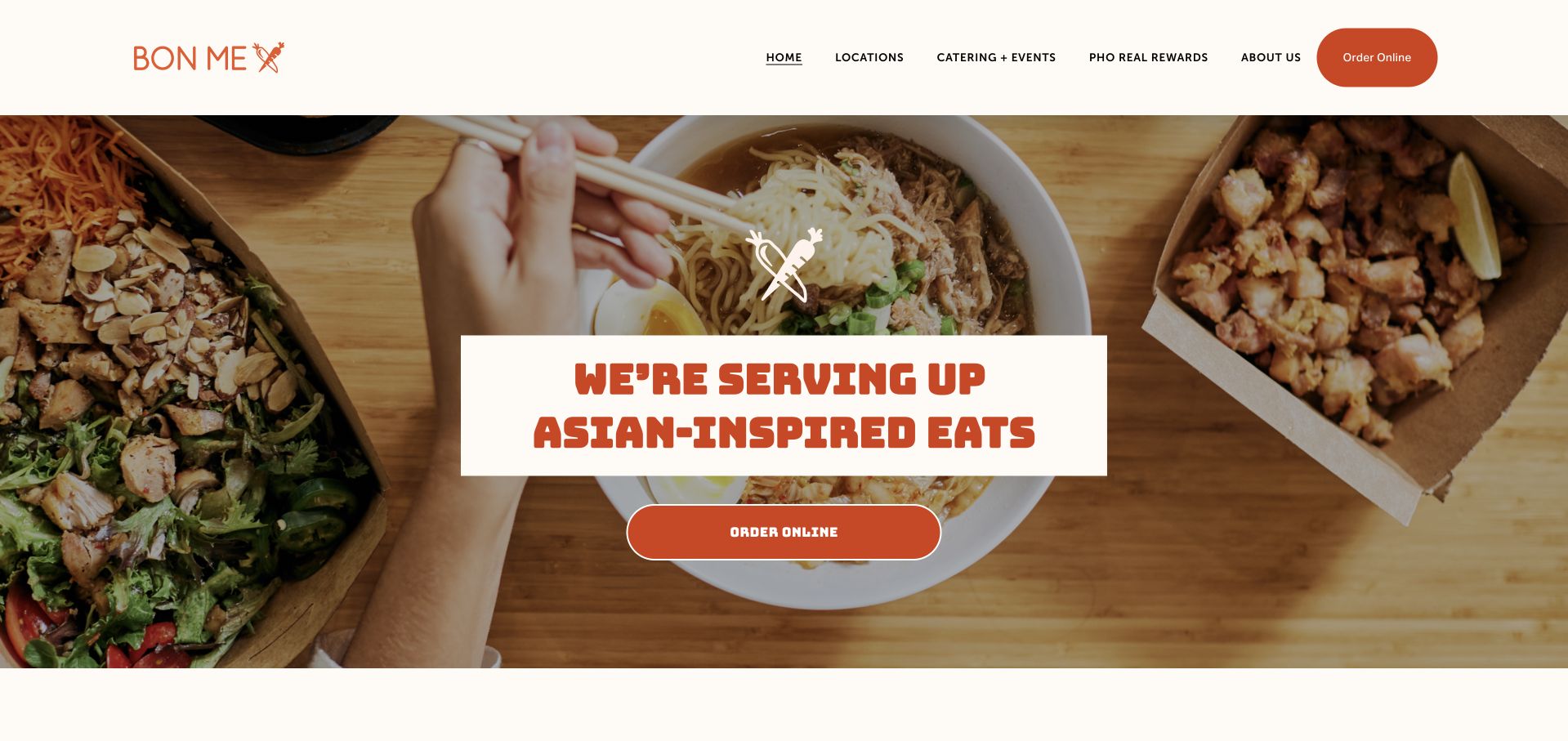
Bon Me is our Editors Choice for connecting an expressive orange-and-cream food identity with clear Boston location, ordering and catering routes. It is a useful model for a truck business that has also added restaurants: explain the formats directly instead of assuming the visitor knows which operation a button refers to.
Before the examples
What makes good food truck website design in 2026?
Give the schedule a date and a real address
Show service date, start and end times, venue name and a map-ready address. Identify public service, ticketed events and private bookings differently. If there is no public stop today, say so instead of leaving an empty calendar or a previous week’s heading.
Make the food legible before ordering
Publish readable dish names, descriptions and current prices where practical. Explain the size or format people are buying. Keep truck menus distinct from restaurant, catering or shipped products when the selection differs.
Treat catering as a planning service
Give event planners service geography, approximate capacity, event formats and the information needed for an inquiry. A truck-hire request is not a normal lunch order and should not be disguised as one more ordering button.
The collection · 12 examples
12 food truck websites worth studying
Compare these examples by how quickly they answer three questions: what is served, where can it be found, and how does a private event differ? The review limitations are as useful as the visual patterns.
Bon Me combines an orange-and-cream identity, bold friendly lettering, and an overhead food photograph with a clear Order Online action. Its introduction explicitly identifies the company as Boston-based and operating both food trucks and restaurants. Locations and Catering + Events remain separate main navigation choices, so everyday customers and event hosts have different routes.
What you can learn
A truck business with permanent locations needs one recognizable identity and clear operating distinctions. State what formats exist, then separate finding a location, ordering a meal, and planning an event. Preserve the truck-versus-restaurant context after Locations is selected, so the Boston brand introduction leads to the appropriate hours, menu and ordering destination rather than an assumed universal operation.
Pros
Ordering and catering are distinct actions.
The text explains the Boston truck-and-restaurant model.
Cons & considerations
The homepage does not show a live truck schedule immediately.
The large food image places the operational explanation further down.
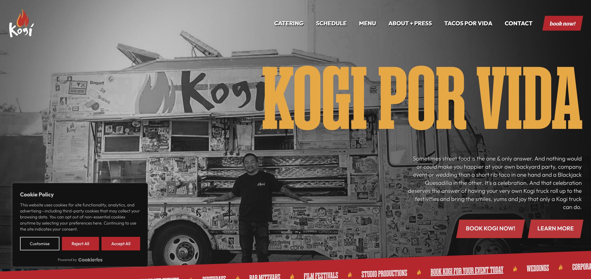
Kogi uses a black-and-white truck photograph, giant ochre type, and red booking buttons to make the vehicle itself the brand setting. A directly dated weekly schedule lists locations and service times, while catering remains a primary action. The strong personality is paired with unusually concrete information for someone deciding where to find the food.
What you can learn
Give a roaming business a dated schedule with location and time together. Keep private-event booking distinct from public stops so the two visitor journeys do not compete inside one vague contact link. Group each dated stop with its location and service window, and keep the catering button separate from those public schedule entries.
Pros
The weekly schedule is explicitly dated.
Truck imagery makes the mobile offer immediately recognizable.
Cons & considerations
The large cookie panel obscures part of the first view.
Dense schedule entries require careful reading when several stops share a day.
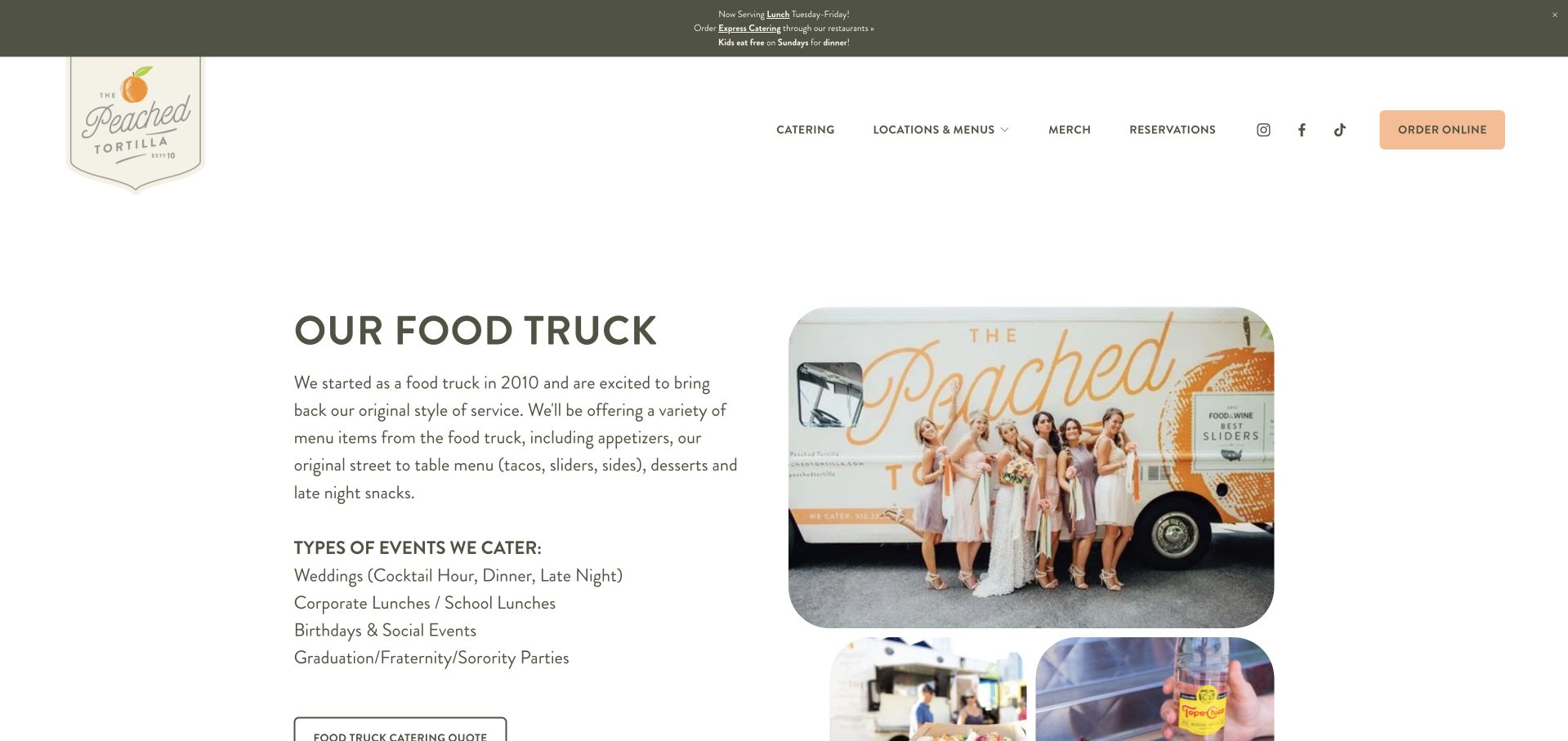
The Peached Tortilla gives its truck a dedicated page rather than expecting visitors to infer it from restaurant locations. A short introduction describes the street-food menu and names weddings, corporate or school lunches, birthdays, and other gatherings. A specifically labeled Food Truck Catering Quote action sits beside photographs of the vehicle and food.
What you can learn
When a restaurant also runs a truck, create a page that explains the mobile service on its own terms. Name suitable event formats and label the inquiry specifically for the truck. Keep the quote request labeled for the mobile service throughout the handoff, so a school-lunch organizer does not end up making an ordinary restaurant reservation.
Pros
The quote action explicitly names food-truck catering.
Event types are listed as readable text.
Cons & considerations
The broader restaurant navigation competes with the truck-specific task.
Pricing and logistical requirements need a further inquiry.
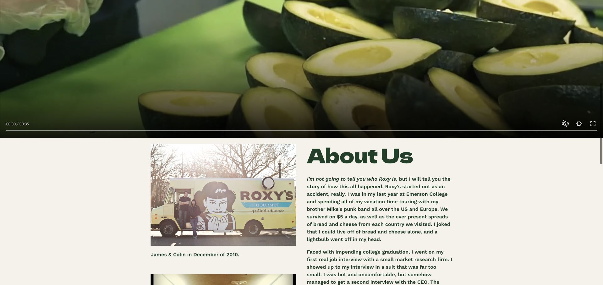
Roxy’s uses a pale yellow header, illustrated identity, and a prominent truck-booking announcement. Food Truck Menu and Restaurant Menu are separately labeled in the navigation, an important distinction for a business that operates both. The homepage follows its food video with founder storytelling and dated team photographs, giving the brand a personal history.
What you can learn
Do not assume the truck and restaurant sell the same menu. Label their menus separately and keep the truck inquiry visible, while letting the company story provide personality after the practical routes. Carry Food Truck Menu and Restaurant Menu into distinct destination headings, and date operational updates separately from the founder photographs that document the brand's history.
Pros
Truck and restaurant menus are separately named.
The truck-booking route is prominent.
Cons & considerations
A large video precedes the company explanation.
The long founder story is less useful for someone looking for today’s stop.
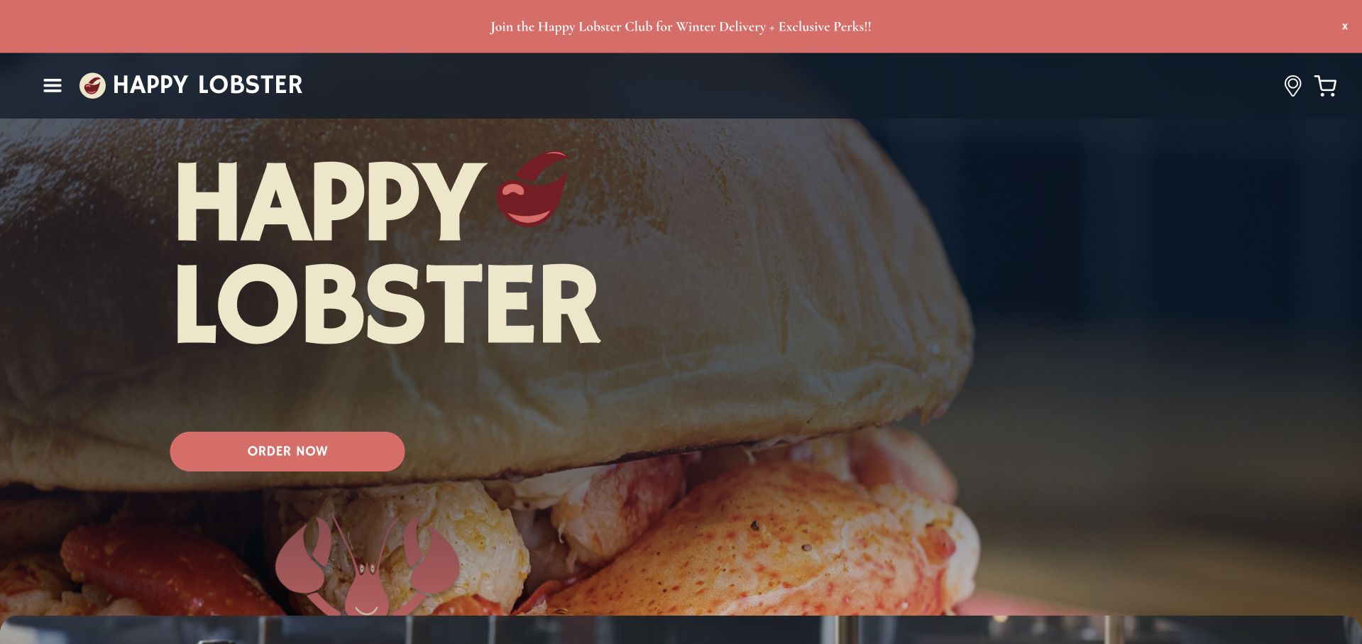
Happy Lobster combines a navy background, cream display lettering, coral actions, and a claw emblem with a distinctly Chicago introduction. Order Now, location discovery, and catering are separate routes, and menu previews explain several formats. During review the homepage schedule area displayed no items, showing why a strong identity still needs dependable operational content.
What you can learn
Keep the local voice, but treat schedules as essential service information. Empty schedule states should tell visitors where to check next instead of leaving them to interpret a missing list. Use an explicit no-public-stops message or a dependable contact alternative when the schedule is empty, and test the coral actions for destinations that still look like staging routes.
Pros
The regional identity is unusually clear.
Ordering and catering are separately signposted.
Cons & considerations
The reviewed schedule area showed no items.
Some links expose staging-style destinations or unclear route names.
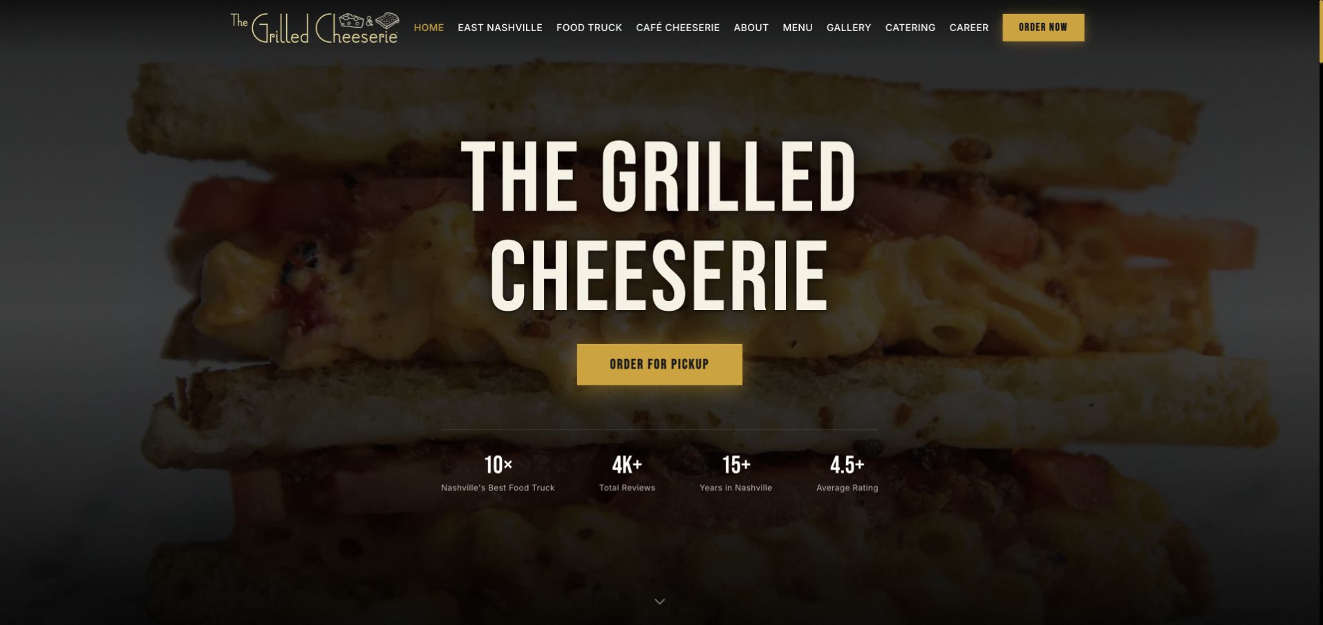
The Grilled Cheeserie leads with close-up sandwich photography and strong cream lettering on a dark background. Food Truck has its own navigation position alongside East Nashville and Café Cheeserie, while the page displays menu descriptions and prices in text. A locations section explicitly distinguishes the flagship shop, truck, and museum café rather than treating them as interchangeable.
What you can learn
Let visitors choose the operating format before assuming one menu or schedule applies everywhere. Text-based dish descriptions and prices make a visual food site much more useful than photography alone. Attach the menu and current hours to East Nashville, the truck or the museum cafe after that format is chosen, rather than letting one appealing sandwich photograph imply identical service.
Pros
Food Truck is a direct primary link.
Menu descriptions and prices are readable page content.
Cons & considerations
The long homepage repeats several promotional messages.
The large hero postpones location and schedule details.
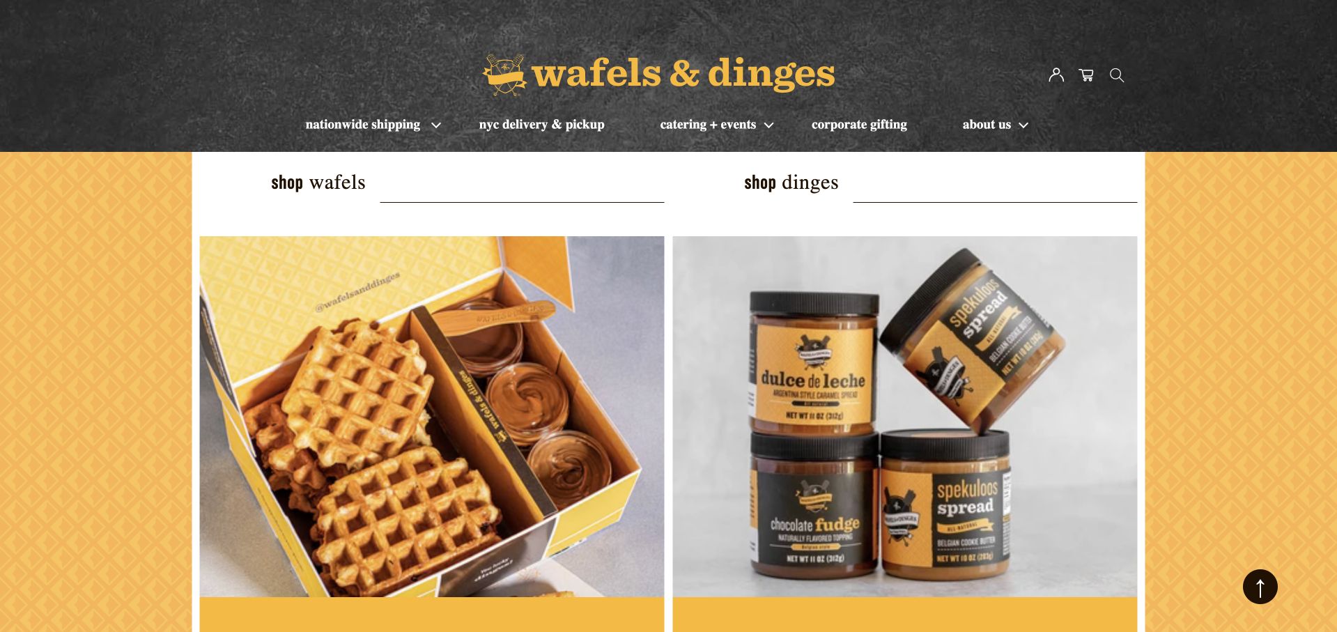
Wafels & Dinges uses a black textured header, yellow patterned background, and large product images to sustain its recognizable street-food identity. Navigation separates New York pickup, shipping, catering, and corporate gifting. The structure acknowledges multiple ways to buy, although many shopping actions leave the site for an external fulfillment partner.
What you can learn
Organize a food brand by fulfillment mode when customers can visit, order locally, ship nationally, or hire an event setup. Make each handoff explicit so a local truck search does not become an accidental shipping journey. Label the external fulfillment partner before the handoff and retain whether the customer selected New York pickup, shipping, catering or corporate gifting on the next destination.
Pros
Local and nationwide purchase routes are distinguished.
The patterned visual identity is consistent across sections.
Cons & considerations
External shopping handoffs fragment the journey.
The homepage emphasizes products more than mobile locations.
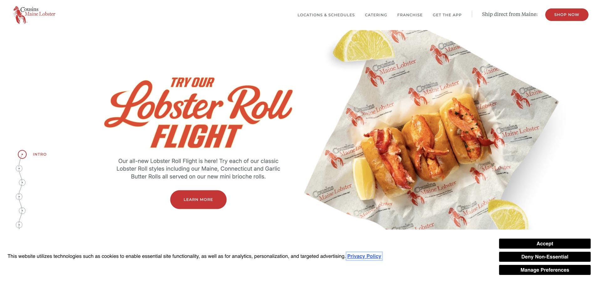
Cousins Maine Lobster places Locations & Schedules first in its navigation and distinguishes finding a truck, finding a restaurant, and shopping shipped lobster. Product sections explain different lobster-roll styles, while catering connects visitors with a local team. The extensive homepage serves several audiences, but location discovery remains an explicitly named task.
What you can learn
A large truck network should make location selection the entrance to local facts. Do not let a national product story imply that every location has identical menus, service hours, or event availability. After a visitor chooses a local truck, carry that selection into catering and schedule information so the nationwide lobster story does not reset a local planning decision.
Pros
Locations and schedules are a primary route.
Truck, restaurant, and shipped-product options are separated.
Cons & considerations
The long promotional carousel delays concrete local information.
The nationwide offer requires an additional local-selection step.
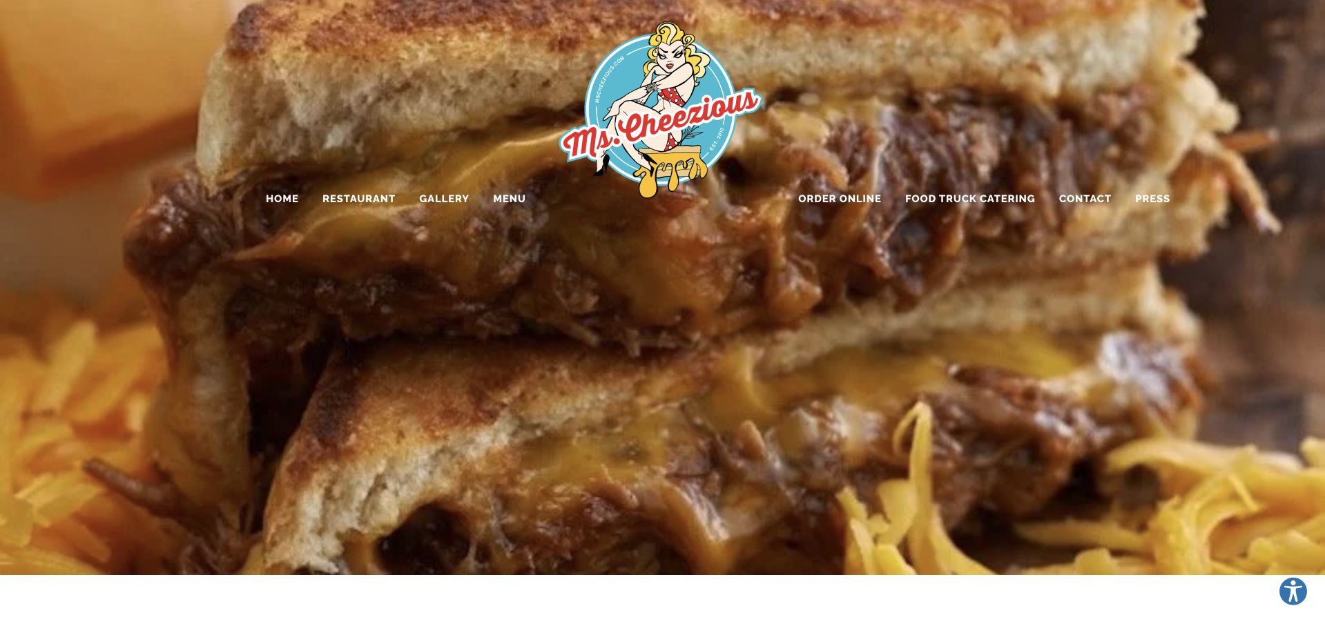
Ms. Cheezious uses a close-up grilled-cheese backdrop and illustrated logo, then publishes its Miami truck location, phone, email, hours, and a substantial text menu. A food-truck catering navigation item distinguishes private events from visiting the current stop. The initial promotional signup overlay interrupts this otherwise direct set of useful information.
What you can learn
For a truck with a regular pitch, publish the address and hours as prominently as a restaurant would. Keep its event-hire option separate and avoid making a signup offer the first barrier to the menu. Use anchor links for the long text menu and Miami visit block, keeping the regular pitch distinct from the food-truck catering request.
Pros
The current truck address and hours are explicit.
The menu is readable text rather than only a scan.
Cons & considerations
The signup popup obstructs the initial view.
The long single-page structure can make specific sections harder to reach.
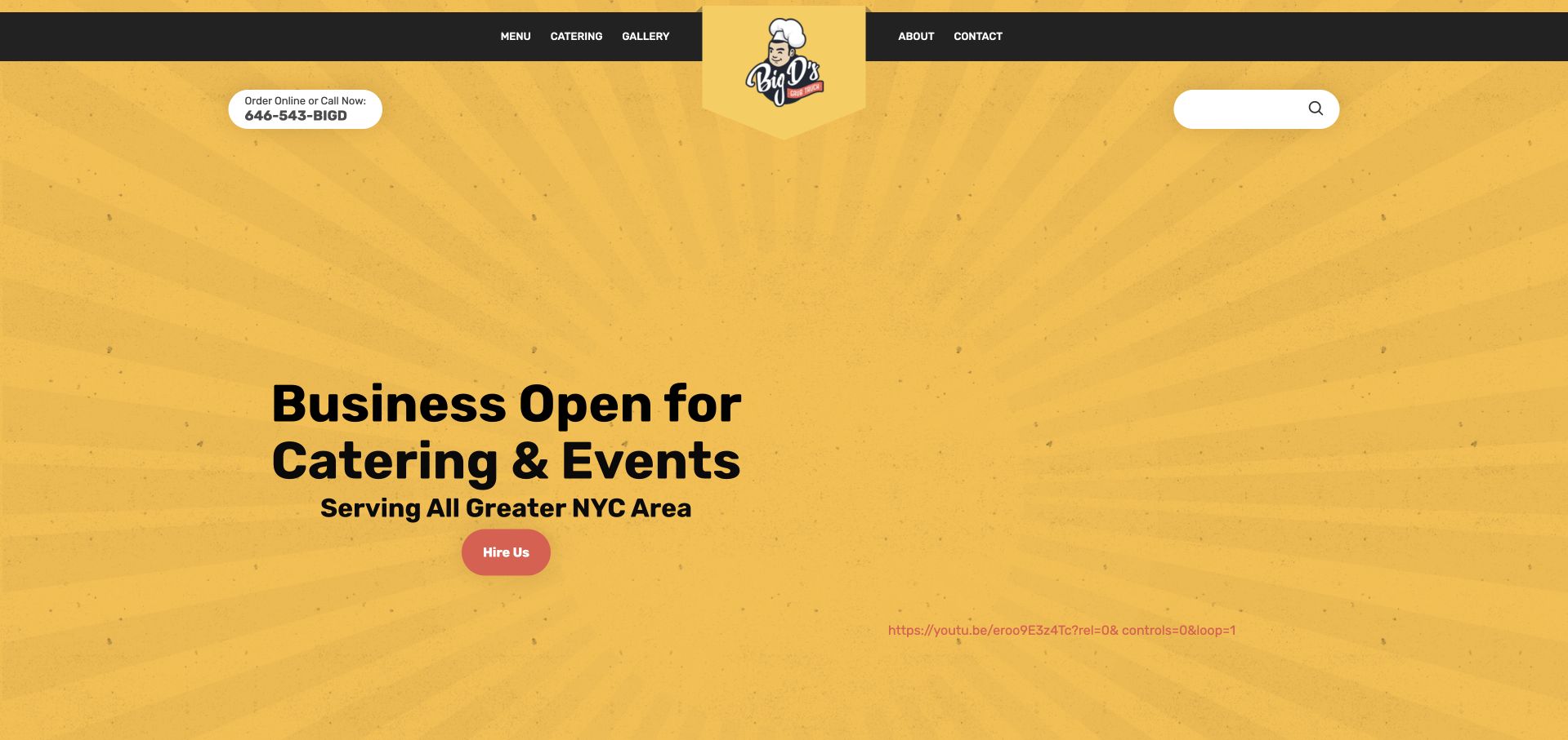
Big D’s uses a yellow textured canvas, compact food-truck identity, and a direct statement that it is open for catering and events across Greater New York City. Hire Us is the primary action, supported by menu, catering, gallery, and contact links. Later sections introduce signature dishes, while the footer repeats the service area and phone route.
What you can learn
If private events are the priority, say so directly and state the travel area early. Keep the truck’s dishes visible so event hosts can connect the practical booking route with an understandable food offer. Replace the raw hero video link with an understandable media control or fallback while preserving Greater New York City coverage and Hire Us as the primary event-planning message.
Pros
The service region is stated in the opening.
Hire Us gives event hosts a clear next action.
Cons & considerations
The hero contains a visibly awkward raw video link.
Public-stop information is not a prominent homepage feature.
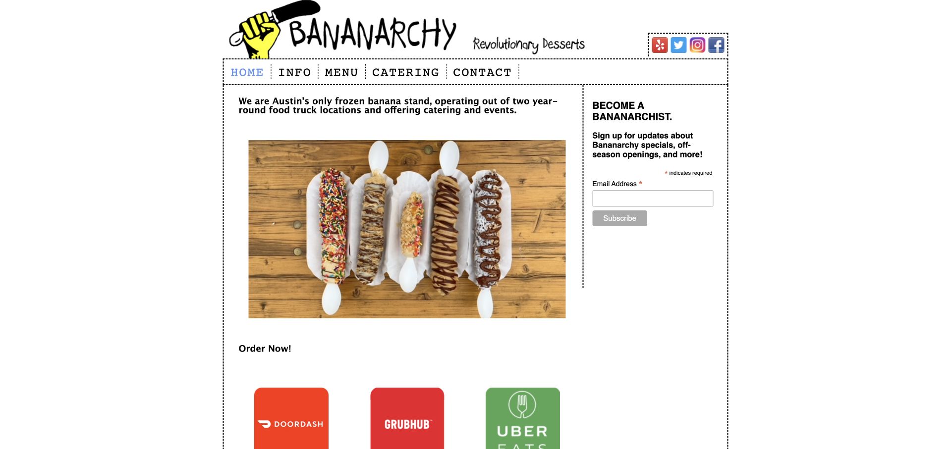
Bananarchy pairs a hand-drawn wordmark and banana emblem with dotted borders, a narrow content column, and a clear photograph of topped frozen bananas. A short sentence identifies two year-round Austin food-truck locations, while Info, Menu, Catering, and Contact are direct routes. Third-party order buttons sit beneath the product introduction.
What you can learn
A focused product needs a simple explanation and an honest photograph more than a large menu system. Keep location details close to the introduction so the playful identity still supports a real visit. Place the two Austin locations beside their individual order links, so the narrow, playful introduction still helps someone choose the correct pickup point before leaving the site.
Pros
The product is immediately understandable from the image.
The site states its truck format and city.
Cons & considerations
Exact addresses require the Info page.
The narrow desktop layout and prominent signup reduce room for visiting information.
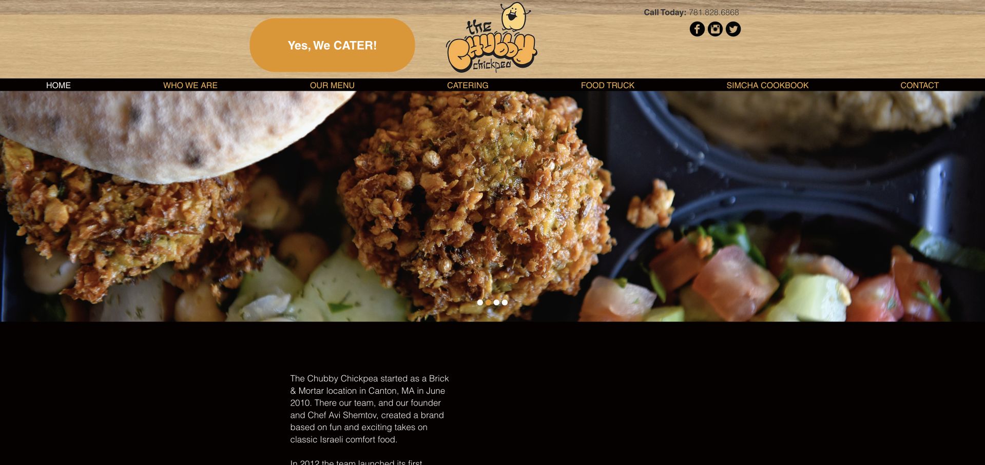
The Chubby Chickpea uses an illustrated chickpea identity, warm gold tones, and a conspicuous catering button beside its phone number. The navigation separately names menu, catering, and food truck. Its introduction explains the move from a Canton location into mobile service, although a later locations note still refers to a previous season.
What you can learn
Keep the distinction between company history and current operating information clear. A dedicated truck page is useful only when its locations and season labels stay current. Audit the earlier-season location note independently of the Canton history; keep a current mobile-service statement beside Food Truck so visitors can separate past premises from present operations.
Pros
Food Truck is a direct navigation destination.
Phone and catering contact are visible in the header.
Cons & considerations
A location note refers to an earlier season.
The large opening gallery area delays operational information.
Kegan is a freelance web designer and developer with 15+ years of experience helping businesses turn complicated website requirements into clear, maintainable digital experiences. He works directly with clients from planning and design through development, launch, and ongoing support.
For food truck website design, his development approach focuses on current stop and service information, readable menus, distinct ordering and event inquiries, and maintainable schedule publishing. The scope can be a targeted improvement or a complete custom build, with responsive layouts, thoughtful content structure, and integrations chosen around the people using and maintaining the site.
Show 3 other food truck website designersHide other food truck website designers
Assign one place and one responsible person for public stops. If the same data feeds the website and social accounts, define how a cancellation propagates. Keep completed events out of the current schedule while retaining a clearly labeled archive if useful.
Map every ordering destination
List truck, restaurant, delivery, pickup and catering systems separately. Confirm which location and fulfillment method each action selects. Explain an external handoff before a visitor reaches a platform that looks unrelated to the truck brand.
Test the closed and sold-out states
A schedule is only useful if it handles exceptions. Rehearse rain, a private booking, a truck repair and an early sellout. Display a clear update with a timestamp and an appropriate alternative instead of keeping an apparently available order button active.
The editing job behind the design
Keep the daily tools simple enough to maintain
A small structured schedule with dates and addresses is often more useful than a complex map that nobody updates. Choose a workflow staff can use from a phone. Cache or export enough text that the website remains understandable when a social feed or map does not load.
Use online ordering only where it reflects the current operating format. Keep event inquiries, preorders and immediate pickup separate. Retain readable menu and contact information outside any account-required service, and compress photography so a street-side visitor can load it quickly.
Our WordPress website examples offer a separate look at publishing approaches. A visible platform label is evidence for that named page, not a guarantee that the same system will suit your requirements.
Before the public launch
Food truck website planning checklist
Date every public schedule.
Publish map-ready addresses.
Mark private and ticketed stops.
State current service times.
Provide a clear no-service-today state.
Separate truck and restaurant menus.
Label pickup versus delivery.
Explain catering geography and format.
Show the actual truck and food.
Assign cancellation and sellout updates.
These checks are a project checklist, not a performance, legal, security, or accessibility certification. Test real journeys with the people responsible for the website before making claims about the result.
Sources & editorial method
How this collection was selected and reviewed
These 12 examples match the exact collection count saved before research. The public company pages were opened directly and visually inspected on November 8, 2026 Pacific time; fresh screenshot files were captured on November 9 UTC, as individually dated. Screenshots show actual public pages, including meaningful inner-page sections where appropriate, and are not generated website concepts or vendor-supplied images. Reviews describe observed website design and information, not product or service quality, safety, availability or promised outcomes. Public technology labels are included only with source evidence; unknown stacks remain unlisted. No purchases, reservations, age-verification submissions, inquiries or private forms were completed. Security gates and unrelated or parked domains were excluded. Images and trademarks belong to their owners.
Each example links to its actual source page. Screenshots are direct browser captures with their own capture dates; moving imagery, announcements and live designs can change. The notes describe observable design choices and conditional tradeoffs, not measured traffic, conversion results, service quality, or accessibility conformance.
Technology labels use public page metadata, asset evidence, or explicitly cited platform documentation. Platform documentation is not a complete current deployment audit. A component reference may be legacy or unused; it is not a complete backend inventory. Unknown stacks are omitted. These sites are editorial examples, not our client portfolio.
Written, Edited and Curated are separate editorial records, not timestamps advanced by a rebuild. Website designs and imagery belong to their owners. See our editorial standards or suggest a correction.
Questions worth asking
Food Truck website design questions
Can social media be the only schedule?
It can support updates, but a clear dated schedule on the site is easier to scan and does not depend on a visitor finding the right post or signing into an app. Link to social accounts as a supplement.
What belongs on the first screen?
The food identity, today’s service or a direct schedule route, and a separate catering action are useful priorities. Address and order context matter more than a long list of awards for someone already nearby.
Should a truck with restaurants use one website?
Yes, if the formats and locations are clearly distinguished. Make the visitor choose the correct operation before showing an order link, and explain when menus, hours or pickup rules differ.
How much detail should a catering inquiry ask for?
Begin with date, event location, guest count, service window and event type. Additional logistics can follow in conversation. Explain that submitting the request does not reserve the truck.
A memorable truck identity attracts attention; a current schedule, readable menu and unambiguous ordering route turn that attention into a useful visit.