Best Directus Websites of 2026 (20 Real-World Examples)
Twenty public properties with direct screenshots and original reviews, supported by scoped Directus project evidence and clearly identified historical associations.
A good Directus website makes structured information useful to both its visitors and its editors. The public interface might be a college guide, an attraction directory, a technical catalog or a focused application entrance. The important design work is deciding what each record means, how it relates to other material and which responsibilities belong outside the CMS.
These references show different ways to present organized information without prescribing one visual style. Some place a direct task at the center of the homepage; others use a feature story, a location, a product demonstration or a strong institutional image. Read the examples as evidence of decisions about hierarchy and content, then decide whether the same decisions serve your audience. An attractive opening screen is only one part of the publishing system.
The opening five are Copa Airlines, Ripley’s, Lucid’s corporate blog, Vanier College and the IDB-associated ADA ConnectAmericas application. Each attribution applies to a specific public property. The Lucid review does not cover its collaboration application, and ADA is a public welcome screen rather than all IDB websites. Several vendor cases describe earlier implementations. The Shift Network’s current audit observes Drupal despite its documented 2023 Directus migration; that distinction remains explicit throughout the evidence.
Before the examples
What makes good Directus website development in 2026?
Design understandable records before flexible pages
Directus collections represent database tables with additional configuration for the editing experience. Begin with the things the team maintains: a course, location, article, event, service or product. Name their fields in language that editors understand and distinguish shared information from one-off presentation choices. A flexible page structure should make those records easier to use, rather than forcing every editor to invent a new information hierarchy whenever a page changes.
Give every public screen a deliberate data requirement
Decide what a card, detail page or comparison view needs before requesting content. Directus query parameters support selecting fields, filtering records and controlling order and quantity. Use an explicit request contract so the frontend can handle a missing image, an empty category or an unavailable related item intelligibly. Avoid treating the largest possible response as the easiest way to build a page; the interface should have a clear reason for the information it receives.
Separate editorial permission from organizational authority
A person who updates a program description does not automatically need to change the schema or see private records. Directus permissions are grouped into policies, which can be assigned through roles or users; multiple policies add permissions. Make those relationships understandable before the site grows. Keep public read access scoped to the intended published material and fields, with separate responsibilities for editorial work, administration and application services.
All twenty examples have direct, individually inspected captures of the exact public properties. Vendor cases and project showcases establish documentary Directus associations. The bounded broad audit recorded fifteen checked sources, one partial source, three unavailable sources and one robots exclusion. Those limits do not become guessed backend claims, and historical evidence remains separate from the current public design.
We start with five recognizable brands or organizations: Copa Airlines, Ripley’s Believe It or Not!, Lucid Blog, Vanier College, ADA by ConnectAmericas (IDB). Each attribution applies to the named website property, not every product or website belonging to its organization. This is a curated reading sequence, not a measured ranking.
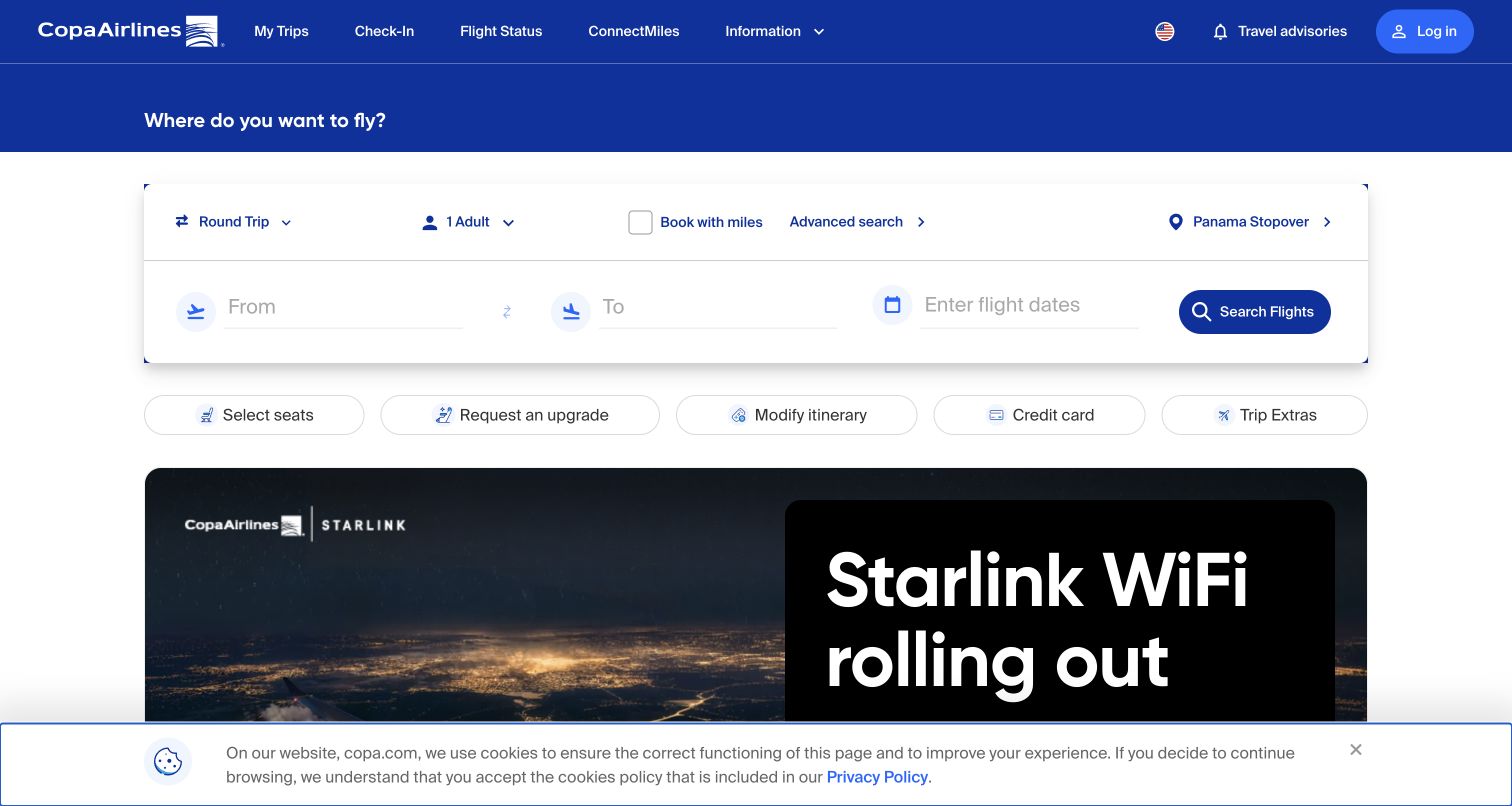
Copa’s English homepage gives the flight-planning area a clear place inside an established blue identity. The surrounding navigation separates the passenger’s practical tasks from promotional content, while the large connectivity campaign supplies an immediately recognizable travel context. The useful lesson is the hierarchy: the airline does not ask the visitor to understand its publishing system before finding a familiar action. Directus’s 2023 case describes the CMS selected for Copa.com in 2022; the original address now redirects here. That documentary association covers the public website, not a fresh verification of the booking engine or internal airline systems.
What you can learn
Define which information an editor can change and which travel rules belong to another service. A campaign image and destination description should not make the essential reservation choices harder to recognize.
Pros
The blue header and distinct task area establish a coherent entrance for returning travelers.
Campaign content has a large visual stage without becoming the only route through the website.
Cons & considerations
The first-visit privacy notice occupies part of the captured lower viewport.
Dense travel navigation still asks unfamiliar passengers to distinguish several closely related service tasks.
Visible tech stack
Earlier / documented evidence
Directus
Platform source: Historical Directus project documentation. The November 2023 vendor case documents Directus as the CMS selected in 2022 for Copa.com and its four-language public website. The requested Copa.com homepage now redirects to the captured CopaAir English property. This is a historical website association, not a fresh inspection of the current CMS or the airline’s booking, internal or inflight systems. Platform evidence is separate from the direct website screenshot and is not a complete current infrastructure audit.
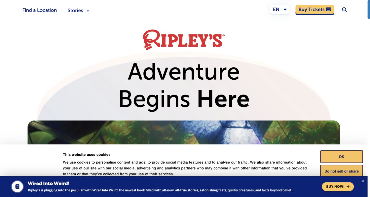
Ripley’s uses a surprisingly restrained entrance for a brand associated with spectacle. A red wordmark, oversized black headline and generous white space let the adventurous message arrive before the imagery becomes busier below. Location discovery and the yellow ticket action provide practical routes around that personality. The vendor’s July 2024 case specifically describes unifying attraction content under ripleys.com with Directus. It does not independently establish the present ticket checkout or every attraction’s systems. The captured first visit also shows two competing layers near the bottom: a privacy notice and a bright promotional panel.
What you can learn
Treat destination records as reusable content with consistent names, images and links. The shared brand can remain expressive while each location still answers the basic questions visitors bring to a visit-planning session.
Pros
A short headline and strong contrast make the opening proposition easy to scan.
Location navigation and the ticket action translate an abstract entertainment promise into recognizable next steps.
Cons & considerations
The promotional panel and privacy layer reduce the amount of unobstructed content in the first view.
Visitors still need deeper pages to compare the practical details of individual attractions.
Platform source: Scoped Directus project documentation. The July 2024 vendor case explicitly documents consolidation of public attraction content at ripleys.com using Directus. This supports the named website project. Future commerce plans in that case do not establish the technology of present ticketing, payments or every Ripley property. Platform evidence is separate from the direct website screenshot and is not a complete current infrastructure audit.
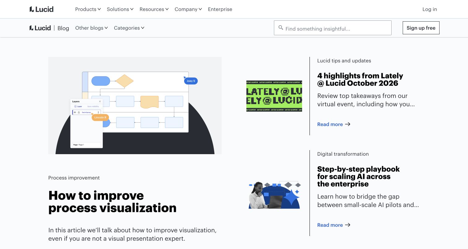
The Lucid Blog presents an editorial surface with its own useful rhythm inside the wider corporate navigation. One large feature sits beside two smaller stories, so image size and placement communicate priority before a reader opens an article. Search and topic paths support visitors who already know what they need. The result is a useful reference for separating a publication from a product landing page without losing the parent identity. Directus’s September 2023 case documents the corporate blog’s migration from Drupal. This review stays on that blog property and does not assign the same CMS to Lucid’s collaboration application.
What you can learn
Model featured placement separately from the article itself. Editors should be able to change the opening reading sequence while keeping article titles, categories and permanent destinations consistent throughout the archive.
Pros
The unequal story sizes create an intelligible editorial order without a long introductory explanation.
Search and topic navigation provide alternatives to browsing the currently featured selection.
Cons & considerations
The corporate and publication navigation together create a substantial amount of chrome above the stories.
A featured grid gives little immediate space for comparing publication dates or article depth.
Platform source: Historical Directus project documentation. The September 2023 vendor case documents migration of Lucid Software’s corporate blog from Drupal to Directus. The captured public corporate blog is the scope. It does not establish Directus on the main product website, visual-collaboration application or account services, and is not a fresh CMS inspection. Platform evidence is separate from the direct website screenshot and is not a complete current infrastructure audit.
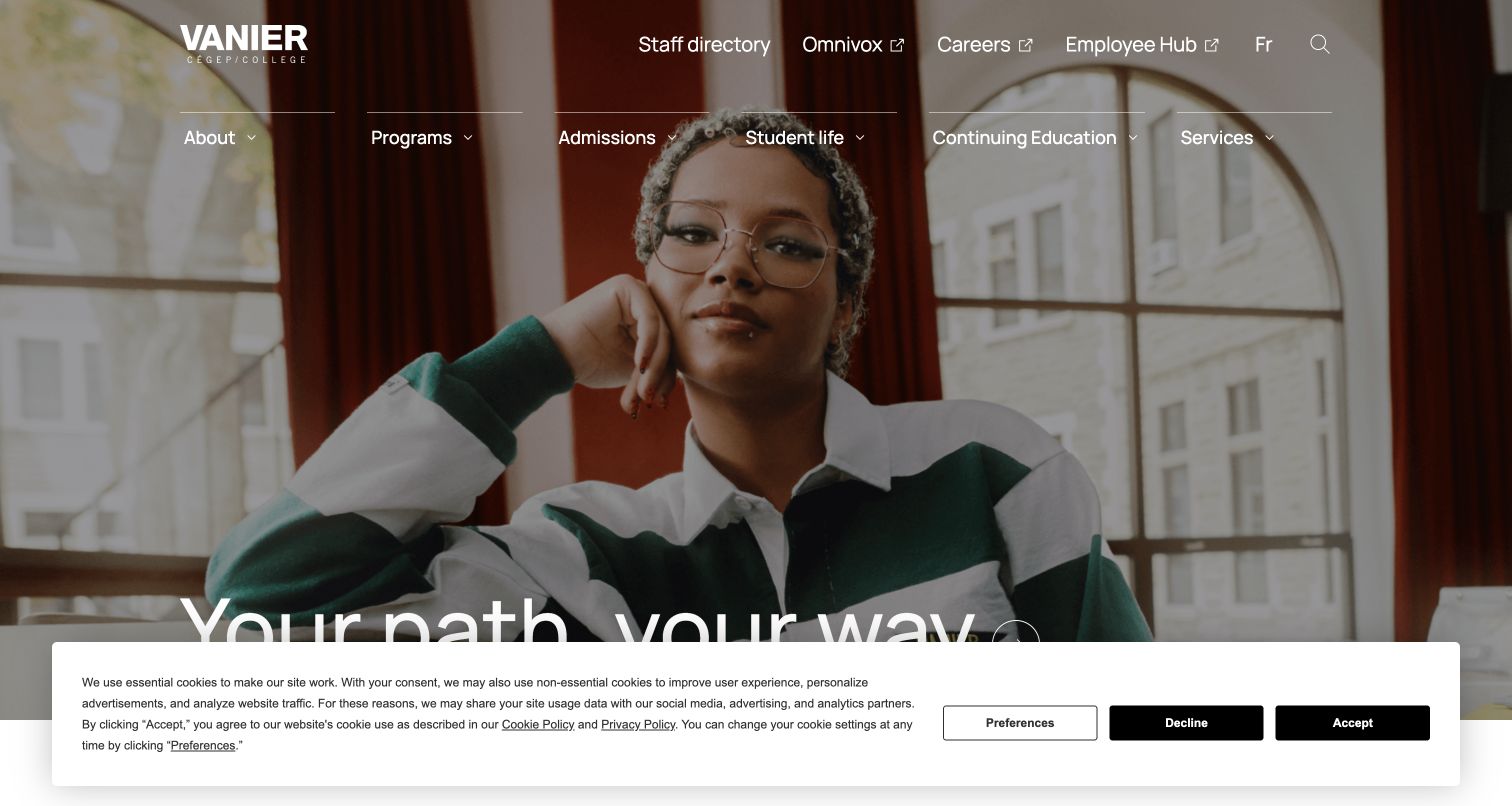
Vanier College’s entrance pairs a full-width student photograph with an emphatic personal invitation. The program and admission routes remain visible across the top, connecting the emotional photograph to concrete institutional choices. This combination matters for a college audience: prospective students need encouragement, but they also need names they can use to find a course or understand an application. Directus’s project showcase identifies the college website and its migration from WordPress. That is documentary evidence for this public implementation, not access to the student systems or confirmation of the present hidden CMS configuration.
What you can learn
Keep programs, admission requirements, events and news as distinct content responsibilities. A shared homepage can feature each of them without asking an editor to rewrite essential institutional information for every campaign.
Pros
The student image and direct headline give a large institution a human entrance.
Explicit program and admission navigation offers practical routes alongside the aspirational message.
Cons & considerations
Text over a detailed photograph relies on the chosen image and treatment remaining readable.
The retained privacy panel covers the bottom of the initial capture and competes with lower-page discovery.
Platform source: Scoped Directus project documentation. Directus’s project showcase explicitly links Vanier College’s public website and describes its WordPress-to-Directus content migration. This is documentary evidence for that website implementation, not proof of the current hidden CMS or the college’s student systems. Platform evidence is separate from the direct website screenshot and is not a complete current infrastructure audit.
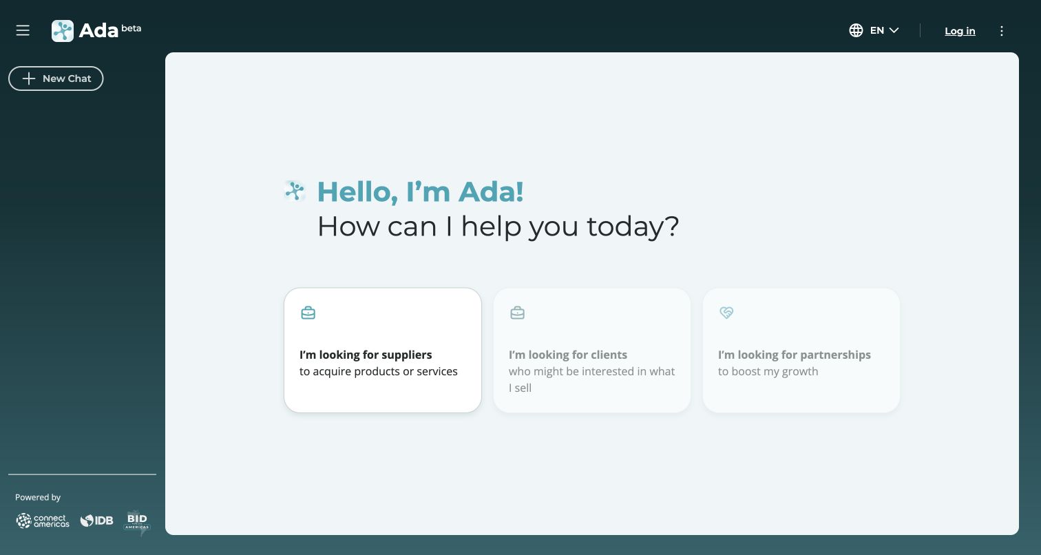
ADA’s public welcome screen uses a dark side rail and a spacious white workspace to separate orientation from action. The greeting is followed by three large task cards, making the intended relationship-finding jobs more concrete than an open-ended promise about artificial intelligence. The supplier path is more visually active than the other options in the captured state. ConnectAmericas and IDB-related marks establish the institutional context. The vendor showcase names this exact application as a Directus project; the review covers only its public welcome screen. No conversation, search, login or private business data was entered.
What you can learn
A content platform behind an application still needs an understandable first screen. Give each available workflow a plain name and make unavailable or secondary choices visibly different before the visitor invests effort.
Pros
The side rail and main workspace establish a recognizable application structure without a crowded dashboard.
Large task cards explain distinct intentions before a visitor has to formulate a detailed request.
Cons & considerations
The faded choices need clear supporting explanation so their availability is not left to visual interpretation.
The public entrance alone cannot demonstrate the quality, coverage or reliability of the resulting recommendations.
Platform source: Scoped Directus project documentation. The vendor showcase identifies Directus as backend and content management for the exact ADA ConnectAmericas app. Only its public welcome screen was inspected and captured; no chat, login or private data was used. The association does not extend to all ConnectAmericas or Inter-American Development Bank websites. Platform evidence is separate from the direct website screenshot and is not a complete current infrastructure audit.
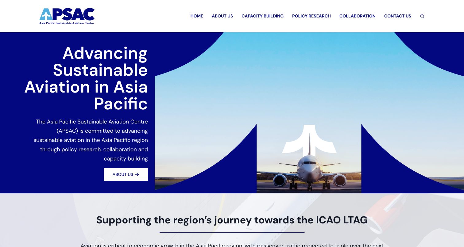
The Asia Pacific Sustainable Aviation Centre uses a deep navy field and a large cropped letterform to make an aircraft photograph part of its identity. The treatment feels specific to aviation without turning the entire first screen into a conventional plane photograph. Above it, the navigation names policy research, capacity building and collaboration, giving visitors useful distinctions between the organization’s activities. Directus’s showcase describes Websparks’ implementation for this exact public website. The association is documentary; neither the visual composition nor a frontend library independently proves the current backend, research quality or environmental impact.
What you can learn
Start the content model with the organization’s actual workstreams. A distinctive brand device works best when it frames useful records and relationships instead of replacing the labels visitors need to navigate a specialist subject.
Pros
The aircraft image inside the graphic shape gives the mission an identifiable visual language.
Named workstreams provide more useful orientation than a navigation menu built only from broad corporate labels.
Cons & considerations
The large graphic leaves detailed evidence and recent work below the first view.
Specialist terminology may still need short explanations for visitors outside the aviation-policy community.
Visible tech stack
Earlier / documented evidence
Directus
Platform source: Scoped Directus project documentation. The vendor showcase describes Websparks’ Directus implementation for the exact AP-SAC public website. This is scoped documentary project evidence. The screenshot and bounded source audit do not independently reveal the complete current backend. Platform evidence is separate from the direct website screenshot and is not a complete current infrastructure audit.
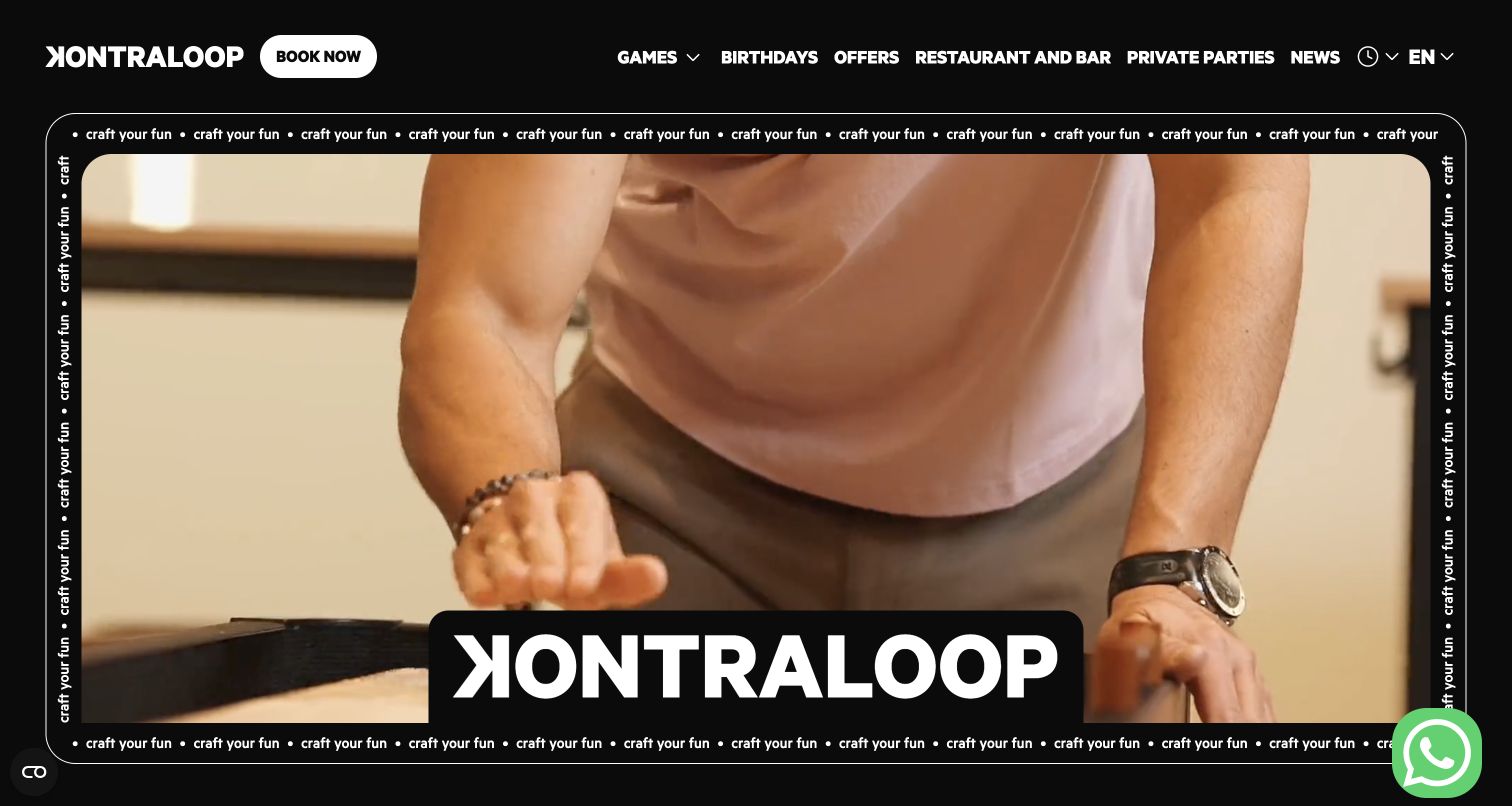
Kontraloop’s English entrance makes the venue itself the main visual material. A dark, full-width scene supports white navigation and an oversized wordmark near the bottom, while repeated border text reinforces the playful tone. A visible booking link gives the expressive composition a practical destination. The language switch was reviewed in English after declining optional consent; the final capture preserves the actual settled page. The vendor case describes a Nuxt website with Directus-managed content and a separate Bookedit reservation integration. That supports the marketing project, without making the booking service part of this inspection.
What you can learn
Keep the stable venue facts separate from changing events and promotional art direction. An editor should be able to announce a new activity while the visitor can still reliably locate the booking and language choices.
Pros
The real venue imagery communicates atmosphere without requiring a long opening paragraph.
A persistent booking route gives the large visual treatment a clear practical purpose.
Cons & considerations
Moving background content can make small white navigation more dependent on contrast treatment.
The oversized branding and decorative border leave limited room for concrete visit details in the first screen.
Platform source: Scoped Directus project documentation. The vendor showcase identifies Lloyds’ Kontraloop website as Nuxt 3 with Directus content management, and describes a separate Bookedit reservation integration. The captured English public marketing page is the review scope; no reservation was made and no claim extends to the booking provider’s architecture. Platform evidence is separate from the direct website screenshot and is not a complete current infrastructure audit.
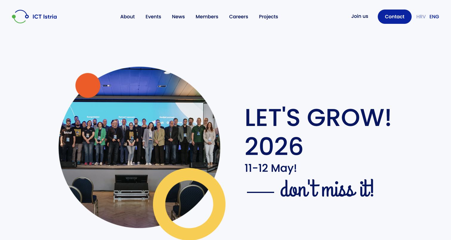
ICT Istria’s English homepage uses blue circular forms to connect its identity with a prominent event photograph. A light background and compact navigation keep the overall composition open, even though the event title and date demand attention. This is a useful association pattern: the current promotional record receives a distinct visual place while the organization’s deeper routes remain available. The capture was made in November and still displayed a May event promotion, so it is a design observation rather than an assertion of an upcoming event. The vendor showcase documents Lloyds’ Directus and Nuxt project for the association.
What you can learn
Give event records explicit dates and an editorial rule for what happens after the event. A reusable hero should help a small team promote timely material without leaving the homepage’s meaning dependent on an old announcement.
Pros
The circle motif gives the photograph and typography a recognizable shared structure.
The event title, image and date are grouped into one easy-to-find promotional area.
Cons & considerations
A past event occupying the hero can make the site’s current priorities harder to infer.
The large announcement pushes a general explanation of membership and ongoing activities further down the page.
Platform source: Scoped Directus project documentation. The vendor showcase documents Lloyds’ ICT Istria association website with Directus content management and a Nuxt/Vue frontend. This supports the named public website project, not a fresh inspection of its hidden CMS. The captured English page retains its actual visible event promotion. Platform evidence is separate from the direct website screenshot and is not a complete current infrastructure audit.
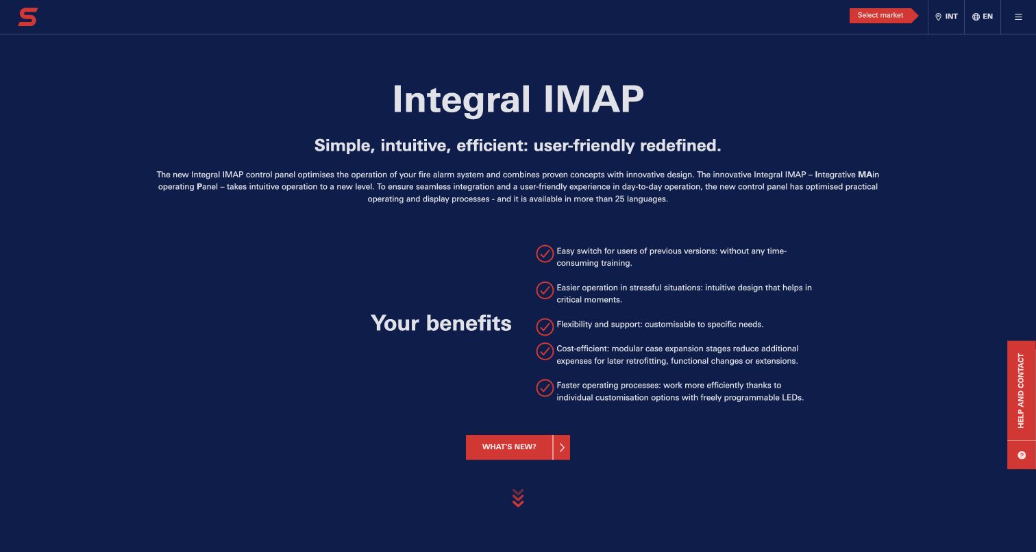
Integral IMAP’s public landing page reduces a technical product introduction to a controlled set of elements: a dark blue background, a strong product name, a short explanatory passage and a checklist of benefits. Red accents identify the brand and selected actions without turning the screen into a dense control panel. A narrow help tab sits at the side, while the main page remains a public explanation. The vendor showcase documents mutor’s multilingual Directus implementation for this microsite. It does not demonstrate the operation, safety or security of the alarm-management application described by the page.
What you can learn
Use structured content to keep the product explanation consistent across languages, but maintain a firm boundary between marketing claims and operational interfaces. Editors can update benefits and release news without being given control over critical application behavior.
Pros
A limited checklist makes the initial technical proposition less intimidating to scan.
The restrained color system distinguishes the product introduction from its supporting help route.
Cons & considerations
Broad benefit statements need detailed supporting material before a buyer can evaluate applicability.
The dark, centered presentation offers fewer immediate comparison points than a visible feature or compatibility table.
Visible tech stack
Earlier / documented evidence
Directus
Platform source: Scoped Directus project documentation. The vendor showcase documents mutor’s multilingual Integral IMAP landing page using Directus for dynamic content and reusable blocks. The captured public explainer is the supported property. The operational alarm-management application and private access-request processing were not exercised or verified. Platform evidence is separate from the direct website screenshot and is not a complete current infrastructure audit.
M&P IP Protectors combines a dark blue and gold palette with shield-like geometry, professional photography and a more expressive headline treatment. The first impression is deliberately branded, while the longer page contains service and expertise material that can answer more specific questions. The small menu and conversation route keep the top edge relatively uncluttered. Directus’s showcase documents Linearloop’s redesign using Directus and Next.js. This is evidence of the public website project, not verification of legal outcomes, professional rankings or the systems used to handle confidential client work.
What you can learn
Separate the firm’s visual personality from the factual service records editors must maintain. Practice areas, explanatory articles and team information need clear relationships and consistent labels even when the homepage adopts a distinctive art direction.
Pros
A consistent navy-and-gold identity helps the specialist practice avoid a generic corporate appearance.
The extended service and expertise content gives visitors paths beyond the opening brand statement.
Cons & considerations
A compact menu makes the full information structure less visible at the entrance.
Decorative lettering and geometry require restraint so important service information remains easy to read.
Platform source: Scoped Directus project documentation. The vendor showcase documents Linearloop’s M&P IP Protectors website redesign with Directus and Next.js. This is documentary evidence for the public law-firm site, not a claim about private legal systems, professional outcomes or the current hidden CMS configuration. Platform evidence is separate from the direct website screenshot and is not a complete current infrastructure audit.
Abaxx Exchange opens with an aerial port image, a dark overlay and an ochre headline that connects its market proposition to tangible goods. The page then introduces contract and market information in a more structured form. The contrast between the atmospheric opening and denser material below is worth studying: one provides context, while the other supports an informed comparison. The vendor showcase links this exact property and describes a Directus migration with Next.js. The association applies to the public information site, not trade execution, private accounts, regulatory suitability or the exchange’s operational security.
What you can learn
Give each product or contract a consistent information structure before designing promotional modules around it. A CMS can organize explanatory records, while authoritative prices and operational market data need explicitly assigned sources and update responsibilities.
Pros
The port image provides a concrete setting for a specialized market proposition.
The shift toward structured contract information creates a route from broad positioning to specific detail.
Cons & considerations
The hero assumes some familiarity with the terminology of the products being introduced.
The retained privacy panel covers part of the lower-left content in the first captured view.
Platform source: Scoped Directus project documentation. The vendor showcase explicitly links abaxx.exchange and describes WeframeTech’s migration to Directus with Next.js. Scope is the public exchange information website, not trading infrastructure, market execution, account services or a security endorsement. Platform evidence is separate from the direct website screenshot and is not a complete current infrastructure audit.
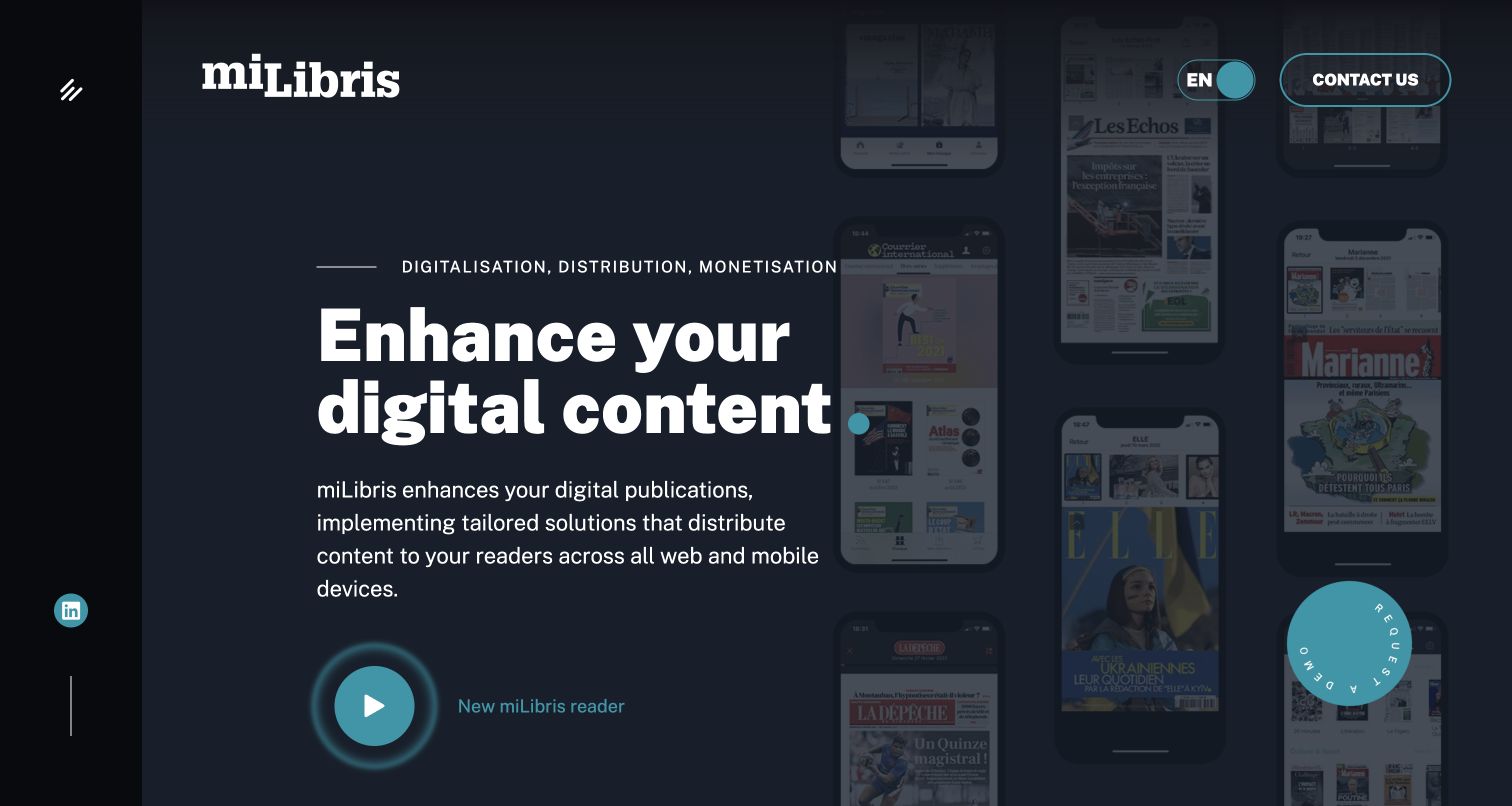
miLibris uses a dark blue and cyan palette, a large content-focused headline and a group of publication screens to explain its subject visually. The devices and covers suggest the output visitors are evaluating, while demo actions offer a route toward a fuller product explanation. A narrow side rail keeps the navigation compact and gives the composition a distinctive frame. The vendor showcase describes WebVision360’s Directus and Next.js implementation for the public miLibris website. That scope does not establish the technology behind every publication reader, subscriber account or other Cafeyn-group product.
What you can learn
Model the marketing material around the customer’s recognizable outputs: publication formats, use cases and examples. Keep demonstrations and commercial requests separate from the records explaining what the product does and which audience each capability serves.
Pros
Publication imagery makes an abstract digital-content proposition more concrete at the entrance.
The limited color palette and side rail create a coherent visual frame for the product story.
Cons & considerations
Several demo-oriented actions can compete before a visitor understands their different destinations.
The compact navigation hides some information choices that a comparison-minded buyer may want immediately.
Platform source: Scoped Directus project documentation. The vendor showcase describes WebVision360’s miLibris public website using Directus with Next.js. The captured English marketing property is the scope; the case does not independently establish the technology of all publisher readers, subscriptions or Cafeyn products. Platform evidence is separate from the direct website screenshot and is not a complete current infrastructure audit.
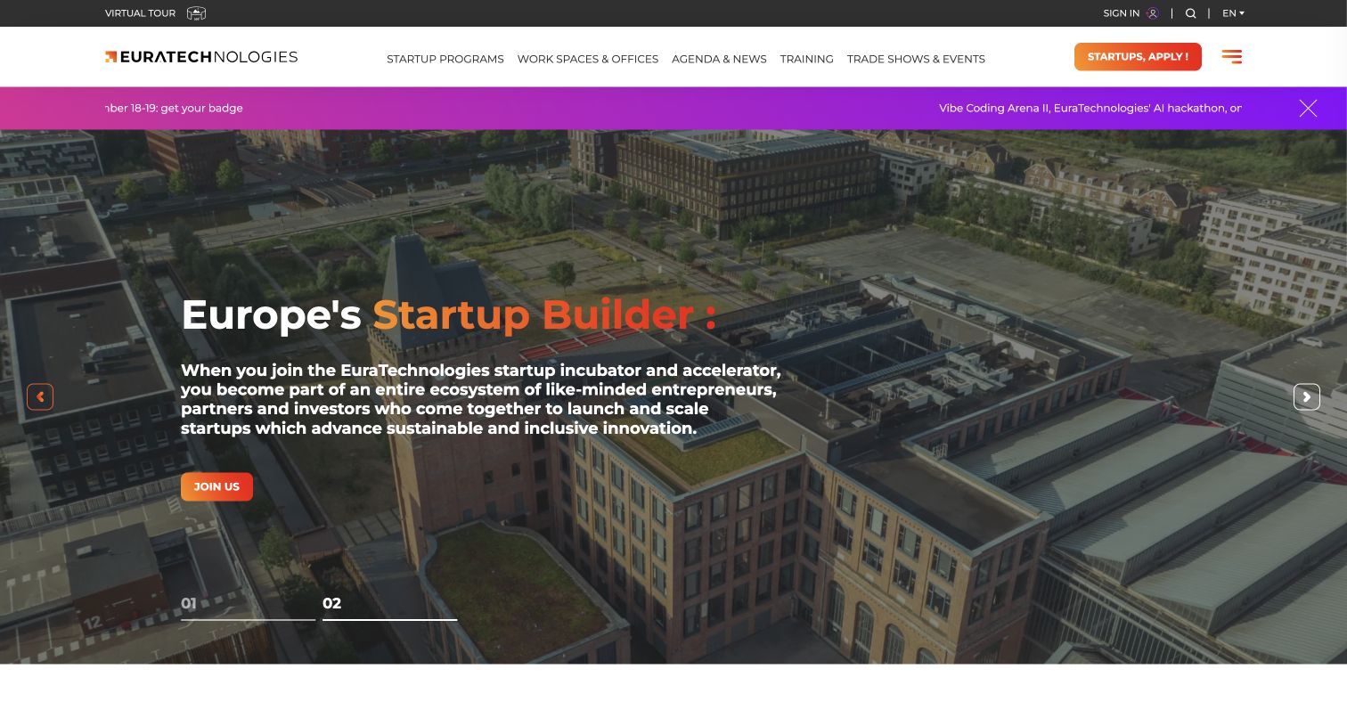
EuraTechnologies sets a large aerial campus photograph behind its opening proposition, using orange emphasis to connect the headline with the main action. The navigation distinguishes startup support, workspaces and events, so the ecosystem is presented as several understandable destinations rather than one broad institutional promise. A promotional strip adds another current message above the image. The vendor showcase and implementing agency identify Directus for the public website; the captured English page is the reviewed property. That evidence does not extend to the technology of resident startups, private program applications or every associated service.
What you can learn
Model programs, spaces and events as related but separate records. A shared institution can give them one visual identity while preserving the different practical questions that a founder, tenant or event visitor needs answered.
Pros
The campus image gives a physical reference point to a broad support ecosystem.
Distinct navigation routes help different audiences bypass material that is less relevant to their immediate task.
Cons & considerations
A promotional strip and a large hero compete for the opening message hierarchy.
The broad invitation still needs more specific eligibility and location detail on subsequent pages.
Platform source: Scoped Directus project documentation. The vendor showcase and implementing agency’s EuraTechnologies project case identify Directus for the organization’s public website. This is documentary project evidence for the captured English property, not a claim about tenant businesses, private startup programs or every associated service. Platform evidence is separate from the direct website screenshot and is not a complete current infrastructure audit.
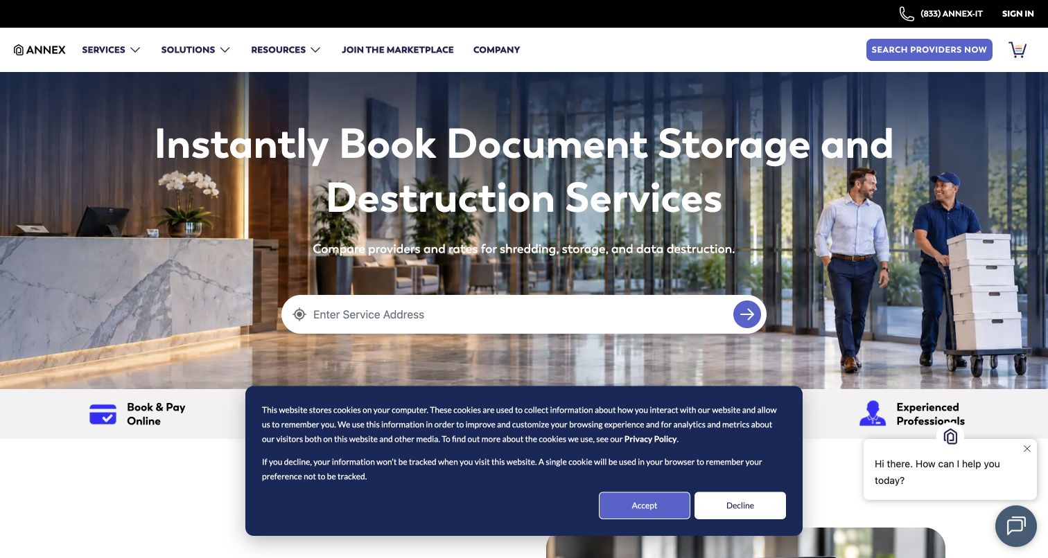
Annex’s public entrance makes document storage and destruction the central subject, then places a service-address search within a spacious hero. The background photograph gives the service a physical context, while the top navigation and purple provider-search action establish the next step. This is a useful marketplace pattern because the interface exposes the information needed to narrow a large supply network. No address, geolocation or order was submitted during the review. The vendor showcase documents Echobind’s Directus project for Annex; that association does not independently verify provider inventory, private customer records or the present transaction systems.
What you can learn
Define the relationship between service types, provider areas and editorial explanations before designing the search surface. The homepage should make the first useful input understandable without implying that marketing content is the authoritative source of operational availability.
Pros
The address field makes the local nature of the marketplace immediately apparent.
The photograph and plain service language make an administrative task feel concrete.
Cons & considerations
The first-visit cookie panel and chat prompt consume space near the primary task area.
Visitors must take another step before they can compare actual providers, prices or coverage.
Platform source: Scoped Directus project documentation. The vendor showcase documents Echobind’s Annex project using Directus as CMS with Next.js and GraphQL. The captured public storage-and-destruction marketplace entrance is the scope. No location, order, account or private inventory was submitted or inspected. Platform evidence is separate from the direct website screenshot and is not a complete current infrastructure audit.
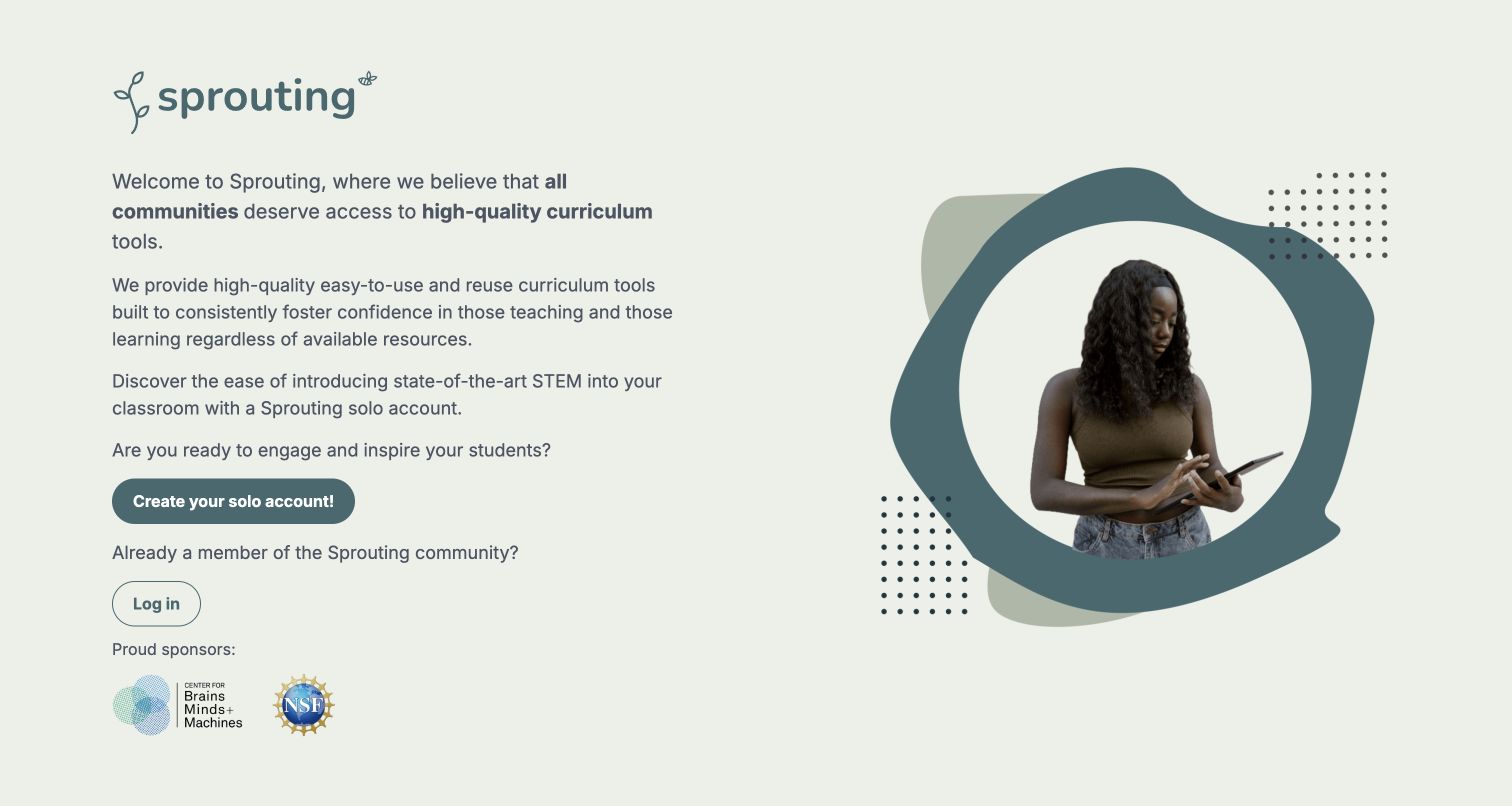
Sprouting’s public landing page uses a soft cream-and-teal palette, a teacher illustration and a substantial explanatory passage to introduce its curriculum platform. Account creation and login are separate actions, helping a returning user distinguish their path from the initial introduction. Institutional and funding marks appear as context rather than replacing the explanation. The vendor showcase identifies Sprouting and links this exact Directus/React platform property. Only the public entrance was inspected: the review does not describe authenticated curriculum, assess teaching outcomes or attribute the same technology to the wider MIT website estate.
What you can learn
A protected learning product still needs useful public content. Explain who the material serves, what kind of work it supports and how access begins before asking visitors to identify themselves or create an account.
Pros
The friendly illustration and restrained colors give the educational subject an approachable entrance.
Separate login and account-creation actions recognize the difference between new and returning visitors.
Cons & considerations
The long opening explanation requires more reading than a concise task-oriented summary.
The public page alone offers limited visibility into the structure and depth of the protected learning material.
Platform source: Scoped Directus project documentation. The vendor showcase identifies Sprouting (MIT) and links this exact platform property as a Directus/React project. Only the public curriculum-platform welcome page was reviewed. No authenticated curriculum was accessed, and the claim does not extend to all MIT websites. Platform evidence is separate from the direct website screenshot and is not a complete current infrastructure audit.
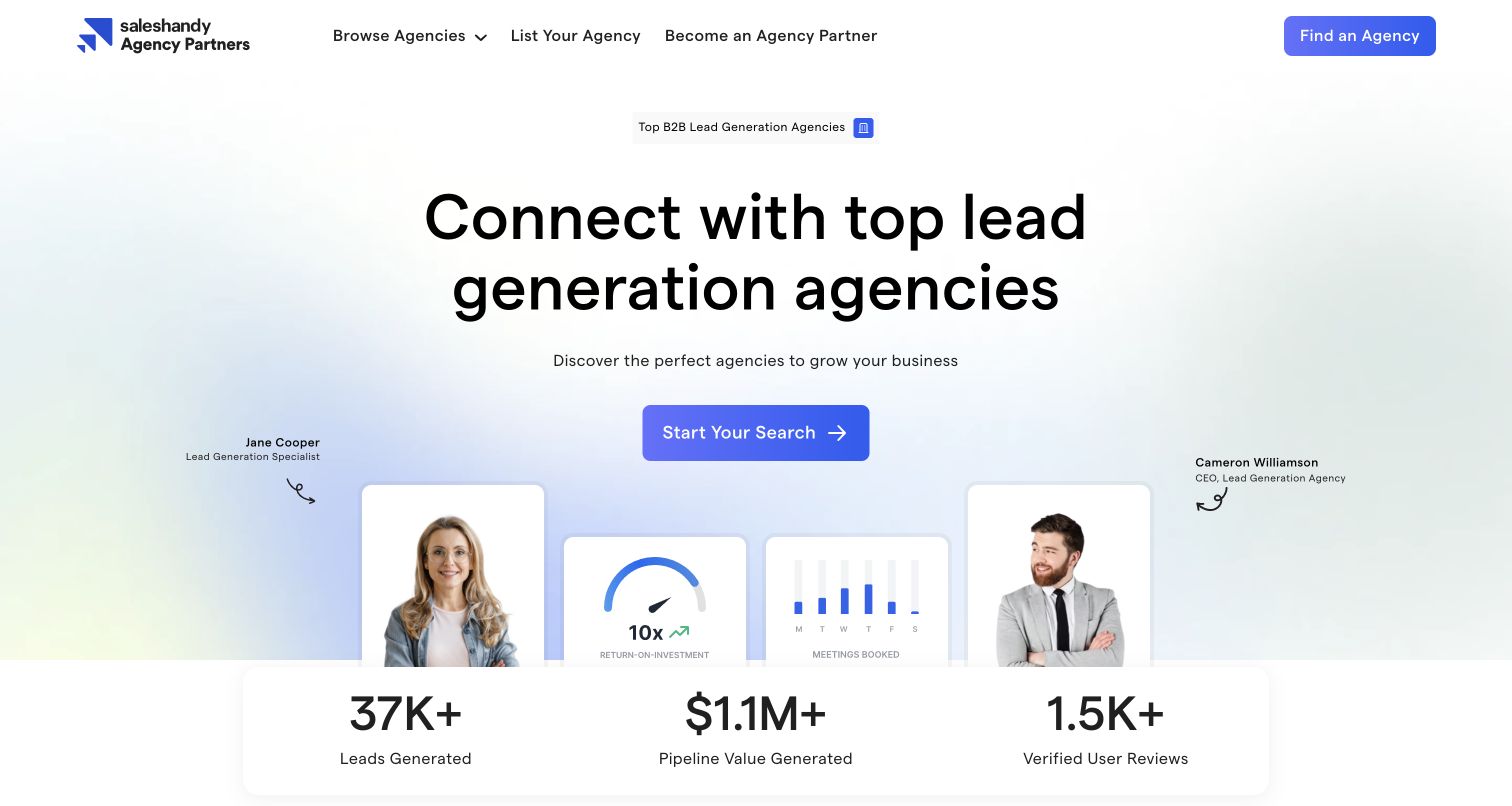
Saleshandy Agency Partners uses a large centered headline and a bright blue search action to make the directory’s purpose unmistakable. Illustrative profile cards and performance-themed graphics provide a marketplace impression, while the wider page groups agencies by service, country, pricing and specialty. Those category distinctions are more useful to copy than the promotional numbers, which were not independently measured here. The vendor showcase explicitly identifies this agency-directory route as a Directus and Astro project. The scope does not extend to Saleshandy’s email product, the listed agencies or their claimed commercial results.
What you can learn
Give directory entries a consistent set of comparison fields before adding decorative proof points. Search and category routes should lead to records with understandable scope, rather than asking visitors to infer suitability from a polished profile card.
Pros
The main headline and search action describe one clear visitor intention.
Several category dimensions acknowledge that buyers compare agencies using more than a single service label.
Cons & considerations
Promotional metrics occupy substantial opening space without explaining their measurement context.
Illustrative profile treatments can look like specific recommendations unless their editorial role is made clear.
Platform source: Scoped Directus project documentation. The vendor showcase identifies the exact Saleshandy agency directory as a Directus and Astro project. This documentary association is scoped to /agencies, not the main Saleshandy product, email-sending systems or the listed agencies. No search or outreach was submitted. Platform evidence is separate from the direct website screenshot and is not a complete current infrastructure audit.
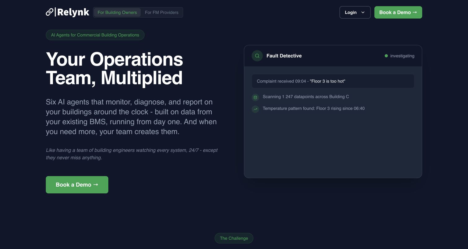
Relynk’s current homepage pairs a dark navy and green identity with a large operations-focused headline. A product-style fault-detection card gives the abstract idea of connected building data a more concrete scenario, while audience tabs distinguish building owners from facilities-management teams. The result is a useful design reference for explaining a technical platform through a job rather than a technology list. The Directus showcase documents an earlier Relynk marketing implementation with Next.js. This is a historical association: the present captured design and current audit observations must remain separate from any claim about the hidden CMS.
What you can learn
Model use cases around the person responsible for the problem and the decision they need to make. Keep the public explanation distinct from claims about the reliability or intelligence of an application that the review has not exercised.
Pros
The operational example gives visitors a concrete way to interpret the platform’s broad promise.
Audience tabs recognize that different decision-makers bring different questions to the same product.
Cons & considerations
A product-style demonstration can suggest more certainty than a static marketing example establishes.
Broad efficiency language still needs specific implementation and integration information on deeper pages.
Platform source: Historical Directus project documentation. Historical association: the vendor showcase documents a Relynk marketing-site implementation with Directus and Next.js. The current captured homepage may have changed since that project. Preserve current audit findings separately; this case does not prove the present CMS or the technology behind the product’s building-data and AI functions. The current broad audit observes React, Tailwind CSS and a Supabase client, which do not independently identify the current CMS. Platform evidence is separate from the direct website screenshot and is not a complete current infrastructure audit.
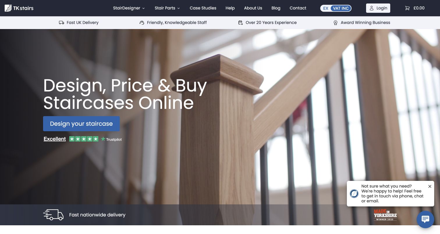
TKstairs places a real staircase photograph behind a concise design-and-purchase proposition. A bright blue design action makes the next task conspicuous, while the top navigation distinguishes the staircase designer from component shopping and supporting information. The photograph explains the product at a glance, which is useful when the detailed decision will happen in a more technical interface. The vendor showcase identifies TKstairs and describes Directus-managed content blocks and product data. That documentary evidence does not verify the present configurator, payment process or product specifications, and no design, quote or checkout was submitted.
What you can learn
Keep the inspirational entrance connected to precise product records. Dimensions, materials and options need clear ownership, while the configurator should have a defined responsibility separate from the editorial copy and photography surrounding it.
Pros
The product photograph makes the category immediately recognizable without an extended explanation.
A strong design action gives the visitor a practical route beyond browsing finished examples.
Cons & considerations
The hero offers limited immediate detail about the constraints of a custom staircase order.
A chat prompt and supporting trust message add competing elements around the primary task.
Visible tech stack
Earlier / documented evidence
Directus
Platform source: Scoped Directus project documentation. The vendor showcase identifies TKstairs and describes Rolley’s Directus-managed content blocks and product data, with a Nuxt/Vue frontend. This is documentary evidence for the public staircase store. The configurator, checkout, payments and present hidden backend were not independently exercised or established. Platform evidence is separate from the direct website screenshot and is not a complete current infrastructure audit.
The Shift Network’s opening composition uses a montage of presenters and atmospheric imagery around a large transformational headline. Navigation separates courses, faculty, retreats and events, giving a broad catalog several recognizable entry points. The page then moves toward public course cards, where a visitor can begin comparing specific material. Directus’s August 2023 case documents the main website’s migration from Drupal. The current audit observes Drupal, so that historical project evidence does not establish a verified current Directus backend. The review concerns presentation, without endorsing spiritual, health or educational claims.
What you can learn
Give presenters, courses and events separate records with explicit relationships. A campaign can then feature familiar people without duplicating the factual information a visitor needs to compare dates, formats and the scope of a particular offering.
Pros
Presenter imagery makes a large catalog feel connected to identifiable people.
Separate faculty, course and event routes provide useful alternatives to the main campaign.
Cons & considerations
The opening promise is broader than the concrete course information visible below it.
The layered montage and retained privacy notice make the initial screen visually busy.
Platform source: Historical Directus project documentation. The August 2023 vendor case documents migration of The Shift Network’s main website from Drupal to Directus. This historical association remains distinct from the current public design and any present audit signals. No private course area was accessed; inclusion is not an endorsement of health, spiritual or educational claims. The current broad audit observes Drupal; preserve that present signal alongside the historical Directus project rather than claiming a current Directus CMS. Platform evidence is separate from the direct website screenshot and is not a complete current infrastructure audit.
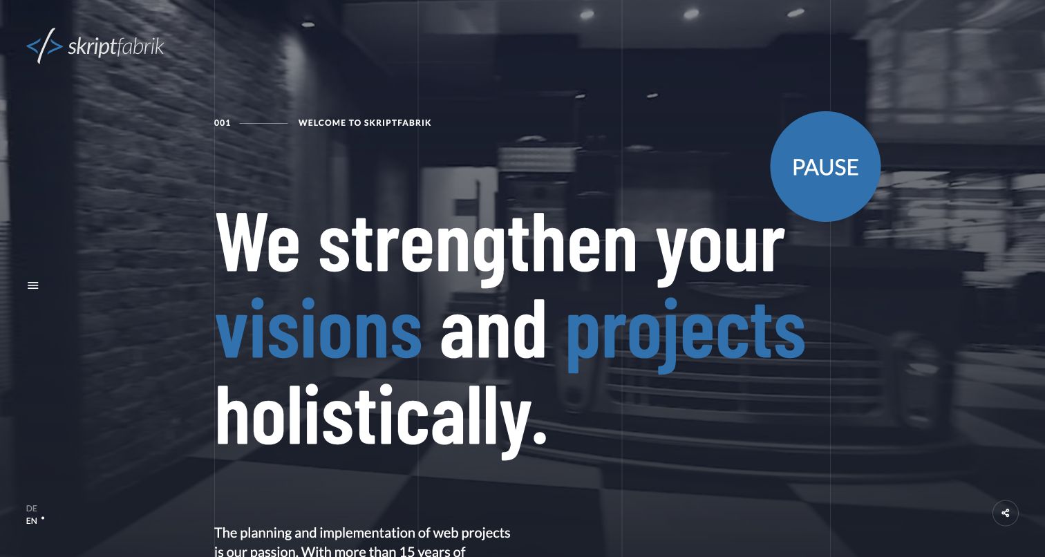
skriptfabrik’s English homepage uses a numbered section marker, a large typographic statement and a dark moving background to establish a deliberately authored experience. Blue emphasis picks out key words, while a visible pause control acknowledges that the background has motion. A narrow left rail holds the menu and language choices, leaving most of the width for the studio’s message. Directus’s showcase explicitly describes the studio’s own website as a Directus and Astro project. This is stronger property identification than merely observing that a studio sells Directus services, but remains documentary project evidence rather than a current backend inspection.
What you can learn
Make the reusable content structure serve the portfolio’s reading sequence. Distinct sections for services, projects and people can support a strong narrative while keeping the editor’s job understandable when the site gains new work.
Pros
Numbered sections and typographic emphasis give the portfolio a recognizable editorial rhythm.
The visible pause control gives the moving background an understandable user-facing control.
Cons & considerations
The oversized opening statement delays access to concrete project evidence and service details.
A minimal side-menu icon makes the full navigation less obvious than persistent descriptive links.
Platform source: Scoped Directus project documentation. The vendor showcase explicitly describes skriptfabrik’s own public website using Directus and Astro. This is documentary evidence for the studio website, not a deduction from its general Directus services or a claim about every client project. Platform evidence is separate from the direct website screenshot and is not a complete current infrastructure audit.
Kegan has 15+ years of experience working with small businesses, Fortune 500 companies, and everything in between. No development job is too big or too small: he brings the same hands-on attention to a focused improvement, a complete website, or a custom application.
For Directus projects, he can help with responsive interfaces, reusable components, custom functionality, API connections, and performance-minded implementation. He works directly with clients on scope, design, implementation, testing, and handover, with an emphasis on clear communication and a system that remains practical to maintain after launch.
Show 3 other Directus developersHide other Directus developers
Choose the publishing job before the Directus layout
An editorial or institutional website
For a college, association or specialist organization, start with the records that change repeatedly and the facts that should remain consistent. Programs, people, news and events often need relationships, but they should not all become interchangeable page blocks. Define who owns each record and how it appears in navigation, search and related content. Let the homepage feature selected material without becoming a second place where essential facts must be manually maintained.
A directory or product-information system
Directories work when entries can be compared using meaningful fields. Decide which categories are useful, which fields are required and what an incomplete record looks like. Product or provider information may depend on another source for stock, pricing or service coverage. Assign that responsibility explicitly. Use the CMS for the information it should own and document how the website handles an unavailable integration without presenting stale operational details as authoritative.
A public entrance to an application
An application’s welcome page still needs editorial clarity. Explain the job, available options and access boundary before asking for an account or private information. ADA and Sprouting are useful references for this public threshold, but their captures reveal nothing about protected workflows. Plan public content, user data and application actions as separate concerns. The shared visual identity should help people navigate between them without obscuring the difference.
From references to requirements
Plan the editing model, access boundaries and handover
Demonstrate a realistic content change
Choose an ordinary editorial task with a long title, optional image and related record. Have the intended editor create it, correct it and explain when it becomes public. Directus content versioning can be enabled for specific collections to work on versions separately from published material. The frontend and permissions still need to request and expose the intended state. Record the workflow in the handover so a draft is not confused with a public update.
Translate the information model as carefully as the words. Directus supports collection content translations and provides setup for the required relationships. The project still needs decisions about untranslated material, regional differences, image text and who approves each language. A visible language switch should take a visitor to an appropriate equivalent page, rather than implying that every record has complete coverage. Use actual translated examples when checking the editor’s workflow.
Connect editorial previews without exposing private content
Directus live preview uses a configured frontend destination and requires deliberate embedding rules. If the team needs it, arrange the preview route, content version and access boundaries together. A preview feature is an editorial convenience, not proof that public permissions are correct. Keep privileged credentials out of browser assets and make public files an explicitly limited set. Hand over ownership of the CMS, frontend, database, media and integrations, including what to do when an update fails.
Ask the actual team to carry out its routine job: publish a realistic update, correct a mistake, preview a narrow screen, and identify who owns an integration failure. For a library or frontend framework, also ask who maintains the content source and deployment. A polished screenshot does not answer those operational questions.
Beyond the screenshot
Directus website planning checklist
Identify the exact public property supported by every technology reference.
Keep historical project evidence separate from current source observations.
Name the collections, fields and relationships in the team’s editorial vocabulary.
Assign one source of truth for repeated facts and operational information.
Define the fields and related records required by each important frontend view.
Make missing images, empty categories and unsuccessful requests understandable.
Distinguish drafts, published material and private records in both permissions and frontend requests.
Scope public access to intended records and fields; keep privileged credentials out of browser code.
Separate public media from private files and exports.
Assign translation ownership and a clear rule for unavailable language versions.
Check realistic long content, keyboard use and narrow-screen reading during product development.
Document operational ownership, recovery and public verification after release.
Test with real content, a keyboard, a small screen, slow or failed requests, and the people who will maintain the system. These are planning checks, not an accessibility, security, performance, or search-ranking certification.
Sources & editorial method
How this Directus collection was reviewed
Twenty distinct public properties were opened and captured directly on November 10, 2026, for the original November 9 evening batch. Each original capture was inspected individually, with its actual pixel dimensions, timestamp, source and attribution retained. The first five organizations have explicit source-backed selection notes. Official vendor cases and project showcases identify the Directus association at property level; they are documentary evidence, not fresh access to hidden CMS installations. The current Shift Network audit observes Drupal, and its earlier Directus case is explicitly historical. Relynk’s older implementation is also qualified against current public observations. One bounded broad audit per new source recorded fifteen checked, one partial, three unavailable and one robots-excluded result. Access restrictions were not retried or bypassed. Startup Open House was excluded after DNS resolution failed and replaced by the independently documented skriptfabrik website. English language controls and nonbinding cookie choices were used where appropriate; first-visit notices remain visible in several final captures. No account, conversation, search submission, reservation, order, email, form or vote was created. Design comments do not verify conversion results, professional quality, financial suitability, health outcomes or accessibility conformance.
Every image is an unmodified capture from the actual website, with its source and capture date. Some captures are reused from our shared catalog; their dates remain the original capture dates. None comes from a vendor gallery or a generated reconstruction. Moving imagery and live content can change.
Technology attribution uses public page assets or metadata, official platform documentation, or a cited first-party project case study. Documentary and framework-relationship evidence is identified where used; it is not a complete current backend inventory. A CMS image CDN alone does not establish a full CMS deployment. A library’s presence does not prove which individual controls use it, and a platform label does not establish AI authorship.
The composition notes, lessons, pros and tradeoffs are original editorial observations. We have not measured conversion, traffic, security, performance or accessibility conformance. Website owners retain their brands and imagery; these examples are not our client portfolio. Written, Edited and Curated are independent records, not dates advanced by a build. See our editorial standards or suggest a correction.
Questions worth asking
Directus website development FAQs
Does every pictured property currently use Directus?
The collection establishes documented Directus projects for specific public properties. Some cases are historical and do not independently verify the present hidden CMS. The Shift Network is an explicit example: its vendor case describes a Directus migration, while the current bounded source audit observes Drupal. Both facts are retained.
Does Directus prescribe a website’s visual design?
No. The examples show different frontends and editorial approaches around structured content. A useful project starts with the audience’s task and the records editors maintain. The choice of layout, typography, navigation and interaction remains a separate design responsibility.
What should be decided before modeling collections?
Name the records the team actually maintains, the fields that describe them and the relationships needed by public pages. Distinguish repeated facts from presentation choices, decide what is required and document the meaning of an incomplete record. Directus provides the modeling tools; the team supplies the editorial rules.
Can an editor work on content before publishing it?
Directus supports content versioning for configured collections. The team must still provide the appropriate permissions and make sure the frontend requests the intended version. Explain the difference between saving editorial work and changing the public website in the handover.
How should public access be planned?
Start from the records and fields the public website needs. Directus public permissions are disabled by default, and enabling broad collection access can expose more than the intended published content. Scope access deliberately and keep private files, credentials and system collections outside the public interface.
Why do some broad audits remain unavailable?
The audit respects robots rules, access checks, rate limits and bounded retrieval. In this collection, Copa returned 401, AP-SAC returned 429, TKstairs required an access check and Integral IMAP was robots-excluded. ADA’s result was partial because its robots policy was unavailable. These outcomes add no invented current CMS conclusion.
Borrow the clarity of the information model and the visitor’s next step. Choose Directus where its documented tools suit the team’s responsibilities, then make the public interface, editorial workflow and supporting systems understandable enough to maintain.