Best Strapi Websites of 2026 (20 Real-World Examples)
Twenty real public properties with scoped Strapi project evidence, original design reviews and direct screenshots, including explicitly historical associations.
A useful Strapi website starts with content that people can understand and maintain. The CMS can support a product catalog, an editorial archive or a campaign system, but the frontend still needs clear navigation, readable information and sensible next steps. These examples show different public presentations while keeping the underlying technology claims tied to specific sources and properties.
The main design decision is how information should be structured before it reaches the screen. A property listing, a destination guide and a studio project may each need titles, images and related records, yet the meaning of those fields is different. A good brief names those differences. It also explains who edits the material, how changes become public and which functions belong to another service, such as booking, payments or customer accounts.
The opening properties are Airbus Space Solutions, Turn 10 Studios, Indeed Career Guide, Orange Flex Blog and Yatra Hotels. Their sources cover specific public projects or sections rather than entire corporate technology estates. Later references include storefronts, specialist catalogs, events and portfolios. Some associations come from vendor interviews; others are community-submitted projects in Strapi’s maintained showcase. Intuz is explicitly historical: the current public audit observes WordPress. The screenshots document the public designs at capture time, not a promise that every pictured site currently uses Strapi.
Before the examples
What makes good Strapi website development in 2026?
Name the content before choosing its layout
Write down the records editors actually manage: an article, a product family, a location, a project or a campaign. Strapi’s Content-type Builder distinguishes repeatable collection types, single types and reusable components. Use that vocabulary to support the real editorial job rather than creating fields around one attractive screenshot. Keep relationships understandable and avoid a generic page builder so unconstrained that every update becomes a new design decision.
Give the frontend an explicit information contract
Decide which fields each screen needs and what should happen when they are absent. Strapi’s REST documentation explains that content types are private by default and that relations, media, components and dynamic zones need explicit population. Treat the API response as a designed interface between the CMS and the website. Keep loading, missing-image and unavailable-content states intelligible, rather than assuming every record will arrive complete.
Separate editorial flexibility from essential behavior
Editors should be able to change a headline, photograph or campaign without accidentally changing the rules of a booking or checkout. Define where content ends and application behavior begins. In the references, public marketing pages sometimes link to separate account, rental or shopping systems. Preserve those boundaries in the brief and in the interface. A shared CMS does not mean every operational system should share the same permissions or release process.
The collection · 20 examples
20 Strapi website examples worth studying
The twenty reviews use direct screenshots of the exact public properties. Vendor interviews and maintained community showcase entries establish scoped project associations. Fourteen bounded source audits completed successfully; six remained unavailable and add no new runtime claims. Historical evidence, current frontend observations and screenshot dates are kept distinct, including the present WordPress signals on the historically documented Intuz project.
We start with five recognizable brands or organizations: Airbus Space Solutions, Turn 10 Studios (Xbox Game Studios), Indeed Career Guide, Orange Flex Blog, Yatra Hotels. Each attribution applies to the named website property, not every product or website belonging to its organization. This is a curated reading sequence, not a measured ranking.
Airbus Space Solutions places two substantial subject areas inside one restrained opening composition. A dark blue navigation bar establishes the organizational identity, while the hero separates geospatial intelligence from secure connectivity with a short explanation and a destination for each. Orbital imagery supplies context without requiring the visitor to understand an unfamiliar product diagram. The highlights beginning below the hero suggest a second layer for people who need news or supporting material. Strapi’s case study concerns the Space Digital web ecosystem; the implementation agency and Airbus’s own description connect this public property to that scope. It does not establish the technology of every Airbus website.
What you can learn
Model the visitor’s main choices before designing reusable content blocks. A shared publishing system can support distinct service stories, but the interface still needs plain labels and a clear destination for each audience.
Pros
Two visible service paths reduce ambiguity before the deeper navigation becomes necessary.
Restrained color and contextual imagery give the technical material a coherent entrance.
Cons & considerations
The large atmospheric hero leaves detailed product comparisons below the first screen.
Several specialist navigation terms still require prior familiarity with the subject.
Platform source: Scoped Strapi project documentation. Strapi’s Airbus case study documents the Space Digital web ecosystem. Implementing agency Adeliom names Strapi, and the public about page identifies this Space Digital property. Documentary project association, not a claim about all Airbus websites or a fresh CMS inspection. Platform evidence is separate from the direct website screenshot and is not a complete current infrastructure audit.
Turn 10 Studios makes the number ten the organizing device of its homepage. Oversized yellow geometry, a monochrome portrait and widely spaced lettering create a recognizable studio statement before the visitor reads a long introduction. The small menu keeps the canvas clear, while a yellow careers button and the Forza identity provide two concrete points of orientation. Further page content introduces people, disciplines and the studio’s history. The vendor interview with 1minus1 explicitly describes the Turn 10 website’s Strapi content model. That documented studio project is the relevant association here, rather than a claim about the technology behind Xbox or the games themselves.
What you can learn
Give a highly expressive page a practical route that survives the art direction. Structured stories about teams and projects are more useful when editors can update them without redesigning the entire opening composition.
Pros
A distinctive numeric motif makes the studio identity memorable without lengthy explanatory copy.
The careers action provides a useful next step alongside the visual brand statement.
Cons & considerations
A collapsed menu conceals the breadth of information until the visitor opens it.
The oversized graphic prioritizes atmosphere over a quick overview of individual projects.
Platform source: Scoped Strapi project documentation. Strapi’s interview with 1minus1 explicitly links the Turn 10 Studios website and describes Strapi-managed content. This documents the studio web project, not the technology behind Xbox generally or the Forza games. Current CMS configuration was not independently established. Platform evidence is separate from the direct website screenshot and is not a complete current infrastructure audit.
Indeed Career Guide distinguishes its editorial purpose through a blue secondary navigation strip and a clear heading. The familiar Indeed header remains above it, so readers can understand the relationship between advice and the wider employment service. A row of illustrated editor picks turns the first screen into readable choices instead of an undifferentiated article feed. Topic navigation and search offer alternative routes for visitors arriving with a specific question. Strapi’s maintained community showcase names this exact Career Guide property. That is documentary project evidence; the current bounded source request returned an access restriction and does not verify the present CMS.
What you can learn
Design an editorial section as a recognizable destination within the parent service. Give it topic labels, search and a selective introduction, while keeping the parent navigation sufficiently distinct that the two jobs do not compete.
Pros
The separate blue navigation makes the advice section’s identity and scope immediately visible.
A compact set of illustrated picks creates an approachable beginning to a large archive.
Cons & considerations
Two navigation layers consume space before readers reach the articles themselves.
The opening editorial selection cannot represent every specialized career question equally well.
Visible tech stack
Earlier / documented evidence
Strapi
Platform source: Scoped Strapi project documentation. Strapi’s maintained, community-submitted showcase names the exact Indeed Career Guide property. This is a documented project association, not fresh proof of the current CMS. The broad source request returned HTTP 403; no access controls were bypassed. Contentful media delivery is not treated as CMS proof. Platform evidence is separate from the direct website screenshot and is not a complete current infrastructure audit.
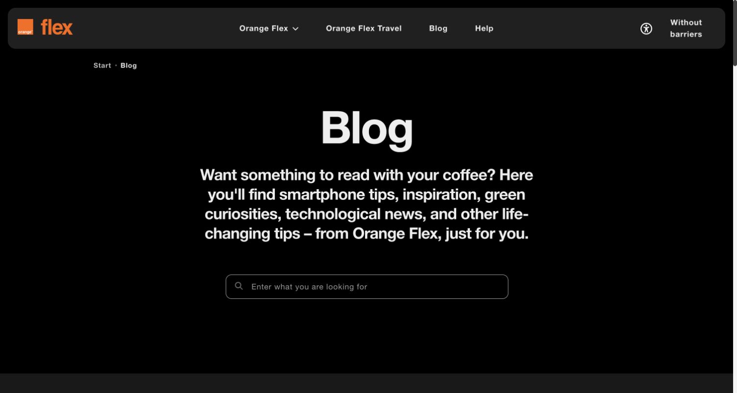
Orange Flex gives its blog a simple entrance: a dark field, a large Blog heading, a short description and one wide search control. The orange brand mark supplies an unmistakable accent. Further down, repeated sections divide travel, technology, lifestyle, student and business material, allowing the same editorial structure to serve different interests. The saved view shows the browser’s automatic English translation of the Polish source; no language setting was changed for this review. Strapi’s community showcase identifies the Orange Flex blog specifically. The association does not establish the technology used by Orange’s other services or account systems.
What you can learn
Make the relationship between a content promise and its search tool obvious. A reusable category model works best when each group has a plain purpose, a consistent article pattern and a clear route to more material.
Pros
The restrained opening gives search a clear role rather than surrounding it with promotions.
Repeated topic sections provide a scalable structure for several kinds of practical advice.
Cons & considerations
The large introductory area pushes the actual article choices beneath the opening viewport.
A dark, mostly textual first screen gives little indication of the archive’s visual variety.
Platform source: Scoped Strapi project documentation. Strapi’s maintained community showcase names the Orange Flex blog and credits Orange PL. This documents the specific blog project, not all Orange websites, products or account services. The current frontend sample does not independently establish its hidden CMS. Platform evidence is separate from the direct website screenshot and is not a complete current infrastructure audit.
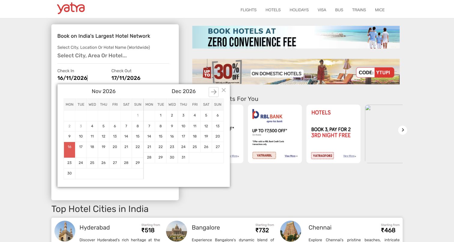
Yatra’s India hotels page puts the booking task on the left and promotional material on the right, then introduces city cards beneath both. The cards combine a destination name, a small image and a brief description, making the page a starting point for travelers who have not yet chosen a city. The captured opening automatically displayed a date picker; no search or booking was submitted. Strapi’s vendor case study specifically describes hotel content and city landing pages. That scope supports this hotel property, while leaving flights, payments and other Yatra systems outside the claim. The bounded audit timed out without adding stack conclusions.
What you can learn
Keep destination information separate from booking state even when both appear on one page. Model city descriptions and campaign content for editors, while the booking interface retains explicit ownership of availability, dates and transaction behavior.
Pros
The first screen connects a concrete search task with recognizable destination choices.
Repeated city cards provide a useful content structure for a large geographic directory.
Cons & considerations
The automatically open calendar obscures part of the surrounding content in this capture.
Multiple promotional panels compete with the hierarchy of the main hotel search.
Visible tech stack
Earlier / documented evidence
Strapi
Platform source: Scoped Strapi project documentation. Strapi’s Yatra case study describes hotel booking content and city landing pages. This review is scoped to the public India hotels page; other travel verticals, payments and account systems are not covered. The current bounded source audit timed out without a new stack conclusion. Platform evidence is separate from the direct website screenshot and is not a complete current infrastructure audit.
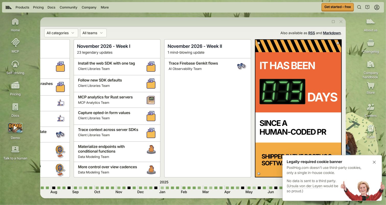
PostHog’s changelog turns a routine product archive into a desktop-like workspace. A central window contains weekly columns, compact release rows and small illustrated icons, while the surrounding background carries shortcuts to other parts of the company site. Category and team controls provide practical structure inside that expressive frame. RSS and Markdown links make the information available beyond the visual interface. Strapi’s vendor interview explicitly discusses the changelog among several community features. The current capture demonstrates its public presentation, but the bounded source sample exceeded its size limit and does not establish a fresh backend inventory. The two forms of evidence remain separate.
What you can learn
Let a strong visual metaphor sit on top of an understandable content model. Dates, teams, categories and stable release links should remain useful even when visitors prefer a feed or a simpler reading format.
Pros
Weekly columns and compact rows make repeated updates feel organized rather than repetitive.
RSS and Markdown offer practical alternatives to the deliberately unconventional visual interface.
Cons & considerations
Desktop-style shortcuts and decorative elements can distract from a reader’s immediate information need.
The wide column arrangement asks more of the viewport than a conventional vertical archive.
Visible tech stack
Earlier / documented evidence
Strapi
Platform source: Scoped Strapi project documentation. Strapi’s PostHog interview explicitly describes the changelog among its community features. This is documentary project evidence for the changelog, not a statement that every present PostHog page uses Strapi. The current source response exceeded the bounded audit size limit. Platform evidence is separate from the direct website screenshot and is not a complete current infrastructure audit.
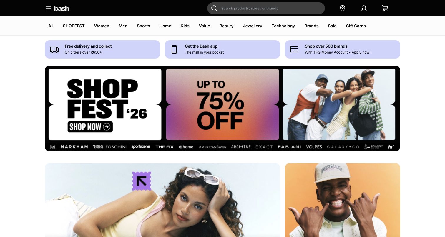
BASH uses a black header and a long, plain category row to anchor a visually busy storefront. Search remains prominent above a set of service messages and a large campaign banner, while fashion imagery introduces the next layer of shopping choices. The banner’s typography and color create a temporary promotional identity without replacing the store’s permanent navigation. Further sections organize stores, brands and categories into repeatable groups. Strapi’s case study identifies content delivery to bash.com through a backend-for-frontend. That supports the editorial storefront association, but it does not establish the platform responsible for inventory, payment processing or customer accounts.
What you can learn
Separate the content a campaign team changes from the controls shoppers rely on every visit. A headless content model can provide promotional flexibility while the storefront preserves stable categories, search and clear service information.
Pros
Search and department links remain visible above the large promotional composition.
Repeatable store and brand sections give a broad assortment several understandable entry points.
Cons & considerations
The dense department row requires careful reading when a visitor’s category is uncertain.
Large campaign artwork can dominate the first screen before individual products become visible.
Platform source: Scoped Strapi project documentation. Strapi’s BASH case study identifies bash.com and describes editorial content delivered through a backend-for-frontend. The supported scope is storefront content; it does not establish commerce inventory, payments or customer-account architecture. Platform evidence is separate from the direct website screenshot and is not a complete current infrastructure audit.
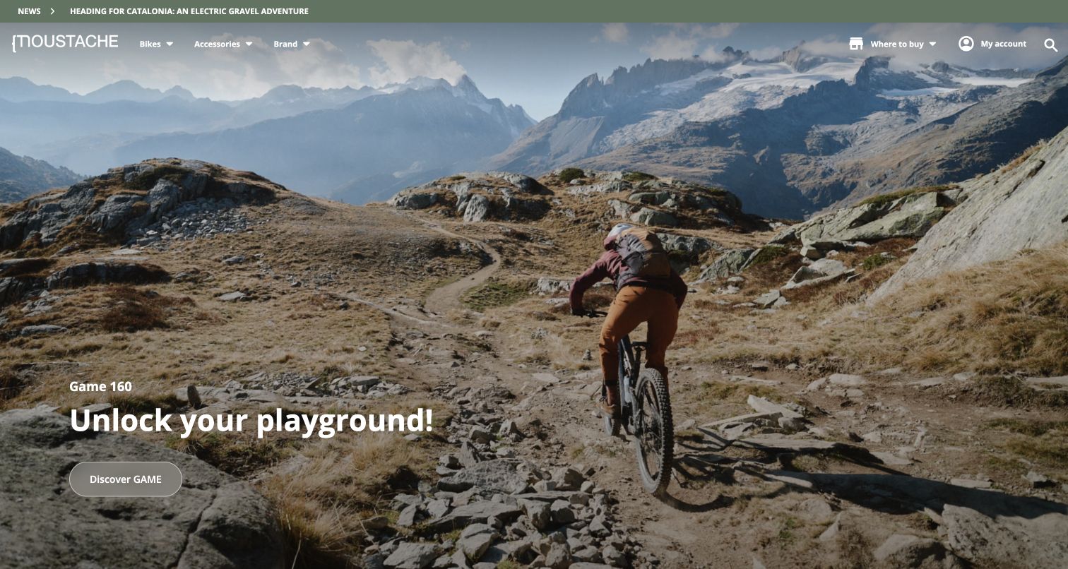
Moustache Bikes uses a mountain landscape and an actual riding scene to frame its featured bicycle range. The opening headline is short, and a single discovery action sits beneath it, allowing the photograph to explain the intended setting. Navigation separates bikes, accessories and brand information, with dealer and account destinations kept to the right. Further content introduces different riding categories and editorial stories. Strapi’s case study documents the company’s migration for public consumer and business publishing; this review covers only the consumer property. Optional cookies and a newsletter prompt were dismissed before the final direct capture, without submitting any information.
What you can learn
Give a featured product one clear story, then connect it to a consistent category system. Content models should let editors change a campaign while preserving the paths people use to compare ranges, find support and locate a dealer.
Pros
The riding photograph explains the product’s intended environment before detailed specifications appear.
A restrained headline and single discovery action keep the campaign composition easy to scan.
Cons & considerations
Text over a changing landscape needs careful contrast treatment across every selected image.
The atmospheric opening postpones practical comparison details until the visitor moves deeper.
Visible tech stack
Earlier / documented evidence
Strapi
Platform source: Scoped Strapi project documentation. Strapi’s Moustache Bikes case study documents its publishing migration. The captured public B2C website is the relevant property; private B2B operations were not accessed. The current bounded source retrieval was unavailable, so no fresh CMS observation is claimed. Platform evidence is separate from the direct website screenshot and is not a complete current infrastructure audit.
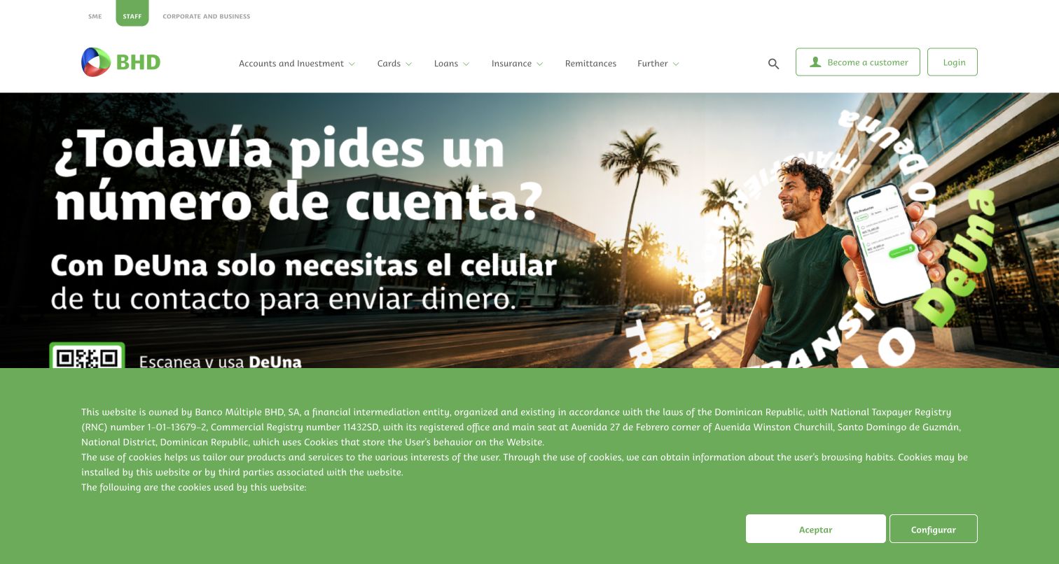
Banco BHD’s public homepage places audience choices above a second row of product categories, giving the bank several ways to direct a visitor before the promotional hero begins. The green identity, outlined account actions and large campaign artwork create a clear distinction between persistent navigation and changing messages. Below the opening, product recommendations and news supply repeatable editorial units. The screenshot retains the site’s cookie notice, and the browser translated some interface text while the campaign artwork remained Spanish. Strapi’s case study concerns this public website. It does not verify the technology or security of authenticated banking, which was not entered during research.
What you can learn
Keep the public publishing system’s responsibilities explicit. Product explanations, campaign images and news may share editorial tools, while authentication and financial transactions require their own clearly separated interfaces, permissions and operational ownership.
Pros
Audience and product navigation offer different routes through a broad information architecture.
Consistent green accents connect practical account destinations with the larger promotional presentation.
Cons & considerations
Two navigation levels and a large privacy notice reduce the opening content area.
Promotional artwork can convey essential wording that is separate from translated interface text.
Platform source: Scoped Strapi project documentation. Strapi’s Banco BHD case study documents the public customer-facing website. This capture is the public personal-banking marketing page, not authenticated internet banking. Documentary CMS association does not verify transactional systems or security. Platform evidence is separate from the direct website screenshot and is not a complete current infrastructure audit.
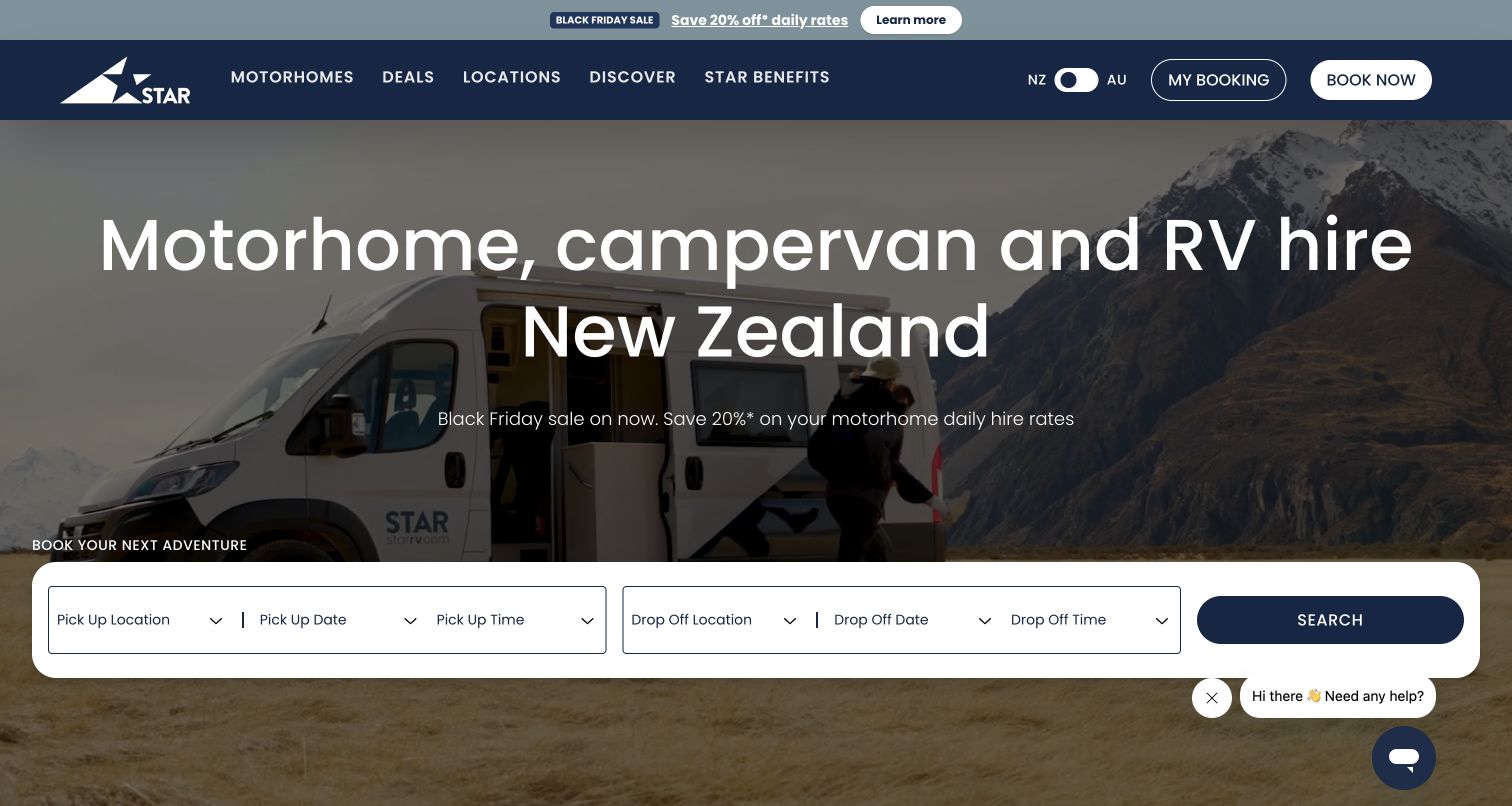
Star RV’s New Zealand page balances a scenic motorhome film with a plainly labeled booking bar. The headline identifies both the vehicle category and the country, while the permanent navigation separates motorhomes, locations, deals and travel inspiration. An explicit New Zealand/Australia switch helps explain the geographic scope before visitors begin comparing options. Further sections bring together benefits, fleet details and branch information, each suited to a reusable editorial structure. The Strapi community showcase names this exact New Zealand property and its implementing studio. That documented association concerns the public travel website; the external booking system was not entered or assessed.
What you can learn
Treat a travel homepage as the meeting point of inspiration and practical constraints. Keep locations, vehicle details and editorial offers consistent across pages, while making the handoff to a separate booking service understandable.
Pros
The country-specific heading and geographic switch reduce uncertainty about the page’s market.
The reservation bar presents the main trip inputs together without hiding them behind navigation.
Cons & considerations
A large background film carries visual weight before detailed vehicle differences become visible.
Promotional messaging and a chat prompt add competing elements around the main planning task.
Platform source: Scoped Strapi project documentation. Strapi’s maintained community showcase lists the exact Star RV New Zealand public website and implementing studio. The entry is documentary project evidence; the separately linked booking service is outside this review and no current hidden CMS is inferred. Platform evidence is separate from the direct website screenshot and is not a complete current infrastructure audit.
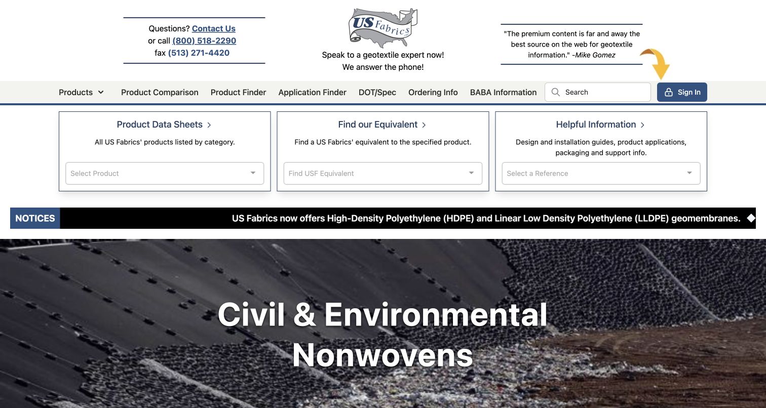
US Fabrics begins with the tools a technically informed visitor might need: product data sheets, an equivalent-product lookup and reference information. These three panels sit directly below the navigation, ahead of the rotating product imagery. Contact details are unusually prominent, while the wider menu includes specifications, ordering information and product comparisons. The result is dense but purposeful, emphasizing the work of finding usable information rather than a general brand slogan. The Strapi showcase explicitly describes content management for this website. Its broader account and application claims were not independently exercised; this review concerns the public page and the observed source sample.
What you can learn
Organize a technical catalog around the questions customers actually bring. Content types for specifications, product relationships and reference documents need consistent labels and maintenance responsibilities before the team designs a more decorative marketing layer.
Pros
Three prominent tool panels make common information tasks visible immediately on arrival.
Contact information and specialist navigation support visitors who already understand the product category.
Cons & considerations
The crowded header leaves little space for a newcomer’s introductory explanation of the offering.
Moving notices and rotating imagery introduce competing reading rhythms below the practical tools.
Platform source: Scoped Strapi project documentation. Strapi’s community showcase explicitly attributes website content management to Strapi for US Fabrics. This review covers the captured public page. Private user tools and mobile applications described in the listing were not exercised. Platform evidence is separate from the direct website screenshot and is not a complete current infrastructure audit.
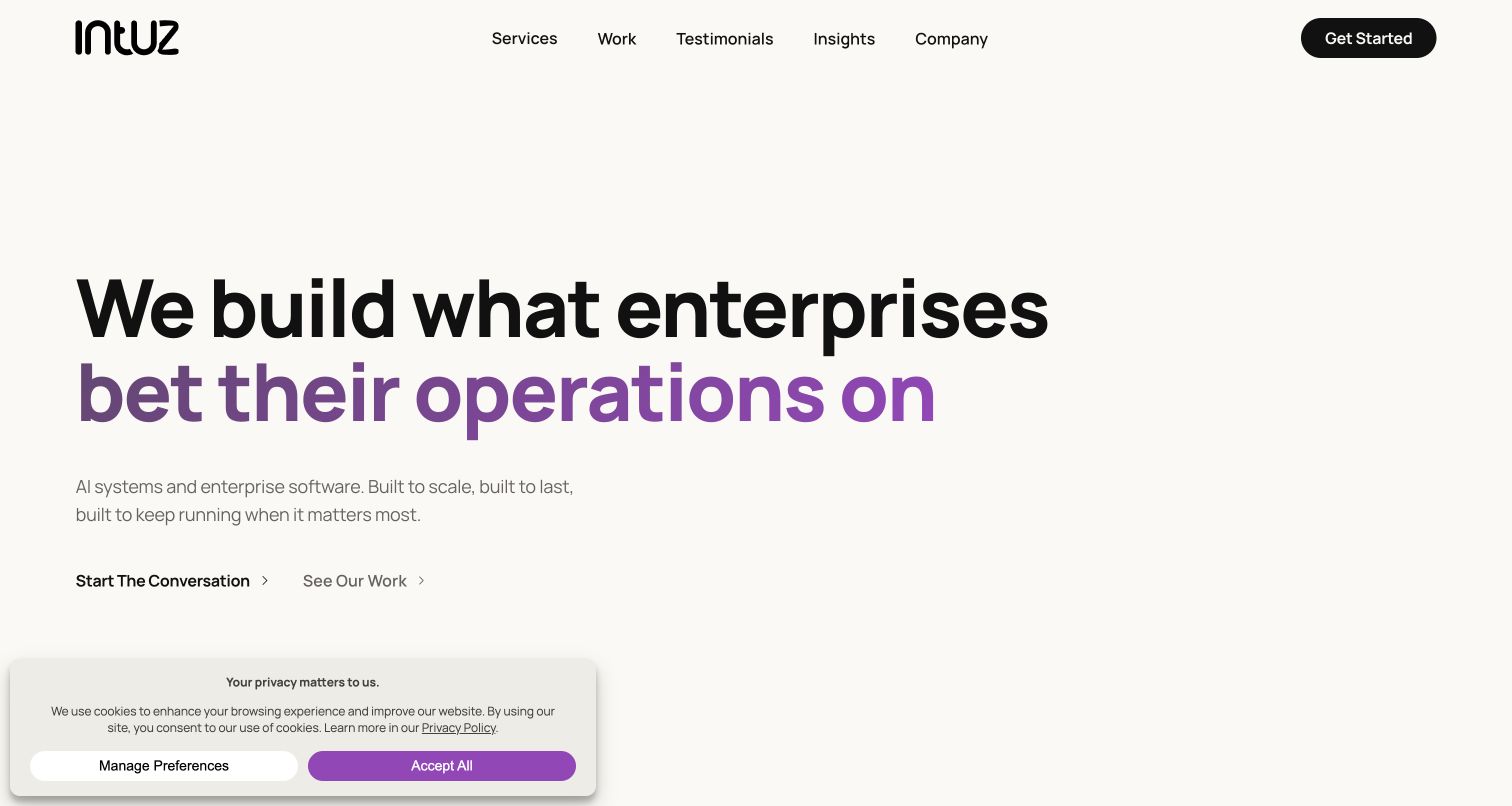
Intuz’s current homepage uses an oversized two-line statement, generous off-white space and a purple emphasis to introduce its enterprise software work. Two nearby actions distinguish starting a conversation from viewing completed work, while the compact navigation gives services, testimonials and company information their own destinations. The composition is readable without a complex hero illustration. Strapi’s community showcase documents an earlier Intuz website built with Strapi, React and Next.js. The new bounded audit instead observes WordPress and related public assets on this current property. This is therefore a historical Strapi project reference paired with a current design capture, not a current Strapi implementation claim.
What you can learn
Preserve the chronology when using a company as a technology reference. A useful design can remain worth studying after a platform change, but the content model and technical attribution must not be inferred from an older showcase.
Pros
The large statement and restrained accent color establish a strong, readable opening hierarchy.
Separate conversation and portfolio actions accommodate visitors at different stages of evaluation.
Cons & considerations
The broad opening promise leaves concrete project evidence below the first viewport.
The first-visit privacy panel competes with the otherwise spacious lower-left action area.
Platform source: Historical Strapi community project. Historical association: Strapi’s community showcase describes an earlier Intuz website built with Strapi, React and Next.js. The current bounded public audit instead observes WordPress and related assets. This capture is a current design reference for the same property, not a claim that its present CMS is Strapi. Platform evidence is separate from the direct website screenshot and is not a complete current infrastructure audit.
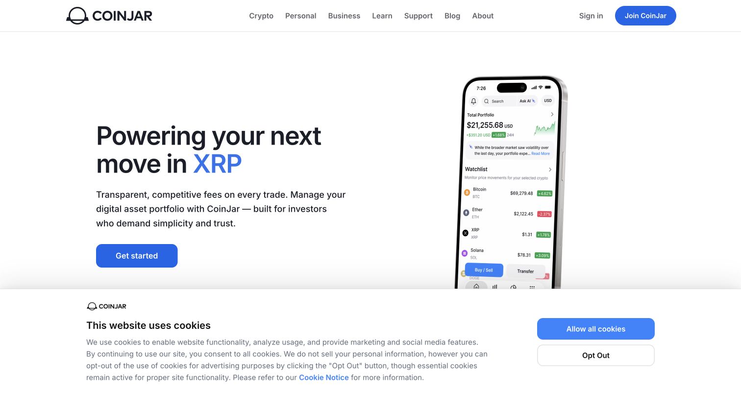
CoinJar’s public marketing page uses a familiar split composition: a plain-language headline and blue action on the left, with a large phone preview on the right. The navigation separates product information, learning material, support and company details, while sign-in remains a distinct destination. The screenshot includes a first-visit cookie notice, showing the real space that consent choices occupy in the opening view. Strapi’s maintained community showcase lists the CoinJar website. That establishes a documented public-site association only; neither the screenshot nor the source audit verifies the systems handling trading, custody or account security. No account or financial action was attempted.
What you can learn
Give public explanations their own editorial model and keep operational claims bounded. A product illustration can help visitors understand a service’s interface, but it should not substitute for clear terms, supported actions or properly separated account controls.
Pros
The split layout connects a concise introductory message with an immediately recognizable app format.
Learning and support destinations remain visible alongside the primary product navigation.
Cons & considerations
A tall phone illustration leaves some interface details outside the opening viewport.
The broad privacy notice reduces the visible area available for supporting product explanations.
Platform source: Scoped Strapi project documentation. Strapi’s maintained community showcase lists CoinJar’s public website. This documentary association covers marketing content only; it does not establish the current hidden CMS or the technology of trading, custody, authentication or private accounts. Platform evidence is separate from the direct website screenshot and is not a complete current infrastructure audit.
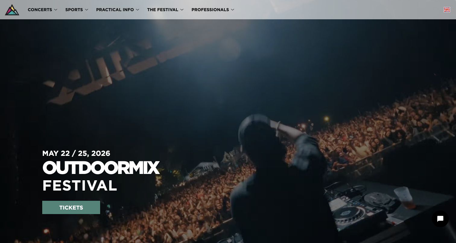
Outdoormix Festival opens with a full-screen moving scene, a large event name and a ticket destination. Its top navigation separates concerts, sports, practical information and professional material, helping an energetic presentation serve visitors with different purposes. Lower sections connect riders, photographs, locations and previous editions into a more substantial archive. The captured page still promotes its May 2026 edition, a reminder that event content needs date maintenance. Strapi’s community showcase explicitly identifies this project. Media references provide context, but media hosting alone is not treated as proof of the current CMS, and the bounded page sample exceeded its size limit.
What you can learn
Build event content around durable relationships between editions, people, activities and places. Keep the current event’s dates and practical notices easy to update, so the emotional opening does not become disconnected from the information visitors need.
Pros
The vivid opening communicates the festival’s atmosphere before visitors read a detailed program.
Distinct practical and professional navigation paths support audiences beyond ticket buyers.
Cons & considerations
The displayed edition date can become misleading if promotional content is not refreshed promptly.
A large moving background can compete with text and increases reliance on its chosen frame.
Visible tech stack
Earlier / documented evidence
Strapi
Platform source: Scoped Strapi project documentation. Strapi’s community showcase explicitly documents the Outdoormix Festival project. Current page references include a Strapi-named media host, but media delivery alone is not CMS proof. The bounded source response exceeded its size limit, so no fresh runtime CMS claim is made. Platform evidence is separate from the direct website screenshot and is not a complete current infrastructure audit.
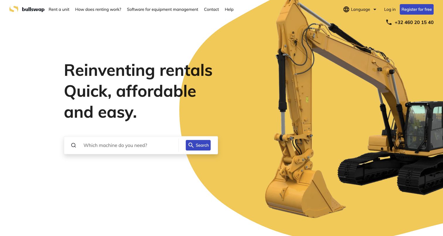
Bullswap uses yellow machinery imagery, a bold black headline and a prominent search field to make the rental task recognizable immediately. The header distinguishes renting from rental management, while help and contact remain separate destinations. This gives the marketplace a useful balance between a broad brand statement and a concrete action. The saved view follows a necessary-cookies-only choice, preserving the page’s actual presentation without a privacy overlay. Strapi’s maintained community showcase lists the machine-rental website as a project. The current bounded audit records public delivery and supporting references, but does not independently verify the catalog backend or the private rental-management application.
What you can learn
Make the first search understandable before adding marketplace complexity. The public content model should explain equipment categories and rental context, while availability, contracts and account workflows retain their own explicit data and permission boundaries.
Pros
Machinery imagery and a visible search control establish the site’s practical purpose quickly.
Separate renting and management destinations acknowledge different visitors without duplicating the whole header.
Cons & considerations
The broad introductory promise supplies fewer concrete category choices in the opening screen.
A search-first presentation depends on visitors knowing enough terminology to begin confidently.
Platform source: Scoped Strapi project documentation. Strapi’s maintained community showcase lists Bullswap’s public machine-rental website. Treat this as documentary project evidence, not an independent current inventory of the catalog backend or private rental-management application. Platform evidence is separate from the direct website screenshot and is not a complete current infrastructure audit.
Addact’s opening uses two outstretched hands, a dark background and a short central statement to establish a technology-focused identity. The top navigation stays conventional, separating services, experts, industries, resources and company information. A visible downward cue signals that the opening is an introduction rather than the complete explanation. Further content presents capabilities, service families and work examples in repeated sections. Strapi’s current community showcase explicitly describes the Addact website as built with Strapi CMS. The bounded audit also finds public frontend references, but those observations do not establish which particular animation or content block uses a named library.
What you can learn
Give an expressive introduction a clearly structured destination below it. Reusable service and project records should remain understandable to editors, so a campaign animation can change without forcing every business page into the same visual treatment.
Pros
The contrasting hands and concise statement create a distinct first impression with little copy.
Conventional navigation provides a practical route around the more theatrical opening sequence.
Cons & considerations
The initial concept postpones the fuller service explanation until the visitor continues downward.
A floating chat prompt competes with the sparse composition’s intended point of focus.
Platform source: Scoped Strapi project documentation. The current Strapi community showcase explicitly describes the Addact website as built with Strapi CMS. This is community-submitted documentary project evidence; current frontend observations do not establish which individual controls use a named library. Platform evidence is separate from the direct website screenshot and is not a complete current infrastructure audit.
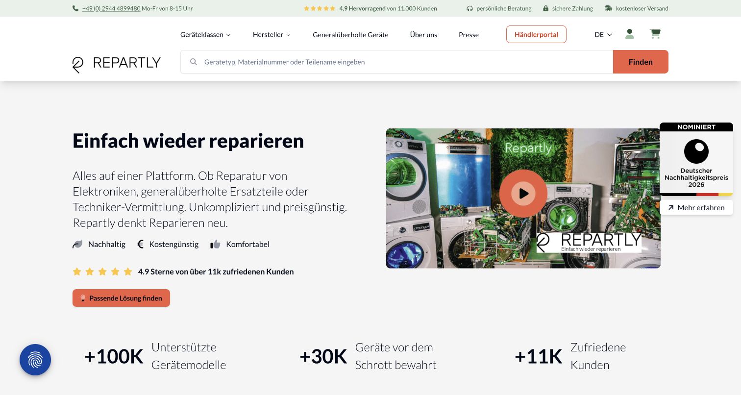
Repartly pairs a concise repair proposition with a video thumbnail showing appliances and components, then introduces a device-based route further down the page. The prominent search asks for a device type, material number or part name, acknowledging that visitors may arrive with different amounts of technical knowledge. A restrained green and orange palette separates reassurance from actions. Supporting sections explain repairs, refurbished parts and help finding the right solution. Strapi’s current community showcase includes this public website as a project. The screenshot follows rejection of optional cookies; no diagnostic request, purchase, registration or repair booking was submitted during the review.
What you can learn
Model the customer’s problem as carefully as the product catalog. Device categories, part identifiers, explanatory guides and service options need clear relationships, so visitors can move from an uncertain fault to an understandable next step.
Pros
The search label supports several real ways a visitor might identify the required part.
Device categories and explanatory service sections provide alternatives to a purely keyword-led journey.
Cons & considerations
Several trust claims and badges compete with the explanatory video near the opening.
The long homepage asks visitors to distinguish repair services from parts purchases while scrolling.
Platform source: Scoped Strapi project documentation. Strapi’s current community showcase includes Repartly’s public repair and refurbished-parts website among Strapi projects. Preserve that documentary qualification; media URLs and frontend signals are not independent proof of the entire operational backend. Platform evidence is separate from the direct website screenshot and is not a complete current infrastructure audit.
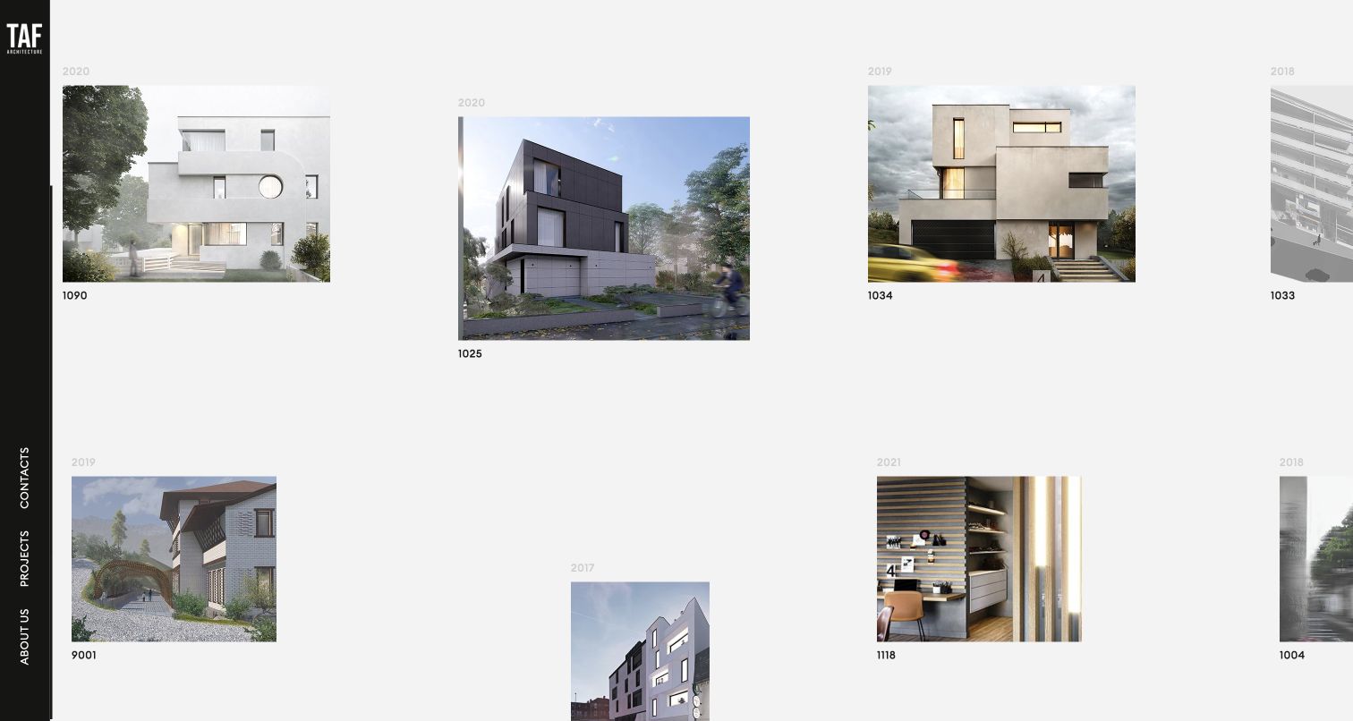
TAF Architecture arranges project images across a pale canvas instead of a standard vertical list. A narrow black rail holds the studio identity and the main navigation, while years and compact project numbers provide repeated points of orientation. Varying image sizes and gaps suggest a studio pinboard, allowing buildings and interiors to establish the visual character. The underlying page still exposes named project destinations, so the composition has a structured archive beneath it. Strapi’s current community showcase identifies this website as a project, while the bounded public audit observes Nuxt and Vue references without claiming the hidden CMS configuration.
What you can learn
Keep the content model predictable when the presentation is unconventional. Project names, dates, identifiers and image sequences should remain consistent records, allowing the frontend to experiment without making the archive dependent on one oversized canvas.
Pros
Varied image scale and generous spacing give individual architectural projects room to establish character.
Repeated years and project identifiers provide an organizing rhythm beneath the free-form composition.
Cons & considerations
The narrow vertical navigation is less immediately familiar than a conventional horizontal menu.
Project names are less prominent than images and numbers in the saved opening view.
Platform source: Scoped Strapi project documentation. Strapi’s current community showcase identifies the TAF Architecture website as a Strapi project. This is documentary evidence for the public portfolio. The new bounded source audit observes frontend references without independently verifying the hidden CMS configuration. Platform evidence is separate from the direct website screenshot and is not a complete current infrastructure audit.
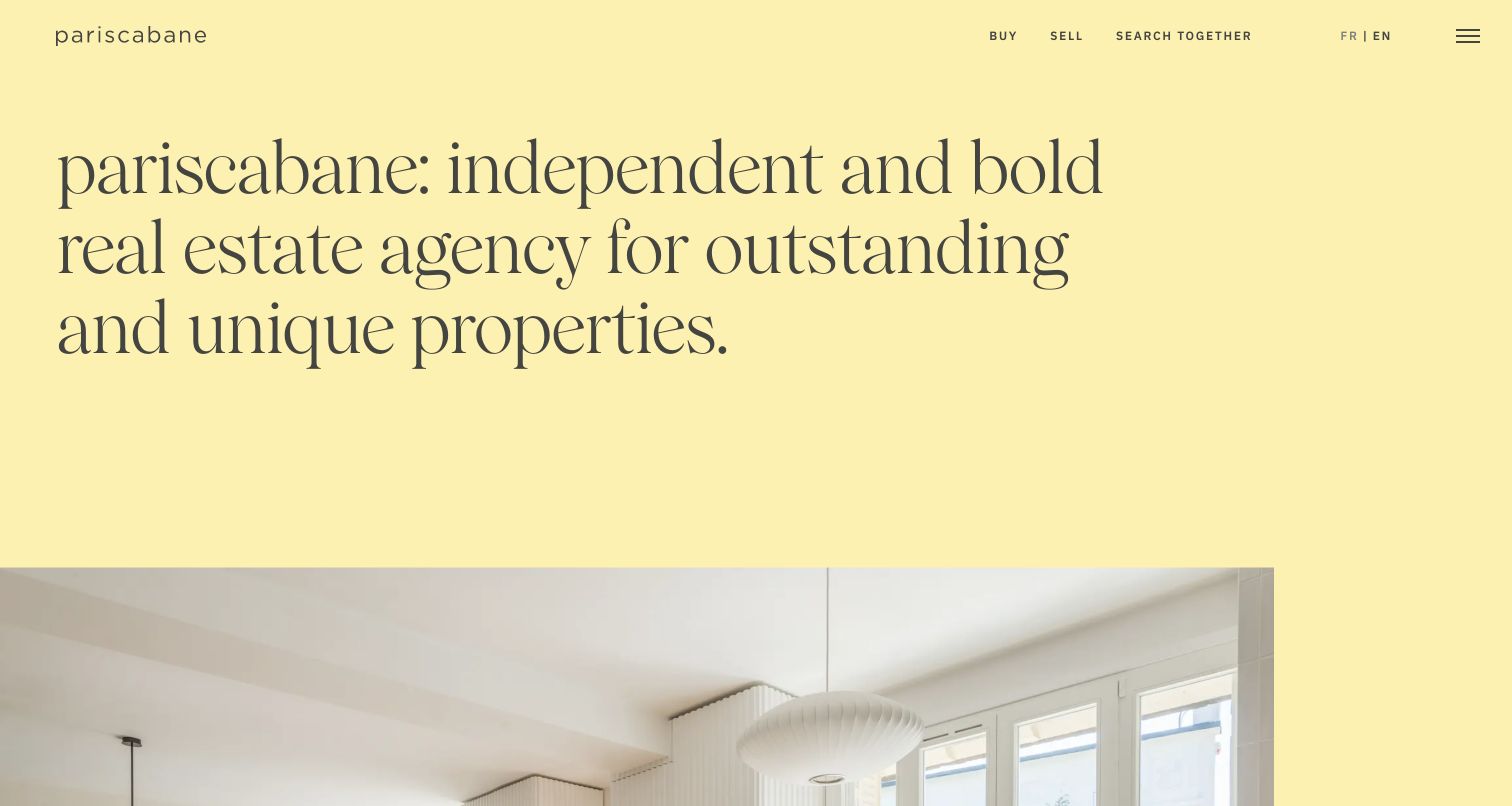
Pariscabane uses a pale yellow field and a large serif introduction to establish an editorial tone before showing its latest properties. The top navigation is unusually concise, grouping the main journeys into buying, selling and searching together, with visible language choices beside them. Lower listing records combine a location, a short identity, price, room information and a description, showing how a consistent property model can support a more expressive presentation. Strapi’s community showcase explicitly describes the management of offers and content for this website. The public English-language property was captured; the separately linked rental-management extranet was neither opened nor assessed.
What you can learn
Decide which property facts must stay consistent before developing a distinctive editorial voice. Reusable listing fields can support expressive typography and photography while still giving buyers the information needed to decide which detail page deserves attention.
Pros
A small set of journey labels keeps the opening navigation understandable and focused.
The warm palette and large serif typography distinguish the agency from a generic listings portal.
Cons & considerations
The oversized introductory statement pushes actual property choices beneath the first screen.
A secondary menu icon means some information remains concealed despite the spacious composition.
Platform source: Scoped Strapi project documentation. Strapi’s maintained community showcase explicitly describes managing property offers and website content for Pariscabane. Scope is the public agency website, here captured in English; the separately linked private rental-management extranet was not accessed. Platform evidence is separate from the direct website screenshot and is not a complete current infrastructure audit.
COLLUSION presents a compact brand destination within one light-gray panel. A large uppercase headline sits above a fashion photograph, while the opposite column contains a short brand explanation and two clear outbound actions. The composition makes the relationship between identity, imagery and shopping simple: this site introduces the brand, then sends visitors to ASOS for products or Instagram for updates. Strapi’s maintained community showcase names this exact property and credits ASOS. That is historical documentary project evidence; the current landing page and its timed-out bounded audit do not establish a present Strapi backend or the technology of the separate ASOS store.
What you can learn
Give a small brand property a deliberately limited job. If shopping happens elsewhere, make the handoff explicit and keep the introduction maintainable, rather than implying that the campaign page contains a complete catalog or checkout experience.
Pros
The two-column panel connects brand imagery and explanation without a complex navigation system.
Two clearly labeled destinations make the external shopping and social paths easy to distinguish.
Cons & considerations
All-uppercase body text is dense compared with the otherwise spacious composition.
Visitors must leave the property to inspect products, availability or more detailed shopping information.
Visible tech stack
Earlier / documented evidence
Strapi
Platform source: Historical Strapi community project. Strapi’s maintained community showcase lists the exact COLLUSION brand property and credits ASOS. This is historical documentary project evidence. The current landing page sends shopping to ASOS and its bounded source audit timed out; neither establishes a present Strapi CMS or the separate ASOS store backend. Platform evidence is separate from the direct website screenshot and is not a complete current infrastructure audit.
Kegan has 15+ years of experience working with small businesses, Fortune 500 companies, and everything in between. No development job is too big or too small: he brings the same hands-on attention to a focused improvement, a complete website, or a custom application.
For Strapi projects, he can help with responsive interfaces, reusable components, custom functionality, API connections, and performance-minded implementation. He works directly with clients on scope, design, implementation, testing, and handover, with an emphasis on clear communication and a system that remains practical to maintain after launch.
Show 3 other Strapi developersHide other Strapi developers
Choose a Strapi content approach that fits the team
A focused editorial website
For a publication, studio or service business, start with a small number of useful records and a restrained set of layouts. Define how an editor creates a new item, selects related material and handles a missing image. Keep the first implementation narrow enough that the team can explain every field. Add flexibility when a real publishing need appears, rather than asking editors to assemble every page from an unlimited set of interchangeable blocks.
A catalog with clear external responsibilities
A catalog can connect structured descriptions, categories, specifications and supporting articles. Identify the source of truth for each fact, especially where prices, stock or booking availability come from another service. The CMS may manage explanatory content while a commerce or reservation system owns transactions. Make those boundaries visible in diagrams and handover notes. Do not copy a reference organization’s architecture simply because its public product page looks effective.
A multilingual or multi-property publishing system
Strapi’s internationalization feature manages content in configured locales and can be enabled for content types and fields. The team still needs decisions about translation responsibility, missing-language content and regional differences. Write those rules before multiplying page templates. For several public properties, identify which records are genuinely shared and which need independent ownership. Shared data is useful only when editors understand the consequences of changing it.
Use a realistic example with a long title, several images and an optional related record. Ask the intended editor to create it, correct it and explain when it becomes public. Strapi’s Draft & Publish feature can be enabled per content type to separate saved drafts from published content. Decide how the website handles those states and who has authority to publish. A polished admin screenshot is less useful than a clearly understood everyday task.
When editors need a preview, connect it deliberately to the correct frontend route and content state. Strapi documents configuration for preview origins and URL generation; the frontend’s draft behavior depends on its implementation. Keep preview access distinct from the public site and avoid exposing privileged tokens in browser-delivered code. Give administrator roles only the responsibilities needed for their work, and distinguish those roles from access to the public content API.
Record who owns the CMS application, database, media storage, frontend and integrations. Strapi’s deployment documentation describes several hosting approaches and the preparation needed for production. The right choice depends on the team’s ability to operate it. Include dependency updates, backups, restoration practice and the handling of a failed content request in the handover. Verify the complete public journey after a release instead of treating an admin build as evidence that every page works.
Ask the actual team to carry out its routine job: publish a realistic update, correct a mistake, preview a narrow screen, and identify who owns an integration failure. For a library or frontend framework, also ask who maintains the content source and deployment. A polished screenshot does not answer those operational questions.
Beyond the screenshot
Strapi website planning checklist
Name the exact public property and scope supported by each technology reference.
Separate historical project documentation from current public-source observations.
Inventory the records, relationships and media fields that editors actually maintain.
Keep essential navigation stable when campaigns or featured content change.
Define missing-content, loading and unsuccessful-request states for each important screen.
Identify the source of truth for prices, availability and other operational information.
Decide who drafts, translates, reviews and publishes each kind of content.
Scope administrator and API access to the responsibilities they need.
Keep privileged credentials and draft-only information outside public browser assets.
Check long text, image alternatives, keyboard use and narrow-screen reading with realistic content.
Document ownership of the CMS, frontend, database, media and external integrations.
Verify public pages after release and retain a tested recovery procedure.
Test with real content, a keyboard, a small screen, slow or failed requests, and the people who will maintain the system. These are planning checks, not an accessibility, security, performance, or search-ranking certification.
Sources & editorial method
How this Strapi collection was reviewed
Twenty distinct public website properties were inspected directly in the task’s routed Chrome tab, and all twenty saved screenshots were reviewed. Captures occurred on November 10 UTC during the November 9 America/Los_Angeles work date; their exact timestamps and dimensions remain attached. The opening five organizations have explicit source-backed selection notes. Vendor interviews, implementing-agency material and Strapi’s maintained community showcase establish property-level documentary associations. The showcase is community submitted, and its entries are not presented as a fresh independent CMS inspection. Intuz’s earlier Strapi project and current WordPress observation are both retained. Broad audits sampled each exact source path and at most four same-origin assets. Fourteen checks succeeded and six remained unavailable; those limits are retained without guessed additions or access bypass. Browser translation is disclosed where it affected Orange Flex and Banco BHD captures. No accounts, bookings, purchases, submissions or private systems were used. Design observations do not establish conversion results, service quality or accessibility conformance.
Every image is an unmodified capture from the actual website, with its source and capture date. Some captures are reused from our shared catalog; their dates remain the original capture dates. None comes from a vendor gallery or a generated reconstruction. Moving imagery and live content can change.
Technology attribution uses public page assets or metadata, official platform documentation, or a cited first-party project case study. Documentary and framework-relationship evidence is identified where used; it is not a complete current backend inventory. A CMS image CDN alone does not establish a full CMS deployment. A library’s presence does not prove which individual controls use it, and a platform label does not establish AI authorship.
The composition notes, lessons, pros and tradeoffs are original editorial observations. We have not measured conversion, traffic, security, performance or accessibility conformance. Website owners retain their brands and imagery; these examples are not our client portfolio. Written, Edited and Curated are independent records, not dates advanced by a build. See our editorial standards or suggest a correction.
Questions worth asking
Strapi website development FAQs
Does every pictured website currently use Strapi?
The evidence establishes specific documented projects or public properties, and some associations are historical. It does not freshly verify every current CMS. Intuz is an explicit example: the maintained showcase documents an earlier Strapi website, while the current public audit observes WordPress. Each record keeps its supported scope.
Does Strapi determine the visual design of a website?
No. Strapi can manage structured content, while the frontend controls how that content is presented. The examples range from technical catalogs to expressive portfolios because their audiences and design decisions differ. Choose the content model and visitor journey before copying a reference layout.
What should be modeled before a Strapi build begins?
Start with the records editors maintain and the relationships between them. Identify repeated items, one-off settings, reusable components, media requirements and missing-content cases. The Content-type Builder provides the modeling tools, but the project team must decide what those structures mean for its actual publishing work.
Can editors save changes without immediately publishing them?
Strapi’s Draft & Publish feature separates draft and published content when enabled for a content type. The team must still configure the workflow and make sure the frontend requests the intended state. Saving content and making it visible to the public should be distinct, understood actions.
How should a multilingual website be planned?
Define locales, translation ownership, regional differences and the treatment of missing translations before expanding the templates. Strapi supports internationalization at content-type and field level. That capability does not replace an editorial decision about what each audience should see or who maintains it.
Why can a source audit leave the CMS unconfirmed?
A headless CMS may sit behind a public frontend without exposing a reliable signature in the sampled page. A bounded audit may also encounter access restrictions, size limits or timeouts. Documentary project evidence can remain useful, but it must retain its date and scope rather than becoming an invented current runtime claim.
Borrow the clarity of the content relationships, navigation and editorial choices. Choose Strapi where its documented publishing model fits the team, then make the frontend and operational responsibilities explicit enough that the website can be maintained with confidence.