Best Fishing Charter Websites of 2026 (17 Real-World Examples)
Fishing-charter websites that explain the trip, the boat and the practical details behind a day on the water.
Explore 17 real fishing-charter websites, from local boat operators to marinas with extensive fleets. Compare how they present trip formats, schedules, preparation and the next step toward a suitable outing.
A photograph of a large catch can create interest, but it does not explain the charter. Visitors still need to understand the departure point, time aboard, shared or private format, supplied equipment and the operator's policies. A strong website gives those decisions a coherent structure before asking someone to choose a date or pay.
This collection includes fishing specialists and broader marine-activity businesses with explicit fishing offers. Their differences matter: a large scheduled fleet needs a different comparison structure from a small operator with one principal boat. These reviews concern website presentation, not catch prospects, operating safety or the quality of a charter experience.
Before the examples
What makes good fishing charter website design in 2026?
Describe the actual trip format
Distinguish an individual place on a shared departure from a private boat charter. Explain duration, departure location and the relevant fishing format in language the operator has approved. Avoid assuming that every visitor understands terms such as head boat, open party or long range.
Make inclusions and preparation visible
Separate supplied equipment and services from items a guest brings or pays for separately. Give arrival instructions, relevant policies and boat facilities clear destinations. Photographs cannot establish accessibility, participation suitability or what happens to a catch.
Keep reports separate from promises
Date fishing reports and describe them as records of particular trips. Keep current availability in its authoritative system, with useful states for full, unavailable or cancelled departures. Historic catches and testimonials are not guarantees about a future outing.
The collection · 17 examples
17 fishing charter websites worth studying
Compare 17 distinct public websites through their charter categories, boat information, trip cards, schedules and preparation pages. The explicitly researched Editors Choice recognizes clear website communication and does not rank charter quality or fishing outcomes.
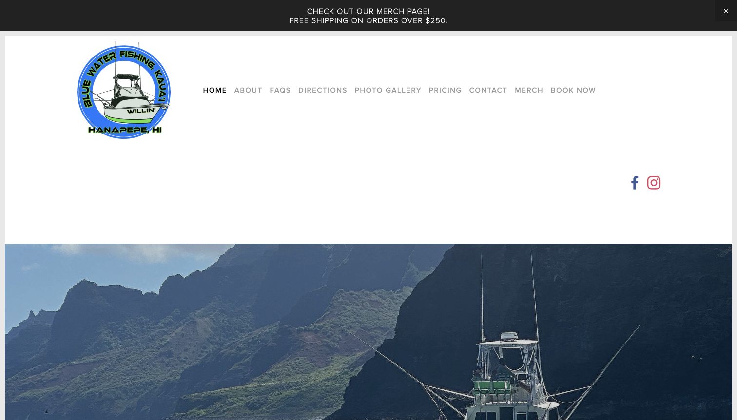
Blue Water Fishing Kauai gives a named boat and a recognizable coastal setting a central place in its presentation. The homepage explains the local fishing context, identifies the vessel, and separates booking information from a Things to Know route. The directly reviewed preparation page is particularly useful: it distinguishes what guests bring from what the operator supplies and gives the catch policy its own heading. Pricing, directions, and contact are named plainly in the navigation. The visual entrance has substantial white space, but the information beneath it provides a concrete explanation of the trip rather than relying only on trophy photographs.
What you can learn
Give a small charter business a specific identity through the actual boat, place, and people. Then answer consequential practical questions in visible sections, especially inclusions, arrival, and what happens to a catch, before visitors enter the reservation service.
Pros
The preparation page separates supplied items from guest responsibilities.
The catch policy is explicit and distinct from promotional fishing imagery.
Cons & considerations
The tall header delays the main introduction below the first view.
The merchandise announcement competes with the more relevant trip-planning routes.
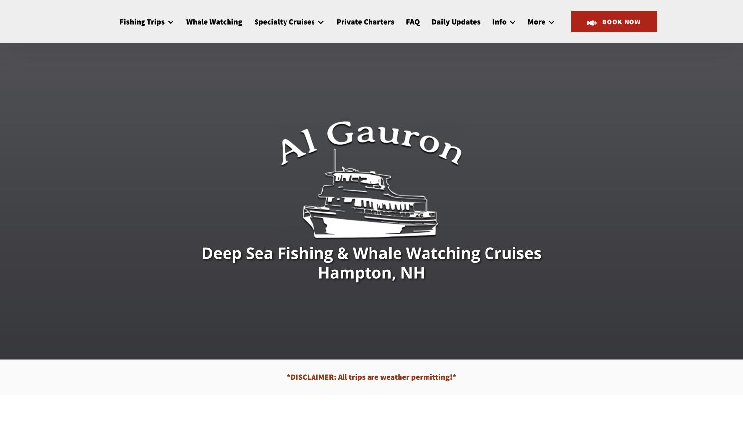
Al Gauron's homepage establishes Hampton as the departure location and separates fishing from whale watching, specialty cruises, and private charters. Below the branded opening, featured cards pair a starting price with duration and the operating season. Full-day, shorter bottom-fishing, and striped-bass options therefore become more concrete than a single broad promise of a day at sea. Each card offers both a detail route and a booking route. A weather qualification appears directly beneath the entrance, and a dated fishing-report section adds recent editorial material. The useful pattern is the combination of clear product fields and practical qualifications.
What you can learn
Make duration, trip type, and season comparable across a small catalog. Keep learning about the offer separate from reserving it, and place the operator's weather and cancellation context where visitors can find it before assuming a scheduled trip is unconditional.
Pros
Trip cards expose duration and season without requiring multiple detail pages.
Private charters have a separate route from shared fishing departures.
Cons & considerations
The opening brand panel uses considerable space before the trip comparison.
Several cruise categories and promotional sections require disciplined navigation labels.
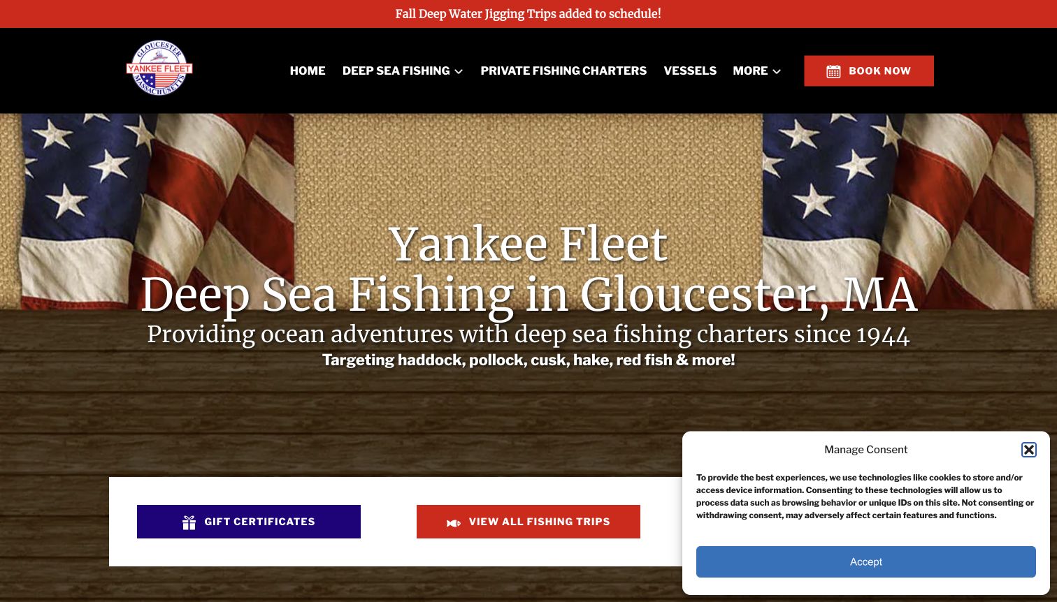
Yankee Fleet uses a red announcement strip to identify newly added fall jigging trips, followed by a dark navigation bar and a prominent Gloucester identity. The featured offerings distinguish a shorter deep-water trip from a longer marathon and include duration, capacity context, and specific schedule information. Vessels and private charters have their own navigation destinations, while reports provide a separate channel for updates. The captured page also retains a consent panel that covers part of the lower entrance. It is a useful example of seasonal inventory taking priority over an abstract travel message, with clear maintenance demands attached.
What you can learn
Bring the currently relevant trip format forward while keeping the fleet, private-charter information, and general FAQs easy to find. Make each seasonal notice specific enough to be useful, and retire or archive it when the schedule changes.
Pros
Featured trips distinguish duration and participation limits in visible copy.
Fleet and private-charter information are separate navigation choices.
Cons & considerations
The consent panel obscures some opening-screen actions in the captured view.
Seasonal announcements and older reports need distinct dates to avoid ambiguity.
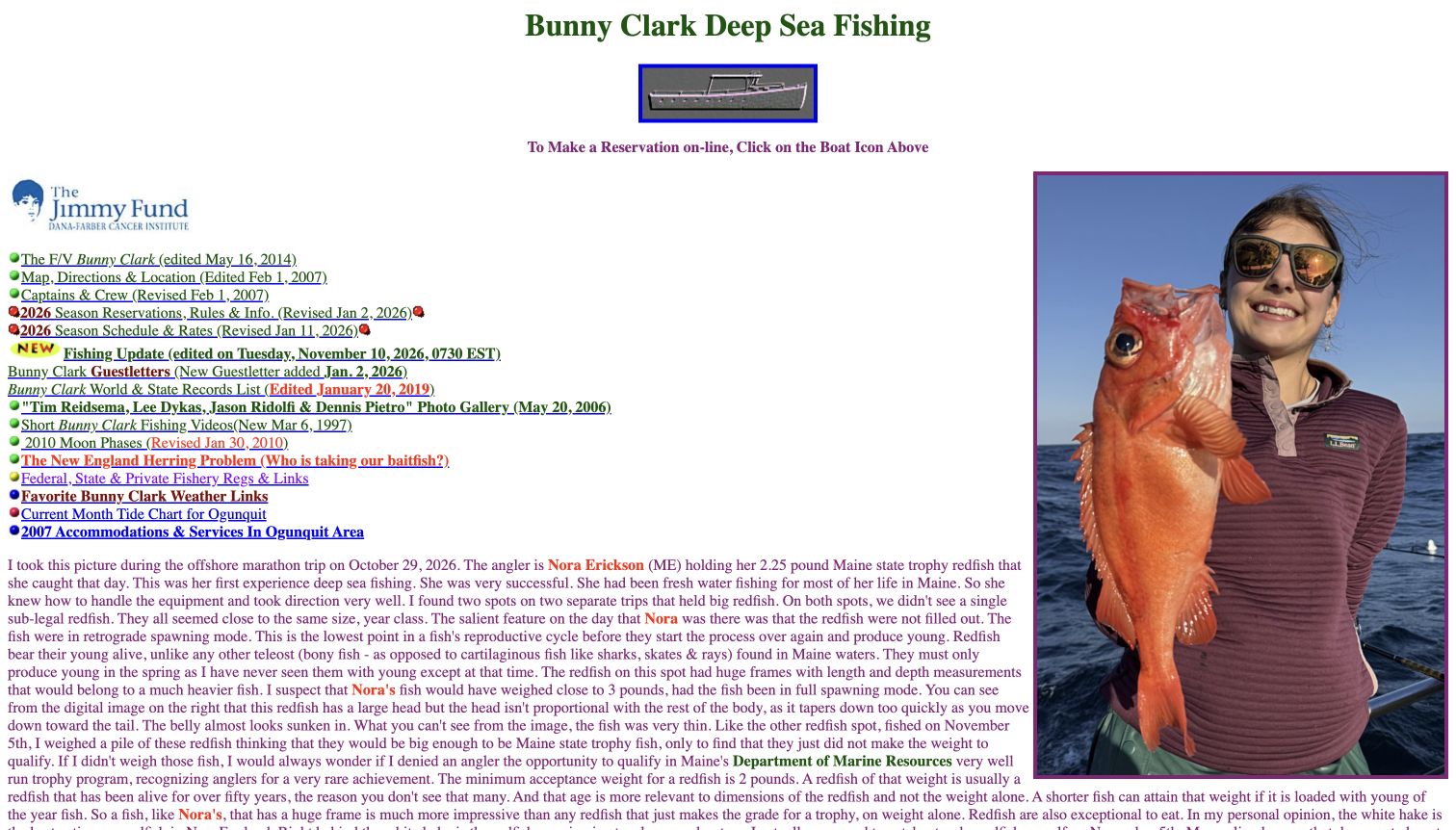
Bunny Clark presents a compact, text-heavy index above a long firsthand fishing account and a large catch photograph. Links identify the boat, crew, location, current-season rules, rates, and the latest fishing update. Many carry explicit revision dates, making the age of the underlying material unusually visible. The reservation link is a small boat graphic with a written instruction above the index. This is a markedly different reference from a modern booking-card layout: its identity comes from a detailed captain's voice and an extensive public record. The same density also makes initial orientation and scanning more demanding.
What you can learn
Use original, dated reporting to communicate a real operating perspective, but give essential planning information a clear hierarchy around it. Revision dates are valuable only when visitors can distinguish current trip details from intentionally retained historical material.
Pros
The update and current-season information display explicit dates.
The detailed narrative has a specific editorial voice rather than generic tourism copy.
Cons & considerations
A small graphic link is less explicit than a conventional reservation button.
Long paragraphs and many differently aged links make the homepage difficult to scan quickly.
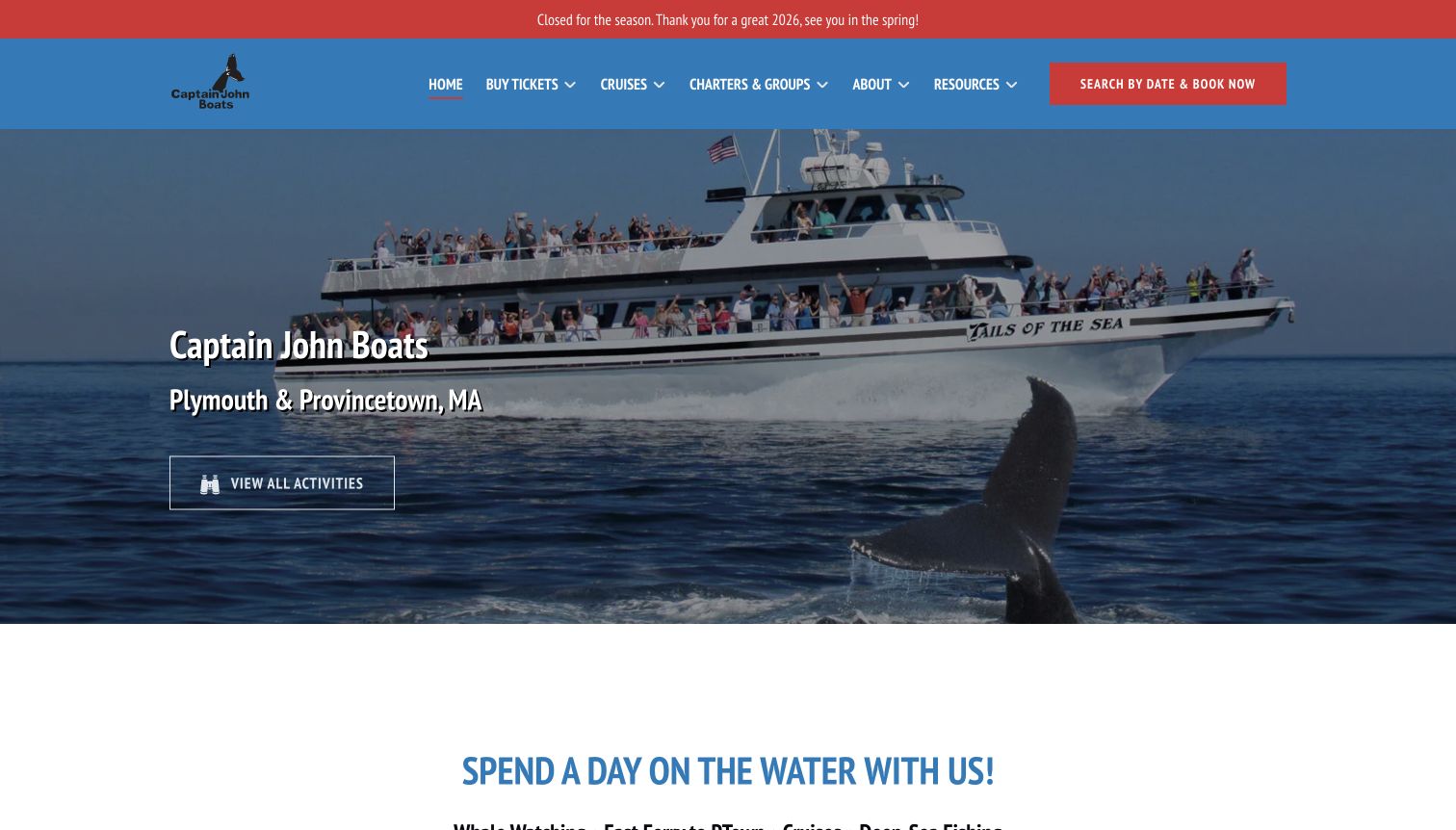
Captain John Boats opens with a vessel photograph and a clear Plymouth and Provincetown identity. A notice above the navigation says the business is closed for the season in the captured view. The activity catalog includes whale watching, ferry travel, cruises, and an explicitly described fishing trip, with cards showing duration and other relevant fields. Charters and groups have their own route, and the broad introduction explains that activities leave from different waterfront locations. The homepage is not primarily a fishing-only sales page, making it a useful reference for managing several related experiences without hiding seasonal operating context.
What you can learn
Explain the range of activities and departure locations before funneling every visitor into one booking path. A prominent closed-season notice can coexist with future planning content, provided the distinction between browsing offers and current availability remains clear.
Pros
The seasonal closure is visible above the main navigation.
Activity cards give fishing a defined place within a broader catalog.
Cons & considerations
Whale-watching imagery dominates the entrance for visitors seeking fishing specifically.
Past special-event material needs clear archival treatment beside future planning information.
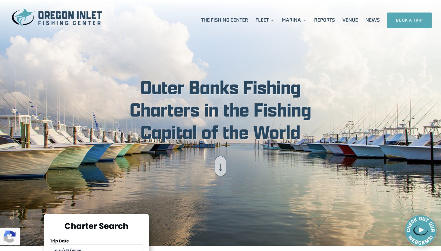
Oregon Inlet Fishing Center uses a wide marina photograph and a centered Outer Banks statement, then introduces a charter-search panel with date, trip type, and optional boat name. The main navigation separates the fleet, marina, reports, and wider facility information. Below the opening, substantial text explains the location, fishing formats, and marina services before linking to reports and a fishing calendar. The search fields are the strongest structural feature: they reflect meaningful differences in the catalog rather than treating every boat as the same product. The long promotional introduction adds context but also delays a compact comparison.
What you can learn
Choose search fields that correspond to real decisions, such as trip format, date, and a known vessel. Keep regional storytelling alongside the finder, while ensuring that visitors can explore the available categories without first supplying personal information.
Pros
Charter type and optional boat name support different browsing intentions.
Fleet information and marina services have distinct destinations.
Cons & considerations
The long introductory copy repeats broad destination claims before concise trip facts.
The finder depends on a separate embedded service and needs a useful fallback route.
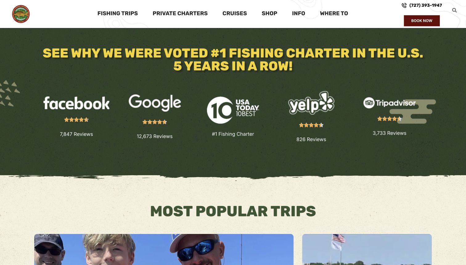
Hubbard's Marina uses a strong green-and-yellow visual identity and a prominent group of attributed review-platform and award references. The navigation separates fishing, private charters, cruises, and practical information. Popular-trip cards then distinguish fishing durations from shorter wildlife experiences and island transport, using consistent age and duration fields. Farther down, private groups and additional activities receive their own explanations. The example shows a business with a wide offer using product cards to create order, although the social-proof section occupies substantial space before those choices. Displayed ratings and promotional awards remain the source's claims, not this review's assessment of operating quality.
What you can learn
Use consistent comparison fields to organize a varied activity catalog. Keep third-party praise clearly attributed, and make the actual differences among trips visible enough that visitors do not have to infer fit from ratings or a general booking button.
Pros
Fishing and non-fishing products share a readable card structure.
Private-charter information is separated from individual scheduled trips.
Cons & considerations
The large social-proof section delays the first practical comparison.
A broad catalog needs careful labels so a fishing visitor can bypass unrelated activities.
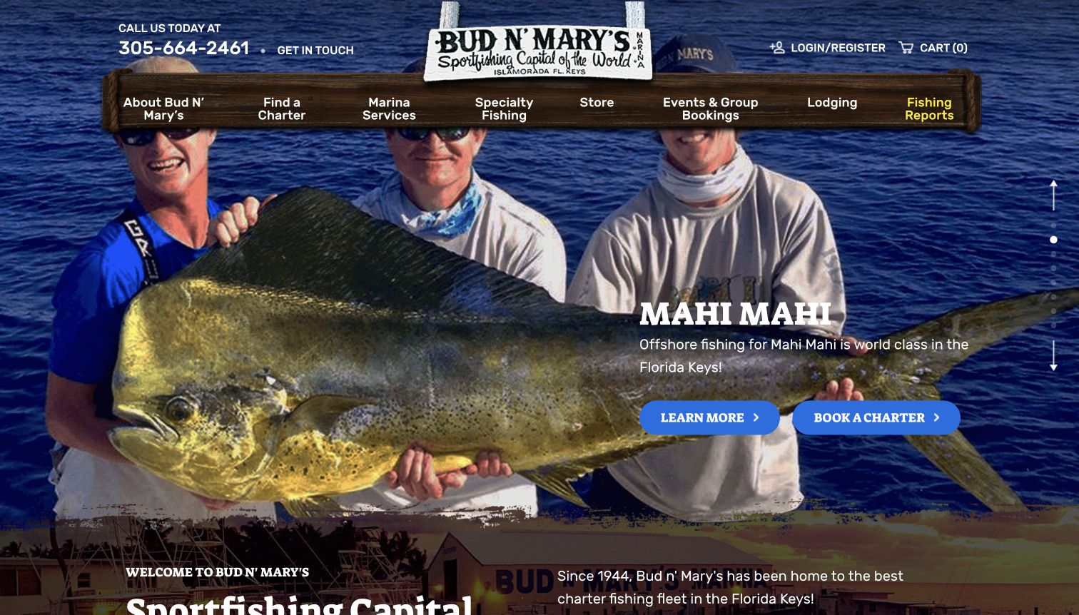
Bud N' Mary's combines an ocean background, a wood-textured navigation bar, and a large catch-focused carousel. The content distinguishes offshore, inshore, head-boat, and lodging routes, while specialty fishing provides another way into the offer. Dated fishing reports sit separately from the evergreen marina introduction and retail material. The design gives experienced anglers several recognizable starting points, but it also mixes species-led inspiration with service categories and accommodation. Its useful lesson is the preservation of distinct pathways through a complex marina business, supported by named boats and more detailed charter information beyond the opening campaign.
What you can learn
Organize the catalog around the differences that change the trip, then provide specialist routes for visitors who already know what they want. Keep dated catch reports separate from descriptions of the general offer so past results do not read as a promise.
Pros
Offshore, inshore, and head-boat categories are explicitly distinguished.
Fishing reports have visible dates and a separate archive route.
Cons & considerations
The large carousel places important information across changing slides.
Retail, lodging, and fishing categories compete within the same extensive navigation.
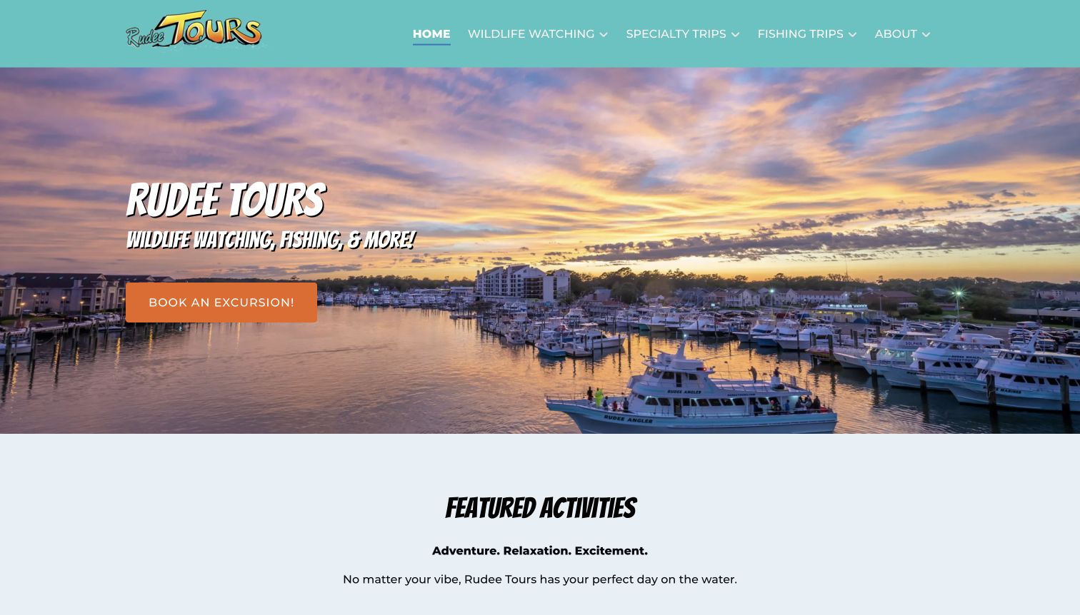
Rudee Tours pairs a colorful harbor photograph with a short introduction to wildlife watching, fishing, and other excursions. The featured-activity section gives each offering a duration, audience label, and detail link, with specific dates where the event requires them. Longer deep-drop fishing and shorter seasonal cruises can therefore be distinguished before a visitor enters a booking flow. The main navigation keeps fishing separate from wildlife and specialty trips. The page's breadth is useful for studying consistent product information, but the large featured carousel can also place very different activities beside one another without an obvious order for a fishing-only visitor.
What you can learn
Use the same basic comparison fields across a mixed excursion catalog, adding special dates only where relevant. Preserve a direct route into the visitor's activity category so broad seasonal promotion does not become a mandatory detour.
Pros
Duration and audience labels make substantial trip differences visible.
Fishing remains a named primary-navigation category.
Cons & considerations
The featured carousel mixes specialist fishing with unrelated holiday events.
A large activity inventory needs consistent inclusion and pricing explanations on detail pages.
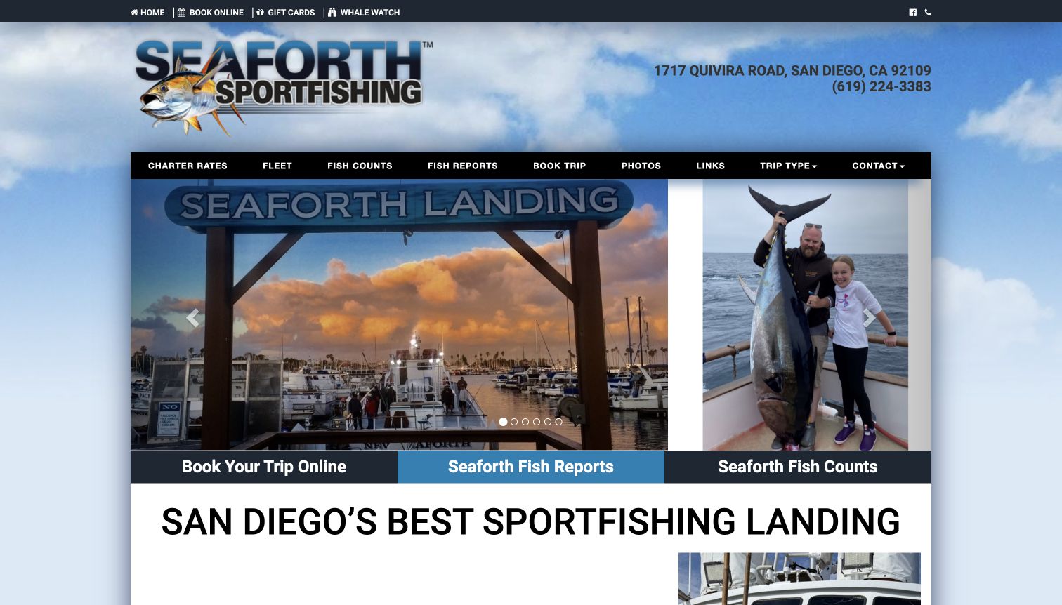
Seaforth Sportfishing places its address and telephone prominently beside the brand, then offers a compact navigation bar for charter rates, fleet, counts, reports, booking, and trip types. A large photographic carousel sits above a three-part shortcut row for booking, reports, and counts. The design is oriented toward repeat tasks rather than a long inspirational narrative. It is especially useful as a reference for a landing whose visitors may already understand the trip categories and arrive to check a particular update. The visible content also links the separate whale-watching business rather than merging it into every fishing decision.
What you can learn
Identify the small set of tasks returning visitors perform repeatedly and give them stable, explicit destinations. Keep a historical catch report distinct from a booking schedule, and offer explanatory trip-type information for newcomers who do not yet know the fleet.
Pros
Address and phone information are visible in the main header.
Bookings, reports, and counts have clearly separated shortcut labels.
Cons & considerations
The dense navigation assumes some familiarity with sportfishing terminology.
The large carousel occupies space that could expose more introductory trip context.
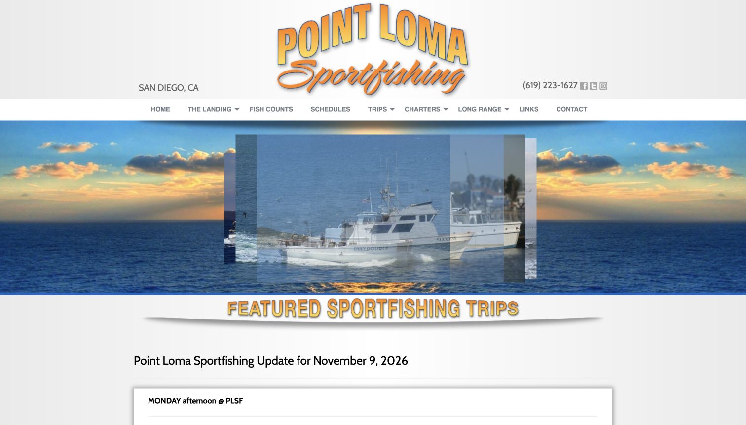
Point Loma Sportfishing places a dated update directly beneath its fleet imagery. The bulletin names upcoming trips and links them to booking, while explaining practical differences such as departure times, included meals, equipment, and additional requirements. Navigation separates open-party, charter, and long-range fishing, with named vessels listed beneath the relevant categories. Lower on the homepage, a schedule table makes departure, return, load, price, and availability comparable. The structure is informative for a visitor choosing among real departures, though its length and technical vocabulary demand more effort than a simple introductory card grid.
What you can learn
Connect an editorial update to structured schedule data rather than letting the announcement become the only source of trip details. Put important inclusions and additional requirements beside the specific departure, using language the operator has approved.
Pros
The update carries a visible date and links to named departures.
Schedule rows compare departure, return, capacity, price, and current spots.
Cons & considerations
Long narrative updates can bury the main comparison table.
Specialist terms need an explanatory route for first-time charter customers.
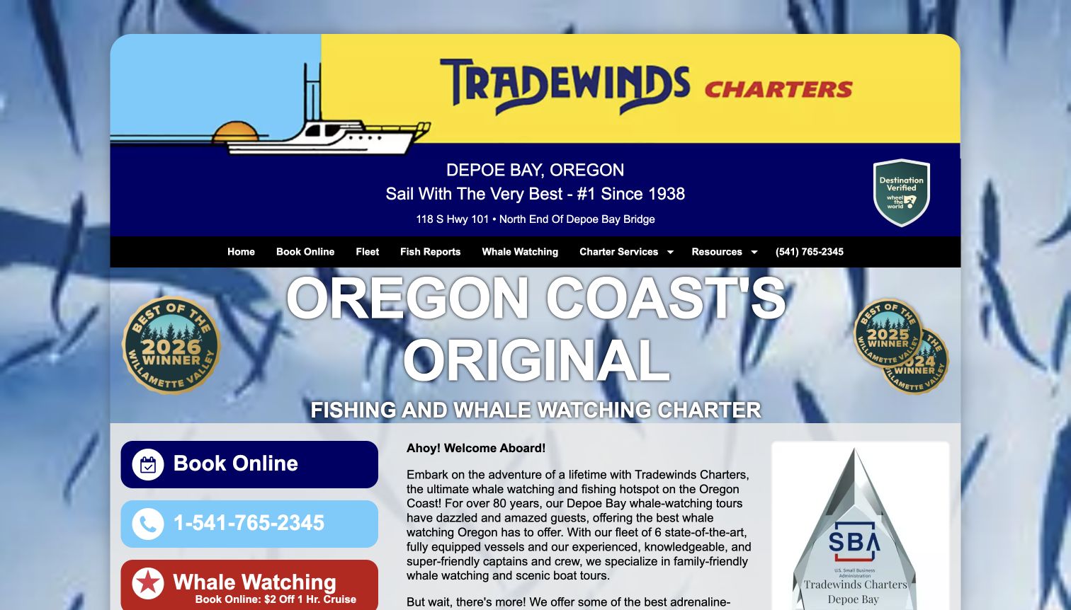
Tradewinds Charters uses a bright illustrated brand header and a clearly stated Depoe Bay location. Booking and phone actions are prominent beside introductory content, while the navigation separates the fleet, fish reports, whale watching, charter services, and resources. The page also explains boarding arrangements and supporting services such as fish processing, with a route to marine conditions. This practical material is useful because the experience starts before the boat leaves and continues after it returns. The entrance is visually busy, combining promotional badges, multiple buttons, and long copy, but the local operational context is more concrete than a generic coastal slogan.
What you can learn
Include arrival, boarding, and relevant after-trip services in the content plan rather than leaving them for a phone call. Keep those durable logistics separate from campaigns and current marine information, each with a clear owner and update process.
Pros
The location and contact route are easy to identify near the top.
Boarding and supporting-service details broaden the practical planning information.
Cons & considerations
Promotional badges and multiple colored actions compete for attention.
Long introductory paragraphs would benefit from more concise decision-oriented grouping.
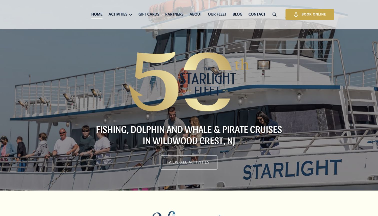
Starlight Fleet places an anniversary mark over a vessel photograph, with a clear Wildwood Crest location and an activity-browsing action. Featured cards distinguish dolphin trips, fishing, pirate cruises, private charters, and longer offshore options. Duration and audience fields make some of those differences visible before opening details, while private fishing is explicitly presented as a separate offer. A date-based activity search appears farther down. The structure supports visitors with either an activity or a day in mind, although the mixed catalog means a person seeking only fishing must filter out several unrelated experiences.
What you can learn
Give shared departures and private charters distinct labels, even when they use the same fleet brand. Combine an activity-first route with a date-first route, and make the meaning of a starting price clear before comparing a whole-boat charter with an individual ticket.
Pros
Private fishing and longer offshore trips are identified separately.
Duration and audience fields support an initial comparison across the catalog.
Cons & considerations
Cruise promotions can dominate the first featured positions for fishing visitors.
Different pricing bases need explicit context to avoid misleading comparisons.
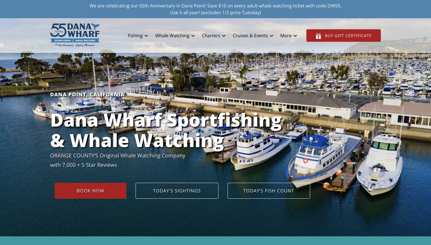
Dana Wharf uses an aerial harbor view to establish the actual departure setting, then places booking, sightings, and fish-count actions together beneath the introduction. The main navigation separates fishing, whale watching, charters, and cruises, while a later section summarizes the major experience types before presenting detailed products. Fishing cards distinguish longer, shorter, and twilight trips, alongside the wider activity catalog. The homepage therefore gives recurring updates a place near the emotional entrance. Its anniversary promotion and extensive secondary offers also demonstrate the maintenance and prioritization challenges of a mature, multi-activity destination site.
What you can learn
Use the real harbor to orient visitors, then separate observational reports from the action of reserving a trip. Let the principal experience categories provide a stable structure beneath campaigns, so visitors can find fishing without following unrelated promotional material.
Pros
Today's sightings and fish counts are distinct from the booking action.
The main experience categories have short explanatory introductions.
Cons & considerations
Several promotions and retail offers compete within the long homepage.
Whale-watching emphasis can delay fishing-specific detail for an angler arriving directly.
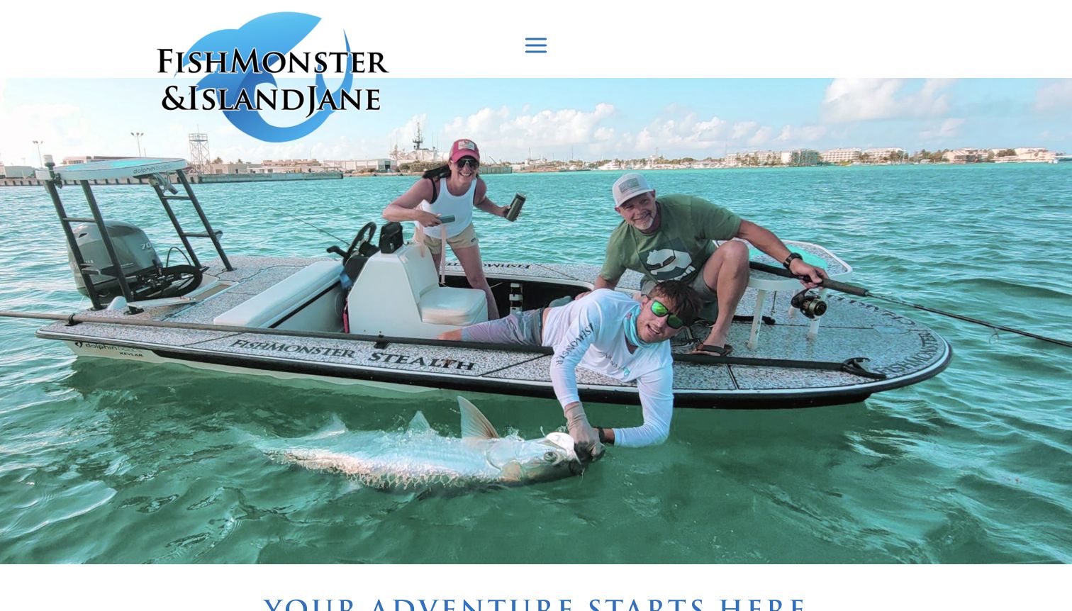
FishMonster and Island Jane share a Key West homepage, but the content divides fishing excursions from island adventures. Within the fishing section, offshore, light-tackle, flats and backcountry, split-charter, and party-boat options receive separate routes. The opening photograph shows people aboard a real fishing boat, while later sections explain the larger party boat and private sailing offer. Practical footer links cover weather, trip questions, cancellation, what to bring, and locations. The information structure is the strongest reference here: a combined brand can retain meaningful distinctions rather than sending every visitor to a single unexplained charter list.
What you can learn
When related businesses share one site, show the relationship while preserving the differences between their products. Use plain labels for fishing styles and booking formats, and keep practical policies accessible before visitors move into a reservation service.
Pros
Fishing formats are separated into clearly named routes.
Preparation, location, and cancellation information have explicit destinations.
Cons & considerations
The compact menu hides much of the product structure on the first screen.
Multiple brand names and activity types require clear continuity through booking.
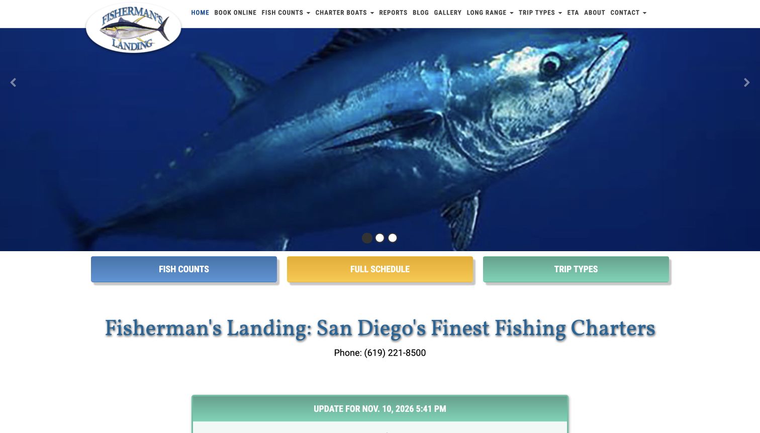
Fisherman's Landing places fish counts, the full schedule, and trip types in three large shortcuts below its opening image. A timestamped update follows, with named boats and dated reports separated from the upcoming-departure table. The table exposes departure and return times, load, price, and available spots, with a key for important inclusions and requirements. Some full trips offer a wait-list route rather than appearing available. This is a strong information reference for a large fleet: the visitor can see concrete differences among departures, although the amount of technical detail makes the page more demanding for a newcomer.
What you can learn
Present availability and major requirements in the same structured place as the departure details. Keep reports as dated observations, not promises about future catches, and explain specialist terms before asking an inexperienced visitor to compare long-range options.
Pros
The main shortcuts distinguish reports, schedules, and trip explanations.
Full departures are labeled clearly and may offer a separate wait-list path.
Cons & considerations
The long homepage combines substantial editorial and schedule detail.
Dense tables and specialist abbreviations need careful small-screen and newcomer support.
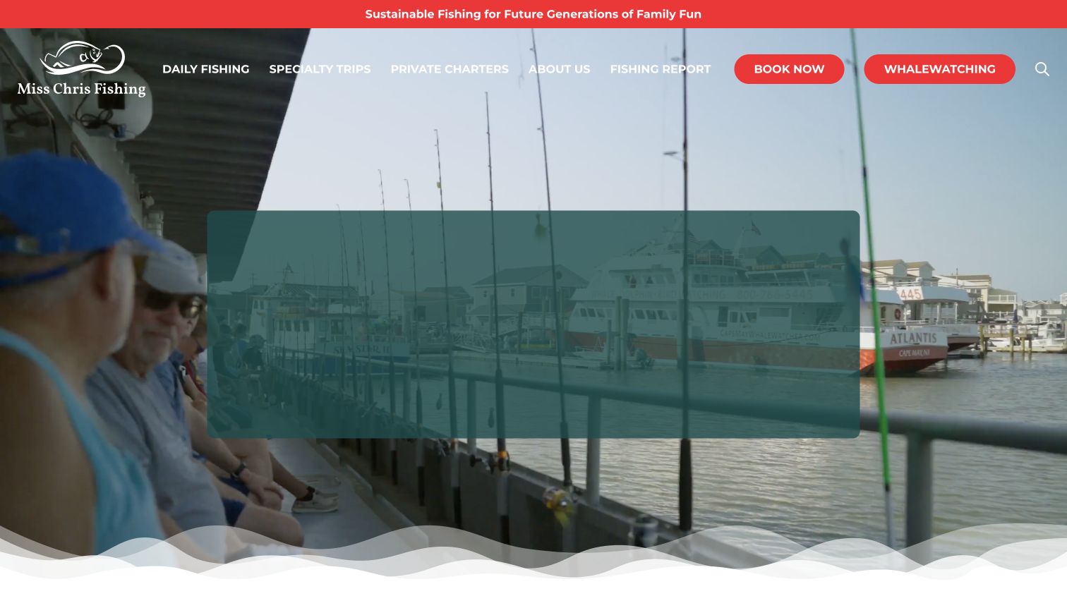
Miss Chris Boats presents daily fishing, specialty trips, private charters, and reports as distinct navigation choices. The homepage's initial product cards use approachable names such as early, later, and sunset departures, paired with duration and starting-price information. Longer species-focused trips appear alongside those simpler options, while a separate section explains the boat's facilities. The captured entrance uses moving onboard imagery and a large overlaid panel. Below it, the information is more concrete than the broad opening promise, offering a useful reference for introducing a casual audience to several fishing formats without assuming detailed prior knowledge.
What you can learn
Start with a comparison a newcomer can understand, such as time and duration, then explain the more specialized options. Describe practical boat facilities and keep the availability action tied to the exact trip rather than an undifferentiated catalog.
Pros
Daily, specialty, and private formats have separate navigation labels.
Trip cards pair familiar names with duration and price context.
Cons & considerations
The moving hero's overlaid content was not fully visible in the captured frame.
Inconsistent date formatting in report previews makes editorial freshness harder to judge.
Kegan is a freelance web designer and developer with 15+ years of experience helping businesses turn complicated website requirements into clear, maintainable digital experiences. He works directly with clients from planning and design through development, launch, and ongoing support.
For fishing charter website design, his development approach focuses on fishing charter websites that explain trip formats, departure locations, equipment and group requirements with clear enquiries and honest weather-dependent expectations. The scope can be a targeted improvement or a complete custom build, with responsive layouts, thoughtful content structure, and integrations chosen around the people using and maintaining the site.
Show 3 other fishing charter website designersHide other fishing charter website designers
Plan the website around the boat, the departure and the guest
Define the catalog before designing the booking button
Begin with the trips the business actually operates. Record whether each offer is shared or private, its approximate duration, departure location, boat, intended format and booking process. A small charter company may need only a few well-explained options, while a landing with many vessels may need a searchable schedule. Let the operating team define the meaningful differences rather than filling a design template with vague adventure labels.
Choose consistent fields for the first comparison. Duration, format and departure point may help more than a species photograph. If prices are shown, make the basis understandable: an individual ticket and a whole-boat price are different kinds of offer. Keep optional extras and required additional charges connected to the relevant trip. Use the operator's approved wording and direct visitors to current details rather than presenting an old example price as a permanent promise.
Provide two routes when the catalog warrants them. Some visitors know the day they are free; others know the kind of fishing or boat they want. A date-first and a trip-first path can serve both without collecting personal information just to browse. Make full departures visibly different from available ones and label a wait list as a separate action, not a disguised reservation.
Answer the practical questions before the reservation
Write the preparation material as a useful part of the offer. Explain where guests arrive, how the stated departure relates to check-in, and which equipment or facilities the operator actually provides. Separate what is included from what guests bring themselves. The information should be specific to the boat and trip; a generic tourism checklist cannot establish the requirements for every charter.
Give policies their own clear headings and links. Catch handling, cancellation, weather changes, private-group terms and optional services can affect the decision before payment. Summarize the important distinctions in plain language and retain a route to the complete approved policy. Do not invent legal, medical or safety guidance from another operator's website. Where a visitor needs individual advice, provide an appropriate contact route instead of implying universal suitability.
Use real boat and location imagery with context. A photograph can help someone recognize the vessel or departure setting, but it does not establish capacity, certification, comfort or accessibility. Have the business verify those statements separately. Treat customer stories and catch photographs as attributed examples from particular trips. Their purpose is to illustrate the experience, not to guarantee what the next customer will catch or encounter.
Assign ownership to schedules and dated reports
Identify which system owns departure availability and which people maintain the public descriptions. Avoid copying live seat counts into manually edited homepage banners. A schedule can become inaccurate while the surrounding design still looks current, so give unavailable and out-of-season states as much thought as the busy-season view. Keep cancelled or full trips distinguishable from technical errors.
Fishing reports are useful editorial material when their date, boat and scope are clear. Separate them from current product descriptions and make an archive recognizable. A compelling older report can remain valuable without appearing to be today's conditions. Give seasonal promotions explicit review dates and remove or revise the message when the offer changes. Preserve an ordinary route into the catalog after a campaign ends.
Keep the handoff to an approved booking service coherent. The visitor should recognize the trip and business when moving between systems, and the action label should say whether the next step is information, availability, inquiry or purchase. Preserve private handling of customer and payment details. Make browsing possible without optional media, chat or marketing cookies, and maintain a useful phone or contact fallback for questions the public pages cannot answer.
The editing job behind the design
Choose publishing and reservation tools around accurate trip information
Model repeating trip details consistently, while keeping live departure inventory in one authoritative service. Editors should be able to update a policy, season or boat description without manually finding every occurrence across the site.
Use approved reservation integrations with clear transitions and matching product names. Keep contact and payment information in the appropriate private systems. The presence of a booking link alone does not identify the rest of an operator's technology stack.
Give reports, photography and practical pages a publishing workflow that preserves dates and source context. The technology observations in this collection come from bounded public-page audits; unavailable results remain explicit rather than becoming guessed CMS or booking-platform claims.
Our WordPress website examples offer a separate look at publishing approaches. A visible platform label is evidence for that named page, not a guarantee that the same system will suit your requirements.
Before the public launch
Fishing-charter website brief checklist
Identify the actual departure location and boats.
Distinguish shared seats from private charters.
Explain duration and fishing format in plain language.
Use consistent fields for comparable trips.
Clarify whether a displayed price is per person or per boat.
Separate included equipment and services from extras.
Provide approved check-in and arrival information.
Describe verified boat facilities without unsupported suitability claims.
Make catch handling and other relevant policies easy to locate.
Keep weather and cancellation terms connected to the offer.
Date reports and distinguish archives from current updates.
Use real images without implying guaranteed catches.
Label full trips, wait lists and unavailable schedules honestly.
Keep booking transitions recognizable and customer data private.
These checks are a project checklist, not a performance, legal, security, or accessibility certification. Test real journeys with the people responsible for the website before making claims about the result.
Sources & editorial method
How this collection was selected and reviewed
We directly inspected these public homepages on November 11, 2026, comparing their navigation, trip descriptions and practical information. Blue Water Fishing Kauai's preparation FAQ was also reviewed directly for its explicit inclusion and catch-policy explanations. Captures retain the visible source state, including consent notices, seasonal information and moving imagery. Reviews describe design choices and conditional tradeoffs; prices, schedules, reports and boat operations can change. Each exact source received a bounded broad public technology-audit attempt. Unavailable scans do not establish a hidden platform or complete architecture.
Each example links to its actual source page. Screenshots are direct browser captures with their own capture dates; moving imagery, announcements and live designs can change. The notes describe observable design choices and conditional tradeoffs, not measured traffic, conversion results, service quality, or accessibility conformance.
Technology labels use public page metadata, asset evidence, or explicitly cited platform documentation. Platform documentation is not a complete current deployment audit. A component reference may be legacy or unused; it is not a complete backend inventory. Unknown stacks are omitted. These sites are editorial examples, not our client portfolio.
Written, Edited and Curated are separate editorial records, not timestamps advanced by a rebuild. Website designs and imagery belong to their owners. See our editorial standards or suggest a correction.
Questions worth asking
Fishing Charter website design questions
What should a fishing-charter homepage explain first?
Identify the departure location and the kinds of trips offered, then provide a clear route to compare them. Shared or private format, duration and practical inclusions are usually more useful than a broad promise of an unforgettable day.
How should private charters differ from shared trips on the site?
Label them explicitly and explain the booking and pricing basis. A whole-boat charter and an individual seat should not appear interchangeable simply because they share a photograph or a Book Now button.
Should catch reports be prominent?
They can be useful original editorial content when the boat, date and scope are clear. Present them as observations from particular trips and keep them distinct from current availability or promises about future catches.
What practical information belongs before booking?
Use the operator's approved details for arrival, duration, supplied equipment, additional charges, relevant facilities and policies. Give unanswered individual questions a clear contact route rather than inferring suitability from general marketing language.
Does a small operator need a complex trip finder?
No. A small set of well-described trips may be easier to compare through consistent cards. Add date or boat filters only when the inventory warrants them, and retain a useful browse route when the scheduling service is unavailable.
Does Editors Choice endorse the fishing experience?
No. It is an editorial website-design selection based on observed presentation and communication. It does not establish catch prospects, service quality, safety, accessibility conformance or current trip availability.
Borrow the clarity behind the design. Show the real boat and departure setting, explain the differences among trips, and make the practical next step easier to understand than the promotional promise.