Best Auction House Websites of 2026 (17 Real-World Examples)
Real auction-house websites that make sale dates, lot discovery, consignment and the steps around bidding easier to understand.
An auction website has to serve the curious browser, the experienced bidder and the person deciding whether to consign an object. Good design explains those different journeys before asking anyone to participate.
A beautiful object photograph can attract attention, but the surrounding information determines whether a visitor understands the sale. Dates, time zones, exhibition arrangements, catalog status and the difference between browsing and registering all belong in the design. The examples here show how houses of different sizes organize those details around art, antiques, jewelry and other collectible property.
This collection includes specialist regional businesses and larger auction brands. It compares their public presentation, navigation and information hierarchy. It does not assess valuations, authenticity, investment potential, sale performance or the quality of auction services. Promotions and estimates are observations of the pictured pages at capture time; consult the relevant house's current catalog and conditions before considering participation.
Before the examples
What makes good auction house website design in 2026?
Make the sale state explicit
A forthcoming auction, an open timed sale, a live event and remaining lots after a sale require different actions. State the status and relevant deadline near the title rather than asking visitors to infer it from a generic Browse button.
Separate buyers from consignors
Keep a persistent seller route beside the current auction promotion. Explain how to request an estimate and what information is needed without confusing a valuation enquiry with registration to bid.
Give objects a readable information frame
Let photographs communicate the work while real text supplies the title, lot identity, sale date and other necessary details. A consistent caption panel is easier to maintain than writing every campaign's facts into a new image.
Explain the process beyond the auction
Buying, payment, collection and shipping are different steps. Link to clear guidance for each and identify external bidding or payment destinations before the handoff. A polished catalog does not answer these practical questions by itself.
The collection · 17 examples
17 auction house websites worth studying
The original saved target is 17 distinct websites. Neal Auction is the explicit Editors Choice for connecting its regional campaign to exhibition information and separate guides for bidding, selling, shipping and payment. The other examples provide useful alternatives for campaign design, catalog discovery and seller journeys, rather than a ranking of auction services.
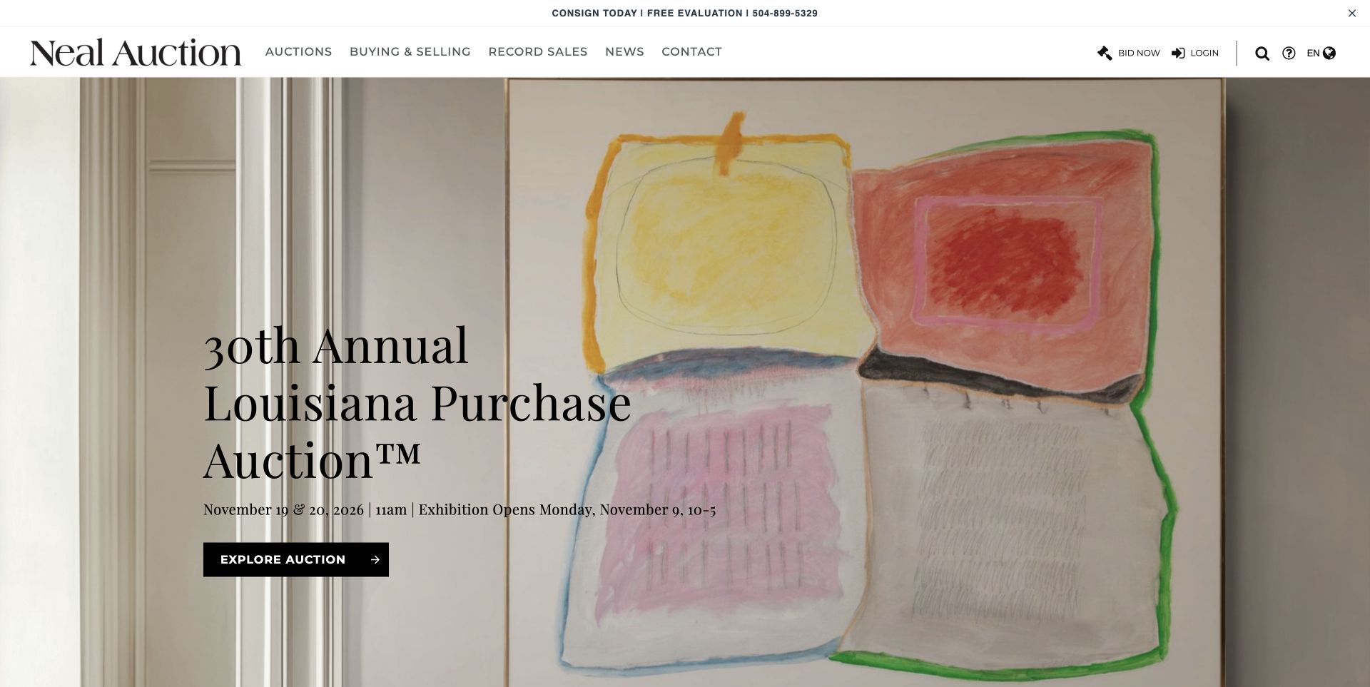
Neal Auction gives its Louisiana Purchase campaign an expansive artwork backdrop, a large serif title and one direct Explore Auction action. The date line distinguishes the auction from the exhibition opening, which matters to a visitor planning to inspect objects in person. Below the opening campaign, four separate routes explain how to bid, sell, ship and pay. That sequence acknowledges that participation involves more than choosing a lot. The New Orleans address and collection hours provide further practical context, while the persistent header keeps the live-bidding destination separate from editorial exploration.
What you can learn
Treat the steps before and after bidding as first-class content. A clear sale announcement can introduce the objects, then a short task-based guide section can answer questions that otherwise interrupt a new collector's progress.
Pros
Auction and exhibition dates appear together rather than being buried in separate calendars.
The four practical guide routes cover buying, consigning and the logistics after a sale.
Cons & considerations
The large campaign occupies most of the first screen, so the useful process guides require scrolling.
The compact date line contains several details and would benefit from careful narrow-screen wrapping.
Rago's opening glass collection uses a nearly black canvas and pale yellow typography, with a large cropped object providing the visual scale. Immediately under the sale title, three parallel links distinguish Information, View lots and Register to bid. This is a useful division of intent: a reader can learn the conditions, examine objects or move toward participation without guessing what a generic action means. A dated network calendar follows the hero, exposing a much wider program of auctions. The visual drama comes from the glass itself rather than from layers of interface decoration.
What you can learn
Name the different levels of commitment in the navigation. Browsing a catalog and registering to bid are separate tasks; giving them distinct routes lets an inexperienced visitor explore without feeling pushed into an account workflow.
Pros
The three campaign actions communicate different destinations in plain language.
Large object imagery and a restrained palette make the collection feel specific rather than generic.
Cons & considerations
The numerical date format is compact but less immediately clear to an international audience.
The network calendar sends visitors to several related websites, so destination labeling matters.
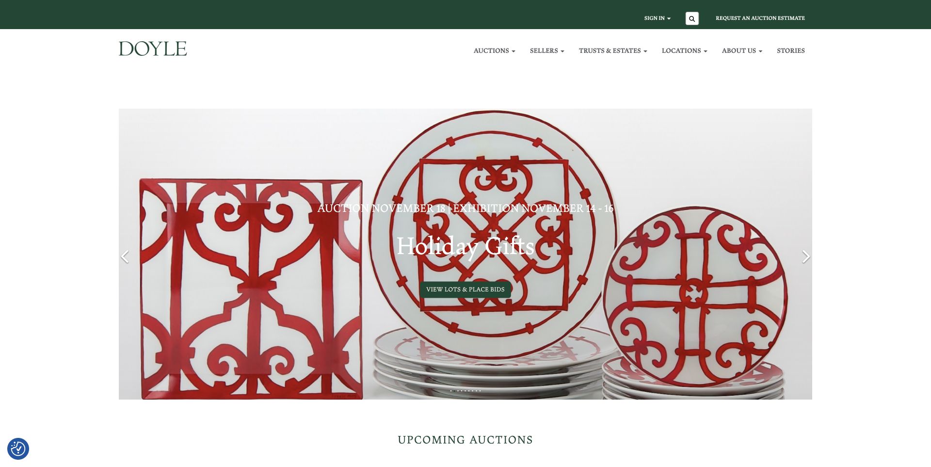
Doyle surrounds its campaign carousel with generous white space and a restrained dark-green identity. The reviewed holiday-gift slide places the auction date and exhibition dates above the title, then provides a specific View lots and place bids action. A separate utility bar keeps Request an Auction Estimate visible for sellers while the main navigation distinguishes auctions, sellers and trusts and estates. Upcoming sale cards repeat dates and registration actions below. The layout demonstrates how buyer and seller journeys can share a homepage without using the same primary button or competing in a single block of introductory copy.
What you can learn
Pair event promotion with viewing information and reserve a stable route for consignors. The campaign can change from sale to sale while the seller's starting point remains predictable in the surrounding navigation.
Pros
The campaign explicitly distinguishes the sale date from the exhibition window.
The estimate request remains separate from the current buyer-focused promotion.
Cons & considerations
White lettering crosses a busy product image, making contrast dependent on the selected slide.
A long results section can add substantial page length after the current auction cards.
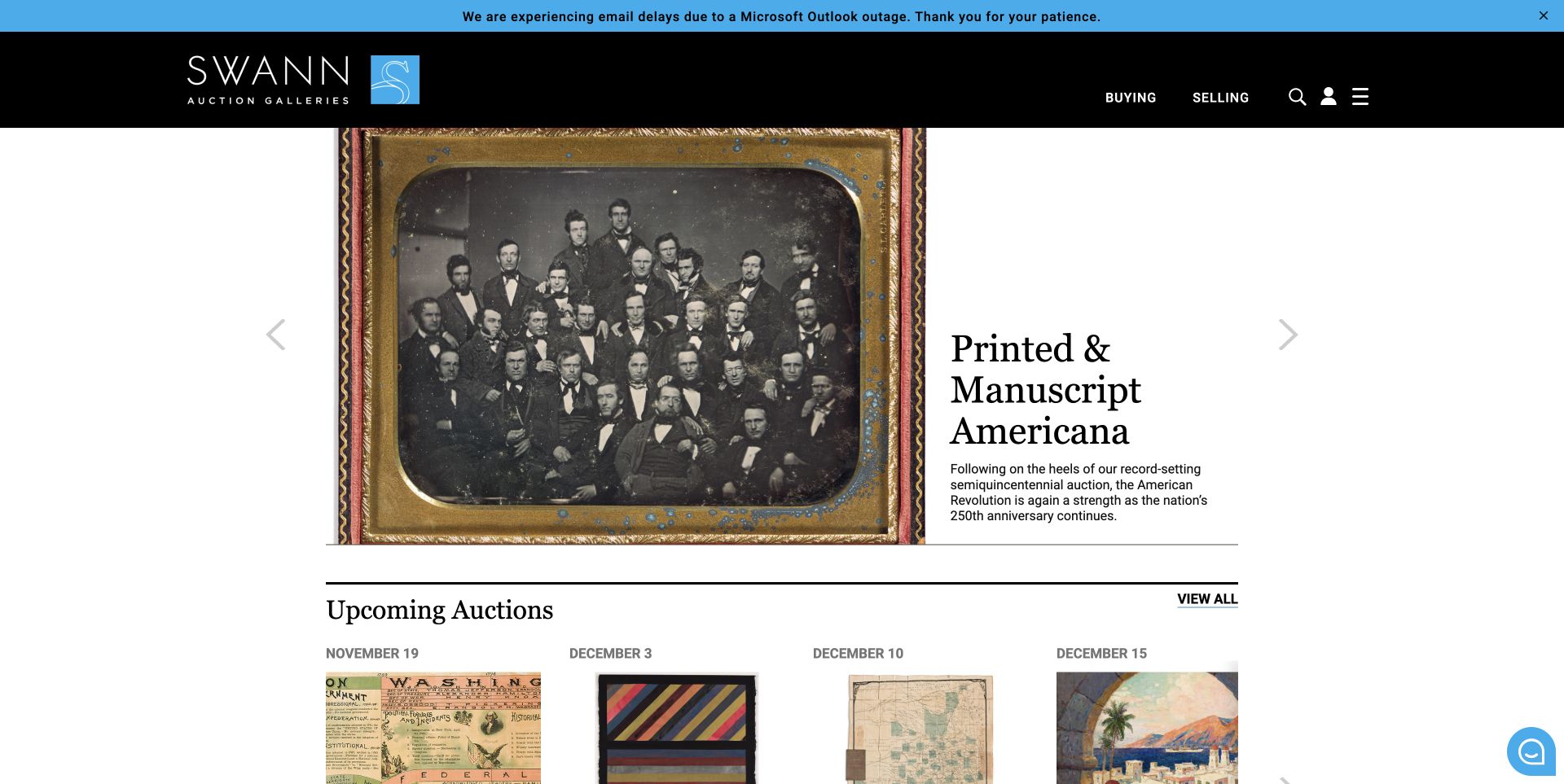
Swann places an archival group photograph beside a clean white text panel for its Printed and Manuscript Americana campaign. The object image and the explanatory paragraph occupy distinct areas, so the copy does not need to fight the detail of the photograph. A black header keeps Buying and Selling visible alongside search, login and a menu. The upcoming-auction row begins within the captured view, giving visitors a second route beyond the rotating feature. The page also mixes sale promotion with articles, making specialist context part of browsing rather than only a document attached to a lot.
What you can learn
Use an editorial split when the object needs close visual attention and the collection needs explanation. A stable calendar below the feature gives readers a practical fallback when the current slide is not their area of interest.
Pros
Copy remains readable on its own background instead of sitting over detailed archival imagery.
The upcoming-sale row quickly exposes other specialist categories and dates.
Cons & considerations
The compact menu hides much of the department structure until the visitor opens it.
Operational notices and app-update campaigns can compete with the auction content in the same opening area.
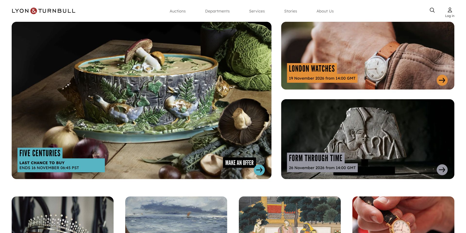
Lyon and Turnbull replaces a single full-width feature with a large left-hand card and two smaller campaigns on the right. The reviewed Five Centuries card states Last chance to buy, gives an end time and uses Make an offer, while neighboring cards display future auction dates and browsing actions. Colored text plates provide contrast over detailed objects without covering the whole image. Farther down, auction viewings and valuation days have their own dated sections. This makes the homepage useful as an operational overview as well as an attractive display of objects.
What you can learn
Model the status of a sale explicitly and let that status determine the action label. Upcoming, open for bidding and available after auction are different states; the website should communicate those differences before a visitor enters a catalog.
Pros
Status, timing and next action are grouped directly on the campaign cards.
The asymmetric grid shows several relevant sales without waiting for a carousel.
Cons & considerations
Different time-zone labels across cards require readers to pay close attention to each event.
Large image cards still push the detailed calendar and seller information farther down the page.
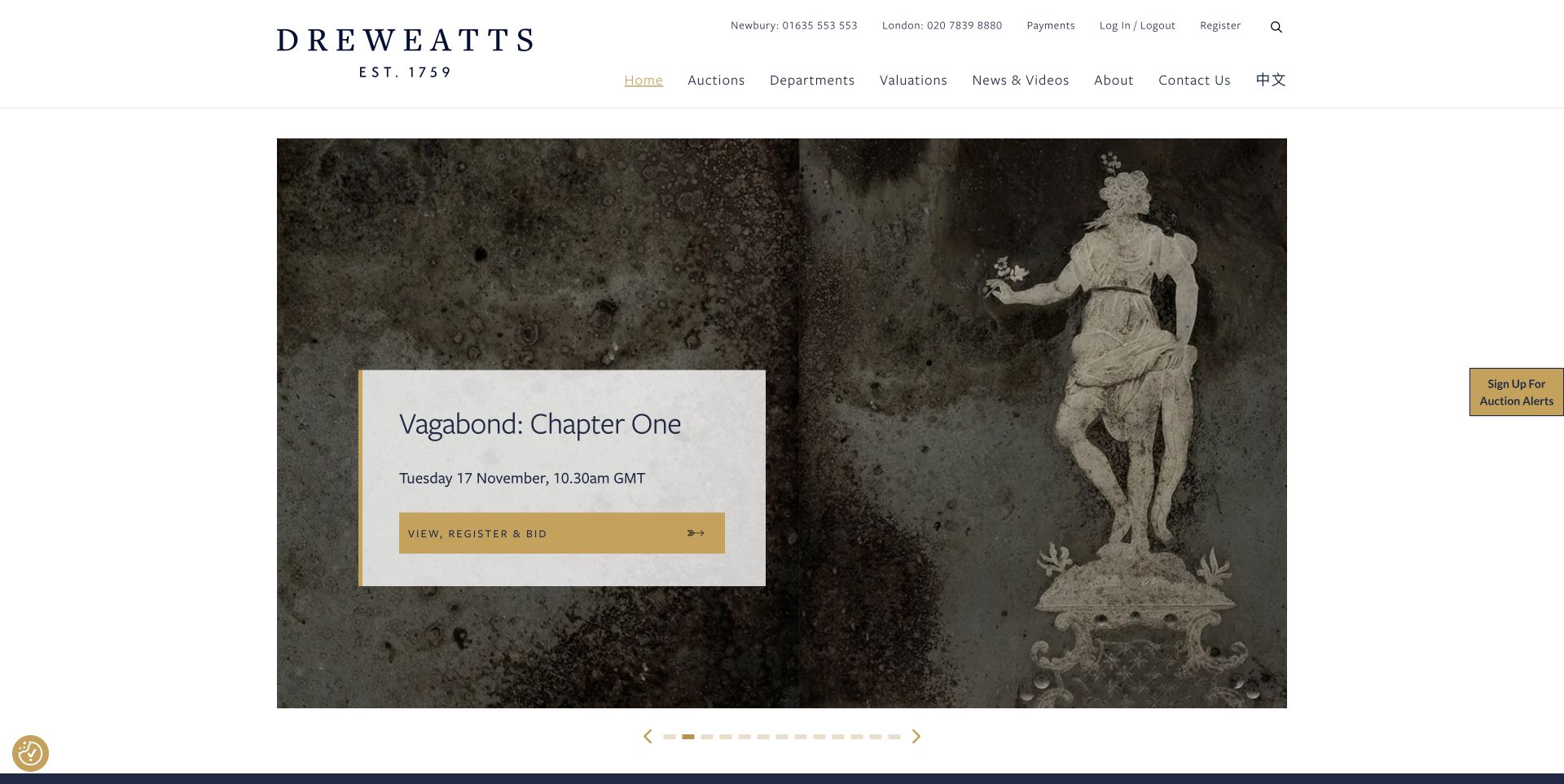
Dreweatts uses a translucent pale panel over its featured object photograph, containing the collection title, the date and time zone, and a gold View, register and bid action. The panel provides a predictable reading area even when the underlying image is dark or intricate. The header separates everyday account and payment tasks from auctions, departments and valuations. Lower on the homepage, trending lots show estimate ranges with a visible fees qualification. The result is a layered information hierarchy: a current campaign first, followed by editorial context and individual objects.
What you can learn
Create a consistent place for the facts that must survive a changing campaign image. Keep operational utilities available, but distinguish them visually from the auction and valuation paths that new visitors are most likely to need.
Pros
The caption groups title, time zone and action on a legible background.
Estimate cards explicitly indicate that fees are additional rather than presenting an unexplained amount.
Cons & considerations
The many carousel indicators provide little information about the other campaigns.
The combined View, register and bid label covers several different levels of visitor readiness.
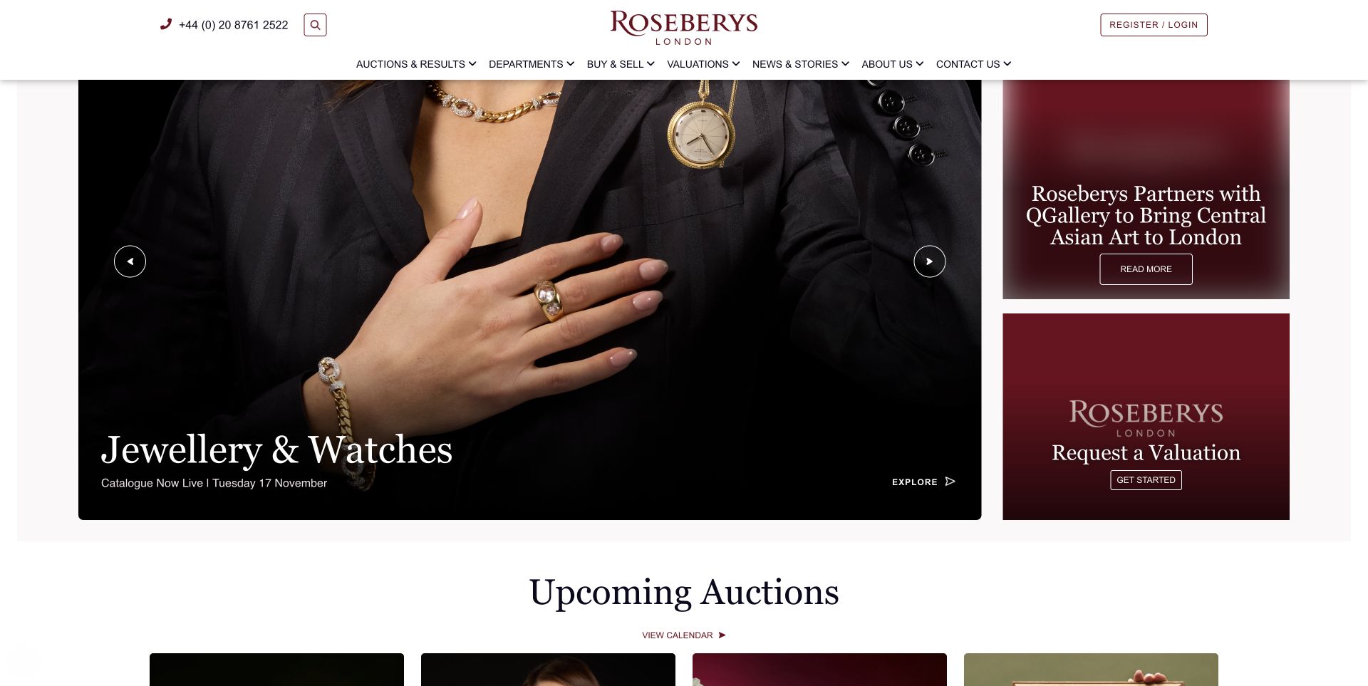
Roseberys gives most of its opening area to a rotating auction campaign and reserves the right-hand column for a story and a valuation request. In the reviewed jewelry slide, the sale title and catalog-live status sit near the bottom of a darkened photograph, while the valuation card keeps its own burgundy background. The arrangement lets a seller find a route without waiting for a seller-focused carousel slide. Upcoming auctions then repeat catalog status and dates, followed by buying and selling guides and recent results. A centered wordmark and restrained palette tie these different modules together.
What you can learn
Reserve stable space for a secondary audience rather than asking every audience to share the same rotating promotion. A compact valuation card can remain useful while individual sale campaigns change around it.
Pros
The valuation request stays visible alongside the buyer-facing campaign.
Catalog availability is stated explicitly in both the hero and the auction listing.
Cons & considerations
The large hero and two side cards create several competing opening actions.
The extensive department and account navigation can feel dense before a visitor understands the terminology.
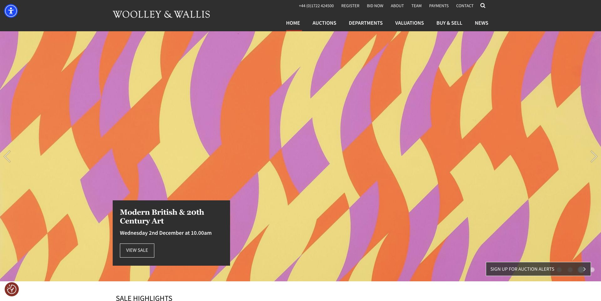
Woolley and Wallis lets a brightly colored artwork fill the opening area while a compact charcoal card supplies the sale name, date and View sale action. The header repeats that charcoal tone, creating a stable frame around a highly variable image. A utility row separates registration, live bidding, payments and contact from the main auction and department navigation. Below the hero, selected results identify the buyer's premium separately. The site demonstrates how a conservative interface can accommodate vivid objects without forcing every campaign into the same visual style.
What you can learn
Keep the information container consistent while allowing the objects to supply color and character. Important dates and actions should remain legible even when the next campaign uses a completely different image or palette.
Pros
A solid text panel protects the sale details from the busy background.
Buyer-premium links beside results provide useful context for interpreting displayed sale amounts.
Cons & considerations
The large opening image delays the more detailed auction and service information.
Small utility links and several floating controls add visual complexity around an otherwise restrained layout.
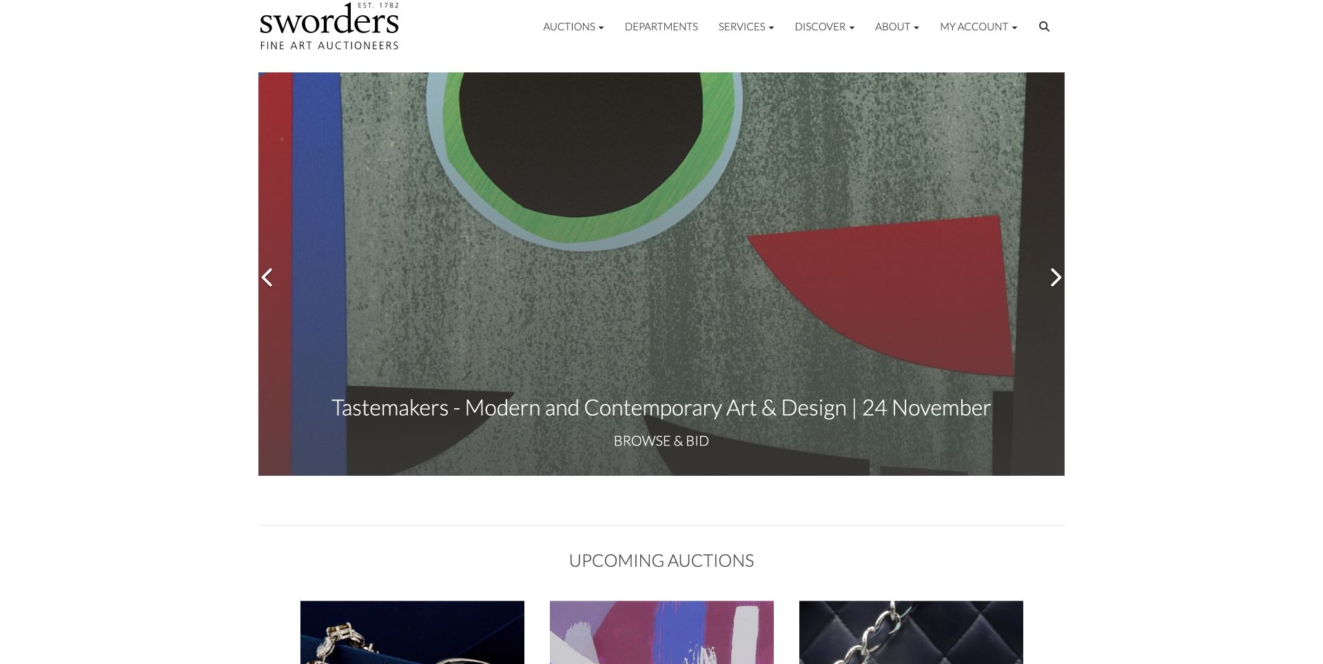
Sworders uses a contained campaign image inside a broad white page rather than extending the artwork to the viewport edges. A concise sale title and date sit near the bottom, followed by a Browse and bid label. The upcoming-auction section gives the rotating campaign a stable counterpart, with dates, browsing links and registration actions. Some entries also offer an illustrated page-turner catalog, while later service blocks cover valuations, appointments, results and shipping. The page gives different forms of catalog access a home, although the number of moving sections requires disciplined labeling.
What you can learn
Give campaign artwork a supporting calendar with repeatable facts and actions. If a sale has both a visual catalog and a searchable lot list, label those formats distinctly so readers can choose the one suited to their task.
Pros
The upcoming-sale cards expose dates and participation routes beyond the opening carousel.
Collection and shipping guidance is treated as a service destination rather than hidden in a footer.
Cons & considerations
Several carousels can make the page harder to scan as a complete schedule.
Campaign text sits directly over artwork and needs contrast checks for every replacement image.
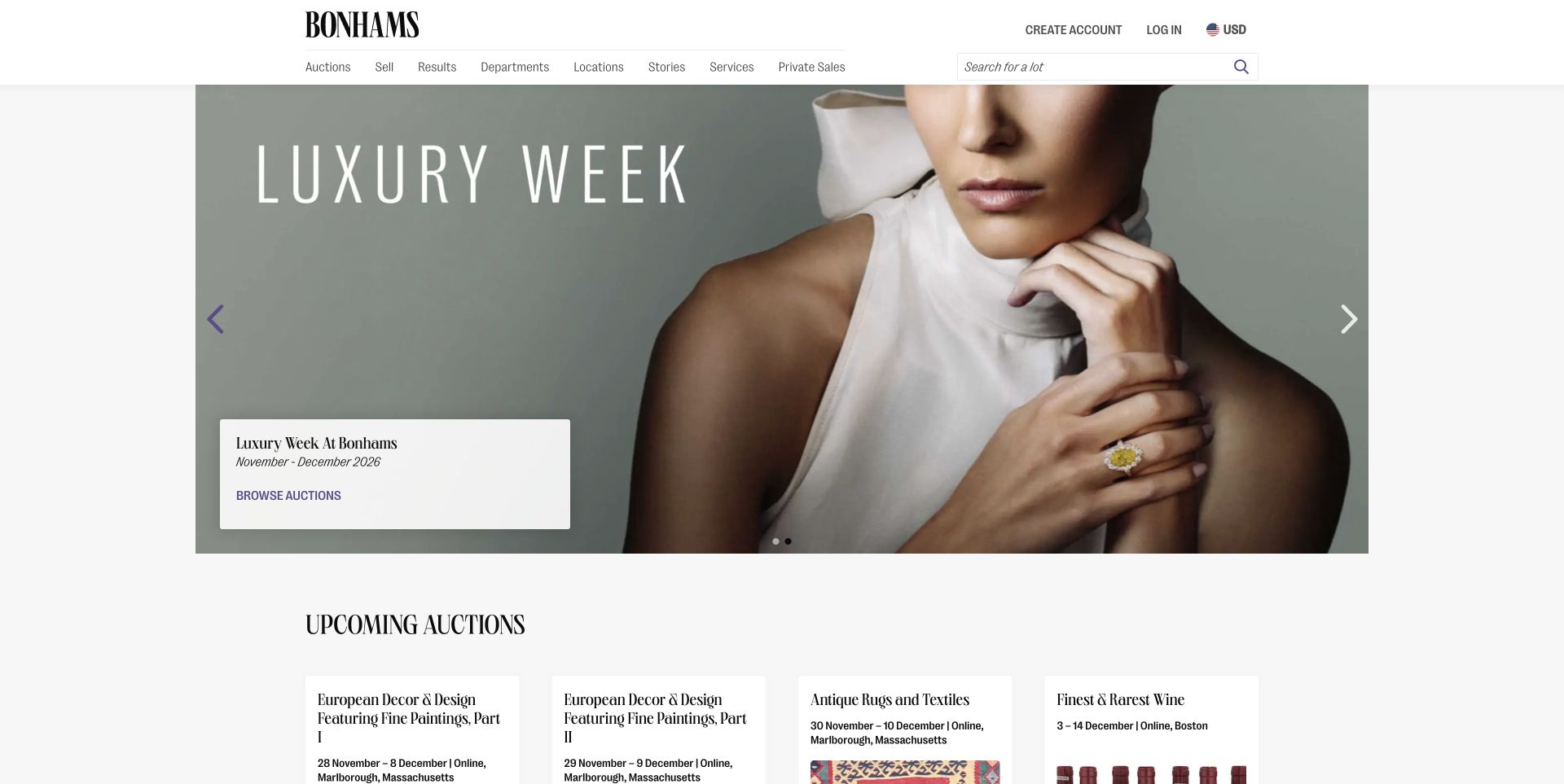
The former Skinner address now leads to Bonhams Skinner's regional site. Its header uses the wider Bonhams identity, with a lot-search field and persistent routes to auctions, selling, results and departments. The opening Luxury Week promotion is followed by a schedule that names locations such as Marlborough and Boston and distinguishes online date ranges from live auctions. A separate Explore more auctions section introduces the wider network. This is useful evidence of the information problem created by consolidation: visitors need to understand which material belongs to their local branch and which belongs to the group.
What you can learn
Preserve local context inside a shared platform. Put the saleroom, sale format and dates on each card, and label cross-network discovery separately so a regional visitor does not mistake a distant event for a local one.
Pros
The regional auction cards state location and distinguish online and live formats.
The lot-search field remains visible in the header for visitors with a specific object in mind.
Cons & considerations
The broad opening campaign communicates the parent brand more strongly than the regional identity.
Local and wider-network auctions require clear section boundaries to avoid location confusion.
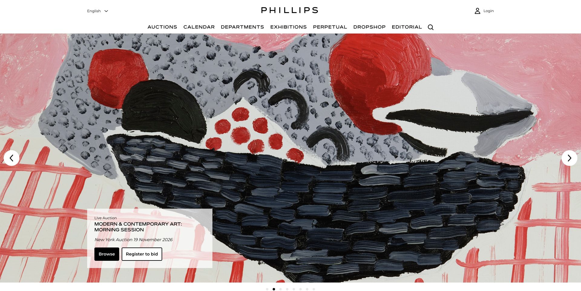
Phillips fills the opening screen with a close view of a painting and places a small translucent information panel in the lower-left corner. The panel identifies the sale as a live auction, gives its location and date, and distinguishes Browse from Register to bid. A clean white header names auctions, calendar, departments, exhibitions and editorial destinations. Below the campaign, videos and articles extend the context around artists and collecting. The interface is most instructive where it gives different visitor intentions separate actions without placing a large promotional headline across the work.
What you can learn
Let visitors inspect the catalog before asking them to enter the participation flow. Supporting editorial material can deepen the collection's context, but the sale facts and browsing route should remain independently understandable.
Pros
Browse and registration are separate buttons with clearly different commitments.
The contained information panel leaves most of the artwork visible.
Cons & considerations
Several branded destinations in the main menu may be unfamiliar to a first-time visitor.
A nearly full-screen rotating image can delay discovery of the broader sale calendar.
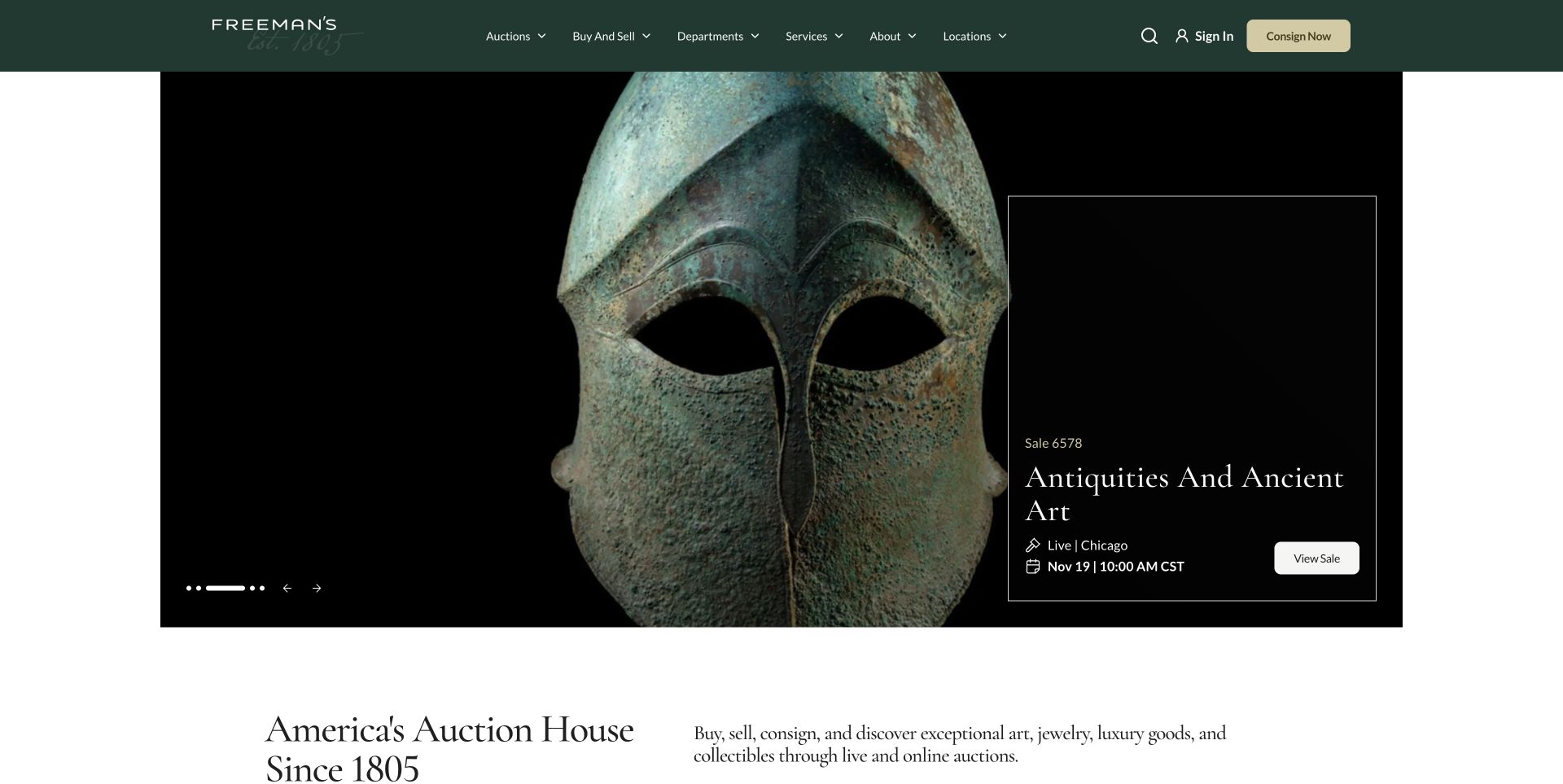
Freeman's pairs a large isolated object with an outlined text panel on a black background. The captured panel includes a sale number, title, live format, Chicago location and a date with a CST time zone. A contrasting View sale button completes the block. The green header keeps Consign now visible while the body later introduces departments, buying guidance and selling guidance. The design turns operational details into a repeatable visual component instead of leaving them in a paragraph. The older Hindman address redirected here during research and is therefore not counted as another website.
What you can learn
Make the sale record visible as a small, predictable set of fields. Format, location and time zone are especially useful when one brand runs many auctions; they should not depend on a reader recognizing an internal sale number.
Pros
The caption states format, location and time zone together with the sale title.
The persistent consignment action serves sellers without displacing the current auction.
Cons & considerations
The tall campaign uses substantial screen space before the auction list begins.
A sale number is useful for returning customers but needs the descriptive title beside it for newcomers.
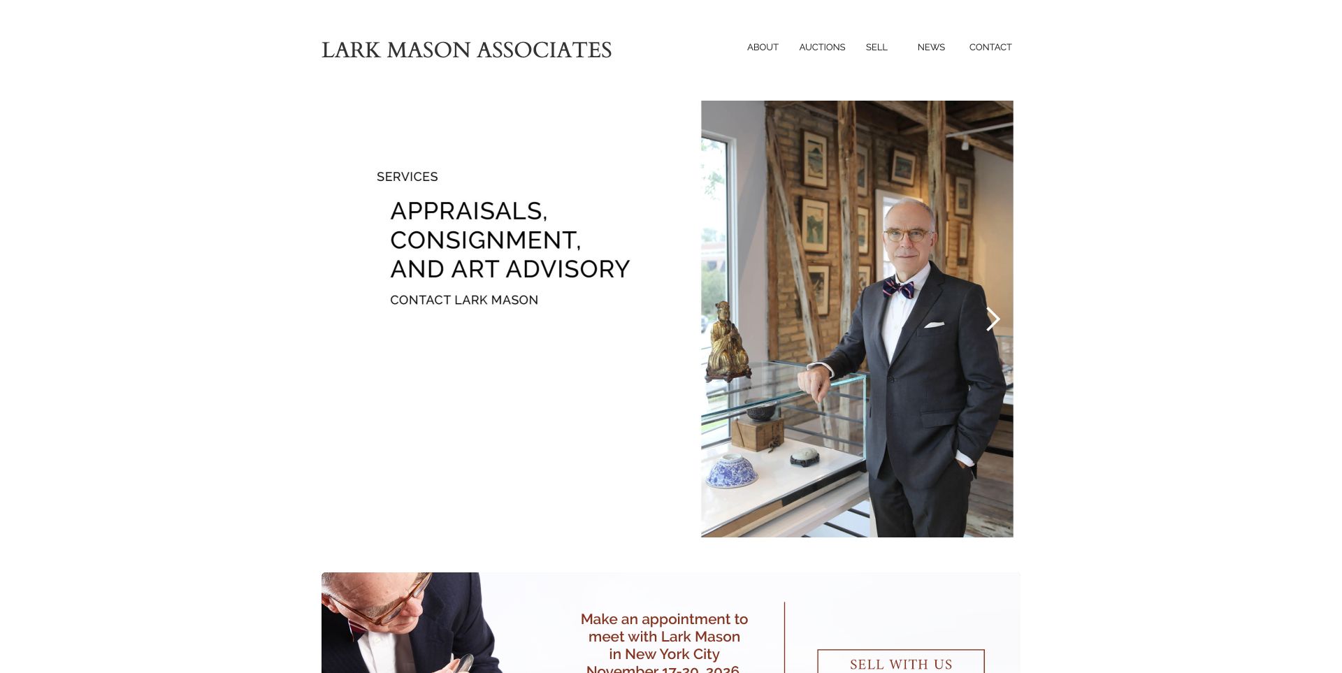
Lark Mason Associates uses a narrow, white layout with a serif wordmark and a small navigation row. The accepted campaign presents a portrait beside the plainly named services of appraisals, consignment and art advisory. Below, the homepage lists current auctions with date ranges and directs readers to the iGavel platform, while featured lots introduce the kinds of property handled. This approach makes the specialist relationship more prominent than a large online marketplace interface. The external catalog destinations remain important context: the public presentation and the bidding environment are separate parts of the visitor's journey.
What you can learn
A smaller specialist business can begin with the person and services behind the sale, then explain the catalog handoff clearly. Keep the relationship between advice, consignment and actual bidding visible rather than presenting them as one indistinguishable action.
Pros
The portrait and concise service list provide a clear introduction to the specialist offering.
Current auction entries include start and end dates before the external catalog link.
Cons & considerations
Several campaign captions are embedded in imagery and can be clipped during carousel transitions.
External catalog and advisory destinations need clearer handoff cues for unfamiliar visitors.
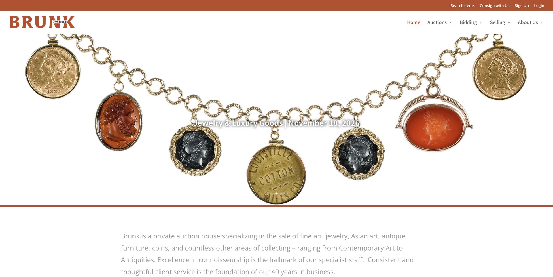
Brunk uses a warm rust-colored identity around large object photographs, with a short sale title and date over the image. The utility bar gives Search items and Consign with us separate positions, while the main navigation divides bidding from selling. Below the opening feature, the page introduces the house's collecting categories and provides a long series of sale catalogs and stories. A pickup notice adds practical context for consignors beyond the auction location. The useful lesson is the parallel treatment of object discovery and property intake, even though the first-screen typography can be difficult against pale photography.
What you can learn
Keep seller logistics close to the invitation to consign. A visually appealing catalog is only one side of an auction business; clear collection arrangements and a separate selling route help visitors understand how property reaches the sale.
Pros
Search and consignment are distinct utility actions available above the campaign.
The page connects specialist sale catalogs with a practical pickup announcement for sellers.
Cons & considerations
White campaign lettering loses contrast against some of the light object backgrounds.
Repeated View links and externally hosted catalogs make destinations less specific than they could be.
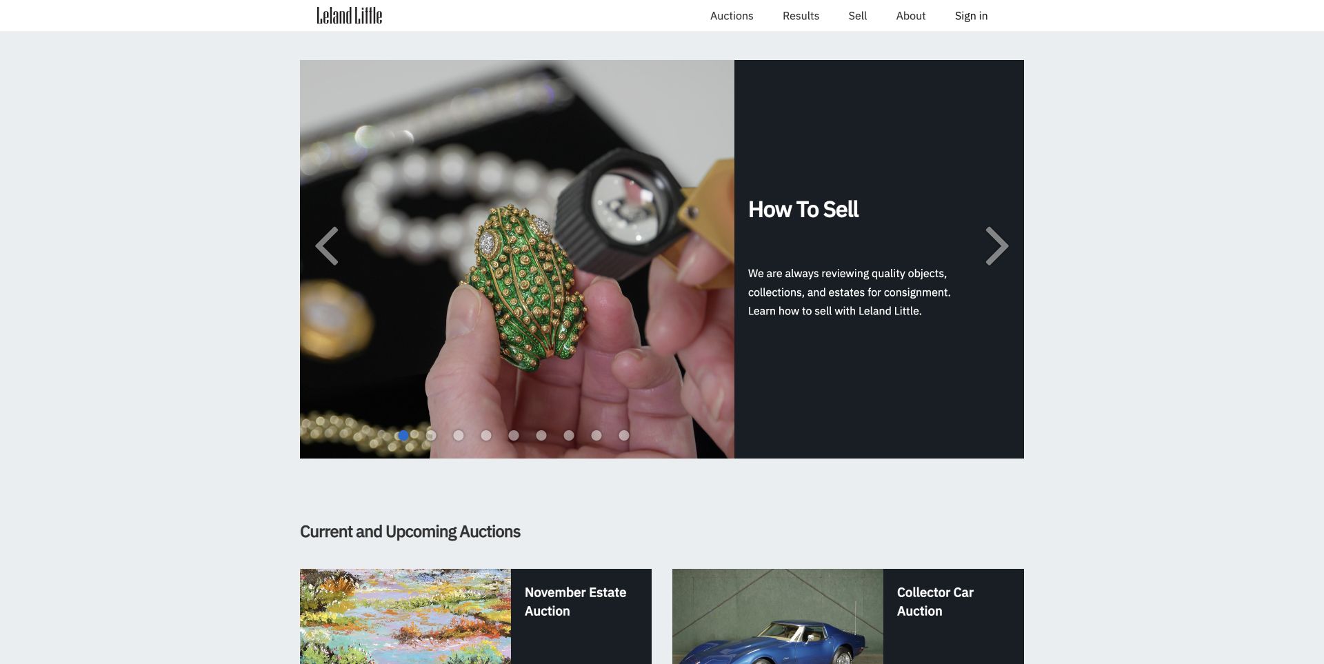
Leland Little's reviewed opening slide splits a close-up of an object being examined from a dark How to Sell panel. The copy names objects, collections and estates as the subject of the consignment process. Directly below, the current and upcoming auction grid distinguishes available sales from future entries whose catalog publication dates are stated explicitly. A later specialist section is organized by department, followed by stories and preview events. This is a useful combination of seller education and calendar transparency: a visitor can see that an announced sale is not necessarily ready to browse yet.
What you can learn
Distinguish the date of the auction from the date its catalog becomes available. Give an unavailable catalog a clear status and expected publication date rather than styling it as though it were already a functioning browsing link.
Pros
Future sale entries explain when their catalogs will be posted.
The seller introduction uses a relevant inspection photograph and a concise explanation of eligible property.
Cons & considerations
Many carousel dots offer little indication of the other opening campaigns.
Future entries resemble links even when the catalog is not yet available, so status cues carry extra responsibility.
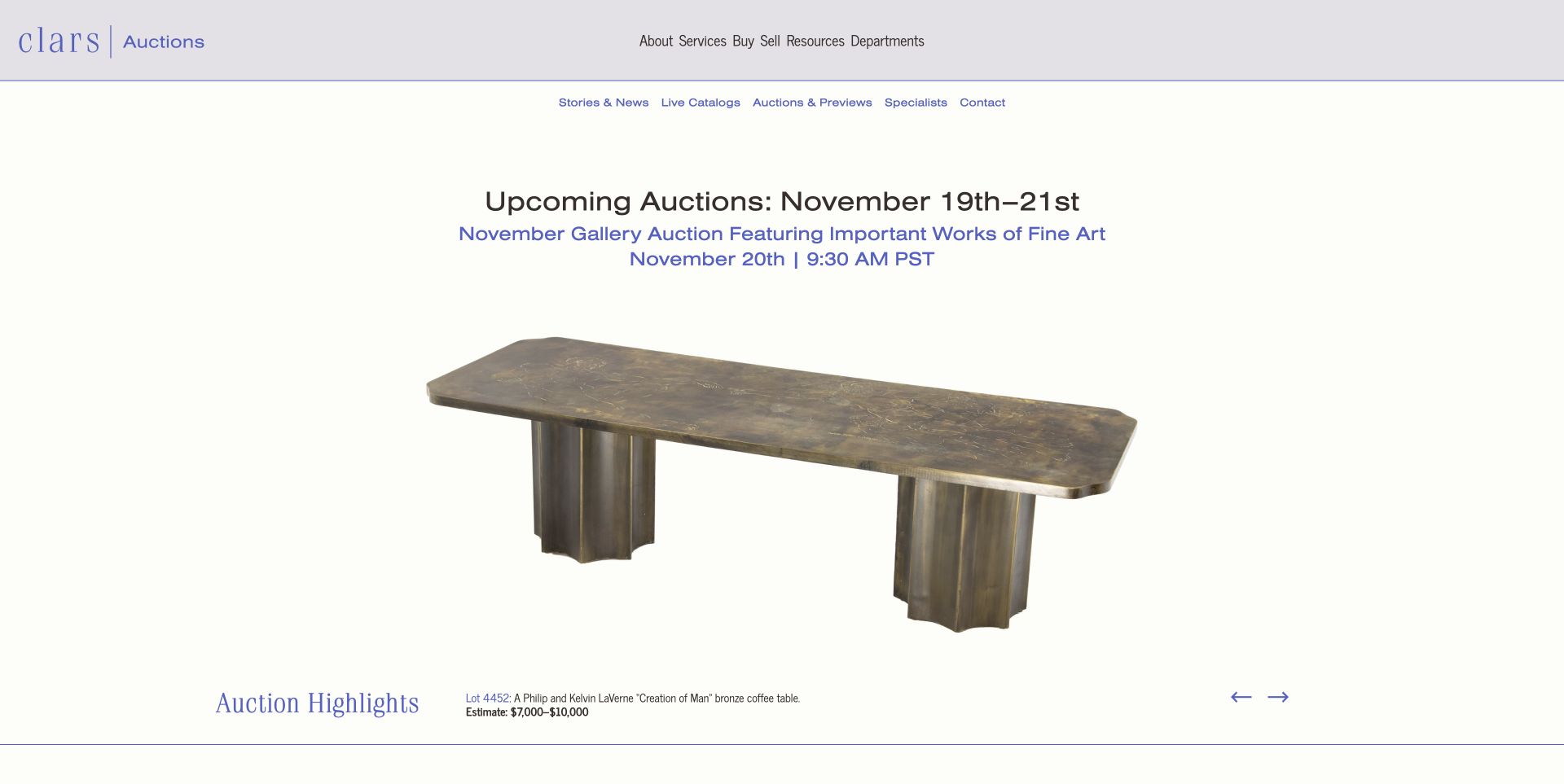
Clars presents a single object against a nearly white canvas, with the auction title and timing above it and a compact lot caption below. In the captured state, a bronze table occupies the center while its lot number, description and estimate remain separate readable text. The two navigation rows distinguish broad services from live catalogs, previews, specialists and contact. Farther down, the homepage explains departments and includes a valuation invitation. The restrained object presentation is a useful alternative to a dense collage, although the two levels of navigation require careful spacing and prioritization.
What you can learn
Use the object as the visual focus while keeping identification and estimate information in a stable caption. An attractive highlight should lead to a larger sale context rather than become an isolated image with no clear date or catalog connection.
Pros
The lot caption separates identification and estimate text from the object photography.
The opening sale heading includes both the date and the Pacific time-zone label.
Cons & considerations
The tightly spaced upper navigation is harder to scan than the generous object area below it.
A highlighted estimate still needs a clear path to the full conditions and applicable charges.
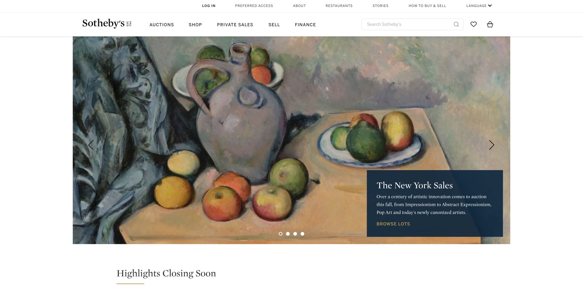
The retained Sotheby's capture gives a still-life painting most of the opening area and places a dark blue New York Sales panel in its lower-right corner. The panel introduces the program and offers Browse lots without obscuring the center of the artwork. Above it, separate navigation labels distinguish auctions, shopping, private sales and selling, while a search field supports a more specific object hunt. A Highlights closing soon section begins below the feature. This is a useful comparison with smaller auction houses because the navigation must explain several transaction models within one brand.
What you can learn
Keep the object presentation calm while naming the different ways a visitor can engage with the catalog. Auctions, direct shopping and private sales should have distinct routes and explanations, not merely different visual treatments of an unlabeled purchase action.
Pros
The contained caption preserves a large, uninterrupted view of the featured painting.
The main navigation explicitly separates auctions, shopping, private sales and selling.
Cons & considerations
The opening panel introduces a sales program without immediately exposing each event's exact date.
Small utility labels and understated carousel controls can be overlooked on a wide screen.
Platform source: Official technology-specific customer or workload source. Twilio describes Sotheby’s centralizing customer information with Segment, implemented with Gangverk, for personalized engagement. This evidence establishes only the stated product, workload, organization or historical association. It does not prove that the pictured public page uses the technology, reveal its CMS/frontend, establish a complete current architecture or independently verify vendor-reported outcomes. Platform evidence is separate from the direct website screenshot and is not a complete current infrastructure audit.
Kegan is a freelance web designer and developer with 15+ years of experience helping businesses turn complicated website requirements into clear, maintainable digital experiences. He works directly with clients from planning and design through development, launch, and ongoing support.
For auction house website design, his development approach focuses on auction calendars, lot and catalogue navigation, sale formats, buyer fees, condition-report requests, and clear bidding, selling and collection guidance. The scope can be a targeted improvement or a complete custom build, with responsive layouts, thoughtful content structure, and integrations chosen around the people using and maintaining the site.
Show 3 other auction house website designersHide other auction house website designers
Plan an auction-house website around objects, sales and participation
Define a sale record before designing its campaign
Create separate fields for the sale title, identifier, format, location, start and end times, time zone, exhibition arrangements and catalog destination. Decide which fields are mandatory for each sale type. A timed online auction needs a closing window, while an in-person event also needs useful location and viewing information.
Use those records in the homepage, calendar and department pages so that a date correction does not require editing several unrelated blocks. Keep the auction date distinct from the exhibition date and from the date the catalog becomes available. Leland Little's forthcoming catalog labels illustrate why those are three different pieces of information.
Give each state a deliberate action label. View catalog, register to bid, see results and enquire about remaining lots should lead to the appropriate destination. Do not leave an old registration action on a completed sale simply because its campaign image still looks attractive.
Design catalog discovery for different levels of knowledge
An experienced collector may search for an artist, maker, lot number or object type. A first-time visitor may begin with a department or a current auction. Support both approaches without requiring the reader to know internal sale codes or the house's branded campaign names.
Use consistent lot cards with meaningful titles and clearly labeled estimates where they are published. Make the relationship between a lot and its sale visible. A visitor arriving from search should be able to find the relevant date, conditions and house contact without returning to the homepage to reconstruct the context.
If offering both a page-turner catalog and a searchable lot list, name the formats. They serve different reading styles and should not share an unexplained View link. Preserve a clear route to the official bidding environment when the editorial catalog is hosted separately.
Give consignors a separate, proportionate starting point
Explain the kinds of property the house handles and how an initial enquiry is reviewed. A valuation request should identify the information the team actually needs and distinguish an initial estimate from a guarantee. Use the business's approved terminology rather than making promises through a promotional button.
Keep the seller route visible even when the homepage is dominated by a buyer-facing campaign. Roseberys uses a stable valuation card beside its rotating feature, while other sites reserve a utility link or a contrasting header action. Choose a treatment that the team can keep consistent across the full site.
Decide how photographs and ownership details are received and protected before adding an upload form. Give people a plain contact alternative. Do not ask for more personal or property information than the initial assessment needs, and do not place submitted material in a publicly accessible content folder.
Make viewing, payment and collection understandable
Write practical guides for viewing objects, registering, paying and arranging collection or shipping. Keep the guidance linked from the relevant sale and lot pages. Neal Auction's four task-based routes are a useful model for acknowledging that the visitor's work continues after discovering an object.
Show which location handles a particular sale or collection appointment, especially when the organization has several offices or belongs to a larger group. A regional homepage should distinguish local auctions from wider-network recommendations. Do not assume that a familiar parent brand tells the visitor where an object is located.
Review the public handoffs without placing bids, making payments or submitting real enquiries. Check that a browsing action reaches the intended catalog and that the site's explanations match the named external service. Have the house's responsible reviewers approve its conditions, fee explanations and transaction-related statements.
The editing job behind the design
Choose tools around the catalog and the house's editorial work
Separate the responsibilities of the marketing site, object catalog and bidding platform before choosing a front end. The editorial system needs to manage departments, specialists, stories and sale campaigns; the transaction system has different operational requirements. Define how identifiers and dates stay consistent across those systems.
A reusable sale model is more valuable than a collection of individually designed banners. Support image selection, readable captions, status changes and archives without requiring staff to rebuild a page for every auction. Keep old results distinguishable from current availability and retain the history the business is entitled to publish.
The technology stacks shown with these examples come from bounded public-source observations and retained qualified evidence. They do not reveal a complete backend, prove transaction security or establish which system would suit another house. Evaluate providers against the actual catalog, editing, integration and support requirements instead of choosing them from appearance alone.
Our WordPress website examples offer a separate look at publishing approaches. A visible platform label is evidence for that named page, not a guarantee that the same system will suit your requirements.
Before the public launch
Auction-house website planning checklist
Store sale dates, time zones, locations and formats as structured text.
Distinguish auction dates from exhibitions and catalog publication dates.
Use different actions for browsing, registration, results and remaining lots.
Keep a persistent consignment or valuation enquiry route.
Give each lot a stable identity and a clear relationship to its sale.
Label estimates and link to the applicable fee and condition information.
Provide both department browsing and useful object search where appropriate.
Explain external catalog, bidding and payment handoffs.
Publish verified viewing, collection and shipping guidance.
Keep campaign text legible across every artwork and carousel state.
Make optional consent and promotional overlays dismissible through normal controls.
Review public journeys without creating test bids, payments or real enquiries.
These checks are a project checklist, not a performance, legal, security, or accessibility certification. Test real journeys with the people responsible for the website before making claims about the result.
Sources & editorial method
How this collection was selected and reviewed
The random target of 17 was saved before research and has not been rerolled. Sixteen source pages were directly inspected and newly captured on November 12; the previously verified Sotheby's homepage capture is reused with its original November 9 timestamp and a new auction-specific review. The former Skinner address redirected to the reviewed Bonhams Skinner regional site. Hindman's address redirected to Freeman's and was excluded as a separate example. Chiswick was held because a reject or necessary-only consent dismissal was not verified. Normal controls were used to dismiss optional overlays; transitional or obstructed captures remain private and were replaced only within the bounded attempt rule. Every included source received the standard broad public stack-audit attempt. Neal Auction's explicit Editors Choice concerns its information design and practical process guidance, not valuations, authenticity, financial outcomes or service quality.
Each example links to its actual source page. Screenshots are direct browser captures with their own capture dates; moving imagery, announcements and live designs can change. The notes describe observable design choices and conditional tradeoffs, not measured traffic, conversion results, service quality, or accessibility conformance.
Technology labels use public page metadata, asset evidence, or explicitly cited platform documentation. Platform documentation is not a complete current deployment audit. A component reference may be legacy or unused; it is not a complete backend inventory. Unknown stacks are omitted. These sites are editorial examples, not our client portfolio.
Written, Edited and Curated are separate editorial records, not timestamps advanced by a rebuild. Website designs and imagery belong to their owners. See our editorial standards or suggest a correction.
Questions worth asking
Auction House website design questions
What should an auction homepage make clear first?
Identify the current sale, its status, date or closing window, location or online format, and the appropriate next action. Keep a visible route for sellers and visitors who want a different auction or department.
Should browsing require an account?
Consider letting people inspect the public catalog and participation guidance before registration. Account requirements should be explained at the point where they become necessary, rather than making a general browsing link unexpectedly open a registration process.
How should a site distinguish estimates from sale results?
Label each amount according to its actual meaning and provide the relevant conditions and charge information. A pre-sale estimate, a hammer amount and a total including charges are different facts and should not share an ambiguous price label.
Can the main site and bidding platform be separate?
Yes, but the handoff should identify the destination and preserve the sale context. Keep dates, identifiers and guidance consistent, and provide an official contact route if a visitor is uncertain about the transition.
What does Editors Choice mean here?
It recognizes a specific design approach observed in the reviewed public site. Neal Auction was selected for combining a regional campaign and exhibition details with separate bidding, selling, shipping and payment guides. It is not a recommendation to buy, sell or invest through that company.
Borrow the structures that make objects and participation easier to understand: readable sale facts, distinct buyer and seller paths, and practical guidance around the transaction. Build the actual conditions and operating process around the auction house's own verified responsibilities.