Best Aerial Fitness Studio Websites of 2026 (13 Real-World Examples)
Real aerial fitness studio websites showing how to explain apparatuses, welcome beginners and connect class information to a useful booking route.
An aerial fitness website should make an unfamiliar activity understandable before it asks someone to reserve a class.
A dramatic photograph can communicate what aerial movement looks like, but it does not answer the questions that decide a first visit. Someone still needs to know which class is suitable, where the studio is, what the session costs and how to prepare. A returning student has a different task: finding the current schedule with as little friction as possible.
These thirteen examples include independent studios, broader aerial schools and a multi-location fitness brand. Compare how they explain equipment, separate adult and youth programs and connect an inviting visual identity to practical information. The collection evaluates website design and communication; it does not assess instruction quality, equipment safety, medical suitability or fitness results.
Before the examples
What makes good aerial fitness studio website design in 2026?
Explain the first class in ordinary language
Do not assume a visitor knows the difference between silks, sling, hoop and trapeze. Use a short description, an appropriate photograph and the studio's actual prerequisites. Identify the introductory class clearly and explain how someone should ask about suitability. Avoid presenting advanced performance images as evidence that beginners need the same abilities.
Connect schedules to useful class information
A calendar is more useful when its labels match the descriptions elsewhere on the site. Explain the level, age group, duration and booking process before handing someone to a scheduling provider. Keep current students' account access easy to find, while giving newcomers a route that does not require them to understand the entire timetable first.
Show the studio people will actually visit
Use authentic photographs of the space, equipment and ordinary classes alongside performance images. Give the location and arrival information a clear home. Introduce instructors accurately, with relevant roles and supported qualifications. The website should help someone recognize the studio and know what to expect without promising an outcome that has not been established.
The collection · 13 examples
13 aerial fitness studio websites worth studying
Notice which sites lead with a class in progress, which lead with a performance and which begin with practical choices. The strongest pattern for your studio depends on the questions visitors need answered before they can choose a suitable first session.
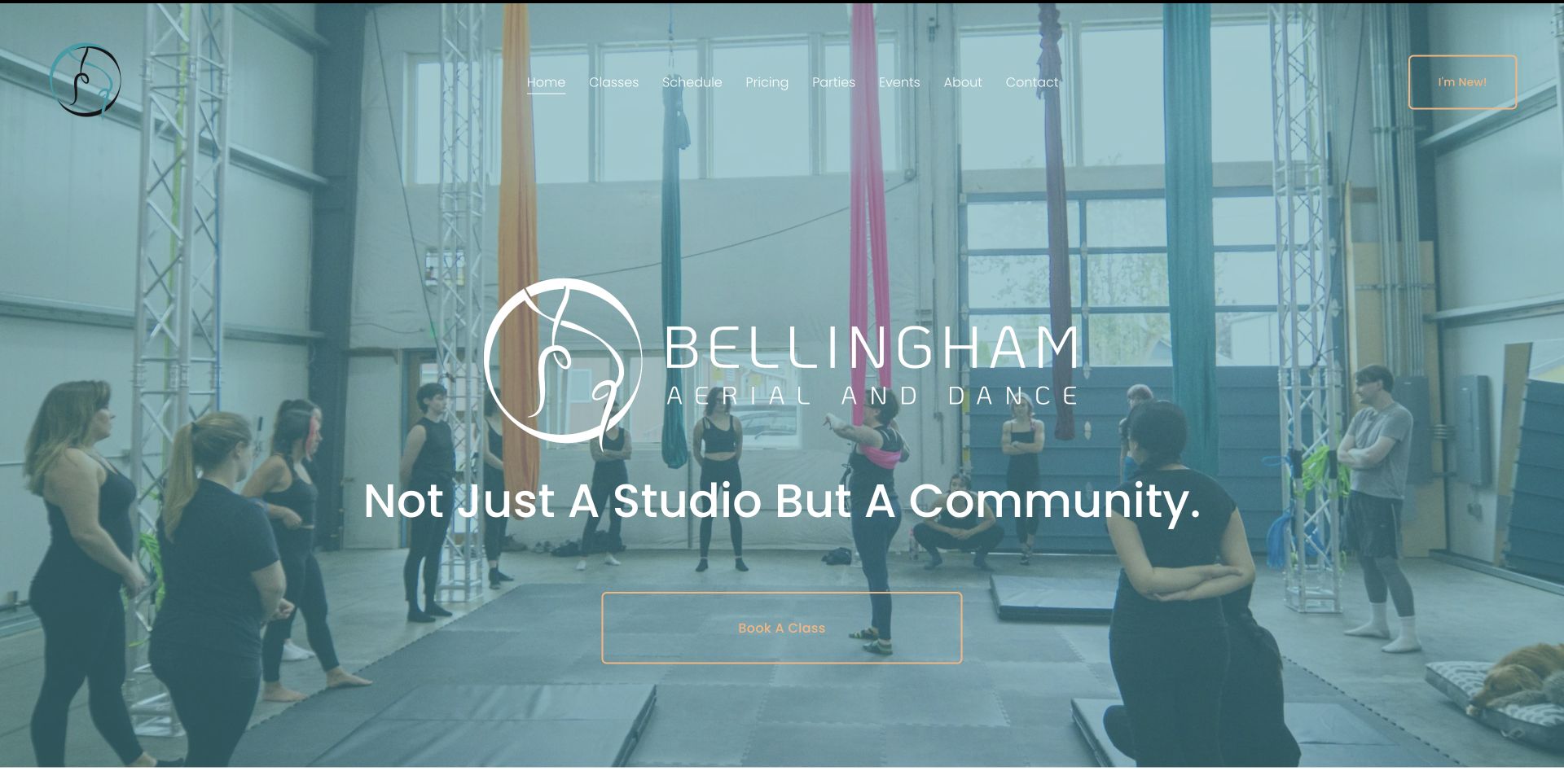
Bellingham Aerial & Dance opens with a photograph of people learning together in the studio, rather than an isolated demonstration of an advanced trick. The large wordmark and community statement sit over that image, while an outlined booking button provides the main action. The navigation also gives newcomers their own destination. Further down, introductory offers, apparatus options, memberships and beginner questions make the welcome concrete. The design is useful for a studio that wants to explain both the social setting and the practical commitment before someone books.
What you can learn
Pair the atmosphere of a real class with a clearly named first-visit route. A welcoming photograph becomes more useful when pricing, suitable classes and preparation questions are close behind it.
Pros
The real group setting helps visitors picture an ordinary class rather than only a performance.
Newcomer guidance, schedules and pricing have distinct navigation destinations.
Cons & considerations
An image-backed header needs careful contrast checks as crops change across screen sizes.
Introductory prices and expiry conditions require an owner who will keep them current.
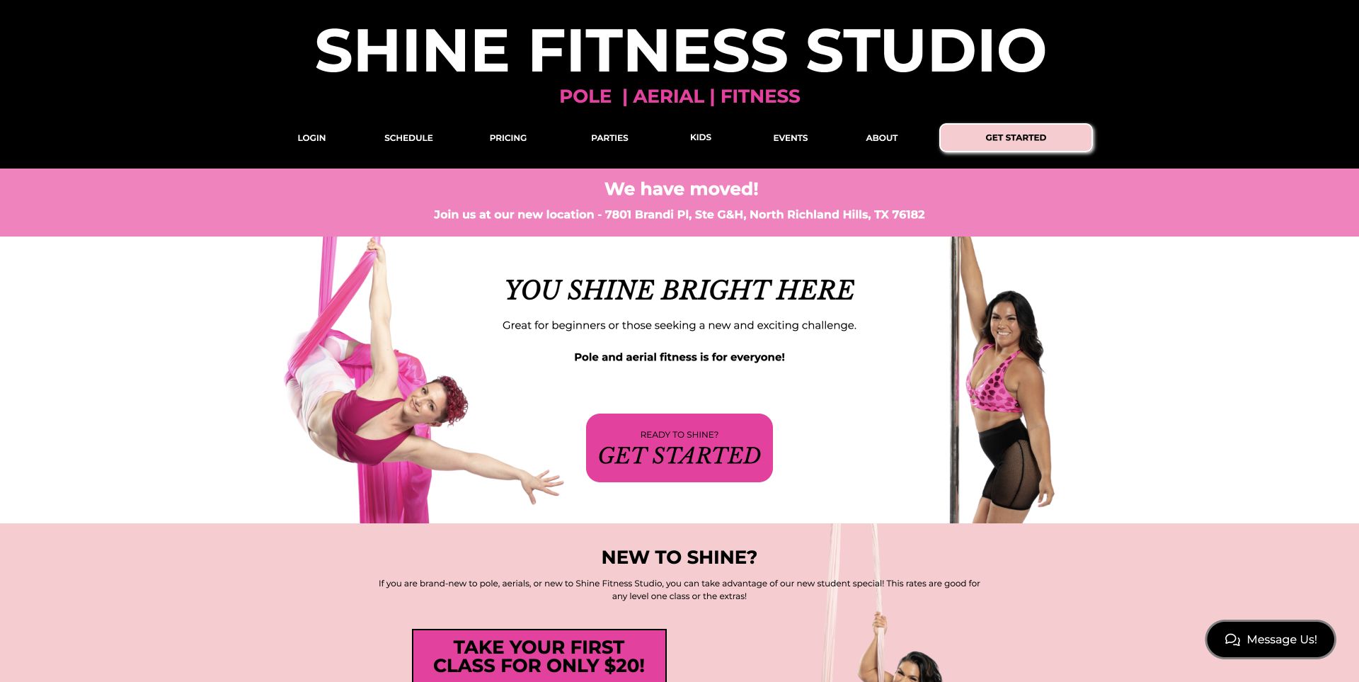
Shine Fitness Studio uses black, white and vivid pink to organize an opening screen with two different disciplines in view. A silk participant and a pole participant flank the central welcome, with a prominent Get Started control between them. The relocation strip is difficult to miss, and the next section immediately explains the new-student offer. Schedule, pricing, parties and children’s classes are named directly in the header. This is a useful example of letting a studio’s personality remain strong while giving a first visitor recognizable practical routes.
What you can learn
Give the first class a clear entry point and place important operational changes where returning students will see them. Distinct class photography can explain a mixed offering faster than a general fitness slogan.
Pros
The relocation notice states the destination rather than relying on a vague announcement.
The first-class offer follows the introductory message without a long promotional detour.
Cons & considerations
Several Get Started links should make their different booking destinations clear.
Bright notices and promotional blocks can compete if too many are added at once.
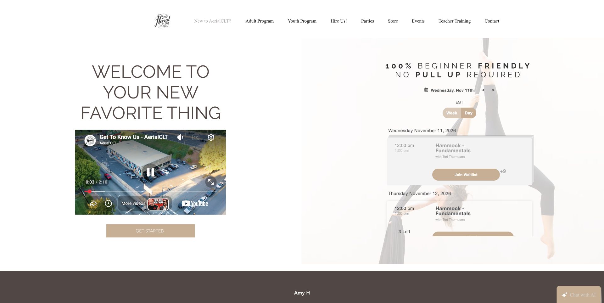
AerialCLT puts its beginner message beside an embedded schedule and a welcome video. The first screen directly addresses a common fear about strength prerequisites, while the dated class cards let a visitor connect that reassurance to an actual session. Adult and youth programs, parties and performance bookings are separated in the top navigation. The restrained pale palette gives the page a quieter character than many fitness sites. Study the relationship between an introductory promise and an immediately useful schedule, rather than treating the embedded booking interface as decoration.
What you can learn
Answer the question that prevents someone from starting, then put a relevant class next to the answer. Keep audience routes separate so a parent, adult beginner and event organizer do not need the same explanation.
Pros
Beginner suitability is stated prominently instead of being buried in an FAQ.
The embedded schedule places concrete session information near the introduction.
Cons & considerations
Pale backgrounds and overlaid schedule text deserve careful contrast testing.
Third-party video and schedule embeds need useful fallback links when they cannot load.
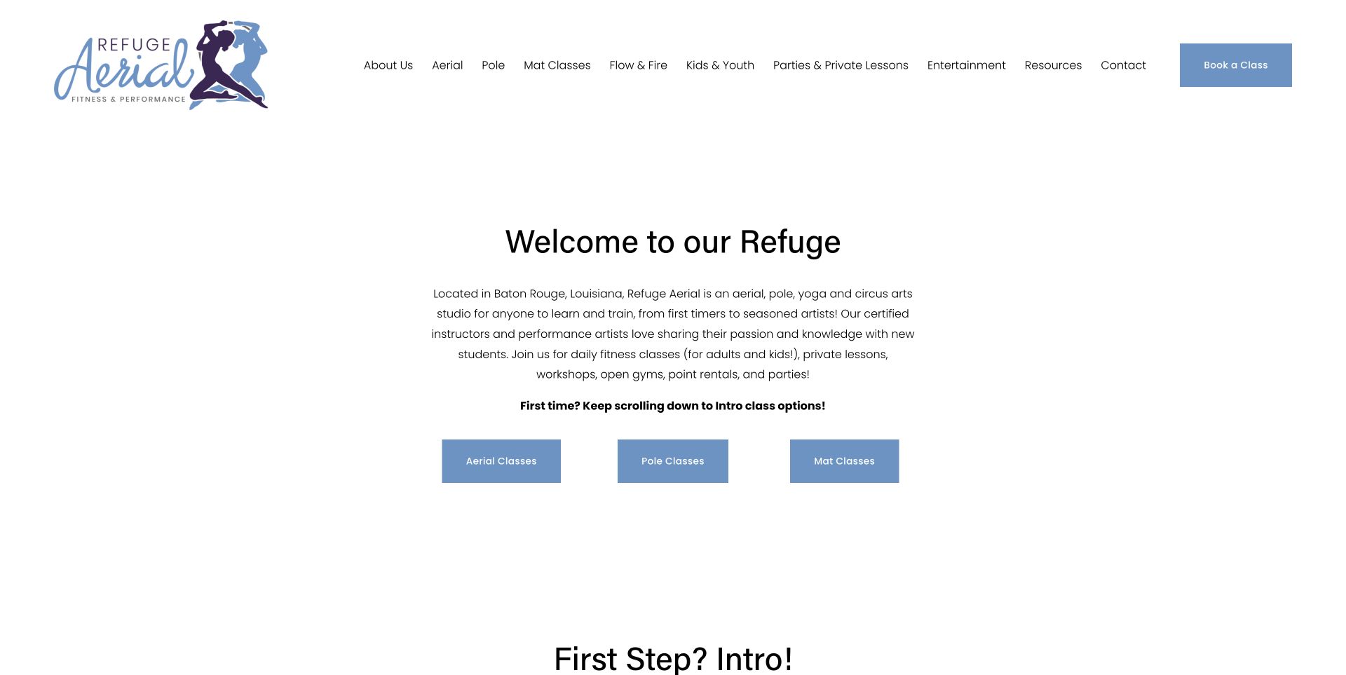
Refuge Aerial begins with a compact explanation of its Baton Rouge studio, followed by three direct links for aerial, pole and mat classes. A bold sentence tells first-time visitors to continue to the introductory options. Those options distinguish fabric apparatuses from lyra and trapeze, explaining unfamiliar names in ordinary language. The white page and blue buttons keep attention on the choices rather than a dramatic opening animation. The result is a useful reference for organizing a broad studio program around what a visitor understands and what they need to do next.
What you can learn
Translate apparatus terminology before asking for a booking. A short explanation of silks, sling or hoop can help a newcomer choose an introductory route without pretending that all aerial classes are interchangeable.
Pros
The main class families have direct, clearly labeled links.
Introductory cards explain equipment differences and separate beginner options.
Cons & considerations
A text-led opening needs supporting photography further down to communicate the physical setting.
A broad navigation menu needs clear grouping as additional classes and events are introduced.
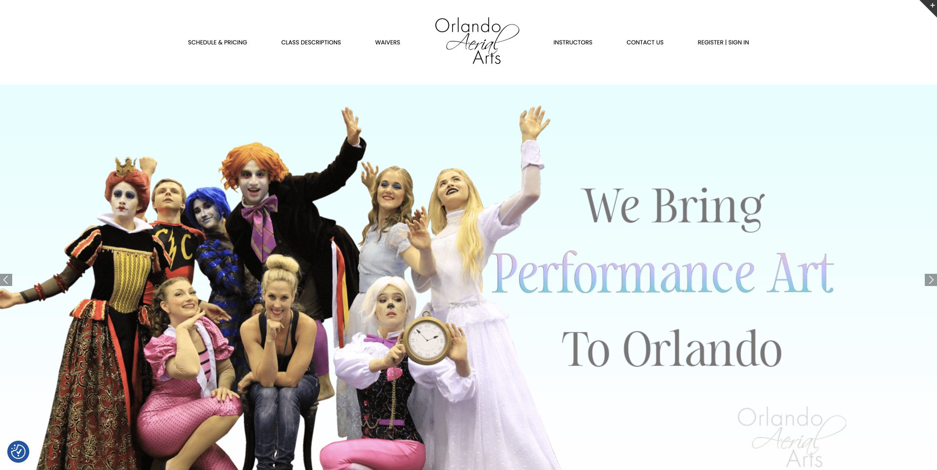
Orlando Aerial Arts uses a large performance photograph to introduce the expressive side of the school. Its centered logo anchors a balanced header, with schedule and pricing, class descriptions, waivers and instructors positioned around it. The public introduction explains that classes serve different ages and levels, while the practical links remain available before visitors enter the longer page. The example demonstrates how theatrical imagery can establish an identity without forcing a newcomer to interpret a performance photograph as the only explanation of the program.
What you can learn
Keep expressive performance imagery separate from the practical facts needed to attend a class. Clear class descriptions and instructor links help visitors understand the school behind the show.
Pros
Schedule and pricing are combined under one plain navigation label.
Instructor and class-description destinations support visitors who want context before registering.
Cons & considerations
A rotating hero should not be the only place that important class information appears.
Visitors need explicit beginner guidance because a performance image can imply advanced entry requirements.
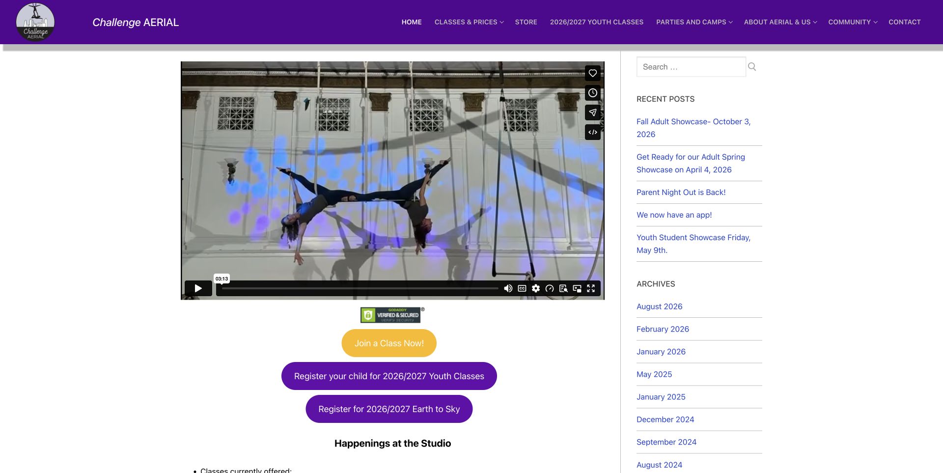
Challenge Aerial presents a performance video above three conspicuous enrollment links, with a separate sidebar for recent posts and archives. Purple navigation and enrollment buttons establish a consistent studio identity, while the main page lists the actual apparatuses and other classes. The format feels closer to a working community noticeboard than a minimal campaign landing page. It offers a useful pattern for a studio that needs to keep classes, youth sessions and showcases visible at the same time, provided the dates and priorities remain carefully maintained.
What you can learn
Give current enrollment actions a stronger visual hierarchy than the archive. A studio news section can show activity, but visitors should still be able to find the next suitable class immediately.
Pros
Adult and youth enrollment links are visible together beneath the introductory video.
The apparatus list explains the breadth of the actual program.
Cons & considerations
Archive links can consume valuable space if they compete with current enrollment information.
Embedded video needs a descriptive introduction and a usable alternative when playback is unavailable.
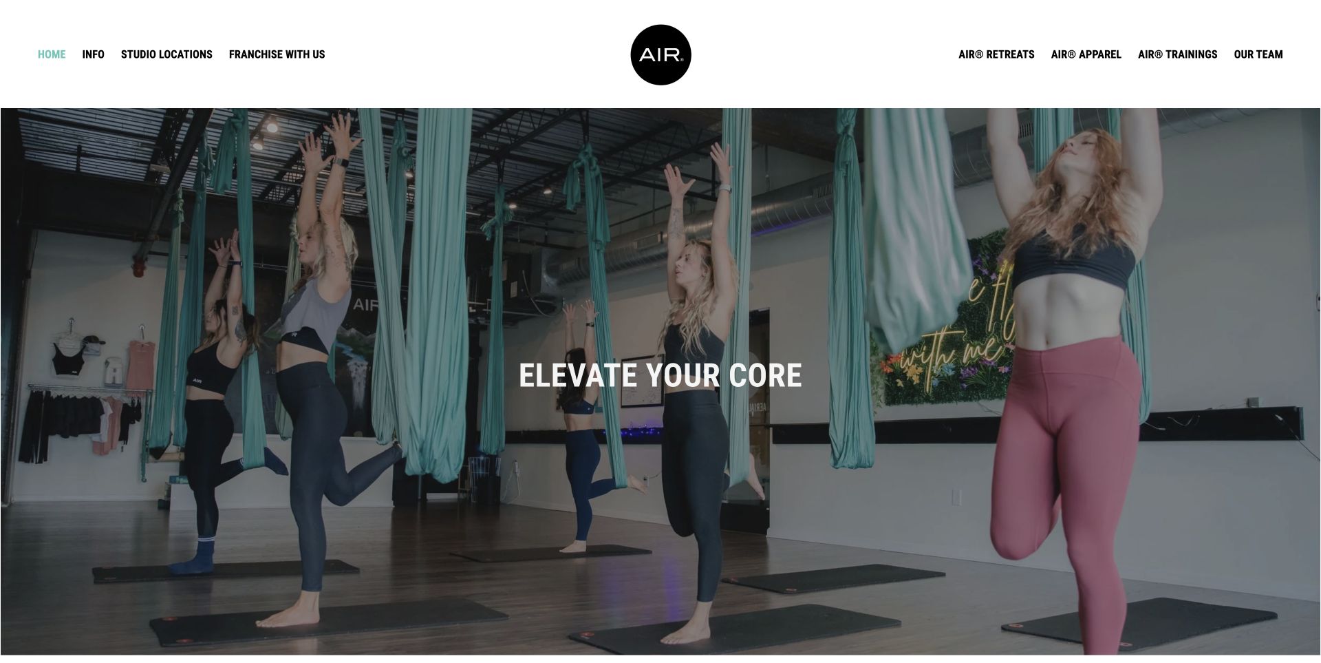
AIR Aerial Fitness opens with a large class photograph and a short central statement. The header separates information about the workout from studio locations, franchise inquiries, retreats, apparel and training. Below the image, the page introduces adult and youth programs and divides getting started into app, membership and youth routes. This is useful for a business serving multiple locations: the main brand page establishes the shared experience while local destinations can supply the details that vary by studio. The photograph communicates the hammock-based setting without requiring a long explanation first.
What you can learn
Use the main brand page to establish a common experience, then route visitors to the location responsible for schedules and prices. Local facts should not be implied to apply identically across an entire network.
Pros
Studio locations have a prominent navigation position.
Adult and youth programs receive separate explanation and entry points.
Cons & considerations
Franchise, retail and retreat links can compete with the primary class-booking journey.
Broad promotional fitness claims should not substitute for clear class descriptions and prerequisites.
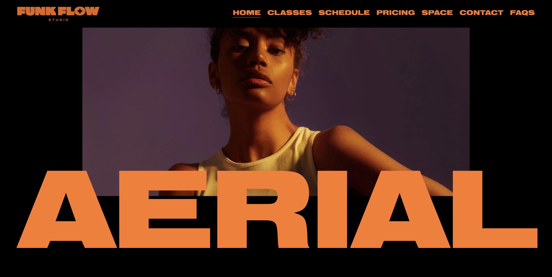
Funk Flow Studio uses oversized orange lettering, a black background and a tightly cropped photograph to create an unmistakable opening. The top navigation remains practical: classes, schedule, pricing, space, contact and FAQs. Further down, the introductory offer and studio address connect that expressive presentation to a real visit. The page is a useful example of allowing a fitness studio to have a strong visual voice while retaining familiar task labels. The giant type creates impact, though the supporting content is what explains the actual aerial program.
What you can learn
Let expressive type establish a studio’s character, but keep the routes to class formats, prices and location conventional. Personality works best when it does not make the basic visit harder to plan.
Pros
The orange-on-black treatment creates a consistent and memorable visual identity.
Classes, pricing and the physical space remain direct navigation choices.
Cons & considerations
Oversized headings need responsive checks so they do not crowd useful introductory information.
A close-up portrait does not explain equipment or class structure without the supporting sections.
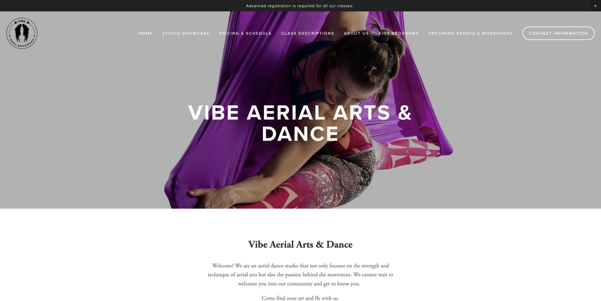
Vibe Aerial Arts & Dance leads with a close view of a participant in purple fabric, placing the studio name over the image. An announcement above the header explains that advance registration is required. The navigation groups pricing and schedules separately from class descriptions, youth programs and events. Lower on the page, image cards point toward the schedule, adult booking and children’s classes. The design is useful for a studio that wants an atmospheric opening while keeping the practical differences between audiences and booking methods understandable.
What you can learn
Use the opening photograph to show the activity, then group choices by the question a visitor is asking. Registration requirements should appear before someone mistakes a scheduled class for a drop-in visit.
Pros
The advance-registration notice communicates an operational requirement immediately.
The navigation separates class information from scheduling and youth-program details.
Cons & considerations
A long desktop menu needs a clear compact version for smaller screens.
In-person and remote booking routes should remain explicitly distinguished at each handoff.
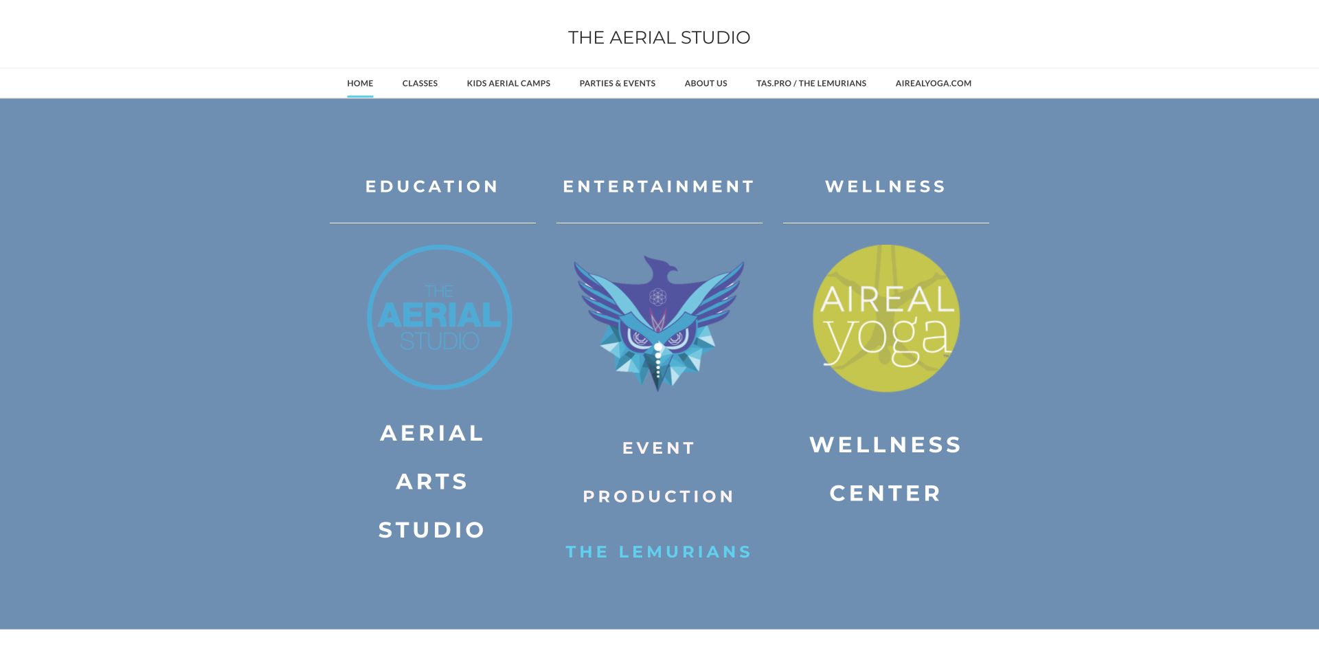
The Aerial Studio organizes its opening around three labeled columns: education, entertainment and wellness. Each has its own mark and supporting label, making the relationship between the aerial school, event production and yoga offering visible before the detailed schedule. The white header gives classes, camps and parties direct routes. This is a useful reference for an organization with related but different services. The design makes the divisions explicit instead of placing every offering under a single Book Now button with an uncertain destination.
What you can learn
When a studio offers teaching, performances and wellness programs, explain those divisions before asking visitors to act. Each audience needs its own information and a clearly identified next step.
Pros
The three-column opening makes the organization’s different activities easy to distinguish.
Classes, children’s camps and parties have dedicated header links.
Cons & considerations
Logo-led columns need descriptive text because a new visitor may not recognize the sub-brands.
Seasonal schedule images and dated registration links need careful ongoing maintenance.
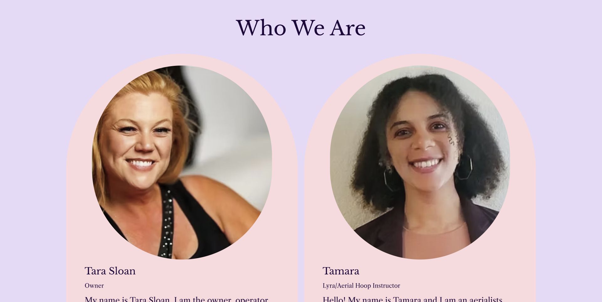
Aerial Elegance Academy gives its owner and instructors substantial space on the homepage. The captured section shows large portraits in soft pink panels against a lavender background, with names and teaching roles directly beneath them. The surrounding page explains class levels and links to plans and online booking. This people-led approach is useful for a small studio where visitors want to know who they will meet. The capture is deliberately labeled as the instructor section; the opening screen also contains a large video player and a simpler navigation bar.
What you can learn
Introduce instructors with an accurate name, role and relevant context. Portraits can make a studio feel approachable, but the accompanying information should explain the program without implying unverified qualifications or outcomes.
Pros
Names and teaching roles appear directly alongside the instructor portraits.
Plans and online booking are separate, explicit navigation destinations.
Cons & considerations
Large portraits can push class information far down the page on narrow screens.
An opening video needs a meaningful poster or alternative content before playback begins.
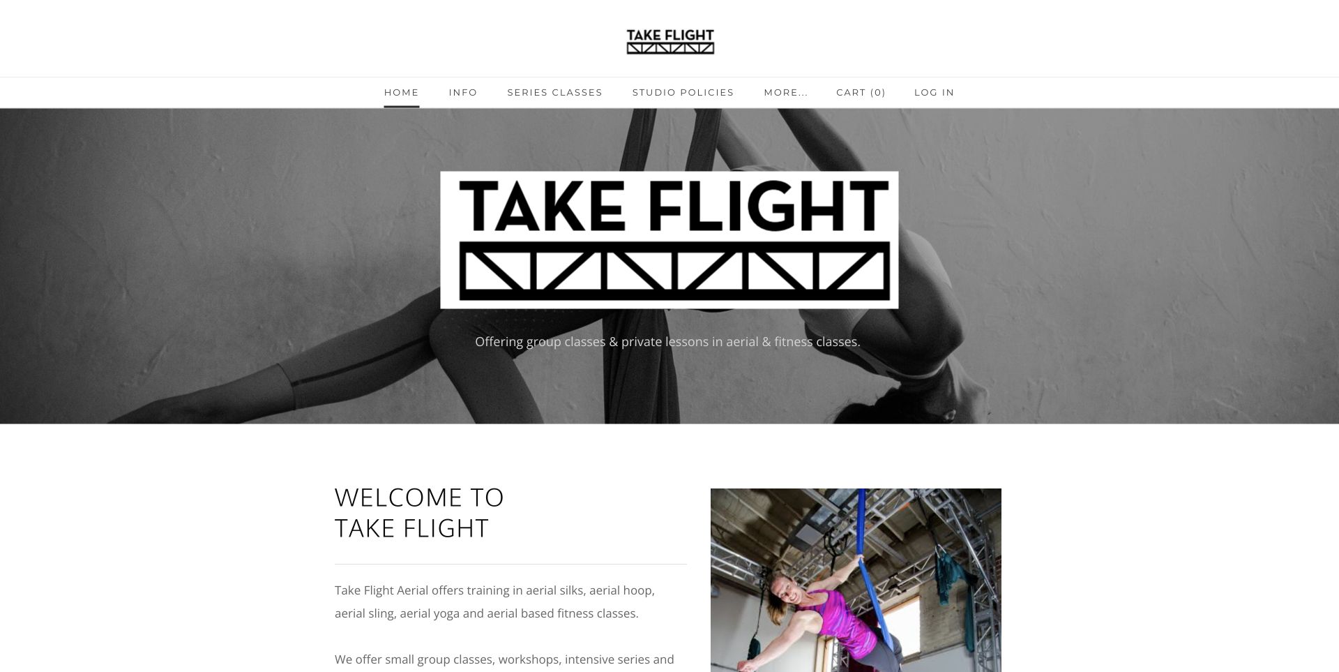
Take Flight Aerial uses a monochrome photograph and a bold wordmark to introduce its group classes and private lessons. Below the hero, a two-column section combines a concise description of the apparatuses with a studio photograph. The header names class series, policies and descriptions rather than relying on broad lifestyle categories. This compact structure is useful for an independent studio: it explains the activity, points to the next practical page and keeps the location available without adding a complex marketing funnel.
What you can learn
A small studio can make a strong first impression with a short sequence: identify the activity, explain the available formats and link to the actual class series. Keep policies visible without letting them overwhelm the welcome.
Pros
The opening description distinguishes group classes from private lessons.
Class descriptions and studio policies have recognizable navigation labels.
Cons & considerations
A monochrome hero should still make the apparatus and activity clear at smaller sizes.
Important location and class details should remain text rather than appearing only inside images.
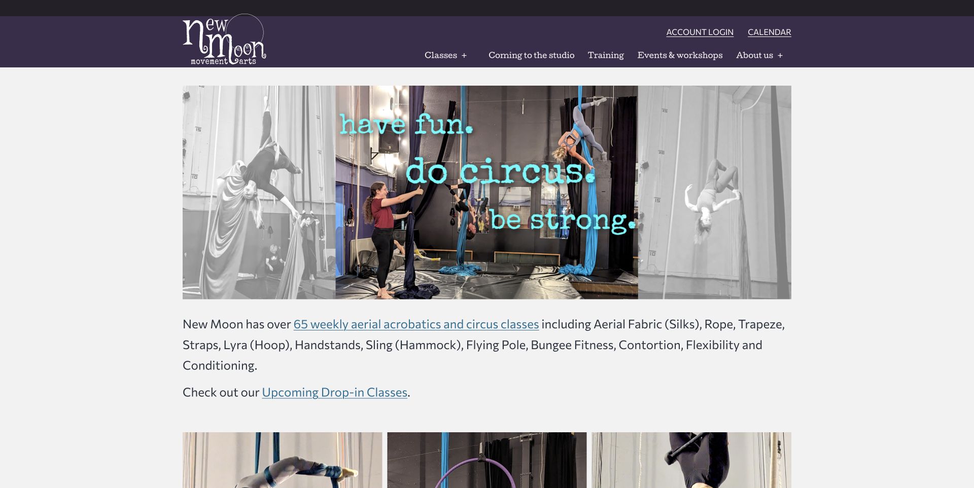
New Moon Movement Arts combines a purple header with a collage of actual studio activity. The introduction names the available apparatuses and links directly to current sessions and drop-in classes. A separate newcomer section explains the beginner class route, while account access and the calendar sit apart from the main navigation. The design is useful for a studio with many offerings because it gives returning students fast utility links and gives newcomers an explanation of where to begin. It treats the curriculum as information to navigate, not simply a list of impressive skills.
What you can learn
Separate returning-student utilities from first-visit guidance. A broad apparatus list becomes easier to use when it leads to current sessions and includes a clearly named beginner path.
Pros
The page names apparatuses and connects them to current class information.
Calendar and account utilities are separated from the main informational menu.
Cons & considerations
A long apparatus list can benefit from short explanations for unfamiliar terms.
Promotional images containing text should be supported by equivalent readable page copy.
Kegan is a freelance web designer and developer with 15+ years of experience helping businesses turn complicated website requirements into clear, maintainable digital experiences. He works directly with clients from planning and design through development, launch, and ongoing support.
For aerial fitness studio website design, his development approach focuses on beginner class pathways, apparatus explanations, studio locations, schedules and clear booking information. The scope can be a targeted improvement or a complete custom build, with responsive layouts, thoughtful content structure, and integrations chosen around the people using and maintaining the site.
Show 3 other aerial fitness studio website designersHide other aerial fitness studio website designers
Plan an aerial studio website around the first visit and the return visit
Map the class choices before designing the booking buttons
List the actual class families, levels and age groups. Record which sessions accept a complete beginner and which require an assessment or prior experience. Ask instructors to approve those distinctions so that the website does not accidentally present a progression class as a general introduction.
Give each class family a stable description and use the same name in the timetable. Explain unfamiliar equipment briefly, then link to the relevant booking destination. If several locations operate under the same brand, identify which schedules, prices and policies belong to each location.
Separate class bookings from private lessons, parties and performance inquiries. These are different commitments and often need different information. A shared visual style can connect them without making every visitor use the same form or interpret a generic call to action.
Prepare the information that reduces first-visit uncertainty
Write a concise newcomer page covering arrival, clothing, registration and the studio's approved preparation instructions. Direct personal suitability questions to an appropriate human contact. Avoid turning website copy into individualized health advice or adding broad claims about who can participate safely.
Show the price structure and the conditions of introductory offers together. State what a class pack or membership includes and where the current terms can be read. A large discount headline is less useful when expiry, location or eligibility details appear only after someone leaves the studio website.
Photograph the actual entrance and teaching environment when useful. Obtain appropriate permission for participant images and avoid implying that a pictured performance represents the expected starting level. Keep descriptions and captions meaningful for visitors who cannot rely on the image alone.
Make routine updates part of the operating plan
Decide who maintains schedules, announcements, instructor information and seasonal programs. Prefer linking to the current timetable over embedding a dated screenshot that can outlive its usefulness. Keep an obvious route available if the scheduling provider or video player fails to load.
Review navigation with a few practical tasks: find an introductory class, compare class formats, locate the studio and manage an existing booking. Test keyboard access and small-screen reading with the real timetable and longest class names. A clean desktop hero does not establish that the booking journey works.
Keep notices proportional to their importance. A relocation or registration requirement may belong near the top; an old showcase should move into an archive. Preserve useful event history without letting past announcements compete with the next available class.
The editing job behind the design
Choose tools that keep class information consistent
A studio website usually needs a manageable content system, dependable image handling and a clearly identified booking service. The most important integration is consistency: class names, locations, prices and prerequisites should agree between the public explanation and the reservation interface.
Use embedded schedules only when they remain understandable on smaller screens and have a direct alternative link. Treat accounts, payments and waivers as separate operational systems with their own responsibilities. Collect only the information required for the actual inquiry or booking task.
The technology observations in this collection come from bounded public source checks. They describe accessible page references and supporting assets, not a complete inventory of private studio systems. Unknown or blocked details remain unknown; a visible booking link does not prove how every part of the business operates.
Our WordPress website examples offer a separate look at publishing approaches. A visible platform label is evidence for that named page, not a guarantee that the same system will suit your requirements.
Before the public launch
An aerial fitness studio website launch checklist
The studio name, location and actual class offering are understandable on the opening page.
A complete beginner has a clearly labeled route to a suitable introductory class.
Apparatus names include short explanations and accurate supporting photographs.
Class descriptions and timetable labels agree on level, age group and format.
Current prices and introductory-offer conditions are easy to find together.
Arrival, clothing and preparation instructions are approved by the studio.
Instructor names, roles and any qualifications are accurate and supported.
Adult, youth, private lesson, party and performance routes are distinguished.
Scheduling embeds have a usable direct-link alternative.
Participant photography has appropriate permission and useful descriptions.
Keyboard navigation, text contrast and small-screen booking journeys are checked.
A named person maintains announcements, schedules and seasonal dates.
These checks are a project checklist, not a performance, legal, security, or accessibility certification. Test real journeys with the people responsible for the website before making claims about the result.
Sources & editorial method
How this collection was selected and reviewed
We reviewed thirteen genuine public aerial studio websites during the November 11, 2026 Pacific editorial session. Their direct browser captures were taken on November 12 UTC, with exact individual capture times retained. We compared first-visit guidance, apparatus explanations, schedules, program navigation and presentation of the real studio. Bellingham Aerial & Dance is the Editors Choice for its combination of ordinary group-class photography, a separate newcomer route and practical introductory information. This is an editorial design selection, not an assessment of instruction, equipment safety or fitness outcomes. Aerial Elegance is shown at its clearly labeled instructor section; the other captures show opening homepage views. Public technology checks are bounded and retain unavailable results honestly.
Each example links to its actual source page. Screenshots are direct browser captures with their own capture dates; moving imagery, announcements and live designs can change. The notes describe observable design choices and conditional tradeoffs, not measured traffic, conversion results, service quality, or accessibility conformance.
Technology labels use public page metadata, asset evidence, or explicitly cited platform documentation. Platform documentation is not a complete current deployment audit. A component reference may be legacy or unused; it is not a complete backend inventory. Unknown stacks are omitted. These sites are editorial examples, not our client portfolio.
Written, Edited and Curated are separate editorial records, not timestamps advanced by a rebuild. Website designs and imagery belong to their owners. See our editorial standards or suggest a correction.
Questions worth asking
Aerial Fitness Studio website design questions
Should the homepage lead with an advanced aerial performance?
It can establish the expressive side of the studio, but it should not be the only explanation of the experience. Pair it with an explicit beginner route and accurate class descriptions. Ordinary class and studio photographs can help a newcomer understand what a first visit actually involves.
Does every apparatus need a separate page?
Use separate pages when the differences help someone choose a class or understand prerequisites. A small program may work well with a compact overview and clear booking links. Keep names consistent with the timetable and explain unfamiliar terms rather than creating pages solely to repeat keywords.
Should a schedule be embedded or linked?
Either can work. An embed puts session details close to the explanation, but it must remain usable on smaller screens and when third-party resources are restricted. Provide a clearly labeled direct link as an alternative and make sure visitors understand when they are entering a separate booking system.
How should adult and youth classes be organized?
Give each audience an explicit route with its actual age ranges, class formats and registration requirements. Do not make parents infer youth suitability from an adult schedule. Shared photographs and branding can connect the programs while their practical information remains distinct.
What should a first-visit page explain?
Cover the studio's approved class-entry requirements, arrival details, clothing guidance, registration steps and where to ask questions. Keep pricing and cancellation information accessible. Do not use general website copy to make individualized medical or safety assurances.