Best Motorcycle Dealer Websites of 2026 (29 Real-World Examples)
Motorcycle-dealer websites that make stock, local expertise and ownership support easier to understand.
Explore 29 real motorcycle-dealer websites, from independent used-bike shops to specialist franchises and multi-store retailers. Study how they connect riding imagery to useful inventory, service and local information.
A motorcycle website needs to serve people with very different levels of certainty. One visitor knows the exact year and model they want; another is deciding between commuting, touring and a first weekend bike. A useful dealer site gives both a path without requiring an enquiry before basic information is available.
These examples show different balances between manufacturer campaigns and the dealer's own identity. Some begin with inventory filters, others with a local showroom, a service proposition or a choice between two franchises. The reviews examine those visible communication decisions rather than the quality of the motorcycles or the outcome of a purchase.
Before the examples
What makes good motorcycle dealer website design in 2026?
Keep stock distinct from the model range
Show which bikes are actually available, which are used or reserved, and which manufacturer models are informational or orderable. Give each listing enough condition, mileage, price and location context to support a useful comparison.
Make the dealer relationship tangible
Publish a clear physical location, department hours and relevant service scope. Explain consignment, trade-ins, storage or specialist parts services where they matter, without burying those tasks under manufacturer advertising.
Connect the next step to the chosen bike
Retain the stock reference and location when visitors enquire or request a visit. Keep browsing open, explain what happens next, and separate a general enquiry from finance applications, deposits and customer-account actions.
The collection · 29 examples
29 motorcycle dealer websites worth studying
Compare 29 distinct public dealer properties with real source captures and original analysis. The Editors Choice recognizes website design and communication only; it is not a recommendation of a dealer, motorcycle, finance product or service.
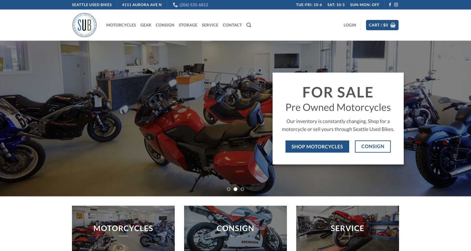
Seattle Used Bikes puts a real showroom behind a compact white panel that separates shopping from consigning. Those two actions address opposite sides of the same used-bike market without asking visitors to decode dealership terminology. The blue utility strip makes the address, phone and opening hours easy to find, while three photographic tiles repeat Motorcycles, Consign and Service below the rotating introduction. Farther down, individual stock cards show recognizable model names, prices and changing sale states. The independent-business explanation and consignment page support the approachable presentation with practical detail. Storage also receives its own navigation item, acknowledging a real urban ownership problem. The newsletter shows a missing-form error, and the introduction rotates.
What you can learn
Organize an independent dealer around the jobs customers bring: buy, sell, maintain and store. Give each a plain-language doorway, then explain the process before asking for personal or vehicle details. Keep the strongest inventory action available outside a carousel.
Pros
Real shop photography makes the local proposition tangible.
Buying and consignment receive distinct, understandable actions.
Cons & considerations
The rotating opening changes which task gets first emphasis.
The newsletter area displayed a missing-form message.
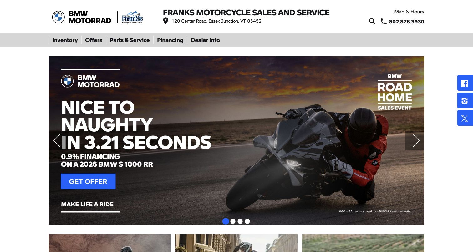
Frank’s Motorcycle Sales & Service surrounds a large BMW campaign with unusually direct local information. The dealer name, Essex Junction address, map link and phone occupy the top strip; a short gray navigation bar then groups inventory, offers, parts and service, financing and dealer information. This creates a useful distinction between the local business and the manufacturer's dramatic riding imagery. New, used and electric inventory have separate paths beneath the campaign, so visitors are not forced to begin with a promotion. The restrained white background also keeps the manufacturer artwork from competing with unrelated decoration. Small financing qualifications and rotating offers complicate comparison.
What you can learn
Keep the dealership's location and service identity outside manufacturer creative. A campaign should be one route into stock, with independent new, used and specialist inventory links remaining visible when that campaign changes or expires.
Pros
Address, phone and map are grouped clearly above navigation.
Electric, new and used inventory have distinct entry points.
Cons & considerations
Campaign artwork carries dense offer details at small sizes.
Several rotating offers compete for the first impression.
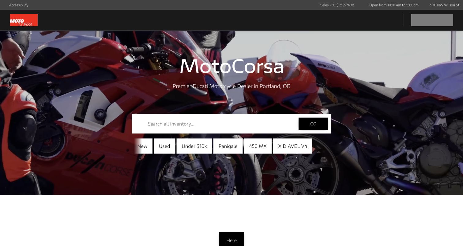
MotoCorsa places its Portland positioning over close motorcycle imagery, then gives the middle of the hero to inventory search. The white search field is followed by compact shortcuts for New, Used, Under $10k and named model interests. That is a more useful starting point than a single aspirational button because it recognizes both budget-led and enthusiast-led shopping. Black framing and red brand accents fit the Ducati specialization without adding another competing color system. The utility bar preserves sales contact and the street address above the spectacle. The source view also shows the cost of a complex opening: some header elements were still populating while the principal search area was already usable. Search-result quality remains unverified.
What you can learn
Pair specialist imagery with shortcuts expressed in customer language. Budget, condition and popular models can shorten the first search, but retain a stable navigation path while enhanced header widgets load.
Pros
Budget and model shortcuts turn the hero into a practical starting point.
Portland positioning keeps the specialist offer geographically clear.
Cons & considerations
Some header elements appeared to populate after the main scene.
The homepage cannot demonstrate the quality of search results.
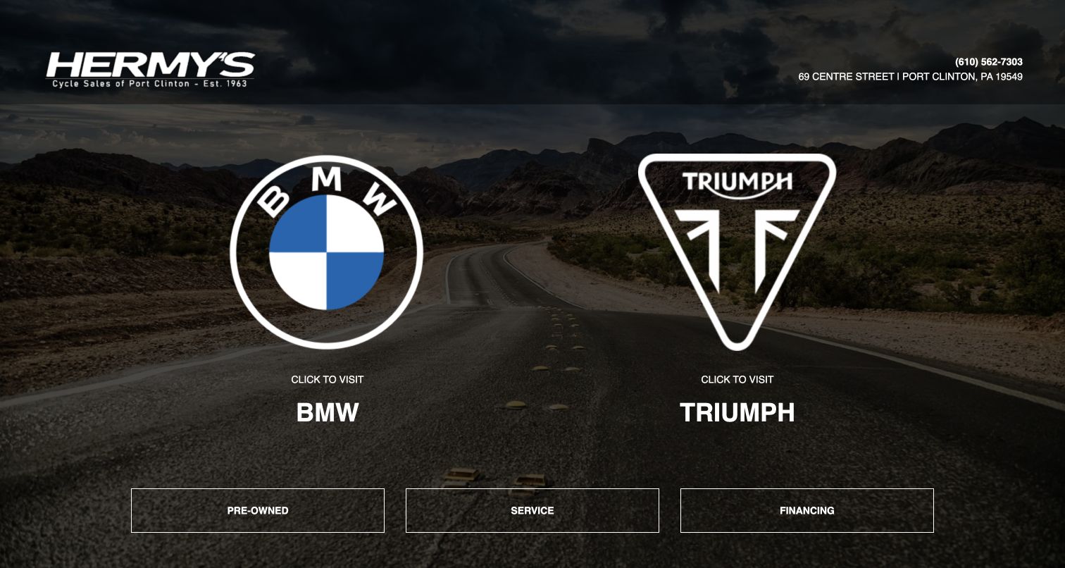
Hermy’s makes a deliberately narrow opening decision: BMW or Triumph. Two large marks sit over a dark road scene, with equally clear labels below them. The dealership logo, phone and Port Clinton address remain in the upper frame, so the manufacturer choice does not erase the local business. Three outlined controls underneath offer shared routes to pre-owned stock, service and financing. This is an economical way to organize a dealer with two strong franchise identities and several cross-brand tasks. The page avoids stuffing every promotion into the entrance. Specific bikes and prices require another step; brand knowledge is assumed.
What you can learn
Use a gateway when a small number of genuinely different shopping paths dominate. Keep common tasks beneath the split and give undecided riders an alternative route, such as all used inventory or help choosing a motorcycle.
Pros
Two large choices make the opening hierarchy easy to understand.
Shared service and used-stock paths remain available.
Cons & considerations
No individual bike or price appears in the opening view.
Brand-led navigation offers less help to undecided beginners.
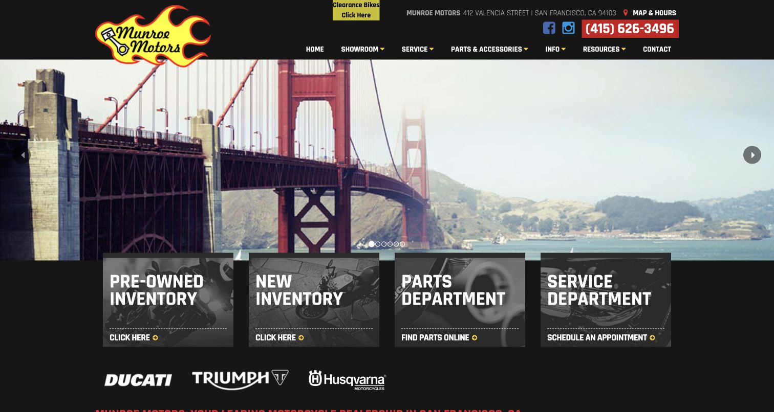
Munroe Motors uses the Golden Gate Bridge as its opening scene, making San Francisco part of the identity before any motorcycle offer appears. The flame-shaped logo, condensed typography and black background create a distinctive shop character. More usefully, four photographic cards overlap the scene with direct paths to pre-owned inventory, new inventory, parts and service. This arrangement gives a visitor a functional next step without requiring the carousel to display a relevant promotion. The address, map and hours, and a prominent phone number sit in the header. A small clearance callout is visible too, although it adds another competing accent. The task cards do more commercial work than the city scene.
What you can learn
Let local imagery establish character, then immediately translate that mood into buying and ownership tasks. Four explicit pathways can be stronger than several ambiguous promotional buttons, especially when they remain unchanged as hero slides rotate.
Pros
The opening has a specific San Francisco identity.
Four task cards connect atmosphere to useful destinations.
Cons & considerations
The scenic hero provides little direct inventory information.
Clearance, social and phone accents crowd the compact header.
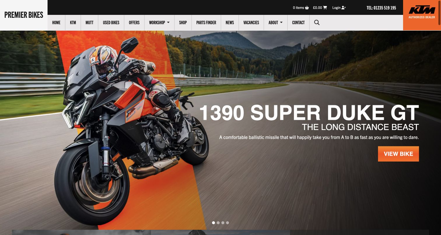
Premier Bikes carries KTM orange from its dealer badge into a broad riding scene and the main model button. The featured motorcycle is large enough to establish the type of riding immediately, while the model name and short positioning line sit in a darker part of the image. A compact header keeps the dealer name distinct from the manufacturer. Navigation includes KTM, Mutt, used bikes, workshop, parts finder and a shop, making the range of tasks explicit even when the opening promotes one model. Below the hero, used inventory provides a different route for visitors whose budget or preferences do not match the campaign. The banner delays comparison, while the long menu separates several shopping systems.
What you can learn
Borrow manufacturer color and photography without surrendering the dealer's own identity. Connect the promoted model to a specific page, and keep used stock, maintenance and parts reachable independently of the campaign.
Pros
Orange accents create a coherent relationship with the featured franchise.
The model-specific action is easier to interpret than a generic enquiry.
Cons & considerations
Large promotional imagery pushes comparison details lower.
The long navigation includes several potentially overlapping shop routes.
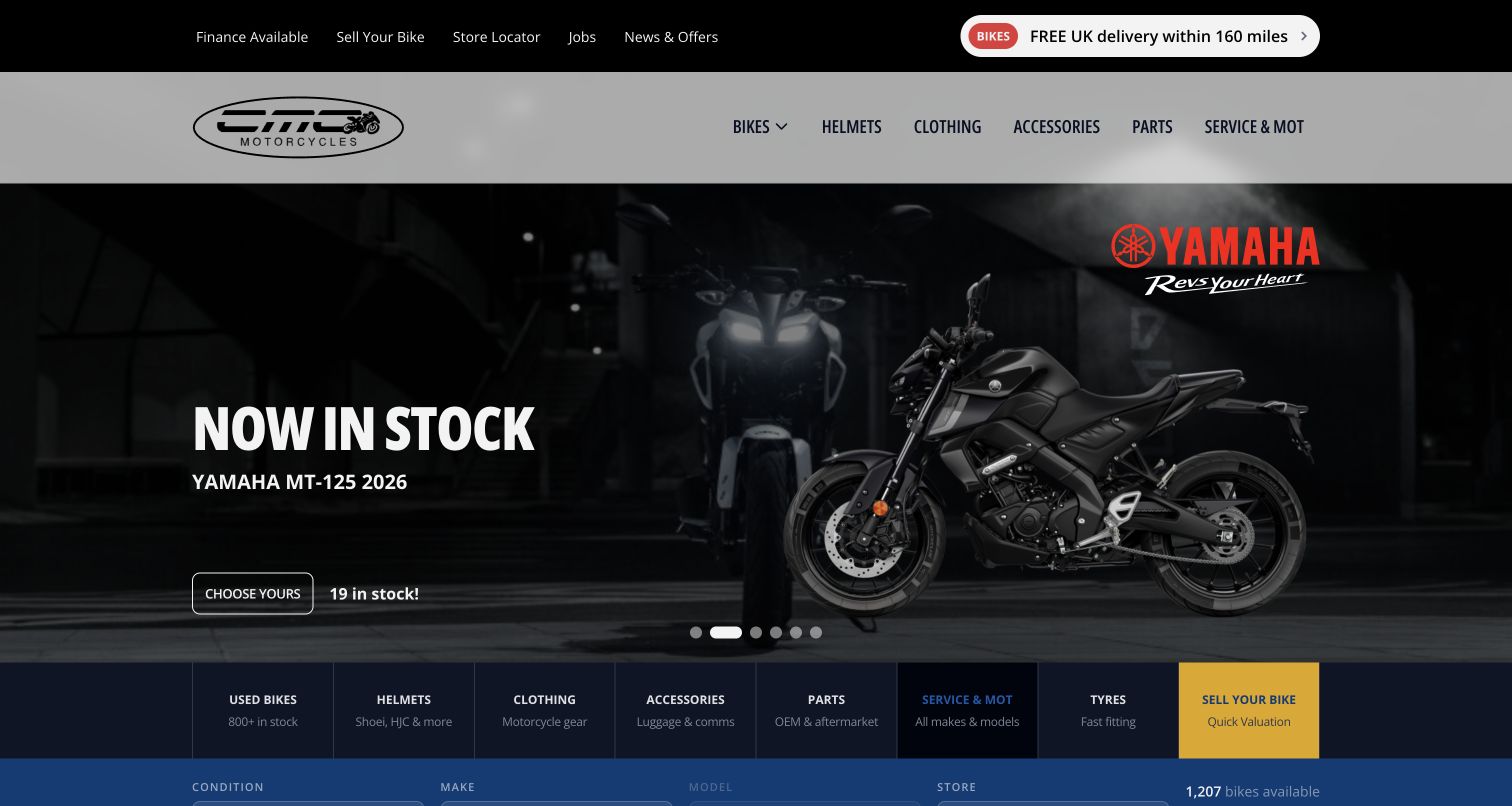
CMC pairs a large manufacturer scene with a short model label, a Choose Yours action and a visible stock count. That small quantity cue changes the role of the hero: it becomes a starting point for real availability rather than simply a brand advertisement. The header also separates finance, selling a bike and store location from the main merchandise and service navigation. Beneath the hero, a row of task tiles covers used bikes, helmets, clothing, accessories, parts, servicing, tyres and selling. A blue filter area follows, introducing condition, make, model and store. The result supports both motorcycle and equipment shoppers, though the many adjacent choices make the opening dense. The capture follows optional-cookie rejection; the initial state is preserved privately.
What you can learn
Make promotions accountable to stock. Model names, quantities and a direct inventory action help turn attractive manufacturer artwork into a useful shopping tool, while a location filter prevents a multi-store catalog from becoming geographically vague.
Pros
The promotion includes a model-specific stock quantity.
Store and condition filters support practical comparison.
Cons & considerations
Many merchandise and ownership tasks compete in the first screen.
Rotating campaigns can change the initial inventory emphasis.
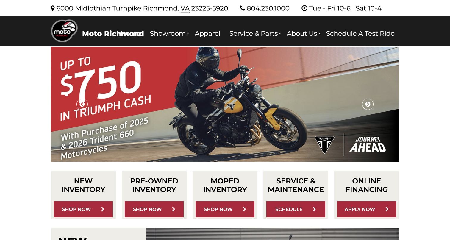
Moto Richmond puts a readable address, telephone number and opening hours at the very top, then uses a modest dark navigation bar over a wide manufacturer campaign. The most transferable element is the row beneath it: five light cards separately identify new inventory, pre-owned inventory, moped inventory, service and maintenance, and online financing. This is a useful acknowledgment that a city dealer's audience includes different kinds of riders, not merely customers for the featured motorcycle. Red action bars provide consistency across those cards. The site also exposes a test-ride route in the header. The campaign remains visually dominant, and the source header's dealer wording appears cramped near the logo. The task row remains useful despite those imperfections.
What you can learn
Give materially different customer needs their own concise cards. A moped shopper should not have to infer that a general showroom link includes them, and service customers should not be pushed through a sales-led route.
Pros
Local contact and opening-hour details are immediately available.
Moped inventory receives an explicit place alongside motorcycle stock.
Cons & considerations
The campaign occupies more space than the task cards.
Dealer wording near the logo appears visually cramped.
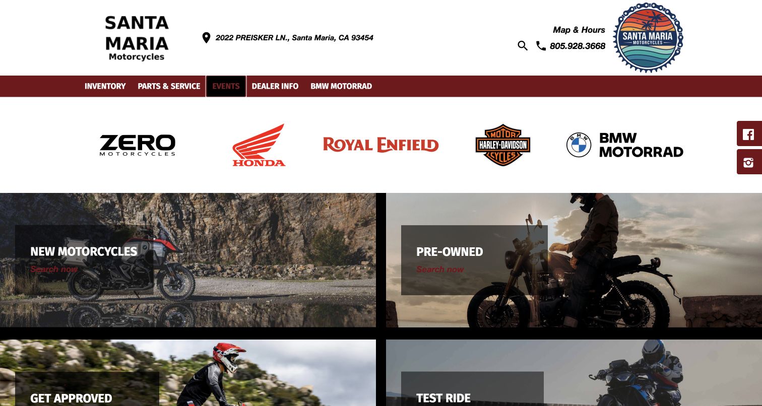
Santa Maria Motorcycles opens with a substantial local header and a line of recognizable manufacturer marks. Rather than relying on one large campaign in the captured view, it then presents broad photographic tiles for new motorcycles, pre-owned bikes, approval and test rides. That structure gives the page a practical rhythm: identify the dealer, establish the range, then choose a task. The circular regional logo and dark red accents add some local personality to otherwise familiar dealership components. Map and hours and the phone number are clearly available above the menu. The tradeoff is that large brand marks consume considerable vertical space before any specific motorcycle appears. Red actions on dark imagery reduce readability.
What you can learn
Use manufacturer recognition to orient visitors, then move quickly to the tasks that bring them to the dealer. Reserve enough contrast for small action labels instead of relying on a photograph and large heading to do all the work.
Pros
New and pre-owned routes are visually distinct and easy to scan.
Map, hours and phone are grouped in the local header.
Cons & considerations
The manufacturer strip delays individual inventory information.
Small red labels are less prominent over darker photographs.
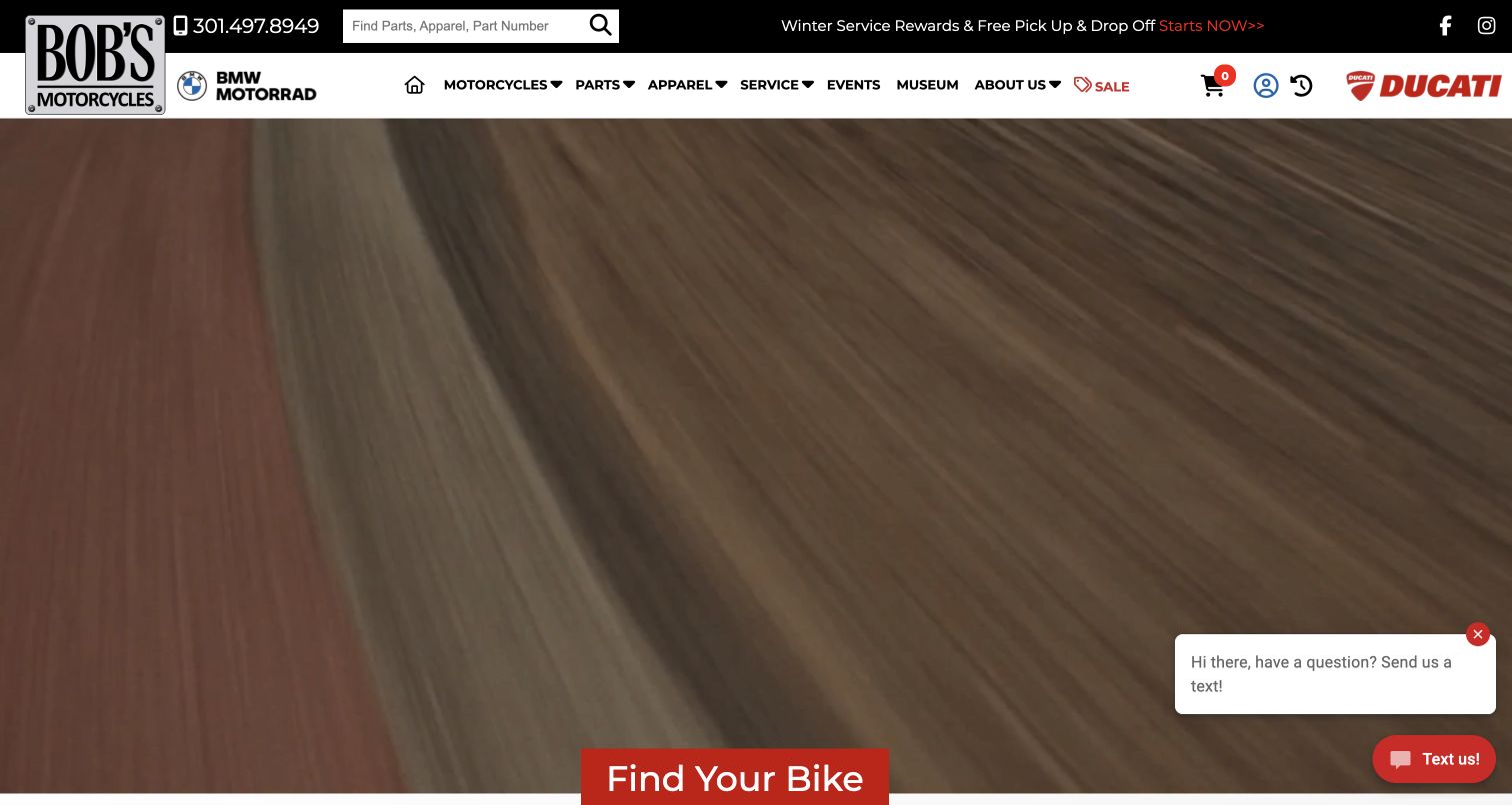
Bob’s Motorcycles gives a large search field to parts, apparel and part numbers rather than treating search as a tiny accessory. That choice suits returning owners who already know what they need. The navigation still distinguishes motorcycles, parts, apparel, service, events and the museum, with BMW and Ducati identities flanking the dealer frame. A narrow announcement strip carries changing offers, while a large moving background introduces the motorcycle route through Find Your Bike. The captured video frame is intentionally preserved as observed, including the source's chat prompt. This is a broad ownership ecosystem rather than a pure lead page. Account, cart, promotions and chat compete for attention.
What you can learn
Match prominent search to the exact vocabulary customers use, including part numbers when appropriate. Separate the motorcycle-shopping path from repeat parts purchases, and make sure motion or chat never becomes the only way to discover a useful action.
Pros
Parts and part-number search addresses a concrete repeat-customer need.
Service, events and museum content broaden the ownership relationship.
Cons & considerations
The moving hero is less informative in an individual still frame.
Account, cart, offers and chat compete with the main buying route.
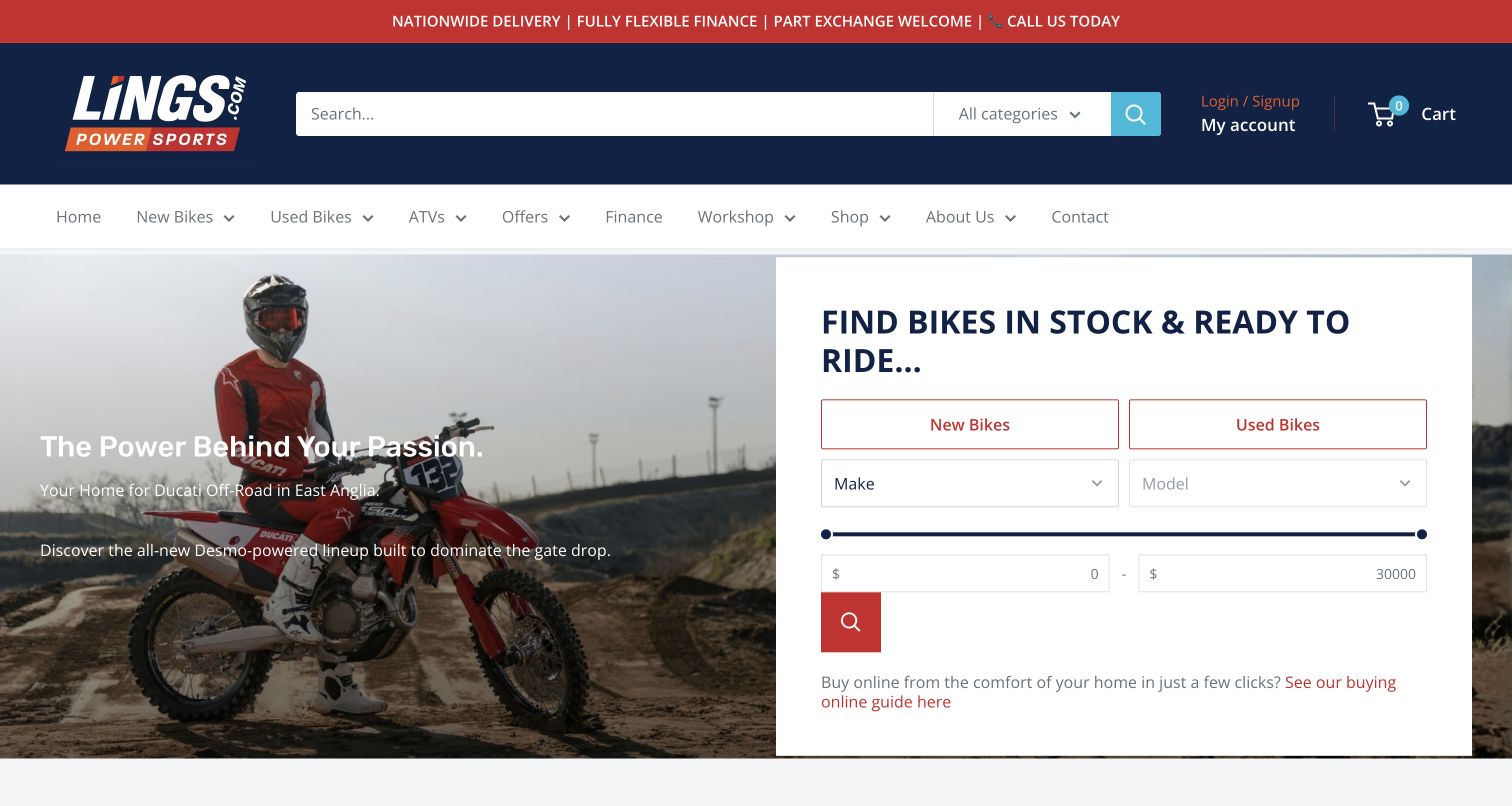
Lings places a large search bar in a dark blue retail header, then gives the hero's right half to an inventory filter panel. New and used tabs, make and model controls, and a price range sit beside motorcycle imagery. A short buying-guide link underneath acknowledges that choosing a bike online may require explanation. The broad navigation includes workshop and contact alongside bikes, offers and a shop. This balance makes the site feel commercially capable without hiding the physical dealership. The captured price inputs display dollar symbols despite the British business context, a detail worth checking when adapting a retail component. Broad catalog categories need clear defaults.
What you can learn
Put useful filters next to the emotional introduction, and explain the next step for online buyers. Audit currency, categories and default ranges carefully: familiar ecommerce controls only help when their labels match the dealership's actual market.
Pros
New and used filters sit prominently beside the opening image.
A buying-guide link supplies context before an enquiry or reservation.
Cons & considerations
The captured range fields showed a potentially confusing currency symbol.
A broad merchandise taxonomy adds complexity to general search.
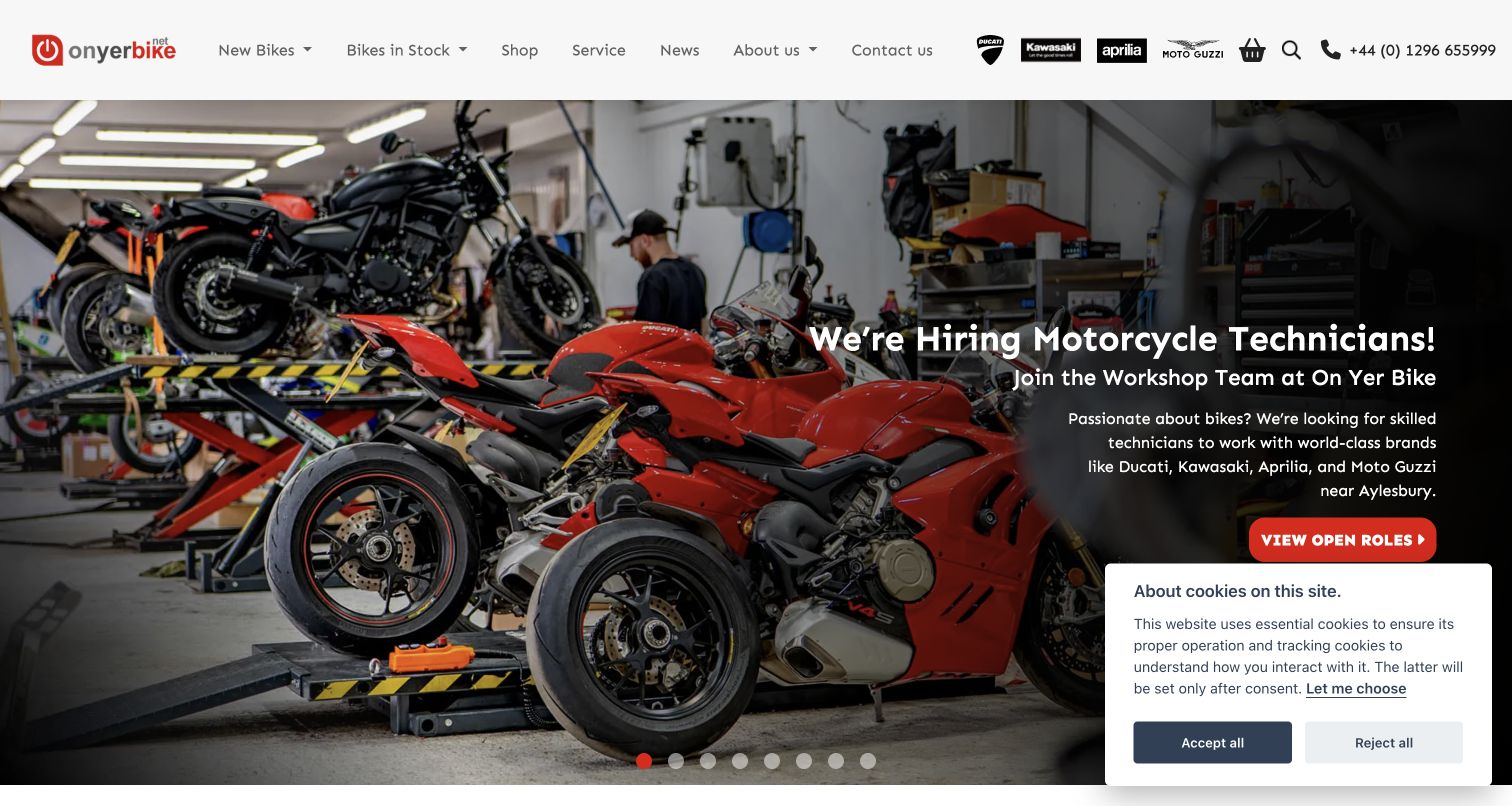
On Yer Bike's captured opening promotes technician recruitment over a photograph of motorcycles in its workshop. This gives the dealer a different visual story from the usual manufacturer racing scene: the business's working environment becomes the subject. Above it, a compact white header keeps new bikes, stock, shop and service visible, alongside manufacturer marks and a telephone number. The recruitment message is explicit about its purpose and offers a direct role-related action. For an ordinary buyer, however, it is a secondary task occupying the largest piece of the page. A cookie notice also overlaps the lower corner in the source capture. Authentic workshop photography gives the dealership character.
What you can learn
Use real workshop imagery to show what the business actually does. When the lead campaign serves a secondary audience, keep buying and ownership navigation stable so prospective customers can continue without waiting for another slide.
Pros
Workshop photography gives the dealer a concrete operational identity.
Stock and service remain clearly named in the top navigation.
Cons & considerations
The opening recruitment campaign is not the primary task for buyers.
The source cookie panel occupies part of the lower hero.
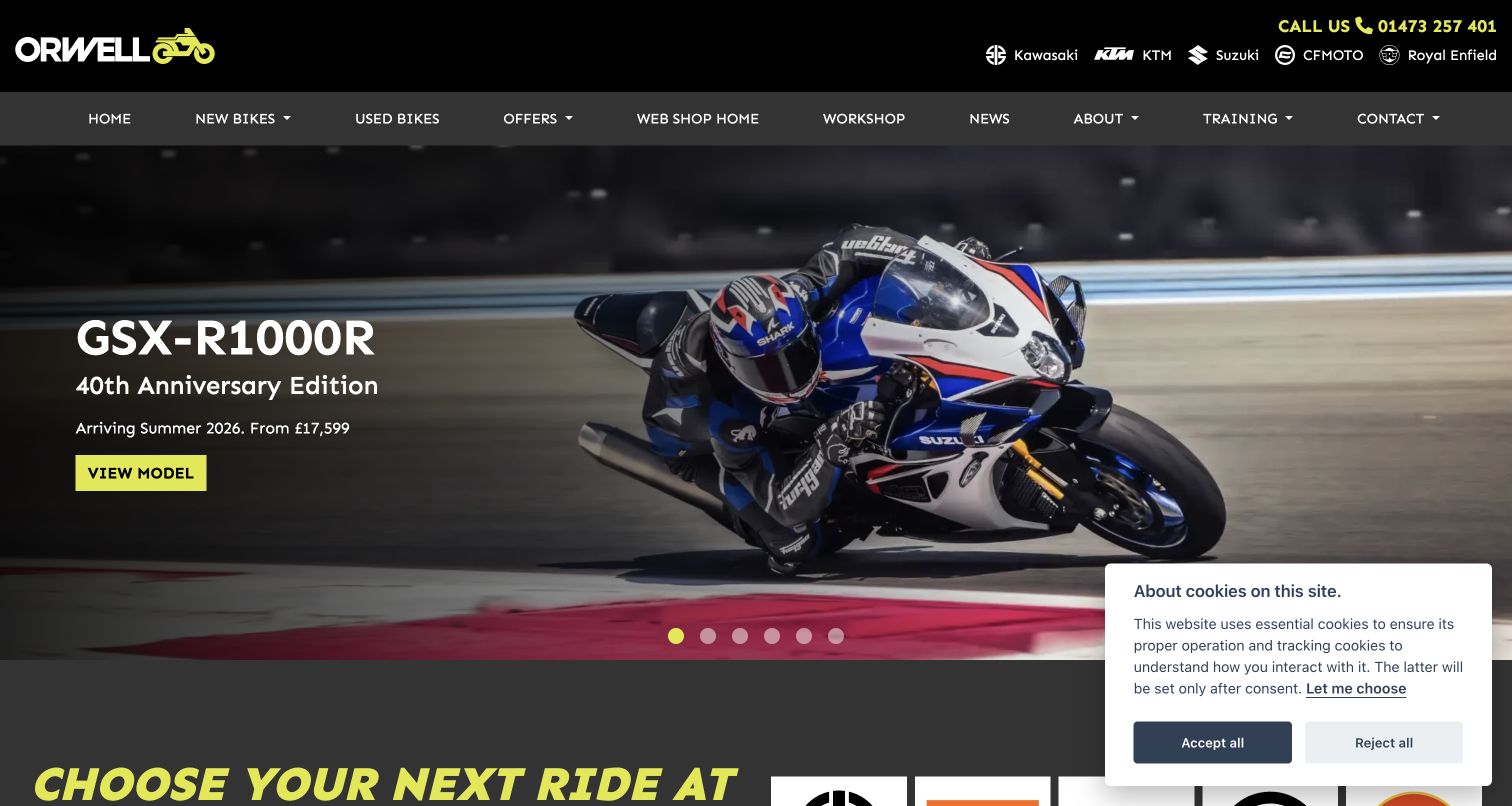
Orwell Motorcycles uses a black and yellow identity to hold several manufacturer brands together. The phone number and franchise marks sit in the upper strip, while a second navigation row includes new bikes, used bikes, workshop and training. A large motorcycle campaign then presents a specific model and a conspicuous yellow action. The clear color relationship makes the button easy to find even against a busy riding photograph. Training is a notable addition because it acknowledges visitors who are still developing their riding skills. The captured campaign refers to a summer arrival despite the November review date, showing why date-sensitive artwork needs maintenance. The cookie notice remains; dropdown destinations require another step.
What you can learn
Use one dealer color system to unify multiple franchise identities. Keep training and workshop routes visible for less experienced riders, and establish an expiry review for campaign wording so seasonal messages do not become accidental current promises.
Pros
Yellow actions are strongly distinguished from the dark campaign scene.
Training and workshop receive clear navigation labels.
Cons & considerations
The observed campaign retained earlier seasonal arrival wording.
Several navigation choices require another step to reveal destinations.
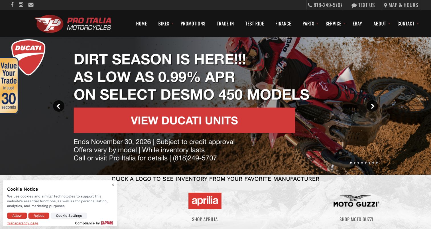
Pro Italia gives the opening campaign a clear motorcycle context and a large View Ducati Units action. The source artwork includes a promotion end date and qualifying conditions, making the offer more concrete than an unexplained percentage. A red and black header retains test ride, trade-in, parts and service routes, while manufacturer inventory links begin immediately below the campaign. This is a practical way to connect an enthusiast identity with the tasks that lead to a visit. The dealer also exposes map and hours and phone contact above the main menu. The composition is busy, however: the trade-in side tab, cookie notice, carousel controls and large offer copy all occupy the same opening area.
What you can learn
Attach promotional creative to the exact stock it describes and keep dates and conditions accessible. Avoid letting auxiliary lead tools obscure that connection; trade-in and contact routes work best when they support rather than surround the main action.
Pros
The offer points to a specific manufacturer inventory route.
Campaign dates and qualifications are included in the artwork.
Cons & considerations
Several floating and promotional elements compete around the hero.
Image-based offer text can be difficult to read at smaller sizes.
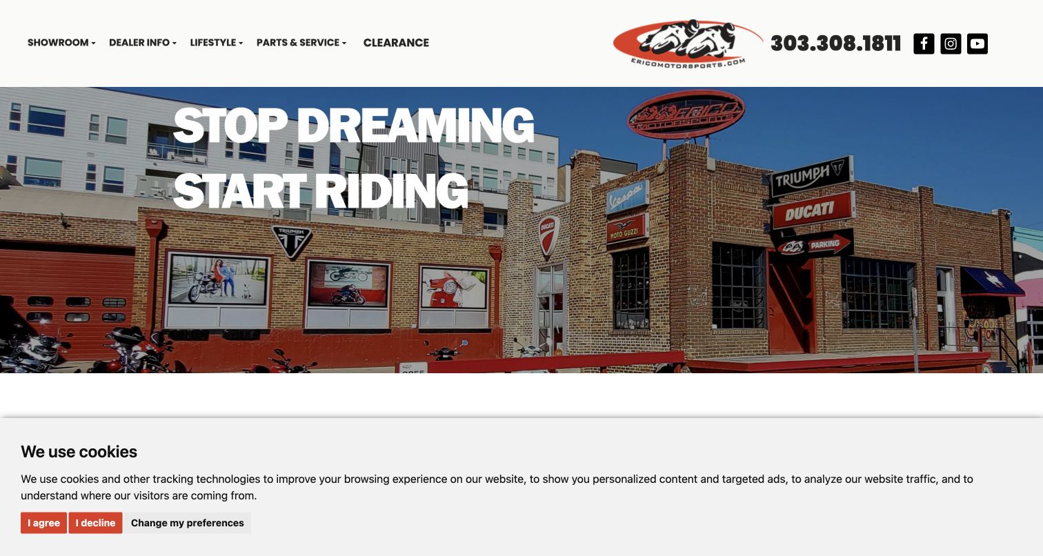
Erico Motorsports uses its brick storefront and motorcycle-lined exterior as the central image. The large white headline sits over that real location rather than a generic riding scene, making the business feel rooted in Denver. A wide, spare header separates showroom, dealer information, lifestyle, parts and service, and clearance, with the logo and telephone at the right. The layout has a confident simplicity that works particularly well for a specialist shop. It also leaves a buyer needing another action before seeing specific stock or prices. In the captured state, a large cookie notice covers the bottom portion of the opening, so the photograph and broad positioning do most of the visible work. The scene establishes identity, not service quality.
What you can learn
A recognizable storefront can be stronger local proof than another manufacturer campaign. Pair it with an explicit inventory action and keep privacy choices compact enough that visitors can still understand the business's next step.
Pros
Actual premises establish local identity without elaborate copy.
The top navigation groups ownership and sales tasks concisely.
Cons & considerations
The opening does not expose specific stock or prices.
The source privacy notice occupies substantial screen space.
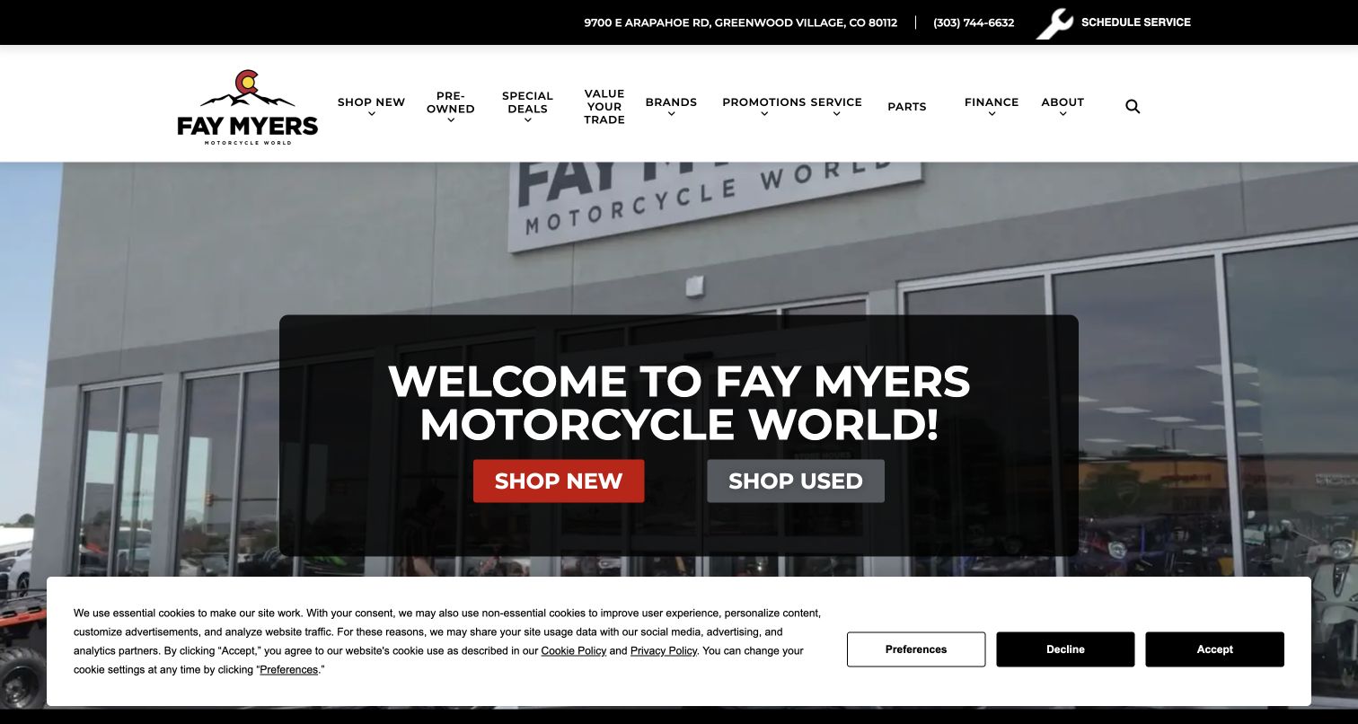
Fay Myers puts a large translucent panel over its dealership imagery, with Shop New and Shop Used as the two dominant actions. That binary choice is useful for a business carrying several vehicle categories because it does not force a first-time visitor to understand the complete franchise structure. The white header adds secondary routes for brands, promotions, trade value, service and parts, while a slim black strip contains the address and service scheduling. The dealer's own mountain-inspired mark stays prominent above the manufacturer material. This is a clear sales entrance, though the sizeable welcome heading uses space that could hold a stock preview. The captured privacy panel also covers the lower part of the scene. Preserve that distinction.
What you can learn
For a broad dealership, begin with a small number of strong decisions and move the full catalog taxonomy into the next screen. Keep service scheduling separate so returning owners do not have to follow the new-customer sales journey.
Pros
New and used are visibly prioritized over secondary navigation.
Service scheduling has a distinct utility-bar position.
Cons & considerations
The welcome panel postpones model and price information.
The source privacy notice covers the lower opening scene.
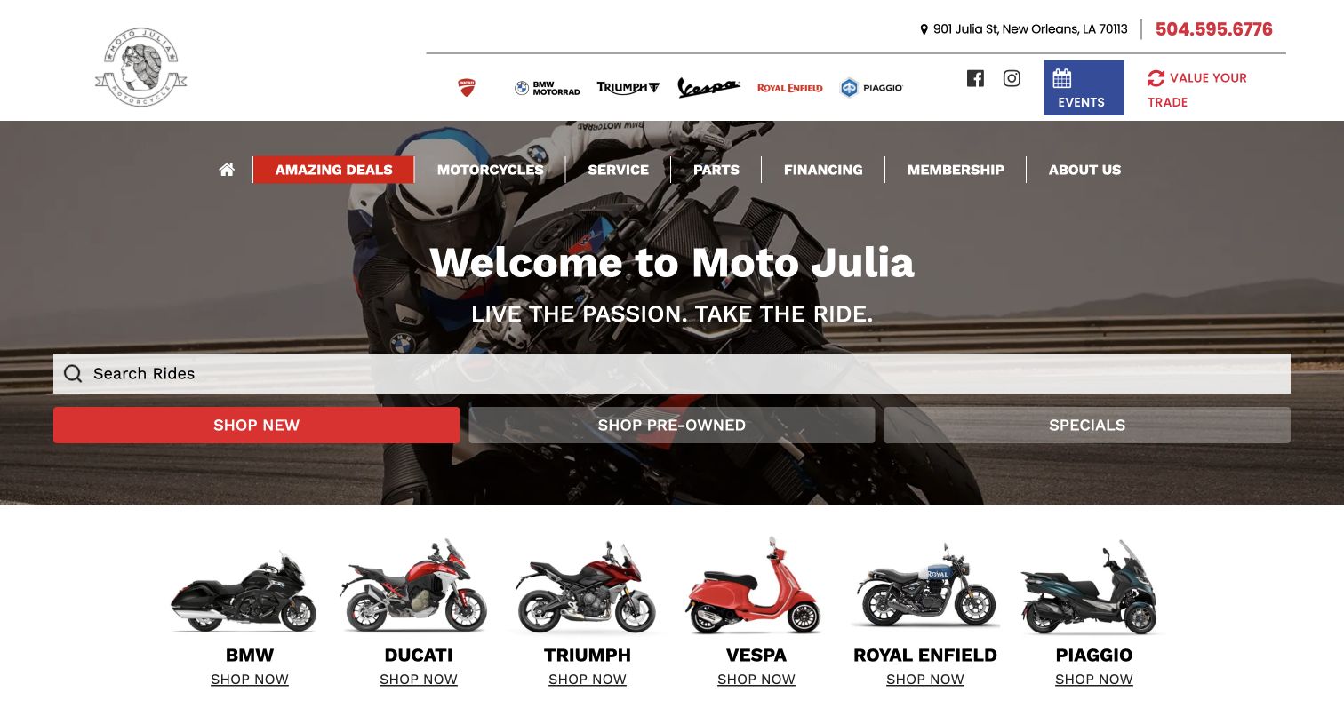
Moto Julia combines a recognizable local name with three practical opening controls: a wide ride search, new stock and pre-owned stock. A specials route sits alongside them. Below the hero, illustrated manufacturer tiles let a visitor move from a broad task to a familiar marque. The upper area keeps the New Orleans address and phone visible, while events and trade valuation receive their own small blocks. This structure accommodates both an undecided browser and a rider who already knows which manufacturer interests them. A moving motorcycle background provides atmosphere without removing the overlaid controls. A specific bike’s price and location require another screen.
What you can learn
Offer two complementary ways into inventory: a task-based route and a manufacturer-based route. Keep both visually subordinate to the dealer identity, and ensure background motion never reduces the legibility of the search or action labels.
Pros
Search, new stock and pre-owned stock are immediately accessible.
Illustrated brand tiles provide a second clear browsing route.
Cons & considerations
The opening presents no individual bike or price comparison.
A familiar template needs local content to remain distinctive.
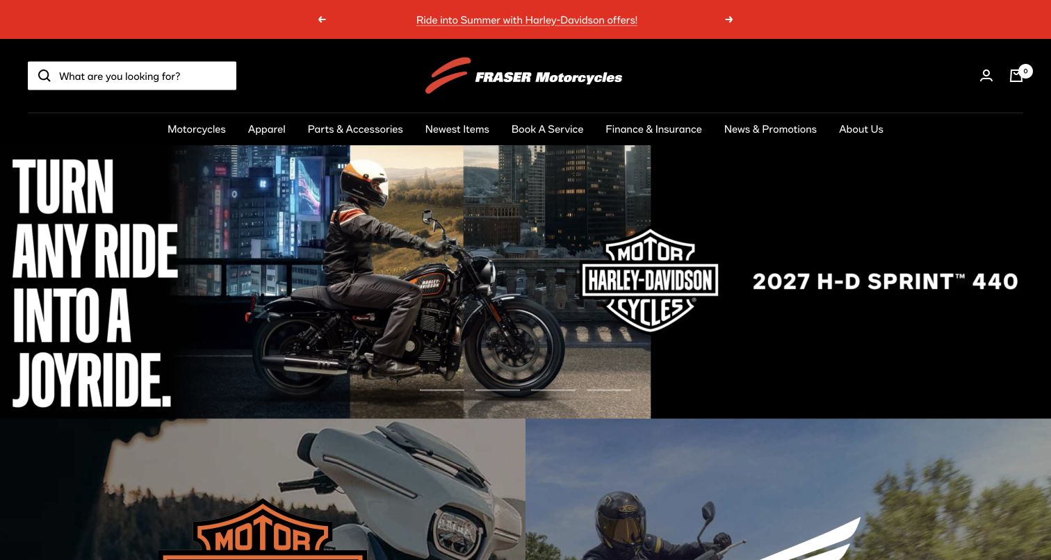
Fraser Motorcycles presents an ecommerce-style header with search, account and cart controls above a broad motorcycle campaign. Its black frame and red identity tie together motorcycles, apparel, parts and accessories, newest items and service booking. The captured Harley-Davidson artwork is deliberately oversized, using large typography and a rider scene to establish the current promotion. Below it, large image panels begin to divide the wider range. The useful design choice is keeping Book A Service in the same primary navigation as merchandise, rather than treating ownership support as a footer afterthought. The challenge is scope: a rider looking for a specific used motorcycle must distinguish the vehicle journey from the conventional shopping-cart experience. Image-heavy campaign lettering also leaves little room for a succinct local dealership explanation.
What you can learn
When motorcycles and merchandise share a storefront, make their journeys explicit. Preserve search and service booking across both, but clarify where an online purchase ends and a dealer conversation or vehicle inspection begins.
Pros
Service booking remains a first-class navigation item.
A consistent dark frame connects several retail categories.
Cons & considerations
Vehicle and merchandise journeys can be difficult to distinguish initially.
Large campaign artwork dominates over dealer-specific explanation.
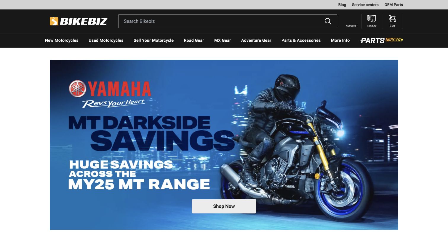
Bikebiz gives search a wide, conspicuous position in its black header and separates new motorcycles, used motorcycles and selling a motorcycle in the navigation beneath it. Road, motocross and adventure gear then provide different browsing routes for equipment shoppers. This is useful segmentation because riding context can be more meaningful than a single undifferentiated apparel category. A large manufacturer campaign occupies the main white content area, while service centers and OEM parts sit in the upper utility strip. The design feels more like a complete retail store than a simple enquiry page. That breadth also creates a hierarchy problem: the campaign, parts finder, toolbox, cart and several gear categories can compete with the motorcycle inventory task.
What you can learn
Use riding categories when they genuinely help customers find relevant equipment, but keep vehicle condition and sell-your-bike routes separate. A strong search field needs a clear scope so customers understand whether it searches motorcycles, products or both.
Pros
New, used and sell-your-motorcycle tasks are explicitly named.
Road, motocross and adventure categories reflect different rider needs.
Cons & considerations
Multiple retail utilities compete with the vehicle-shopping path.
The opening does not explain the scope of general search.
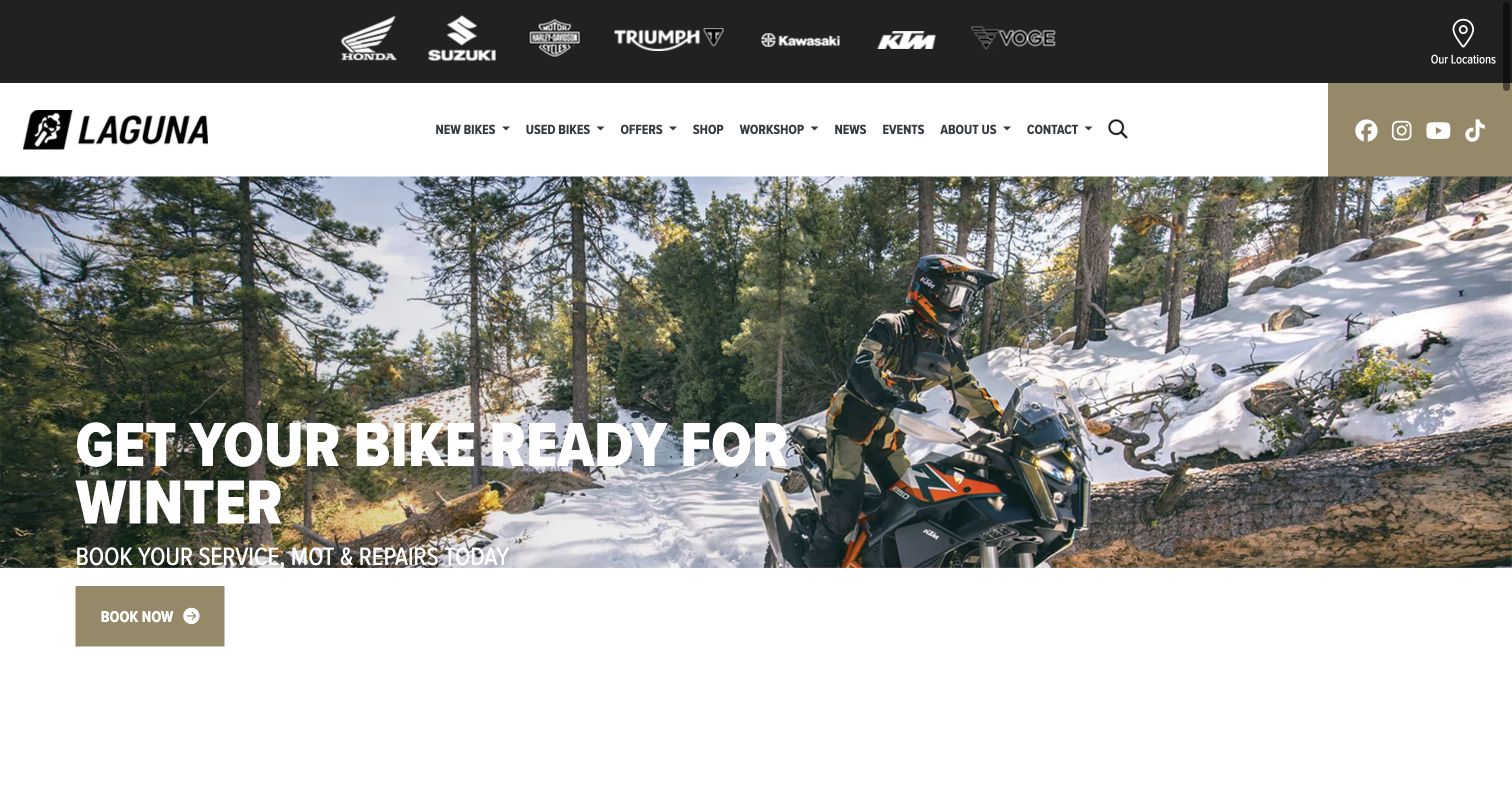
Laguna's captured homepage leads with winter preparation rather than a new-bike offer. A rider in a snowy setting and a large service message connect the seasonal idea to an explicit booking action. The manufacturer strip above the dealer identity establishes the range, while an Our Locations control acknowledges that this is a multi-site business. Main navigation keeps new bikes, used bikes, workshop, events and contact visible. The muted gold accent gives the dealer a recognizable frame without fighting the manufacturer logos. The seasonal service emphasis is useful for existing owners, although a sales visitor must use navigation to reach available motorcycles. Booking scope and workshop location need further explanation.
What you can learn
Let seasonal campaigns serve real ownership needs, not only clearance stock. For a multi-location dealer, connect the campaign to a location-aware destination and keep new and used inventory routes stable when the homepage emphasis changes.
Pros
The opening makes seasonal maintenance a clear customer task.
A dedicated locations control supports the multi-store structure.
Cons & considerations
Current motorcycle stock is not visible in the opening scene.
Booking scope and workshop location require additional navigation.
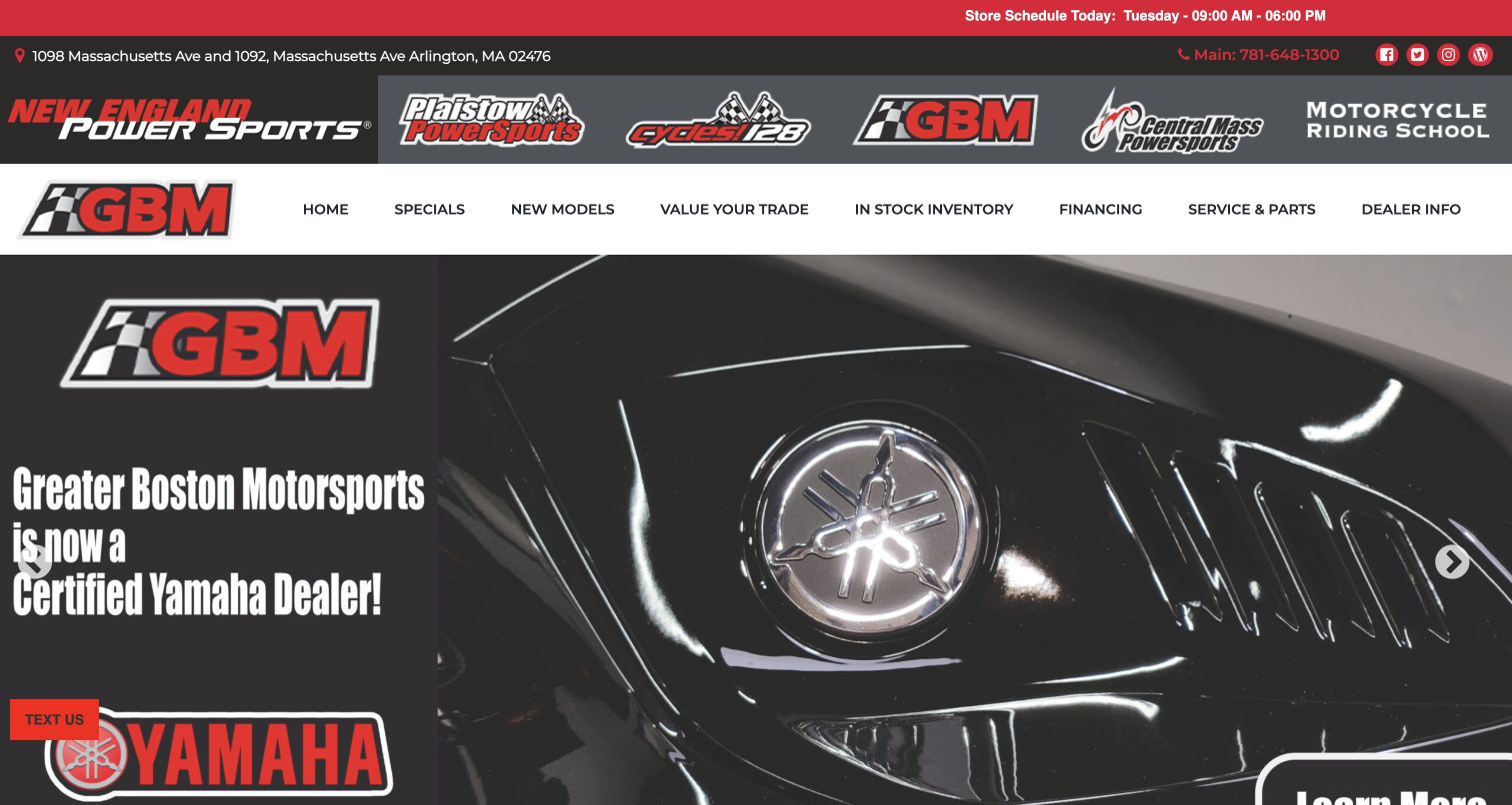
Greater Boston Motorsports gives its regional network a prominent row of dealership marks, then repeats its own GBM identity above the local navigation. The top utility strip includes the current day's schedule, address and telephone, which helps visitors planning a physical trip. The captured manufacturer campaign announces Yamaha availability with a close motorcycle photograph. Inventory, new models, trade value, financing and service remain separate menu items below the network strip. This is a useful example of balancing group-level recognition with a specific dealership, though the network logos occupy considerable space before a buyer reaches the local offer. The campaign's large image and text also extend beyond the opening viewport, and a floating text prompt introduces another focal point.
What you can learn
If a dealer belongs to a regional group, make the current location unmistakable. Group navigation should help users switch deliberately, while address, hours and inventory context remain tied to the dealership they are actually viewing.
Pros
The current day's schedule is visible before the main content.
Local inventory and service paths remain distinct from group links.
Cons & considerations
The network identity consumes substantial header space.
A large campaign and floating contact prompt compete for attention.
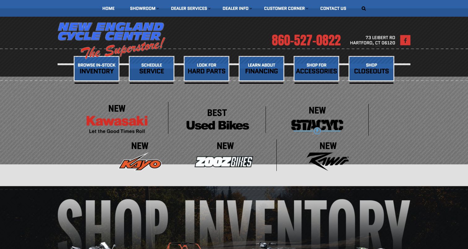
New England Cycle Center uses a textured gray and blue visual style with six boxed shortcuts across the top of the content. Those boxes name the tasks directly: in-stock inventory, service, hard parts, financing, accessories and closeouts. A separate row presents manufacturer and used-bike choices, followed by a large inventory introduction. The phone number and Hartford address are prominent near the dealer mark. This arrangement makes several practical destinations visible without requiring a menu to open, and the parts distinction is more specific than a generic shopping label. The visual treatment is busy, however, with texture, strong outlines and several competing type sizes. Some category wording is promotional rather than descriptive. Simpler decoration would strengthen the task structure.
What you can learn
A compact dealer site can succeed by naming common tasks plainly. Preserve direct links to in-stock machines and service, but use restrained decoration so the labels remain the easiest things to read, especially on a small screen.
Pros
Six clearly named shortcuts expose common dealership tasks.
The local phone number and address are easy to locate.
Cons & considerations
Texture and heavy outlines create substantial visual competition.
Promotional category wording is less precise than condition-based labels.
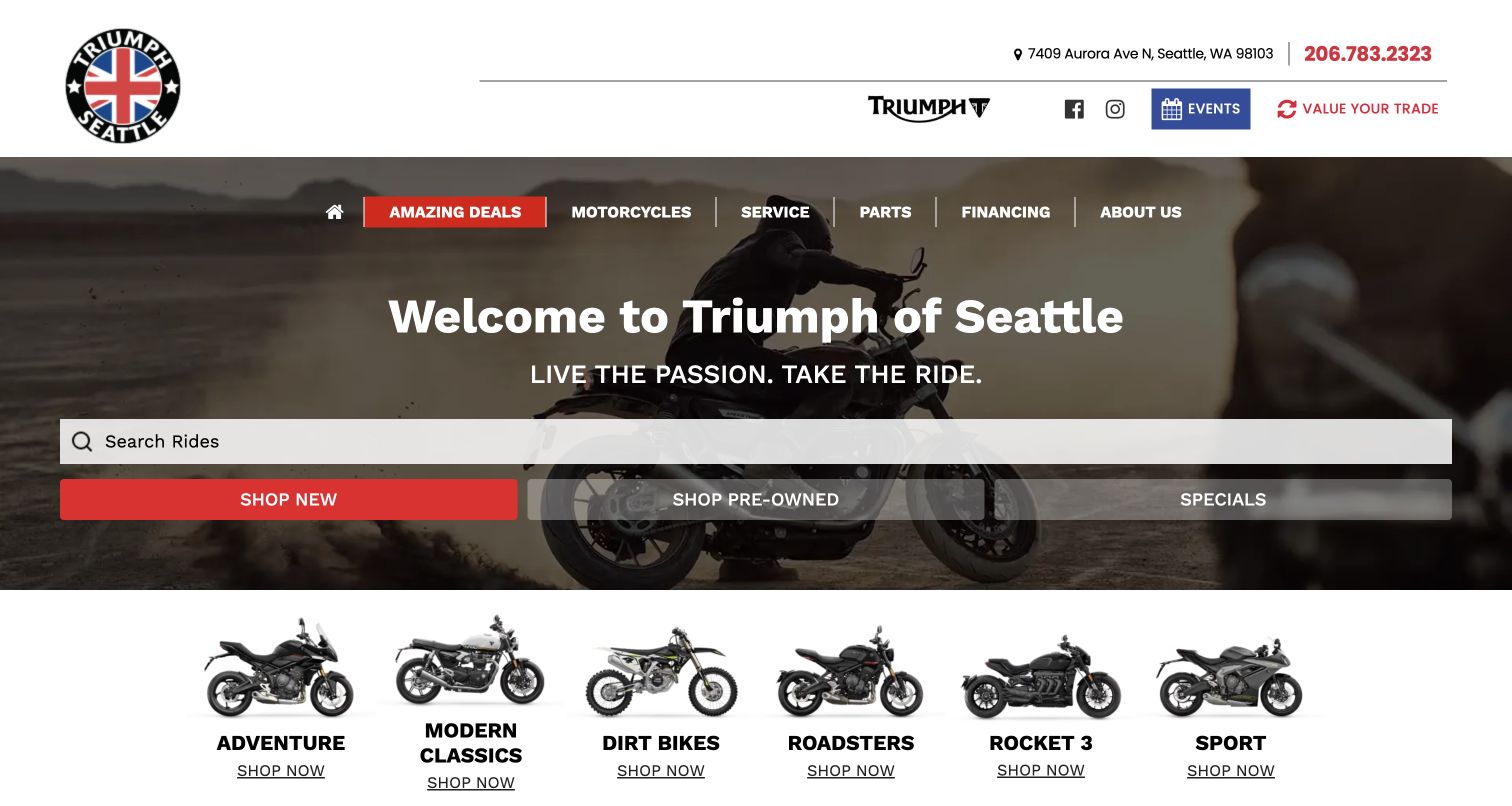
Triumph of Seattle places ride search and new, pre-owned and specials buttons over a motorcycle scene, then adds a row of riding-category illustrations. Adventure, modern classics, dirt bikes, roadsters, Rocket 3 and sport offer useful alternatives to knowing an exact model in advance. The dealer mark and Aurora Avenue address keep the experience local, with events and trade valuation available in the upper area. This is a sensible progression from broad intent to more specific riding interests. The large welcome message and familiar campaign structure do less to explain the dealer's individual character, and the categories mix styles with a named model family. Beginners may need explanation of these categories.
What you can learn
Give riders a way to browse by the experience they want, not only by a model code. Keep category labels consistent, and add short explanations where manufacturer terminology or a specific model family sits alongside general riding styles.
Pros
Illustrated riding categories help visitors who lack a model preference.
Search and condition-based shopping routes remain prominent.
Cons & considerations
The category set mixes riding styles with a named model family.
The opening provides limited dealer-specific differentiation.
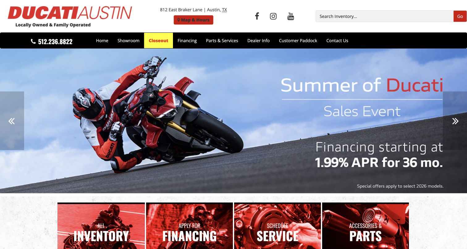
Ducati Austin states its locally owned and family operated position directly beneath the logo. That small line is valuable because the rest of the opening uses strong Ducati branding, red accents and manufacturer campaign imagery. The header also exposes the street address, map and hours, phone and inventory search. Four photographic task cards begin below the campaign, separating inventory, financing, service and parts. The Customer Paddock label gives the navigation some enthusiast character, although it is less immediately descriptive than the other items. The observed artwork still uses summer sales wording at a November review, so readers should treat it as captured presentation rather than a verified current offer. Local identity remains separate from franchise advertising.
What you can learn
Keep the dealer's own story and contact information visible around manufacturer material. Assign expiry dates to seasonal artwork, and balance enthusiast language with plain task labels so newcomers understand where each route leads.
Pros
Local ownership and physical location are stated prominently.
Inventory search and four ownership tasks are clearly separated.
Cons & considerations
The captured campaign retained summer wording during the November review.
Customer Paddock is less explicit than the surrounding task labels.
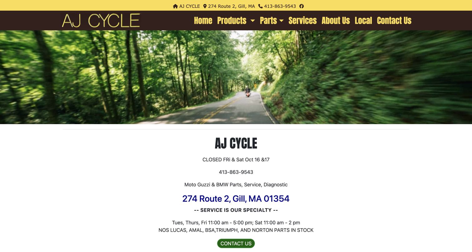
A-J Cycle uses a forest-road photograph above a simple centered information block. The opening tells visitors where the shop is, how to call, what marques it services and which days it opens. Products, parts, services, history and local information are plainly named in the navigation. Used motorcycles for sale appear farther down, confirming that the site serves a sales role as well as maintenance. This is a markedly different approach from a franchise campaign carousel: the specialist's practical identity is the main content. The design is easy to understand, but much of the opening is text rather than stock, and the dated closure notice needs active maintenance. The centered address and green contact button provide the next step.
What you can learn
A small specialist can lead with location, scope and real opening information. Keep used stock accessible alongside that service identity, and remove expired notices so a helpful operational message does not become a source of uncertainty.
Pros
Location, phone and specialist scope are stated with little ambiguity.
Used-bike sales and service have separate visible destinations.
Cons & considerations
A dated closure notice remains in the captured introduction.
Specific motorcycle availability sits below the initial information block.
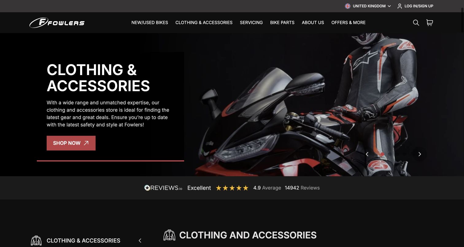
Fowlers places new and used bikes, clothing and accessories, servicing and bike parts in one clear black navigation bar. The captured view leads with equipment, using a rider-and-motorcycle photograph beside a short retail panel. A review strip and department content appear below, reinforcing the sense of a substantial physical and online store. Search and basket controls are present but visually secondary to the main categories. The useful pattern is the explicit separation between the motorcycle buying journey and the parts and apparel journeys. A buyer can identify the correct department without assuming every item shares the same checkout process. The opening campaign may concern another part of the wider retail operation.
What you can learn
Treat a broad dealer as a set of clearly named departments. Make vehicle shopping distinct from merchandise purchasing, preserve service access, and explain transitions when inventory or parts systems live on different sections or subdomains.
Pros
The main departments are concise and immediately understandable.
Service and genuine parts sit alongside retail categories.
Cons & considerations
The opening campaign prioritizes equipment over motorcycle stock.
Different shopping destinations may require users to reorient themselves.
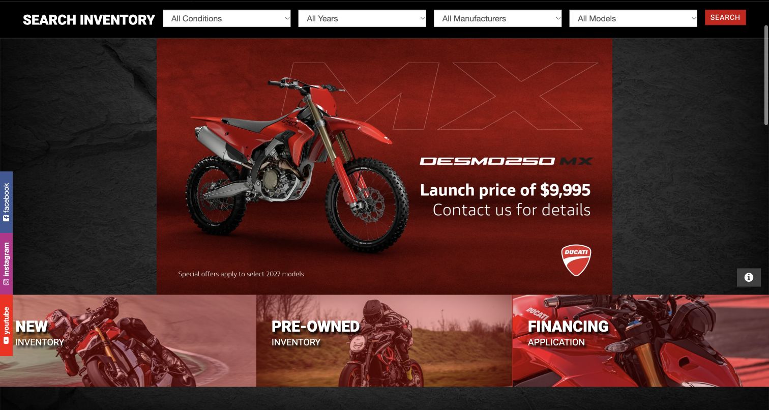
Moto Union gives inventory search its own horizontal strip above the campaign area. Condition, year, manufacturer and model controls are aligned in a predictable sequence, ending with a red Search button. The captured lower homepage view also shows new inventory, pre-owned inventory and financing cards beneath a Ducati promotion. This makes filtering and broad browsing complementary rather than competing approaches. The dealer's wider header identifies several franchises and includes winter storage, a useful regional ownership service. Red and black styling provides consistency, although the many uppercase labels and dark textures create a heavy visual treatment. The first source frame contained an incomplete campaign image; the accepted capture preserves the subsequently loaded view after a short scroll.
What you can learn
Expose practical inventory filters before asking users to browse campaigns. Keep condition and model choices understandable, offer a broad inventory alternative, and make sure promotional images load without pushing the essential controls out of reach.
Pros
Four useful inventory filters are available before deeper browsing.
Winter storage recognizes a regional ownership need.
Cons & considerations
Dense uppercase labels and textures make the presentation visually heavy.
The campaign image did not appear immediately in the initial source view.
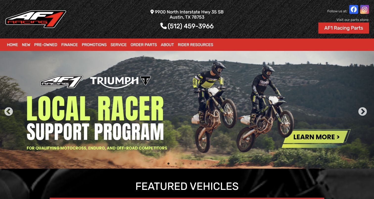
AF1 Racing Austin makes its dedicated parts store unusually visible, with a separate red action in the upper header and another Order Parts navigation item. New and pre-owned motorcycles, service and rider resources remain clearly named alongside it. The accepted capture shows a local racer-support campaign after the initial image finished loading, followed by featured vehicles. That campaign gives the dealership a specific community angle instead of relying only on price promotions. The address and phone are centered above the navigation, making the physical location easy to identify. The red, black and textured visual treatment suits the specialist identity but produces a dense header. Parts-store transitions should preserve browsing context.
What you can learn
Give valuable specialist services an obvious place in the interface. A parts operation or rider program can distinguish the dealer, provided each has a clear route and does not obscure the basic tasks of browsing stock and arranging maintenance.
Pros
The parts store is explicit rather than buried in a dropdown.
Rider resources add a concrete community dimension.
Cons & considerations
A dense textured header competes with the campaign.
Separate vehicle and parts systems need clear transition cues.
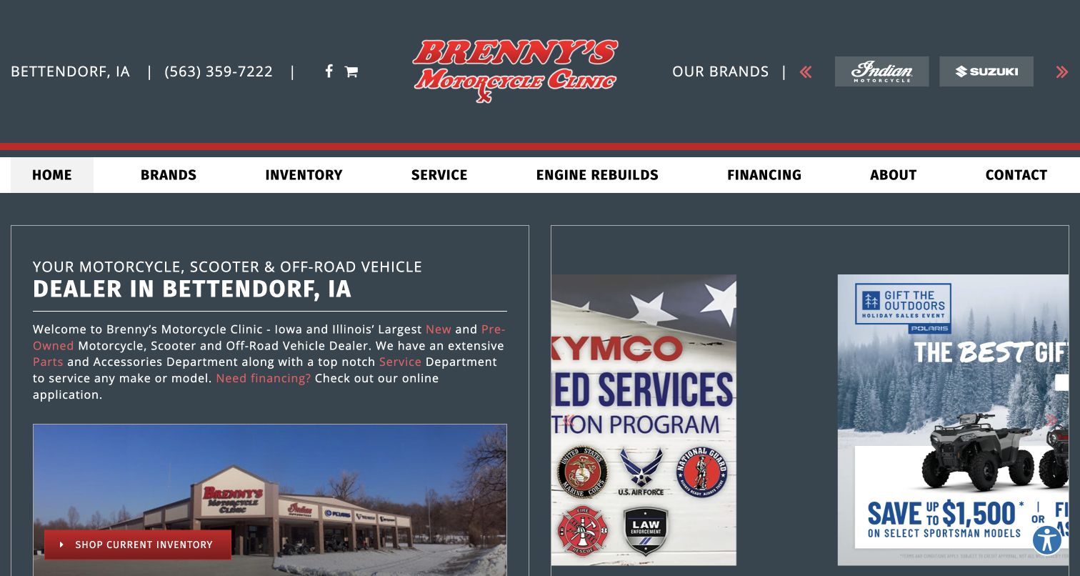
Brenny’s Motorcycle Clinic gives the left side of its opening to a local introduction and a photograph of the premises. The right side carries rotating manufacturer promotions, while the header cycles through franchise marks. This split lets the dealer explain its Bettendorf identity without removing space for seasonal campaigns. Inventory, service, engine rebuilds, financing and contact are plainly named in a broad white navigation row. Engine rebuilds are a particularly specific service label that communicates more than a generic after-sales menu. The left column's text links and inventory button offer several routes into the business, although the red link color is subdued against the dark background. The capture honestly preserves a campaign transition.
What you can learn
Reserve space for the dealer's own explanation alongside manufacturer creative. Specific services can help differentiate a regional business, but keep text contrast strong and ensure rotating promotions remain useful without relying on a perfectly timed slide.
Pros
The physical location and regional positioning remain visible beside promotions.
Engine rebuilds receives a specific primary navigation label.
Cons & considerations
Some red text links have limited emphasis against the dark background.
Kegan is a freelance web designer and developer with 15+ years of experience helping businesses turn complicated website requirements into clear, maintainable digital experiences. He works directly with clients from planning and design through development, launch, and ongoing support.
For motorcycle dealer website design, his development approach focuses on motorcycle dealer websites that connect searchable new and used inventory, model details, servicing, consignment and clear enquiry routes without implying vehicle condition or finance approval. The scope can be a targeted improvement or a complete custom build, with responsive layouts, thoughtful content structure, and integrations chosen around the people using and maintaining the site.
Show 3 other motorcycle dealer website designersHide other motorcycle dealer website designers
Plan a motorcycle-dealer website around stock, rider intent and ownership
Build an inventory model before designing the hero
Start by listing the information a rider needs to decide whether a motorcycle deserves a closer look. Condition, year, manufacturer, model, mileage, price state and stocking location form a useful core. Add more detail where the actual range requires it, such as engine size, riding category or approved-used status, and explain labels that are not self-evident. Keep a manufacturer showroom separate from available units so a polished product page does not imply that a specific bike is on the floor. Plan reserved, sold and incoming states before launch, including how those states move through search cards, detail pages and enquiries. Decide who owns each field and how a correction reaches every surface. Photograph the actual used motorcycle where possible, and distinguish representative model photography from the specific unit being offered. Search controls should reflect the catalog rather than a standard component's capabilities. A small specialist may need condition and price; a large regional group may also need store and riding type. Review what happens when filters return nothing, when a price is unavailable, and when a visitor follows an old listing link. Clear alternatives and retained context are more useful than a blank result or a generic contact page.
Give new riders and experienced owners different routes
A rider who knows a model code can use direct inventory search. Someone buying a first motorcycle may need a route based on intended use, fit, experience or the difference between new and pre-owned stock. Plan these journeys together without pretending that a website can determine personal suitability. Explain categories in ordinary language and provide a way to speak with the dealership before a consequential choice. Keep test-ride information specific about the next step and any published requirements, rather than promising access that has not been confirmed. Returning owners often arrive for parts, workshop hours or seasonal storage, so those tasks should not be hidden behind a sales campaign. A parts-number search can be valuable for a specialist, while a clear service department page may matter more for a local shop with a compact catalog. If the business offers consignment, explain the process before the form: what information is requested, who evaluates the motorcycle and when a conversation follows. Do not put private customer details into public examples. The aim is to reduce uncertainty before contact, not to turn every question into a lead or to make every visitor follow the same funnel.
Create a sustainable campaign and location system
Manufacturer artwork can make a dealer site feel current and recognizable, but it also introduces dates, conditions and dependencies that someone must maintain. Give each campaign an owner, a destination and a review or expiry date. Check that the linked stock matches the promotion and that a seasonal headline does not survive long after the season has passed. Keep the dealer's own location, phone and core tasks outside the campaign so they remain useful when slides rotate or media fails to load. For a multi-store operation, treat location as structured content rather than a footer list. Each branch needs its actual address, department hours, available services and a clear relationship to the inventory it holds. Explain transitions to separate parts shops, finance systems or manufacturer showrooms so visitors know when the context changes. Test the page with optional cookies declined and with large campaign media unavailable; basic navigation and readable stock information should remain. Make accessibility and mobile use part of the component brief, including keyboard operation, visible focus, labeled controls and sufficient text contrast. Finally, schedule practical content checks around inventory and operating hours, not just a visual redesign every few years. A modest page that remains accurate is more useful than an elaborate entrance with stale details.
The editing job behind the design
Choose tools that keep stock and dealer information dependable
Start with the inventory workflow: how units enter the system, how prices and status change, and which staff can correct a listing. The public website should preserve a stable stock identity while presenting an understandable view of that data.
Separate editorial pages from sensitive transaction steps. A public service explanation, a test-ride enquiry, an online merchandise purchase and a finance application have different information needs and should not be treated as interchangeable forms.
Evaluate media performance and fallback behavior alongside visual flexibility. Campaign video, third-party chat and manufacturer widgets should not be required for visitors to find a location, read stock details or contact the correct department. Public stack observations are limited evidence, not a complete audit of a dealership's backend.
Our WordPress website examples offer a separate look at publishing approaches. A visible platform label is evidence for that named page, not a guarantee that the same system will suit your requirements.
Before the public launch
Motorcycle-dealer website brief checklist
Distinguish available units from manufacturer model information and orderable stock.
Label new, used, incoming, reserved and sold states consistently.
Show meaningful year, model, mileage, price state and location details.
Identify whether photographs show the actual used motorcycle or a representative model.
Offer useful filters that match the real size and variety of the inventory.
Provide a route for riders who do not yet know a model name.
Keep department hours, address and telephone information current.
Explain test-ride, service and storage processes before asking for details.
Keep consignment and trade-in routes distinct from ordinary buying enquiries.
Preserve the selected stock reference and branch in the enquiry journey.
Assign owners and expiry dates to promotions and seasonal notices.
Verify core navigation and content with optional cookies declined and campaign media unavailable.
These checks are a project checklist, not a performance, legal, security, or accessibility certification. Test real journeys with the people responsible for the website before making claims about the result.
Sources & editorial method
How this collection was selected and reviewed
The collection matches its original saved draw of 29 distinct dealer website properties. Every accepted image is a direct browser screenshot captured on November 10, 2026, with the exact source URL, UTC capture time, measured dimensions, attribution and hash retained. A few views include source privacy notices, chat prompts or campaign transition frames; short-scrolled homepage views are labeled. Initial incomplete frames and challenged or unsuitable candidates remain private and are excluded from the collection. Each accepted source received one bounded broad technology-audit attempt: 19 returned checked observations and ten were unavailable. Those unavailable results do not establish a hidden backend and were not bypassed or repeatedly scanned. Reviews assess visible design, navigation and public explanations, not motorcycle condition, dealer credentials, service quality or financing outcomes. No enquiry, purchase, finance application, account action, vote or message was submitted during research.
Each example links to its actual source page. Screenshots are direct browser captures with their own capture dates; moving imagery, announcements and live designs can change. The notes describe observable design choices and conditional tradeoffs, not measured traffic, conversion results, service quality, or accessibility conformance.
Technology labels use public page metadata, asset evidence, or explicitly cited platform documentation. Platform documentation is not a complete current deployment audit. A component reference may be legacy or unused; it is not a complete backend inventory. Unknown stacks are omitted. These sites are editorial examples, not our client portfolio.
Written, Edited and Curated are separate editorial records, not timestamps advanced by a rebuild. Website designs and imagery belong to their owners. See our editorial standards or suggest a correction.
Questions worth asking
Motorcycle Dealer website design questions
Should a motorcycle-dealer homepage lead with a campaign or inventory?
Either can work if an obvious inventory route remains visible. A campaign is most useful when it identifies the relevant model or stock and links directly to it. Local contact, service and used-bike routes should remain stable when the campaign changes.
Should new and used motorcycles share a search?
They can share a search when condition is clearly labeled and easy to filter. Used listings need information about the actual unit, while a manufacturer model page should not be mistaken for proof that the bike is in stock.
How much information should be available before an enquiry?
Enough to judge whether the listing is relevant: model, year, condition, mileage where applicable, price state, location and useful photographs. If a price requires contact, say so clearly and preserve the bike reference in the enquiry route.
Do small dealers need complex inventory filters?
Only when the catalog benefits from them. A compact specialist may be better served by clear stock cards and a few meaningful categories. Larger inventories may need condition, make, model, price and location filters with helpful empty states.
Does the Editors Choice identify the best dealer to buy from?
No. It is a researched editorial choice about the public website's design and communication. It does not establish motorcycle condition, business performance, financing suitability or the outcome of any purchase or service.