Google Analytics can help answer questions about a website’s use. Its presence cannot tell you whether the experience is effective, whether collection is configured correctly, or why a visitor made a decision.
These examples range from editorial archives and public information to specialist services and products. Each has a scoped public Analytics reference. The screenshots are useful for discussing visitor tasks; they are not screenshots of a company’s private reports, and we have not audited the events that company collects.
A good implementation starts with a decision someone actually needs to make. If an editorial team wants to understand discovery, define the entrances and reading tasks. If a service business wants better inquiries, distinguish an attempt, a successful submission, and an internally qualified request. A tag appearing on a page does not settle any of those definitions.
Before the examples
What makes good Google Analytics website development in 2026?
Name the question before the event
Write an ordinary-language question, its intended audience, and the action a report could support. Then identify the smallest observable interaction that helps answer it. Avoid treating every navigation click as a business outcome. Record limitations such as blocked collection, repeated visits, and actions that finish in another system.
Separate a click from a completed task
A submit-button click may precede validation failure or a rejected request. Define success using the application’s confirmed outcome, and make repeat submissions or retries part of the test plan. Google’s event documentation distinguishes automatically collected, enhanced, recommended, and custom events; choose deliberately rather than adding several overlapping implementations.
Essential content, contact routes, purchasing, and error messages should not depend on an analytics request succeeding. Test a blocked tag and a slow network. Keep form text, account details, and other personal information out of the proposed event payload; have the responsible team review collection, access, retention, and required notices for its circumstances.
The collection · 20 examples
20 Google Analytics website examples worth studying
Use the examples to identify concrete tasks worth understanding: finding a topic, selecting a location, discovering a product, or completing an inquiry. The public signal establishes a limited technology reference, not access to the organization’s measurement strategy.
We start with five recognizable brands or organizations: Spotify — For the Record, US Food and Drug Administration, Stack Overflow corporate website, Google Summer of Code, Yelp Top 100 Places to Eat 2025. Each attribution applies to the named website property, not every product or website belonging to its organization. This is a curated reading sequence, not a measured ranking.
Spotify's For the Record pairs a bold headline with an artist photograph and a deliberately small News and Company navigation. Search remains available across the top, while the numbered feature control distinguishes the current cover from the continuing archive. A Google Analytics reference was observed on this newsroom property. That does not reveal the organization's reporting configuration or establish how any particular reader is identified.
What you can learn
Design the measurement brief around editorial questions rather than around decorative clicks. Distinguish opening a featured article, searching the archive, and leaving for another Spotify property. Record the story and placement separately so a campaign change does not silently change the meaning of the same event name. Validate the actual implementation with the people responsible for consent and reporting.
Pros
The lead story has an obvious visual priority without removing archive search.
News and company information have separate, recognizable entry points.
Cons & considerations
A rotating lead complicates comparisons unless placement is recorded consistently.
Small carousel positions need meaningful story labels to support repeat visitors seeking a particular announcement.
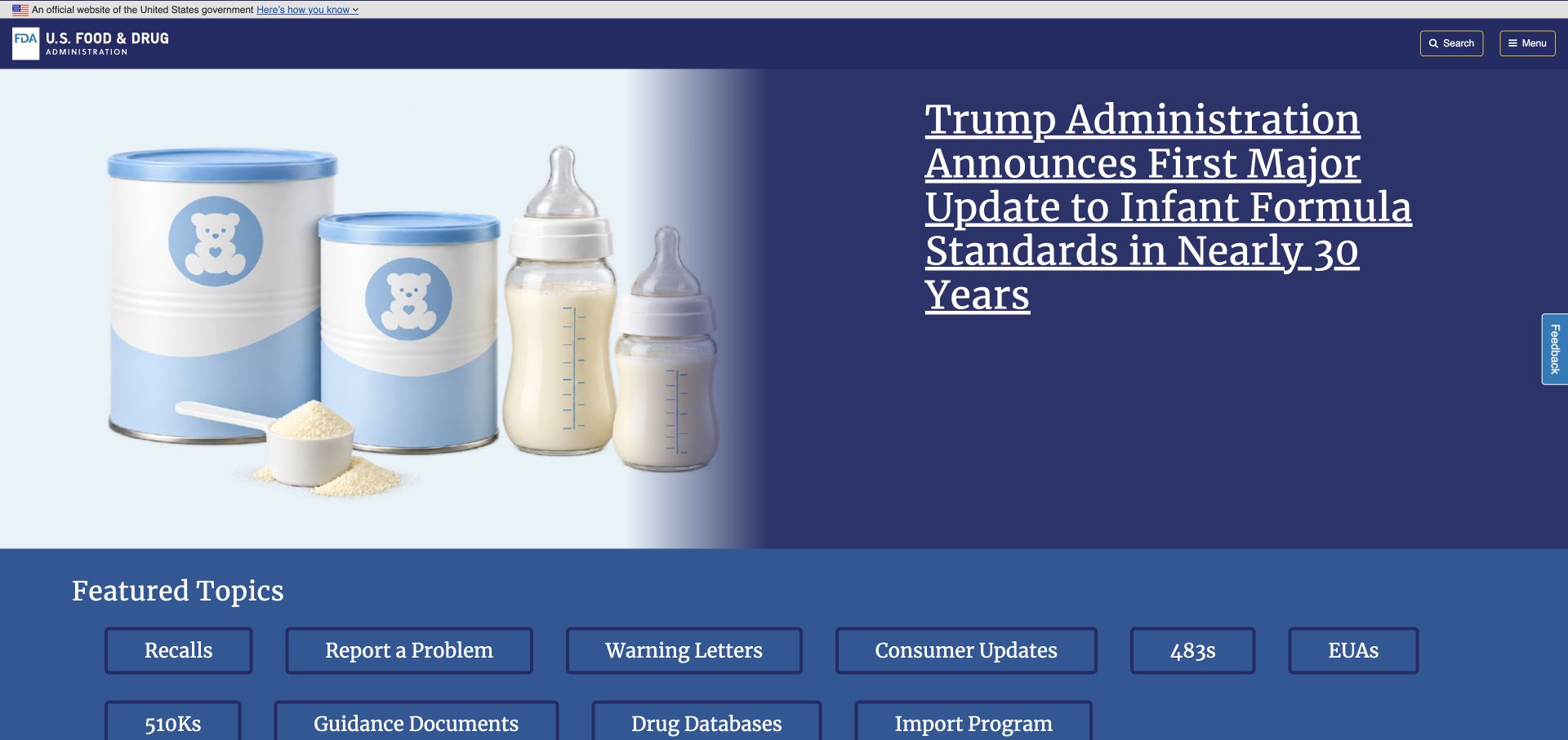
The FDA opening separates official identity, a prominent announcement, and a dense set of named tasks. Recalls, reporting, guidance, and databases are exposed as concrete destinations rather than hidden behind a single promotional action. The observed analytics reference belongs to this public information page. It is not evidence about the separate systems behind a report, database search, or other linked government service.
What you can learn
Before tracking a government information journey, decide which task the visitor is trying to complete and where that task leaves the public website. A click to guidance and a click to a submission service should not share an ambiguous success label. Maintain a destination inventory and make reports distinguish navigation from actual completion. Keep sensitive form contents and case details outside ordinary analytics payloads.
Pros
Named task destinations make the alternatives to the headline immediately understandable.
The feature and the reference links occupy visibly different layers.
Cons & considerations
Many adjacent destinations need careful grouping on a small screen.
Guidance reading and formal reporting need distinct destinations so visitors do not confuse information with submission.
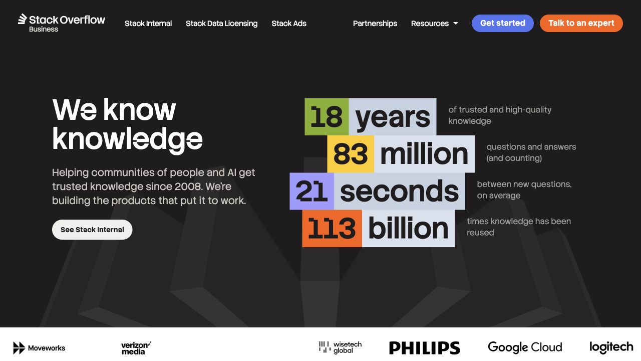
Stack Overflow's corporate homepage places a concise knowledge proposition beside large colored statistics. Each number has an accompanying explanation, and the header distinguishes commercial offerings rather than treating every visitor as a question-and-answer user. The page is a useful reminder that analytics has to respect property boundaries: this corporate website is not the public question archive or an authenticated customer workspace.
What you can learn
Map events to the particular commercial journey that the page describes. A reader exploring an internal knowledge product, a licensing prospect, and someone following a partnership route have different intentions. Preserve those distinctions without collecting a person's workplace content. Give every displayed numerical claim an editorial owner, and do not confuse a marketing statistic shown in the hero with a metric independently verified by this review.
Pros
Supporting labels make the numerical composition more informative than isolated counters.
Product and partnership routes provide recognizable alternatives to the main action.
Cons & considerations
Large statistics need review dates and supporting context as the business changes.
Several commercial offerings require clear differentiation beneath the broad knowledge proposition.
Google Summer of Code presents its program name and a large current-phase announcement on a pale, mostly typographic canvas. The captured edition identifies the year and contributor announcement, while a small login control remains visually separate. The analytics reference is associated with this program website, not every Google product. The screenshot also records one point in the program cycle rather than a permanent application state.
What you can learn
Treat the year and phase as explicit reporting context. Reading eligibility guidance, opening an organization profile, and entering an application system are not interchangeable conversions. Keep a stable explanation and archive route so visitors arriving after a deadline can still understand the program. Review event naming before the next edition launches, and preserve comparisons only when the underlying task and implementation remain genuinely equivalent.
Pros
The program year and phase are communicated in readable text.
The account route is distinct from the public announcement.
Cons & considerations
A phase-specific opening can leave newcomers needing a more durable introduction.
A returning applicant needs a dependable explanation of what the current program phase allows.
Yelp's Top 100 Places to Eat feature uses a prominent badge and a short explanation on a red patterned field. The primary action points to the named 2025 collection, and the compact navigation distinguishes different editions. This is a dedicated editorial feature, not a review of Yelp's complete product. Its visible analytics integration does not validate the ranking methodology or establish the results of the linked list.
What you can learn
Include an edition identifier in the measurement plan instead of repeatedly overwriting one undated campaign label. Track the introduction and the list destination as different surfaces, and document whether crossing between them changes reporting scope. Preserve old URLs and readable year labels when publishing the next collection. Comparisons should account for different publishing windows and promotional exposure rather than treating every annual total as directly comparable.
Pros
The edition appears in both the visual badge and the destination label.
A focused primary action keeps the campaign's immediate purpose legible.
Cons & considerations
A campaign page can obscure the boundary between introduction and external collection.
Edition comparisons need dates and publication context rather than one undifferentiated annual traffic total.
Norm Architects introduces its work through an atmospheric interior photograph, a small wordmark, and restrained navigation. The image carries much of the first impression, while project and studio routes remain available around it. Google Analytics was referenced on the sampled public page alongside the design's other visible components. No inquiry, project browsing session, or reporting account was tested as part of this visual reference.
What you can learn
For a similarly restrained practice site, identify a few meaningful tasks before adding instrumentation everywhere. Opening a project, finding studio information, and initiating contact can answer more useful questions than an inventory of animation interactions. Keep the image's editorial purpose separate from assumptions about commercial results. Test events against real navigation changes and document what the team can reasonably infer from an incomplete, consent-dependent public sample.
Pros
The opening gives a strong project image space without a wall of competing actions.
The limited navigation makes a small task inventory practical to define.
Cons & considerations
An image-led opening offers little explanation when the visitor is unfamiliar with the practice.
Project exploration needs useful names and categories, not only a sequence of atmospheric image impressions.
Heatherwick Studio overlays its large identity on an immersive project scene and keeps the first navigation choices compact. The opening is expressive, but it is still the entrance to a substantial body of work. An analytics reference on this public page supports an integration observation only; the scene, scale, and type treatment do not establish how effectively visitors discover relevant projects afterward.
What you can learn
Define what useful exploration means for the archive before selecting events. A project view, a category selection, and a return to the studio introduction describe different levels of engagement. Keep stable project identifiers even when titles or featured imagery change. For moving introductions, separate an optional media interaction from access to essential information so reports do not mistake the mechanics of the presentation for progress toward a visitor's actual goal.
Pros
A clear studio identity anchors the visually ambitious opening.
The compact initial navigation leaves the project scene easy to read.
Cons & considerations
An immersive lead can delay practical project facts for a task-focused visitor.
A visitor comparing relevant experience still needs project names and practical facts beyond the opening scene.
The Noguchi Museum places an evocative spatial photograph beside biographical material and a portrait. The header distinguishes the artist, museum, artworks, and shop, while an operational status line supplies a more immediate fact. These visible routes suggest several genuinely different visitor tasks. The sampled Google Analytics reference does not show whether the museum combines, separates, or excludes any of those journeys in its own reporting.
What you can learn
Write a measurement plan that preserves the difference between planning a visit, researching an artist, and entering commerce. A shop exit should not automatically become an editorial success, and reading a closure notice may itself answer an important question. Keep operational facts reusable so changes do not create contradictory copies. Verify any cross-domain ticket or shop handoff explicitly, without assuming the shared museum identity makes the data continuous.
Pros
The navigation gives practical visiting and deeper collection discovery distinct identities.
Operational status is not buried inside a purely atmospheric introduction.
Cons & considerations
Several audience types need more than one generic engagement metric.
The transition into a separate shop or ticket destination needs clear expectations and continuity.
The Clove Club's opening is predominantly blue-toned imagery with a small central identity. Reservations occupy one corner and a compact menu control the other. Very little introductory text competes with the visual field. The public page referenced Google Analytics, but this capture did not exercise booking or demonstrate what happens after someone chooses a reservation date, party size, or external booking provider.
What you can learn
For a minimal restaurant site, distinguish the desire to book from the completion of a reservation. Measure the visible reservation entry only as a handoff unless the destination has a properly implemented completion signal. Keep practical location and dining information discoverable for guests who are still deciding. An unobtrusive design can support a clear event plan, but it does not remove the need for consent review and accurate reporting boundaries.
Pros
The booking entrance is separate from general exploration.
A small set of controls makes the intended opening task easy to identify.
Cons & considerations
The sparse introduction asks unfamiliar guests to explore for basic context.
A booking-provider handoff may leave completion outside the public site's visible evidence.
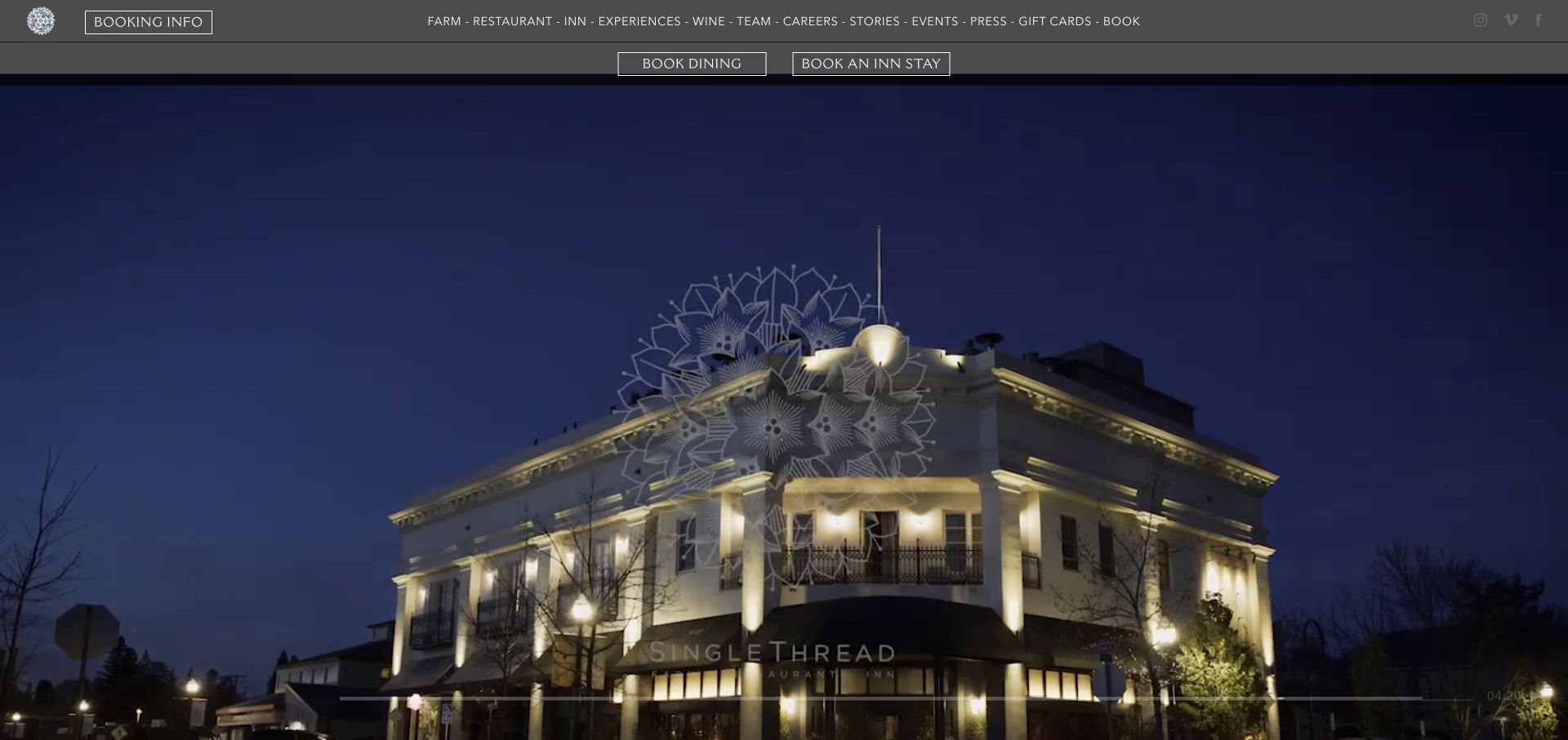
SingleThread presents a dark navigation bar above a rich hospitality scene. Farm, restaurant, inn, and experience routes coexist, while distinct controls separate dining from an overnight stay. The composition makes the breadth of the brand visible without pretending those purchases are the same task. A Google Analytics reference was found on the public property; no reservation, payment, or private guest workflow was inspected.
What you can learn
Describe the booking object in the event vocabulary. A dining reservation, an inn availability search, and interest in an experience need separate definitions and downstream owners. Keep temporary announcements out of permanent event names, and record campaign context independently. When different providers handle the actual reservations, document each boundary and the level of completion that can truly be observed instead of adding the handoffs together as equivalent confirmed bookings.
Pros
The two principal booking types have distinct visible entrances.
The broader navigation communicates the relationship between food, place, and accommodation.
Cons & considerations
Multiple experiences can make a single headline conversion total misleading.
Dining and overnight-stay actions need distinct destinations and explanations before any booking commitment.
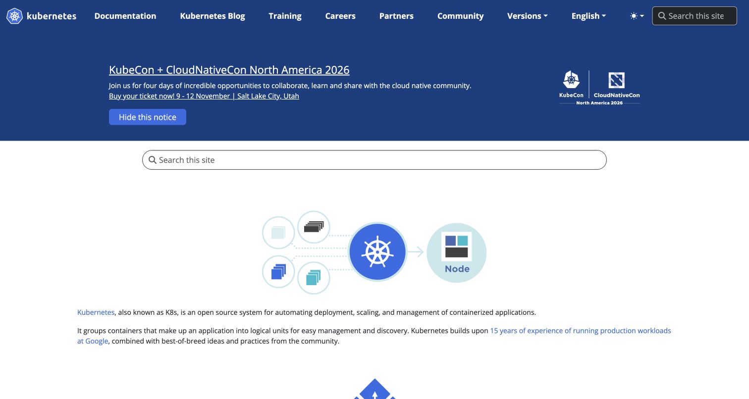
Kubernetes combines a blue identity and announcement area with a broad search field, a small diagram, and readable introductory text. Documentation, training, partners, and community each have a permanent route. The public page also carries a substantial event notice. An analytics reference was observed here, not within a Kubernetes cluster or an organization's operational infrastructure, which would be a very different measurement surface.
What you can learn
Distinguish a visitor finding reference material from one responding to an event campaign. Search use can indicate either successful discovery or difficulty finding a page, so interpret it alongside destinations and appropriate qualitative feedback. Maintain a stable documentation taxonomy and give temporary notices an owner. Do not send configuration snippets, search secrets, or operational identifiers through generic website events merely because the audience is technical.
Pros
Search and permanent documentation routes remain visible around the event notice.
An explanatory diagram gives newcomers another way to understand the project.
Cons & considerations
A large announcement can compete with the durable learning task.
A broad documentation library needs meaningful empty-search behavior and a conventional browsing alternative.
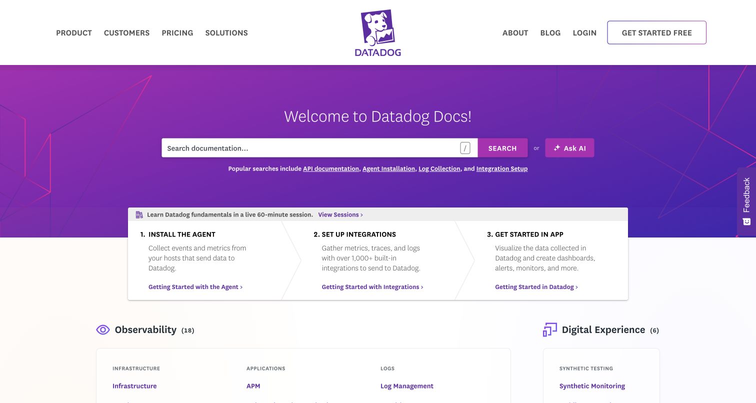
Datadog's documentation landing page places search in a purple banner and follows it with three numbered setup panels. Installation, integration, and application use form a visible sequence before the broader content library. Popular searches sit close to the main field. The Google Analytics reference relates to this public documentation surface; it does not describe measurement inside the authenticated observability product or a customer's monitored systems.
What you can learn
Treat a tutorial step and a general reference lookup as different tasks. A click on installation material is evidence of intent to read, not proof that software was installed. Define completion signals only where a legitimate, privacy-conscious mechanism exists. Keep product navigation and documentation navigation distinct in the reports, and test whether search and onboarding labels remain stable when the documentation taxonomy changes.
Pros
A short numbered path provides context before the full reference library.
Popular searches offer concrete alternatives to an empty search box.
Cons & considerations
A public reading event cannot establish successful configuration in another environment.
Broad corporate navigation can distract from an immediate installation or reference question.
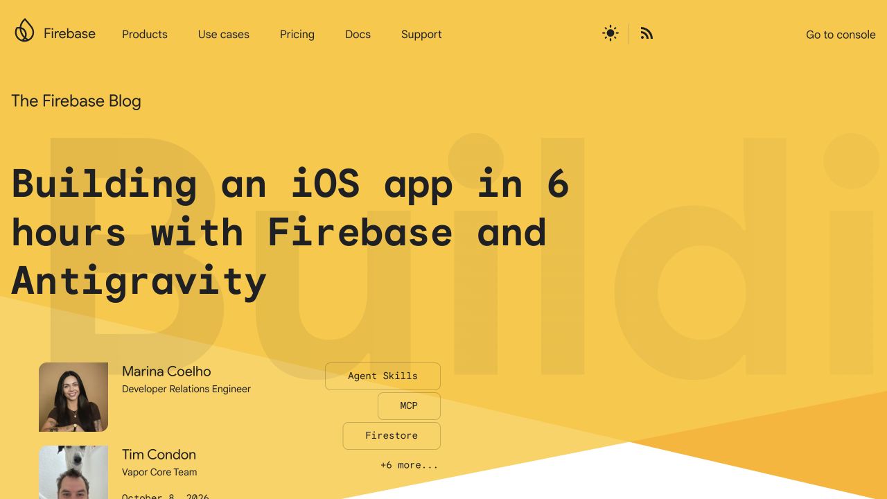
Firebase Blog leads with a warm yellow feature, a large monospaced article title, named authors, and topic labels. Links to products, documentation, support, and the console surround the publication identity. A reader can recognize both the article and the larger product ecosystem. The observed Google Analytics integration belongs to this public blog; the console and the behavior of applications built with Firebase are outside this reference.
What you can learn
Model article identifiers, authors, topics, and publication dates before defining analytics dimensions. Those stable editorial fields make a feature change easier to interpret than an event tied to the current headline text. Distinguish documentation referrals from console exits and avoid treating either as proof of product adoption. Review what is actually sent when someone searches or follows a technical example, especially if query strings could contain project-specific information.
Pros
Author and topic metadata supply useful editorial context around the feature.
The product-family navigation is available without disguising the page as the console.
Cons & considerations
Very large titles need testing with less convenient technical headlines.
A product-family header needs clear boundaries between reading, reference lookup, and account-based console activity.
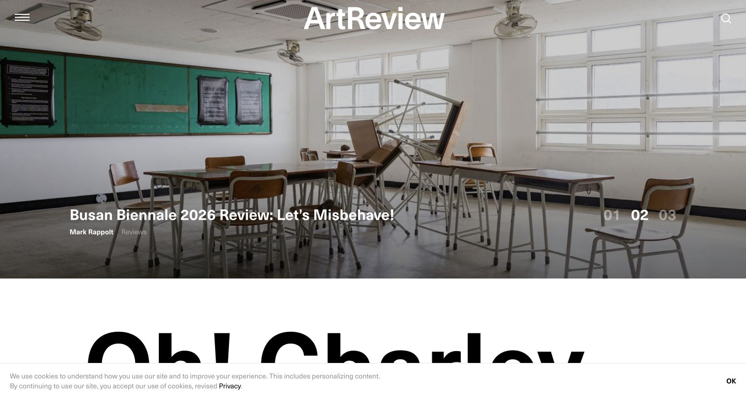
ArtReview's lead places a large exhibition photograph behind the publication masthead and a story title. Author and category information remain part of the composition, while numbered positions indicate additional featured stories. A dramatic change to black text on white begins the next section. The analytics reference establishes a public integration signal, not readership quality, subscriber conversion, or the effectiveness of the particular image shown.
What you can learn
Keep article identity separate from homepage placement when defining reports. A story may move between the lead slot, a category index, and an archive without becoming a different editorial object. Use consistent labels for those placements and retain publication dates. Pair quantitative data with editorial judgment: a photograph can be visually dominant without ensuring that a reader understands the headline or finds the next related piece.
Pros
Author and category labels keep the feature connected to its editorial record.
The strong shift below the photograph creates a clear next reading zone.
Cons & considerations
Overlay contrast must be checked again for every replacement image.
A feature sequence needs readable article names and direct destinations rather than anonymous position controls alone.
American Landmaster's captured opening promotes an October vehicle offer over product photography. Models, configuration, learning, parts, owners, and dealer search have distinct positions in the dark navigation. Smaller utilities include manuals and warranty registration. The visible campaign is preserved as captured, rather than represented as a current offer. Google Analytics was referenced on the public website, not on a dealer's sales or service systems.
What you can learn
Define campaign identifiers and expiry independently of model and owner-support destinations. A customer downloading a manual should not be grouped with someone starting a vehicle configuration simply because both began on the same homepage. Document where dealer search hands the visitor elsewhere and what can actually be observed there. Keep promotion terms under editorial review, and avoid sending serial numbers or customer details through routine analytics events.
Pros
Stable owner resources remain available beside the seasonal sales campaign.
Model exploration and dealer discovery are recognizable, separate tasks.
Cons & considerations
An expired promotional feature can make captured marketing context easy to misread.
Owners seeking manuals or parts need a stable route that remains clear after a seasonal sales campaign changes.
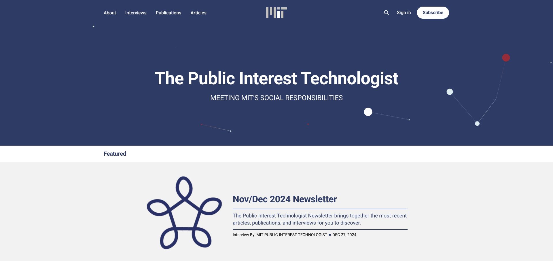
MIT's Public Interest Technologist presents a centered institutional mark and a publication title on a deep blue field. Interviews, publications, and articles are separated in the header, with sign-in and subscription actions elsewhere. The featured item carries an edition label, including its original date. The sampled analytics reference relates to this publication, not all MIT websites or authenticated university services.
What you can learn
A compact institutional publication can start with a small reporting vocabulary tied to format and subject. Distinguish reading a report from entering a subscription flow, and preserve the edition date so archive content is not mistaken for a new campaign. If the feature has not changed recently, interpret its placement and publishing window honestly. Do not automatically refresh dates merely to make an analytics comparison look like a current release.
Pros
Format labels make the editorial library easier to interpret.
Institutional identity and publication identity coexist without a dense portal header.
Cons & considerations
An older feature requires context about the publication's update rhythm.
Sign-in and subscription routes should explain their distinct purposes beside an otherwise small editorial library.
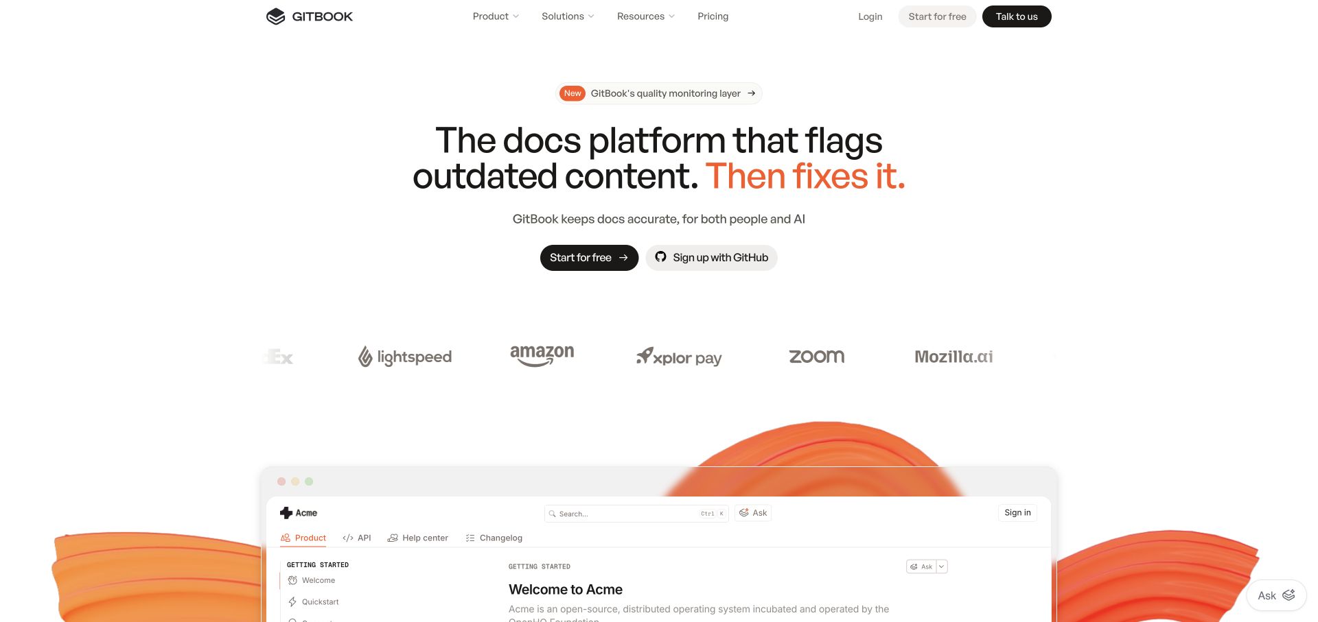
GitBook's marketing page centers a short proposition and registration controls above a large documentation preview. Customer marks provide a bridge between the introduction and the product illustration. The preview includes a familiar sidebar and content structure, helping explain the category before a feature list. An analytics reference on the marketing property does not show how customer documentation or the authenticated application records activity.
What you can learn
Distinguish interactions with the marketing page from actual product events. A visitor viewing an interface illustration has not used the corresponding application feature. Define a clear handoff to registration and document which system owns any later activation signal. Keep product claims tied to explanations and current evidence, and ensure an event label still makes sense when the preview image or headline is replaced in the next campaign.
Pros
The interface preview conveys a recognizable documentation structure.
Primary registration controls are easy to distinguish from supporting customer marks.
Cons & considerations
A static product illustration can be mistaken for a working interface without clear framing.
Registration actions should make the next commitment clear rather than imply that viewing a preview is product use.
Ugmonk shows a desktop product in use, a restrained introduction, and a warm yellow shopping action. Starter kits, cards, accessories, and journals form a compact header taxonomy. A separate announcement introduces another release without replacing the main product story. The public page's Google Analytics reference does not verify a complete commerce event implementation, a purchase total, or any displayed publication endorsement.
What you can learn
Write the catalog model and measurement model together. A starter kit and an accessory should carry consistent product identities even when they appear in different campaigns. Separate an announcement click from evaluation of the main system, and verify any cart or checkout events in the appropriate test workflow rather than assuming a tag supplies them automatically. A focused catalog benefits from useful distinctions more than from a large collection of redundant custom events.
Pros
The product is shown in a believable working context before a dense catalog appears.
The starter product and supporting items have understandable navigation labels.
Cons & considerations
Simultaneous release announcements can compete with the main product introduction.
Starter kits and accessories need clear relationships so a first-time shopper understands what is required.
Drawn & Quarterly's Books view places a handwritten masthead above a bright catalog band. Memoir, fiction, manga, and children's reading categories make the subject matter more important than generic lifestyle merchandising. A spacious row of new-release covers follows. The separate Montréal bookstore destination is visibly distinguished. An analytics reference on this publisher property does not establish the reporting or fulfillment behavior of that separate retail destination.
What you can learn
Use stable title and creator identifiers when planning catalog reporting. Category discovery, reading about an author, and following a bookstore link answer different editorial and commercial questions. Keep release timing explicit so a seasonal feature can change without redefining the book record. If a retailer or external shop completes the transaction, label the publisher's measurable action as a referral unless a reliable, approved cross-system completion mechanism actually exists.
Pros
The category vocabulary matches the way a reader might evaluate a book.
The publisher catalog and the external bookstore have distinct identities.
Cons & considerations
Cover-led discovery still needs useful text for less recognizable titles.
The bookstore handoff needs clear geographic and transaction context for a reader expecting the publisher catalog.
WaterBear's public film catalog gives its editorial pick a large cinematic field, synopsis, duration, and separate watch and information routes. Small position and sound controls accompany the moving presentation, while genre content begins below. This reference concerns the captured /play catalog rather than another marketing property. The observed Google Analytics integration does not establish player implementation, account behavior, or the handling of an individual viewer's history.
What you can learn
Separate browsing, requesting more information, and starting playback in the measurement brief. A click on a watch control is not proof that a film played to completion. Decide which events the actual player can report and which require privacy review, and avoid sending personal viewing histories through unexamined custom parameters. Keep duration and availability readable before playback so visitors can make a decision without first creating an account.
Pros
Synopsis and duration provide useful context before the main media action.
Watch and information destinations acknowledge different levels of visitor readiness.
Cons & considerations
Moving features need meaningful still and non-audio alternatives.
Genre discovery needs an alternative to the changing featured pick for visitors seeking a particular subject.
Choose a small measurement architecture with a clear owner
Begin with a deliberately limited plan
For a small publication or service site, a short inventory of meaningful pages and confirmed outcomes can be easier to maintain than a large custom taxonomy. State which questions the initial plan will not answer. Expand when a real reporting need and an owner exist, not because another site exposes more scripts.
Make tag-management responsibility explicit
If a tag manager is involved, distinguish who publishes the website from who can publish measurement changes. Document naming, review, test, and removal procedures. A second team adding the same tag can create duplicate observations even when each change looked reasonable in isolation.
Treat application navigation as its own integration
A single-page interface can change screens without a full page load. Choose one page-view strategy and test it across forward navigation, back, refresh, and entry on a deep link. Google’s SPA guidance explains history-based and custom-event approaches; it also warns about overlapping mechanisms that count the same change twice.
Write an event dictionary that another maintainer can use
Describe triggers and non-triggers
For every proposed event, write the exact user action, when it is confirmed, allowed parameters, and situations that must not trigger it. Include invalid forms, interrupted requests, opening an external destination, and revisiting a confirmation page. Use stable internal identifiers rather than free-form visitor text.
Prepare a repeatable acceptance session
Use approved test accounts and non-sensitive sample content. Check the initial page, a meaningful interaction, an unsuccessful attempt, and a completed task in the appropriate debug workflow. Compare expected and observed counts before declaring the plan ready. A screenshot of a tag scanner is not this acceptance session.
Plan reporting ownership after launch
Assign someone to maintain definitions, investigate sudden changes, and annotate site releases. Keep access under the business’s control. Document how a renamed form, a new route, or an external booking provider changes the reporting boundary, and how obsolete events are retired without making historical comparisons misleading.
A useful handover demonstration
Ask the actual team to carry out its routine job: publish a realistic update, correct a mistake, preview a narrow screen, and identify who owns an integration failure. For a library or frontend framework, also ask who maintains the content source and deployment. A polished screenshot does not answer those operational questions.
Beyond the screenshot
Google Analytics integration checklist
Tie each proposed event to a specific question and a named report owner.
Define successful completion separately from button presses and form attempts.
Check for duplicate tags, duplicate page views, and repeated success events.
Keep event parameters bounded and exclude form contents or account information.
Test navigation, refresh, deep links, and back-button behavior in applications.
Verify that essential visitor tasks work when measurement is unavailable.
Have the responsible team approve collection choices and access arrangements.
Document the event dictionary, test evidence, release notes, and removal process.
Test with real content, a keyboard, a small screen, slow or failed requests, and the people who will maintain the system. These are planning checks, not an accessibility, security, performance, or search-ranking certification.
Sources & editorial method
How this Google Analytics collection was reviewed
Each selected public property exposed a Google Analytics-specific reference in our bounded source review. An Analytics resource is not evidence of the contents, accuracy, ownership, consent handling, or business results of a private Analytics account. Original interface observations use the attributed, dated captures, not private reporting data.
Every image is an unmodified capture from the actual website, with its source and capture date. Some captures are reused from our shared catalog; their dates remain the original capture dates. None comes from a vendor gallery or a generated reconstruction. Moving imagery and live content can change.
Technology attribution uses public page assets or metadata, official platform documentation, or a cited first-party project case study. Documentary and framework-relationship evidence is identified where used; it is not a complete current backend inventory. A CMS image CDN alone does not establish a full CMS deployment. A library’s presence does not prove which individual controls use it, and a platform label does not establish AI authorship.
The composition notes, lessons, pros and tradeoffs are original editorial observations. We have not measured conversion, traffic, security, performance or accessibility conformance. Website owners retain their brands and imagery; these examples are not our client portfolio. Written, Edited and Curated are independent records, not dates advanced by a build. See our editorial standards or suggest a correction.
Questions worth asking
Google Analytics website development FAQs
Does Google Analytics make a website perform better?
It supplies measurement capabilities, not an automatic improvement to the experience. An organization still needs a useful question, reliable implementation, appropriate interpretation, and a decision it can test. We have not measured outcomes for the examples.
Is an Analytics tag enough to prove the setup is correct?
No. A public reference shows only that the page references that software. It does not verify event definitions, duplicate handling, reporting access, collection choices, or whether requests reach the intended property.
Should every click be an event?
Not necessarily. Start with meaningful tasks and the minimum information needed to understand them. A large volume of loosely defined events can make reporting harder to maintain and interpret.
Can I see how these organizations configured Analytics?
Not through this guide. We review public websites and their visible signals. Private properties, reports, audiences, and user-level information are outside the research scope.
Borrow a useful visitor task from a reference, then write down how you would recognize its successful completion and what you would do with that information.