The most useful Vue examples show clear boundaries: between navigation and content, local interaction and shared state, and a reusable interface pattern and the data it presents. Those boundaries matter more than whether the opening looks like a conventional application.
This guide includes public commercial experiences using Vue through Nuxt and documentation properties using Vue through VitePress, alongside Vue’s own site. Those framework relationships are labeled explicitly. They are not independent detections of every Vue bundle or claims about a company’s entire software estate.
Study the interface from the visitor’s point of view first. What can be understood without opening a menu? Which controls change the current view, and which lead somewhere new? Then ask how a development team could preserve that behavior as the content and product grow.
Before the examples
What makes good Vue.js website development in 2026?
Define components around a clear responsibility
A reusable component should have a useful name, a limited purpose, and understandable inputs and outputs. Start with a real repeated pattern: a navigation item, product comparison, search result, or field with validation. Review long text, missing media, disabled actions, and errors before calling the pattern complete. Splitting a page into many tiny files is not automatically a design system; consistent decisions and maintainable boundaries are the goal.
Decide what state must be shared
A menu being open, a selected filter, a saved preference, and an order record are different kinds of information. Make their lifetime and owner explicit. Vue’s state-management guidance explains the problems that appear when several components need the same state. Do not duplicate an authoritative value in several components or introduce a global store for every small local interaction.
Choose the page architecture for the first visit as well as later clicks
A responsive application can still be disappointing when its first meaningful content appears late. Distinguish initial loading from later interface updates. Vue supports different website architectures, including higher-level frameworks and static generation. Choose around the content, direct-link requirements, and team’s deployment capabilities. A fast filter after loading does not compensate for an unclear or empty initial page.
Compare commercial pages with documentation experiences: both need consistent interfaces, but their visitors arrive with different tasks. Where Vue is attributed through Nuxt or VitePress, the note names that relationship rather than implying the captured page exposes an independently inspected Vue implementation.
We start with five recognizable brands or organizations: Louis Vuitton international website, GV (Google Ventures), ALDI SÜD Germany, NASA Jet Propulsion Laboratory, GitLab public marketing website. Each attribution applies to the named website property, not every product or website belonging to its organization. This is a curated reading sequence, not a measured ranking.
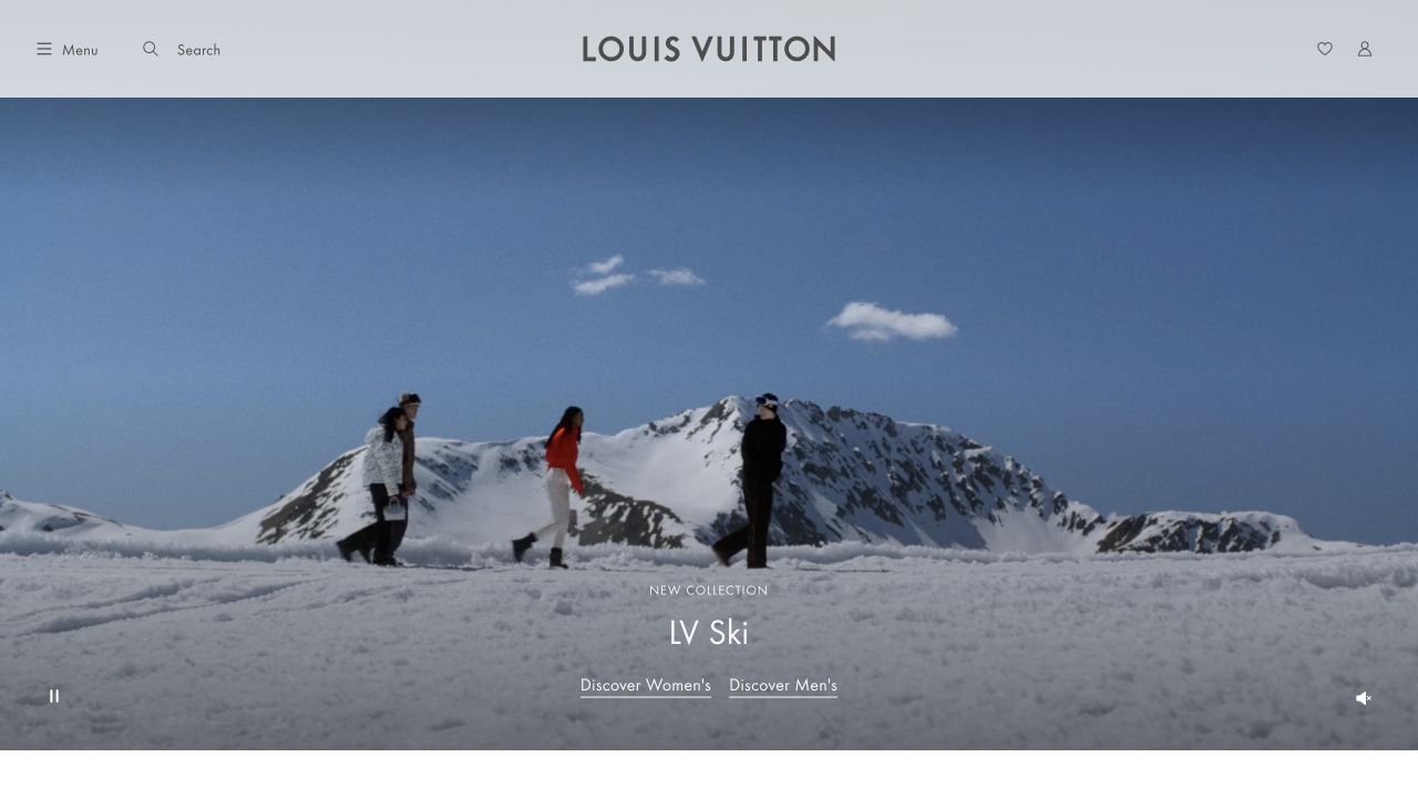
Louis Vuitton’s international homepage balances a broad snowy campaign film with an almost empty white navigation band. A small collection label and two understated shopping links sit below the figures in the landscape, while playback controls occupy separate corners. The interface relies on spacing and familiar utilities rather than a grid of promotional cards. The platform evidence is qualified: Nuxt’s official showcase names this property, and Vue’s own documentation identifies Nuxt as a Vue framework. This is Vue through Nuxt, not an independently detected bundle or enterprise-wide inventory.
What you can learn
The useful component lesson is to keep navigation, collection copy, audience links, and media controls independently understandable. Vue state can coordinate playback and transitions, but a shopper should not need animation to discover categories. Design a static frame, keyboard order, and regional orientation before adding motion to the collection experience.
Pros
Quiet interface chrome keeps the collection artwork dominant.
Playback and shopping controls have different positions and purposes.
Cons & considerations
Sparse introductory copy gives unfamiliar visitors little product context.
Media and locale overlays can interrupt the otherwise calm opening.
Vue.jsFramework dependency association; not independently observed
Earlier cited evidence retained; no current scan result. References may be embedded or legacy—not a complete backend inventory.
Platform source: Vue through Nuxt — official showcase and Vue framework documentation. Nuxt's official showcase links Louis Vuitton international website. Vue's own SSR guide identifies Nuxt as a higher-level Vue framework; this is a Vue-through-Nuxt relationship at the named property, not an independently audited Vue bundle or an enterprise-wide inventory. Platform evidence is separate from the direct website screenshot and is not a complete current infrastructure audit.
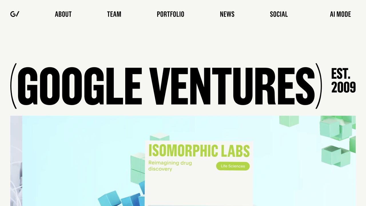
GV makes its full organizational name the largest object on the page. The condensed black lettering spans an off-white canvas, accompanied by an establishment date and a compact uppercase menu. A portfolio story begins beneath the identity, with its own imagery and company context. The design communicates an editorial perspective before asking visitors to explore investments. Its Vue association comes through Nuxt’s official showcase and Vue’s documented Nuxt relationship; it is not a claim about Google Search, internal investment software, or a direct runtime audit.
What you can learn
Build the portfolio stage as content-driven components rather than one inseparable animation. A Vue implementation needs stable headings and links underneath visual transitions, plus a meaningful paused state. The most reusable idea is a strong identity followed by actual work; the enormous wordmark itself should not determine every breakpoint or article layout.
Pros
The organization’s name and portfolio focus are immediately evident.
The restrained palette gives individual company stories room to vary.
Cons & considerations
The display lettering uses most of the available introductory space.
Unusual presentation modes require an equally usable conventional navigation path.
Vue.jsFramework dependency association; not independently observed
Public source checked November 3, 2026. References may be embedded or legacy—not a complete backend inventory.
Platform source: Vue through Nuxt — official showcase and Vue framework documentation. Nuxt's official showcase links GV (Google Ventures). Vue's own SSR guide identifies Nuxt as a higher-level Vue framework; this is a Vue-through-Nuxt relationship at the named property, not an independently audited Vue bundle or an enterprise-wide inventory. Platform evidence is separate from the direct website screenshot and is not a complete current infrastructure audit.
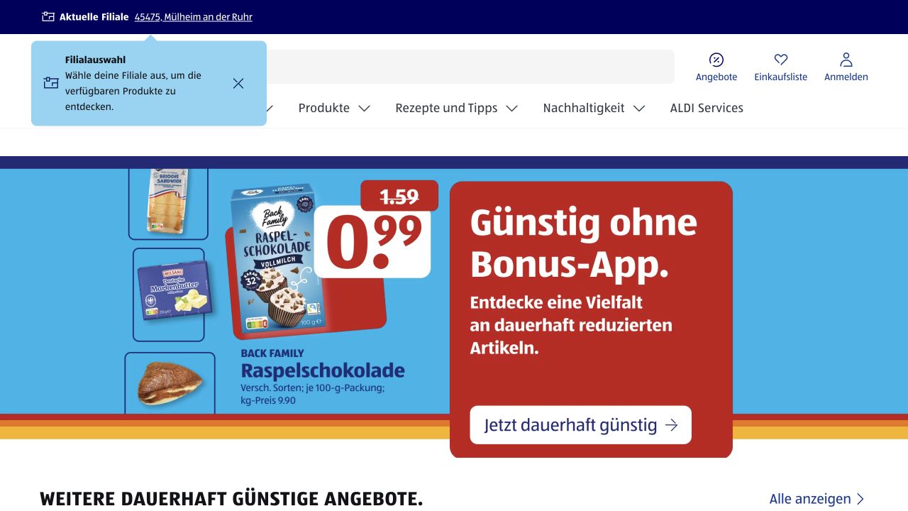
ALDI SÜD’s German homepage layers store context, a broad search field, account utilities, and category navigation above a bright product campaign. The feature’s real packaging, bold price treatment, and high-contrast panels make it more task-oriented than atmospheric. A small location guidance panel illustrates how contextual interface state can coexist with promotional content, though it consumes valuable header space. The technology attribution is Vue through Nuxt: the official Nuxt showcase lists this property, while Vue documents the framework relationship. Individual stock and checkout systems are not identified.
What you can learn
Use Vue state for meaningful context, not just animated decoration. Store selection, saved shopping items, and account access should remain visibly distinct, with clear persistence and error behavior. Keep national campaigns editable separately from local availability. A successful component library must handle ordinary task text and promotional variation without shifting essential header controls unexpectedly.
Pros
Product photography and price hierarchy communicate a concrete shopping opportunity.
Local-store context is connected to the surrounding task navigation.
Cons & considerations
Stacked utility layers leave less room for useful product content.
Contextual guidance can cover controls unless dismissal and focus handling are deliberate.
ReactAssociated with Next.js; not independently observed
Vue.jsFramework dependency association; not independently observed
Public source checked November 3, 2026. References may be embedded or legacy—not a complete backend inventory.
Platform source: Vue through Nuxt — official showcase and Vue framework documentation. Nuxt's official showcase links ALDI SÜD Germany. Vue's own SSR guide identifies Nuxt as a higher-level Vue framework; this is a Vue-through-Nuxt relationship at the named property, not an independently audited Vue bundle or an enterprise-wide inventory. Platform evidence is separate from the direct website screenshot and is not a complete current infrastructure audit.
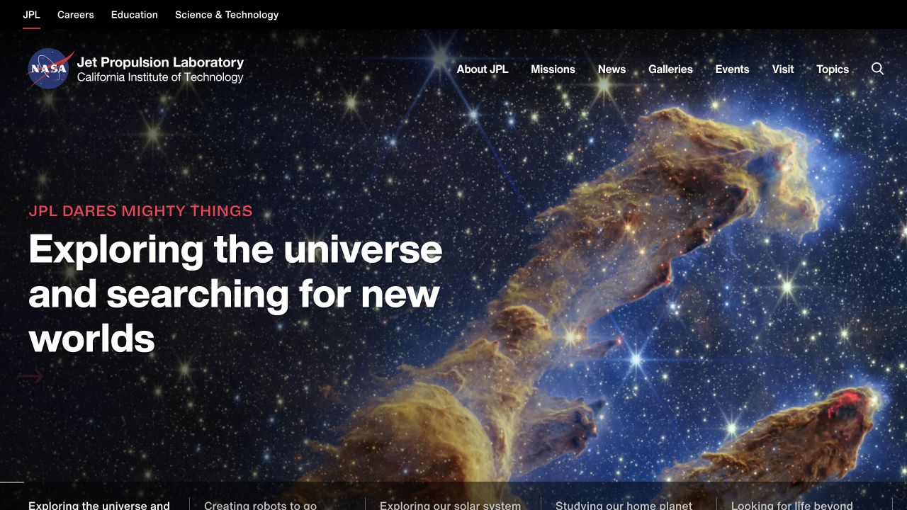
NASA JPL places its institutional identity and subject navigation over an expansive space photograph. The lead statement sits on the left in large white type, while red accents identify its editorial hierarchy and a lower band introduces other stories. Separate utility navigation serves careers, education, and research audiences. The Vue association is indirect but documented: Nuxt’s showcase lists JPL, and Vue identifies Nuxt as a Vue framework. This concerns JPL’s public website, not NASA’s main property, scientific software, or every application behind its missions.
What you can learn
A Vue component system should support a changing editorial lead without destabilizing navigation or reading order. Model each feature with a heading, destination, static image, and optional media behavior. When a story changes, verify all overlay states and preserve keyboard access to the archive rather than making the feature carousel the only route into the organization.
Pros
Institutional and editorial navigation serve clearly different audiences.
The photograph establishes scientific context before detailed explanation.
Cons & considerations
Complex backgrounds make text contrast a continuing editorial responsibility.
A full-screen story delays direct access to detailed mission information.
Vue.jsFramework dependency association; not independently observed
Earlier cited evidence retained; no current scan result. References may be embedded or legacy—not a complete backend inventory.
Platform source: Vue through Nuxt — official showcase and Vue framework documentation. Nuxt's official showcase links NASA JPL. Vue's own SSR guide identifies Nuxt as a higher-level Vue framework; this is a Vue-through-Nuxt relationship at JPL's public property, not an independently audited Vue bundle or a claim about NASA's main website. Platform evidence is separate from the direct website screenshot and is not a complete current infrastructure audit.
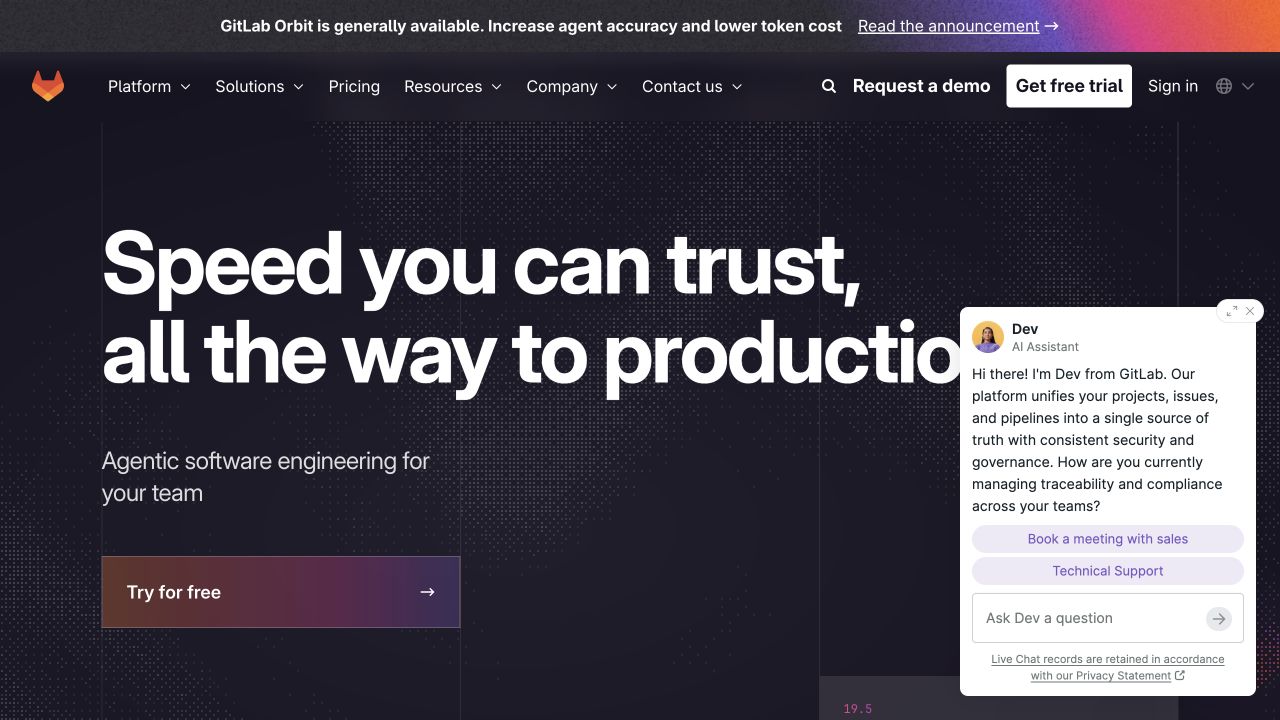
GitLab’s marketing homepage uses very large white typography, a dark textured canvas, and a warm gradient acquisition control. The upper navigation separates platform, solutions, resources, pricing, and company information, while an announcement strip adds a temporary story. A visible sales-assistant panel demonstrates the competing interface layers a component system must accommodate. This is a Vue-through-Nuxt example: Nuxt’s showcase identifies the marketing property and Vue documents Nuxt’s foundation. The evidence is separate from the authenticated GitLab application and does not inspect that product’s runtime.
What you can learn
Think of the page as interacting states rather than a pristine hero screenshot. A Vue implementation should coordinate open chat, collapsed navigation, announcement dismissal, and trial links without trapping focus or obscuring essential text. Give each overlay a purpose and an accessible exit, and avoid mounting several conversion invitations simply because each is available as a reusable component.
Pros
Evaluation and existing-customer routes are available in the persistent navigation.
A limited dark palette gives promotional accents a clear role.
Cons & considerations
The assistant panel covers part of the initial reading area.
Announcement, trial, demo, and chat invitations create a crowded interaction budget.
Vue.jsFramework dependency association; not independently observed
Public source checked November 3, 2026. References may be embedded or legacy—not a complete backend inventory.
Platform source: Vue through Nuxt — official showcase and Vue framework documentation. Nuxt's official showcase links GitLab public marketing website. Vue's own SSR guide identifies Nuxt as a higher-level Vue framework; this is a Vue-through-Nuxt relationship at the named property, not an independently audited Vue bundle or an enterprise-wide inventory. Platform evidence is separate from the direct website screenshot and is not a complete current infrastructure audit.
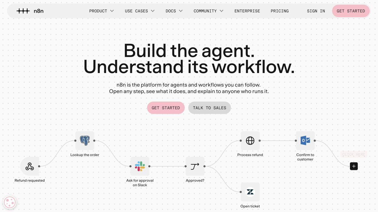
n8n’s dotted canvas turns the lower hero into a recognizable workflow, with service icons, connecting lines, and a decision branch. The headline and short explanation sit above two contrasting evaluation actions. A rounded navigation bar keeps the global structure separate from the diagram. The captured interface is a public product story rather than a running automation. Vue’s role is inferred only through a documented framework relationship: Nuxt’s official showcase names this website, and Vue’s first-party documentation identifies Nuxt as Vue-based. Customer workflows and the editor are outside that scope.
What you can learn
Interactive Vue demonstrations need a written sequence, legible labels, and a stable paused state. Define whether a node is an explanatory illustration, a navigation link, or an actual control before styling it like a working application. Avoid asking visitors to understand a moving diagram before they can reach documentation or learn what information a real demo would process.
Pros
Connected steps communicate relationships more effectively than a generic dashboard image.
The diagram and navigation have clearly separate visual roles.
Cons & considerations
Small node descriptions are vulnerable to unreadable mobile scaling.
Animation can suggest live functionality that a marketing illustration does not provide.
Vue.jsFramework dependency association; not independently observed
Public source checked November 3, 2026. References may be embedded or legacy—not a complete backend inventory.
Platform source: Vue through Nuxt — official showcase and Vue framework documentation. Nuxt's official showcase links n8n public website. Vue's own SSR guide identifies Nuxt as a higher-level Vue framework; this is a Vue-through-Nuxt relationship at the named property, not an independently audited Vue bundle or an enterprise-wide inventory. Platform evidence is separate from the direct website screenshot and is not a complete current infrastructure audit.
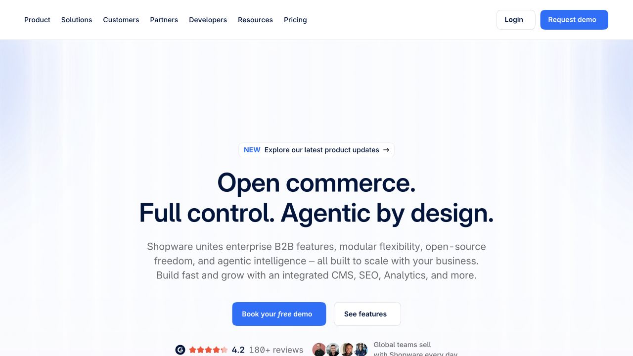
Shopware’s public homepage uses a generous white-and-pale-blue introduction centered around a large headline and a substantial supporting paragraph. A compact update announcement precedes the main text; demo and feature actions follow it. Ratings and customer context begin at the lower edge, while the header includes both business and developer destinations. This is not a claim that Shopware stores are Vue applications. The evidenced relationship is the marketing site’s inclusion in Nuxt’s showcase combined with Vue’s first-party description of Nuxt as a Vue framework.
What you can learn
A Vue marketing component system should support readable explanation before adding interactive product tours. Keep customer proof, announcements, text, and action groups independently editable, and use responsive line lengths rather than shrinking the complete desktop composition. Preserve direct documentation access for evaluators who need implementation details before they are ready to request a commercial demonstration.
Pros
The restrained surface keeps the platform explanation readable.
Commercial and technical navigation paths remain visible together.
Cons & considerations
The introductory paragraph asks for substantial attention before showing a product.
A broad navigation catalog needs purposeful grouping in compact layouts.
Vue.jsFramework dependency association; not independently observed
Public source checked November 3, 2026. References may be embedded or legacy—not a complete backend inventory.
Platform source: Vue through Nuxt — official showcase and Vue framework documentation. Nuxt's official showcase links Shopware public website. Vue's own SSR guide identifies Nuxt as a higher-level Vue framework; this is a Vue-through-Nuxt relationship at the named property, not an independently audited Vue bundle or an enterprise-wide inventory. Platform evidence is separate from the direct website screenshot and is not a complete current infrastructure audit.
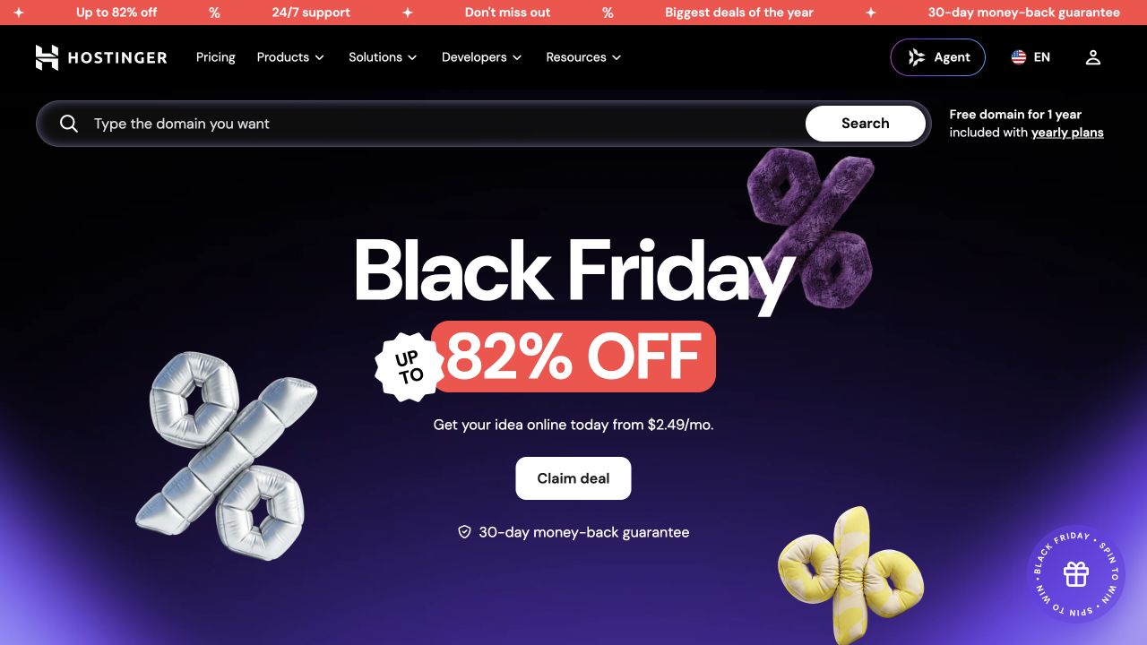
Hostinger uses an expansive domain-search field above a seasonal campaign of large type and three-dimensional percentage symbols. A black navigation shell and purple gradient tie the task interface to the promotion, while a thin animated announcement strip adds urgency. The primary campaign action remains visually separate from search. The association here is explicitly Vue through Nuxt: the official Nuxt showcase lists the public marketing website, and Vue explains Nuxt’s framework foundation. This does not identify the hosting dashboard, checkout, or website-builder application.
What you can learn
Vue state should clarify the domain-search journey rather than entangle it with the offer animation. Specify query validation, loading, unavailable names, and no-result states separately from campaign components. Keep pricing terms as governed content with a review owner. A visitor who bypasses the promotion should still understand what search does and where its results will appear.
Pros
Domain search provides a direct task independent of the campaign action.
The consistent dark palette joins utility navigation and promotional media.
Cons & considerations
Moving banners and offer artwork can compete with the actual service explanation.
Vue.jsFramework dependency association; not independently observed
Earlier cited evidence retained; no current scan result. References may be embedded or legacy—not a complete backend inventory.
Platform source: Vue through Nuxt — official showcase and Vue framework documentation. Nuxt's official showcase links Hostinger public website. Vue's own SSR guide identifies Nuxt as a higher-level Vue framework; this is a Vue-through-Nuxt relationship at the named property, not an independently audited Vue bundle or an enterprise-wide inventory. Platform evidence is separate from the direct website screenshot and is not a complete current infrastructure audit.
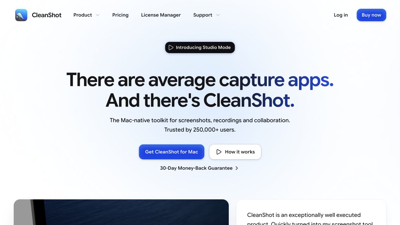
CleanShot’s spacious introduction combines a short product proposition, a small feature badge, and two central actions on a soft blue glow. The header acknowledges both new buyers and existing customers through pricing, license management, support, login, and buying destinations. A product demonstration and a review begin below the first-screen text. The platform claim is limited to the public website: Nuxt’s showcase names it, and Vue’s documentation explains Nuxt’s Vue foundation. The native Mac application and cloud service are not attributed to Vue from this evidence.
What you can learn
Keep public storefront components distinct from the application they describe. Vue can coordinate demonstration playback and responsive navigation while ordinary links handle purchasing and support. Define platform requirements and existing-customer routes in real text. Do not force visitors through an animated tour before they can find licensing, compatibility, or help information.
Pros
Existing-customer license management has a prominent navigation route.
The two main actions distinguish acquisition from learning about the product.
Cons & considerations
The generous first view postpones concrete workflow detail.
Several buying controls need consistent language about destination and license expectations.
Vue.jsFramework dependency association; not independently observed
Public source checked November 3, 2026. References may be embedded or legacy—not a complete backend inventory.
Platform source: Vue through Nuxt — official showcase and Vue framework documentation. Nuxt's official showcase links CleanShot X. Vue's own SSR guide identifies Nuxt as a higher-level Vue framework; this is a Vue-through-Nuxt relationship at the named property, not an independently audited Vue bundle or an enterprise-wide inventory. Platform evidence is separate from the direct website screenshot and is not a complete current infrastructure audit.
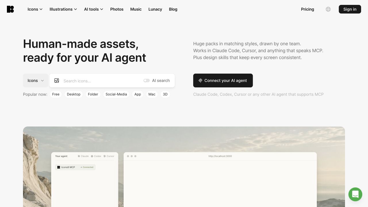
Icons8’s public homepage presents a search category selector and wide query field beneath a large asset proposition. Suggested topic chips make browsing approachable, while a separate dark control introduces an integration workflow. The two-column introduction gives ordinary search and tool-connected use distinct space; a broad demonstration panel begins underneath. Vue is identified through a framework relationship, not by guessing from the visible search box: Nuxt’s official showcase lists this property, and Vue documents Nuxt’s foundation. Individual APIs, design applications, and external editor integrations remain outside that attribution.
What you can learn
Use Vue state to make category, query, and assisted-search choices explicit and reversible. A reusable search component needs clear empty, loading, error, and result states, not just a polished input. Keep a conventional browsing route for visitors who do not want to connect tools, and describe any account or permission requirement before the integration step.
Pros
Suggested topics give visitors concrete examples without submitting a search.
Integration and manual browsing are visually distinct journeys.
Cons & considerations
A large media area may appear empty before its content loads.
The broad catalog requires deeper filtering than the initial category selector provides.
Vue.jsFramework dependency association; not independently observed
Public source checked November 3, 2026. References may be embedded or legacy—not a complete backend inventory.
Platform source: Vue through Nuxt — official showcase and Vue framework documentation. Nuxt's official showcase links Icons8. Vue's own SSR guide identifies Nuxt as a higher-level Vue framework; this is a Vue-through-Nuxt relationship at the named property, not an independently audited Vue bundle or an enterprise-wide inventory. Platform evidence is separate from the direct website screenshot and is not a complete current infrastructure audit.
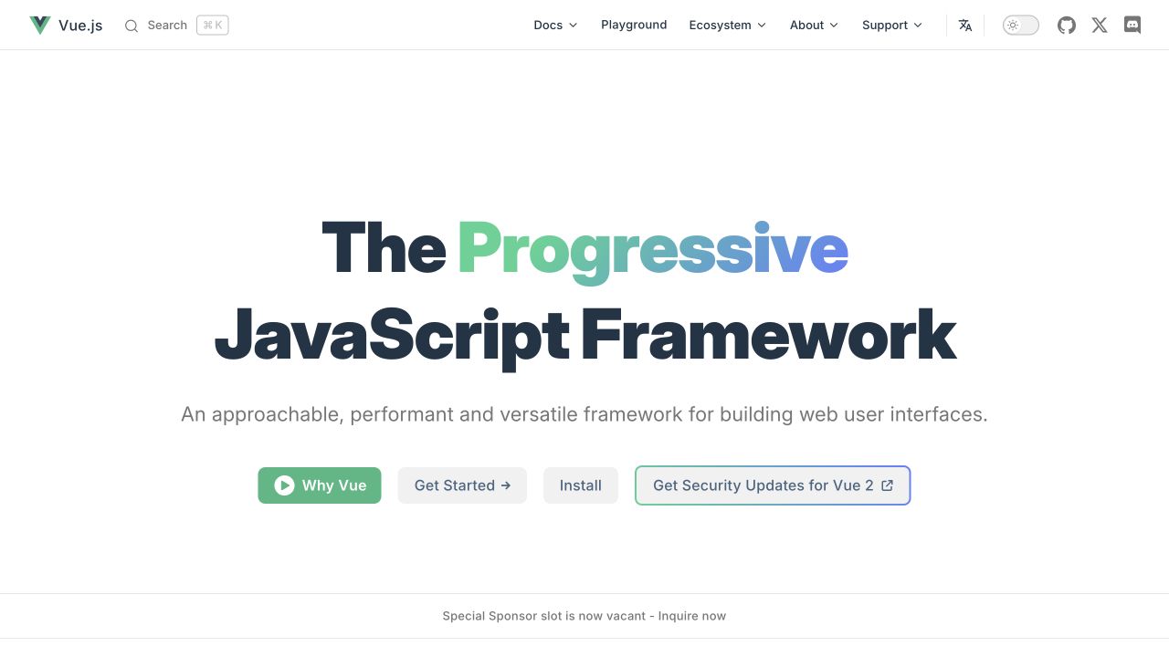
Vue’s own homepage centers a large typographic introduction on a white background, using a green-to-blue accent within the headline. Four differentiated actions offer an overview, learning, installation, and legacy-version security information. The header groups documentation, playground, ecosystem, community information, and support alongside search, language, and theme controls. A separate sponsor area begins below the main proposition. Vue’s first-party FAQ explicitly describes this site using Vue with static generation, hydration, and client navigation; unlike the commercial examples, this is direct self-documented site evidence.
What you can learn
A framework homepage must serve learning and returning-reference tasks without treating every visitor as ready to install. Vue components can support search and presentation, but the information architecture is what makes those routes useful. Keep version-specific notices distinguishable from the current getting-started path, and make the first explanation readable without playing a video.
Pros
Learning, installation, and explanatory actions address distinct visitor needs.
Language, search, and theme utilities have a consistent header location.
Cons & considerations
Several adjacent starting choices may still overwhelm a complete beginner.
A broad ecosystem requires additional explanation beyond the concise first-screen proposition.
Public source checked November 3, 2026. References may be embedded or legacy—not a complete backend inventory.
Platform source: Vue’s own implementation FAQ. Vue's own FAQ explicitly states that this documentation website is powered by Vue with static generation, hydration, and client-side navigation. Platform evidence is separate from the direct website screenshot and is not a complete current infrastructure audit.
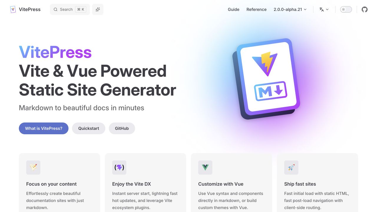
VitePress pairs a left-aligned framework statement with a large colored document illustration. Three introductory actions lead to explanation, quick start, and source code, while four feature cards begin beneath the hero. Search, reference, version, language, and theme controls stay in a compact upper navigation. The visual hierarchy resembles a welcoming documentation gateway rather than a demonstration application. Its first-party architecture guide explicitly identifies Vue-powered hydration and client navigation, so this association concerns the publishing website and documented framework relationship rather than an invented customer implementation.
What you can learn
Use a Vue-based documentation shell to enhance readable content, not replace it with a loading screen. Keep introductory tasks separate from API reference and version context. A reusable landing template should support ordinary text, accessible illustrations, and understandable action labels before adding component examples, and its static reading experience should still explain the project.
Pros
Explanation, quick start, and repository routes are clearly differentiated.
Feature cards translate the architecture proposition into concrete documentation needs.
Cons & considerations
Large decorative artwork uses space that could hold a practical content example.
Version indicators need clear context so visitors do not mistake preview releases for requirements.
Vue.jsFramework dependency association; not independently observed
Public source checked November 3, 2026. References may be embedded or legacy—not a complete backend inventory.
Platform source: Vue through VitePress — first-party documentation association. VitePress's official documentation specifically identifies the VitePress website among its documentation users and explains that VitePress hydrates a Vue application. The Vue association is through VitePress at this documentation property, not the implementation of the software it documents. Platform evidence is separate from the direct website screenshot and is not a complete current infrastructure audit.
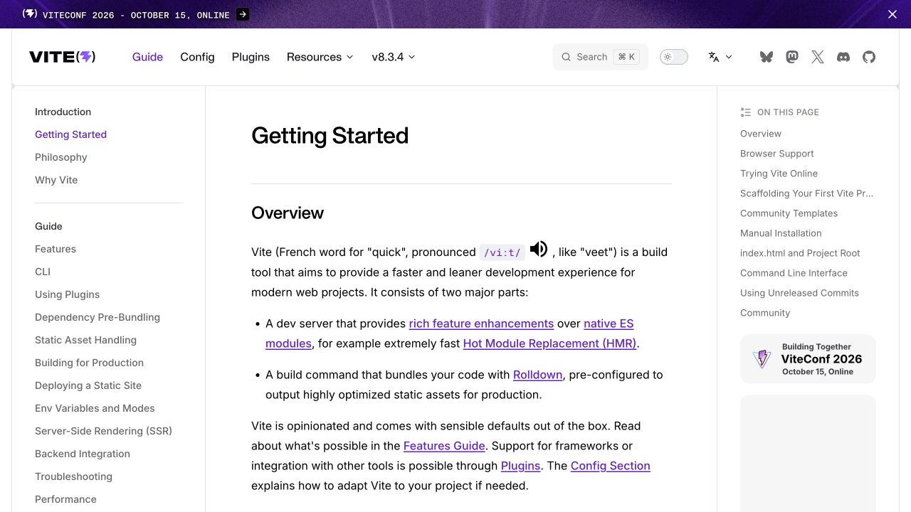
Vite’s getting-started documentation uses a three-column desktop structure: a detailed topic tree at the left, the article in the center, and a local contents list at the right. Purple active states and links connect those layers, while search and version controls remain above. The central text combines explanation, bullet points, and linked technical terms with comfortable spacing. The Vue association applies to the documentation surface through VitePress: the first-party VitePress guide lists Vite documentation and explains its Vue foundation. It is not a claim that every Vite-built application uses Vue.
What you can learn
A Vue-powered reference shell should maintain article reading order and stable headings while navigation enhances orientation. Keep global topics distinct from headings within the current document, and ensure route changes restore a sensible focus location. Test long sidebar trees and code blocks at smaller widths rather than scaling the three desktop columns into illegibility.
Pros
Global and within-page navigation have clearly different positions.
Linked technical terms support deeper reading without interrupting the article structure.
Cons & considerations
Three simultaneous columns can feel dense to new developers.
Announcements and promotional reference cards reduce the available reading area.
Vue.jsFramework dependency association; not independently observed
Public source checked November 3, 2026. References may be embedded or legacy—not a complete backend inventory.
Platform source: Vue through VitePress — first-party documentation association. VitePress's official documentation specifically identifies the Vite documentation website among its documentation users and explains that VitePress hydrates a Vue application. The Vue association is through VitePress at this documentation property, not the implementation of the software it documents. Platform evidence is separate from the direct website screenshot and is not a complete current infrastructure audit.
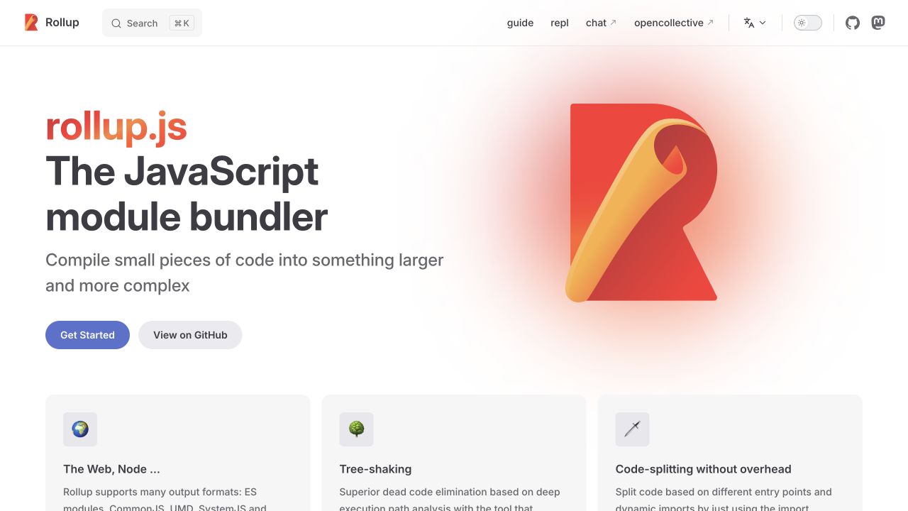
Rollup’s website uses a clean left-text, right-illustration composition with warm orange branding. A brief product statement and short explanation lead to a getting-started action and repository link. Three feature cards begin underneath, introducing compatibility, tree-shaking, and code splitting without filling the opening with API details. Search and reference navigation stay restrained in the header. The documented Vue relationship belongs to the website: VitePress’s first-party guide lists Rollup documentation as a user and explains its Vue-powered architecture. Rollup’s bundler runtime is not itself being labeled a Vue application.
What you can learn
A Vue documentation component library can give a technical project a recognizable entry without making the homepage a complex interactive demo. Keep project description, installation route, source repository, and feature summaries as independent content. Readers should reach the manual directly, and the illustration should remain optional rather than containing information unavailable in the surrounding text.
Pros
The narrow action set makes learning and source inspection easy to distinguish.
Warm logo colors connect the illustration and primary action.
Cons & considerations
Feature summaries require deeper pages to explain practical tradeoffs.
A repeated documentation-template structure needs strong project-specific content to remain distinctive.
Vue.jsFramework dependency association; not independently observed
Public source checked November 3, 2026. References may be embedded or legacy—not a complete backend inventory.
Platform source: Vue through VitePress — first-party documentation association. VitePress's official documentation specifically identifies the Rollup documentation website among its documentation users and explains that VitePress hydrates a Vue application. The Vue association is through VitePress at this documentation property, not the implementation of the software it documents. Platform evidence is separate from the direct website screenshot and is not a complete current infrastructure audit.
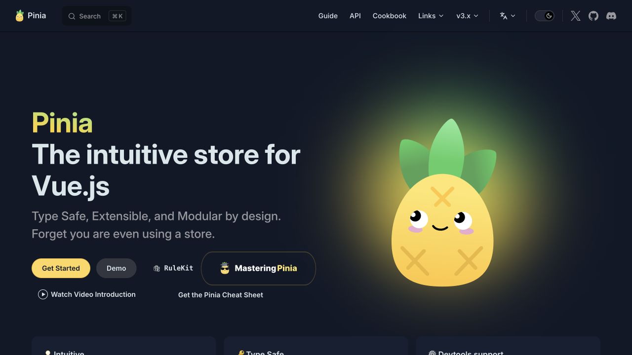
Pinia uses a dark navy introduction, a bright pineapple character, and large white-and-yellow typography. The short description establishes the library’s role, while a row of actions offers learning, demonstration, and related educational material. Guide, API, cookbook, and version destinations remain visible above the illustration. The mascot brings personality to an otherwise conventional documentation gateway. VitePress’s first-party guide lists Pinia documentation and describes its Vue foundation, so this is a documented publishing-site relationship, separate from claims about every application that chooses Pinia for state management.
What you can learn
A Vue-powered documentation shell can be welcoming without sacrificing precise navigation. Keep demonstration links different from educational promotions, and label version-specific reference material clearly. Reusable hero components should allow the practical product definition to remain visible when the illustration is removed, and maintain sufficient contrast for muted supporting text in the dark theme.
Pros
The character provides a memorable identity without replacing the product description.
API and cookbook routes acknowledge experienced users alongside beginners.
Cons & considerations
Several educational actions can compete with the primary learning route.
Large mascot artwork delays detailed examples below the initial viewport.
Vue.jsFramework dependency association; not independently observed
Public source checked November 3, 2026. References may be embedded or legacy—not a complete backend inventory.
Platform source: Vue through VitePress — first-party documentation association. VitePress's official documentation specifically identifies the Pinia documentation website among its documentation users and explains that VitePress hydrates a Vue application. The Vue association is through VitePress at this documentation property, not the implementation of the software it documents. Platform evidence is separate from the direct website screenshot and is not a complete current infrastructure audit.
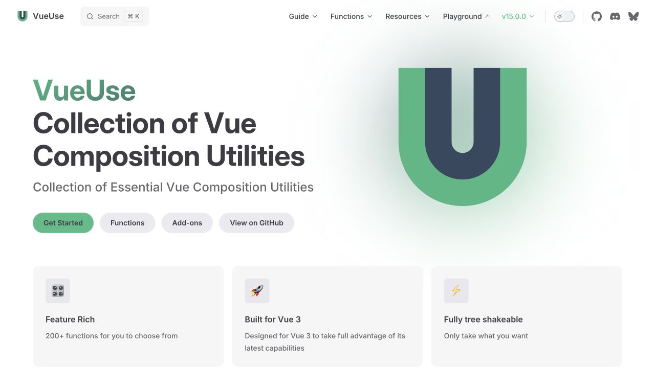
VueUse’s homepage combines a strong green project identity with a large simple emblem and a plain description of its utility collection. The action row distinguishes getting started, function browsing, add-ons, and source code. Feature cards begin immediately beneath, while a small header provides guide, function, resource, playground, and version destinations. The content feels oriented toward finding a useful capability rather than a sales conversion. Its maintained contribution documentation names VitePress, and VitePress documents the Vue foundation; the association concerns this reference website, not every package’s internal implementation.
What you can learn
For a Vue reference library, expose the catalog as a first-class route instead of assuming all visitors will read a linear introduction. Design search and function pages around stable names and meaningful grouping. Keep add-on material distinct from the core collection, and make version context visible when examples may differ between supported releases.
Pros
A direct functions route supports visitors arriving with a specific task.
The simple emblem leaves the product definition readable as actual text.
Cons & considerations
A large catalog needs additional filtering beyond the homepage action row.
Brief feature cards cannot explain compatibility limits or the cost of individual utilities.
Vue.jsFramework dependency association; not independently observed
Public source checked November 3, 2026. References may be embedded or legacy—not a complete backend inventory.
Platform source: Vue through VitePress — first-party documentation association. VitePress's official documentation specifically identifies the VueUse documentation website among its documentation users and explains that VitePress hydrates a Vue application. The Vue association is through VitePress at this documentation property, not the implementation of the software it documents. Platform evidence is separate from the direct website screenshot and is not a complete current infrastructure audit.
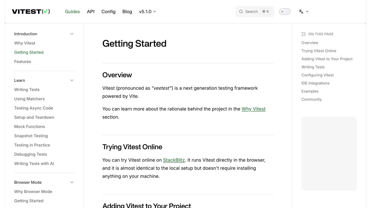
Vitest’s getting-started guide places a short overview and online-evaluation section within a three-column documentation layout. A detailed left sidebar organizes testing topics, while the right contents list gives a quick view of the current article. Green active states and restrained rules keep the otherwise white interface readable. Version and search utilities are positioned above the article rather than inside it. VitePress’s first-party guide lists Vitest documentation and explains its Vue foundation; this describes the documentation website, not a requirement that tests or tested applications use Vue.
What you can learn
A Vue documentation shell should enhance orientation while preserving a clear linear setup narrative. Keep links to online experiments distinct from installation steps, and ensure example blocks remain readable when sidebars collapse. Version-aware content and predictable anchor links matter more than elaborate transitions for readers moving between a failing test and a specific reference section.
Pros
The local contents list previews the installation and learning sequence.
The article begins with context before introducing project-setup instructions.
Cons & considerations
A deep testing sidebar can be intimidating before basic setup is complete.
Three-column layouts need careful prioritization when available reading width shrinks.
Vue.jsFramework dependency association; not independently observed
Public source checked November 3, 2026. References may be embedded or legacy—not a complete backend inventory.
Platform source: Vue through VitePress — first-party documentation association. VitePress's official documentation specifically identifies the Vitest documentation website among its documentation users and explains that VitePress hydrates a Vue application. The Vue association is through VitePress at this documentation property, not the implementation of the software it documents. Platform evidence is separate from the direct website screenshot and is not a complete current infrastructure audit.
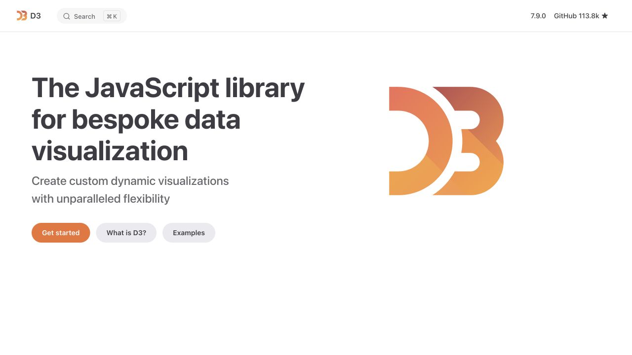
D3’s homepage places a heavy left-aligned product statement beside a large orange-and-yellow emblem. A short explanation leads to three distinct routes: getting started, understanding the library, and exploring examples. The header is notably compact, retaining search, version, and repository access without a long commercial navigation. Large areas of white space keep the introduction uncluttered. VitePress’s first-party architecture guide lists D3 documentation and describes its Vue foundation. That relationship concerns the public documentation experience; D3 visualizations do not therefore require Vue or share this site’s complete stack.
What you can learn
A Vue-based project gateway should distinguish conceptual learning from reference and inspiration. Preserve ordinary example links and a readable product description before mounting interactive charts. When demonstrations are added, provide text alternatives and predictable focus behavior, and do not assume that a visually impressive chart explains the underlying data or API choices.
Pros
Conceptual explanation and examples have separate, clearly labeled routes.
The compact header leaves attention on the library’s purpose.
Cons & considerations
The initial emblem demonstrates branding rather than an actual visualization.
The sparse opening needs supporting pages to communicate learning complexity and tradeoffs.
Vue.jsFramework dependency association; not independently observed
Public source checked November 3, 2026. References may be embedded or legacy—not a complete backend inventory.
Platform source: Vue through VitePress — first-party documentation association. VitePress's official documentation specifically identifies the D3 documentation website among its documentation users and explains that VitePress hydrates a Vue application. The Vue association is through VitePress at this documentation property, not the implementation of the software it documents. Platform evidence is separate from the direct website screenshot and is not a complete current infrastructure audit.
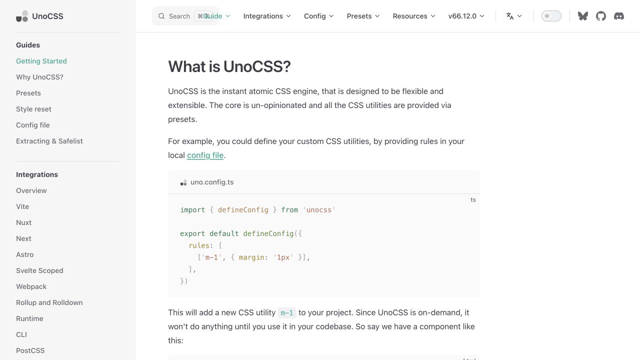
UnoCSS’s guide opens with a short conceptual explanation followed by a syntax-highlighted configuration example. Its persistent left rail separates introductory topics, integrations, configuration, and additional technical areas. The upper header offers related reference destinations, search, version, and theme utilities, while the central reading area stays broad and relatively uncluttered. This is a useful counterpoint to illustration-led homepages. The Vue association is scoped through VitePress’s first-party user list and architecture documentation: the documentation site uses that Vue-based publishing approach, not every project styled with UnoCSS.
What you can learn
Use Vue components to support code reading and reference navigation without overshadowing the example itself. Configuration snippets need a language label, readable contrast, and a sensible horizontal-overflow strategy. Keep conceptual explanation adjacent to the code so readers understand what it changes, and ensure integration links lead to the right environment rather than implying one configuration suits every framework.
Pros
A real code example makes the abstract configuration concept concrete.
Integration topics have a visible place in the persistent navigation.
Cons & considerations
The dense sidebar assumes familiarity with several build-tool terms.
Long configuration examples require careful mobile scrolling and accessible copy controls.
Vue.jsFramework dependency association; not independently observed
Public source checked November 3, 2026. References may be embedded or legacy—not a complete backend inventory.
Platform source: Vue through VitePress — first-party documentation association. VitePress's official documentation specifically identifies the UnoCSS documentation website among its documentation users and explains that VitePress hydrates a Vue application. The Vue association is through VitePress at this documentation property, not the implementation of the software it documents. Platform evidence is separate from the direct website screenshot and is not a complete current infrastructure audit.
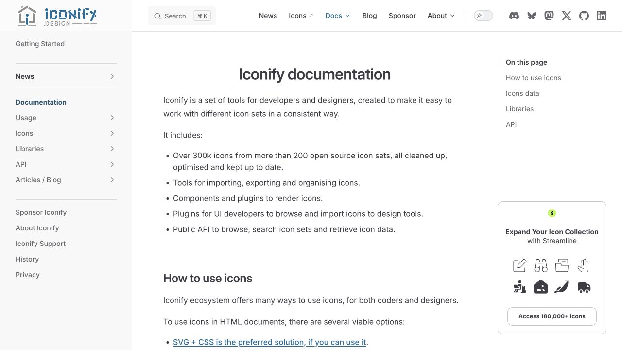
Iconify documentation uses a centered article title, a short explanation, and a bulleted overview within a familiar reference shell. The left rail separates usage, icons, libraries, APIs, and supporting articles, while a right-hand contents list previews the current page. Search, news, catalog, documentation, and sponsorship routes occupy the top navigation. The information structure acknowledges several kinds of users without presenting everything as a single installation step. VitePress’s first-party guide lists Iconify documentation and explains its Vue foundation; the API and every icon-rendering integration are not attributed from that relationship.
What you can learn
A Vue documentation shell should help readers choose an integration before overwhelming them with individual API details. Keep navigation labels tied to actual tasks and maintain a clear distinction between the icon catalog and implementation reference. Article anchors, searchable names, and readable lists should survive route transitions and sidebar collapse without depending on decorative animation.
Pros
Usage, libraries, and API topics are visible as separate documentation paths.
The overview explains the collection before asking readers to choose a tool.
Cons & considerations
Multiple catalog and documentation destinations need careful labeling.
A reference sidebar and sponsor card reduce the space available for the main article.
Vue.jsFramework dependency association; not independently observed
Public source checked November 3, 2026. References may be embedded or legacy—not a complete backend inventory.
Platform source: Vue through VitePress — first-party documentation association. VitePress's official documentation specifically identifies the Iconify documentation website among its documentation users and explains that VitePress hydrates a Vue application. The Vue association is through VitePress at this documentation property, not the implementation of the software it documents. Platform evidence is separate from the direct website screenshot and is not a complete current infrastructure audit.
Choose a Vue approach that fits the scope of the interface
Enhance a focused part of an existing website
If one calculator, filter, or booking panel needs richer behavior, describe the boundary before rebuilding the entire site. Decide how it receives data, how it communicates errors, and what remains useful when it cannot initialize. Preserve the surrounding document’s normal links and headings. An incremental approach should reduce coordination costs, not create two competing sources of page state.
Build a connected application when the journey needs it
A multi-step workspace or interactive product may justify shared navigation, route state, and a component system across the experience. Define the page families and user permissions before selecting a visual library. Keep business validation and sensitive authorization on the server. Review an expired session, an unsaved change, a failed request, and a direct link to a deeper screen as normal requirements rather than unusual edge cases.
Use a website framework or documentation system deliberately
Nuxt and VitePress solve different problems around Vue. A public service or commerce frontend has different demands from a documentation library. Vue’s SSR guidance discusses higher-level solutions and the distinction between rendering at request time and preparing static content. Select the framework around the actual publishing and application work, not merely because another company in this collection uses it.
Make interface consistency something you can verify
Write acceptance cases before the component gallery
For each important pattern, list what a person must be able to do with a keyboard, a narrow screen, and realistic content. Include validation and empty states. Vue’s testing guidance separates several test levels; use that distinction to check individual logic, composed controls, and complete journeys. A screenshot of a polished default state cannot demonstrate that all those cases work.
Keep editorial content and untrusted input in their proper roles
Decide which fields contain plain text, controlled formatting, or genuinely reviewed HTML. Never treat customer text as an executable template. Separate user input from code and review every place an integration inserts markup, URLs, or styles. The security model belongs in the project brief as well as the implementation, especially when a CMS or third-party editor can supply content.
Ask the team to add a new navigation item, translate a long label, replace a component variant, and remove an obsolete integration. Record the places each change touches. A well-factored system should make the impact understandable, but reuse is not a promise that every change is free. Give maintenance, dependency upgrades, and regression checks named owners instead of leaving them as an unspecified future activity.
A useful handover demonstration
Ask the actual team to carry out its routine job: publish a realistic update, correct a mistake, preview a narrow screen, and identify who owns an integration failure. For a library or frontend framework, also ask who maintains the content source and deployment. A polished screenshot does not answer those operational questions.
Beyond the screenshot
A Vue launch checklist for reusable, understandable interfaces
Define component responsibilities, inputs, outputs, and non-default states.
Identify local, URL-based, shared, persisted, and server-owned state.
Check direct entry, refresh, navigation history, and missing routes.
Exercise slow requests, empty results, errors, and interrupted submissions.
Verify labels, focus, keyboard controls, motion, and long translated text.
Keep authorization and authoritative business rules outside client-only checks.
Review text, URL, and HTML handling at every content and integration boundary.
Document publishing, test coverage, upgrades, deployment, and rollback ownership.
Test with real content, a keyboard, a small screen, slow or failed requests, and the people who will maintain the system. These are planning checks, not an accessibility, security, performance, or search-ranking certification.
Sources & editorial method
How this Vue.js collection was reviewed
The reviews use direct public-site captures and first-party platform or project sources. Nuxt-based examples identify Vue through Nuxt; VitePress-based documentation identifies Vue through VitePress. The association is scoped to the named property. The collection does not infer business outcomes, framework versions, or complete internal stacks from visual appearance.
Every image is an unmodified capture from the actual website, with its source and capture date. Some captures are reused from our shared catalog; their dates remain the original capture dates. None comes from a vendor gallery or a generated reconstruction. Moving imagery and live content can change.
Technology attribution uses public page assets or metadata, official platform documentation, or a cited first-party project case study. Documentary and framework-relationship evidence is identified where used; it is not a complete current backend inventory. A CMS image CDN alone does not establish a full CMS deployment. A library’s presence does not prove which individual controls use it, and a platform label does not establish AI authorship.
The composition notes, lessons, pros and tradeoffs are original editorial observations. We have not measured conversion, traffic, security, performance or accessibility conformance. Website owners retain their brands and imagery; these examples are not our client portfolio. Written, Edited and Curated are independent records, not dates advanced by a build. See our editorial standards or suggest a correction.
Questions worth asking
Vue.js website development FAQs
Will a Vue website have a recognizable look?
No. Vue is an implementation tool, not a theme. Typography, content, spacing, navigation, and component choices determine the visual identity. Use the references to study those decisions rather than expecting the library to supply a finished brand.
Do I need a state-management library for every Vue site?
Not necessarily. Begin by identifying which information genuinely needs to be shared and how long it must survive. A global store is a solution to a specific coordination problem, not a required decoration for every project.
Why does this guide include Nuxt and documentation examples?
They demonstrate real website forms built around Vue through documented framework relationships. The notes preserve that distinction. A Nuxt storefront and a VitePress manual should not be mistaken for the same kind of product or operational arrangement.
Can an existing website adopt Vue gradually?
It can be a focused enhancement when the integration boundary is well defined. Discuss data ownership, behavior without initialization, styling conflicts, and maintenance. Replacing everything at once should follow a real requirement, not the presence of one interactive feature.
Borrow a useful interaction or content pattern, then define the component and state boundaries that let it remain understandable as the website changes.