Drupal website design is as much about content relationships and publishing responsibility as page appearance. The strongest references make a complicated organization easier to navigate without flattening everything into generic cards.
The selected public properties have Drupal evidence or an attributed first-party platform association. This review does not inventory an organization’s internal systems, hosting, security posture, or every subdomain.
Use the examples to ask better questions about audiences, content types, permissions, search, and maintenance. A university or international organization is a useful information-design reference, not a mandate to copy its scale.
Before the examples
What makes good Drupal website development in 2026?
Model the organization’s information, not its current page shapes
Identify content types such as people, events, locations, programs, and publications, then define useful fields and relationships. Drupal’s content-type model provides structure; the editorial design still needs to decide which distinctions help visitors.
Give publishing responsibility a visible structure
Document who writes, reviews, publishes, and maintains each area. Drupal roles and permissions are tools for defining access; the business must still choose sensible responsibilities and test them with real users.
A public institution may serve visitors, applicants, researchers, partners, and staff. Start with their tasks, then use clear section labels, search, and cross-links. Do not make the homepage reflect an internal department chart at the expense of practical destinations.
The collection · 20 examples
20 Drupal website examples worth studying
Study how recognizable institutions organize a large public presence, then compare the smaller properties for more focused patterns. A Drupal signal identifies the named site, not a complete technical or organizational audit.
We start with five recognizable brands or organizations: University of Oxford, UNICEF, Princeton University, UNESCO, World Food Programme. Each attribution applies to the named website property, not every product or website belonging to its organization. This is a curated reading sequence, not a measured ranking.
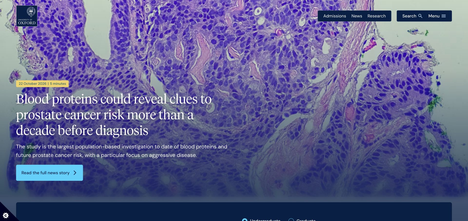
Oxford opens with a large research image, a date and reading-time badge, and a short explanatory headline. Admissions, news, and research remain visible as distinct header choices rather than being buried inside the story. A contrasting course-search area begins below. Drupal generator metadata supports the platform attribution, but the page’s useful quality is its editorial separation between a featured article and evergreen study tasks.
What you can learn
Treat research stories, courses, and institutional pages as different content types with shared visual rules. A homepage can promote one current story without making every visitor enter through that story. Model dates, summaries, imagery, and audience destinations explicitly, then assign ownership for keeping each group current.
Pros
The article metadata tells a reader what kind of commitment the featured story involves.
A separate study area gives prospective applicants a more direct route than browsing the news archive.
Cons & considerations
The large lead image and headline consume much of the first viewport.
Research promotion and admissions navigation need deliberate priority rules during busy application periods.
Visible tech stack
Earlier / documented evidence
Drupal
Associated dependencies
PHPCMS dependency association; runtime not independently observed
Earlier cited evidence retained; no current scan result. References may be embedded or legacy—not a complete backend inventory.
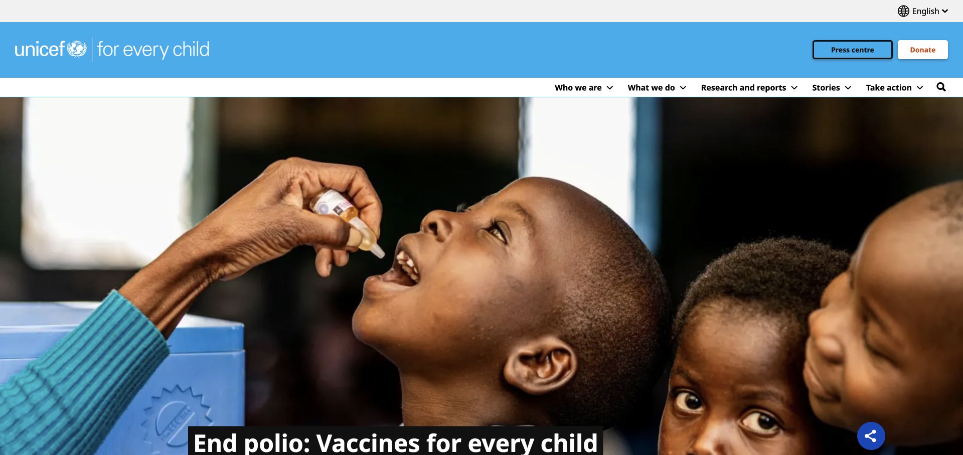
UNICEF separates a blue utility bar from a white primary navigation and a large photographic feature. Research, stories, organizational information, and action routes are named explicitly. The page includes content labels such as emergency material and news alongside longer-lived informational pages. Drupal settings and core assets are visible in the reviewed public page; this does not establish the implementation of separate donation or operational systems.
What you can learn
Build an editorial taxonomy before designing the homepage cards. An international publisher needs consistent relationships among countries, topics, publication formats, and languages, not simply more landing pages. Keep fundraising routes recognizable while allowing researchers and journalists to reach source material without following a donation journey.
Pros
The two-level header distinguishes utility needs from the organization’s main content categories.
Clear publication and action labels accommodate readers with very different reasons for visiting.
Cons & considerations
The tall photographic feature leaves some introductory context close to or below the fold.
A broad global navigation needs continual labeling and search maintenance as emergencies and priorities change.
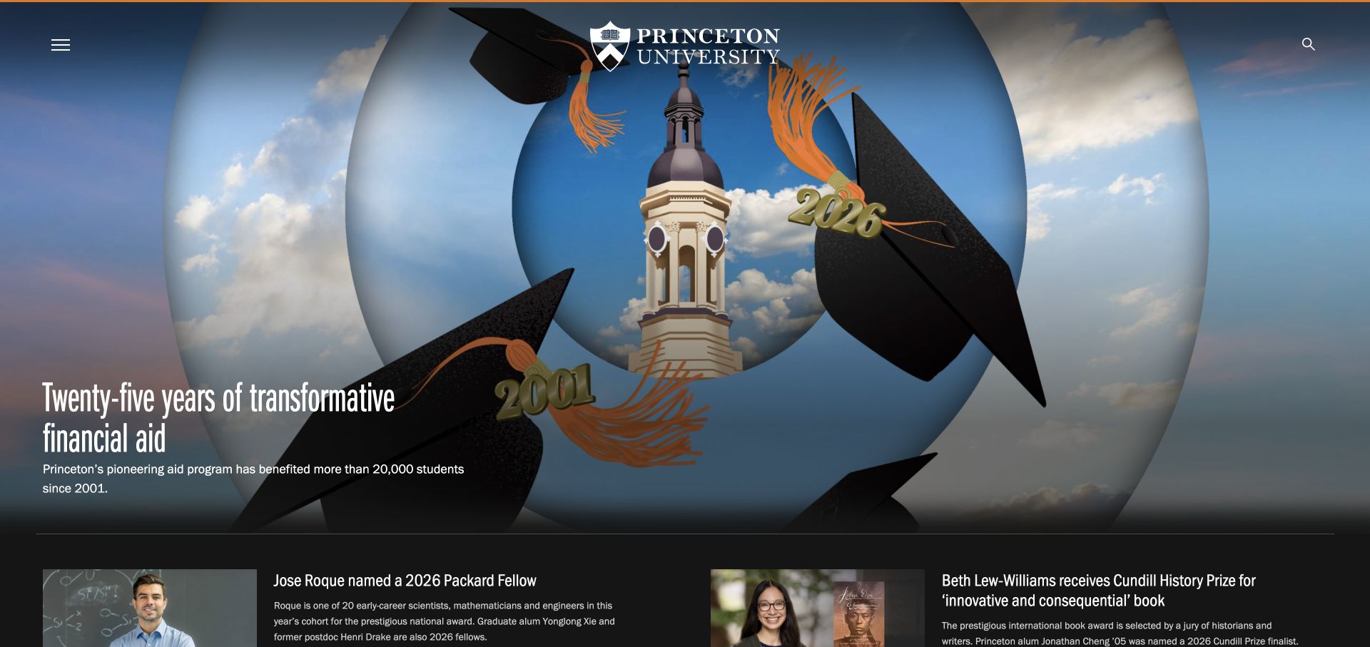
Princeton places its centered identity over a large collage, with a story headline and explanatory paragraph set against the image. Menu and search controls sit at opposite edges, while the next group of stories begins in a contrasting dark band. The composition feels like an editorial cover rather than a course catalog. Explicit Drupal generator metadata identifies the public platform without revealing the university’s complete internal technology estate.
What you can learn
Use structured story fields to support expressive presentation without turning every feature into a one-off page. Headlines, short descriptions, image crops, and related stories should remain independently editable. Keep stable destinations for applicants, researchers, and visitors accessible even when the homepage is temporarily devoted to a campus campaign.
Pros
The centered identity remains recognizable while the current story artwork changes.
A contrasting second section establishes a clear transition from the lead feature to additional stories.
Cons & considerations
The collapsed menu adds a step for visitors seeking an ordinary institutional destination.
Text over complex collage imagery needs careful crop and contrast decisions for each replacement story.
Visible tech stack
Earlier / documented evidence
Drupal
Associated dependencies
PHPCMS dependency association; runtime not independently observed
Earlier cited evidence retained; no current scan result. References may be embedded or legacy—not a complete backend inventory.
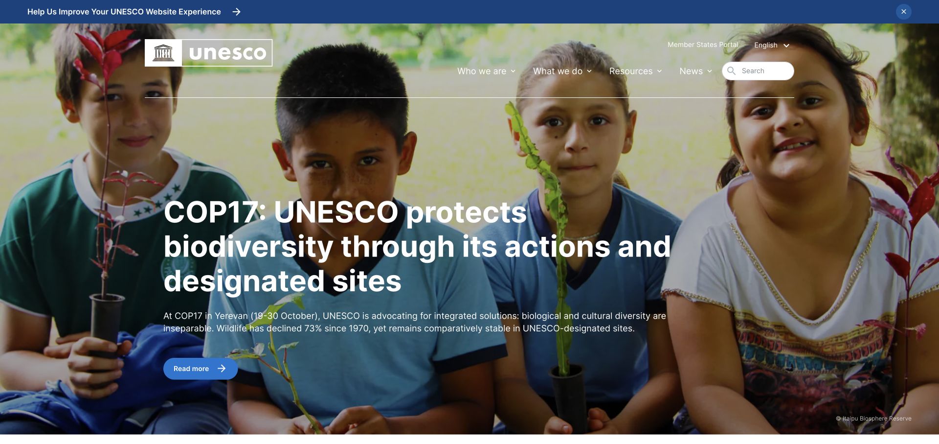
UNESCO’s English homepage combines a language control, institutional navigation, a full-width photograph, and a large campaign headline. Resources and news are explicit peers of organizational information rather than miscellaneous footer links. The captured feature uses a blue action button and a visible image credit. Drupal settings in the public DOM support the platform identification, while the breadth of content suggests the importance of an editorial structure beyond the homepage itself.
What you can learn
Plan shared content fields and translation relationships before producing localized page designs. Campaigns, institutional descriptions, and reusable resources have different lifespans and review needs. A flexible CMS is useful only when editors know which material is authoritative, which translations correspond, and when an announcement should stop occupying the lead position.
Pros
The language choice is prominent enough to support an international rather than single-market audience.
Resource and news destinations give repeat visitors routes beyond the current campaign.
Cons & considerations
A large campaign headline can dominate practical institutional tasks in the first screen.
Multiple language versions and publication types create maintenance work that a visual template alone cannot resolve.
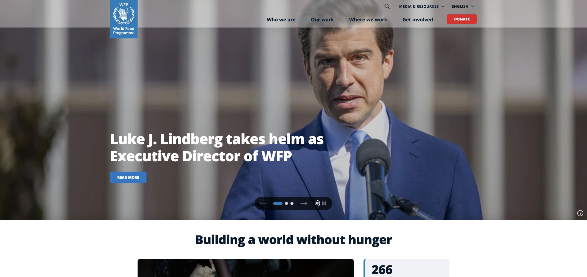
The World Food Programme places its blue identity and compact navigation above a photographic feature with a white headline. A red donation action is visually distinct from the informational routes. Carousel controls include a pause option and an indication of progression, while an institutional introduction begins below the lead feature. The page identifies a branded WFP CMS and exposes Drupal settings and core assets; the attribution is limited to this public publishing surface.
What you can learn
Keep emergency announcements and durable organizational material in related but separate editorial structures. Country pages, stories, facts, and campaigns benefit from consistent metadata and explicit owners. When a homepage rotates several priorities, give visitors control and ensure each slide remains understandable outside the carousel as a normal linked page.
Pros
The donation action is easy to distinguish from research and organizational navigation.
Visible carousel controls make the rotating feature more controllable than an unexplained automatic banner.
Cons & considerations
A changing lead story can make it harder for returning visitors to find yesterday’s announcement.
Large photography and overlaid text require editorial checks for every campaign image and language.
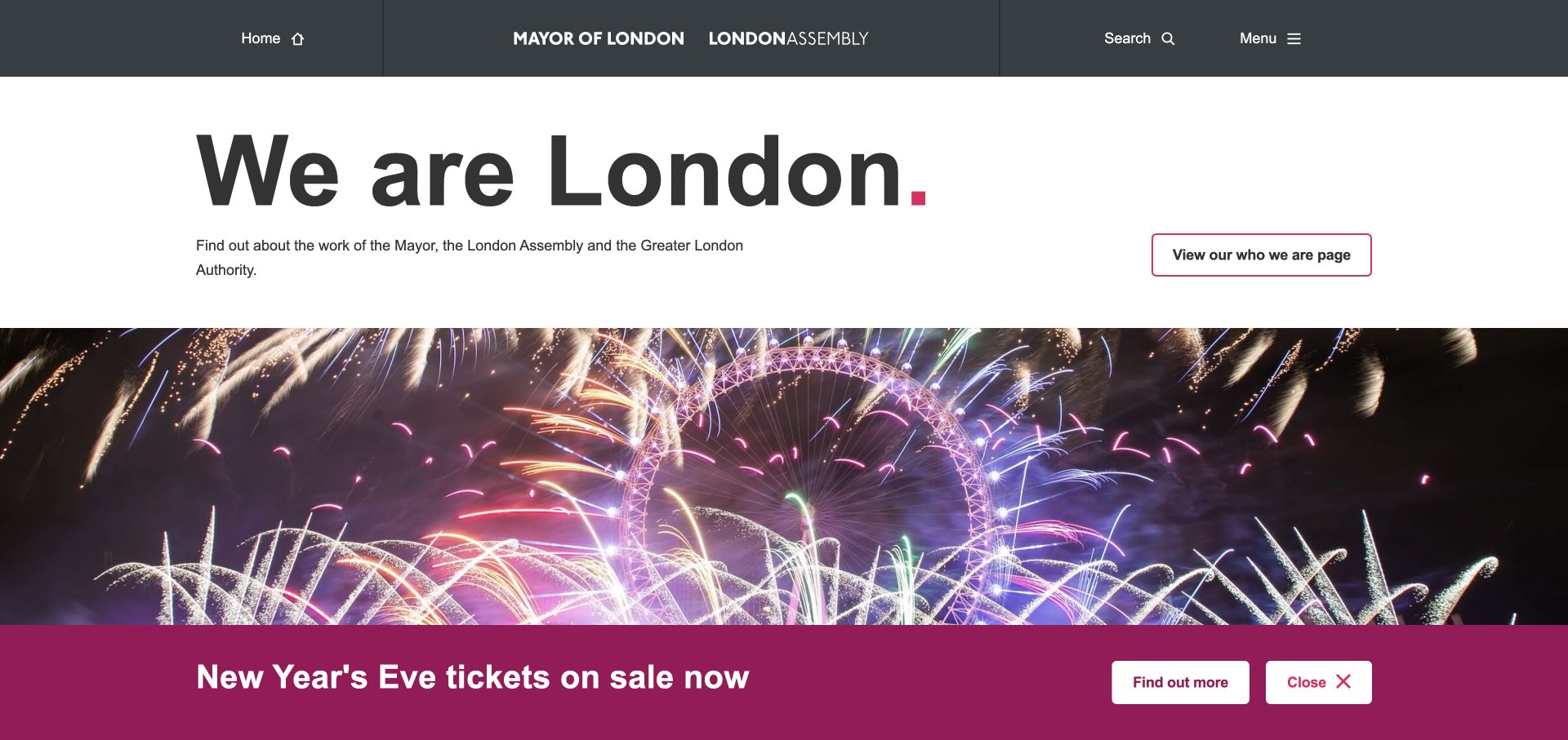
London City Hall begins with a broad text statement, a short explanation, and a link describing the organization. A large fireworks photograph then introduces a current event, while lower sections distinguish the mayor, assembly, and policy priorities. Search and menu controls occupy a dark institutional header. The design uses Drupal-backed public content without trying to present every civic topic in the opening screen.
What you can learn
Model responsibilities, policies, events, and participation opportunities as distinct material. Plain-language introductions help residents understand who does what before they navigate a complex institution. Homepage campaigns should have defined start and end dates so an event does not displace essential civic information indefinitely. The content structure matters more than copying the photograph or typography.
Pros
The short introduction explains the site’s institutional purpose before asking visitors to explore its many topics.
Separate responsibility cards can clarify the difference between related public bodies.
Cons & considerations
The collapsed main menu adds an extra interaction for users who already know their topic.
A prominent event strip and large photograph can compete with less seasonal public-service information.
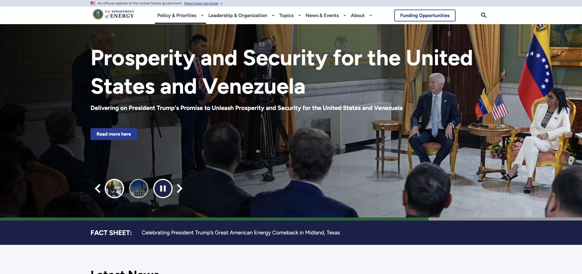
The Department of Energy uses a compact white navigation above a large photographic announcement. Funding opportunities receive a separate outlined route, while policy, leadership, topics, news, and background are grouped in the main header. The hero includes a small set of image-based slide controls and a pause button. Multiple generator strings identify Drupal, but they should not be interpreted as a reliable inventory of installed versions or a security assessment.
What you can learn
Give specialized tasks a direct route instead of assuming all visitors want the current announcement. A government CMS should distinguish news, funding notices, topic pages, and organizational information with clear ownership and review dates. Design templates that let editors update a headline and image without weakening the stability of program navigation.
Pros
The separate funding route gives a high-intent audience an alternative to browsing the news.
A narrow header preserves space for several institutional categories without turning them into promotional cards.
Cons & considerations
The photographic announcement takes most of the first screen before other agency material appears.
Image-only slide thumbnails provide less context than descriptive story labels for comparing featured announcements.
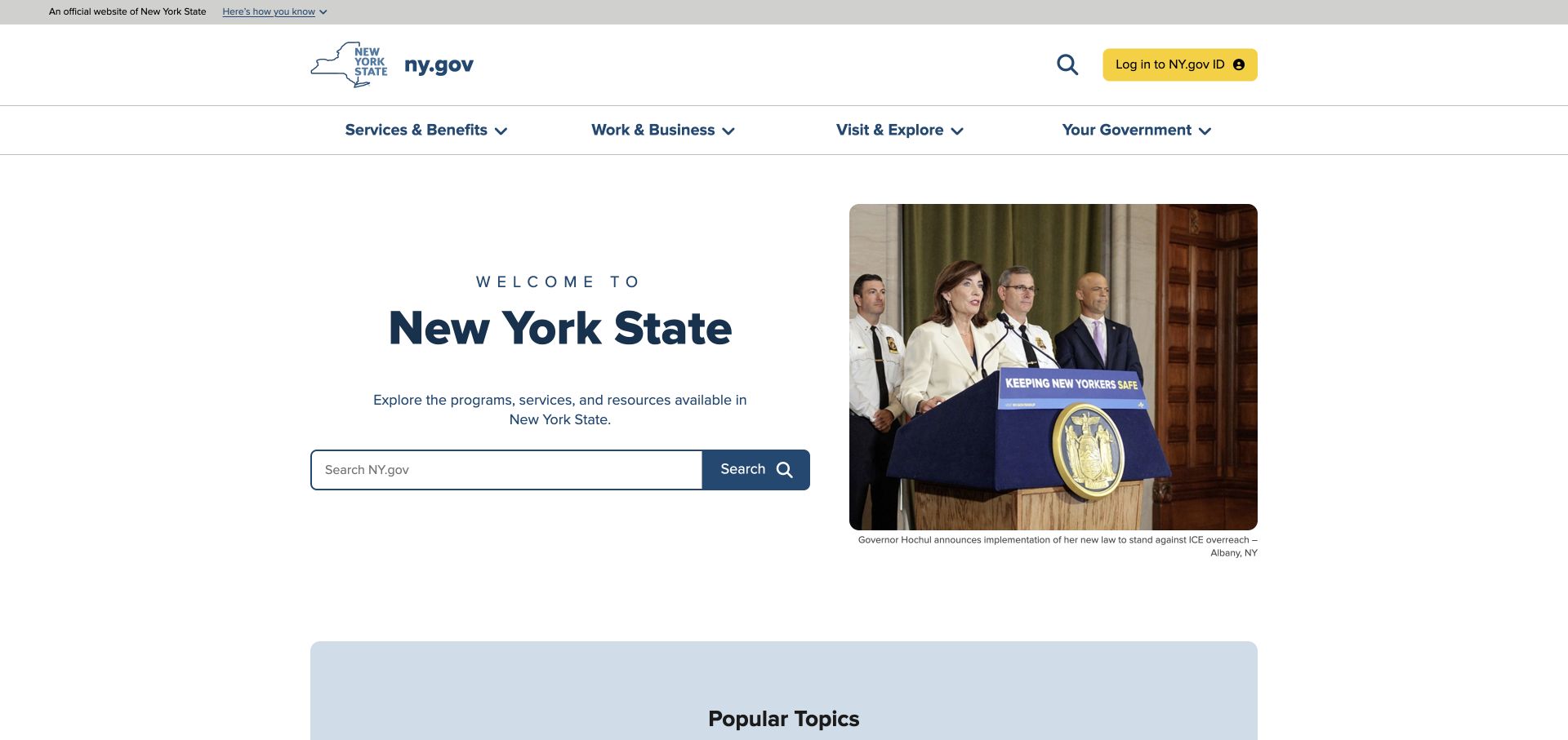
New York State places a large search field beside an announcement photograph, with four broad service-oriented navigation groups above. A clearly labeled identity login is separate from the public content search. Popular topics begin immediately below the introductory area. The hierarchy prioritizes finding a task over reading a long institutional welcome. Drupal generator metadata is directly visible, supporting the public-site attribution without implying that every linked state service uses the same application.
What you can learn
Treat a portal as a directory with useful task labels, not merely a homepage full of announcements. Service pages should have consistent summaries, eligibility context, responsible agencies, and maintained onward links. Search terms and popular-topic lists need editorial ownership, particularly when several agencies describe similar tasks using different language.
Pros
The large search field makes the primary finding task obvious without opening another panel.
Broad service groups provide an alternative for visitors who do not know the right search terms.
Cons & considerations
Search quality becomes especially important when the homepage makes it the dominant route.
Prominent announcements and popular-topic lists require regular review to remain useful rather than simply current.
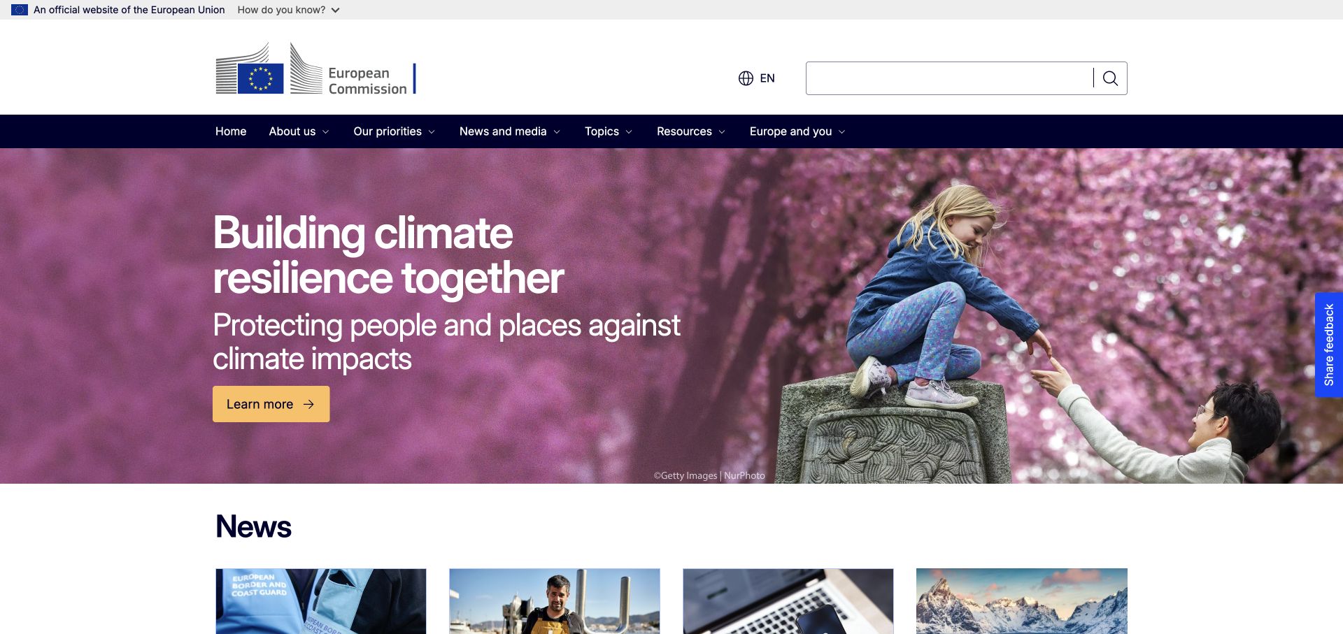
The European Commission combines an official-site banner, a large identity, an English-language control, and a wide search field. A dark horizontal navigation separates institutional information, priorities, topics, resources, and public participation. Below it, a campaign photograph carries a concise explanatory message and a single contrasting action. The final reviewed address is the English index route, and explicit Drupal metadata confirms the public publishing platform.
What you can learn
Design content relationships around policy topics and audience tasks, then connect translations intentionally. An institutional CMS needs more than flexible page blocks: it needs reliable ownership, publication formats, review cycles, and links between current news and enduring policy information. A shared visual system can keep those different materials recognizable without making every page identical.
Pros
The language control and visible search acknowledge the scale and multilingual nature of the institution.
Topics and resources are distinct destinations rather than being mixed into a single news feed.
Cons & considerations
The substantial header occupies meaningful vertical space before the featured material.
Campaign promotion requires careful balancing against visitors seeking a specific policy document or practical institutional task.
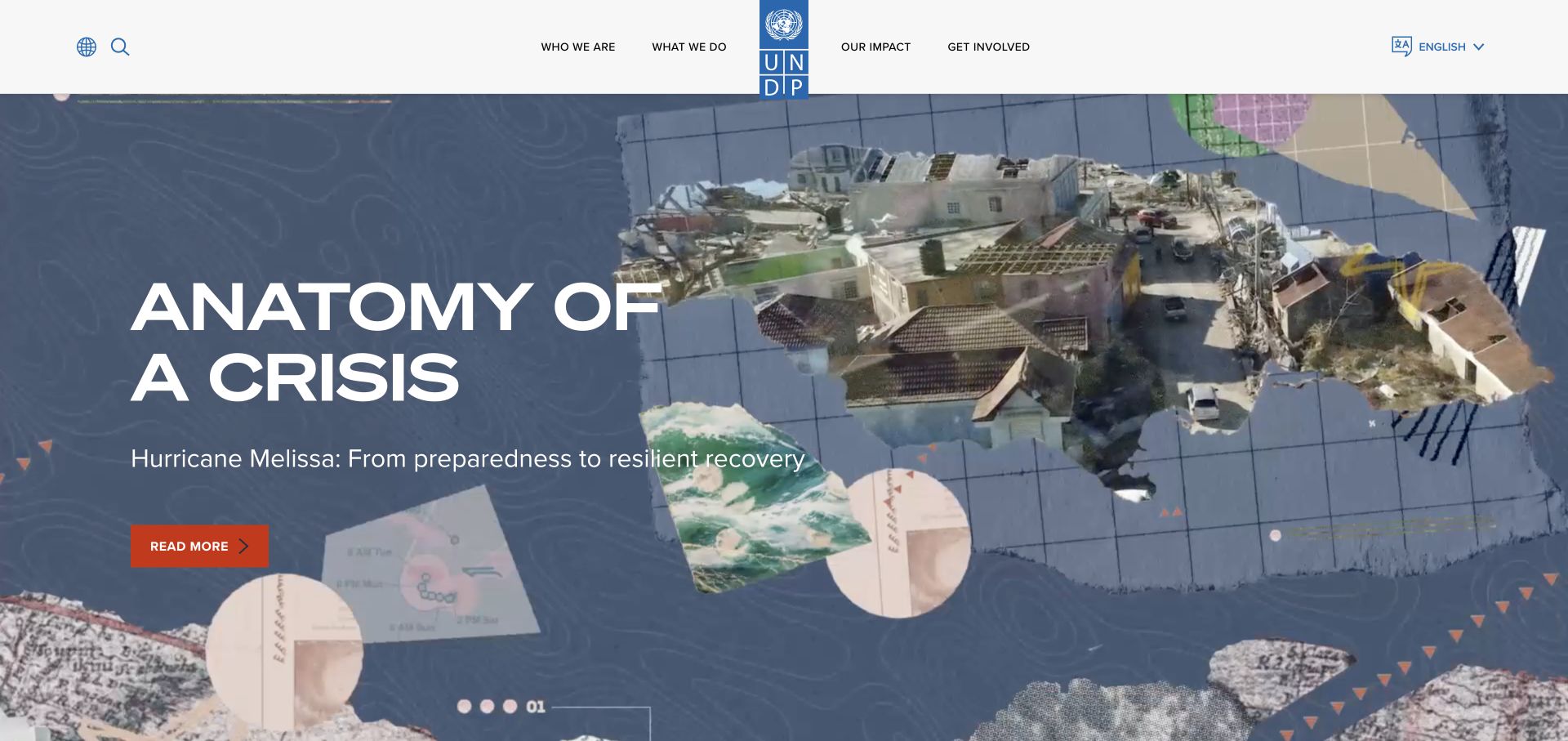
UNDP centers its tall blue identity in a white navigation band and gives the opening feature a large editorial canvas. The captured campaign uses collage-like map textures, photography, a short title, and a contrasting reading action. Global and language controls remain separate from the four main organizational categories. Public Drupal attributes and core assets support the attribution, but the expressive campaign design should not be confused with a default CMS layout.
What you can learn
Keep a common content framework underneath different story treatments. A global organization can use distinctive campaign art while preserving predictable fields for countries, topics, publications, and participation. Plan which material belongs in the main CMS and which campaign destinations are separate properties; a link to another hostname is not evidence that it shares the same platform.
Pros
The centered identity connects the institutional header with highly varied campaign artwork.
Global and language controls are separated from the main organizational navigation.
Cons & considerations
A full-height campaign can postpone access to the wider publication and country catalog.
Highly art-directed features need usable summaries and fallback imagery rather than depending entirely on motion.
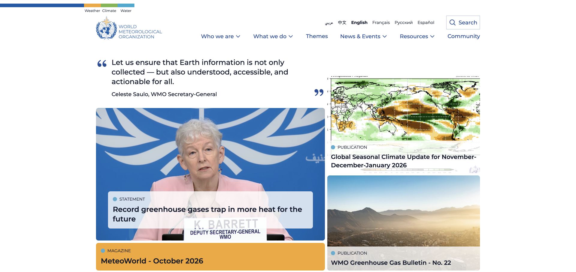
WMO uses a large but orderly white header with language links, search, and topic navigation. The lead content is not a single oversized campaign: a quote introduces a grid whose labels distinguish statements, magazines, and publications. Images, text panels, and a consistent blue accent make several formats coexist on the same page. Explicit Drupal metadata identifies the platform behind this public institutional property.
What you can learn
Model publication format as meaningful content, not a decorative tag added after publication. A bulletin, an official statement, and a magazine issue have different metadata and reader expectations. Shared card components can expose those differences while keeping the page visually coherent. Build relationships between recurring series and their individual issues so an archive remains useful after a homepage promotion ends.
Pros
Format labels help readers distinguish a recurring publication from a one-time announcement.
The multi-card opening presents several paths without requiring visitors to wait through a slideshow.
Cons & considerations
Different card sizes and overlaid labels need careful alignment as headlines change length.
A broad scientific archive still needs dependable search and topic filters beyond the homepage selection.
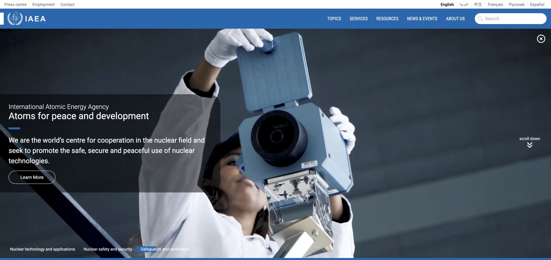
The IAEA homepage layers a dark explanatory panel over large scientific imagery. A blue header names topics, services, resources, news, and organizational information, with a separate utility and language row above. Three thematic labels at the lower edge organize the feature into more specific areas. The public page explicitly identifies Drupal, illustrating that the platform can support a media-led introduction as well as document-heavy institutional sections.
What you can learn
Separate the mission statement from specialist content navigation. An agency website needs structured resources and services beneath a visually engaging introduction, with consistent ownership and dates for technical material. Treat the opening media as a replaceable presentation layer rather than storing essential meaning only inside it. Pictured identities are not inferred.
Pros
The translucent text panel gives the introductory copy a more consistent backdrop than text placed directly on imagery.
Services and resources are visible categories alongside news, supporting more than casual browsing.
Cons & considerations
The large opening media leaves detailed specialist material outside the first viewport.
Two navigation rows and thematic labels require clear hierarchy to avoid presenting several competing menus.
Visible tech stack
Earlier / documented evidence
Drupal
Earlier cited evidence retained; no current scan result. References may be embedded or legacy—not a complete backend inventory.
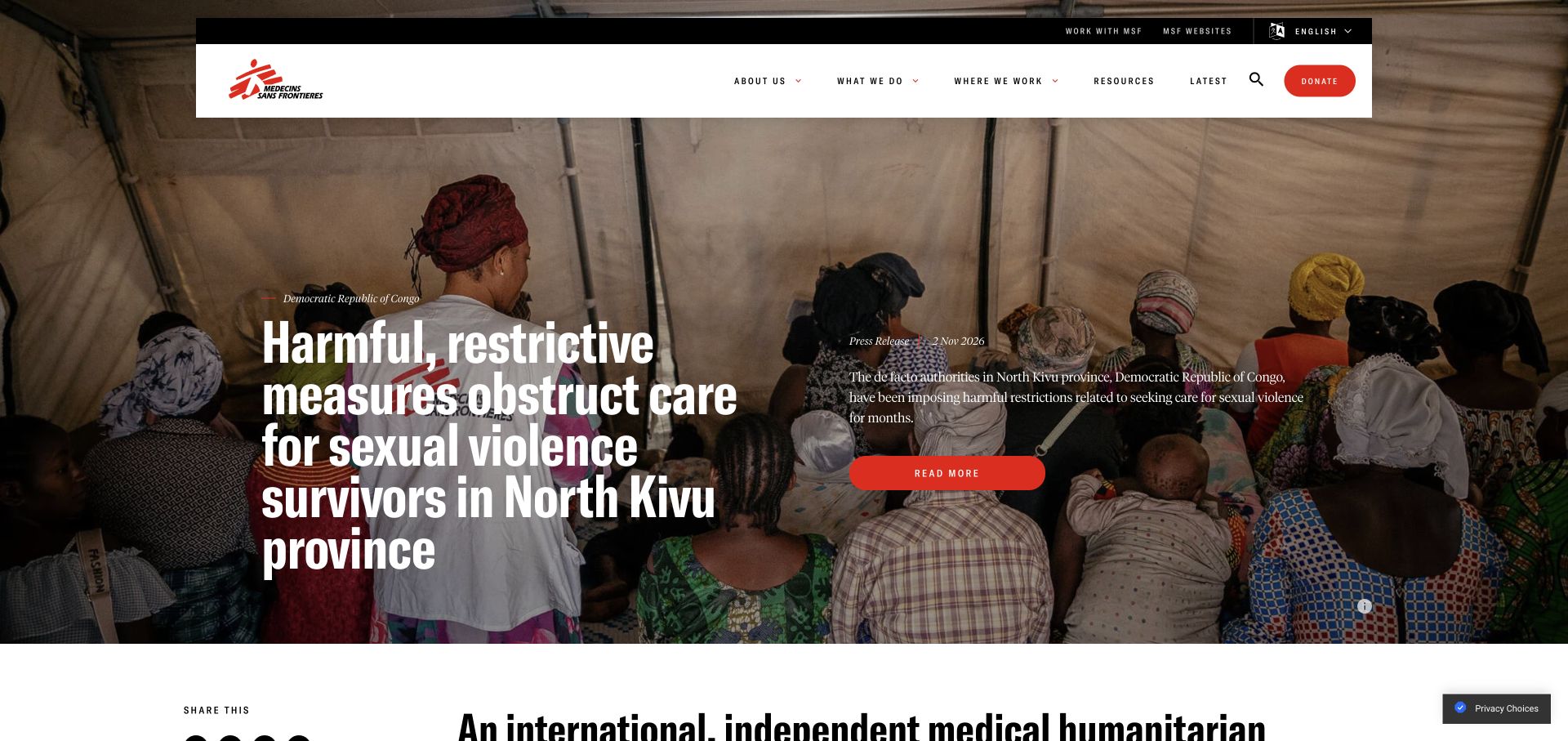
Médecins Sans Frontières places a white navigation panel over a full-width editorial photograph. The lead story includes a geographical label, publication format, date, headline, and short description rather than an unexplained image. Donation and recruitment routes are visually separate from the main reporting categories. Explicit Drupal metadata supports the public-site attribution. The visual review focuses on the page structure, not unverified assumptions about the people shown in the story photograph.
What you can learn
Preserve publication context as structured fields. Geography, format, date, and summary make a current report understandable when it appears on a homepage, topic page, or archive. A humanitarian CMS workflow should also include photographic permissions, sensitive-content review, and careful captions; expressive storytelling does not remove those editorial responsibilities.
Pros
The visible date and publication format explain what kind of report the visitor is seeing.
The persistent navigation separates organizational research from donation and work opportunities.
Cons & considerations
Long headlines over photography need deliberate line breaks and adequate background contrast.
Urgent lead reporting can displace evergreen resources unless alternative routes remain easy to find.
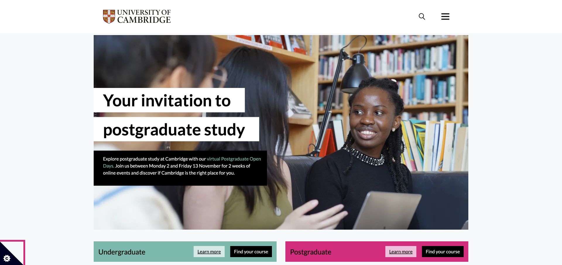
Cambridge presents a large photograph with a headline set on separate light panels and a short darker description below. Its minimal header keeps only identity, search, and menu controls visible. Immediately beneath the feature, contrasting undergraduate and postgraduate bars offer both introductory information and direct course links. Explicit Drupal generator metadata identifies the public site; the admissions feature remains an editorial choice rather than a property unique to the software.
What you can learn
Give temporary recruitment events their own fields for dates, descriptions, and destinations, then preserve stable study-level routes around them. A CMS content model should help editors retire an event without breaking course links or recreating the homepage. Keep the information needed to understand an invitation in readable text, not solely in the accompanying photograph.
Pros
The two study-level bars distinguish learning about an option from finding a specific course.
Text panels give the featured invitation a stable reading surface over changing photography.
Cons & considerations
The minimal header hides the broader university structure until the menu is opened.
Event-specific lead content needs a clear expiry process to avoid presenting an outdated invitation.
Visible tech stack
Referenced on the public page
Drupal
Google Fonts
nginxReported response header
Public source checked November 3, 2026. References may be embedded or legacy—not a complete backend inventory.
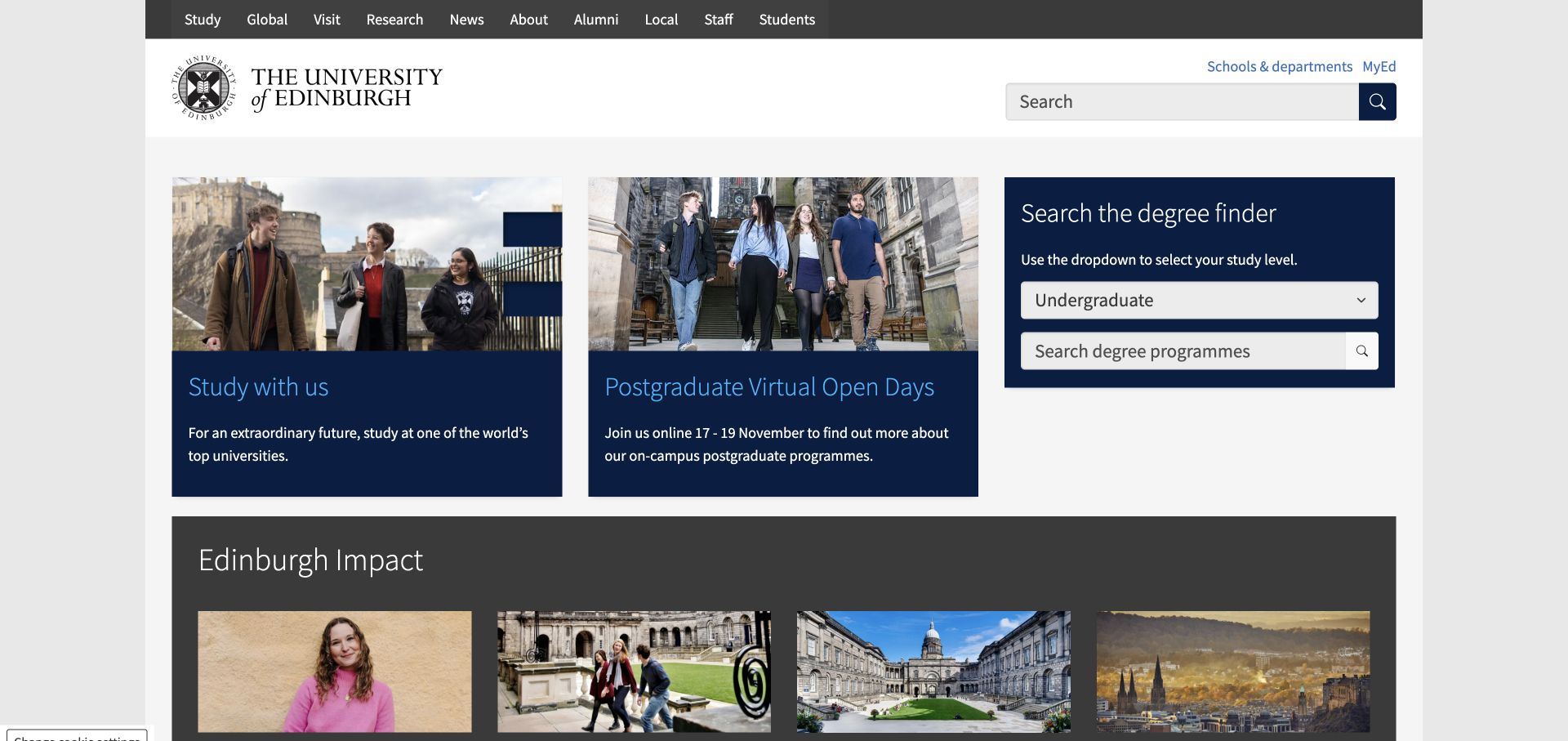
Edinburgh places two photographic study cards beside a dark degree-finder panel. A study-level selector and search field make course discovery a visible task rather than a distant menu item. The upper navigation also names audiences such as staff, students, alumni, and local visitors. The result is more portal-like than a full-screen promotional story. Explicit Drupal metadata confirms the public platform, without establishing the software used by linked student services.
What you can learn
Match content structures to recurring questions: what can I study, which event can I attend, and where does my audience belong? A CMS should keep event dates separate from reusable study information, and connect course searches to the appropriate study level. Predictable fields make routine maintenance more reliable than repeatedly rebuilding feature panels.
Pros
The degree finder appears alongside promotional content instead of being hidden behind it.
Audience labels acknowledge that the university website serves more than applicants alone.
Cons & considerations
Many top-level destinations can make the header feel dense on smaller screens.
The card layout requires careful text-length management so related panels remain visually balanced.
Visible tech stack
Referenced on the public page
Drupal
nginxReported response header
Public source checked November 3, 2026. References may be embedded or legacy—not a complete backend inventory.
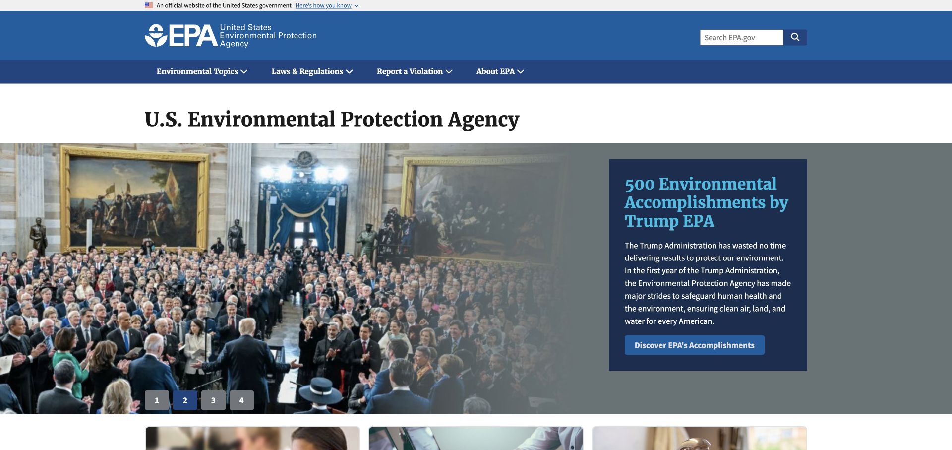
EPA separates its identity and search area from a dark navigation bar naming environmental topics, regulations, reporting, and institutional information. The lead announcement uses a photograph beside a dark text panel, with numbered controls indicating alternative features. Drupal core scripts and settings are directly visible in the public page. The useful example is the distinction between reference categories and a replaceable editorial announcement, not the claims made by the announcement itself.
What you can learn
Keep laws, topic pages, reporting instructions, and news as different content roles. Their ownership, revision needs, and expected reader actions are not interchangeable. A CMS can supply reusable structures, but editors still need rules for retiring announcements and maintaining authoritative reference links. Review the hierarchy independently from the current promotional message.
Pros
The reporting route is visible at the same level as topics and regulations.
A separate text panel avoids placing the entire announcement directly over a complex photograph.
Cons & considerations
Numbered slides give less descriptive context than labeled story choices.
A prominent announcement can dominate visitors who arrive to complete a specific environmental task.
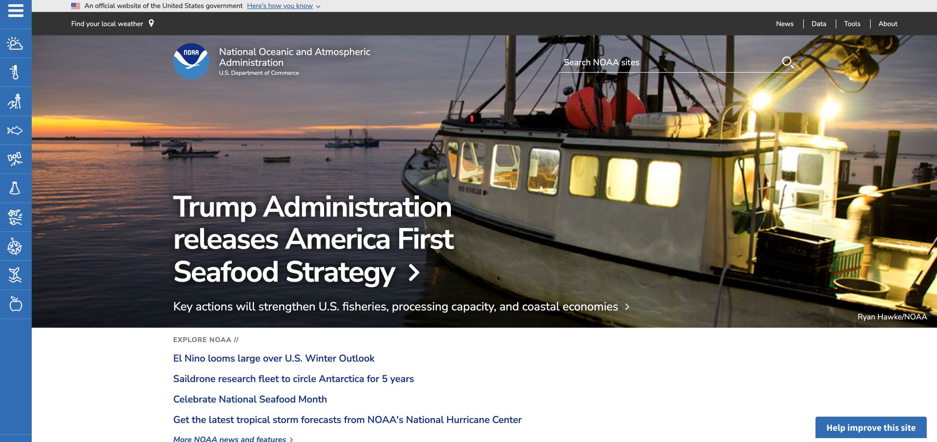
NOAA uses a narrow vertical icon rail alongside a large photographic feature. A top utility strip offers news, data, tools, and organizational information, while a wide search field sits over the hero. Several plain text story links begin below the feature rather than disappearing into a carousel. Explicit Drupal generator metadata confirms the public platform. The page’s local-weather route is a generic invitation, not a saved personalized forecast in our capture.
What you can learn
Separate editorial stories from datasets and practical tools. An institutional CMS can organize their descriptions and relationships, while specialist applications may live elsewhere. Keep those handoffs explicit, and give icons meaningful text labels in the navigation. Topic breadth should be handled through a consistent taxonomy, not simply by adding more promotional panels.
Pros
Data and tools receive direct utility routes distinct from the current lead story.
Additional story links remain visible as text below the photographic feature.
Cons & considerations
An icon-heavy side rail can require interpretation before a new visitor understands its categories.
Search and a broad topic menu need sustained editorial maintenance as scientific resources expand.
Visible tech stack
Earlier / documented evidence
Drupal
Associated dependencies
PHPCMS dependency association; runtime not independently observed
Earlier cited evidence retained; no current scan result. References may be embedded or legacy—not a complete backend inventory.
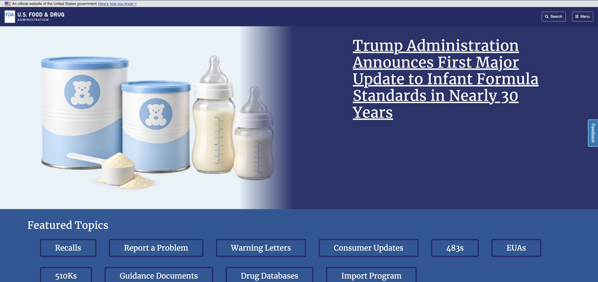
FDA uses a compact dark identity bar above a split feature with a product-related illustration and a large linked headline. A grid of named task links follows immediately: recalls, reporting, consumer information, guidance, and databases are visible without opening the menu. Drupal selectors appear in the rendered public DOM. This public information surface does not identify separate reporting or database applications.
What you can learn
Design task destinations around recognizable user questions before expanding promotional content. Regulatory material benefits from clear formats, review dates, responsible owners, and relationships between a news announcement and its authoritative guidance. A shared CMS can make those links consistent, but it should not blur the difference between general information and instructions for a formal submission.
Pros
The task grid exposes several important resources before visitors enter a deeper navigation layer.
The split feature keeps the headline on a consistent background rather than directly over the image.
Cons & considerations
The large linked headline can be difficult to scan when an announcement title is long.
Technical shorthand in task labels may need plain-language explanations for non-specialist visitors.
Visible tech stack
Referenced on the public page
Google Analytics
nginxReported response header
Earlier / documented evidence
Drupal
Public source checked November 3, 2026. References may be embedded or legacy—not a complete backend inventory.
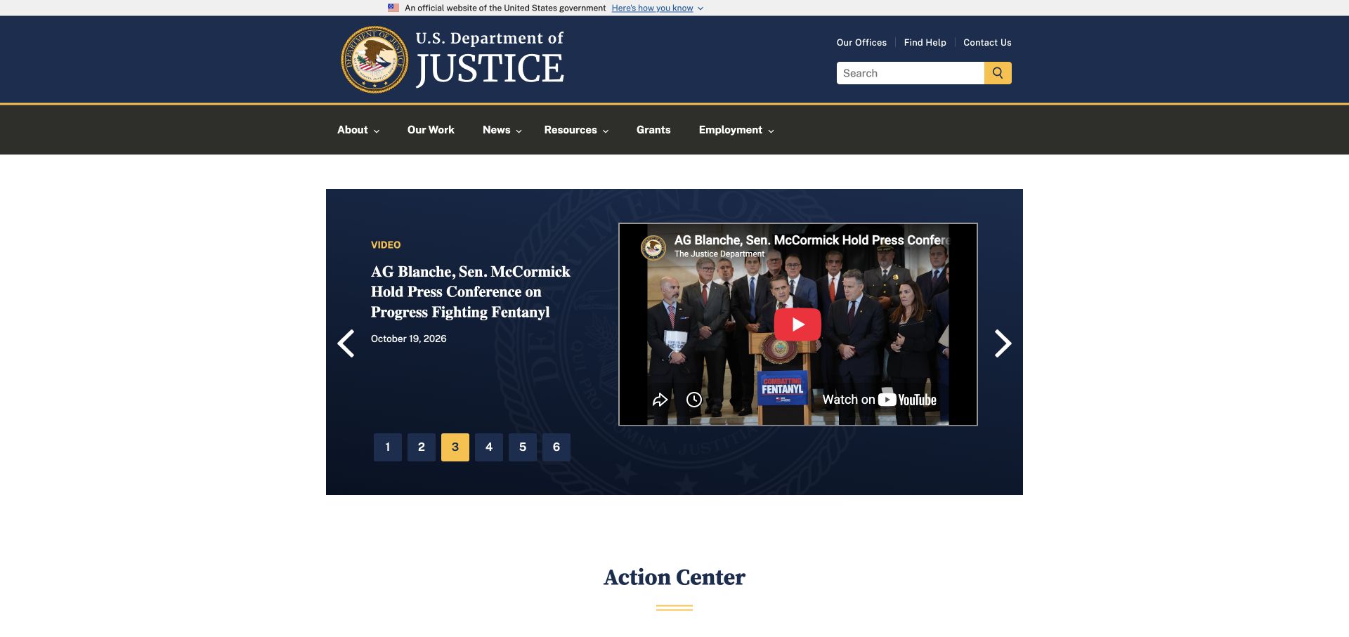
The Department of Justice uses a broad navy identity header and a distinct dark navigation band. Its central feature is bounded rather than edge-to-edge, pairing a dated video item with a recognizable embedded player and numbered slide choices. A public action-center section begins below. Explicit Drupal generator metadata supports the platform attribution, but the embedded player is a separate visible media service, not a reason to infer the whole technology estate.
What you can learn
Give press releases, videos, help pages, and grant material different templates and metadata. A homepage feature should retain a readable title and date without requiring the visitor to play media. Keep practical help routes stable around changing announcements, and make ownership of archived material clear when organizational structures change.
Pros
The dated video description gives context before a visitor chooses whether to play the embed.
Office, help, and contact utilities are separate from the broader institutional navigation.
Cons & considerations
Numbered carousel choices reveal quantity but not the subjects of other featured items.
A large branded header and feature can delay the practical action-center links below.
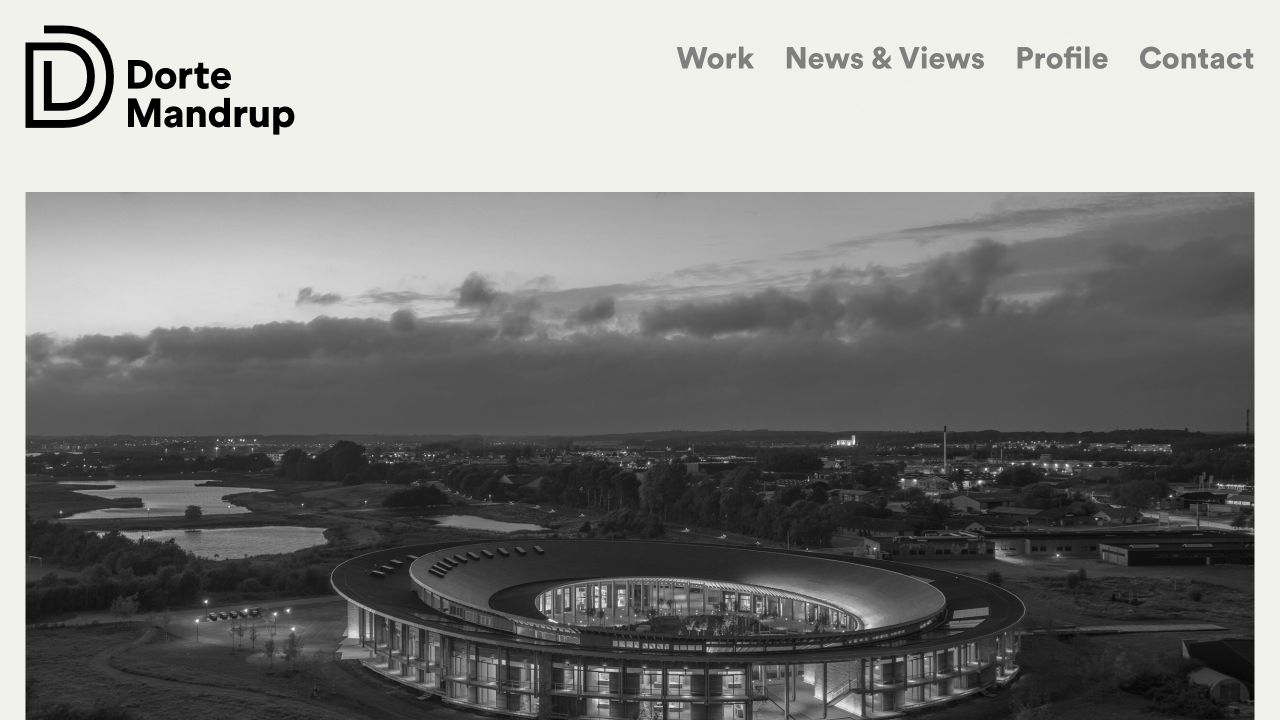
Dorte Mandrup’s November 1 homepage capture pairs a strong black monogram with a small set of large navigation labels. A broad monochrome architectural photograph fills the remaining screen. Work, news and views, profile, and contact are distinct destinations, making the site a useful contrast to the institutional portals elsewhere in this Drupal collection. Generator metadata directly named Drupal; the exposed version string is not an independently verified patch-level assessment.
What you can learn
Use structured project records and a separate editorial stream to preserve both an archive and a current point of view. The same CMS can support a visually quiet practice website without adopting a government-portal aesthetic. Keep titles, image descriptions, project facts, and related writing editable even when the homepage deliberately foregrounds photography.
Pros
Large navigation labels make the main content roles apparent without an elaborate menu.
The monochrome photograph creates visual unity with the restrained black identity.
Cons & considerations
The opening image provides atmosphere before written information about a specific project.
A minimal homepage needs strong internal project context for visitors comparing scope and expertise.
Visible tech stack
Earlier / documented evidence
Drupal
Earlier cited evidence retained; no current scan result. References may be embedded or legacy—not a complete backend inventory.
Choose the content and governance model before the theme
Use a coupled site when one publishing system should own the presentation
A conventional implementation can keep content editing and rendered pages close together. Prototype representative content types and their templates before choosing extensive visual customization.
Decouple only with a clear frontend ownership plan
A separate frontend adds responsibilities for preview, routing, rendering, caching, and deployments. Specify the need it solves and the team that will support both sides. Headless is an architecture choice, not a visual quality label.
Treat migration as a content and URL project
Inventory old content, relationships, files, authorship, redirects, and permissions. Decide what to archive rather than importing everything by default. Rehearse a sample migration and verify the resulting public pages and editorial experience.
From references to requirements
Plan a governable Drupal build
Prototype representative editorial tasks
Ask an editor to publish an event with a changed date, update a staff profile, replace a document, and correct a related item. Test permissions with non-administrator accounts rather than relying on a developer’s all-access demonstration.
Design search and taxonomy together
Define the terms people use, the metadata editors can maintain, and the filters that genuinely help. Include empty results, synonyms, and outdated items. A search field alone does not establish findability.
Give maintenance a named owner
Record responsibility for core, contributed extensions, custom code, backups, recovery, and deployment. Agree on review and response procedures appropriate to the organization. A recognizable site is not evidence of your implementation’s security.
A useful handover demonstration
Ask the actual team to carry out its routine job: publish a realistic update, correct a mistake, preview a narrow screen, and identify who owns an integration failure. For a library or frontend framework, also ask who maintains the content source and deployment. A polished screenshot does not answer those operational questions.
Beyond the screenshot
Drupal launch and operations checklist
Validate content types, relationships, and optional fields.
Test editor roles with least-privilege accounts.
Review search, taxonomy, filters, and empty results.
Rehearse migration and verify files and redirects.
Check translations and audience-specific navigation where required.
Review keyboard behavior, forms, and semantic page structure.
Test backups and the recovery procedure, not only their existence.
Document update ownership, environments, and release approval.
Test with real content, a keyboard, a small screen, slow or failed requests, and the people who will maintain the system. These are planning checks, not an accessibility, security, performance, or search-ranking certification.
Sources & editorial method
How this Drupal collection was reviewed
Direct captures are paired with public Drupal generators, settings, core assets, or explicitly attributed project sources. These signals do not identify every extension, version, integration, hosting service, or security control.
Every image is an unmodified capture from the actual website, with its source and capture date. Some captures are reused from our shared catalog; their dates remain the original capture dates. None comes from a vendor gallery or a generated reconstruction. Moving imagery and live content can change.
Technology attribution uses public page assets or metadata, official platform documentation, or a cited first-party project case study. Documentary and framework-relationship evidence is identified where used; it is not a complete current backend inventory. A CMS image CDN alone does not establish a full CMS deployment. A library’s presence does not prove which individual controls use it, and a platform label does not establish AI authorship.
The composition notes, lessons, pros and tradeoffs are original editorial observations. We have not measured conversion, traffic, security, performance or accessibility conformance. Website owners retain their brands and imagery; these examples are not our client portfolio. Written, Edited and Curated are independent records, not dates advanced by a build. See our editorial standards or suggest a correction.
Questions worth asking
Drupal website development FAQs
Is Drupal only for very large organizations?
No, but its structure and governance should solve real needs. A small brochure site may not need the same publishing model as a multi-audience institution.
Does Drupal require a headless frontend?
No. Choose the architecture according to rendering, integration, preview, and team requirements. Either approach needs a clear maintenance plan.
Can we migrate everything automatically?
Some material may be imported programmatically, but content quality, relationships, redirects, permissions, and editorial testing still require decisions and validation.
Does a Drupal signal establish that a site is secure?
No. The guide does not perform a security audit. Configuration, dependencies, custom code, operations, and ongoing updates all need separate review.