The best Webflow references show how a visual identity repeats across useful pages—not just how an opening animation looks. Separate the design system, CMS model, and integrations before planning a build.
The named properties below have public Webflow evidence or an attributed platform association. That does not establish where every form, application, store, or customer database runs.
Study each site with two questions: can a visitor find the next useful page, and could an editor add another item without redesigning it? A strong answer to both is more valuable than visual novelty alone.
Before the examples
What makes good Webflow website development in 2026?
Create a system before multiplying pages
Define typography, spacing, surfaces, navigation states, and reusable content sections with realistic copy. Check a long title and a short one. The goal is an identifiable site that stays coherent when a different editor publishes the next page.
Model repeated content rather than copying layouts
A CMS Collection represents a repeatable kind of content. Decide which fields and relationships an article, project, person, or location needs, then connect the model to its index and detail experience. Do not turn every visual section into an unnecessary content type.
Keep headings, links, and meaningful images understandable before a reveal completes. Test a reduced-motion presentation and narrow screens. A dramatic reference is useful inspiration, not proof that its effects suit every audience or device.
The collection · 20 examples
20 Webflow website examples worth studying
Compare the stable elements around each campaign: navigation, typography, repeated sections, and the way deeper content becomes discoverable. Public Webflow evidence applies to the selected property, not necessarily the organization’s product application.
We start with five recognizable brands or organizations: Dropbox Brand Guidelines, IDEO, TEDAI Vienna event, Barry’s, [solidcore]. Each attribution applies to the named website property, not every product or website belonging to its organization. This is a curated reading sequence, not a measured ranking.
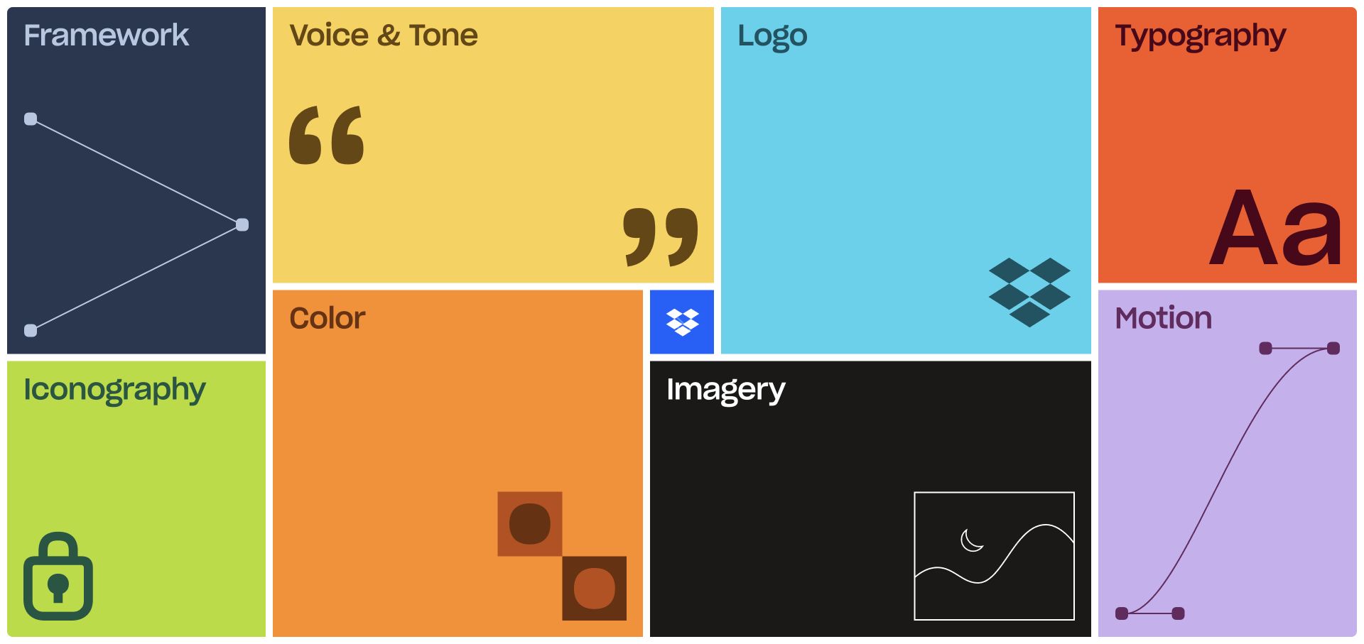
Dropbox’s brand homepage resolves into a full-screen arrangement of colored tiles. Framework, Voice and Tone, Logo, Typography, Iconography, Color, Imagery, and Motion each receive a distinctive visual example rather than an identical card icon. Narrow white gutters hold the unequal rectangles together, with a small blue Dropbox tile near the center. The capture shows the completed toolkit overview after the animated introduction, not an empty loading state. Current Webflow document attributes and the vendor’s case study identify this brand-guidelines property, not the file-storage product.
What you can learn
Turn a reference library’s real subjects into its navigation. A reusable Webflow component can preserve the relationship between label, representative graphic, and destination while allowing each category its own character. Build a straightforward alternate index as well, so finding logo guidance does not depend on following the introductory animation or understanding a spatial arrangement.
Pros
Subject-specific graphics explain the contents before a category is opened.
The consistent gutters make an intentionally irregular layout feel like one coherent system.
Cons & considerations
The introductory sequence delays access compared with an immediately visible conventional index.
A viewport-filling mosaic needs a deliberate mobile order and readable labels at smaller sizes.
Public source checked November 3, 2026. References may be embedded or legacy—not a complete backend inventory.
Platform source: Webflow’s official Dropbox brand-site case study. Official vendor case study plus current data-wf-site evidence for the Dropbox Brand Guidelines property only, not Dropbox’s file-storage application. Platform evidence is separate from the direct website screenshot and is not a complete current infrastructure audit.
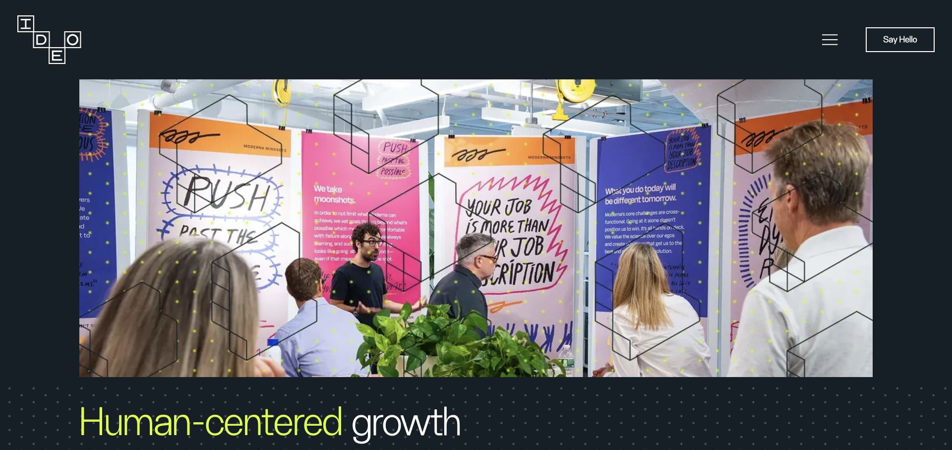
IDEO places its block-letter identity in a charcoal header, with a menu control and an outlined contact action at the opposite edge. A workshop photograph carries the opening: people, wall-mounted notes, and a patterned overlay make the practice visible without placing a dashboard-style graphic in the hero. Fluorescent lime and white typography introduce the proposition near the lower edge. Live Webflow document attributes support the publishing association. The photograph illustrates a working setting; it is not proof of project results, participant identities, or a particular research methodology.
What you can learn
Give case-study media a strong but stable frame. In a Webflow build, separate the global navigation from replaceable project artwork, and define where captions, headings, and follow-on links belong. Test the same structure with a quieter photograph and a longer title so the component remains useful after the launch image changes.
Pros
The dark header keeps essential navigation independent of the bright workshop imagery.
The lime accent establishes a recognizable handoff from media to the written proposition.
Cons & considerations
The large media opening postpones a concise explanation for unfamiliar visitors.
Fine overlays and text crossing image edges require fresh contrast checks for each replacement photograph.
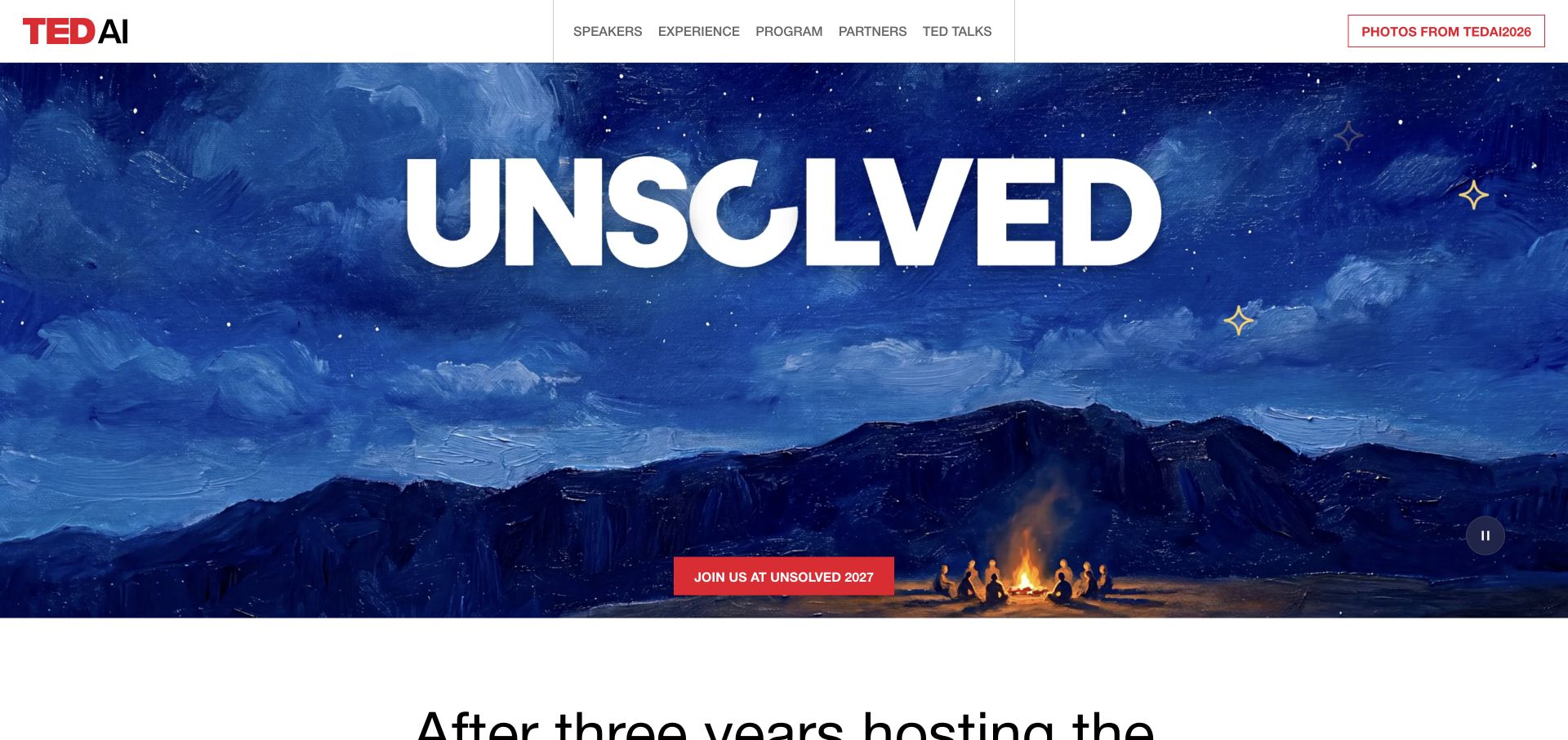
TEDAI Vienna combines a white conference header with a richly colored night-sky scene and an enormous UNSOLVED title. A red action announces the next 2027 event, while the header retains a distinct route to photographs from TEDAI 2026. Speakers, experience, program, partners, and talks remain separate navigation subjects. This makes the edition handoff part of the design rather than silently changing a date. Direct Webflow attributes identify this event property; the official TED conference directory supports its scoped association, not a claim about every TED website.
What you can learn
Model event content around editions, not only editable headline text. A Webflow publishing workflow should distinguish current registration, archived schedules, photographs, and the next announcement. The page title and visible campaign can move at different speeds, so include a release checklist that catches outdated metadata and links before a new season goes live.
Pros
The previous edition’s photograph route gives returning attendees a meaningful destination.
A single red action separates the next-event invitation from the atmospheric artwork.
Cons & considerations
The oversized title offers little practical event detail without scrolling.
The visible 2027 handoff alongside a 2026 document title shows why edition metadata needs editorial attention.
Public source checked November 3, 2026. References may be embedded or legacy—not a complete backend inventory.
Platform source: TED’s official conference directory. The TEDAI Vienna event property is directly verified as Webflow. TED’s official conference directory establishes the scoped conference association; it does not imply that all TED properties use Webflow. Platform evidence is separate from the direct website screenshot and is not a complete current infrastructure audit.
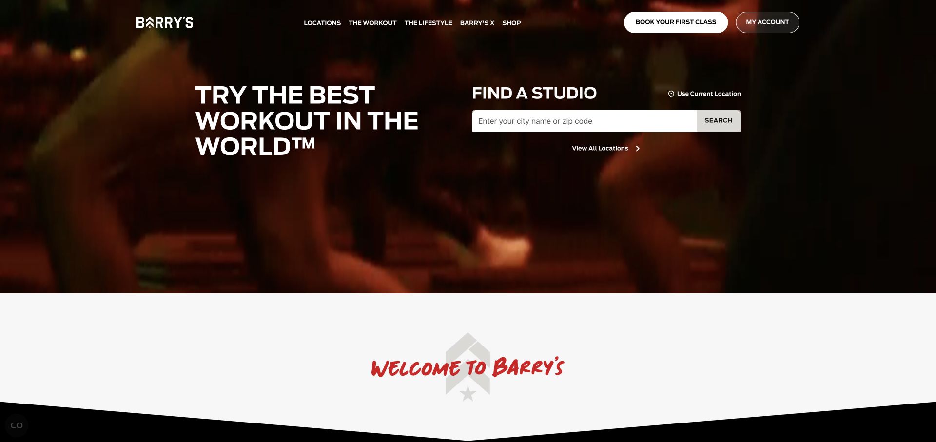
Barry’s gives a large studio-search area approximately half of the opening composition, alongside a bold workout introduction. Dark red footage creates atmosphere, while the white search field and browse-all route remain prominent. The header distinguishes a first-class action from existing-account access, and a broad curved white transition introduces the following section. Matching Webflow CSS and JavaScript are publicly visible. This association concerns the public marketing property, not the architecture of class booking, accounts, or every connected service.
What you can learn
Treat location discovery as a reusable product feature rather than another decorative section. Define its labels, empty results, manual browse route, and mobile layout before choosing the visual treatment. In a Webflow implementation, document the content source and any connected search or booking service so the editor knows which system owns each change.
Pros
The studio finder supplies a concrete task before a longer brand explanation.
New-visitor booking and account entry have visibly different purposes.
Cons & considerations
Moving imagery requires a readable and useful still presentation.
Local discovery and the subsequent reservation handoff need separate end-to-end testing.
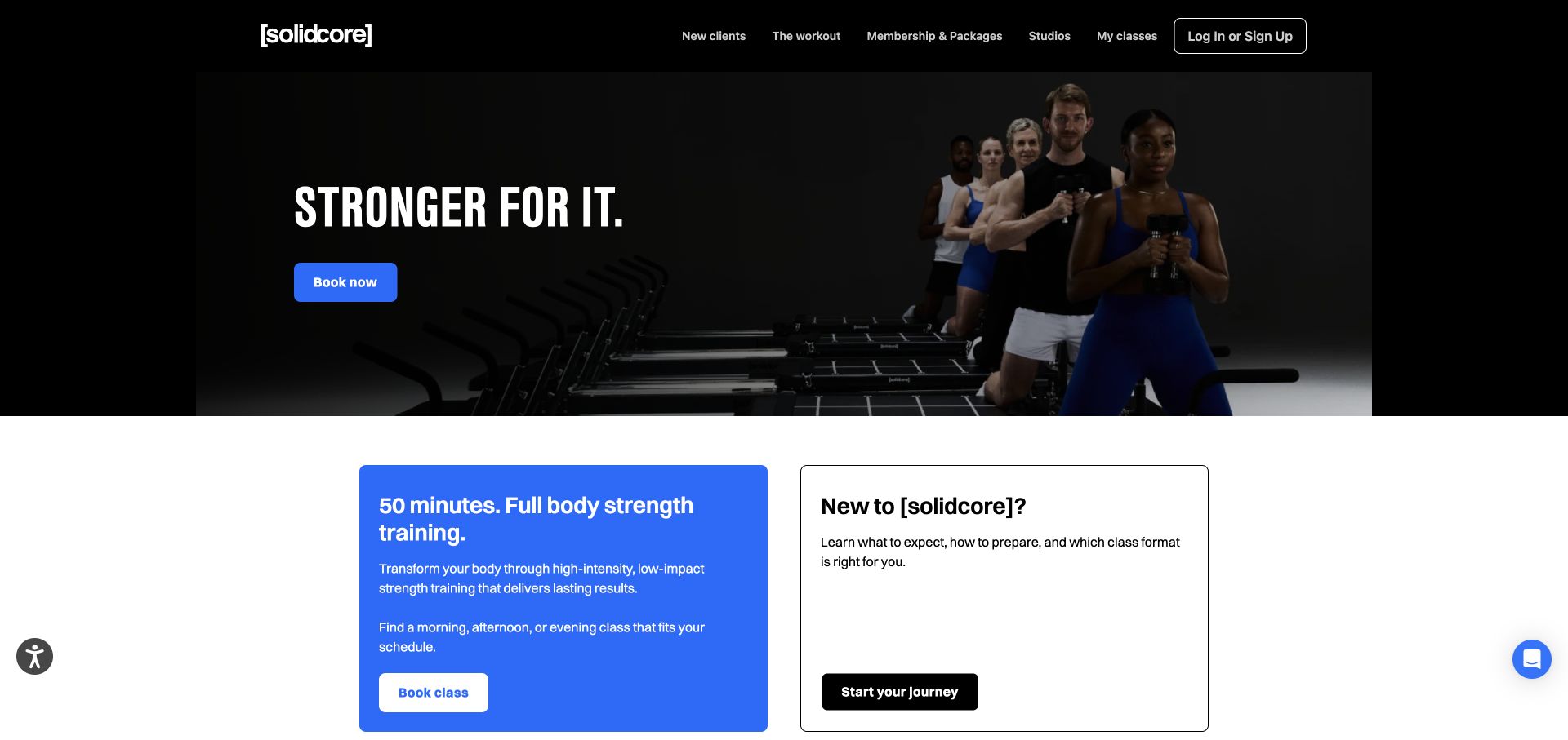
[solidcore] uses a black header and a dark group-training image with a bright blue booking action. The next section is already visible: a filled blue explanation card and a white outlined card specifically for newcomers. The shared proportions make the difference in audience easy to understand. Membership, studio, classes, and account routes remain in the header. Public Webflow runtime and site CSS provide the platform evidence. The interface does not verify workout outcomes, identify the pictured people, or establish the reservation system’s implementation.
What you can learn
Build reusable audience-routing cards with a clear editorial purpose. One should answer the experienced visitor’s immediate task, while the other explains what a newcomer needs before committing. In the editing model, keep headings, supporting text, and destinations linked logically so a visual update does not accidentally send both audiences into the same unexplained flow.
Pros
Newcomer guidance is a substantial content area, not a tiny help link.
The blue accent connects the booking route and the explanatory card.
Cons & considerations
The intense opening may need more reassuring context for a hesitant visitor.
Several account and membership routes require consistently clear labels.
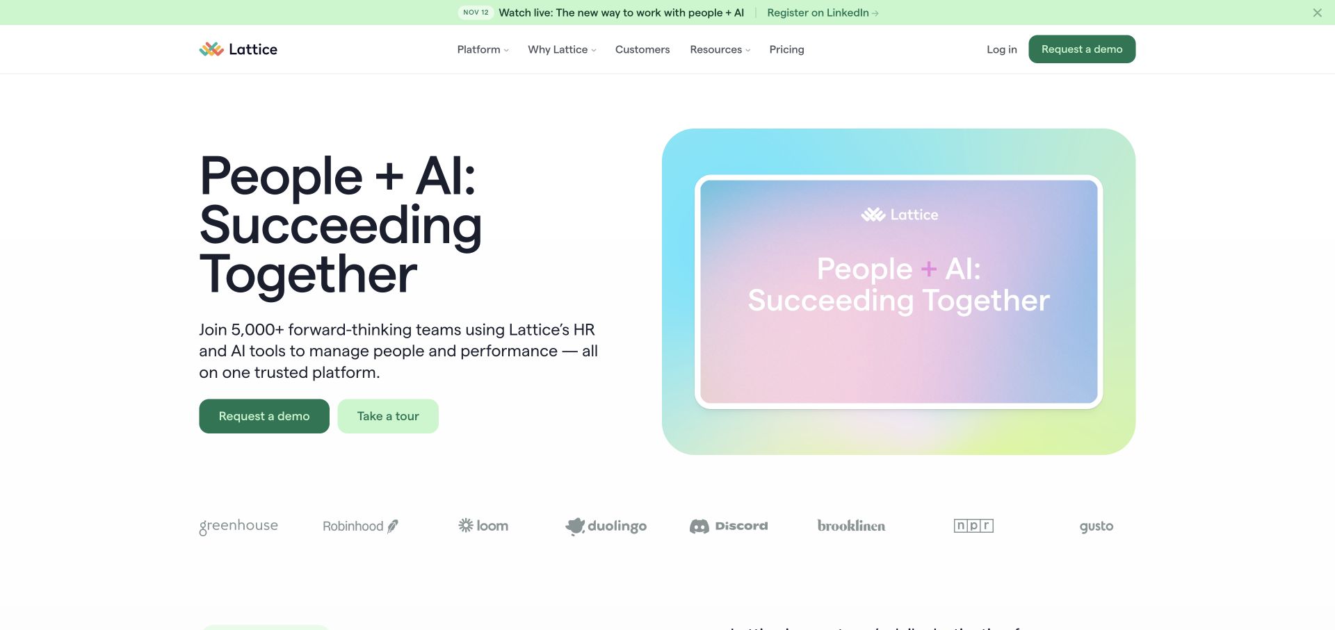
Lattice uses a green event strip above a solid white navigation bar, then divides the hero between a people-and-AI proposition and a pastel demonstration panel. The two primary actions distinguish requesting a demonstration from taking a tour. Customer identities sit below in a separate row. Thin borders, pale gradients, and restrained typography hold the software story together. Current Webflow page attributes verify the public marketing property; the illustrated HR interface is not an employee account or evidence about the application’s data infrastructure.
What you can learn
Build a campaign slot that can expire independently of the main product introduction. A reusable Webflow section should preserve action labels, supporting text, media, and fallback imagery as an editorial unit. Give the tour and sales journey different destinations and test their handoffs rather than assuming two adjacent buttons serve the same visitor.
Pros
The announcement strip keeps a dated event distinct from the durable proposition.
The solid header and framed media separate actual navigation from illustrative interface elements.
Cons & considerations
The broad AI wording needs more specific workflow detail further down the page.
A large demonstration frame can push supporting evidence below the first screen on shorter displays.
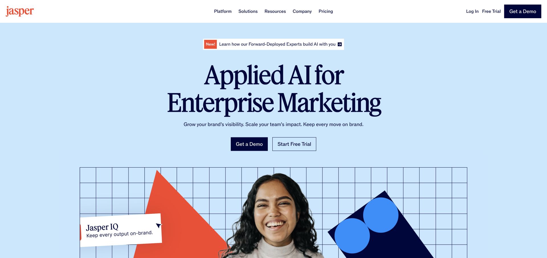
Jasper places a dark serif proposition on a pale blue field beneath an announcement label. Two rectangular actions create a simple decision point before the page introduces an image collage and a labeled product-intelligence panel. The coral identity mark and geometric artwork provide visual character without adding several competing callouts around the headline. Live Webflow document attributes identify this marketing website. The collage and product language do not independently establish how the AI agents work, which models are used, or what results a customer should expect.
What you can learn
A centered hero needs especially disciplined content length because each extra line pushes the explanatory media downward. Define a component’s heading range, action hierarchy, and media crop together in Webflow. Follow the broad proposition with concrete tasks, review controls, and product documentation, rather than asking a polished AI illustration to supply evidence.
Pros
The limited action pair gives the opening a clear visual hierarchy.
The pale background and bounded collage distinguish the brand without imitating an application dashboard.
Cons & considerations
A long enterprise headline occupies substantial space before a concrete workflow appears.
Abstract AI positioning needs task-specific explanation before readers can evaluate whether the product fits.
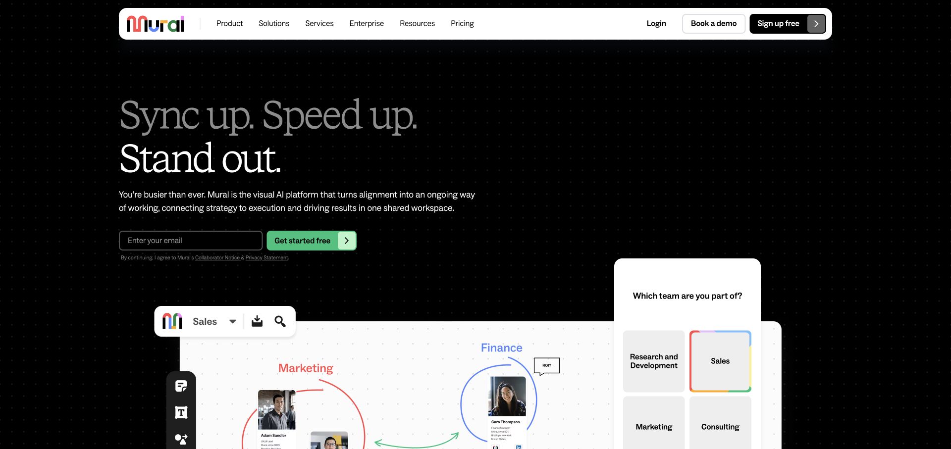
Mural uses a dark dotted field, a floating white navigation capsule, and a large left-aligned proposition. A bright green acquisition action and email field stand apart from the surrounding visual-workspace illustration. Along the lower edge, a white canvas, colored connectors, and example collaborators introduce the working environment. The right-hand prompt card extends that narrative without turning the page into the application itself. Direct Webflow attributes support this public marketing property; the sample collaboration graphics are promotional examples, not a private board or evidence of the editor’s implementation.
What you can learn
Borrow a product’s organizing language, not every detail of its interface. A Webflow marketing component can suggest a canvas while keeping the actual email form and navigation clearly separate from simulated controls. Define a useful static composition for reduced motion and ensure connectors do not dictate an illogical reading order when the layout stacks.
Pros
A solid floating header remains legible against the busy canvas-inspired background.
The green action is visually distinct from the illustrative cards and connectors.
Cons & considerations
Small interface details become harder to read than the central proposition.
Several overlapping elements need deliberate narrow-screen ordering rather than proportional shrinking.
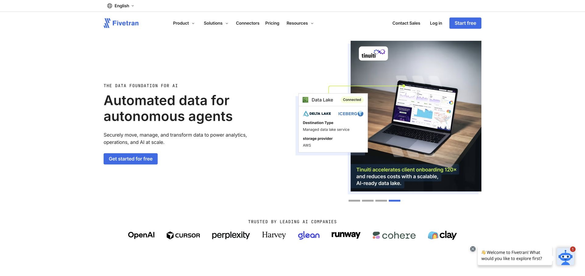
Fivetran puts a small technical eyebrow, a large black headline, explanatory copy, and a blue action in the left column. The right column is a bounded customer-story carousel, captured on a Tinuiti example with a laptop image and a data-related overlay. Segment indicators beneath it show that the story can change without reorganizing the hero. A row of recognizable customer identities follows. The public page exposes Webflow attributes; neither those attributes nor the story artwork establishes how the data-movement service operates or verifies the case study’s outcome claims.
What you can learn
Use a stable story module to connect technical positioning with a concrete organization. In Webflow, keep the customer name, image, caption, destination, and image alternative together so changing slides does not leave mismatched context. Retain direct routes to connectors and documentation for readers who need implementation detail before a sales conversation.
Pros
The two-column layout gives explanation and supporting story distinct roles.
Visible carousel indicators make the presence of additional stories discoverable.
Cons & considerations
Rotating stories can hide the most relevant example unless an index is also available.
Broad AI positioning still requires precise technical documentation beyond the opening screen.
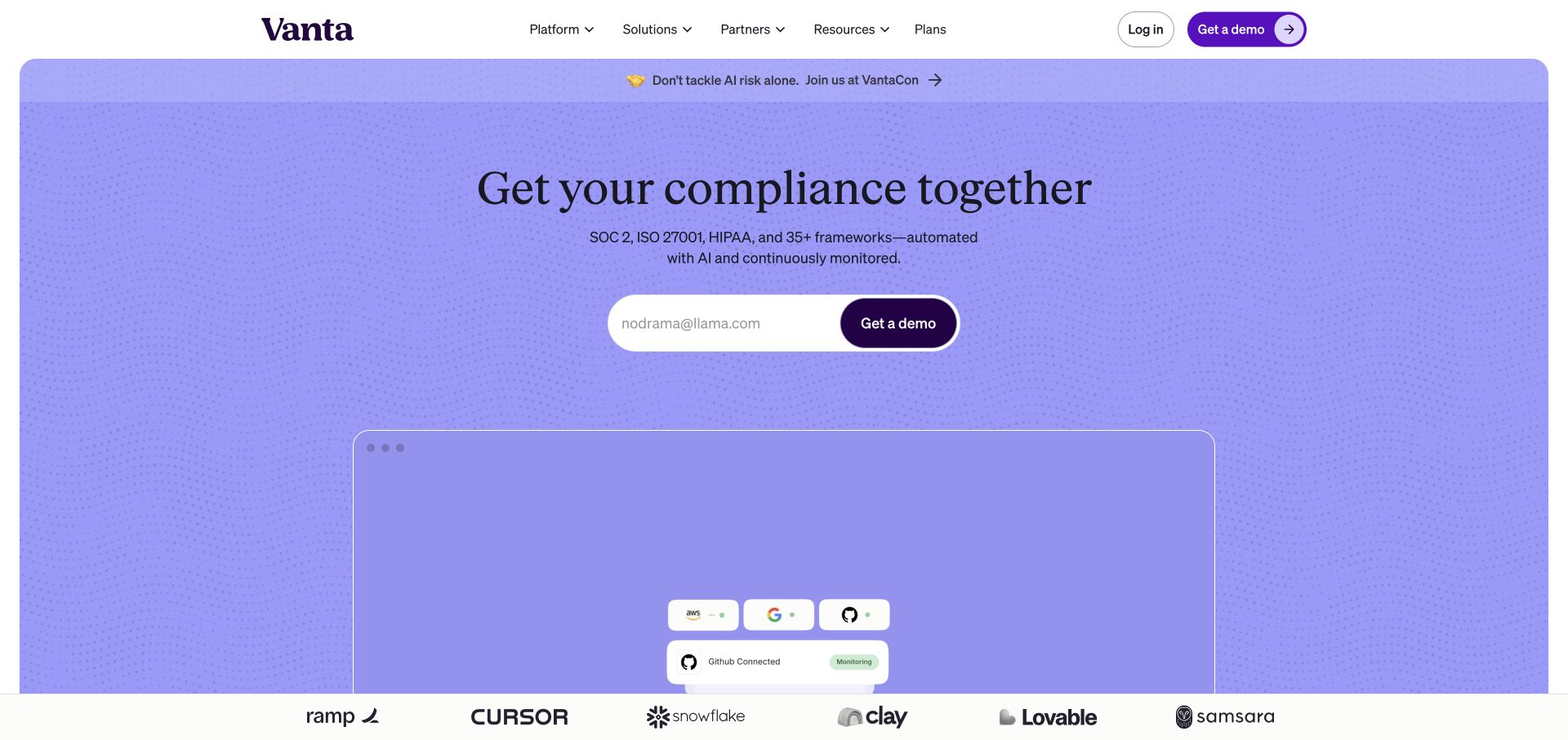
Vanta groups its opening inside a purple panel with rounded corners. A centered serif headline sits above a category description and a white email-entry surface with a purple demonstration action. Pale dotted waves provide texture, while an interface preview enters below the copy. Navigation remains a separate band. Current Webflow document attributes and an official vendor case study support the marketing-site association, not the compliance application. The framework names on the page are product positioning, not certifications established by this visual review.
What you can learn
Contain a lead-generation section so its message, input, action, and illustration read as one unit. A Webflow implementation should define real label text, validation feedback, and the successful handoff as carefully as the rounded frame. Keep illustrative interface details separate from actual form controls, and provide sufficient product explanation for visitors not ready to enter an address.
Pros
The white input surface gives the main action a strong visual boundary.
A consistent purple field ties the headline and preview together without extra card layers.
Cons & considerations
A demonstration-led opening may feel premature to visitors still learning the product category.
The expansive decorative panel delays detailed workflow explanation on smaller viewports.
Public source checked November 3, 2026. References may be embedded or legacy—not a complete backend inventory.
Platform source: Webflow’s official Vanta marketing-site case study. Vendor case study and current document attributes identify the public marketing property, not the compliance application. Platform evidence is separate from the direct website screenshot and is not a complete current infrastructure audit.
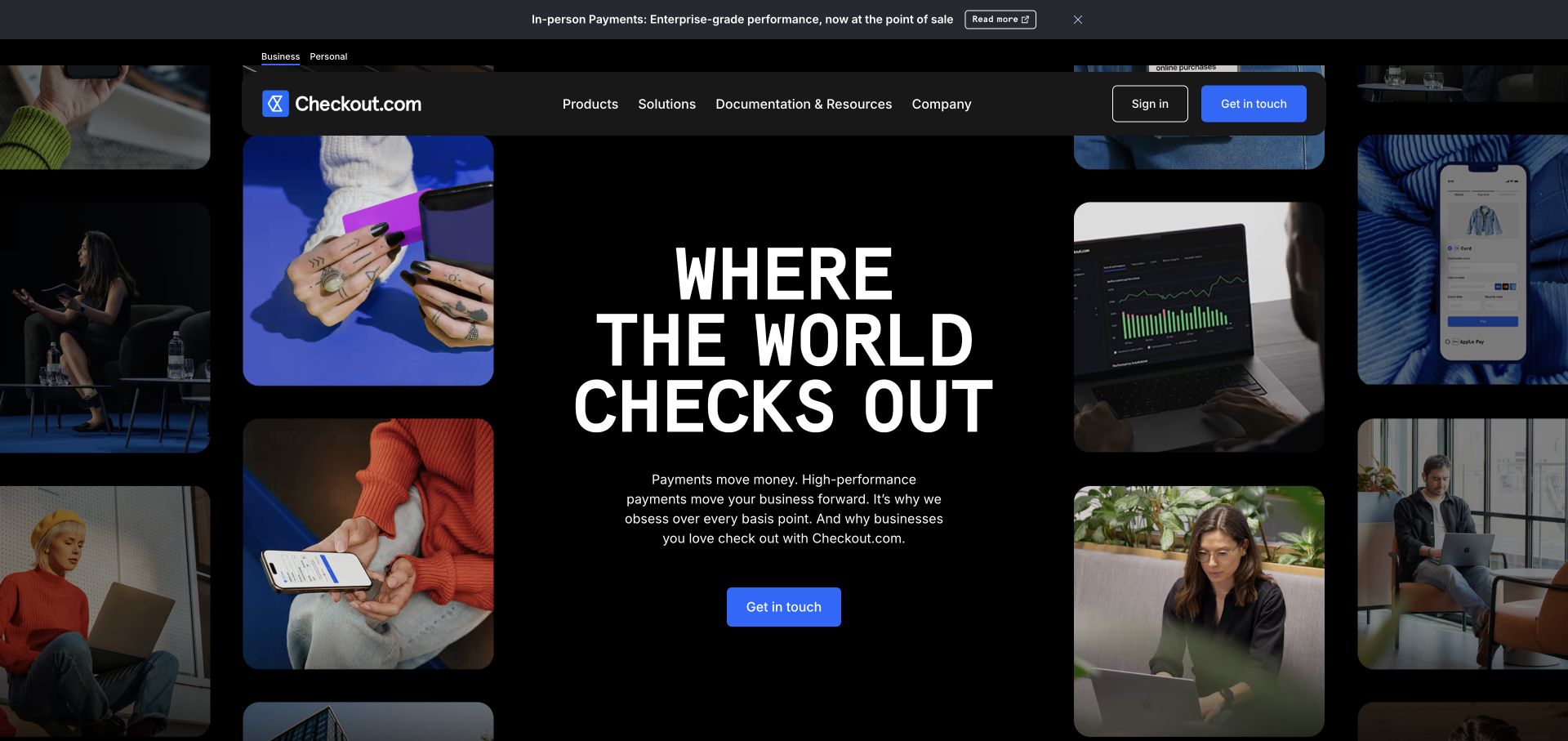
Checkout.com centers a tall white headline and compact supporting paragraph on a nearly black field. Rounded photographs form loose columns around the copy, alternating people, devices, and payment-related scenes. A blue contact action anchors the center, while a dark floating navigation bar stays distinct from the image collage. A narrow announcement band introduces a separate timely message above it. Live Webflow document attributes identify this marketing website. They do not describe the payments network, establish transaction performance, or mean that hosted payment experiences use the same platform.
What you can learn
Use supporting media to frame the primary message without turning each image into a competing destination. A Webflow component library should define safe zones for the text, predictable photo proportions, and a simplified mobile arrangement. Keep campaign announcements independently editable and link broad commercial language to technical and regional detail elsewhere.
Pros
The single blue action has a clear place within the dark central composition.
Rounded image frames make several different photographs feel like a coordinated system.
Cons & considerations
The scattered gallery provides atmosphere more readily than specific product explanation.
The large uppercase headline and surrounding photos require careful rebalancing when the available width contracts.
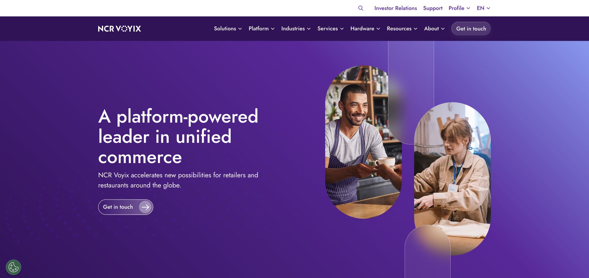
NCR Voyix separates utility destinations from the main product navigation, then uses a purple gradient hero to introduce unified commerce. The left-hand proposition and outlined action face a large arch-shaped photograph of service workers on the right. Fine curved outlines echo the image frame without adding another content column. Solutions, platform, industries, services, hardware, and resources are visible as distinct catalog entry points. Current Webflow attributes support the corporate marketing website only, not the point-of-sale systems, payment handling, or operational platforms being promoted.
What you can learn
Start a complex Webflow build with a maintained navigation taxonomy rather than a collection of disconnected landing pages. Utility links, audience routes, product categories, and sales actions need different priorities. Test the menu with real long labels and clarify which teams own updates, especially when hardware, software, and services share the same corporate identity.
Pros
The utility row prevents support and investor destinations from competing directly with the proposition.
The arch-shaped photograph and restrained linework create a recognizable repeatable hero pattern.
Cons & considerations
Two navigation levels and numerous categories can be demanding for first-time visitors.
The broad unified-commerce promise needs industry-specific examples to become actionable.
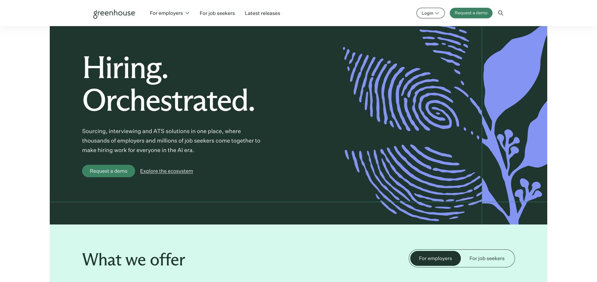
Greenhouse pairs a dark green field and white serif proposition with a purple fingerprint-like plant form. Two actions sit beneath concise supporting copy. The white header separates employer and job-seeker routes, while a pale section entering below introduces product choices. The illustration provides a strong identity without pretending to be a screenshot of the hiring interface. Live Webflow document attributes identify this public marketing property; the visual pattern does not imply biometric collection, and the platform association says nothing about how candidate records or hiring workflows are processed.
What you can learn
Separate audiences before they reach a form. A Webflow navigation system can preserve distinct employer research, candidate help, and account-entry routes while sharing one brand shell. Give the illustration a useful static fallback, and ensure product sections explain concrete tasks rather than repeating the opening metaphor or broad category language.
Pros
Employer and job-seeker destinations are explicit in the header.
The large purple form establishes visual character without filling the hero with tiny interface labels.
Cons & considerations
The metaphor supplies identity more than practical detail about the product.
A substantial decorative column needs intentional scaling so the explanatory text remains the priority on phones.
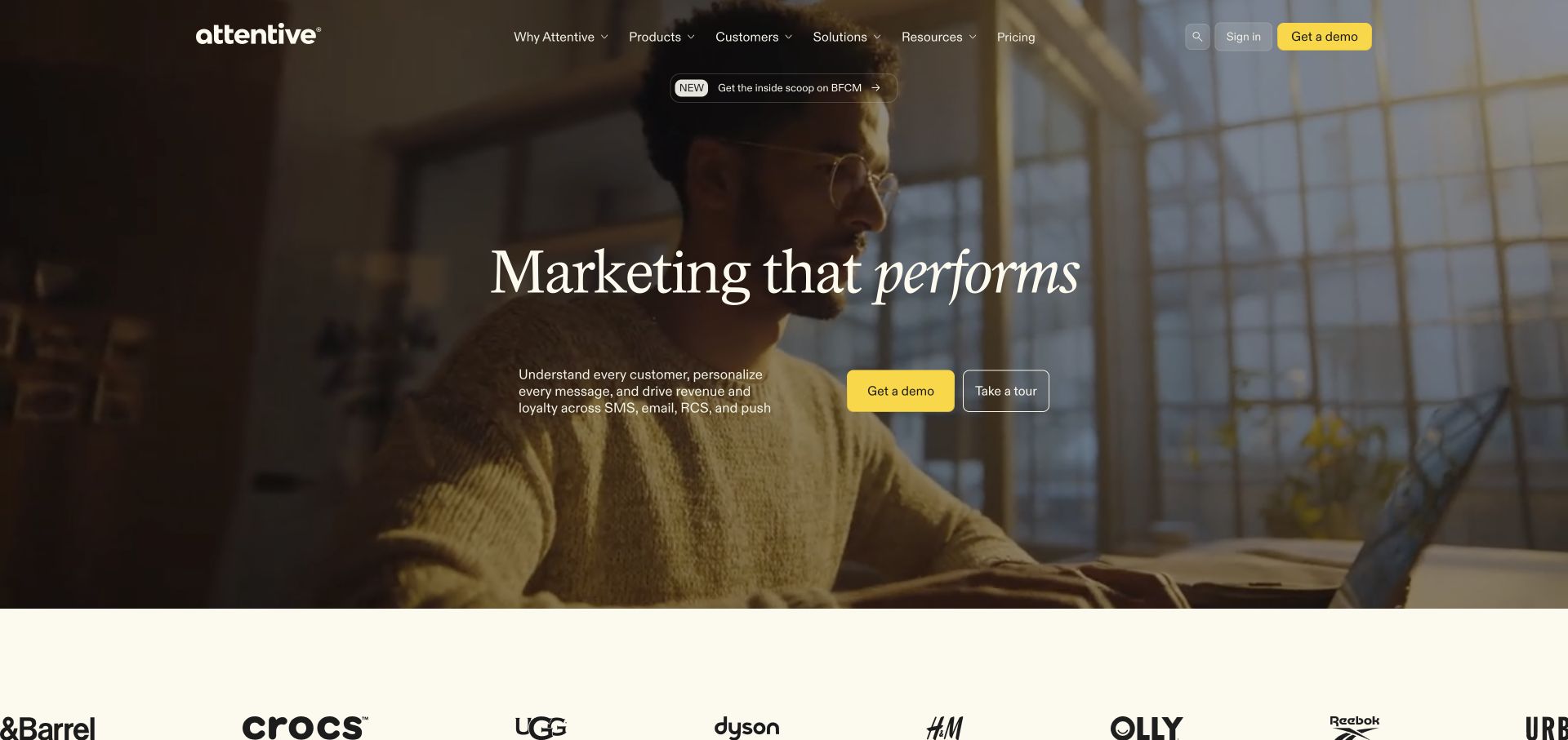
Attentive overlays a cream serif headline on a warm, full-width film frame of someone using a phone. An announcement pill sits above the proposition, with a short paragraph and paired demonstration and tour actions below. The yellow filled action has a different weight from the outlined alternative. A pale customer-logo strip begins after the media area. Current Webflow document attributes verify this public marketing website, not the messaging platform or its AI systems. The filmed scene is promotional content rather than evidence of a particular recipient, customer conversation, or campaign result.
What you can learn
Keep a moving campaign’s essential message and actions fixed while the background changes. In Webflow, design the still image, text-safe area, motion controls, and narrow-screen crop together. Distinguish a sales conversation from a self-directed tour, and follow an emotional opening with specific product explanations and permission-related information.
Pros
The yellow demonstration control remains recognizable against the darker moving background.
The customer strip provides a clear visual transition into the next content section.
Cons & considerations
Text contrast must remain reliable across every film frame, not just the captured image.
Lifestyle footage explains the setting more than the mechanics of the marketing workflow.
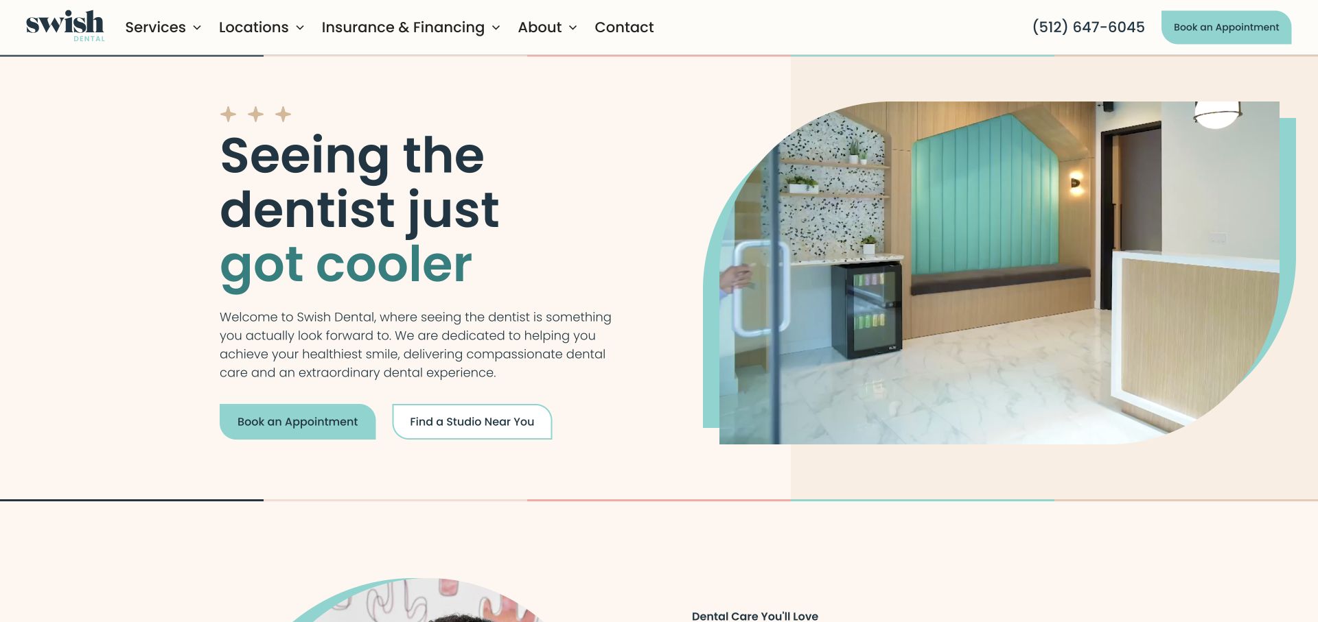
Swish Dental pairs a large navy-and-teal introduction with a studio-interior image inside a strongly rounded geometric frame. A cream canvas and repeated curved button corners tie the two halves together. The header exposes services, locations, and insurance information, while booking and finding a studio are distinct actions beneath the text. Public site CSS and scripts support the Webflow association. The visible composition does not establish whether these particular sections use CMS Collections or how the separate appointment journey is implemented.
What you can learn
A Webflow section library should preserve the useful relationship between explanation, media, and actions when content changes. Test the shaped crop with several images rather than building around one perfect frame. Keep locations and service details in a repeatable content structure, and demonstrate their editing workflow instead of assuming a visual canvas automatically provides it.
Pros
The filled booking button and outlined studio-finding button communicate different tasks.
A solid header keeps phone and patient-information routes independent of imagery.
Cons & considerations
The distinctive crop needs deliberate adjustment for narrow screens.
Repeated appointment controls can become distracting if every section uses the same emphasis.
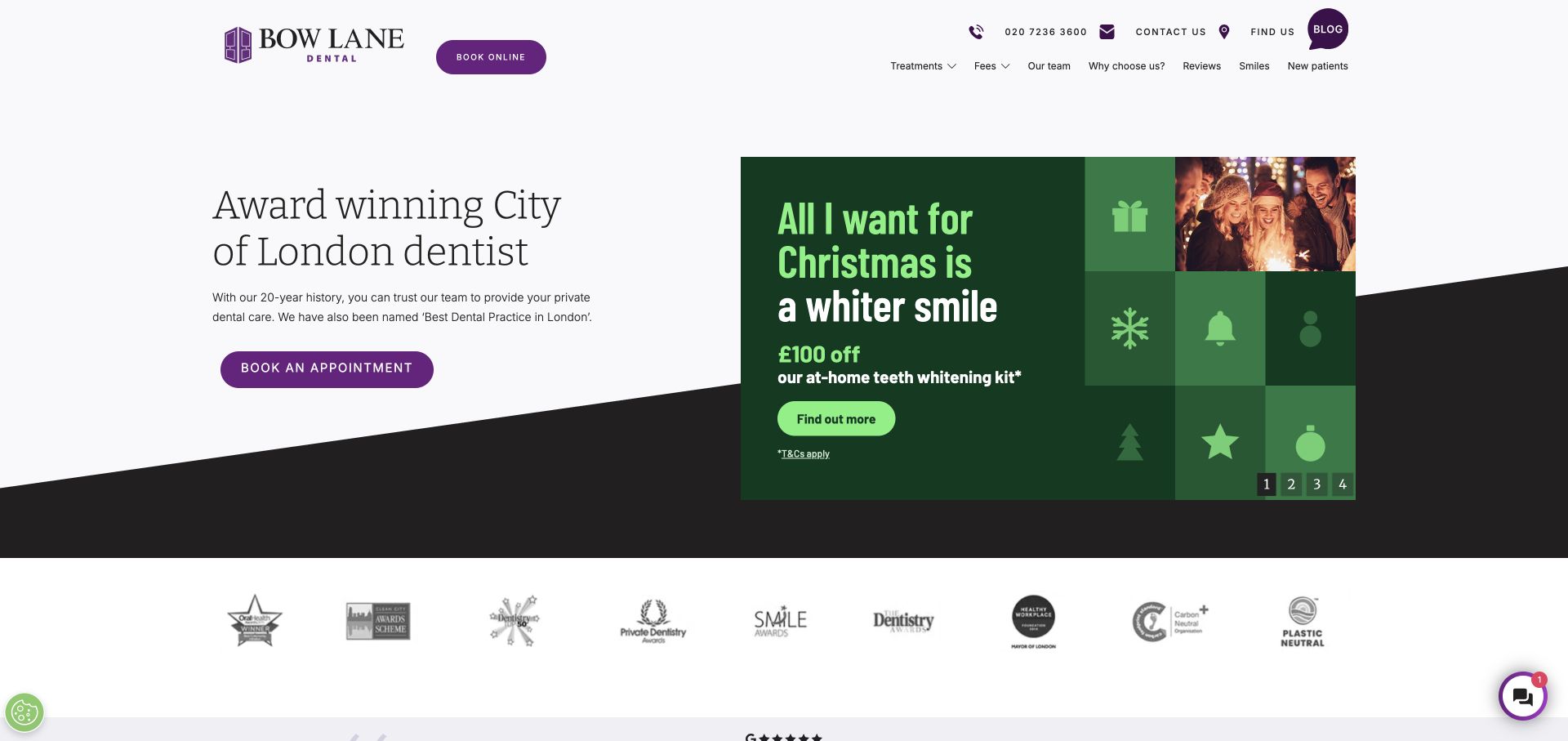
Bow Lane Dental divides the opening between a pale, text-led practice introduction and a large green seasonal offer. Purple connects the identity and appointment actions, while an angled dark band gives the two-column layout a distinctive base. Fees, new-patient information, reviews, location, and contact routes remain visible above. A separate strip holds third-party marks below the campaign. Named Webflow delivery assets support the platform association; the offer’s terms and the displayed awards are site statements, not results verified by this review.
What you can learn
Model the campaign as replaceable content beside a durable service introduction. An editor should be able to retire an offer without disrupting the appointment route or the surrounding layout. Check long terms, missing campaign artwork, and the stacked mobile order before considering the reusable section complete.
Pros
Permanent patient information has a clear place outside the temporary promotion.
The split layout lets campaign creative change independently of the introduction.
Cons & considerations
The offer can outweigh the more durable explanation of the practice.
Small terms and numerous marks need restraint to remain useful rather than decorative clutter.
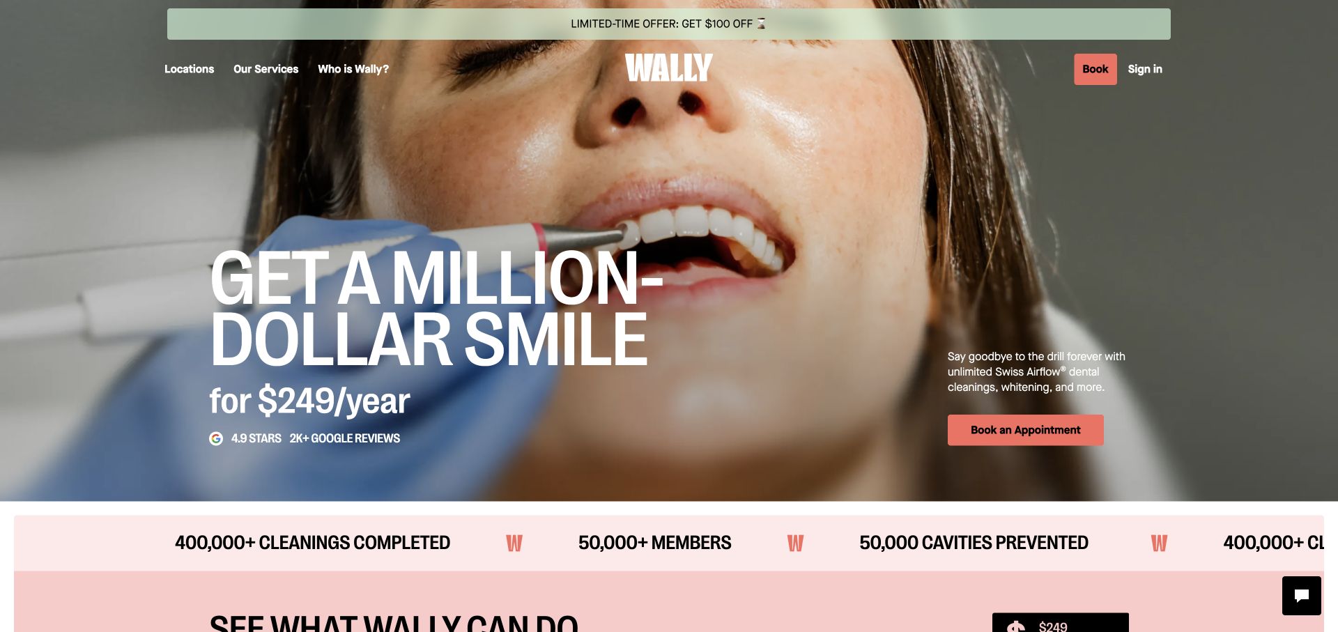
Wally places a large annual-membership proposition over a close-up dental-treatment image. Condensed white type, coral booking controls, and a pale promotional strip establish a forceful hierarchy. The centered wordmark divides informational navigation from booking and account entry, while another claim strip begins underneath the photograph. The public page loads Webflow site assets. That is a platform observation, not validation of clinical claims, the pictured person’s identity, membership suitability, or the systems behind appointments and accounts.
What you can learn
For a membership-led Webflow build, make price, inclusions, exclusions, and the next step separately maintainable. Keep the offer understandable as real text and ensure a campaign edit cannot leave outdated conditions elsewhere on the page. Do not let a large headline replace the detailed information someone needs before deciding to subscribe.
Pros
The membership model is immediately visible rather than hidden in a pricing page.
Account entry is distinct from the main appointment action.
Cons & considerations
Close-up treatment imagery will not reassure every visitor.
The promotion and scrolling claims can compete with information that needs slower, careful reading.
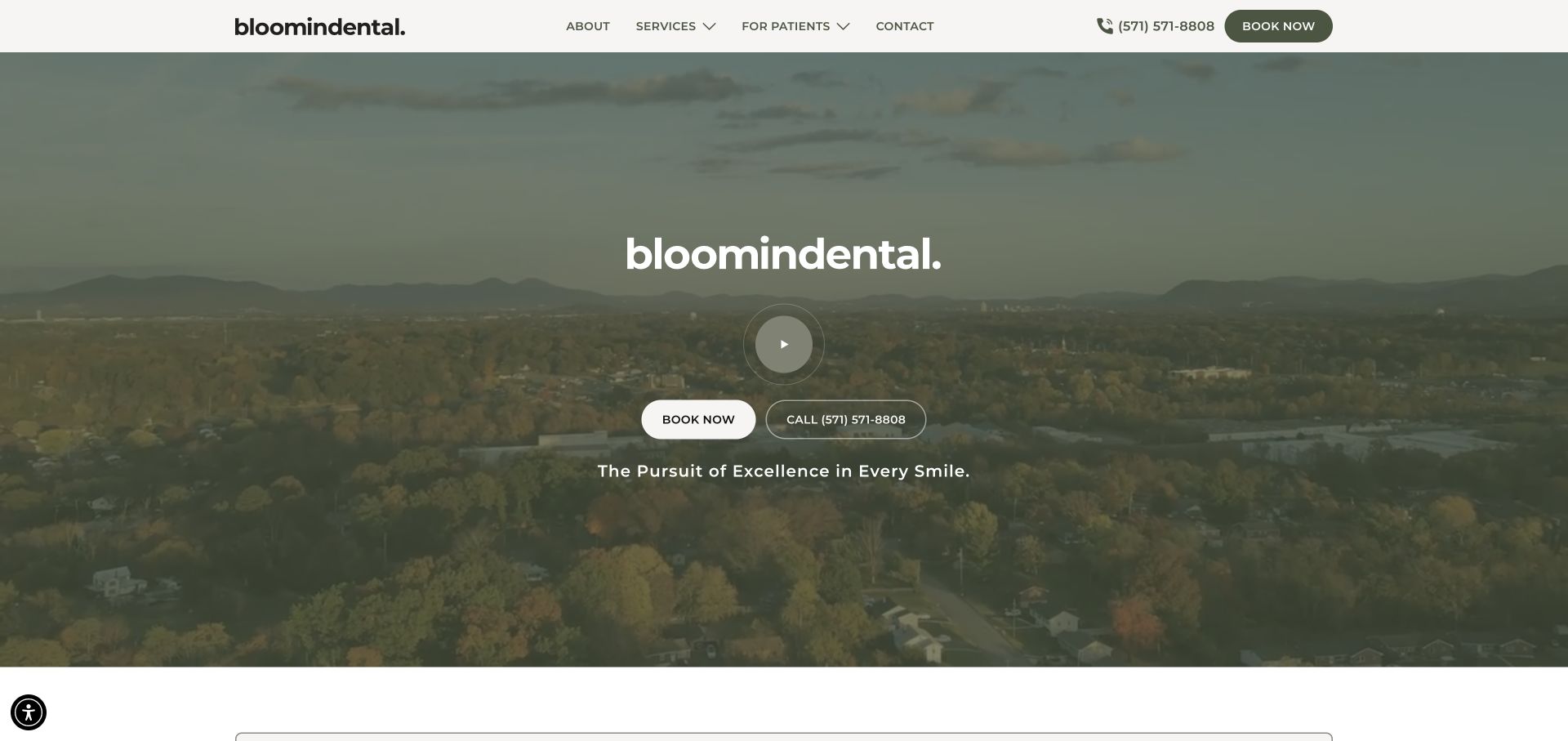
bloomindental places a centered identity and circular play control over a broad landscape view with an olive-toned overlay. Booking and telephone actions sit together beneath, using different button treatments. The solid pale masthead preserves about, services, patient information, contact, and phone links independently of the moving background. Webflow site assets and dropdown structure are publicly observable. The landscape is an atmospheric design choice; the capture does not establish its geographic relationship to the practice or the implementation of clinical and booking systems.
What you can learn
Separate the stable navigation component from replaceable media and campaign copy. In a Webflow handover, demonstrate the still-image fallback, long supporting text, and an image with a different focal point. The same section should retain a clear service explanation when a visitor never presses play or prefers reduced motion.
Pros
The solid header protects practical links from changing background contrast.
Calling and online booking are presented as recognizable alternatives.
Cons & considerations
The opening provides little immediate detail about individual services.
The large play control adds another decision before the visitor understands much about the practice.
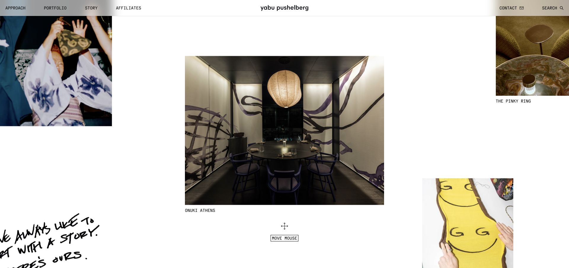
Yabu Pushelberg arranges photographs and fragments across a spacious white field rather than a regular card grid. A larger interior image anchors the middle, while smaller project, object, and process imagery sits around the edges. Brief captions supply context, and a movement prompt makes the exploratory interaction explicit. A narrow header still offers portfolio, approach, story, affiliates, contact, and search routes. The public Webflow site attribute supports the platform association, but does not establish how the spatial interface is coded or how projects are stored.
What you can learn
A visual builder can support an expressive presentation, but the project model and dependable browsing route still matter. Specify captions, destinations, keyboard access, and an alternate small-screen arrangement before polishing movement. Preserve a conventional portfolio index so someone researching a specific commission does not have to navigate an exploratory canvas.
Pros
Different image scales communicate a featured subject and supporting material.
Captions and the top-level portfolio route provide context beyond the imagery.
Cons & considerations
A movement-led field is less predictable than a standard project list.
Off-edge imagery and large gaps need a deliberate touch-screen alternative.
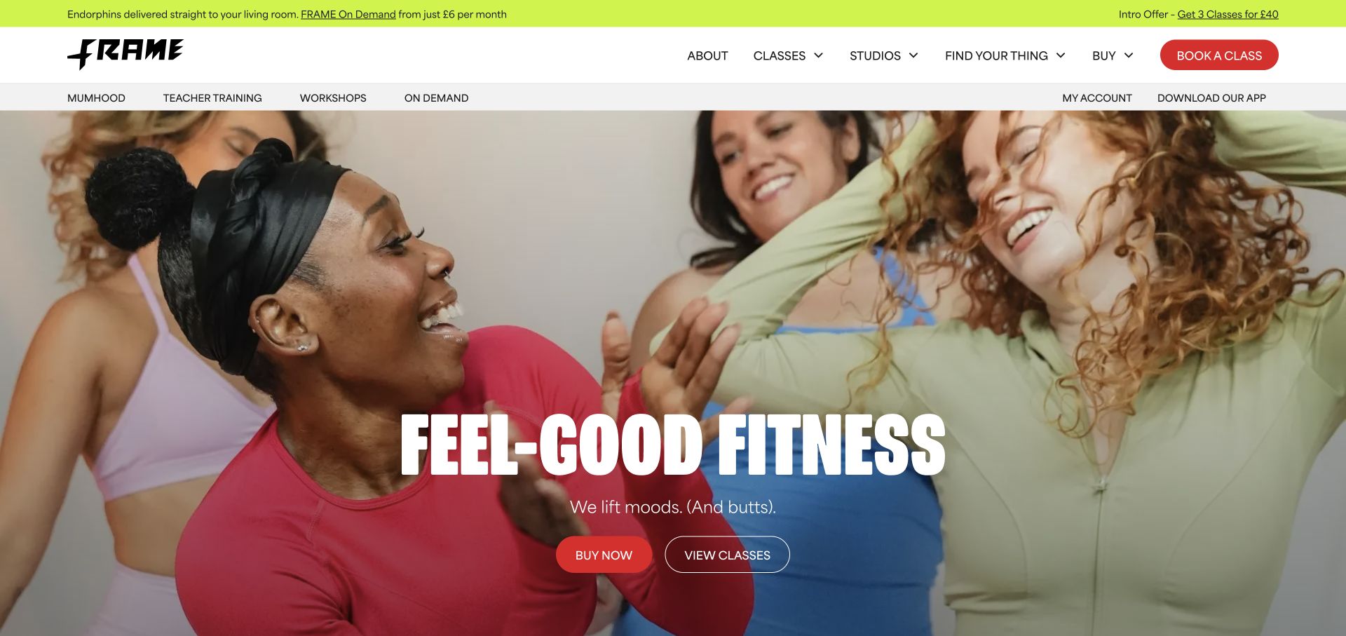
Frame uses a lively group photograph, oversized condensed white type, red rounded actions, and a lime utility strip. The central opening distinguishes buying from viewing classes. Above, classes and studios have their own navigation categories, while another row accommodates workshops, on-demand material, account entry, and the app. The expressive imagery is balanced by familiar task labels. Matching Webflow site assets support the platform association, not the implementation of schedules, transactions, or account systems behind the public page.
What you can learn
A Webflow navigation system should distinguish the everyday catalog from occasional programs before adding more menu items. Give each offering a maintained title, destination, and place in the hierarchy. Demonstrate how a new program appears on mobile and how an expired promotion is removed without changing the essential class and studio routes.
Pros
Class browsing is available alongside a higher-commitment purchasing action.
The palette and typography remain coherent across several interface bands.
Cons & considerations
Three header layers consume significant space before the main introduction.
A growing program menu can make occasional offerings compete with routine class discovery.
Choose the right amount of visual and custom development
Use a restrained component library for a marketing site
Build the handful of sections the team repeatedly needs. Establish which content is freeform and which belongs in a Collection. A smaller, well-tested library can be easier to maintain than dozens of nearly identical variants.
Use CMS templates for a growing editorial library
Test the actual article, case study, or directory model with incomplete content and varied media. Give index pages, related items, empty states, and search their own attention instead of treating a detail template as the whole content system.
Specify custom behavior as an integration
Custom embeds and scripts introduce code that needs review and maintenance. Webflow’s CMS custom-code guidance describes limitations and possible conflicts; test published behavior and record who owns it rather than assuming visual-editor support covers the code.
Brief the editor experience as carefully as the layout
Run a content-model workshop
Have the actual editor enter a real article or project. Check field names, image crops, optional sections, links, and the difference between draft and live content. Revise the model before filling it with migrated material.
Trace every conversion destination
For an inquiry, signup, booking, or purchase, identify the receiving system, confirmation message, failure state, and data owner. A styled form on the page is not evidence that leads arrive in the right place.
Plan the move and the ownership
Inventory old URLs, redirects, search metadata, analytics, consent requirements, domains, and access. Include ongoing changes to third-party scripts and integrations in the support agreement, not just visual page edits.
A useful handover demonstration
Ask the actual team to carry out its routine job: publish a realistic update, correct a mistake, preview a narrow screen, and identify who owns an integration failure. For a library or frontend framework, also ask who maintains the content source and deployment. A polished screenshot does not answer those operational questions.
Beyond the screenshot
Before a Webflow site goes live
Test reusable sections with long and missing content.
Review Collection templates, indexes, pagination, and empty states.
Use keyboard navigation through menus, dialogs, and forms.
Check reduced motion, media dimensions, and narrow-screen reading order.
Verify real form delivery and any separate booking or commerce service.
Review custom scripts on the published site, not only the canvas.
Test old-to-new URL redirects and page-specific metadata.
Document access, publishing permissions, integrations, and rollback.
Test with real content, a keyboard, a small screen, slow or failed requests, and the people who will maintain the system. These are planning checks, not an accessibility, security, performance, or search-ranking certification.
Sources & editorial method
How this Webflow collection was reviewed
Examples use direct website captures and public generator metadata, Webflow asset signals, or an attributed official project source. The observations concern the selected public page, not the platform behind every linked service.
Every image is an unmodified capture from the actual website, with its source and capture date. Some captures are reused from our shared catalog; their dates remain the original capture dates. None comes from a vendor gallery or a generated reconstruction. Moving imagery and live content can change.
Technology attribution uses public page assets or metadata, official platform documentation, or a cited first-party project case study. Documentary and framework-relationship evidence is identified where used; it is not a complete current backend inventory. A CMS image CDN alone does not establish a full CMS deployment. A library’s presence does not prove which individual controls use it, and a platform label does not establish AI authorship.
The composition notes, lessons, pros and tradeoffs are original editorial observations. We have not measured conversion, traffic, security, performance or accessibility conformance. Website owners retain their brands and imagery; these examples are not our client portfolio. Written, Edited and Curated are independent records, not dates advanced by a build. See our editorial standards or suggest a correction.
Questions worth asking
Webflow website development FAQs
Is Webflow only useful for landing pages?
The examples include broader marketing and content properties. Suitability depends on the content model, integrations, editing requirements, and current project limits—not the number of attractive homepage sections.
Will Webflow automatically make a site accessible?
No platform label is an accessibility certification. Content, contrast, semantic structure, keyboard behavior, and custom interactions still require review.
Should every section be editable?
Make routine business changes editable within useful boundaries. Unlimited layout freedom can create inconsistent pages; locked content can create unnecessary developer dependence.
Can I reproduce every effect in these examples?
Treat an effect as a design reference, not a guaranteed built-in feature. Ask how it is implemented, maintained, and presented when motion or JavaScript is unavailable.