A useful GSAP reference starts with a strong page underneath the motion. Typography, images, navigation, and calls to action should make sense before a timeline begins. Animation can connect those pieces, but it cannot replace their explanation.
These examples load identifiable GSAP resources on the named public property. That is a scoped implementation signal, not proof that every visible effect uses GSAP or that the wider organization uses the same stack. The static captures support observations about composition; they do not document animation timing.
Use this collection to decide what motion should help a visitor understand. A product demonstration, a spatial transition, and a decorative entrance have different jobs. Write that job into the brief, then test whether the page remains useful when movement is reduced or unavailable.
Before the examples
What makes good GSAP website development in 2026?
Give each animated sequence one intelligible purpose
Describe the information the visitor should gain from movement: where an object went, how parts relate, or which step comes next. If the only explanation is that a competitor moves its heading, reconsider the sequence. Approve the static hierarchy first, including the main heading and primary action. Avoid hiding essential copy behind an interaction visitors may never perform. A decorative flourish should have a clearly limited role and a straightforward removal path.
Provide a considered reduced-motion version
Reduced motion is a design state, not simply a shorter duration. Specify which elements become static, which transitions remain necessary for orientation, and how a pinned story becomes normal readable content. GSAP matchMedia can associate animation setup with media queries and revert the recorded work when conditions change. Review the alternative with the same attention as the full animation, including links, focus, and any content originally revealed in stages.
A visitor arriving through a deep link should be able to identify the page and act immediately. Test a reload halfway down, a browser Back action, a quick scroll, and a narrow screen. Keep persistent navigation understandable while the content moves. Do not turn an ordinary link into a delay while an exit sequence finishes unless the delay has a clear purpose and an accessible alternative.
The collection · 20 examples
20 GSAP website examples worth studying
Study the underlying page system in these direct captures. The accompanying source notes identify a GSAP resource on each public property; they do not attribute individual effects, measure performance, or describe private implementation details.
We start with five recognizable brands or organizations: The Harvard Gazette, UNICEF, TEDAI Vienna event, NCR Voyix corporate website, Checkout.com marketing website. Each attribution applies to the named website property, not every product or website belonging to its organization. This is a curated reading sequence, not a measured ranking.
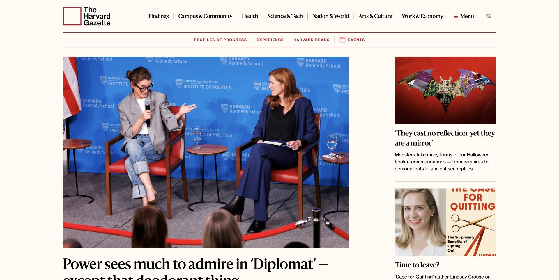
The Harvard Gazette uses a compact university masthead and a broad subject navigation above a deliberately uneven story grid. The main interview photograph is much larger than the adjacent illustrated and portrait stories, so a reader can distinguish the lead item without watching a transition. Thin rules, restrained color, and serif headlines preserve the feel of a publication rather than a software demonstration. The current homepage references a named GSAP library asset; that observation does not establish which element uses it or whether any particular interaction improves readership.
What you can learn
Start an animated editorial brief with this kind of static reading order. The lead story, secondary items, and subject navigation should remain understandable before scripts run and when motion is reduced.
Pros
Different image sizes establish a clear priority among competing stories.
Conventional subject labels keep the publication useful beyond its lead photograph.
Cons & considerations
The dense upper navigation needs careful treatment when space is limited.
A strong photograph can push the headline toward the fold; review real crops and headline lengths.
PHPCMS dependency association; runtime not independently observed
Earlier cited evidence retained; no current scan result. References may be embedded or legacy—not a complete backend inventory.
Platform source: Direct public page source; named library reference. Public page source reviewed on 2026-11-03 references the named GSAP library script https://cdn.jsdelivr.net/npm/gsap@3.14.2/dist/gsap.min.js?ver=3.14.2. This is evidence of a loaded frontend component; it does not identify every animation, prove runtime execution, or describe the whole organization’s stack. Platform evidence is separate from the direct website screenshot and is not a complete current infrastructure audit.
UNICEF gives a campaign photograph most of the opening screen while retaining a bright blue institutional header. The image is emotionally direct, and its caption sits on a dark backing that separates the words from the changing photographic tones. Donation and press actions occupy the upper utility area instead of being mixed into the main campaign statement. Public homepage source references GSAP and ScrollTrigger assets. This is evidence of loaded frontend components, not a finding about the technology behind donations or UNICEF’s broader operations.
What you can learn
Make the important message and action available in the resting composition before adding a reveal. If a campaign changes, recheck the caption backing, image crop, and utility controls against the actual replacement photograph.
Pros
Brand color keeps institutional identity visible above a large image.
Separate utility actions distinguish donating from press and research tasks.
Cons & considerations
An image-dominated opening can delay access to detailed background information.
A campaign photograph needs a useful text alternative and careful narrow-screen cropping.
PHPCMS dependency association; runtime not independently observed
Earlier cited evidence retained; no current scan result. References may be embedded or legacy—not a complete backend inventory.
Platform source: Direct public page source; named library reference. Public page source reviewed on 2026-11-03 references the named GSAP library script https://cdnjs.cloudflare.com/ajax/libs/gsap/3.10.4/gsap.min.js. This is evidence of a loaded frontend component; it does not identify every animation, prove runtime execution, or describe the whole organization’s stack. Platform evidence is separate from the direct website screenshot and is not a complete current infrastructure audit.
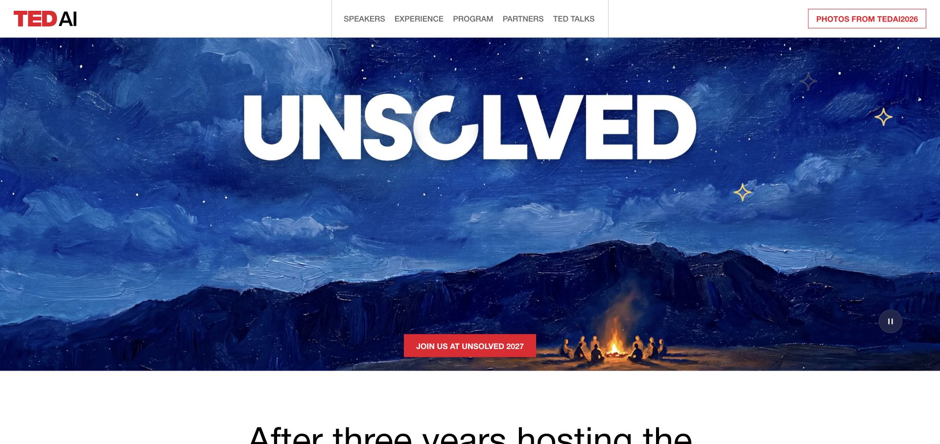
TEDAI Vienna’s captured opening combines a small white navigation bar with an expansive blue landscape and a very large event theme. Speakers, experience, program, and partners remain separate routes above the scene. A contrasting red invitation gives the otherwise atmospheric view a practical destination, while a visible pause control acknowledges that the media is more than a still background. The source loads named GSAP components alongside its Webflow delivery. That identifies a component relationship, without attributing every visual effect to one library or treating the event site as TED’s entire technical stack.
What you can learn
Keep the edition, action, and information routes independent of the spectacle. An animation plan should specify a useful paused view and preserve the visitor’s ability to reach dates, speakers, and program details immediately.
Pros
A restrained navigation bar makes the event information easy to locate.
The single contrasting action stands apart from the expansive blue artwork.
Cons & considerations
Large theme lettering can communicate less practical information than a descriptive subtitle.
Edition changes require deliberate review so old media and next-event links remain consistent.
Public source checked November 3, 2026. References may be embedded or legacy—not a complete backend inventory.
Platform source: Direct public page source; named library reference. Public page source reviewed on 2026-11-03 references the named GSAP library script https://cdn.prod.website-files.com/gsap/3.15.0/gsap.min.js. This is evidence of a loaded frontend component; it does not identify every animation, prove runtime execution, or describe the whole organization’s stack. Platform evidence is separate from the direct website screenshot and is not a complete current infrastructure audit.
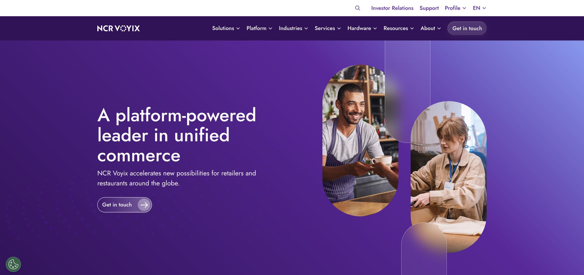
NCR Voyix places a concise commerce message on the left of a purple field and a pair of rounded image windows on the right. People and retail settings give the abstract platform wording a tangible context. The page separates investor, support, and profile utilities from the deeper product navigation, leaving the main contact action inside the hero. The current source references GSAP and ScrollTrigger scripts. The association is limited to the public corporate page; it says nothing about point-of-sale applications or the infrastructure operating customer transactions.
What you can learn
Use a stable two-part composition to decide where motion would help explanation. Keep the headline and contact action readable while imagery changes, and review any clipped image shape with several real photographs.
Pros
The split composition gives the primary message its own uncluttered space.
Utility links are separated from product discovery and sales contact.
Cons & considerations
A broad platform claim still needs specific product explanations further down the page.
Rounded image masks can crop useful contextual details on smaller screens.
Public source checked November 3, 2026. References may be embedded or legacy—not a complete backend inventory.
Platform source: Direct public page source; named library reference. Public page source reviewed on 2026-11-03 references the named GSAP library script https://cdn.prod.website-files.com/gsap/3.15.0/gsap.min.js. This is evidence of a loaded frontend component; it does not identify every animation, prove runtime execution, or describe the whole organization’s stack. Platform evidence is separate from the direct website screenshot and is not a complete current infrastructure audit.
Checkout.com surrounds a centered white headline with a mosaic of commerce scenes and product imagery. The black center gives the short statement room to remain legible even though there is substantial visual activity around it. A blue contact action repeats the strongest accent in the navigation, and the business versus personal distinction appears above the main menu. Public source includes a named GSAP asset. This is a frontend observation about the marketing page, not a review of payment processing, security certification, or the company’s complete software stack.
What you can learn
Define a protected reading area before animating a surrounding media system. The message, supporting sentence, and action should keep their position and contrast while peripheral imagery provides context.
Pros
The dark central zone prevents the surrounding pictures from swallowing the headline.
One strong blue accent consistently identifies the commercial next step.
Cons & considerations
A collage introduces many image assets whose loading order needs deliberate planning.
Short campaign language should be followed by concrete explanations for different merchant needs.
Public source checked November 3, 2026. References may be embedded or legacy—not a complete backend inventory.
Platform source: Direct public page source; named library reference. Public page source reviewed on 2026-11-03 references the named GSAP library script https://cdnjs.cloudflare.com/ajax/libs/gsap/3.12.2/gsap.min.js. This is evidence of a loaded frontend component; it does not identify every animation, prove runtime execution, or describe the whole organization’s stack. Platform evidence is separate from the direct website screenshot and is not a complete current infrastructure audit.
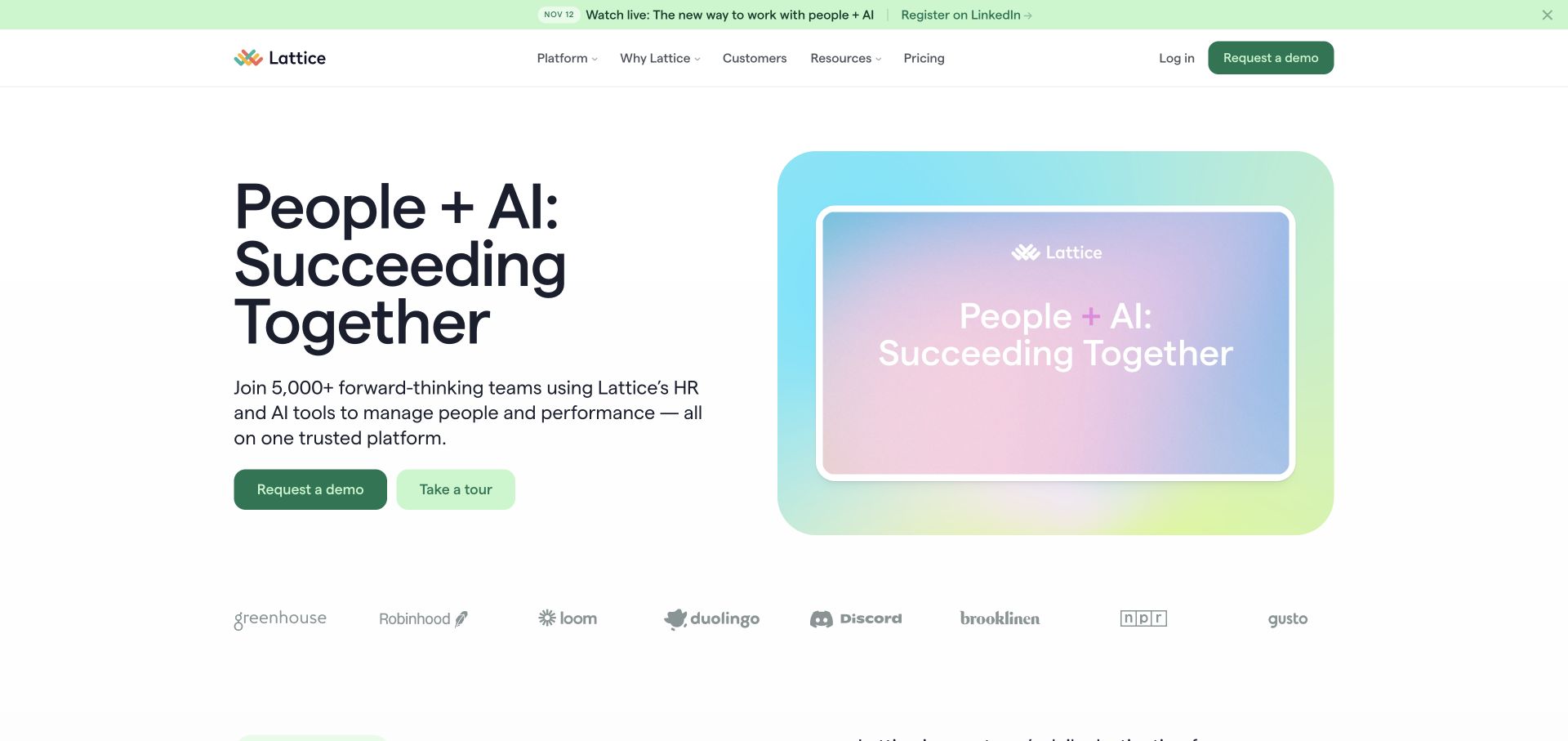
Lattice’s opening pairs a compact headline and supporting explanation with a softly colored product-media panel. The two green actions are differentiated enough to suggest a sales conversation and a lighter tour, and a small row of customer marks sits underneath rather than interrupting the main message. Most of the surrounding page remains white, allowing the gradient panel to be a clear focal point. Current source references several named GSAP plugins. Their presence alone does not show which transitions are active, and this review does not measure conversion or application usability.
What you can learn
Use the static division between explanation and demonstration to plan animation boundaries. Give the media panel a meaningful initial frame, then keep both action routes usable while its content changes or fails to load.
Pros
Copy and product media occupy clearly separated areas.
Two distinct actions accommodate visitors at different levels of readiness.
Cons & considerations
A soft abstract media treatment may need a clearer product example nearby.
Customer marks should supplement specific evidence rather than carry the whole trust argument.
Public source checked November 3, 2026. References may be embedded or legacy—not a complete backend inventory.
Platform source: Direct public page source; named library reference. Public page source reviewed on 2026-11-03 references the named GSAP library script https://cdn.prod.website-files.com/gsap/3.15.0/gsap.min.js. This is evidence of a loaded frontend component; it does not identify every animation, prove runtime execution, or describe the whole organization’s stack. Platform evidence is separate from the direct website screenshot and is not a complete current infrastructure audit.
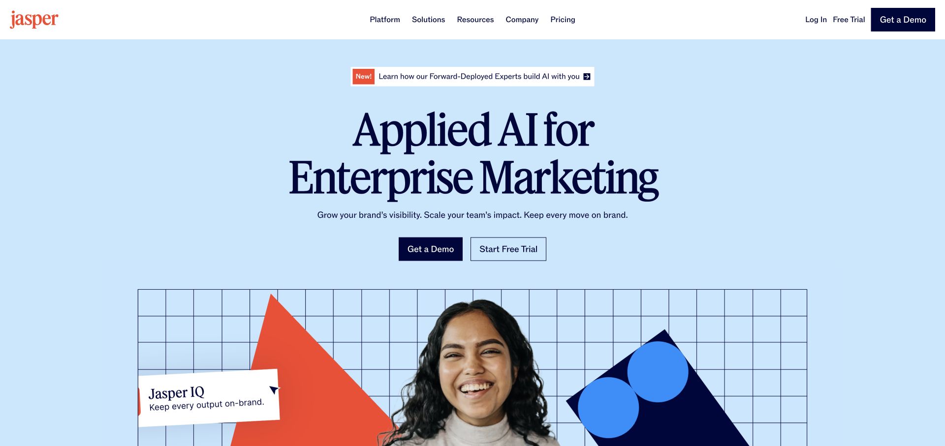
Jasper gives a large serif headline a pale blue field and a generous amount of empty space. The enterprise-marketing subject is stated before the visitor reaches a collage of people, geometry, and interface elements. The header uses compact conventional labels, while the demo and trial actions repeat beneath the main explanation. The current page includes named GSAP assets, including interaction-related plugins; that does not establish which plugin controls the captured arrangement. The example concerns the public marketing site, not the behavior or quality of generated material inside the product.
What you can learn
Animate around a clear, already visible proposition. A visitor should understand the audience and choose a trial or conversation without waiting for the illustrative composition to assemble.
Pros
Strong type and a calm background make the product positioning easy to scan.
The media begins below the actions, preserving their prominence.
Cons & considerations
A visually rich collage can compete with more concrete product explanations.
Multiple introductory announcements need an editorial owner so the main promise stays focused.
Public source checked November 3, 2026. References may be embedded or legacy—not a complete backend inventory.
Platform source: Direct public page source; named library reference. Public page source reviewed on 2026-11-03 references the named GSAP library script https://cdn.jsdelivr.net/npm/gsap@3.13.0/dist/gsap.min.js. This is evidence of a loaded frontend component; it does not identify every animation, prove runtime execution, or describe the whole organization’s stack. Platform evidence is separate from the direct website screenshot and is not a complete current infrastructure audit.
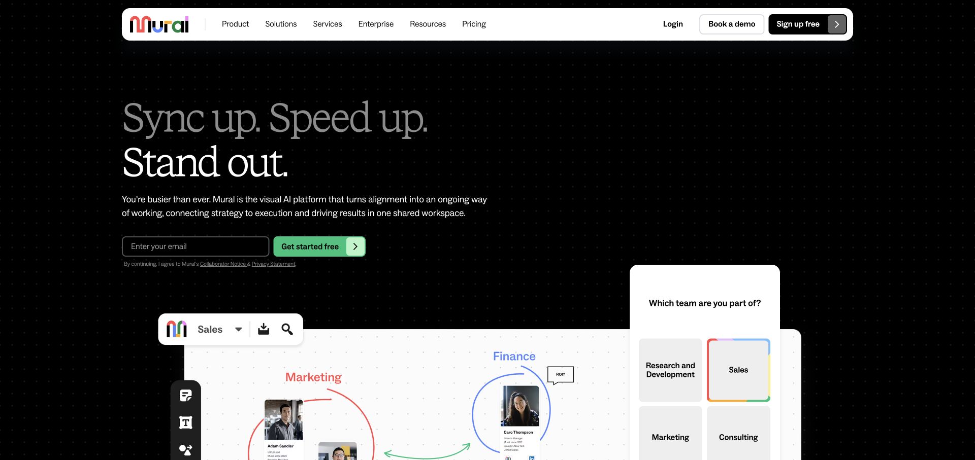
Mural’s dark opening places a compact text block above a large, bright workspace illustration. The white navigation bar and the white canvas create useful anchors inside the darker visual field. Small interface labels and a visible team-selection panel connect the abstract promise of collaboration with recognizable work. A named GSAP and ScrollTrigger pair appears in the current source, but the screenshot does not prove how any transition is implemented. The visible canvas is a marketing illustration, not a tested session in the private collaboration product.
What you can learn
Make an animated demonstration explain one task at a time. Preserve a readable static frame and distinguish decorative product media from controls that the visitor can actually operate.
Pros
A bright product canvas gives the abstract headline an immediate visual example.
The dark surrounding field makes the main content hierarchy easy to identify.
Cons & considerations
Tiny interface text may be illegible when the media is reduced to a phone width.
A demonstration that resembles a live application needs clear interaction expectations.
Public source checked November 3, 2026. References may be embedded or legacy—not a complete backend inventory.
Platform source: Direct public page source; named library reference. Public page source reviewed on 2026-11-03 references the named GSAP library script https://cdn.prod.website-files.com/gsap/3.15.0/gsap.min.js. This is evidence of a loaded frontend component; it does not identify every animation, prove runtime execution, or describe the whole organization’s stack. Platform evidence is separate from the direct website screenshot and is not a complete current infrastructure audit.
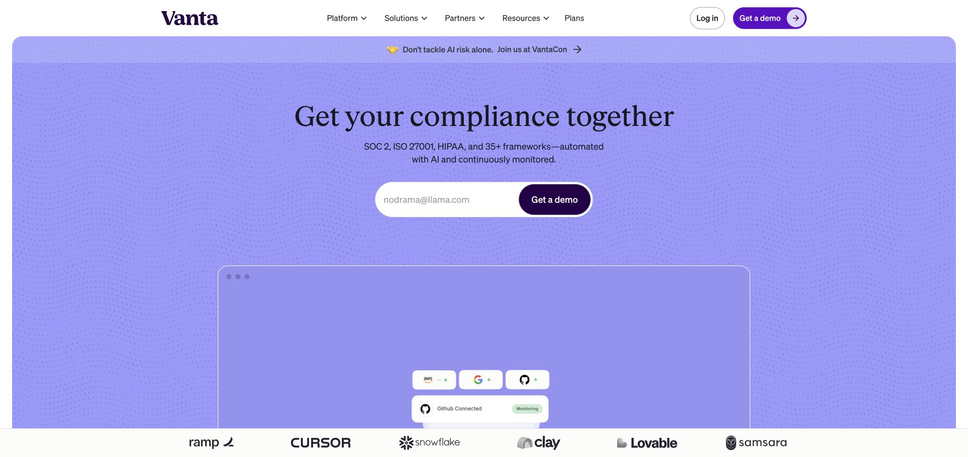
Vanta centers its principal statement above a compact demo form on a large lavender surface. The rounded panel separates the marketing introduction from the white navigation, while a partially visible product area starts the next explanation lower in the view. A customer-logo row provides a distinct transition instead of surrounding the headline with competing endorsements. Current homepage source includes GSAP and ScrollTrigger. The observation is limited to public frontend assets and is not evidence about compliance outcomes, audit quality, or the security of a customer’s implementation.
What you can learn
Keep the form and its label stable while adding motion to supporting media. The animation brief should preserve field focus, error visibility, and a readable next step in every display state.
Pros
A single concentrated action gives the opening an understandable purpose.
The limited palette creates separation without requiring several decorative modules.
Cons & considerations
A short headline cannot explain the boundaries of complex compliance services by itself.
Product media below the fold still needs useful captions and readable detail.
Public source checked November 3, 2026. References may be embedded or legacy—not a complete backend inventory.
Platform source: Direct public page source; named library reference. Public page source reviewed on 2026-11-03 references the named GSAP library script https://cdn.prod.website-files.com/gsap/3.15.0/gsap.min.js. This is evidence of a loaded frontend component; it does not identify every animation, prove runtime execution, or describe the whole organization’s stack. Platform evidence is separate from the direct website screenshot and is not a complete current infrastructure audit.
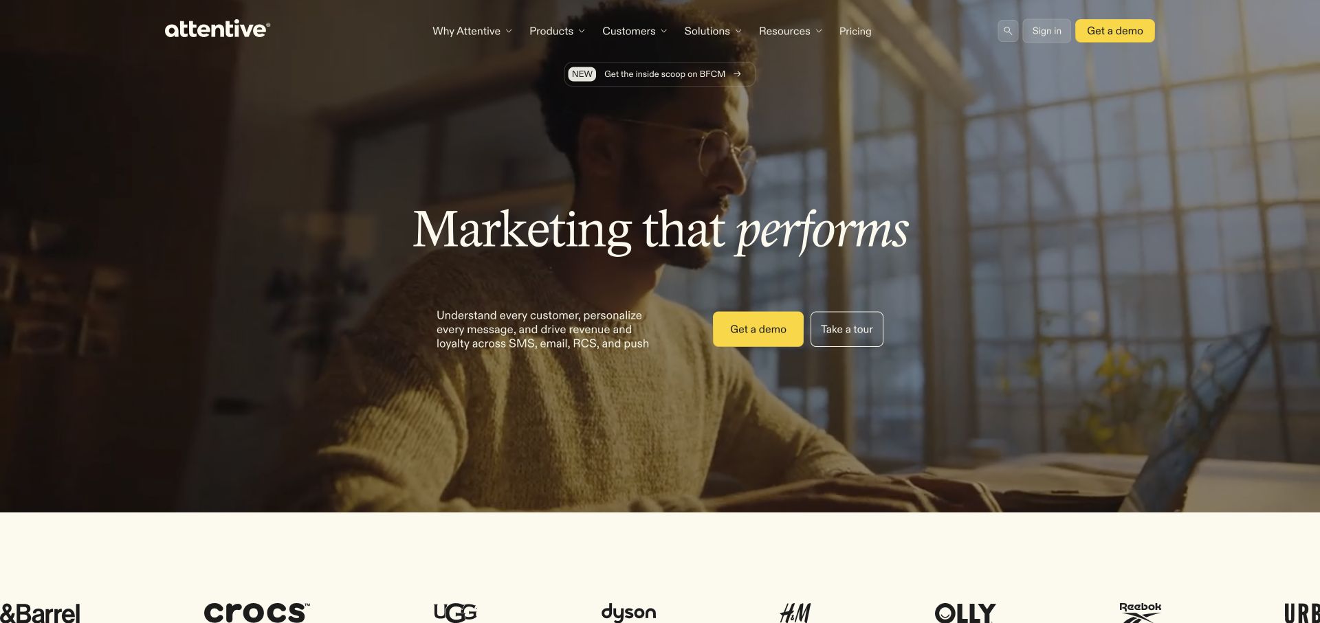
Attentive places a centered statement over a full-width photographic scene, with small yellow actions providing the clearest contrast. The top navigation stays compact and the customer-mark strip below the hero forms a lighter second layer. A short paragraph identifies the messaging channels more concretely than the broad headline does. The current page references GSAP through its frontend asset delivery. That association does not verify which parts of the media use animation or establish anything about the performance of campaigns run inside the platform.
What you can learn
Treat foreground text and actions as a stable interface on top of changing media. Review the darkest and lightest actual frames, the poster image, and reduced-motion behavior before approving the treatment.
Pros
A disciplined yellow accent draws attention to the primary commercial actions.
The supporting sentence gives practical context to the broader brand line.
Cons & considerations
Text over photography depends on contrast across every frame and crop.
A cinematic opening can consume substantial bandwidth without teaching a visitor more about the product.
Public source checked November 3, 2026. References may be embedded or legacy—not a complete backend inventory.
Platform source: Direct public page source; named library reference. Public page source reviewed on 2026-11-03 references the named GSAP library script https://cdn.prod.website-files.com/gsap/3.15.0/gsap.min.js. This is evidence of a loaded frontend component; it does not identify every animation, prove runtime execution, or describe the whole organization’s stack. Platform evidence is separate from the direct website screenshot and is not a complete current infrastructure audit.
Wally combines a close-up treatment photograph with oversized offer typography, a visible annual price, and a contrasting booking action. The top bar separates locations and services from sign-in and booking, and a pale strip of numeric claims starts beneath the hero. This is a more transactional composition than the quieter studio references in the collection. Current source includes named GSAP assets, although the capture alone cannot attribute individual effects. The displayed service and outcome claims belong to the business; this design review does not independently verify them or provide clinical advice.
What you can learn
Establish the offer, conditions, and booking route in readable static content before animating statistics or imagery. Motion should not be required to discover a price qualifier or the service being offered.
Pros
A strong contrast between offer text and the booking control creates a clear hierarchy.
Locations and service information remain accessible in the primary navigation.
Cons & considerations
Close-up clinical photography may not suit every visitor’s comfort level.
Large numeric claims and promotional prices need supporting detail and ongoing editorial verification.
Public source checked November 3, 2026. References may be embedded or legacy—not a complete backend inventory.
Platform source: Direct public page source; named library reference. Public page source reviewed on 2026-11-03 references the named GSAP library script https://cdn.prod.website-files.com/gsap/3.15.0/gsap.min.js. This is evidence of a loaded frontend component; it does not identify every animation, prove runtime execution, or describe the whole organization’s stack. Platform evidence is separate from the direct website screenshot and is not a complete current infrastructure audit.
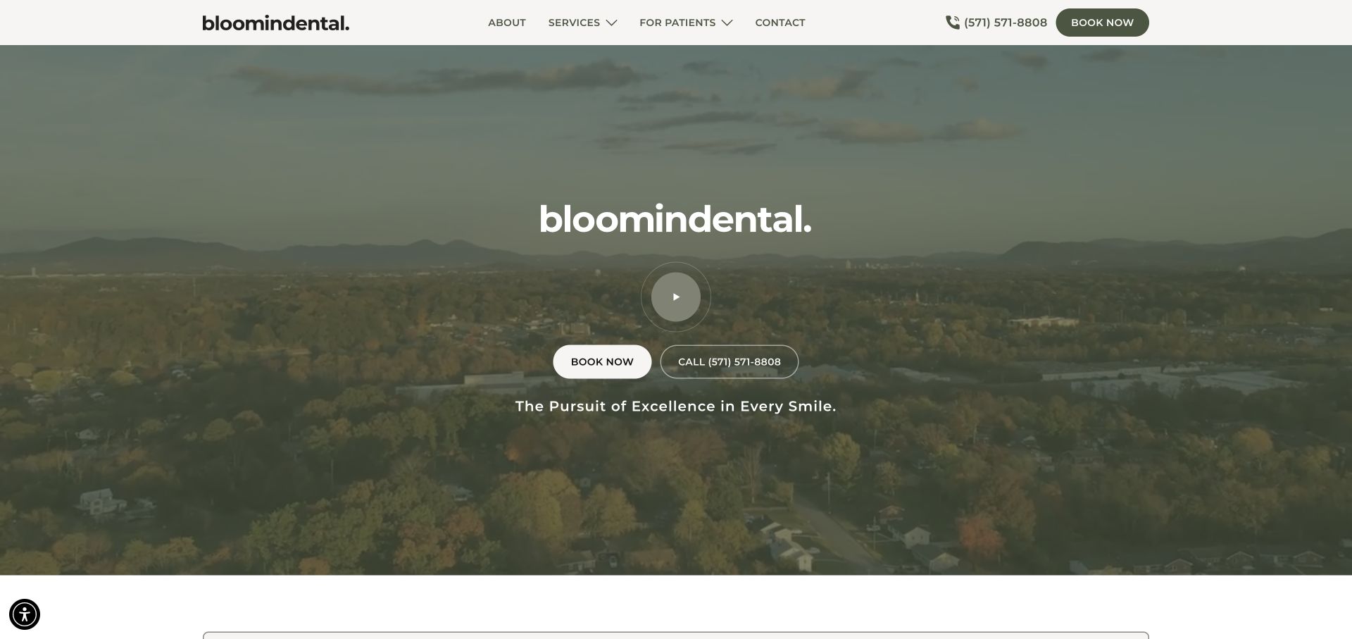
bloomindental opens with a muted landscape, a centered practice name, and two compact routes for booking or calling. The white header keeps services, patient information, and the phone number separate from the atmospheric hero. A circular play control indicates a media layer without forcing the whole composition to look like a video player. The current page references GSAP and ScrollTrigger. That supports a frontend component association, not a claim about clinical systems or a guarantee that every displayed effect is generated by those scripts.
What you can learn
Use the quiet resting view as the baseline for a motion specification. Keep phone and booking controls available, provide a clear poster image, and ensure the practice identity survives when media is paused.
Pros
The header provides practical navigation without overwhelming the calm hero.
Call and booking actions acknowledge two different visitor preferences.
Cons & considerations
A landscape offers atmosphere but little immediate evidence of the actual practice environment.
Low-contrast media needs careful checking with white text and varying screen brightness.
Public source checked November 3, 2026. References may be embedded or legacy—not a complete backend inventory.
Platform source: Direct public page source; named library reference. Public page source reviewed on 2026-11-03 references the named GSAP library script https://cdnjs.cloudflare.com/ajax/libs/gsap/3.10.4/gsap.min.js. This is evidence of a loaded frontend component; it does not identify every animation, prove runtime execution, or describe the whole organization’s stack. Platform evidence is separate from the direct website screenshot and is not a complete current infrastructure audit.
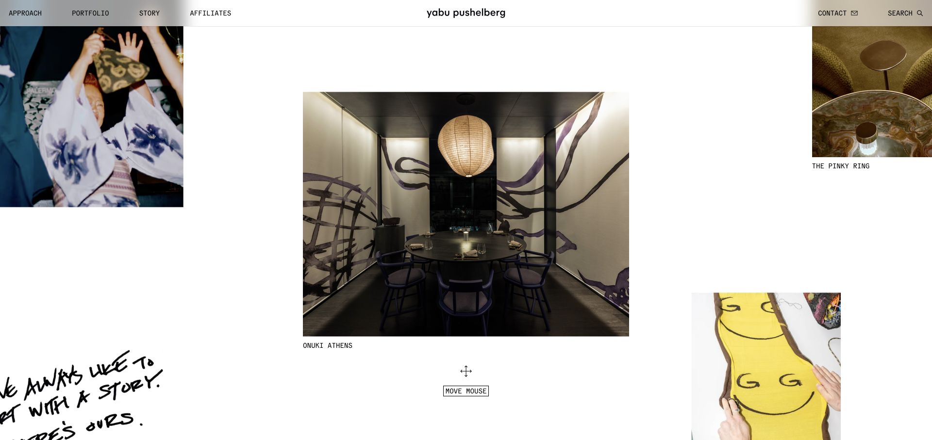
Yabu Pushelberg distributes project photographs and expressive fragments across a mostly white canvas instead of using a single full-screen image. The largest interior photograph has room around it, while smaller images at the edges suggest a broader collection. A compact top navigation and a visible move-mouse prompt make the page feel exploratory. Named GSAP, SplitText, and ScrollTrigger assets appear in current source. The static reference establishes composition and labels, while any relationship between those scripts and the pointer prompt remains outside this review’s direct evidence.
What you can learn
Give an exploratory portfolio a dependable alternative path. Every featured project needs a normal link and useful label so visitors can understand the work without discovering a pointer-driven interaction.
Pros
Unequal image sizes create rhythm without filling every available space.
The largely white field gives detailed interiors a quieter visual setting.
Cons & considerations
An unconventional collage may obscure the sequence or total extent of a portfolio.
Pointer-oriented prompts need equivalent touch and keyboard paths.
Public source checked November 3, 2026. References may be embedded or legacy—not a complete backend inventory.
Platform source: Direct public page source; named library reference. Public page source reviewed on 2026-11-03 references the named GSAP library script https://cdn.prod.website-files.com/gsap/3.15.0/gsap.min.js. This is evidence of a loaded frontend component; it does not identify every animation, prove runtime execution, or describe the whole organization’s stack. Platform evidence is separate from the direct website screenshot and is not a complete current infrastructure audit.
Sarah Sherman Samuel’s captured homepage places a richly textured interior beside a close-up sculptural object. Widely spaced lettering crosses the division, and minimal navigation leaves most of the screen to materials and form. The two photographs suggest different scales of practice before the visitor reaches a conventional project list. Current source references a named GSAP script, but the capture does not reveal which movement it controls. The useful reference is the relationship between the images and typography, not an assumption that a particular animation library produces a recognizable design style.
What you can learn
Plan a split composition with real content pairs and a clear static fallback. Keep project names and navigation reachable outside the image treatment, especially when the halves must stack on a smaller screen.
Pros
Two scales of imagery communicate a varied creative practice immediately.
Minimal navigation allows the material palette to remain the main visual subject.
Cons & considerations
Widely spaced lettering can become difficult to read across contrasting photographic areas.
An immersive opening supplies little project context until the visitor explores further.
Public source checked November 3, 2026. References may be embedded or legacy—not a complete backend inventory.
Platform source: Direct public page source; named library reference. Public page source reviewed on 2026-11-03 references the named GSAP library script https://cdn.jsdelivr.net/npm/gsap@3/dist/gsap.min.js. This is evidence of a loaded frontend component; it does not identify every animation, prove runtime execution, or describe the whole organization’s stack. Platform evidence is separate from the direct website screenshot and is not a complete current infrastructure audit.
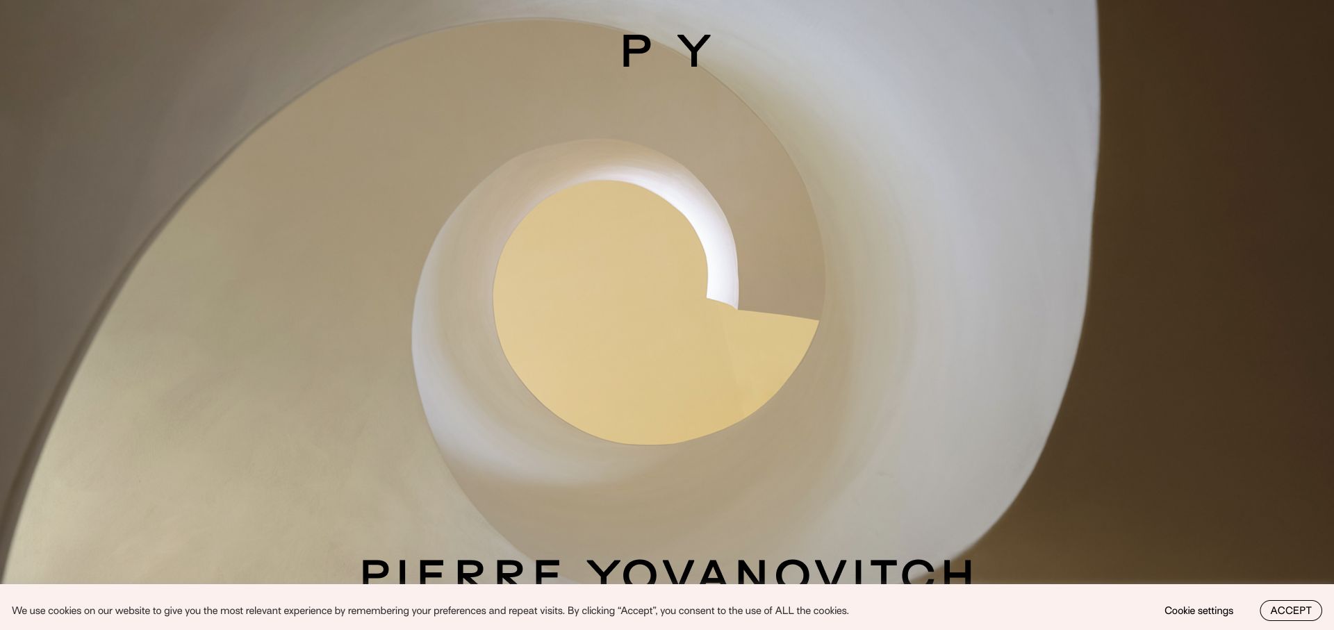
Pierre Yovanovitch uses a close architectural photograph to make curved form and warm light the opening subject. A small monogram at the top and a larger name near the lower edge let the image occupy almost all of the first view. A narrow cookie notice introduces an operational layer that must coexist with the unusually spare composition. Current page source includes a named GSAP file. This observation supports library presence; it does not establish that the photographed space, image transition, or consent interface was built with one specific animation technique.
What you can learn
Specify the first meaningful frame as carefully as any transition. The studio identity and route into the portfolio should remain usable when motion is disabled or consent controls cover part of the screen.
Pros
One strong architectural detail creates a memorable visual introduction.
Restrained typography leaves the photograph’s geometry easy to appreciate.
Cons & considerations
Very little visible navigation can make the next step less obvious.
Viewport-edge lettering and notices need testing against short screens and enlarged text.
Public source checked November 3, 2026. References may be embedded or legacy—not a complete backend inventory.
Platform source: Direct public page source; named library reference. Public page source reviewed on 2026-11-03 references the named GSAP library script https://www.pierreyovanovitch.com/wp-content/themes/pierreyovanovitch/js/gsap_3.6.0_gsap.min.js?ver=7.1.3. This is evidence of a loaded frontend component; it does not identify every animation, prove runtime execution, or describe the whole organization’s stack. Platform evidence is separate from the direct website screenshot and is not a complete current infrastructure audit.
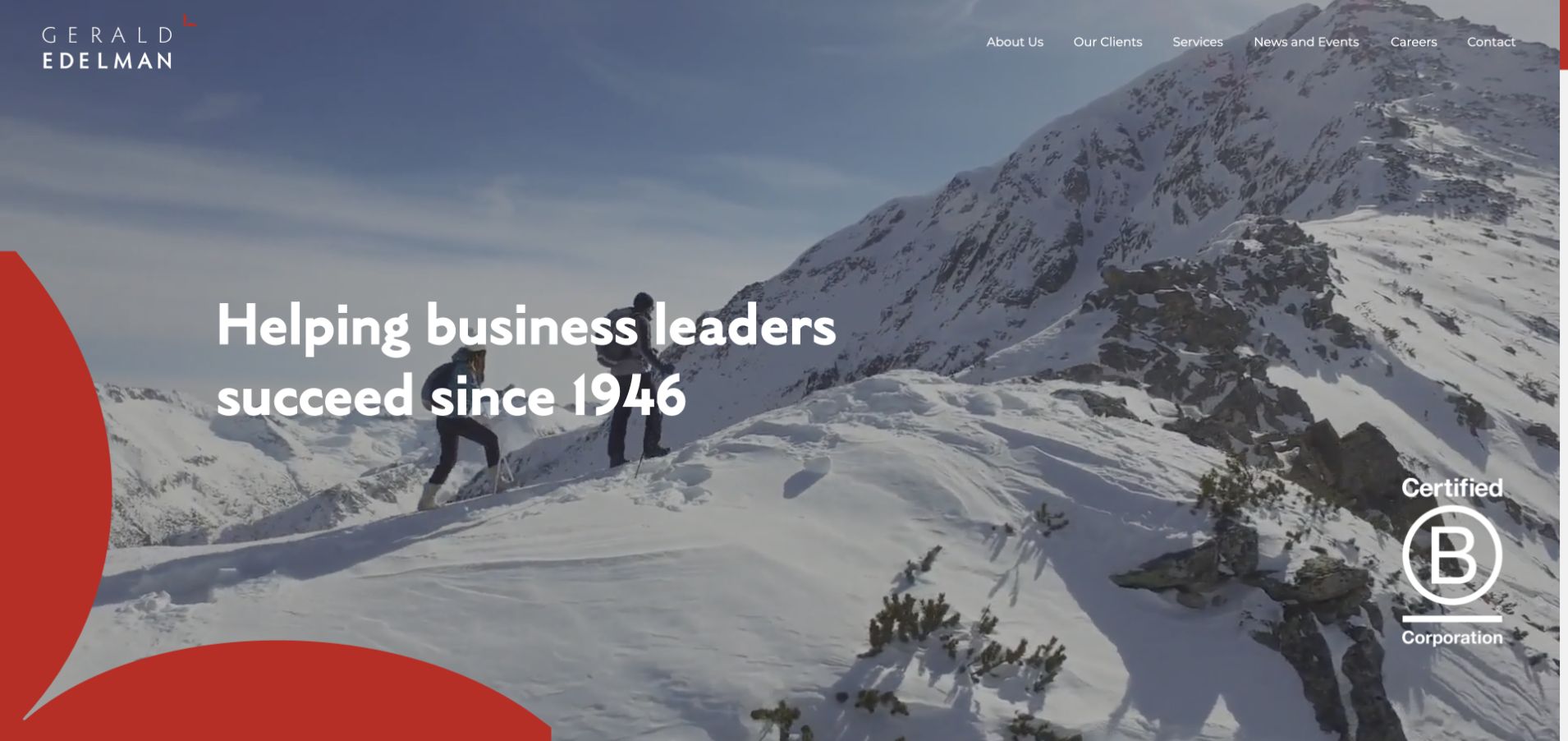
Gerald Edelman pairs a mountain photograph with a bold white positioning statement and a large red graphic entering from the lower-left corner. The wordmark and small navigation form a quiet band at the top, while a certification mark occupies a separate corner. These elements produce a clear visual center despite the detailed landscape. The current homepage references GSAP and several related plugins. The capture does not verify the firm’s certification or show which effect uses which plugin; it provides a composition to evaluate before adding movement.
What you can learn
Keep professional-service information legible and stable while decorative shapes or backgrounds change. Make service categories, people, and contact routes easier to discover than the choreography around the brand statement.
Pros
The bright foreground type has a distinct area within the landscape.
A limited red accent introduces identity without multiplying competing colors.
Cons & considerations
A broad positioning line does not identify the most relevant service for every visitor.
Small navigation over photography needs careful contrast and mobile-menu treatment.
Public source checked November 3, 2026. References may be embedded or legacy—not a complete backend inventory.
Platform source: Direct public page source; named library reference. Public page source reviewed on 2026-11-03 references the named GSAP library script https://www.geraldedelman.com/wp-content/themes/getheme/assets/js/gsap/gsap.min.js. This is evidence of a loaded frontend component; it does not identify every animation, prove runtime execution, or describe the whole organization’s stack. Platform evidence is separate from the direct website screenshot and is not a complete current infrastructure audit.
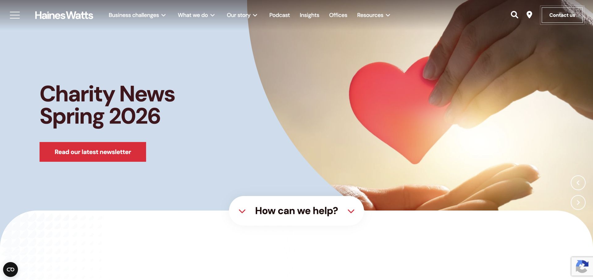
Haines Watts gives a seasonal charity-news feature the main opening position, combining large burgundy text with a warm photograph and a red newsletter action. The lower edge introduces a rounded white section and a prominent help prompt, so the page has a route back to services after the topical feature. Current source references GSAP and ScrollTrigger. That source evidence is separate from the captured edition, which retains its original date and headline; the review does not imply that the editorial feature itself was newly published during this research.
What you can learn
Use motion to connect a changing feature to a stable service structure, if it helps at all. Record the owner and expiry of the feature so a polished transition does not conceal outdated campaign information.
Pros
A specific editorial feature gives returning visitors something concrete to explore.
The help prompt creates a transition from news to practical service discovery.
Cons & considerations
A seasonal feature can become stale without an explicit review schedule.
A visitor seeking a particular service may need an immediate alternative to the featured newsletter.
Public source checked November 3, 2026. References may be embedded or legacy—not a complete backend inventory.
Platform source: Direct public page source; named library reference. Public page source reviewed on 2026-11-03 references the named GSAP library script https://cdnjs.cloudflare.com/ajax/libs/gsap/3.6.1/gsap.min.js. This is evidence of a loaded frontend component; it does not identify every animation, prove runtime execution, or describe the whole organization’s stack. Platform evidence is separate from the direct website screenshot and is not a complete current infrastructure audit.
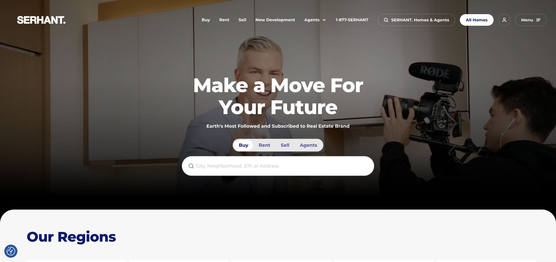
SERHANT. places a large property-search field beneath its central headline and above a clearly separated regions section. Buy, rent, sell, and agent routes appear close to the search instead of being scattered through the media background. A darkened image keeps the white headline and rounded search control visible. The current source includes a named GSAP asset. This supports a frontend association only: the screenshot is not a review of listing accuracy, search behavior, brokerage performance, or the technology operating any private transaction workflow.
What you can learn
Keep the search task independent of decorative motion. Maintain visible labels, a stable input position, and a usable results route even when the surrounding media pauses or a script fails.
Pros
The search control turns a broad brand message into a concrete visitor task.
Nearby task labels distinguish several real-estate audiences within one opening.
Cons & considerations
Background media still requires contrast checks behind navigation and the headline.
A prominent search needs clear empty, invalid-location, and no-result states beyond the photographed view.
Earlier cited evidence retained; no current scan result. References may be embedded or legacy—not a complete backend inventory.
Platform source: Direct public page source; named library reference. Public page source reviewed on 2026-11-03 references the named GSAP library script https://cdnjs.cloudflare.com/ajax/libs/gsap/3.11.5/gsap.min.js. This is evidence of a loaded frontend component; it does not identify every animation, prove runtime execution, or describe the whole organization’s stack. Platform evidence is separate from the direct website screenshot and is not a complete current infrastructure audit.
Landia’s opening uses a film still as the main surface, with the project name, client, and director stacked over the image. The large wordmark and compact menu icon occupy opposite corners, leaving the credited work at the center. The arrangement makes the authorship of the selected production visible without a separate caption panel. Current source references GSAP under the site’s theme assets. This observation does not identify which transitions use the library or establish the duration and behavior of the moving work from a single retained capture.
What you can learn
Keep project credits readable in the first frame and through any media change. An animated production portfolio should preserve a conventional route to the complete project, its credits, and contact information.
Pros
Project and director credits connect the striking image to a specific piece of work.
A simple corner-based header avoids covering the central subject.
Cons & considerations
Text over moving work needs review across more than one favorable frame.
A menu icon alone can hide useful paths for visitors who want to browse by discipline or director.
Earlier cited evidence retained; no current scan result. References may be embedded or legacy—not a complete backend inventory.
Platform source: Direct public page source; named library reference. Public page source reviewed on 2026-11-03 references the named GSAP library script https://www.landia.com/us/wp-content/themes/landia-theme/assets/js/vendor/gsap.min.js. This is evidence of a loaded frontend component; it does not identify every animation, prove runtime execution, or describe the whole organization’s stack. Platform evidence is separate from the direct website screenshot and is not a complete current infrastructure audit.
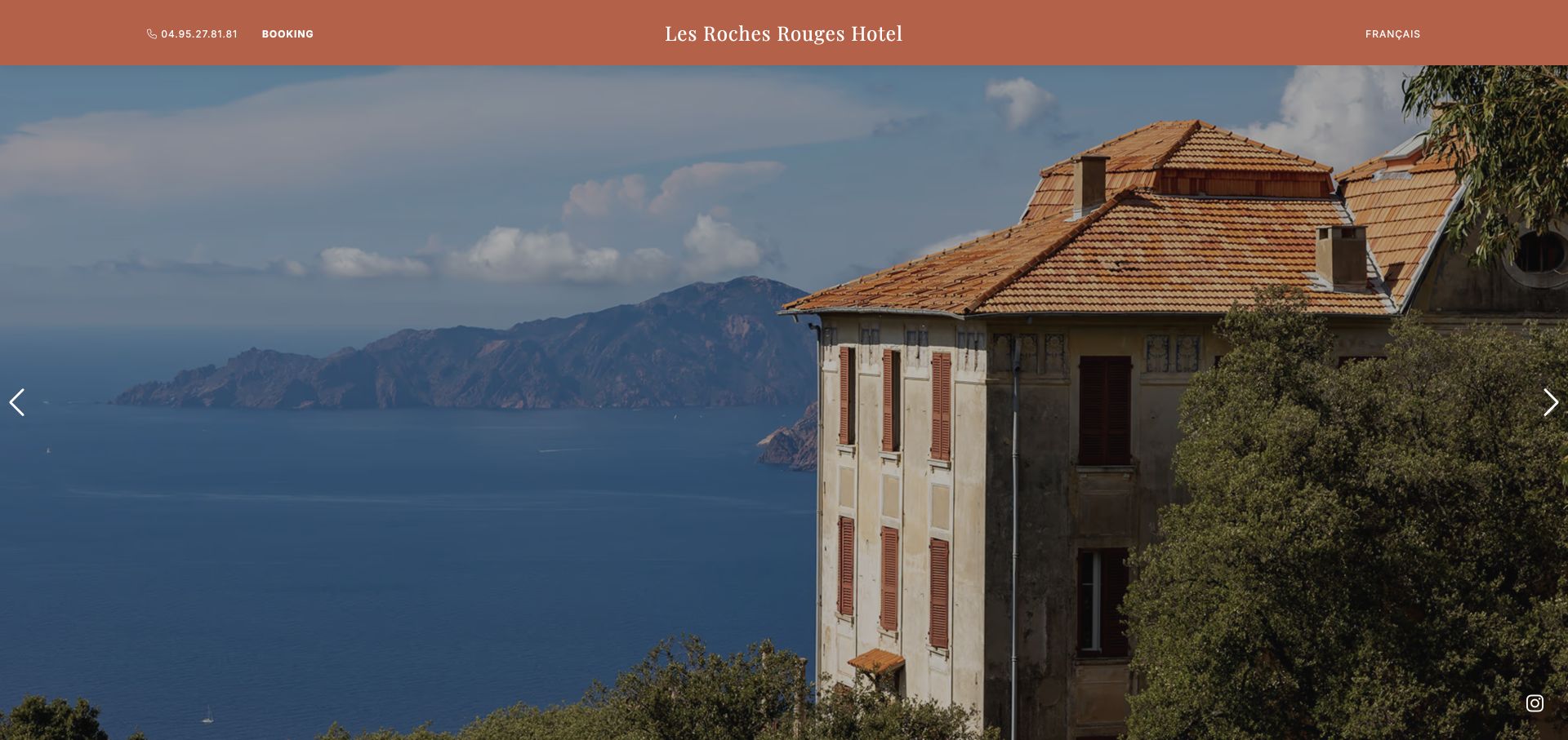
Les Roches Rouges in Piana puts a coastal building and landscape beneath a narrow terracotta navigation band. Booking and telephone access stay in that band while carousel arrows sit at the sides of the photograph. The hotel name is centered above the scene, giving the image a clear identity without a large overlay message. A named GSAP file appears in current public source. The observation concerns this property’s page and does not infer booking-engine technology, availability, or a relationship to similarly named hotels elsewhere.
What you can learn
Keep reservation routes stable while destination imagery changes. Choose photographs that still explain the location when cropped on a phone, and give any carousel a usable paused state with visible controls.
Pros
The thin warm-colored bar gives booking information a persistent home.
The wide photograph establishes both the building and its coastal setting.
Cons & considerations
A scenic introduction needs supporting room and access information for a complete decision.
Carousel controls at the edges require touch-target and keyboard checks on narrower layouts.
Public source checked November 3, 2026. References may be embedded or legacy—not a complete backend inventory.
Platform source: Direct public page source; named library reference. Public page source reviewed on 2026-11-03 references the named GSAP library script https://www.lesrochesrouges.com/cdn/js/gsap.min.js. This is evidence of a loaded frontend component; it does not identify every animation, prove runtime execution, or describe the whole organization’s stack. Platform evidence is separate from the direct website screenshot and is not a complete current infrastructure audit.
Use modest transitions for ordinary interface feedback
A small state change often needs a small response. Make selected tabs, expanded details, and successful interactions visible without requiring a long sequence. Specify the interrupted state as well as the completed state: people click twice, change their minds, and navigate away. Where browser CSS handles the requirement simply, evaluate that option alongside GSAP. Maintenance responsibility should be proportionate to the value of the effect.
Sequence a demonstration when order carries meaning
A diagram or product explanation may benefit from a controlled progression that makes relationships easier to follow. Draw the beginning, middle, and end before implementing it. Include a way to reach the same explanation as ordinary text. Decide whether the visitor controls progression or the page advances automatically, and how a sequence restarts after it has been interrupted. The visual reference should clarify this decision rather than obscure it behind a striking screenshot.
Budget scroll-driven stories carefully
ScrollTrigger supports features such as triggering, scrubbing, and pinning. Each changes the relationship between a visitor’s scroll and the content. Prototype a short section with representative copy before committing an entire page. Check small screens, large text, keyboard navigation, fast scrolling, and reduced motion. A long pinned canvas can make a short idea feel laborious; ensure the material actually benefits from being presented over that distance.
Make the static page and animation lifecycle equally reviewable
Write a motion inventory alongside the content brief
For every sequence, name its trigger, duration range, dependency, final state, and reduced-motion alternative. Identify the content owner and the person maintaining the animation. Include what happens when an image changes size or a translated heading becomes longer. This turns an attractive reference into a manageable scope. It also makes clear which effects can be removed without breaking the rest of the page.
Clean up animation when components leave
In an application, mounting and unmounting components can leave listeners or animation state behind if lifecycle handling is incomplete. GSAP’s React guidance describes useGSAP and context-based cleanup for recorded animation work. Ask the developer to demonstrate repeated navigation and remounting, not just a first visit. Keep selectors scoped to the intended component so a reused class does not unexpectedly animate unrelated content.
Review the page with its real photographs, fonts, analytics, consent interface, and embedded media. Check loading and responsiveness on ordinary hardware, then observe the experience with scripts delayed or unavailable. Document which findings come from measurements and which are design judgments. A recognizable brand or a GSAP script in source does not establish accessibility, speed, conversion improvement, or a sensible budget for your project.
A useful handover demonstration
Ask the actual team to carry out its routine job: publish a realistic update, correct a mistake, preview a narrow screen, and identify who owns an integration failure. For a library or frontend framework, also ask who maintains the content source and deployment. A polished screenshot does not answer those operational questions.
Beyond the screenshot
A GSAP review checklist that goes beyond the opening reveal
Approve a readable static layout with meaningful links and headings.
Record the purpose, trigger, interruption behavior, and final state of every sequence.
Design and test a complete reduced-motion alternative.
Try direct links, refresh, Back, fast scrolling, and repeated navigation.
Check keyboard focus, zoom, long copy, small screens, and changed media dimensions.
Verify component cleanup and selector scoping where an application framework is used.
Measure real media and third-party scripts on representative hardware.
Assign maintenance ownership and preserve a practical way to remove optional effects.
Test with real content, a keyboard, a small screen, slow or failed requests, and the people who will maintain the system. These are planning checks, not an accessibility, security, performance, or search-ranking certification.
Sources & editorial method
How this GSAP collection was reviewed
The examples use existing direct browser captures with their original dates, visually reviewed for this collection. Public HTML was checked on November 3, 2026 UTC for identifiable GSAP resource references. These references establish a limited page-level association. Static-image reviews assess visible structure and tradeoffs; they do not pretend to reproduce motion, identify the author of an effect, or audit the whole website.
Every image is an unmodified capture from the actual website, with its source and capture date. Some captures are reused from our shared catalog; their dates remain the original capture dates. None comes from a vendor gallery or a generated reconstruction. Moving imagery and live content can change.
Technology attribution uses public page assets or metadata, official platform documentation, or a cited first-party project case study. Documentary and framework-relationship evidence is identified where used; it is not a complete current backend inventory. A CMS image CDN alone does not establish a full CMS deployment. A library’s presence does not prove which individual controls use it, and a platform label does not establish AI authorship.
The composition notes, lessons, pros and tradeoffs are original editorial observations. We have not measured conversion, traffic, security, performance or accessibility conformance. Website owners retain their brands and imagery; these examples are not our client portfolio. Written, Edited and Curated are independent records, not dates advanced by a build. See our editorial standards or suggest a correction.
Questions worth asking
GSAP website development FAQs
Is GSAP a website builder?
GSAP is an animation toolset used within websites and applications. It does not by itself provide a CMS, content model, hosting setup, or publishing workflow. Choose those responsibilities separately.
Does every website with GSAP need elaborate animation?
No. The useful scope comes from a visitor’s task. A restrained transition can be appropriate, and a page may load a library without using it for every visible effect. Start with the simplest behavior that communicates the intended idea.
Can a screenshot prove how a GSAP animation behaves?
No. A screenshot records a visual state at a particular moment. Timing, easing, interruption, scroll behavior, and reduced-motion handling require direct interaction and testing. The examples here keep those limits explicit.
Does using GSAP guarantee a smooth or accessible website?
No. Media size, layout work, device capability, content structure, and implementation choices all matter. Test the finished experience, including keyboard operation and reduced motion, instead of treating the library name as a quality result.