Netlify website development is as much about publishing discipline as page design. Plan the content, previews, redirects and service handoffs that make a good-looking site dependable after launch.
These 20 public properties returned Netlify request identifiers on the exact routes shown. The collection includes universities, documentation, product marketing, editorial publishing and commerce. The evidence concerns public website delivery, not every product or application operated by the named organization.
Look for patterns the maintaining team can repeat: a stable documentation frame, a replaceable campaign, an audience-specific entry point or an article record with clear dates. Then ask how that pattern will be reviewed, published, corrected and retired in your own project.
Before the examples
What makes good Netlify website development in 2026?
Design for the next content update
Use real examples of the work editors or developers do repeatedly. A documentation page may need version cues and anchors; an event needs an end date; a storefront feature needs a valid product destination. A coherent content model reduces the need to redesign every update.
Make the preview a reviewable release candidate
Netlify Deploy Previews provide a separate URL for changes associated with a configured pull or merge request. Use that URL to inspect real content and route behavior, with the correct environment configuration. Define who reviews the result and how approval relates to the exact version being published.
Netlify’s official support guidance describes x-nf-request-id as a response identifier added by its service. We use a successful response from the pictured route as scoped delivery evidence. It does not make a marketing site, documentation property and private application interchangeable.
Study the content and navigation patterns around the main visual. The Netlify association comes from fresh route-level response evidence; the screenshot remains an independently dated record of the actual page.
We start with five recognizable brands or organizations: Figma marketing website, Docusign eSignature marketing, Stanford University, Stack Overflow corporate website, Kubernetes. Each attribution applies to the named website property, not every product or website belonging to its organization. This is a curated reading sequence, not a measured ranking.
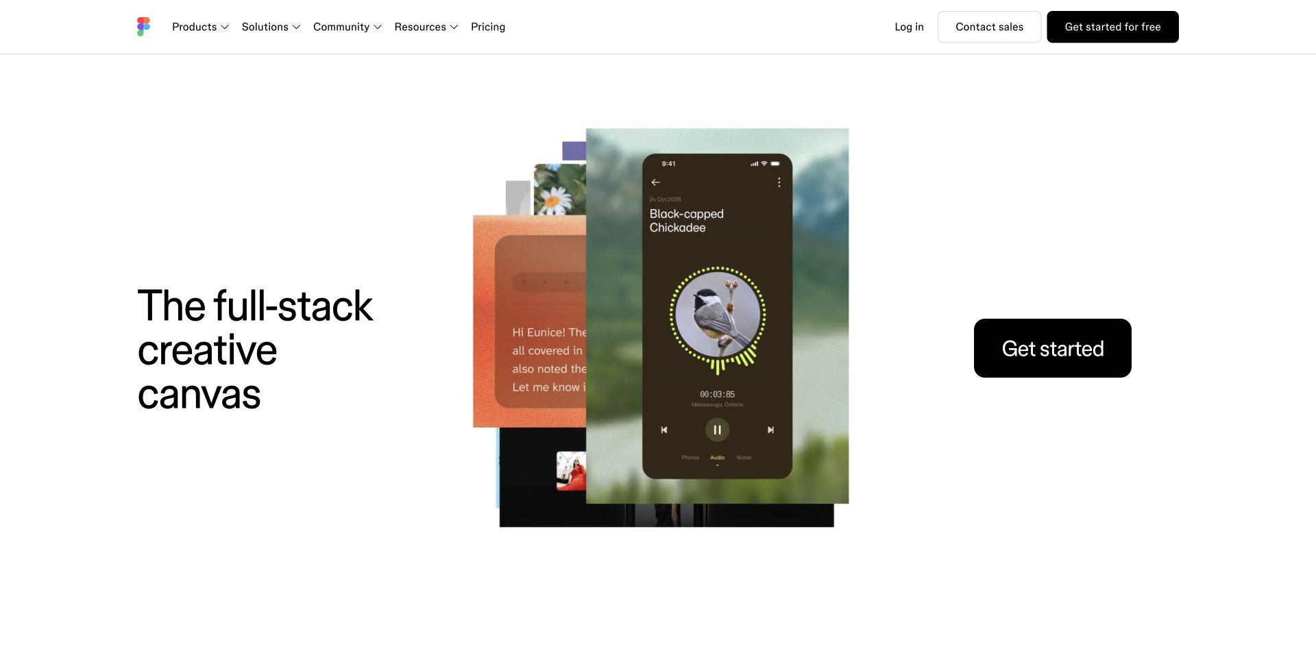
Figma's captured homepage gives stacked creative examples the center of the screen. A short proposition sits to the left, with a clear start action to the right and restrained navigation above. The image suggests variety without requiring several separate feature explanations in the opening. For a Netlify project, this is a useful reference for coordinating a changing creative showcase with stable account and product destinations. The current response includes Netlify's request identifier for this public route. That evidence concerns website delivery and does not establish where Figma's editor, collaboration sessions or customer documents operate.
What you can learn
Keep the showcase content independent from the navigation contract. Review new artwork with its actual text in a deployment preview, and test the product handoff separately so a visual campaign change cannot silently alter the account journey.
Pros
The asymmetric composition gives creative work substantial space while retaining a concise explanation.
The start action is visually distinct from both the artwork and ordinary navigation.
Cons & considerations
A layered illustration can become difficult to parse if mobile cropping removes its key context.
The marketing page needs connected product detail for visitors who cannot evaluate the service from imagery alone.
Public source checked November 3, 2026. References may be embedded or legacy—not a complete backend inventory.
Platform source: Observed public HTTP response. On 2026-11-03, an HTTP HEAD request to https://www.figma.com/ returned status 200 at https://www.figma.com/ with x-nf-request-id: 01M6GZAYFN8B4V339Y27MY77DD. Netlify delivery for this response; not evidence about every organizational property or product service. Platform evidence is separate from the direct website screenshot and is not a complete current infrastructure audit.
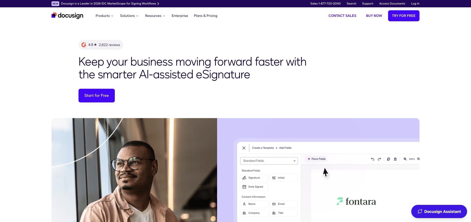
Docusign's eSignature page pairs a centered product promise with a large visual combining a person and an application screen. A compact announcement and a direct trial action sit above that image. The page establishes a particular product within a larger brand, which is useful when a company has several related offerings. A Netlify request identifier and server header were observed on the pictured public route. They support the delivery association, not claims about signature verification, document storage or the operational security of an account. Those systems are outside this visual review.
What you can learn
Give each product page a clear place in the wider navigation and an explicit handoff to its trial or sales flow. Use preview review to catch mismatched product names, stale interface images and actions pointing to the wrong offering.
Pros
The product-specific heading reduces ambiguity about which part of the company's suite is being introduced.
The combined human and interface image connects a service concept with a recognizable work situation.
Cons & considerations
Fine application detail may be unreadable when the hero is reduced for smaller screens.
Assurance and compliance language requires precise supporting material beyond a polished presentation or hosting label.
ContentfulDocumented platform association; current media delivery observed
Public source checked November 3, 2026. References may be embedded or legacy—not a complete backend inventory.
Platform source: Observed public HTTP response. On 2026-11-03, an HTTP HEAD request to https://www.docusign.com/products/electronic-signature returned status 200 at https://www.docusign.com/products/electronic-signature with x-nf-request-id: 01M6GZB02X5GSJPYACABB9DH05. Netlify delivery for this response; not evidence about every organizational property or product service. Platform evidence is separate from the direct website screenshot and is not a complete current infrastructure audit.
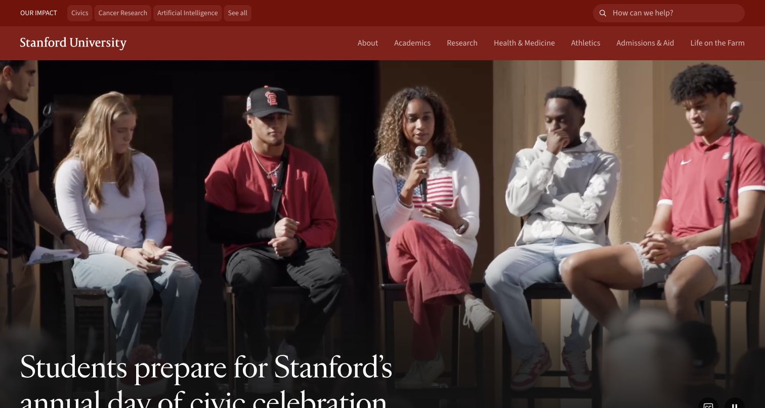
Stanford opens with a large campus-life story beneath two compact rows of navigation. The red institutional frame remains stable while photography and editorial headlines can change. Audience links, search and major information categories provide routes for readers with very different reasons to visit. This makes the site a useful reference for separating a durable institutional structure from a frequently updated news surface. Current response headers identify Netlify on the homepage route. They do not establish the hosting of admissions systems, student records, research applications or every departmental website associated with the university.
What you can learn
Map persistent information routes before designing the news feature. Preview editorial updates against the complete header, verify image crops and long titles, and give the publishing team a simple way to replace a story without changing institutional navigation.
Pros
The consistent brand frame gives changing editorial material a recognizable institutional home.
Multiple audience and topic routes acknowledge that visitors arrive with different tasks.
Cons & considerations
Two navigation levels need careful grouping so they remain comprehensible on narrow screens.
A large feature story can push practical information down unless search and audience routes stay accessible.
ReactAssociated with Next.js; not independently observed
Public source checked November 3, 2026. References may be embedded or legacy—not a complete backend inventory.
Platform source: Observed public HTTP response. On 2026-11-03, an HTTP HEAD request to https://www.stanford.edu/ returned status 200 at https://www.stanford.edu/ with x-nf-request-id: 01M6GZARZNPCSW7T4KTV7K8BFW. Netlify delivery for this response; not evidence about every organizational property or product service. Platform evidence is separate from the direct website screenshot and is not a complete current infrastructure audit.
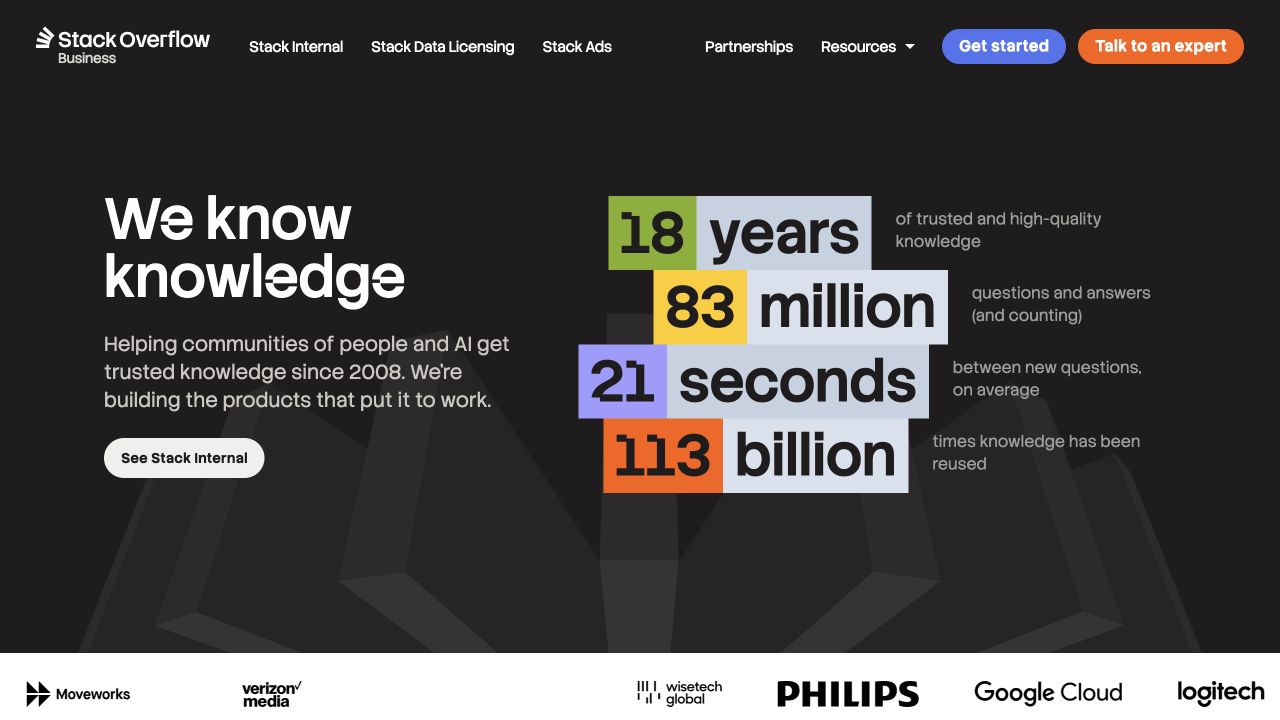
Stack Overflow's corporate homepage uses a dark field, a concise statement and a block of prominent numerical claims. A row of customer marks begins underneath, while product and resource navigation sits above. The composition is useful because it gives the corporate proposition its own identity rather than imitating the familiar question-and-answer interface. Netlify headers were observed on stackoverflow.co, the exact property shown. This should not be expanded into a claim about stackoverflow.com or its community application. The displayed numbers are part of the captured marketing, not independently validated performance findings from this review.
What you can learn
Document each public property's purpose and ownership. In previews, check that corporate, community and commercial links remain distinguishable, and assign a source and review date to numerical proof so content changes can be approved deliberately.
Pros
The corporate page explains its offer without relying on the community site's interface conventions.
Color blocks make the proof area visually separate from the main proposition and action.
Cons & considerations
Prominent statistics need definitions, dates and supporting sources to avoid ambiguous interpretations.
Closely related domains require clear handoffs so readers know when they are entering a different product or service.
Vue.jsAssociated with Nuxt; not independently observed
Public source checked November 3, 2026. References may be embedded or legacy—not a complete backend inventory.
Platform source: Observed public HTTP response. On 2026-11-03, an HTTP HEAD request to https://stackoverflow.co/ returned status 200 at https://stackoverflow.co/ with x-nf-request-id: 01M6GZBDCPMK19ZBN6Y2AWGNEB. Netlify delivery for this response; not evidence about every organizational property or product service. Platform evidence is separate from the direct website screenshot and is not a complete current infrastructure audit.
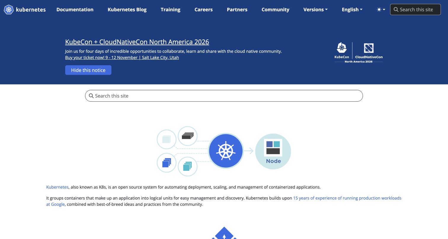
Kubernetes places project navigation, language choices and search around a clear introduction to the technology. The saved view also includes an event announcement, showing how a community campaign can coexist with durable learning routes. The page feels like a hub rather than a single sales narrative, which suits readers arriving with installation, learning or contribution tasks. Netlify's server and request headers were observed on the public homepage. This supports a website-delivery association; it says nothing about where any Kubernetes cluster runs or how the software itself is deployed by its users.
What you can learn
Keep events and announcements separate from versioned documentation. Preview changes with the actual navigation, verify language and version destinations, and make the withdrawal of an expired notice part of the publishing workflow rather than a later cleanup.
Pros
Search and documentation are visible early for visitors who already know their task.
The project explanation provides a starting point without replacing routes into deeper technical material.
Cons & considerations
Event notices can occupy valuable space and need explicit expiry ownership.
A large documentation estate needs careful redirects and version cues that a homepage screenshot cannot verify.
Public source checked November 3, 2026. References may be embedded or legacy—not a complete backend inventory.
Platform source: Observed public HTTP response. On 2026-11-03, an HTTP HEAD request to https://kubernetes.io/ returned status 200 at https://kubernetes.io/ with x-nf-request-id: 01M6GZBJVG2EPV619VE907XVTJ. Netlify delivery for this response; not evidence about every organizational property or product service. Platform evidence is separate from the direct website screenshot and is not a complete current infrastructure audit.
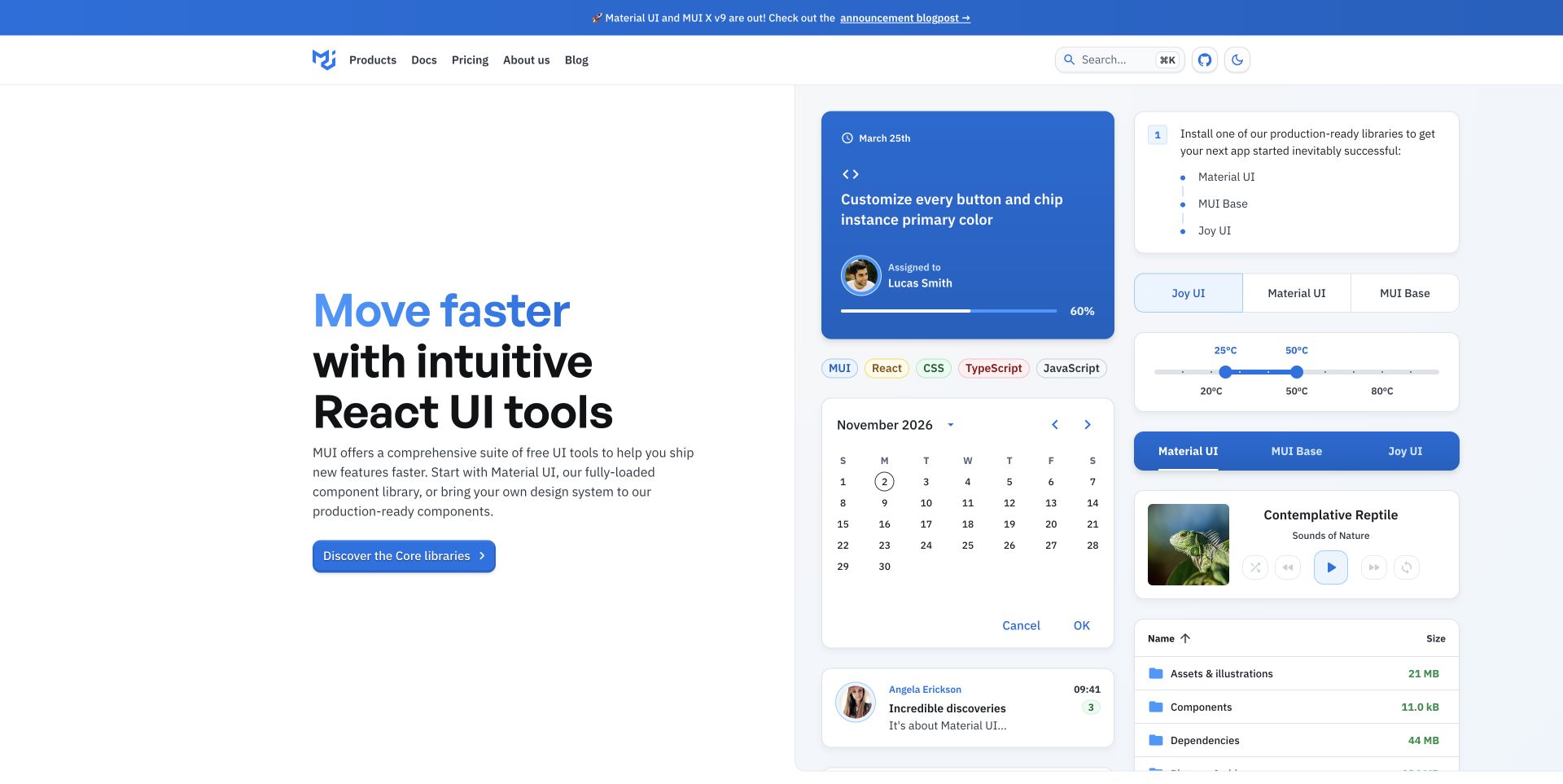
MUI combines a straightforward developer proposition with a collage of interface components. Small charts, controls and cards make the subject concrete, while product, documentation and pricing links remain in a compact header. The design demonstrates how a technical library can explain itself through examples without making the first screen a full interactive playground. Current Netlify headers support delivery of the public page shown here. They do not establish how a visitor's application is hosted after adopting the library, nor do they prove that every illustrated control meets a particular accessibility or performance requirement.
What you can learn
Treat component illustrations and live demonstrations as different assets with different test needs. Preview the marketing examples at readable sizes, then link to maintained documentation and tested demos that explain installation, behavior and commercial boundaries.
Pros
The variety of interface examples communicates the breadth of the library quickly.
Documentation and pricing remain nearby for readers moving from visual interest into evaluation.
Cons & considerations
Small component text can become decorative when too many examples share the opening viewport.
A polished sample still needs clear guidance about customization, licensing and implementation responsibilities.
Public source checked November 3, 2026. References may be embedded or legacy—not a complete backend inventory.
Platform source: Observed public HTTP response. On 2026-11-03, an HTTP HEAD request to https://mui.com/ returned status 200 at https://mui.com/ with x-nf-request-id: 01M6GZAYXJ06HP2X297GTPN7KE. Netlify delivery for this response; not evidence about every organizational property or product service. Platform evidence is separate from the direct website screenshot and is not a complete current infrastructure audit.
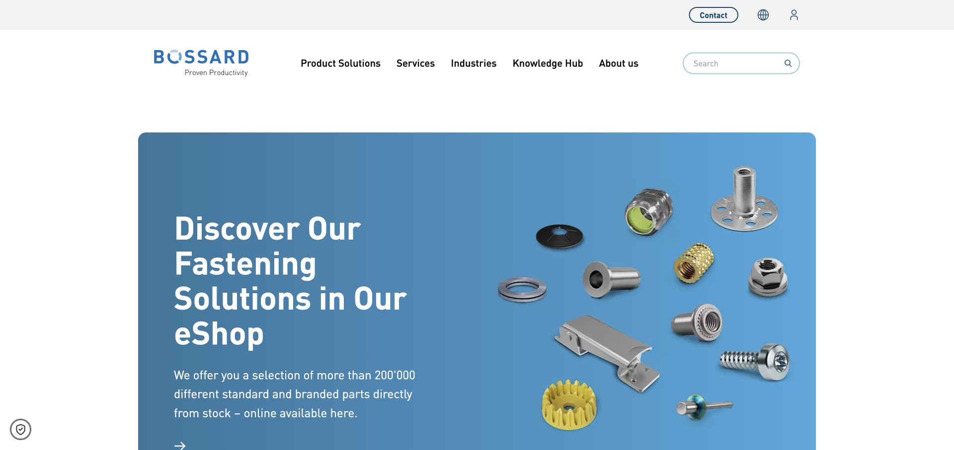
Bossard introduces its eShop through a blue product scene containing several fastener types. The surrounding header keeps product solutions, services, industries and knowledge resources within reach. This is a useful balance for an industrial supplier whose visitors may be looking for either a specific part or broader technical help. The observed Netlify response identifies the delivery layer for the public global page. It does not identify the eShop's inventory, pricing, procurement or account systems. A development brief should therefore distinguish the informational website from the transaction and specification tools it connects to.
What you can learn
Map the transition from a product family to the correct technical or purchasing destination. Preview category names and imagery with actual supplier content, and verify regional routing before treating the marketing site's successful deployment as a completed commerce release.
Pros
The product scene makes an otherwise broad industrial offering immediately recognizable.
Knowledge and service routes remain available beside the direct catalog proposition.
Cons & considerations
A global entry point needs clear regional expectations for availability, language and purchasing conditions.
Small product illustrations cannot replace accurate specifications and a dependable search or catalog structure.
Public source checked November 3, 2026. References may be embedded or legacy—not a complete backend inventory.
Platform source: Observed public HTTP response. On 2026-11-03, an HTTP HEAD request to https://www.bossard.com/global-en/ returned status 200 at https://www.bossard.com/global-en/ with x-nf-request-id: 01M6GZB15BN472XG3KHRPD8WWP. Netlify delivery for this response; not evidence about every organizational property or product service. Platform evidence is separate from the direct website screenshot and is not a complete current infrastructure audit.
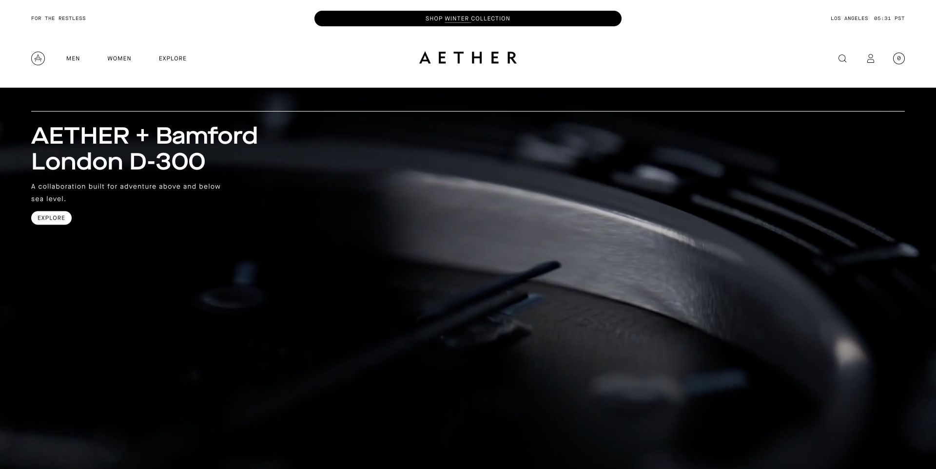
AETHER's saved opening highlights a branded collaboration through a dark, close-up product image. The centered wordmark and sparse navigation leave substantial room for the campaign, while a short call to action introduces its next step. The layout is useful for studying a store that treats collections as editorial events. Netlify headers were observed on this public route. They support a delivery association for the storefront page, but do not reveal the commerce backend or establish anything about payment, stock or fulfillment. The visual review concerns the campaign's hierarchy and its connection to useful shopping information.
What you can learn
Package collaborations with their own imagery, explanatory copy, destination links and retirement plan. Use previews to check the first-frame image and mobile crop, and preserve ordinary category routes for shoppers who are not interested in the featured release.
Pros
The collaboration has a distinct editorial presence rather than appearing as an ordinary product tile.
The restrained header keeps the brand visible without competing with the hero image.
Cons & considerations
A dark close-up can obscure the product's function for visitors unfamiliar with the collaboration.
Campaign pages need durable links or redirects when a limited collection is no longer available.
SanityDocumented platform association; current media delivery observed
Associated dependencies
ReactAssociated with Next.js; not independently observed
Public source checked November 3, 2026. References may be embedded or legacy—not a complete backend inventory.
Platform source: Observed public HTTP response. On 2026-11-03, an HTTP HEAD request to https://aetherapparel.com/ returned status 200 at https://aetherapparel.com/ with x-nf-request-id: 01M6GZB220MSWTB3T23TSC92JG. Netlify delivery for this response; not evidence about every organizational property or product service. Platform evidence is separate from the direct website screenshot and is not a complete current infrastructure audit.
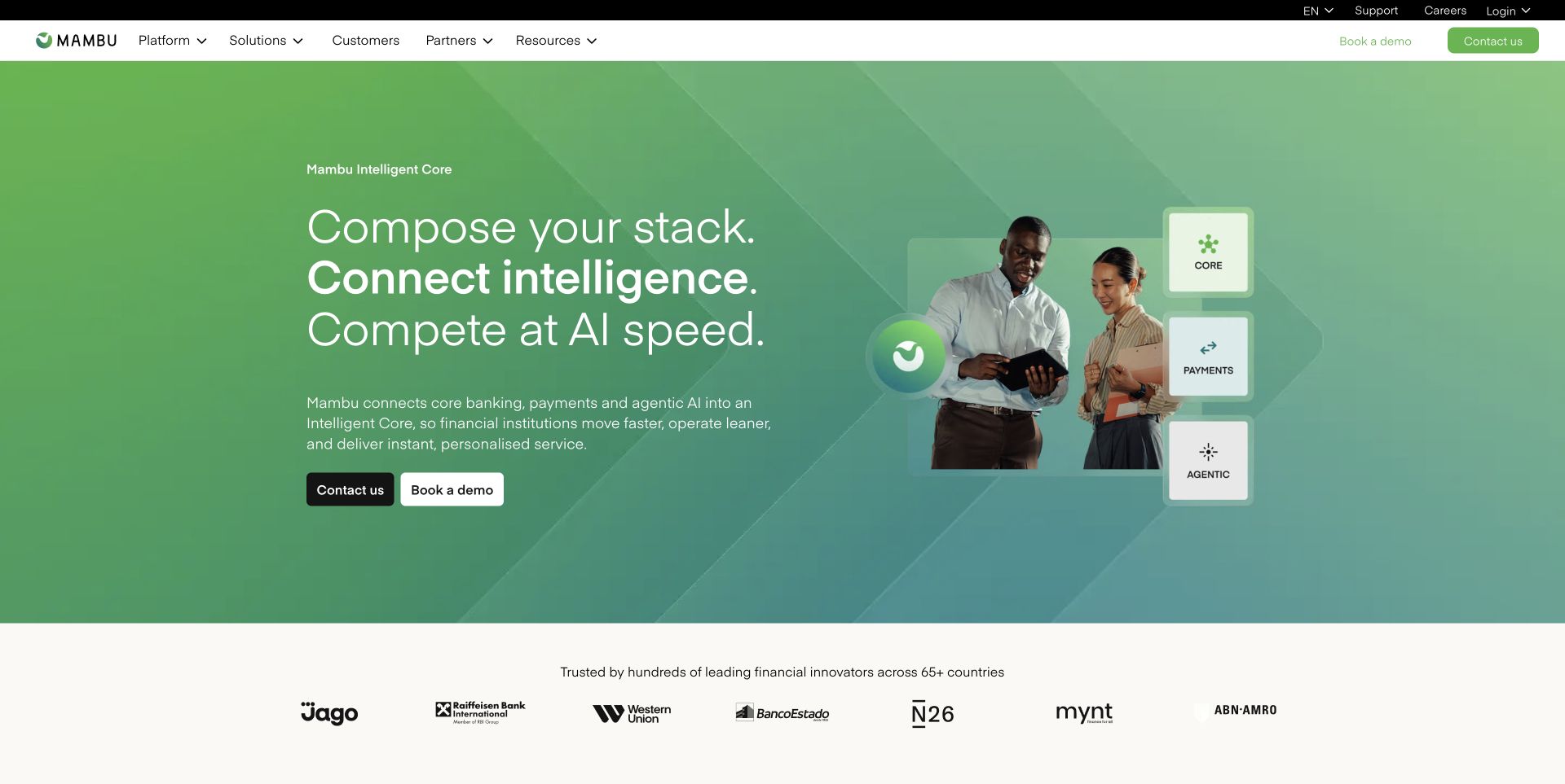
Mambu uses a green gradient, a concise platform proposition and a small composition of people and interface elements. Customer marks appear in a separate strip below, making the transition from introduction to proof visible. The page provides a reference for explaining a complex business platform without opening with a dense architecture diagram. Netlify headers were observed on the marketing route shown. They do not establish where banking workloads run or verify operational, regulatory or financial claims. The public website's deployment and the service's customer infrastructure must remain separate subjects in a development plan.
What you can learn
Give each broad platform statement a clear route to a more specific capability or use case. In deployment previews, check terminology across the hero, product navigation and customer examples so different teams do not publish conflicting descriptions.
Pros
The visual system ties several ideas together without presenting every feature in the first screen.
A separate customer strip provides a natural place to continue into evidence and case studies.
Cons & considerations
Abstract platform language can delay comprehension if concrete use cases are too far away.
Trust-related claims need precise sources and qualified wording beyond a reassuring color palette or customer logo.
SanityDocumented platform association; current media delivery observed
Associated dependencies
ReactAssociated with Next.js; not independently observed
Public source checked November 3, 2026. References may be embedded or legacy—not a complete backend inventory.
Platform source: Observed public HTTP response. On 2026-11-03, an HTTP HEAD request to https://mambu.com/en returned status 200 at https://mambu.com/en with x-nf-request-id: 01M6GZB2T6TJF03PNW78WQG531. Netlify delivery for this response; not evidence about every organizational property or product service. Platform evidence is separate from the direct website screenshot and is not a complete current infrastructure audit.
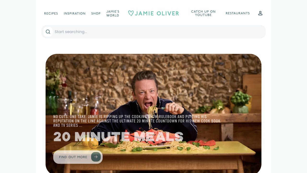
Jamie Oliver's captured homepage puts a broad search field above a large food-led feature. Topic navigation and related brand destinations sit in a calm header, while the feature combines a recognizable presenter, a recipe scene and a concise campaign title. This pattern supports visitors who want to browse as well as those who arrive with an ingredient or meal in mind. The response includes Netlify and Cloudflare signals for the pictured route. Those observations identify delivery layers, not the publishing backend, search implementation or any separate commerce and subscription systems linked from the site.
What you can learn
Make recipe search and durable categories work independently of the current promotion. Preview campaign images and titles with realistic content, and verify that older recipes remain discoverable when the homepage changes to a new seasonal theme.
Pros
Search appears before the major feature, giving task-oriented readers an immediate alternative to browsing.
Food photography and a recognizable person give the campaign a clear editorial subject.
Cons & considerations
A seasonal feature needs useful destinations after its promotional period ends.
Recipe sites require accurate structured content and practical reading layouts that the homepage alone cannot demonstrate.
Earlier cited evidence retained; no current scan result. References may be embedded or legacy—not a complete backend inventory.
Platform source: Observed public HTTP response. On 2026-11-03, an HTTP HEAD request to https://www.jamieoliver.com/ returned status 200 at https://www.jamieoliver.com/ with x-nf-request-id: 01M6G808ZKPK6WNXH6PM9V8JBY. Netlify delivery for this response; not evidence about every organizational property or product service. Platform evidence is separate from the direct website screenshot and is not a complete current infrastructure audit.
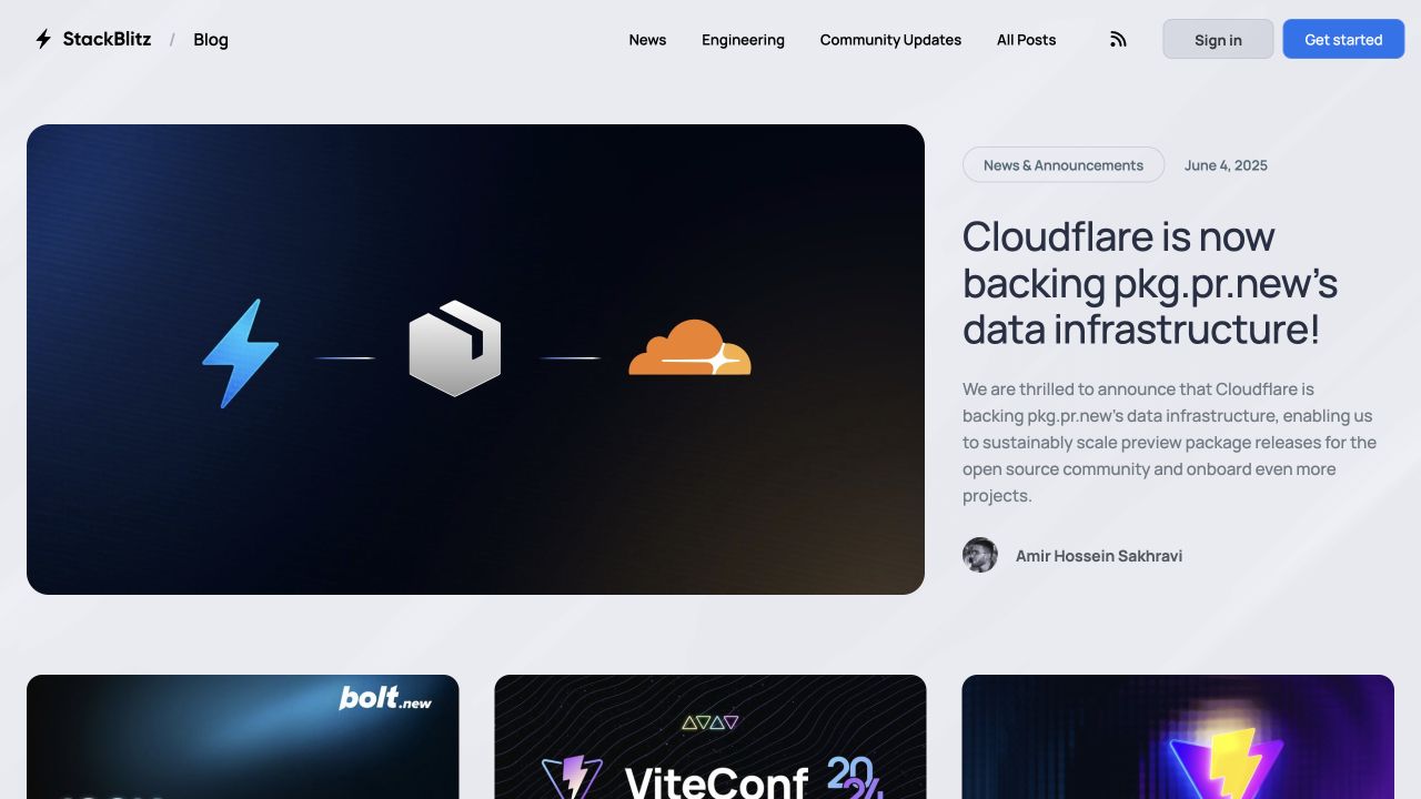
StackBlitz's blog gives its lead announcement a large visual and a nearby headline, summary, date and author. A row of further stories begins below, while the header offers news, engineering and community routes. This is a useful pattern for a technical company that needs announcements to remain understandable after the launch day. Netlify headers were observed on the blog's public route. The article image mentions other infrastructure companies, but that artwork is not the hosting evidence. The review relies on the actual response and does not generalize it to StackBlitz's editor or development environment.
What you can learn
Keep article metadata, campaign artwork and product documentation linked but independently maintained. Use previews to inspect long headlines and missing images, then verify that dated announcements retain their context rather than silently becoming evergreen product instructions.
Pros
The lead story includes enough metadata to distinguish an announcement from general product documentation.
Topic navigation gives returning readers a route beyond the newest feature.
Cons & considerations
Infrastructure logos inside editorial artwork can be mistaken for a complete architecture description.
A large lead image should not make dates, authorship or the actual article destination difficult to find.
Public source checked November 3, 2026. References may be embedded or legacy—not a complete backend inventory.
Platform source: Observed public HTTP response. On 2026-11-03, an HTTP HEAD request to https://blog.stackblitz.com/ returned status 200 at https://blog.stackblitz.com/ with x-nf-request-id: 01M6GZBCQ9ZVKC9DSY62K20D6R. Netlify delivery for this response; not evidence about every organizational property or product service. Platform evidence is separate from the direct website screenshot and is not a complete current infrastructure audit.
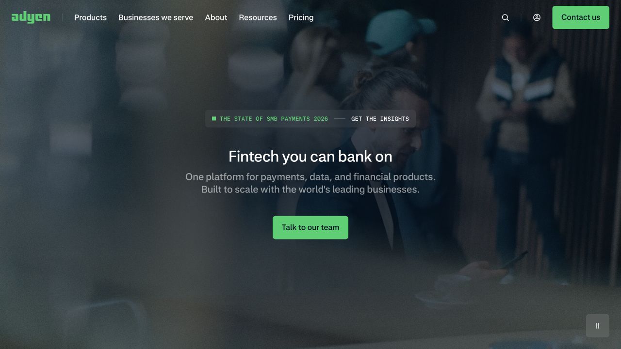
Adyen's saved homepage uses a full-width scene with a centered proposition and a compact sales action. The dark treatment keeps the bright green brand accents and contact route visible. Product, business, resource and pricing navigation remain available for visitors who need more detail than the opening message supplies. The current Netlify response identifies delivery of this public website route. It does not establish how Adyen processes payments, stores transaction data or operates its financial services. The useful reference is the relationship between a broad platform story and the more specific evaluation paths around it.
What you can learn
Translate the umbrella proposition into clearly labeled destinations for actual use cases. Preview the hero with its real navigation, then check that sales and technical routes explain the relevant product before requesting sensitive business or payment information.
Pros
The limited accent color creates a clear hierarchy between atmosphere, message and next step.
Several evaluation routes remain visible without filling the hero with detailed feature descriptions.
Cons & considerations
A broad payments proposition may require additional context before a visitor can identify the right service.
Dark moving imagery needs a readable still frame and a reduced-motion treatment across device sizes.
Vue.jsAssociated with Nuxt; not independently observed
Public source checked November 3, 2026. References may be embedded or legacy—not a complete backend inventory.
Platform source: Observed public HTTP response. On 2026-11-03, an HTTP HEAD request to https://www.adyen.com/ returned status 200 at https://www.adyen.com/ with x-nf-request-id: 01M6GZBD2VTW9EYN4HWC8SDA22. Netlify delivery for this response; not evidence about every organizational property or product service. Platform evidence is separate from the direct website screenshot and is not a complete current infrastructure audit.
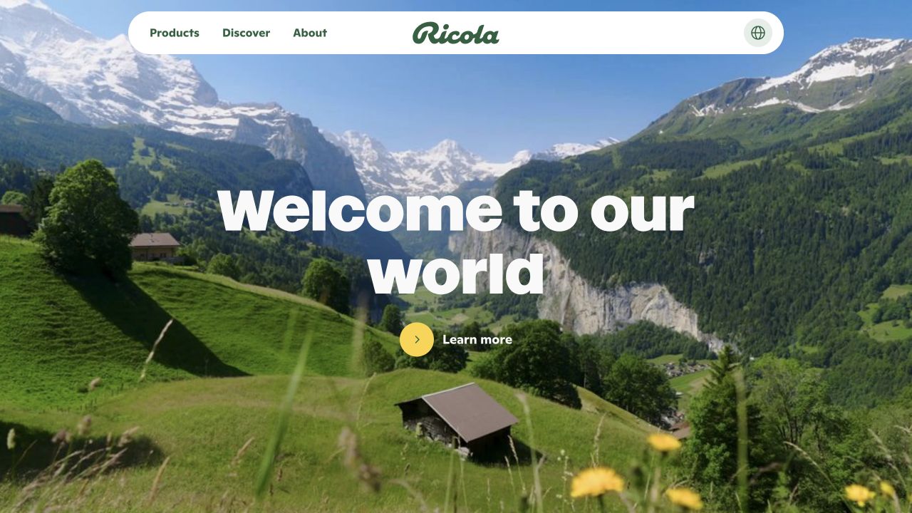
Ricola's Canadian page uses an alpine landscape to establish the brand's visual world. A compact white navigation capsule sits above a short central headline and a modest discovery action. The result is more editorial introduction than product grid, which can be useful when origin and atmosphere are central to the brand story. Netlify headers were observed on the specific Canadian route shown. This does not establish that every country site uses the same implementation, nor does it say anything about manufacturing, distribution or the business systems behind local product availability.
What you can learn
Define the shared brand frame and regional content separately. Preview translated headlines, local product destinations and imagery together, then verify country switching so visitors do not lose context or land on a page with different availability assumptions.
Pros
The landscape gives the brand a coherent visual setting before detailed product content appears.
A contained navigation bar remains distinct against varied photographic backgrounds.
Cons & considerations
An atmospheric opening can postpone practical information for visitors seeking a particular product.
Country-specific content needs explicit ownership so shared design does not imply identical products or language everywhere.
Public source checked November 3, 2026. References may be embedded or legacy—not a complete backend inventory.
Platform source: Observed public HTTP response. On 2026-11-03, an HTTP HEAD request to https://www.ricola.com/en-ca/ returned status 200 at https://www.ricola.com/en-ca/ with x-nf-request-id: 01M6GZBCV7X5Y71CWHPQAKKRZ1. Netlify delivery for this response; not evidence about every organizational property or product service. Platform evidence is separate from the direct website screenshot and is not a complete current infrastructure audit.
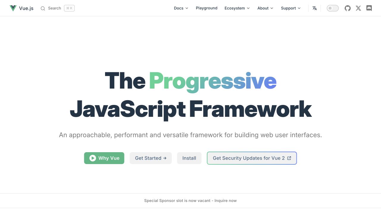
Vue's homepage centers a short framework description above several distinct learning and installation actions. The header offers documentation, APIs and ecosystem routes, while the open space keeps the first decision easy to understand. This is a useful reference for a technical project whose audience includes both first-time learners and experienced developers. Current headers identify Netlify delivery of the public Vue site. They do not mean applications built with Vue must use Netlify, or that the framework determines a site's hosting. The public documentation and the software's deployment choices are separate layers.
What you can learn
Design the first screen around the reader's next task: understand the project, begin learning or install it. Preview changes with the actual documentation destinations, and keep older-version guidance visibly distinct from the recommended current path.
Pros
Separate introductory and installation actions serve readers with different levels of familiarity.
The concise central explanation avoids overwhelming new visitors with the full ecosystem at once.
Cons & considerations
A large ecosystem still needs coherent ownership of external links and maintained examples.
Version-related notices must remain clear so readers do not mix legacy instructions with current documentation.
Public source checked November 3, 2026. References may be embedded or legacy—not a complete backend inventory.
Platform source: Observed public HTTP response. On 2026-11-03, an HTTP HEAD request to https://vuejs.org/ returned status 200 at https://vuejs.org/ with x-nf-request-id: 01M6GZBEA1X1ZWK1WC1P3CP4RR. Netlify delivery for this response; not evidence about every organizational property or product service. Platform evidence is separate from the direct website screenshot and is not a complete current infrastructure audit.
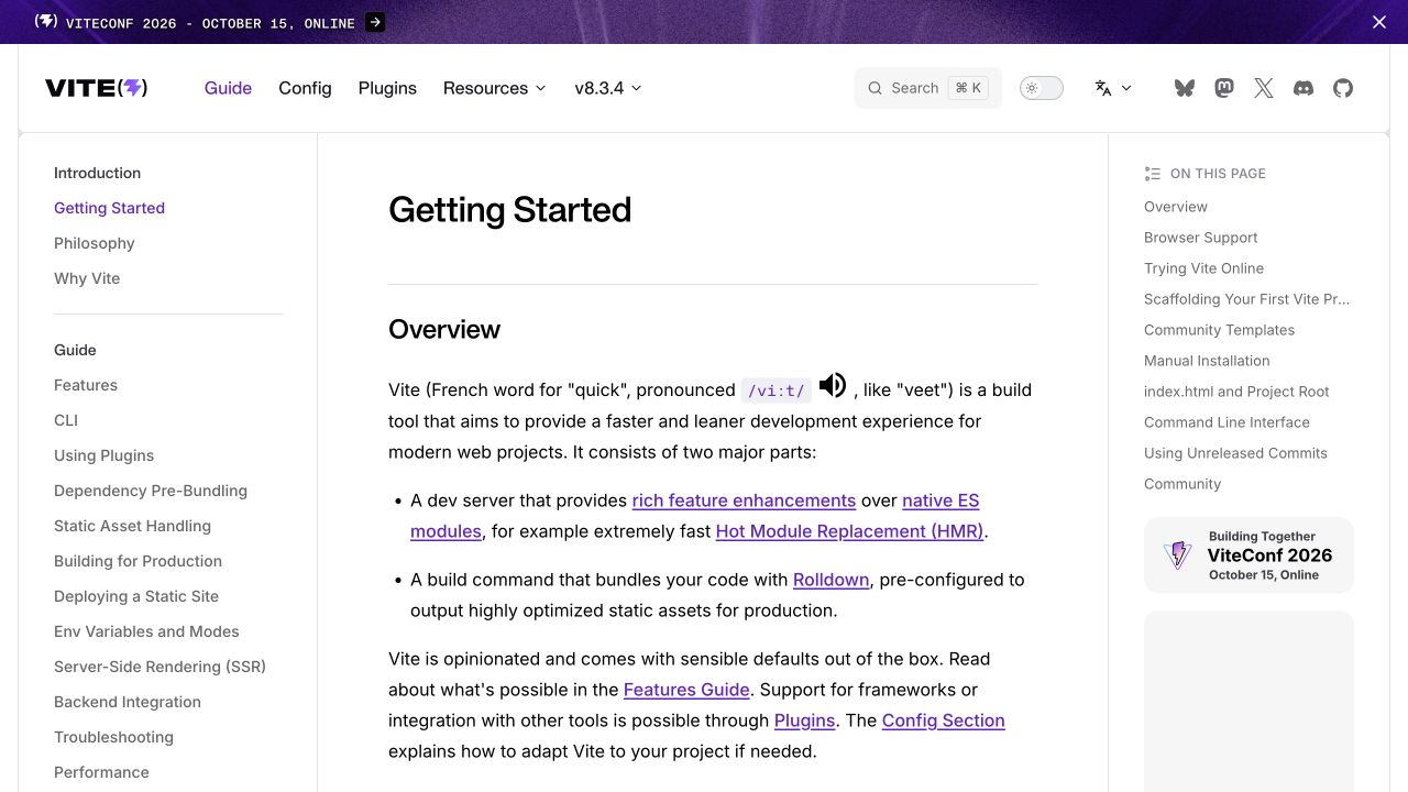
Vite's getting-started page uses a familiar documentation arrangement: persistent topic navigation on the left, the article in the center and page-level anchors on the right. Search, version and project routes occupy the header. The structure makes the current task visible while leaving neighboring topics close at hand. Netlify headers were observed on this exact guide route, supporting its delivery association. That does not imply applications built using Vite are hosted there. The useful development lesson concerns the documentation site's publishing and navigation, not a required runtime architecture for projects created with the tool.
What you can learn
Version content and navigation together. Before a documentation deploy, check headings, anchors, code formatting and migration links, and use representative long pages to reveal layout problems that a short homepage preview would miss.
Pros
Persistent section navigation gives the article a clear location within the larger manual.
Page anchors let readers move through a longer task without losing their place.
Cons & considerations
Three-column documentation needs a deliberate mobile treatment to avoid hiding essential navigation.
Technical instructions require version context and testing beyond the visual correctness of the page.
Vue.jsFramework dependency association; not independently observed
Public source checked November 3, 2026. References may be embedded or legacy—not a complete backend inventory.
Platform source: Observed public HTTP response. On 2026-11-03, an HTTP HEAD request to https://vite.dev/guide/ returned status 200 at https://vite.dev/guide/ with x-nf-request-id: 01M6GZBEGKEJ20TH7T24ZNZV7T. Netlify delivery for this response; not evidence about every organizational property or product service. Platform evidence is separate from the direct website screenshot and is not a complete current infrastructure audit.
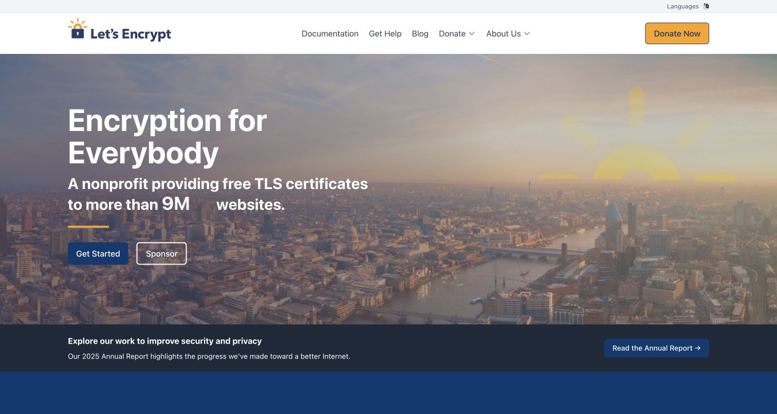
Let's Encrypt introduces its purpose over a city photograph, with a start action and a secondary support route. Documentation and organizational links remain in a simple header, while a report notice sits beneath the main scene. The layout connects a technical service with a public-interest identity without forcing every reader through a long institutional story. Netlify headers were observed on this public website route. They concern the informational site, not the certificate-issuance infrastructure or the security properties of any certificate. The example is useful for planning how explanation, documentation and organizational support can coexist.
What you can learn
Separate service instructions from the organization story while keeping both easy to reach. Preview updates to prominent claims with their supporting documentation, and check that reports and donation-related messages do not obstruct the practical getting-started path.
Pros
The first action offers a concrete route for readers who already understand their need.
Documentation and organizational information share a coherent frame without becoming the same content type.
Cons & considerations
Broad impact figures need current context and sources when they appear in prominent copy.
Support and report campaigns require expiry checks so practical service guidance remains the main task.
Public source checked November 3, 2026. References may be embedded or legacy—not a complete backend inventory.
Platform source: Observed public HTTP response. On 2026-11-03, an HTTP HEAD request to https://letsencrypt.org/ returned status 200 at https://letsencrypt.org/ with x-nf-request-id: 01M6GZBJVG5VRHSZE3GBCVB5YB. Netlify delivery for this response; not evidence about every organizational property or product service. Platform evidence is separate from the direct website screenshot and is not a complete current infrastructure audit.
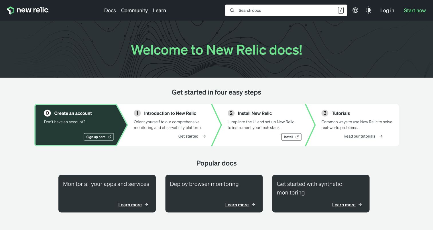
New Relic's documentation landing page opens with a short welcome and a row of numbered starting steps. A second group of popular documentation cards follows, while search is prominent in the dark header. The page demonstrates a useful distinction between guided onboarding and direct access to a known topic. Netlify headers were observed on the docs property shown here. They do not establish where the main marketing site or New Relic's observability services run. A documentation platform needs its own release, search and content-maintenance plan even when it shares a brand with the product.
What you can learn
Identify the handful of starting tasks that remain useful across releases. Preview those paths with real article titles, verify the search and version destinations, and assign owners for popular links so the hub does not slowly accumulate obsolete guidance.
Pros
Numbered first steps provide a manageable entry into a large technical documentation estate.
Search and popular topics support returning users who do not need an onboarding sequence.
Cons & considerations
A hub can look complete while linked instructions become outdated or inconsistent.
Cards need descriptive labels and useful fallback behavior when their destination is moved or retired.
ReactAssociated with Gatsby; not independently observed
Public source checked November 3, 2026. References may be embedded or legacy—not a complete backend inventory.
Platform source: Observed public HTTP response. On 2026-11-03, an HTTP HEAD request to https://docs.newrelic.com/ returned status 200 at https://docs.newrelic.com/ with x-nf-request-id: 01M6GZBKP3QT0P27C9F22C2692. Netlify delivery for this response; not evidence about every organizational property or product service. Platform evidence is separate from the direct website screenshot and is not a complete current infrastructure audit.
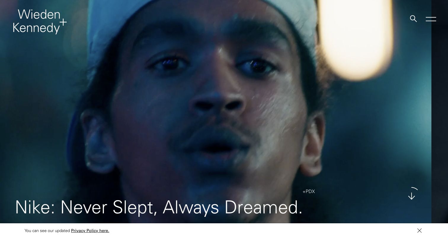
Wieden+Kennedy's saved homepage gives a campaign image nearly the entire viewport. The agency name, search and menu remain at the edges, while the project title and a downward cue sit over the image. This puts the work first and uses navigation as a supporting frame. Netlify headers were observed on the pictured public route. They identify its delivery association without revealing the agency's content workflow or the production systems behind any featured campaign. The useful implementation question is how to preserve a dependable portfolio structure while the first-screen artwork changes dramatically from project to project.
What you can learn
Build a repeatable campaign template with explicit title, image, credit and destination fields. Preview difficult images and long project names, and make the archive usable without requiring visitors to watch a full sequence of featured work.
Pros
A single campaign receives enough space to establish its visual tone and subject.
The restrained frame avoids confusing the agency identity with the featured client's brand.
Cons & considerations
Text over campaign imagery needs repeated contrast and crop checks as projects change.
Minimal menu treatment can slow discovery for readers who arrive looking for services, offices or specific work.
ReactAssociated with Gatsby; not independently observed
Public source checked November 3, 2026. References may be embedded or legacy—not a complete backend inventory.
Platform source: Observed public HTTP response. On 2026-11-03, an HTTP HEAD request to https://www.wk.com/ returned status 200 at https://www.wk.com/ with x-nf-request-id: 01M6GZBKYWK2B4W5Z3Z6PPJZ7K. Netlify delivery for this response; not evidence about every organizational property or product service. Platform evidence is separate from the direct website screenshot and is not a complete current infrastructure audit.
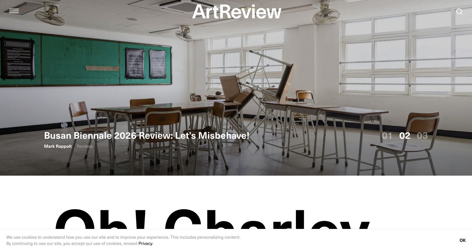
ArtReview places a large exhibition image beneath its centered wordmark, with a story title and carousel-style indicators over the photograph. The next content area begins below, signaling a transition into the publication's broader editorial offering. This is useful for studying how a visually led publication can give one story prominence without replacing its archive. The observed Netlify headers apply to this public homepage route. They do not identify subscription, advertising or publishing systems behind the magazine. The review concerns the visible editorial hierarchy and the maintenance questions created by rotating features and dated cultural coverage.
What you can learn
Treat the lead feature as one record in a structured editorial system. Preview headlines with varied artwork, keep author and date context reachable, and define how the homepage changes when an exhibition or featured event is no longer current.
Pros
The exhibition photograph gives the lead story a specific subject instead of generic publication imagery.
A strong wordmark ties changing editorial artwork back to a consistent publication identity.
Cons & considerations
Rotating features need accessible controls and a useful static presentation when motion is reduced.
Event-based coverage can become misleading if dates and archive context are difficult to find.
ReactAssociated with Gatsby; not independently observed
Public source checked November 3, 2026. References may be embedded or legacy—not a complete backend inventory.
Platform source: Observed public HTTP response. On 2026-11-03, an HTTP HEAD request to https://artreview.com/ returned status 200 at https://artreview.com/ with x-nf-request-id: 01M6GZBNMFPRTMVA431X8Q1RJ8. Netlify delivery for this response; not evidence about every organizational property or product service. Platform evidence is separate from the direct website screenshot and is not a complete current infrastructure audit.
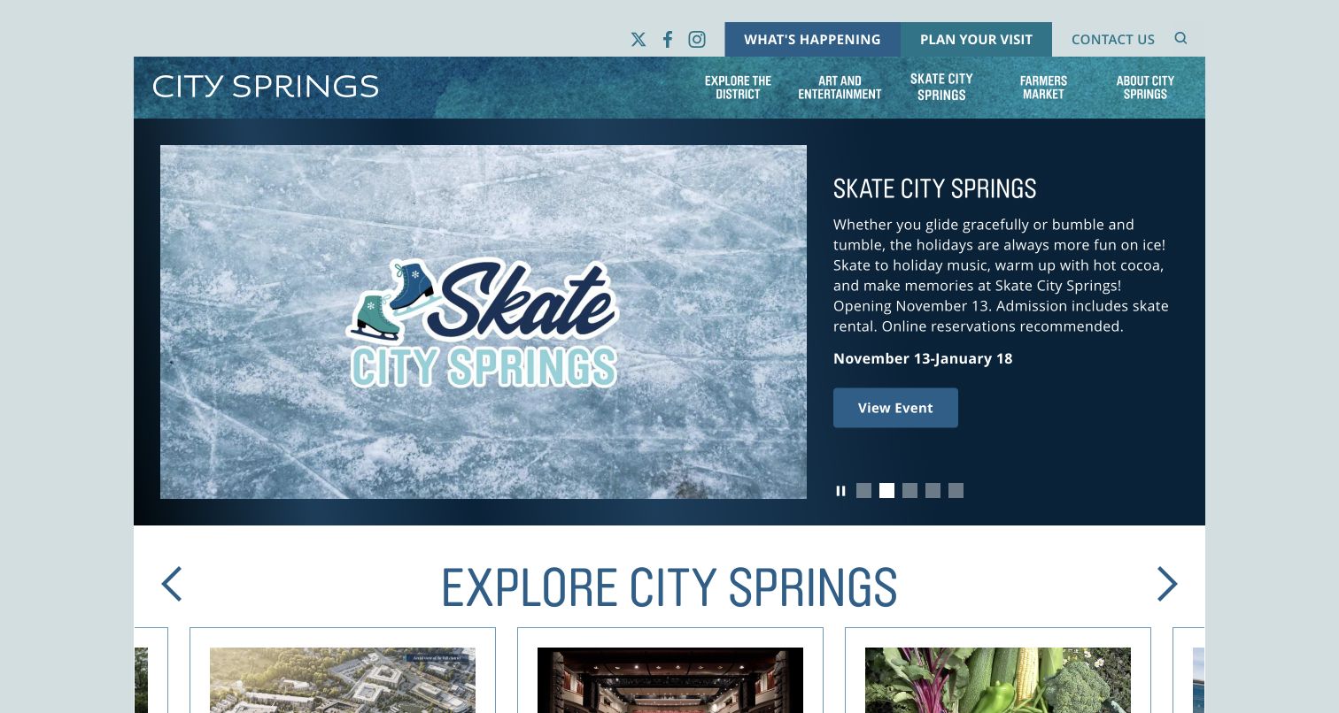
City Springs uses a compact place-based header and a two-part feature combining event artwork with practical explanatory text. The saved view promotes skating, while an exploration section begins immediately below. The composition balances a temporary event with the destination's longer-lived facilities and activities. Current Netlify headers support delivery of the pictured route, not the ticketing or reservation services it may link to. This distinction matters for a civic or cultural site: publishing an attractive event page is only one part of making dates, availability, access and booking destinations dependable for visitors.
What you can learn
Keep events as dated records with explicit location, booking destination and end state. Preview the feature alongside ordinary venue navigation, and verify that expired events remain understandable in the archive without continuing to look like current invitations.
Pros
Artwork and explanatory copy sit together, giving the event more context than a banner alone.
The exploration section keeps other reasons to visit visible beneath the current promotion.
Cons & considerations
Seasonal event content needs reliable expiry and replacement ownership.
Booking links, access information and schedules require operational checks beyond the homepage's visual presentation.
ReactAssociated with Gatsby; not independently observed
Public source checked November 3, 2026. References may be embedded or legacy—not a complete backend inventory.
Platform source: Observed public HTTP response. On 2026-11-03, an HTTP HEAD request to https://citysprings.com/ returned status 200 at https://citysprings.com/ with x-nf-request-id: 01M6GZBMZ7AX6ES8N7BTTDD7KE. Netlify delivery for this response; not evidence about every organizational property or product service. Platform evidence is separate from the direct website screenshot and is not a complete current infrastructure audit.
Choose repeatable page types for articles, campaigns, people and product information. Give editors useful controls with sensible boundaries. Preserve stable navigation and archive routes while the homepage changes, and demonstrate the workflow with imperfect content rather than one polished sample.
A versioned documentation estate
Treat navigation, search, code examples and version context as part of the product. Test deep URLs and anchors, and retain useful paths for readers arriving from older links. A documentation homepage can be simple while the maintenance requirements behind it are substantial.
A public frontend with separate services
Describe where forms, accounts, commerce and search actually operate. Define the browser-to-service handoff, data handling, error messages and owner for each integration. The public site’s successful deploy does not by itself confirm that a separate service is working or configured correctly.
From references to requirements
Plan routes and ownership before the first release
Map old and new destinations
Create a route inventory before moving a site. Netlify supports redirects and rewrites through defined configuration, with rule ordering that matters. Test representative old URLs, query variants and missing routes so a migration does not turn a visually complete site into a collection of broken entry points.
Identify which environment supplies content and which endpoints a preview can call. Make it possible to test forms and account journeys without creating real leads, purchases or notifications. Confirm preview access controls and search-index behavior as explicit project decisions.
Practice correction and recovery
Have the maintaining team publish a realistic update, inspect the result and correct an error. Record the tested source and deployment, the rollback reference and the expected behavior of linked services. Include expired campaigns and retired documentation in the handover, not just new content.
A useful handover demonstration
Ask the actual team to carry out its routine job: publish a realistic update, correct a mistake, preview a narrow screen, and identify who owns an integration failure. For a library or frontend framework, also ask who maintains the content source and deployment. A polished screenshot does not answer those operational questions.
Beyond the screenshot
A Netlify website launch and handover checklist
Inventory content types and assign a maintainer to each recurring publishing task.
Review the real deployment preview with representative content and integrations.
Confirm access controls and appropriate data connections for preview environments.
Check old URLs, redirects, deep links, missing pages and document anchors.
Test search, filters, forms and account handoffs in an approved test workflow.
Inspect keyboard behavior, narrow screens, media fallbacks and long content.
Verify the public domain, canonical metadata, sitemap and important assets.
Record correction, rollback, campaign-expiry and external-service ownership.
Test with real content, a keyboard, a small screen, slow or failed requests, and the people who will maintain the system. These are planning checks, not an accessibility, security, performance, or search-ranking certification.
Sources & editorial method
How this Netlify collection was reviewed
We selected 20 distinct public properties with successful responses carrying x-nf-request-id on November 3, 2026. Existing direct browser captures were visually reviewed and retain their original source URLs, dates and dimensions. The association applies to the named page or documentation property, not all organizational systems. We did not create accounts, submit forms or test transactions, and the reviews do not establish speed, conversion, security or accessibility results.
Every image is an unmodified capture from the actual website, with its source and capture date. Some captures are reused from our shared catalog; their dates remain the original capture dates. None comes from a vendor gallery or a generated reconstruction. Moving imagery and live content can change.
Technology attribution uses public page assets or metadata, official platform documentation, or a cited first-party project case study. Documentary and framework-relationship evidence is identified where used; it is not a complete current backend inventory. A CMS image CDN alone does not establish a full CMS deployment. A library’s presence does not prove which individual controls use it, and a platform label does not establish AI authorship.
The composition notes, lessons, pros and tradeoffs are original editorial observations. We have not measured conversion, traffic, security, performance or accessibility conformance. Website owners retain their brands and imagery; these examples are not our client portfolio. Written, Edited and Curated are independent records, not dates advanced by a build. See our editorial standards or suggest a correction.
Questions worth asking
Netlify website development FAQs
Does a Netlify website have to use a particular visual style?
No. The collection ranges from documentation to cinematic portfolios. The content model, design and framework remain project decisions.
Can a documentation site use a different host from the main product?
Yes. A documentation property can have its own delivery and publishing workflow. Our evidence is scoped to the route shown, rather than extended to the organization’s other services.
What should reviewers check in a Deploy Preview?
Review real content, key routes, mobile layout, keyboard behavior and safe integration states. Also confirm which data and services the preview connects to.
Are redirects only a migration concern?
No. Renamed articles, expired events and retired products create ongoing routing work. Keep the route map and redirect rules maintained as the site grows.
Is a successful deploy enough for handover?
No. The team should be able to publish and correct content, identify an integration failure and find the tested rollback reference.